FBO ALLinOneVoici un indicateur permettant de visualiser les points stratégiques pour appliquer notre méthode.
* Asian Box
* HHLL pour tracer les "bons" Fibo
* IMB
* BPR
Pivot points and levels

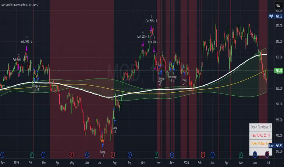
Ticker Pulse Meter + Fear EKG StrategyDescription
The Ticker Pulse Meter + Fear EKG Strategy is a technical analysis tool designed to identify potential entry and exit points for long positions based on price action relative to historical ranges. It combines two proprietary indicators: the Ticker Pulse Meter (TPM), which measures price positioning within short- and long-term ranges, and the Fear EKG, a VIX-inspired oscillator that detects extreme market conditions. The strategy is non-repainting, ensuring signals are generated only on confirmed bars to avoid false positives. Visual enhancements, such as optional moving averages and Bollinger Bands, provide additional context but are not core to the strategy's logic. This script is suitable for traders seeking a systematic approach to capturing momentum and mean-reversion opportunities.
How It Works
The strategy evaluates price action using two key metrics:
Ticker Pulse Meter (TPM): Measures the current price's position within short- and long-term price ranges to identify momentum or overextension.
Fear EKG: Detects extreme selling pressure (akin to "irrational selling") by analyzing price behavior relative to historical lows, inspired by volatility-based oscillators.
Entry signals are generated when specific conditions align, indicating potential buying opportunities. Exits are triggered based on predefined thresholds or partial position closures to manage risk. The strategy supports customizable lookback periods, thresholds, and exit percentages, allowing flexibility across different markets and timeframes. Visual cues, such as entry/exit dots and a position table, enhance usability, while optional overlays like moving averages and Bollinger Bands provide additional chart context.
Calculation Overview
Price Range Calculations:
Short-Term Range: Uses the lowest low (min_price_short) and highest high (max_price_short) over a user-defined short lookback period (lookback_short, default 50 bars).
Long-Term Range: Uses the lowest low (min_price_long) and highest high (max_price_long) over a user-defined long lookback period (lookback_long, default 200 bars).
Percentage Metrics:
pct_above_short: Percentage of the current close above the short-term range.
pct_above_long: Percentage of the current close above the long-term range.
Combined metrics (pct_above_long_above_short, pct_below_long_below_short) normalize price action for signal generation.
Signal Generation:
Long Entry (TPM): Triggered when pct_above_long_above_short crosses above a user-defined threshold (entryThresholdhigh, default 20) and pct_below_long_below_short is below a low threshold (entryThresholdlow, default 40).
Long Entry (Fear EKG): Triggered when pct_below_long_below_short crosses under an extreme threshold (orangeEntryThreshold, default 95), indicating potential oversold conditions.
Long Exit: Triggered when pct_above_long_above_short crosses under a profit-taking level (profitTake, default 95). Partial exits are supported via a user-defined percentage (exitAmt, default 50%).
Non-Repainting Logic: Signals are calculated using data from the previous bar ( ) and only plotted on confirmed bars (barstate.isconfirmed), ensuring reliability.
Visual Enhancements:
Optional moving averages (SMA, EMA, WMA, VWMA, or SMMA) and Bollinger Bands can be enabled for trend context.
A position table displays real-time metrics, including open positions, Fear EKG, and Ticker Pulse values.
Background highlights mark periods of high selling pressure.
Entry Rules
Long Entry:
TPM Signal: Occurs when the price shows strength relative to both short- and long-term ranges, as defined by pct_above_long_above_short crossing above entryThresholdhigh and pct_below_long_below_short below entryThresholdlow.
Fear EKG Signal: Triggered by extreme selling pressure, when pct_below_long_below_short crosses under orangeEntryThreshold. This signal is optional and can be toggled via enable_yellow_signals.
Entries are executed only on confirmed bars to prevent repainting.
Exit Rules
Long Exit: Triggered when pct_above_long_above_short crosses under profitTake.
Partial exits are supported, with the strategy closing a user-defined percentage of the position (exitAmt) up to four times per position (exit_count limit).
Exits can be disabled or adjusted via enable_short_signal and exitPercentage settings.
Inputs
Backtest Start Date: Defines the start of the backtesting period (default: Jan 1, 2017).
Lookback Periods: Short (lookback_short, default 50) and long (lookback_long, default 200) periods for range calculations.
Resolution: Timeframe for price data (default: Daily).
Entry/Exit Thresholds:
entryThresholdhigh (default 20): Threshold for TPM entry.
entryThresholdlow (default 40): Secondary condition for TPM entry.
orangeEntryThreshold (default 95): Threshold for Fear EKG entry.
profitTake (default 95): Exit threshold.
exitAmt (default 50%): Percentage of position to exit.
Visual Options: Toggle for moving averages and Bollinger Bands, with customizable types and lengths.
Notes
The strategy is designed to work across various timeframes and assets, with data sourced from user-selected resolutions (i_res).
Alerts are included for long entry and exit signals, facilitating integration with TradingView's alert system.
The script avoids repainting by using confirmed bar data and shifted calculations ( ).
Visual elements (e.g., SMA, Bollinger Bands) are inspired by standard Pine Script practices and are optional, not integral to the core logic.
Usage
Apply the script to a chart, adjust input settings to suit your trading style, and use the visual cues (entry/exit dots, position table) to monitor signals. Enable alerts for real-time notifications.
Designed to work best on Daily timeframe.
Supply & Demand MTF[E7T]This is not your average supply and demand tool. it’s a powerful, flexible indicator that helps traders spot high-probability opportunities by adapting to real-time market conditions. It uses a smart combination of volatility (ATR), volume, and price action to identify key zones where the market is likely to react. Perfect for scalpers and swing traders alike, this strategy brings together adaptive zone detection, trend bias (pivot line), two-tiered signals (S1 and S2), volume filtering, built-in Fibonacci targets, and even a debug mode for transparency and performance tracking.
KEY FEATURES
1. ADAPTIVE ZONE DETECTION; This feature highlights areas where price is likely to bounce or reversebullish demand zones and bearish supply zones. Instead of using fixed levels, it adjusts based on market volatility.
HOW IT WORKS:
Uses Average True Range (ATR) to measure volatility.
TWO MODES:
Low Volatility Mode: Makes zones tighter for calm markets.
High Volatility Mode: Expands zones during choppy or fast-moving conditions.
Plots red boxes for supply zones and blue for demand zones. Zones extend until broken or naturally expire.
WHY IT MATTERS: Traditional zone indicators often fall short in fast-changing conditions. This one adjusts automatically, helping you stay one step ahead.
EXAMPLE: On a 4H BTCUSD chart, a demand zone will form at a key support level and adjust its size depending on whether the market is quiet or volatile.
2. MARKET BIAS PIVOT LINE; This dynamic line helps you quickly see whether the market is trending up or down so you can trade in the direction of strength.
HOW IT WORKS:
Based on recent swing highs and lows (default: last 4 bars).
Line is green when price is above (bullish), red when below (bearish).
Updates live and can be turned on/off in settings.
WHY IT MATTERS: It’s a built-in trend filter. Use it to avoid fighting the market.
EXAMPLE: If SPY is above a green pivot and enters a demand zone, it’s a solid bullish setup.
3. DUAL ENTRY SIGNALS (S1 and S2) The strategy gives you two signal types depending on your risk style:
S1 SIGNALS: Early entry, based on basic confirmation (like a bullish engulfing pattern).
S2 SIGNALS: Stronger entry, requiring solid candle confirmation, volume spike, and close near the zone.
HOW IT WORKS:
S1 = good for aggressive traders or small size entries.
S2 = better for high-conviction trades and bigger position sizes.
Both signals follow your selected market mood (bullish or bearish).
WHY IT MATTERS: Flexibility! Most indicators only offer one signal style. This one gives you choice.
EXAMPLE: In EURUSD, S1 might show up when price taps a demand zone and forms a small bullish candle. If volume increases and the next candle closes strong, S2 confirms the entry.
4. VOLUME CONFIRMATION This filters out weak signals by checking for real buying/selling interest.
HOW IT WORKS:
Compares current volume to previous bar and a 10–14 bar average.
Adjustable volume thresholds for S1 and S2.
Can be disabled for markets with unreliable volume (like certain forex pairs).
WHY IT MATTERS: It adds a layer of quality control. High-volume moves usually mean higher conviction.
EXAMPLE: On AAPL, an S2 will only trigger if volume jumps by 1.3x the average, signaling strong seller presence.
5. BUILT-IN FIBONACCI TARGETS (TP1, TP2, SL) No more guessing exits. The strategy draws take profit (TP) and stop loss (SL) levels automatically based on zone size.
HOW IT WORKS:
TP1 = 2.12x the zone height
TP2 = 3.3x the zone height
SL = 1x the zone height (all adjustable)
These are shown as dashed (TP) and solid (SL) lines with labels
WHY IT MATTERS: Reduces emotional decision-making. Helps you plan trades with consistent risk/reward.
Example: In GOLD, if the demand zone is $20 tall, TP1 would be ~$42.40 higher, TP2 ~$66 higher, and SL $20 lower.
6. FULLY CUSTOMIZABLE INPUTS Tweak the settings to match your style and asset type.
KEY INPUTS:
Market Mood: Choose bullish (1) or bearish (2)
Timeframe Filter: Focus only on reliable zones (30M or 4H) or can disable to show on every timeframe
Zone Limit: Limit how many zones show (e.g., max 4)
Breakout Buffer: Defines how much price must move to break a zone
Zone Opacity: Make zones more/less visible
WHY IT MATTERS: This lets you dial in the indicator for scalping, swing trading, crypto, stocks, or forex.
Example: A scalper might use tighter zones and a low breakout buffer, while a swing trader prefers more zones and higher volatility mode.
7. DEBUG MODE (Optional) Get under the hood and see exactly how the strategy works.
HOW IT WORKS:
Shows metrics like ATR, volatility mode, memory usage, signal win rate, etc.
Plots visual lines showing zone age and success rate (TP1 hit tracking)
WHY IT MATTERS: Very few indicators show their math. This one does—great for power users who want to optimize.
EXAMPLE: You might discover that signals perform best in high volatility mode during news events, helping you adjust settings accordingly.
HOW TO USE IT
1. Add it to your TradingView chart (30M or 4H timeframes recommended).
2. Adjust inputs:
Market Mood = 1 (bullish) or 2 (bearish)
Pick your Volatility Mode
Set Zone Collector Limit (3–4 works well)
Use Timeframe Filter for better signals
3. Watch for S1 and S2:
S1 = quicker trades, lighter risk
S2 = stronger confirmation, bigger trades
4. Use the Pivot Line for trade direction.
5. Manage exits with auto TP/SL levels.
6. Turn on Debug Mode if you want detailed stats.
WORKS VERY WELL WITHOUT REPAINTING
Why It’s a Game-Changer; IT takes the guesswork out of zone trading. It’s not just smart—it’s adaptive. From volatility and volume to dynamic signals and exit plans, everything adjusts based on what the market is doing. And with a built-in trend filter and real-time debug info, it’s like having a trading co-pilot that’s always alert.
Why It’s Different Most zone indicators are basic. This one isn’t. Here’s why:
Adaptive zones that change with the market
Dual signal system (S1/S2) for flexibility
Volume confirmation to filter noise
Built-in Fibonacci targets for clean exits
Debug mode that shows you how it works
YOU CAN SET ALERTS WITHOUT repainting
THIS isn’t just another tool—it’s a smarter, more responsive way to trade.

Pristine Value Areas & MGIThe Pristine Value Areas indicator enables users to perform comprehensive technical analysis through the lens of the market profile in a fraction of the time! 🏆
A Market Profile is a charting technique devised by J. Peter Steidlmayer, a trader at the Chicago Board of Trade (CBOT), in the 1980's. He created it to gain a deeper understanding of market behavior and to analyze the auction process in financial markets. A market profile is used to analyze an auction using price, volume, and time to create a distribution-based view of trading activity. It organizes market data into a bell-curve-like structure, which reveals areas of value, balance, and imbalance.
💠 How is a Value Area Calculated?
A value area is a distribution of 68%-70% of the trading volume over a specific time interval, which represents one standard deviation above and below the point of control, which is the most highly traded level over that period.
The key reference points are as follows:
Value area low (VAL) - The lower boundary of a value area
Value area high (VAH) - The upper boundary of a value area
Point of Control (POC) - The price level at which the highest amount of a trading period's volume occurred
If we take the probability distribution of trading activity and flip it 90 degrees, the result is our Pristine Value Area!
Market Profile is our preferred method of technical analysis at Pristine Capital because it provides an objective and repeatable assessment of whether an asset is being accumulated or distributed by institutional investors. Market Profile levels work remarkably well for identifying areas of interest, because so many institutional trading algorithms have been programmed to use these levels since the 1980's!
The benefits of using Market Profile include better trade location, improved risk management, and enhanced market context. It helps traders differentiate between trending and consolidating markets, identify high-probability trade setups, and adjust their strategies based on whether the market is in balance (consolidation) or imbalance (trending). Unlike traditional indicators that rely on past price movements, Market Profile provides real-time insights into trader behavior, giving an edge to those who can interpret its nuances effectively.
Virgin Point of Control (VPOC) - A point of control from a previous time period that has not yet been revisited in subsequent periods. VPOCs are great for identifying prior supply or demand zones.
Below is a great example of price reversing lower after taking out an upside VPOC
💠 Are all POCs Created Equal?
If POCs are used to gauge supply & demand zones at key levels, then a POC with higher volume should be viewed as more significant than a POC that traded lower volume, right? We created Golden POCs as a tool to identify high volume POCs on all timeframes.
Golden POC (GPOC) - A POC that traded the highest volume compared to prior POCs (proprietary to Pristine Capital)
We calculate value areas for the following time intervals based on the user selected timeframe:
5 Minute and 15 Minute Timeframes -> Daily Value Area
The daily value area paints the distribution of the PRIOR session's trading activity. The "d" in the label references for VAHd, POCd and VALd is a visual cue that value area shown is daily.
1 Hour Timeframe -> Weekly Value Area
The weekly value area paints the distribution of the PRIOR week's trading activity. The "w" in the label references for VAHw, POCw and VALw is a visual cue that value area shown is weekly.
1 Day Timeframe -> Monthly Value Area
The monthly value area paints the distribution of the PRIOR month's trading activity. The "m" in the label references for VAHm, POCm and VALm is a visual cue that value area shown is monthly.
1 Week Timeframe -> Yearly Value Area
The yearly value area paints the distribution of the PRIOR year's trading activity. The "y" in the label references for VAHy, POCy and VALy is a visual cue that value area shown is yearly.
💠 What is a developing value area?
The developing value area provides insight into the upcoming value area while it is still forming! It appears when 80% of the way through the current value area. As the end of a trading period approaches, it can make sense to start trading off the developing value area. When the time period flips, the developing value area becomes the active value area!
💠 Value Areas Trading Setups
Two popular market profile concepts are the bullish and bearish 80% rules. The concept is that there is an 80% probability that the market will traverse the entire relevant value area.
Bullish 80% Rule - If a security opens a period below the value area low , and subsequently closes above it, the bullish 80% rule triggers, turning the value area green. One can trade for a move to the top of the value area, using a close below the value area low as a potential stop!
In the below example, HOOD triggered the bullish 80% rule after it reclaimed the monthly value area!
HOOD proceeded to rally through the monthly value area and beyond in subsequent trading sessions. Finding the first stocks to trigger the bullish 80% rule after a market correction is key for spotting the next market leaders!
Bearish 80% Rule - If a security opens a period above the value area high , and subsequently closes below it, the bearish 80% rule triggers, turning the value area red. One can trade for a move to the bottom of the value area, using a close above the value area high as a potential stop!
ES proceeded to follow through and test the value area low before trending below the weekly value area
Value Area Breakouts - When a security is inside of value, the auction is in balance. When it breaks out from a value area, it could be entering a period of price discovery. One can trade these breaks out of value with tight risk control by setting a stop inside the value area! These breakouts can be traded on all chart timeframes depending on the timeframe of the individual trader. Combining multiple timeframes can result in even more effective trading setups.
RBLX broke out from the monthly value area on 4/22/25👇
RBLX proceeded to rally +62.78% in 39 trading sessions following the monthly VAH breakout!
💠 Market Generated Information to Improve Your Situational Awareness!
In addition to the value areas, we've also included stat tables with useful market generated information. The stats displayed vary based on the timeframe the user has up on their screen. This incentivizes traders to check the chart on multiple timeframes before taking a trade!
Metrics Grouped By Use Case
Performance
▪ YTD α - YTD Alpha (α) measures the risk-adjusted, excess return of a security over its user defined benchmark, on a year-to-date basis.
▪ MTD α - MTD Alpha (α) measures the risk-adjusted, excess return of a security over its user defined benchmark, on a month-to-date basis.
▪ WTD α - WTD Alpha (α) measures the risk-adjusted, excess return of a security over its user defined benchmark, on a week-to-date basis.
▪ YTD %Δ - Year-to-date percent change in price
▪ MTD %Δ - Month-to-date percent change in price
▪ WTD %Δ - Week-to-date percent change in price
Volatility
▪ ATR % - The Average True Range (ATR) expressed as a percentage of an asset's price.
▪ Beta - Measures the price volatility of a security compared to the S&P 500 over the prior 5 years (since inception if 5 years of data is not available)
Risk Analysis
▪ LODx - Low-of-day extension - ATR % multiple from the low of day (measures how extended a stock is from its low of day)
▪ MAx - Moving average extension - ATR % multiple from the user-defined moving average (measures how extended a security is from its moving average). Default moving average = 50D SMA
Why does MAx matter?
MAx measures the number of ATR % multiples a security is trading away from a key moving average. The default moving average length is 50 days.
MAx can be used to identify mean reversion trades . When a security trends strongly in one direction and moves significantly above or below its moving average, the price often tends to revert back toward the average.
Example, if the ATR % of the security is 5%, and the stock is trading 50% higher than the 50D SMA, the MAx would be 50%/5% = 10. A user might opt to take a countertrend trade when the MAx exceeds a predetermined level.
The MAx can also be useful when trading breakouts above or below the key moving average of your choosing. The lower the MAx, the tighter stop loss one can take if trading against that level.
Identifying an extreme price extension using MAx 👇
Price mean reverted immediately following the high MAx 👇
💠 Trend Analysis
The Trend Analysis section consists of short-term and long-term stage analysis data as well as the value area timeframe and price in relation to the value area.
Stage Analysis
▪ ST ⇅ - Short-term stage analysis indicator
▪ LT ⇅ - Long-term stage analysis indicator
Short-term and long-term stage analysis data is provided in the two rightmost columns of each table. The columns are labeled ST ⇅ and LT ⇅.
Why is Stage Analysis important? Popularized by Stan Weinstein, stage analysis is a trend following system that classifies assets into four stages based on price-trend analysis.
The problem? The interpretation of stage analysis is highly subjective. Based on the methodology provided in Stan Weinstein’s books, five different traders could look at the same chart, and come to different conclusions as to which stage the security is in!
We solved for this by creating our own methodology for classifying stocks into stages using moving averages. This indicator automates that analysis, and produces short-term and long-term trend signals based on user-defined key moving averages. You won’t find this in any textbook or course, because it’s completely unique to the Pristine trading methodology.
Our indicator calculates a short-term trend signal using two moving averages; a fast moving average, and a slow moving average. We default to the 10D EMA as the fast moving average & the 20D SMA as the slow moving average. A trend signal is generated based on where price is currently trading with respect to the fast moving average and the slow moving average. We use the signal to guide shorter-term swing trades.
In general, we want to take long trades in stocks with strengthening trends, and short trades in stocks with weakening trends. The user is free to change the moving averages based on their own short-term timeframe. Every trader is unique!
The same process is applied to calculate the long-term trend signal. We default to the 50D SMA as our fast moving average, and the 200D SMA as the slow moving average for the LT ⇅ signal calculation, but users can change these to fit their own unique trading style.
What is Stage 1?
Stage 1 identifies stocks that transitioned from downtrends, into bottoming bases.
Stage 1A - Bottom Signal: Marks the first day a security shows initial signs of recovery after a downtrend, with early indications of strength emerging.👇
Stage 1B - Bottoming Process: Identifies the ongoing phase where the security continues to stabilize and strengthen, confirming the base-building process after the initial signal.👇
Stage 1R - Failed Uptrend: Detects when a security that had entered an early uptrend loses momentum and slips back into a bottoming phase, signaling a failed breakout.👇
What is Stage 2?
Stage 2 identifies stocks that transitioned from bottoming bases to uptrends.
Stage 2A - Breakout: Marks the first day a security decisively breaks out, signaling the start of a new uptrend.👇
Stage 2B - Uptrend: Identifies when the security continues to trade in an established uptrend following the initial breakout, with momentum building but not yet showing full strength.👇
Stage 2C - Strong Uptrend: Detects when the uptrend strengthens further, with the security displaying clear signs of accelerating strength and buying pressure.👇
Stage 2R - Failed Breakdown: Detects when a security that had recently entered a corrective phase reverses course and reclaims its upward trajectory, moving back into an uptrend.👇
What is Stage 3?
Stage 3 identifies stocks that transitioned from uptrends to topping bases.
Stage 3A - Top Signal: Marks the first day a security shows initial signs of weakness after an uptrend, indicating the start of a potential topping phase.👇
Stage 3B - Topping Process: Identifies the period following the initial signal when the security continues to show signs of distribution and potential trend exhaustion.👇
Stage 3R - Failed Breakdown: Detects when a security that had entered a deeper corrective phase reverses upward, recovering enough strength to re-enter the topping phase.👇
What is Stage 4?
Stage 4 identifies stocks that transitioned from topping bases to downtrends.
Stage 4A - Breakdown: Marks the first day a security decisively breaks below key support levels, signaling the start of a new downward trend.👇
Stage 4B - Downtrend: Identifies when the security continues to trend lower following the initial breakdown, with sustained bearish momentum, though not yet fully entrenched.👇
Stage 4C - Strong Downtrend: Detects when the downtrend intensifies, with the security displaying clear signs of accelerating weakness and selling pressure.👇
Stage 4R - Failed Bottom: Detects when a security that had begun to show early signs of bottoming reverses course and resumes its decline, falling back into a downtrend.👇
Stage N/A - Recent IPO: Applies to stocks that recently IPO’ed and don’t have enough data to calculate all necessary moving averages.
Value Area
In Trend Analysis, the value area information is helpful to gauge price in relation to the value area.
▪ VA(y) - Categorizes the security based on the relation of price to the yearly value area
▪ VA(m) - Categorizes the security based on the relation of price to the monthly value area
▪ VA(w) - Categorizes the security based on the relation of price to the weekly value area
Value area states:
▪ ABOVE = Price above the value area high
▪ BELOW = Price below the value area low
▪ INSIDE = Price inside the value area
▪ Bull 80% = Bullish 80% rule in effect
▪ Bear 80% rule = Bearish 80% rule in effect
For example, in the chart above, VA(m) - ABOVE indicates a monthly value area and price is above the VAH.
💠 What Makes This Indicator Unique
There are many value area indicators, however...
Value Area
▪ Golden POC (GPOC) - This is a proprietary concept.
▪ Unique Label Customization
Pristine value areas often comprehensive and unique label customizations. Styles include options to display any combination of the following on your labels:
• Price levels associated with market profile levels
• % distance of market profile levels from security price
• ATR% extension of market profile levels from security price
Multi-Timeframe Analysis
Based on the chart timeframe, unique market generated information is shown to facilitate multi-timeframe analysis.
▪ Weekly Timeframe
On the weekly timeframe the focus is the bigger picture and the metrics reflect this perspective. Performance data includes YTD Alpha and YTD percent change in price. Volatility is measured using ATR % and the industry standard beta. Trend analysis for this higher timeframe include the 52-week range, which measures where a security is trading in relation to its 52wk high and 52wk low. Also included is the where price is in relation to yearly value area.
▪ Daily Timeframe
As one drills down to the daily timeframe, the performance metrics include MTD alpha and MTD percent change in price.
Risk analysis includes the low-of-day extension (LODx), which is the ATR % multiple from the low of the day, to measures how extended a stock is from its low of day. In addition, the moving average extension (MAx) is the ATR % multiple from the user-defined moving average, measures how extended a security is from its
moving average. The default moving average is the 50D SMA, however this can be customized in Settings.
Trend Analysis on the daily timeframe includes the Pristine Capital methodology for classifying stocks into stages using moving averages. Both short-term and long-term stage analysis data is included. Finally, price in relation to monthly value area is shown.
▪ Hourly Timeframe
An the hourly timeframe, performance metrics include WTD alpha and WTD percent change in price. Trend analysis includes the daily closing range (DCR) and price in relation to weekly value area.
💠 Settings and Preferences
💠 Acknowledgements
We'd like to thank @dgtrd, a TradingView Pine Wizard, for his insight on the finer details when working with volume profiles.

Swing PointsSwing Points Indikator
Der Swing Points Indikator für TradingView ist ein vielseitiges Tool, das Schwinghochs und Schwingtiefs auf deinem Chart identifiziert und visualisiert. Diese Punkte sind entscheidend für die technische Analyse, da sie potenzielle Bereiche für Trendumkehrungen oder die Fortsetzung eines Trends markieren können.
Hauptfunktionen:
→ Anpassbare Swing-Größe: Du kannst die Anzahl der Bars links und rechts eines potenziellen Swing-Punktes einstellen, um die Sensibilität des Indikators anzupassen.
→ Visualisierung von Swing-Linien: Der Indikator kann horizontale Linien von den identifizierten Swing-Punkten aus zeichnen, die sich auf Wunsch erweitern, bis sie von den Preisen berührt werden.
→ Beschriftungs-Bubbles: Kleine Kreise (Bubbles) markieren die exakte Position der Swing-Punkte auf dem Chart.
→ Anpassbare Darstellung: Du hast volle Kontrolle über die Farben und Linienstile der Swing-Hochs und -Tiefs, um sie an dein bevorzugtes Chart-Layout anzupassen.
Filtermöglichkeiten:
→ "Hide Filled": Ermöglicht das Ausblenden von Swing-Linien, die bereits vom Preis berührt wurden.
→ "Extend Until Fill": Bestimmt, ob die Swing-Linien erweitert werden sollen, bis der Preis sie kreuzt.
Lookback-Periode:
Eine optionale Lookback-Funktion beschränkt die Anzeige der Swing-Punkte auf eine bestimmte Anzahl von Tagen, was die Performance auf sehr langen Charts verbessern kann.
Dieser Indikator ist nützlich für Trader, die:
→ Unterstützungs- und Widerstandsniveaus identifizieren möchten.
→ Potenzielle Umkehrpunkte im Markt suchen.
→ Trendlinien auf der Grundlage signifikanter Preisbewegungen zeichnen möchten.
→ Eine klare visuelle Darstellung der Marktstruktur bevorzugen.
Der Swing Points Indikator bietet eine klare und anpassbare Möglichkeit, wichtige strukturelle Punkte im Preisgeschehen zu erkennen und kann dir helfen, fundiertere Handelsentscheidungen zu treffen

Liquidity Point LinesLiquidity Point Lines
The "Liquidity Point Lines" indicator helps traders identify potential areas of liquidity in the market by drawing lines at specific price levels where significant "liquidation events" may have occurred. These events are determined by analyzing the MACD Histogram and identifying pivot points that suggest strong movements, which are often associated with the flushing out of short or long positions.
How It Works
This indicator leverages the MACD Histogram to gauge the strength of price momentum. It then identifies pivot highs and lows within the MACD Histogram's values. When a significant pivot is detected, the indicator interprets this as a potential "liquidity point" — a price level where a substantial amount of buy or sell orders (often due to liquidations) may have been executed.
The indicator distinguishes between:
Shorts Liquidation Points (Resistance): These are identified when the MACD Histogram registers a pivot high, suggesting a strong upward movement that could have liquidated short positions. Lines are drawn at the high price of the bar where this pivot occurred.
Longs Liquidation Points (Support): Conversely, these are identified when the MACD Histogram registers a pivot low, indicating a strong downward movement that might have liquidated long positions. Lines are drawn at the low price of the bar where this pivot occurred.
Key Features and Settings
The "Liquidity Point Lines" indicator offers extensive customization to tailor its sensitivity and visual representation:
MACD Settings for Liquidity: Configure the underlying MACD calculation with adjustable Fast Length, Slow Length, Source, Signal Smoothing, and MA Types (SMA/EMA) for both the Oscillator and Signal Line.
Liquidity Points Settings:
Pivot Lookback Left/Right: Define the number of bars to look back on either side to identify a pivot in the MACD Histogram.
Dynamic Strength Thresholds: This powerful feature allows the indicator to dynamically calculate the significance of a liquidation event. When enabled, it uses the average absolute histogram value over a specified Dynamic Threshold Lookback Period and applies Small and Medium Threshold Factors to determine the strength (Small, Medium, or Large) of the liquidity point.
Fixed Strength Thresholds: If dynamic thresholds are disabled, you can set fixed numerical values for Small and Medium Histogram Thresholds to define the strength categories.
Color & Style Customization: Assign distinct colors for Small, Medium, and Large liquidation points, choose the Line Style (Solid, Dashed, Dotted), and set the Label Text Color.
Label X Offset (To Right): Adjust the horizontal position of the liquidity point labels on your chart.
Liquidity Points Management:
Max Active Liquidity Lines: Control the maximum number of liquidity lines displayed simultaneously on your chart. Older lines are automatically removed to maintain clarity, except for lines that have been "touched" (i.e., price has interacted with that liquidity level).
Visual Interpretation
Each liquidity line is colored according to the strength of the detected liquidation event, making it easy to visually assess the potential significance of the price level. Lines extend to the right, serving as ongoing reference points. When the price interacts with a liquidity line (i.e., "touches" it), the line and its corresponding label are removed, indicating that the liquidity at that level may have been absorbed.
This indicator can be a valuable tool for identifying potential support and resistance levels, understanding market reactions to "liquidation cascades," and informing your trading decisions.


True Close – Institutional Trading Sessions (Zeiierman)█ Overview
True Close – Institutional Trading Sessions (Zeiierman) is a professional-grade session mapping tool designed to help traders align with how institutions perceive the market’s true close. Unlike the textbook “daily close” used by retail traders, institutional desks often anchor their risk management, execution benchmarks, and exposure metrics to the first hour of the next session.
This indicator visualizes that logic directly on your chart — drawing session boxes, true close levels, and time-aligned labels across Sydney, Tokyo, London, and New York. It highlights the first hour of each session, projects the institutional closing price, and builds a live dashboard that tells you which sessions are active, which are in the critical opening phase, and what levels matter most right now.
More than just a visual tool, this indicator embeds institutional rhythm directly into your workflow — giving you a window into where big players finalize yesterday’s business, rebalance exposure, and execute delayed orders. It’s not just about painting sessions on your chart — it’s about adopting the mindset of those who truly move the market. Institutions don’t settle risk at the bell; they complete it in the next session. This tool lets you see that transition in real time, giving you an edge that goes beyond candles and indicators.
█ How It Works
⚪ Session Detection Engine
Each session is identified by its own time block (e.g., 09:00–17:30 for London). Once a session opens:
A full-session box is drawn to track its range.
The first hour is highlighted separately.
Once the first hour completes, the true close line is plotted, representing the price institutions often treat as the "real" close of the prior day.
⚪ Institutional True Close Logic
The script captures the close of the first hour, not the end of the day.
This line becomes a static reference across your chart, letting you visualize how price interacts with that institutional anchor:
Rejections from it show where yesterday's flow is respected.
Breaks through it may indicate that today's flows are rewriting the narrative.
⚪ Dynamic Dashboard Table
A live table appears in the corner of your screen, showing:
Each session's active status
Whether we’re inside the first hour
The current “true close” price if available
Each cell comes with advanced tooltips giving institutional context, flow dynamics, and market microstructure insights — from rebalancing spillovers to VWAP/TWAP lag effects.
█ How to Use
⚪ Use the First-Hour Line as Your Institutional Anchor
Treat it like the price level that big funds care about. Watch how the price behaves around level. Fades, re-tests, or continuation moves often occur as the market finishes recapping yesterday’s leftover orders.
⚪ Structure Entries Around the Session Context
Are you inside the first hour? Expect more volatility, more decisive flow. After the first session hour, expect fading liquidity as the market slows down and awaits the next session to open.
█ Settings
UTC Offset – Select your preferred time zone; all sessions adjust accordingly.
Session Toggles – Enable/disable Sydney, Tokyo, London, or NY.
Box Display Options – Show/hide session background, first-hour fill, borders.
True Close Line Controls – Enable line, label, and customize width & color.
Execution Hour Labels – Optional toggle for first-hour label placement.
-----------------
Disclaimer
The content provided in my scripts, indicators, ideas, algorithms, and systems is for educational and informational purposes only. It does not constitute financial advice, investment recommendations, or a solicitation to buy or sell any financial instruments. I will not accept liability for any loss or damage, including without limitation any loss of profit, which may arise directly or indirectly from the use of or reliance on such information.
All investments involve risk, and the past performance of a security, industry, sector, market, financial product, trading strategy, backtest, or individual's trading does not guarantee future results or returns. Investors are fully responsible for any investment decisions they make. Such decisions should be based solely on an evaluation of their financial circumstances, investment objectives, risk tolerance, and liquidity needs.

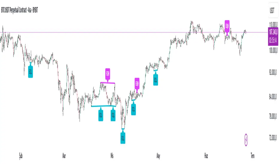
Equal High Low Detector v2.0✅ Equal High Low Detector – Description
This script detects and visualizes Equal Highs (EQH) and Equal Lows (EQL) using multiple user-defined pivot lengths. The indicator compares swing highs and lows based on ATR-based tolerance, identifying price levels that may represent liquidity zones, potential reversals, or breakout traps.
🔹 Uses ATR × tolerance to determine "equal" zones
🔹 Plots dynamic lines and labels for EQH/EQL zones
🔹 Automatically deletes older lines to reduce clutter
🔹 Useful for identifying areas of liquidity, stop hunts, or fakeouts
How it works:
For each active pivot setting, the script checks if the current pivot high/low is within a customizable range (using ATR) of the previous one. If they match within that threshold, it draws a line between the two points and marks the midpoint with a label.
This tool is especially helpful for traders focusing on liquidity engineering, market structure, and price action based strategies.
Expected Move Levels Plotter# Expected Move Levels Plotter - Pine Script Indicator
## Overview
The Expected Move Levels Plotter is a comprehensive Pine Script indicator designed to help traders visualize expected price movements based on options market data. This indicator plots key support and resistance levels using either Expected Move values from ThinkorSwim or calculated implied volatility-based movements.
## Key Features
### Dual Calculation Methods
- **Expected Move Method**: Input expected move values directly from ThinkorSwim platform
- **IV-Based Method**: Calculate expected moves using implied volatility percentage and time to expiration
- **Both Methods**: Display both calculation methods simultaneously for comparison
### Multiple Level Types
- **Standard Expected Move Levels**: Plot basic expected move upper and lower boundaries
- **Enhanced EM × 1.85 Levels**: Extended levels at 1.85 times the expected move for wider potential ranges
- **IV × 1.85 Levels**: Implied volatility-based extended levels for comprehensive analysis
### Highly Customizable Display
- **Flexible Price Sources**: Use current close price or manual price input
- **Custom Colors**: Individual color settings for each level type (yellow for standard EM, red for EM×1.85, blue for IV×1.85)
- **Line Styling**: Adjustable line width (1-5), style (solid, dashed, dotted), and extension options
- **Label Customization**: Configurable label positioning, size, style, and colors with price value display
### Information Dashboard
- **Real-time Data Table**: Shows current price, expected move values, and calculated levels
- **Flexible Positioning**: Choose from 6 table positions (top/bottom/middle + left/right)
- **Customizable Appearance**: Adjust table colors, text size, and border styling
### Smart Alert System
- **Price Breakthrough Alerts**: Notifications when price crosses above or below key levels
- **Multiple Alert Types**: Separate alerts for standard EM levels and EM×1.85 levels
- **Automated Monitoring**: Set-and-forget alert system for active trading
## Technical Specifications
### Calculation Formula
**IV-Based Expected Move**: `Price × (IV/100) × √(Days/365)`
### Input Parameters
- Expected Move value (from ThinkorSwim)
- Implied Volatility percentage
- Number of days to expiration
- Price source selection
- Comprehensive styling options
### Performance Features
- **Efficient Memory Management**: Automatic cleanup of old lines and labels
- **Real-time Updates**: Dynamic recalculation on each bar
- **Optimized Rendering**: Smart line extension and label positioning
## Use Cases
### Options Trading
- Identify potential profit/loss zones for options strategies
- Assess market expectations for upcoming events
- Plan entry and exit points based on expected volatility
### Day Trading
- Establish intraday support and resistance levels
- Set stop-loss and take-profit targets
- Monitor for breakout opportunities beyond expected ranges
### Swing Trading
- Plan multi-day position management
- Assess risk/reward ratios for swing positions
- Monitor for extended moves beyond normal expectations
### Risk Management
- Visualize potential portfolio impact zones
- Set appropriate position sizing based on expected moves
- Monitor for unusual market behavior
## Installation & Setup
1. Copy the Pine Script code into TradingView's Pine Editor
2. Configure your preferred calculation method (Expected Move or IV-Based)
3. Input relevant values from your options platform
4. Customize colors and styling to match your chart theme
5. Enable desired alert conditions
6. Apply to your chart
## Best Practices
### Data Input
- Use current session IV values for most accurate calculations
- Update expected move values regularly, especially before earnings or events
- Cross-reference with multiple options chains when possible
### Visual Setup
- Choose contrasting colors for different level types
- Position labels to avoid chart clutter
- Use appropriate line styles for easy identification
### Alert Management
- Set alerts for levels most relevant to your trading strategy
- Test alert conditions before live trading
- Adjust alert sensitivity based on market volatility
## Market Applications
### Earnings Events
- Visualize market expectations before earnings announcements
- Monitor actual vs. expected price movements
- Plan earnings play strategies
### FOMC & Economic Events
- Assess market pricing of event risk
- Identify potential overreactions or underreactions
- Plan hedging strategies
### Index Trading
- Particularly effective for major indices (SPX, NDX, RUT)
- Useful for ETF trading (SPY, QQQ, IWM)
- Applicable to high-volume individual stocks
## Version Information
- **Version**: 5
- **Type**: Overlay indicator
- **Compatibility**: TradingView Pine Script v5
- **Chart Types**: All timeframes and instruments with options data
## Support & Updates
This indicator is designed for traders who want to incorporate options market expectations into their technical analysis. Regular updates ensure compatibility with TradingView's latest features and market structure changes.
---
*Note: This indicator is for educational and analysis purposes. Always conduct your own research and consider multiple factors before making trading decisions.*
I highly recommend
SpeedEdge_Securities
for all your programming needs
api.whatsapp.com

Metaplanet MSW Strike (Actual Schedule)This indicator displays the actual Moving Strike Warrant pricing schedule for Metaplanet Inc (3350.T), showing the precise strike prices that warrant holders can exercise at during each evaluation period.
Key Features
Accurate MSW Schedule: Reflects Metaplanet's actual warrant terms with the current strike price locked at 1,649 yen through July 1st, 2025, followed by 3-day re-evaluation cycles starting July 2nd.
Segmented Price Lines: Shows yellow horizontal lines only during their active periods, creating distinct blocks for each MSW window rather than continuous lines. Lines extend into the future to show when each strike price remains valid.
Automatic Calculations: Starting July 2nd, the indicator will automatically calculate new strike prices using the 3-day simple moving average of closing prices from the previous evaluation period.
Real-time Information: Displays current strike price on the right price scale and includes an information panel showing the active strike price and next evaluation date.
Visual Reference: Background colors indicate whether the current price is above (green) or below (red) the active strike price, helping traders quickly assess warrant profitability.


NF Liquidity Sweep TrackerNF Liquidity Sweep Tracker
A tool for detecting stop hunts, reversals, and liquidity grabs
Built for Smart Money Concepts (SMC) and ICT-style trading
🔧 Full Features Usage -
🔹 1. Lookback Period
How it works: Automatically finds recent swing highs and lows using a configurable Swing High/Low Detection.
Forms the foundation for detecting liquidity levels. These are potential areas where price may reverse or sweep.
🔹 2. Liquidity Sweep Detection
Detects price movements that break through swing points, often used by institutions to trigger stops.
Modes Available:
Wick-Based Sweeps: Price wicks above/below a swing but closes back inside.
Indicates a possible stop hunt or false breakout. Shown as Label: LS
Break- Retest Based Sweeps: Price breaks the swing level and continues or retests the zone.
Helps confirm continuation or retest setups. Shown as Labels: BO (Breakout), R (Retest)
All Types of Sweeps:
Enables both wick-based and breakout/retest sweeps.
🔹 3. Liquidity Zones (Boxes)
Draws boxes around swept areas to highlight liquidity zones.
Color-coded:
🟩 Green for bullish sweeps (below swing lows)
🟥 Red for bearish sweeps (above swing highs)
Usage: These zones act as temporary support/resistance and help traders spot: Reversals, Breakout continuations, Entries after retests.
🔹 5. Visual Labels
Helps quickly identify the type of liquidity event.
LS – Liquidity Sweep
Triggered when price wicks above/below a level and closes back inside.
BO – Breakout
Triggered when price cleanly breaks above/below a zone.
R – Retest
Triggered when price revisits a broken level.
Note: In a strong trending market, using a wick-based liquidity sweep (LS) strategy is often ineffective because the liquidity sweeps triggered by breakouts (BO) and breakdowns tend to dominate price action, making wick-based setups less reliable. However, liquidity sweeps ( LS ) tend to work very well when they occur near strong liquidity zones—areas where a significant concentration of buy or sell orders exist—because these zones act as natural support or resistance levels, increasing the likelihood of price reacting strongly and providing better trading opportunities.
📌 Usage Tip: These labels help with entry zone, trend confirmation, and trap detection.
🔹 6. Liquidity Lines
What it does: Draws horizontal lines from each swing high/low.
Usage: Acts as a visual reference for where liquidity lies. Great for planning take-profits, stop placements, or sniper entries.
🔹 8. Customization Options
Turn on/off:
Labels (LS, BO, R)
Liquidity lines
Breakout/retest zones
Set your own:
Line and box colors
Detection mode (Wick/Breakout/All)
Lookback period for swing points
🧠 Many Trader's use this concept to -
Identify high-probability reversal points (after sweeps)
Trade stop hunts and traps like institutions
Use zones for breakout and retest entries
Avoid false signals by waiting for sweeps and mitigations.

The Sequences of FibonacciThe Sequences of Fibonacci - Advanced Multi-Timeframe Confluence Analysis System
THEORETICAL FOUNDATION & MATHEMATICAL INNOVATION
The Sequences of Fibonacci represents a revolutionary approach to market analysis that synthesizes classical Fibonacci mathematics with modern adaptive signal processing. This indicator transcends traditional Fibonacci retracement tools by implementing a sophisticated multi-dimensional confluence detection system that reveals hidden market structure through mathematical precision.
Core Mathematical Framework
Dynamic Fibonacci Grid System:
Unlike static Fibonacci tools, this system calculates highest highs and lowest lows across true Fibonacci sequence periods (8, 13, 21, 34, 55 bars) creating a dynamic grid of mathematical support and resistance levels that adapt to market structure in real-time.
Multi-Dimensional Confluence Detection:
The engine employs advanced mathematical clustering algorithms to identify areas where multiple derived Fibonacci retracement levels (0.382, 0.500, 0.618) from different timeframe perspectives converge. These "Confluence Zones" are mathematically classified by strength:
- CRITICAL Zones: 8+ converging Fibonacci levels
- HIGH Zones: 6-7 converging levels
- MEDIUM Zones: 4-5 converging levels
- LOW Zones: 3+ converging levels
Adaptive Signal Processing Architecture:
The system implements adaptive Stochastic RSI calculations with dynamic overbought/oversold levels that adjust to recent market volatility rather than using fixed thresholds. This prevents false signals during changing market conditions.
COMPREHENSIVE FEATURE ARCHITECTURE
Quantum Field Visualization System
Dynamic Price Field Mathematics:
The Quantum Field creates adaptive price channels based on EMA center points and ATR-based amplitude calculations, influenced by the Unified Field metric. This visualization system helps traders understand:
- Expected price volatility ranges
- Potential overextension zones
- Mathematical pressure points in market structure
- Dynamic support/resistance boundaries
Field Amplitude Calculation:
Field Amplitude = ATR × (1 + |Unified Field| / 10)
The system generates three quantum levels:
- Q⁰ Level: 0.618 × Field Amplitude (Primary channel)
- Q¹ Level: 1.0 × Field Amplitude (Secondary boundary)
- Q² Level: 1.618 × Field Amplitude (Extreme extension)
Advanced Market Analysis Dashboard
Unified Field Analysis:
A composite metric combining:
- Price momentum (40% weighting)
- Volume momentum (30% weighting)
- Trend strength (30% weighting)
Market Resonance Calculation:
Measures price-volume correlation over 14 periods to identify harmony between price action and volume participation.
Signal Quality Assessment:
Synthesizes Unified Field, Market Resonance, and RSI positioning to provide real-time evaluation of setup potential.
Tiered Signal Generation Logic
Tier 1 Signals (Highest Conviction):
Require ALL conditions:
- Adaptive StochRSI setup (exiting dynamic OB/OS levels)
- Classic StochRSI divergence confirmation
- Strong reversal bar pattern (adaptive ATR-based sizing)
- Level rejection from Confluence Zone or Fibonacci level
- Supportive Unified Field context
Tier 2 Signals (Enhanced Opportunity Detection):
Generated when Tier 1 conditions aren't met but exceptional circumstances exist:
- Divergence candidate patterns (relaxed divergence requirements)
- Exceptionally strong reversal bars at critical levels
- Enhanced level rejection criteria
- Maintained context filtering
Intelligent Visualization Features
Fractal Matrix Grid:
Multi-layer visualization system displaying:
- Shadow Layer: Foundational support (width 5)
- Glow Layer: Core identification (width 3, white)
- Quantum Layer: Mathematical overlay (width 1, dotted)
Smart Labeling System:
Prevents overlap using ATR-based minimum spacing while providing:
- Fibonacci period identification
- Topological complexity classification (0, I, II, III)
- Exact price levels
- Strength indicators (○ ◐ ● ⚡)
Wick Pressure Analysis:
Dynamic visualization showing momentum direction through:
- Multi-beam projection lines
- Particle density effects
- Progressive transparency for natural flow
- Strength-based sizing adaptation
PRACTICAL TRADING IMPLEMENTATION
Signal Interpretation Framework
Entry Protocol:
1. Confluence Zone Approach: Monitor price approaching High/Critical confluence zones
2. Adaptive Setup Confirmation: Wait for StochRSI to exit adaptive OB/OS levels
3. Divergence Verification: Confirm classic or candidate divergence patterns
4. Reversal Bar Assessment: Validate strong rejection using adaptive ATR criteria
5. Context Evaluation: Ensure Unified Field provides supportive environment
Risk Management Integration:
- Stop Placement: Beyond rejected confluence zone or Fibonacci level
- Position Sizing: Based on signal tier and confluence strength
- Profit Targets: Next significant confluence zone or quantum field boundary
Adaptive Parameter System
Dynamic StochRSI Levels:
Unlike fixed 80/20 levels, the system calculates adaptive OB/OS based on recent StochRSI range:
- Adaptive OB: Recent minimum + (range × OB percentile)
- Adaptive OS: Recent minimum + (range × OS percentile)
- Lookback Period: Configurable 20-100 bars for range calculation
Intelligent ATR Adaptation:
Bar size requirements adjust to market volatility:
- High Volatility: Reduced multiplier (bars naturally larger)
- Low Volatility: Increased multiplier (ensuring significance)
- Base Multiplier: 0.6× ATR with adaptive scaling
Optimization Guidelines
Timeframe-Specific Settings:
Scalping (1-5 minutes):
- Fibonacci Rejection Sensitivity: 0.3-0.8
- Confluence Threshold: 2-3 levels
- StochRSI Lookback: 20-30 bars
Day Trading (15min-1H):
- Fibonacci Rejection Sensitivity: 0.5-1.2
- Confluence Threshold: 3-4 levels
- StochRSI Lookback: 40-60 bars
Swing Trading (4H-1D):
- Fibonacci Rejection Sensitivity: 1.0-2.0
- Confluence Threshold: 4-5 levels
- StochRSI Lookback: 60-80 bars
Asset-Specific Optimization:
Cryptocurrency:
- Higher rejection sensitivity (1.0-2.5) for volatile conditions
- Enable Tier 2 signals for increased opportunity detection
- Shorter adaptive lookbacks for rapid market changes
Forex Major Pairs:
- Moderate sensitivity (0.8-1.5) for stable trending
- Focus on Higher/Critical confluence zones
- Longer lookbacks for institutional flow detection
Stock Indices:
- Conservative sensitivity (0.5-1.0) for institutional participation
- Standard confluence thresholds
- Balanced adaptive parameters
IMPORTANT USAGE CONSIDERATIONS
Realistic Performance Expectations
This indicator provides probabilistic advantages based on mathematical confluence analysis, not guaranteed outcomes. Signal quality varies with market conditions, and proper risk management remains essential regardless of signal tier.
Understanding Adaptive Features:
- Adaptive parameters react to historical data, not future market conditions
- Dynamic levels adjust to past volatility patterns
- Signal quality reflects mathematical alignment probability, not certainty
Market Context Awareness:
- Strong trending markets may produce fewer reversal signals
- Range-bound conditions typically generate more confluence opportunities
- News events and fundamental factors can override technical analysis
Educational Value
Mathematical Concepts Introduced:
- Multi-dimensional confluence analysis
- Adaptive signal processing techniques
- Dynamic parameter optimization
- Mathematical field theory applications in trading
- Advanced Fibonacci sequence applications
Skill Development Benefits:
- Understanding market structure through mathematical lens
- Recognition of multi-timeframe confluence principles
- Appreciation for adaptive vs. static analysis methods
- Integration of classical Fibonacci with modern signal processing
UNIQUE INNOVATIONS
First-Ever Implementations
1. True Fibonacci Sequence Periods: First indicator using authentic Fibonacci numbers (8,13,21,34,55) for timeframe analysis
2. Mathematical Confluence Clustering: Advanced algorithm identifying true Fibonacci level convergence
3. Adaptive StochRSI Boundaries: Dynamic OB/OS levels replacing fixed thresholds
4. Tiered Signal Architecture: Democratic signal weighting with quality classification
5. Quantum Field Price Visualization: Mathematical field representation of price dynamics
Visualization Breakthroughs
- Multi-Layer Fibonacci Grid: Three-layer rendering with intelligent spacing
- Dynamic Confluence Zones: Strength-based color coding and sizing
- Adaptive Parameter Display: Real-time visualization of dynamic calculations
- Mathematical Field Effects: Quantum-inspired price channel visualization
- Progressive Transparency Systems: Natural visual flow without chart clutter
COMPREHENSIVE DASHBOARD SYSTEM
Multi-Size Display Options
Small Dashboard: Core metrics for mobile/limited screen space
Normal Dashboard: Balanced information density for standard desktop use
Large Dashboard: Complete analysis suite including adaptive parameter values
Real-Time Metrics Tracking
Market Analysis Section:
- Unified Field strength with visual meter
- Market Resonance percentage
- Signal Quality assessment with emoji indicators
- Market Bias classification (Bullish/Bearish/Neutral)
Confluence Intelligence:
- Total active zones count
- High/Critical zone identification
- Nearest zone distance and strength
- Price-to-zone ATR measurement
Adaptive Parameters (Large Dashboard):
- Current StochRSI OB/OS levels
- Active ATR multiplier for bar sizing
- Volatility ratio for adaptive scaling
- Real-time StochRSI positioning
TECHNICAL SPECIFICATIONS
Pine Script Version: v5 (Latest)
Calculation Method: Real-time with confirmed bar processing
Maximum Objects: 500 boxes, 500 lines, 500 labels
Dashboard Positions: 4 corner options with size selection
Visual Themes: Quantum, Holographic, Crystalline, Plasma
Alert Integration: Complete alert system for all signal types
Performance Optimizations:
- Efficient confluence zone calculation using advanced clustering
- Smart label spacing prevents overlap
- Progressive transparency for visual clarity
- Memory-optimized array management
EDUCATIONAL FRAMEWORK
Learning Progression
Beginner Level:
- Understanding Fibonacci sequence applications
- Recognition of confluence zone concepts
- Basic signal interpretation
- Dashboard metric comprehension
Intermediate Level:
- Adaptive parameter optimization
- Multi-timeframe confluence analysis
- Signal quality assessment techniques
- Risk management integration
Advanced Level:
- Mathematical field theory applications
- Custom parameter optimization strategies
- Market regime adaptation techniques
- Professional trading system integration
DEVELOPMENT ACKNOWLEDGMENT
Special acknowledgment to @AlgoTrader90 - the foundational concepts of this system came from him and we developed it through a collaborative discussions about multi-timeframe Fibonacci analysis. While the original framework came from AlgoTrader90's innovative approach, this implementation represents a complete evolution of the logic with enhanced mathematical precision, adaptive parameters, and sophisticated signal filtering to deliver meaningful, actionable trading signals.
CONCLUSION
The Sequences of Fibonacci represents a quantum leap in technical analysis, successfully merging classical Fibonacci mathematics with cutting-edge adaptive signal processing. Through sophisticated confluence detection, intelligent parameter adaptation, and comprehensive market analysis, this system provides traders with unprecedented insight into market structure and potential reversal points.
The mathematical foundation ensures lasting relevance while the adaptive features maintain effectiveness across changing market conditions. From the dynamic Fibonacci grid to the quantum field visualization, every component reflects a commitment to mathematical precision, visual elegance, and practical utility.
Whether you're a beginner seeking to understand market confluence or an advanced trader requiring sophisticated analytical tools, this system provides the mathematical framework for informed decision-making based on time-tested Fibonacci principles enhanced with modern computational techniques.
Trade with mathematical precision. Trade with the power of confluence. Trade with The Sequences of Fibonacci.
"Mathematics is the language with which God has written the universe. In markets, Fibonacci sequences reveal the hidden harmonies that govern price movement, and those who understand these mathematical relationships hold the key to anticipating market behavior."
* Galileo Galilei (adapted for modern markets)
— Dskyz, Trade with insight. Trade with anticipation.

Grid Bot v6 StrategyGrid Bot v6 Strategy
Adaptive parabolic grid that turns market structure into a step-by-step trading plan
Idea of strategy and source code of base indicator provided by my subscriber @Sergio_Nov
1. Core concept
Grid Bot v6 draws a dynamic parabola from a user-defined time/price anchor and builds a 10-level grid around it (five lines above, five below).
Each level is colour-coded:
Green – preferred buy area
Red – preferred sell area
Yellow – overlap of buy-and-sell zones (balance)
Grey – neutral zone
Orders are fired when price touches or reverses from a grid line and the signal is confirmed by current market sentiment. If sentiment contradicts the signal, the order is tagged secondary and uses a reduced lot size.
2. How the logic works
Parabola – the function f_parabola computes the curve from Accel, Curve and Sensitivity. Zero values give a flat horizontal grid; non-zero values create an accelerating or decelerating trendline.
Grid spacing – controlled by Intervals (percentage of price). Lines are recalculated every bar, so the grid “breathes” with the market.
Triggers – choose which part of the candle must reach the level (Wick, Close, Midpoint, SWMA).
Confirmation – decide whether a simple touch is enough or a full reversal is required (Touch vs Reverse).
Sentiment filter – by default the slope of the parabola (up = long bias, down = short bias). You can override it to Long, Short or Neutral.
Order types – four independent sizes: Main Buy, Secondary Buy, Main Sell, Secondary Sell. Pyramiding up to 100 entries is allowed.
Visuals – the script plots actual and projected grid lines (100 bars ahead), the SWMA trigger and the parabola itself. Trade symbols: ▲ ▼ △ ▽.
3. User inputs
Strategy Settings
Main Buy Lot / Secondary Buy Lot
Main Sell Lot / Secondary Sell Lot
Grid Settings
Accel – tilt of the curve (positive for uptrend, negative for downtrend)
Curve – concavity; higher absolute value = stronger bend
Intervals – distance between grid lines (in %)
Sensitivity – how fast the parabola adapts; higher = more reactive
Buy Zones / Sell Zones – number of active lines below/above the curve
Trigger – Wick, Close, Midpoint, SWMA
Confirm – Touch or Reverse
Sentiment – Slope, Long, Short, Neutral
Show Signals / Show Selector – toggle on-chart markers and SWMA line
Chart Settings – individual colours for active grid, projection, parabola and SWMA.
Time/Price Anchor
B_Time – starting bar (e.g. a recent swing high/low)
B_Price – price at that bar
Tip: drop the anchor on a clear pivot, then tune Accel and Curve so the parabola hugs the trend.
4. Quick-start guide
Open your favourite symbol and timeframe (works best on volatile markets from 5-minute to 4-hour).
Set B_Time / B_Price to the last significant extreme.
Adjust Accel and Curve:
Uptrend – positive Accel, negative Curve for a concave support.
Range – both zero for a flat ladder.
Choose Intervals: smaller values = more frequent trades.
Limit Buy Zones and Sell Zones if you prefer a tighter grid.
Run a back-test, check P/L, max drawdown and trade count.
Fine-tune: lower Sensitivity if the curve outruns price; switch Trigger to SWMA to filter noise.
5. Pros and cons
Strengths
Adaptive levels that keep up with trend acceleration.
Clear colour coding plus forward projection for better context.
Sentiment filter reduces counter-trend exposures.
Weaknesses
Many parameters – each asset/timeframe needs its own calibration.
In narrow ranges frequent fills can accumulate fees.
pyramiding = 100 grows exposure quickly; monitor margin closely.
6. Risk disclaimer
This script is for educational and research purposes only. Historical performance does not guarantee future results. Before going live:
Forward-test bar-by-bar;
Check that your broker supports similar order handling;
Apply sound position sizing and, where appropriate, stop-losses or hedging.

[Myth Busting] [ORB] Casper SMC - 16 JunJust showcase of YouTube strategy claimed to be profitable and fool proof. Not on every asset and not long-term though

Supply & Demand (OTC)Supply & Demand - Advanced Zone Detection
Overview
This indicator is a sophisticated tool designed to automatically identify and draw high-probability supply and demand zones on your chart. It analyzes pure price action to find key areas where institutional buying and selling pressure has previously occurred, providing you with a clear map of potential market turning points.
Unlike basic supply and demand indicators, this script is built with a proprietary engine that intelligently defines zone boundaries and filters for the most relevant price action patterns. It's designed to be a clean, professional, and highly customizable tool for traders who use supply and demand as a core part of their strategy.
Features
Advanced Zone Detection: Automatically finds and draws supply and demand zones based on significant price imbalances.
Reversal & Continuation Patterns: Identifies all four major price action patterns: Rally-Base-Drop (RBD), Drop-Base-Rally (DBR), Rally-Base-Rally (RBR), and Drop-Base-Drop (DBD).
"Level on Level" (LoL) Analysis: Automatically detects and labels zones that are stacked closely together, highlighting areas of potentially high liquidity and significance.
Wider vs. Preferred Zones: Choose between two zone definition modes. "Wider" mode draws the zone based on the full range of the consolidation, while "Preferred" mode refines the entry line based on key price action within the base, offering more precision.
Smart Zone Display: Intelligently displays only the most relevant zones closest to the current price, keeping your chart clean and focused. Supply zones above the current price and demand zones below are automatically prioritized and displayed based on your settings.
Customizable Zone Interaction: Control how zones react after being tested. Zones can change color on a first touch and be automatically deleted after a significant violation, which you can define by a percentage.
Customizable Visuals & Alerts: Fully customize the colors of all zones and candles. Enable or disable alerts for new zone creation and zone touches to stay on top of market movements.
How to Use
Identify Zones: The indicator will automatically plot supply zones (red) above the price and demand zones (green) below the price. These are potential areas to look for trade entries.
Assess Zone Strength: The strongest zones are typically "fresh" (untouched) and are formed by a strong, explosive move away from a tight consolidation (a small number of base candles).
Use Labels for Context: The floating labels (RBD, DBR, RBR (LoL), etc.) provide immediate context about the price action structure that formed each zone. "LoL" indicates a "Level on Level" zone, which may be of higher importance.
Wait for Confirmation: For the highest probability setups, wait for the price to return to a zone and show signs of rejection (e.g., reversal candlestick patterns) before considering an entry.
Settings Overview
Zone Definition: Control the core logic, such as including continuation patterns, setting the max number of base candles, and choosing between Wider and Preferred zone types.
Zone Display & Limits: Toggle limits on or off, and specify the maximum number of supply and demand zones to show on the chart.
Zone Interaction: Define how zones react to being tested, including the percentage required to delete a zone.
Colors & Style: Fully customize the appearance of zones, labels, and price candles.
Alerts: Enable or disable alerts for key events.
Disclaimer
This indicator is a tool for market analysis and should not be considered financial advice or a signal provider. Always use proper risk management and conduct your own analysis before making any trading decisions. Past performance is not indicative of future results.

MT Daily ZonesMT Daily Zones
A precision market structure tool from Mindfluential Trading, combining daily CPR, PDH/PDL zones, EMAs/SMAs - all optimized for intraday traders.
🔹 Core Features
🔵 CPR (Central Pivot Range)
Plots Pivot, TC, and BC from the previous day
Helps define the market's fair value zone and compression/breakout areas
Royal blue color ensures clarity on both light and dark themes
🟠 PDH / PDL Zones
Accurately plots Previous Day’s High and Low
Useful for breakout scalps, reversal traps, and trend continuation setups
🟢 Smart Trend Filters
Toggle EMAs (8, 20, 50) and SMAs (50, 100, 200)
Smooth color-coded display for dynamic trend alignment
✅ Clean Visuals. Real Structure. No Clutter.
⚠️ Disclaimer
This indicator is for educational purposes only. Do your own research before making trading decisions.
May 27
Release Notes
MT Daily Zones
A precision market structure tool from Mindfluential Trading, combining daily CPR, PDH/PDL zones, EMAs/SMAs - all optimized for intraday traders.
🔹 Core Features
🔵 CPR (Central Pivot Range)
Plots Pivot, TC, and BC from the previous day
Helps define the market's fair value zone and compression/breakout areas
Royal blue color ensures clarity on both light and dark themes
🟠 PDH / PDL Zones
Accurately plots Previous Day’s High and Low
Useful for breakout scalps, reversal traps, and trend continuation setups
🟢 Smart Trend Filters
Toggle EMAs (8, 20, 50) and SMAs (50, 100, 200)
Smooth color-coded display for dynamic trend alignment
✅ Clean Visuals. Real Structure. No Clutter.
⚠️ Disclaimer
This indicator is for educational purposes only. Do your own research before making trading decisions.

Deep Z pi SP MA + 2 CC + OB + CPR + last 5 Minmy script with proper strike price, if strike price crosses R1, take put ex + hedge, if crosses s1 take call ex. bottom bc call normal and top bc put normal.

Golden Pocket Syndicate [GPS]🔍 Golden Pocket Syndicate
The Golden Pocket Syndicate is a precision tool built for identifying high-probability reaction zones around dynamic golden pocket levels. Unlike generic fib overlays or EMA mashups, GPS uses a multi-timeframe approach to highlight key inflection zones based on institutional price behavior.
🧠 Core Logic:
• Golden Pocket Zones for Daily, Weekly, Monthly, Previous Periods & Yearly levels
• Volume-aware trend confirmation using WaveTrend + EMA alignment
• Clean Reversal Diamonds mark strong pivots with volume confluence
• Trend Strength Bubbles (white for bullish, purple for bearish) show when trend + momentum + volume align
• Visuals scale by proximity to price, minimizing noise and maximizing clarity
⚙️ How to Use:
• Use Golden Pocket zones to anticipate pullbacks, reversals, or continuation setups
• Look for Diamond signals near GP levels as potential pivot triggers
• Confirm with volume and EMA/WaveTrend alignment
• Use bubbles as secondary confirmation—not every bubble is a trade, but every major move confirms via bubble first
🆕 What Makes It Unique:
GPS isn’t a mashup of standard scripts—it filters only the most relevant price zones and prints actionable signals sparingly. It avoids overfitting by weighting volume trends and clean trend structure, giving it utility in scalping, swing, and intraday positioning.
🚫 Not Included:
• No repainting
• No built-in TradingView signals
• No automated alerts for every crossover—GPS only highlights high-probability moves.

Rolling VWAP LevelsRolling VWAP Levels Indicator
Overview
Dynamic horizontal lines showing rolling Volume Weighted Average Price (VWAP) levels for multiple timeframes (7D, 30D, 90D, 365D) that update in real-time as new bars form.
Who This Is For
Day traders using VWAP as support/resistance
Swing traders analyzing multi-timeframe price structure
Scalpers looking for mean reversion entries
Options traders needing volatility bands for strike selection
Institutional traders tracking volume-weighted fair value
Risk managers requiring dynamic stop levels
How To Trade With It
Mean Reversion Strategies:
Buy when price is below VWAP and showing bullish divergence
Sell when price is above VWAP and showing bearish signals
Use multiple timeframes - enter on shorter, confirm on longer
Target opposite VWAP level for profit taking
Breakout Trading:
Watch for price breaking above/below key VWAP levels with volume
Use 7D VWAP for intraday breakouts
Use 30D/90D VWAP for swing trade breakouts
Confirm breakout with move beyond first standard deviation band
Support/Resistance Trading:
VWAP levels act as dynamic support in uptrends
VWAP levels act as dynamic resistance in downtrends
Multiple timeframe VWAP confluence creates stronger levels
Use standard deviation bands as additional S/R zones
Risk Management:
Place stops beyond next VWAP level
Use standard deviation bands for position sizing
Exit partial positions at VWAP levels
Monitor distance table for overextended moves
Key Features
Real-time Updates: Lines move and extend as new bars form
Individual Styling: Custom colors, widths, styles for each timeframe
Standard Deviation Bands: Optional volatility bands with custom multipliers
Smart Labels: Positioned above, below, or diagonally relative to lines
Distance Table: Shows percentage distance from each VWAP level
Alert System: Get notified when price crosses VWAP levels
Memory Efficient: Automatically cleans up old drawing objects
Settings Explained
Display Group: Show/hide labels, font size, line transparency, positioning
Individual VWAP Groups: Color, line width (1-5), line style for each timeframe
Standard Deviation Bands: Enable bands with custom multipliers (0.5, 1.0, 1.5, 2.0, etc.)
Labels Group: Position (8 options including diagonal), custom text, price display
Additional Info: Distance table, alert conditions
Technical Implementation
Uses rolling arrays to maintain sliding windows of price*volume data. The core calculation function processes both VWAP and standard deviation efficiently. Lines are created dynamically and updated every bar. Memory management prevents object accumulation through automatic cleanup.
Best Practices
Start with 7D and 30D VWAP for most strategies
Add 90D/365D for longer-term context
Use standard deviation bands when volatility matters
Position labels to avoid chart clutter
Enable distance table during high volatility periods
Set alerts for key VWAP level breaks
Market Applications
Forex: Major pairs during London/NY sessions
Stocks: Large cap names with good volume
Crypto: Bitcoin, Ethereum, major altcoins
Futures: ES, NQ, CL, GC with continuous volume
Options: Use SD bands for strike selection and volatility assessment

Opening Range Breakout (15 mins Range)Take the guesswork out of your trading with the Opening Range Breakout Pro script. This tool automatically marks the high and low of the first 15 minutes of the NYSE session, then highlights the first candle to break out above or below this range—removing ambiguity from your trade entries.
The opening range is one of the most powerful concepts in day trading. By identifying the price range set during the market’s first minutes, you gain a clear framework for your trades. When price breaks out above the range, it often signals a strong bullish move; a break below signals bearish momentum. This script visually marks these moments, so you can react quickly and confidently.
Why use Opening Range Breakout Pro?
• Defined Entry and Exit Points: The script gives you clear, objective breakout levels—no more guessing when to enter a trade.
• Removes Emotional Trading: With visual cues for breakouts, you can follow a systematic approach and avoid hesitation or FOMO.
• Backtested, Time-Tested Strategy: The opening range breakout has been used by professional traders for decades to capture early trends and maximize profit potential.
• High Reward Potential: By capitalizing on the volatility and momentum of the opening session, traders often catch the best moves of the day.
• Easy to Use: Just add to your chart—no configuration needed. The script works on any NYSE stock, on a 5-minute chart.
How it works:
• Draws the opening 15-minute high and low as orange lines.
• Labels the range prices for quick reference.
• Marks the first candle to close above the range with an orange ▲, and the first to close below with an orange ▼.
Take control of your trading day, remove uncertainty, and trade with confidence—just like the pros.
