Educational

MACD GAPS PivotLabels MAIt provides with dots where the MACD is either highest or lowest. Identify the gaps in the chart. Pivot labels are to read the numeric value of the candle high or low and an option to select moving averages

SMA 200 Cross with Candle Color + AlertsSMA 200 Cross with Candle Color + Alerts
SMA 200 Cross with Candle Color + Alerts
Using SMA 200 cross + candle color + alerts can greatly improve your trading by combining trend-following, momentum confirmation, and timely execution.
help for trade and educational purpose
🔹 1. SMA 200 (Simple Moving Average) Cross
What it does: SMA 200 is a long-term trend indicator. A crossover happens when price moves from one side of the SMA to the other.
Trading Signal:
Bullish crossover: Price crosses above the 200 SMA → Long-term uptrend.
Bearish crossover: Price crosses below the 200 SMA → Long-term downtrend.
Why it's useful: Filters out noise and avoids trading against the trend.
🔹 2. Candle Color Confirmation
What it does: Color (based on open/close) shows momentum or buyer/seller strength.
Example:
Green/white candle (close > open) → Buying pressure.
Red/black candle (close < open) → Selling pressure.
How it helps:
Confirms that the breakout or cross is not a fakeout.
Wait for a bullish candle to close above SMA for confirmation to go long.
🔹 3. Alerts (in TradingView or other platforms)
What they do: Automatically notify you (via popup, sound, SMS, email) when:
Price crosses SMA 200.
A candle closes with bullish/bearish color.
Why they matter:
No need to constantly watch the screen.
Helps you react in real time.
Great for swing traders, intraday, or even positional trades.

ALP AT + KAMA Crossover This indicator is a powerful combination of two adaptive trend-following concepts: the AlphaTrend by Kivanc Ozbilgic and the Kaufman's Adaptive Moving Average (KAMA), often credited to Perry Kaufman (with the specific implementation based on HPotter's interpretation of KAMA).
The primary goal of this indicator is to provide a robust trend detection and dynamic support/resistance system, adapting to market volatility.
How it Works:
AlphaTrend Component: The green/red line is the AlphaTrend. It dynamically adjusts to market volatility (using ATR) and momentum (using MFI or RSI, configurable). It provides faster signals for trend changes.
KAMA Component: The black line is the Kaufman's Adaptive Moving Average. KAMA is designed to filter out market noise during choppy periods and follow the price closely during trending periods, making it a smoother and more reliable long-term trend indicator.
Color-Coded Trend Zones: The AlphaTrend line is color-coded to visually represent the current market condition based on the price's position relative to both AlphaTrend and KAMA:
Strong Uptrend (Lime Green): Price is above both AlphaTrend and KAMA.
Strong Downtrend (Red): Price is below both AlphaTrend and KAMA.
Uptrend Uncertainty (Orange): Price is above KAMA but below AlphaTrend (suggests consolidation or weakening uptrend).
Downtrend Uncertainty (Blue): Price is below KAMA but above AlphaTrend (suggests consolidation or strengthening downtrend within a downtrend).
Gray: Default/unclassified state.
The underlying logic is based on:
Bullish Crossover (Potential Buy Signal): When the AlphaTrend line crosses above the KAMA line.
Bearish Crossover (Potential Sell Signal): When the AlphaTrend line crosses below the KAMA line.
These crossovers indicate a shift in the adaptive trend momentum.
Customization:
Users can customize various parameters in the indicator's settings, including:
AlphaTrend Multiplier and Common Period.
KAMA Lengths and Alpha values.
All the color codes for different trend zones and lines, allowing for full personalization of the visual output.
Disclaimer:
This indicator is for informational and educational purposes only and should not be considered as financial advice. Trading involves substantial risk, and past performance is not indicative of future results. Always conduct your own thorough research and analysis before making any trading or investment decisions. This indicator is NOT a buy/sell/hold recommendation. Use it as a tool to aid your analysis, not as a sole basis for your trades.

ADT MSI TableKey Features:
1. Market Smith Methodology
Composite Rating: Combines price and volume strength
Relative Strength Rating: Measures stock performance vs benchmark
Base Pattern Detection: Identifies consolidation patterns
Breakout Signals: Detects valid breakouts with volume confirmation
2. Indian Market Adaptations
INR Currency Formatting: Displays prices in ₹, Lakhs, and Crores
Indian Benchmarks: NIFTY, SENSEX, NIFTY500 options
Market Cap Display: Formatted in Indian currency standards
Trading Hours Compatibility: Works with NSE/BSE data
3. Comprehensive Data Table
Real-time Metrics: Current price, daily change, volume analysis
Technical Indicators: MA positions, RS rating, composite rating
Performance Tracking: 3M, 6M, 12M returns
Signal Generation: BUY/SELL/HOLD recommendations
4. Visual Elements
Multiple Moving Averages: 10, 20, 50, 200 period MAs
Support/Resistance Levels: Dynamic pivot-based levels
Volume Analysis: Color-coded volume bars with surge detection
Trend Background: Color-coded background based on trend strength
Breakout Markers: Visual signals for valid breakouts
5. Customizable Parameters
Adjustable Periods: All timeframes can be modified
Table Positioning: 9 different table positions
Alert System: Customizable breakout and volume alerts
Display Options: Toggle any component on/off
6. Indian Market Specific
No Errors: Fully compatible with Indian stock data
Proper Formatting: All values in Indian currency format
Market Hours: Optimized for Indian trading sessions
Volume Calculations: Adapted for Indian market volume patterns

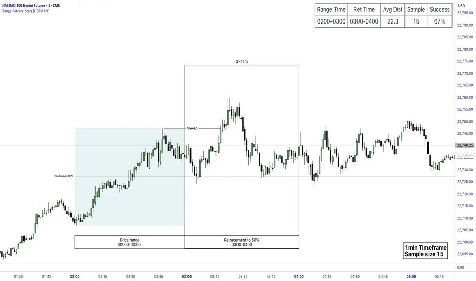
Price Range Retrace statisticks [HERMAN]📈 Price Range Retrace Stats
This indicator is designed to help traders quantify how often price retraces to a selected equilibrium level (e.g., 50%) after sweeping the high/low of a defined time-based range.
It is especially useful for modeling sessions such as the London Opening Range (e.g., 02:00–03:00 NY time), checking if price sweeps that range in a subsequent window (e.g., 03:00–04:00), and returns to its 50% level.
✅ What does it do?
Lets you define multiple time ranges (e.g. London, NY Open, custom ranges).
Draws the range box for the selected session time.
Calculates and plots the retracement level (default 50%).
Checks if price sweeps the high/low of the range before retracing.
Tracks success rate, average distance, sample size and displays these stats in a table.
⚙️ Key Features:
Fully customizable time windows (range box time and retracement check time).
-Configurable retracement % (default 50% equilibrium).
-Optional sweep condition (only count retracements if price sweeps the high/low first).
-Clean, theme-adaptive stats table with success rates and averages.
-Supports two independent levels (e.g. London and NY sessions).
📊 Why use it?
This tool turns session-based setups into statistical models:
Backtest session strategies over many days.
Quantify edge with % success over time.
Validate trading ideas with data.
Use probabilities instead of gut feeling.
Example insight you can track:
“Between 3–4 AM NY time, price swept the high/low of the 2–3 AM London Opening Range and returned to its 50% equilibrium level in 64% of 234 sessions.”
📌 Ideal for:
ICT concepts (Opening Range, Sweep, Equilibrium Return).
Algo developers wanting probabilities.
Anyone who wants data-driven confirmation for session range mean-reversion.
Instructions:
1️⃣ Enable the desired Price Range (1 or 2).
2️⃣ Set your Range Time (e.g. 02:00–03:00).
3️⃣ Set your Retracement Check Time (e.g. 03:00–04:00).
4️⃣ Choose retracement % (e.g. 50%).
5️⃣ Watch the box and retrace line plot on chart.
6️⃣ Review the success statistics in the table.
CPR + PDH/PDL + VWAP with TC/BC, EMA & SupertrendCPR + PDH/PDL + VWAP with TC/BC, EMA & SupertrendCPR + PDH/PDL + VWAP with TC/BC, EMA & Supertrend

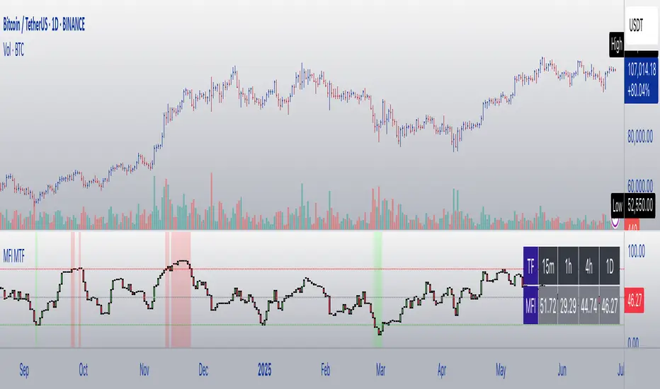
MFI Candles MTF TableMFI Candles + Multi-Timeframe Table | by julzALGO
This open-source script visualizes the Money Flow Index (MFI) in a new format — as candles instead of a traditional oscillator line. It provides a clean, volume-driven view of momentum and pressure, ideal for traders seeking more actionable and visual cues than a typical MFI plot.
What Makes It Unique:
• Plots "MFI Candles" — synthetic candles based on smoothed MFI values using a selected timeframe (default: 1D), giving a new way to read volume flow.
• Candles reflect momentum: green if MFI rises, red if it falls.
• Background turns red when MFI is overbought (≥ 80) or green when oversold (≤ 20).
Multi-Timeframe Strength Table:
• Displays MFI values from 15m, 1h, 4h, and 1D timeframes — all in one dashboard.
• Color-coded for quick recognition: 🔴 Overbought, 🟢 Oversold.
• Values are smoothed with linear regression for better clarity.
Custom Settings:
• MFI calculation length
• Smoothing factor
• Candle source timeframe
• Toggle table and OB/OS background
How to Use:
- Use MFI Candles to monitor momentum shifts based on money flow.
- Use the Multi-Timeframe Table to identify when multiple timeframes align — helpful for timing entries and exits.
- Watch the background for extreme conditions (OB/OS) that may signal upcoming reversals or pressure exhaustion.
Happy Trading!
MTF FVG with Hit Counter HarmoniXTradeMain Purpose of the Indicator:
This indicator is designed to automatically identify Fair Value Gaps (FVG) across three different timeframes simultaneously. The primary goal is to display these key zones on the chart and provide detailed information about price interaction with these levels, enabling traders to make more informed decisions.
Key Features:
Multi-Timeframe FVG Identification:
By default, the indicator identifies and displays FVGs on the Weekly (W), Daily (D), and 4-Hour (240) timeframes.
Users can customize these timeframes in the settings to fit their preferences.
Detailed Hit Counter:
This indicator goes beyond simply showing FVGs; it accurately counts the number of times the price has touched each of the three key FVG levels:
Up: The top line of the FVG
Mid: The midline (equilibrium) of the FVG
Down: The bottom line of the FVG
This information is displayed in a clear label next to each FVG zone, helping traders assess the strength and validity of each level.
Extensive Customization:
Appearance: You can change the colors for bullish and bearish FVGs for each timeframe individually, modify the style of the main and mid lines, and adjust the label size.
Detection Logic: Users can define the minimum size of an FVG for detection based on a percentage or point value.
Mitigation Logic: Two methods are provided for FVG invalidation:
Percentage Mitigation: The FVG is considered mitigated after the price has penetrated it by a specific percentage (e.g., 50%).
Full Fill: The FVG remains valid until the price has completely filled the gap and closed beyond it.
Extend Lines Capability:
To prevent chart clutter and get a better view of future price action, you can extend the FVG lines and labels to the right by a specified number of bars, creating distance from the current candle.
How to Use This Indicator:
Identifying Support and Resistance Zones: FVG areas can act as strong support and resistance levels.
Confirming Entry Points: A price touch and reaction to one of the FVG levels (especially the midline) can be used as a confirmation for entering a trade.
Assessing Level Strength: The number of hits on each level (Up, Mid, Down) indicates which price point within the zone has been more attractive to the market. For example, repeated reactions to the top line of a bearish FVG might suggest strong selling pressure at that level.
Your Feedback for Improvement:
You are invited to use this indicator and share any suggestions, ideas for improvement, or reports of potential issues. Your feedback will be valuable for implementation in future versions.

Gold Power Hours StrategyStrategy: XAUUSD Gold Power Hours
(ideal for Tuesday to Thursday, 8:00–11:30 am NY and 1:30–3:30 pm NY)
Strategy Rules
1️⃣ Timeframe
Trade on 15 min and 1 hour charts
Confirm with the 4 h chart (trend direction)
2️⃣ Entry Conditions
✅ Main trend (confirmation):
50-period Simple Moving Average (SMA50) on the 4h chart
price above = only look for longs
price below = only look for shorts
✅ Momentum (confirmation):
RSI(14) on the 15 min chart
above 55 = bullish strength
below 45 = bearish strength
✅ Volume (validation):
Increasing volume (bar higher than previous) during NY open (8–9 am) or at 1:30 pm
confirms institutional interest
3️⃣ Entry Setup
🟢 Longs (buys):
Price above 4h SMA50
15 min RSI > 55
break of previous resistance (e.g., last hour’s high)
rising volume on the entry candle
👉 Enter on breakout + 2 pips of margin
🔴 Shorts (sells):
Price below 4h SMA50
15 min RSI < 45
break of previous support
rising volume on the entry candle
👉 Enter on breakout – 2 pips of margin
4️⃣ Trade Exits / Management
✅ Take profit (TP):
2 × the risk taken (e.g., SL 20 pips → TP 40 pips)
or the next significant support/resistance on H1
✅ Stop loss (SL):
below the last impulse candle (for longs)
or above the last impulse candle (for shorts)
minimum 15–20 pips to avoid stop hunts
✅ Break-even
move SL to entry point once +15 pips profit is reached
5️⃣ Additional Filters
✅ Avoid trading during red news (NFP, FOMC) until the first spike finishes.
✅ Avoid trading outside these windows:
8:00–11:30 am NY
1:30–3:30 pm NY

Mary Mount - Bean CounterAn attempt at capturing technically extraordinary moments of buy and sell pressure.

BTC/Fiat Divergence & Spread Monitor📄 BTC/Fiat Divergence & Spread Monitor
This indicator visualizes Bitcoin’s relative performance across multiple fiat currencies and highlights periods of unusual divergence. It helps traders assess which fiat pairs BTC has outperformed or underperformed over a configurable lookback period and monitor the dynamic spread between the strongest and weakest pairs.
Features:
Relative Performance Matrix:
Ranks BTC returns in 6 fiat pairs, displaying a color-coded table of percentage changes and ranks.
Divergence Spread Oscillator:
Calculates the spread between the top and bottom performing pairs and normalizes this using a Z-Score. The oscillator helps identify when fiat pricing divergence is unusually high or compressed.
Dynamic Smoothing:
Optional Hull Moving Average smoothing to reduce noise in the spread signal.
Customizable Inputs:
Lookback period for percent change.
Z-Score normalization window.
Smoothing length.
Symbol selection for each fiat pair.
Visual Mode Toggle:
Switch between relative performance lines and spread oscillator view.
Potential Use Cases:
Fiat Rotation:
Identify which fiat is relatively weak or strong to optimize your exit currency when taking BTC profits.
Volatility Detection:
Use the spread Z-Score to detect periods of high divergence across fiat pairs, signaling macro FX volatility or dislocations.
Regime Analysis:
Track when fiat spreads are converging or expanding, potentially signaling market regime shifts.
Risk Management:
When divergence is extreme (Z-Score > +1), consider reducing position sizing or waiting for reversion.
Disclaimer:
This indicator is provided for educational and informational purposes only. It does not constitute financial advice or a recommendation to buy or sell any security or asset. Always do your own research and consult a qualified financial professional before making trading decisions. Use at your own risk.
Tip:
Experiment with different lookback periods and smoothing settings to adapt the indicator to your timeframe and trading style.

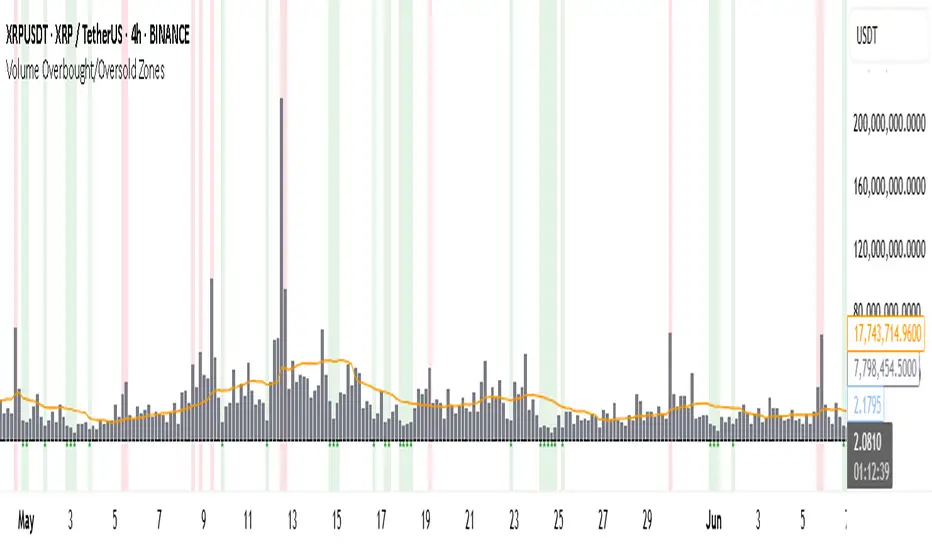
Volume Overbought/Oversold Zones📊 What You’ll See on the Chart
Red Background or Red Triangle ABOVE a Candle
🔺 Means: Overbought Volume
→ Volume on that bar is much higher than average (as defined by your settings).
→ Suggests strong activity, possible exhaustion in the trend or an emotional spike.
→ It’s a warning: consider watching for signs of reversal, especially if price is already stretched.
Green Background or Green Triangle BELOW a Candle
🔻 Means: Oversold Volume
→ Volume on that bar is much lower than normal.
→ Suggests the market may be losing momentum, or few sellers are left.
→ Could signal an upcoming reversal or recovery if confirmed by price action.
Orange Line Below the Candles (Volume Moving Average)
📈 Shows the "normal" average volume over the last X candles (default is 20).
→ Helps you visually compare each bar’s volume to the average.
Gray Columns (Actual Volume Bars)
📊 These are your regular volume bars — they rise and fall based on how active each candle is.
🔍 What This Indicator Does (In Simple Words)
This indicator looks at trading volume—which is how many shares/contracts were traded in a given period—and compares it to what's considered "normal" for recent history. When volume is unusually high or low, it highlights those moments on the chart.
It tells you:
• When volume is much higher than normal → market might be overheated or experiencing a buying/selling frenzy.
• When volume is much lower than normal → market might be quiet, potentially indicating lack of interest or indecision.
These conditions are marked visually, so you can instantly spot them.
💡 How It Helps You As a Trader
1. Spotting Exhaustion in Trends (Overbought Signals)
If a market is going up and suddenly volume spikes way above normal, it may mean:
• The move is getting crowded (lots of buyers are already in).
• A reversal or pullback could be near because smart money may be taking profits.
Trading idea: Wait for high-volume up bars, then look for price weakness to consider a short or exit.
2. Identifying Hidden Opportunities (Oversold Signals)
If price is falling but volume drops unusually low, it might mean:
• Panic is fading.
• Sellers are losing energy.
• A bounce or trend reversal could happen soon.
Trading idea: After a volume drop in a downtrend, watch for bullish price patterns or momentum shifts to consider a buy.
3. Confirming or Doubting Breakouts
Volume is critical for confirming breakouts:
• If price breaks a key level with strong volume, it's more likely to continue.
• A breakout without volume could be a fake-out.
This indicator highlights volume surges that can help you confirm such moves.
📈 How to Use It in Practice
• Combine it with candlestick patterns, support/resistance, or momentum indicators.
• Use the background colors or shapes as a visual cue to pause and analyze.
• Adjust the sensitivity to suit fast-moving markets (like crypto) or slow ones (like large-cap stocks).
Gold Power Hours StrategyStrategy: XAUUSD Gold Power Hours
(ideal for Tuesday to Thursday, 8:00–11:30 am NY and 1:30–3:30 pm NY)
Strategy Rules
1️⃣ Timeframe
Trade on 15 min and 1 hour charts
Confirm with the 4 h chart (trend direction)
2️⃣ Entry Conditions
✅ Main trend (confirmation):
50-period Simple Moving Average (SMA50) on the 4h chart
price above = only look for longs
price below = only look for shorts
✅ Momentum (confirmation):
RSI(14) on the 15 min chart
above 55 = bullish strength
below 45 = bearish strength
✅ Volume (validation):
Increasing volume (bar higher than previous) during NY open (8–9 am) or at 1:30 pm
confirms institutional interest
3️⃣ Entry Setup
🟢 Longs (buys):
Price above 4h SMA50
15 min RSI > 55
break of previous resistance (e.g., last hour’s high)
rising volume on the entry candle
👉 Enter on breakout + 2 pips of margin
🔴 Shorts (sells):
Price below 4h SMA50
15 min RSI < 45
break of previous support
rising volume on the entry candle
👉 Enter on breakout – 2 pips of margin
4️⃣ Trade Exits / Management
✅ Take profit (TP):
2 × the risk taken (e.g., SL 20 pips → TP 40 pips)
or the next significant support/resistance on H1
✅ Stop loss (SL):
below the last impulse candle (for longs)
or above the last impulse candle (for shorts)
minimum 15–20 pips to avoid stop hunts
✅ Break-even
move SL to entry point once +15 pips profit is reached
5️⃣ Additional Filters
✅ Avoid trading during red news (NFP, FOMC) until the first spike finishes.
✅ Avoid trading outside these windows:
8:00–11:30 am NY
1:30–3:30 pm NY
-----------
Estrategia: XAUUSD Gold Power Hours
(ideal para martes a jueves, 8:00 – 11:30 am NY y 1:30 – 3:30 pm NY)
Reglas de la estrategia
1️⃣ Marco temporal
Operar en gráficos de 15 min y 1 hora
Confirmaciones con gráfico de 4 h (dirección de tendencia)
2️⃣ Condiciones de entrada
✅ Tendencia principal (confirmación):
Media Móvil Simple de 50 (SMA50) en gráfico 4h
precio por encima = solo buscar compras
precio por debajo = solo buscar ventas
✅ Momentum (confirmación):
RSI(14) en gráfico de 15 min
sobre 55 = fuerza alcista
debajo de 45 = fuerza bajista
✅ Volumen (validación):
Volumen creciente (barra más alta que la anterior) en la apertura NY (8–9 am) o a la 1:30 pm
confirma que hay interés institucional
3️⃣ Setup de entrada
🟢 Largos (compras):
Precio arriba de SMA50 4h
RSI 15 min > 55
rompimiento de resistencia previa (ej. alto de la última hora)
volumen creciente en la vela de entrada
👉 Entrada en rompimiento + 2 pips de margen
🔴 Cortos (ventas):
Precio debajo de SMA50 4h
RSI 15 min < 45
rompimiento de soporte previo
volumen creciente en la vela de entrada
👉 Entrada en rompimiento – 2 pips de margen
4️⃣ Salidas / gestión del trade
✅ Take profit (TP):
2 × riesgo asumido (por ejemplo, SL 20 pips → TP 40 pips)
o siguiente soporte/resistencia mayor en H1
✅ Stop loss (SL):
debajo de la última vela de impulso (para compras)
o encima de la última vela de impulso (para ventas)
mínimo 15–20 pips para evitar barridas
✅ Break-even
mover el SL a punto de entrada cuando se alcance +15 pips de ganancia
5️⃣ Filtros adicionales
✅ Evita operar durante noticias rojas (NFP, FOMC) hasta que el primer spike termine.
✅ Evita operar fuera de las ventanas:
8:00 – 11:30 am NY
1:30 – 3:30 pm NY

Day of Week HighlighterThis Indicator Helps Indian Traders or Any Traders to see Charts Days Highlights in their Charts..

AshishBediSPLThis Pine Script indicator, "AshishBediSPL," is designed to help you visualize and analyze the combined premium of a short straddle strategy using Call and Put options. It fetches real-time and historical data for your chosen index or stock (NIFTY, BANKNIFTY, FINNIFTY, MIDCPNIFTY, SENSEX, BANKEX, or RELIANCE) and a specified expiry date and strike price.
You can opt to view the combined premium of both Call and Put options, or analyze just the Call or Put premium individually. The indicator then allows you to overlay and generate trading signals based on a selection of popular technical indicators, including:
EMA Crossover: Identify trend changes with configurable fast and slow Exponential Moving Averages.
Supertrend: Determine the prevailing trend direction and potential reversal points.
VWAP (Volume Weighted Average Price): Track the average price traded based on volume, resetting daily.
RSI (Relative Strength Index): Gauge momentum and potential overbought/oversold conditions (note: RSI buy/sell logic is set to trigger on overbought/oversold levels, which can be interpreted for contrarian or trend-following strategies depending on your approach).
SMA (Simple Moving Average): Smooth price data to identify support and resistance.
The indicator plots the combined premium as a dynamic line, changing color based on its opening and closing values. Buy and Sell signals are clearly marked on the chart, and you can set up alerts to notify you of these trading opportunities.
This tool is ideal for traders looking to monitor straddle premiums and integrate multiple indicator-based signals into their analysis.


FBO ALLinOneVoici un indicateur permettant de visualiser les points stratégiques pour appliquer notre méthode.
* Asian Box
* HHLL pour tracer les "bons" Fibo
* IMB
* BPR

Rejection Blocks (RJB) and Liquidity Grabs (SFPs)- Milana TradesThis indicator highlights Rejection Blocks (RJB) and Liquidity Grabs (SFPs)—two advanced price action concepts used by professional traders, especially those following ICT (Inner Circle Trader) strategies.
Rejection Block (RJB) is an advanced version of the traditional Order Block. It marks areas where price has been sharply rejected—often zones where smart money enters or exits positions. The logic is based on specific wick rejection criteria and candle structure, with mitigated RJBs marked or hidden automatically.
Liquidity Grab (SFP) detects key Swing Failure Patterns—where price takes out a previous high/low, grabs liquidity, and reverses. Optional volume validation is available for more accurate filtering, especially using LTF (lower timeframe) data.
Key Features:
Rejection Block (RJB)
1) Identifies both bullish and bearish rejection blocks.
2) Two logic types: “trapped wick” and “signal wick” configurations.
3) Auto-detection of mitigated RJBs and customizable visualization.
4)Adjustable color, transparency, box style, label text, and more.
5)Limit on max RJBs displayed to keep the chart clean.
Liquidity Grab (SFP)
1)Detects bullish and bearish SFPs (Swing Failure Patterns).
2)Optional volume validation with threshold control (based on LTF).
3)Dynamically adjusts lower timeframe resolution (auto/manual).
4)Visual confirmation lines, wick highlights, and labels.
5)SFP Dashboard table (optional) for LTF & validation display.
SFP Wick to RJB Zones
Converts confirmed SFPs into new RJB boxes.
Adds powerful confluence between rejection and liquidity.
🔔 Built-in Alerts
Alerts can be set up for both bullish and bearish Rejection Blocks, as well as confirmed SFPs.
Ideal for traders who want to be notified in real-time when price:
Forms a valid Rejection Block,
Prints a confirmed SFP (Swing Failure),
Enters or exits key liquidity zones.
Alerts are fully compatible with TradingView’s alert system.
⚙️ Settings Overview:
Rejection Blocks
Enable plotting, box limit, mitigated filtering, label customization.
Liquidity Grabs (SFPs)
Enable SFPs (bull/bear), pivot length, volume % threshold, LTF resolution.
Enable dashboard, wick display, and validation logic.
SFP-based RJB
Create RJB zones from confirmed SFP signals.
Independent box length and color settings.
Dashboard & Labels
Enable/disable visual labels and LTF info table.
Customize font size, color, and position.
Use Cases:
Identify smart money rejection zones before price reversals.
Use mitigated RJBs to anticipate failed retests or structure breaks.
Trade with confidence by combining RJB + SFP signals.
Set alerts to monitor setups without staring at charts 24/7.
Notes:
Compatible with any market (Forex, Crypto, Indices, Stocks).
Works on all timeframes.

CLMM Vault策略回测 (专业版) v5Explanation of the CLMM (Concentrated Liquidity - Market Maker) Strategy Backtesting Model Developed for the Sui Chain Vaults Protocol
Why Are We Doing This?
Conducting strategy backtesting is a crucial step for us to make data-driven decisions, validate the feasibility of strategies, and manage potential risks before committing real funds and significant development resources. A strategy that appears to have a high APY may perform entirely differently once real-world frictional costs (such as rebalancing fees and slippage) are deducted. The goal of this backtesting model is to quickly and cost-effectively identify which strategy parameter combinations have the potential to be profitable and which ones pose risks before formal development, thereby avoiding significant losses and providing data support for the project's direction.
Core Features of the Backtesting Model
We have built a "pro version" (v5) strategy simulator using TradingView's Pine Script. It can quickly simulate the core performance of our auto-compounding and rebalancing Vaults on historical price data, with the following main features:
Auto-Compounding: Continuously adds the generated fee income to the principal based on the set profit range (e.g., 0.01%).
Auto-Rebalancing: Simulates automatic rebalancing actions when the price exceeds the preset profit range and deducts the corresponding costs.
Smart Filtering Mechanism: To make the simulation closer to our ideal "smart" decision-making, it integrates three freely combinable filtering mechanisms:
Buffer Zone: Tolerates minor and temporary breaches of the profit range to avoid unnecessary rebalancing.
Breakout Confirmation: Requires the price to be in the trigger zone for N consecutive candles to confirm a breakout, filtering out market noise from "false breakouts."
Time Cooldown: Enforces a minimum time interval between two rebalances to prevent value-destroying high-frequency trading in extreme market conditions.
Important: Simplifications and Assumptions of the Model
To quickly prototype and iterate on the TradingView platform, we have made some key simplifications to the model.
A fully accurate backtest would require a deep simulation of on-chain liquidity pools (Pool Pair), calculating the price impact (Slippage) and impermanent loss (IL) caused by each rebalance on the pool. Since TradingView cannot access real-time on-chain liquidity data, we have made the following simplifications:
Simplified Rebalancing Costs: Instead of simulating real transaction slippage, we use a unified input parameter of single rebalance cost (%) to "bundle" and approximate the total of Gas fees, slippage, and realized impermanent loss.
Simplified Fee Income: Instead of calculating fees based on real-time trading volume, we directly input an average fee annualized return (%) as the core income assumption for our strategy.
How to Use and Test
Team members can load this script and test different strategies by adjusting the input parameters on the panel. The most critical parameters include: position profit range, average fee annualized return, single rebalance cost, and the switches and corresponding values of the above three smart filters.

Previous 2 Days High/LowCan you give me a summary of this indicator
The "Previous 2 Days High/Low" indicator, written in Pine Script v5 for TradingView, plots horizontal lines representing the combined high and low prices of the previous two trading days on a chart. Here's a summary of its functionality, purpose, and key features:
Purpose
The indicator helps traders identify significant price levels by displaying the highest high and lowest low from the previous two days, which can act as potential support or resistance levels. These levels are plotted as lines that extend across the current trading day, making it easier to visualize key price zones for trading decisions.
Key Features
Calculates Combined High and Low:
Retrieves the high and low prices of the previous day and the day before using request.security on the daily timeframe ("D").
Computes the combined high as the maximum of the two days' highs and the combined low as the minimum of the two days' lows.
Dynamic Line Plotting:
Draws two horizontal lines:
Red Line: Represents the combined high, plotted at the highest price of the previous two days.
Green Line: Represents the combined low, plotted at the lowest price of the previous two days.
Lines are created at the start of a new trading day and extended to the right edge of the chart using line.set_x2, ensuring they span the entire current day.
Labels for Clarity:
Adds labels to the right of the chart, displaying the exact price values of the combined high ("Combined High: ") and combined low ("Combined Low: ").
Labels are updated to move with the lines, maintaining alignment at the current bar.
Clutter Prevention:
Deletes old lines and labels at the start of each new trading day to avoid overlapping or excessive objects on the chart.
Dynamic Requests:
Uses dynamic_requests=true in the indicator() function to allow request.security calls within conditional blocks (if ta.change(time("D"))), enabling daily data retrieval within the script's logic.
ORB Screener-Multiple Indicators [Marin adjusted]ORB screener for multiple instruments. it needs just the customization of time/ timezone.

Fred - FVG BOS ToolsCombining the BOS and FVG tool. I combined these 2 tools due to the lack of indicators on the free version of TradingView
