PMI Banknifty Blaster (Intraday) 5 MinsThis is a Special Strategy for Bank Nifty Intraday to be used on 5 Minutes Chart.
We are not a SEBI-registered investment or financial advisor. Strategies should not be followed solely based on past performance. Profit and loss are part of the trading business and Back testing is a feature of Trading View and we show it only for informational and educational purposes.
Conducting paper trading for at least one month is highly recommended to understand strategy behavior.
Please note that trading strategies are not a shortcut to becoming wealthy, and a disciplined approach is essential for long-term results.
Educational

PMI Natural Gas (Intraday) 5 MinsThis is a Special Strategy for Natural Gas Intraday to be used on 5 Minutes Chart.
We are not a SEBI-registered investment or financial advisor. Strategies should not be followed solely based on past performance. Profit and loss are part of the trading business and Back testing is a feature of Trading View and we show it only for informational and educational purposes.
Conducting paper trading for at least one month is highly recommended to understand strategy behavior.
Please note that trading strategies are not a shortcut to becoming wealthy, and a disciplined approach is essential for long-term results.

PMI Pure Gold Mini (Positional) 15 MinsThis is a Special Strategy for Gold Mini Positional to be used on 15 Minutes Chart.
We are not a SEBI-registered investment or financial advisor. Strategies should not be followed solely based on past performance. Profit and loss are part of the trading business and Back testing is a feature of Trading View and we show it only for informational and educational purposes.
Conducting paper trading for at least one month is highly recommended to understand strategy behavior.
Please note that trading strategies are not a shortcut to becoming wealthy, and a disciplined approach is essential for long-term results.

PMI Nifty (Intraday) 5 Mins V2This is a Special Strategy for Nifty Intraday to be used on 5 Minutes Chart.
We are not a SEBI-registered investment or financial advisor. Strategies should not be followed solely based on past performance. Profit and loss are part of the trading business and Back testing is a feature of Trading View and we show it only for informational and educational purposes.
Conducting paper trading for at least one month is highly recommended to understand strategy behavior.
Please note that trading strategies are not a shortcut to becoming wealthy, and a disciplined approach is essential for long-term results.

PMI Nifty (Intraday) 5 Mins V1This is a Special Strategy for Nifty Intraday to be used on 5 Minutes Chart.
We are not a SEBI-registered investment or financial advisor. Strategies should not be followed solely based on past performance. Profit and loss are part of the trading business and Back testing is a feature of Trading View and we show it only for informational and educational purposes.
Conducting paper trading for at least one month is highly recommended to understand strategy behavior.
Please note that trading strategies are not a shortcut to becoming wealthy, and a disciplined approach is essential for long-term results.

ORB Strategy Professional FinalORB (Opening Range Breakout) Strategy Guide – Updated Outline
Overview
I asked this script to be programmed based on my parameters and strategy. Feel free to utilize it.
A structured approach to trading the Opening Range Breakout (ORB) strategy, emphasizing:
Confirmation-based entries
Time-based high-probability setups
Contextual filters for directional bias
Robust risk management and scaling protocols
ORB Entry Criteria
A. Identify the Opening Range (ORB)
Define the ORB using the session’s initial breakout (up or down).
B. Confirm the Breakout Direction
Wait for a 5-minute candle close in the direction of the breakout.
Alternatively, use candlestick confirmation, such as the 3-bar play.
C. Optional Entry Confirmations
Magic 8 Ball Algo – Adds confidence to directional entries.
Gamma Levels – Identify potential support/resistance zones.
Context Filter: 200 SMA (5-Minute Chart)
Use the 200-period Simple Moving Average (SMA) to validate trade direction:
Price above 200 SMA → Favor long trades.
Price below 200 SMA → Favor short trades.
If signal suggests short, but price is above the 200 SMA, wait for a third confirmation candle before entry.
I had the please of working with SpeedEdge_Securities who kind enogh to program it feel free to contact them.
api.whatsapp.com

Lot Size Calculator (SL percentuale) - Precisione Pip OANDA🇬🇧 Lot Size Calculator (SL Percentage or Manual) – with Live USD Pip Value
This tool helps traders accurately calculate the optimal lot size based on account equity, risk percentage, and stop loss – which can be defined either as a percentage or dragged directly on the chart.
🔧 Key Features:
✅ Real-time lot size calculation based on equity and risk.
✅ Flexible stop loss options:
Percentage-based SL
Manual SL line (editable by dragging on the chart)
✅ Take Profit automatically calculated from your RR ratio.
✅ Live pip value in USD, based on OANDA exchange rates.
✅ Compatible with all major Forex pairs, including USD as base or quote currency.
✅ On-chart info table with equity, risk, pip value, SL in pips, RR, lot size, and levels.
🎯 Who it's for:
For Forex traders who:
Need risk-managed position sizing
Want dynamic and visual control of entry, SL, and TP
Prefer clear data tables and pip accuracy
⚠️ Disclaimer:
This tool is for educational and informational purposes only. We do not take responsibility for any trading losses, calculation errors, or misinterpretations. Use at your own risk.
🇮🇹 Calcolatore Lotti (SL Percentuale o Manuale) – con Valore Pip USD Dinamico
Questo strumento ti aiuta a calcolare in modo preciso la dimensione ottimale del lotto, in base al tuo capitale, al rischio percentuale e allo stop loss – che può essere definito come percentuale oppure trascinato manualmente sul grafico.
🔧 Caratteristiche principali:
✅ Calcolo automatico della lot size in base a equity e rischio.
✅ Stop loss flessibile:
In percentuale
Manuale (modificabile trascinando la linea sul grafico)
✅ Take Profit calcolato automaticamente dal rapporto rischio/rendimento.
✅ Valore pip in USD in tempo reale, tramite tassi di cambio OANDA.
✅ Compatibile con tutte le principali coppie Forex, anche con USD come valuta base o quotata.
✅ Tabella visiva sul grafico con tutti i dettagli operativi (SL, TP, rischio, equity, pip, lotti…).
🎯 Per chi è pensato:
Per trader Forex che vogliono:
Una gestione del rischio professionale
Il pieno controllo visivo di SL, TP e Entry
Informazioni chiare e affidabili direttamente sul grafico
⚠️ Disclaimer:
Questo strumento è fornito solo a scopo educativo e informativo. Non ci assumiamo alcuna responsabilità per eventuali errori di calcolo, perdite economiche o usi impropri. L’uso è a proprio rischio e pericolo.

15m ORB Pip Run with Range HighlightThis marks up the first 15 minute range of the NYSE at 9:30 AM EST.
Then it counts the number of pips that price has run in the direction of the breakout.
The script it not anything amazing.
I just wrote it to help me backtest the 15 minute ORB strategy quickly.

My script//@version=5
indicator("Gold Spot vs Futures Diff", overlay=false)
spot = request.security("OANDA:XAUUSD", timeframe.period, close)
futures = request.security("COMEX:GCQ2025", timeframe.period, close)
diff = futures - spot
plot(diff, title="GCQ2025 - XAUUSD", color=color.orange, linewidth=2)
hline(0, "Zero Line", color=color.gray)

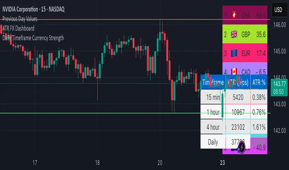
ATR FX DashboardATR FX Dashboard – Multi-Timeframe Volatility Monitor
Overview:
The ATR FX Dashboard provides a quick, at-a-glance view of market volatility across multiple timeframes for any forex pair. It uses the well-known Average True Range (ATR) indicator to display real-time volatility information in both pips and percentage terms, helping traders assess potential risk, position sizing, and market conditions.
How It Works:
This dashboard displays:
✔ ATR in Pips — The average price movement over a given timeframe, converted to pips for easy interpretation, automatically adjusting for JPY pairs.
✔ ATR as a Percentage of Price — Shows how significant the ATR is relative to the current price. Higher percentages often signal higher volatility or more active markets.
✔ Color-Coded Volatility Highlights — On the daily timeframe, ATR % cells are color-coded:
Green: High volatility
Orange: Moderate volatility
Red: Low volatility
Timeframes Displayed:
15 Minutes
1 Hour
4 Hour
Daily
This gives traders a clear, multi-timeframe view of short-term and broader market volatility conditions, directly on the chart.
Ideal For:
✅ Forex traders seeking quick, reliable volatility reference points
✅ Day traders and swing traders needing help with risk assessment and position sizing
✅ Anyone using ATR-based strategies or simply wanting to stay aware of changing market conditions
Additional Features:
Toggle option to display or hide ATR % relative to price
Automatic pip conversion for JPY pairs
Simple, clean table layout in the bottom-right corner of the chart
Supports all forex symbols
Disclaimer:
This tool is for informational purposes only and is not financial advice. As with all technical indicators, it should be used in conjunction with other tools and proper risk management.
7AM + 12AM ET MarkersShows 12AM and 7AM EST Markers on your chart. You are able to change colors of the 7AM marker and line style type. Great to see when the next day starts and when the market opens!

Double Bottom Strategy (Long Only, ATR Trailing Stop + Alerts)Updated chart script:
This script implements a long-only breakout strategy based on the recognition of a Double Bottom price pattern, enhanced with a 50 EMA trend filter and a dynamic ATR-based trailing stop. It is suitable for traders looking to capture reversals in trending markets using a structured pattern-based entry system.
🧠 Key Features:
Double Bottom Detection: Identifies double bottom structures using pivot lows with configurable tolerance.
ATR-Based Trailing Stop: Manages exits using a trailing stop calculated from Average True Range (ATR), dynamically adjusting to market volatility.
EMA Filter (Optional): Filters trades to only go long when price is above the 50 EMA (trend confirmation).
Alerts: Real-time alerts on entry and exit, formatted in JSON for webhook compatibility.
Backtest Range Controls: Customize historical testing period with start and end dates.
✅ Recommended Markets:
Gold (XAUUSD)
S&P 500 (SPX, ES)
Nasdaq (NDX, NQ)
Stocks (Equities)
⚠️ Not recommended for Forex due to differing behavior and noise levels in currency markets.
🛠️ User Guidance:
Tune the pivot period, tolerance, and ATR settings for best performance on your chosen asset.
Backtest thoroughly over your selected date range to assess historical effectiveness.
Use small position sizes initially to test viability in live or simulated environments.

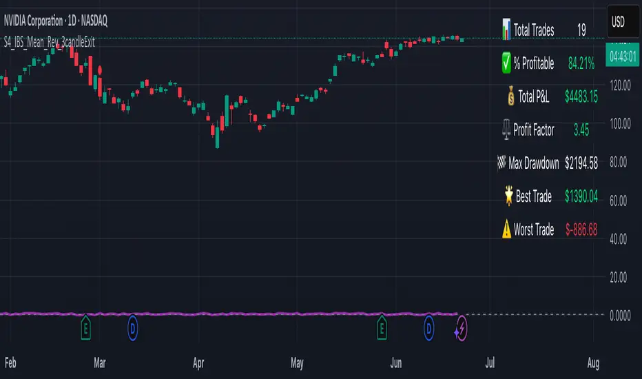
S4_IBS_Mean_Rev_3candleExitOverview:
This is a rules-based, mean reversion strategy designed to trade pullbacks using the Internal Bar Strength (IBS) indicator. The system looks for oversold conditions based on IBS, then enters long trades , holding for a maximum of 3 bars or until the trade becomes profitable.
The strategy includes:
✅ Strict entry rules based on IBS
✅ Hardcoded exit conditions for risk management
✅ A clean visual table summarizing key performance metrics
How It Works:
1. Internal Bar Strength (IBS) Setup:
The IBS is calculated using the previous bar’s price range:
IBS = (Previous Close - Previous Low) / (Previous High - Previous Low)
IBS values closer to 0 indicate price is near the bottom of the previous range, suggesting oversold conditions.
2. Entry Conditions:
IBS must be ≤ 0.25, signaling an oversold setup.
Trade entries are only allowed within a user-defined backtest window (default: 2024).
Only one trade at a time is permitted (long-only strategy).
3. Exit Conditions:
If the price closes higher than the entry price, the trade exits with a profit.
If the trade has been open for 3 bars without showing profit, the trade is forcefully exited.
All trades are closed automatically at the end of the backtest window if still open.
Additional Features:
📊 A real-time performance metrics table is displayed on the chart, showing:
- Total trades
- % of profitable trades
- Total P&L
- Profit Factor
- Max Drawdown
- Best/Worst trade performance
📈 Visual markers indicate trade entries (green triangle) and exits (red triangle) for easy chart interpretation.
Who Is This For?
This strategy is designed for:
✅ Traders exploring systematic mean reversion approaches
✅ Those who prefer strict, rules-based setups with no subjective decision-making
✅ Traders who want built-in performance tracking directly on the chart
Note: This strategy is provided for educational and research purposes. It is a backtested model and past performance does not guarantee future results. Users should paper trade and validate performance before considering real capital.
Gap % Distribution Table (2% Bins)Description
This indicator displays a Gap % Distribution Table categorized in 2% bins ranging from `< -20%` to `> +20%`. It calculates the gap between today’s open and the previous day’s close, and groups occurrences into defined bins. The table includes:
Gap range, count, and percentage for each bin
A total row summarizing all entries
Customizable appearance including:
Font color, cell background fill (with transparency), and table border color
Column headers and full outer border
Date filtering using selectable start and end dates
Position control for placing the table on the chart area
Ideal for analyzing the historical behavior of opening gaps for any instrument.

Order Flow Delta Matrix Pro @MaxMaserati 2.0Order Flow Delta Matrix Pro @MaxMaserati 2.0
Institutional-level order flow analysis
This advanced indicator displays institutional order flow data in an easy-to-read time-series matrix, revealing hidden buying and selling pressure that drives price movements.
KEY FEATURES
🔥 REAL-TIME DELTA TRACKING
- Delta Row: Net buying vs selling pressure per time period
- Live Countdown: Shows exact time remaining until next candle close
- Extended historical view for pattern recognition
CUSTOMIZABLE ROWS (Toggle On/Off)
- Max Delta: Highest buying pressure spikes (accumulation zones)
- *Min Delta: Lowest selling pressure spikes (distribution zones)
- Cumulative Delta: Running total showing institutional bias
- Delta/Volume Ratio: Quality of directional flow vs total volume
- Session Delta: Net flow since session start
- Volume: Raw transaction volume with high-volume highlighting
ADVANCED CONTROLS
- Time Direction: View oldest→newest OR newest→oldest
- 12/24 Hour Format: Choose your preferred time display
- Current Time Highlighting: Blue highlight on active time period
- Full Color Customization: Adapt to any chart theme
- Smart Sensitivity: Low/Normal/High modes for different markets
🎓 HOW TO USE IT
🟢 BULLISH SIGNALS
- Positive Delta Spikes: Look for green +500K+ delta values
- Rising Cumulative Delta: Upward trending cumulative line = institutional accumulation
- High Max Delta: Strong buying pressure at support levels
🔴 BEARISH SIGNALS
- Negative Delta Spikes: Look for red -500K+ delta values
- Falling Cumulative Delta: Downward trending cumulative = institutional distribution
- High Min Delta: Strong selling pressure at resistance levels
PRO TECHNIQUES
-Divergence Analysis: Price goes up but cumulative delta goes down = potential reversal
- Volume Confirmation: High delta + high volume = strong institutional conviction
- Session Bias: Positive session delta = bullish bias, negative = bearish bias
BEST USED FOR
- Scalping: 1-5 minute timeframes for quick institutional flow detection
- Day Trading: 15-60 minute timeframes for session bias and reversal spots
- Volume Profile: Combine with volume profile for complete order flow picture
- Futures Trading: Excellent for ES, NQ, crude oil, forex majors
PRO TIPS
1. Watch for Delta Divergences - Most reliable reversal signal
2. High Volume + High Delta = Institutional activity
3. Session Delta Direction = Overall market bias
4. Blue highlighted column= Current live data
5. Use with Support/Resistance for entry/exit timing
IMPORTANT NOTES
- Works on ALL timeframes and ALL markets
- Real-time updates for live trading decisions
- Historical data available for backtesting strategies
- No repainting - all signals are final and reliable
The matrix format makes complex data easy to interpret, giving a significant edge in understanding market dynamics and smart money order timing.

80% Rule Indicator (ETH Session + SVP Prior Session)I created this script to show the 80% opportunity on chart if setting lines up.
"80% rule: Open outside the vah or Val. Spend 30 mins outside there then break back inside spend 15 mins below or above depending which way u broke. Then come back and retest the vah/val and take it to the poc as a first target with the final target being the other Val/vah "
📌 Script Summary
The "80% Rule Indicator (ETH Session + SVP Prior Session)" overlays your chart with prior session value area levels (VAH, VAL, and POC) calculated from extended-hours 30-minute data. It tracks when the price reenters the value area and confirms 80% Rule setups during your chosen trading session. You can optionally trigger alerts, show/hide market sessions, and fine-tune line appearance for a clean, modular workflow.
⚙️ Options & Settings Breakdown
- Use 24-Hour Session (All Markets)
When checked, the indicator ignores time zones and tracks signals during a full 24-hour period (0000-0000), helpful if you're outside U.S. trading hours or want consistent behavior globally.
- Market Session
Dropdown to select one of three key market zones:
- New York (09:30–16:00 ET)
- London (08:00–16:30 local)
- Tokyo (09:00–15:00 local)
Used to gate entry signals during relevant hours unless you choose the 24-hour option.
- Show PD VAH/VAL/POC Lines
Toggle to show or hide prior day’s levels (based on the 30-min extended session). Turning this off removes both the lines and their white text labels.
- Extend Lines Right
When enabled, the VAH/VAL/POC lines extend into the current day’s session. If disabled, they appear only at their anchor point.
- Highlight Selected Session
Adds a soft blue background to help visualize the active session you selected.
- Enable Alert Conditions
Allows TradingView alerts to be created for long/short 80% Rule entries.
- Enable Audible Alerts
Plays an in-chart sound with a popup message (“80% Rule LONG” or “SHORT”) when signals trigger. Requires the chart to be active and sounds enabled in TradingView.

Universal Sentiment Oscillator with Trade RecommendationsUniversal Sentiment Oscillator & Strategy Guide
Summary
This all-in-one indicator is designed to be a comprehensive co-pilot for your trading journey. It moves beyond simple buy/sell signals by analyzing the underlying market sentiment and providing a dynamic, risk-assessed guide of potential trading strategies. Whether you're a novice learning the ropes or an expert seeking confirmation, this tool provides a structured framework for making smarter, more informed decisions in stocks, options, and futures.
How It Works
The core of the indicator is the Sentiment Oscillator, which calculates a score from -5 (Extremely Bearish) to +5 (Extremely Bullish) on every bar. This isn't just a single measurement; it's a weighted aggregate of several key technical conditions:
Trend Analysis: Price position relative to the 20, 50, and 200 EMAs.
Momentum Analysis: The current RSI value.
Hybrid Analysis: The state of the MACD and its signal line.
These factors are intelligently combined and normalized to produce a single, intuitive sentiment score, giving you an at-a-glance understanding of the market's pulse.
Core Features
Dynamic Trade Recommendation Table:
The informational heart of the indicator. This on-chart table provides a list of potential trades perfectly aligned with the current sentiment score.
Risk-Ranked Strategies:
All suggested trades are logically ordered by risk, helping you quickly identify strategies that match your comfort level.
Adjusted Trade Suggestions:
The indicator analyzes sentiment momentum (the score vs. its signal line) to provide proactive, forward-looking trade ideas based on where the market might be heading next.
Customizable Trading Styles:
Tell the indicator if you are a Conservative, Neutral, or Aggressive trader, and the "Adjusted Trade Suggestion" will automatically tailor its recommendations to your personal risk preference.
Context-Aware Futures Mode:
When viewing a futures contract, enable this mode to switch all recommendations from stock/options to futures-specific actions (e.g., "Cautious Long," "Monitor Range").
Predictive Sentiment Cone:
Visualize the potential short-term path of sentiment based on current momentum, helping you anticipate future conditions.
Fully Customizable:
Every parameter—from EMA lengths to trade filters—can be adjusted, allowing you to fine-tune the indicator to your exact specifications.
How to Use This Indicator
This tool is flexible and can be integrated into many trading systems. Here is a powerful, professional approach:
Top-Down Analysis (for Swing or Position Trading):
Establish the Trend: Start on the higher timeframes (Monthly, Weekly, Daily). Use the oscillator's color and score to define the dominant, long-term market sentiment. You only want to look for trades that align with this macro trend.
Refine the Entry: Drop down to the medium timeframes (4-Hour, 1-Hour). Wait for the sentiment on these charts to come into alignment with the higher-timeframe trend. This pullback or consolidation is your "zone of interest."
Pinpoint the Execution: Move to a lower timeframe (e.g., 15-Minute). Use the Adjusted Trade Suggestion and Sentiment Momentum to find a precise entry as momentum begins to shift back in the direction of the primary trend. You can set alerts on the oscillator's zero-line for early warnings of a sentiment shift.
As a Confirmation Tool: If you have an existing trade idea, use the indicator to validate it. Does the sentiment score align with your bullish or bearish thesis? Does the momentum confirm that now is a good time to enter?
As an Idea Generation Tool: Unsure what to trade? Browse different assets and let the indicator's "Primary Trades" and "Adjusted Trade Suggestion" present you with a list of risk-assessed ideas that you can then investigate further.
Disclaimer: This is an analysis tool and should not be considered financial advice. All forms of trading involve substantial risk. You should not trade with money you cannot afford to lose. Always perform your own due diligence and use this indicator as one component of a complete trading plan.

Super MTF Clouds (4x3 Pairs)Overview:
This script is based on Ripster's MTF clouds, which transcends the standard moving average cloud indicator by offering a powerful and deeply customizable Multi-Timeframe (MTF) analysis. Instead of being limited to the moving averages of your current charts from the current timeframe, this tool allows you to project and visualize the trend and key support/resistance zones from up to 4 different timeframes simultaneously. User can input up to 6 different EMA values which will form 3 pairs of EMA clouds, for each of the timeframes.
The primary purpose is to provide traders with immediate confluence. By observing how price interacts with moving average clouds from higher timeframes (e.g., Hourly, Daily, Weekly), you can make more informed decisions on your active trading timeframe (e.g., 10 Minute). It's designed as a complete MTF Cloud toolkit, allowing you to display all necessary MTFs in a single script to build a comprehensive view of the market structure without having to flick to different timeframe to look for cloud positions.
Key features:
Four Independent Multi-Timeframe Slots: Each slot can be assigned any timeframe available on TradingView (e.g., D, W, M, 4H).
Three MA Pairs Per Timeframe: For each timeframe, configure up to three separate MA clouds (e.g., a 9/12 EMA pair, a 20/50 EMA pair, and a 100/200 SMA pair).
Complete Customisation: For every single moving average (24 in total), you can independently control:
MA Type: Choose between EMA or SMA.
Length: Any period you require.
Line Color: Full colour selection.
Line Thickness: Adjust the visual weight of each line.
Cloud Control: For every pair (12 in total), you can set the fill colour and transparency.
How To Use This Script:
This tool is best used for confirmation and context. Here are some practical strategies that one can adopt:
Trend Confluence: Before taking a trade based on a signal on your current timeframe, glance at the higher timeframe clouds. If you see a buy signal on the 15-minute chart and the price is currently trading above a thick, bullish Daily cloud, the probability of that trade succeeding is significantly higher. Conversely, shorting into strong HTF support is a low-probability trade.
Dynamic Support & Resistance: The edges of the higher timeframe clouds often act as powerful, dynamic levels of support and resistance. A pullback to the 4-Hour 50 EMA on your 15-minute chart can be a prime area to look for entries in the direction of the larger trend.
Gauging Market Regimes: Use the toggles in the settings to quickly switch between different views. You can have a "risk-on" view with short-term clouds and a "macro" view with weekly and monthly clouds. This helps you adapt your trading style to the current market conditions.
Key Settings:
1. Global Setting
Source For All MAs: This determines the price data point used for every single moving average calculation.
Default: hl2 (an average of the High and Low of each bar). This gives a smooth midpoint price.
Options: You can change this to Close (the most common method), Open, High, Low, or ohlc4 (an average of the open, high, low, and close), among others.
Recommendation: For most standard trend analysis, the default hl2 is the common choice.
2. The Timeframe Group Structure
The rest of the settings are organized into four identical, collapsible groups: "Timeframe 1 Settings" through "Timeframe 4 Settings". Each group acts as a self-contained control panel for one multi-timeframe view.
Within each timeframe group, you have two master controls:
Enable Timeframe: This is the main power switch for the entire group. Uncheck this box to instantly hide all three clouds and lines associated with this timeframe. This is perfect for quickly decluttering your chart or focusing on a different set of analyses.
Timeframe: This dropdown menu is the heart of the MTF feature. Here, you select the higher timeframe you want to analyse (e.g., 1D for Daily, 1W for Weekly, 4H for 4-Hour). All calculations for the three pairs within this group will be based on the timeframe you select here.
3. Pair-Specific Controls
Inside each timeframe group, there are three sections for "Pair 1", "Pair 2", and "Pair 3". These control each individual moving average cloud.
Enable Pair: Just like the master switch for the timeframe, this checkbox turns a single cloud and its two MA lines on or off.
For each pair, the settings are further broken down:
Moving Average Lines (A and B): These two rows control the two moving averages that form the cloud. 'A' is typically used for the shorter-period MA and 'B' for the longer-period one.
Type (A/B): A dropdown menu to select either EMA (Exponential Moving Average) or SMA (Simple Moving Average). EMAs react more quickly to recent price changes, while SMAs are smoother and react more slowly.
Length (A/B): The lookback period for the moving average (e.g., 21, 50, 200).
Color (A/B): Sets the specific colour of the MA line itself on your chart.
Cloud Fill Settings
Fill Color: This controls the colour of the shaded area (the "cloud") between the two moving average lines. For a consistent look, you can set this to the same colour as your shorter MA line.
Transparency: Controls how see-through the cloud is, on a scale of 0 to 100. 0 is a solid, opaque colour, while 100 is completely invisible. The default of 85 provides a light, "cloud-like" appearance that doesn't obscure the price action.
----------------------------------------------------------------------
If anything is not clear please let me know!

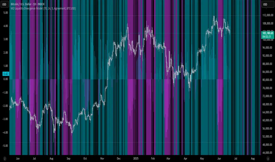
M2 Liquidity Divergence ModelM2 Liquidity Divergence Model
The M2 Liquidity Divergence Model is a macro-aware visualization tool designed to compare shifts in global liquidity (M2) against the performance of a benchmark asset (default: Bitcoin). This script captures liquidity flows across major global economies and highlights whether price action is aligned ("Agreement") or diverging ("Divergence") from macro trends.
🔍 Core Features
M2 Global Liquidity Index (GLI):
Aggregates M2 money supply from major global economies, FX-adjusted, including extended contributors like India, Brazil, and South Africa. The slope of this composite is used to infer macro liquidity trends.
Lag Offset Control:
Allows the M2 signal to lead benchmark asset price by a configurable number of days (Lag Offset), useful for modeling the forward-looking nature of macro flows.
Gradient Macro Context (Background):
Displays a color-gradient background—aqua for expansionary liquidity, fuchsia for contraction—based on the slope and volatility of M2. This contextual backdrop helps users visually anchor price action within macro shifts.
Divergence Histogram (Optional):
Plots a histogram showing dynamic correlation or divergence between the liquidity index and the selected benchmark.
Agreement Mode: M2 and asset are moving together.
Divergence Mode: Highlights break in expected macro-asset alignment.
Adaptive Transparency Scaling:
Histogram and background gradients scale their visual intensity based on statistical deviation to emphasize stronger signals.
Toggle Options:
Show/hide the M2 Liquidity Index line.
Show/hide divergence histogram.
Enable/disable visual offset of M2 to benchmark.
🧠 Suggested Usage
Macro Positioning: Use the background context to align directional trades with macro liquidity flows.
Disagreement as Signal: Use divergence plots to identify when price moves against macro expectations—potential reversal or exhaustion zones.
Time-Based Alignment: Adjust Lag Offset to synchronize M2 signals with asset price behavior across different market conditions.
⚠️ Disclaimer
This indicator is designed for educational and analytical purposes only. It does not constitute financial advice or an investment recommendation. Always conduct your own research and consult a licensed financial advisor before making trading decisions.
Ticker Pulse Meter BasicPairs nicely with the Contrarian 100 MA located here:
and the Enhanced Stock Ticker with 50MA vs 200MA located here:
Description
The Ticker Pulse Meter Basic is a dynamic Pine Script v6 indicator designed to provide traders with a visual representation of a stock’s price position relative to its short-term and long-term ranges, enabling clear entry and exit signals for long-only trading strategies. By calculating three normalized metrics—Percent Above Long & Above Short, Percent Above Long & Below Short, and Percent Below Long & Below Short—this indicator offers a unique "pulse" of market sentiment, plotted as stacked area charts in a separate pane. With customizable lookback periods, thresholds, and signal plotting options, it empowers traders to identify optimal entry points and profit-taking levels. The indicator leverages Pine Script’s force_overlay feature to plot signals on either the main price chart or the indicator pane, making it versatile for various trading styles.
Key Features
Pulse Meter Metrics:
Computes three percentages based on short-term (default: 50 bars) and long-term (default: 200 bars) lookback periods:
Percent Above Long & Above Short: Measures price strength when above both short and long ranges (green area).
Percent Above Long & Below Short: Indicates mixed momentum (orange area).
Percent Below Long & Below Short: Signals weakness when below both ranges (red area).
Flexible Signal Plotting:
Toggle between plotting entry (blue dots) and exit (white dots) signals on the main price chart (location.abovebar/belowbar) or in the indicator pane (location.top/bottom) using the Plot Signals on Main Chart option.
Entry/Exit Logic:
Long Entry: Triggered when Percent Above Long & Above Short crosses above the high threshold (default: 20%) and Percent Below Long & Below Short is below the low threshold (default: 40%).
Long Exit: Triggered when Percent Above Long & Above Short crosses above the profit-taking level (default: 95%).
Visual Enhancements:
Plots stacked area charts with semi-transparent colors (green, orange, red) for intuitive trend analysis.
Displays threshold lines for entry (high/low) and profit-taking levels.
Includes a ticker and timeframe table in the top-right corner for quick reference.
Alert Conditions: Supports alerts for long entry and exit signals, integrable with TradingView’s alert system for automated trading.
Technical Innovation: Combines normalized price metrics with Pine Script v6’s force_overlay for seamless signal integration on the price chart or indicator pane.
Technical Details
Calculation Logic:
Uses confirmed bars (barstate.isconfirmed) to calculate metrics, ensuring reliability.
Short-term percentage: (close - lowest(low, lookback_short)) / (highest(high, lookback_short) - lowest(low, lookback_short)).
Long-term percentage: (close - lowest(low, lookback_long)) / (highest(high, lookback_long) - lowest(low, lookback_long)).
Derived metrics:
pct_above_long_above_short = (pct_above_long * pct_above_short) * 100.
pct_above_long_below_short = (pct_above_long * (1 - pct_above_short)) * 100.
pct_below_long_below_short = ((1 - pct_above_long) * (1 - pct_above_short)) * 100.
Signal Plotting:
Entry signals (long_entry) use ta.crossover to detect when pct_above_long_above_short crosses above entryThresholdhigh and pct_below_long_below_short is below entryThresholdlow.
Exit signals (long_exit) use ta.crossover for pct_above_long_above_short crossing above profitTake.
Signals are plotted as tiny circles with force_overlay=true for main chart or standard plotting for the indicator pane.
Performance Considerations: Optimized for efficiency by calculating metrics only on confirmed bars and using lightweight plotting functions.
How to Use
Add to Chart:
Copy the script into TradingView’s Pine Editor and apply it to your chart.
Configure Settings:
Short Lookback Period: Adjust the short-term lookback (default: 50 bars) for sensitivity.
Long Lookback Period: Set the long-term lookback (default: 200 bars) for broader context.
Entry Thresholds: Modify high (default: 20%) and low (default: 40%) thresholds for entry conditions.
Profit Take Level: Set the exit threshold (default: 95%) for profit-taking.
Plot Signals on Main Chart: Check to display signals on the price chart; uncheck for the indicator pane.
Interpret Signals:
Long Entry: Blue dots indicate a strong bullish setup when price is high relative to both lookback ranges and weakness is low.
Long Exit: White dots signal profit-taking when strength reaches overbought levels.
Use the stacked area charts to assess trend strength and momentum.
Set Alerts:
Create alerts for Long Entry and Long Exit conditions using TradingView’s alert system.
Customize Visuals:
Adjust colors and thresholds via TradingView’s settings for better visibility.
The ticker table displays the symbol and timeframe in the top-right corner.
Example Use Cases
Swing Trading: Use entry signals to capture short-term bullish moves within a broader uptrend, exiting at profit-taking levels.
Trend Confirmation: Monitor the green area (Percent Above Long & Above Short) for sustained bullish momentum.
Market Sentiment Analysis: Use the stacked areas to gauge bullish vs. bearish sentiment across timeframes.
Notes
Testing: Backtest the indicator on your chosen market and timeframe to validate its effectiveness.
Compatibility: Built for Pine Script v6 and tested on TradingView as of June 20, 2025.
Limitations: Signals are long-only; adapt the script for short strategies if needed.
Enhancements: Consider adding a histogram for the difference between metrics or additional thresholds for nuanced trading.
Acknowledgments
Inspired by public Pine Script examples and designed to simplify complex market dynamics into a clear, actionable tool. For licensing or support, contact Chuck Schultz (@chuckaschultz) on TradingView. Share feedback in the comments, and happy trading!

MNQ/NQ Risk Management ToolThis tool helps MNQ and NQ futures traders automatically calculate position size based on either a fixed dollar risk or a percentage of account balance.
Simply enter your stop loss level and choose whether to risk a set dollar amount or a percentage of your account. The script will display how many contracts to trade based on your setup.
Features:
Calculates contracts based on stop loss and risk size
Toggle between dollar-based or percent-of-account risk
Works with both MNQ ($2/point) and NQ ($20/point)
Automatically updates based on current price and direction (long or short)
Displays a clean info box on your chart with risk, contracts, and settings
This tool is ideal for intraday or swing traders who want to stay consistent with risk management across trades.

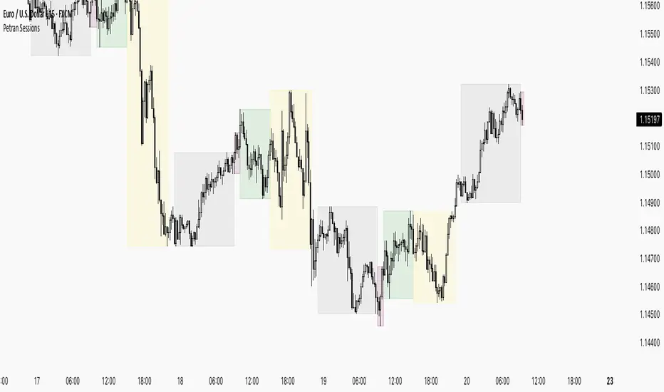
Sessions By petranThis indicator highlights the key trading sessions on the chart: Asian, Frankfurt, London, and New York. It helps traders visually track when each session begins and ends, making it easier to analyze price action, volume, and volatility during specific times of the day.
Key features:
Customizable session start and end times
Up to 4 major sessions highlighted
Best used on intraday timeframes (1-minute to 1-hour)
Clean, minimal design with adjustable colors and transparency
No repainting – reliable for both live trading and backtesting
Ideal for intraday traders and anyone who wants to better understand market dynamics during different trading sessions.
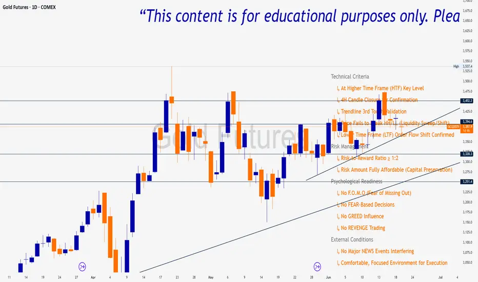
Trade Insight Entry Check List📌 Trade Insight™ Entry Checklist Indicator
This indicator is designed for Smart Money Concepts (SMC) and Price Action traders who prioritize precision, patience, and psychological discipline.
It helps you validate your trade setup across four essential categories before execution:
🔍 Technical Criteria
✅ Higher Time Frame (HTF) Key Level respected
✅ 4H Candle Closure Confirmation
✅ Trendline 3rd Touch Validation
✅ Liquidity Sweep or Shift (price fails to break HH/LL)
✅ Lower Time Frame (LTF) Order Flow Shift Confirmed
💰 Risk Management
✅ Risk-to-Reward Ratio ≥ 1:2
✅ Risk Amount Fully Affordable (Capital Preservation mindset)
🧠 Psychological Readiness
✅ No F.O.M.O (Fear of Missing Out)
✅ No FEAR-based decisions
✅ No GREED influence
✅ No REVENGE trading