itradepro macd signalsvisit our website www.itradepro.academy and get free all signals , scanners , education .. all of them for free
Educational

SHMA + Cassure de Support (Long Only)SHMA Support Breakout Strategy (Long Only)
📈 Strategy based on a dynamic support breakout combined with a proprietary SHMA (Schrödinger Harmonic Moving Average) exit filter.
Entry: price crossing above a recently recognized pivot‑low support.
Exit options:
- Immediate on Stop Loss.
- On Take Profit: either exit immediately or wait for a bearish SHMA cross‑under (configurable).
This is a long‑only strategy. All logic is implemented through user‑configurable inputs: support detection (left/right bars), TP/SL levels, SHMA length and quantum alpha, and optional SHMA exit behavior.
Everything is documented and original—this script is not a simple mash‑up of standard indicators, but a unique strategy applying quantum harmonic feedback.
⚠️ Backtest only, no guarantee of future results. Use realistic commission/slippage, and risk sizing per trade (≤ 5 % of equity) are recommended.

Target Trend v1.0 [MkTrade]Target Trend is an intelligent trend indicator that automatically detects the trend direction and displays key levels on the chart: entry, stop, and up to 3 target (take-profit) levels.
🧠 How It Works:
The indicator uses moving averages and an adapted ATR to:
📈 Detect uptrends or downtrends;
🔄 Identify change of character (CHoCH) trend shifts;
🎯 Plot entry, stop-loss, and take-profit levels in the direction of the trend;
🧱 Visually display these levels with lines and labels on the chart;
✅ Mark targets hit and stop-outs with a checkmark or cross icon.
⚙️ Settings:
Trend Length – moving average period (default is 10);
Set Targets – additional multiplier for target levels;
All targets are dynamically calculated using volatility (ATR 200).
🔔 Alerts:
The indicator detects and supports alerts for:
Trend reversals (up/down),
Target (TP) hits,
Stop-loss activation.
You can enable these in the TradingView Alerts Panel.
✅ Benefits:
Fully automatic – no manual drawing required;
Convenient – all key levels are visualized directly on the chart;
Flexible – can be adapted to any strategy;
Clear visuals – clean interface with intuitive colors.
📋 How to Use:
Add the indicator to your chart;
Wait for a trend reversal signal (triangle + colored candle);
Enter at the current candle (Entry line);
Monitor price reaching T1–T3 or stop level;
Use alerts for automation if needed.
Target Trend — это интеллектуальный трендовый индикатор, который автоматически определяет направление тренда и отображает ключевые уровни: вход, стоп и до 3-х целей (тейков) на графике.
🧠 Как работает:
Индикатор использует скользящие средние и адаптированный ATR для:
📈 Определения восходящего или нисходящего тренда;
🔄 Определения моментов смены тренда (CHoCH);
🎯 Построения уровней входа, стоп-лосса и тейков в направлении тренда;
🧱 Отображения целей в виде уровней и меток на графике;
✅ Отмечает достигнутые цели и срабатывание стопа (визуально — галочкой и крестиком).
⚙️ Настройки:
Trend Length — длина скользящей средней (по умолчанию 10);
Set Targets — дополнительный множитель для расчёта тейков;
Все цели рассчитываются динамически с учётом волатильности (ATR 200).
🔔 Алерты:
Индикатор распознаёт сигналы на:
смену тренда (вверх/вниз),
достижение целей (тейков),
срабатывание стопа.
Можно включить в окне алертов TradingView.
✅ Преимущества:
Полностью автоматический: не требует ручной разметки.
Удобство: уровни и цели отображаются прямо на графике.
Гибкость: можно адаптировать под любую стратегию.
Визуальная ясность: приятные цвета, чистый интерфейс.
📋 Как использовать:
Добавь индикатор на график.
Дождись сигнала смены тренда (треугольник и свеча с цветом тренда).
Вход осуществляется на текущем баре (линия Entry).
Следи за достижением целей T1–T3 или стопа.
Можно использовать алерты для автоматизации.
Переведи на английский

VisionThis indicator helps visually distinguish and analyze the Asian, London, and New York trading sessions. It's a great tool for intraday traders focusing on time-based liquidity zones.
🔧 Features:
Asian range box, London / New York high-low lines with distinct colors.
Customizable time windows, Asian range deviations and colors.

MADA Trader Zones📊 Institutional Bias Indicator
This indicator is based on the analysis of institutional evaluations of individual trading days. By assessing trader behavior on a daily basis, an average is created that indicates when a market is considered cheap or expensive. Combined with current sentiment, this results in potential signals for entries or exits.
⚠️ Important Note:
This indicator does not work autonomously. Its signals must always be interpreted in the context of the overall market structure. That’s why it serves as a supportive tool within our MADA Mentoring Program, where we teach institutional knowledge and decision-making processes in depth.

Tongo_DemoИндикатор позволяет отображать аргументы Tongo_Levels для одного инструмента в демонстрационных целях
The indicator displays Tongo_Levels arguments for a single instrument for demonstration purposes

RNDMandar_RND This indicator give buy sell signal. Mandar_RND This indicator give buy sell signal Mandar_RND This indicator give buy sell signal Mandar_RND This indicator give buy sell signal Mandar_RND This indicator give buy sell signal Mandar_RND This indicator give buy sell signal Mandar_RND This indicator give buy sell signal Mandar_RND This indicator give buy sell signal Mandar_RND This indicator give buy sell signal Mandar_RND This indicator give buy sell signal Mandar_RND This indicator give buy sell signal

XAUUSD 5m Aggressive Buy/Sell Signals v2This indicator is designed to help identify potential short-term entry points for XAUUSD on the 5-minute timeframe.
It highlights aggressive buy and sell opportunities with clear on-chart markers and background cues for visual clarity.
Alerts are also integrated to notify traders in real-time when a potential signal occurs.
⚠️ Disclaimer : This tool is for informational and educational purposes only and is not financial advice. Always conduct your own analysis before making any trading decisions.


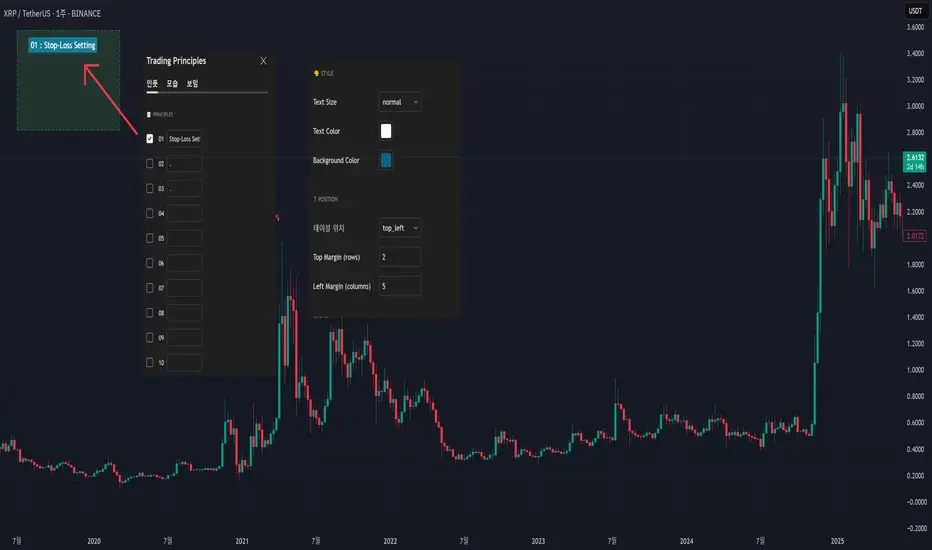
My Own Trading Principles - for Avoiding Emotional TradingThis indicator lets you clearly mark your personal trading principles right on the chart.
Far too often, traders dive into the market without clear guidelines, only to find themselves facing substantial losses and ultimately stepping away discouraged.
Imagine having your own carefully-crafted set of trading rules?tailored just for you. By adhering to these principles, you can better manage risks, limit losses, and build a sustainable, long-term approach to trading.
Writing notes on your monitor or jotting them down on random sticky pads can be forgettable?and let's admit it, we've all misplaced a note or two! Why not keep your rules clearly visible directly on your chart, guiding your trades with consistency and confidence?
When I first began trading, my mentors consistently emphasized the importance of having my own set of trading principles. And guess what?they were right! It really does matter.
I've included numerous menu options so you can freely customize its appearance.
This script is open-source; feel free to modify and adapt it to your own needs.
SEVEN THIRTY### 🕖 **Seven Thirty Strategy — Automated Trend Reversal System**
**Overview:**
The *Seven Thirty* strategy is a fully automated trend-following reversal system designed for TradingView and integrated with platforms like WunderTrading for hands-free execution. It enters trades on EMA crossovers with smart risk management and automatically reverses position when trends shift.
**Key Features:**
* 📈 **EMA Cross Entry:** Trades are opened immediately on confirmed EMA crossovers, no delay or buffer.
* 🛑 **Smart Stop Loss:** Stop is dynamically placed at the second most recent swing high/low (Gann F2 logic).
* 🎯 **Take Profit Targets:** Partial take profits (TP1/TP2/TP3) can be enabled based on user-defined percentages.
* 🔄 **Auto-Reverse Logic:** When a stop is hit, the strategy flips into a new position in the opposite direction.
* 📉 **2% Risk Per Trade:** Dynamic position sizing based on distance to stop ensures consistent portfolio risk.
* 🧠 **Optional Momentum Filter:** Adjustable trend/momentum filter to avoid choppy conditions.
* 🔁 **Works on Any Asset:** Designed to function across all markets and timeframes with minimal tweaking.
**Automation-Ready:**
This strategy is built for direct integration with automated bots like WunderTrading. Alerts include webhook-ready comments for:
* ENTER LONG
* EXIT LONG
* ENTER SHORT
* EXIT SHORT
**Best Timeframes:**
Optimized for 4H and Daily charts but works well on any timeframe when fine-tuned.

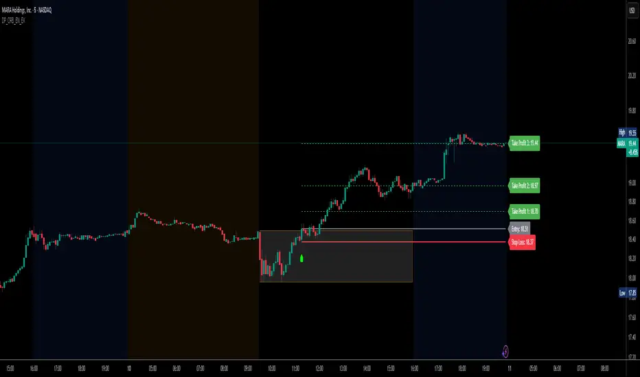
DP_ORB Entry & Exit IndicatorDisclaimer:
This indicator is for educational purposes only. It does not constitute financial advice. Always do your own research and manage your risk. Also, I cannot take full credit for 'ORB' as its a well known strategy amongst many traders, but I do need to give a special shout out to @TheBigDaddyMax for putting me on to this.
DP_ORB Entry & Exit Indicator
Description:
The DP_ORB Entry & Exit Indicator is a powerful tool designed for traders who utilize the Opening Range Breakout (ORB) strategy on the NYSE session. This indicator visually identifies the initial volatility window of the trading day, by marking the 15m High, and 15m Low into a ORB Box, & then tracks breakout opportunities, and provides clear, dynamic trade management levels—all directly on your chart.
Key Features:
Automatic Opening Range (ORB) Box:
Identifies and plots the high and low of the user-defined opening range (default 9:30–9:45 NYSE) for visual reference and strategy foundation.
Breakout Entry Signals:
Automatically detects and marks long or short breakout entries when price closes above or below the ORB range, with additional momentum confirmation.
Dynamic Stop Loss:
Stop loss is intelligently set to the previous bar’s low for long trades (or high for shorts), adapting to market structure at entry.
Take Profit Targets:
Up to three fully adjustable take-profit levels are plotted, calculated as percentages from entry, supporting progressive trade management.
Visual Trade Management:
Entry, stop loss, and take profit levels are displayed as extending dashed lines from entry point to the current bar, with labels always shown just to the right of price for clarity on all timeframes.
Automatic Reset and Cleanup:
Visuals and logic reset daily and upon exit, ensuring a clean, uncluttered chart experience.
How to Use:
Set your preferred opening range time and take profit levels in the settings.
Wait for a breakout and confirmation during the NYSE session.
Use the on-chart lines and labels to manage your trade according to your risk and strategy plan.
Best For:
Day traders and scalpers seeking a disciplined, visual, and fully-automated approach to opening range breakout trading.
5-Minute Momentum Indicator ($1000 Entry + 20% TP + 9:30 Exit)Showing entry candle and displaying entry, TP, and SL

KHAN ULTIMATEMost Versatile Indicator working on all assets and Time frames, with Two Buy entry Triggers when favorable conditions are met.
Just follow the Labels and exit Long when Sell appears or Price crosses below the Blue line, on the short side enter with Sell and exit when price crosses above the Fuchsia line.
Disclaimer : As everyone knows that indicators are lagging in Nature and always follows the Price action and Price never follows the indicators so a Buy/Sell triggers never guarantees a successful trade, market conditions and several other factors are also needs to be considered and always follow Risk management.
for any clarifications DM me.
I( author) have no responsibility for Profit/Loss booked by using this Indicator, User is solely responsible. for it,

Customized ATR Trailing Stop with Fixed ATR DisplayCustomized ATR Trailing Stop with Fixed ATR Display

FLUID-TRADES SMC Indicator that works on All TF and assets Trade, source code is Hidden but other adjustments can be made

Smart Confluence Scalper🔥 Smart Confluence Scalper — Precision-Based Scalping Tool for M1/M5 🔥
Smart Confluence Scalper is a precision-engineered scalping tool built for high-performance intraday traders, especially those targeting funded challenges and consistent profits.
Core Features:
📊 Institutional Confluences: Combines SMC, FVG, Break of Structure (BOS), and Volume Spike
🎯 Trade Confidence Score: Entry only when 3–5 confluences align
🕐 Optimized for M1 & M5 scalping
📍 Dynamic Buy/Sell Zones with Alerts
🔄 No repaint — clean & real-time logic
Who should use this?
Traders aiming for consistency and accuracy
Funded challenge participants
Professional scalpers using smart money logic
🔐 Note: This script is published as Protected. Users can apply it to their charts, but the source code remains hidden to protect the proprietary logic.

SHMA Quantique – Schrödinger Moving AverageAn experimental moving average inspired by the Schrödinger model. Reacts to momentum and filters noise on small timeframes. Ideal for scalping. 1 minute and up.

Multi-TF Bullish Dashboard ✅🔼back test gives good results but try the indicator and give me the feedback

ROGUE ICT PROROGUE ICT PRO | ICT-Inspired Confluence System
The ROGUE ICT PRO is a precision tool built for traders who follow the principles of Inner Circle Trader (ICT) methodology. This script is designed to highlight potential high-probability trade setups based on multiple confluences including Market Structure Shifts (MSS), Fair Value Gaps (FVGs), killzone timing, rejection confirmations, and optional HTF bias filters.
This tool is intended for educational and research purposes only and is best used by traders who already understand ICT-style concepts.
🔍 Key Features:
- Market Structure Shift (MSS): Detects bullish or bearish structure breaks and plots them on the chart.
- Fair Value Gaps (FVGs): Highlights potential imbalance zones after a structure shift.
- Signal Logic: Buy or sell signals only trigger when price returns to a valid FVG and confirms with a rejection wick or engulfing (optional).
- Session Killzones: Filter entries to only occur during specific sessions: Asian, London, or New York.
High Timeframe Bias (Optional):
- HTF EMA trend direction
- HTF swing structure break
- HTF candle bias
RSI Confirmation (Optional): A 3-period RSI must be in overbought (for sell) or oversold (for buy) territory.
ATR-Based Risk Management:
SL and TP lines are drawn dynamically using ATR with configurable multipliers and risk-reward ratio.
Cooldown Logic: Prevents signal spam by enforcing a minimum bar gap between trades.
Previous Day High/Low Anchoring (Optional): Visual levels drawn from the previous day’s extremes.
⚙️ Customization:
Every feature can be toggled or configured via the settings menu:
Choose which killzones to enable.
Select your HTF bias filter or disable bias altogether.
Adjust ATR, Risk:Reward, and RSI levels to suit your strategy.
Fine-tune structure sensitivity, gap size, and rejection rules.
🛡️ Disclaimer:
This indicator is provided for educational and informational purposes only. It is not intended as financial advice or a trading signal service. Past performance is not indicative of future results. Always conduct your own research and consult with a licensed financial advisor before making any trading decisions.

FibPivot FluidTradesThis comprehensive indicator provides a complete trading framework combining institutional concepts (SMC), Fibonacci-based levels, and a systematic trading approach with clear risk management.
Key Features of This Combined Indicator:
Smart Money Concepts (SMC) Components:
Supply/Demand zones with configurable width and history
Break of Structure (BOS) detection
Point of Interest (POI) labels
Swing high/low detection with HH/HL/LH/LL labeling
Fibonacci Pivot Points:
Daily pivot points with configurable Fib levels
Support/Resistance levels (S1-S5, R1-R5)
Customizable visual appearance
Trading System:
ATR-based trailing stop signals
EMA trend confirmation (13, 33, 200)
Visual buy/sell signals
Risk management with SL/TP levels
Trade information table
Enhanced Visuals:
Themed colors (dark/light mode)
Clean, organized layout
Configurable display options for all components
Alerts:
Buy/Sell signal alerts
Can be extended for BOS alerts


Trendline Breakouts With Targets [ Chartprime ]The Trendline Breakouts With Targets indicator is meticulously crafted to improve trading decision-making by pinpointing trendline breakouts and breakdowns through pivot point analysis.
Here's a comprehensive look at its primary functionalities:
Upon the occurrence of a breakout or breakdown, a signal is meticulously assessed against a false signal condition/filter, after which the indicator promptly generates a trading signal. Additionally, it conducts precise calculations to determine potential target levels and then exhibits them graphically on the price chart.
