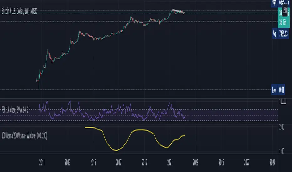
100W sma/200W smaThis is an Indicator specifically made for BTC/USD ( Index)
Zoom out on Daily and Weekly candles as much and you can SEE a trend . A very very important trend and you shall remember this indicator with Years to come . This is a VERY long term type indicator and can help you with long term hodling investor mindset analysis .
1-BTCUSD
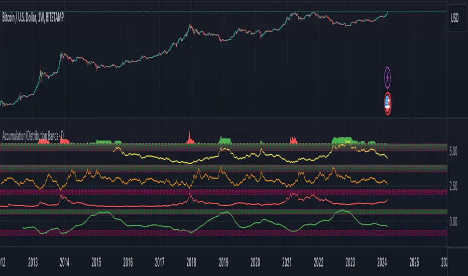
Accumulation/Distribution Bands & Signals (BTC, 1D, BITSTAMP) This is an accumulation/distribution indicator for BTC/USD (D) based on variations of 1400D and 120D moving averages and logarithmic regression. Yellow plot signals Long Term Accumulation, which is based on 1400D (200W) ALMA, orange plot signals Mid Term Accumulation and is based on 120D ALMA, and finally the red plot signals Long Term Distribution that's based on log regression. It should be noted that for red plot to work BTC 1D BITSTAMP graph must be used, because the function of the logarithmic regression was modified according to the x axis of the BITSTAMP data.
Signal bands have different coefficients; long term accumulation (yellow) and and the log regression (red) plots have the highest coefficients and mid term accumulation (orange) has the lowest coefficients. Coefficients are 6x, 3x and 1.5x for the red (sell) and yellow (buy) plots and 1x, 2x and 3x for the orange (buy) plot. Selling coefficient for the yellow and the orange plots are respectively 2x and 1x. Buy and sell signals are summed up accordingly and plotted at the top of the highest band.
Acknowledgement: Credits for the logarithmic regression function are due @memotyka9009 and Benjamin Cowen
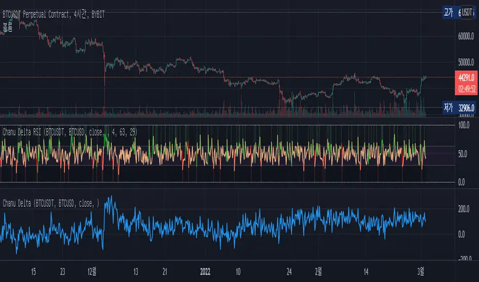
Chanu Delta RSIThis Chanu Delta RSI indicates the strength of the Bitcoin market. The problem with the previous Chanu Delta Indicator was that it was simply based on the price difference between the two Bitcoin markets, so there was no universality. However, this new Chanu Delta RSI solves the problem by introducing an RSI that compares the price difference trend.
This indicator is selectable from both reference and large amplitude BTCUSD markets. I recommend using BYBIT:BTCUSDT for the reference market and COINBASE:BTCUSD for the large amplitude market.
_____________________________________________________________
이 지표는 비트코인 시장의 단기적인 추세를 판단하는데 도움을 줄 수 있습니다. 기존 Chanu Delta 지표의 문제점은 단순히 두 비트코인 시장의 가격차를 기준으로 하여 보편성이 없었다는 점이다. 하지만 이번 새로운 Chanu Delta RSI는 가격차이 추세를 비교하는 RSI를 도입해 문제를 해결했습니다.
이 지표는 레퍼런스 및 큰 진폭 BTCUSD 시장에서 모두 선택할 수 있습니다. 레퍼런스 시장에는 BYBIT:BTCUSDT를 사용하고 큰 진폭 시장에는 COINBASE:BTCUSD를 사용하는 것이 좋습니다.
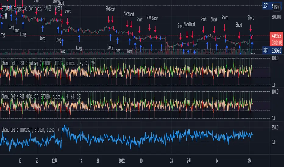
Chanu Delta RSI StrategyThis strategy is built on the Chanu Delta RSI , which indicates the strength of the Bitcoin market. The problem with the previous Chanu Delta Strategy was that it was simply based on the price difference between the two Bitcoin markets, so there was no universality. However, this new Chanu Delta RSI strategy solves the problem by introducing an RSI that compares the price difference trend.
When the Chanu Delta RSI hits “Bull Level” and “Bear Level” and closes the candle, long and short signals are triggered respectively. The example shown on the screen is a default setting optimized for a 4-hour candlestick strategy based on the Bybit BTCUSDT futures market. You can use it by adjusting the setting value and modifying it to suit you.
This strategy is selectable from both reference and large amplitude BTCUSD markets in order to enable fine backtesting. I recommend using BYBIT:BTCUSDT for the reference market and COINBASE:BTCUSD for the large amplitude market.
(Note) Using the "Chanu Delta RSI" to know the current indicator value in real time, it is convenient to predict the signal of the strategy.
(Note) Because the Chanu Delta RSI represents the price difference based on the Bybit BTCUSDT futures market, backtesting is possible from March 2020.
_____________________________________________________________
이 전략은 비트코인 시장의 강점을 나타내는 Chanu Delta RSI를 기반으로 합니다. 기존 Chanu Delta 전략의 문제점은 단순히 두 비트코인 시장의 가격차를 기준으로 하여 보편성이 없었다는 점이다. 하지만 이번 새로운 Chanu Delta RSI 전략은 가격차이 추세를 비교하는 RSI를 도입해 문제를 해결했습니다.
Chanu Delta RSI가 "Bull Level"과 "Bear Level"에 도달하고 봉마감하면 롱, 숏 신호가 각각 트리거됩니다. 화면에 보이는 예시는 Bybit BTCUSDT 선물 시장을 기반으로 한 4시간 캔들스틱 전략에 최적화된 기본 설정입니다. 설정값을 조정하여 자신에게 맞게 수정하여 사용하시면 됩니다.
이 전략은 정밀한 백테스팅을 가능하게 하기 위해 참조 및 큰 진폭 BTCUSD 시장에서 모두 선택할 수 있습니다. 참조 시장에는 BYBIT:BTCUSDT를 사용하고 큰 진폭 시장에는 COINBASE:BTCUSD를 사용하는 것이 좋습니다.
(주) "Chanu Delta RSI"를 이용하여 현재 지표 값을 실시간으로 알 수 있어 전략의 시그널을 예측하는데 편리합니다.
(주) Chanu Delta RSI는 바이비트 BTCUSDT 선물시장을 기준으로 가격차이를 나타내므로 2020년 3월부터 백테스팅이 가능합니다.
BTC Cap Dominance RSIBTC Cap Dominance RSI indicator is a combination of the RSI of Bitcoin Market Cap and the RSI of Bitcoin Dominance. The concept of this indicator is to get a good grasp of the bitcoin market flow by combining bitcoin dominance as well as bitcoin market cap.
BTC Cap Dominance (BCD) RSI is defined as:
BCD RSI = (BTC Cap RSI + BTC Dominance RSI) / 2
Case 1 (Bull market):
Both Cap RSI and Dominance RSI values are high
Case 2 (Neutral market):
Cap RSI is high but Dominance RSI is low
Cap RSI is low but Dominance RSI is high
Case 3 (Bear market):
Both Cap RSI and Dominance RSI values are low
(Note) Please note that the market capitalization symbols (CRYPTOCAP:TOTAL and CRYPTOCAP:TOTAL2) of TradingView started in January 2020, so you can check the indicator value from this point on.

BTC Cap Dominance RSI StrategyThis strategy is based on the BTC Cap Dominance RSI indicator, which is a combination of the RSI of Bitcoin Market Cap and the RSI of Bitcoin Dominance. The concept of this strategy is to get a good grasp of the bitcoin market flow by combining bitcoin dominance as well as bitcoin market cap.
BTC Cap Dominance (BCD) RSI is defined as:
BCD RSI = (BTC Cap RSI + BTC Dominance RSI) / 2
Case 1 (Bull market):
Both Cap RSI and Dominance RSI values are high
Case 2 (Neutral market):
Cap RSI is high but Dominance RSI is low
Cap RSI is low but Dominance RSI is high
Case 3 (Bear market):
Both Cap RSI and Dominance RSI values are low
When the BCD RSI value closes the candle above the Bull level, it triggers a long signal and when the value closes below the Bear level, it triggers a short signal.
(Note) Please note that TradingView's market cap symbols (CRYPTOCAP:TOTAL and CRYPTOCAP:TOTAL2) started in January 2020, so strategy backtesting is possible from this point on.
(Note) Since the real-time BCD RSI value does not come out with this strategy, it is recommended to use it together because the current value can be known and the long-short signal can be predicted in advance by using a separate BCD RSI Index together.
If "Use Combination of dominance RSI ?" is not checked in addition to the recommended default value of the strategy, the recommended values are Length (14), Bull level (74), Bear level (25).
_______________________________________________________________________
이 전략은 비트코인 시가총액의 RSI와 비트코인 도미넌스 RSI를 조합하여 만든 BTC Cap Dominance RSI 지표를 기반으로 만들어졌습니다. 이 전략의 컨셉은 비트코인 시가총액뿐만 아니라 비트코인 도미넌스를 조합함으로써 비트코인 시장 흐름을 잘 파악할 수 있도록 하는 것입니다.
BTC Cap Dominance (BCD) RSI는 다음과 같이 정의하였습니다.
BCD RSI = (BTC Cap RSI + BTC Dominance RSI) / 2
Case 1 (강세 장):
Cap RSI와 Dominance RSI 값 모두 높은 경우
Case 2 (횡보 장):
Cap RSI는 높지만 Dominance RSI는 낮은 경우
Cap RSI는 낮지만 Dominance RSI는 높은 경우
Case 3 (약세 장):
Cap RSI와 Dominance RSI 값 모두 낮은 경우
BCD RSI 값이 Bull level 위에서 캔들 마감할 경우 long 신호를 트리거하고 Bear level 아래에서 캔들 마감할 경우 short 신호를 트리거합니다.
(주의) 트레이딩뷰의 시가총액 심볼들 (CRYPTOCAP:TOTAL과 CRYPTOCAP:TOTAL2)이 2020년 1월부터 시작하였으므로 이 시점부터 전략 백테스팅이 가능한 점을 유의하십시오.
(주의) 이 전략은 실시간 BCD RSI 값이 나오지 않기 때문에 별도의 BCD RSI Index를 함께 사용하면 현재 값을 알 수 있어 롱숏 신호를 사전에 예측할 수 있으므로 함께 사용하기를 권장합니다.
전략의 추천 기본값 외에 "Use Combination of dominance RSI ?"를 체크하지 않는 경우 권장하는 값은 Length (14), Bull level (74), Bear level (25) 입니다.

Bitcoin Inflation-Adjusted Support and Resistance5year breakeven inflation rate fitted for log BTC chart as Support and Resistance
Btcusdt - 4hr Trendreversal algoritmeIn this strategy we use a combination of differents indicators to catch the highs and lows and follow the right direction at all times.
The conditions of this 4hr algo are based on Ema's and WMA's that rise or fall:
Momentum;
Price Action
Volume
RSI
BB
I have backtested the algo for 2 years before i ran it live. I ran the algo live for 1 year now and ( October 2020) as for now the algo indicates a trend reversal 70-80% correctly.
The backtest result shown started from 01-10-2017and is simulated using 15% of the capital on BINANCE:BTCUSDT
I have varies Algo's on different Timeframes. If you're interested sent me a message.
Please be aware that past results are no guarantee for future performance!

[FTX Funding Colored Candles] [third eye]This Indicator plots FTX: BTCPERP predicted funding rates and colours the candlesticks based on it.
!!!
Since Tradingview always plots new indicators at the back you might have to click:
Name of the Indicator ( ) -> More -> Visual Order -> Bring to Front
(unfortunately, there is no way for me to do this in pinescript)
There is also the possibility to change colors in the Settings:
It is grouped by where Basis is (FTX:BTCPERP - FTX Spot index)
Changing that might be good for getting a more close up view of LTF price action.
Also to get rid of the Values in the Status line click on Settings and scroll to the bottom to disable "Value in Status Line"
Bitcoin Golden Bottom Oscillator (MZ BTC Oscillator)This indicator uses Elliot Wave Oscillator Methodology applied on "BTC Golden Bottom with Adaptive Moving Average" and Relative Strength Index of Resulted EVO to form an Oscillator to detect trend health in Bitcoin price. Ticker is set to "INDEX : BTCUSD" on 1D timeframe.
Methodology
Oscillator uses Adaptive Moving Average with 1 year of length, Minor length of 50 and Major length of 100 to mark AMA as Golden Bottom.
Percentage Elliot Wave Oscillator is calculated between BTC price and AMA.
Relative Strength Index of EVO is calculated to detect trend strength and divergence detection.
Hull Moving Average of resulted RSI is used to smoothen the Oscillator.
Oscillator is hard coded to 'INDEX:BTCUSD' ticker on 1d so it can be used on any other chart and on any other timeframe.
Color Schemes
Bright Red background color indicates that price has left top Fib multiple ATR band and possibly go for top.
Light Red background color indicates that price has left 2nd top Fib multiple ATR band and possibly go for local top.
Lime background color indicates that price has entered lowest band indicating local bottom.
Bright Green background color indicates that price is approximately resting on Golden Bottom i.e. AMA.
Oscillator color is set to gradient for easy directional adaption.
BTC Golden Bottom with Adaptive Moving Average

BTC Price OverlayThis is not a crazy strategy like most of the code I write. It's a simple overlay so you can drop BTC on top of whatever chart you are watching. It will track BTC's price on Binance.us (though the exchange is changeable with a few lines of code, maybe I will make it a dropdown on the next iteration of this.)
It uses TradingView's scale function to show both assets on a relative chart. BTC's price is on the left and your asset is on the right.
I've made this available for free because it is quick and easy. I plan to write a bot based around this code and that one will be private.

Bitmex BTC Perpetual Premium and FundingThis script tracks the premium (default red line) and the funding rate (default yellow area) of the Bitmex XBTUSD pair perpetual contract.
The calculations are based on the 8H TWAP of interest rates and premium index from Bitmex.
BTC 30m ScriptWhat are your thoughts on this script? I connected it to Coinbase Pro via AWS lambda for auto-trading. I'm waiting for BTC to start bullish again before turning it on in production. Thoughts? Thank you! John
[VIP] Composite BTC Funding Rate APR
Calculates and displays a BTC funding rate (positive or negative) in terms of APR. Positive APR = Positive funding. Negative APR = Negative funding
This calculation is sourced from a variety of spot and perpetual markets on a couple of top-volume exchanges, Binance, FTX, etc.
This logic is utilized in Dip Hunter and Take Profit Hunter
Code is open source! All feedback and improvements encouraged

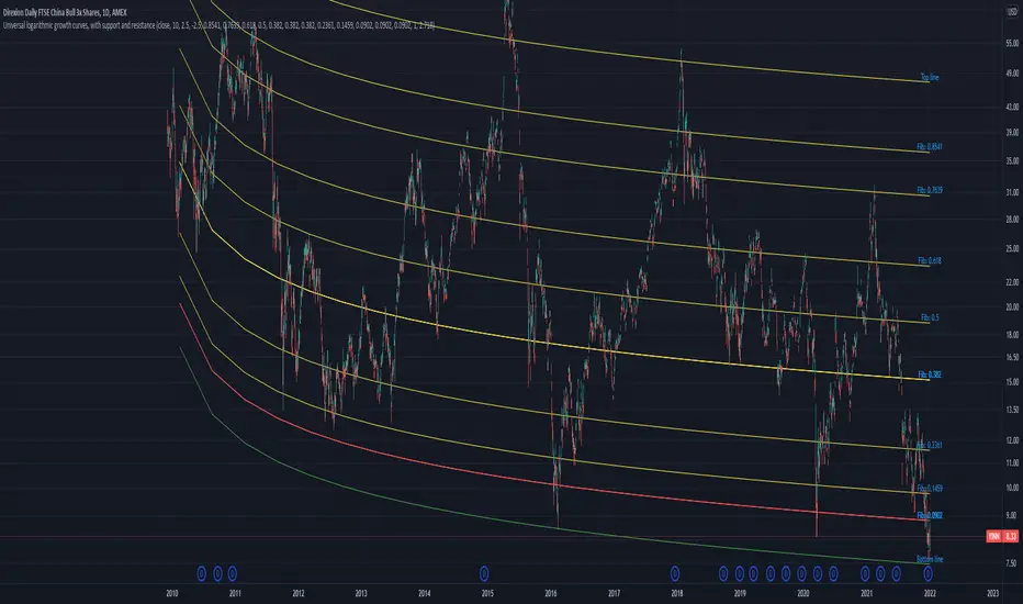
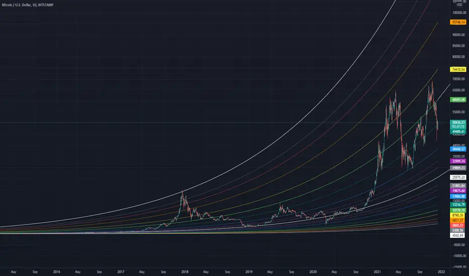
Universal logarithmic growth curves, with support and resistanceLogarithmic regression is used to model data where growth or decay accelerates rapidly at first and then slows over time. This model is for the long term series data (such as 10 years time span).
The user can consider entering the market when the price below 25% or 5% confidence and consider take profit when the price goes above 75% or 95% confidence line.
This script is:
- Designed to be usable in all tickers. (not only for bitcoin now!)
- Logarithmic regression and shows support-resistance level
- Shape of lines are all linear adjustable
- Height difference of levels and zones are customizable
- Support and resistance levels are highlighted
Input panel:
- Steps of drawing: Won't change it unless there are display problems.
- Resistance, support, other level color: self-explanatory.
- Stdev multipliers: A constant variable to adjust regression boundaries.
- Fib level N: Base on the relative position of top line and base line. If you don't want all fib levels, you might set all fib levels = 0.5.
- Linear lift up: vertically lift up the whole set of lines. By linear multiplication.
- Curvature constant: It is the base value of the exponential transform before converting it back to the chart and plotting it. A bigger base value will make a more upward curvy line.
FAQ:
Q: How to use it?
A: Click "Fx" in your chart then search this script to get it into your chart. Then right click the price axis, then select "Logarithmic" scale to show the curves probably.
Q: Why release this script?
A: - This script is intended to to fix the current issues of bitcoins growth curve script, and to provide a better version of the logarithmic curve, which is not only for bitcoin , but for all kinds of tickers.
- In the public library there is a hardcoded logarithmic growth curve by @quantadelic . But unfortunately that curve was hardcoded by his manual inputs, which makes the curve stop updating its value since 2019 the date he publish that code. Many users of that script love using it but they realize it was stop updating, many users out there based on @quantadelic version of "bitcoin logarithmic growth curves" and they tried their best to update the coordinates with their own hardcode input values. Eventually, a lot of redundant hardcoded "Bitcoin growth curve" scripts was born in the public library. Which is not a good thing.
Q: What about looking at the regression result with a log scale price axis?
A: You can use this script that I published in a year ago. This script display the result in a log scale price axis.
BTC Golden Bottom with Adaptive Moving AverageIntroduction:
This study uses Adaptive Moving Average with 1 year of length to plot on all time history Index Calculated by Tradingview . All previous $BTC bear runs bottomed on this curve which makes it important enough. Use this only on " "
Default Values:
AMA length is 1 year
Minor length is 50
Major length is 100

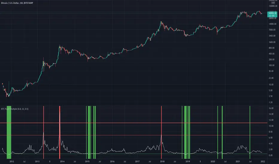
BTC Puell Multiple with alert functionThe Puell Multiple examines the fundamentals of mining profitability and the way they shape market cycles. It is calculated by taking a ratio of daily coin issuance (in USD) and the 365 moving average of daily coin issuance (in USD).
Interpretation of the Puell Multiple can generally be considered in the following framework:
high values indicate that current miner profitability if high compared to the yearly average. As such, the incentive for miners to liquidate their treasuries is high and greater sell pressure may be expected.
Low values indicate that current miner profitability is low compared to the yearly average. As such, income stress may become a factor, and some miners may need to start reducing hash-power by switching off rigs. This increases the hash-share of remaining miners who can then sell fewer coins to cover their operations, reducing their impact on liquid supply.
Halving events will drop the current coin issuance by 50% relative to the preceding year creating an immediate halving of the Puell Multiple also. The effect on miner profitability will thus be as per the point on low values above.
ADX_OSCILLATOR [APIDEVs]ENGLISH:
ADX (ORIGINAL VERSION)
The ADX Indicator (Average Directional Index), is a non-directional oscillator type indicator, that is, it quantifies the strength of a trend regardless of its direction. In its original version, it is made up of 3 lines that represent the direction and strength of the movement:
• A line representing the ADX indicator.
• A green line representing the bullish Direction Index (DI +).
• A red line representing the Bearish Direction Index (DI-).
When the ADX is greater than 35, the market is in a strong trend, when it is between 35 and 20 the market is in trend and when it is less than 20 it indicates that the market is in range.
ADX OSCILLATOR (OUR VERSION)
At APIDEVs we really care about improving the understanding and experience of our users, which is why, in response to multiple requests, we decided to make important modifications to the ADX, which we consider to be the most powerful indicator of strength.
For many traders it was really confusing to understand that the ADX could be bullish or bearish and at the same time have the same numerical values, so in our version of the “ADX PRO +” we added colors and different intensity levels for your better understanding, however. , many needed a more explicit indicator and it is based on this request that we decided to take a leap into the incredible and that is how the “ADX OCILLATOR” was born.
We convert the ADX into a trend oscillator, now simpler and with multiple advantages which we will proceed to list:
1. The ADX was transformed into a directional oscillator whose color is based on the crossing of (DI +) and (DI-). This modification opens the door to the replacement of the Squeeze Momentum Indicator (SQZMOM) as a directional complement to the ADX.
2. A Background was added that is activated exclusively when the market has a strong upward or downward trend, specifying through its colors and intensity the type and direction of the force.
3. The original ADX parameters were adjusted to almost eliminate completely the “no trend” condition. This condition only created confusion for traders.
4. Added a system of signals based on the direction of the oscillator and the strength of the ADX.
• When the oscillator is sloping up and the ADX is green, the LONG (L) signal is activated.
• When the oscillator slopes downward and the ADX is red, the SHORT (S) signal is activated.
5. A side panel has been enabled that visually expresses the numerical value and direction of the ADX, as well as the direction of the oscillator.
6. An alert system was enabled so that traders receive notifications on all their devices:
• It is activated when the ADX changes color.
• It is activated when the Oscillator crosses the 0 point.
• It is activated when any input signal is activated.
---------------------------SPANISH --------------------------------
ADX OSCILLATOR:
ADX (VERSIÓN ORIGINAL)
El Indicador ADX (Average Directional Index), Es un indicador de tipo oscilador no direccional, es decir, cuantifica la fuerza de una tendencia independientemente de su dirección. En su versión original está compuesto por 3 líneas que representan la dirección y la fuerza del movimiento:
1. Una línea que representa el indicador ADX.
2. Una línea verde que representa el Índice de Dirección alcista (DI+).
3. Una línea roja que representa el Índice de Dirección bajista (DI-).
Cuando el ADX es mayor a 35, el mercado está en fuerte tendencia, cuando está entre 35 y 20 el mercado esta en tendencia y cuando es menor a 20 indica que el mercado está en rango.
ADX OSCILLATOR (NUESTRA VERSIÓN)
En APIDEVs realmente nos preocupamos por mejorar la comprensión y experiencia de nuestros usuarios, es por ello por lo que atendiendo a múltiples solicitudes decidimos realizar importantes modificaciones al ADX, el cual consideramos como el más potente indicador de fuerza.
Para muchos traders era realmente confuso entender que el ADX podía ser alcista o bajista y al mismo tiempo tener los mismos valores numéricos, así que en nuestra versión del “ADX PRO+” le añadimos colores y diferentes niveles de intensidad para su mejor comprensión, sin embargo, muchos necesitaban un indicador más explícito y es en base a esta solicitud que decidimos dar un salto a lo increíble y es así como nació el “ADX OCILLATOR” .
Convertimos el ADX en un oscilador de tendencia, ahora más simple y con múltiples ventajas las cuales procederemos a enumerar:
1. Se transformó el ADX en un oscilador direccional cuyo color esta basado en el cruce del (DI+) y el (DI-). Esta modificación abre la puerta al remplazo del Squeeze Momentum Indicator (SQZMOM) como complemento direccional del ADX.
2. Se añadió un Background que se activa exclusivamente cuando el mercado posee una fuerte tendencia alcista o bajista, Especificando a través de sus colores e intensidad el tipo y dirección de la fuerza.
3. Se ajustaron los parámetros del ADX original para eliminar casi en su totalidad la condición de “no haber tendencia” esta condición solo creaba confusión en los traders.
4. Se añadió un sistema de señales basados en la dirección del oscilador y la fuerza del ADX.
• Cuando el oscilador tiene la pendiente alcista y el ADX está en verde, se activa la señal de LONG (L).
• Cuando el oscilador tiene la pendiente bajista y el ADX está en rojo, se activa la señal de SHORT (S).
5. Se habilitó un panel lateral que expresa visualmente el valor numérico y la dirección del ADX, así como también la dirección del oscilador.
6. Se habilito un sistema de alertas para que los traders reciban notificaciones en todos sus dispositivos:
• Se activa cuando el ADX cambia de color.
• Se activa cuando el Oscilador cruza el punto 0.
• Se activa cundo se activa alguna señal de entrada.

RSI Bands [APIDEVs]RSI BANDS:
It is an exclusive product of ApiDevs , this indicator selectively integrates a series of highly advanced algorithms that aim to provide the trader with an effective and profitable trading system, based on a series of conditions that project the price direction with a reasonable probability.
This indicator bears the name of “RSI Bands” , this is because we have based this trading system on the “Relative Strength Index (RSI)” , the strength of this indicator is centennial and we at APIDEVs have decided to focus our efforts on the development of powerful tools based on the favorite indicators of the afternoon.
WHAT IT HAS INCORPORATED:
1. Exponential Moving Average (EMAs): The RSI Bands has, by default, a band composed of two moving averages of 10 and 55 exponential periods, which can be modified in the indicator menu.
• Possibility of changing the value of the EMAs.
• Function was enabled to change the color and transparency of the bands.
• Visual alerts SHORT (L) and LONG (L) were added when there is the crossing of the EMAS.
• Hull Moving Average (HMA) of 100 periods was also incorporated, also modifiable for those who wish to strengthen their visual analysis. (Disabled by default)
• We also add an Exponential Moving Average (EMA) of 200 periods to mark the trend. (Disabled by default).
2. A TR (Average True Range): This indicator has two main functions in the RSI Bands, the first is to mark the trend of the asset and the second is to establish a margin of safety in price volatility, that is, a maximum estimate of the setbacks without this representing a change in the direction of the price.
3. RSI (Relative Strength Index): It was visually incorporated into the RSI Bands, the graph is obtained on the right side and its purpose is to visually indicate where the price is with respect to the RSI PRO+ indicator, offering the following improvements :
• ALERT SYSTEM: THE RSI PRO+ has the ADX incorporated into its algorithm, which allows establishing a filter that will provide reliable inputs, represented by the LONG (L) and SHORT (S) signals.
• FILTER AGAINST TREND: The signals described above will be activated according to the crossing of the RSI above the 50 point, provided that the ADX agrees with the market direction.
• Possibility of deactivating this graphical representation.
4. ADX (Average Directional Index): The ADX in this indicator is intended to estimate the strength of the movement, it is present in each part of the code, either to indicate the strength of the market or to serve as a filter against trend. In the same way, we apply certain exclusive improvements for this indicator:
• It was established as default values of the ADX that the Level Range was 10 and the Level Trend 25. This significantly changes the behavior of this indicator, almost completely eliminating the zone of disinterest that was usually considered.
• A function was activated to paint the sails the color of the ADX.
5. ADX Ocillator: Yes, we developed a Wave oscillator type ADX and incorporated it into this strategy. From this indicator, which we recommend using in conjunction with the RSI Bands, we extracted the LONG (L) and SHORT (S) signals. The ADX Oscillator is the improved version of the traditional ADX as it offers the following improvements:
• Its interpretation is much simpler.
• Allows you to set entry and exit signals during the trend change and during the price path.
• It has an integrated alert system.
STRATEGY PANEL:
This panel is an exclusive creation of APIDEVs , and its purpose is to parameterize five conditionals based on the indicators that make up our RSI strategy, giving the trader an immediate vision of the status of the asset analyzed considering this strategy. That is, we decided to transfer our experience of using this indicator on a panel that will project the price trajectory visually. It has the following characteristics:
• It can be placed anywhere on the screen through the main menu of the indicator, it can even be deactivated.
• It can be resized, we designed this to adapt to all types of screens, including those of mobile phones.
• It has an upper panel called "Project" which will calculate the percentage probability that the price has to take a direction based on all the indicators incorporated into the strategy. Their values range from (+ 100%) to (-100%).
STRATEGY PANEL PARAMETERS:
1. EMAs : This panel has 2 variables:
• LONG : If the fast EMA is above the slow EMA.
• SHORT : If the fast EMA is below the slow EMA.
2. RSI : This panel has 3 variables:
• LONG : The RSI should be bullish (green) and above the 50 point.
• SHORT : The RSI should be bearish (red) and be below the 50 point.
• RANK: (Range)this condition is activated when there is no concordance with the RSI condition and its crossing.
3. ATR : This panel has 2 variables:
• LONG : When the price is above the ATR.
• SHORT : When the price is below the ATR.
4. ADX: This panel has 3 variables:
• LONG : The ADX is green. That is, the DI + is above the DI-.
• SHORT : The ADX is red. That is, the DI- is above the DI +.
• RANK : ADX is below point 10.
It also has a numerical value that indicates the value of the ADX and two texts indicating the strength of the trend:
• Trend (bullish or bearish).
• Strong trend (bullish or bearish).
5. OSC : This panel has 3 variables:
• LONG : The oscillator slopes upward and the built-in ADX is green.
• SHORT : The oscillator slopes downward and the built-in ADX is red.
• RANK : The oscillator slopes downward and the built-in ADX is green and the opposite. In short, there is no coherence in the movement of the oscillator and the projection of the ADX.

KURD_TRADE Bitcoin Fibonacci Log Regressionthis indicatore show fibonacci logarithmic regression for BITCOIN and we can analyse the crypto market with it.
60-Day Accumulated Increasing RateIs this Bitcoin bull run still driven by new investors and new funds? Definitely. That’s why the 60-day accumulative increasing rate is so important and it can even determine everything. The only thing that can be trusted is the math. In history, each capital inflow uptrend bull run has ended once the 60-day accumulative increasing rate reached a high level and when the short-term euphoric investors push BTC price to rise at a fast speed and use up all kinds of leverages. At that point, there’s no time for new investors and new funds to flow in, thus the cryptocurrency market will crash from the global top.
In that sense, the crashes on 4th September, 2017 and 19th May, 2021 didn’t end the bull run, instead,they lengthened the bull run span.The last bull run cycle (2017) might have ended prematurely when BTC reached $10,000, recording 150% accumulated increase over 60 days. Then BTC won’t be pumped up to $20,000 if the course wasn’t interrupted by September 4th, 2017 incident.
Technical analysts(they are far from trustworthy, full of bollocks) call the correction of BTC: “consolidation or wipeout”, just like that diabetes is called as Liver Qi Stagnation, weight lossing, being thirsty and other symptoms. It’s quite fun to watch so many people explaining it in a false concept. Everyone knows what the maths is. That’s enough.
PS: This indicator can only be applied to Bitcoin daily chart!

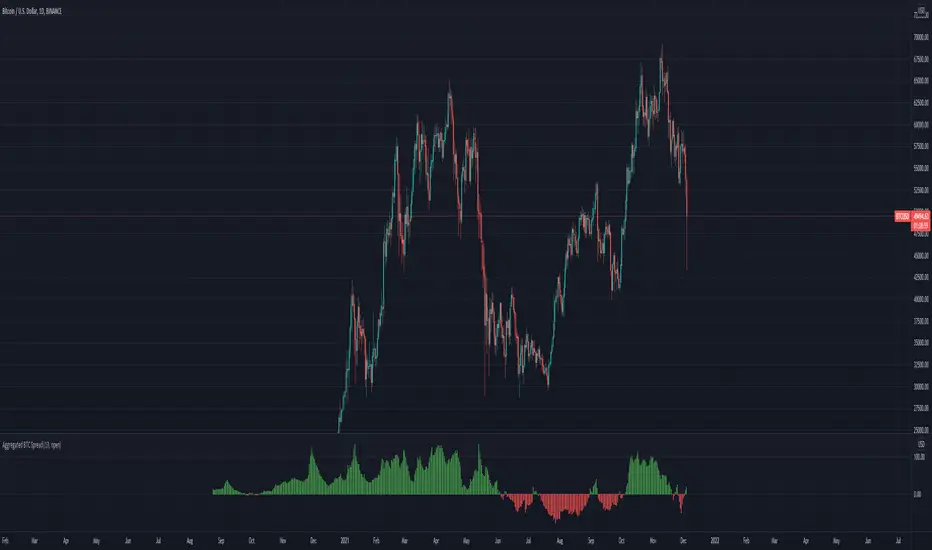
Aggregated BTC SpreadThis script is used to aggregate the bitcoin spread on futures contracts on different platforms.
It works by averaging the for every selected exchange, and apply an EMA of .
It is supporting
Binance (USD / USDT)
Okex
FTX
Huobi
Deribit
Ascendex
CME (BTC1!)
NSDT Fracking CryptoThis indicator is part of our Fracking series of indicators and is specifically designed for scalping Crypto. It looks for a particular price action pattern/sequence then displays levels and a label on the chart to show a potential entry, target, and stop based on that analysis. Basically enter long through the green zones and short through the red zones. The target levels are not guaranteed to be hit, but are a good guide with high potential. Pivot Point levels were added for additional confirmation of potential key levels.
Trading is risking and you can lose money. Trade at your own discretion and risk. This indicator is only providing potential scalping zones based on recent price action.
