Trading with RSI IndicatorRSI TA
SETUP
1. Start a new layout on Trading View. Call it “RSI TA” to distinguish it from the rest
2. Add only the following indicators:
A) Volume: straight forward, nothing to configure here
B) RSI Candles: Configure it as follows:
Length = 9
UpLevel = 60
DownLevel = 40
Change the Bar Colors to any colors that suit you or keep them as default if you like. I use phosphoric green for 60 (color 0) and phosphoric red for 40 (color 1)
C) RSI Multi Level V3: Configure it as follows:
Length = 9
Style:
Plot ( I chose yellow to distinguish it from my background and the rest)
Level 80 Phosphoric Green (to distinguish it from the regular green candles)
Level 60 Phosphoric Red (to distinguish it from the regular red candles)
Level 50 White ( I use dark mode, so white is visible. Otherwise choose black if you use light mode)
Level 40 Green
Level 20 Red
Disable the rest
READINGS:
1. Use the daily chart, don’t apply it to lower time frames.
In a BULL RUN Market:
- Go long after the close of the first daily phosphoric green candle.
- Continue longing daily phosphoric green candles
- Once the daily candle is no more phosphoric green, exit the trade.
- Go long again when the candle turns phosphoric green.
- Make sure you do not enter/exit a trade before a triggering phosphoric candle.
In a BEAR RUN Market:
- Go short after the close of the first daily phosphoric red candle.
- Continue shorting daily phosphoric red candles
- Once the daily candle is no more phosphoric red, exit the trade.
- Go short again when the candle turns phosphoric red.
- Make sure you do not enter/exit a trade before a triggering phosphoric candle.
Apply the above to previous historical data to get confident about it. Observe how the signals reflect on the RSI Multi Level V3 Indicator at the bottom of the page to get an understanding of how the indicators are getting triggered.
Feel free to paper trade first. And if you are margin trading, make sure you use Stop Losses.
Oscillators

Using number of bars above tenkanSen as a way to determine trendHey, while searching ichimoku scripts it looks like all of them use signals like kumo breakout, tenkan cross above kijun etc as a strategy. This is how ichimoku is used in the west while it is not realy made to provide signals. It is used for market analysis using time theory, wave theory etc. Counting the number of bars before a day of change is also part of ichimoku kinko hyo.
Does anybody know a way to calculate the average bars above tenkanSen in specific situations. It would be very beneficial to know the average amount of bars above tenkanSen while above kumo Cloud etc

The RSI explained ! how to identify buy and sell signals Hello everyone , as we all know the market action discounts everything :) I have created this short video to explain what is the RSI and how to use it to identify buy and sell signals with this oscillator , everything you need to know about this indicator is right here.
Its been around since the late 70s so its probably one of the more established oscillators out there .
So lets check out the formula and how the RSI works :
RS=100 -100/1-RS
RS (relative strength) average X day up / average X day down
So simply lets say we are using a 10 days average so we check how many days the price closed up and we add them and we divide by 10 which would give us the average X days up.
And we do the same for the average X days down but we calculate how many days the price closed down and then we add them and divide by 10 ,And after all of that has been calculated we will always get a value between 0% and 100%
And that's why the RSI is considered a bounded oscillator it means that the value will always be between 0 % and 100%
The oscillator has 2 major zones which are the overbought and oversold zones. Anything above 70% is considered overbought and anything below 30% the market considered oversold .
So when the market reaches overbought zone it tells us that the market has gone up to far and its due a bounce back down , and the same when it reaches oversold zone it means that the market has gone to far down and its due a bounce back up.
So looking to buy or sell when the market reaches oversold and overbought is one strategy .
But because the market moves a lot and reaches these levels so much this way is not as reliable that much , the better way to use the RSI is to check if it has a divergence with the market price.
what is a divergence you may ask !!!
A Divergence is when the price of the market is moving in the opposite direction of a technical indicator, such as an oscillator, Divergence warns that the current price trend may be weakening, and in some cases may lead to the price changing direction.
These signals of divergences doesn’t happen that often but they do give us a better way to use the RSI .
And there is it that’s everything you need to know about the RSI and how it works it’s a really simple oscillator and its one of the most popular oscillators used by technical analysts.
_____________________________________________Make sure to Follow, Like & comment for more content_____________________________________________
If you have any questions please ask
Thank you for reading & watching .

Simple Indicators and Setups #3: Using Oscillator LevelsI'd like to talk about something that is probably the most criminally under-discussed part of being a technical trader: levels. It's great to learn what indicators work for you, how to scope out price supports, price resistance, trend lines, and things of that nature for sure-- but that's not everything. Being able to use oscillator levels to your advantage as part of a holistic approach to your active trading strategy is, in my opinion, a huge step missing from many technical trader arsenals.
To start, some people believe they're using levels with oscillators because they read that X is overbought and Y is oversold. This is complete bull. That's not how stocks work. A level that screams overbought for one stock doesn't mean jack for another. This is one reason I'm such a proponent of asset stables where you track limited assets you get to know over time. It gives you the context you need to know what price action normally looks like with the stocks you track, giving you an inside edge. It also helps you understand what "oversold" and "overbought" really look like on stocks that matter to you.
So let's get to it.
This is AMEX:SPY from 2018 through mid-2020, daily candles.
When I refer to oscillator levels I don't mean the 70/30 numbers you hear trotted out as a baseline for RSI. What I mean is looking historically at the asset to see what the lowest points and highest points have been and set horizontal lines (levels) at those points. What I like to do personally is set two: one for closing and one for entry.
On the image above, you'll see that when $SPY hits a historically low level on my momentum oscillator (the True Momentum Indicator by hCaosTrader here on TradingView) of around -92.13, this is historically a good pivot point in momentum and a good opportunity to go long. There is normally an upswing in bullish momentum at that level historically speaking.
When I say I have one level for closing and one for entry, I mean that you need to know where you're going to get out if you get into a trade. You have to have a plan for capturing profits and levels can help you get there. I'll go over my personal rules here. Keep in mind that I'm NOT just looking at momentum, I'm looking at it in the context of the chart. So if the rest of my indicators and price action say one thing but momentum says something else, I won't just dive into the trade.
Zooming in on one instance of this level being hit from the above image:
Price action dumps below the lower Bollinger Band and simultaneously hits the lower end of the momentum oscillator. This looks like a good buy to me due to the historically low pivot point and price being so violently outside the lower Bollinger (I covered how I use Bollinger Bands in a previous post). Given how violently the price ran down, I'd say this was a price volume gap fill.
My personal levels for profit taking are half at 0 (unless the rest of the chart is flaming crap then 100%) and the rest at the first opposing level. So if I am going long, the rest of my profit would be taken off the table at the first upper level on momentum.
This is a good example to use because it shows why that isn't always the case and why you have to look at everything in context with the rest of the chart. So on this one, I would have sold before hitting 0 because the price was approaching the midline of the Bollinger Bands, which is often reasonable support/resistance. So I capture 50% a little before 0 on the momentum oscillator. The final profit taking is again before the first upper level on momentum because price was approaching the 200HMA which is often VERY strong support/resistance. The price continues to go up but I don't care because I captured my profits and I'm not chasing trying to squeeze every cent out of every play.
This doesn't always work out so well. Here's an example:
As you can see the oscillator hits its historically very overbought level and there's definitely some gains up through the 0 level. In our model you would sell half at 0 on the oscillator not only because that's the target but because you're looking at the chart in context and see the price approaching the Bollinger midline. After that, the price kind of bumps around a bit but doesn't really move as we'd hope it would. Since the price rides the Bollinger mid, we close out the rest of the position and wait for a better setup. You don't make as much profit, maybe risk losing your initial gains, but if it turns out to be a loss it's not so bad and honestly normally ends up just being a break-even play.
Creating these levels is easy enough to do but you definitely want to do it on multiple timeframes. I like the 1, 5, 65 minute and 1 day candles personally. I only use the 1 minute candles for last hour entertainment but to each their own. When you're on the correct timeframe you just want to zoom out far enough to get a decent sample size of candles and use the TradingView horizontal line tool in the oscillator to set your levels. When you set these up yourself you'll be surprised at how commonly those levels are hit and what an amazing pivot point they create. If you only want the horizontal line to show up on one timeframe you can double click on the line and click on the "Visibility" tab to turn the line on or off for certain time frames. You may want to do this if you set up levels on multiple time frames because if you don't things can get pretty cluttered.
Always remember:
you have to look at everything holistically
levels provide a great target
As with anything in technical trading, the more you can quantify what movements are meaningful and which you can ignore, the better off you are. Using levels is a way for you to confirm or disconfirm whether you're seeing what you think you're seeing on a chart in a way that's simple and allows you to get lots of historical context without much work.

HOW TO: Center Of Gravity OscillatorIf I could only have one indicator it would need to be versatile. It would need to able to confirm trends, highlight pivots and reversals but most of all it would need to expose epic entries. Lucky there is such an indicator... The Center of Gravity Oscillator (COG).
The COG is yet another masterpiece created by John Ehlers. It is essentially zero lag and enables clear identification of turning points. This indicator is a result of Ehlers research into adaptive filters and was published in an article on page 20 of the May 2002 issue of Stocks and Commodities Magazine. According to the Tradingview docs "The cog (center of gravity) is an indicator based on statistics and the Fibonacci golden ratio."
1. Breakout Trading
Breakout trading is one of the most popular trading strategies and rightly so, there is not much better than watching those candles fly to the moon.
Trend lines and wedges can be made by connecting 2 or more pivot points (as shown above). When the oscillator crosses the trend line traders can expect “boom” like explosions in price action.
Above is an example of a breakout.
Below I’ve marked out some breakouts on 1 hr BTC chart.
Epic breakouts can be found by drawing a trend line along major pivot points. The major pivots should be easy to spot as they stick out above and below the minor pivots. (As shown below on 1 hour chart.)
There are many oscillators that can also pick up breakouts, below are some breakouts marked on the BTC 12 hour chart with my Volatility Oscillator.
Smaller breakouts can be found by drawing a fan from major pivot to minor pivots.
Ive marked out the most obvious breakouts on the ETH Daily chart below.
Along the way I found some LSMA pumps, which leads me to the next strategy…
2. LSMA Breakouts.
Least Squares Moving Average is my favourite moving average and I incorporate it in one way or another with most of my scripts. To understand a LSMA breakout have a look at the LSMA 21 line on the chart below. As the candles cross the line it breaks out.
The default setting for the LSMA line on my COG indicator is 200. This is a great “zero” line and shows general trend. To catch LSMA breakouts I set the COG length to 6 and LSMA length to 6. The LSMA can also be set to 21 to find breakouts and LSMA Pumps (don’t worry, I’ll get to it soon).
Easy to find sweet entries on the BTC 1 hr chart.
3. What is a LSMA pump???
This is when a LSMA line pulls back and crosses another line for just a few bars before recrossing into a boom. Ive marked out a few LSMA pumps on the chart above. I like to use COG set at length of 6 and LSMA set to 21 for trading hourly to daily charts.
4. Trading Reversal Patterns.
If you are not familiar with reversal patterns such as double tops, double bottoms or head and shoulders then it would be a good idea to look into it. These are fundamentals of reading charts.
The COG is great for trading these patters too.
Above shows reversal patterns marked out.
5. Previous High/Low Strategy
This is another chart reading fundamental. This strategy can be used to find solid long and short entries. He is an example below using no indicators.
This example is a down trend that turns into an up trend. The first entry is a short found when price is unable to beat previous high. The second entry is a long. This is the confirmation of the up trend. Notice how the the low pivot point is higher than previous pivot. Next a short reveals itself again as price is unable to beat previous highs. The next long entry is made as up trend is reconfirmed by a low pivot forming higher than previous low pivot. Lastly another short as price is unable to beat previous high.
Now to apply this to the COG…
Above shows a nice long and short on the major pivots. The first trade is a long. As the major low pivot is made it does not break previous major pivot low and thus is a great long entry. Price then breaks out and forms a major high pivot point which does not break previous major pivot high making a great short entry.
The next example shows trading on continuations of trends.
A major Pivot is made. Long entries are found every time the the lows keep getting higher. Often these are LSMA pumps.
Above is another example of finding solid entries.
Here I have marked the entries on a 1 hour ETH chart using this strategy. It is great for swing trading.
6. Tuning your indicator.
Indicator settings should depend on what timeframe and what trades you are looking for. Its always a great idea to play with the settings and get the signals as accurate as possible.
COG lengths to try: 3-6, 9-14, 21-27, 50-55, 100, 200.
LSMA lengths to try: 2,6,9,11,19,21,25,27,32,50,100,150,200
In the indicator settings there is an option for smoothing. I usually have this turned on.
The centre of gravity oscillator is one of the most underrated indicators out. It gives solid signals and Im sure there is plenty more that I have not mentioned here. I am currently working on including all these signals into the indicator so you can set alerts or run bots. So far it looks like a Christmas tree with all those signals and needs work….
If you have any questions or ideas please drop a comment below. I am always keen to talk shop.
You can find my COG indicator here:
Join me on Bybit! They have the lowest fees and best servers. It’s free to join and we both get $20 if you use my referral link.
partner.bybit.com
Thanks for the support and happy trading!

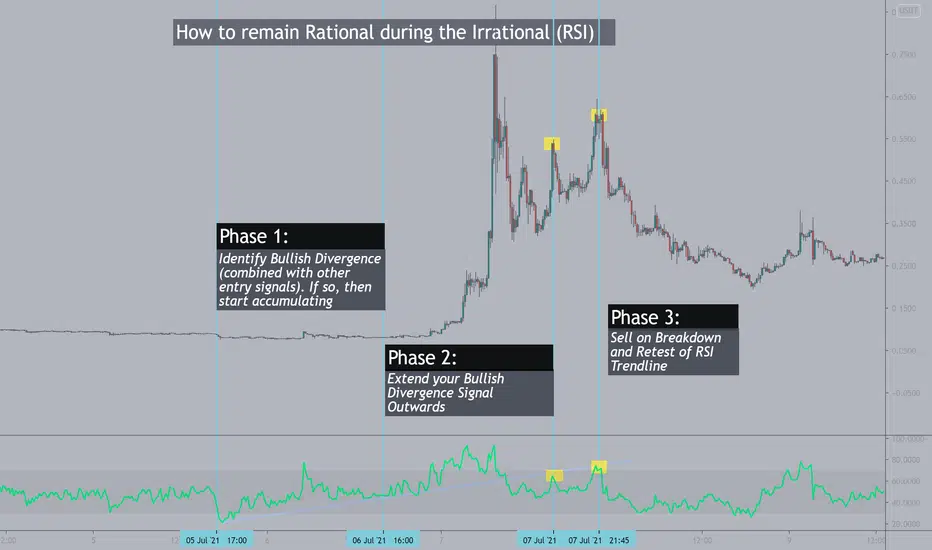
How to Trade the RSI with Irrational Price ActionCheck out the related ideas link for more information.
I hope this adds another tool to your trading arsenal
The DEFINITION of STOCHASTIC oscillator !*Stochastic oscillator
The stochastic oscillator is a useful indicator when it comes to assessing momentum or trend strength. The stochastic oscillator, and oscillators in general, are presented in an easy to understand manner with clear buy and sell signals. However, an overreliance on these signals, without a deeper understanding of stochastic oscillators, is likely to end in frustration.
To avoid such frustration, new traders ought to have a solid understanding of the underlying mechanics of the stochastic oscillator viewed in relation to present market conditions.
**WHAT IS A STOCHASTIC OSCILLATOR?
A stochastic oscillator is a momentum indicator that calculates whether the price of a security is overbought or oversold when compared to price movement over a specified period. The oscillator essentially weighs up the most recent price level as a percentage of the range (highest high – lowest low) over a defined period of time.
***HOW DOES A STOCHASTIC OSCILLATOR WORK?
The stochastic oscillator presents two moving lines that ‘oscillate’ between two horizontal lines. The solid black line in the image below is called the %K and is while the red dotted line is a 3-period moving average of the %K line and It is called %D.
Price is shown to be ‘overbought’ when the two moving lines break above the upper horizontal line and ‘oversold’ once they break below the lower horizontal line.
The overbought line represents price levels that fit into the top 80% of the recent price range (high – low) over a defined period – with the default period often being ‘14’. Likewise, the oversold line represents price levels that fit into the bottom 20% of the recent price range.
****Timing entries:
Furthermore, the stochastic indicator provides great insight when timing entries. When both lines are above the ‘overbought’ line (80) and the %K line crosses below the dotted %D line, this is viewed as a possible entry signal to go short and the other way around is when the %K line crosses above the %D line when both lines are below the oversold line (20).
Additionally, you should not blindly trade based on overbought/oversold conditions alone. Traders need to understand the direction of the overall trend and filter trades accordingly. For example, when looking at the BTC/USD chart below, since the overall trend is down, traders should only look for short entry signals Further more, the stochastic indicator provides great insight when timing entries. When both lines are above the ‘overbought’ line (80) and the %K line crosses below the dotted %D line, this is viewed as a possible entry signal to go short and the other way around is when the %K line crosses above the %D line when both lines are below the oversold line (20).
Additionally, you should not blindly trade based on overbought/oversold conditions alone. Traders need to understand the direction of the overall trend and filter trades accordingly. For example, when looking at the USD/SGD chart below, since the overall trend is down, traders should only look for short entry signals at overbought levels. Only when the trend reverses or a trading range is well-established, should you look for long entries in oversold conditions.at overbought levels. Only when the trend reverses or a trading range is well-established, should you look for long entries in oversold conditions.
****STOCHASTIC OSCILLATORS: A SUMMARY
The stochastic indicator is a great tool for identifying overbought and oversold conditions over a specific time period. The stochastic oscillator is preferred by many traders when price is trading in a range because price itself is ‘oscillating’, leading to more reliable signals from the stochastic indicator. However, you need to avoid blindly shorting at overbought levels in upward trending markets; and going long in down trending markets purely based on oversold conditions shown by the indicator.
Note that sometimes the accuracy of BB is low (like the one shown with white flash) but most of the times it works fine.
We hope that you've learn something with this post .
Have a nice day and Good luck.

Everything about the Stochastic oscillator !!!!Hello everyone , as we all know the market action discounts everything :)
A lot of people asked me about the Stochastic oscillator so i prepared this video for you guys explaining it please enjoy .
or if you prefer to reading :
First thing you need to know is that the stochastic oscillator is a momentum index just like the RSI it looks at the price momentum.
A DR.George Lane developed it in the 1950s.
So let us talk about the stochastic oscillator now
it has 2 lines %K (blue color) and %D (Red color)
this is how we use it :
1_ the Stochastic oscillator indicates overbought and oversold state of the market cuz the stochastic is a bounded indicator that means its bounded between 0 and 100 range ( above 80 overbought , bellow 20 oversold )
2_we use it to identify buy and sell signals using crossovers:
• If %K crosses below %D then it’s a sell signal
• If %k crosses above %D then it’s a buy signal
3_Divergance between the price and the Oscillator
We have 2 types of the Stochastic Oscillator:
Fast and slow
The difference between the Fast and Slow stochastic is:
1. The Fast stochastic is more sensitive than the Slow stochastic ( the most common problem for oscillators is the number of false signals that they give so the Slow stochastic tries to solve that problem )
2. Slow stochastic smooths out the %K line by averaging over (d) period
so let me make it simple the %K line in the Slow Stochastic is like the %D in the fast stochastic
Now let us talk about the Formula
%K=100. (C-Ln/Hn-Ln)
Where C is the current closing price
Ln is low in (n) period
Hn is high in (n) period
(n) Is the number of period and the default value for (n) is 15
Now the %D is calculated like this
%D=average %K/ (d) period
(d) Is the number for period and the default value for (d) is 3
Make sure to Follow and Like for more content
If you have any questions please ask
Thank you for reading & watching .

Chaikin Oscillator From ScratchHi, traders!
Today we'll speak about one of the most pretty instrument of divergence detection.
The Chaikin oscillator is named for its creator Marc Chaikin.1
The oscillator measures the accumulation-distribution line of moving average convergence-divergence (MACD). To calculate the Chaikin oscillator, subtract a 10-day exponential moving average (EMA) of the accumulation-distribution line from a 3-day EMA of the accumulation-distribution line. This measures momentum predicted by oscillations around the accumulation-distribution line.
The purpose of the Chaikin oscillator is to identify underlying momentum during fluctuations in accumulation-distribution. Specifically, it applies the MACD indicator to accumulation-distribution rather than closing prices.
For example, a trader wants to determine whether a coin price is more likely to go up or to fall and MACD is trending higher. The Chaikin oscillator generates a bullish divergence when it crosses above a baseline. The baseline is called the accumulation-distribution line. A cross above that line indicates that traders are accumulating, which is typically bullish.
The Chaikin oscillator utilizes two primary buy and sell signals. First, a positive divergence is confirmed with a center-line crossover above the accumulation-distribution line, signaling a potential buying opportunity. Second, a negative divergence is confirmed with a center-line crossover below the accumulation-distribution line, signaling a potential selling opportunity.
A positive divergence signals a coin price is likely to rise, given the increase in accumulation. A negative divergence signals a coin price is likely to fall, given the increase in distribution.
DISCLAMER: Information is provided only for educational purposes. Do your own study before taking any actions or decisions at the real market.

So you say you wanna range trade? Here's how you survive...DISCLAIMER: Trading Forex/Cryptocurrency involves risk and you may lose more money than you started with! These posts are not to be taken as financial advice and I offer NO guarantee that any of these ideas will result in profit. Also, trade ideas may change, depending on ever-changing market conditions. You are trading at your own risk and past performance is NOT indicative of future results. Please, know how much you are willing to risk on EVERY trade that you take and be SMART!
Simplify your trading. Always measure your risk and be okay with being wrong ; ) Wait patiently and get the price that you want. Use the market. Don't let the market use you!

Quick tip: Add a signal line to your indicator, no coding!Want to make your RSI smoother and easier to track and follow its signals? You can add a moving average signal line to it.
Let me share how to do this quickly without coding.
This is a very neat and easy trick you can do - thanks to TradingView :) - using the feature "Indicator-on-indicator"
Quick Steps: add RSI to your chart if its not already there, hover on the RSI indicator label, click the "..." ellipsis, choose the option to "Add Indicator/Strategy on RSI" - it will be the second command from the top on the shortcut menu, and choose your favorite moving average from the indicator library - adjust the MA settings to your preference - and you're done! No coding needed.
maybe, like me, you are experimenting with my recently-published RSS_WMA - aka the Lazy Line 😎 - will add a link below - you can add it to your RSI like i did in the example chart above.
The RSI with the new signal line looks a lot easier to use and trade on, right? The MA Line not only makes RSI more visually appealing, but also makes it easy to follow the RSI movements into OB/OS zones, or crossing the middle line. for "visual folks" like me, this is an improvement that makes a big difference in my trading.
* You can use this same trick with any other indicator / combo of indicators - that would make sense to combine with this approach - in your charts. Get creative.
* Indicator-on-Indicator is an awesome feature - just wanted to share a quick reminder of this trick, as i also forget about it most of the time.
* for more details, there's a comprehensive guide to this feature in TradingView's Help Center
www.tradingview.com
trade safely and good luck!

Awesome Oscillator From ScratchHi, traders!
Today we’ll speak about one of the most pretty and easy-to-interpret oscillator - Awesome oscillator.The Awesome Oscillator Indicator (AO) is a technical analysis indicator created by Bill Williams as a tool to determine whether bullish or bearish forces dominate the market. It measures the market momentum with the aim to detect potential trend direction or trend reversals. The market momentum is evaluated using a combination of a shorter time frame and longer time frame simple moving averages or stated differently, it considers the recent momentum in comparison with a higher frame momentum.
The Awesome Oscillator is calculated as the difference between the newest 5 periods (bars) simple moving average (SMA) and the 34 bars simple moving average. But instead of the closing price, the indicator uses the bar midpoint value.
The indicator is plotted as a histogram in a box at the bottom of the chart and the histogram bars are found in either of the two colors red or green (with some trading platforms the lines can be red or blue). When the midpoint value of the last price is higher than the previous bar midpoint, the histogram will be green (blue) and if the midpoint of the last bar is lower compared to the previous bar, it will be red.
How to use Awesome Oscillator?
There are a variety of strategies which could be used by traders to identify potential trading opportunities. Some of the well-known and basic trading setups are the zero-line and divergence.
Awesome Oscillator and zero-line crossovers
The basic alerts which are generated by the Awesome Oscillator are identified on the basis of the zero-line cross overs.
* A bullish buying opportunity alerts occur when the AO indicator crosses above the zero-line, indicating that the short-term momentum is increasing faster compared to the long term.
* A sell opportunity is detected when the indicator crosses below the zero-line mark displaying that the short-term momentum decreases more rapidly than the long-term.
DISCLAMER: Information is provided only for educational purposes. Do your own study before taking any actions or decisions at the real market.

Top 10 Patterns (Harami) #9Harami and Harami Cross Candlestick Patterns. This reversal pattern is on my top 3 best, on 1 hour or higher time frames.
Harami in Japanese language means pregnant. This pattern forms by two candlesticks, the first one is bigger and the other one is smaller. The smaller candlestick is completely engulfed by the body of the first candlestick. It looks like a pregnant woman looking from the side:
There are two kinds of Harami. The one that forms at the bottom of a bearish market is a Bullish Harami. And the pattern that forms at the top of an uptrend is a Bearish Harami. Harami is a reversal pattern.
Although Harami is known as a reversal pattern, you have to be careful not to take any positions as soon as you see a Harami pattern forms on the chart, because this pattern is not that strong. Only on the longer time frames like weekly and monthly it can be considered as a reliable reversal pattern.
I do not trust it on the smaller time frames at all. Even if you trade this pattern on the longer time frame, having a reasonable stop loss is a must.
Only under one condition the Harami Pattern can be known as a strong reversal pattern. It is when it crosses Bollinger Upper or Lower Band. Some traders know this pattern as Inside Day Candlestick while its combination with Bollinger Bands makes it a profitable and strong reversal candlestick pattern.
Chart example is a Bearish Harami on a one hour chart that broke the upper band of the Bollinger band- that is why you could take the trade with confidence.

EURUSD Recent Price Action| Identifying a break of a key levelEvening Traders,
In this educational post I will analyse how a price action level breaks and puts in a retest.
Assessing the chart, we have a clear Resistance on the left that was breached with an impulse break. The level was retested and confirmed as support with an S/R Flip Retest.
This shows strength in the price action; however volume was not evident, leading to a bearish expansion back below the level.
EURUSD eventually retraced and broke the resistance again with a strong impulse and is currently trading above the level.
For this breakout to be valid on the retest, we need to see an increase in the volume profile. This will signify a true break as incoming volume will lead to an expansion.
I hope this educational peace helped,
Thank you for following my work!

📉 Your Ultimate Guide to RSI Divergence (Settings & Tips) 📈
Hey traders,
Relative strength index is a classic technical indicator .
It is frequently applied to spot a market reversal.
RSI divergence is considered to be a quite reliable signal of a coming trend violation and change .
Though newbie traders think that the application of the divergence is quite complicated, in practice, you can easily identify it with the following tip s:
💠First of all, let's start with the settings .
For the input , we will take 7/close .
For the levels , we will take 80/20 .
Then about the preconditions :
1️⃣ Firstly, the market must trade in a trend (bullish or bearish)
with a sequence of lower lows / lower highs (bearish trend) or higher highs / higher lows (bullish trend).
2️⃣ Secondly, RSI must reach the overbought/oversold condition (80/20 levels) with one of the higher highs/higher lows.
3️⃣ Thirdly, with a consequent market higher high / lower low, RSI must show the lower high / higher low instead.
➡️ Once all these conditions are met, you spotted RSI Divergence .
A strong counter-trend movement will be expected.
Also, I should say something about a time frame selection .
Personally, I prefer to apply it on a daily time frame , however, I know that scalpers apply divergence on intraday time frames as well.
❗️Remember, that it is preferable to trade the divergence in a combination with some price action pattern or some other reversal signal.
❤️Please, support this idea with a like and comment!❤️

Interesting observation with the Volume Profile...DISCLAIMER: Trading Forex/Cryptocurrency involves risk and you may lose more money than you started with! These posts are not to be taken as financial advice and I offer NO guarantee that any of these ideas will result in profit. Also, trade ideas may change, depending on ever-changing market conditions. You are trading at your own risk and past performance is NOT indicative of future results. Please, know how much you are willing to risk on EVERY trade that you take and be SMART!
Simplify your trading. Always measure your risk and be okay with being wrong ; ) Wait patiently and get the price that you want. Use the market. Don't let the market use you!

📉 Your Ultimate Guide to RSI Divergence (Settings & Tips) 📈
Hey traders,
Relative strength index is a classic technical indicator .
It is frequently applied to spot a market reversal.
RSI divergence is considered to be a quite reliable signal of a coming trend violation and change .
Though newbie traders think that the application of the divergence is quite complicated, in practice, you can easily identify it with the following tip s:
💠First of all, let's start with the settings .
For the input , we will take 7/close .
For the levels , we will take 80/20 .
Then about the preconditions :
1️⃣ Firstly, the market must trade in a trend (bullish or bearish)
with a sequence of lower lows / lower highs (bearish trend) or higher highs / higher lows (bullish trend).
2️⃣ Secondly, RSI must reach the overbought/oversold condition (80/20 levels) with one of the higher highs/higher lows.
3️⃣ Thirdly, with a consequent market higher high / lower low, RSI must show the lower high / higher low instead.
➡️ Once all these conditions are met, you spotted RSI Divergence .
A strong counter-trend movement will be expected.
Also, I should say something about a time frame selection .
Personally, I prefer to apply it on a daily time frame , however, I know that scalpers apply divergence on intraday time frames as well.
❗️Remember, that it is preferable to trade the divergence in a combination with some price action pattern or some other reversal signal.
❤️Please, support this idea with a like and comment!❤️

Ultimate Oscillator From ScratchHi, traders!
Oscillators are very important part of any trading strategy. It helps to find the momentum and gives rather reliable signals in conjunction with other indicators. Today we’ll speak about one of the most powerful oscillators – Ultimate Oscillator.
Ultimate Oscillator uses the weighted average of three different timeframes and has less volatility and fewer trade signals compared to other oscillators that rely on a single timeframe. Buy and sell signals are generated following divergences. The Ultimately Oscillator generates fewer divergence signals than other oscillators due to its multi-timeframe construction. By using the weighted average of three different timeframes the indicator has less volatility and fewer trade signals compared to other oscillators that rely on a single timeframe. Buy and sell signals are generated following divergences. The Ultimately Oscillator generates fewer divergence signals than other oscillators due to its multi-timeframe construction.
How to Calculate the Ultimate Oscillator
-Calculate the Buying Pressure (BP) which is the close price of the period less the low of that period or prior close, whichever is lower. Record these values for each period as they will be summed up over the last seven, 14, and 28 periods to create BP Sum.
-Calculate the True Range (TR) which is the current period's high or the prior close, whichever is higher, minus the lowest value of the current period's low or the prior close. Record these values for each period as they will be summed up over the last seven, 14, and 28 periods to create TR Sum.
-Calculate Average7, 14, and 28 using the BP and TR Sums calculations from steps one and two. For example, the Average7 BP Sum is the calculated BP values added together for the last seven periods.
-Calculate the Ultimate Oscillator using the Average7, 14, and 28 values. Average7 has a weight of four, Average14 has a weight of two, and Average28 has a weight of one. Sum the weights in the denominator (in this case, the sum is seven, or 4+2+1).
-Multiply by 100 when other calculations are complete.
UO= ×100
UO=Ultimate Oscillator
How to use it?
In order for the indicator to generate a buy signal, it's recommended a three-step approach.
-First, a bullish divergence must form. This is when the price makes a lower low but the indicator is at a higher low.
-Second, the first low in the divergence (the lower one) must have been below 30. This means the divergence started from oversold territory and is more likely to result in an upside price reversal.
-Third, the Ultimate oscillator must rise above the divergence high. The divergence high is the high point between the two lows of the divergence.
Three-step method for sell signals.
-First, a bearish divergence must form. This is when the price makes a higher high but the indicator is at a lower high.
-Second, the first high in the divergence (the higher one) must be above 70. This means the divergence started from overbought territory and is more likely to result in a downside price reversal.
-Third, the Ultimate oscillator must drop below the divergence low. The divergence low is the low point between the two highs of the divergence.

How to use RSI and MACD In trading?Hi every one
*Definition of RSI:
This indicator Is momentum base indicator.
The biggest difference with momentum is that there are two line which indicate that: Is the price in the oversold or overbought area or not?
We can easily compare the tops and bottoms of every instrument that we like!
There is not much difference between RSI and Stochastic oscillator only that there is one line in RSI!
Remember every Indicators shows the future of the market!
**Full explanation of MACD:
Moving average convergence divergence (MACD) is a trend-following momentum indicator that shows the relationship between two moving averages of a security’s price. The MACD is calculated by subtracting the 26-period exponential moving average (EMA) from the 12-period EMA.
The result of that calculation is the MACD line. A nine-day EMA of the MACD called the "signal line," is then plotted on top of the MACD line, which can function as a trigger for buy and sell signals. you may buy the security when the MACD crosses above its signal line and sell—or short—the security when the MACD crosses below the signal line. Moving average convergence divergence (MACD) indicators can be interpreted in several ways, but the more common methods are crossovers, divergences, and rapid rises/falls.
Moving average convergence divergence (MACD) is calculated by subtracting the 26-period exponential moving average (EMA) from the 12-period EMA.
MACD triggers technical signals when it crosses above (to buy) or below (to sell) its signal line.
The speed of crossovers is also taken as a signal of a market is overbought or oversold.
MACD helps investors understand whether the bullish or bearish movement in the price is strengthening or weakening.
The MACD has a positive value (shown as the blue line) whenever the 12-period EMA (indicated by the red line) is above the 26-period EMA (the blue line) and a negative value when the 12-period EMA is below the 26-period EMA. The more distant the MACD is above or below its baseline indicates that the distance between the two EMAs is growing.
The MACD has a positive value (shown as the blue line) whenever the 12-period EMA (indicated by the red line) is above the 26-period EMA (the blue line ) and a negative value when the 12-period EMA is below the 26-period EMA. The more distant the MACD is above or below its baseline indicates that the distance between the two EMAs is growing.
MACD is often displayed with a histogram which graphs the distance between the MACD and its signal line. If the MACD is above the signal line, the histogram will be above the MACD’s baseline. If the MACD is below its signal line, the histogram will be below the MACD’s baseline. Traders use the MACD’s histogram to identify when bullish or bearish momentum is high.
***RSI VS MACD:
The relative strength indicator (RSI) aims to signal whether a market is considered to be overbought or oversold in relation to recent price levels. The RSI is an oscillator that calculates average price gains and losses over a given period of time. The default time period is 14 periods with values bounded from 0 to 100. MACD measures the relationship between two EMAs, while the RSI measures price change in relation to recent price highs and lows. These two indicators are often used together to provide analysts a more complete technical picture of a market. These indicators both measure momentum in a market, but, because they measure different factors, they sometimes give contrary indications. For example, the RSI may show a reading above 70 for a sustained period of time, indicating a market is overextended to the buy side in relation to recent prices, while the MACD indicates the market is still increasing in buying momentum. Either indicator may signal an upcoming trend change by showing divergence from price (price continues higher while the indicator turns lower, or the other way around.
The DEFINITION of Divergences!
We hope that you've learn something with this post .
Have a nice day and Good luck.

Tools of the Trade: All about trendline'sI get a lot of questions on how do I seem to make such accurate trendline's, channels and support's and resistance. People seem to be impressed how often the lines on my chart are right where price seems to always react. Well this is as it should be, as your lines are markers where price action might do something interesting. But what is my trendline or support/resistance is probably different from yours. I will try to show my thought process on how I draw these lines. These tips work for me and they might work for you. But sometimes you have to fuss around some to find what works for you. This is because we all see different things.
I will start with a trendline and I will use the GC (gold futures) chart. These methods work on all charts and all timeframes.
We first want to find and connect at least 2 points in any given trend.
Now in this case I connected the tips of the wick, but really for me anywhere between the open and the tip of the wick or the close and the tip of the wick is a valid area for a trendline. Now you may say, "great! but any 2 points make a trendline so what's the big deal?". You are right, 2 points do not make a trendline but this will be a start. So I can fuss around and pull my trendline down and to the left manually and try to find other areas that fit my trendline. But this will cause bias and we want to eliminate bias as much as we can. So what do we do to minimize bias?
1. Open up the settings for your trendline (click on the trendline and then click on the gear icon in the selection box).
2. Click the "extend trendline left" box. This is what you should see now for this example:
Now you look at it and say, well that doesn't look valid because it goes through a bunch of candles in the yellow and orange ellipses.
But now let's take a closer look at the orange ellipse area:
look at all the blue arrows and that the trendline goes right through the wicks. This adds validity to our trendline.
Now you may ask, what about all the bodies that the trendline goes through (see yellow arrows)? Does this matter?
A different question though is does the trendline really go through the body pointed out by the yellow arrows? Let's take an even closer look!
This looks pretty good to me. But what happened? I moved to a higher timeframe. I like to move at least 3x timeframes higher. Now you can see that the trendline goes through the wicks of the candle or at least pretty dang close. And because it is well known that looking at a higher time frame is always a good idea when entering a trade for confirmation this also applies to trendlines. A trendline that is still a valid trendline on a higher timeframe is an even stronger trendline.
Now look at the yellow ellipse in a 3x higher time frame:
Nope, that doesn't look good.
Let's move to a 6x higher timeframe (12 hour)
Nope, still doesn't cut it!
But it does fit okay, not great on our initial 2 hour timeframe chart, we just can't confirm it on a higher time frame. So I say the trendline get's weaker around here:
Another way to confirm an appropriate trendline is to use RSI (or any oscillator of your choice that shows overbought or oversold)
The vertical red lines show that RSI is in the oversold area as price approaches or dips below the trendline. This is what you would expect right? especially since in these areas the price is coming from a downtrend.
The blue vertical lines show that RSI is between 70 and 30 as we would expect as price seems to be consolidating around the trendline and actually tickles the overbought area at the price peak between the 2 blue vertical lines. This is also as you would expect.
So these are my tips on trendline's and how I use them. I hope this is useful. Next tutorial I am going to go into how I do support, resistance and parallel channels.
I hope this was helpful and I hope everybody makes money off these tips. Otherwise, play around with trendline's in your own way and you might find something that works better for you!
Thank you!
Miss Bunny

How to detect the active cycle length?This is a short tutorial on how to use the Detrended Rhythm Oscillator (DRO) to identify the current dominant cycle. The Detrended Rhythm Oscillator is an advanced Detrended Price Oscillator DPO which helps to spot the key market rhythm or beat for any symbol on any timeframe.
It automatically labels the length of current market high-high and low-low pivots which helps to see cycle harmonics and relations. The output should be used as input setting for almost all technical indicators which require and "length" settings for the calculation. Using this length setting based on the dominant market rhythm will help to ensure better accuracy to your indicators at turning points. The indicators get synced to the beat of the market.
The indicator is available as Public Open Source Script for your own usage:

How to use the Crypto Sniper indicatorJust a simple tutorial on how to use the Crypto Sniper indicator.
Rules
1. Wait for the entry Long/Short signal appears
2. Use the ATR take profit or stop loss as a trailing stop or to close your position
3. Use the exits signals to close partially or entirely your position
4. You can enable the additional entries where you can add more to your position following the trend
5. Any market or timeframe will work
6. Specially designed to scalp trade on cryptocurrency futures

Aroon From ScratchHi traders!
Today we gonna tell you about one of the most interesting indicators. As you know, trend is based on price action. Everything on the market based on price action, LMAO. Thus, it’s considerably important to define and extract some hidden states, that can play a huge role in trend predicting. Aroon is one of this hidden-state finders.
The Aroon indicator is a technical indicator that is used to identify trend changes in the pric, as well as the strength of that trend. In essence, the indicator measures the time between highs and the time between lows over a time period. The idea is that strong uptrends will regularly see new highs, and strong downtrends will regularly see new lows. The indicator signals when this is happening, and when it isn't.
The indicator consists of the "Aroon up" line, which measures the strength of the uptrend, and the "Aroon down" line, which measures the strength of the downtrend.
Formulas for the Aroon Indicator
Aroon Up(orange)= (x-periods since last high in x period) /x*100 where x – number of periods.
Aroon Down(blue)= (x-periods since last low in x period)/x*100 where x – number of periods.
How to use it?
We use it in two ways: crossovers and parallel state. When Aroon Up and Aroon Down draw a parallel channel, we can make a conclusion that market is choppy and it would be better to avoid entering.
Crossovers can signal entry or exit points. Up crossing above Down can be a signal to buy. Down crossing below Up may be a signal to sell.
When both indicators are below 50 it can signal that the price is consolidating. New highs or lows are not being created. Traders can watch for breakouts as well as the next Aroon crossover to signal which direction price is going.
As for the parameters, we use on 15M timeframe Aroon with the length 10 on 4H. It gives us less signals, but they are very strong. You can tune it in depending on your purposes and goals of strategy.
