The Mechanics Of Trading - Part VPart V - Deploying Success/Failure Techniques
I started this video because a friend asked me for help determining trends on multi-interval (time frames) and asked how I look at trading across multiple intervals. Asking how to best setup/use price trends to capture the best trade setups.
Essentially, it comes down to three key components...
A. Initial reversal/impulse waves should be traded lightly (if at all). They are the "potential price reversal setups" that are usually the most dangerous for traders (and often fairly short in length).
B. Looking for the second wave to form provides traders with the opportunity to catch the bigger Wave-3. This wave forms after the impulse (Wave-1) and a corrective wave (Wave-2), which must stay below any previous ultimate high or above any previous ultimate low.
C. Wave-3, and Wave-5 if applicable, are where traders can flex their muscles related to trade size using the techniques I present to try to capture the MEAT (Sweet Spot) of any trend.
Remember, after Wave-3, you must prepare for the potential end of a trend setup where volatility is likely to increase and risks become a bit more elevated.
I go over multiple techniques in this video.
Fibonacci techniques and Fibonacci Price Theory
Anchor Bars (breakaway bars)
Using Fibonacci Retracements to identify key support/resistance levels for trending
Stochastics
RSI
Wave formations (ZigZag)
and Others
This video is designed as an instructional video to help you incorporate usable techniques into your own trading style.
Hope you enjoy.
Oscillators

The Mechanics Of Trading - Part IVPart IV - Decision Making (A vs B)
I started this video because a friend asked me for help determining trends on multi-interval (time frames) and asked how I look at trading across multiple intervals. Asking how to best setup/use price trends to capture the best trade setups.
Essentially, it comes down to three key components...
A. Initial reversal/impulse waves should be traded lightly (if at all). They are the "potential price reversal setups" that are usually the most dangerous for traders (and often fairly short in length).
B. Looking for the second wave to form provides traders with the opportunity to catch the bigger Wave-3. This wave forms after the impulse (Wave-1) and a corrective wave (Wave-2), which must stay below any previous ultimate high or above any previous ultimate low.
C. Wave-3, and Wave-5 if applicable, are where traders can flex their muscles related to trade size using the techniques I present to try to capture the MEAT (Sweet Spot) of any trend.
Remember, after Wave-3, you must prepare for the potential end of a trend setup where volatility is likely to increase and risks become a bit more elevated.
I go over multiple techniques in this video.
Fibonacci techniques and Fibonacci Price Theory
Anchor Bars (breakaway bars)
Using Fibonacci Retracements to identify key support/resistance levels for trending
Stochastics
RSI
Wave formations (ZigZag)
and Others
This video is designed as an instructional video to help you incorporate usable techniques into your own trading style.
Hope you enjoy.

The Mechanics Of Trading - Part IIIPart III
I started this video because a friend asked me for help determining trends on multi-interval (time frames) and asked how I look at trading across multiple intervals. Asking how to best setup/use price trends to capture the best trade setups.
Essentially, it comes down to three key components...
A. Initial reversal/impulse waves should be traded lightly (if at all). They are the "potential price reversal setups" that are usually the most dangerous for traders (and often fairly short in length).
B. Looking for the second wave to form provides traders with the opportunity to catch the bigger Wave-3. This wave forms after the impulse (Wave-1) and a corrective wave (Wave-2), which must stay below any previous ultimate high or above any previous ultimate low.
C. Wave-3, and Wave-5 if applicable, are where traders can flex their muscles related to trade size using the techniques I present to try to capture the MEAT (Sweet Spot) of any trend.
Remember, after Wave-3, you must prepare for the potential end of a trend setup where volatility is likely to increase and risks become a bit more elevated.
I go over multiple techniques in this video.
Fibonacci techniques and Fibonacci Price Theory
Anchor Bars (breakaway bars)
Using Fibonacci Retracements to identify key support/resistance levels for trending
Stochastics
RSI
Wave formations (ZigZag)
and Others
This video is designed as an instructional video to help you incorporate usable techniques into your own trading style.
Hope you enjoy.

The Mechanics Of Trading - Part IIPart I
I started this video because a friend asked me for help determining trends on multi-interval (time frames) and asked how I look at trading across multiple intervals. Asking how to best setup/use price trends to capture the best trade setups.
Essentially, it comes down to three key components...
A. Initial reversal/impulse waves should be traded lightly (if at all). They are the "potential price reversal setups" that are usually the most dangerous for traders (and often fairly short in length).
B. Looking for the second wave to form provides traders with the opportunity to catch the bigger Wave-3. This wave forms after the impulse (Wave-1) and a corrective wave (Wave-2), which must stay below any previous ultimate high or above any previous ultimate low.
C. Wave-3, and Wave-5 if applicable, are where traders can flex their muscles related to trade size using the techniques I present to try to capture the MEAT (Sweet Spot) of any trend.
Remember, after Wave-3, you must prepare for the potential end of a trend setup where volatility is likely to increase and risks become a bit more elevated.
I go over multiple techniques in this video.
Fibonacci techniques and Fibonacci Price Theory
Anchor Bars (breakaway bars)
Using Fibonacci Retracements to identify key support/resistance levels for trending
Stochastics
RSI
Wave formations (ZigZag)
and Others
This video is designed as an instructional video to help you incorporate usable techniques into your own trading style.
Hope you enjoy.

The Mechanics Of Trading - Part IPart I
I started this video because a friend asked me for help determining trends on multi-interval (time frames) and asked how I look at trading across multiple intervals. Asking how to best setup/use price trends to capture the best trade setups.
Essentially, it comes down to three key components...
A. Initial reversal/impulse waves should be traded lightly (if at all). They are the "potential price reversal setups" that are usually the most dangerous for traders (and often fairly short in length).
B. Looking for the second wave to form provides traders with the opportunity to catch the bigger Wave-3. This wave forms after the impulse (Wave-1) and a corrective wave (Wave-2), which must stay below any previous ultimate high or above any previous ultimate low.
C. Wave-3, and Wave-5 if applicable, are where traders can flex their muscles related to trade size using the techniques I present to try to capture the MEAT (Sweet Spot) of any trend.
Remember, after Wave-3, you must prepare for the potential end of a trend setup where volatility is likely to increase and risks become a bit more elevated.
I go over multiple techniques in this video.
Fibonacci techniques and Fibonacci Price Theory
Anchor Bars (breakaway bars)
Using Fibonacci Retracements to identify key support/resistance levels for trending
Stochastics
RSI
Wave formations (ZigZag)
and Others
This video is designed as an instructional video to help you incorporate usable techniques into your own trading style.
Hope you enjoy.

Trading with RSI: The Bad, The Good and Even BetterIn this video I explain how to use RSI (Relative Strength Index) to make trading decisions. You'll learn how to properly use RSI oversold condition, combining low timeframe price action signals with high level context analysis.
Besides of explaining three different strategies (the bad, the good and even better) I'll do back-testing on historical data to demonstrate how those strategies translate into real trading results.
Disclaimer
I don't give trading or investing advice, just sharing my thoughts.

1-Indicator Strategy For Beginners...The Stochastic Hey Rich Friends,
Happy Wednesday!
I wanted to share one of my top 3 favorite indicators with you.... The Stochastic (STOCH). As a leading (vs lagging) indicator, it is perfect for beginners because you can find entry and exit signals with only a few key details.
Adding the STOCH to your chart:
1. Search the indicators for "STOCHASTIC" and click once to add to your chart. The only thing that I modify is the thickness of the lines but feel free to make further changes to your liking.
2. Make sure that the "indicators and financial values" option is ON. Right-click your scales, select labels, and make sure "indicators and financial values" is checkmarked.
Entry signals for a buy:
- The STOCH is facing up
- The fast line (blue) is above the slow line (orange)
- The STOCH has crossed above the 20% level, from oversold, back into the blue-shaded area
Exit the trade or take profit once the STOCH has crossed back below the 80% level, from overbought, into the blue-shaded area.
Entry Signals for a sell:
- The STOCH is facing down
- The slow line (orange) is above the fast line (blue)
- The STOCH has crossed below the 80% level, from overbought, back into the blue shaded area
Exit the trade or take profit once the STOCH has crossed back above the 20% level, from oversold, into the blue-shaded area.
I hope that this video helps someone become a more independent and profitable trader. Let me know in the comments if you try this strategy!
Peace and Profits,
Cha

Don't Get Duped by the RSIWhy This Popular Indicator Can Lead You Astray
The Relative Strength Index (RSI) is a common technical analysis tool used by traders to gauge whether an asset is overbought (priced too high) or oversold (priced too low). It analyzes price movements over a specific period (often 14 days) and displays a score between 0 and 100. Generally, an RSI above 70 suggests an overbought condition, while an RSI below 30 suggests an oversold condition.
While the RSI seems straightforward, there's a crucial catch: it's a lagging indicator. This means it reacts to past price movements rather than predicting future ones. This inherent lag can sometimes mislead traders, particularly when markets are volatile or trending strongly.
Here's how the RSI's lagging nature can be deceptive:
Overbought Traps: The RSI might reach overbought territory (above 70) during a strong uptrend. However, instead of signaling an imminent reversal, the price could keep climbing, potentially reaching new highs. This can lure traders into believing a correction is coming (based on the high RSI) only to miss out on further gains.
Oversold Deceptions: Conversely, the RSI might dip into oversold territory (below 30) during a downtrend. This could be interpreted as a buying opportunity, anticipating a bounce back. But, in a strong downtrend, the price may continue to fall, and the RSI might stay oversold for extended periods.
How to Use the RSI More Effectively:
Despite its limitations, the RSI can still be a valuable tool when used strategically:
Confirmation Tool: Combine the RSI with other technical indicators or chart patterns for confirmation. For example, an RSI divergence (where the RSI moves in the opposite direction of the price) might strengthen a potential reversal signal.
Identify Trending Markets: The RSI can help identify the strength of a trend. During strong uptrends, the RSI may frequently reach overbought levels without signaling an immediate reversal. Conversely, in downtrends, the RSI may stay oversold for extended periods.
Identify Overbought/Oversold Conditions: While not a precise timing tool, the RSI can indicate when an asset might be nearing extreme price levels, potentially due for a correction. However, be cautious about chasing these signals blindly.
Beyond the RSI:
Remember, the RSI is just one piece of the puzzle. Always consider other factors like market sentiment, news events, and overall price trends when making trading decisions.
Here are some additional tips:
Don't rely solely on technical indicators. Develop a comprehensive trading strategy that considers both technical and fundamental analysis.
Backtest your strategies. Test your trading ideas using historical data to see how they would have performed in different market conditions.
Start small and manage your risk. Don't invest more than you can afford to lose, especially when using potentially deceptive indicators.
By understanding the limitations of the RSI and using it strategically, you can improve your technical analysis skills and make more informed trading decisions.

Double EMA Strategy...For Beginners Hey Rich Friends,
Happy Monday! It's a new week which means many new opportunities to get into the market...but it doesn't mean that you have to take all of them.
Make sure you focus on finding the best setups by sticking to your plan and following your confirmation checklist. The best out of 25 will give you a good idea of your win/loss ratio.
If you are still struggling to find a SIMPLE strategy that works for you, try using this Double EMA strategy that I apply to my trades. Let me know what you think and if it works for you!
Today we will cover:
1. How to use EMAs on Tradingview
2. Double EMA Strategy
3. Feel confident taking a buy or sell in Forex trades
4. Trade with the trend
Peace and Profits,
Cha

Where to Put Your TP and SL | Learn in 10 MinutesHey Rich Friends,
This quick video will explain how I easily find my TP and SL for my Forex Trades. I've noticed how many new traders struggle with this, so hopefully this video will help. Here is what I do:
1 . Identify the overall trend of the market.
It is important to understand that a Selling market will look like a roller coaster going up, have more red candles and it will continue to create Lower Highs and Lower Lows. A Buying market will look like a roller coaster going down, have more green candles, and continue to create Higher Highs and Higher Lows. This is very important.
2 . Collect my confirmations for the potential trade. Here are some questions I ask myself:
- What color is the current candle?
- Are the candles above or below my EMAs?
- Have the EMAs crossed?
- Is my Momentum indicator facing up or down? Is it positive or negative?
- Is my Stochastic facing up or down? Is the Indicator's financial value above 50?
These are the answers you should get:
- Bullish/Buying: Green, Above, Up, Over, Higher, and Positive
- Bearish/Selling: Red, Below, Down, Under, Lower and Negative
3. Enter the market at Market Execution or set a Pending Order.
4. Choose my TP and SL using the Long position tool for buying and the Short position tool for selling.
Buys: Place TP above previous high and SL below the previous low
Sells: Place TP below previous low and SL above the previous high
- Peace and Profits, Cha

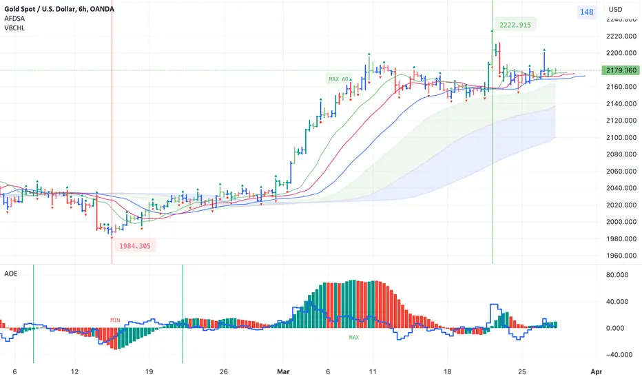
Indicators for trading using Bill Williams' Profitunity strategyI published 3 indicators for trading using Bill Williams' Profitunity strategy. For each indicator, I have added a visual and detailed description in English and Russian. In this post I will briefly describe these indicators and how I use them together.
AFDSA indicator (Alligator + Fractals + Divergent & Squat Bars + Signal Alerts)
Includes Williams Alligator, Williams Fractals, Divergent Bars, Market Facilitation Index, Highest and Lowest Bars, maximum or minimum peak of the Awesome Oscillator, and signal alerts based on Bill Williams' Profitunity strategy:
Bullish and Bearish Divergent Bar Signal + Squat Bar + Green Bar + Fake Bar + Awesome Oscillator Color Change + AO Divergence.
Crossing the green line (Lips) of an open Alligator.
Formation of a fractal.
Signal about the breakdown of the last upper or lower fractal.
Signal about the appearance of a new maximum or minimum peak of AO in the interval of 140 bars from the last bar.
I also added an Alligator display for the higher timeframe, for example, if the chart timeframe is 1 hour, then the higher timeframe will automatically be 4 hours, if the chart timeframe is 4 hours, then the higher timeframe will be 1 day, etc.
AOE Oscillator (Awesome Oscillator + Bars count lines + EMA Line)
Includes the Awesome Oscillator with two vertical lines at a distance of 100 and 140 bars from the last bar to determine the third Elliott wave by the maximum peak of AO in the interval from 100 to 140 bars according to Bill Williams' Profitunity strategy. Additionally, a faster EMA line is displayed.
I also added display of the AO line for the lower timeframe instead of the EMA line if the Moving Average Line values (method, length and source) are equal to the Awesome Oscillator values in the indicator settings. For example, if the chart timeframe is 1 day, then the lower timeframe will automatically be 4 hours, if the chart timeframe is 4 hours, then the lower timeframe will be 1 hour, etc.
VBCHL indicator (Visible bars count on chart + highest/lowest bars, max/min AO)
The indicator displays the number of visible bars on the screen, including the prices of the highest and lowest bars, the maximum or minimum value of the Awesome Oscillator. The values change dynamically when scrolling or changing the scale of the chart, but with a delay of several seconds, so this feature is included in a separate indicator so as not to slow down the work of other indicators.
Indicator settings
In the AFDSA indicator I use the following settings:
By default, the Squat Bar is colored blue, and all other bars are colored to match the Awesome Oscillator color, except for the Fake bars, which are colored with a lighter AO color. But I also enable the display of "Green" Divergent bars in the "Green Bars > Show" field.
I enable the display of Alligator for higher timeframes in the "Alligator for higher timeframe > Enable" field.
In the indicator style settings, I disable the display of the highest and lowest bars, maximum and minimum AO peak labels, because these labels are also displayed by the VBCHL indicator depending on the number of visible bars in the chart window.
Only after opening a position, I enable all additional alerts in the “Enable all additional alerts” field (after changing this field, you need to re-create the alert for the current chart): crossing the green line of an open Alligator, formation of a fractal, appearance of a new maximum or minimum AO peak.
In the settings of the AOE oscillator, I enable the display of the AO line for the lower timeframe instead of the EMA line, setting the same values in the fields for the Moving Average Line (method, length and source) and Awesome Oscillator.
In the VBCHL indicator settings, I only enable the simple display text style for labels in the "Simple display text style for labels" field.
As a result, when analyzing the current chart, I immediately see all the signals on the chart, the location of the bars relative to the Alligator on the higher timeframe and changes in the Awesome Oscillator on the lower timeframe. And thanks to the VBCHL indicator, I quickly select the desired timeframe for analyzing the 5-wave Elliott impulse, focusing on the interval of 140 bars, and immediately see whether there is divergence between the maximum AO peak and the following lower AO peak in this interval.
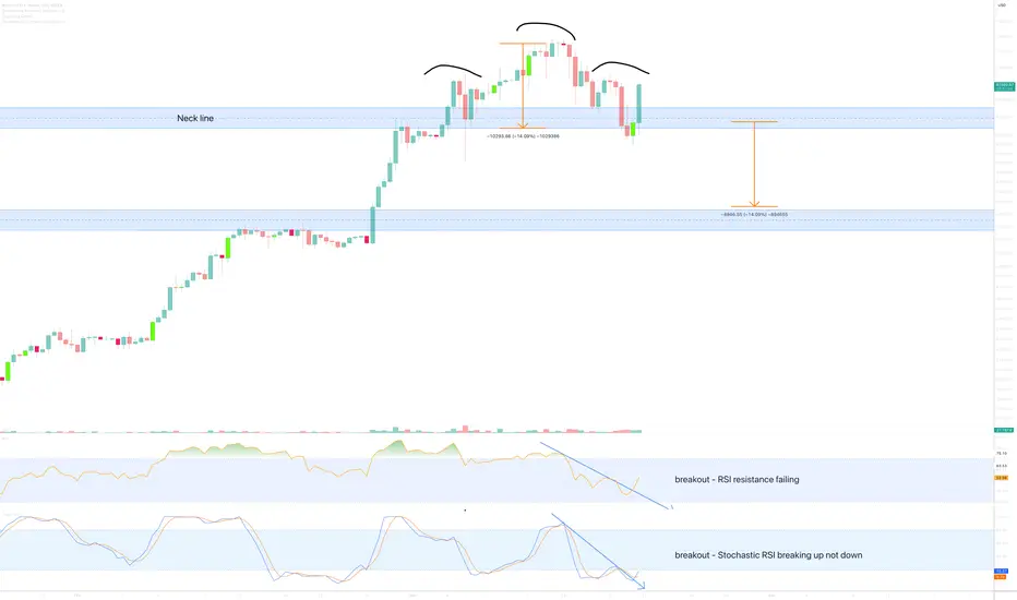
How to tell if a Head & Shoulders pattern is voidThere’s been a number of messages today informing me of the lower time frame head and shoulders pattern.
Traders are sometimes caught out with falsely identified head and shoulders patterns, and then the market runs in the opposite direction of that expected as the error is realised causing a energetic surge in price action as traders closes short positions.
How do you identify valid from void?
The last lower time frame (12hr examples used here) head and shoulders pattern printed in March 2022. There was a couple of leading indications this neckline would confirm as resistance at the time of the breakout:
1) RSI confirmed failed support (black circle)
2) Stochastic RSI is crossing down 80. Very bearish.
12hr head and shoulder March 2022
Now lets look above on the current 12hr chart (main chart)
1) RSI resistance is failing, a breakout is evident.
2) Stochastic RSI is crossing up not down! Very bullish.
There you have it. While many traders identify the price action of a head and shoulders pattern in isolation it is an expensive error to ignore what the oscillators are doing at the time of the print.
In almost all of the ideas published by Without Worries, if you look udder the main chart idea you’ll notice “Oscillators” as one of the selected indicators for use in the study. Now you know why!
Ww
HOW-TO: Accumulation Strategy 2024What if instead of buying a stock, crypto, currency only once and holding until we are in profit, we split our strategy capital and buy several times, until the total is in profit ? Yes, that is DCA you’d say. Ok, but what if instead of buying at predetermined intervals, we bought at oversold RSI, or on a double bottom, for example ? That’s the idea behind the Accumulation Strategy, which I’m going to explain in detail in this article.
█ Simple Example
The strategy comes with several features, and the easiest way to explain them is through examples.
The Max Active Deals input allows to limit how many times the strategy can trigger a buy in a trade, just like the pyramiding setting. It can go up to 100.
In this example, the strategy has 10 max active deals. and is using the RSI feature to buy when RSI crosses below a configurable threshold, here 25.
Note: to get stronger signals, the RSI time frame has been set to 1 hour, since the chart is in a 30 min time frame.
In this trade, the strategy bought 8 times (yellow arrows) before selling at take profit, but it could have bought twice more.
█ Take Profit Feature
Customisable in the input tab, this feature allows you to set one or multiple take profit(s). You can set the value in either %, pips, or Auto mode.
To create multiple targets, increase the Number of take profit and set the Step between each TP.
In our previous example, instead of just one, I set 3 TPs with 1% value and a step of 1. The strategy will sell progressively at a quantity split even at each take profit, until the last TP is hit.
Note: Using multiple take profit is often used to improve risk management in trading.
█ Built-in Entry Options
The strategy comes with several built-in indicators, such as the RSI that we’ve seen, but here’s the list:
MTF RSI cross, RSI divergences
MTF Stochastic cross
MTF Bollinger Bands cross
Top & Bottoms
Double Top & bottoms
Higher/Lower Lows/Highs
Custom External Entries
If you want to use ANY external indicator from the TradingView library and use it as an entry signal, you can!
For example, let’s use the Squeeze Momentum Indicator by Lazybear. After adding it to the chart, we select the first plot which is the histogram. Then we select the condition “crossover” and “0”. It will create a buy when the histogram turns green.
█ Trend Filters
In trading, we try to avoid going against the global trend.
The strategy comes with several built-in trendlines, MTF, or you can use ANY external trendline from the TV library.
The strategy offers other built-in filters such as volume, overbought in range/trending market, or flat market entry filters.
█ Stop Loss
The stop loss can be turned on/off. You can set the value in either %, pips, ATR or Auto mode.
Note: When to use a Stop Loss? Using a stop kind of defeats the purpose of the strategy, but it can be useful if you plan to trade highly volatile and risky coins (remember LUNA ?) That is why the option is there.
█ How to use the strategy
The indicator access is unlocked by subscribing on my website. See the links below this article.
█ Setting up a strategy
You can set up a strategy on your own chart in just one click using the preconfigured charts I will share below, or you can simply add the indicator yourself and play with the settings.
Backtesting
Backtesting is automatically done in the Strategy Tester Tab.
Creating Alerts
Once you have your strategy setup on the chart:
1 - Set the alert message in the indicator inputs (scroll to the bottom, you will find an “alert’ section)
2 - Save your chart and do not touch it anymore unless you want to update your alert (optional but recommended)
3 - Create an alert on Cyatophilum Accumulation Strategy, using the option “alert() function calls only” (this is really important!)
Only one alert is needed to handle all the strategy events! (entry, take profit, stop loss, etc.) Even a free TradingView user can create a strategy!
Automation
The subscription that I offer also comes with Automation bots using the Binance spot trading API .
Important: if you wish to automate your strategies, make sure your TradingView account has access to alert webhook notifications .
That’s it for this tutorial!
Pretty easy right? No, I know it can get complicated at first. 😣
That is why I make preconfigured charts. Once you have access, click on the chart link, then click “copy”, then “save” your “layout” to get your own chart that you can use and edit. Enjoy!
█ Preconfigured charts
BTC/USDT
Chart: www.tradingview.com
ETH/USDT
Chart: www.tradingview.com
BNB/USDT
Chart: www.tradingview.com
MATIC/USDT
Chart: www.tradingview.com
EGLD/USDT
Chart: www.tradingview.com

Trend Trading Strategy for the Heiken Ashi Algo v6Knowing when the RSI and price are in a ranging phase even in the short term can be a difficult process.
You are either #Ranging #bullish or #bearish. At least in the Algo v6 you can get a clear vision of exactly whats happening.
In this video im going to give you a VERY simple strategy on:
1. How to know if the RSI and price are ranging
2. When do i break away from Ranges
3. Am I trending
4. Im trending but whats my confluence to take a long or short
5. Is my range getting bigger or smaller
Enjoy this quick vid and ask questions below.
Thanks everyone.

RSI as a Trend ToolMost people use the RSI as a momentum indicator,
trying to find Overbought/Oversold (OBOS) conditions,
and/or divergences.
However there is also a way to use it as a Trend Tool.
There is a mathematical relationship that connects the RSI and EMA's.
The formula is RSI(x) cross-over 50-line = Close cross-over EMA(2x)
i.e. RSI(14) cross-over 50 line = Close cross-over EMA(28)
This one of the properties of the RSI,
which I discovered when taking a more indept look into momentum indicators,
which ultimately led to the discovery of the MACD-v in 2014/2015
The MACD-v was then publicly disclosed in 2022,
in the form of a a paper called
"MACD-v: Volatility Normalised Momentum",
which was awarded:
It has won 2 International Awards:
1. The “Founders Award” (2022),
for advances in Active Investment Management
from the National Association of Active Investment Managars (NAAIM)
2. The “Charles H. Dow Award” (2022)
for outstanding research in Technical Analysis,
from the Chartered Market Technicians Association (CMTA)

Price overextension: misconceptions and common mistakesPrice overextension remains a widely misunderstood concept in trading, causing both novice and seasoned traders to make errors in their decision-making. This misinterpretation often leads to placing trades in the wrong direction or, equally detrimental, overlooking profitable opportunities.
In essence, price overextension signifies that the market has undergone a rapid and excessive movement in one direction. Such movements are often perceived as unsustainable. Numerous indicators, such as Stochastic, RSI, Bollinger Bands and many other, attempt to identify such "abnormal" price movements so traders could capitalize on them. Despite variations in statistical methods and calculations, their common goal is to detect instances where price went or down too much and is likely to reverse.
In this discussion, I will use Relative-Strength-Index (RSI), a popular indicator, to convey my perspective on price overextension. While some traders argue for customization, the elusive question of "how" often remains unanswered. From my experience, there are no universally perfect settings that consistently yield optimal results.
I’ll draw my examples from the recent SPY bar chart (February 2024).
The first misconception
The first misconception is that if price is overextended it is time to immediately start looking for a trade in the opposite direction. The most important phrase here is “start looking”. Many beginners misinterpret this as an invitation to commence trading, leading to the premature initiation of short positions during perceived market "overextension" and vice versa.
So, the first and foremost important advice is to never try guessing top/bottom based on one indicator or gut feeling. Simple as it seems I remember many times breaking this rule myself because the temptation was too strong. It rarely ended up well.
On the graph, I've highlighted three recent instances where the RSI exceeded 70 (indicating overbought conditions). What stands out is that, following each occurrence, the price surged significantly before consolidation set in, inflicting losses upon short traders.
Even experienced traders, who look for confluence of signals, may fall into this trap. In the first two examples, bearish candlestick patterns failed to prevent subsequent price increases. Most likely, those candles were “created” by weak hands traders, who tried to short market, while it was actually controlled by strong buyers.
These instances could have been avoided by considering the daily graph, revealing a robust bullish context – price was in an uptrend, one-time-framing up on weekly. There were couple of moments when bears gained short term control (Tuesdays 13th and 20th) but they never could take the previous week low; bulls always confirmed their control.
The second advice is to avoid trading against higher level context. While sometimes those trades might work the result is usually mediocre and most of the times you’ll simply lose. If you really wish to trade against context you need to construct a solid dossier of evidence, supporting your trade.
The second misconception
What is the second misconception? It is that when price overextended it is not time to go with the market. In this scenario, traders refrain from initiating long trades after RSI indicates overbought conditions, potentially causing them to miss profitable opportunities. It might not hurt your account but who likes missing good opportunities?
Surprisingly, seizing these trades correctly is not much harder than any other trade. It simply requires prudence and discipline and getting rid-off cognitive biases. For example, in the second example on the graph a trader could win up to 1% if he played off gap-up open after seeing that the new price has found acceptance.
Conclusion
It is possible to build a profitable strategy that relies on “price overextension” concept. However, it demands more than a cursory examination of a single indicator and adherence to textbook candle patterns. Personally, I reached a point where I entirely abandoned the use of RSI and similar tools because, instead of providing clarity, they seemed to cloud my thinking.
Opting for a more effective approach involves keenly observing actual market behavior, which often defies conventional expectations. Study of high-level contexts, understanding key levels, and discerning confluence in price action signals on lower timeframes consistently prove invaluable. This method helps steer clear of common pitfalls and contributes to enhancing overall trading results.

RSI indicatorRSI is a commonly used secondary indicator gauging market momentum.
Providing signals such as Divergence and Buy/Sell signals.
Can be used on any timeframe and also on trending or sideways markets.
Always use in the direction of a major trend and only to provide confirmation to a primary setup.

Beating the S&P500 (SPX) Buy&Hold strategy by 16 timesS&P500 (SPX) strategy using Stochastic RSI Min-Max, normalized Volatility and Trailing Stop signals, beats the Buy&Hold strategy by 16 times
Embarking on the quest to time the market accurately, the 'Holy Grail' of strategies, led me to create a script to approach this goal. Unlike other strategies that I tested, this one not only surpasses the long-term S&P500 Buy&Hold approach but does so by a remarkable 16.38 times!
Initially, I employed an A.I. program based on an LSTM Neural Network using TensorFlow. Despite achieving a 55% next-day prediction accuracy for short/long positions, I sought improvement using a heuristic pine-scripting approach, incorporating stochastic RSI oscillators, moving averages, and volatility signals.
With default parameters, this strategy, freely available as "XPloRR S&P500 Stock Market Crash Detection Strategy v2" delivered a staggering 2,663,001% profit since February 1871. In the same period, the Buy&Hold strategy "only" generated 162,599% profit. Picture this: a $1,000 investment in 1871 would now be worth $26,630,014 by February 2024. Check it out for yourself loading this strategy.
The script operates as a Stochastic RSI Min-Max script, automatically generating buy and sell alerts on the S&P500 SPX. What sets it apart? The strategy detects "corrections," minimizes losses using Trailing Stop and Moving Average parameters, and strategically re-enters the market after detecting bottoms using tuned Stochastic RSI signals and normalized Volatility thresholds.
Tailor its parameters to your preference, use it for strategic exits and entries, or stick to the Buy&Hold strategy and start new buy trades at regular intervals using buy signals only. In the pursuit of minimizing losses, the script has learned the effectiveness of a 9% trailing stop on trades. As you can clearly see on the upper graph (revolving around 100), the average overall green surfaces (profits) of all trades are much bigger than the average red surfaces (losses). This follows Warren Buffets first rule of trading to "Never lose money" and thus minimizing losses.
Update: Advanced S&P500 Stochastic RSI Min-Max Buy/Sell Alert Generator
I have also created an Alerter script based on the same engine as this script, which auto-generates buy and sell alert signals (via e-mail, in-app push-notifications, pop-ups etc.).
The script is currently fine-tuned for the S&P500 SPX tracker, but parameters can be fine-tuned upon request for other trackers or stocks.
If you are interested in this alerter-version script or fine-tuning other trackers, please drop me a message or mail xplorr at live dot com.
How to use this Strategy?
Select the SPX (S&P500) graph and set the value to "Day" values (top) and set "Auto Fit Data To Screen" (bottom-right).
Select in the Indicators the "XPloRR S&P500 Stock Market Crash Detection Strategy v2" script and set "Auto Fit Data To Screen" (bottom-right)
Look in the strategy tester overview to optimize the values "Percent Profitable" and "Net Profit" (using the strategy settings icon, you can increase/decrease the parameters).
How to interpret the graphical information?
In the SPX graph, you will see the Buy(Blue) and Sell(Purple) labels created by the strategy.
The green/red graph below shows the accumulated profit/loss in % of to the initial buy value of the trade (it revolves around 100%, 110 means 10% profit, 95 means 5% loss)
The small purple blocks indicate out-of-trade periods
The green graph below the zero line is the stochastic RSI buy signal. You can set a threshold (green horizontal line). The vertical green lines show minima below that threshold and indicate possible buy signals.
The blue graph above the zero line is the normalized volatility signal. You can set a threshold (blue horizontal line) affecting buy signals.
The red graph above the zero line is the slower stochastic RSI sell signal. You can set a threshold (red horizontal line). The red areas indicate values above that threshold.
However real exits are triggered if close values are crossing below the trailing stop value or optionally when the fast moving average crosses under the slow one. The red areas above the threshold are rather indicative to show that the SPX is expensive and not ideal to enter. Please note that in bullish periods the red line and areas can stay at a permanent high value, so it is not ideal to use as a strict sell signal. However, when it drops below zero and the green vertical lines appear, these are strong buy signals together with a high volatility.
These Parameters can be changed
Buy Stochastic Lookback
Buy Stochastic Smoother
Buy Threshold
Buy Only After Fall
Minimum % Fall
Sell Stochastic Lookback
Sell Stochastic Smoother
Sell Threshold
Sell Only With Profit
Minimum % Profit
Use Sell MA
Fast MA Sell
Slow MA Sell
MA Sell Threshold
Use Buy Volatility
Volatility Smoother
Volatility Threshold
Use Trailing Stop
Use ATR (iso of a fixed percentage for the trailing stop)
ATR Lookback
Trailing Stop Factor(or fixed percentage if "use ATR" is false)
Trailing Stop Smoother
Important : optimizing and using these parameters is no guarantee for future winning trades!

Negative Correlations in Trading: FULL GUIDEEmbarking on a journey in the world of trading demands a profound understanding of market intricacies. One often-overlooked yet powerful aspect is the domain of negative correlations — the intricate dance where the movement of one asset influences another inversely. This guide aims to be your compass in navigating these complex waters, exploring real-world examples, and providing strategies to harness this knowledge for astute and strategic trading.
Section 1: Unraveling the DXY-BTC Dynamic: Understanding Dollar-Bitcoin Connections
1. The Dance of DXY and BTC:
Delve into the intricate relationship between the U.S. Dollar Index (DXY) and Bitcoin.
Grasp the nuances of how a strengthening DXY tends to exert a weakening influence on Bitcoin and vice versa.
2. Leveraging the DXY-BTC Correlation:
Explore scenarios where the correlations of DXY and Bitcoin align.
Discuss long-term trading strategies that arise from discerning the interconnectedness of these two prominent assets.
Section 2: Discorrelation RSI: Decoding Signals Amidst Market Chaos
1. Understanding Discorrelation RSI:
Introduce the concept of discorrelation RSI, where RSI signals diverge from price action.
Emphasize the significance of recognizing when RSI provides a more accurate reflection of market sentiment.
2. Trading Wisdom with RSI Signals:
Analyze real-world examples where RSI forms a higher low while the price chart indicates a lower low.
Illuminate actionable strategies for entering long positions based on RSI signals during instances of price divergence.
Section 3: Structural Manipulation: Navigating Opportunities Amidst Deceptive Markets
1. OP Case Study: Structural Manipulation vs. RSI Insights:
Explore the dynamics of the OP token, where structural lows are seemingly updated on the price chart.
Unveil instances where RSI provides a more accurate representation of market conditions, presenting buying opportunities during purported oversold conditions.
2. Seizing Opportunities in Manipulation:
Discuss the art of discerning manipulation from genuine market conditions.
Explore how negative correlations can guide traders to capitalize on opportunities created by market manipulation.
Section 4: Crafting Your Strategy: Navigating the Complexities of Negative Correlations
1. Building a Trading Plan:
Outline the essential components of a comprehensive trading plan that incorporates insights from negative correlations.
Emphasize the need for adaptability and ongoing analysis to refine trading strategies.
2. Risk Management in Negative Correlation Trading:
Discuss advanced risk management strategies tailored to the nuances of negative correlations.
Highlight the importance of position sizing and the judicious use of stop-loss orders.
Conclusion: Orchestrating Success in Market Dynamics
As you conclude this profound exploration of negative correlations in trading, envision the market as a symphony of interconnected instruments. The ability to recognize and leverage negative correlations adds a powerful melody to your trading strategy. Regularly revisit and refine your approach, staying attuned to evolving market conditions, and use negative correlations as a guiding force in your trading journey.
💡 Deciphering Negative Correlations | 🔄 DXY-BTC Symphony | 📊 RSI Discorrelation Strategies | 🎭 Unmasking Structural Manipulation
💬 Engage in the discourse: Share your experiences in trading based on negative correlations, pose thoughtful questions, and connect with a community dedicated to mastering the dynamic nuances of the market. 🌐✨

Trading Nasdaq Futures: Correlation Insights & Market StrategiesIntroduction
The realm of futures trading offers a spectrum of opportunities, and at the forefront of this dynamic market are the E-mini Nasdaq Futures. Designed to track the Nasdaq 100 index, these futures contracts have become a favorite among traders who focus on technology and growth-oriented companies. The Nasdaq 100, dominated by technology giants, serves as a barometer for the broader tech sector and offers insights into the health of the US economy.
Basic Product Specifications
Point Value: Each point of the E-mini Nasdaq Futures is worth $20.00, making them an accessible yet potent instrument for both individual and institutional traders.
Trading Hours: Reflecting the global nature of the financial markets, these futures trade nearly 24 hours a day, from Sunday evening to Friday afternoon (US times), ensuring that traders across time zones can participate in market movements.
Current Margin Requirements: As of the latest update, the initial margin requirement for one E-mini Nasdaq Futures contract is approximately $9,000, subject to change based on market volatility. The maintenance margin is slightly lower, ensuring traders have some leeway in managing their positions.
Micro E-mini contracts available: 10x smaller than the E-minis.
Market Context and Economic Events
In the ever-evolving landscape of global finance, several macroeconomic events cast a significant impact on the futures market. For traders of E-mini Nasdaq Futures, staying abreast of these events is crucial. Key among them is the Federal Open Market Committee (FOMC) meeting, a regular event that can sway market sentiments and cause significant price movements. The announcements regarding interest rates and economic outlook made during these meetings are pivotal in shaping market trends.
Similarly, the release of labor market reports, including unemployment rates and job creation numbers, provides critical insights into the economic health of the country. These reports can trigger volatility in the E-mini Nasdaq Futures, presenting both risks and opportunities for traders. Understanding and anticipating the potential market reactions to these events is an integral part of a successful trading strategy.
Correlation Analysis and Trading Opportunities
A cornerstone of strategic futures trading lies in understanding the relationships between different financial instruments. Our recent analysis highlights the intriguing correlation dynamics of E-mini Nasdaq Futures with other key markets. While E-mini Nasdaq Futures often move in tandem with major indices like the Mini Dow Jones and E-mini S&P 500, they occasionally exhibit negative correlations with markets such as Gold, Euro Futures, Bitcoin, and Light Crude Oil.
Insights from Correlation Analysis:
Gold: Traditionally viewed as a safe haven, Gold often moves inversely to risk assets like Nasdaq Futures. In periods of market uncertainty or economic downturns, investors might flock to Gold, driving its prices up, while tech-heavy indices like Nasdaq could see a decline.
Euro and Bitcoin Futures: The relationship between Euro/Bitcoin Futures and Nasdaq Futures is nuanced, often influenced by broader economic policies and shifts in global trade dynamics and or monetary policy affecting the US Dollar.
Light Crude Oil: Fluctuations in oil prices can have a multifaceted impact on stock markets, including the Nasdaq. Rising oil prices, signaling higher energy costs, can negatively affect the performance of tech companies, leading to an inverse relationship.
Strategic Trading Approaches : Identifying bearish setups in Gold, Euro Futures, Bitcoin, and Light Crude Oil can be a precursor to bullish opportunities in E-mini Nasdaq Futures. For instance, a downturn in Gold amid rising economic optimism can signal an opportune moment to go long on Nasdaq Futures. Similarly, bearish trends in Euro/Bitcoin Futures and Light Crude Oil, perhaps due to geopolitical tensions or shifts in global demand, can also point towards potential gains in the Nasdaq market.
The below chart, where various correlations have been computed by aggregating daily data since 2018, shows a negative correlation between Euro Futures and Nasdaq Futures. Such inverse correlation will be used in the following section as a key element to plan on a long Nasdaq Futures trade.
Technical Analysis: Decoding Market Trends
Technical analysis forms the backbone of trading strategy formulation, especially in the volatile world of futures trading. For E-mini Nasdaq Futures, two key technical indicators – the Moving Average Convergence Divergence (MACD) and the Relative Strength Index (RSI) – provide valuable insights into market momentum and potential trend reversals.
Moving Average Convergence Divergence (MACD):
The MACD is a trend-following momentum indicator that shows the relationship between two moving averages of a security's price. It consists of the MACD line (the difference between the 12-day and 26-day exponential moving averages), the signal line (a 9-day EMA of the MACD line), and the histogram (which illustrates the distance between the MACD line and the signal line).
Having both MACD lines above the zero line can be seen as bullish as it could be interpreted as an up-trending market and could indicate a potential upward price momentum, signaling traders to consider a long position. Conversely, having both MACD lines below the zero line might suggest a selling or shorting opportunity.
Relative Strength Index (RSI):
RSI is a momentum oscillator that measures the speed and change of price movements, oscillating between zero and 100. Typically, an RSI above 70 indicates a security is overbought, while an RSI below 30 suggests it is oversold.
For traders of E-mini Nasdaq Futures, an RSI reading near 70 could warn of a potential market pullback, suggesting a cautious approach or a potential short position. An RSI near 30, however, might indicate an upcoming price rise, presenting a buying opportunity.
Practical Application : Incorporating these indicators into the analysis of E-mini Nasdaq Futures allows traders to make more informed decisions. By monitoring the MACD lines and RSI levels, traders can gauge the market's pulse, identifying key entry and exit points that align with their risk-reward parameters.
Trade Rationale :
The Nasdaq Futures daily timeframe presents us with an up-trend (based on MACD), but caution may be advisable for long traders since RSI values are near 70. Given the fact that UFOs (UnFilled Orders) are available below price, patient traders may be interested in waiting for a retracement into such lower prices before planning on a buy opportunity.
Such trade may receive “extra” help from the negatively correlated Euro Futures contract which recently switched from an up-trend to a down-trending environment as seen above.
Trade Plan: Strategic Execution
Developing a well-thought-out trade plan is essential for capitalizing on the opportunities presented by E-mini Nasdaq Futures. Given the insights from our correlation and technical analysis, here’s a strategic approach for trading:
1. Identifying Entry Points:
Utilizing bearish setups in negatively correlated markets (Euro Futures) as indicators for potential bullish momentum in E-mini Nasdaq Futures.
While both MACD lines remain above the zero line and RSI readings remain below 70, look for potential bullish price reactions between 17076.50 and 16316.00, which is where our technical analysis suggests Buy UnFilled Orders (UFOs) may be available.
2. Setting Target Prices:
Determining realistic target prices based on historical price movements and resistance levels observed in the Nasdaq Futures market.
Since the Nasdaq Futures is in a position to potentially start making new all-times high prices, a target could be set using a Fibonacci projection pointing at 18527.00.
3. Establishing Stop-Loss Levels:
Placing stop-loss orders to minimize potential losses. These should be set at levels where the initial trade hypothesis is invalidated, such as below 16316.00, which is where UnFilled Orders would be proven to not to be available.
4. Calculating Reward-to-Risk Ratio:
Ensuring that the potential reward justifies the risk taken. A healthy reward-to-risk ratio, such as 2:1 or higher, is typically desirable.
5. Point Values and Contract Specifications:
For E-mini Nasdaq Futures, understanding that each point movement represents a $20 change per contract. This knowledge is crucial in calculating potential profits and losses.
Considering Micro contract options for traders with smaller account sizes or those seeking to manage risk more conservatively. The point value would be $2 in such case.
Practical Considerations : In implementing this trade plan, continuous market monitoring and readiness to adjust strategies in response to changing market conditions are paramount. The plan aims to maximize profits while strictly managing risks, aligning with individual trading styles and risk tolerances.
Risk Management: Safeguarding Investments
Effective risk management is the cornerstone of successful trading, particularly in the dynamic environment of E-mini Nasdaq Futures. Implementing robust risk management strategies not only protects investments but also enhances trading performance.
1. Utilizing Stop-Loss Orders:
Stop-loss orders are essential in limiting potential losses. They should be set at levels where the initial trade hypothesis is invalidated.
These orders help in managing trades without emotional biases, ensuring decisions are based on pre-set risk parameters.
2. Hedging Techniques:
Hedging strategies, such as using options or diversifying with inversely correlated assets, can provide a safety net against adverse market movements.
For instance, while correlations are not a guarantee, holding positions in Gold or WTI Crude Oil Futures could serve as a hedge against a downturn in the E-mini Nasdaq Futures.
3. Avoiding Undefined Risk Exposure:
It is crucial to avoid situations where the potential loss is unknown or unlimited. This can be achieved by using defined-risk strategies and avoiding high-leverage positions that can amplify losses.
Traders should be aware of the leverage inherent in futures contracts and adjust their position sizes accordingly.
4. Adapting to Market Conditions:
A flexible approach to risk management is key. This involves regularly reviewing and adjusting stop-loss levels and hedging positions in response to changing market dynamics.
Staying informed about economic events and market trends is vital in making timely adjustments to risk management strategies, including a potential for a trade to be invalidated and cancelled altogether.
Conclusion
In the intricate tapestry of financial markets, trading E-mini Nasdaq Futures presents both challenges and opportunities. This article has navigated through the complex correlations between Nasdaq Futures and other key financial instruments, uncovering strategies to capitalize on these relationships. The integration of technical analysis, focusing on MACD and RSI indicators, further enriches the trader's arsenal, providing a deeper understanding of market trends and potential entry and exit points.
As we've explored, the negative correlations with markets such as Gold Futures, Euro Futures, or WTI Crude Oil, can signal opportune moments to go long on Nasdaq Futures. Conversely, these markets can offer hedging opportunities against potential downturns in Nasdaq. The strategic execution of trades, underpinned by solid risk management practices, forms the bedrock of successful trading in this dynamic environment.
In conclusion, trading E-mini Nasdaq Futures demands a multifaceted approach, blending correlation insights, technical analysis, and stringent risk management. By staying informed, adaptable, and disciplined, traders can navigate the ebb and flow of the Nasdaq Futures market with increased confidence and potential for success.
When charting futures, the data provided could be delayed. Traders working with the ticker symbols discussed in this idea may prefer to use CME Group real-time data plan on TradingView: www.tradingview.com This consideration is particularly important for shorter-term traders, whereas it may be less critical for those focused on longer-term trading strategies.
Disclaimer:
The trade ideas presented herein are solely for illustrative purposes forming a part of a case study intended to demonstrate key principles in risk management within the context of the specific market scenarios discussed. These ideas are not to be interpreted as investment recommendations or financial advice. They do not endorse or promote any specific trading strategies, financial products, or services. The information provided is based on data believed to be reliable; however, its accuracy or completeness cannot be guaranteed. Trading in financial markets involves risks, including the potential loss of principal. Each individual should conduct their own research and consult with professional financial advisors before making any investment decisions. The author or publisher of this content bears no responsibility for any actions taken based on the information provided or for any resultant financial or other losses.

Examples of how to draw and use trend linesHello traders!
If you "Follow" us, you can always get new information quickly.
Please also click “Boost”.
Have a good day.
-------------------------------------
(1W chart)
Usually, the way to draw a trend line is to connect the high point and the high point where the trend changes, or to connect the low point and the low point to display the trend line.
Then, a channel is formed to express movement within that channel.
It is a relatively simple analysis tool that anyone with a good understanding of charts can draw trend lines.
However, I think whether you can use it in actual trading depends on how much you trust the trend line.
However, due to the nature of the trend line, it is expressed as a diagonal line, so it has a fundamental problem that it is not easy to respond even if it deviates from the trend line.
So, in order to trade with information obtained from chart analysis, you must draw support and resistance points close to the horizontal line.
Therefore, in chart analysis, you must have a basic understanding of the candle arrangement.
In my chart, the StochRSI indicator is
1. Use the waves of the StochRSI indicator to check support and resistance at support and resistance points.
2. Used to draw trend lines.
When drawing a trend line with the StochRSI indicator, the oversold section is below 20, the overbought section is above 80, and the trend line is drawn by connecting the points where the vertices are created.
However, the trend line drawn between high points is drawn based on the opening price of the falling candle.
Therefore, draw a trend line by selecting the peak of the StochRSI indicator or the opening price of the nearest bearish candle.
You can draw a trend line by connecting the low points of candles corresponding to the vertices of the trend line, which is drawn by connecting the low points.
For detailed instructions, please refer to the trend line displayed on the chart.
Among the trend lines drawn on the chart, I think that the trend line drawn almost horizontally is actually important.
Otherwise, I think it is a trend line drawn for chart analysis because it is difficult to use diagonal trend lines for trading.
In order to utilize a trend line expressed as a diagonal line, support and resistance points must be displayed together to be considered a trend line that can be used for trading.
When using various chart tools that are used by specifying a selection point, how the selection point is specified is very important.
Therefore, if the criteria are not clear when specifying the selection point, what is drawn using various chart tools cannot be trusted.
To solve this problem to some extent, we used the StochRSI indicator to draw a trend line.
(1D chart)
If you look at the trend lines drawn on the 1D chart, you can see that the two trend lines at the current price position are drawn close to the horizon.
Therefore, the key is whether the price can be maintained by breaking above the trend line of 1.
If this is not the case and it falls below trend line 2, it can be seen that there is a high possibility that it will lead to a further decline.
In that sense, the key is whether it can rise above the HA-High indicator, that is, above 43K.
If it falls, it is likely to touch the HA-Low indicator, so it is important to check for support near the HA-Low indicator when it is generated.
When drawing a trend line using the StochRSI indicator, vertices formed outside of oversold or overbought areas are excluded.
The reason is that the upward or downward intensity is weak.
This is to prevent confusion because if the rising or falling strength is weak, it is likely to be a fake or whipsaw.
It is important to draw in a way that has a solid basis so that you can trust the tools you draw on the chart.
StochRSI settings : 14, 7, 3, 3 (RSI, Stoch, K, D)
Have a good time.
thank you
--------------------------------------------------
- The big picture
The full-fledged upward trend is expected to begin when the price rises above 29K.
This is the section expected to be touched in the next bull market, 81K-95K.
#BTCUSD 12M
1st: 44234.54
2nd: 61383.23
3rd: 89126.41
101875.70-106275.10 (when overshooting)
4th: 13401.28
151166.97-157451.83 (when overshooting)
5th: 178910.15
These are points that are likely to encounter resistance in the future.
We need to see if we can break through these points upward.
Since it is thought that a new trend can be created in the overshooting zone, you should check the movement when this zone is touched.
If the general upward trend continues until 2025, it is expected to rise to around 57014.33 and then create a pull back pattern.
1st: 43833.05
2nd: 32992.55
-------------------------------------------------- -------------------------------------------
** All explanations are for reference only and do not guarantee profit or loss in investment.
** Trading volume is displayed as a candle body based on 10EMA.
How to display (in order from darkest to darkest)
More than 3 times the trading volume of 10EMA > 2.5 times > 2.0 times > 1.25 times > Trading volume below 10EMA
** Even if you know other people’s know-how, it takes a considerable amount of time to make it your own.
** This chart was created using my know-how.
---------------------------------

Mastering Stop-Loss with ATR IndicatorMastering Stop-Loss and Take-Profit with ATR Indicator
What is the ATR Indicator?
The Average True Range (ATR) indicator is a nifty tool that helps traders gauge the market's volatility. Simply, it tells you how much an asset typically moves in a given timeframe.
Placing Stop Loss to Avoid Getting Stopped Out
Step 1: Identify ATR Value
Look at the ATR indicator on your chart; it's usually at the bottom or top of your screen.
Note the ATR value; the higher it is, the more volatile the market.
Step 2: Setting Stop Loss
Set your stop loss beyond the ATR value to avoid getting prematurely stopped due to regular market fluctuations.
For instance, if the ATR is 50, consider placing your stop loss at least 60 points away to give your trade room to breathe.
Understand ATR's Role
ATR not only helps with stopping losses but also guides in setting realistic take-profit levels.
It gives you an idea of how much the asset can move in a given time, assisting you in capturing profits before a potential reversal.
Final Tips for Beginners
Adapt to Market Changes: ATR values change as market conditions shift. Stay adaptable and reassess your stop-loss and take-profit levels accordingly.
Practice on Demo Accounts: Before diving into live trading, practice using the ATR indicator on demo accounts. Gain confidence and refine your strategy without risking real money.
In essence, the ATR indicator is your ally in navigating market volatility. By using it wisely, you can enhance your risk management, safeguarding your trades from unnecessary stop-outs while optimizing your profit potential. Happy trading! 📈✨

RSI Failure Swing exampleThis is an example of what an RSI failure swing looks like. I show on the chart how to enter the strategy, when to exit and ways to find a stop loss. This example is shown using the 9 period RSI. You can play this strat soley but i prefer to play them after a divergence has formed for more confirmation.
