Know Sure Thing: Navigating Trends and Volatility EffectivelyIn the realm of technical analysis, the Know Sure Thing (KST) indicator stands out as a robust tool for traders seeking to decipher market trends and manage volatility effectively. This momentum-based oscillator amalgamates multiple moving averages to offer a comprehensive perspective on market momentum across various timeframes.
Introduction to the Know Sure Thing (KST) Indicator
The Know Sure Thing (KST) indicator is designed to unveil the market's underlying momentum, encompassing both short and long-term trends. The KST is a dynamic momentum oscillator rooted in the Rate of Change (ROC) principle. It amalgamates four distinct ROC timeframes, smoothing them via Simple Moving Averages. Consequently, the KST generates a fluctuating final value, oscillating above and below a Zero Line. Additionally, it incorporates a signal line, derived from an SMA of the KST line itself.
The moving average methodology of KST empowers traders with a tool capable of identifying both bullish and bearish trends, providing an encompassing view of market momentum shifts. Fundamentally, this indicator gauges momentum using the ROC across four price periods, aiding analysts in detecting divergences, overbought or oversold market conditions, and crossovers.
Understanding Trends with KST
The KST indicator is predominantly used to discern the strength and direction of market trends. When the KST line crosses above its signal line, it signifies a bullish trend shift, indicating a potential upward price movement. Conversely, when the KST line dips below the signal line, it suggests a bearish trend shift, signaling a potential downward price movement.
Similar to the MACD, when a crossover happens and the KST line crosses over the zero the overall signal can be considered to have a greater degree of confirmation.
Moreover, traders rely on crossovers and divergences within the KST indicator for confirming trend reversals or continuations. Bullish and bearish divergences between KST and price action can provide valuable insights into potential market movements, offering opportunities for traders to enter or exit positions.
Managing Volatility Using KST
Beyond trend identification, KST also assists in measuring market volatility. It enables traders to gauge the degree of volatility present in the market at any given time. Sharp spikes or fluctuations in KST readings often coincide with periods of increased market volatility. This information is crucial for traders as it aids in adapting their strategies to accommodate varying market conditions, thereby managing risk more effectively.
Practical Applications of KST
A practical application of KST involves combining its signals with other technical indicators, such as Moving Average Convergence Divergence (MACD) or Relative Strength Index (RSI), to strengthen trade setups. For instance, if KST indicates a bullish crossover and MACD confirms the same, it enhances the confidence of a potential uptrend.
Additionally, traders use KST to identify bullish or bearish signals in conjunction with chart patterns. A bullish KST crossover alongside a bullish chart pattern like a "falling wedge" could reinforce the conviction for a long position.
Tips for Effective Utilization:
Effective utilization of the KST indicator requires a clear understanding of its strengths and limitations. Traders should consider experimenting with different settings and timeframes to find the optimal configuration that aligns with their trading strategies. Always implement some form of backtesting or paper trading to confirm that your strategy is in fact profitable.
The strengths of the KST indicator lies in its ability to offer a more complete view of market momentum. However, like any technical indicator, KST has limitations. During choppy or ranging markets, it might generate false or contradictory signals, leading to potentially misguided trading decisions. Traders should exercise caution and supplement KST readings with additional forms of analysis to mitigate the impact of its limitations.
It's paramount not to rely solely on a single indicator like the KST, but to corroborate KST signals with signals from other indicators or methods of analysis. A fortified approach involving multiple confirmatory signals, fundamental analysis, and risk management strategies strengthens trading decisions and minimizes potential false signals from any single indicator.
Conclusion:
The journey to mastering the Know Sure Thing (KST) indicator involves continuous learning, experimentation with settings, and adapting to evolving market conditions. By staying adaptable, open to new strategies, and consistently refining trading methodologies, traders can harness the full potential of the KST to navigate trends and volatility effectively.
In summary, the KST serves as a valuable addition to traders' toolkits, empowering them to make better trading decisions. Remember, while the KST enhances market analysis, prudent risk management and a comprehensive trading approach remain pivotal for sustained success in the dynamic world of financial markets. Good luck and happy trading!
Oscillators

How RSI Alerts Can Supercharge Your Long-Term Crypto PortfolioBuilding a long-term portfolio demands a strategic approach that goes beyond random buys and impulsive decisions.
Instead, savvy investors employ tools like the Relative Strength Index (RSI) to identify advantageous entry points and navigate the market cycles effectively.
💜 If you appreciate our guides, support us with boost button 💜
Here’s a step-by-step guide on how to harness RSI alerts to fortify your long-term crypto holdings.
Step 1: Spotting Entry Opportunities with RSI < 35
When aiming for long-term crypto accumulation, the goal is to buy assets at opportune prices. Setting up your charts with the RSI indicator and adjusting the lower band to 35 enables you to pinpoint instances where cryptocurrencies in your portfolio might have experienced an unwarranted dip. This can be a golden opportunity to acquire assets for the long run, aligning with the principle of buying low.
Step 2: Steering Clear of Overbought Zones with RSI > 70
Conversely, an RSI reading surpassing 70 signals potential overbought conditions. In such instances, it's prudent to exercise caution. Holding off on new purchases during these periods or even considering exiting certain positions that have seen significant price surges allows you to safeguard your returns. Converting gains into stablecoins during overbought phases enhances liquidity, positioning you strategically for future opportunities.
Step 3: Confirm with Other Indicators & DYOR
RSI functions most effectively when complemented by other indicators. Incorporating tools like Moving Averages, Bollinger Bands, and MACD provides a more comprehensive view of market conditions. Remember, thorough research is crucial. Rely on multiple indicators to reinforce your decision-making process and mitigate risks associated with single-point analyses.
Step 4: Get Timely RSI Alerts On Your Email & TradingView App
Time is of the essence in the volatile crypto market. Instead of constantly monitoring prices across various platforms, set up RSI alerts on TradingView to receive timely notifications. This ensures you don’t miss critical market movements and can respond promptly to favorable conditions or potential risks.
How to Create RSI Alerts on TradingView
Open TradingView: Log in to your TradingView account.
Select the Chart: Open the chart of the cryptocurrency you're monitoring.
Add RSI Indicator: Click on "Indicators" at the top, search for RSI "Relative Strength Index", and add it to your chart.
Set RSI Levels: Adjust RSI levels by clicking on the RSI label on the chart, then edit the Upper and Lower Band levels to your preferred values (e.g., 35 for Lower Band, 70 for Upper Band).
Create Alert: Click on the alarm bell icon at the top of the chart, then select "Add Alert." Choose the condition (crossing above/below RSI level), set the desired RSI level, and customize the notification settings.
Save Alert: Confirm and save your alert. You’ll now receive notifications via email or within the TradingView platform when the specified RSI conditions are met.
Effectively utilizing RSI alerts is a game-changer for long-term crypto investors. By intelligently identifying entry points, avoiding overbought conditions, confirming signals with other indicators, and staying informed with timely alerts, you position yourself for success in the dynamic world of cryptocurrencies. Enhance your portfolio strategy with RSI – a tool that brings precision and efficiency to your crypto investment journey.

Decoding RSI during bear market, the Constance Brown way!RSI, as conventionally understood, does not oscillate between 70-30.
This idea explains the RSI behaviour during bear market phase.

Decoding RSI during bull market, the Constance Brown way!RSI, as conventionally understood, does not oscillate between 70-30.
This idea explains the RSI behaviour during bull market phase.
Stay tuned for similar idea explaining RSI behaviour during bear market phase.

Interpreting RSI (Relative Strength Index)The Relative Strength Index (RSI) is a momentum indicator that measures the speed and magnitude of price movements. It is a versatile tool that can be used to identify overbought and oversold conditions, as well as divergences and trend strength.
Overbought and Oversold Conditions
The RSI oscillates between 0 and 100. Traditionally, the RSI is considered overbought when above 70 and oversold when below 30. These levels are not set in stone, and they can vary depending on the security and the market conditions. However, they are a good starting point for identifying potential buying and selling opportunities.
Overbought:
An RSI reading above 70 indicates that the security is overbought, which means that it has been trading up rapidly and may be due for a correction. However, it is important to note that the RSI can stay in overbought territory for an extended period of time before a correction occurs.
Overbought RSI indicator
ETHUSD(Day Chart)
As you can see in the chart, when the RSI indicator hit the 70 level, the price started dropping continuously.
Oversold:
An RSI reading below 30 indicates that the security is oversold, which means that it has been trading down rapidly and may be due for a bounce. However, like with overbought conditions, the RSI can stay in oversold territory for an extended period of time before a bounce occurs.
Oversold RSI indicator
BTCUSD (weekly Chart)
As you can see in the chart, when the RSI indicator hit the 30 level, the price started bouncing from the bottom level.
The RSI indicator has accurately predicted the bottoms of Bitcoin's major bear markets in 2015, 2018, and 2022.
Stay tuned for more updates on this topic.
Regards
Hexa


Tips on Adjusting the RSI (Part 2) Although the standard setting for the RSI is 70 (overbought) and 30 (oversold), I prefer to adjust the levels to 80 and 20. The purpose of this is to identify the extremely overbought/oversold regions.
In addition to adjusting the levels, I would pay attention to the chart when the RSI enters in the overbought/oversold region (but would hold back on entering a trade)
I would only enter a trade when the RSI turns down/up from the overbought/oversold region.
This would signal that the price is likely to fall/rise as the RSI reverses from the extremes and back within range.

Learning to use the RSI (Part 1)The Relative Strength Index (RSI) is a popular momentum oscillator used in technical analysis to identify overbought or oversold conditions in the market. The RSI is measured on a scale from 0 to 100,
RSI values above 70 are often considered overbought, suggesting that the price may be due for a reversal or pullback.
RSI values below 30 are often considered oversold, indicating that the price may be due for a bounce or recovery.
A common mistake most traders will make is to assume that once RSI signals an overbought/oversold condition, the price should drop/rise, hence leading to a sell/buy decision.
In the 2 examples highlighted (solid blue lines), you will notice that although RSI signaled an overbought/oversold condition, the price continued to climb/drop despite being overbought/oversold.
Remember: Prices can be overbought/oversold for an extended period of time
When using any indicator, always remind yourself of what it is measuring and remember that it is just math (not magic). The indicator is supposed to help quantify and help you see things clearer on the chart (rather than numbers).
Check out Part 2 for Tips on Adjusting the RSI

Example of The Retracement TheoryOn the chart I include the formula and a example of how to get shirt term price targets using the retrace theory.
Basic retracement theory
(B-A)+C
(130.77-128.71)+129.94=$132
the low = A
the retrace high = B
current retracement low = C
Trend Strength Maximum Retracements Upside Targets (downside targets are inverse)
Very Strong
-14.6% to 23.7%
A to B added to C
Easily exceed B
-Strong
38.2%
A to B added to C
Easily exceed B
-Medium Strong
38.2% to 50%
80% of A to B added to C
Should Easily exceed B
-Medium
50%
80% of A to B added to C
Should Easily exceed B
-Medium Weak
61.8% to 50%
80% of A to B added to C
Possibly exceed B
-Weak
61.8%
80% of A to B added to C
Possibly exceed B
-Very Weak
85.4%to 76.3%
80% of A to B added to C
Probably will not exceed B

Patience: How Higher Time Frames Can Save You from False SignalsHello TradingView Community! I know it's been a little bit since we have posted any content, but we are back after a brief hiatus to bring you more in-depth trading education! Today we want to cover a topic that we consistently see when helping traders who are trying to improve their results. That topic involves patience and leveraging time frames to improve your entries and chances for successful trades.
In the fast-paced world of trading, it's easy to get caught up in the excitement of chasing quick profits, almost every trader has done it. However, successful traders understand the value of patience and the importance of using higher time frames to avoid false signals. Today we are going to broadly cover how incorporating higher time frames into your strategy can improve your long-term results.
The Power of Higher Time Frames: Unveiling the Big Picture
By zooming out and analyzing higher time frames, traders gain a broader perspective on market trends and patterns. This allows them to identify major support and resistance levels, significant price movements, and long-term trends that may be invisible on a shorter time frame. Understanding the big picture helps traders avoid getting trapped in false signals and make more accurate predictions.
Avoiding False Signals: The Benefits of Confirmation on Higher Time Frames:
One of the biggest challenges traders face is distinguishing actual market signals from noise. By patiently waiting for confirmations on higher time frames, traders can filter out the false signals that often plague shorter time frames.
In this reversal example on the 15-minute time frame, it is nearly impossible to ascertain where an entry might be. If we zoom out several time frames, we get a much better idea of a possible entry signal that has taken days to develop.
Trading with higher time frames allows you to filter out false signals and make more informed trading decisions. Don’t get me wrong, lower time frames have their place in the trading world. However, they should be complemented with an analysis of higher time frames to obtain a better understanding of market conditions. Traders can use higher time frames to get their broader entry signal and fine-tune that entry with lower time frames. A well-timed trade can make a world of difference in your profits or losses.
Developing Patience in Trading:
Trading with higher time frames requires patience and discipline. It helps you overcome the urge to make impulsive trades based on short-term fluctuations. Here are some broad examples of how you can develop patience in trading:
Set longer-term goals: Instead of focusing on daily or weekly gains, set goals based on monthly or yearly returns. This shift in perspective allows you to take a more patient approach and avoid getting swayed by short-term market movements.
Practice delayed gratification: Instead of constantly checking your trades and obsessing over every small price movement, take a step back and give your trades more time to develop. Adopting a "set it and forget it" mindset can help you avoid making premature decisions based on short-term fluctuations. If you are constantly monitoring low time frame price fluctuations you risk getting analysis paralysis, which can lead to impulsive decisions that may negatively impact your mindset and your hard-earned money.
Adopting a systematic approach: Developing a trading plan or strategy that outlines clear entry and exit criteria can help traders maintain discipline and patience. By following a systematic approach, traders can avoid impulsive decisions and stick to their predetermined rules, which ultimately leads to better trading outcomes. A well-developed systematic approach often naturally forces our hand to be patient and lets the price action play out.
Practice self-reflection: Take the time to analyze your trading decisions and outcomes. Look for patterns, identify areas where impatience may have led to poor choices, and learn from your mistakes. By reflecting on your trading journey, you can gain valuable insights and make adjustments to improve your patience in future trades. A very undervalued way to accomplish this is to maintain a trading journal. We highly recommend keeping even a basic trading journal for anyone we work with.
Conclusion:
Trading with patience and using higher time frames is a proven strategy for avoiding false signals and improving trading accuracy. By taking the time to analyze the big picture, patiently waiting for confirmations, and blending different time frames, traders can make better decisions and increase their chances of success. Remember, in the world of trading, patience truly is a virtue.

The Relative Strength Index Explained [RSI]Hello traders and investors! If you appreciate our charts, give us a quick 💜. Your support matters!
The Relative Strength Index (RSI) is a powerful tool used in technical analysis to gauge the momentum and potential overbought or oversold conditions of an asset. Here's a breakdown of how it works:
Time Period and Calculation:
By default, the RSI measures the price changes of an asset over a set period, which is usually 14 periods.
These periods can represent days on daily charts, hours on hourly charts, or any other timeframe you choose. The formula then calculates two averages: the average gain the price has had over those periods and the average loss it has sustained.
Momentum Indicator:
RSI is categorized as a momentum indicator. It essentially measures how quickly the price or data is changing. When the RSI indicates increasing momentum and the price is rising, it signals active buying in the market. Conversely, if momentum is increasing to the downside, it suggests that selling pressure is intensifying.
Momentum Explained:
Momentum in trading is like measuring how fast a car is speeding up or slowing down. In the case of RSI, it's all about understanding if a cryptocurrency or stock is picking up speed in its price changes or slowing down.
RSI as a Trend Strength Indicator:
Think of RSI as a meter that shows you how strong the current trend is in the world of trading. It's like checking the engine power of a car to see how fast it can go.
Shifting Frame Analogy:
Imagine RSI as a shifting picture frame. This frame covers a certain number of periods, say 14 days, just like a moving window in time. When a day with a significant loss falls out of this frame, and days with substantial gains come into view, it's as if the frame is shifting to reveal a brighter picture. This shift in the frame is reflected in the RSI. If the new days are bringing in more gains than losses, the RSI goes from being low (indicating a weak trend) to high (indicating a strong trend).
RSI and Momentum:
RSI acts like a swinging pendulum, moving back and forth between 0 and 100. It tells you the current speed of price changes in the market.
When RSI is going up, think of it like a rocket taking off – it indicates bullish momentum, meaning prices are likely rising.
Conversely, when RSI is going down, it's like a balloon deflating – this suggests bearish momentum, indicating prices are likely falling.
Overbought and Oversold Conditions:
RSI helps you spot extreme conditions in the market.
If RSI goes above 70, it's like a warning sign that the price might have gone up too fast, and the asset could be overbought. It's a bit like when a stock is in high demand, and everyone's rushing to buy it.
On the flip side, if RSI drops below 30, it's a signal that the price may have fallen too quickly, and the asset could be oversold. It's a bit like when a stock is out of favor, and everyone's selling it.
So, when you see RSI crossing these thresholds, it's like a traffic light for traders. Above 70 is like a red light (be cautious, price may reverse), and below 30 is like a green light (consider buying, price may bounce back). These are handy rules of thumb for making trading decisions!
Price Reversals in Overbought/Oversold Territory:
When a stock or cryptocurrency's price is in the overbought or oversold territory (RSI above 70 or below 30), it's like a warning sign that a reversal might happen.
However, it's important to remember that these levels don't guarantee an immediate reversal. Just because RSI is high doesn't mean you should rush to sell, and vice versa. Prices can remain in these extreme zones for a while before reversing.
RSI as a Tool, Not a Sole Decision Maker:
RSI is a tool in your trading toolbox, not a crystal ball. It's one piece of the puzzle. It's not accurate to say, "RSI < 30 equals an automatic buy signal, and RSI > 70 equals an automatic sell signal." Trading involves more factors and judgment than that.
Consider Multiple Timeframes:
Looking at different timeframes is like zooming in and out on a map. It provides a more complete picture of what's happening. For example, if the daily RSI is showing overbought conditions, but the weekly RSI is still in a healthy range, it suggests a different perspective. The longer-term trend may still be intact.
Oscillating Indicator:
RSI oscillates between 0 and 100, providing traders with a visual representation of an asset's strength or weakness. The scale helps identify potential overbought or oversold market conditions. An RSI score of 30 or lower suggests that the asset is likely nearing its bottom and is considered oversold. Conversely, an RSI measurement above 70 indicates that the asset price is likely nearing its peak and is considered overbought for that period.
Customization:
While the default setting for RSI is 14 periods, traders can adjust this parameter to suit their trading strategies. Shortening the period, such as using a 7-day RSI, makes the indicator more sensitive to recent price movements.
In contrast, using a longer period like 21 days reduces sensitivity. Additionally, some traders adapt the overbought and oversold levels, using 20 and 80 instead of the default 30 and 70, to fine-tune the indicator for specific trading setups and reduce false signals.
Divergences:
Divergences occur when the price of an asset and its RSI are moving in opposite directions. It's like having two friends walking together but going in different directions.
Regular Divergences:
Imagine this like a traffic signal turning red when everyone's used to it being green.
Regular divergences signal a potential trend reversal. For example, if the price is going up (bullish), but RSI is going down (bearish), it could indicate that the bullish trend is losing steam, and a reversal might be on the horizon.
Hidden Divergences:
Hidden divergences are like a green light at a junction where everyone expects red.
They signal a potential trend continuation. For instance, if the price is going down (bearish), but RSI is going up (bullish), it could mean that the bearish trend might continue but with less intensity.
Learn more about divergence:
Practical Use and Timeframes:
Divergences are like big road signs on a highway. They're often easier to spot on higher timeframes, such as daily or weekly charts, where the broader trend becomes more apparent. When you see a divergence, it's like getting a heads-up that something interesting might happen in the market, but it's important to combine this signal with other analysis and indicators to make informed trading decisions.

Simple Introduction to RSI for Crypto TradingCrypto trading can be a rollercoaster ride, with prices jumping up and down. To help you make smarter trading choices, many traders turn to technical tools like the Relative Strength Index (RSI). In this article, we'll break down what RSI is, how it works, and how you can use it as a crypto trader, even if you're not a finance expert.
What is RSI?
RSI stands for Relative Strength Index, but you don't need to worry too much about the fancy name. It's just a tool that helps you figure out if a cryptocurrency is overbought or oversold. Think of it like a traffic light for crypto prices, telling you when to slow down or speed up.
How Does RSI Work?
RSI works by looking at recent price changes and comparing how much a cryptocurrency has gone up versus how much it's gone down. This gives you a number between 0 and 100, which you can use to make better decisions about buying or selling.
Here's the simple way RSI is calculated:
First, you pick a specific number of days to look at, usually 14 days. This is called the "period."
Next, you figure out how much the price went up and down during those 14 days.
Then, you calculate the Relative Strength (RS) by dividing the average gain by the average loss.
Finally, you use that RS to find the RSI with a simple formula.
Interpreting RSI
Once you have your RSI number, it's time to understand what it's telling you:
RSI above 70: It's like a red light, indicating the crypto might be overpriced and due for a drop. This could be a good time to sell or take some profits.
RSI below 30: It's like a green light, suggesting the crypto might be a bargain and due for a rise. This could be a good time to buy or hold on to what you have.
RSI between 30 and 70: It's like a yellow light, showing that things are neither too hot nor too cold. It means the market is in a neutral state, and you might want to use other tools to make your decision.
Using RSI in Crypto Trading
Here are some practical tips for using RSI in your crypto trading:
Double-Check with Other Tools: RSI works best when you use it together with other tools and analysis methods. Don't rely solely on it.
Look for Divergence: Keep an eye out for times when RSI disagrees with the price. If RSI is showing one thing and the price is doing something else, it could signal a change in the market.
Adjust Your Settings: You can tweak the RSI settings to match the crypto you're trading. Shorter periods (like 7 days) react faster, while longer ones (like 21 days) give smoother signals.
Manage Risks: Always be careful and use good risk management. RSI can help, but it's not a crystal ball. Set stop-loss orders and make wise decisions about how much you're willing to risk.
Conclusion
The Relative Strength Index (RSI) is like a helpful traffic light for crypto traders. By understanding its basics and using it alongside other tools, you can make better decisions in the world of crypto trading. Just remember that RSI is a part of your toolkit, not the whole strategy. Use it wisely and keep learning to become a more successful crypto trader.
Cheers!
GreenCrypto
Follow us for more such articles and trading ideas.

The Best Forex Strategy I've Used in 3 Years | 4 IndicatorsHey Rich Friends,
Here is my trading strategy in black and white. Nothing more, nothing less. Stop overthinking. Stop overtrading. Stop overleveraging. Focus on finding great setups that meet all confirmations and let the market do the rest.
Indicators:
50 EMA (blue)
200 EMA (purple)
Momentum (turn on price line)
Stochastic (turn on price line)
Bullish confirmations (Up, Above, Over, Higher):
1. Candles above/crossing up 1 or both EMAS
2. MOM is facing up AND/OR above 0.
3. Stoch is facing up. Stoch is above 50. The blue line is above the orange line. Must have all 3 or wait
Bearish confirmations (Down, Below, Under, Lower):
1. Candles below/crossing down 1 or both EMAS
2. MOM is facing down AND/OR below the dotted 0 line.
3. Stoch is facing down. Stoch is below the dotted 50. The blue line is below the orange line. Must have all 3 or wait.

DIVERGENCE CHEATSHEETHello dear traders and investors community!
The Divergence Cheat Sheet
Divergence occurs when the price of an asset and an indicator, such as the Relative Strength Index (RSI), move in opposite directions. This pattern provides valuable insights into potential price reversals or changes in trends.
Detecting Divergence
Detecting divergence is crucial for identifying lucrative trading opportunities. By using divergence indicators like the RSI, MACD, or Stochastic Oscillator, we can gain significant insights into market trends and potential price reversals.
To pinpoint divergence effectively, follow these steps:
Choose an indicator capable of detecting divergence, such as the RSI, MACD, or Stochastic Oscillator.
Look for discrepancies between the indicator and the price action. Regular divergence occurs when the price and the indicator move in opposite directions, while hidden divergence occurs when they move in the same direction but at different rates.
Monitor the direction of the trend. Divergence can indicate a trend reversal, so keeping track of the current market trend is crucial.
Confirm the divergence signal with other technical analysis tools. Divergence is just one piece of the puzzle, so it's essential to use other indicators to validate your trading decisions.
Examples of Divergence in Trading Charts
Let's examine a few examples of divergence on Bitcoin charts:
Strong Bullish Divergence:
When lows of the price decreases while the RSI increases, a regular bullish divergence occurs. This signals a potential trend reversal and presents an opportunity for a bullish trade.
Strong Bearish Divergence:
When highs the price of an asset is rising while the RSI is falling, it indicates a regular bearish divergence. This suggests a potential trend reversal and presents an opportunity for a bearish trade.
Medium Bullish Divergence:
When the lows of an asset remain equal while the RSI is rising, it indicates a medium bullish divergence. This suggests a potential increase in price, although it may not be a strong upward movement.
Medium Bearish Divergence:
When the highs of an asset remain unchanged while the RSI is decreasing, it indicates a medium bearish divergence. This suggests a potential decline in price, although the downward movement may not be significant.
Weak Bullish Divergence:
When the lows of an asset is decreasing while the RSI lows is equal, it indicates a weak bullish divergence. This suggests a potential increase in price, although it may not be a strong upward movement.
Weak Bearish Divergence:
When the highs of an asset are rising while the RSI remains unchanged, it indicates a moderate bearish divergence. This suggests a potential decline in price, although the downward movement may not be significant.
Hidden Bullish Divergence:
Hidden bullish divergence occurs when the price creates higher lows while the RSI is creating lower lows. This reinforces an existing uptrend and suggests its strength.
Hidden Bearish Divergence:
Hidden bearish divergence is observed when the price forms lower highs while the RSI forms higher highs. This indicates a potential weakening of the current uptrend and might signal a trend reversal or a pullback.
By recognizing these divergence patterns on trading charts, we can gain insights into potential market reversals, entry and exit points, and adjust trading strategies accordingly.
To effectively incorporate divergence into your trading, consider the following steps:
Identify the appropriate indicators: Choose reliable indicators such as RSI, MACD, or Stochastic Oscillator that can detect divergence patterns effectively.
Learn to spot divergence: Familiarize yourself with the different types of divergence patterns and practice identifying them on price charts. This will help you develop a trained eye for spotting potential trading opportunities.
Confirm with additional analysis: While divergence can provide valuable signals, it's essential to use other technical analysis tools to confirm your trading decisions. Look for supporting indicators, chart patterns, or trendline breaks that align with the divergence signal.
Set clear entry and exit criteria: Define your entry and exit points based on the divergence signal and your risk tolerance. Consider using stop-loss orders and take-profit levels to manage your trades effectively.
Practice risk management: Implement proper risk management techniques, such as position sizing, to protect your capital. Divergence alone should not be the sole basis for your trading decisions but rather an additional tool in your arsenal.
Backtest and refine your strategy: Test your divergence-based trading strategy on historical price data to assess its effectiveness. Make adjustments as needed and continuously monitor and evaluate your results to improve your trading approach.
Remember, divergence analysis is not foolproof and should be used in conjunction with other technical analysis methods and market factors.
Divergence analysis is a powerful tool that can provide us with an edge in the cryptocurrency market. By understanding and effectively utilizing divergence patterns, we can identify potential trend reversals, improve entry and exit timing, and enhance overall trading strategy. Incorporate divergence analysis into your trading approach and combine it with other technical indicators and risk management techniques for a well-rounded and informed trading strategy.

Bullish Hidden Divergence vs Bearish Hidden DivergenceHere is an explanation on the Bullish and Bearish Hidden Divergence concepts
Rules are as follows:
Bullish Hidden Divergence
Happens only in uptrend
Observed on pivot lows
Price makes higher low, whereas indicator makes lower low due to price consolidation. In bullish trend, this is considered as bullish as the price gets a breather and get ready to surge further.
Bearish Hidden Divergence
Happens only in downtrend
Observed on pivot Highs
Price makes lower high whereas oscillator makes higher high due to price consolidation. In bearish trend, this is considered as bearish as the price gets a breather and get ready to fall further.
Watch out for breakouts against the trend.

Quick Look - Bullish Divergence vs Bearish DivergenceHere is a graphical representation of the simple concept of bullish and bearish divergences.
Rules are pretty clear
Bearish Divergence
Happens only in uptrend
Observed on pivot Highs
Price makes higher high whereas oscillator makes lower high, indicating weakness and possible reversal
Bullish Divergence
Happens only in downtrend
Observed on pivot Lows
Price makes lower low whereas oscillator makes higher low, indicating weakness and possible reversal
Watch out for hidden divergences on the opposite pivots and breakouts in the direction of trend.

Trading RSI Divergence: Unveiling Potential Opportunities In the world of technical analysis, the Relative Strength Index (RSI) serves as a valuable tool for traders seeking to identify potential trend shifts and entry points. RSI divergence, a divergence between the RSI indicator and the price movement, is a powerful signal that can offer insights into upcoming price reversals. This article provides an in-depth exploration of how to identify RSI divergences and the different types that traders encounter.
Understanding RSI Divergence:
RSI divergence occurs when the movement of the RSI indicator diverges from the movement of the price chart. It can signal a change in momentum and a possible upcoming trend reversal. There are two main types of RSI divergence: bullish and bearish.
Bullish Divergence:
Bullish divergence happens when the price forms lower lows while the RSI forms higher lows. This suggests that although the price is trending downward, the RSI is showing potential upward momentum. Bullish divergence can indicate that a downtrend might be losing steam and a bullish reversal could be imminent.
Example of Bullish Divergence :
Bearish Divergence:
Bearish divergence occurs when the price forms higher highs while the RSI forms lower highs. In this scenario, the price is moving upward while the RSI indicates a potential loss of upward momentum. Bearish divergence can signal that an uptrend might be weakening and a bearish reversal could be on the horizon.
Example of Bearish Divergence :
Identifying RSI Divergence:
To spot RSI divergence, follow these steps:
Analyze Price and RSI Trends: Examine the price chart and the RSI indicator. Pay attention to the highs and lows on both the price chart and the RSI line.
Look for Discrepancies: In bullish divergence, when the price forms lower lows, check if the RSI forms higher lows. In bearish divergence, when the price forms higher highs, check if the RSI forms lower highs.
Confirm with Other Indicators: Utilize other technical indicators or chart patterns to confirm the divergence signal. These indicators can strengthen the validity of your divergence findings.
Consider the Trend: Evaluate the prevailing trend on higher timeframes. Divergence signals are more significant when they align with the broader trend direction.
Be Mindful of Timeframes: RSI divergence signals can occur on various timeframes. Consider using multiple timeframes to validate and refine your divergence analysis.
Conclusion:
RSI divergence is a potent tool that traders can use to identify potential trend reversals and entry points. By understanding the different types of RSI divergence and following a systematic approach to identification, traders can gain valuable insights into the underlying momentum of an asset's price movement. Remember that while RSI divergence can provide powerful signals, it's essential to use it in conjunction with other technical analysis tools for a comprehensive trading strategy. 🚀🔍

How to trade Fake Breakouts in the range Range trading, characterized by price oscillations within defined support and resistance levels, offers traders a structured approach in sideways markets. However, even within these stable waves, deceptive price movements known as fake breakouts can occur. These false signals can lead traders astray if not properly recognized and managed. In this article, we'll delve into the world of fake breakouts within range trading, equipping you with strategies to identify and navigate these misleading market dynamics.
Understanding Fake Breakouts:
A fake breakout occurs when price seemingly breaches a support or resistance level but quickly reverses back into the established range. These deceptive moves often trigger stop-loss orders and entice traders into taking positions in the direction of the apparent breakout, only to experience a sudden reversal against their trades. Fake breakouts are fueled by market manipulation, emotional trading, or sudden news events.
Here are few examples of fake breakouts in big Time-frames :
Often, this is not enough for entering a position.
Combine this with divergences on RSI or other factors for entry.
Key Characteristics of Fake Breakouts:
Swift Reversal: A true breakout sustains its direction, while a fake breakout swiftly reverses back into the range.
High Volatility: Fake breakouts often coincide with spikes in volatility due to market confusion and emotional reactions.
Trapped Traders: Traders who entered positions based on the fake breakout are "trapped" when the market reverses, leading to potential losses.
Navigating Fake Breakouts:
Confirmation Through Candlesticks: Wait for candlestick confirmation beyond the breakout level. A close above resistance or below support lends greater credibility to the breakout.
Increased Volume: Look for a surge in trading volume accompanying the breakout, indicating genuine market participation.
Use of Indicators: Rely on technical indicators like the Relative Strength Index (RSI) or Moving Average Convergence Divergence (MACD) to validate breakout momentum.
Strategies for Trading Fake Breakouts:
False Breakout Reversal: Enter positions in the opposite direction of the fake breakout when price returns to the range, targeting a retracement towards the opposite boundary.
Wait-and-Watch Approach: Allow the breakout to develop and wait for confirmation before entering a trade, avoiding pre-mature positions.
Risk Management When Dealing with Fake Breakouts:
Tight Stop-Loss: Set a tight stop-loss order beyond the breakout point to limit potential losses if the breakout reverses.
Position Sizing: Allocate a smaller portion of your capital to trades involving potential fake breakouts due to the increased risk.
Pros and Cons of Trading Fake Breakouts:
👍 Pros:
Opportunities in Deception: Skilled traders can capitalize on market deception by trading against fake breakouts.
Enhanced Risk Management: Proper identification of fake breakouts allows traders to minimize losses through tight stop-loss orders.
👎 Cons:
Increased Complexity: Identifying fake breakouts requires additional analysis and indicators.
Risk of Mistakes: Mistaking a genuine breakout for a fake one or vice versa can lead to missed opportunities or losses.

CCI Made Easy:Comprehensive Guide on the Commodity Channel IndexHello TradingView Community, it’s Ben with LeafAlgo! Today we will explore a popular indicator with commodity traders - the Commodity Channel Index (CCI). The CCI is a powerful tool that has earned its place among traders due to its ability to identify potential trend reversals, overbought or oversold conditions, and price extremes. In this comprehensive guide, we will delve into the origins of the Commodity Channel Index, explain its components, outline its applications in commodity trading, and provide real-life examples. By the end of this article, you will have a solid understanding of how to leverage the CCI effectively in your trading endeavors. Let's dive in!
Origin of the Commodity Channel Index (CCI)
Developed by Donald Lambert in 1980s, the Commodity Channel Index was initially designed to analyze commodities. However, over time, its application expanded to various financial markets. The CCI is a momentum oscillator, that measures the relationship between an asset's price and its statistical average. The indicator's ability to detect market conditions beyond standard price trends has made it popular among traders of all levels.
Components of the Commodity Channel Index
The Commodity Channel Index consists of four main components:
Typical Price: The Typical Price is calculated as the average of the high, low, and closing prices of the asset over a specified period.
Simple Moving Average (SMA): The SMA is a moving average of the Typical Price over the chosen number of periods. The most common period used is 20.
Mean Deviation: The Mean Deviation measures the average deviation of the Typical Price from the SMA over the selected period.
Commodity Channel Index (CCI): Finally, the CCI itself is calculated using the formula:
CCI = (Typical Price - SMA) / (0.015 * Mean Deviation).
The standard period for the Commodity Channel Index is 20, but traders can adjust this parameter to suit their trading preferences and timeframes.
Interpreting the Commodity Channel Index
The Commodity Channel Index fluctuates around a zero line, which acts as a reference point for identifying overbought and oversold conditions. Positive CCI values indicate that the asset's price is above the average, signaling potential overbought conditions. Conversely, negative CCI values suggest that the price is below the average, indicating potentially oversold conditions.
Applications of the Commodity Channel Index in Commodity Trading
1. Identifying Overbought and Oversold Conditions
The Commodity Channel Index excels in spotting overbought and oversold conditions, making it valuable for commodity traders. When the CCI climbs above +100, it indicates overbought territory, suggesting that the asset's price may be due for a pullback or reversal. On the other hand, a CCI reading below -100 suggests oversold conditions, hinting at a potential bounce or reversal in the upward direction.
2. Divergence and Trend Reversals
Divergence occurs when the price of the asset moves in the opposite direction of the CCI. Bullish divergence is when the price forms lower lows while the CCI makes higher lows. This can indicate a potential trend reversal to the upside. Conversely, a bearish divergence occurs when the price forms higher highs while the CCI makes lower highs, signaling a possible trend reversal to the downside. Divergence can provide early signals of trend changes and potential entry points for traders.
Bearish Example:
Bullish example:
3. Commodity Channel Index as a Trend-Following Tool
The Commodity Channel Index can also be employed as a trend-following indicator. Traders can look for long opportunities when the CCI crosses above zero and short opportunities when the CCI crosses below zero. However, to avoid false signals, it is advisable to combine the CCI with other technical indicators or trend confirmation tools.
4. CCI and Price Extremes
The Commodity Channel Index can highlight price extremes by measuring how far the asset's price deviates from its average. A high positive CCI value indicates an exceptionally strong uptrend, while a low negative CCI value indicates a substantial downtrend. Traders can use these extreme readings to assess the strength of the prevailing trend and potential exhaustion points.
Utilizing the CCI with Other Indicators
Combining the Commodity Channel Index with other indicators can enhance its effectiveness and provide traders with more robust trading signals. By using complementary indicators, traders can confirm CCI signals and gain deeper insights into market conditions. Here are a few indicators that work well with the CCI:
1. Moving Averages (MA): Moving averages can be powerful tools when used alongside the CCI. By adding a simple moving average to the price chart, traders can identify the overall trend direction. When the CCI provides a signal, such as overbought or oversold conditions, traders can cross-reference it with the moving average to confirm the prevailing trend. For instance, in an uptrend, traders may focus on CCI readings below -100 as potential entry points for long positions when the price is above the moving average.
2. Relative Strength Index (RSI): The RSI is another popular momentum oscillator that can complement the CCI. When used together, these indicators can provide stronger signals and reduce the risk of false positives. If both the CCI and RSI signal overbought or oversold conditions while simultaneously diverging, it can increase confidence in a potential market reversal.
3. Moving Average Convergence Divergence (MACD): The MACD is a trend-following indicator that also incorporates momentum analysis. When combined with the CCI, traders can get a more comprehensive view of trend strength and potential trend changes. For example, if the CCI shows overbought conditions, traders may wait for the MACD to generate a bearish signal before considering a long trade.
4. Bollinger Bands: Bollinger Bands are volatility-based bands that expand and contract around a simple moving average. When the CCI reaches extreme values outside the Bollinger Bands, it can signal potential price reversals. Traders may look for price action confirming these signals, such as candlestick patterns or divergences, before making a trading decision.
Conclusion
Incorporating the Commodity Channel Index (CCI) with other indicators can significantly enhance its effectiveness in trading. By cross-referencing CCI signals with confirmation from other indicators, traders can improve the accuracy of their trading decisions. However, it is crucial to avoid overcrowding the chart with too many indicators, as this can lead to analysis paralysis. Instead, focus on a select few indicators that complement the CCI and align with your trading strategy. Remember, continuous learning and practice are key to mastering the art of using technical indicators effectively in your commodity trading journey. Happy trading! :)

A combination of Stochastic and RSI indicatorsHello?
Traders, welcome.
If you "Follow", you can always get new information quickly.
Please also click "Boost".
Have a good day.
-------------------------------------
(Strength indicator)
The strength indicator will also be explained gradually.
Today, I would like to talk about how to interpret the indicators consisting of the Stochastic indicator and the RSI indicator.
It is set as below.
1. RSI indicator
ta.ema(rsi, 14)
For the setting value of the RSI indicator, we used the most frequently used value of 14.
2. Stochastic indicators
ta.sma(ta.stoch(close, high, low, 20), 12)
As the setting values of the stochastic indicator, as shown in the above formula, the setting values of 20 and 12 were used.
An important way to interpret
1. Stoch > RSI: likely to show an uptrend
2. Stoch < RSI: likely to show a downtrend
but,
1. If the Stoch indicator rises below 30, it is likely to show an uptrend.
2. If the Stoch indicator falls above 70, it is likely to show a downtrend
thus,
1. When Stoch > RSI, start split buying.
2. When Stoch < RSI, start split selling.
In that sense, I used the fill function to make it appear orange (#ff9800) when it is rising, and blue (#00bcd4) when it is falling.
It's best to understand the detailed information about all the indicators and use them, but be careful because if you study too deeply, your thoughts can become trapped in them.
Therefore, unless you are going to create a new indicator by directly utilizing the formula, it is recommended to understand and use only the core interpretation method of the indicator.
Since the stochastic indicator is an indicator of the price position within a certain period of time, it is recommended to use a set value suitable for your investment period, as it can indicate different results depending on how you set the set value.
As I said above, I used the settings of 20, 12.
The RSI indicator is an indicator of strength.
Therefore, when the price enters the overbought zone, the uptrend is at its highest, so once it exits the overbought zone, the likelihood of a downtrend increases.
Conversely, when the price enters the oversold zone, the downtrend is at its highest, so once it exits the oversold zone, it is likely to show an uptrend.
Therefore, it is not recommended to react in advance by thinking that price volatility will inevitably occur when a stock enters an overbought or oversold zone.
The key to the RSI indicator is to respond when it enters the oversold zone and exits the oversold zone, and when it enters the overbought zone and exits the overbought zone.
This is because if a full-fledged uptrend has begun, the RSI indicator may remain in the overbought zone.
Therefore, it is not a good idea to judge the situation based on all indicators alone.
The above is not a big deal, but I think it is a combination of indicators that makes it very intuitive to know whether or not the chart you are looking at is a chart you can start trading with.
We will go into more detail when we discuss how to find support and resistance points for that indicator.
-------------------------------------------------- -------------------------------------------
** All descriptions are for reference only and do not guarantee profit or loss in investment.
** Even if you know other people's know-how, it takes a considerable period of time to make it your own.
** This is a chart created with my know-how.
---------------------------------
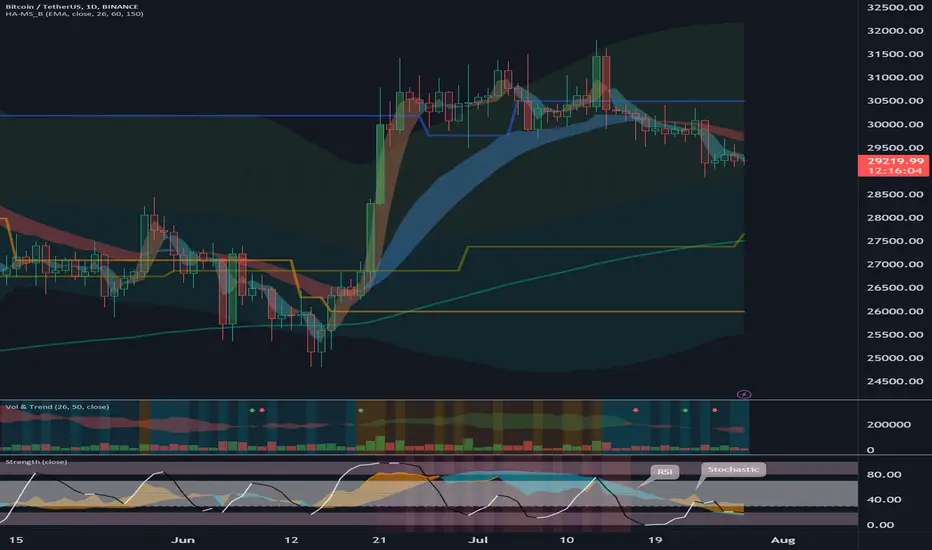
Using Heikin Ashi and MS-Signal Indicatorshello?
Traders, welcome.
If you "Follow", you can always get new information quickly.
Please also click "Boost".
Have a good day.
-------------------------------------
(1h chart)
The biggest disadvantage of trading using moving averages is that it is not easy to identify support and resistance points.
To compensate for this to some extent, we looked at how to add and utilize Bollinger bands and StochRSI indicators.
The 150 moving average is an important moving average in utilizing the moving average.
This 150 Moving Average can be applied and utilized on any time frame chart.
The next possible moving average combinations are 5 and 26, 26 and 50.
Time frame charts suitable for utilizing the 26 and 50 moving averages can be utilized on charts under the 15m chart.
The reason is that it is a time frame chart with too fast volatility.
For other time frame charts, i.e. 15m charts and above, you can use a combination of 5 and 26 moving averages.
I have written down the names of the indicators displayed on this chart.
5 The indicator corresponding to the moving average corresponds to the Heikin Ashi indicator.
26 The indicator corresponding to the moving average corresponds to the MS-Signal indicator.
Therefore, when the 5 moving average crosses upward from the 26 moving average, that is, when a regular arrangement is made, it is time to buy.
As such, when the Heikin Ashi indicator breaks above the MS-Signal indicator, it is time to buy.
The good thing about using the MS-Signal indicator and the Heikin Ashi indicator is that you can see the breadth along the trend.
The thicker the width, the stronger the role of support and resistance.
Thus, it provides more confidence in direction than a single line, such as the 5EMA indicator on a 1D chart.
And, you can also tell if a trend reversal is taking place or not.
This change is indicated by the color change of the MS-Signal indicator and the width of the Heikin Ashi indicator.
The transition of the MS-Signal indicator from downtrend to uptrend is indicated by the transition from red to blue.
Conversely, a transition from an uptrend to a downtrend is indicated by the transition from blue to red.
The Heikin Ashi indicator transitions from blue to orange for a downtrend to uptrend and orange to blue for an uptrend to bearish transition.
This change in appearance can be useful when conducting transactions.
The M-Signal indicator on the 1D, 1W, and 1M charts and the 5EMA indicator on the 1D chart are very useful when conducting day trading.
Therefore, it is recommended to activate it and check the movement during day trading.
The M-Signal indicator on the 1D chart works similarly to the 26 Moving Average.
Therefore, the short-term trend of the 1D chart can be intuitively identified by the 5EMA indicator on the 1D chart and the M-Signal indicator on the 1D chart.
Therefore, it can be very useful if you trade using tradingview brokers.
(1D chart)
Also, if you mark the M-Signal indicators of the 1W and 1M charts on the chart, you can intuitively know the mid- to long-term trend, so you can complete the chart analysis faster.
-------------------------------------------------- --------
With this, we learned how to trade using moving averages and indicators that are more valuable than this.
Chart analysis is only one part of the process to trade after all.
No matter how good your chart analysis is, if you don't come up with a good trading strategy, you will end up with losses or small profits.
---------------------------------------------------------------------------------------------
** All descriptions are for reference only and do not guarantee profit or loss in investment.
** Even if you know other people's know-how, it takes a considerable period of time to make it your own.
** This is a chart created with my know-how.
---------------------------------

Day trading using moving averagesHello?
Traders, welcome.
If you "Follow", you can always get new information quickly.
Please also click "Boost".
Have a good day.
-------------------------------------
The first time you studied moving averages, you must have had a new and surprising experience.
However, if you trade using the moving average, you will also have experienced that it does not work properly.
This is the limit of moving averages.
This is a problem because it is not easy to quickly determine whether the moving average line is supported or resisted because it is made up of curved lines.
Moving averages, which are explained in many textbooks, usually have a lot of descriptions of 20 and 60 setting values.
This can be said to be the result of the utilization value in the stock market, which has been utilized for a long time.
However, charts in the coin market use a default value of 150, which is greater than the 20 and 60 settings.
Therefore, if the price is above the 150 moving average based on the 150 moving average, it is an uptrend, that is, a buying season.
Conversely, if the price is below the 150 moving average, it is in a downtrend, i.e. selling period.
Therefore, the time to buy corresponds to LONG and the time to sell corresponds to SHORT.
The setting value of 150 for this moving average is a value that can be applied to all time frame charts.
Therefore, even in day trading, you can trade based on the 150 moving average.
However, as mentioned above, it is not easy to trade only with the moving average, so to overcome this, Bollinger bands and StochRSI indicators are added and utilized.
Because the moving average line is made up of curves, you proceed with trading by your own sensory decision.
Therefore, market transactions are mainly conducted rather than limit transactions.
Therefore, it is necessary to be careful when trading because it is often bought at a higher price than expected and sold at a lower price than expected.
Depending on the size of the trading volume, it is necessary to decide whether to proceed with the transaction based on the limit or market price.
Coins (tokens) with a high trading volume can be traded at market prices, but caution is required when trading coins (tokens) with a low trading volume.
Therefore, when conducting day trading, you should check the size of the trading volume rather than the increase in the price.
Although the above explanation may seem difficult, you should make good use of the search function supported by the exchange as it is a must-have for day trading. (Search by trading volume)
Once you have decided which coin (token) to trade, you now need to decide which time frame chart and which moving average line to use.
Time frame charts that fall under scalping usually refer to trades under the 3m chart.
Therefore, you should set 5 moving averages on the chart and practice trading from the 1m chart.
Buy when the price crosses above the 5 Moving Average, and sell when it crosses below the 5 Moving Average.
After several trades like this, you can find a time frame chart that suits you.
Finding a time frame chart that suits you depends on whether you traded near the price you thought when you traded when the 5 moving average line was broken up or down.
If the trades are continuously made near the price you thought, the time frame chart you traded now becomes a day trading chart that suits you.
If the time frame chart found is a chart below the 5m chart, set a 26, 50 moving average line on the chart.
Otherwise, if it exceeds the 5m chart, set 5, 26 moving averages on the chart.
(1m chart)
(15m chart)
Note that,
Settings for the bowlinger bands are 60, 1.8.
The StochRSI indicator is 3, 3, 14, 7.
Here 7 is the Stochastic Length value.
You have also found a coin (token) to trade, and have completed setting up a time frame chart and indicator to use.
If you are trading spot, buy when the 150 moving average, the most basic moving average, is crossed upward, and when the price is above the 150 moving average, 5 and 26, and also when the 26 and 50 moving averages are in regular alignment.
At this time, what you need to check is whether it is located near the top of the Bollinger Band and whether the StochRSI indicator is in the overbought zone.
If it is near the top of the Bollinger Bands or if the StochRSI indicator is in the overbought zone, do not buy.
Therefore, in order to buy, the price must be located in the middle or below the Bollinger Band, and the StochRSI indicator must also be located near or below 50.
To recap,
In spot trading,
1. When the 150 moving average crosses upward, it is a buying time.
2. When the price is located above the 150 moving average, when the 5 and 26 and 26 and 50 moving averages form a regular array, when the Bollinger Band is below the middle and the StochRSI indicator is below 50, it is a buying time.
when to sell
1. When it falls below the 150 Moving Average
2. When the 5 and 26 and 26 and 50 moving averages create an inverted array
3. When the StochRSI indicator breaks out of the overbought zone
SHORT trading in futures trading is the opposite of the spot trading above.
This concludes the study of moving averages.
Moving averages are an important part of chart study.
In order to perform lower chart analysis or trading, you must learn the concept and movement of moving averages.
Therefore, you should awaken your senses by using various indicators using moving averages.
---------------------------------------------------------------------------------------------
** All descriptions are for reference only and do not guarantee profit or loss in investment.
** Even if you know other people's know-how, it takes a considerable period of time to make it your own.
** This is a chart created with my know-how.
---------------------------------

Visualizing Stochastic energy for perfect entriesThe stochastic RSI has always been a problem tool for me because of its clunky look erratic lines and the way it seems l....r each other and sometimes it doesn't.
I've always felt like the stochastic RSI had these energy waves built into it that we weren't able to see because if there's an uptrend of the stochastic then there has to be an equal or greater downtrend of energy pushing it in the other direction but what if there isn't more than that energy and what if this is a perfect balance between the two energies.
This would imply that either that there's a divergence of the energy related to how price is closing or there is a pause in the energy because they're balanced between the two and of course that means your price will pause and run flat as well.
In this video I talk about the proper way to use this new indicator and the way you used to use the stochastic RSI.
Using the information as video and the images that I plot out on the screen you'll be able to see when you should do you should enter trades long or short and why you need to know where your support and resistance lines are as well as whether you're breaking above or below your moving averages.
Let this video be a first class tutorial on perfect trades using a stochastic RSI but like all other indicators you cannot use it by itself make sure that you have confluence on your price chart.
PS as always welcome to the coffee shop.
