Seting up Volume Indicators on Trading View ChartThis is basic video will show you how to set up volume indicator on a Trading View chart.
Volume

Forex Session Tendencies Tokyo Session:
Liquidity begins coming in from Wellington, New Zealand. The Tokyo session has a higher tendency for ranges to hold- support and resistance to be respected.
London Session:
Liquidity being furnished throughout Europe. The London session has a proclivity for fat, active moves.
New York Session:
Can exhibit behaviors from both London or Tokyo sessions. The Overlap is often considered "The most liquid period" of the day.
Other useful information:
The New York Forex session is one of the most liquid Forex trading sessions. When the US session overlaps with the London Forex market session it is considered to be the most liquid period of the day.The beginning of the New York session is normally more volatile than later in the day. There are different methods traders can use to trade differing levels of volatility.
WHAT TIME DOES THE NEW YORK FOREX SESSION OPEN?
The New York Forex session opens at 8:00 AM ET and closes at 5:00 PM ET. The ‘overlap’ occurs when the US Forex session overlaps with the London Forex market session. The London Forex market session opens at 3:00 AM ET and closes at 12:00 PM ET, so the overlap occurs between 8:00 AM ET and 12:00 PM ET.

Break Out Range (Entry Pattern 1/5)One of my favorite day time or scalping entry patterns is the breakout of range pattern on hourly time frame. The best times for any entry patterns occur is in between (end of Tokyo) 10 p.m. to 6 a.m (start of New York) PST/CA times- why? high liquidity and volume.
This pattern on attached hourly chart, happened end of Tokyo and start of London a prime time to entry a new trade. This set up could have been from a 1:4 or 2:4 set up of risk reward, depending on your plan and strategy and risk management.
BTC/USD ( May Sideways Ranging PA?)I think that Btc/Usd will be in a sideways range in the month of May, in between 55000.0 to 60000.0 ($5000.0) unless some world CraCra event happens.
On weekly and monthly Btc/Usd charts- most of the price action has been in between this range, with one spike to $65000.0 last month.
Btc/Usd sellers won last month with price action making a long legged red doji candle (undecided) on April chart and most of the strength, I believe still in sell side. Last couple of years price action has been going almost straight up or 90 degrees, this year (2021) will mostly be a consolation one or sideways so their is some kind of balance placed in Btc/Usd market.
Note: I do not trade Btc/Usd, but if you do---- good luck!!!

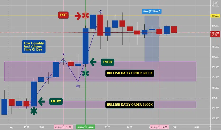
GbpAud London/NY session order blocks (examples)Example of both a bearish and bullish order block that would have helped you day trading the Gbp/Aud pair on 15 minute time frame. This is a very both a high liquidity and volume four hours of day (last four hours before London session closes).
Noted on attached chart is following:
1) 1:3 risk/reward set up on a bearish and bullish trade. If you would have utilized a 12.5 pip stop loss vs possible target of 36+ target. These trades would have lasted around a hour in real time to hit targets.
2) Note: Fib retracement indicator on chart, with a reversal in golden zone of 38% to 62% areas. They can/should be used for both trades for entry areas.
3) Price action on 2nd trade had support right above white line or S1 pivot line, which is another confirming indicator.

Sessions (Best Times To Day trade)Visual chart of different daily session: Sydney, Tokyo, London & New York is easier to understand then just read on website. When sessions overlap and when both highest liquidity and highest volume happens per day.
If you day trade & keep price action number one and trade during highest liquidity and volume hours area per day, which is the (12 hrs) in between the end of Tokyo session and end of London session, you will keep trading Forex as simple as possible. Use risk management and stop losses always when trading.
Please convert noted PST/USA chart times to your time zone.

Per Day 12 Hours Of High Liquidity & Volume Forex is open 24 hours a day, but first 8 hours of new session has slow and low liquidity and volume and last 4 hour of session has slow and low liquidity and volume. Why is first 8 hours mostly ranging and sideways price action, related to Sydney and Tokyo sessions are only ones open for trading and last 4 hours of session is because only session is open is New York, after London has closed for session. * You generally should not trade these times unless you are scalping trades for low pips.
Best times (you can convert to your time zone) is from 10 p.m. to 6 a.m. P.S.T/USA- or end of Tokyo session to end of London session. This is where most of the 6 trillion dollars of Forex buying and selling takes place and has highest liquidity and volume every day. Please put a simple volume on any Forex hourly or four hour chart and you will see when high volume is trading (London and NY session, especially overlap 4 hr period before London closes).
On noted 4 hour attached chart: You see possible day trading done on 4 hour charts during high liquidity and volume times of day, these trades mostly are reversal back into daily trends from liquidity within the last 8 hours of Tokyo session before London. You can set an sell limit or buy limit trade expecting next 4 hour (10 p.m. to 2 a.m.) candle to reverse back into major trend of week or day. Best day trading is during 12 hours of high liquidity and high volume period.
The Forex markets want to get retailers going wrong direction, let price action come to you on either 4 hour or daily time frames- then trade in that trend direction you will profit more and have less stress. Good Luck and Good Trading.
Always, use stop losses and risk management when trading Forex.

a Tip about reading VolumeHow to read volume in your stock:
General concept:
- You want to see volume increase on impulses and volume decrease on corrections
Volume analysis:
A:
Price is moving up, volume is increasing - as should be.
B:
Price is correcting, volume is decreasing - as should be.
C:
Price is moving up, volume is increasing - as should be, BUT the large volume is not pushing forward and the price is starting to correct - Red flag.
D:
Price is correcting, volume is decreasing - as should be.
E:
Price is keeping correcting further, volume is increasing on deep correction after breaking local low!!! (not as should be) + HUGE amount of volume greater than volume peaks 1 and 2 =====>>>> we are about to go into a large correction!
Large correction = deep or lengthy... but it doesn't tell you which one... maybe both, it is just telling you correction about to happen...
F:
Large correction is happening, volume is decreasing.
EXTRA ANALYSIS:
Remember that the market is fractal, so this pattern repeats itself on different structures.
- From point A to E you have an impulse on increasing volume. From point E to F you have a correction on decreasing volume (Bigger time frame).
- From point A to 1 to B there is an impulse and correction volume pattern, as stated above on the lower time frame:
A is an impulse with increasing volume
1 is like point E - volume on the RED day is greater than the Green day or any previous days on the rise.
B is a correction on decreasing volume
The whole concept of volume analysis is to help the trader be more in tune with the market cycle... So you will know when you are in a correction, and when you are in impulse.
Knowing this will help you HOLD ON, when you need to, or TAKE PROFIT when you have signs that correction is happening.
If you like it, follow and like this idea so it will save on your saved ideas for future reference.

Should You Use Sessions Indicator?If you are new to trading Forex, should you have sessions indicator on your charts? Yes, 100%. Why, most of the liquidity and volume happens at end of Tokyo session to end of London session. This involved Tokyo/London overlapping one hour and London/New York overlapping four hours.
You need to understand that price action during Tokyo session mostly ranges or goes sideways.
You need to understand that price action during London session will mostly do a fakey or false move in wrong direction, then start trending.
You need to understand that price action during New York session will mostly continue same direction of London session and/or reverse trend.
You need to understand that price action after London session closes, will decrease with both liquidity and volume dropping suddenly for rest of session.
Note: You need to know that 1st hour of any new sessions have the highest spreads and are not for trading, but for setting up future possible trades.
Finally, from 10 p.m. to 2 a.m. PST/USA- either high or low of day will be made, 80% of time- then you can trade in trend direction of day.
Sessions Indicator will keep you trading the right pair, at the right price, at the right time of day and during the right sessions. Why, trade AUDJPY during New York Session when both Sydney and Tokyo sessions are closed? Commonsense and keeping trading simple will help your bottom line, in Forex. The sessions indicator will work with any time-frame under 4 hours and keep a visual reminder of what session is open and closed - F.Y.I.

Use of Volume At PriceThis video shows how you can use Volume At Price data using two indicators for Visible Range and Fixed Range.

Pair? Price? Time? & Session?- Before Entering A New Trade.Before Taking Any New Trades, Ask Yourself These Questions:
What pair? Is base currency in current session.
What price? Is current price action around round numbers? double zeros or higher are psychological numbers of banks and retailers.
*On chart I use .500, .750, .000 & .250 ending numbers which on GBP pairs are quarter levels (or 12.5 pips) zones. Total ADR on this chart is 75 pips.
What is current time? Beginning of a session (higher volume & liquidity) during London and New York sessions.
What session is set up pattern to enter a new trade? Sydney, Tokyo, London or New York session.
Higher volume? Beginning of sessions are a great time to initiate new trades, in direction of momentum and trend. Highest volume and liquidity is between London open to London close time, which is around 12 hours per day. *London overlaps Tokyo and London overlaps New York session.
High liquidity? Overlapping sessions (best) and where two major sessions are working, so double liquidity and volume at play.
Refer to noted possible five trades that could have been taken on noted 1 hour chart of GBPAUD during Fridays session. A lot of possible profit pips with the right stop losses and risk management- please trade according to your plan and strategy. For entries I use fractals, trends, momentum, volume, liquidity, fib ret reversal levels of (50% to 61.8%-golden zone), engulfing, harami and pin bar candlestick setups to enter with right pair, right price, right time and during right session. Good Luck.

MID-DAY Video {Chef Bubbles} How to use it Please refer to the linked video from before to match it with the indicators and formulate the thought process of the Bubbles strategy!
thank you for watching!!

April 1, 2021 - Opening Range-Initial Balance Trading the NQIn this video I will show you how I took a very common setup with the OR/IB indicators. The setup is to fade the first touch of the IB range, after the range has been set. As you can see, price rejected at the IB high and came down to tag the Overnight High (the magenta line).
This trade netted about 50 points on the NQ.

How I used my Opening Range / Initial Balance indicatorIn this video I will demonstrate how to use my Opening Range / Initial Balance indicator to take profits on March 31, 2021.
Please watch and LIKE if you find it useful.
Thanks!

Volume and Open interest of some CME contractsLooking at the numbers helps us figure out what goals to other market participants have? Do they rollover their positions alot? How far do they project themselves?
Do they hold for months of exit after just a few days?
We can see the volume of Oil popping off when the expiry is close as traders, for example terrible ETFS, close and re-open the next month and I am suspecting much of this volume are front running algos taking advantage of these rollovers.
The S&P is looking more like a casino of short term gamblers than ever.
And the EURUSD sees much holding relative to trading, there are no day traders in FX which echoes with the BIS report showing trader's timeframe (almost all retail investors day gamble or "swing" gamble < 7 days but they represent only 5% of the FX market maybe even less).
Other notable futures: Gold with a volume of 185 thousand contracts this Monday, and open interest of 472 thousand split almost evenly between the "front" month (in practice the April contract) and June one.
10 year T Notes have an open interest of 3,780,235 contracts (378 billion usd) I think this is the second highest one.
10 year T Notes options also have an open interest of over 3.5 million.
The total volume is close to 2 million for futures & 500k for options. So about 250 billion USD.
I think the third biggest contract in usd terms is the e-mini S&P 500, with a daily volume typically around 3-3.5 million (> 500 billion usd). The contact volume is about the same it has been for years but the usd value has almost doubled from when the S&P was lurking in the depth at close to 2000 points.
Open interest for the S&P is at 3 million for futures + 500k for options, it's sitting at around the same value as the ADV.
This is the era of day traders...
The largest contract is not even close. Seriously these numbers make my head turn.
It's the Eurodollar (the future that represents the London interbank rate).
The daily volume hoovers around 2 - 2.5 million contracts (I'm guessing around 700 billion usd).
The open interest is eye popping at 25-35 million contracts (Friday it was at 11.8 million futures & 20.9 million options), it's half the GDP of China.

PB&J: Shadow-30PB&J: SHADOW-30
If you are new to trading, then start with this pattern!
It is easy to identify, easy to learn, and easy to trade.
What more could you ask for?
HOW TO TRADE THE SHADOW-30 CHART PATTERN
This can be an "everyday" pattern because of its reliability.
It is easy to spot and simple to trade.
THE SETUP
The name Shadow-30 refers to a "shadow" that slices through the "30" period exponential moving average.
This looks like a Hammer on the chart but it doesn't have to be perfect to be considered a Shadow-30.
- The color of the real body is not important.
- The shadow on the chart flushes other traders out of their position.
Note: There is nothing special about the 30 period moving average. It is just a reference.
Look to the left on the chart to determine support and resistance.
When you are trading any kind of long lower shadow or Hammer pattern, always look for volume to be higher than the previous day .
- This suggests that many traders were shaken out and demand is picking up.
- This is important!
THE ENTRY
If you are able to trade during the day then buy on the day of the Hammer near the end of the day. You do not need any kind
of "confirmation" or anything else. You only need to see that price is at a support level and that demand
is coming (volume). That is all the confirmation you need.
If you cannot trade during the day then place your buy stop above the high of this Hammer day. The next
day you'll have to check to see if your order gets filled and then place your stop loss order. You could also use a bracket order.
THE STOP LOSS ORDER
There are two options for the placement of your stop loss order. Each has advantages and disadvantages. You decide what
is right for you.
Option 1:
- Put your stop under the low of the Hammer. The advantage to this is that your stop is far away from your entry price
and you will not likely get stopped out prematurely. The disadvantage to this is that because your stop is so far away, you will
have to buy fewer shares in order to comply with your money management rules.
Option 2:
- Move down to the 1H chart and put your stop below the support area closer near the real body of the candle.
The advantage to this is that you get to buy more shares because your stop is closer to your buy price. The disadvantage to
this is that because your stop is so close, you may get stopped out more often, before a big move happens.
TAKING PROFITS
When you are trading wide range days like Hammers you will find out that many times the chart will trade sideways for a day or two. That is fine.
You are already in the trade just waiting for other traders to enter. Also, the days that follow a Hammer are typically low volatility, narrow
range days like Doji.
Be patient! Do not get anxious to move your stop up. Wait for price to actually move in your favor before you begin trailing your stop.
Once price moves in your favor, then you safely begin to trail your stop loss using your favorite exit strategy to lock in profits.
TRADING TIPS
Focus on those charts where the real body of the candle is close to the 30 EMA. You want as many traders as possible shaken out of this
before you get in.
This setup is reversed for short positions except now your are looking for charts with a Shooting Star pattern through a declining 30 EMA.
Give more weight to setups where price gaps away from the previous candle to end the day in a Hammer.
Always look to the left on the chart to make sure price is at a significant support or resistance area.
WHEN GOOD CHART PATTERNS GO BAD
Yes, you will have losing trades with this pattern.
There is no pattern that will guarantee all winning trades!
But with proper money, trade, and self management, you can do very well with this setup.

HOW TO PROPERLY TRADE WYCKOFF ON ANY TIMEFRAME W/ VOLUME!Ok guys, I've gotten many requests over the past month about how to actually trade using Wyckoff's work... I will try to simplify it the best I can.
According to Wyckoff's theory, you should "technically" ONLY get into a trade AFTER a trading range has been broken... A trading range is usually referred to by most traders as "consolidation", and it is usually written off as nothing significant... Just price doing it's wacky thing, going up and down... Which is not correct. It is actually a sign of institutions manipulating price around to see where buying and selling is from retail traders like you and me. Once they have decided where where the herd is, they move OPPOSITE of the herd in order to take as much money as they can from you. (Or at least the majority of you).
Wyckoff's work was to find a way to properly identify the signatures of where price was actually being taken by these price manipulating institutions with big enough pockets to manipulate price.
Let's start.
First and foremost, ALWAYS wait for a big move. Big sharp moves up or down will (over time) identify these trading ranges. I am using Bitcoin as an example, because it is perfectly situated right above an existing trading range. Let's take a closer look.
How the trading range retest will probably look
For now, I am going to post this, and in the updates on this idea, I will post about how to place short trades very soon so you guys can see what the opposite of accumulation looks like.

Take Advantage of Tradingview Alerts! (TUTORIAL)Many Options are available for custom tailoring your Alerts so that you can make sure you don't miss out or loose money! Quick crash Course on how to utilize these alerts on your indicators so you can keep an upper hand as you scan the markets

Auction Market Theory + Supply and Demand ETHUSDI have tried to move away from indicator based trading into more fact based TA and would like to breakdown how to use this form of analysis with just candlesticks and volume. This is a larger time frame breakdown though similar patterns can be identified (though significantly more volatility prone) in smaller time frames and one can find that these principles explain moves across many markets. What's interesting with Ethereum is the similarities to precious metals. The demand has no specified cap while the supply is limited. Using supply as a constant and demand as dependent variable paired with a basic understanding of auction market theory, each move in an asset can be analyzed. I only chose ETHUSD due to the rising buzz around cryptocurrency.
There are 3 main discussion points in this post They are numbered on the chart in order and the numbers will also be used to tie them to their principle.
1. Aggression: Who is currently more aggressive in the market? Buyer or sellers? Aggression in markets simply is the continued buying or selling at higher or lower prices respectively, causing rapid fluctuations. I try to mark the more significant areas of aggression as they often have more importance in the broader scheme of things. For ETHUSD, in 2021, we have seen tons of buyer aggression causing large breakouts, often followed by selling aggression after new highs are created. These types of moves can not be predicted, nor can we establish how long they will carry on, though after the fact they are of upmost importance. For reference, (1), (2), (4), (5), (6) are all areas of aggression I identified on this chart. To identify these I look for volume that is relatively higher than usual as this shows the increase of interaction between buyers and sellers. I then find the bias which is simple on a candle chart- red or green. Typically with larger aggressive moves there is a scenario that occurs referred to as imbalance. An imbalance is formed when buyers raise the bid or sellers lower the ask quickly creating larger fluctuations in prices. These imbalances are often POI's during a retrace.
2. Absorption: Absorption is when there is a large group of resting limit buy or sell orders that temporarily or fully halt selling or buying action. This information can be accessed in real time with level 2 data in the stock market though I'm not to sure how to identify them best real time in the cryptocurrency market as it is decentralized. Though absorption isn't dependent on aggression, it can easily be identified when there is an aggressive party in the market. First, the assumption must be made that prices with downward/upward momentum will continue in the same direction as long as the majority of the money in the market retains bull or bear bias. Theoretically, one must assume that as long as there is no worthy contest, prices will remain moving to infinity or 0. Second, the study of volume. If there is an obvious directional movement, volume is continuing to increase, and prices are unchanged as buy/sell pressure continues, then it is safe to assume that there is larger amount of limit orders than active/aggressive orders, in a nut shell that is all absorption is. Example- . What happens next is a competition of the buyers or sellers for the best possible prices and trends form in that direction until their position is fully formed, example-(COMP). Absorption areas are often referred to as support and resistance and in a consolidating market these areas are easy to identify. They often creating a mix of limit buyers/sellers along with "market" buyers/sellers resulting from the fact that both of these parties have identified these levels and they both are in agreement that it is a buy/sell zone . If these supports and resistances are broken (typically a result of aggression) those on the sidelines may see a chance to enter the market causing aggression/breakouts, for example- (5).
3. Supply and Demand- Supply and demand is essential for understanding any market and is arguably the biggest influence on price. When it comes to understanding demand in the form of Cryptos or any other asset it is not always easy to identify, as it is all relative. However, as stated earlier we know for a fact that the total supply in my example, ETHUSD, is always going to be capped. Demand on the other hand, is constantly going to be changing. One way demand can be inferred is fundamental analysis, technically if enough people were to say "to the moon" and the unspoken HODL agreement is maintained, price could rise forever as people continue to put money into the market. Another way to find demand is looking at historical price relative to historical volume, find areas where volume was low yet price still pushed higher. This occurs when enough are people are actively buying the asset but there is a majority of people intentionally holding the bag. This is a phenomenon known as a supply crunch and is exclusive to assets with capped supply. As these people continuously buy, the asset's price moves higher in search of absorption or where market participants may want to sell their holdings. As mentioned before, these can be found with time/price based volume studies that for simplicity sake I will refer to as "volume wells" (3A and 3B). More often than not these volume wells a result of ranging markets and come in different sizes depending on the longevity of the consolidation/accumulation period.
Tying it Together-
Using these three principles to breakdown markets, one can better establish an understanding of price action and envision the market as whole rather than piece by piece. Furthermore, the understanding of how buyers and seller are interacting minimizes the risk when trading. I hope this was helpful and remember, there is no right or wrong way to trade and I intend for this post to be strictly educational. Feel free to leave your thoughts or questions in the comments.

How To Catch a Knife : Island Warning Show of 2-11-2021Demonstration of how I short, cover, and catch knifes using 2-11-2021 as an example.

Pre-Market Top Gainer breaks to new highI often noticed that the big gainers from the opening make near the close another move up.
As always I use the 5 min bar break or bounce of the POC line as an entry, place the stop below the entry bar and trail the stop when there was an down move and and again an upmove.
I am looking forward to program or get a scanner in tradingview that sents us an alert if the price breaks above a POC line on the session volume indicator

Melvin Capital: the adventures of an infinite size short sellerYet another degenerate bites the dust.
In the markets, there is a once every 100 years 5 sigma event every few months.
Some of you may remember the James Cordier of optionsellers dot com emotional apology video, after he got wiped out by a short squeeze on Natural Gas in 2018.
I looked into it back then and this guy was an out of the money naked option seller using extreme leverage.
These people, that get wiped out, every time they are psychopaths. This time we are looking at stocks, and the guy running Melvin Capital was a madman.
This guy single-handedly shorted between 50 and 100% of Gamestop all available shares. The ADV is ~3.5MM shares which is around 5% roughly.
I do not trade stocks (I do Forex CFDS & CME commodity futures) but I know enough to know shorting all by yourself more shares in percentage than the second highest shorted stock entire short interest, that's asking for trouble. I do not know what limits one should set, as a famous stock expert would say "it depends on your personal risk tolerance", but the adv would be a good place to start maybe? 5% of float seems big but reasonable?
When he shorted CD projekt he only used 0.6% of the outstanding shares according to this article.
Funny thing: they say he did not make as much as he should have because the rate was not favorable. They know this or they are guessing?
The reckless CEO of Melvin did not bother to open an FX position to hedge? He likes to live dangerously, or maybe he was making an FX bet.
www.world-today-news.com
On this page they claim to have a list of stocks Melvin is short of: whalewisdom.com
Reddit found a troll in a very dangerous position, and so they went whale hunting.
But I think it's other institutions that took down the whale actually, and the heroic "little guy" just joined late (as usual) and is now left holding the bag.
Melvin loss was entirely the responsibility of the head manager, risk managers and whoever came up with the idea of shorting more than 50% of shares.
It's always the same story. Before getting wiped out James Cordier published (on another site) a trading idea called "option selling opportunities so good they're scary" and was persuaded he could not lose.
I bet the same happened here. Gabe Plotkin had big success (50% returns, one of the best funds), got lucky and made easy money, got excited (this is the "don't get emotional" part), went in big, and then got punished.
I doubt Gabe Plotkin and James Cordier are excited today.

I LOST 70% OF MY CAPITAL WITH THE SAME MISTAKE => OVERTRADINGHello Traders,
today I want show you a point of my live, that I constantly overlooked. I want sensitize you for it and also make me so a reminder for the future!
1. OVERTRADING
It's the truth: In the past I lost 70% of my capital with overtrading. If you find yourself there then I would be sensitize you to rethink your approach of trading.
On the chart above you can see how I take at the beginning all rules what I learned before:
Only 1% of my capital I choose for risk with using StoppLoss
Support and Resistance are STOPPLOSS and TAKEPROFIT, depence on trading direction
I choose a Takeprofit more then 2 times of my risk
=> I lost the most time with this rules
But the rules are not the problem!
The problem was my overtrading. I see only "ONE" signal to take action => then it overcomes to reaction buy, no no, sell... dame, better buy and so on => always if I was in loss I tried to rethink my trade 24/7 hours in front of the screen.
2. SUPPORT AND RESISTANCE: THE WORST ENTRY POINTS EVER, BUT GOOD STOPLOSS AND TAKEPROFIT AREAS
Another thing is, that support and resistance areas are good reverse moments. Every greedy trader like I used to be, try to catch the early trade to make more money than anyone can imagine. Then back to reality: you get stopped. The market takes your money and you don't realize why!
On this moment, you have your own opinion of the market and this your mistake to believe you are right. You hadn't wait enough!
3. BE PATIENCE - TRADE LATE AND RIGHT THEN EARLY AND WRONG (MULTIPLE)
The headline above in point 3. is since my realizing the importast rule. Trade late and right!
Because the other thing of trading you can: the right risk, the winning opportunity.
Sometimes it helps to look in deeper timeframes, to get enough win-risk-ratio.
Hopefully it helps you!
Kind regards
NXT2017
