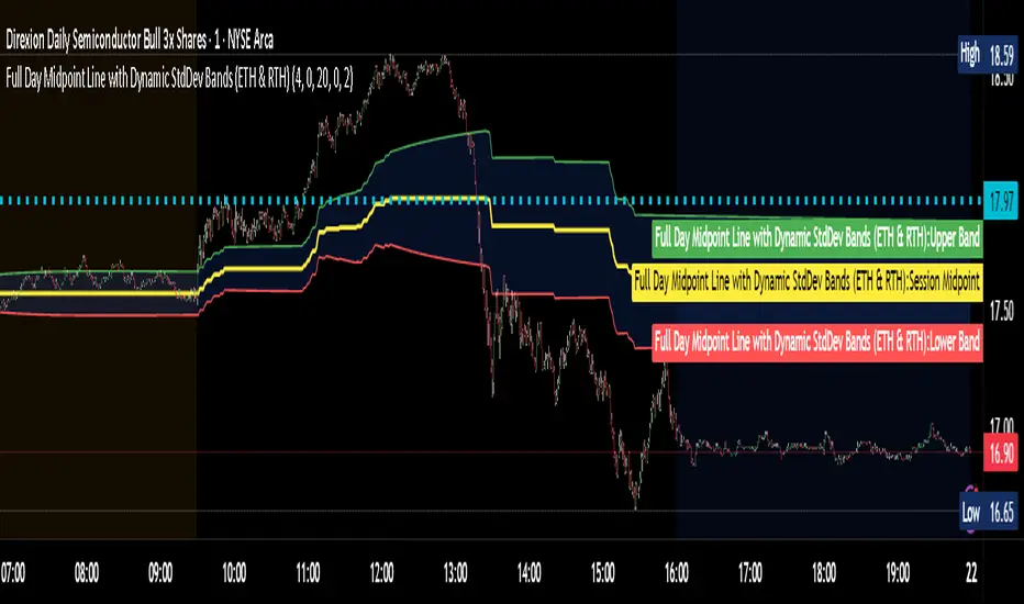
Full Day Midpoint Line with Dynamic StdDev Bands (ETH & RTH)A Pine Script indicator designed to plot a midpoint line based on the high and low prices of a user-defined trading session (typically Extended Trading Hours, ETH) and to add dynamic standard deviation (StdDev) bands around this midpoint.
Session Midpoint Line:
The midpoint is calculated as the average of the session's highest high and lowest low during the defined ETH period (e.g., 4:00 AM to 8:00 PM).
This line represents a central tendency or "fair value" for the session, similar to a pivot point or volume-weighted average price (VWAP) anchor.
Interpretation:
Prices above the midpoint suggest bullish sentiment, while prices below indicate bearish sentiment.
The midpoint can act as a dynamic support/resistance level, where price may revert to or react at this level during the session.
Dynamic StdDev Bands:
The bands are calculated by adding/subtracting a multiple of the standard deviation of the midpoint values (tracked in an array) from the midpoint.
The standard deviation is dynamically computed based on the historical midpoint values within the session, making the bands adaptive to volatility.
Interpretation:
The upper and lower bands represent potential overbought (upper) and oversold (lower) zones.
Prices approaching or crossing the bands may indicate stretched conditions, potentially signaling reversals or breakouts.
Trend Identification:
Use the midpoint as a reference for the session’s trend. Persistent price action above the midpoint suggests bullishness, while below indicates bearishness.
Combine with other indicators (e.g., moving averages, RSI) to confirm trend direction.
Support/Resistance Trading:
Treat the midpoint as a dynamic pivot point. Price rejections or consolidations near the midpoint can be entry points for mean-reversion trades.
The StdDev bands can act as secondary support/resistance levels. For example, price reaching the upper band may signal a potential short entry if accompanied by reversal signals.
Breakout/Breakdown Strategies:
A strong move beyond the upper or lower band may indicate a breakout (bullish above upper, bearish below lower). Confirm with volume or momentum indicators to avoid false breakouts.
The dynamic nature of the bands makes them useful for identifying significant price extensions.
Volatility Assessment:
Wider bands indicate higher volatility, suggesting larger price swings and potentially riskier trades.
Narrow bands suggest consolidation, which may precede a breakout. Traders can prepare for volatility expansions in such scenarios.
The "Full Day Midpoint Line with Dynamic StdDev Bands" is a versatile and visually intuitive indicator well-suited for day traders focusing on session-specific price action. Its dynamic midpoint and volatility-adjusted bands provide valuable insights into support, resistance, and potential reversals or breakouts.
Bands and Channels
ORB - Opening Range Breakout + AlertsThe only ORB indicator you'll ever need.
- Flexible Range: Tailor the opening range (e.g., 5m, 15m, 30m) to your trading style.
- Key Levels: Auto-plots striking pink/purple support/resistance lines post-range for clear trade setups.
- Breakout Alerts: Reliable LONG/SHORT signals on 5m chart for confirmed breakouts; enable/disable as needed.
- Personalized Design: Customize line color and thickness for optimal visibility.
A friendly reminder that no tool or indicator guarantees success. Integrate this into a robust trading plan.

RTH Session Highs & LowsA Pine Script indicator designed to track and plot the Regular Trading Hours (RTH) session highs and lows on a chart, typically for U.S. equity markets (e.g., S&P 500, Nasdaq, etc.), which operate from 9:30 AM to 4:00 PM Eastern Time.
Session High & Low Lines:
During the RTH session, the indicator draws green and red horizontal lines that represent the highest and lowest price seen so far within that trading session.
These levels help traders identify intraday support (low) and resistance (high) levels.
New High/Low Markers:
Small triangle markers are placed:
Above the bar when a new intraday high is made (green triangle).
Below the bar when a new intraday low is made (red triangle).
This visually flags when momentum may be building or reversing.
Intraday Strategy Support:
Use the session high/low as dynamic support/resistance for scalping or breakout strategies.
For example:
Breakouts above session highs may indicate bullish strength.
Breakdowns below session lows may suggest bearish momentum.
Mean Reversion Tactics:
Prices approaching these lines and then rejecting can be used for mean reversion setups.
Combine with volume or candlestick patterns for confirmation.
Risk Management:
Set stops or targets relative to session highs/lows.
For instance, use session high as a stop-loss level in a short position.
Volatility Gauge:
Tracking how frequently new highs/lows are formed can help assess intraday volatility or range expansion.
Complement with Indicators:
Combine this with our "McGinley Dynamic Channel with Directional Shading" indicator or our "EMA Crossover with Shading" indicator to add context to breakouts or rejections.

Key Open LevelsThis Pine Script indicator (Key Open Levels) allows users to highlight up to six specific open prices from different times of the trading day as horizontal lines on the chart.
Each line can be customized with user-defined style, width, and color settings.
Users also have the option to display price labels directly on the lines for added clarity.
The indicator is designed to work seamlessly across all intraday timeframes, including seconds, minutes, and hourly intervals, making it versatile for various trading strategies that rely on key intraday price levels.
This indicator has proved to be a key indicator especially for people studying Futures market reaction around Key Open Levels.

ATR Overlay with Trailing Flip [ask2maniish]📘 ATR Overlay with Trailing Flip
🔍 Overview
The ATR Overlay with Trailing Flip is a dynamic, visually-enhanced overlay indicator designed to assist traders in trend detection, trailing stop management, and volatility-based decision making. It leverages the Average True Range (ATR) with optional dynamic multipliers, filters, and alerts to enhance trade execution precision.
⚙️ Features Summary
✅ Static & dynamic ATR multiplier
✅ Customizable trailing stop logic
✅ Volume & Bollinger Band filters
✅ Buy/Sell label signals with alerts
✅ ATR bands with color fill
✅ Optional candle coloring based on trend
✅ Table showing current ATR multiplier
✅ Fully customizable visual controls
🔧 User Inputs
📘 Info Panel
ATR Usage Guide
Tooltip with trading-style recommendations:
Scalping: ATR 5–10, Intraday: ATR 10–14 , Swing: ATR 14–21 , Position: ATR 21–50
📊 Visual Elements
📈 Plots
Upper/Lower ATR Bands
ATR Fill Zone
Dynamic Trailing Stop Line
🕯 Candle Coloring
Candles colored green (uptrend) or red (downtrend)
Wick coloring matches body
🏷 Signal Labels
"BUY" below candle when trend flips up
"SELL" above candle when trend flips down
📊 Table (Top Right)
Displays current multiplier value:
If static: Static: x.x
If dynamic: percentage format based on ATR ratio
🔔 Alerts
Two alert conditions:
Flip to Long → "📈 ATR flip to LONG"
Flip to Short → "📉 ATR flip to SHORT"
Sound can be enabled for real-time feedback.
🧠 Best Practices
Combine this tool with support/resistance or order flow indicators
Use dynamic ATR during volatile periods for better adaptability
Filter signals in ranging markets with BBand Width Filter
For scalping, reduce ATR period and multiplier for tighter risk
🛠️ Customization Tips
Adjust trailingPeriod for tighter/looser stops
Use color inputs to match your charting theme
Disable features (labels/fill) to declutter chart

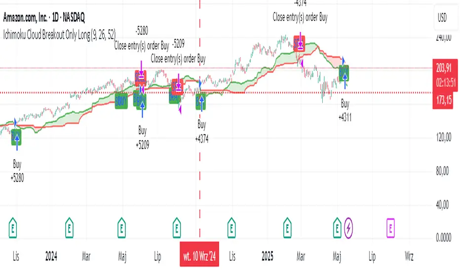
Ichimoku Cloud Breakout Only LongThis is a very simple trading strategy based exclusively on the Ichimoku Cloud. There are no additional indicators or complex rules involved. The key condition is that we only open long positions when the price is clearly above the cloud — indicating a bullish trend.
For optimal results, the recommended timeframes are 1D (daily) or 1W (weekly) charts. These higher timeframes help filter out market noise and provide more reliable trend signals.
We do not short the market under any circumstances. The focus is purely on riding upward momentum when the price breaks out or stays above the cloud.
This strategy works best when applied to growth stocks with strong upward trends and good fundamentals — such as Google (GOOGL), Tesla (TSLA), Apple (AAPL), or NVIDIA (NVDA).
CANX Supply and Demand - Order Block - Candle Identification© CanxStixTrader
CANX Supply and Demand - Order Block - Candle Identification
Description
Designed as a visual aid, to highlight the last up or down candle before a fractal break. We can assume these candles where the point of origin that generated enough strength to break recent structure. By using them as reference points, traders are expected to follow their own set of rules and mark higher probability supply and demand zones in the area.
How to use:
Expect price to retest in these areas, and if they fail, a potential retest in the opposite direction . The greater the number of times a zone is tested, the more likely it is to break. A fresh zone that has not yet been tested will have a higher probability of a bounce.
Fractal period and candle break type can be customized in the settings. This works on all time frames.
**The indicator is set to my optimal settings for the 5 minute or 15 minute time frame** Please mess around to find your comfort zone and back test the results.
The lower the period number the more noise this creates on the market. The higher the number the less noise and more potential for a stronger zone.
Keep it simple
SuperSmoothed Volume Zone Oscillator------------------------------------------------------------------------------------
SUPERSMOOTHED VOLUME ZONE OSCILLATOR (SSVZO)
TECHNICAL INDICATOR DOCUMENTATION
------------------------------------------------------------------------------------
Table of Contents:
1. Original VZO Background
2. SuperSmoother Technology
3. SSVZO Components
3.1. Main SSVZO Oscillator
3.2. Momentum Velocity Component
3.3. Adaptive Levels
3.4. Static Levels
3.5. Trend Shift Detection
3.6. Glow Effect Visualization
4. References & Further Reading
------------------------------------------------------------------------------------
1. ORIGINAL VOLUME ZONE OSCILLATOR (VZO) BACKGROUND
------------------------------------------------------------------------------------
Creator: Walid Khalil (November 2009, Technical Analysis of Stocks & Commodities)
History: Khalil designed the VZO to address limitations in other volume indicators
by focusing on the relative balance between buying and selling volume while filtering
out market noise. The indicator identifies accumulation and distribution patterns.
Traditional Usage: The classic VZO uses a 14-period calculation setting and is
interpreted on a scale from -60% to +60%:
- Readings above +40% indicate strong buying pressure (potential overbought)
- Readings below -40% indicate strong selling pressure (potential oversold)
- The zero line acts as a key reference for trend changes
- Divergences between VZO and price offer valuable trading signals
Difference from Other Volume Indicators: Unlike simple volume indicators that only
track total volume, the VZO tracks the relative difference between up-volume and
down-volume, more effectively identifying buying/selling pressure imbalances and
potential reversal points.
------------------------------------------------------------------------------------
2. SUPERSMOOTHER FILTER TECHNOLOGY
------------------------------------------------------------------------------------
Creator: John F. Ehlers, an engineer specializing in digital signal processing for
trading systems.
Origins: Introduced in "Rocket Science for Traders" (2001) and refined in "Cybernetic
Analysis for Stocks and Futures" (2004). Represents the application of digital signal
processing techniques to financial markets.
Technical Foundation: The SuperSmoother is a two-pole low-pass filter specifically
designed to eliminate noise while preserving the underlying signal. It combines
principles of Butterworth and Gaussian filters to minimize both phase shift and
passband ripple.
Mathematical Implementation:
a1 = exp(-π * sqrt(2) / period)
b1 = 2 * a1 * cos(sqrt(2) * π / period)
c2 = b1
c3 = -a1²
c1 = 1 - c2 - c3
Advantages Over Traditional Filters:
- Reduces lag compared to simple moving averages
- Eliminates high-frequency market noise more effectively
- Minimizes unwanted ripples in the output signal
- Preserves important turning points in the data
- Superior handling of sudden market movements
According to Ehlers: "Conventional moving averages are plagued by excessive lag and/or
rippling in their passband. The SuperSmoother eliminates virtually all of this ripple
and has excellent transient response characteristics." (TASC Magazine, 2014)
------------------------------------------------------------------------------------
3. SSVZO COMPONENTS
------------------------------------------------------------------------------------
3.1. MAIN SSVZO OSCILLATOR
------------------------------------------------------------------------------------
Description: The core component measuring buying vs. selling volume pressure using
the SuperSmoother filter for enhanced noise reduction.
Calculation: SSVZO analyzes the relationship between up-volume (volume on rising
prices) and down-volume (volume on falling prices), applying exponential moving
averages to both components, then calculating their relative strength. The
SuperSmoother filter reduces market noise while preserving the underlying trend signal.
Implementation Advantage: By applying the SuperSmoother filter to the VZO calculation,
the SSVZO provides significantly cleaner signals with fewer false crossovers and more
accurate identification of true trend changes.
Interpretation:
- Values above zero indicate bullish volume dominance
- Values below zero indicate bearish volume dominance
- Readings above +60 suggest overbought conditions
- Readings below -60 suggest oversold conditions
- Crossovers of the zero line signal potential trend changes
Trading Application: Use SSVZO as a primary volume-based momentum indicator to
confirm price trends, identify divergences, and spot potential reversal zones.
------------------------------------------------------------------------------------
3.2. MOMENTUM VELOCITY COMPONENT
------------------------------------------------------------------------------------
Description: A histogram displaying the rate of change of momentum, showing how
quickly buying or selling pressure is accelerating or decelerating.
Calculation: Derived from price momentum over a user-defined period, with optional
adaptive filtering that adjusts sensitivity based on market volatility. The velocity
component shows the first derivative of momentum – essentially the "acceleration" of
market movement.
Technical Origin: Inspired by Ehlers' work on Hilbert Transforms and research on
cyclic components in financial markets, as detailed in "Cycle Analytics for Traders"
(2013).
Interpretation:
- Positive readings (teal bars) indicate accelerating upward momentum
- Negative readings (orange bars) suggest accelerating downward momentum
- Larger bars indicate stronger momentum acceleration
- Shrinking bars signal momentum deceleration
Trading Application: Use as an early warning system for potential trend exhaustion
or confirmation of a new trending move. When momentum velocity diverges from price,
it often precedes a reversal.
------------------------------------------------------------------------------------
3.3. ADAPTIVE LEVELS
------------------------------------------------------------------------------------
Description: Dynamic overbought and oversold boundaries that adjust to market
conditions, providing context-aware trading signals.
Calculation: Uses statistical methods based on the standard deviation of the SSVZO
values over a longer period. These levels automatically widen during higher volatility
periods and narrow during consolidation.
Research Base: Draws from Perry Kaufman's work on Adaptive Moving Averages (AMA) and
Bollinger's research on dynamic volatility bands, as published in "Trading Systems
and Methods" (2013).
Interpretation:
- Adaptive Overbought (dotted circles above): Dynamic ceiling that expands/contracts
based on market volatility
- Adaptive Oversold (dotted circles below): Dynamic floor that expands/contracts based
on market volatility
Trading Application: More reliable for identifying extremes than static levels,
particularly in changing market conditions or different instruments. Touching these
levels often provides higher-probability reversal signals.
------------------------------------------------------------------------------------
3.4. STATIC LEVELS
------------------------------------------------------------------------------------
Description: Fixed overbought and oversold horizontal lines that provide consistent
reference points for excess market conditions.
Calculation: Preset at +60 (overbought) and -60 (oversold) based on historical
analysis of volume behavior across multiple markets, extending the classic VZO range.
Interpretation:
- Readings above +60 suggest potential buying exhaustion
- Readings below -60 indicate potential selling exhaustion
- Duration spent beyond these levels correlates with reversal probability
Trading Application: Use as baseline reference points for extreme conditions. Most
effective when combined with other confirmation signals like divergences or
candlestick patterns.
------------------------------------------------------------------------------------
3.5. TREND SHIFT DETECTION
------------------------------------------------------------------------------------
Description: Visual markers and optional background shading highlighting potential
trend changes when the SSVZO crosses the zero line.
Calculation: Based on mathematical crossovers of the SSVZO value above or below the
zero line, with pattern recognition to reduce false signals.
Research Foundation: Incorporates concepts from Dr. Alexander Elder's "triple screen
trading system" and Mark Chaikin's volume-based trend identification research.
Interpretation:
- Upward triangles indicate bullish trend shifts (SSVZO crossing above zero)
- Downward triangles indicate bearish trend shifts (SSVZO crossing below zero)
- Background shading emphasizes the new trend direction
Trading Application: These signals often precede price trend changes and can serve
as entry triggers when aligned with the higher timeframe trend.
------------------------------------------------------------------------------------
3.6. GLOW EFFECT VISUALIZATION
------------------------------------------------------------------------------------
Description: An aesthetic enhancement creating a gradient "glow" around the main SSVZO
line, improving visual clarity and emphasizing signal strength.
Calculation: Generated using percentage-based bands around the main SSVZO value, with
multiple translucent layers to create a subtle illumination effect.
Design Inspiration: Inspired by modern UI/UX design principles for financial
dashboards and the MATS (Moving Average Trend Sniper) indicator's visual presentation,
enhancing perception of signal strength through visual intensity.
Interpretation:
- Teal glow indicates positive SSVZO values (bullish)
- Orange glow indicates negative SSVZO values (bearish)
- Glow intensity correlates with the strength of the signal
Trading Application: Beyond aesthetics, the glow creates visual emphasis that makes
trend direction, strength, and changes more immediately apparent, particularly useful
during fast-moving market conditions.
------------------------------------------------------------------------------------
4. REFERENCES & FURTHER READING
------------------------------------------------------------------------------------
1. Ehlers, J. F. (2001). "Rocket Science for Traders: Digital Signal Processing
Applications." John Wiley & Sons.
2. Ehlers, J. F. (2004). "Cybernetic Analysis for Stocks and Futures: Cutting-Edge
DSP Technology to Improve Your Trading." John Wiley & Sons.
3. Ehlers, J. F. (2013). "Cycle Analytics for Traders: Advanced Technical Trading
Concepts." John Wiley & Sons.
4. Khalil, W. (2009). "The Volume Zone Oscillator." Technical Analysis of Stocks &
Commodities, November 2009.
5. Kaufman, P. J. (2013). "Trading Systems and Methods." 5th Edition, Wiley Trading.
6. Elder, A. (2002). "Come Into My Trading Room: A Complete Guide to Trading."
John Wiley & Sons.
7. Bollinger, J. (2002). "Bollinger on Bollinger Bands." McGraw-Hill Education.
------------------------------------------------------------------------------------
END OF DOCUMENTATION
------------------------------------------------------------------------------------

Van|TVT trendVan Trend-Volume Track (TVT) Indicator
Overview
The TVT Indicator is a multi-functional tool designed to identify market trends and key support/resistance levels. It combines dynamic trend channels with customizable EMA lines, offering clear visual signals for trading decisions.
Key Features
Trend Identification
Green Channel: Indicates a strong bullish trend.
Red Channel: Signals a strong bearish trend.
Gray Channel: Suggests trend uncertainty or consolidation.
Support & Resistance
The upper band acts as a dynamic resistance zone.
The lower band serves as a dynamic support zone.
Customizable EMA Lines
Displays 6 adjustable EMA lines simultaneously.
Flexible settings for periods and colors to match your strategy.
中文介绍:
Van TVT指标 是一款多功能交易工具,用于识别市场趋势及关键支撑/阻力位。它结合动态趋势轨道与可自定义EMA均线,为交易决策提供清晰的视觉信号。
核心功能
趋势判定
绿色轨道:代表强势上涨趋势。
红色轨道:代表强势下跌趋势。
灰色轨道:提示趋势不明或震荡行情。
支撑与阻力
上轨 具有动态阻力作用。
下轨 具有动态支撑作用。
可调EMA均线
同时显示6条EMA均线,支持自由设置周期与颜色,适配不同交易策略。

Support and Resistance Power Channel [ChartPrime]The Support and Resistance Power Channel indicator helps traders visualize key support and resistance zones, along with buy and sell power within those zones. By identifying the highest and lowest prices within a defined range, this indicator provides insight into potential price reversals and market strength. It calculates the strength of buy and sell pressure within the zones and includes additional features like midline values and delayed signals to reduce false breakouts.
⯁ KEY FEATURES AND HOW TO USE
⯌ Support and Resistance Zones :
This indicator identifies dynamic support (lower zone) and resistance (upper zone) levels, allowing traders to easily visualize key price levels. These zones are customizable with settings for the length of the channel and how far the zones extend into the future. The zones can be used to predict areas of potential price reversal or consolidation.
⯌ Buy and Sell Power :
Within the upper resistance zone, the indicator calculates Sell Power based on the number of bearish candles, while the lower support zone calculates Buy Power based on bullish candles. This feature helps traders understand the strength of buying or selling activity within each zone.
Example of buy and sell power tracking:
⯌ Highest, Lowest, and Mid Price Levels :
The indicator marks the highest and lowest price levels within the channel with an "X," and displays these values at the end of the channel. Additionally, the midline (average of the high and low) is plotted with a dotted line, showing a key area that the price often retests during trends.
⯌ Delayed Signal Markers :
To prevent false breakouts, the indicator includes a 2-bar delay for signals. These signals are plotted when the price crosses above or below the resistance or support zones, confirming potential reversals or breakouts. Arrows or diamonds are used to mark these signals on the chart.
Example of delayed breakout signals on the chart:
⯌ Extend Zones into the Future :
In the settings, traders can extend the support and resistance zones further into the future, allowing for ongoing analysis even after the initial levels have been identified. This feature can help with forward-looking trade planning.
⯁ USER INPUTS
Length : Defines the number of bars used to calculate the support and resistance zones.
Extend : Sets how far the support and resistance zones should be extended into the future.
Top and Bottom Colors : Allows customization of the colors for the support and resistance zones.
⯁ CONCLUSION
The Support and Resistance Power Channel indicator provides a powerful and visually intuitive way to track key market levels, buy and sell pressure, and potential reversals. With its real-time zone plotting and the calculation of power within each zone, it offers traders essential insights for making more informed trading decisions.

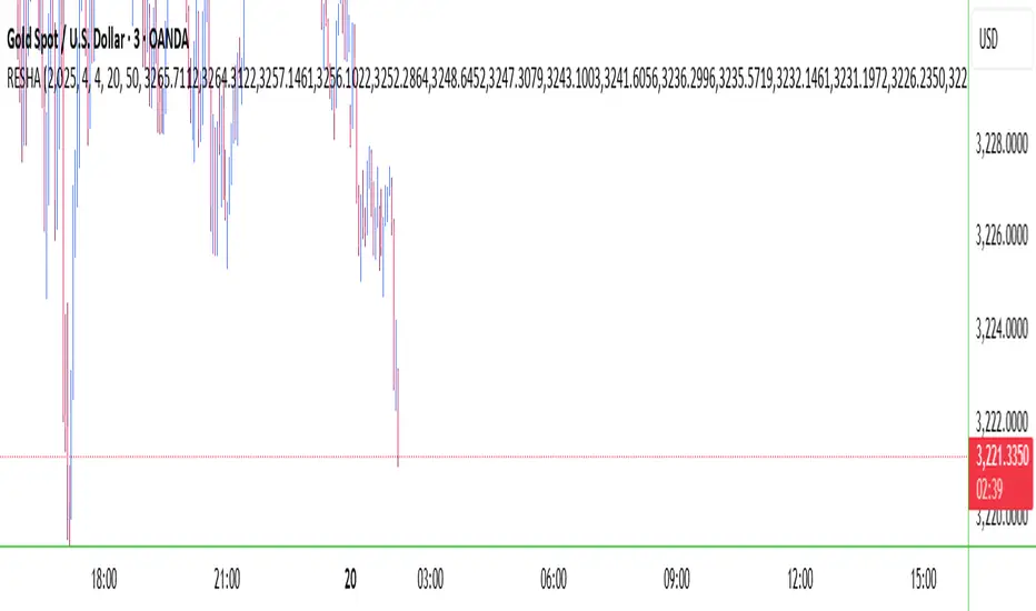
RESHAIndicator Name: RESHA – Static Price Levels
Description:
The RESHA indicator is a simple tool that allows traders to manually define multiple horizontal price levels on the chart. These levels are displayed as horizontal lines, each extending a customizable number of candles forward. Traders can input a comma-separated list of prices, which are then plotted automatically on the chart.
Features:
📍 Custom input box for price levels (comma-separated).
📏 Adjustable line length in bars.
Visual price labels at the end of each level.
Clean and minimalistic design, perfect for support/resistance zones or static analysis.
This tool is ideal for traders who want to keep key price zones visible at all times without relying on dynamic calculations or automated indicators.
Dynamic Volatility EnvelopeDynamic Volatility Envelope: Indicator Overview
The Dynamic Volatility Envelope is an advanced, multi-faceted technical indicator designed to provide a comprehensive view of market trends, volatility, and potential future price movements. It centers around a customizable linear regression line, enveloped by dynamically adjusting volatility bands. The indicator offers rich visual feedback through gradient coloring, candle heatmaps, a background volatility pulse, and an on-chart trend strength meter.
Core Calculation Mechanism
Linear Regression Core :
-A central linear regression line is calculated based on a user-defined source (e.g., close, hl2) and lookback period.
-The regression line can be optionally smoothed using an Exponential Moving Average (EMA) to reduce noise.
-The slope of this regression line is continuously calculated to determine the current trend direction and strength.
Volatility Channel :
-Dynamic bands are plotted above and below a central basis line. This basis is typically the calculated regression line but shifts to an EMA in Keltner mode.
-The width of these bands is determined by market volatility, using one of three user-selectable modes:
ATR Mode : Bandwidth is a multiple of the Average True Range (ATR).
Standard Deviation Mode : Bandwidth is a multiple of the Standard Deviation of the source data.
Keltner Mode (EMA-based ATR) : ATR-based bands are plotted around a central Keltner EMA line, offering a smoother channel.
The channel helps identify dynamic support and resistance levels and assess market volatility.
Future Projection :
The indicator can project the current regression line and its associated volatility bands into the future for a user-defined number of bars. This provides a visual guide for potential future price pathways based on current trend and volatility characteristics.
Candle Heatmap Coloring :
-Candle bodies and/or wicks/borders can be colored based on the price's position within the upper and lower volatility bands.
-Colors transition in a gradient from bearish (when price is near the lower band) through neutral (mid-channel) to bullish (when price is near the upper band), providing an intuitive visual cue of price action relative to the dynamic envelope.
Background Volatility Pulse :
The chart background color can be set to dynamically shift based on a ratio of short-term to long-term ATR. This creates a "pulse" effect, where the background subtly changes color to indicate rising or falling market volatility.
Trend Strength Meter :
An on-chart text label displays the current trend status (e.g., "Strong Bullish", "Neutral", "Bearish") based on the calculated slope of the regression line relative to user-defined thresholds for normal and strong trends.
Key Features & Components
-Dynamic Linear Regression Line: Core trend indicator with optional smoothing and slope-based gradient coloring.
-Multi-Mode Volatility Channel: Choose between ATR, Standard Deviation, or Keltner (EMA-based ATR) calculations for band width.
-Customizable Vertical Gradient Channel Fills: Visually distinct fills for upper and lower channel segments with user-defined top/bottom colors and gradient spread.
-Future Projection: Extrapolates regression line and volatility bands to forecast potential price paths.
-Price-Action Based Candle Heatmap: Intuitive candle coloring based on position within the volatility channel, with adjustable gradient midpoint.
-Volatility-Reactive Background Gradient: Subtle background color shifts to reflect changes in market volatility.
-On-Chart Trend Strength Meter: Clear textual display of current trend direction and strength.
-Extensive Visual Customization: Fine-tune colors, line styles, widths, and gradient aggressiveness for most visual elements.
-Comprehensive Tooltips: Detailed explanations for every input setting, ensuring ease of use and understanding.
Visual Elements Explained
Regression Line : The primary trend line. Its color dynamically changes (e.g., green for uptrend, red-pink for downtrend, neutral for flat) based on its slope, with smooth gradient transitions.
Volatility Channel :
Upper & Lower Bands : These lines form the outer boundaries of the envelope, acting as dynamic support and resistance levels.
Channel Fill : The area between the band center and the outer bands is filled with a vertical gradient. For example, the upper band fill might transition from a darker green near the center to a lighter green at the upper band.
Band Borders : The lines outlining the upper and lower bands, with customizable color and width.
Future Projection Lines & Fill :
Projected Regression Line : An extension of the current regression line into the future, typically styled differently (e.g., dashed).
Projected Channel Bands : Extensions of the upper and lower volatility bands.
Projected Area Fill : A semi-transparent fill between the projected upper and lower bands.
Candle Heatmap Coloring : When enabled, candles are colored based on their closing price's relative position within the channel. Bullish colors appear when price is in the upper part of the channel, bearish in the lower, and neutral in the middle. Users can choose to color the entire candle body or just the wicks and borders.
Background Volatility Pulse : The chart's background color subtly shifts (e.g., between a calm green and an agitated red-pink) to reflect the current volatility regime.
Trend Strength Meter : A text label (e.g., "TREND: STRONG BULLISH") positioned on the chart, providing an at-a-glance summary of the trend.
Configuration Options
Users can tailor the indicator extensively via the settings panel, with options logically grouped:
Core Analysis Engine : Adjust regression source data, lookback period, and EMA smoothing for the regression line.
Regression Line Visuals : Control visibility, line width, trend-based colors (uptrend, downtrend, flat), slope thresholds for trend definition, strong slope multiplier (for Trend Meter), and color gradient sharpness.
Volatility Channel Configuration : Select band calculation mode (ATR, StdDev, Keltner), set relevant periods and multipliers. Customize colors for vertical gradient fills (upper/lower, top/bottom), border line colors, widths, and the gradient spread factor for fills.
Future Projection Configuration : Toggle visibility, set projection length (number of bars), line style, and colors for projected regression and band areas.
Appearance & Candle Theme : Set default bull/bear candle colors, enable/disable candle heatmap, choose if body color matches heatmap, and configure heatmap gradient target colors (bull, neutral, bear) and the gradient's midpoint.
Background Volatility Pulse : Enable/disable the background effect and configure short/long ATR periods for the volatility calculation.
Trend Strength Meter : Enable/disable the meter, and choose its on-chart position and text size.
Interpretation Notes
-The Regression Line is the primary indicator of trend direction. Its slope and color provide immediate insight.
-The Volatility Bands serve as dynamic support and resistance zones. Price approaching or touching these bands may indicate potential turning points or breakouts. The width of the channel itself reflects market volatility – widening suggests increasing volatility, while narrowing suggests consolidation.
Future Projections are not predictions but rather an extension of current conditions. They can help visualize potential areas where price might interact with projected support/resistance if the current trend and volatility persist.
Candle Heatmap Coloring offers a quick visual assessment of where price is trading within the dynamic envelope, highlighting strength or weakness relative to the channel.
The Background Volatility Pulse gives a contextual feel for overall market agitation or calmness.
This indicator is designed to be a comprehensive analytical tool. Its signals and visualizations are best used in conjunction with other technical analysis techniques, price action study, and robust risk management practices. It is not intended as a standalone trading system.
Risk Disclaimer
Trading and investing in financial markets involve substantial risk of loss and is not suitable for every investor. The Dynamic Volatility Envelope indicator is provided for analytical and educational purposes only and does not constitute financial advice or a recommendation to buy or sell any security. Past performance is not indicative of future results. Always use sound risk management practices and never trade with capital you cannot afford to lose. The developers assume no liability for any financial losses incurred based on the use of this indicator.
Vector Candles [v6 Optimized + EMA]
Vector Candles represent an innovative technical analysis approach that transforms traditional candlestick charting by integrating volume dynamics, color-coded momentum, and multi-dimensional market insights. Unlike standard candlesticks that merely display price movement, Vector Candles encode additional market information through sophisticated color and volume algorithms.
Key Features:
-Dynamic Volume-Based Coloring: Candles change color based on trading volume intensity
-Volume Categories:
High Volume (Lime/Red): Significant market activity (200%+- Vol of Previous 10 Candles)
Above Average Volume (Blue/Fuchsia): Moderate market momentum (150%+- Vol of Previous 10 Candles).
Normal Volume (Gray Scales): Standard market conditions.
Stopping Volume Candles - Typically Pinbar/Doji candles. Stops volume in the current direction of delivery & can help forecast impending reversals or end to the current trend.
-Integrated EMA (Exponential Moving Average) Option:
-Customizable EMA Length (Default: 50 periods) (I use 33)
Configurable EMA Source (e.g., close price)
Optional EMA Overlay for Trend Confirmation

Relative Performance Spread**Relative Performance Spread Indicator – Overview**
This indicator compares the **relative performance between two stocks** by normalizing their prices and calculating the **spread**, **area under the curve (AUC)**, or **normalized price ratio**.
### **How It Works**
* **Input**: Select a second stock (`ticker2`) and a moving average window.
* **Normalization**: Each stock is normalized by its own moving average → `norm = close / MA`.
* **Spread**: The difference `spread = norm1 - norm2` reflects which stock is outperforming.
* **AUC**: Cumulative spread over time shows prolonged dominance or underperformance.
* **Bounds**: Bollinger-style bands are drawn around the spread to assess deviation extremes.
### **Usage**
* **Plot Type Options**:
* `"Spread"`: Spot outperformance; crossing bands may signal rotation.
* `"AUC"`: Track long-term relative trend dominance.
* `"Normalized"`: Directly compare scaled price movements.
Use this tool for **pair trading**, **relative momentum**, or **rotation strategies**. It adapts well across assets with different price scales.
LGMM (flat buffers) — multivariate poly + latent statesLGMM POLYNOMIAL BANDS — DISCOVER THE MARKET’S HIDDEN STATES
Overview
Latent-Gaussian-Mixture-Models (LGMMs) view price action as a mix of several invisible regimes: trending up, drifting sideways, sudden volatility spikes, and so on.
A Gaussian Mixture learns these states directly from data and outputs, for every bar, the probability that the market is in each state.
This indicator feeds those probabilities into a rolling polynomial regression that draws a fair-value line, then builds adaptive upper and lower bands.
Band width expands when recent residuals are large *and* when the state mix is uncertain, and contracts when price is calm or one regime clearly dominates.
Crossing back into the band from below generates a buy flag; crossing back into the band from above generates a sell flag (or take-profit for longs).
Key Inputs
Price source – default is Close; you can choose HL2, OHLC4, etc.
Training window (bars) – look-back length for every retrain. 252 bars (one trading year) is a balanced default for US stocks on daily timeframe. Use fewer bars for intraday charts (say 7*24=168 for 1H bars on crypto), more for weekly periods.
Polynomial degree – 1 for a straight trend line, 2 for a curved fit. Curved fits are better when the symbol shows persistent drift.
Hidden states K – number of regimes the mixture tracks (1 to 3). Three states often map well to up-trend, chop, down-trend.
Band width ×σ – multiplier on the entropy-weighted standard deviation. Smaller values (1.5-2) give more trades; larger values (2.5-3) give fewer, higher-conviction trades.
Offline μ,σ pairs (optional) – paste component means and sigmas from an offline LGMM (format: mu1,sigma1;mu2,sigma2;…). Leave blank to let the script use its built-in approximation.
Quick Start
Add the indicator to a chart and wait until the initial Training window has filled.
Watch for green BUY triangles when price closes back above the lower band and red SELL triangles when price closes back below the upper band.
Fine-tune:
– Increase Training window to reduce noise.
– Decrease Band width ×σ for more frequent signals.
– Experiment with Hidden states K; more states capture richer behaviour but need longer windows to stay reliable.
Tips
Bands widen automatically in chaotic periods and tighten when one regime dominates.
Combine with a volume filter or a higher-time-frame trend to reduce whipsaws.
If you already run an LGMM in Python or Matlab, paste its component parameters for a perfect match between your back-test and the TradingView plot.
Works on all markets and time-frames, provided you have at least five times the Training window’s bars in history.
Happy trading!

[blackcat] L2 Multi-Level Price Condition TrackerOVERVIEW
The L2 Multi-Level Price Condition Tracker represents an innovative approach to analyzing financial markets by simultaneously monitoring multiple price levels, thus providing traders with a holistic view of market dynamics. By combining dynamic calculations based on moving averages and price deviations, this tool aims to deliver precise and actionable insights into potential entry and exit points. It leverages sophisticated statistical measures to identify key thresholds that signify shifts in market sentiment, thereby aiding traders in making well-informed decisions. 🎯
Key benefits encompass:
• Comprehensive calculation of midpoints and average prices indicating short-term trend directions.
• Interactive visualization elements enhancing interpretability effortlessly.
• Real-time generation of buy/sell signals driven by precise condition evaluations.
TECHNICAL ANALYSIS COMPONENTS
📉 Midpoint Calculations:
Computes central reference points derived from high-low ranges establishing baseline supports/resistances.
Utilizes Simple Moving Averages (SMAs) along with standardized deviation formulas smoothing out volatility while preserving long-term trends accurately.
Facilitates identification of directional biases reflecting underlying market forces dynamically.
🕵️♂️ Advanced Price Level Detection:
Derives upper/lower bounds adjusting sensitivities adaptively responding to changing conditions flexibly.
Employs proprietary logic distinguishing between bullish/bearish sentiments promptly signaling transitions effectively.
Ensures consistent adherence to predefined statistical protocols maintaining accuracy robustly.
🎥 Dynamic Signal Generation:
Detects crossovers indicating dominance shifts between buyers/sellers promptly triggering timely alerts.
Integrates conditional logic reinforcing signal validity minimizing erroneous activations systematically.
Supports adaptive thresholds tuning sensitivities based on evolving market conditions flexibly accommodating varying scenarios.
INDICATOR FUNCTIONALITY
🔢 Core Algorithms:
Utilizes moving averages alongside standardized deviation formulas generating precise net volume measurements.
Implements Arithmetic Mean Line Algorithm (AMLA) smoothing techniques improving interpretability.
Ensures consistent alignment with established statistical principles preserving fidelity.
🖱️ User Interface Elements:
Dedicated plots displaying real-time midpoint markers facilitating swift decision-making.
Context-sensitive color coding distinguishing positive/negative deviations intuitively highlighting key activations clearly.
Background shading emphasizing proximity to crucial threshold activations enhancing visibility focusing attention on vital signals promptly.
STRATEGY IMPLEMENTATION
✅ Entry Conditions:
Confirm bullish/bearish setups validated through multiple confirmatory signals assessing concurrent market sentiment factors.
Validate entry decisions considering alignment between calculated midpoints and broader trend directions ensuring coherence.
Monitor cumulative breaches signifying potential trend reversals executing partial/total closes contingent upon predetermined loss limits preserving capital efficiently.
🚫 Exit Mechanisms:
Trigger exits upon hitting predefined thresholds derived from historical analyses promptly executing closures.
Execute partial/total closes contingent upon cumulative loss limits preserving capital efficiently managing exposures prudently.
Conduct periodic reviews gauging strategy effectiveness rigorously identifying areas needing refinement implementing corrective actions iteratively enhancing performance metrics steadily.
PARAMETER CONFIGURATIONS
🎯 Optimization Guidelines:
Lookback Period: Governs responsiveness versus stability balancing sensitivity/stability governing moving averages aligning with preferred granularity.
Price Source: Dictates primary data series driving volume calculations selecting relevant inputs accurately tailoring strategies accordingly.
💬 Customization Recommendations:
Commence with baseline defaults; iteratively refine parameters isolating individual impacts evaluating adjustments independently prior to combined modifications minimizing disruptions.
Prioritize minimizing erroneous trigger occurrences first optimizing signal fidelity sustaining balanced risk-reward profiles irrespective of chosen settings upholding disciplined approaches preserving capital efficiently.
ADVANCED RISK MANAGEMENT
🛡️ Proactive Risk Mitigation Techniques:
Enforce strict compliance with pre-defined maximum leverage constraints adhering strictly to guidelines managing exposures prudently.
Mandatorily apply trailing stop-loss orders conforming to script outputs enforcing discipline rigorously preventing adverse consequences.
Allocate positions proportionately relative to available capital reserves conducting periodic reviews gauging effectiveness continuously identifying improvement opportunities steadily.
⚠️ Potential Pitfalls & Solutions:
Address frequent violations arising during heightened volatility phases necessitating manual interventions judiciously preparing contingency plans proactively mitigating risks effectively.
Manage false alerts warranting immediate attention avoiding adverse consequences systematically implementing corrective actions reliably.
Prepare proactive responses amid adverse movements ensuring seamless functionality amidst fluctuating conditions fortifying resilience against anomalies robustly.
PERFORMANCE MONITORING METRICS
🔍 Evaluation Criteria:
Assess win percentages consistently across diverse trading instruments gauging reliability measuring profitability efficiency accurately evaluating downside risks comprehensively uncovering systematic biases potentially skewing outcomes.
Calculate average profit ratios per successful execution benchmarking actual vs expected performances documenting results meticulously tracking progress dynamically addressing identified shortcomings proactively fostering continuous improvements.
📈 Historical Data Analysis Tools:
Maintain detailed logs capturing every triggered event recording realized profits/losses comparing simulated projections accurately identifying discrepancies warranting investigation implementing iterative refinements steadily enhancing performance metrics progressively.
Identify recurrent systematic errors demanding corrective actions implementing iterative refinements steadily addressing identified shortcomings proactively fostering continuous enhancements dynamically improving robustness resiliently.
PROBLEM SOLVING ADVICE
🔧 Frequent Encountered Challenges:
Unpredictable behaviors emerging within thinly traded markets requiring filtration processes enhancing signal integrity excluding low-liquidity assets prone to erratic movements effectively.
Latency issues manifesting during abrupt price fluctuations causing missed opportunities introducing buffer intervals safeguarding major news/event impacts mitigating distortions seamlessly verifying reliable connections ensuring uninterrupted data flows guaranteeing accurate interpretations dependably.
💡 Effective Resolution Pathways:
Limit ongoing optimization attempts preventing model degradation maintaining optimal performance levels consistently recalibrating parameters periodically adapting strategies flexibly responding appropriately amidst varying conditions dynamically improving robustness resiliently.
Verify reliable connections ensuring uninterrupted data flows guaranteeing accurate interpretations dependably bolstering overall efficacy systematically addressing identified shortcomings dynamically fostering continuous advancements.
THANKS
Heartfelt acknowledgment extends to all developers contributing invaluable insights regarding multi-level price condition-based trading methodologies! ✨

Custom Sector Relative Strength (sector rotation)📌 Indicator Summary for “Custom Sector Relative Strength (sector rotation)”
🔹 Overview:
This Pine Script indicator calculates and displays the relative strength performance of up to 25 customizable sectors or ETFs compared to a user-defined benchmark index (e.g., SPY, TASI.TAD, etc.).
It helps traders and analysts identify which sectors are outperforming or underperforming relative to the benchmark over different time frames.
________________________________________
🔹 Calculation Method:
For each sector, the indicator:
1. Retrieves the current and past closing prices for both the sector and the benchmark.
2. Computes the ratio of the sector's price to the benchmark at both time points.
3. Calculates the percentage change in this ratio over the selected lookback period:
4. Relative Strength (%) = ((Current_Ratio / Past_Ratio) - 1) * 100
5. Assigns a direction symbol:
o ↑ for positive outperformance
o ↓ for underperformance
o → for no significant change
6. Applies a color code for clarity:
o Green for ↑
o Red for ↓
o Gray for →
________________________________________
🔹 How to Use:
1. Set your benchmark index (e.g., SPY or TASI.TAD) from the settings panel.
2. Choose a lookback period: 1 Day, 1 Week, 1 Month, 3 Months, 6 Months, or 1 Year.
3. Define up to 25 sectors:
o Enter the symbol and name of each sector.
o Toggle the Show option on/off to include/exclude any sector.
4. The script will sort the sectors from strongest to weakest based on their relative performance.
5. Results are displayed in a dynamic table on the chart showing:
o Ticker
o Sector Name
o Relative % Performance
o Direction Indicator (↑ ↓ →)
________________________________________
🔹 Practical Uses:
• Sector rotation strategies
• Market breadth analysis
• Benchmark-relative strength monitoring
• Multi-sector ETFs or custom group comparisons
• Saudi, US, or global sector analysis
________________________________________
Let me know if you'd like an Arabic version or want this formatted as a PDF or used as a code comment section.

High/Low Digit SumNAMAN SHAH
Its about the high low total of a candle only for gold where if highs total is 9 then its a chance that it will not break the high for a long time and it will be a good opportunity for short
And vise versa

Gold Breakout Strategy - RR 4Strategy Name: Gold Breakout Strategy - RR 4
🧠 Main Objective
This strategy aims to capitalize on breakouts from the Donchian Channel on Gold (XAU/USD) by filtering trades with:
Volume confirmation,
A custom momentum indicator (LWTI - Linear Weighted Trend Index),
And a specific trading session (8 PM to 8 AM Quebec time — GMT-5).
It takes only one trade per day, either a buy or a sell, using a fixed stop-loss at the wick of the breakout candle and a 4:1 reward-to-risk (RR) ratio.
📊 Indicators Used
Donchian Channel
Length: 96
Detects breakouts of recent highs or lows.
Volume
Simple Moving Average (SMA) over 30 bars.
A breakout is only valid if the current volume is above the SMA.
LWTI (Linear Weighted Trend Index)
Measures momentum using price differences over 25 bars, smoothed over 5.
Used to confirm trend direction:
Buy when LWTI > its smoothed version (uptrend).
Sell when LWTI < its smoothed version (downtrend).
⏰ Time Filter
The strategy only allows entries between 8 PM and 8 AM (GMT-5 / Quebec time).
A timestamp-based filter ensures the system recognizes the correct trading session even across midnight.
📌 Entry Conditions
🟢 Buy (Long)
Price breaks above the previous Donchian Channel high.
The current channel high is higher than the previous one.
Volume is above its moving average.
LWTI confirms an uptrend.
The time is within the trading session (20:00 to 08:00).
No trade has been taken yet today.
🔴 Sell (Short)
Price breaks below the previous Donchian Channel low.
The current channel low is lower than the previous one.
Volume is above its moving average.
LWTI confirms a downtrend.
The time is within the trading session.
No trade has been taken yet today.
💸 Trade Management
Stop-Loss (SL):
For long entries: placed below the wick low of the breakout candle.
For short entries: placed above the wick high of the breakout candle.
Take-Profit (TP):
Set at a fixed 4:1 reward-to-risk ratio.
Calculated as 4x the distance between the entry price and stop-loss.
No trailing stop, no break-even, no scaling in/out.
🎨 Visuals
Green triangle appears below the candle on a buy signal.
Red triangle appears above the candle on a sell signal.
Donchian Channel lines are plotted on the chart.
The strategy is designed for the 5-minute timeframe.
🔄 One Trade Per Day Rule
Once a trade is taken (buy or sell), no more trades will be executed for the rest of the day. This prevents overtrading and limits exposure.

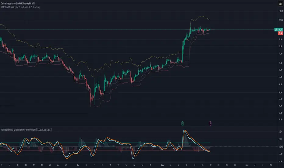
TradersFriendCandles v2
TradersFriendCandles
A fully customizable candle‑color and banding indicator built on percentile + ATR, with optional EMA vs. ALMA trend filtering and higher‑timeframe support.
Key Features
Dynamic Percentile Center Line
Compute any Nth percentile over M bars (default 20th over 15) to serve as a reference “mid‑price” level.
ATR‑Based Bands
Envelope that percentile line with upper/lower bands at X × ATR (default 1×), plus an extended upper band at 3.5× ATR.
Higher‑Timeframe Mode
Plot bands based on a higher timeframe (e.g. daily bands on a 15m chart) so you can gauge macro support/resistance in micro timeframes.
Custom‑Color Candles
5 user‑editable colors for:
Strong bullish
Light bullish
Neutral
Light bearish
Strong bearish
Optional EMA vs. ALMA Trend Filter
When enabled, candles simply turn “bull” or “bear” based on fast EMA crossing above/below slow ALMA.
Border‑Only Coloring
Keep candle bodies transparent and color only the border & wick.
Live Plot Labels & Track Price
All lines carry titles and can display current values directly on the price scale.
Alerts
Strong Bull Breakout (price stays above upper band)
Strong Bear Breakdown (price closes below lower band)
EMA/ALMA crossovers
Inputs & Customization
Percentile level & lookback length
ATR length, multiplier, opacity
Fast EMA length, ALMA parameters (offset, length, sigma)
Toggle bands, lines, custom candles, higher‑timeframe mode
Pick your own colors via color‑picker inputs
Use TradersFriendCandles to visualize momentum shifts, dynamic support/resistance, and trend strength all in one overlay. Perfect for pinpointing breakouts, breakdowns, and filtering noise with adjustable sensitivity.
Bollinger Band StrategyDescription of the Bollinger Band Breakout Strategy
This trading strategy, credited to Siddhart Bhanushali, is a momentum-based approach that uses Bollinger Bands and a 22-period Simple Moving Average (SMA) to identify high-probability breakout trades. It focuses on detecting periods of low volatility (contraction) followed by high volatility (expansion) to enter trades with a favorable risk-reward ratio. The strategy is designed to capture significant price movements in trending markets, with clear rules for entry, stop loss, and profit targets.
Strategy Overview
The strategy generates buy and sell signals based on specific conditions involving the 22-period SMA and Bollinger Bands. It aims to enter trades when the price breaks out of a consolidation phase, confirmed by the direction of the SMA and the behavior of a green or red candle relative to the Bollinger Bands. The minimum target for each trade is a 1:2 risk-reward ratio.
Credit
This strategy is credited to Siddhart Bhanushali, who designed it to leverage Bollinger Band breakouts in trending markets, providing a clear and systematic approach to trading with defined risk-reward parameters.
Chandelier Exit + EMA Filtered SignalsThis script is a powerful upgrade to the original Chandelier Exit by Alex Orekhov (everget), combining trend-following logic with higher-quality trade filtering.
✅ Key Features:
Chandelier Exit logic with ATR-based stop levels
Buy/Sell signals only when trend is confirmed:
Buy: Price must be above EMA 13, 50, and 200
Sell: Price must be below EMA 13, 50, and 200
Candle highlighting: Green for Buy, Red for Sell
Signal labels for visual clarity
Toggle to show/hide EMAs
Built-in alerts for:
Buy signal
Sell signal
Trend direction change
🛠️ Inputs:
ATR Period and Multiplier
Toggle: Use Close Price for High/Low Calculation
Toggle: Show/Hide Labels and State Highlight
Toggle: Show/Hide EMA 13, 50, 200
Toggle: Await confirmed bar for alerts
🔔 Alerts Included:
Chandelier Exit Buy
Chandelier Exit Sell
Direction Change (long to short or vice versa)
💡 How to Use:
Use on trending assets (e.g., Gold, Indices, Crypto).
Combine with support/resistance or session filters for optimal results.
Enable alerts to be notified on trade setups.
📢 Credits:
Based on the original Chandelier Exit script by everget.
Enhancements by AP Capital for filtered signals and better visual feedback.
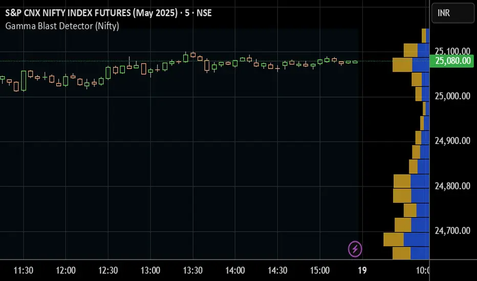
Gamma Blast Detector (Nifty)The Gamma Blast Detector (Nifty) is a custom TradingView indicator designed to help intraday traders identify sudden and explosive price movements—commonly referred to as "gamma blasts"—in the Nifty index during the final minutes of the trading session, particularly on expiry days. These movements are typically caused by rapid delta changes in ATM options, resulting in aggressive short-covering or option unwinding.
This indicator specifically monitors price action between 3:10 PM and 3:20 PM IST, which translates to 09:40 AM to 09:50 AM UTC on TradingView. It is optimized for use on 5-minute charts of the Nifty spot or futures index, where gamma-driven volatility is most likely to occur during this time window.
The core logic behind the indicator involves identifying unusually large candles within this time frame. It compares the size of the current candle to the average size of the previous five candles. If the current candle is at least twice as large and shows clear direction (bullish or bearish), the script flags it as a potential gamma blast. A bullish candle suggests a Call Option (CE) is likely to blast upward, while a bearish candle points to a Put Option (PE) gaining sharply.
When such a condition is detected, the indicator visually marks the candle on the chart: a "CE 🚀" label is shown below the candle for a bullish move, and a "PE 🔻" label appears above for a bearish move. It also includes alert conditions, allowing users to set real-time alerts for potential blasts and act quickly.
This tool is especially useful for expiry day scalpers, option traders, and anyone looking to ride momentum generated by gamma effects in the final minutes of the market. It provides a visual and alert-based edge to anticipate short-term, high-impact moves often missed in normal technical analysis.