TMT Crazy Horse BandsCrazy Horse ORB Strategy – Dynamic Trade Zones with Visual Edge
This indicator is built for traders who want to consistently identify high-probability trade setups using a combination of range breakouts, volatility zones, and momentum tracking. It’s primarily designed for intraday futures and CFD trading, with a focus on assets like the Nasdaq (MNQ/NQ), but works across various instruments and timeframes.
What it does:
The script identifies the 15-minute Opening Range (ORB) and overlays a dynamic set of bands (what we call “The Crazy Horse”) that expand and contract based on price momentum and structure. These bands help traders visualize expansion zones and potential reversal points. The system also detects shifts in market direction by comparing price behavior around the ORB in conjunction with volume flow and structure.
How to use it:
Wait for the 15-minute ORB to form after the open.
Look for price to break above or below the range with strength.
Use the mid-band as a re-entry or continuation zone.
Trailing stop logic is based on the band’s slope and interaction with price structure.
Why it’s closed-source:
The logic behind the band creation, entry signals, and trailing mechanisms has been refined through live trading and years of backtesting. The uniqueness lies in how this script adapts to changing volatility while respecting market structure. This flexibility allows for creative trade management and sizing techniques—something not found in any open-source version currently available.
Note:
For clean charting, this indicator should be used solo. Do not overlay additional scripts unless you are stacking logic intentionally. The visual output of this script is designed to stand on its own for decision making.
Bands and Channels

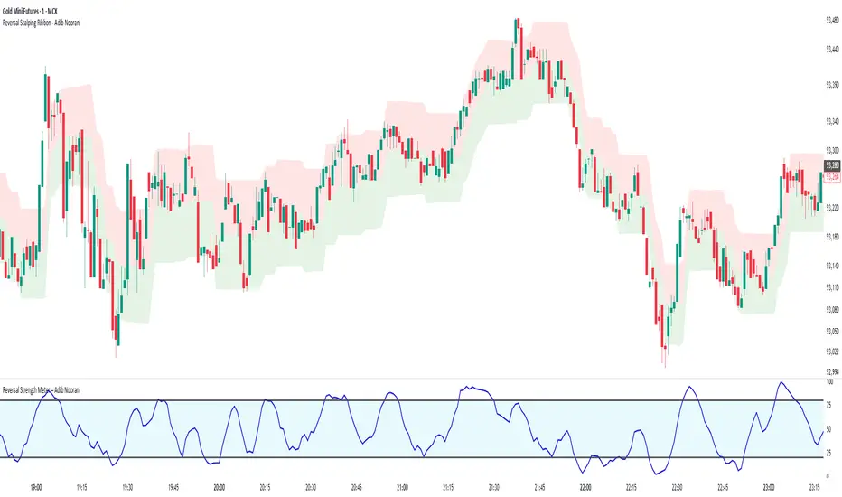
Reversal Scalping Ribbon - Adib NooraniThe Reversal Scalping Ribbon is a trend-following overlay tool designed to visually identify potential reversal zones based on price extremes and dynamic volatility bands. It calculates adaptive upper and lower bands using price action and custom ATR logic, helping traders quickly assess market direction and possible turning points
🔹 Volatility-adjusted bands based on price highs/lows
🔹 Color-coded ribbons to indicate trend bias and potential reversal shifts
🔹 No repainting, works on all timeframes and assets
🔹 Visual-only display, no trade signals — supports discretion-based entries
This ribbon is designed for scalpers and intraday traders to spot reversal setups with clarity. It enhances your trading by showing real-time market bias without unnecessary distractions. By focusing on probabilities, it helps to improve decision-making in fast-paced environments
How to use the indicator efficiently
For Reversal Trading:
Buy: When price closes below the green ribbon with a red candle, then re-enters with a green candle. Enter above the high of the green candle with a stop loss below the lowest low of the recent green/red candles
Sell: When price closes above the red ribbon with a green candle, then re-enters with a red candle. Enter below the low of the red candle with a stop loss above the highest high of the recent red/green candles
Risk Management:
Limit risk to 0.5% of your capital per trade
Take 50% profit at a 1:1 risk-reward ratio
For the remaining 50%, trail using the lower edge of the green band for buys and the upper edge of the red band for sells
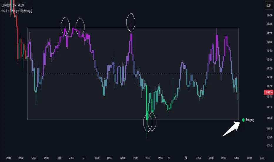
Gradient Range [BigBeluga]
This indicator highlights range-bound market conditions by dynamically plotting gradient-colored candlesticks within a defined price box. It detects whether the market is ranging or trending using ADX and can identify mean reversion points when price steps outside the established range.
🔵KEY FEATURES:
Range Detection Box:
➣ A transparent box is drawn based on the highest and lowest price close over a user-defined period.
➣ Helps visualize range boundaries and the midline for support/resistance reference.
Gradient Candlestick Coloring:
➣ Candles inside the range are colored with a gradient from top to bottom based on proximity to the midline.
➣ Top range candles are shaded with bearish tones, while bottom range candles use bullish tones.
Ranging/Trending State Detection:
➣ Uses ADX to determine if the market is currently in a ranging or trending state.
➣ A label in the bottom right corner shows a real-time status (🟢 Ranging / 🟡 Trending).
Mean Reversion Signal Circles:
➣ When the market is ranging, white circles are plotted at highs/lows that breach the box boundary, indicating potential mean reversion points.
➣ These levels can act as fade trade setups or exhaustion markers.
🔵USAGE:
Range Trading: Trade between the upper and lower boundaries during range-bound conditions with clearer visual feedback.
Mean Reversion Plays: Use circle signals as early alerts to identify when price extends beyond the range and may revert to the mean.
Visual Trend Strength: Instantly recognize where price is concentrated inside the range via the color gradient system.
Ranging Filter: Use the ADX label to avoid false setups during strong trending periods.
Gradient Range provides an elegant and data-driven approach to range-bound market analysis. With its gradient visualization and smart reversion detection, it empowers traders to better time entries and exits within consolidation zones.
Trap Zone 2 minTrap Zone 2 Min — Visual Detection of Trap and Expansion Zones
This indicator is designed to clearly identify key price zones on lower timeframes, particularly the 2-minute chart. It's ideal for scalpers and intraday traders looking for structured, high-probability setups.
Trap Zone (No Trade Zone)
A central shaded area where trading is discouraged.
Marks potential liquidity traps or manipulation zones.
Calculated using recent highs, lows, and moving averages (MA20 and MA200).
Zones + and -
Positioned two times the size of an EB (Elephant Bar) above and below the trap zone.
Represent the first expansion level.
Useful for identifying potential long or short entries based on price breakout direction.
Zones ++ and --
Extend from the first + or - level to the next line outward.
Represent a second expansion layer, often aligning with price continuation or reaction zones.
Helpful for profit-taking or adjusting risk.
Zones +++ and ---
The most extreme levels plotted.
Serve as final take-profit areas or potential reversal zones.
Additional Features
Optional display of MA20 and MA200.
Configurable ADR (Average Daily Range) labels.
Full visual customization for better chart integration.
Best For
Scalpers and intraday traders.
Identifying and reacting to structured market zones.
Mapping price expansions and potential reversal points.

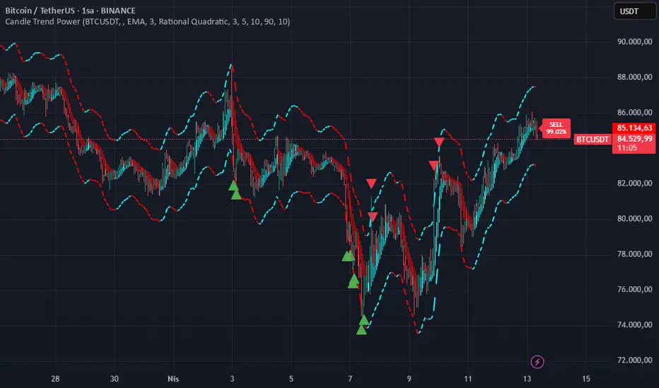
Candle Trend PowerThe Candle Trend Power is a custom technical indicator designed for advanced trend analysis and entry signal generation. It combines multiple smoothing methods, candle transformations, and volatility bands to visually and analytically enhance your trading decisions.
🔧 Main Features:
📉 Custom Candle Types
It transforms standard OHLC candles into one of several advanced types:
Normal Candles, Heikin-Ashi, Linear Regression, Rational Quadratic (via kernel filtering), McGinley Dynamic Candles
These transformations help traders better see trend continuations and reversals by smoothing out market noise.
🧮 Smoothing Method for Candle Data
Each OHLC value can be optionally smoothed using:
EMA, SMA, SMMA (RMA), WMA, VWMA, HMA, Mode (Statistical mode) Or no smoothing at all.
This flexibility is useful for customizing to different market conditions.
📊 Volatility Bands
Volatility-based upper and lower bands are calculated using:
Band = price ± (price% + ATR * multiplier)
They help identify overbought/oversold zones and potential reversal points.
📍 Candle Color Logic
Each candle is colored:
Cyan (#00ffff) if it's bullish and stronger than the previous candle
Red (#fd0000) if it's bearish and weaker
Alternating bar index coloring improves visual clarity.
📈 Trend Momentum Labels
The script includes a trend strength estimation using a smoothed RSI:
If the candle is bullish, it shows a BUY label with the overbought offset.
If bearish, it shows a SELL label with the oversold offset.
These labels are dynamic and placed next to the bar.
📍 Signal Markers
It also plots triangles when the price crosses the volatility bands:
Triangle up for potential long
Triangle down for potential short
✅ Use Case Summary
This script is mainly used for:
Visual trend confirmation with enhanced candles
Volatility-based entry signals
RSI-based trend momentum suggestions
Integrating different smoothing & transformation methods to fine-tune your strategy
It’s a flexible tool for both manual traders and automated system developers who want clear, adaptive signals across different market conditions.
💡 What's Different
🔄 Candle Type Transformations
⚙️ Custom Candle Smoothing
📉 Candle's Multi-level Volatility Bands
🔺 Dynamic Entry Signals (Buy/Sell Labels)
❗Important Note:
This script is provided for educational purposes and does not constitute financial advice. Traders and investors should conduct their research and analysis before making any trading decisions.
Scalper's Fractal Cloud with RSI + VWAP + MACD (Fixed)Scalper’s Fractal Confluence Dashboard
1. Purpose of the Indicator
This TradingView indicator script provides a high-confluence setup for scalping and day trading. It blends momentum indicators (RSI, MACD), trend bias tools (EMA Cloud, VWAP), and structure (fractal swings, gap zones) to help confirm precise entries and exits.
2. Components of the Indicator
- EMA Cloud (50 & 200 EMA): Trend bias – green means bullish, red means bearish. Avoid longs under red cloud.
- VWAP: Institutional volume anchor. Ideal entries are pullbacks to VWAP in direction of trend.
- Gap Zones: Shows open-air zones (white space) where price can move fast. Used to anticipate momentum moves.
- ZigZag Swings: Marks structural pivots (highs/lows) – useful for stop placement and range anticipation.
- MACD Histogram: Shows bullish or bearish momentum via background color.
- RSI: Overbought (>70) or oversold (<30) warnings. Good for exits or countertrend reversion plays.
- EMA Spread Label: Quick view of momentum strength. Wide spread = strong trend.
3. Scalping Entry Checklist
Before entering a trade, confirm these conditions:
• • Bias: EMA cloud color supports trade direction
• • Price is above/below VWAP (confirming institutional flow)
• • MACD histogram matches direction (green for long, red for short)
• • RSI not at extreme (unless you’re fading trend)
• • If entering gap zone, expect fast move
• • Recent swing high/low nearby for target or stop
4. Risk & Sizing Guidelines
Risk 1–2% of account per trade. Place stop below recent swing low (for longs) or high (for shorts). Use fractional sizing near VWAP or white space zones for scalping reversals.
5. Daily Trade Journal Template
- Date:
- Ticker:
- Setup Type (VWAP pullback, Gap Break, EMA reversion):
- Entry Time:
- Bias (Green/Red Cloud):
- RSI Level / MACD Reading:
- Stop Loss:
- Target:
- Result (P/L):
- What I Did Well:
- What Needs Work:

Green*DiamondGreen*Diamond (GD1)
Unleash Dynamic Trading Signals with Volatility and Momentum
Overview
GreenDiamond is a versatile overlay indicator designed for traders seeking actionable buy and sell signals across various markets and timeframes. Combining Volatility Bands (VB) bands, Consolidation Detection, MACD, RSI, and a unique Ribbon Wave, it highlights high-probability setups while filtering out noise. With customizable signals like Green-Yellow Buy, Pullback Sell, and Inverse Pullback Buy, plus vibrant candle and volume visuals, GreenDiamond adapts to your trading style—whether you’re scalping, day trading, or swing trading.
Key Features
Volatility Bands (VB): Plots dynamic upper and lower bands to identify breakouts or reversals, with toggleable buy/sell signals outside consolidation zones.
Consolidation Detection: Marks low-range periods to avoid choppy markets, ensuring signals fire during trending conditions.
MACD Signals: Offers flexible buy/sell conditions (e.g., cross above signal, above zero, histogram up) with RSI divergence integration for precision.
RSI Filter: Enhances signals with customizable levels (midline, oversold/overbought) and bullish divergence detection.
Ribbon Wave: Visualizes trend strength using three EMAs, colored by MACD and RSI for intuitive momentum cues.
Custom Signals: Includes Green-Yellow Buy, Pullback Sell, and Inverse Pullback Buy, with limits on consecutive signals to prevent overtrading.
Candle & Volume Styling: Blends MACD/RSI colors on candles and scales volume bars to highlight momentum spikes.
Alerts: Set up alerts for VB signals, MACD crosses, Green*Diamond signals, and custom conditions to stay on top of opportunities.
How It Works
Green*Diamond integrates multiple indicators to generate signals:
Volatility Bands: Calculates bands using a pivot SMA and standard deviation. Buy signals trigger on crossovers above the lower band, sell signals on crossunders below the upper band (if enabled).
Consolidation Filter: Suppresses signals when candle ranges are below a threshold, keeping you out of flat markets.
MACD & RSI: Combines MACD conditions (e.g., cross above signal) with RSI filters (e.g., above midline) and optional volume spikes for robust signals.
Custom Logic: Green-Yellow Buy uses MACD bullishness, Pullback Sell targets retracements, and Inverse Pullback Buy catches reversals after downmoves—all filtered to avoid consolidation.
Visuals: Ribbon Wave shows trend direction, candles blend momentum colors, and volume bars scale dynamically to confirm signals.
Settings
Volatility Bands Settings:
VB Lookback Period (20): Adjust to 10–15 for faster markets (e.g., 1-minute scalping) or 25–30 for daily charts.
Upper/Lower Band Multiplier (1.0): Increase to 1.5–2.0 for wider bands in volatile stocks like AEHL; decrease to 0.5 for calmer markets.
Show Volatility Bands: Toggle off to reduce chart clutter.
Use VB Signals: Enable for breakout-focused trades; disable to focus on Green*Diamond signals.
Consolidation Settings:
Consolidation Lookback (14): Set to 5–10 for small caps (e.g., AEHL) to catch quick consolidations; 20 for higher timeframes.
Range Threshold (0.5): Lower to 0.3 for stricter filtering in choppy markets; raise to 0.7 for looser signals.
MACD Settings:
Fast/Slow Length (12/26): Shorten to 8/21 for scalping; extend to 15/34 for swing trading.
Signal Smoothing (9): Reduce to 5 for faster signals; increase to 12 for smoother trends.
Buy/Sell Signal Options: Choose “Cross Above Signal” for classic MACD; “Histogram Up” for momentum plays.
Use RSI Div + MACD Cross: Enable for high-probability reversal signals.
RSI Settings:
RSI Period (14): Drop to 10 for 1-minute charts; raise to 20 for daily.
Filter Level (50): Set to 55 for stricter buys; 45 for sells.
Overbought/Oversold (70/30): Tighten to 65/35 for small caps; widen to 75/25 for indices.
RSI Buy/Sell Options: Select “Bullish Divergence” for reversals; “Cross Above Oversold” for momentum.
Color Settings:
Adjust bullish/bearish colors for visibility (e.g., brighter green/red for dark themes).
Border Thickness (1): Increase to 2–3 for clearer candle outlines.
Volume Settings:
Volume Average Length (20): Shorten to 10 for scalping; extend to 30 for swing trades.
Volume Multiplier (2.0): Raise to 3.0 for AEHL’s volume surges; lower to 1.5 for steady stocks.
Bar Height (10%): Increase to 15% for prominent bars; decrease to 5% to reduce clutter.
Ribbon Settings:
EMA Periods (10/20/30): Tighten to 5/10/15 for scalping; widen to 20/40/60 for trends.
Color by MACD/RSI: Disable for simpler visuals; enable for dynamic momentum cues.
Gradient Fill: Toggle on for trend clarity; off for minimalism.
Custom Signals:
Enable Green-Yellow Buy: Use for momentum confirmation; limit to 1–2 signals to avoid spam.
Pullback/Inverse Pullback % (50): Set to 30–40% for small caps; 60–70% for indices.
Max Buy Signals (1): Increase to 2–3 for active markets; keep at 1 for discipline.
Tips and Tricks
Scalping Small Caps (e.g., AEHL):
Use 1-minute charts with VB Lookback = 10, Consolidation Lookback = 5, and Volume Multiplier = 3.0 to catch $0.10–$0.20 moves.
Enable Green-Yellow Buy and Inverse Pullback Buy for quick entries; disable VB Signals to focus on Green*Diamond logic.
Pair with SMC+ green boxes (if you use them) for reversal confirmation.
Day Trading:
Try 5-minute charts with MACD Fast/Slow = 8/21 and RSI Period = 10.
Enable RSI Divergence + MACD Cross for high-probability setups; set Max Buy Signals = 2.
Watch for volume bars turning yellow to confirm entries.
Swing Trading:
Use daily charts with VB Lookback = 30, Ribbon EMAs = 20/40/60.
Enable Pullback Sell (60%) to exit after rallies; disable RSI Color for cleaner candles.
Check Ribbon Wave gradient for trend strength—bright green signals strong bulls.
Avoiding Noise:
Increase Consolidation Threshold to 0.7 on volatile days to skip false breakouts.
Disable Ribbon Wave or Volume Bars if the chart feels crowded.
Limit Max Buy Signals to 1 for disciplined trading.
Alert Setup:
In TradingView’s Alerts panel, select:
“GD Buy Signal” for standard entries.
“RSI Div + MACD Cross Buy” for reversals.
“VB Buy Signal” for breakout plays.
Set to “Once Per Bar Close” for confirmed signals; “Once Per Bar” for scalping.
Backtesting:
Replay on small caps ( Float < 5M, Price $0.50–$5) to test signals.
Focus on “GD Buy Signal” with yellow volume bars and green Ribbon Wave.
Avoid signals during gray consolidation squares unless paired with RSI Divergence.
Usage Notes
Markets: Works on stocks, forex, crypto, and indices. Best for volatile assets (e.g., small-cap stocks, BTCUSD).
Timeframes: Scalping (1–5 minutes), day trading (15–60 minutes), or swing trading (daily). Adjust settings per timeframe.
Risk Management: Combine with stop-losses (e.g., 1% risk, $0.05 below AEHL entry) and take-profits (3–5%).
Customization: Tweak inputs to match your strategy—experiment in replay to find your sweet spot.
Disclaimer
Green*Diamond is a technical tool to assist with trade identification, not a guarantee of profits. Trading involves risks, and past performance doesn’t predict future results. Always conduct your own analysis, manage risk, and test settings before live trading.
Feedback
Love Green*Diamond? Found a killer setup?

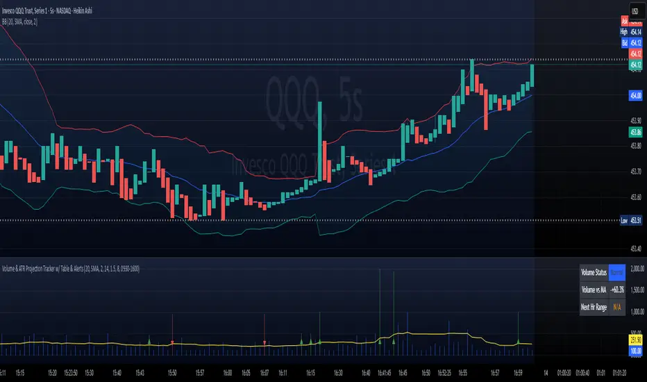
Volume & ATR Projection Tracker w/ Table & Alerts# README: Volume & ATR Projection Tracker (Pine Script Indicator)
## Overview
This Pine Script indicator for TradingView is designed to help traders analyze volume activity and potential short-term price volatility. It plots volume bars, calculates a moving average of volume, highlights unusual volume spikes (differentiating between up and down bars), and projects potential price ranges for upcoming hours based on Average True Range (ATR). It also provides a status table and configurable alerts.
**Disclaimer:** This indicator provides informational analysis and projections based on historical data and volatility. It does **not** provide guaranteed price predictions or financial advice. Trading involves substantial risk. Always do your own research and consult with a qualified financial advisor.
## Features
* **Volume Plotting:** Displays volume as a histogram in a separate panel.
* **Volume Moving Average:** Calculates and plots a configurable MA (SMA, EMA, WMA) of volume.
* **Unusual Volume Detection:** Identifies bars where volume significantly exceeds its moving average (based on a user-defined multiplier).
* **Differentiated Volume Analysis:**
* Colors volume bars differently based on whether unusual volume occurred on an up-bar (Close > Open), down-bar (Close < Open), or neutral bar (Close == Open).
* Plots different spike markers (up/down triangles) on the price chart for unusual volume on up/down bars.
* **ATR Volatility Projections:**
* Calculates the Average True Range (ATR) as a measure of recent volatility.
* Projects a potential price range (Close +/- ATR \* Multiplier) for a specified number of future hours.
* Plots these ranges as dashed lines and labels on the price chart.
* **Important:** These are volatility-based *ranges*, not directional predictions.
* **Status Table:** Displays a concise summary table on the chart including:
* Current Volume Status (Normal, High (Up), High (Down), High (Neut)).
* Current Volume compared to its MA (as a percentage).
* The projected ATR range for the next hour.
* **Configurable Alerts:** Provides alert conditions for:
* Unusual Volume detection.
* Volume crossing above its MA.
* Volume crossing below its MA.
* **Customizable Inputs:** Allows users to configure MA settings, volume threshold, ATR settings, projection hours, trading session times, and colors.
## How it Works
1. **Volume Analysis:**
* Calculates a Moving Average (SMA, EMA, or WMA) of the volume over a specified length (`MA Length`).
* Compares the current bar's volume to this MA. If `Volume > MA * Unusual Vol Multiplier`, the volume is flagged as "unusual".
* Checks if the unusual volume occurred on a bar where `Close > Open` (Up), `Close < Open` (Down), or `Close == Open` (Neutral).
* Colors the volume bars and plots spike markers based on this differentiated status.
2. **ATR Projections:**
* Calculates the ATR over a specified length (`ATR Length`).
* At the start of each hour *within the defined Trading Session*:
* Calculates an upper projection level: `Current Close + (Current ATR * ATR Multiplier)`.
* Calculates a lower projection level: `Current Close - (Current ATR * ATR Multiplier)`.
* Stores these levels for the specified number of `Projection Hours Ahead`.
* Draws dashed lines and labels on the price chart representing these hourly ranges for the future, but only if they are within TradingView's 500-bar drawing limit from the current bar.
3. **Status Table:**
* Updates on the last bar of the chart.
* Displays the current differentiated volume status, the percentage difference between current volume and its MA, and the calculated ATR range for the *next* hour.
4. **Alerts:**
* Uses `alertcondition()` to create trigger conditions based on `unusualVolumeBase`, `vol_cross_above`, and `vol_cross_below`. Users can create alerts based on these conditions in the TradingView UI.
## Input Settings
The indicator settings are organized into groups:
**Group 1: Volume Analysis Settings**
* **MA Length:** (Default: 20) Number of bars for the volume MA calculation.
* **MA Type:** (Default: SMA) Type of moving average (SMA, EMA, WMA).
* **Unusual Vol Multiplier:** (Default: 2.0) Threshold for detecting unusual volume (Volume > MA * Multiplier).
* **Show Volume Spikes:** (Default: true) Toggle visibility of triangle markers on the price chart.
* **Show Volume MA:** (Default: true) Toggle visibility of the MA line on the volume panel.
**Group 2: ATR Projection Settings**
* **ATR Length:** (Default: 14) Number of bars for the ATR calculation.
* **ATR Multiplier:** (Default: 1.5) Factor applied to ATR to determine the projection range width. Higher values create wider ranges.
* **Projection Hours Ahead:** (Default: 8) How many hours forward to calculate and display projections.
* **Show Projections:** (Default: true) Toggle visibility of projection lines and labels on the price chart.
**Group 3: Session & Colors**
* **Trading Session:** (Default: "0930-1600") Defines the hours during which projections are calculated. **Crucial:** Format is HHMM-HHMM based on the exchange timezone (see Timezone Note below).
* **Normal Vol Color:** (Default: blue) Color for volume bars when volume is not unusual.
* **Volume MA Color:** (Default: yellow) Color of the volume MA line.
* **Unusual Vol (Up Bar) Color:** (Default: light green) Color for unusual volume bars where Close > Open.
* **Unusual Vol (Down Bar) Color:** (Default: light red) Color for unusual volume bars where Close < Open.
* **Unusual Vol (Neutral Bar) Color:** (Default: light gray) Color for unusual volume bars where Close == Open.
* **Projection Line Color:** (Default: orange) Color of the dashed projection range lines.
* **Proj Label Bg Color:** (Default: semi-transparent gray) Background color for projection labels.
* **Proj Label Text Color:** (Default: white) Text color for projection labels.
## Timezone Note
The `Trading Session` input relies on a timezone setting within the `is_in_session` function in the code (currently hardcoded to `"UTC-4"` as an example for US Eastern Time). **You may need to edit the script code** to change this timezone string (e.g., `"America/New_York"`, `"Europe/London"`, `"Asia/Tokyo"`) to match the exchange time of the instrument you are trading. Consult Pine Script documentation for valid timezone strings.
## Limitations
* **Drawing Limit:** TradingView limits drawing objects (lines, labels) to a maximum of ~500 bars into the future from the current bar. On lower timeframes, the script automatically stops drawing projections that exceed this limit.
* **Projection vs. Prediction:** The ATR ranges are based on past volatility and are *not* price predictions. The market can easily move outside these projected ranges.
* **Alerts:** Alerts for price crossing the projected future levels are not implemented due to technical complexity in Pine Script.
## Disclaimer
Trading financial markets involves substantial risk of loss and is not suitable for all investors. The information provided by this indicator is for educational and informational purposes only and does not constitute financial advice, investment advice, trading advice, or any other sort of advice. You should not make any investment decision based solely on the information provided by this indicator. Past performance is not indicative of future results.
Michael's EMA (Selectable TF) by Koenigsegg📌 Michael’s EMA (Selectable TF) by Koenigsegg
A multi-timeframe EMA crossover trend tool for clear market direction.
🔍 CORE LOGIC & PURPOSE
This indicator visualizes the trend based on two Exponential Moving Averages (EMAs) — fast and slow — from a user-defined timeframe.
Referencing a higher timeframe strengthens the trend signal and reduces the noise from short-term volatility.
Perfect for traders seeking cleaner entries and exits , especially those who get faked out by lower timeframe chop.
✅ KEY FEATURES
1. Multi-Timeframe EMA Calculation
- Fetches EMAs from any timeframe using `request.security()`.
- Selecting a higher timeframe makes signals more meaningful and decisive .
2. Customizable EMAs
- Small EMA (default: 12) and Big EMA (default: 21).
- Clear logic:
- Uptrend = Small EMA ≥ Big EMA
- Downtrend = Small EMA < Big EMA
3. Dynamic Trend Coloring
- EMAs change color based on the trend:
- Uptrend: Green (customizable)
- Downtrend: Red (customizable)
4. Crossover Detection & Arrows
- Clean visual arrows on trend flips only.
- Optional visibility, customizable size & color.
- Built with a debounce mechanic to avoid spam signals.
5. Built-In Alerts
- Trend Up Alert when fast EMA crosses above slow EMA.
- Trend Down Alert when fast EMA crosses below slow EMA.
- Compatible with automation, bots, and manual strategies.
⚠️ PRO TIP
Using a higher timeframe (e.g., 1H on a 15m chart, or 15m on a 5m chart as visually represented on the chart) makes trend flips more decisive and reliable, helping you avoid being faked out by short-term volatility. When the higher TF flips red — that’s your true trend shift, not just noise.
🏷️ HASHTAGS
#EMA #MovingAverage #MultiTimeframe #TrendIndicator #TradingViewScript #TradingTools
#TechnicalAnalysis #PriceAction #ForexTrader #CryptoTrader #StockTrader
#AlgoTrading #TrendFlip #SmartMoney #SwingTrading #DayTrading #MarketStructure #TradingEdge #ProfMichaelG #Koenigsegg #Bitcoin
⚠️ DISCLAIMER
This script is provided for educational and informational purposes only .
It does not constitute financial advice , investment advice, or a recommendation to buy or sell any financial instruments.
Always do your own research and consult with a licensed financial advisor before making any trading decisions.
Use this tool at your own risk.

Stochastic Overlay - Regression Channel (Zeiierman)█ Overview
The Stochastic Overlay – Regression Channel (Zeiierman) is a next-generation visualization tool that transforms the traditional Stochastic Oscillator into a dynamic price-based overlay.
Instead of leaving momentum trapped in a lower subwindow, this indicator projects the Stochastic oscialltor directly onto price itself — allowing traders to visually interpret momentum, overbought/oversold conditions, and market strength without ever taking their eyes off price action.
⚪ In simple terms:
▸ The Bands = The Stochastic Oscillator — but on price.
▸ The Midline = Stochastic 50 level
▸ Upper Band = Stochastic Overbought Threshold
▸ Lower Band = Stochastic Oversold Threshold
When the price moves above the midline → it’s the same as the oscillator moving above 50
When the price breaks above the upper band → it’s the same as Stochastic entering overbought.
When the price reaches the lower band →, think of it like Stochastic being oversold.
This makes market conditions visually intuitive. You’re literally watching the oscillator live on the price chart.
█ How It Works
The indicator layers 3 distinct technical elements into one clean view:
⚪ Stochastic Momentum Engine
Tracks overbought/oversold conditions and directional strength using:
%K Line → Momentum of price
%D Line → Smoothing filter of %K
Overbought/Oversold Bands → Highlight potential reversal zones
⚪ Volatility Adaptive Bands
Dynamic bands plotted above and below price using:
ATR * Stochastic Scaling → Creates wider bands during volatile periods & tighter bands in calm conditions
Basis → Moving average centerline (EMA, SMA, WMA, HMA, RMA selectable)
This means:
→ In strong trends: Bands expand
→ In consolidations: Bands contract
⚪ Regression Channel
Projects trend direction with different models:
Logarithmic → Captures non-linear growth (perfect for crypto or exponential stocks)
Linear → Classic regression fit
Adaptive → Dynamically adjusts sensitivity
Leading → Projects trend further ahead (aggressive mode)
Channels include:
Midline → Fair value trend
Upper/Lower Bounds → Deviation-based support/resistance
⚪ Heatmap - Bull & Bear Power Strength
Visual heatmeter showing:
% dominance of bulls vs bears (based on close > or < Band Basis)
Automatic normalization regardless of timeframe
Table display on-chart for quick visual insight
Dynamic highlighting when extreme levels are reached
⚪ Trend Candlestick Coloring
Bars auto-color based on trend filter:
Above Basis → Bullish Color
Below Basis → Bearish Color
█ How to Use
⚪ Trend Trading
→ Use Band direction + Regression Channel to identify trend alignment
→ Longs favored when price holds above the Basis
→ Shorts favored when price stays below the Basis
→ Use the Bull & Bear heatmap to asses if the bulls or the bears are in control.
⚪ Mean Reversion
→ Look for price to interact with Upper or Lower Band extremes
→ Stochastic reaching OB/OS zones further supports reversals
⚪ Momentum Confirmation
→ Crossovers between %K and %D can confirm continuation or divergence signals
→ Especially powerful when happening at band boundaries
⚪ Strength Heatmap
→ Quickly visualize current buyer vs seller control
→ Sharp spikes in Bull Power = Aggressive buying
→ Sharp spikes in Bear Power = Heavy selling pressure
█ Why It Useful
This is not a typical Stochastic or regression tool. The tool is designed for traders who want to:
React dynamically to price volatility
Map momentum into volatility context
Use adaptive regression channels across trend styles
Visualize bull vs bear power in real-time
Follow trends with built-in reversal logic
█ Settings
Stochastic Settings
Stochastic Length → Period of calculation. Higher = smoother, Lower = faster signals.
%K Smoothing → Smooths the Stochastic line itself.
%D Smoothing → Smooths the moving average of %K for slower signals.
Stochastic Band
Band Length → Length of the Moving Average Basis.
Volatility Multiplier → Controls band width via ATR scaling.
Band Type → Choose MA type (EMA, SMA, WMA, HMA, RMA).
Regression Channel
Regression Type → Logarithmic / Linear / Adaptive / Leading.
Regression Length → Number of bars for regression calculation.
Heatmap Settings
Heatmap Length → Number of bars to calculate bull/bear dominance.
-----------------
Disclaimer
The content provided in my scripts, indicators, ideas, algorithms, and systems is for educational and informational purposes only. It does not constitute financial advice, investment recommendations, or a solicitation to buy or sell any financial instruments. I will not accept liability for any loss or damage, including without limitation any loss of profit, which may arise directly or indirectly from the use of or reliance on such information.
All investments involve risk, and the past performance of a security, industry, sector, market, financial product, trading strategy, backtest, or individual's trading does not guarantee future results or returns. Investors are fully responsible for any investment decisions they make. Such decisions should be based solely on an evaluation of their financial circumstances, investment objectives, risk tolerance, and liquidity needs.

STH-MVRV Bollinger BandsSTH-MVRV Bollinger Bands
🛠️ Detailes
This proprietary indicator seamlessly integrates on-chain data with advanced volatility metrics to construct adaptive Bollinger Bands that overlay directly on the price chart. Here’s a breakdown of its technical components:
Data Integration:
On-chain & Index Data: Utilizes BTC_MVRV (on-chain metric) and INDEX:BTCUSD (market index) to compute the STH-MVRV ratio.
Smoothing: Data series are smoothed with a configurable SMA (Simple Moving Average) over a user-defined period to reduce noise.
Ratio Computation:
Forms: Calculates three ratio variants:
STH-MVRV (MVRV)
STH-MVRV (Price)
STH-MVRV (AVG)
Dynamic Selection: The user can select the desired ratio from a dropdown menu.
Bollinger Bands Construction:
Basis & Deviation:
The basis is derived using the SMA of the selected ratio (or price, if substituted).
The standard deviation is scaled by a multiplier to form the upper and lower bands.
🟢 Green: When the selected ratio is ≥ 1 (bullish condition).
🔴 Red: When the selected ratio is < 1 (bearish condition).
Usage Recommendations:
Parameter Tuning: Adjust the moving average period, band length, and standard deviation multiplier to tailor the indicator to specific market conditions.
Multi-Timeframe Analysis: Combine with other technical indicators for a comprehensive risk management and trade execution strategy.

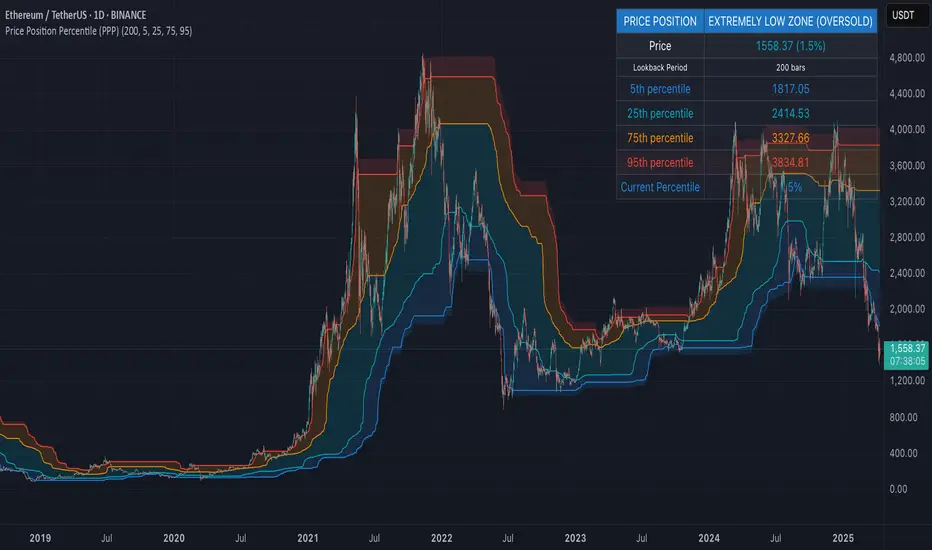
Price Position Percentile (PPP)
Price Position Percentile (PPP)
A statistical analysis tool that dynamically measures where current price stands within its historical distribution. Unlike traditional oscillators, PPP adapts to market conditions by calculating percentile ranks, creating a self-adjusting framework for identifying extremes.
How It Works
This indicator analyzes the last 200 price bars (customizable) and calculates the percentile rank of the current price within this distribution. For example, if the current price is at the 80th percentile, it means the price is higher than 80% of all prices in the lookback period.
The indicator creates five dynamic zones based on percentile thresholds:
Extremely Low Zone (<5%) : Prices in the lowest 5% of the distribution, indicating potential oversold conditions.
Low Zone (5-25%) : Accumulation zone where prices are historically low but not extreme.
Neutral Zone (25-75%) : Fair value zone representing the middle 50% of the price distribution.
High Zone (75-95%) : Distribution zone where prices are historically high but not extreme.
Extremely High Zone (>95%) : Prices in the highest 5% of the distribution, suggesting potential bubble conditions.
Mathematical Foundation
Unlike fixed-threshold indicators, PPP uses a non-parametric approach:
// Core percentile calculation
percentile = (count_of_prices_below_current / total_prices) * 100
// Threshold calculation using built-in function
p_extremely_low = ta.percentile_linear_interpolation(source, lookback, 5)
p_low = ta.percentile_linear_interpolation(source, lookback, 25)
p_neutral_high = ta.percentile_linear_interpolation(source, lookback, 75)
p_extremely_high = ta.percentile_linear_interpolation(source, lookback, 95)
Key Features
Dynamic Adaptation : All zones adjust automatically as price distribution changes
Statistical Robustness : Works on any timeframe and any market, including highly volatile cryptocurrencies
Visual Clarity : Color-coded zones provide immediate visual context
Non-parametric Analysis : Makes no assumptions about price distribution shape
Historical Context : Shows how zones evolved over time, revealing market regime changes
Practical Applications
PPP provides objective statistical context for price action, helping traders make more informed decisions based on historical price distribution rather than arbitrary levels.
Value Investment : Identify statistically significant low prices for potential entry points
Risk Management : Recognize when prices reach historical extremes for profit taking
Cycle Analysis : Observe how percentile zones expand and contract during different market phases
Market Regime Detection : Identify transitions between accumulation, markup, distribution, and markdown phases
Usage Guidelines
This indicator is particularly effective when:
- Used across multiple timeframes for confirmation
- Combined with volume analysis for validation of extremes
- Applied in conjunction with trend identification tools
- Monitored for divergences between price action and percentile ranking
Volume Range Map [BigBeluga]This volume-based tool identifies the highest and lowest price extremes within a lookback period and constructs two dynamic range zones. Each zone is filled with horizontal volume profiles that visualize the distribution of traded volume across price bins, helping traders pinpoint key areas of accumulation and distribution.
🔵Key Features:
Dynamic High/Low Zones:
➣ Automatically detects the highest and lowest price levels within a custom lookback window.
➣ Draws two shaded zones: one near the high and one near the low, representing potential supply and demand areas.
Volume Profiles per Zone:
➣ Each zone is filled with a volume profile histogram divided into bins.
➣ The length of each horizontal bar represents the relative volume traded at that price level.
➣ Bins collectively account for 100% of the zone’s volume.
POC Highlighting:
➣ The price bin with the highest volume is marked as the Point of Control (POC), along with a label showing its share of total volume in percentage.
➣ A dashed line is drawn at the middle level of the zone.
Customizable Display:
➣ Traders can adjust the number of bins, zone width, and toggle midline visibility to match their strategy needs.
➣ Colors of upper and lower volume zones are fully customizable.
🔵Usage:
Supply/Demand Analysis: Use upper/lower volume zones to find key reversal or continuation areas where market participants were most active.
Volume Confirmation: Confirm breakout or rejection trades by watching how price reacts to high-volume areas inside each zone.
POC Strategy: Treat POC levels as magnet zones — price tends to revisit them due to high liquidity.
Trade Planning: Use volume-weighted levels instead of raw price action to plan entries, stop-losses, and targets.
Volume Range Map offers a clean and powerful way to analyze volume distribution at price extremes. By combining precise volume histograms, POC highlights, and adaptive zone drawing, it brings market structure into sharper focus for range and breakout traders alike.

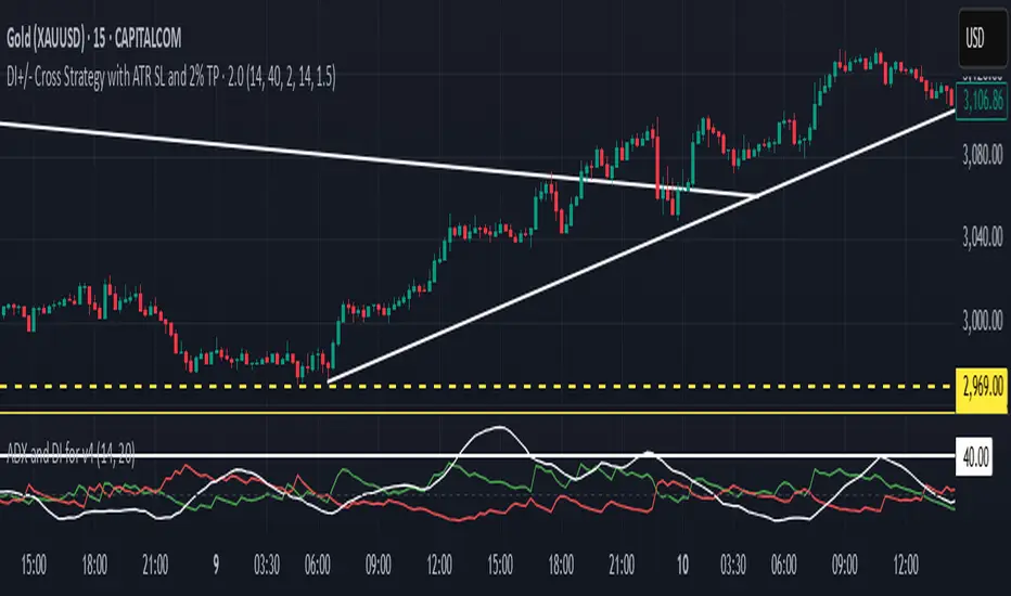
DI+/- Cross Strategy with ATR SL and 2% TPDI+/- Cross Strategy with ATR Stop Loss and 2% Take Profit
📝 Script Description for Publishing:
This strategy is based on the directional movement of the market using the Average Directional Index (ADX) components — DI+ and DI- — to generate entry signals, with clearly defined risk and reward targets using ATR-based Stop Loss and Fixed Percentage Take Profit.
🔍 How it works:
Buy Signal: When DI+ crosses above 40, signaling strong bullish momentum.
Sell Signal: When DI- crosses above 40, indicating strong bearish momentum.
Stop Loss: Dynamically calculated using ATR × 1.5, to account for market volatility.
Take Profit: Fixed at 2% above/below the entry price, for consistent reward targeting.
🧠 Why it’s useful:
Combines momentum breakout logic with volatility-based risk management.
Works well on trending assets, especially when combined with higher timeframe filters.
Clean BUY and SELL visual labels make it easy to interpret and backtest.
✅ Tips for Use:
Use on assets with clear trends (e.g., major forex pairs, trending stocks, crypto).
Best on 30m – 4H timeframes, but can be customized.
Consider combining with other filters (e.g., EMA trend direction or Bollinger Bands) for even better accuracy.
Hamid Double RSIRSI with Moving Average and Another RSI
This script combines two Relative Strength Index (RSI) indicators with configurable moving averages. It allows traders to track momentum and market strength with adjustable periods for both the RSI and moving averages. The script also allows you to choose different data sources for each RSI, offering flexibility in analysis.
Features:
Two RSIs: One with a shorter period and another with a longer period .
Moving Averages: Each RSI has its own configurable moving average . The moving averages help smooth out the RSI and provide clearer trends.
Customizable Inputs: Adjust the RSI period and the length of the moving averages. You can also choose different sources for each RSI (e.g., close, open, high, low).
Mid Line: A horizontal line at 50, which is commonly used as the neutral level for the RSI. It helps identify whether the RSI is above or below neutral, indicating bullish or bearish conditions.
Overbought and Oversold Levels: Horizontal lines at 70 (overbought) and 30 (oversold) to highlight when the asset might be overbought or oversold according to the RSI.
How it works:
RSI Calculation: The script calculates two RSIs using different lengths
Moving Averages: A Simple Moving Average (SMA) is applied to both RSIs to smooth their values and help identify trends.
Overbought/Oversold Indicators: The script includes horizontal lines at 70 and 30 to show overbought and oversold conditions. The mid line is plotted at 50 to highlight neutral levels.
This indicator is useful for traders who want to compare the behavior of two RSIs over different time periods and use the moving averages to filter out noise. The ability to customize the source data for each RSI makes this script adaptable to different trading strategies.

Donchian Breakout Strategy📈 Donchian Breakout Strategy (Inspired by Way of the Turtle)
This strategy is a modern adaptation of the legendary Turtle Trading system as taught in Way of the Turtle by Curtis Faith — re-engineered for the crypto market’s volatility, 24/7 nature, and frequent fakeouts.
⸻
🐢 Original Inspiration
The original Turtle system, created by Richard Dennis and William Eckhardt, used:
• Breakouts of Donchian Channels (20-day for entry, 10-day for exit)
• Volatility-based position sizing using ATR (N)
• Simple rules, big trend exposure, and pyramiding to grow winners
It was built for futures and commodities, trading daily bars, assuming stable trading hours and regulated markets.
⸻
🚀 What’s Different in This Strategy?
✅ Optimized for Crypto
• Adapts to constant volatility and price manipulation common in crypto
• Adds commission modeling for realistic results (0.045% default)
✅ Improved Entry Filtering
• Uses EMA filter to align with trend direction
• Adds RSI momentum check to avoid early or weak breakouts
• Optional volatility and volume filters to reduce false signals
✅ Smarter Exits
• ATR-based volatility stop loss, not just Donchian reversal
• Avoids pyramiding to reduce risk from sudden reversals
✅ Backtest-Friendly
• Default backtest window starts from 2025-01-01
• Fully configurable: long/short toggle, filter control, stop loss multiplier
⸻
🧪 Use Case
• Best on trending coins with strong directional moves
• Avoids chop via filters, preserving capital
• Can be tuned for aggressive or conservative setups with just a few tweaks

Multi-Timeframe Anchored VWAP Valuation# Multi-Timeframe Anchored VWAP Valuation
## Overview
This indicator provides a unique perspective on potential price valuation by comparing the current price to the Volume Weighted Average Price (VWAP) anchored to the start of multiple timeframes: Weekly, Monthly, Quarterly, and Yearly. It synthesizes these comparisons into a single oscillator value, helping traders gauge if the current price is potentially extended relative to significant volume-weighted levels.
## Core Concept & Calculation
1. **Anchored VWAP:** The script calculates the VWAP separately for the current Week, Month, Quarter (3 Months), and Year (12 Months), starting the calculation from the first bar of each period.
2. **Price Deviation:** It measures how far the current `close` price is from each of these anchored VWAPs. This distance is measured in terms of standard deviations calculated *within* that specific anchor period (e.g., how many weekly standard deviations the price is away from the weekly VWAP).
3. **Deviation Score (Multiplier):** Based on this standard deviation distance, a score is assigned. The further the price is from the VWAP (in terms of standard deviations), the higher the absolute score. The indicator uses linear interpolation to determine scores between the standard deviation levels (defaulted at 1, 2, and 3 standard deviations corresponding to scores of +/-2, +/-3, +/-4, with a score of 1 at the VWAP).
4. **Timeframe Weighting:** Longer timeframes are considered more significant. The deviation scores are multiplied by fixed scalars: Weekly (x1), Monthly (x2), Quarterly (x3), Yearly (x4).
5. **Final Valuation Metric:** The weighted scores from all four timeframes are summed up to produce the final oscillator value plotted in the indicator pane.
## How to Interpret and Use
* **Histogram (Indicator Pane):**
* The main output is the histogram representing the `Final Valuation Metric`.
* **Positive Values:** Suggest the price is generally trading above its volume-weighted averages across the timeframes, potentially indicating strength or relative "overvaluation."
* **Negative Values:** Suggest the price is generally trading below its volume-weighted averages, potentially indicating weakness or relative "undervaluation."
* **Values Near Zero:** Indicate the price is relatively close to its volume-weighted averages.
* **Histogram Color:**
* The color of the histogram bars provides context based on the metric's *own recent history*.
* **Green (Positive Color):** The metric is currently *above* its recent average plus a standard deviation band (dynamic upper threshold). This highlights potentially significant "overvalued" readings relative to its normal range.
* **Red (Negative Color):** The metric is currently *below* its recent average minus a standard deviation band (dynamic lower threshold). This highlights potentially significant "undervalued" readings relative to its normal range.
* **Gray (Neutral Color):** The metric is within its typical recent range (between the dynamic upper and lower thresholds).
* **Orange Line:** Plots the moving average of the `Final Valuation Metric` itself (based on the "Threshold Lookback Period"), serving as the centerline for the dynamic thresholds.
* **On-Chart Table:**
* Provides a detailed breakdown for transparency.
* Shows the calculated VWAP, the raw deviation multiplier score, and the final weighted (adjusted) metric for each individual timeframe (W, M, Q, Y).
* Displays the current price, the final combined metric value, and a textual interpretation ("Overvalued", "Undervalued", "Neutral") based on the dynamic thresholds.
## Potential Use Cases
* Identifying potential exhaustion points when the indicator reaches statistically high (green) or low (red) levels relative to its recent history.
* Assessing whether price trends are supported by underlying volume-weighted average prices across multiple timeframes.
* Can be used alongside other technical analysis tools for confirmation.
## Settings
* **Calculation Settings:**
* `STDEV Level 1`: Adjusts the 1st standard deviation level (default 1.0).
* `STDEV Level 2`: Adjusts the 2nd standard deviation level (default 2.0).
* `STDEV Level 3`: Adjusts the 3rd standard deviation level (default 3.0).
* **Interpretation Settings:**
* `Threshold Lookback Period`: Defines the number of bars used to calculate the average and standard deviation of the final metric for dynamic thresholds (default 200).
* `Threshold StDev Multiplier`: Controls how many standard deviations above/below the metric's average are used to set the "Overvalued"/"Undervalued" thresholds (default 1.0).
* **Table Settings:** Customize the position and colors of the data table displayed on the chart.
## Important Considerations
* This indicator measures price deviation relative to *anchored* VWAPs and its *own historical range*. It is not a standalone trading system.
* The interpretation of "Overvalued" and "Undervalued" is relative to the indicator's logic and calculations; it does not guarantee future price movement.
* Like all indicators, past performance is not indicative of future results. Use this tool as part of a comprehensive analysis and risk management strategy.
* The anchored VWAP and Standard Deviation values reset at the beginning of each respective period (Week, Month, Quarter, Year).

Daily Volatility Range (DVR) [GIF]VIX as a Volatility Indicator:
The VIX is a measure of the market's expectation of volatility in the S&P 500 over the next 30 days, based on the prices of S&P 500 options.
The Rule of 16:
A VIX of 16 implies that the market expects the SPX to move up or down by roughly 1% on any given day.
If the VIX is 24, the expected daily move is around 1.5%, and with a VIX of 32, the expected move is around 2%.
The rationale for the rule is that the square root of the number of trading days in a year (approximately 252) is roughly 16.
Example:
If the VIX is at 20, the rule suggests that the SPX might see daily moves of around 1.25%.
Practical Application:
The rule of 16 can be used as a quick and easy way to estimate the potential daily volatility of the S&P 500 based on the VIX.
The Daily Volatility Range:
This indicator cross references the ticker on the chart with it's own volatility index (assuming it has one). Below are the indexes and stocks that have their own volatility index:
S&P 500
Nasdaq 100
Russell 2000
Dow Jones
TLT
Bitcoin
Gold
Crude Oil
Apple
Amazon
Google
IBM
Goldman Sachs
How I use the DVR:
Historic probabilities show that you will close the day within the DVR. However, there are times when those probabilities diminish greatly. One of those times is when you open in the RTH session outside of the DVR. If you open outside the DVR, you can look for the DVR to becomes support/resistance and stay extended outside the DVR. These days can often become muted as most of the most has happened before the market open. However, if we open outside the DVR and break back into range, it is highly probable that we will not break back into those extended ranges.
Indicator Options:
There are 2x and 3x DVR levels that can be plotted. During times of extreme volatility, it will become important to have these plotted.
There is the option to plot calculated pivot points. These are fib ranges that have historically been areas of consolidation or trend reversal. These are projections based on my own research and are not as important as the DVR levels themselves.
There is also an option to color the candles a specific color if the candle closes outside the DVR. This is to highlight the fact that price action has exceeded the range and caution should be taken.
If you have suggestions how to make this indicator better, please let me know in the comments and I will look into it. Thank you!

ATLAS Reversion Bands v2 [EMA % Spread]🧠 About the ATLAS Reversion Bands v2
I created this indicator to answer a simple question:
"When is price extended too far from trend, and likely to revert?"
The ATLAS Reversion Bands measure the percentage spread between a fast and slow EMA (default 25/200) and track how far that spread moves from its historical average using z-score and standard deviation bands—essentially building a Bollinger Band system on top of EMA distance.
Instead of relying on traditional oscillators like RSI or MACD, this tool is purely math-driven and tailored for spotting overextensions across any asset.
🔍 What It Does
Tracks the normalized spread between EMA 25 and EMA 200
Highlights statistically rare zones using ±2 and ±3 standard deviation bands
Plots BUY/SELL triangle markers only on first entry into extreme zones
Helps identify mean reversion opportunities (deep pullbacks or FOMO tops)
📈 How to Use It
Wait for the spread to hit or exceed ±2.5 or ±3 standard deviations
Look for confirmation via price structure, candles, or volume
Best used on spot or perp markets with healthy liquidity
Ideal for swing trading or narrative-based rotational setups
🕐 Recommended Timeframes
1H, 4H, and 1D are optimal
Use MTF mode to apply daily logic on lower timeframes (e.g., see 1D exhaustion while trading 4H)
Works across:
✅ BTC, ETH, Majors
✅ Meme coins (better on 1H/4H)
✅ Market indexes (TOTAL2, BTC.D, etc.)
📌 Pro Tips
Raise the Z-score alert threshold for stricter signals (e.g., 3.0 for only the wildest extensions)
Use with other confluence tools (like S/R, candles, or RSI)
Not designed for chasing trends — this is a fade-the-hype, buy-the-blood kind of tool

Multi-Timeframe Trading SystemOverview
The Multi-Timeframe Trading System is an advanced technical analysis indicator designed to identify high-probability trading opportunities by combining signals from multiple timeframes and trading strategies. This system analyzes market context, identifies optimal setups, and confirms entries with lower timeframe precision, significantly increasing signal reliability.
Key Features
Triple Timeframe Analysis: Combines high, medium, and low timeframe data for comprehensive market analysis
Three Trading Strategies in One: Incorporates trend-following, mean-reversion, and breakout strategies
Adaptive to Market Conditions: Automatically identifies the current market context (trending or ranging) and applies the appropriate strategy
Signal Strength Evaluation: Rates buy/sell signals from weak to strong based on indicator confluence
Visual Alerts: Clear buy/sell signals with on-chart markers and signal labels
Customizable Parameters: Fully adjustable settings for all indicators and timeframes
Technical Indicators Included
-Moving Averages (EMA 50, EMA 200)
-Ichimoku Cloud components
-ADX for trend strength
-RSI for momentum and oversold/overbought conditions
-Stochastic oscillator for entry timing
-MACD for trend confirmation
-Bollinger Bands for volatility and price channels
-ATR for measuring market volatility
Trading Strategies
1. Trend-Following Strategy
Identifies the primary trend direction on higher timeframes
Locates optimal pullback entry points on medium timeframes
Confirms entries with precision using lower timeframe momentum signals
2. Mean-Reversion Strategy
Activates during ranging market conditions
Identifies oversold and overbought conditions using Bollinger Bands and RSI
Confirms reversals with Stochastic crossovers
3. Breakout Strategy
Detects price consolidation periods through Bollinger Band width
Identifies volatility expansion and price breakouts
Confirms breakout direction with momentum indicators
Ideal For
Swing traders looking for high-probability setups
Day traders seeking to align with the larger trend
Traders who want systematic confirmation across multiple timeframes
Those looking to adapt their trading approach to changing market conditions
How To Use
Apply the indicator to your chart and customize the timeframe settings to match your trading style
-Observe the market context information (uptrend, downtrend, or ranging)
-Wait for a setup to form on the medium timeframe
-Enter when the low timeframe confirms the signal
-Use the signal strength rating to prioritize the highest probability trades
The Multi-Timeframe Trading System eliminates the guesswork from your trading by providing clear, objective signals based on professional-grade multi-timeframe analysis techniques.

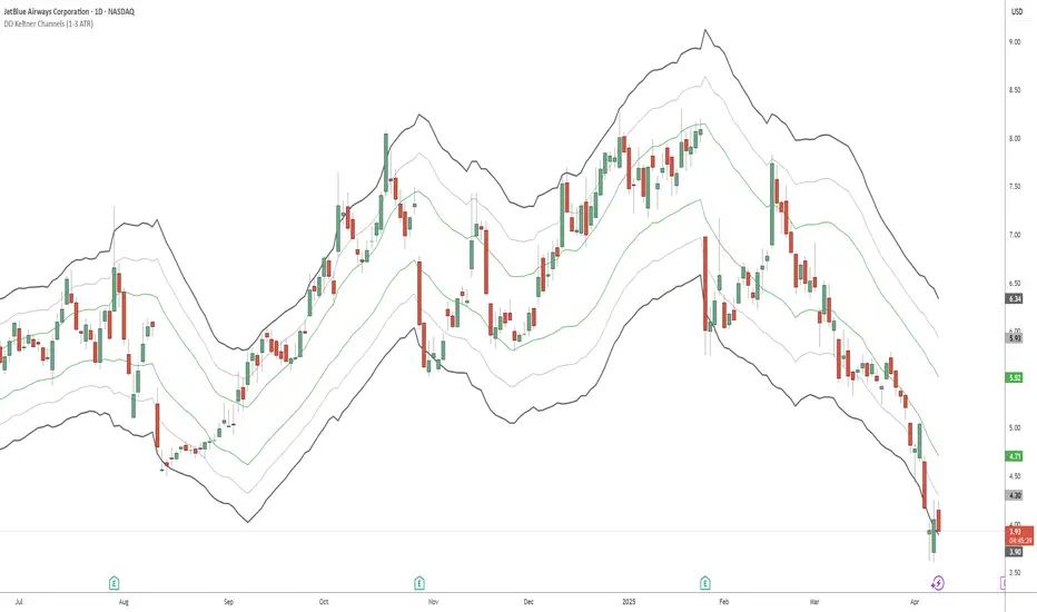
DD Keltner Channels (1-3 ATR)This indicator creates Keltner Channels with 1, 2, and 3 ATR multipliers, allowing you to visualize different volatility levels around a moving average.
It's specifically created for people taking the "Deep Dip Buy" stock trading course, and attempts to provide a ready-to-go solution for those struggling with configuring the default Keltner indicator on TradingView to suit their needs for the course.
Any input from students or the instructor is welcome to improve this indicator so it offers more value to those looking to learn how to trade.
Features:
- Uses SMA or EMA as the base (20-period default)
- Displays 6 lines: +3, +2, +1, -1, -2, and -3 ATR levels
- Color-coded for easy identification:
• +/-1 ATR: Green
• +/-2 ATR: Light Gray (thin)
• +/-3 ATR: Dark Gray (thick)
Fibonacci Counter-Trend TradingOverview:
The Fibonacci Counter-Trend Trading strategy is designed to capitalize on price reversals by utilizing Fibonacci levels calculated from the standard deviation of price movements. This strategy opens a sell order when the closing price crosses above a specified upper Fibonacci level and a buy order when the closing price crosses below a specified lower Fibonacci level. By leveraging the principles of Fibonacci retracement and volatility, this strategy aims to identify potential reversal points in the market.
How It Works:
Fibonacci Levels Calculation:
The strategy calculates upper and lower Fibonacci levels based on the standard deviation of the price over a specified moving average length. These levels are derived from the Fibonacci sequence, which is widely used in technical analysis to identify potential support and resistance levels.
The upper levels are calculated by adding specific Fibonacci ratios (0.236, 0.382, 0.5, 0.618, 0.764, and 1.0) multiplied by the standard deviation to the basis (the volume-weighted moving average).
The lower levels are calculated by subtracting the same Fibonacci ratios multiplied by the standard deviation from the basis.
Trade Entry Rules:
Sell Order: A sell order is triggered when the closing price crosses above the selected upper Fibonacci level. This indicates a potential reversal point where the price may start to decline.
Buy Order: A buy order is initiated when the closing price crosses below the selected lower Fibonacci level. This suggests a potential reversal point where the price may begin to rise.
Trade Management:
The strategy includes stop-losses based on the Fibonacci levels to protect against adverse price movements.
How to Use:
Users can customize the moving average length and the multiplier for the standard deviation to suit their trading preferences and market conditions.
The strategy can be applied to various financial instruments, including stocks, forex, and cryptocurrencies, making it versatile for different trading environments.
Pros:
The Fibonacci Counter-Trend Trading strategy combines the mathematical principles of the Fibonacci sequence with the statistical measure of standard deviation, providing a unique approach to identifying potential market reversals.
This strategy is particularly useful in volatile markets where price swings can lead to significant trading opportunities.
The use of Fibonacci levels can help traders identify key support and resistance areas, enhancing decision-making.
Cons:
The strategy may generate false signals in choppy or sideways markets, leading to potential losses if the price does not reverse as anticipated.
Relying solely on Fibonacci levels without considering other technical indicators or market conditions may result in missed opportunities or increased risk.
The effectiveness of the strategy can vary depending on the chosen parameters (e.g., moving average length and standard deviation multiplier), requiring users to spend time optimizing these settings for different market conditions.
As with any counter-trend strategy, there is a risk of significant drawdowns during strong trending markets, where the price continues to move in one direction without reversing.
By understanding the mechanics of the Fibonacci Counter-Trend Trading strategy, along with its pros and cons, traders can effectively implement it in their trading routines and potentially enhance their trading performance.
DT_KEY_LEVELSDT_Key_Levels: Powerful Market Structure Analysis Indicator
DT_Key_Levels is an advanced indicator for fundamental market structure analysis, optimized for higher timeframes (D1, W, M). The indicator combines three powerful technical analysis tools — fractals, Fair Value Gaps (FVG), and psychological levels — in one comprehensive solution.
Three Components of the Indicator
1. Enhanced Fractal System
The indicator uses an improved version of Bill Williams' classic fractals, allowing for deeper market structure analysis:
Dual Identification System:
Standard 5-bar fractals (displayed with thick lines) for analyzing reliable support/resistance levels
Light 3-bar fractals (displayed with thin lines) for early identification of potential reversal points
Intelligent Tracking System:
Automatic detection and filtering of completed fractals
Marking fractals with corresponding timeframe designation (HTF-1D, HTF-1W, HTF-1M)
Tracking and marking the All-Time High (ATH)
2. Fair Value Gaps (FVG) System
The indicator identifies and visualizes price gaps in market structure — zones that often act as magnets for future price movements:
Precise Identification of Inefficient Zones:
Bullish FVG: when the current candle's low is above the -2 candle's high
Bearish FVG: when the current candle's high is below the -2 candle's low
Detailed Visualization:
Clear display of upper and lower boundaries of each FVG
Midline (0.5 FVG) for determining key reaction levels within the gap
Marking each FVG with "FF" (Fair value Fill) label for quick identification
Dynamic Management:
Automatic removal of FVGs when they are filled by price movement
Customizable line extension for improved tracking of target zones
3. Intelligent Psychological Levels
The indicator automatically determines key psychological levels with adaptation to the type of instrument being traded:
Specialized Calibration for Various Assets:
Forex (EUR/USD, GBP/USD, USD/JPY): optimization for standard figures and round values
Precious metals (XAUUSD): adaptation to typical gold reaction zones with a $50 step
Cryptocurrencies (BTC, ETH): dynamic step adjustment depending on current price zone
Stock indices (NASDAQ, S&P500, DAX): accounting for the movement characteristics of each index
Smart Adaptation System:
Automatic determination of the optimal step for any instrument
Generation of up to 24 key levels, evenly distributed around the current price
Intelligent filtering to display only significant levels
Practical Application
Strategic Analysis
Identifying Key Structural Levels:
Use monthly and weekly fractals to determine strategic support/resistance zones
Look for coincidences of fractals with psychological levels to identify particularly strong zones of interest
Determine long-term barriers using type 5 fractals on higher timeframes
Analysis of Market Inefficiencies:
Track the formation of FVGs as potential targets for future movements
Use FVG midlines (0.5) as important internal reaction levels
Analyze the speed of FVG filling to understand trend strength
Tactical Trading Decisions
Entry Points and Risk Management:
Use bounces from fractals in the direction of the larger trend as a signal for entry
Place stop-losses behind fractal levels or key psychological levels
Monitor the formation of new fractals as a signal of potential reversal
Determining Target Levels:
Use unfilled FVGs as natural price targets
Apply nearby psychological levels for partial position closing
Project higher timeframe fractals to determine long-term goals
Indicator Advantages
Comprehensive Approach: combining three methodologies for a complete understanding of market structure
Intelligent Adaptation: automatic adjustment to the characteristics of different types of assets
Clean Visual Presentation: despite the abundance of information, the indicator maintains clarity of display
Effective Signal Filtering: automatic removal of completed levels to reduce visual noise
Higher Timeframe Optimization: specifically designed for daily, weekly and monthly charts
Usage Recommendations
Use the indicator only on D1, W, and M timeframes for the most reliable signals
Pay special attention to areas where different types of signals coincide (e.g., fractal + psychological level)
Use higher timeframe fractals as key zones for medium and long-term trading
Track FVGs as potential target zones and focus on their filling
