Bollinger Free BarsIdentify Extreme Price Actions with Non-Overlay Visualization
Core Functionality
This indicator detects two types of Bollinger Band breakout patterns without cluttering your chart:
1 ️⃣ Half Breakout Bar (Blue Triangles)
- Triggers when both open & close prices are outside the Bollinger Bands
- Suggests strong directional momentum continuation
2 ️⃣ Complete Breakout Bar (Red Flags)
- Activates when entire price action (including wicks) stays outside the bands
- Signals extreme volatility exhaustion points
Feature Highlights
◾ Smart Band Display
Translucent bands (#2196F3 & #FF9800 with 70% transparency) maintain chart clarity while showing dynamic volatility ranges
◾ Parameter Customization
- Adjustable period (default 20) & deviation multiplier (default 2.0)
- Selectable price source (close/open/high/low)
◾ Statistical Validation
Based on Bollinger Band's 95.4% price containment principle, signals filter out 4.6% extreme market conditions for high-probability scenarios.
Recommended Usage
1. Combine with volume analysis (significant breakout with high volume increases signal reliability)
2. Confirm with trend lines or RSI divergence
3. Adjust transparency via "Style" tab for multi-indicator layouts
Code Safety
- No repainting: All calculations use historical price data only
- No external network requests
- Open-source logic compliant with Pine Script v6 standards
Disclaimer
This tool is for technical analysis education only. Past performance doesn't guarantee future results. Always validate signals with fundamental analysis and proper risk management.
Bands and Channels

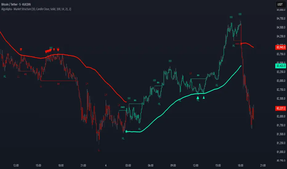
Market Structure Confluence [AlgoAlpha]OVERVIEW
This script is called "Market Structure Confluence" and it combines classic market structure analysis with a dynamic volatility-based band system to detect shifts in trend and momentum more reliably. It tracks key swing points (higher highs, higher lows, lower highs, lower lows) to define the trend, then overlays a basis and ATR-smoothed volatility bands to catch rejection signals and highlight potential inflection points in the market.
CONCEPTS
Market structure is the foundation of price action trading, focusing on the relationship between successive highs and lows to understand trend conditions. Break of Structure (BOS) and Change of Character (CHoCH) events are important because they signal when a market might be shifting direction. This script enhances traditional structure by integrating volatility bands, which act like dynamic support/resistance zones based on ATR, allowing it to capture momentum surges and rejections beyond just structural shifts.
FEATURES
Swing Detection: It detects and labels Higher Highs (HH), Higher Lows (HL), Lower Highs (LH), and Lower Lows (LL) based on user-defined time horizons, helping traders quickly spot the trend direction.
BOS and CHoCH Lines: When a previous swing point is broken, the script automatically plots a Break of Structure (BOS) line. If the break represents a major trend reversal (a CHoCH), it is marked differently to separate simple breakouts from real trend changes.
Rejection Signals: Special arrows plot when price pierces a band and then pulls back, suggesting a potential trap move or rejection signal in the direction of the new structure.
Alerts: Built-in alerts for structure breaks, CHoCHs, swing points, rejections at bands, and trend flips make it easy to automate setups without manually watching the chart.
USAGE
Set your preferred swing detection size depending on your timeframe and trading style — smaller numbers for intraday, larger numbers for swing trading. Choose whether you want BOS/CHoCH confirmed by candle closes or by wick breaks. Use the volatility band settings to fine-tune how tightly or loosely the bands hug the price, adjusting sensitivity based on market conditions. When a BOS or CHoCH occurs, or when a rejection happens at the bands, the script will highlight it clearly and optionally trigger alerts. Watch for combinations where both structure breaks and volatility band rejections happen together — those are high-quality trade signals. This setup works best when used with basic trend filtering and higher timeframe confirmation.
MA Dashboard (NAPC Histogram Table) MADashV1MA Dashboard (MAPC Histogram Table) MADashV1 - User Guide
1. Introduction & Purpose
The "MA Dashboard (MADashV1)" indicator is a tool for TradingView designed to give you a quick, comprehensive overview of how the current price relates to multiple Moving Averages (MAs). It displays key information in a convenient table and provides a visual histogram in a separate pane below your main price chart.
Its main goals are:
To monitor up to six different MAs simultaneously without cluttering your main chart.
To instantly see if the price is currently above or below each MA ("Status").
To show the actual value of each MA ("MA$").
To identify the price level of the most recent price crossover for each MA within a specific lookback period (" TSX:XMA ").
To quantify the exact difference between the current price and each MA ("MAPC" - Moving Average Price Crossover/Difference).
To visualize the MAPC of one selected MA as a histogram for quick momentum assessment.
To optionally plot the historical MAPC values as lines in the histogram pane.
2. Key Features
Configurable MAs: Set up to 6 independent Moving Averages. For each, you can choose:
Type (SMA, EMA, WMA, RMA)
Length (Period)
Source (Close, Open, High, Low, etc.)
Color (Used for identification in the table)
Informative Table: A dashboard summarizing all configured MAs, showing:
MA Number (1-6)
Type & Length settings
Current MA Value (MA$)
Price Status relative to MA (Bullish/Bearish/Neutral)
Last Crossover Price ( TSX:XMA ) with color-coded background (Green=Up, Red=Down)
Price Difference from MA (MAPC) with color-coded text (Green=Positive, Red=Negative)
MAPC Histogram: Plotted in a separate pane, showing the difference between the price and one user-selected MA.
Green bars indicate the price is above the selected MA.
Red bars indicate the price is below the selected MA.
The height of the bars shows the magnitude of the difference.
Optional MAPC Lines: Plot the historical MAPC values for any of the 6 MAs as lines directly on the histogram pane for comparison.
Customizable Appearance: Control the table's position, colors (background, text, header, border), border size, and text size.
Flexible Formatting: Adjust the number of decimal places displayed for price values and MAPC values.
Crossover Lookback: Define how many bars back the indicator should look for the last price crossover ( TSX:XMA ).
3. How It Works (Simplified)
MA Calculation: The indicator calculates the value of each enabled Moving Average based on your chosen settings (Type, Length, Source).
Status Check: For each MA, it compares the current price (from the MA's Source setting) to the MA's calculated value. If the price is higher, the status is "Bullish"; if lower, "Bearish"; if equal, "Neutral".
MAPC Calculation: It simply subtracts the MA's value from the current price (Price - MA Value). This gives the raw price difference, shown in the MAPC column.
TSX:XMA Calculation: It looks back over the number of bars you specified ("Crossover Lookback Bars"). It finds the most recent instance where the price crossed either above or below the MA within that lookback period. It then records the price at which that specific crossover occurred and displays it in the TSX:XMA column. The background color indicates if the last cross within the lookback was upwards (green) or downwards (red). If no cross occurred within the lookback, it shows "N/A".
Histogram: It takes the MAPC value (Price - MA Value) calculated for the single MA you selected in the "Histogram Source MA" setting and plots it as a bar for each candle.
4. Indicator Components
Histogram Pane: This appears below your main price chart.
Histogram Bars: Visual representation of the MAPC for the selected MA.
Zero Line: A horizontal line indicating where the price is exactly equal to the selected MA.
(Optional) MAPC Lines: Lines showing the historical MAPC values for any MAs you choose to plot.
Information Table: Displayed on top of the Histogram Pane (or wherever you position it). This is the main dashboard showing the data for all enabled MAs.
5. Configuration Settings (Inputs)
When you add the indicator to your chart, you'll see these settings:
General Settings:
Show Info Table: Turn the table display on or off.
Table Horizontal/Vertical Position: Choose where the table appears (Top/Middle/Bottom, Left/Center/Right).
Table BG Color, Table Text Color, Table Header Color: Customize the table's colors.
Table Border Size, Table Border Color: Adjust the table's border.
Text Size: Change the font size within the table.
Formatting:
Price Decimals: Set how many decimal places to show for MA values (MA$) and crossover prices ( TSX:XMA ). "Default" uses the chart's setting.
MAPC Decimals: Set how many decimal places to show for the MAPC column values.
Crossover Settings:
Crossover ( TSX:XMA ) Lookback Bars: How many past bars to check for the last price/MA crossover. A smaller number focuses on recent crosses.
Histogram Settings:
Show Histogram Pane: Turn the entire histogram pane (including bars and lines) on or off.
Histogram Source MA: Crucial setting! Select which MA (MA1 to MA6) will be used to generate the histogram bars.
Histogram Positive/Negative Color: Choose the colors for the histogram bars when the price is above (positive) or below (negative) the selected MA.
Plot MAPC Line 1 to Plot MAPC Line 6: Check these boxes to draw the historical MAPC value for the corresponding MA as a line on the histogram pane.
MA 1 to MA 6 Settings:
Enable MA X: Turn each specific MA on or off. If off, it won't be calculated or shown in the table.
Type: Select the calculation type (SMA, EMA, etc.).
Length: Set the period for the MA.
Source: Choose the price data used for the MA calculation (Close, Open, High, Low, hl2, etc.).
Color: Select a color for this MA. This color is used as the background for the MA number in the first column of the table for easy identification.
Style, Width: These primarily affect how the MA would look if plotted on the main chart (which this indicator doesn't do by default), but the Width setting is not used in the table or histogram pane.
6. How to Interpret the Output
Table:
MA, Type, Len: Reminders of your settings for each row.
MA$: The current calculated value of that Moving Average.
Status: Quickly see if the price is currently bullish (above) or bearish (below) relative to that specific MA. Look for confluence (multiple MAs showing the same status). Text color matches MAPC (Green=Bullish, Red=Bearish).
TSX:XMA : Shows the price level of the last crossover within your lookback period. The background color tells you the direction of that cross (Green = Price crossed UP, Red = Price crossed DOWN). Useful for identifying potential support/resistance levels based on recent crosses. "N/A" means no cross occurred within the lookback.
MAPC: Shows the exact price difference between the source price and the MA. A large positive number means the price is significantly above the MA; a large negative number means it's significantly below. The text color indicates the direction (Green = Price > MA, Red = Price < MA). Useful for gauging the strength of deviation from the MA.
Histogram:
Focus on the MA selected in Histogram Source MA.
Bars above Zero: Price is above the selected MA (Bullish). Taller bars mean a larger difference.
Bars below Zero: Price is below the selected MA (Bearish). Longer bars (downwards) mean a larger difference.
Crossing the Zero Line: Indicates the price is crossing the selected MA.
Trend/Momentum: Observe if the histogram bars are generally staying positive or negative, and if their height/length is increasing or decreasing, which can indicate strengthening or weakening momentum relative to that MA.
MAPC Lines (if enabled):
Compare the lines to each other and the zero line. See how the price difference for different MAs has evolved over time. For example, you could plot a short-term MAPC line and a long-term MAPC line to see how they diverge or converge.
7. Potential Use Cases
Trend Confirmation: Check if the price is consistently above (bullish) or below (bearish) multiple MAs according to the "Status" column.
Momentum Gauge: Use the Histogram height/depth or the MAPC values to see how far the price is deviating from key MAs. Increasing deviation might suggest strong momentum, while decreasing deviation might suggest consolidation or reversal potential.
Crossover Signals: Use the " TSX:XMA " column's background color to quickly spot recent crossovers within your defined lookback. Note the price level ( TSX:XMA value) where it happened.
Dynamic Support/Resistance: The current "MA$" values act as potential dynamic support (if price is above) or resistance (if price is below). The " TSX:XMA " price shows where recent interactions occurred.
Comparing MA Relationships: Enable MAPC lines for different MAs (e.g., a fast MA and a slow MA) to visualize how their distance from the price changes relative to each other.
8. Important Notes
This indicator plots in a separate pane (overlay=false), not directly on your price chart.
The MA lines themselves are not plotted on the main chart by default, although the plotting code exists internally. The focus is on the table and histogram data.
MAPC shows the absolute price difference, not a percentage difference.
The usefulness of the " TSX:XMA " column depends heavily on the "Crossover Lookback Bars" setting.
This guide should help you understand and effectively use the MA Dashboard (MADashV1) indicator. Remember to experiment with the settings to tailor it to your specific trading style and the assets you trade.

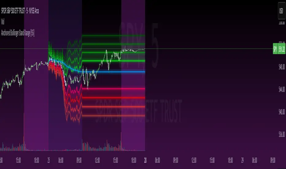
Anchored Bollinger Band Range [SS]This is the anchored Bollinger band indicator.
What it does?
The anchored BB indicator:
Takes a user defined range and calculates the Standard Deviation of the entire selected range for the high and low values.
Computes a moving average of the high and low during the selected period (which later becomes the breakout range average)
Anchors to the last high and last low of the period range to add up to 4 standard deviations to the upside and downside, giving you 4 high and low targets.
How can you use it?
The anchored BB indicator has many applicable uses, including
Identifying daily ranges based on premarket trading activity ( see below ):
Finding breakout ranges for intraday pattern setups ( see below ):
Identified pattern of interest:
Applying Anchored BB:
Identifying daily or pattern biases based on the position to the opening breakout range average (blue line). See the examples with explanations:
ex#1:
ex#2:
The Opening Breakout Average
As you saw in the examples above, the blue line represents the opening breakout range average.
This is the average high of the period of interest and the average low of the period of interest.
Price action above this line would be considered Bullish, and Bearish if below.
This also acts as a retracement zone in non-trending markets. For example:
Best Use Cases
Identify breakout ranges for patterns on larger timeframes. For example
This pattern on SPY, if we overlay the Anchored BB:
You want to see it actually breakout from this range and hold to confirm a breakout. Failure to exceed the BB range, means that it is just ranging with no real breakout momentum.
Identify conservative ranges for a specific period in time, for example QQQ:
Worst Use Cases
Using it as a hard and fast support and resistance indicator. This is not what it is for and ranges can be exceeded with momentum. The key is looking for whether ranges are exceeded (i.e. high momentum, thus breakout play) or they are not (thus low volume, rangy).
Using it for longer term outlooks. This is not ideal for long term ranges, as with any Bollinger/standard deviation based approach, it is only responsive to CURRENT PA and cannot forecast FUTURE PA.
User Inputs
The indicator is really straight forward. There are 2 optional inputs and 1 required input.
Period Selection: Required. Selects the period for the indicator to perform the analysis on. You just select it with your mouse on the chart.
Visible MA: Optional. You can choose to have the breakout range moving average visible or not.
Fills: Optional. You can choose to have the fills plotted or not.
And that is the indicator! Very easy to use and hope you enjoy and find it helpful!
As always, safe trades everyone! 🚀
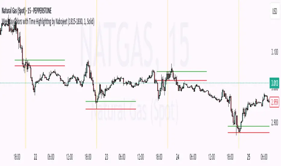
Weekday Colors with Time Highlighting by NabojeetThis script is a Pine Script (version 6) indicator called "Weekday Colors with Time Highlighting" designed for TradingView charts. It has several key functions:
1. **Weekday Color Coding**:
- Assigns different background colors to each trading day (Monday through Friday)
- Allows users to customize the color for each day
- Includes toggles to enable/disable colors for specific days
2. **Time Range Highlighting**:
- Highlights a specific time period (e.g., 18:15-18:30) on every trading day
- Uses a custom color that can be adjusted by the user
- The time range is specified in HHMM-HHMM format
3. **High/Low Line Drawing**:
- Automatically identifies the highest high and lowest low points within the specified time range
- Draws horizontal lines at these levels when the time period ends
- Lines extend forward in time to serve as support/resistance references
- Users can customize the line color, width, and style (solid, dotted, or dashed)
The script is organized into logical sections with input parameters grouped by function (Weekday Colors, Weekday Display, Time Highlighting, and Horizontal Lines). Each section's inputs are customizable through the indicator settings panel.
This indicator would be particularly useful for traders who:
- Want visual distinction between different trading days
- Focus on specific time periods each day (like market opens, closes, or specific sessions)
- Use intraday support/resistance levels from key time periods
- Want to quickly identify session highs and lows
The implementation resets tracking variables at the beginning of each new time range and draws the lines once the time period ends, ensuring accurate high/low marking for each day's specified time window.
Author - Nabojeet
Gaussian Channel StrategyGaussian Channel Strategy — User Guide
1. Concept
This strategy builds trades around the Gaussian Channel. Based on Pine Script v4 indicator originally published by Donovan Wall. With rework to v6 Pine Script and adding entry and exit functions.
The channel consists of three dynamic lines:
Line Formula Purpose
Filter (middle) N-pole Gaussian filter applied to price Market "equilibrium"
High Band Filter + (Filtered TR × mult) Dynamic upper envelope
Low Band Filter − (Filtered TR × mult) Dynamic lower envelope
A position is opened when price crosses a user-selected line in a user-selected direction.
When the smoothed True Range (Filtered TR) becomes negative, the raw bands can flip (High drops below Low).
The strategy automatically reorders them so the upper band is always above the lower band.
Visual colors still flip, but signals stay correct.
2. Entry Logic
Choose a signal line for longs and/or shorts: Filter, Upper band, or Lower band.
Choose a cross direction (Cross Up or Cross Down).
A signal remains valid for Lookback bars after the actual cross, as long as price is still on the required side of the line.
When the opposite signal appears, the current position is closed or reversed depending on Reverse on opposite.
3. Parameters
Group Setting Meaning
Source & Filter Source Price series used (close, hlc3, etc.)
Poles (N) Number of Gaussian filter poles (1-9). More poles ⇒ smoother but laggier
Sampling Period Main period length of the channel
Filtered TR Multiplier Width of the bands in fractions of smoothed True Range
Reduced Lag Mode Adds a lag-compensation term (faster but noisier)
Fast Response Mode Blends 1-pole & N-pole outputs for quicker turns
Signals Long → signal line / Short → signal line Which line generates signals
Long when price / Short when price Direction of the cross
Lookback bars for late entry Bars after the cross that still allow an entry
Trading Enable LONG/SHORT-side trades Turn each side on/off
On opposite signal: reverse True: reverse -- False: flat
Misc Start trading date Ignores signals before this timestamp (back-test focus)
4. Quick Start
Add the strategy to a chart. Default: hlc3, N = 4, Period = 144.
Select your signal lines & directions.
Example: trend trading – Long: Filter + Cross Up, Short: Filter + Cross Down.
Disable either side if you want long-only or short-only.
Tune Lookback (e.g. 3) to catch gaps and strong impulses.
Run Strategy Tester, optimise period / multiplier / stops (add strategy.exit blocks if needed).
When satisfied, connect alerts via TradingView webhooks or use the builtin broker panel.
5. Notes
Commission & slippage are not preset – adjust them in Properties → Commission & Slippage.
Works on any market and timeframe, but you should retune Sampling Period and Multiplier for each symbol.
No stop-loss / take-profit is included by default – feel free to add with strategy.exit.
Start trading date lets you back-test only recent history (e.g. last two years).
6. Disclaimer
This script is for educational purposes only and does not constitute investment advice.
Use entirely at your own risk. Back-test thoroughly and apply sound risk management before trading real capital.

Tango Rocket velas 1.3Tango Rocket Indicator:
Daily Volatility Range Projection
This indicator identifies the 3 largest-bodied candles from the last N daily bars and calculates a projected price range centered on the current day’s opening price. The projected channel is displayed for the current day and past days, helping visualize potential daily movement and historical volatility patterns.

SPY 0DTE Scalper - Auto AlertsTimeframes:
Main chart: 1-minute (for precision entries)
Confirmations: 3-minute or 5-minute (to avoid fakeouts)
Indicators I Use:
VWAP – Orange line → Institutional fair value
EMA 9 – Green line → Short-term momentum
EMA 21 – Red line → Trend filter
Custom Pullback Signal Script – Marks buy/sell/pullback signals with labels (triangles)
Above VWAP = Bullish Bias
Below VWAP = Bearish Bias
Institutions treat this as the "fair price" — so I do too.
EMA 9 (Green):
If price hugs or bounces off EMA 9 = 🔥 strong continuation move.
I use this as my guide for momentum.
EMA 21 (Red):
Great for trend confirmation.
Above EMA 21 = Trend building to the upside.
Below EMA 21 = Weakness or possible reversal.
💸 Step 3: How I Read the Signals
✅ BUY Signal:
Price breaks above VWAP with volume 1.5x+ average
Candle must close strong (not a wickfest)
EMA 9 becomes my trailing stop for the move
🚨 SELL Signal:
Price breaks below VWAP with strong volume
Clean body close below → momentum shift to the downside
EMA 9 again = trailing resistance guide
🔵 Pullback Long (Blue Triangle Under Candle):
Bullish continuation entry
Price pulls back to EMA 9 or 21, but stays above VWAP
Low-risk re-entry after a breakout
🟣 Pullback Short (Purple Triangle Above Candle):
Bearish continuation entry
Price retraces into EMA 9, but stays below VWAP & EMA 21
Ideal for catching second legs after breakdowns

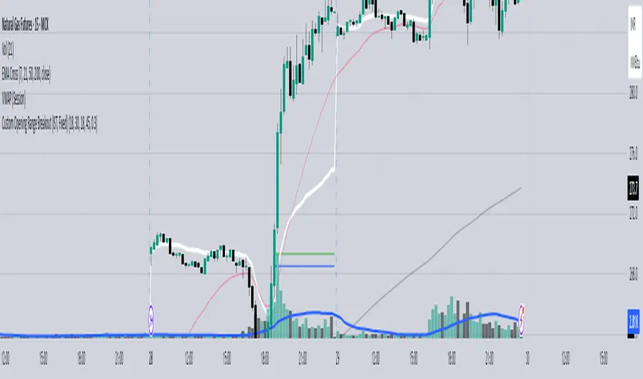
Custom Opening Range - CommoditiesThe Custom Opening Range Indicator for Commodities is designed for instruments that trade nearly 24 hours, such as crude oil or natural gas. It allows traders to define the Opening Range based on Indian Standard Time (IST)—typically starting at 3:30 AM IST, which aligns with the global commodities market open. Users can customize both the start time and duration of the range (e.g., 5, 15, or 30 minutes). The indicator dynamically plots the high and low of this range and shades the area between them, providing a clear visual reference for breakout or reversal setups during the rest of the trading session.
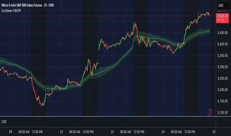
Euclidean VWATROverview
Dual-Centroid ATR Cluster Bands is an on-chart indicator that dynamically clusters price around two evolving centroids and builds volatility-based bands around each. By combining an online Euclidean update with average true range (ATR) and volume weighting, it creates two adaptive support/resistance zones and highlights which cluster price belongs to on each bar.
Key Features
- Two adaptive centroids that move toward price based on proximity and volume
- ATR-based upper and lower bands around each centroid to show volatility zones
- Volume weighting so high-volume bars shift centroids faster
- Background shading to show whether the current bar belongs to the red or green cluster
- Optional breakout flags for when price crosses each band (not tied to automated entries or exits)
Inputs
Learning Rate: speed at which centroids adapt to new price (0–1). Default = 0.025
Init Centroid 1 / Init Centroid 2: starting value for each centroid (0 uses the first bar’s close). Default = 0.0
ATR Length: lookback period for ATR calculation. Default = 14
ATR Band Multiplier: multiple of ATR used for upper and lower bands. Default = 1.5
Volume SMA Length: lookback period for smoothing volume to compute relative weight. Default = 20
Interpretation & Usage
- Trend vs. mean-reversion: price oscillating inside a colored zone suggests mean-reversion to that centroid.
- Equilibrium shifts: a move toward the midpoint between centroids may signal a cluster change.
- Breakout signals: use price crosses of the ATR bands as potential momentum entries (combine with volume or other filters).
- Dynamic support/resistance: treat the centroids and their bands as floating levels that adapt to market conditions.
- Volume sensitivity: high-volume moves will pull the centroids more strongly, making zones more responsive during heavy trading.
Recommended Tips
- Increase Learning Rate for faster adaptation in volatile markets.
- Raise ATR Band Multiplier in choppy conditions to reduce false breakouts.
- Adjust Volume SMA Length to emphasize recent or longer-term volume trends.
- Combine with other indicators (pivot points, VWAP, trend filters) for filtered entries.
StupidTrader Money GlitchStupidTrader Money Glitch
This indicator identifies high-probability buy setups by combining key technical concepts. It detects a reclaimed demand zone (a significant low that was broken and reclaimed), confirms bullish market structure breaks (MSB), ensures the price is above the 9 and 21 EMAs, and looks for volume spikes or trends.
Key Features:
Plots a demand zone (blue box) based on a reclaimed low.
Signals long entries (green triangles) when conditions align: reclaimed demand zone, MSB, price above EMAs, and volume confirmation.
Includes EMA 9 (blue) and EMA 21 (aqua) for trend confirmation.
How to Use:
Add the indicator to your chart and look for green triangles below candles as buy signals. Ensure the price interacts with the demand zone, breaks market structure, and shows volume confirmation. Works best on daily or higher timeframes for assets like ONDO, BTC, and more.
Settings:
Short EMA Length: 9
Mid EMA Length: 21
Pivot Lookback for Demand Zone: 5
Zone Lookback for Demand: 90
Volume Lookback: 20

Auto Trend Channel + Buy/Sell AlertsThis indicator automatically detects trend channels using a linear regression line, and dynamically plots upper and lower channel boundaries based on standard deviation. It helps traders identify potential Buy and Sell zones with clear visual signals and customizable alerts.
💡 How It Works:
🧠 Regression-Based Channel: Calculates the central trend line using ta.linreg() over a user-defined length.
📏 Dynamic Boundaries: Upper and lower channel lines are offset by a multiplier of the standard deviation for precision volatility tracking.
✅ Buy Signals: Triggered when price crosses above the lower boundary — potential bounce entry.
❌ Sell Signals: Triggered when price crosses below the upper boundary — potential reversal exit.
🔔 Alerts Enabled: Get real-time alerts when price touches the channel lines.

Multi Scanner Plot & Table V1Here's how to interpret each column in the table:
Price vs MAs:
What it shows: Where the current price is relative to the short-term (e.g., 20-period) and long-term (e.g., 50-period) Simple Moving Averages (SMAs) calculated on your current chart's timeframe.
Interpretation:
Above Both (Green background): Price is above both the short and long MAs. Generally considered a bullish sign for the current trend.
Below Both (Red background): Price is below both MAs. Generally considered a bearish sign.
Mixed (Gray background): Price is between the two MAs (e.g., above the short but below the long, or vice-versa). Indicates indecision or a potential trend change.
RSI Value:
What it shows: The actual numerical value of the Relative Strength Index (RSI) calculated on your current chart's timeframe.
Interpretation: Just the raw RSI number (e.g., 65.32). The background is always gray. You compare this value to standard overbought/oversold levels (like 70/30) or the levels defined in the script's inputs.
RSI Status:
What it shows: Interprets the RSI Value based on the Overbought/Oversold levels set in the script's inputs (default 70/30). Calculated on your current chart's timeframe.
Interpretation:
Overbought (Red background): RSI is above the overbought level (e.g., > 70). Suggests the asset might be due for a pullback or reversal downwards. Red indicates a potentially bearish condition.
Oversold (Green background): RSI is below the oversold level (e.g., < 30). Suggests the asset might be due for a bounce or reversal upwards. Green indicates a potentially bullish condition.
Neutral (Gray background): RSI is between the oversold and overbought levels.
Last Sig Price:
What it shows: The price level where the last "SIG NOW" Buy or Sell signal occurred on your current chart's timeframe.
Interpretation: Helps you see the entry price of the most recent short-term signal generated by this script. The background color matches the signal type: Green for the last Buy signal, Red for the last Sell signal. N/A if no signal has occurred yet.
SIG NOW:
What it shows: This is the main short-term signal generated by the script based on conditions on your current chart's timeframe. It combines the "Price vs MAs" status and specific RSI conditions (price must be above/below both MAs and RSI must be within a certain range defined in the inputs).
Interpretation:
BUY (Green background): The specific buy conditions are met right now. (Price above both MAs AND RSI is strong but not necessarily overbought).
SELL (Red background): The specific sell conditions are met right now. (Price below both MAs AND RSI is weak but not necessarily oversold).
NEUTRAL (Gray background): Neither the Buy nor the Sell conditions are currently met.
ALERT:
What it shows: Flags unusual volume activity on the current bar compared to the recent average volume (calculated on your current chart's timeframe).
Interpretation:
SPIKE (Yellow background, black text): Current volume is significantly higher than the recent average (defined by the Volume Spike Multiplier). Can indicate strong interest or a potential climax.
DUMP (Purple background): Current volume is significantly lower than the recent average (defined by the Volume Dump Multiplier). Can indicate fading interest.
NONE (Gray background): Volume is within the normal range for the lookback period.
SD$:
What it shows: The price level where the last Volume Spike or Dump occurred on your current chart's timeframe.
Interpretation: Shows the price associated with the most recent significant volume event. The background color indicates the type of the last event: Green if the last event was a Spike, Red if the last event was a Dump. N/A if no Spike/Dump has occurred yet.
BB Value (%B):
What it shows: This relates to Bollinger Bands, but specifically calculated on a Higher Timeframe (HTF) that you can set in the inputs (e.g., Daily BBs while viewing an Hourly chart). It shows the Bollinger Band Percent B (%B) value for that HTF. %B measures where the HTF closing price is relative to the HTF upper and lower bands.
Interpretation:
Value > 1: HTF price closed above the HTF upper Bollinger Band.
Value < 0: HTF price closed below the HTF lower Bollinger Band.
Value between 0 and 1: HTF price closed within the HTF Bollinger Bands (e.g., 0.5 is exactly on the middle band).
The background is always gray.
LTS (Long Term Signal):
What it shows: A signal derived only from the Higher Timeframe (HTF) Bollinger Bands.
Interpretation:
BUY (Green background): The HTF price closed above the HTF upper Bollinger Band (see BB Value > 1). Considered a strong bullish signal from the higher timeframe perspective.
SELL (Red background): The HTF price closed below the HTF lower Bollinger Band (see BB Value < 0). Considered a strong bearish signal from the higher timeframe perspective.
NEUTRAL (Gray background): The HTF price closed within the HTF Bollinger Bands.
How to Understand Bollinger Bands and Signals in this Context:
Bollinger Bands are primarily used for the Long Term Signal (LTS) column. This script calculates BBs on a higher timeframe (you choose which one, or it defaults to the chart's timeframe if left blank).
The "LTS" signal triggers:
A BUY when the price on that higher timeframe closes above its upper Bollinger Band. This often indicates strong momentum or a potential breakout.
A SELL when the price on that higher timeframe closes below its lower Bollinger Band. This often indicates strong negative momentum or a potential breakdown.
The "BB Value" column gives you the raw %B number from that same higher timeframe, showing you exactly where the price is relative to the bands (is it just barely above/below, or way outside?).
The script does not directly use Bollinger Bands from the current chart timeframe for the "SIG NOW" or other table signals. The main short-term signals ("SIG NOW") rely on Moving Averages and RSI on the current timeframe. The LTS provides a longer-term perspective using HTF Bollinger Bands.
In summary: Look at the table to quickly gauge:
Short-term trend (Price vs MAs).
Short-term momentum (RSI Status, SIG NOW).
Recent short-term entry points (Last Sig Price).
Current volume anomalies (ALERT).
Long-term strength/weakness based on HTF Bollinger Bands (LTS, BB Value).
Combine these pieces of information to get a more rounded view of the current market conditions according to this specific script's logic.

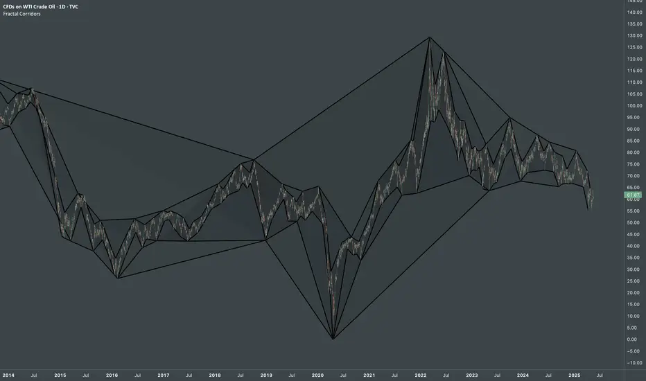
Fractal CorridorsFractal Corridors - visual tool that maps market structure through a multi-scale lens, revealing the underlying architecture of price action across time. By processing pivot points at multiple depths, it constructs a layered geometric corridors that reflects the self-similar, scalable nature of financial markets. Each pivot scale connects successive highs and lows with lines, and when both sides are present, fills the space between them, forming polygonal bands that shift in shape and density as volatility and trend evolve.
Inputs
Base Depth: Number of bars for the smallest pivot
Factor: Multiplier between small, medium and large depths
Selectable color of components
The real value of this indicator lies not in generating executive signals, but in offering a structural perspective that blends short-term fluctuations with longer-term market cycles. The output allows to visually assess trends in terms of shapes, detect compression zones, and identify multi-timeframe confluence areas where price is likely to react. Whether used for macro trend confirmation or pattern evaluation, this indicator transforms raw price data into a clear, fractal-informed map of market behavior, helping the user navigate the complexity of emerging price through the language of geometry.
M2 Liqudity WaveGlobal Liquidity Wave Indicator (M2-Based)
The Global Liquidity Wave Indicator is designed to track and visualize the impact of global M2 liquidity on risk assets—especially those highly correlated to monetary expansion, like Bitcoin, MSTR, and other macro-sensitive equities.
Key features include:
Leading Signal: Historically leads Bitcoin price action by approximately 70 days, offering traders and analysts a forward-looking edge.
Wave-Based Projection: Visualizes a "probability cloud"—a smoothed band representing the most likely trajectory for Bitcoin based on changes in global liquidity.
Min/Max Offset Controls: Adjustable offsets let you define the range of lookahead windows to shape the wave and better capture liquidity-driven inflection points.
Explicit Offset Visualization: Option to manually specify an exact offset to fine-tune the overlay, ideal for testing hypotheses or aligning with macro narratives.
Macro Alignment: Particularly effective for assets with high sensitivity to global monetary policy and liquidity cycles.
This tool is not just a chart overlay—it's a lens into the liquidity engine behind the market, helping anticipate directional bias in advance of price moves.
How to use?
- Enable the indicator for BTCUSD.
- Set Offset Range Start and End to 70 and 115 days
- Set Specific Offset to 78 days (this can change so you'll need to play around)
FAQ
Why a global liquidity wave?
The global liquidity wave accounts for variability in how much global liquidity affects an underlying asset. Think of the Global Liquidity Wave as an area that tracks the most probable path of Bitcoin, MSTR, etc. based on the total global liquidity.
Why the offset?
Global liquidity takes time to make its way into assets such as #Bitcoin, Strategy, etc. and there can be many reasons for that. It's never a specific number of days of offset, which is why a global liquidity wave is helpful in tracking probable paths for highly correlated risk assets.

Spot Premium with ROCDescription:
This indicator tracks the spot premium of BTC by comparing the perpetual futures price (perp) from Binance against the spot price on Coinbase. The histogram displays the price difference (spot minus perp) with green bars when spot is higher and red when perp carries a premium. The Rate of Change (ROC) line measures how quickly this premium shifts, with an option to normalize fluctuations for greater stability.
Implications & Possible Use Cases:
• Market Sentiment Gauge: A sustained positive premium often indicates bullish sentiment, while a discount can signal bearish bias.
• Arbitrage Signals: Significant divergences between perp and spot may present short-term arbitrage opportunities across exchanges.
• Risk Management & Hedging: Traders can align derivatives and spot positions when premiums deviate sharply, reducing funding cost exposures.
• Funding Rate Insights: Since perp funding rates tend to follow premium levels, this indicator can act as an early warning for funding spikes.
• Trend Confirmation: Use the normalized ROC to confirm continuation or reversal of premium trends, filtering out noise around small diff values.
Let me know if you would like additional features.

Key Levels (4H and Daily)Key Levels (4H and Daily)
This indicator highlights important key price levels derived from the 4-hour (4H) and daily (D) timeframes, providing traders with critical support and resistance areas. The levels are calculated using the highest highs and lowest lows over a customizable lookback period, offering a dynamic view of significant price points that could influence market movement.
Key Features:
Key Levels for 4H and Daily Timeframes:
The indicator calculates and displays the highest high and lowest low over a user-defined period for both the 4-hour and daily timeframes. This helps traders identify key support and resistance levels that could dictate the market's behavior.
Customizable Lookback Period:
Traders can adjust the lookback period (in days) for both the 4-hour and daily timeframes to reflect different market conditions. This flexibility ensures the levels are tailored to your preferred trading style and market conditions.
Horizontal Lines:
The indicator plots horizontal lines at the high and low levels for both timeframes. These levels serve as dynamic support and resistance areas and help traders monitor price action near these critical points.
Real-Time Updates:
The lines adjust automatically with each new bar, providing up-to-date key levels based on the most recent price action and trading session.
Alert Conditions:
Alerts are built-in to notify traders when the price breaks above or below these key levels. Traders can set up notifications to stay informed when significant market moves occur.
How to Use:
Support and Resistance: Use the levels as potential support and resistance areas where price could reverse. Price often reacts at these levels, providing potential trading opportunities.
Breakouts: Pay attention to breakouts above the high or below the low of these levels. A break above the 4H or daily high could indicate bullish momentum, while a break below could signal bearish trends.
Trend Confirmation: Combine these levels with other technical analysis tools to confirm the overall market trend and enhance your trading strategy.
Perfect for:
Day Traders: Use the 4-hour levels for intraday trading setups, such as potential reversals or breakouts.
Swing Traders: The daily levels provide longer-term insights, helping to identify key zones where price might pause, reverse, or break out.
Market Context: Ideal for those who want to contextualize their trades within broader timeframes, helping to understand the market’s structure at multiple time scales.
This description conveys the utility and functionality of the indicator, focusing on how it helps traders identify and monitor key levels that influence market action.
PRO SMC Full Suite BY Mashrur“PRO SMC Full Suite BY Mashrur”
A Pine Script (v5) indicator for TradingView, focused on Smart Money Concepts (SMC). It overlays on price charts and provides visual tools for identifying key institutional trading behaviors.
🎯 Purpose
This script is designed to help traders analyze and trade using SMC principles by automatically detecting:
Order Blocks (OBs)
Fair Value Gaps (FVGs)
Breaks of Structure (BoS)
Liquidity Sweeps (Buy/Sell Side Liquidity Grabs)
Mitigation Entries
⚙️ Inputs / Settings
Show Fair Value Gaps: Toggle FVGs on/off
Higher Timeframe (HTF): Choose HTF for OB analysis
Use HTF OBs: Switch between current TF OBs and HTF OBs
Show Order Blocks: Toggle OBs on/off
Show OB Mitigation Entries: Toggle mitigation entry signals on/off
🧠 Core Logic Overview
🔹 1. Swing Points Detection
Identifies swing highs/lows using a 3-bar pattern (pivot-based structure).
🔹 2. Break of Structure (BoS)
A bullish BoS happens when price closes above the last swing high.
A bearish BoS occurs when price closes below the last swing low.
🔹 3. Order Block Detection
Upon BoS, the script marks the previous candle as the Order Block.
Uses either:
Current TF OBs (based on price action)
HTF OBs (based on candle body direction)
🔹 4. Mitigation Entry Logic
A mitigation occurs when price returns to the OB and reacts with confirmation:
Bullish: price dips into OB and closes above
Bearish: price wicks into OB and closes below
Plots entry markers for these mitigations.
🔹 5. Liquidity Sweeps
Detects equal highs/lows (liquidity zones)
Marks Buy SL when price dips below an equal low then closes above
Marks Sell SL when price breaks above an equal high then closes below
🔹 6. Fair Value Gaps (FVGs)
FVG Up: Gap between candle 3 and candle 1 (low > high )
FVG Down: Gap between candle 3 and candle 1 (high < low )
Plots highlighted boxes on these gaps
📊 Visual Elements
Boxes: For OB zones and FVGs
Shapes:
Labels: OB Buy/Sell entries
Triangles: Buy SL / Sell SL liquidity sweeps
Lines: Equal Highs and Lows
🔔 Alerts
Built-in alerts to notify when:
OB entries are confirmed
Liquidity sweeps happen
Helps in automation or active monitoring
✅ Ideal For
Traders using SMC, ICT concepts, Wyckoff, or institutional trading models
Anyone wanting to automate detection of structural elements on their chart

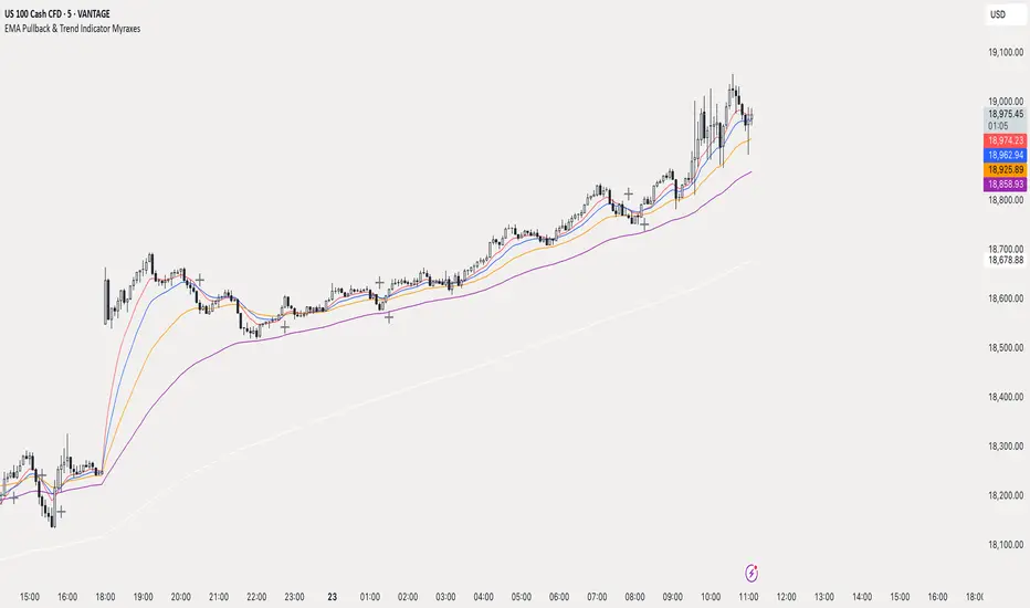
EMA Pullback & Trend Indicator MyraxesEMA Pullback & Trend Indicator by Max Retri
Plots five EMAs—9, 15, 30, 65 and 200—and draws clean, easy-to-interpret signals when the fast EMAs cross in the direction of the longer-term trend. No other indicators or overlays are required; simply add it to your chart and watch for the arrows and crosses.
⸻
What It Does & How It Works
1. EMAs & Colors
• Red (EMA 9) – Fast signal line
• Blue (EMA 15) – Confirmation line
• Orange (EMA 30) – Pullback zone 1
• Purple (EMA 65) – Pullback zone 2 & mid-term trend
• White (EMA 200) – Long-term trend
2. Trend Filter
• Bullish regime when price is above both EMA 65 and EMA 200.
• Bearish regime when price is below both EMA 65 and EMA 200.
3. Pullback Requirement
• Only consider a signal if price has retraced into the EMA 30 or EMA 65 zone.
4. Signal Logic
Long Entry ▲: EMA 9 (red) crosses above EMA 15 (blue) while in a bullish regime and after a pullback into EMA 30/65.
Short Entry ▼: EMA 9 crosses below EMA 15 while in a bearish regime and after a retracement up to EMA 30/65.
Exit ✖: Opposite EMA 9/15 crossover marks the close of the position.
⸻
How to Use
1. Add the indicator to any chart/timeframe.
2. Identify trend: make sure price is aligned above or below the 65 and 200 EMAs.
3. Watch for pullbacks into the orange or purple EMAs.
4. Enter on the black ▲ or ▼ arrow.
5. Exit when you see the gray ✖ cross.
Because it’s a pure‐EMA indicator (no heavy calculations), it runs quickly even on lower-end machines.
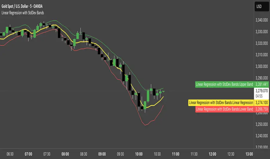
Linear Regression with StdDev BandsLinear Regression with Standard Deviation Bands Indicator
This indicator plots a linear regression line along with upper and lower bands based on standard deviation. It helps identify potential overbought and oversold conditions, as well as trend direction and strength.
Key Components:
Linear Regression Line: Represents the average price over a specified period.
Upper and Lower Bands: Calculated by adding and subtracting the standard deviation (multiplied by a user-defined factor) from the linear regression line. These bands act as dynamic support and resistance levels.
How to Use:
Trend Identification: The direction of the linear regression line indicates the prevailing trend.
Overbought/Oversold Signals: Prices approaching or crossing the upper band may suggest overbought conditions, while prices near the lower band may indicate oversold conditions.
Dynamic Support/Resistance: The bands can act as potential support and resistance levels.
Alerts: Option to enable alerts when the price crosses above the upper band or below the lower band.
Customization:
Regression Length: Adjust the period over which the linear regression is calculated.
StdDev Multiplier: Modify the width of the bands by changing the standard deviation multiplier.
Price Source: Choose which price data to use for calculations (e.g., close, open, high, low).
Alerts: Enable or disable alerts for band crossings.
This indicator is a versatile tool for understanding price trends and potential reversal points.
Dynamic Trend Bands [ChartPrime]The Dynamic Trend Bands is a versatile trend-following indicator that uses a double-smoothed Hull Moving Average (HMA) to detect market trends, combined with dynamic bands that provide insight into potential momentum shifts and volatility-based price zones.
⯁ KEY FEATURES
Double HMA Trend Filter
Utilizes a double-smoothed HMA for a smoother and more responsive trend line, reducing noise while highlighting clear market trends.
float base = ta.hma(ta.hma(close, length - 10), length)
Dynamic Volatility Bands
Plots upper and lower bands based on volatility, positioned above the price in a downtrend and below the price in an uptrend.
Momentum Shift Detection
Highlights bars in orange when a potential momentum shift occurs:
- During a downtrend, if the high breaks above the upper band.
- During an uptrend, if the low breaks below the lower band.
Customizable Band Appearance
Users can adjust the size, distance, and colors of the bands, as well as choose whether to display the mid-band line and fill the area between bands.
Timeframe Flexibility
Allows selection of different calculation timeframes, enabling traders to adapt the indicator to various trading strategies.
⯁ HOW TO USE
Identify Trend Direction
Use the double HMA line to confirm the prevailing trend:
- Above the bands: downtrend.
- Below the bands: uptrend.
Spot Potential Momentum Shifts
Watch for orange-highlighted bars signaling potential reversals or weakening trends.
Optimize Entries and Exits
Enter trades on trend continuation signals while using band breaks to spot potential reversal zones.
Customize to Fit Your Strategy
Adjust the bands’ size, distance, and calculation timeframe to suit scalping, swing, or position trading.
⯁ CONCLUSION
The Dynamic Trend Bands is an all-in-one tool that helps traders assess trend strength, detect momentum shifts, and identify key price zones. Its customizable features make it adaptable for various trading styles and market conditions.

Highest/Lowest Range in TimeframeThis script helps traders visually identify the highest high and lowest low within a customizable range of recent bars.
🔍 Key Features
Scans the last 100 to 1000 bars (user-defined)
Automatically detects:
The highest wick (high) and lowest wick (low)
Draws dotted green horizontal lines at both levels
Shows a label indicating the percentage range between high and low
Displays real-time high and low price labels directly on the chart
⚙️ Use Cases
Quickly spot price extremes over your desired time window
Visually measure market range and volatility
Identify breakout potential or reversal zones
✅ How to Use
Add the script to your chart.
Set the “Bars to Scan” input to your desired lookback period (between 100–1000).
Use the displayed lines and labels to identify key high/low price levels and range metrics.

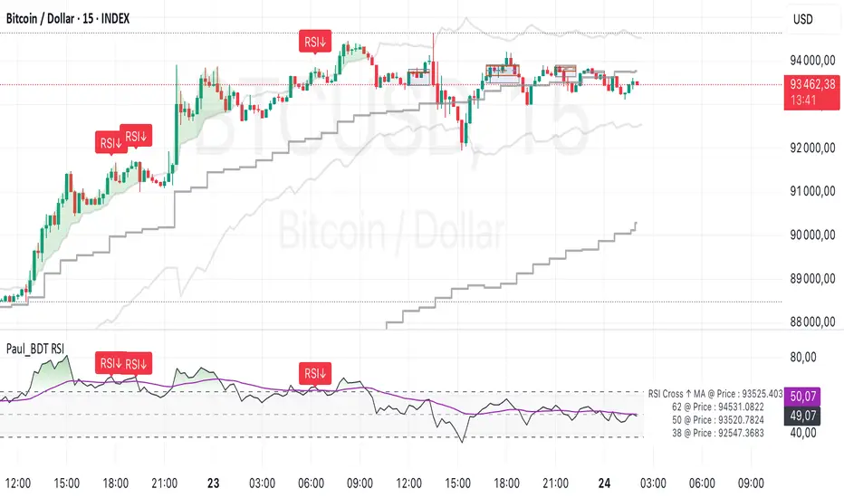
Paul_BDT Osc. RSI with Divergence, Order Blocks & Channel//=====================================================================
// Combination of:
// 1. Classic RSI with overbought/oversold thresholds
// 2. Adaptive bands on RSI (dynamically calculated with EMA of gains/losses)
// 3. Moving averages on RSI (optional, including SMA + Bollinger Bands)
// 4. Detection of RSI/price divergences (classic: bullish and bearish)
// 5. Detection of ranges (consolidation zones) with Order Blocks and extensions
// 6. Candle coloring based on dynamic RSI thresholds (breakout/breakdown)
//
// All with multi-timeframe options (displaying adaptive bands from a higher timeframe).
//=====================================================================
//=======================//
// 1. INPUTS (Parameters)
//=======================//
// RSI parameters: source, length, OB/OS thresholds, higher timeframe, divergence activation, adaptive bands display
// Smoothing parameters: choice of MA type applied to RSI (SMA, EMA, etc.) + optional Bollinger Bands
// Order Block parameters: display of ranges, order blocks, zone and candle colors
//=======================//
// 2. CALCULATIONS
//=======================//
// Base RSI calculated on the selected source (default: close)
// Smoothing: applies a chosen moving average to the RSI
// If 'SMA + Bollinger Bands' is selected, also calculates standard deviation to plot the bands
// Adaptive RSI bands: calculated via EMA method of gains/losses over a specific period (close to Wilder's RSI)
// Two adaptive thresholds are defined: upper (overbought) and lower (oversold), which adjust according to the market
// Multi-timeframes:
// Retrieves adaptive bands calculated on a higher timeframe (e.g., daily if TF = 'D')
// Allows overlaying adaptive RSI thresholds from different timeframes
// Dynamic definition of RSI thresholds for candle coloring:
// - Bullish/bearish center: 55/45
// - Adjusts the thresholds based on the price position relative to SMA 200 (if > SMA200, bullish center is used)
//=======================//
// 3. PLOTS (Displays)
//=======================//
// Display of the classic RSI with its OB/OS thresholds + gradient fill to better visualize the zones
// Display of moving averages on RSI and optional Bollinger Bands (if enabled)
// Display of adaptive RSI bands:
// - Those from the higher timeframe (always displayed)
// - Those from the current timeframe (optional display)
// Candle coloring (barcolor):
// - Green if RSI exceeds the dynamic upper threshold (breakout)
// - Red if RSI drops below the dynamic lower threshold (breakdown)
// - Specific color for candles within the neutral zone (range candle color)
//=======================//
// 4. DIVERGENCES
//=======================//
// Detection of regular RSI/price divergences:
// - Bullish divergence: price forms a new lower low, RSI forms a higher low
// - Bearish divergence: price forms a new higher high, RSI forms a lower high
// Display on the RSI panel:
// - Curves and labels (Bull/Bear) at divergence points
//=======================//
// 5. RANGE DETECTION & ORDER BLOCKS
//=======================//
// Automatic detection of ranges (consolidation zones):
// - Based on dynamic RSI thresholds (if RSI oscillates within a defined band)
// - Identifies the range's highs/lows (with configurable future extensions)
// Two types of zones plotted with 'boxes':
// 1. **Range close box**: frames the main consolidation zone (candle bodies)
// 2. **Order block box**: tighter zone around the extremes (highs/lows of closes)
// A midline is drawn at the center of the order block (dashed)
// If price breaks the range boundaries, the zone is removed (range ended)