Trend Lines by CR86The basic construction algorithm:
1. The baseline trend line through the closing prices:
First, the best fit line (linear regression) is calculated for the closing prices for a given period.
The least squares method is used to find the optimal slope and intersection point.
2. Search for key deviation points:
For each bar in the period, the deviation of the maximum and minimum from the regression baseline is calculated.
The point with the maximum deviation of the maximum upward from the regression line (for the resistance line) is located
The point with the maximum deviation of the minimum is located down from the regression line (for the support line)
3. Optimizing the slope of the lines:
Lines with an optimized slope are drawn through the found key points.
The algorithm selects the slope so that the line best "bends around" the corresponding extremes (maxima for resistance, minima for support)
Numerical optimization is used to check the validity of the trend line.
4. The principle of validity:
For the support line: all points must be above or at the line level (with a tolerance of 1e-5)
For the resistance line: all points must be below or at the line level (with a tolerance of 1e-5)
Key Features
Adaptability: the lines automatically adjust to the actual price extremes
Mathematical precision: a rigorous mathematical approach with optimization is used
Logarithmic scaling: optional for dealing with highly volatile assets
The basic construction algorithm
1. The baseline trend line through the closing prices:
First, the best fit line (linear regression) is calculated for the closing prices for a given period.
The least squares method is used to find the optimal slope and intersection point.
2. Search for key deviation points:
For each bar in the period, the deviation of the maximum and minimum from the regression baseline is calculated.
The point with the maximum deviation of the maximum upward from the regression line (for the resistance line) is located
The point with the maximum deviation of the minimum is located down from the regression line (for the support line)
3. Optimizing the slope of the lines:
Lines with an optimized slope are drawn through the found key points.
The algorithm selects the slope so that the line best "bends around" the corresponding extremes (maxima for resistance, minima for support)
Numerical optimization is used to check the validity of the trend line.
4. The principle of validity:
For the support line: all points must be above or at the line level (with a tolerance of 1e-5)
For the resistance line: all points must be below or at the line level (with a tolerance of 1e-5)
Key Features
Adaptability: the lines automatically adjust to the actual price extremes
Mathematical precision: a rigorous mathematical approach with optimization is used
Logarithmic scaling: optional for dealing with highly volatile assets
***********************************************************************************************
Основной алгоритм построения:
1. Базовая линия тренда через цены закрытия:
Сначала вычисляется линия наилучшего соответствия (линейная регрессия) для цен закрытия за заданный период
Используется метод наименьших квадратов для нахождения оптимального наклона и точки пересечения
2. Поиск ключевых точек отклонения:
Для каждого бара в периоде вычисляется отклонение максимума и минимума от базовой линии регрессии
Находится точка с максимальным отклонением максимума вверх от линии регрессии (для линии сопротивления)
Находится точка с максимальным отклонением минимума вниз от линии регрессии (для линии поддержки)
3. Оптимизация наклона линий:
Через найденные ключевые точки проводятся линии с оптимизированным наклоном
Алгоритм подбирает такой наклон, чтобы линия наилучшим образом "огибала" соответствующие экстремумы (максимумы для сопротивления, минимумы для поддержки)
Используется численная оптимизация с проверкой валидности трендовой линии
4. Принцип валидности:
Для линии поддержки: все точки должны быть выше или на уровне линии (с допуском 1e-5)
Для линии сопротивления: все точки должны быть ниже или на уровне линии (с допуском 1e-5)
Ключевые особенности
Адаптивность: линии автоматически подстраиваются под фактические экстремумы цен
Математическая точность: используется строгий математический подход с оптимизацией
Логарифмическое масштабирование: опционально для работы с сильно волатильными активами
Bands and Channels

MTF RSI MA System + Adaptive BandsMTF RSI MA System + Adaptive Bands
Overview
MTF RSI MA System + Adaptive Bands is a highly customizable Pine Script indicator for traders seeking a versatile tool for multi-timeframe (MTF) analysis. Unlike traditional RSI, it focuses on the Moving Average of RSI (RSI MA), delivering smoother and more flexible trading signals. The main screenshot displays the indicator in two panels to showcase its diverse capabilities.
Important: Timeframes do not adjust automatically – users must manually set them to match the chart’s timeframe.
Features
Core Component: Built around RSI MA, not raw RSI, for smoother trend signals.
Multi-Timeframe: Analyze RSI MA across three customizable timeframes (default: 4H, 8H, 12H).
Adaptive Bands: Three band calculation methods (Fixed, Percent, StdDev) for dynamic signals.
Flexible Signals: Generated via RSI MA crossovers, band interactions, or directional alignment across timeframes.
Background Coloring: Highlights when RSI MAs across timeframes move in the same direction, aiding trend confirmation.
Screenshot Panels Configuration
Upper Panel: Shows RSI, RSI MA, and fixed bands for reversal strategies (RSI crossing bands).
Lower Panel: Displays three RSI MAs (Alligator-style) for trend-following, with background coloring for directional alignment.
Band Calculation Methods
The indicator offers three ways to calculate bands around RSI MA, each with unique characteristics:
Fixed Bands
Set at a fixed point value (default: 10) above and below RSI MA.
Example: If RSI MA = 50, band value = 10 → upper band = 60, lower = 40.
Use Case: Best for stable markets or fixed-range preferences.
Tip: Adjust the band value to widen or narrow the range based on asset volatility.
Percent Bands
Calculated as a percentage of RSI MA (default: 10%).
Example: If RSI MA = 50, band value = 10% → upper band = 55, lower = 45.
Use Case: Ideal for assets with varying volatility, as bands scale with RSI MA.
Tip: Experiment with percentage values to match typical price swings.
Standard Deviation Bands (StdDev)
Based on RSI’s standard deviation over the MA period, multiplied by a user-defined factor (default: 10).
Example: If RSI MA = 50, standard deviation = 5, factor = 2 → upper band = 60, lower = 40.
Important: The default value (10) may produce wide bands. Reduce to 1–2 for tighter, practical bands.
Use Case: Best for dynamic markets with fluctuating volatility.
Configuration Options
RSI Length: Set RSI calculation period (default: 20).
MA Length: Set RSI MA period (default: 20).
MA Type: Choose SMA or EMA for RSI MA (default: EMA).
Timeframes: Configure three timeframes (default: 4H, 8H, 12H) for MTF analysis.
Overbought/Oversold Levels: Optionally display fixed levels (default: 70/30).
Background Coloring: Enable/disable for each timeframe to highlight directional alignment.
How to Use
Add Indicator: Load it onto your TradingView chart.
Setup:
Reversals: Configure like the upper panel (RSI, RSI MA, bands) and watch for RSI crossing bands.
Trends: Configure like the lower panel (three RSI MAs) and look for fastest MA crossovers and background coloring.
Adjust Timeframes: Manually set tf1, tf2, tf3 (e.g., 1H, 2H, 4H on a 1H chart) to suit your strategy.
Adjust Bands: Choose band type (Fixed, Percent, StdDev) and value. For StdDev, reduce to 1–2 for tighter bands.
Experiment: Test settings to match your trading style, whether scalping, swing trading, or long-term.
Notes
Timeframes: Always match tf1, tf2, tf3 to your chart’s needs, as they don’t auto-adjust.
StdDev Bands: Lower the default value (10) to avoid overly wide bands.
Versatility: Works across markets (stocks, forex, crypto).

IU Market Rhythm WaveDESCRIPTION:
The IU Market Rhythm Wave is a multi-dimensional indicator designed to reveal the underlying rhythm and energy of the market. By analyzing price momentum, harmonic oscillations, volume behavior, and market breadth, it helps traders identify high-quality long and short wave signals. It also visualizes rhythm bands, wave strength zones, and harmonic levels to provide comprehensive context for decision-making.
This tool is best used on trending instruments where rhythm cycles and volume patterns create clear wave-based opportunities.
USER INPUTS:
Rhythm Cycle Length
Controls the main lookback period used to calculate price waves, harmonic oscillation, volume rhythm, and breath. A longer cycle smooths signals, while a shorter cycle makes them more responsive. Recommended range: 8 to 35.
Wave Signal Strength
Multiplies the standard deviation of rhythm to define dynamic breakout thresholds. A higher value results in fewer but stronger signals, filtering out minor fluctuations.
Harmonic Filter
Applies a sensitivity filter to the harmonic mean and standard deviation. It helps eliminate weak or noisy signals and ensures rhythm-based signals align with harmonic structure.
Show Wave Energy Zones
Toggles background color shading based on current rhythm conditions. Greenish zones indicate strong upward rhythm, red for strong downward rhythm, yellow for positive bias, and gray for weak or neutral zones.
Show Rhythm Bands
Enables the display of upper and lower rhythm bands derived from ATR and rhythm volatility. These bands act as dynamic price envelopes and potential support/resistance zones.
Wave Zone Opacity
Adjusts the transparency of background energy zones, allowing users to control how prominent these zones appear on the chart. Range: 60 to 90 for optimal visibility.
INDICATOR LOGIC:
The indicator combines multiple rhythmic components into a composite rhythm score:
1. Price Wave – Based on momentum (rate of price change) smoothed by a moving average.
2. Harmonic Oscillation – Measures how far price has deviated from a central harmonic average (HLC3).
3. Volume Rhythm – Uses volume’s deviation from its mean, standardized by its volatility.
4. Market Breath – Captures range expansion and closing strength relative to range.
These elements form the Raw Rhythm, which is further smoothed to produce the Market Rhythm. When the rhythm exceeds statistically calculated thresholds and other conditions like volume confirmation and harmonic proximity are met, wave signals are triggered.
Harmonic Fibonacci levels (0.236, 0.382, 0.618, 0.764) are also calculated every rhythm cycle to identify nearby structural price zones. Signals occurring near these levels are considered more reliable.
The Rhythm Bands use ATR and rhythm strength to define dynamic boundaries above and below price. Visual zones and arrows mark rhythm shifts and highlight the underlying energy of the market.
WHY IT IS UNIQUE:
This indicator goes beyond traditional oscillators or volume indicators by blending multiple market dimensions into one rhythmic framework. It adapts to volatility, applies harmonic structure awareness, and filters signals based on real-time market conditions. It offers:
* A unique rhythm-based view of price, volume, and volatility
* Dynamic, adaptive signal generation and zone coloring
* Visual analytics and contextual data in a summary table
* Signal filtering using harmonic alignment and market breath
Its real-time responsiveness and multi-layered logic make it suitable for intraday, swing, and positional traders.
HOW USER CAN BENEFIT FROM IT:
* Spot high-conviction long or short entries when rhythm, volume, and structure align
* Avoid low-quality trades during weak or noisy rhythm periods
* Use visual wave zones to gauge trend strength and rhythm direction
* Monitor harmonic proximity to enter or exit near key structural levels
* Apply rhythm bands for dynamic stop-loss and target setting
* Use rhythm direction arrows and analytics table to gain deeper market insight
DISCLAIMER:
This indicator is created for educational and informational purposes only. It does not constitute financial advice or a recommendation to buy or sell any asset. All trading involves risk, and users should conduct their own analysis or consult with a qualified financial advisor before making any trading decisions. The creator is not responsible for any losses incurred through the use of this tool. Use at your own discretion.
VWAP Multi-Timeframe VWAP Multi-Timeframe - Complete Professional Indicator
🚀 WHAT IS IT?
The VWAP Multi-Timeframe is an advanced indicator that combines 5 different VWAP periods in a single tool, providing a complete view of market fair value levels across multiple time scales.
⭐ KEY FEATURES
📊 5 Configurable VWAPs:
🟡 Daily VWAP - Ideal for day trading and intraday operations
🟠 Weekly VWAP - Perfect for swing trading
🔵 Monthly VWAP - Excellent for medium-term analysis
🔴 Quarterly VWAP - Essential for quarterly strategies
🟢 Yearly VWAP - Fundamental for long-term investments
🎯 Multiple Price Sources:
Choose the source that best fits your strategy:
Close - Closing price (most common)
OHLC4 - Complete average (smoother)
HLC3 - Typical price (default)
HL2 - Period midpoint
Open/High/Low - Specific prices
💡 HOW TO USE
For Day Traders:
Use Daily VWAP as main fair value reference
Prices above = buying pressure / Prices below = selling pressure
For Swing Traders:
Combine Weekly and Monthly VWAP to identify trends
Look for confluences between different timeframes
For Investors:
Quarterly and Yearly VWAP show long-term value levels
Excellent for identifying entry points in investments
🔧 TECHNICAL FEATURES
✅ Pine Script v6 - Latest and optimized version
✅ Clean Interface - User-friendly design
Adaptive Quadratic Kernel EnvelopeThis study draws a fair-value curve from a quadratic-weighted (Nadaraya-Watson) regression. Alpha sets how sharply weights decay inside the look-back window, so you trade lag against smoothness with one slider. Band half-width is ATRslow times a bounded fast/slow ATR ratio, giving an instant response to regime shifts without overshooting on spikes. Work in log space when an instrument grows exponentially, equal percentage moves then map to equal vertical steps. NearBase and FarBase define a progression of adaptive thresholds, useful for sizing exits or calibrating mean-reversion logic. Non-repaint mode keeps one-bar delay for clean back-tests, predictive mode shows the zero-lag curve for live decisions.
Key points
- Quadratic weights cut phase error versus Gaussian or SMA-based envelopes.
- Dual-ATR scaling updates width on the next bar, no residual lag.
- Log option preserves envelope symmetry across multi-decade data.
- Alpha provides direct control of curvature versus noise.
- Built-in alerts trigger on the first adaptive threshold, ready for automation.
Typical uses
Trend bias from the slope of the curve.
Entry timing when price pierces an inner threshold and momentum stalls.
Breakout confirmation when closes hold beyond outer thresholds while volatility expands.
Stops and targets anchored to chosen thresholds, automatically matching current noise.

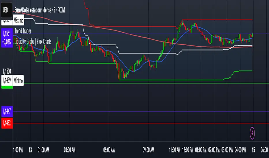
Trend TraderDescription and Usage of the "Trend Trader" Indicator
The "Trend Trader" indicator, created by Gerardo Mercado as a legacy project, is a versatile trading tool designed to identify potential buy and sell signals across various instruments. While it provides predefined settings for popular instruments like US30, NDX100, GER40, and GOLD, it can be seamlessly adapted to any market, including forex pairs like EUR/USD. The indicator combines moving averages, time-based filters, and MACD confirmation to enhance decision-making for traders.
How It Works
Custom Moving Averages (MAs):
The indicator uses two moving averages:
Short MA: A faster-moving average (default: 10 periods).
Long MA: A slower-moving average (default: 100 periods).
Buy signals are generated when the Short MA crosses above the Long MA.
Sell signals are triggered when the Short MA crosses below the Long MA.
Time-Based Signals:
The user can define specific trading session times (start and end in UTC) to focus on high-activity periods for their chosen market.
Signals and background coloring are only active during the allowed session times.
MACD Confirmation:
A MACD (Moving Average Convergence Divergence) calculation on a 15-minute timeframe ensures stronger confirmation for signals.
Buy signals require the MACD line to be above the signal line.
Sell signals require the MACD line to be at or below the signal line.
Target Levels:
Predefined profit targets are dynamically set based on the selected trading instrument.
While it includes settings for US30, NDX100, GER40, and GOLD, the target levels can be adjusted to fit the volatility and structure of any asset, including forex pairs like EUR/USD.
Target 1 and Target 2 levels display when these thresholds are met after an entry signal.
Adaptability to Any Market:
Although predefined options are included for specific instruments, the indicator's moving averages, time settings, and MACD logic are applicable to any tradable asset, making it suitable for forex, commodities, indices, and more.
Visual Alerts:
Labels appear on the chart to highlight "BUY" and "SELL" signals at crossover points.
Additional labels indicate when price movements reach the predefined target levels.
Bar and background coloring visually represent active signals and MACD alignment.
Purpose
The indicator aims to simplify trend-following and momentum-based trading strategies. By integrating moving averages, MACD, customizable time sessions, and dynamic targets, it offers clear entry and exit points while being adaptable to the needs of individual traders across diverse markets.
How to Use
Setup:
Add the indicator to your TradingView chart.
Configure the moving average periods, trading session times, and target levels according to your preferences.
Select the instrument for predefined target settings or customize them to fit the asset you’re trading (e.g., EUR/USD or other forex pairs).
Interpreting Signals:
Buy Signal: The Short MA crosses above the Long MA, MACD confirms the upward trend, and the session is active.
Sell Signal: The Short MA crosses below the Long MA, MACD confirms the downward trend, and the session is active.
Adapt for Any Instrument:
Adjust the predefined target levels to match the volatility and trading style for your chosen asset.
For forex pairs like EUR/USD, consider typical pip movements to set appropriate profit targets.
Targets:
Use the provided target labels (e.g., 50 or 100 points) or customize them to reflect realistic profit goals based on the asset’s volatility.
Visual Aids:
Pay attention to the background color:
Greenish: Indicates a bullish trend during the allowed session.
Redish: Indicates a bearish trend during the allowed session.
Use the "BUY" and "SELL" labels for actionable insights.
This indicator is a flexible and powerful tool, suitable for traders across all markets. Its adaptability ensures that it can enhance your strategy, whether you’re trading forex, commodities, indices, or other assets. By offering actionable alerts and customizable settings, the "Trend Trader" serves as a valuable addition to any trader’s toolkit. FX:EURUSD
Multi-Volatility Adjusted Moving Average🎯 Core Concept
The Multi-Volatility Adjusted Moving Average (MVAMA) is an advanced technical indicator that creates an adaptive moving average with a built-in upward bias. Unlike traditional moving averages that simply follow price, this indicator adjusts upward based on market volatility, making it particularly useful for identifying dynamic resistance levels and trend strength.
🔧 How It Works
Key Principle: Upward Volatility Bias
Base Calculation: Starts with your chosen moving average (EMA, SMA, etc.)
Volatility Measurement: Calculates market volatility using one of 5 different methods
Upward Adjustment: Always adds volatility adjustment upward: Adaptive MA = Base MA + Volatility Adjustment
Dynamic Resistance: Creates a moving resistance level that adapts to market conditions
📊 5 Volatility Calculation Methods
1. Simple (High-Low Range)
Method: (High - Low) / Close × 100
Best For: Clean, straightforward volatility measurement
Use Case: General purpose, all market conditions
2. Parkinson (Range-Based Log Volatility)
Method: √(ln(High/Low)²) with safety bounds
Best For: Intraday volatility without using open/close gaps
Use Case: Choppy markets, day trading
3. ATR (Average True Range)
Method: Traditional ATR as percentage of price
Best For: Handling gaps and limit moves
Use Case: Swing trading, gap-prone markets
4. Standard Deviation (Statistical)
Method: Standard deviation of price returns
Best For: Academic/statistical approach
Use Case: Backtesting, quantitative analysis
5. Garman-Klass (OHLC Optimized)
Method: 0.5×ln(H/L)² - (2ln2-1)×ln(C/O)²
Best For: Most comprehensive volatility using all OHLC data
Use Case: Professional trading, maximum accuracy
🎛️ 12 Moving Average Types
Fast & Responsive:
HMA (Hull): Minimal lag, very responsive
DEMA/TEMA: Double/Triple exponential for speed
WMA: Weighted for recent price emphasis
Balanced:
EMA: Classic exponential (default)
ALMA: Arnaud Legoux for balanced response
LSMA: Linear regression trend following
Smooth & Stable:
SMA: Simple moving average
SMMA/RMA: Smoothed for noise reduction
TRIMA: Triangular for maximum smoothness
VWMA: Volume-weighted for market participation
💡 Practical Applications
Trading Uses:
Dynamic Resistance: Acts as adaptive resistance level
Trend Strength: Higher volatility = stronger adjustment = more significant level
Entry Timing: Price touching the adaptive MA can signal rejection points
Risk Management: Volatility bands show market uncertainty
Market Analysis:
Low Volatility: Adaptive MA stays close to base MA (consolidation)
High Volatility: Adaptive MA moves significantly above base MA (trending/breakout)
Trend Confirmation: Sustained distance between price and adaptive MA shows trend strength
⚙️ Key Features
Risk Management:
Volatility Capping: Prevents extreme adjustments (default 15% max)
Safety Bounds: All calculations protected against infinite/NaN values
Parameter Limits: Sensible ranges for all inputs
Visualization Options:
Base MA Display: Show underlying moving average
Volatility Bands: Visual representation of volatility adjustment
Custom Colors: Professional color schemes
Clean Interface: Organized input groups
Professional Features:
Multi-timeframe Support: Works on any timeframe
Alert Framework: Ready-to-enable price crossover alerts
🎯 Ideal For:
Traders Who Want:
Dynamic support/resistance levels
Volatility-aware trend analysis
Adaptive position sizing based on market conditions
Professional-grade technical analysis tools
Market Conditions:
Trending Markets: Volatility creates meaningful resistance levels
Volatile Markets: Adaptive adjustment handles changing conditions
All Timeframes: From scalping to position trading
🔍 Unique Advantages:
Always Upward Bias: Unlike oscillating indicators, always provides clear directional bias
Multi-Volatility Support: Choose the best volatility method for your market/style
Comprehensive MA Library: 12 different moving average types
Built-in Risk Management: Prevents extreme values that break other indicators
Professional Implementation: Publication-ready code with proper documentation
This script transforms traditional moving averages into intelligent, volatility-aware tools that adapt to market conditions while maintaining a consistent upward bias for clear directional guidance.
Dynamic Flow Ribbons [BigBeluga]🔵 OVERVIEW
A dynamic multi-band trend visualization system that adapts to market volatility and reveals trend momentum with layered ribbon channels.
Dynamic Flow Ribbons transforms price action into flowing trend bands that expand and contract with volatility. It not only shows the active directional bias but also visualizes how strong or weak the trend is through layered ribbons, making it easier to assess trend quality and structure.
🔵 CONCEPTS
Uses an adaptive trend detection system built on a volatility envelope derived from an EMA of the average price (HLC3).
Measures volatility using a long-period average of the high-low range, which scales the envelope width dynamically.
Trend direction flips when the average price crosses above or below these envelopes.
Ribbons form around the trend line to show how far price is stretching or compressing relative to the mean.
🔵 FEATURES
Volatility-Based Trend Line:
A thick, color-coded line tracks the current trend with smoother transitions between phases.
Multi-Layered Flow Ribbons:
Up to 10 bands (5 above and 5 below) radiate outward from the upper and lower envelopes, reflecting volatility strength and direction.
Trend Coloring & Transitions:
Ribbons and candles are dynamically colored based on trend direction— green for bullish , orange for bearish . Transparency fades with distance from the core trend band.
Real-Time Responsiveness:
Ribbon structure and trend shifts update in real time, adapting instantly to fast market changes.
🔵 HOW TO USE
Use the color and thickness of the core trend line to follow directional bias.
When ribbons widen symmetrically, it signals strong trend momentum .
Narrowing or overlapping ribbons can suggest consolidation or transition zones .
Combine with breakout systems or volume tools to confirm impulsive or corrective phases .
Adjust the “Length” (factor) input to tune sensitivity—higher values smooth trends more.
🔵 CONCLUSION
Dynamic Flow Ribbons offers a sleek and insightful view into trend strength and structure. By visualizing volatility expansion with directional flow, it becomes a powerful overlay for momentum traders, swing strategists, and trend followers who want to stay ahead of evolving market flows

SPX Weekly Expected Moves# SPX Weekly Expected Moves Indicator
A professional Pine Script indicator for TradingView that displays weekly expected move levels for SPX based on real options data, with integrated Fibonacci retracement analysis and intelligent alerting system.
## Overview
This indicator helps options and equity traders visualize weekly expected move ranges for the S&P 500 Index (SPX) by plotting historical and current week expected move boundaries derived from weekly options pricing. Unlike theoretical volatility calculations, this indicator uses actual market-based expected move data that you provide from options platforms.
## Key Features
### 📈 **Expected Move Visualization**
- **Historical Lines**: Display past weeks' expected moves with configurable history (10, 26, or 52 weeks)
- **Current Week Focus**: Highlighted current week with extended lines to present time
- **Friday Close Reference**: Orange baseline showing the previous Friday's close price
- **Timeframe Independent**: Works consistently across all chart timeframes (1m to 1D)
### 🎯 **Fibonacci Integration**
- **Five Fibonacci Levels**: 23.6%, 38.2%, 50%, 61.8%, 76.4% between Friday close and expected move boundaries
- **Color-Coded Levels**:
- Red: 23.6% & 76.4% (outer levels)
- Blue: 38.2% & 61.8% (golden ratio levels)
- Black: 50% (midpoint - most critical level)
- **Current Week Only**: Fibonacci levels shown only for active trading week to reduce clutter
### 📊 **Real-Time Information Table**
- **Current SPX Price**: Live market price
- **Expected Move**: ±EM value for current week
- **Previous Close**: Friday close price (baseline for calculations)
- **100% EM Levels**: Exact upper and lower boundary prices
- **Current Location**: Real-time position within the EM structure (e.g., "Above 38.2% Fib (upper zone)")
### 🚨 **Intelligent Alert System**
- **Zone-Aware Alerts**: Separate alerts for upper and lower zones
- **Key Level Breaches**: Alerts for 23.6% and 76.4% Fibonacci level crossings
- **Bar Close Based**: Alerts trigger on confirmed bar closes, not tick-by-tick
- **Customizable**: Enable/disable alerts through settings
## How It Works
### Data Input Method
The indicator uses a **manual data entry approach** where you input actual expected move values obtained from options platforms:
```pinescript
// Add entries using the options expiration Friday date
map.put(expected_moves, 20250613, 91.244) // Week ending June 13, 2025
map.put(expected_moves, 20250620, 95.150) // Week ending June 20, 2025
```
### Weekly Structure
- **Monday 9:30 AM ET**: Week begins
- **Friday 4:00 PM ET**: Week ends
- **Lines Extend**: From Monday open to Friday close (historical) or current time + 5 bars (current week)
- **Timezone Handling**: Uses "America/New_York" for proper DST handling
### Calculation Logic
1. **Base Price**: Previous Friday's SPX close price
2. **Expected Move**: Market-derived ±EM value from weekly options
3. **Upper Boundary**: Friday Close + Expected Move
4. **Lower Boundary**: Friday Close - Expected Move
5. **Fibonacci Levels**: Proportional levels between Friday close and EM boundaries
## Setup Instructions
### 1. Data Collection
Obtain weekly expected move values from options platforms such as:
- **ThinkOrSwim**: Use thinkBack feature to look up weekly expected moves
- **Tastyworks**: Check weekly options expected move data
- **CBOE**: Reference SPX weekly options data
- **Manual Calculation**: (ATM Call Premium + ATM Put Premium) × 0.85
### 2. Data Entry
After each Friday close, update the indicator with the next week's expected move:
```pinescript
// Example: On Friday June 7, 2025, add data for week ending June 13
map.put(expected_moves, 20250613, 91.244) // Actual EM value from your platform
```
### 3. Configuration
Customize the indicator through the settings panel:
#### Visual Settings
- **Show Current Week EM**: Toggle current week display
- **Show Past Weeks**: Toggle historical weeks display
- **Max Weeks History**: Choose 10, 26, or 52 weeks of history
- **Show Fibonacci Levels**: Toggle Fibonacci retracement levels
- **Label Controls**: Customize which labels to display
#### Colors
- **Current Week EM**: Default yellow for active week
- **Past Weeks EM**: Default gray for historical weeks
- **Friday Close**: Default orange for baseline
- **Fibonacci Levels**: Customizable colors for each level type
#### Alerts
- **Enable EM Breach Alerts**: Master toggle for all alerts
- **Specific Alerts**: Four alert types for Fibonacci level breaches
## Trading Applications
### Options Trading
- **Straddle/Strangle Positioning**: Visualize breakeven levels for neutral strategies
- **Directional Plays**: Assess probability of reaching target levels
- **Earnings Plays**: Compare actual vs. expected move outcomes
### Equity Trading
- **Support/Resistance**: Use EM boundaries and Fibonacci levels as key levels
- **Breakout Trading**: Monitor for moves beyond expected ranges
- **Mean Reversion**: Look for reversals at extreme Fibonacci levels
### Risk Management
- **Position Sizing**: Gauge likely price ranges for the week
- **Stop Placement**: Use Fibonacci levels for logical stop locations
- **Profit Targets**: Set targets based on EM structure probabilities
## Technical Implementation
### Performance Features
- **Memory Managed**: Configurable history limits prevent memory issues
- **Timeframe Independent**: Uses timestamp-based calculations for consistency
- **Object Management**: Automatic cleanup of drawing objects prevents duplicates
- **Error Handling**: Robust bounds checking and NA value handling
### Pine Script Best Practices
- **v6 Compliance**: Uses latest Pine Script version features
- **User Defined Types**: Structured data management with WeeklyEM type
- **Efficient Drawing**: Smart line/label creation and deletion
- **Professional Standards**: Clean code organization and comprehensive documentation
## Customization Guide
### Adding New Weeks
```pinescript
// Add after market close each Friday
map.put(expected_moves, YYYYMMDD, EM_VALUE)
```
### Color Schemes
Customize colors for different trading styles:
- **Dark Theme**: Use bright colors for visibility
- **Light Theme**: Use contrasting dark colors
- **Minimalist**: Use single color with transparency
### Label Management
Control label density:
- **Show Current Week Labels Only**: Reduce clutter for active trading
- **Show All Labels**: Full information for analysis
- **Selective Display**: Choose specific label types
## Troubleshooting
### Common Issues
1. **No Lines Appearing**: Check that expected move data is entered for current/recent weeks
2. **Wrong Time Display**: Ensure "America/New_York" timezone is properly handled
3. **Duplicate Lines**: Restart indicator if drawing objects appear duplicated
4. **Missing Fibonacci Levels**: Verify "Show Fibonacci Levels" is enabled
### Data Validation
- **Expected Move Format**: Use positive numbers (e.g., 91.244, not ±91.244)
- **Date Format**: Use YYYYMMDD format (e.g., 20250613)
- **Reasonable Values**: Verify EM values are realistic (typically 50-200 for SPX)
## Version History
### Current Version
- **Pine Script v6**: Latest version compatibility
- **Fibonacci Integration**: Five-level retracement analysis
- **Zone-Aware Alerts**: Upper/lower zone differentiation
- **Dynamic Line Management**: Smart current week extension
- **Professional UI**: Comprehensive information table
### Future Enhancements
- **Multiple Symbols**: Extend beyond SPX to other indices
- **Automated Data**: Integration with options data APIs
- **Statistical Analysis**: Success rate tracking for EM predictions
- **Additional Levels**: Custom percentage levels beyond Fibonacci
## License & Usage
This indicator is designed for educational and trading purposes. Users are responsible for:
- **Data Accuracy**: Ensuring correct expected move values
- **Risk Management**: Proper position sizing and risk controls
- **Market Understanding**: Comprehending options-based expected move concepts
## Support
For questions, issues, or feature requests related to this indicator, please refer to the code comments and documentation within the Pine Script file.
---
**Disclaimer**: This indicator is for informational purposes only. Trading involves substantial risk of loss and is not suitable for all investors. Past performance does not guarantee future results.

BackToBasic XEMAบทความอธิบายสคริปต์ “BackToBasic XEMA”
ภาษาไทย
แนวคิดโดยย่อ
BackToBasic XEMA เกิดจากแนวคิด “กลับสู่พื้นฐานแต่เพิ่มประโยชน์” โดยใช้สัญญาณ EMA Crossover เป็นแกนหลัก แล้วต่อยอดด้วยการแสดงกำไร/ขาดทุนจริง (PnL) และเส้น Trailing Stop แนวนอน เพื่อช่วยวัดประสิทธิภาพและป้องกันการคืนกำไร
กลไกการทำงาน
Dual EMA – คำนวณ EMA สองเส้น (Fast และ Slow)
Crossover Signal – ออกสัญญาณ Buy เมื่อ Fast ตัดขึ้น Slow และ Sell เมื่อ Fast ตัดลง Slow
PnL Lines & Labels – เมื่อทิศทางกลับตัว ระบบจะคำนวณส่วนต่างราคา × จำนวน Contracts แล้ววาดเส้นเชื่อมจุดเข้า–ออก พร้อมป้ายกำไร/ขาดทุนสีเขียว / แดง
Horizontal Trailing Stop – เมื่อราคาวิ่งไปทางกำไรเกิน trailStartPips ระบบจะสร้างเส้น Trail ห่างจาก EMA อ้างอิงด้วย trailBufferPips และเลื่อนเฉพาะในทางที่ล็อกกำไร
การตั้งค่าใช้งาน (สรุปเป็นคำอธิบาย)
ปรับค่า Fast/Slow EMA ให้สัมพันธ์กับกรอบเวลาและความผันผวนของสินทรัพย์
กรอกจำนวน Contracts ตามขนาดโพซิชันจริงเพื่อให้ค่า PnL สมจริง
ค่า Trail เริ่มต้นเหมาะกับกราฟ 1 ชั่วโมงขึ้นไป หากเทรดสั้นอาจลด trailStartPips และ trailBufferPips
แนะนำใช้กับสินทรัพย์สภาพคล่องสูง (คู่เงินหลัก, XAUUSD, ดัชนี) และทดสอบบนบัญชีเดโมก่อนเสมอ
จุดเด่นเมื่อเทียบกับ EMA Crossover พื้นฐาน
เห็นผลกำไร/ขาดทุนของแต่ละการเทรดทันที ไม่ต้องคำนวณย้อนหลัง
มีเส้น Trailing Stop แนวนอนช่วยล็อกกำไรและจำกัดขาดทุน
เปิด–ปิดฟังก์ชัน PnL และ Trailing ได้จากหน้าตั้งค่า ไม่ยุ่งยาก
ข้อจำกัดและคำเตือน
ไม่เหมาะกับกราฟแบบ Heikin Ashi หรือ Renko เพราะอาจเกิด repaint
PnL คำนวณจากส่วนต่างราคาเท่านั้น ไม่รวมค่าคอมมิชชันหรือสลิปเพจ
ผลลัพธ์ในอดีตไม่รับประกันอนาคต ควรจัดการความเสี่ยงและทดลองก่อนใช้งานจริง
ลิขสิทธิ์
สคริปต์นี้พัฒนาใหม่ทั้งหมดโดย , © 2025
English
Concept
BackToBasic XEMA extends a classic EMA-crossover setup with real-time profit-and-loss tracking and a horizontal trailing-stop line, giving traders both clear entry/exit signals and built-in risk management.
How It Works
Dual EMAs – Calculates Fast and Slow EMAs.
Crossover Signals – Generates a Buy when the Fast EMA crosses above the Slow EMA, and a Sell when it crosses below.
PnL Lines & Labels – On every direction flip the script computes price difference × contracts, draws a line from entry to exit, and labels the result in green (profit) or red (loss).
Horizontal Trailing Stop – After price moves in profit by at least trailStartPips, a trail line is placed trailBufferPips away from the chosen EMA and moves only in the trade’s favour.
Practical Settings (plain-language guide)
Adjust Fast/Slow EMA lengths to suit your timeframe and the instrument’s volatility.
Enter your position size in Contracts so PnL lines reflect real cash values.
For shorter timeframes, lower trailStartPips and trailBufferPips; for swing trading, larger values work better.
Best used on 1-hour-and-above charts of liquid symbols (major FX pairs, gold, indices). Forward-test on demo first.
Advantages over a Basic EMA Cross
Instant visual feedback on each trade’s profit or loss.
Built-in horizontal trailing stop to lock in gains and limit downside.
Modular design – PnL and trailing features can be toggled on or off in the input panel.
Limitations & Disclaimer
Not repaint-safe on non-standard chart types such as Heikin Ashi or Renko.
PnL lines show raw price change only; commissions and slippage are not included.
Past performance does not guarantee future results – trade responsibly and test thoroughly.
License
Original Pine Script by , © 2025

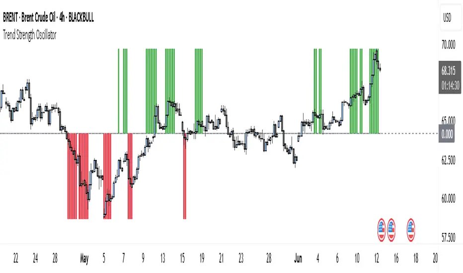
Trend Strength Oscillator📌 What Is the Trend Strength Oscillator?
The Trend Strength Oscillator is a visual tool that helps traders understand the overall direction and strength of the market trend. Instead of using multiple indicators separately, this tool combines three trusted methods into one clear, color-coded bar chart. The bars change based on whether the market is strongly trending up, down, or just moving sideways.
Imagine it as a traffic light for trading:
• Green means it’s safe to consider buying (strong uptrend).
• Red means consider selling or avoiding longs (strong downtrend).
• Gray means wait, the market isn’t clearly trending.
🧠 How It Works — The 3 Main Components
1. EMA Slope
The EMA (Exponential Moving Average) tracks the average price but reacts more quickly to changes. If the EMA is rising, it means the market is likely moving upward. If it’s falling, the trend is likely downward.
2. RSI Direction
RSI (Relative Strength Index) measures momentum. This tool compares the RSI to its smoothed average. If the RSI is above its average, momentum is up. If it’s below, momentum is down.
3. ADX Strength
ADX (Average Directional Index) measures how strong a trend is, not the direction. So even if EMA and RSI agree on a trend, the ADX must confirm it’s strong enough to be worth trading.
Only when all three indicators agree do we consider it a strong trend.
🧮 What the Oscillator Shows
The result of combining those components is a number that becomes a colored bar:
• +2 means all three signals are bullish → green bar.
• -2 means all three signals are bearish → red bar.
• Anything else (e.g., mixed signals or weak ADX) → gray bar.
This makes the chart super easy to read at a glance, even for beginners.
📈 How to Use It in Trading
You can use the Trend Strength Oscillator in a few simple ways:
• Entering Trades:
Look for a green bar when you want to buy or go long. Look for a red bar when you want to sell or go short. These bars mean all systems are “go” in the same direction.
• Avoiding Mistakes:
If the bar is gray, it’s a warning that the market is undecided or weak. It’s often better to wait for a clearer signal rather than force a trade.
• Managing Existing Trades:
If you’re in a trade and the bar color shifts back to gray, that can be a clue that the trend is losing strength. You might tighten your stop-loss or take some profit.
🧭 Final Thoughts
This indicator doesn’t give you a trade entry every few minutes. Instead, it helps you stay on the right side of strong moves and avoid choppy or sideways markets. It’s especially helpful for:
• Trend-following traders
• People who want clean, simple visuals
• Beginners who get overwhelmed with too many indicators
Let me know if you'd like to see this paired with another tool like volume or MACD, or if you’d like a chart screenshot to visualize how this looks live.
bands ⚡ What This Script Does
This is a structured trading system specifically designed for navigating Bitcoin cycles and identifying higher-probability buy setups.
It is not a simple combination of public indicators instead, it applies a rules-based logic to adapt signals dynamically depending on the current market phase (bull/bear), while also using a triple confirmation framework (macro trend + volatility bands + buy signals).
This approach aims to reduce false signals and align trading decisions with Bitcoin’s well-known cyclical behavior.
⚡ Core Concept & Components
The system combines three complementary elements:
A macro trend filter band (red/green), shown at the bottom of the chart, representing Bitcoin’s macro trend environment.
Adaptive volatility bands using advanced smoothing techniques including HMA, KAMA, WVMA, combined with moving average (MA) and average true range (ATR) logic to capture dynamic “cheap” and “expensive” price zones. These bands adapt to Bitcoin’s volatility structure better than standard Bollinger Bands or SMA plus ATR setups.
Multi-timeframe RSI-based Buy Signals on 8h, 1D, 1W, and 1M timeframes historically calibrated for Bitcoin cycles.
These components work together through a rules-based process, dynamically adapting signal validity depending on the macro trend state.
⚡ Signal System and how to use
The red and green band at the bottom of the chart represents Bitcoin’s macro trend environment:
Light Green → Likely start of a bull market
Dark Green → Market is bullish but becoming extended; potentially nearing a local top
Red → Bear market conditions
Our trading approach uses four distinct BUY signals, depending on the market phase:
Red (8h) → weak buy signal
Yellow (1D) → medium buy signal
Green (1W) → strong buy signal
Blue (1M) → strongest buy signal
However, Day Trading and Swing Trading signals are automatically blocked during bear markets (Red Band).
Reason: low timeframe signals (1 minute to 1 day) tend to perform poorly in bear markets, as major bottoms typically form on higher timeframes (1 week or 1 month).
Therefore, during Red Band conditions, only Buy Bear Market and Buy Recession signals remain active.
to use it correctly you must go to configuration of the indicator, section input and enable 4 buy signals and check every day timefarme 8h 1d 1w and 1m.
⚡ Invalidation Conditions
To exit the bear market, the system includes an invalidation condition:
If the price closes above a specific SMA on a defined timeframe, the Red Band switches to Green → signaling a potential market recovery.
Additionally, for the Red Band to activate initially, the system requires that:
Price must break below a specific Hull Moving Average (HMA) on a defined timeframe and length.
⚡ Why These 3 Indicators Work Well Together
If the band is green (bull market conditions) and a Buy signal (any color) appears → it is generally safer to buy in a bull market than in a bear market.
(I’m trying to apply the famous phrase "the trend is your friend" in this trading indicator and trading strategy.)
If the price is also touching the lower green band, and a Buy signal appears → the buy becomes even more reliable, as you are combining big trend plus band support plus signal confirmation.
This gives you triple confirmation:
Band color plus band level touch plus Buy signal → increasing the probability that the trade is going to work.
By combining:
Blocking low timeframe signals during bear markets
Using a clear invalidation point to detect recovery
Requiring a structural break via HMA to enter a bear market phase, and requiring a break above a specific SMA (length and timeframe) to enter a bull market
Applying a triple confirmation logic when conditions are favorable
→ this framework helps you navigate Bitcoin markets more securely and profitably than using unfiltered signals alone.
⚡ Why It’s Not a Simple Mashup
The logic of the system is not just an overlay of RSI, moving averages and bands:
It applies a structured "state machine" logic:
Macro Band determines which signals are allowed.
Band-level touches condition the strength of signals.
Triple confirmation (macro trend plus band level plus signal) governs high-probability setups.
Invalidation points (SMA breakouts) dynamically switch macro state, ensuring no lagging bull signals in a bear market or vice versa.
This makes the system superior to using public domain components in isolation, as those do not provide dynamic signal filtering nor respect Bitcoin’s macro cyclicality explicitly.
⚡ Why This is Invite-Only
This script reflects deep backtesting and original integration of state logic specific to Bitcoin cycles, I also tried to choose the the correct conditions and invalidation points by using hma and smas in specific timeframes and lengths,
it has a system that also block many wrong buy signals during bearmarkets.
It encapsulates a rules-based trading process which goes beyond simply combining public indicators. The aim is to provide traders with a coherent framework that reduces false signals, adapts to bitcoin cycles, and promotes risk-aware participation in Bitcoin markets.
I also refined the line aesthetics and thicknesses to improve chart readability and help users quickly identify key levels.
⚡ Disclaimer
This is an analytical tool, not financial advice. Use with appropriate risk management and as part of a broader trading strategy.
Past positive results this indicator achieved do NOT guarantee future success !!
Per TradingView rules:
The logic is described sufficiently so that traders understand what it does and how it works.
This is not a simple mashup, but an original framework applying structured logic to Bitcoin macro trading.
This is a COMPLEMENTARY tool designed for use by my existing clients who are already familiar with my trading strategy and risk management approach. If you are not one of my clients or do not know my trading strategy, please do NOT request access or attempt to purchase it !!
⚡ Conformance
This description is written to comply with TradingView’s script publishing rules (tradingview.com/pine-script-docs/en/v5/writing/Publishing.html), as per recent moderator feedback.
If further clarification is required, I welcome additional feedback.

EMA Power Oscillator By DCX What matters is what’s above the zero line.
This is not just another EMA chart.
The EMA Power Oscillator analyzes the strength and positioning of 4 key EMAs (5, 10, 15, 25) relative to their dynamic average — giving you real momentum clarity.
✅ If the green line (EMA 5) is above the center → the bullish drive is strong.
✅ If the red line (EMA 25) rises above the center → it signals a strong bearish force coming alive.
🎯 The centerline isn’t arbitrary — it’s the average of all 4 EMAs.
Background coloring highlights only filtered crossovers to avoid false signals.
Fill appears only during directional momentum rise, keeping the focus on actionable setups.
Use it to track clean trend shifts, time entries with confidence, and stay in sync with real market momentum.

M2 GLI SD BandsHighly customizable M2 Global Liquidity Index with adaptive standard deviation bands.
The SD bands incorporate data from M2 with varying lags to capture M2's full impact on the price of Bitcoin spread across multiple weeks.
EMAs are used for smoothing. Offset, smoothing, and other features are customizable.

Candle Ribbon [UkutaLabs]The Candle Ribbon is a powerful trading tool that creates a strong ribbon that indicates market strength. This ribbon is created using three moving averages that use the candle values (high, low, open and close) as its input values.
The center most MA will also be colored green, red or grey depending on whether or not its direction aligns with current market strength.
The outer band lines act as range indicators, plotted above and below the center ribbon, which represent volatility boundaries for price action.
█ USAGE
The Candle Ribbon is created using a series of three moving averages that uses values from the candle as its inputs. The user has the ability to select whether the moving averages are EMAs or SMAs, as well as the ability to control the period of the moving averages.
If the moving average calculated using the Candle Open is below the moving average calculated using the Candle Close, the ribbon will be colored green, indicating a bullish trend. If the moving average calculated using the Candle Open is above the moving average calculated using the Candle Open, the ribbon will be colored red, indicating a bearish trend.
This indicator also uses a series of hidden EMAs to determine market strength. If these EMAs do not align with the direction of the Candle Ribbon, the middle MA will instead be colored grey, indicating uncertainty in the market, as well as a possible reversal.
█ SETTINGS
Configuration
• Moving Average Type: Determines whether or not the Candle Moving Averages will be drawn as EMAs or SMAs.
• Moving Average Period: Determines the period of the Candle Moving Averages.
Moving Average
• Moving Average Input: Determines the input values for the hidden EMAs.

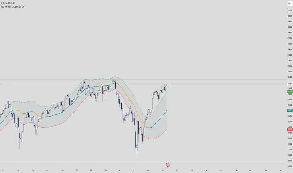
Oculus Ultra Parallel S/R Channel**Oculus Ultra Parallel S/R Channel**
*Version 1.0 | Pine Script v6*
**Overview**
This indicator overlays a statistically-driven support/resistance channel on your chart by fitting a linear regression (median) line and plotting parallel bands at a configurable multiple of standard deviation. It adapts dynamically to both trend and volatility, highlights potential reaction zones, and offers optional alerts when price touches key levels.
**Key Features**
* **Median Regression Line**
Fits a best-fit line through the chosen lookback of price data, showing the underlying trend.
* **Volatility-Based Bands**
Upper and lower bands offset by *N*× standard deviation of regression residuals, capturing dynamic S/R zones.
* **Dynamic Coloring**
* Median line turns **teal** when sloping up, **orange** when sloping down.
* Bands tinted green or red depending on their position relative to the median.
* **Channel Fill**
Optional shaded area between the bands for immediate visual context.
* **Touch Alerts**
Precision alerts and on-chart markers when price touches the support or resistance band, with configurable tick tolerance.
* **Clean Layout**
Minimal lines and plots to avoid chart clutter, adjustable via toggle inputs.
**How to Use**
1. **Apply the Script** – Add to any timeframe in overlay mode.
2. **Configure Inputs** –
* **Channel Length**: Number of bars for regression and volatility calculation.
* **Deviation Factor**: Multiplier for band width (in standard deviations).
* **Show/Hide Elements**: Toggle median line, bands, fill, and touch alerts.
* **Color by Slope**: Enable slope-based median coloring.
* **Touch Tolerance**: Number of ticks within which a band touch is registered.
3. **Interpret the Channel** –
* **Trend**: Follow the slope and color of the median line.
* **Support/Resistance**: Bands represent dynamic zones where price often reacts.
* **Alerts**: Use touch markers or alert pop-ups to time entries or exits at band levels.
**Inputs**
* **Channel Length** (default: 100)
* **Deviation Factor** (default: 1.0)
* **Show Median Regression Line** (true/false)
* **Show Channel Bands** (true/false)
* **Fill Between Bands** (true/false)
* **Color Median by Slope** (true/false)
* **Alert on Band Touch** (true/false)
* **Touch Tolerance (ticks)** (default: 2)
**Version History**
* **1.0** – Initial release with dynamic regression channel, slope coloring, band fill, and touch alerts.
**Disclaimer**
This indicator is intended for educational purposes. Always backtest with your own settings and apply sound risk management before trading live.
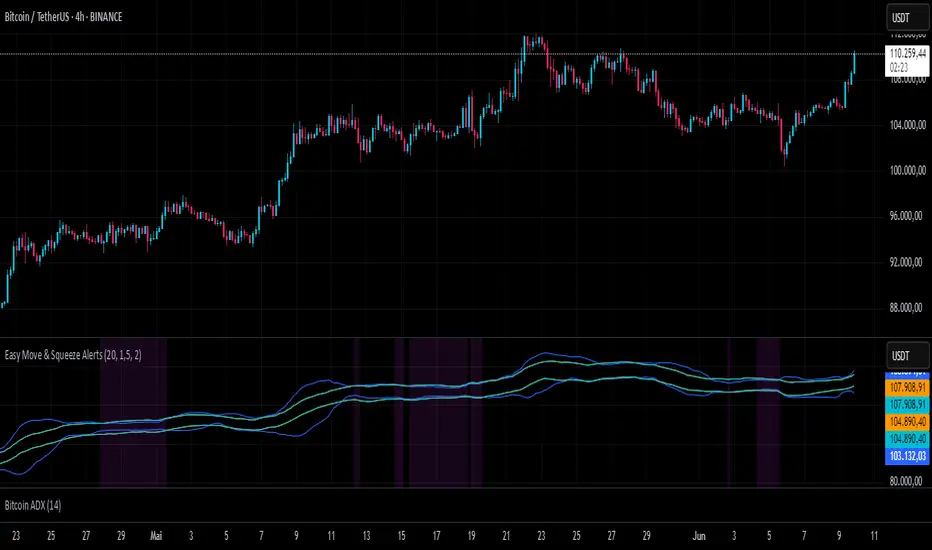
Easy Move & Squeeze Alerts1. Overview
The Easy Move & Squeeze Alerts indicator combines two proven techniques to help you anticipate major price swings and spot volatility compressions (long/short squeezes) early on. It offers:
Automated Alerts via TradingView’s alert engine
On-chart Visual Cues for immediate context
Flexible Inputs to fine-tune sensitivity, lookback length, and display options
2. TTM Squeeze (Volatility Compression)
Core Concept: Compares Bollinger Bands (standard deviation channels) with Keltner Channels (ATR-based channels).
Squeeze On: BBs lie completely inside Keltner Channels → volatility is compressed, signaling a potential buildup.
Squeeze Off: BBs break outside Keltner Channels → typically the start of a strong directional move.
Alert: When the squeeze releases, the indicator fires an alert:
💥 Squeeze Release – Volatility incoming!
Chart Label: A small, purple “🔒 Squeeze” label appears above the high of each bar while compression persists, giving you a real-time visual flag.
3. ATR Breakouts (Detecting Large Moves)
Core Concept: Builds a dynamic price channel around an EMA using ATR (Average True Range) multiplied by your chosen factor.
Cross Events:
Price crosses above the upper ATR band → potential bullish breakout.
Price crosses below the lower ATR band → potential bearish breakdown.
Alert Conditions: Separate alert triggers for “🚀 Move Up” and “📉 Move Down” fire the moment the close breaches the ATR-based bounds.
4. Visualization & Usage
Channel Plots:
Bollinger Bands in blue
Keltner Channels in orange
ATR Channels in aqua (optional)
Toggle all channel plots on or off with the showZones input.
Background Highlight: During a squeeze, the chart background lightly tints purple for quick visual confirmation.
Alerts Setup:
Simply click Create Alert in TradingView, select this indicator, and choose the event(s) you want (squeeze release, ATR breakouts).
You can route notifications via email, webhook, SMS, or platform pop-ups.
5. Deployment & Customization
Timeframes: Effective across all timeframes; most popular for day- and swing-trading.
Parameter Tuning:
Increase the len value to smooth channels and focus on only the most significant compressions/moves.
Adjust the ATR or BB multipliers to make alerts more or less sensitive.
With this indicator, you gain a clear, actionable framework for spotting both volatility squeezes and breakouts before they unfold—empowering you to enter trades ahead of the crowd. Enjoy customizing and putting it to work!
CHoCH + BOS Detector (con líneas)este indicador sirve para simplificar las entrada scalper en el oro

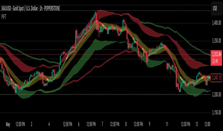
Price Imbalance Flow Tracker (PIFT)Price Imbalance Flow Tracker (PIFT)
PIFT is a visual volatility and structure indicator that maps market imbalance zones using dynamic envelope logic. It plots three sets of envelope bands derived from different moving averages — short, medium, and long — with volatility-based offsets scaled by ATR. These envelopes adapt in real time to reflect momentum expansion, compression, and directional pressure.
- The system highlights only the dominant envelope layer at any given moment (short cancels medium/long, medium cancels long) to reduce clutter and help you focus on the most reactive structure.
- There’s also a central yellow zone representing the core trend channel — a tighter band derived from the short MA, helping you track price containment and breakout zones.
- The green and red fills show where price is expanding beyond core levels, acting as pressure zones. These fills compress during consolidations and widen during impulse moves, giving you a clean read on momentum shifts.
You can toggle:
- Full grid view (all envelopes)
- Core channel only
- Price tracks (moving averages)
- Dynamic pressure zones
Use PIFT to:
- Identify clean trend continuation inside the yellow zone
- Spot momentum exhaustion when price rides the outer bands
- Filter false moves when fills contract but price keeps drifting
- See structure shifts before standard indicators like Bollinger Bands react
This isn’t just another moving average overlay. It’s a dynamic envelope hierarchy built for traders who want to read price flow — not just lagging trend direction.
See the following images for a more in-depth breakdown.
1.)
2.)
3.)
4.)
5.)
6.)
7.)
8.)
9.)
10.)
11.)
12.)
13.)
14.)
FVGs, Env, BB & Knoxville: A Unified Analysis SuiteFVGs, Env, BB & Knoxville: A Unified Analysis Suite
I'm excited to share the Unified Market Analysis Suite, a powerful and comprehensive indicator designed to provide a multi-layered perspective on market dynamics.
Instead of cluttering your chart with separate tools, this script synergizes four key analytical concepts—Fair Value Gaps (FVGs), Volatility Bands (BB & Envelopes), and Momentum Divergence (Knoxville)—into one seamless package. The core philosophy is to help you identify, confirm, and act on high-probability setups by using each component to validate the others. This layered approach provides a more robust signal than any single indicator could alone.
How the Components Work Together: A Strategic Approach
This script is built for a step-by-step analysis, turning abstract data into actionable insights:
Step 1: Spot Potential Reversals with Knoxville Divergence. The process begins when a bullish or bearish Knoxville Divergence signal appears on your chart. This acts as an early warning, alerting you to a potential shift in momentum that is not yet reflected in the price trend.
Step 2: Identify Inefficiency with Fair Value Gaps (FVGs). Following a divergence signal, you then look for a Fair Value Gap to form in the direction of that divergence. For example, after a bullish divergence, a newly formed bullish FVG can serve as a high-probability zone for potential entries.
Step 3: Gauge Volatility with Bollinger Bands. The Bollinger Bands provide critical context. Is the FVG forming during a low-volatility squeeze, suggesting an explosive move might be imminent? Or is it occurring in a high-volatility environment where more caution is needed? An FVG that forms near or outside the bands can signal a particularly potent setup.
Step 4: Confirm with the Macro Trend using Envelopes. Finally, the long-term Envelope channel helps you see the bigger picture. This confirms whether your FVG/divergence setup is aligned with the dominant market trend (a continuation) or against it (a potential reversal), allowing you to manage your trade with greater confidence.
Key Features & Full Customization
Every component is highly customizable to fit your unique trading style.
1. Fair Value Gaps (FVGs) & Consequent Engulfment (CE)
Automatic Detection: Clearly identifies and plots bullish (UP) and bearish (DOWN) FVGs.
Dynamic Visuals: Boxes and CE lines extend until mitigated, with distinct colors for bullish and bearish gaps. You have the option to automatically hide filled boxes for a cleaner chart.
Mitigation Options: Choose whether FVG mitigation is calculated based on wicks or candle bodies.
Clear Labeling: A new feature adds an "FVG" text label inside each box, with adjustable size, color, and positioning.
Advanced Alerts: Receive alerts for FVG formation (confirmed and un-confirmed), price crossing an FVG's threshold (CE or full fill), and IOFED (price entry into an FVG).
2. Knoxville Divergence
Integrated Momentum Analysis: Uses a combination of RSI and Momentum to detect high-quality divergence signals.
Precision Control: Adjust RSI/Momentum lengths, the lookback period for finding divergences, and RSI overbought/oversold levels.
Intuitive Visuals & Alerts: Divergence lines are drawn directly on your chart with customizable colors, styles, and thickness. Alerts trigger the moment a new bearish or bullish divergence is confirmed.
3. Bollinger Bands (BB)
Classic Volatility Analysis: Monitor market volatility and identify potential price extremes.
Multiple MA Types: Choose from SMA, EMA, SMMA (RMA), WMA, or VWMA for the basis of the bands.
Full Customization: Adjust the length, source, and standard deviation multiplier.
4. Envelopes
Trend & Deviation Channel: Quickly assess price deviation from a central moving average.
Flexible Calculation: Can be calculated using either an SMA or EMA as the basis.
Clear Visuals: The channel is filled for easy and immediate interpretation of the broader trend.
Getting Started
This script is an overlay that plots directly on your price chart. After adding it, click the "Settings" cogwheel. You will find clearly organized sections for each of the four components, allowing you to enable, disable, and fine-tune every parameter to create the perfect analytical view for your strategy.
Acknowledgments and Development Process
This indicator is a comprehensive suite, and I want to be transparent about its development. The foundational logic for detecting three-bar Fair Value Gaps was inspired by the excellent open-source script by @twingall.
However, this module was not simply a copy; it was fundamentally re-architected and enhanced to serve as one component within this larger, original system. Here are the specific, significant improvements:
Architectural Refactoring: The original v5 code was entirely rewritten into a modular fvgManager function in Pine Script® v6, allowing it to integrate seamlessly with the other indicators.
New Feature (Dynamic Labels): I designed and implemented a system to add, manage, and customize text labels inside each FVG box—a feature not present in the original.
Original Components: The other three indicators in this suite—Envelopes, Bollinger Bands, and the Knoxville Divergence detector—are my own original code from the ground up.
Synergistic Integration: The primary development effort was focused on integrating these four distinct analytical tools. The FVG code was specifically modified to support advanced conditional visibility, ensuring it could be toggled on and off without conflicting with the other modules.
My goal was to build on a known concept and place it within a broader, synergistic framework. I truly believe the combination of these tools can enhance your analysis. If you find this script valuable, please consider giving it a boost to show your support.
I wish you all the best on your trading journey!

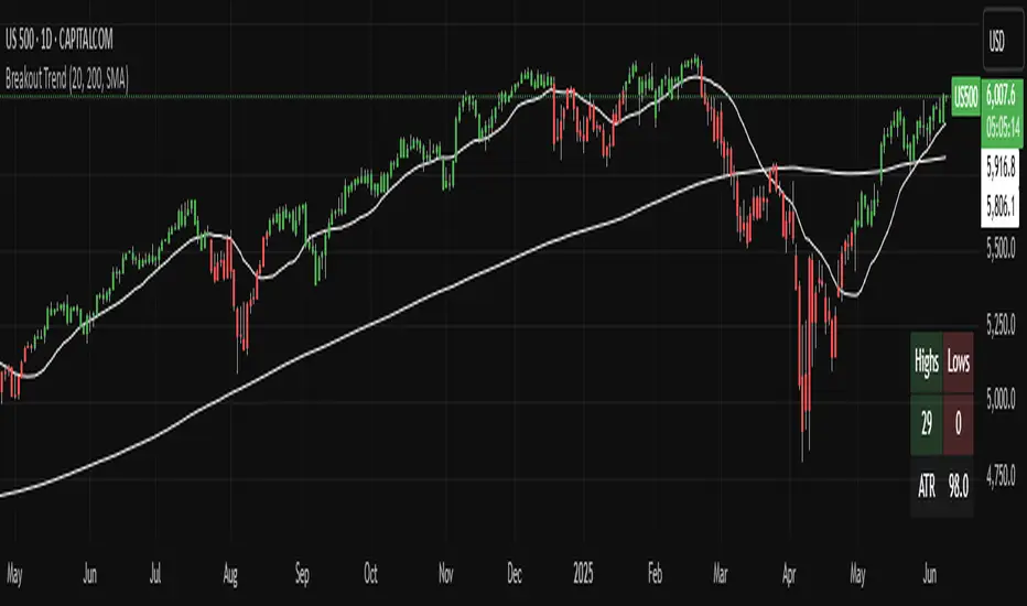
Breakout TrendTiltFolio Breakout Trend indicator
The Breakout Trend indicator is designed to help traders clearly visualize trend direction by combining two complementary techniques: moving averages and Donchian-style breakout logic.
Rather than relying on just one type of signal, this indicator merges short-term and long-term moving averages with breakout levels based on recent highs and lows. The moving averages define the broader trend regime, while the breakout logic pinpoints moments when price confirms directional momentum. This layered approach filters out many false signals while still capturing high-conviction moves.
Yes, these are lagging indicators by design — and that’s the point. Instead of predicting every wiggle, the Breakout Trend waits for confirmation, offering higher signal quality and fewer whipsaws. When the price breaks above a recent high and sits above the long-term moving average, the trend is more likely to persist. That’s when this indicator shines.
While it performs best on higher timeframes (daily/weekly), it's also adaptable to shorter timeframes for intraday traders who value clean, systematic trend signals.
For early signal detection, we recommend pairing this with TiltFolio’s Buying/Selling Proxy, which anticipates pressure buildups—albeit with more noise.
It's easy to read and built for real-world trading discipline.
MACD Support and Resistance [ChartPrime]⯁ OVERVIEW
MACD Support and Resistance is a dynamic support/resistance mapping tool powered by MACD crossover logic. Each time the MACD line crosses the signal line, the indicator scans for recent price extremes and locks them in as potential support or resistance zones. These levels are automatically cleaned up if price breaks them, keeping the chart focused on active market structure. The system includes a built-in MACD display with visual markers, along with contextual highs and lows to help define the current environment.
⯁ MACD-BASED SUPPORT/RESISTANCE GENERATION
The core logic uses the MACD oscillator crossover as a trigger event to generate structural levels:
When MACD crosses above its signal line:
→ The script scans the last 5 bars for the lowest low .
→ A support level is plotted at that price.
When MACD crosses below its signal line:
→ The script scans the last 5 bars for the highest high .
→ A resistance level is plotted at that price.
These dynamic levels reflect where price recently reversed or paused, making them prime zones for reaction, continuation, or invalidation.
⯁ LEVEL MANAGEMENT AND VALIDATION
To keep the chart clean and relevant:
A maximum of 20 active levels are allowed at once.
Older levels are automatically removed if the list exceeds the limit.
If price closes below a support level or above a resistance level , the corresponding line is deleted.
This ensures that only currently respected levels remain on the chart — a major advantage for active traders.
⯁ MACD VISUALIZATION + SIGNAL MARKERS
A full MACD system is rendered on the lower panel for visual confirmation:
The MACD line and Signal line are both plotted and color-coded dynamically.
A filled area] highlights the spread between them to emphasize momentum strength.
A diamond marker is drawn each time MACD crosses its signal line, alerting traders to potential trend shifts.
These visuals make it easy to understand the timing of the support/resistance updates.
⯁ LOCAL EXTREME REFERENCE LINES
To help contextualize current price position relative to recent market extremes:
A Local High line is plotted based on the highest MACD value over the past 100 bars].
A Local Low line is plotted based on the lowest MACD value over the past 100 bars].
These levels are rendered lightly and serve as dynamic range boundaries.
They assist traders in identifying overextended or compressed MACD behavior.
⯁ USAGE
Use the generated S/R levels as breakout or reversal zones.
Watch for MACD diamond markers to confirm the timing of new levels.
Combine these reactive zones with other ChartPrime confluence tools for higher-confidence entries.
Use the Local High/Low zones as a volatility envelope to guide risk and trend continuation potential.
⯁ CONCLUSION
MACD Support and Resistance takes a classic momentum indicator and adds real-time structural awareness. By linking MACD crossover events to recent price extremes, it identifies the zones where market sentiment shifted — and continues to monitor their strength. Whether you're a breakout trader or looking to fade key reaction points, this tool delivers clean, actionable levels based on momentum and structure — not guesswork.
Trend Impulse Channels (Zeiierman)█ Overview
Trend Impulse Channels (Zeiierman) is a precision-engineered trend-following system that visualizes discrete trend progression using volatility-scaled step logic. It replaces traditional slope-based tracking with clearly defined “trend steps,” capturing directional momentum only when price action decisively confirms a shift through an ATR-based trigger.
This tool is ideal for traders who prefer structured, stair-step progression over fluid curves, and value the clarity of momentum-based bands that reveal breakout conviction, pullback retests, and consolidation zones. The channel width adapts automatically to market volatility, while the step logic filters out noise and false flips.
⚪ The Structural Assumption
This indicator is built on a core market structure observation:
After each strong trend impulse, the market typically enters a “cooling-off” phase as profit-taking occurs and counter-trend participants enter. This often results in a shallow pullback or stall, creating a slight negative slope in an uptrend (or a positive slope in a downtrend).
These “cooling-off” phases don’t reverse the trend — they signal temporary pressure before the next leg continues. By tracking trend steps discretely and filtering for this behavior, Trend Impulse Channels helps traders align with the rhythm of impulse → pause → impulse.
█ How It Works
⚪ Step-Based Trend Engine
At the heart of this tool is a dynamic step engine that progresses only when price crosses a predefined ATR-scaled trigger level:
Trigger Threshold (× ATR) – Defines how far price must break beyond the current trend state to register a new trend step.
Step Size (Volatility-Guided) – Each trend continuation moves the trend line in discrete units, scaling with ATR and trend persistence.
Trend Direction State – Maintains a +1/-1 internal bias to support directional filters and step tracking.
⚪ Volatility-Adaptive Channel
Each step is wrapped inside a dynamic envelope scaled to current volatility:
Upper and Lower Bands – Derived from ATR and band multipliers to expand/contract as volatility changes.
⚪ Retest Signal System
Optional signal markers show when price re-tests the upper or lower band:
Upper Retest → Pullback into resistance during a bearish trend.
Lower Retest → Pullback into support during a bullish trend.
⚪ Trend Step Signals
Circular markers can be shown to mark each time the trend steps forward, making it easy to identify structurally significant moments of continuation within a larger trend.
█ How to Use
⚪ Trend Alignment
Use the Trend Line and Step Markers to visually confirm the direction of momentum. If multiple trend steps occur in sequence without reversal, this typically signals strong conviction and trend persistence.
⚪ Retest-Based Entries
Wait for pullbacks into the channel and monitor for triangle retest signals. When used in confluence with trend direction, these offer high-quality continuation setups.
⚪ Breakouts
Look for breakouts beyond the upper or lower band after a longer period of pause. For higher likelihood of success, look for breakouts in the direction of the trend.
█ Settings
Trigger Threshold (× ATR) - Defines how far price must move to register a new trend step. Controls sensitivity to trend flips.
Max Step Size (× ATR) - Caps how far each trend step can extend. Prevents runaway step expansion in high volatility.
Band Multiplier (× ATR) - Expands the upper and lower channels. Controls how much breathing room the bands allow.
Trend Hold (bars) - Minimum number of bars the trend must remain active before allowing a flip. Helps reduce noise.
Filter by Trend - Restrict retest signals to those aligned with the current trend direction.
-----------------
Disclaimer
The content provided in my scripts, indicators, ideas, algorithms, and systems is for educational and informational purposes only. It does not constitute financial advice, investment recommendations, or a solicitation to buy or sell any financial instruments. I will not accept liability for any loss or damage, including without limitation any loss of profit, which may arise directly or indirectly from the use of or reliance on such information.
All investments involve risk, and the past performance of a security, industry, sector, market, financial product, trading strategy, backtest, or individual's trading does not guarantee future results or returns. Investors are fully responsible for any investment decisions they make. Such decisions should be based solely on an evaluation of their financial circumstances, investment objectives, risk tolerance, and liquidity needs.
