Enhanced Gann Time-Price SquaresEnhanced Gann Time-Price Squares Indicator
A comprehensive Pine Script indicator that identifies and visualizes W.D. Gann's time-price square formations on your charts. This tool helps traders spot potential market turning points where time and price movements align according to Gann's legendary market theories.
Key Features:
Automatic Square Detection - Identifies completed squares where price movement equals time movement
Future Projections - Shows forming squares with projected completion points
Pivot Integration - Automatically detects pivot highs/lows as square starting points
Visual Clarity - Clean box outlines with customizable colors and styles
Smart Filtering - Prevents overlapping squares and includes minimum move thresholds
Real-time Status - Information table showing current square formations
How to Use:
The indicator draws boxes when price moves from pivot points equal the time elapsed (number of bars). Green squares indicate upward movements, red squares show downward movements. Dashed lines show forming squares, while dotted lines project where they might complete.
Settings:
Adjust pivot sensitivity and minimum price moves
Customize tolerance for time-price matching
Toggle projections, labels, and visual elements
Fine-tune colors and line styles
Perfect for Gann theory practitioners and traders looking for time-based market analysis. The squares often coincide with significant support/resistance levels and potential reversal points.
Compatible with all timeframes and instruments.
More updates to follow
Cycles


XAUUSD BOS + Retest Looser Bot//@version=5
indicator("SMC Map — BOS/CHoCH + PD + Liquidity + Killzones", overlay=true)
// === CONFIG ===
pd_tf = input.timeframe("240", "HTF for PD array")
show_killzone = input.bool(true, "Show Killzones")
// === HTF SWINGS ===
htf_high = request.security(syminfo.tickerid, pd_tf, high)
htf_low = request.security(syminfo.tickerid, pd_tf, low)
pd_mid = (htf_high + htf_low) / 2
// Plot PD midline
plot(pd_mid, title="PD 50%", color=color.gray, linewidth=2)
// === SWING STRUCTURE ===
var float swing_high = na
var float swing_low = na
is_swing_high = ta.highest(high, 3) == high and close < high
is_swing_low = ta.lowest(low, 3) == low and close > low
if (is_swing_high)
swing_high := high
if (is_swing_low)
swing_low := low
// === BOS / CHoCH ===
bos_up = not na(swing_high) and close > swing_high
bos_down = not na(swing_low) and close < swing_low
var int structure_dir = 0 // 0=neutral, 1=up, -1=down
choch_up = false
choch_down = false
if (bos_up)
choch_up := structure_dir == -1
structure_dir := 1
if (bos_down)
choch_down := structure_dir == 1
structure_dir := -1
// === PLOTS ===
plotshape(bos_up, title="BOS UP", style=shape.triangleup, location=location.belowbar, color=color.green, size=size.small)
plotshape(bos_down, title="BOS DOWN", style=shape.triangledown, location=location.abovebar, color=color.red, size=size.small)
plotshape(choch_up, title="CHOCH UP", style=shape.labelup, location=location.belowbar, color=color.lime, size=size.tiny, text="CHOCH")
plotshape(choch_down, title="CHOCH DOWN", style=shape.labeldown, location=location.abovebar, color=color.maroon, size=size.tiny, text="CHOCH")
plot(swing_high, title="Swing High Liquidity", color=color.new(color.green, 50), style=plot.style_cross, linewidth=1)
plot(swing_low, title="Swing Low Liquidity", color=color.new(color.red, 50), style=plot.style_cross, linewidth=1)
// === KILLZONE ===
in_london = (hour >= 6 and hour < 11)
in_ny = (hour >= 12 and hour < 18)
bgcolor(show_killzone and in_london ? color.new(color.green, 90) : na)
bgcolor(show_killzone and in_ny ? color.new(color.blue, 90) : na)

minchang volume tradingCondition
Point color
Volume ≥ 3× MA(24)
Violet
Volume ≥ 1.5× MA(24)
Red
Volume < 1.5× MA(24) & bullish
White
Volume < 1.5× MA(24) & bearish
Black

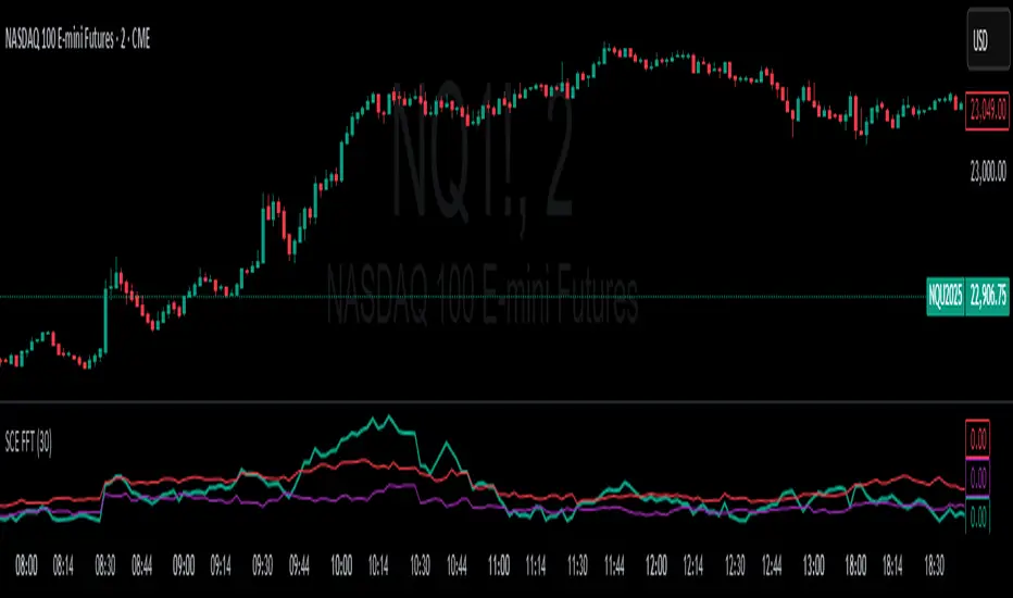
Fast Fourier Transform [ScorsoneEnterprises]The SCE Fast Fourier Transform (FFT) is a tool designed to analyze periodicities and cyclical structures embedded in price. This is a Fourier analysis to transform price data from the time domain into the frequency domain, showing the rhythmic behaviors that are otherwise invisible on standard charts.
Instead of merely observing raw prices, this implementation applies the FFT on the logarithmic returns of the asset:
Log Return(𝑚) = log(close / close )
This ensures stationarity and stabilizes variance, making the analysis statistically robust and less influenced by trends or large price swings.
For a user-defined lookback window 𝑁:
Each frequency component 𝑘 is computed by summing real and imaginary projections of log-returns multiplied by complex exponential functions:
𝑒^−𝑖𝜃 = cos(𝜃)−𝑖sin(𝜃)
where:
θ = 2πkm / N
he result is the magnitude spectrum, calculated as:
Magnitude(𝑘) = sqrt(Real_Sum(𝑘)^2 + Imag_Sum(𝑘)^2)
This spectrum represents the strength of oscillations at each frequency over the lookback period, helping traders identify dominant cycles.
Visual Analysis & Interpretation
To give traders context for the FFT spectrum’s values, this script calculates:
25th Percentile (Purple Line)
Represents relatively low cyclical intensity.
Values below this threshold may signal quiet, noisy, or trendless periods.
75th Percentile (Red Line)
Represents heightened cyclical dominance.
Values above this threshold may indicate significant periodic activity and potential trend formation or rhythm in price action.
The FFT magnitude of the lowest frequency component (index 0) is plotted directly on the chart in teal. Observing how this signal fluctuates relative to its percentile bands provides a dynamic measure of cyclical market activity.
Chart examples
In this NYSE:CL chart, we see the regime of the price accurately described in the spectral analysis. We see the price above the 75th percentile continue to trend higher until it breaks back below.
In long trending markets like NYSE:PL has been, it can give a very good explanation of the strength. There was confidence to not switch regimes as we never crossed below the 75th percentile early in the move.
The script is also usable on the lower timeframes. There is no difference in the usability from the different timeframes.
Script Parameters
Lookback Value (N)
Default: 30
Defines how many bars of data to analyze. Larger N captures longer-term cycles but may smooth out shorter-term oscillations.
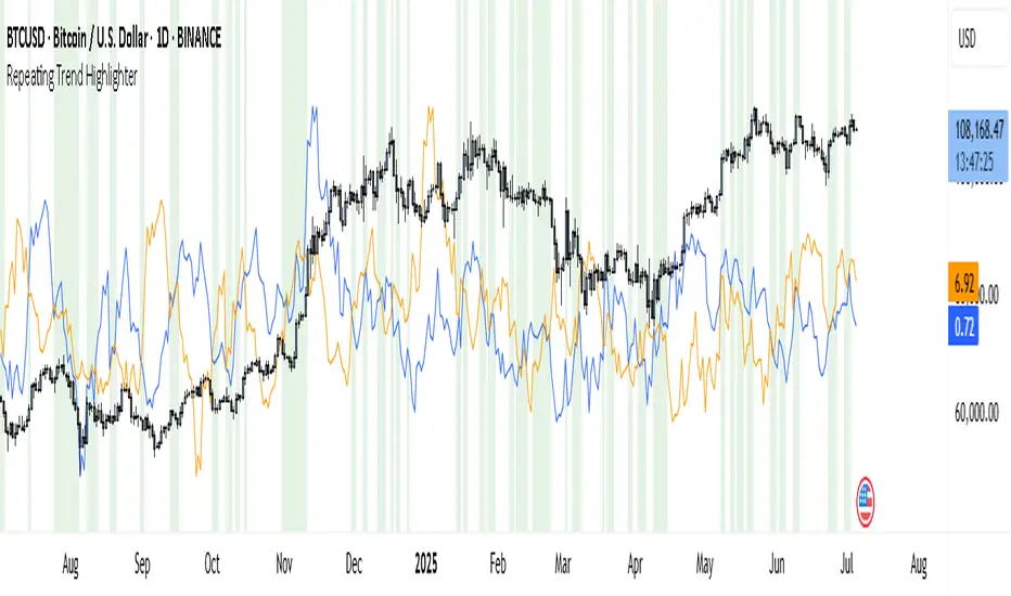
Repeating Trend HighlighterThis custom indicator helps you see when the current price trend is similar to a past trend over the same number of candles. Think of it like checking whether the market is repeating itself.
You choose three settings:
• Lookback Period: This is how many candles you want to measure. For example, if you set it to 10, it looks at the price change over the last 10 bars.
• Offset Bars Ago: This tells the indicator how far back in time to look for a similar move. If you set it to 50, it compares the current move to what happened 50 bars earlier.
• Tolerance (%): This is how closely the moves must match to be considered similar. A smaller number means you only get a signal if the moves are almost the same, while a larger number allows more flexibility.
When the current price move is close enough to the past move you picked, the background of your chart turns light green. This makes it easy to spot repeating trends without studying numbers manually.
You’ll also see two lines under your chart if you enable them: a blue line showing the percentage change of the current move and an orange line showing the change in the past move. These help you compare visually.
This tool is useful in several ways. You can use it to confirm your trading setups, for example if you suspect that a strong rally or pullback is happening again. You can also use it to filter trades by combining it with other indicators, so you only enter when trends repeat. Many traders use it as a learning tool, experimenting with different lookback periods and offsets to understand how often similar moves happen.
If you are a scalper working on short timeframes, you can set the lookback to a small number like 3–5 bars. Swing traders who prefer daily or weekly charts might use longer lookbacks like 20–30 bars.
Keep in mind that this indicator doesn’t guarantee price will move the same way again—it only shows similarity in how price changed over time. It works best when you use it together with other signals or market context.
In short, it’s like having a simple spotlight that tells you: “This move looks a lot like what happened before.” You can then decide if you want to act on that information.
If you’d like, I can help you tweak the settings or combine it with alerts so it notifies you when these patterns appear.
RSI For LoopTitle: RSI For Loop
SurgeQuant’s RSI with Threshold Colors and Bar Coloring indicator is a sophisticated tool designed to identify overbought and oversold conditions using a customizable Relative Strength Index (RSI). By averaging RSI over a user-defined lookback period, this indicator provides clear visual signals for bullish and bearish market conditions. The RSI line and price bars are dynamically colored to highlight momentum, making it easier for traders to spot potential trading opportunities.
How It Works
RSI Calculation:
Computes RSI based on a user-selected price source (Close, High, Low, or Open) with a configurable length (default: 5). Optional moving average smoothing refines the RSI signal for smoother analysis.
Lookback Averaging:
Averages the RSI over a user-defined lookback period (default: 5) to generate a stable momentum indicator, reducing noise and enhancing signal reliability.
Threshold-Based Signals:
Long Signal: Triggered when the averaged RSI exceeds the upper threshold (default: 52), indicating overbought conditions.
Short Signal: Triggered when the averaged RSI falls below the lower threshold (default: 48), indicating oversold conditions.
Visual Representation
The indicator provides a clear and customizable visual interface: Green RSI Line and Bars: Indicate overbought conditions when the averaged RSI surpasses the upper threshold, signaling potential long opportunities.
Red RSI Line and Bars: Indicate oversold conditions when the averaged RSI drops below the lower threshold, signaling potential short opportunities.
Neutral Gray RSI Line: Represents RSI values between thresholds for neutral market conditions.
Threshold Lines: Dashed gray lines mark the upper and lower thresholds on the RSI panel for easy reference.
Customization & Parameters
The RSI with Threshold Colors and Bar Coloring indicator offers flexible parameters to suit
various trading styles: Source: Select the input price (default: Close; options: Close, High, Low, Open).
RSI Length: Adjust the RSI calculation period (default: 5).
Smoothing: Enable/disable moving average smoothing (default: enabled) and set the smoothing length (default: 10).
Moving Average Type: Choose from multiple types (SMA, EMA, DEMA, TEMA, WMA, VWMA, SMMA, HMA, LSMA, ALMA; default: ALMA).
ALMA Sigma: Configure the ALMA smoothing parameter (default: 5).
Lookback Period: Set the period for averaging RSI (default: 5).
Thresholds: Customize the upper (default: 52) and lower (default: 48) thresholds for signal generation.
Color Settings: Transparent green and red colors (70% transparency) for bullish and bearish signals, with gray for neutral states.
Trading Applications
This indicator is versatile and can be applied across various markets and strategies: Momentum Trading: Highlights strong overbought or oversold conditions for potential entry or exit points.
Trend Confirmation: Use bar coloring to confirm RSI-based signals with price action on the main chart.
Reversal Detection: Identify potential reversals when RSI crosses the customizable thresholds.
Scalping and Swing Trading: Adjust parameters (e.g., RSI length, lookback) to suit short-term or longer-term strategies.
Final Note
SurgeQuant’s RSI with Threshold Colors and Bar Coloring indicator is a powerful tool for traders seeking to leverage RSI for momentum and reversal opportunities. Its combination of lookback-averaged RSI, dynamic threshold signals, and synchronized RSI and bar coloring offers a robust framework for informed trading decisions. As with all indicators, backtest thoroughly and integrate into a comprehensive trading strategy for optimal results.

Previous 10 Weekly Highs/Lows z s s bsf bsfd sfdv svdvvdsfvsdvsddvbadvvf zfvdzcxvdsfzv dfcvfdcxvsfdzvzdsfcx

Nến Tô Màu Theo Volume / MA(21)Condition
Point color
Volume ≥ 3× MA(24)
Violet
Volume ≥ 1.5× MA(24)
Red
Volume < 1.5× MA(24) & bullish
White
Volume < 1.5× MA(24) & bearish
Black

Bearish Fibonacci Extension Distance Table
### 📉 **Bearish Fibonacci Extension Distance Table – Pine Script Indicator**
This TradingView indicator calculates and displays **bearish Fibonacci extension targets** based on recent price swings, specifically designed for traders looking to **analyze downside potential** in a trending market. Unlike traditional Fibonacci retracement tools that help identify pullbacks, this version projects likely **price targets below current levels** using Fibonacci ratios commonly followed by institutional and retail traders alike.
#### 🔧 **How It Works:**
* **Swing Calculation**:
The script looks back over a user-defined period (`swingLen`, default 20 bars) to find:
* `B`: The **highest high** in the lookback (start of bearish move)
* `A`: The **lowest low** in the same period (end of bearish swing)
* `C`: The **current high**, serving as the base for projecting future downside levels.
* **Bearish Extensions**:
It then calculates Fibonacci extension levels **below** the current high using standard ratios:
* **100%**, **127.2%**, **161.8%**, **200%**, and **261.8%**
* **Distance Calculation**:
For each level, the indicator computes:
* The **target price**
* The **distance (in %)** between the current close and each Fibonacci level
* **Visual Output**:
A live, auto-updating **data table** is shown in the **top-right corner** of the chart. This provides at-a-glance insight into how far current price is from each bearish target, with color-coded levels for clarity.
#### 📊 **Use Cases**:
* Identify **bearish continuation targets** in downtrending or correcting markets.
* Help manage **take-profit** zones for short trades.
* Assess **risk-reward** scenarios when entering bearish positions.
* Combine with indicators like RSI, OBV, or MACD for **confluence-based setups**.
#### ⚙️ **Inputs**:
* `Swing Lookback`: Number of bars to consider for calculating the swing high and swing low.
* `Show Table`: Toggle to display or hide the Fibonacci level table.
---
### 🧠 Example Interpretation:
Suppose the stock is trading at ₹180 and the 161.8% Fibonacci extension level is ₹165 with a -8.3% distance — this suggests the price may continue down to ₹165, offering a potential 8% short opportunity if confirmed by other indicators.


Wyckoff Smart Signals (Long + Short)- Wycoff Smart signals made by Melik
Using Wycoff fundamentals and volume confirmation to form a bias

NEXGEN ADXNEXGEN ADX
NEXGEN ADX – Advanced Trend Strength & Directional Indicator
Purpose:
The NEXGEN ADX is a powerful trend analysis tool developed by NexGen Trading Academy to help traders identify the strength and direction of market trends with precision. Based on the Average Directional Index (ADX) along with +DI (Positive Directional Indicator) and –DI (Negative Directional Indicator), this custom indicator provides a reliable foundation for both trend-following strategies and trend reversal setups.

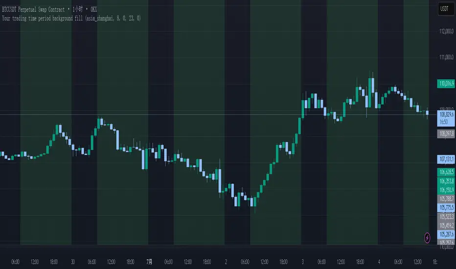
Your trading time period background fillThis script allows you to add background highlights to charts during any regional trading session, customize your own trading time, and is precise and customizable yet simple and easy to use, making it more convenient to review transactions.
Support global mainstream time zones: The drop-down list includes 30 commonly used IANA time zones (default is Asia/Shanghai) (such as Asia/Shanghai, America/New_York, Europe/London, etc.), one-click switching, no need to manually calculate the time difference.
Fully localized time input: "Start hour/minute" and "End hour/minute" are filled in with the local time of the selected time zone. The end hour defaults to 23:00 and can be adjusted to 0-23 at will.
Accurate time difference splitting: The script internally splits the time zone offset into whole hours and remainder minutes (supports half-hour zones, such as UTC+5:30), and ensures that all parameters are integers when calling timestamp to avoid errors.
Dynamic background rendering: Each K-line is judged according to the UTC timestamp whether it falls within the set range. If it meets the time period, it will be marked with a semi-transparent green background, and it will return to its original state after crossing the time period, helping you to identify the opening, closing or active period of any market at a glance.
Wide range of scenarios: It can be used for time-sharing highlighting of all-weather varieties of foreign exchange and cryptocurrency, and can also be used in conjunction with backtesting and timing strategies to only send signals during the active period of the target market, greatly improving trading efficiency and strategy accuracy.
Just select the region and set the time, and the script will automatically complete all complex time zone conversions and drawing, allowing you to focus on the transaction itself.

Altcoin Liquidity Flow Score - Big Moves Only//@version=6
indicator("Altcoin Liquidity Flow Score - Big Moves Only", overlay=false)
// Pull weekly macro data
walcl = request.security("FRED:WALCL", "W", close)
rrp = request.security("FRED:RRPONTSYD", "W", close)
tga = request.security("FRED:WDTGAL", "W", close)
hyg = request.security("AMEX:HYG", "W", close)
total3 = request.security("CRYPTOCAP:TOTAL3", "W", close)
usdt_d = request.security("CRYPTOCAP:USDT.D", "W", close)
// Calculate week-over-week change
delta_liquidity = ta.change(walcl + rrp - tga)
delta_rrp = ta.change(rrp)
delta_hyg = ta.change(hyg)
delta_total3 = ta.change(total3)
delta_usdt_d = ta.change(usdt_d)
// Compute raw score
raw_score = delta_liquidity - delta_rrp + delta_hyg + delta_total3 - delta_usdt_d
// Apply 3-week smoothing
score = ta.ema(raw_score, 3)
// Define threshold for major liquidity shift
threshold = 2.0
// Plot score + background for only strong signals
plot(score, title="Liquidity Flow Score (Smoothed)", color=color.teal, linewidth=2)
hline(0, "Zero Line", color=color.gray)
bgcolor(score > threshold ? color.new(color.green, 85) : score < -threshold ? color.new(color.red, 85) : na)

Panchak 369This indicator highlights Panchak Dates based on Vedic astrology, marking specific lunar dates (Tithis) that occur when the Moon transits from Dhanishta to Revati Nakshatra. These days are considered astrologically sensitive and are traditionally avoided for initiating important activities.


TVI-3 Z-Score: MA + VWAP + BB Composite🔧 Overview:
It combines:
Z-score of price relative to the 200-period simple moving average (MA)
Z-score of price relative to the 200-period VWAP (volume-weighted average price)
Z-score of Bollinger Band width
The result is an average of these three Z-scores, plotted as a composite indicator for identifying overvalued and undervalued conditions.

Day and DateA simple indicator that show day and date at the start of each day. This is usefull in case you are downloading charts or get confused when studying past charts for expiry and non expiry day actions.

Previous 10 Weekly Highs/LowsNewer vweionnnnnnnnnnnnnnnnnnnnnnnnnnnnnnnnnnnnnnnnnnnnnnnnnnnnnnnnnnnnnnn

Previous 10 Weekly Highs/LowscilcvieowhvioewfvhgweiofgheaoifgascvgaucgfvUfgiocfgacfbaofcgaeo8gfhhfioqlkea
