Absolute Volume Levels [AlgoRich]This indicator classifies the volume of each candle into three levels—weak, intermediate, and strong—using absolute thresholds. It allows you to define fixed levels for what constitutes low, moderate, or high activity.
Key Features:
Classification by Absolute Thresholds:
The indicator uses two configurable cut-off points:
Intermediate Volume Threshold: The value from which volume is no longer considered weak and is classified as intermediate.
Strong Volume Threshold: The value from which volume is considered strong.
Any volume below the intermediate threshold is classified as weak; volume between the thresholds is classified as intermediate; and volume above the strong threshold is considered strong.
Distinction Between Bullish and Bearish Candles:
Bullish candles are displayed with positive volume (bars pointing upward).
Bearish candles are shown with negative volume (bars pointing downward).
This makes it easier to quickly identify the prevailing direction of volume activity.
Customizable Colors:
You can independently adjust the colors for each volume level for both bullish and bearish candles. This helps to visually highlight unusual volume levels, which can be useful for detecting breakouts or liquidity sweeps.
Benefits of Using This Indicator:
Simplicity and Clarity:
By using absolute thresholds, you eliminate the dependency on moving averages, obtaining a direct measure of volume relative to fixed values. This is particularly useful if you know the typical volume ranges for your asset.
Adaptability:
The thresholds and colors can be easily adjusted to suit different assets and timeframes, allowing you to fine-tune the indicator to your trading style and needs.
Effective Visualization:
The representation of volume bars—differentiated by both direction (bullish or bearish) and intensity (weak, intermediate, or strong)—facilitates the quick identification of changes in market activity, helping you make more informed trading decisions.
This indicator is ideal for traders who want to assess volume in absolute terms and clearly visualize spikes in activity that may indicate trading opportunities or confirm trend changes.
Volatility

ATR SuperTrend - IonJauregui-ActivTradesEste script en Pine Script utiliza el indicador SuperTrend basado en el ATR para identificar tendencias y generar señales de compra y venta.
¿Cómo funciona?
Detecta la volatilidad con el ATR para calcular niveles dinámicos de soporte y resistencia.
Dibuja la tendencia:
Línea verde: Tendencia alcista.
Línea roja: Tendencia bajista.
Genera señales de trading:
Compra cuando la tendencia pasa de bajista a alcista.
Venta cuando cambia de alcista a bajista.
Opera de forma automática:
Abre posiciones según las señales.
Establece stop loss y take profit para gestionar el riesgo.
Este indicador ayuda a seguir la tendencia y automatizar operaciones, filtrando el ruido del mercado.
**********************************************************
This Pine Script uses the SuperTrend indicator based on ATR to identify trends and generate buy and sell signals.
How it works:
Detects volatility with ATR to calculate dynamic support and resistance levels.
Plots the trend:
Green line: Bullish trend.
Red line: Bearish trend.
Generates trading signals:
Buy when the trend switches from bearish to bullish.
Sell when it switches from bullish to bearish.
Trades automatically:
Opens positions based on the signals.
Sets stop loss and take profit to manage risk.
This indicator helps follow the trend and automate trades, filtering out market noise.

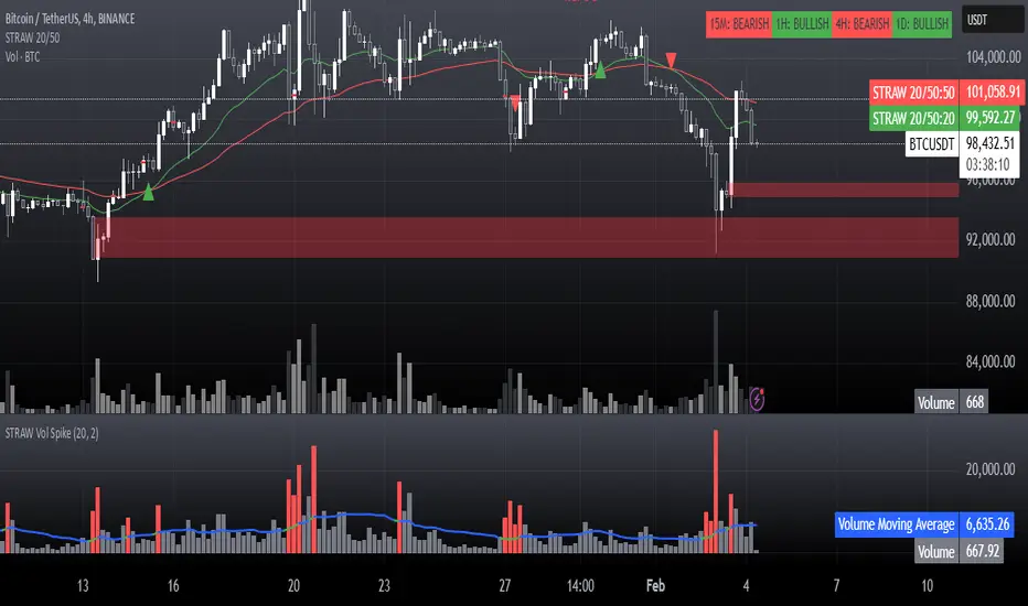
STRAW Volume Spike IndicatorThis is basically a:
High-Volume Impulse Detector
The High-Volume Impulse Detector is a refined tool designed to highlight key moments of explosive volume surges in the market, specifically calibrated for assets like Bitcoin on the 15-minute timeframe. Unlike generic volume-based indicators, this script doesn’t just flag high volume—it intelligently adapts to market dynamics by incorporating a custom-moving average baseline and highlighting instances where volume exceeds a significant threshold relative to the average.
Key Features
✅ Adaptive Volume Benchmark – Uses a dynamic moving average to filter out noise and pinpoint meaningful volume spikes.
✅ Impulse Confirmation – Only highlights volume bars that exceed the 50% threshold above the baseline, ensuring signals capture real liquidity shifts.
✅ Smart Color Coding – Differentiates high-impact bullish and bearish volume with distinct visual cues for easy market structure identification.
✅ Designed for Order Block Traders – Helps validate liquidity-driven price movements essential for refining order block and break-of-structure strategies.
Unlike conventional volume overlays, this tool helps traders connect volume surges to key structural shifts, making it an ideal companion for those navigating momentum shifts, market inefficiencies, and institutional footprints.
⚡ Best used on BTC 15m for tracking aggressive volume-driven moves in real-time.
Cypto Oscillator with Sortino-like VolatilityEnhanced Inverted Ultimate Oscillator with Sortino-like Volatility
This indicator combines the power of the Ultimate Oscillator with a unique Sortino-like volatility calculation to provide a comprehensive view of market dynamics. It's designed to help traders identify potential turning points and assess the risk associated with price movements.
**Core Components:**
* **Ultimate Oscillator (UO):** The UO is a momentum indicator that incorporates short, medium, and long-term price action to identify overbought and oversold conditions. This indicator inverts and normalizes the UO to a 0-10 scale, providing a clear view of momentum shifts.
* **Sortino-like Volatility:** Instead of a standard deviation, this indicator uses a downside deviation calculation. This focuses specifically on *negative* price movements, offering a more relevant measure of risk for most traders. By not penalizing upside volatility, it avoids giving false signals during strong bull runs. The downside deviation is scaled as a percentage of the closing price for cross-asset comparability.
* **Volatility Signal:** The inverted UO is multiplied by the downside deviation to create a combined volatility signal. This signal reflects both momentum and downside risk, providing a more nuanced market perspective.
**Key Features and Uses:**
* **Identifying Potential Turning Points:** Divergences between the UO and price action can signal potential trend reversals. Look for the UO to make higher lows while price makes lower lows (bullish divergence) or the UO to make lower highs while price makes higher highs (bearish divergence).
* **Assessing Downside Risk:** The Sortino-like volatility component helps traders gauge the potential for downside price swings. Higher volatility suggests greater risk.
* **Dynamic Volatility Thresholds:** The indicator includes adjustable upper and lower volatility thresholds, based on a moving average of the volatility signal. These thresholds can be used to identify periods of unusually high or low volatility.
* **Customizable Lookback Periods:** Traders can adjust the lookback periods for the UO and the standard deviation calculation to fine-tune the indicator to their specific trading style and market conditions.
* **Visualizations:** The indicator provides several visual aids, including:
* A histogram of the volatility signal, colored dynamically based on its relationship to the moving average of volatility. Red indicates volatility above the upper bound, orange between the bounds and green below the lower bound.
* A line plot of the volatility signal.
* An optional moving average of the volatility signal.
* Optional upper and lower volatility threshold lines with a filled range for visual clarity.
* **Alerts:** The indicator includes alert conditions for when the volatility signal crosses above the upper threshold (high volatility) or below the lower threshold (low volatility).
**How to Use:**
1. **Inputs:** Adjust the input parameters to optimize the indicator for your chosen asset and timeframe.
2. **Divergences:** Look for divergences between the UO and price to identify potential trend reversals.
3. **Volatility:** Use the volatility signal and thresholds to assess downside risk.
4. **Alerts:** Enable alerts to be notified of high or low volatility events.
**Disclaimer:** This indicator is for informational purposes only and should not be considered financial advice. Always conduct your own thorough analysis before making any trading decisions.
Key improvements in this description:
Clear and concise language: Easy for traders to understand.
Focus on benefits: Highlights how the indicator can help traders.
Detailed explanation of features: Covers all the important aspects.
How-to-use section: Provides practical guidance.
Disclaimer: Includes a necessary disclaimer.
Emphasis on the Sortino-like approach: This is a unique selling point of your indicator.
Well-structured and formatted: Easy to read and digest.
This description should be a great starting point for sharing your indicator with the TradingView community. You can further customize it by adding screenshots of the indicator in action or linking to a chart where it's being used. Remember to respond to comments and questions from other users to build engagement and improve your indicator over time.
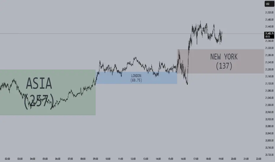
Session Opening Ranges [DB](Reuploaded with open source script)
A simple indicator that displays the 15 minute opening ranges of the Asia, London and New York trading sessions.
You can select how many days you want to display in total and also customise the colors of each session. The indicator is coded to NY time and should always display at the correct times, which are:
- 18:00 - 18:15 for Asia
- 03:00 - 03:15 for London
- 09:30 - 09:45 for New York
You can also choose to display the sessions name and/or range in points.
If you find any bugs let me know in the comments.
Enjoy!
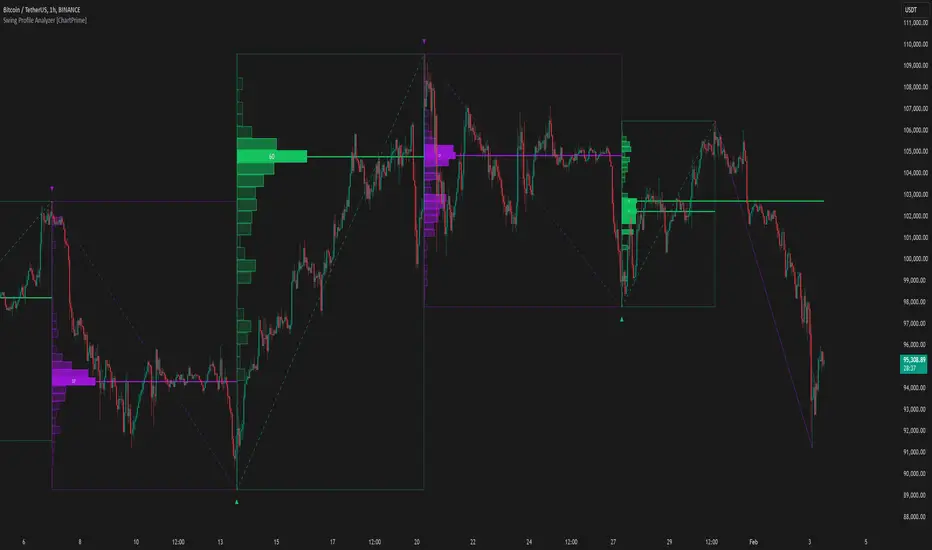
Swing Profile Analyzer [ChartPrime]Swing Profile Analyzer
The Swing Profile Analyzer is a comprehensive tool designed to provide traders with valuable insights into swing frequency profiles, enabling them to identify key price levels and areas of market interest.
⯁ KEY FEATURES
Swing Frequency Profiles
Automatically plots frequency profiles for each swing, highlighting price distribution and key levels of significance.
Point of Control (POC) Line
Marks the price level with the highest number of closes within a swing, acting as a key area for potential price reactions.
Customizable Trend Display
Allows users to toggle between displaying profiles for bullish swings, bearish swings, or both, offering tailored analysis.
Integrated ZigZag Lines
Visualizes swing highs and lows, providing a clear picture of market trends and reversals.
Dynamic Profile Visualization
Profiles are color-coded to indicate the frequency of closes, with the highest value bins distinctly marked for easy recognition.
Max Frequency Highlight
Displays numerical values for the most active price level within each profile, showing how many closes occurred at the peak bin.
Updates only after swing formed
Profiles and POC lines automatically appear after swing is done
⯁ HOW TO USE
Identify Critical Price Levels
Use the POC line and frequency distribution to locate levels where price is likely to react or consolidate.
Analyze Swing Characteristics
Observe swing profiles to understand the strength, duration, and behavior of market trends.
Plan Entries and Exits
Leverage significant price levels and high-frequency bins to make more informed trading decisions.
Focus on Specific Trends
Filter profiles to analyze bullish or bearish swings based on your trading strategy.
⯁ CONCLUSION
The Swing Profile Analyzer is an essential tool for traders seeking to understand price dynamics within market swings. By combining frequency profiles, POC levels, and trend visualization, it enhances your ability to interpret and act on market movements effectively.
Alpha Beta Gamma OscillatorThis momentum oscillator calculates three key ratios to analyze price position within a dynamic range:
1. **Alpha (Blue Line)**
`Alpha = (Current Close - Lowest Close) / Lookback Period`
Measures the absolute price elevation above the recent low, normalized by time. Represents raw upward momentum.
2. **Beta (Red/Blue Line)**
`Beta = (Highest Close - Lowest Close) / Lookback Period`
Calculates the normalized price range volatility over the period. Acts as a denominator for relative positioning.
3. **Gamma (Green/Red Line)**
`Gamma = Alpha / Beta`
Creates a 0-1 bounded oscillator showing relative position within the recent price range:
- 0 = At period's lowest close
- 1 = At period's highest close
- 0.5 = Midpoint of range
**Key Features:**
- Dynamic horizontal levels (default 15/85) for overbought/oversold zones
- Color-coded momentum direction:
- Beta turns red when expanding volatility
- Gamma turns green when strengthening momentum
- Candle visualization reinforces gamma's directional bias
- All calculations adapt automatically to the user-defined lookback period
**Interpretation Guide:**
- Gamma > 0.15 suggests overbought conditions
- Gamma < 0.85 indicates oversold territory
- Converging Alpha/Beta signals range contraction
- Gamma candles + line color alignment confirms trend strength
*Usage: Best applied to identify mean-reversion opportunities and confirm breakout/breakdown scenarios in ranging markets.*
---
This description maintains technical accuracy while being accessible to traders, with clear attribution to najoomi ji as the creator.

ATR stop lossPlots the stop loss level based on average true range (ATR) and a multiplier of choice (1 to 2.5, default is 1.5), subtracted from closing price.
Additions in this version:
You can now show percentage labels to help evaluate the level of risk.
The color of the plotted line and the text labels can be picked by the user.

Bollinger Bands + RSI [Uncle Sam Trading]The Bollinger Bands + RSI indicator combines two popular technical analysis tools, Bollinger Bands (BB) and the Relative Strength Index (RSI), into a unified framework designed to assess both market volatility and momentum. This indicator provides both visual signals on the chart, and allows you to set alerts. It is intended to help traders identify potential overbought/oversold conditions, trend reversals, and to refine trade entry and exit points.
Key Features:
Bollinger Bands: The indicator plots Bollinger Bands, which consist of a basis line (typically a 20-period Simple Moving Average), an upper band (basis + 2 standard deviations), and a lower band (basis - 2 standard deviations). The bands dynamically adjust to market volatility, widening during periods of increased volatility and contracting during periods of decreased volatility.
Relative Strength Index (RSI): The RSI, a momentum oscillator, is plotted in a separate pane below the price chart. It measures the magnitude of recent price changes to evaluate overbought or oversold conditions in the price of a stock or other asset. Traditional interpretation uses 70 and 30 as overbought and oversold levels, respectively.
Overbought/Oversold Zones Highlighting: This indicator uniquely highlights overbought and oversold zones directly on the price chart based on the RSI values. When the RSI is above the overbought level (default 70), a red-shaded area is displayed. When the RSI is below the oversold level (default 30), a green-shaded area is displayed. These visual cues enhance the identification of potential trend reversals.
Buy and Sell Signals: The indicator generates buy signals when the price crosses above the lower Bollinger Band and the RSI is below the oversold level (if the RSI filter is enabled). Sell signals are generated when the price crosses below the upper Bollinger Band and the RSI is above the overbought level (if the RSI filter is enabled). These signals are plotted as green upward-pointing triangles (buy) and red downward-pointing triangles (sell) on the chart.
Customizable Parameters: Users can adjust various settings, including:
Bollinger Bands Length: The number of periods used to calculate the moving average and standard deviation.
Bollinger Bands Standard Deviation: The multiplier used to determine the distance of the upper and lower bands from the basis.
RSI Length: The number of periods used to calculate the RSI.
RSI Overbought/Oversold Levels: The threshold values that define overbought and oversold conditions for the RSI.
Use RSI Filter for Signals: Enable/disable the RSI filter for buy and sell signals.
Colors: The colors of the Bollinger Bands, RSI, overbought/oversold levels, and zone highlights can be customized to suit user preferences.
Alerts: The indicator supports customizable alerts for various conditions, including:
Buy Signal: Triggered when a buy signal is generated.
Sell Signal: Triggered when a sell signal is generated.
Price Crossed Upper BB: Triggered when the price crosses above the upper Bollinger Band.
Price Crossed Lower BB: Triggered when the price crosses below the lower Bollinger Band.
RSI Overbought: Triggered when the RSI crosses above the overbought level.
RSI Oversold: Triggered when the RSI crosses below the oversold level.
How to Use:
The Bollinger Bands + RSI indicator can be used in various ways, including:
Identifying Potential Trend Reversals: Price crosses above the lower band coupled with an oversold RSI (and highlighted zone) may signal a bullish reversal. Conversely, a price cross below the upper band with an overbought RSI (and highlighted zone) may indicate a bearish reversal.
Confirming Trend Strength: In an uptrend, the price may "ride" the upper band, while in a downtrend, it may "ride" the lower band.
Exit Signals: Crossing the opposite band while in a trade, particularly with confirming RSI signals, is often used to identify potential exit points.
Combined with Other Analysis: This indicator works well in conjunction with other technical analysis tools, such as trend lines, support/resistance levels, chart patterns, and moving average-based strategies.
Disclaimer:
This indicator is for educational and informational purposes only and should not be considered as financial advice. Trading involves risk, and past performance is not indicative of future results. Always conduct thorough research and consider your risk tolerance before making any trading decisions.

[AlbaTherium] MTF Volatility Edge Zones Premium for Price Action Volatility Edge Zones Premium for Price Action (HTF)
The MTF Volatility Edge Zones Premium for Price Action is an advanced Multiple Timeframes (MTF) trading indicator that combines the power of volume analysis with price action, designed to reveal key volatility zones and assess market participants’ engagement levels . This tool offers unique insights into the dynamics of higher timeframes (HTF), helping traders identify critical zones of decision-making, such as potential reversals, continuations, or breakout areas.
Introduction to the MTF Volatility Edge Zones Premium
This indicator is built upon a deep understanding of the interaction between price action and volume. By mapping volume data onto price action, Volatility Edge Zones Premium (HTF) pinpoints areas of heightened market engagement. These zones represent where buyers and sellers have shown significant activity, allowing traders to identify market intent and anticipate key movements.
Key Features:
Higher Timeframe Analysis: Focuses on significant price and volume interactions over HTFs (e.g., 4H, Daily, Weekly) for a broader perspective on market trends.
Volatility Zones : Highlights areas where market participants show increased activity, signaling potential market turning points or strong continuations.
Volume-Driven Insights: Tracks the behavior of aggressive buyers and sellers, showing their engagement levels relative to price changes.
Overlayon Price Action: Provides a clear and actionable visual representation of volatility and engagement zones directly on price charts.
Chapter 1: Understanding Volatility and Engagement
1.1 Volatility Edge Zones
Volatility Edge Zones are areas where price and volume interact to signal potential changes in market direction or momentum. These zones are derived from high-volume clusters where significant market activity occurs.
1.2 Participant Engagement
Market participants can be categorized based on their level of engagement in these zones:
Aggressive Buyers: Represented by sharp spikes in volume and upward price action.
Aggressive Sellers: Represented by high volume during downward price movement.
Passive Participants: Identified in zones of consolidation or low volatility.
By isolating these behaviors, traders can gain a clearer picture of market sentiment and the relative strength of buyers versus sellers.
Chapter 2: The Principle of Volume and Price Interplay
2.1 Volume as a Leading Indicator
Volume often precedes price movements, and the Volatility Edge Zones Premium captures this relationship by overlaying volume activity onto price charts. This allows traders to:
Identify where volume supports price movement (trend confirmation).
Spot divergences where price moves without volume support (potential reversals).
2.2 The Role of Higher Timeframes
HTFs filter out market noise, revealing macro trends and key levels of engagement. The indicator uses this perspective to highlight long-term volatility zones, helping traders align their strategies with the broader market context.
Chapter 3: Visualizing Volatility Edge Zones
3.1 Color-Coded Zones for Engagement
The indicator uses a color-coded system to represent volatility zones and market engagement levels. These colors correspond to different market conditions:
Red Zones: High selling pressure and aggressive bearish activity.
Blue Zones: High buying pressure and aggressive bullish activity.
Yellow Zones: Transitional zones, representing indecision or balance between buyers and sellers.
White Zones: Neutral areas, where low engagement is observed but could serve as potential breakout points.
3.2 Key Metrics Tracked
Volume Clusters: Areas of concentrated buying or selling activity.
Directional Bias: Net buying or selling dominance.
Momentum Shifts: Sudden changes in volume relative to price action.
These metrics provide actionable insights into market dynamics, making it easier to predict key movements.
Chapter 4: Practical Applications in Trading
4.1 Identifying High-Impact Zones
By focusing on HTFs, traders can use the Volatility Edge Zones Premium to identify high-impact areas where market participants are most engaged. These zones often align with:
Support and Resistance Levels: High-volume areas that act as barriers or catalysts for price movement.
Breakout Points: Zones of heightened volatility where price is likely to escape consolidation.
4.2 Detecting Bull and Bear Campaigns
The indicator highlights early signs of bullish or bearish campaigns by analyzing volume surges in critical volatility zones. These campaigns often signal the beginning of significant trends.
Chapter 5: Real-World Examples and Strategies
5.1 Spotting Market Reversals
Real-world examples demonstrate how the indicator can identify volatility zones signaling potential reversals, allowing traders to enter positions early.
5.2 Riding the Trend
By tracking volatility zones in alignment with HTF trends, traders can maximize profit potential by entering during periods of high engagement and riding the trend until it weakens.
Conclusion
The MTF Volatility Edge Zones Premium for Price Action is an essential tool for traders looking to master market dynamics through a combination of volume and price action analysis. By focusing on higher timeframes and overlaying volatility zones onto price charts, this indicator provides unparalleled insights into market participant engagement.
Whether you’re trading intraday, swing, or long-term strategies, the MTF Volatility Edge Zones Premium equips you with the information needed to make confident and precise trading decisions. Stay tuned as we continue to enhance this tool for even greater accuracy and usability.

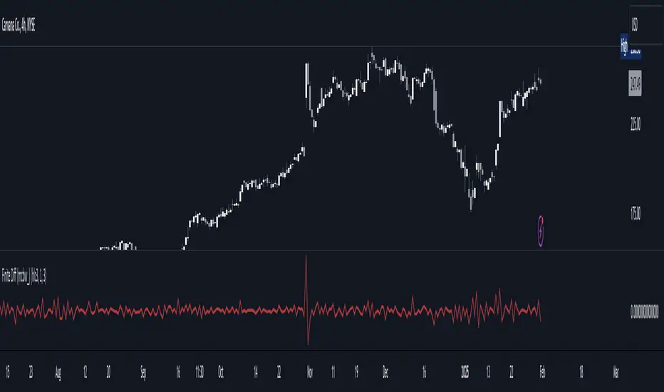
Finite Difference - Backward (mcbw_)In calculus there exists a 'derivative', which simply just measures the difference between two points on a curve. For well behaved mathematical functions there are infinitely many points and so there exists a derivative at every point. Where there are infinitely many points in a curve that curve is called 'continuous'. Continuous curves are very nice to deal with since each point on it exists almost exactly where its neighbors are. However, if the curve does not have infinitely many points on it, but instead has a finite number of points on it, that curve is called 'discrete' instead of continuous. Taking the derivative of discrete curves is much trickier business since there are none of the mathematical conveniences that a continuous offers. In the real world everything we measure is a discrete curve, including Price (since we measure it a finite number of times, aka each candlestick)!
The branch of Discrete Mathematics has found an approach to measure the derivative along a discrete curve, that approach is aptly called " Finite Difference ". To get a more accurate approximation of a discrete derivative, the finite difference approach uses weighted combinations of neighboring points. The most common type of finite difference is a 'central' difference, this uses a combination of points before and after the point of interest to approximate the discrete derivative. This is great for historical analysis but is not of much use for trading algorithms since it technically means using future prices to calculate the derivative of the current point. Instead we can use a less common variant called a ' Backwards Difference ' that only uses a combination of points before the current one to help approximate the current derivative.
In this script you can choose the " Order " of your derivative and the " Accuracy " of its approximation. This script is for educational purposes for folks building trading algorithms. Many trading algorithms often have an element of seeing how much Price has changed from the previous candle to the current candle. This approach is the lowest accuracy derivative possible, and using the backwards finite differences, made available for the first time on TradingView (!!), algorithms that use derivatives can now have higher orders of accuracy!
Happy Trading/Developing!
MomentumQ Momentum ROCMomentumQ Momentum Rate of Change (ROC) Indicator
The MomentumQ Momentum ROC Indicator is a powerful and user-friendly tool designed to measure the speed and strength of price momentum. By calculating the percentage change in price over a customizable period, this indicator helps traders identify trend shifts and market momentum with ease.
How It Works :
Rate of Change (ROC) Calculation :
Measures the percentage price change over a specified period (default: 14).
Helps traders determine whether an asset's momentum is increasing or decreasing.
Moving Average Smoothing :
A Simple Moving Average (SMA) is applied to the ROC for better trend visualization.
This helps filter out market noise and highlights sustained momentum trends.
Zero-Level Reference Line :
A dashed horizontal line at 0% provides a clear reference point for momentum shifts.
Above 0%: Indicates positive momentum (potential uptrend).
Below 0%: Indicates negative momentum (potential downtrend).
Key Features :
Customizable Input Parameters:
Adjust the ROC period (default: 14) to analyze short- or long-term momentum.
Modify the SMA period (default: 10) for smoother trend identification.
Intuitive Visualization :
Blue Line: Represents the Rate of Change (ROC) to track momentum shifts.
White Line: Represents the SMA of ROC, helping traders see long-term momentum.
Gray Dashed Line: A fixed reference at 0% for trend interpretation.
Momentum-Based Trading Signals :
Rising ROC: Increasing momentum, potential breakout.
Falling ROC: Weakening momentum, possible reversal.
ROC Crossing Zero: Signals a possible trend change.
User-Friendly Input Options :
Grouped settings menu for an intuitive setup experience.
Tooltips included to help traders understand each parameter.
Concepts and Calculations :
Momentum Rate of Change (ROC):
ROC = ((Close - Close ) / Close ) * 100
where n is the selected ROC period.
Simple Moving Average (SMA) of ROC :
Smooths ROC fluctuations for clearer trend insights.
How to Use :
Open the indicator settings.
Customize the ROC period (14 by default).
Enable and adjust the SMA period for smoothing (default: 10).
Analyze the plotted ROC and its SMA in relation to the zero line:
ROC > 0: Momentum is positive (uptrend).
ROC < 0: Momentum is negative (downtrend).
ROC rising or falling: Indicates strengthening or weakening momentum.
Use the insights to refine your entries and exits in trades.
Why It’s Useful :
Identifies Trend Strength – Helps detect early momentum shifts.
Confirms Trend Reversals – Zero-line crossovers can indicate changes in direction.
Works Across Multiple Markets – Stocks, Forex, Crypto, Commodities.
Customizable & Easy to Use – Adjustable settings for different strategies.
Use the MomentumQ Momentum ROC Indicator to gain deeper insights into market momentum and improve your trading decisions.

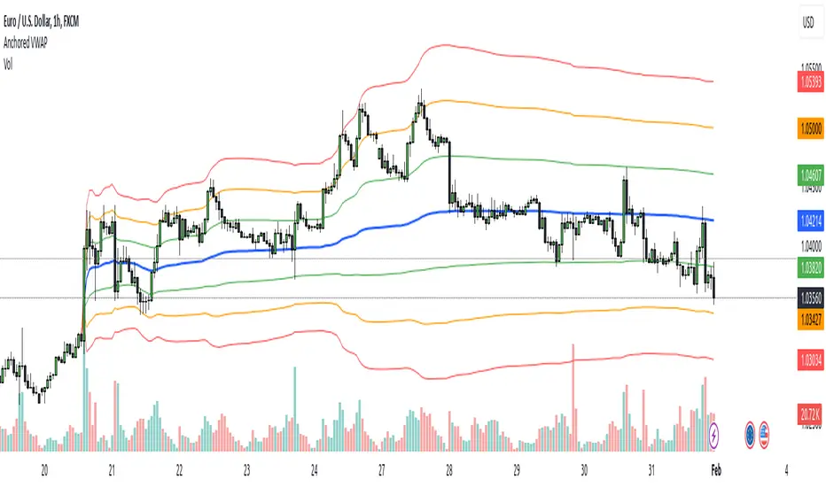
Anchored VWAPAnchored VWAP with 3 Standard Deviation Bands
📈 Version: Pine Script v5
📌 Author: Aymen Haddaji
🔍 Overview
This indicator calculates an Anchored Volume-Weighted Average Price (AVWAP), allowing traders to anchor the VWAP calculation from a user-defined date and time. It also plots three standard deviation bands above and below the AVWAP to help identify potential areas of overbought and oversold conditions.
📊 Features & Functionality
✔ Custom Anchor Point: Select a specific date and time to start the AVWAP calculation.
✔ OHLC/4 Calculation: Uses the average of Open, High, Low, and Close to smooth the price input.
✔ Three Standard Deviation Bands:
1st Deviation (Green): Moderate volatility zone.
2nd Deviation (Orange): High volatility zone.
3rd Deviation (Red): Extreme overbought/oversold areas.
✔ Real-Time Calculation: Updates dynamically with each price movement.
✔ Clear Visuals:
AVWAP (Blue Line) represents the fair market price from the anchor.
Deviation Bands (Dashed Lines) show potential support and resistance levels.
🛠 How It Works
VWAP Calculation
Uses a cumulative sum of price × volume divided by cumulative volume.
Calculation starts from the user-defined anchor time.
Standard Deviation Bands
Measures the price dispersion around the AVWAP.
The wider the bands, the higher the volatility.
When price touches or exceeds the 3rd deviation, a potential reversal zone is indicated.
Trading Strategies with AVWAP & Deviation Bands
Trend Confirmation:
Price above AVWAP = Uptrend (bullish).
Price below AVWAP = Downtrend (bearish).
Support & Resistance:
AVWAP acts as dynamic support or resistance.
1st & 2nd deviations often act as secondary levels.
Mean Reversion Trading:
When price reaches the 3rd standard deviation, a pullback is likely.
Breakout Confirmation:
A strong close above/below the 3rd deviation may indicate trend continuation.
⚙️ Input Settings
📍 Anchor Time: Allows you to set the exact date and time to start the AVWAP calculation.
🎯 Ideal For
✅ Intraday traders looking for short-term mean reversion plays.
✅ Swing traders identifying key support/resistance zones.
✅ Trend traders confirming long-term market direction.
✅ Volatility traders using standard deviation for trade entries.
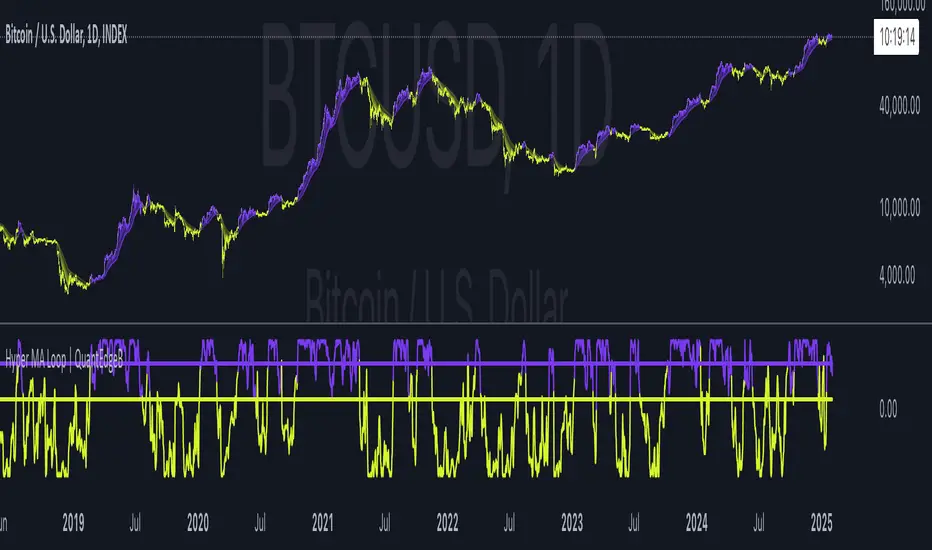
Hyper MA Loop | QuantEdgeBIntroducing Hyper MA Loop by QuantEdgeB
Hyper MA Loop | QuantEdgeB is an advanced trend-following indicator that leverages a custom Hyper Moving Average (HyMA) and an innovative loop-based scoring system to assess trend strength and direction. This tool is designed to provide a dynamic perspective on market momentum, allowing traders to capture trends effectively while filtering out market noise.
Key Features:
1. Hyper Moving Average (HyMA) 🟣
- A weighted moving average that enhances trend responsiveness by applying a custom
weight function.
- Ensures smoother trend detection while maintaining reactivity to price changes.
2. Loop-Based Trend Scoring 🔄
- Utilizes a for-loop function to analyze the movement of HyMA over a specified period.
- Compares current values to past values, generating a cumulative score indicating bullish or
bearish momentum.
- Dynamic thresholds adjust to market conditions for better trend filtering.
3. Threshold-Based Signal System ✅❌
- Long Signals: Triggered when the loop score exceeds the long threshold.
- Short Signals: Activated when the score falls below the short threshold.
- Avoids false signals by requiring sustained strength before confirming a trend.
4. Customizable Visualization & Colors 🎨
- Multiple color modes (Default, Solar, Warm, Cool, Classic) for tailored aesthetics.
- Extra plot options enhance visualization of market structure and volatility.
________
How It Works:
- HyMA Calculation : A unique moving average with a specialized weighting function to
smooth out price action.
- Loop Function : Iterates over past HyMA values, assessing whether price is consistently
higher or lower.
- Threshold Comparison : The loop score is compared against pre-set thresholds to
determine bullish or bearish conditions.
- Signal Generation :
1. Bullish (🔵): If the score crosses the long threshold
2. Bearish (🔴): If the score drops below the short threshold.
- Plotting & Styling : Dynamic candles and gradient overlays provide an intuitive
visualization of rend shifts.
________
Use Cases:
✅ Ideal for trend-following traders looking for solid trends confirmation.
✅ Helps filter out choppy market conditions by adjusting sensitivity dynamically.
✅ Works well with other indicators (e.g., ADX, volume-based filters) for added confirmation.
✅ Suitable for both short-term and long-term trend analysis.
________
Customization Options:
- Adjustable HyMA Length: Modify the responsiveness of the moving average. Default se to 2.
- For-Loop Parameters: Fine-tune how far back the trend analysis should consider. Default se to Start = 1 , End = -1.
- Thresholds for Long & Short: Control signal sensitivity to market fluctuations. Default set to Long = 40, Short = 8.
- Color Modes & Extra Plots: Personalize visualization for better clarity.
________
Conclusion:
The Hyper MA Loop | QuantEdgeB is a powerful, adaptive indicator that combines custom moving averages with loop-based trend analysis to deliver accurate, visually intuitive market signals. Whether you're looking to ride strong trends or filter out weak setups, this tool provides the precision and flexibility needed for effective decision-making. 🚀📈
🔹 Disclaimer: Past performance is not indicative of future results. No trading indicator can guarantee success in financial markets.
🔹 Strategic Consideration: As always, backtesting and strategic adjustments are essential to fully optimize this indicator for real-world trading. Traders should consider risk management practices and adapt settings to their specific market conditions and trading style.
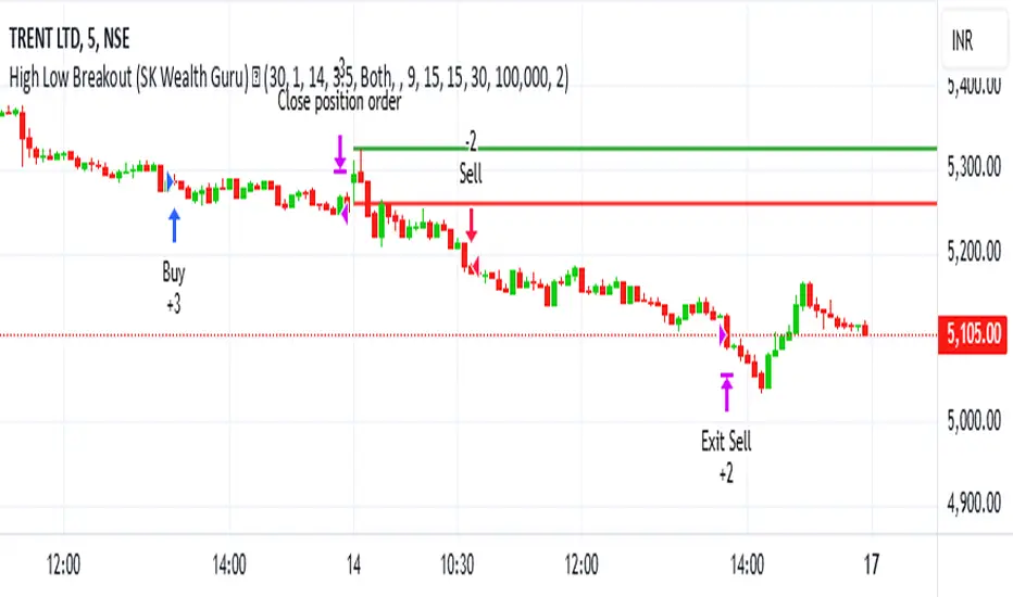
High-Low Breakout Strategy with ATR traling Stop LossThis script is a TradingView Pine Script strategy that implements a High-Low Breakout Strategy with ATR Trailing Stop.created by SK WEALTH GURU, Here’s a breakdown of its key components:
Features and Functionality
Custom Timeframe and High-Low Detection
Allows users to select a custom timeframe (default: 30 minutes) to detect high and low levels.
Tracks the high and low within a user-specified period (e.g., first 30 minutes of the session).
Draws horizontal lines for high and low, persisting for a specified number of days.
Trade Entry Conditions
Long Entry: If the closing price crosses above the recorded high.
Short Entry: If the closing price crosses below the recorded low.
The user can choose to trade Long, Short, or Both.
ATR-Based Trailing Stop & Risk Management
Uses Average True Range (ATR) with a multiplier (default: 3.5) to determine a dynamic trailing stop-loss.
Trades reset daily, ensuring a fresh start each day.
Trade Execution and Partial Profit Taking
Stop-loss: Default at 1% of entry price.
Partial profit: Books 50% of the position at 3% profit.
Max 2 trades per day: If the first trade hits stop-loss, the strategy allows one re-entry.
Intraday Exit Condition
All positions close at 3:15 PM to ensure no overnight risk.
Golden Ratio Oscillator (GRO)Here is a description for your Golden Ratio Oscillator (GRO) indicator:
Golden Ratio Oscillator (GRO) - Overview
The Golden Ratio Oscillator (GRO) is a powerful technical analysis tool that leverages the Golden Ratio (1.618) to smooth price action and generate a normalized momentum-based oscillator. By applying a Golden Ratio-based Exponential Moving Average (EMA), the indicator offers a unique way to analyze price trends, overbought/oversold conditions, and potential reversals.
How It Works
Golden Ratio Smoothing:
The indicator applies a smoothing function based on the Golden Ratio (Φ = 1.618) to the closing price.
This creates a dynamically smoothed price curve, reducing noise while maintaining responsiveness to price changes.
Normalization for Oscillation:
The smoothed price is normalized between -1 and 1, making it a bounded oscillator that fluctuates within a fixed range.
This allows traders to easily interpret overbought and oversold conditions.
Overbought & Oversold Levels:
The oscillator includes two key horizontal reference lines:
Overbought Level (+1.0) – Indicates potential reversal zones from bullish momentum.
Oversold Level (-1.0) – Suggests possible price bottoms and reversal opportunities.
The area between these levels is visually highlighted for better clarity.
How to Use the Indicator
Trend & Momentum Analysis:
When GRO is rising, it signals increasing bullish momentum.
When GRO is falling, it indicates weakening price action or bearish momentum.
Overbought & Oversold Zones:
A reading near +1.0 suggests the market is overbought and could face selling pressure.
A reading near -1.0 indicates an oversold condition, hinting at a potential buying opportunity.
Divergence Detection:
If price makes a new high, but GRO fails to confirm, it signals a potential bearish divergence (weakening trend).
If price makes a new low while GRO holds higher, it suggests bullish divergence (potential reversal).
Customizable Parameters:
Smoothing Length: Defines the responsiveness of the indicator (default: 14).
Overbought/Oversold Levels: Can be adjusted to fine-tune entry and exit points.
Why Use the Golden Ratio Oscillator?
✅ Golden Ratio-Based Smoothing: Reduces noise while maintaining trend sensitivity.
✅ Dynamic Normalization: Adapts to market conditions, making it more intuitive.
✅ Clear Overbought/Oversold Signals: Helps in spotting potential reversals with confidence.
✅ Versatile Trading Applications: Useful for trend confirmation, reversals, and divergence analysis.
