Timeframes: Why They’re Fundamentally Flawed (And What To Do)When analyzing price action, timeframes serve as a convenient lens through which traders attempt to make sense of the market. They help us categorize price movement — bullish , bearish , ranging , trending , and so on — within a structured framework. But here’s the reality: candlesticks themselves aren’t real . Much like clocks or calendars, they’re simply man-made constructs — tools we've invented to measure and scale something intangible: time . I know that might sound a bit abstract, but stay with me.
While traders commonly rely on standard timeframes like the Daily, 4H, 1H, 15M , etc., it’s important to recognize that price doesn’t conform to these rigid intervals. The market moves continuously, and the “spaces between” those timeframes — like a 27-minute or 3-hour chart — are just as real . These non-standard timeframes often offer better clarity depending on the speed and rhythm of the market at any given moment.
This begs the question: How do we keep up with this ever-shifting pace? Do we constantly toggle between similar timeframes to recalibrate our analysis? Do we measure volatility? Amplitude? Period length? There’s no clear consensus, which leads to inefficiency — and in trading, inefficiency costs.
In my view, the solution lies in blending multiple nearby timeframes into a single, adaptive framework . We need a representation of price action that adjusts automatically with the speed of the market. And the answer is surprisingly simple — literally . It’s called the Simple Moving Average (SMA) .
Think an SMA is just a line representing past highs, lows, or closes? It’s much more than that. When used creatively, the SMA becomes a dynamic lens that filters noise, reveals trend clarity, and smooths out irregularities in price behavior. Rather than relying on a single metric, we can combine multiple SMA variations — highs, lows, opens, closes — into one composite view of the market . This gives us a continuously adjusting snapshot of average price action.
Once we adopt this approach, everything starts to click.
• Engulfing patterns become more reliable
• Liquidity sweeps occur less frequently
• Supply and demand zones become more precise
• Market structure begins to make consistent sense
With SMA-based price action , our strategies don’t just become clearer — they become smarter .
Want to See It in Action?
If you’re interested in applying this concept to your own trading strategy, check out my TradingView profile: The_Forex_Steward . There, you’ll find the SMA Price Action indicator used in the examples shown, as well as tools that apply this methodology to:
• Supply and Demand
• Market Structure
• Market Balance Levels
• Velocity & Momentum
• And more to come!
If you found this idea helpful, be sure to follow the page. I’ll be releasing more exclusive indicators and trading concepts soon — so stay tuned!
Moving Averages
Sharing the advanced Bollinger Bands strategyHere are the Bollinger Band trading tips: *
📌 If you break above the upper band and then drop back down through it, confirm a short signal!
📌 If you drop below the lower band and then move back up through it, confirm a long signal!
📌 If you continue to drop below the middle band, add to your short position; if you break above the middle band, add to your long position!
Pretty straightforward, right? This means you won’t be waiting for the middle band to signal before acting; you’ll be ahead of the game, capturing market turning points!
Let’s break it down with some examples:
1. When Bitcoin breaks above the upper Bollinger Band, it looks strong, but quickly drops back below:
➡️ That’s a “bull trap”—time to go short!
2. If Bitcoin crashes below the lower band and then pops back up:
➡️ Bears are running out of steam—time to go long and grab that rebound!
3. If the price keeps moving above the middle band:
➡️ Add to your long or short positions to ride the trend without being greedy or hesitant.
Why is this method powerful?
It combines “edge recognition + trend confirmation” for double protection:
1. Edge Recognition—spot the turning point and act early.
2. Trend Confirmation—wait for the middle band breakout and then confidently add positions!
You won’t be reacting after the fact; you’ll be ahead of the curve, increasing your positions in the trend’s middle and locking in profits at the end. This is the rhythm of professional traders and the core logic of systematic profits!
Who is this method for?
- You want precise entry and exit points.
- You’re tired of “chasing highs and cutting losses.”
- You want a clear, executable trading system.
- You want to go from “I see the chart but don’t act” to “I see the signal and take action.”
Follow for more. Make sure to like this if you found it useful.

Golden Cross vs. Death Cross: What Do They Really Tell Us?Hello, traders! 🤝🏻
It’s hard to scroll through a crypto newsfeed without spotting a headline screaming about a “Golden Cross” forming on Bitcoin or warning of an ominous “Death Cross” approaching. But what do these classic MA signals can really mean? Are they as prophetic as they sound, or is there more nuance to the story? Let’s break it down.
📈 The Basics: What Are Golden and Death Crosses?
At their core, both patterns are simple moving average crossovers. They occur when two moving averages — typically the 50-day and the 200-day — cross paths on a chart.
Golden Cross: When the 50-day MA crosses above the 200-day MA, signaling a potential shift from a bearish phase to a bullish trend. It's often seen as a sign of renewed strength and a long-term uptrend.
Death Cross: When the 50-day MA crosses below the 200-day MA, suggesting a possible transition from bullish to bearish, hinting at extended downside pressure.
📊 Why They Work (and When They Don't)
In theory, the idea is simple: The 50-day MA represents shorter-term sentiment, while the 200-day MA captures longer-term momentum. When short-term price action overtakes long-term averages, it’s seen as a bullish signal (golden cross). When it drops below, it’s bearish (death cross).
This highlights a key point: moving average crossover signals are inherently delayed. They’re based on historical data, so they can’t predict future price moves in real time.
🔹 October 2020: Golden Cross
On the weekly BTC/USDT chart, we can clearly see a Golden Cross forming in October 2020. The 50-week MA (short-term) crossed above the 200-week MA (long-term), marking the start of Bitcoin's explosive rally from around $11,000 to its then all-time high above $60,000 in 2021. This signal aligned with growing institutional interest and the post-halving narrative, reinforcing the bull case.
🔹 June 2021: Death Cross
Just months after Bitcoin’s peak, a Death Cross emerged around June 2021, near the $35,000 mark. However, this was more of a lagging signal: by the time it appeared, the sharp pullback from $60K+ had already taken place. Interestingly, the market stabilized not long after, with a recovery above $50K later that year, showing that Death Cross signals aren’t always the end of the story.
🔹 Mid-2022: Another Death Cross
In mid-2022, BTC formed another Death Cross during its prolonged bear market. This one aligned better with the broader trend, as price continued to slide towards $15,000, reflecting macro pressures like tightening monetary policies and the collapse of major players in the crypto space.
🔹 Early 2024: Golden Cross Comeback
The most recent Golden Cross appeared in early 2024, signaling renewed bullish momentum. This crossover preceded a significant rally, pushing Bitcoin above $100,000 by mid-2025, as seen in your chart. While macro factors (like ETF approvals or regulatory clarity) also played a role, this MA signal coincided with a notable shift in sentiment.
⚙️ Golden Cross ≠ Guaranteed Rally, Death Cross ≠ Doom
While these MA crossovers are clean and appealing, they’re not foolproof. Their lagging nature means they often confirm trends rather than predict them. For example, in June 2021, the Death Cross appeared after much of the selling pressure had already played out. Conversely, in October 2020 and early 2024, the Golden Crosses aligned with genuine upward shifts.
🔍 Why Care About These Signals?
Because they help us contextualize market sentiment. The golden cross and death cross reflect collective trader psychology — optimism and fear. But to truly understand them, we need to combine them with volume, market structure, and macro narratives.
So, are golden crosses and death crosses reliable signals, or just eye-catching headlines?
Your chart tells us both stories: sometimes they work, sometimes they mislead. What’s your take? Do you use these MA signals in your trading, or do you prefer other methods? Let’s discuss below!

Two MAs, One Ribbon: A Smarter Way to Trade TrendsSome indicators aim to simplify. Others aim to clarify. The RedK Magic Ribbon does both, offering a clean, color-coded visualization of trend strength and agreement between two custom moving averages. Built by RedKTrader , this tool is ideal for traders who want to stay aligned with the trend and avoid the noise.
Let’s break down how it works, how we use it at Xuantify, and how it can enhance your trend-following setups.
🔍 What Is the RedK Magic Ribbon?
This indicator combines two custom moving averages:
CoRa Wave – A fast, Compound Ratio Weighted Average
RSS_WMA (LazyLine) – A slow, Smooth Weighted MA
When both lines agree on direction, the ribbon fills with:
Green – Bullish trend
Red – Bearish trend
Gray – No-trade zone (disagreement or consolidation)
Key Features:
Visual trend confirmation
No-trade zones clearly marked
Customizable smoothing and length
Works on any timeframe
🧠 How We Use It at Xuantify
We use the Magic Ribbon as a trend filter and visual guide .
1. Trend Confirmation
We only trade in the direction of the ribbon fill. Gray zones = no trades.
2. Entry Timing
We enter near the RSS_WMA (LazyLine) for optimal risk-reward. It also acts as a dynamic stop-loss guide.
🎨 Visual Cues That Matter
Green Fill – Trend is up, both MAs agree
Red Fill – Trend is down, both MAs agree
Gray Fill – No-trade zone, MAs disagree
This makes it easy to:
Avoid choppy markets
Stay aligned with the dominant trend
Spot early trend shifts
⚙️ Settings That Matter
Adjust CoRa Wave length and smoothness
Tune RSS_WMA to track price with minimal lag
Customize colors, line widths, and visibility
🧩 Best Combinations with This Indicator
We pair the Magic Ribbon with:
Structure Tools – BOS/CHOCH for context
MACD 4C – For momentum confirmation
Volume Profile – To validate breakout strength
Fair Value Gaps (FVGs) – For sniper entries
⚠️ What to Watch Out For
This is a confirmation tool , not a signal generator. Use it with structure and price action. Always backtest and adjust settings to your asset and timeframe.
🚀 Final Thoughts
If you want a clean, intuitive way to stay on the right side of the trend, the RedK Magic Ribbon is a powerful visual ally. It helps you avoid indecision and focus on high-probability setups.
What really sets the Magic Ribbon apart is the precision of its fast line—the CoRa Wave. It reacts swiftly to price action and often aligns almost perfectly with pivot reversals. This responsiveness allows traders to spot potential turning points early, giving them a valuable edge in timing entries or exits. Its accuracy in identifying momentum shifts makes it not just a trend filter, but a powerful tool for anticipating market moves with confidence.
Try it, tweak it, and let the ribbon guide your trades.

Engineering the Hull‑style Exponential Moving Average (HEMA)▶️ Introduction
Hull’s Moving Average (HMA) is beloved because it offers near–zero‑lag turns while staying remarkably smooth. It achieves this by chaining *weighted* moving averages (WMAs), which are finite‑impulse‑response (FIR) filters. Unfortunately, FIR filters demand O(N) storage and expensive rolling calculations. The goal of the Hull‑style Exponential Moving Average (HEMA) is therefore straightforward: reproduce HMA’s responsiveness with the constant‑time efficiency of an EMA, an infinite‑impulse‑response (IIR) filter that keeps only two state variables regardless of length.
▶️ From FIR to IIR – What Changes?
When we swap a WMA for an EMA we trade a hard‑edged window for an exponential decay. This swap creates two immediate engineering challenges. First, the EMA’s centre of mass (CoM) lies closer to the present than the WMA of the same “period,” so we must tune its alpha to match the WMA’s effective lag. Second, the exponential tail never truly dies; left unchecked it can restore some of the lag we just removed. The remedy is to shorten the EMA’s time‑constant and apply a lighter finishing smoother. If done well, the exponential tail becomes imperceptible while the update cost collapses from O(N) to O(1).
▶️ Dissecting the Original HMA
HMA(N) is constructed in three steps:
Compute a *slow* WMA of length N.
Compute a *fast* WMA of length N/2, double it, then subtract the slow WMA. This “2 × fast − slow” operation annihilates the first‑order lag term in the transfer function.
Pass the result through a short WMA of length √N, whose only job is to tame the mid‑band ripple introduced by step 2.
Because the WMA window hard‑cuts, everything after bar N carries zero weight, yielding a razor‑sharp response.
▶️ Re‑building Each Block with EMAs
1. Slow leg .
We choose αₛ = 3 / (2N − 1) .
This places the EMA’s CoM exactly one bar ahead of the WMA(N) CoM, preserving the causal structure while compensating for the EMA’s lingering tail.
2. Fast leg .
John Ehlers showed that two single‑pole filters can cancel first‑order phase error if they keep the ratio τ𝑓 = ln2 / (1 + ln2) ≈ 0.409 τₛ .
We therefore compute α𝑓 = 1 − e^(−λₛ / 0.409) ,
where λₛ = −ln(1 − αₛ).
3. Zero‑lag blend .
Instead of Hull’s integer 2/−1 pair we adopt Ehlers’ fractional weights:
(1 + ln 2) · EMA𝑓 − ln 2 · EMAₛ .
This pair retains unity DC gain and maintains the zero‑slope condition while drastically flattening the pass‑band bump.
4. Finishing smoother .
The WMA(√N) in HMA adds roughly one and a half bars of consequential delay. Because EMAs already smear slightly, we can meet the same lag budget with an EMA whose span is only √N / 2. The lighter pole removes residual high‑frequency noise without re‑introducing noticeable lag.
▶️ Error Budget vs. Classical HMA
Quantitatively, HEMA tracks HMA to within 0.1–0.2 bars on the first visible turn for N between 10 and 50. Overshoot at extreme V‑turns is 25–35 % smaller because the ln 2 weighting damps the 0.2 fs gain peak. Root‑mean‑square ripple inside long swings falls by roughly 15–20 %. The penalty is a microscopic exponential tail: in a 300‑bar uninterrupted trend HEMA trails HMA by about two bars—visually negligible for most chart horizons but easily fixed by clipping if one insists on absolute truncation.
▶️ Practical Evaluation
Side‑by‑side plots confirm the math. On N = 20 the yellow HEMA line flips direction in the same candle—or half a candle earlier—than the blue HMA, while drawing a visibly calmer trace through the mid‑section of each swing. On tiny windows (N ≤ 8) you may notice a hair more shimmer because the smoother’s span approaches one bar, but beyond N = 10 the difference disappears. More importantly, HEMA updates with six scalar variables; HMA drags two or three rolling arrays for every WMA it uses. On a portfolio of 500 instruments that distinction is the difference between comfortable real‑time and compute starvation.
▶️ Conclusion
HEMA is not a casual “replace W with E” hack. It is a deliberate reconstruction: match the EMA’s centre of mass to the WMA it replaces, preserve zero‑lag geometry with the ln 2 coefficient pair, and shorten the smoothing pole to offset the EMA tail. The reward is an indicator that delivers Hull‑grade responsiveness and even cleaner mid‑band behaviour while collapsing memory and CPU cost to O(1). For discretionary traders wedded to the razor‑sharp V‑tips of the original Hull, HMA remains attractive. For algorithmic desks, embedded systems, or anyone streaming thousands of symbols, HEMA is the pragmatic successor—almost indistinguishable on the chart, orders of magnitude lighter under the hood.

Color Your Trades: MACD 4C vs the Classic📊 Coloring Momentum: Comparing Standard MACD vs MACD 4C
Momentum indicators are a trader’s compass—but not all compasses are created equal. In this post, we compare the classic MACD with the visually enhanced MACD 4C , a four-color histogram tool that adds clarity and nuance to trend and momentum analysis.
Let’s break down how both tools work, how we use them at Xuantify, and how you can decide which one fits your strategy best.
🔍 What Are These Indicators?
Standard MACD (Moving Average Convergence Divergence) is a time-tested momentum indicator that plots the difference between two EMAs (typically 12 and 26) and a signal line (usually a 9 EMA of the MACD line). It’s simple, effective, and widely used.
MACD 4C , developed by vkno422 , builds on the classic MACD by introducing a four-color histogram and divergence detection , making it easier to interpret momentum shifts and trend strength visually.
Key Differences:
Standard MACD: Two lines + histogram (single color)
MACD 4C: Histogram only, but with four colors to show trend strength and direction
MACD 4C includes bullish/bearish divergence detection
🧠 How We Use Them at Xuantify
We use both indicators—but for different purposes.
1. Standard MACD – Clean Confirmation
We use it for classic trend confirmation and crossover signals . It’s great for traders who prefer minimalism and are comfortable interpreting line-based momentum.
2. MACD 4C – Visual Momentum Clarity
We use MACD 4C when we want a more intuitive, color-coded view of momentum. The four-color histogram helps us quickly spot trend strength, exhaustion, and divergence.
🧭 Color Coding in MACD 4C
MACD 4C uses four histogram colors (default settings):
Lime/Green : Bullish momentum building or continuing
Red/Maroon : Bearish momentum building or continuing
This makes it easier to:
Spot momentum shifts
Identify trend continuation
Detect divergence at a glance
⚙️ Settings That Matter
Both indicators allow customization, but MACD 4C offers more visual tuning:
MACD 4C:
Adjustable fast/slow MA and signal smoothing
Toggle divergence detection
Color-coded histogram for quick reads
Standard MACD:
Clean, minimal, and widely supported
Best for traders who prefer traditional setups
🔗 Best Combinations with These Indicators
We combine MACD tools with:
Structure Tools – BOS/CHOCH for context
Liquidity Zones – To spot where momentum may reverse
Volume Profile – To confirm strength behind moves
Fair Value Gaps (FVGs) – For precision entries
⚠️ What to Watch Out For
Both indicators are lagging by nature—they rely on moving averages. MACD 4C’s divergence detection can help anticipate reversals, but it’s still best used as a confirmation tool , not a standalone signal.
🔁 Repainting Behavior
Both the standard MACD and MACD 4C are non-repainting . Once a histogram bar or crossover is printed, it remains fixed. This makes them reliable for real-time trading and backtesting .
⏳ Lagging or Leading?
These are lagging indicators , designed to confirm trends—not predict them. MACD 4C’s divergence feature adds a leading element , but it should always be used with structure and price action for confirmation.
🚀 Final Thoughts
If you’re a visual trader who wants more clarity from your momentum tools, MACD 4C is a powerful upgrade. If you prefer simplicity and tradition, the standard MACD still holds its ground.
Try both, test them in your strategy, and see which one sharpens your edge.

Why Your EMA Isn't What You Think It IsMany new traders adopt the Exponential Moving Average (EMA) believing it's simply a "better Simple Moving Average (SMA)". This common misconception leads to fundamental misunderstandings about how EMA works and when to use it.
EMA and SMA differ at their core. SMA use a window of finite number of data points, giving equal weight to each data point in the calculation period. This makes SMA a Finite Impulse Response (FIR) filter in signal processing terms. Remember that FIR means that "all that we need is the 'period' number of data points" to calculate the filter value. Anything beyond the given period is not relevant to FIR filters – much like how a security camera with 14-day storage automatically overwrites older footage, making last month's activity completely invisible regardless of how important it might have been.
EMA, however, is an Infinite Impulse Response (IIR) filter. It uses ALL historical data, with each past price having a diminishing - but never zero - influence on the calculated value. This creates an EMA response that extends infinitely into the past—not just for the last N periods. IIR filters cannot be precise if we give them only a 'period' number of data to work on - they will be off-target significantly due to lack of context, like trying to understand Game of Thrones by watching only the final season and wondering why everyone's so upset about that dragon lady going full pyromaniac.
If we only consider a number of data points equal to the EMA's period, we are capturing no more than 86.5% of the total weight of the EMA calculation. Relying on he period window alone (the warm-up period) will provide only 1 - (1 / e^2) weights, which is approximately 1−0.1353 = 0.8647 = 86.5%. That's like claiming you've read a book when you've skipped the first few chapters – technically, you got most of it, but you probably miss some crucial early context.
▶️ What is period in EMA used for?
What does a period parameter really mean for EMA? When we select a 15-period EMA, we're not selecting a window of 15 data points as with an SMA. Instead, we are using that number to calculate a decay factor (α) that determines how quickly older data loses influence in EMA result. Every trader knows EMA calculation: α = 1 / (1+period) – or at least every trader claims to know this while secretly checking the formula when they need it.
Thinking in terms of "period" seriously restricts EMA. The α parameter can be - should be! - any value between 0.0 and 1.0, offering infinite tuning possibilities of the indicator. When we limit ourselves to whole-number periods that we use in FIR indicators, we can only access a small subset of possible IIR calculations – it's like having access to the entire RGB color spectrum with 16.7 million possible colors but stubbornly sticking to the 8 basic crayons in a child's first art set because the coloring book only mentioned those by name.
For example:
Period 10 → alpha = 0.1818
Period 11 → alpha = 0.1667
What about wanting an alpha of 0.17, which might yield superior returns in your strategy that uses EMA? No whole-number period can provide this! Direct α parameterization offers more precision, much like how an analog tuner lets you find the perfect radio frequency while digital presets force you to choose only from predetermined stations, potentially missing the clearest signal sitting right between channels.
Sidenote: the choice of α = 1 / (1+period) is just a convention from 1970s, probably started by J. Welles Wilder, who popularized the use of the 14-day EMA. It was designed to create an approximate equivalence between EMA and SMA over the same number of periods, even thought SMA needs a period window (as it is FIR filter) and EMA doesn't. In reality, the decay factor α in EMA should be allowed any valye between 0.0 and 1.0, not just some discrete values derived from an integer-based period! Algorithmic systems should find the best α decay for EMA directly, allowing the system to fine-tune at will and not through conversion of integer period to float α decay – though this might put a few traditionalist traders into early retirement. Well, to prevent that, most traditionalist implementations of EMA only use period and no alpha at all. Heaven forbid we disturb people who print their charts on paper, draw trendlines with rulers, and insist the market "feels different" since computers do algotrading!
▶️ Calculating EMAs Efficiently
The standard textbook formula for EMA is:
EMA = CurrentPrice × alpha + PreviousEMA × (1 - alpha)
But did you know that a more efficient version exists, once you apply a tiny bit of high school algebra:
EMA = alpha × (CurrentPrice - PreviousEMA) + PreviousEMA
The first one requires three operations: 2 multiplications + 1 addition. The second one also requires three ops: 1 multiplication + 1 addition + 1 subtraction.
That's pathetic, you say? Not worth implementing? In most computational models, multiplications cost much more than additions/subtractions – much like how ordering dessert costs more than asking for a water refill at restaurants.
Relative CPU cost of float operations :
Addition/Subtraction: ~1 cycle
Multiplication: ~5 cycles (depending on precision and architecture)
Now you see the difference? 2 * 5 + 1 = 11 against 5 + 1 + 1 = 7. That is ≈ 36.36% efficiency gain just by swapping formulas around! And making your high school math teacher proud enough to finally put your test on the refrigerator.
▶️ The Warmup Problem: how to start the EMA sequence right
How do we calculate the first EMA value when there's no previous EMA available? Let's see some possible options used throughout the history:
Start with zero : EMA(0) = 0. This creates stupidly large distortion until enough bars pass for the horrible effect to diminish – like starting a trading account with zero balance but backdating a year of missed trades, then watching your balance struggle to climb out of a phantom debt for months.
Start with first price : EMA(0) = first price. This is better than starting with zero, but still causes initial distortion that will be extra-bad if the first price is an outlier – like forming your entire opinion of a stock based solely on its IPO day price, then wondering why your model is tanking for weeks afterward.
Use SMA for warmup : This is the tradition from the pencil-and-paper era of technical analysis – when calculators were luxury items and "algorithmic trading" meant your broker had neat handwriting. We first calculate an SMA over the initial period, then kickstart the EMA with this average value. It's widely used due to tradition, not merit, creating a mathematical Frankenstein that uses an FIR filter (SMA) during the initial period before abruptly switching to an IIR filter (EMA). This methodology is so aesthetically offensive (abrupt kink on the transition from SMA to EMA) that charting platforms hide these early values entirely, pretending EMA simply doesn't exist until the warmup period passes – the technical analysis equivalent of sweeping dust under the rug.
Use WMA for warmup : This one was never popular because it is harder to calculate with a pencil - compared to using simple SMA for warmup. Weighted Moving Average provides a much better approximation of a starting value as its linear descending profile is much closer to the EMA's decay profile.
These methods all share one problem: they produce inaccurate initial values that traders often hide or discard, much like how hedge funds conveniently report awesome performance "since strategy inception" only after their disastrous first quarter has been surgically removed from the track record.
▶️ A Better Way to start EMA: Decaying compensation
Think of it this way: An ideal EMA uses an infinite history of prices, but we only have data starting from a specific point. This creates a problem - our EMA starts with an incorrect assumption that all previous prices were all zero, all close, or all average – like trying to write someone's biography but only having information about their life since last Tuesday.
But there is a better way. It requires more than high school math comprehension and is more computationally intensive, but is mathematically correct and numerically stable. This approach involves compensating calculated EMA values for the "phantom data" that would have existed before our first price point.
Here's how phantom data compensation works:
We start our normal EMA calculation:
EMA_today = EMA_yesterday + α × (Price_today - EMA_yesterday)
But we add a correction factor that adjusts for the missing history:
Correction = 1 at the start
Correction = Correction × (1-α) after each calculation
We then apply this correction:
True_EMA = Raw_EMA / (1-Correction)
This correction factor starts at 1 (full compensation effect) and gets exponentially smaller with each new price bar. After enough data points, the correction becomes so small (i.e., below 0.0000000001) that we can stop applying it as it is no longer relevant.
Let's see how this works in practice:
For the first price bar:
Raw_EMA = 0
Correction = 1
True_EMA = Price (since 0 ÷ (1-1) is undefined, we use the first price)
For the second price bar:
Raw_EMA = α × (Price_2 - 0) + 0 = α × Price_2
Correction = 1 × (1-α) = (1-α)
True_EMA = α × Price_2 ÷ (1-(1-α)) = Price_2
For the third price bar:
Raw_EMA updates using the standard formula
Correction = (1-α) × (1-α) = (1-α)²
True_EMA = Raw_EMA ÷ (1-(1-α)²)
With each new price, the correction factor shrinks exponentially. After about -log₁₀(1e-10)/log₁₀(1-α) bars, the correction becomes negligible, and our EMA calculation matches what we would get if we had infinite historical data.
This approach provides accurate EMA values from the very first calculation. There's no need to use SMA for warmup or discard early values before output converges - EMA is mathematically correct from first value, ready to party without the awkward warmup phase.
Here is Pine Script 6 implementation of EMA that can take alpha parameter directly (or period if desired), returns valid values from the start, is resilient to dirty input values, uses decaying compensator instead of SMA, and uses the least amount of computational cycles possible.
// Enhanced EMA function with proper initialization and efficient calculation
ema(series float source, simple int period=0, simple float alpha=0)=>
// Input validation - one of alpha or period must be provided
if alpha<=0 and period<=0
runtime.error("Alpha or period must be provided")
// Calculate alpha from period if alpha not directly specified
float a = alpha > 0 ? alpha : 2.0 / math.max(period, 1)
// Initialize variables for EMA calculation
var float ema = na // Stores raw EMA value
var float result = na // Stores final corrected EMA
var float e = 1.0 // Decay compensation factor
var bool warmup = true // Flag for warmup phase
if not na(source)
if na(ema)
// First value case - initialize EMA to zero
// (we'll correct this immediately with the compensation)
ema := 0
result := source
else
// Standard EMA calculation (optimized formula)
ema := a * (source - ema) + ema
if warmup
// During warmup phase, apply decay compensation
e *= (1-a) // Update decay factor
float c = 1.0 / (1.0 - e) // Calculate correction multiplier
result := c * ema // Apply correction
// Stop warmup phase when correction becomes negligible
if e <= 1e-10
warmup := false
else
// After warmup, EMA operates without correction
result := ema
result // Return the properly compensated EMA value
▶️ CONCLUSION
EMA isn't just a "better SMA"—it is a fundamentally different tool, like how a submarine differs from a sailboat – both float, but the similarities end there. EMA responds to inputs differently, weighs historical data differently, and requires different initialization techniques.
By understanding these differences, traders can make more informed decisions about when and how to use EMA in trading strategies. And as EMA is embedded in so many other complex and compound indicators and strategies, if system uses tainted and inferior EMA calculatiomn, it is doing a disservice to all derivative indicators too – like building a skyscraper on a foundation of Jell-O.
The next time you add an EMA to your chart, remember: you're not just looking at a "faster moving average." You're using an INFINITE IMPULSE RESPONSE filter that carries the echo of all previous price actions, properly weighted to help make better trading decisions.
EMA done right might significantly improve the quality of all signals, strategies, and trades that rely on EMA somewhere deep in its algorithmic bowels – proving once again that math skills are indeed useful after high school, no matter what your guidance counselor told you.

RSI 101: The Secret of RSI’s WMA45 Line and How to Use ItIn my trading method, I use the WMA45 line together with RSI to help spot the trend more clearly.
Today, I’ll share with you how it works and how to apply it — whether you're doing scalping or swing trading.
Why WMA45?
WMA (Weighted Moving Average) is a type of moving average where recent prices are given more importance.
WMA45 simply means it takes the average of the last 45 candles (could be 45 minutes, 45 hours, or 45 days depending on your chart).
Because it moves slower than RSI, it helps reduce the “noise” and gives you a better idea of the real trend.
This idea is not new — many traders have tested RSI strategies also use this line. I just applied and adjusted it in my own way.
👉 How to set it up on TradingView (very simple):
What WMA45 Tells You
Trending
This line shows you the overall direction of the market:
📉 If WMA45 is going down, the price is likely going down.
📈 If WMA45 is going up, the price is likely going up.
Also, the steeper the line, the stronger the trend is:
Looking at the example above, the WMA45 line starts from the same level in two different phases, but the slope is different. The steeper line shows a larger price range.
This happens because the price was more volatile, which caused the RSI to move more sharply, and that, in turn, made the WMA45 slope steeper.
In multi-timeframe analysis, when the trend on the higher timeframe is strong (shown by a steep WMA45 line), the RSI on the lower timeframe will usually move within a tighter range and react more accurately to key levels.
If you’re not sure what these key RSI levels are, check out my previous post here:
For example, in a strong downtrend on H1, RSI on M5 might not even reach 50:
✅ What does this mean for trading?
Use WMA45 on higher timeframes to define trend bias.
On lower timeframes, watch RSI responses at key zones for optimal entries.
When holding positions, WMA45 helps determine whether to stay in the trade.
Moving Sideways
Here’s something important to note: when WMA45 is flat, RSI will keep crossing back and forth over it.
Depending on where WMA45 is flat, RSI tends to move within that range and creates different sideways price patterns. Here are the main types:
Around 50 → price moves in a box: According to RSI theory, the 50 level is the balance between buyers and sellers. RSI fluctuating around this causes price to move sideways in a rectangular box range.
Above 50 → price goes up in a rising channel: Above 50 is where buyers dominate sellers. RSI operating in this zone will continually create bullish candles pushing the price upward.
Below 50 → price goes down in a falling channel: Below 50 is where sellers dominate buyers. RSI in this zone will consistently form lower highs and lower lows, pushing the price downward.
Trend Reversal of WMA45
WMA45 is calculated from the average of 45 candles, so it's almost impossible for it to reverse direction suddenly. When it's sloping (trending), it takes time for RSI to fluctuate enough to "flatten" it before it can reverse.
As shown in the example, after WMA45 slopes up, before it turns downward, RSI must cross back and forth through it to reduce the steepness => flatten it => then reverse.
Does this align with Dow Theory? It represents the phases: Trend > Sideway > Trend. Sideway is when the WMA45 line is flattened.
✅ What does this mean for trading?
After a trend forms, if you want to enter a counter-trend trade, patiently wait for WMA45 to flatten to confirm the previous trend has ended.
Dynamic Support and Resistance
In addition to being a trend indicator for RSI, WMA45 also serves as a dynamic support/resistance level for RSI.
You will often observe RSI reacting when it encounters the WMA45 line.
In an uptrend, WMA45 acts as support for RSI.
In a downtrend, WMA45 acts as resistance for RSI.
Notably, if the reactions occur at higher RSI values, the resulting price support is stronger. Conversely, if reactions happen at lower RSI values, the price is pushed down further.
In the above example, in the first reaction around RSI 60s, RSI dropped by 9.6 points and price dropped by 12 points. In the second reaction at RSI 40s, RSI dropped similarly, but the price dropped by 25 points.
✅ What does this mean for trading?
You can use WMA45 as an entry zone for your trade: Wait for reactions with WMA45 on the higher timeframe, then switch to a lower timeframe to find a trade entry.
Use WMA45 as a take-profit or stop-loss level: For a short trade near WMA45, you can stop out if RSI crosses above it.
When monitoring these reactions, pay attention to the number of reactions—more reactions require more caution in trading.
Some Trade Setups Using WMA45 and RSI
1. Intraday trading
Trend: Follow the trend on the H1 chart.
Entry zone: At WMA45 of H1.
Entry confirmation: 2 methods:
On M5: when WMA45 of RSI is already flattened, and RSI has crossed above WMA45.
On M5: when a divergence appears in RSI.
2. Scalping
With the RSI’s reaction to WMA45, even on smaller timeframes (M1, M5), you can scalp when RSI touches WMA45.
When WMA45 has a slope and RSI returns to touch it, you can enter a trade with SL behind the candle close (10–20 pips to avoid stop hunts and spread), and TP to the nearest peak.
As mentioned, the first touch gives the best reaction.
My trading system is entirely based on RSI, feel free to follow me for technical analysis and discussions using RSI.

MACD: More Than Just a Crossover ToolHello, traders! 🔥
The MACD (Moving Average Convergence Divergence) indicator is one of the most trusted tools in technical analysis — but often one of the most oversimplified. While many traders focus on signal line crossovers, the real power of MACD lies in its ability to visualize market momentum, subtle shifts in trend strength, and early signs of potential reversals.
Let’s unpack how MACD behaves using the weekly BTC/USDT chart ✍🏻.
🔧 Understanding the Mechanics
At its core, MACD is the difference between two exponential moving averages — typically the 12-period EMA and the 26-period EMA. The result is the MACD line (blue). The orange line represents a 9-period Exponential Moving Average (EMA) of the MACD line, commonly referred to as the signal line. The histogram reflects the distance between them, helping to visualize when momentum is building or fading.
📊 MACD in Action — Weekly BTC Chart Breakdown
Looking at the BTC/USDT weekly chart, several notable MACD behaviors stand out:
1. The Bullish Acceleration in Early 2023
In early 2023, MACD crossed above the signal line, accompanied by a sharp rise in the histogram. This indicated strong positive momentum, as the price began recovering from the 2022 lows. The histogram’s expansion confirmed increasing divergence between the short- and long-term EMAs — a classic sign of trend acceleration.
2. Peak Momentum in Late 2023
Around late 2023, the MACD line peaked while the histogram also reached maximum height. This wasn’t just a confirmation of strength — it also hinted that momentum may have reached a climax. Despite price continuing to rise slightly, the MACD curve started to flatten — an early warning of potential exhaustion in trend strength.
3. Bearish Convergence into Q1 2025
In early 2025, the MACD line turned downward and eventually crossed below the signal line, while the histogram flipped to red. This reflected a cooldown in bullish momentum rather than an immediate reversal. What’s notable is how price didn’t collapse sharply, but moved into a pullback phase — illustrating how MACD can show momentum softening before price visibly reacts.
📌 What This Can Tells Us
The MACD indicator on this weekly BTC chart shows how momentum often shifts before the trend itself breaks. Each crossover, divergence, or histogram change is not a guarantee, but a cue to pay closer attention.
Key takeaways:
Strong Histogram Expansion = Confidence in the Current Move.
Peaks in MACD Without Price Making New Highs = Potential Divergence.
Shrinking Histogram + Converging Lines = Momentum Stalling.
🧠 Final Thought
MACD isn’t just about “buy when it crosses” or “sell on red bars.” It’s a narrative tool, showing how the story of the price develops beneath the surface. On higher timeframes, such as the weekly chart, it can potentially highlight macro momentum shifts long before they become apparent in price action alone.

Using Moving Averages Like a ChaseHow Institutions May Be Using Moving Averages to Align Technicals with Fundamentals
Are moving averages just for retail traders and chart watchers? Not if you're JPMorgan Chase.
While many associate moving averages (MAs) with simple trading strategies, institutional giants like JPMorgan Chase likely use them very differently. Instead of relying on MAs to chase trends, they may use them as confluence tools—where technical signals meet macroeconomic insight, risk models, and long-term strategy.
Here’s how JPMorgan might be using moving averages across their medium- to long-term investments—and what you can learn from it.
📊 1. Moving Averages as Investment Benchmarks
At the institutional level, MAs aren’t just "buy/sell" triggers. JPMorgan likely treats the 50-day and 200-day moving averages as dynamic references that help answer broader questions:
Is this trend aligned with the macro picture?
Is this a real shift, or just short-term volatility?
How do fund flows behave around these levels?
Rather than acting on the average itself, JPMorgan probably uses it to validate investment theses and smooth out the noise.
⚙️ 2. Confluence: Where Technicals and Fundamentals Align
In large portfolios, confluence is king. It’s not just about one indicator—but about multiple factors aligning to strengthen conviction.
MAs might be used alongside:
Macro trends (GDP growth, inflation, interest rates)
Sector momentum (e.g. financials vs. tech rotation)
Earnings growth and valuation models
Liquidity flows and volatility data
When a stock reclaims its 200-day MA and fundamentals improve, that’s a green light. When everything lines up, JPMorgan can move with more confidence.
📈 3. A Probabilistic (Not Predictive) Approach
Institutions don’t deal in absolutes—they deal in probabilities. JPMorgan’s quant teams likely test how often certain MA setups lead to favorable outcomes under different market regimes.
So instead of reacting to a crossover, they may ask:
"How often does this setup succeed, given current economic conditions?"
If the odds are strong, they’ll scale in. If not, they’ll wait or hedge. It’s a measured, data-driven approach to timing.
🛡️ 4. Risk Management and Strategic Timing
Moving averages are also incredibly useful for managing portfolio risk. They offer:
Clarity in volatile markets
Timing cues for rebalancing
Visual structure for entries/exits
MAs help JPMorgan place guardrails around long-term positions—keeping strategy in check while avoiding overreactions to noise.
🔍 Final Thought: JPMorgan Isn’t Chasing Trends—They’re Refining Them
The lesson for investors? Don’t treat moving averages as magic lines. Used well, they become tools of confirmation and control, not prediction.
For JPMorgan Chase, MAs are likely just one piece of a much larger puzzle—blending technicals with fundamentals, data science, and market context to execute with precision.
💡 Pro Tip: You can apply the same idea to your own strategy—use moving averages to validate your thesis, not to drive it. Confluence is the key.

Understanding Moving Averages In TradingToday, we dive into a comprehensive guide on Moving Averages (MAs) — one of the most fundamental yet powerful tools in technical analysis. Whether you're a seasoned trader or just starting out, understanding how MAs work can help you better interpret market trends, identify potential entry and exit points, and smooth out price data for clearer decision-making.
In this article, we’ll break down the different types of moving averages, how they’re calculated, when to use them, and common strategies that incorporate them into successful trading plans.
1️⃣ 1. What are Moving Averages?
Moving averages (MAs) are statistical calculations used in technical analysis to smooth out price data and identify trends over a specific period. They help traders filter out short-term fluctuations and focus on the overall direction of an asset's price.
2️⃣ 2. Importance
Moving averages (MAs) play a crucial role in technical analysis by helping traders identify trends, reduce noise, and make informed trading decisions. Here’s why they are important:
Trend Identification: MAs help traders determine the overall direction of the market.
Dynamic Support & Resistance: Traders watch key MAs (e.g., 50-day and 200-day) to anticipate price reactions.
Trading Signals & Crossovers: Detects potential changes in trend direction.
Golden Cross (Bullish): When a short-term MA (e.g., 50-day) crosses above a long-term MA (e.g., 200-day), signaling a potential uptrend.
Death Cross (Bearish): When a short-term MA crosses below a long-term MA, indicating a possible downtrend.
Momentum Confirmation: A steeply rising MA suggests strong bullish momentum, while a declining MA signals bearish strength.
3️⃣ 3. Moving Averages Types
Simple Moving Average (SMA): Calculates the simple average of past prices.
Exponential Moving Average (EMA): Prioritizes recent prices for faster response.
Weighted Moving Average (WMA): Prioritizes recent prices for faster response.
Hull Moving Average (HMA): Smooths trends while reducing lag effectively.
Smoothed Moving Average (SMMA): Averages data with less sensitivity to noise.
Triangular Moving Average (TMA): Applies a double smoothing to price data.
Adaptive Moving Average (AMA): Adapts dynamically to changing market trends.
Kaufman Adaptive Moving Average (KAMA): Adjusts speed based on volatility and noise.
Double Exponential Moving Average (DEMA): Uses dual EMAs to reduce lag in trends.
Triple Exponential Moving Average (TEMA): Enhances trend detection with triple EMAs.
Arnaud Legoux Moving Average (ALMA): Minimizes lag while improving price smoothness.
Variable Moving Average (VMA): Adjusts its value based on market conditions.
Volume-Weighted Moving Average (VWMA): Weights price data according to trading volume
Jurik Moving Average (JMA): A highly smooth and responsive MA that reduces lag and noise.
Fractal Adaptive Moving Average (FRAMA): Adapts to market fractal geometry, adjusting speed based on volatility.
Zero Lag Exponential Moving Average (ZLAMA): A variation of EMA that eliminates lag by compensating for past price movements.
4️⃣ 4. Calculations
Moving averages are fundamental tools in technical analysis, helping to smooth price data and highlight trends. However, not all moving averages are created equal—each type is calculated differently, affecting how it responds to market movement.
In this section, we’ll focus on the formulas behind a few of the most relevant and widely used types: the Simple Moving Average (SMA), Exponential Moving Average (EMA), and Weighted Moving Average (WMA).
a. Simple Moving Average (SMA)
The Simple Moving Average (SMA) calculates the average price of an asset over a specified period.
Lag: High (delayed response to price changes)
Best for: Identifying long-term trends and support/resistance
SMA = P1 + P2... + ... + Pn / n
Where:
P1 + P2... + ... + Pn: are the prices (usually closing prices) of the last n periods.
n: is the number of periods on average.
It gives an equal weight to all prices in the period.
ta.sma(close, length)
b. Exponential Moving Average (EMA)
The Weighted Moving Average (WMA) assigns higher weights to more recent prices, reducing lag and increasing responsiveness compared to SMA.
Lag: Lower than SMA but higher than EMA
Best for: Short-term trading strategies
EMA = (Pt × α) + EMAy × (1 − α)
Where:
Pt: Current price (usually the closing price)
EMAy: Previous period’s EMA
α (alpha): Smoothing factor = 2 / (n + 1)
n: Number of periods in the EMA
It gives more weight to recent prices, reducing the lag compared to SMA.
ema = ta.ema(close, length)
c. Weighted Moving Average (WMA)
The Weighted Moving Average (WMA) assigns higher weights to more recent prices, reducing lag and increasing responsiveness compared to SMA.
Lag: Lower than SMA but higher than EMA
Best for: Short-term trading strategies
WMA = (P1 × w1 + P2 × w2 + ... + Pn × wn) / (w1 + w2 + ... + wn)
Where:
P1...Pn: Prices (usually closing) over the last n periods
w1...wn: Weights assigned to each period (most recent gets the highest weight)
n: Number of periods
It reacts faster than SMA but smoother than EMA due to its linear weighting.
wma = ta.wma(close, length)
While there are many variations of moving averages available, the formulas covered here—SMA, EMA, and WMA—represent the most essential and commonly applied in both trading platforms and manual analysis.
Understanding how these are calculated gives deeper insight into their strengths, limitations, and the types of signals they provide.
5️⃣ 5. Choosing the Right MA
Choosing the Right Moving Average for Your Trading Style
Choosing the right moving average (MA) depends on your trading style, time horizon, and goals. Different types of MAs have varying levels of sensitivity to price movements, so the choice should align with your trading strategy.
Here’s how you can choose the best moving average based on your trading approach:
Short-Term Traders (Day Traders, Scalpers)
Exponential Moving Average (EMA): The EMA reacts faster to price changes, which is crucial for short-term traders who need to enter and exit positions quickly.
Simple Moving Average (SMA): While less sensitive than the EMA, shorter-term SMAs (like the 5 or 10-period) can still be useful for spotting very quick trend changes.
Hull Moving Average (HMA): Offers a good balance between smoothness and responsiveness, reducing lag while staying sensitive to price changes.
Medium-Term Traders (Swing Traders)
Simple Moving Average (SMA): Longer SMAs (like the 50-period or 100-period) are effective in identifying the general trend over a few days or weeks.
Exponential Moving Average (EMA): The 20-period or 50-period EMA can work well for medium-term traders, providing a smoother trend signal while still responding to changes.
Smoothed Moving Average (SMMA): The SMMA gives a smoother trend and reduces the noise, which is ideal for swing traders who look for stable trends over a couple of weeks.
Long-Term Traders (Position Traders, Investors)
Simple Moving Average (SMA): Longer SMAs like the 100-period or 200-period SMA are perfect for long-term traders and investors. These averages provide a clear indication of the long-term trend and act as reliable support and resistance levels.
Triangular Moving Average (TMA): TMA smooths out price movements even more and is useful for capturing long-term trends. It's slower, but highly effective for those trading in longer time frames.
Trend-Following Traders
Exponential Moving Average (EMA): As trend-following traders rely on capturing long trends, EMAs with longer periods (50, 100, 200) are a solid choice, providing smoother signals with less noise.
Hull Moving Average (HMA): The HMA reduces lag, making it a great choice for trend-following traders who want to react quickly to changes while staying in the trend.
6️⃣ 6. How To Use Moving Averages
Moving averages (MAs) are one of the most widely used tools in technical analysis due to their simplicity and effectiveness in identifying trends, smoothing price data, and signaling potential market reversals. They are used by traders to help spot entry and exit points, determine the direction of the market, and define dynamic support and resistance levels.
Here’s a deeper dive into how moving averages are used in trading:
Identifying Trends
Uptrend: When the price is consistently above the moving average, it indicates a bullish trend. The longer the period of the moving average, the smoother it becomes, showing the overall direction of the market.
Downtrend: Conversely, when the price is consistently below the moving average, it indicates a bearish trend.
Sideways/Consolidation Market: When the price hovers around the moving average without a clear direction, the market is often in a consolidation phase.
Support and Resistance Levels
Support Levels: When the price is above a moving average and then pulls back to touch it, the moving average often acts as a support level. Traders anticipate the price to bounce off the moving average and resume its uptrend.
Resistance Levels: When the price is below a moving average and then rallies back to it, the moving average often acts as a resistance level. This resistance can lead to a reversal or consolidation as the price struggles to break above the MA.
7️⃣ 7. Golden Cross & Death Cross
One of the most well-known signals involving moving averages is the crossover of short-term and long-term moving averages. These crossovers are used to signal potential trend changes and provide traders with entry and exit signals.
Golden Cross: Occurs when a short-term moving average crosses above a long-term moving average.
Death Cross: Occurs when a short-term moving average crosses below a long-term moving average.
Golden Cross
This is considered a bullish signal, indicating that an uptrend may be starting or strengthening.
When it happens: A common example of a Golden Cross is when the 50-day moving average crosses above the 200-day moving average. The short-term trend is gaining strength and could signal the beginning of a sustained uptrend.
Why it works: The Golden Cross indicates that recent prices are moving higher and that momentum is accelerating. It suggests that buying pressure is overpowering selling pressure.
Death Cross
This is considered a bearish signal, indicating that a downtrend may be imminent or already in place.
When it happens: A typical example of a Death Cross is when the 50-day moving average crosses below the 200-day moving average, signaling that the short-term trend is weakening and a bearish shift may be in play.
Why it works: The Death Cross shows that short-term price movements are declining relative to longer-term trends, and it indicates increasing selling pressure.
8️⃣ 8. MA Strategies
Trend Following
The trend following strategy focuses on identifying and capitalizing on strong price movements in one direction.
Trend Identification: Moving averages are used to identify whether the market is trending up or down. The most common trend-following strategy is to buy when the price is above a key moving average and sell when it’s below.
Trend Confirmation: Once the trend is identified using MAs, traders can enter trades that align with the trend. The idea is to "ride the wave" of the trend as long as possible until there is evidence of a reversal or loss of momentum.
MA Crossover
Moving average crossovers are one of the most popular and widely used strategies in technical analysis. Crossovers occur when a short-term moving average crosses over a longer-term moving average, signaling potential trend changes.
Short-Term Crossovers: These are typically faster and more sensitive, which can help traders spot quicker market changes. Short-term crossovers tend to generate more signals, but they can also lead to more false signals in choppy or sideways markets. (9 EMA & 21 EMA Strategy)
Long-Term Crossovers: These are slower and less frequent but tend to produce more reliable trend signals. Long-term crossovers filter out market noise and provide a clearer view of the overall market direction. (The 50/200-Day Moving Average Strategy)
Mean Reversion
Mean reversion is based on the idea that prices tend to return to their average over time.
How to Identify Overextended Prices
Overbought and Oversold Conditions: When the price is significantly above or below a moving average, it may be overextended. In such cases, traders expect the price to revert to the moving average.
Using MAs as a Benchmark: Traders can use longer-term MAs, like the 50-day or 200-day moving averages, to identify overextended conditions. If the price moves significantly above or below the moving average, it is often seen as an opportunity for mean reversion trades.
Trading Moving Average Pullbacks
Pullbacks: A pullback is when the price moves against the prevailing trend, temporarily retracing toward the moving average before resuming its original trend.
Buying Pullbacks in Uptrends: In an uptrend, traders look to buy when the price pulls back to a moving average like the 50-day or 200-day MA, assuming the trend will continue.
Selling Pullbacks in Downtrends: In a downtrend, traders look for selling opportunities when the price temporarily rallies back to a moving average, anticipating a return to the downtrend.
9️⃣ 9. Key Takeaways
Moving Averages (MAs) smooth price data, helping identify trends, entry, and exit points.
Trend Following Strategies use MAs to align trades with the market’s direction (uptrend, downtrend).
Support & Resistance: MAs act as dynamic levels where prices may reverse or consolidate.
Crossovers:
- Golden Cross (50/200-day crossover) signals a bullish trend.
- Death Cross (50/200-day crossover) signals a bearish trend.
- Short-Term Crossovers (9/21 EMA) provide faster signals for active traders.
Mean Reversion Strategy: Prices often revert to their moving average after being overextended.
Pullback Trading: Enter trades when prices pull back to key MAs during trends.
Combining Indicators:
- RSI confirms MAs’ buy or sell signals.
- MACD crossover strengthens trend direction confirmation.
- Bollinger Bands help assess volatility, confirming price targets and trends.
Timeframe Selection: Short-term traders use quicker MAs (e.g., 9 EMA), while long-term traders prefer slower MAs (e.g., 200-day SMA).
Best MA Settings: For trend-following, use 50/200-day MAs; for short-term, use 9/21 EMAs.
Stay sharp, stay ahead, and let’s make those moves. Until next time, happy trading!

How To Filter Signals On The 1 Minute Scalping IndicatorThis tutorial shows you how to use external indicators to filter out signals on the 1 Minute Scalping Indicator so that you only get signals that are in the direction of the trend.
Step By Step Process:
1. Pick an external indicator that provides an output value of 1 for bullish, -1 for bearish or 0 for neutral and add it to your chart. We have multiple indicators that can do this, but you can also customize your own indicators to provide this value and use that to filter out signals.
2. Set your desired trend parameters on your external indicator and make sure that indicator is on the same chart as the 1 Minute Scalping Indicator.
3. Go to the indicator settings for the 1 Minute Scalping Indicator and turn on one of the 3 available External Indicator Filters. Then from the dropdown menu, select the external indicator you want to use and make sure to choose the output value that gives the 1, -1 or 0 output for trends. Our indicators will have an output titled "Trend Direction To Send To External Indicators" to make that value easy to find in the dropdown menus.
That's it! Let the 1 Minute Scalping Indicator reload with the external indicator trend values and it will only show buy signals during bullish trends, only show sell signals during bearish trends or no signals during neutral markets. Make sure to back test your setup until you find the best external indicators and settings to use that work best for your trading style and then apply that setup to any chart you would like.
Here is the code you can use to add a trend value to your own custom indicators and send it to the 1 Minute Scalping Indicator:
trendDirection = 0
if close > ema1
trendDirection := 1
else if close < ema1
trendDirection := -1
else
trendDirection := 0
plot(trendDirection, title="Trend Direction To Send To External Indicators", color=#00000000, display=display.data_window)
Change the (close > ema1) and (close < ema1) to use your own variables from within your script.

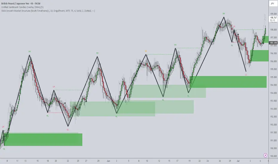
PL Dot Shapes (Detailed Summary)This idea shall focus on the behavior and structure of PL Dot Shapes, which are crucial in identifying market trends, congestion phases, and potential reversals. Let's deep dive on how to interpret PL Dot formations and recognize patterns that signal market movements.
1. Understanding PL Dot Behavior
- Trend:
PL Dots form a straight line, indicating a clear market direction. A trend stops when the market enters congestion.
- Congestion:
PL Dots move horizontally or “snake” sideways, signaling indecision or balance between buyers and sellers.
- Higher Time Period (HTP) Influence:
PL Dots from the HTP influence those in the Lower Time Period (LTP). Inconsistencies between them may indicate no clear pattern.
- Dot Distance:
Refers to the vertical price difference between consecutive PL Dots.
- Increasing Dot Distance: Indicates trend continuation or strength.
- Decreasing Dot Distance: Suggests trend exhaustion or potential reversal.
2. Key PL Dot Patterns
✅ Yes Pattern (Energy Termination Pattern)
Indicates the end of a trend and potential reversal. This pattern is characterized by signs of exhaustion:
1. PL Dot Pullback: PL Dot moves off the main trend channel, and the angle starts sloping down.
2. Decreasing Dot Distance: Dots get closer together, signaling waning momentum.
3. Exhaustion Signs: The dot pulls within range, with closes moving towards the PL Dot, causing congestion entrance.
4. Block Occurrence: Price likely returns to the area of 2-3 dots back.
5. Crest Formation: A PL Dot crest forms, indicating a potential market top.
6. Directional Shift: Dot directions begin turning downward.
7. Challenges: Be alert to price challenging PL Dot crests and valleys.
---
❌ No Pattern (Non-Termination Pattern)
Indicates that the trend is likely to continue without exhaustion:
1. Similar early behavior to the Yes Pattern but lacks signs of exhaustion.
2. No Significant Pullback: PL Dot may pull within range, but no congestion entrance signs appear (bullish).
3. Price Holds: Prices do not return to the 2-3 dots back area.
4. Weak Crests: No strong crest formation, or it's shallow.
5. Stable Direction: Dot direction struggles to turn down.
6. No Challenges: No challenges to PL Dot crests or valleys, confirming trend strength.
---
3. Trend Pattern (Trend Continuation Pattern)
Describes the start or continuation of a trend, especially in the LTP:
1. Dot Opening: PL Dot opens up, with increasing distance between dots, signaling strong momentum.
2. No Exhaustion: Continuation without signs of exhaustion.
3. Energy Refresh: If price reaches the area of 2-3 dots back, expect high energy on any PL Dot refresh.
4. Dots Out of Range: PL Dots move outside the prior bar’s range, confirming a strong trend.
5. Strong Challenges: Challenges to crests only add momentum to the trend.
6. Stable Direction: Dot direction maintains strength with minimal reversals.
---
4. PL Dot Shapes in Congestion
When the market is in congestion, expect the following:
1. Sideways Dots: PL Dots snake sideways, indicating market indecision.
2. Support/Resistance Holding: The 6-1 lines hold both sides of the congestion area.
3. Congestion Exit Signs: Look for signs indicating the market is ready to break out of congestion.
---
Key Takeaways:
- Trend Continuation: Increasing dot distance and out-of-range dots suggest a strong trend.
- Trend Exhaustion (Yes Pattern): Decreasing dot distance, dot pullbacks, and crest formation signal potential reversals.
- No Pattern: Indicates no exhaustion, suggesting the trend will continue.
- Congestion Behavior: PL Dots snake sideways with key support/resistance levels holding firm.
Understanding these patterns helps traders anticipate market behavior, identify trend reversals early, and manage trades effectively.

Understanding MACD In TradingThe Moving Average Convergence Divergence (MACD) is a trend-following momentum indicator that measures the relationship between two moving averages of an asset’s price. Developed by Gerald Appel in the late 1970s, MACD is designed to provide insights into both trend strength and momentum.
Unlike simple moving averages, which merely smooth price data over a specific period, MACD goes a step further by identifying when short-term momentum is shifting in relation to the long-term trend. This makes it a valuable tool for traders looking to enter or exit positions at optimal points.
1. Why is MACD important in trading?
Trend Confirmation: Identifies whether an asset is in an uptrend or downtrend.
Momentum Strength: Measures how strong a price movement is.
Reversal Signals: Detects potential changes in trend direction.
Entry and Exit Points: Helps traders determine when to buy and sell.
2. MACD Components
The MACD Line: Identifies whether an asset is in an uptrend or downtrend.
This line is derived by subtracting the 26-period Exponential Moving Average (EMA) from the 12-period EMA.
When the MACD Line is positive, it indicates bullish momentum; when negative, it suggests bearish momentum.
The Signal Line: Measures how strong a price movement is.
A 9-period EMA of the MACD Line.
It smooths out MACD fluctuations, making it easier to identify crossovers.
The Histogram: Detects potential changes in trend direction.
The difference between the MACD Line and the Signal Line.
A positive histogram suggests increasing bullish momentum, while a negative histogram suggests growing bearish momentum.
3. MACD Formula
The Moving Average Convergence Divergence (MACD) is one of the most widely used technical indicators in trading. It helps traders identify trends, momentum shifts, and potential buy or sell opportunities by analyzing the relationship between two moving averages.
By calculating the difference between a short-term and long-term exponential moving average (EMA), MACD provides insight into market direction and strength.
//@version=6
indicator("MACD Indicator", overlay=false)
// MACD parameters
shortLength = 12
longLength = 26
signalLength = 9
// Calculate MACD
macdLine = ta.ema(close, shortLength) - ta.ema(close, longLength)
signalLine = ta.ema(macdLine, signalLength)
histogram = macdLine - signalLine
// Plot MACD components
plot(macdLine, color=color.blue, title="MACD Line")
plot(signalLine, color=color.red, title="Signal Line")
plot(histogram, color=color.green, style=plot.style_columns, title="Histogram")
Explanation:
Short EMA (12-period) and Long EMA (26-period) are calculated.
The MACD Line is the difference between these EMAs.
A Signal Line (9-period EMA of MACD Line) is calculated.
The Histogram represents the difference between the MACD Line and the Signal Line.
4. Interpreting MACD signals
MACD Crossovers
A crossover occurs when the MACD Line and Signal Line intersect:
Bullish Crossover: When the MACD Line crosses above the Signal Line, it signals a potential uptrend and a buying opportunity.
Bearish Crossover: When the MACD Line crosses below the Signal Line, it suggests a potential downtrend and a selling opportunity.
MACD Divergences
Divergences occur when MACD moves in the opposite direction of the price, signaling a potential reversal:
Bullish Divergence: If price makes lower lows, but MACD makes higher lows, it suggests weakening downward momentum and a possible bullish reversal.
Bearish Divergence: If price makes higher highs, but MACD makes lower highs, it signals weakening upward momentum and a potential bearish reversal.
Histogram Interpretation
The MACD histogram visually represents momentum shifts:
When bars are increasing in height, momentum is strengthening.
When bars shrink, it suggests momentum is weakening.
Zero Line Crossings
The MACD crossing the zero line indicates momentum shifts:
MACD crossing above zero → Bullish trend initiation.
MACD crossing below zero → Bearish trend initiation.
5. Trend & Momentum Analysis
Traders use MACD to confirm trends and analyze market momentum:
If MACD Line is above the Signal Line, an uptrend is in place.
If MACD Line is below the Signal Line, a downtrend is dominant.
A widening histogram confirms strong momentum in the trend’s direction.
A narrowing histogram warns of potential trend weakening.
MACD works best in trending markets and should be used cautiously in sideways markets.
6. MACD Based Trading Strategies
Entry Strategies
Buy when MACD Line crosses above the Signal Line in an uptrend.
Sell when MACD Line crosses below the Signal Line in a downtrend.
Exit Strategies
Exit long trades when a bearish crossover occurs.
Close short positions when a bullish crossover occurs.
Position Management
If the histogram is expanding, traders can hold positions.
If the histogram is contracting, it may signal weakening momentum.
7. Limitations of MACD
While MACD is a powerful tool, traders must consider:
It lags behind price movements (since it is based on moving averages).
It can generate false signals in choppy markets.
Customization is required to suit different trading styles.
8. Optimization
Optimizing MACD for Different Market Conditions
Day Traders & Scalpers: Use faster settings like (5, 13, 6) for quick signals.
Swing Traders: Stick with the default (12, 26, 9) setting for balanced signals.
Long-Term Investors: Use slower settings like (24, 52, 18) for a broader market perspective.
9. Key Takeaways
MACD is a momentum and trend-following indicator that helps traders identify market direction, strength, and potential reversals.
Since MACD is a lagging indicator, it may generate false signals, especially in sideways markets.
Combining MACD with RSI, moving averages, and volume indicators improves accuracy and reduces risk.
MACD should be used alongside risk management strategies and other confirmation tools for best results.
MACD remains one of the most effective technical indicators, widely used across different markets. It helps traders identify trends, confirm momentum, and optimize trade entries and exits. However, it should always be used with additional tools to minimize false signals.
Stay sharp, stay ahead, and let’s make those moves. Until next time, happy trading!

Enhance Your Trading with Dual MACD OverlaysBy using two MACD overlays—one based on the current timeframe and another on a higher timeframe—you gain a more comprehensive view of market momentum. This approach helps identify short-term opportunities while aligning trades with the broader trend, reducing false signals. As seen in my chart, combining multiple MACD perspectives can improve decision-making and trade timing.
Try it out and refine your strategy with better trend confirmation!

Behind the Buy&Sell Strategy: What It Is and How It WorksWhat is a Buy&Sell Strategy?
A Buy&Sell trading strategy involves buying and selling financial instruments with the goal of profiting from short- or medium-term price fluctuations. Traders who adopt this strategy typically take long positions, aiming for upward profit opportunities. This strategy involves opening only one trade at a time, unlike more complex strategies that may use multiple orders, hedging, or simultaneous long and short positions. Its management is simple, making it suitable for less experienced traders or those who prefer a more controlled approach.
Typical Structure of a Buy&Sell Strategy
A Buy&Sell strategy consists of two key elements:
1) Entry Condition
Entry conditions can be single or multiple, involving the use of one or more technical indicators such as RSI, SMA, EMA, Stochastic, Supertrend, etc.
Classic examples include:
Moving average crossover
Resistance breakout
Entry on RSI oversold conditions
Bullish MACD crossover
Retracement to the 50% or 61.8% Fibonacci levels
Candlestick pattern signals
2) Exit Condition
The most common exit management methods for a long trade in a Buy&Sell strategy fall into three categories:
Take Profit & Stop Loss
Exit based on opposite entry conditions
Percentage on equity
Practical Example of a Buy&Sell Strategy
Entry Condition: Bearish RSI crossover below the 30 level (RSI oversold entry).
Exit Conditions: Take profit, stop loss, or percentage-based exit on the opening price.

My take on using AVWAPsTrying to remove the hard work of selecting multipliers for your anchored VWAPs, I came up with this idea of a AVWAP band and built an indicator for it.

Seeds in Chaos, Petals in Profit -A trader's guideSeeds in Chaos, Petals in Profit
A trader's guide to reading the market through nature's lens.
By: Masterolive
Intro:
This trader's guide is not another cookie-cutter trading system.
Instead, it focuses on building a long-term mindset and a way to read the market's chaos through nature's lens. This guide is grounded in real success but is not for the daily trader; it works for long-term swings using hourly price moves.
Over seven years of trading, I developed a unique way to view the market, which led to a practical trading mindset. The technique comes from simplifying the chart after experiencing endless combinations of indicators to no avail. It wasn't until I had to explain my concept to someone else that I found a way to use a garden analogy that fits the mindset well to see the market as a natural system: planting in chaos, thriving through storms.
Later, I read two books: "The Alchemy of Finance" by George Soros and "The Misbehavior of Markets" by Benoit Mandelbrot and Richard L. Hudson. Surprisingly, these two books validated my approach and inspired me to share it. Previously, I would tell no one because I thought it was silly.
The overall goal is to plant a garden, watch it grow, and understand how the weather affects the plants. This guide walks you through determining what flowers you want to plant and how to read the weather after you have made your choice.
It uses a garden and planting flowers as an analogy to choosing the right stocks and interpreting an EMA indicator to determine the market's direction. This guide also works well for Bitcoin.
This guide will help you understand how to read and interpret the chart. It will also give you accurate future context so you react less to the market moves and see the bigger picture: Plant while they panic.
This guide is not financial advice.
Part One - Planting.
Some traders focus on various companies based on technicals or fundamentals, some short-term and some long-term. Other traders will focus on a few stocks or diversify across many.
For this guide, we pick and diversify a sector with roles that thrive together. The industry can be broad or small, but we will use 10 assets, including nine stocks and Bitcoin, and explain how they correlate and grow into a weather-worthy garden.
In this garden, we will focus on Tech and Finance and explain how to plant and organize the garden. First, we must look back at the broadest picture in finance. We will choose a stock exchange and a crypto exchange in this garden. (1 and 2 out of 10 flowers)
Why an exchange? Simply put, traders will always look for stocks and crypto to buy. They will look for the best companies and the best opportunities. Therefore, stock exchanges will benefit from the revenue they generate. If a stock goes parabolic, the exchange still profits from that price move.
Choosing the exchange skips the hassle of finding companies in a haystack. The same is true for the crypto exchange. Our garden has two flowers: one stock exchange and one crypto exchange, representing those two sectors.
Next, what else can correlate with our garden from a zoomed-out view?
Let's choose a Bank and a payment processor. (3 and 4 out of 10 flowers)
Traders will need the bank to on and offramp their cash profits to and from the stock and crypto exchange. Meanwhile, they will need to process those electronic payments.
The bank and payment processors benefit from trading surges; if everyone piles in for a parabolic price move of a particular stock, the bank and payment processors benefit from the action, and the exchanges offering the stock get revenue from the surge.
Once again, this choice skips the need to hunt for specific stocks. It takes advantage of all stocks since traders need cash, banks, electronic payments, and exchanges to buy those company stocks or bitcoin.
Our garden now has Four flowers, a bank and payment processor, and two exchanges for this sector. The correlation? Exchanges, banks, and processors all thrive when traders move money.
The fifth is a pivot flower before we discuss the tech company sector. This pivot flower is a gambling company (5 out of 10).
How does this correlate? Some traders and other users gamble with their cash and profits; even in a recession or a depression, people will still gamble. Plus, users might take their gambling winnings and invest them in a stock or buy bitcoin. They need a bank, an exchange, and a payment method.
In this case, the flowers are self-reinforcing: gambling winnings or losses, stock booms or busts; it doesn't matter in the big picture because, once again, exchanges, banks, and processors all thrive when people move money. Our garden now has five flowers with a broad but strong correlation.
Now, on to the tech sector with the last five flowers.
You will hone in on specific tech roles at this point, but remember that your choices will be self-reinforcing.
If your choice booms, the exchange benefits, and you benefit again from the exchange stock. You will electronically transfer your profits to your bank, which you benefit from by owning the bank stock and payment processor. But if you're smart, you will skip the gambling and let the crowd roll the dice while you plant the profits.
We will focus on two more flowers (6 and 7 out of 10) for tech, so we need to find companies exposed to the popular and relevant tech we want. For tech company 1, you could expose yourself to AI, EVs, and ROBOTS. For tech company 2, Semiconductors (or graphics cards).
In this section of our garden, graphic cards and AI rely on one another, while EVs and robots use AI to operate. Eventually, people will buy or sell the robot and EV, and some may use the profits to buy stock (or Bitcoin), requiring a bank and payment processor.
Meanwhile, people use LLMs, log into their bank, or exchange daily on a computer that requires a graphics card.
Our garden now has seven flowers out of 10, 3 more to go!
We want to diversify (but stay correlated with our garden), so next, we will look at a real estate company or ETF—but not just any company or ETF, one that develops in tech hub areas. How does this correlate?
Robots, AI, EVs, and graphics cards all need workers to operate the companies; young talent will want to move to places where they can work in AI or Robotics or factory EV workers, so the real estate in those areas will be in high demand, so now we own the real estate for our Ai, EV, Robots, and graphic card workers.
As tech grows, real estate booms, driving more money through exchanges, banks, and processors.
We now have eight flowers in our weather-worthy garden.
For the 9th flower, we turn to a wildflower: none other than Bitcoin. Bitcoin is not just a crypto coin but a capital asset, a store of value for your currency when it debases.
People, especially tech workers, will buy, trade, and sell Bitcoin.
As people learn and turn to the asset, global capital will flow through Bitcoin as people around the world save their cash value,
whether it be from gambling winnings, selling a car, selling real estate, selling a stock, or simply putting part of their income from their tech job into it regularly. All of this requires Exchanges, Banks, and payment processors to move.
Bitcoin correlates with that, as exchanges profit off bitcoin, which you own stock in the exchange company. You still need a bank to land on and a payment processor to move the money electronically.
We now have nine flowers in our garden, and it's almost complete.
How can we diversify even more? We can use industrial metal for our last flower, but how does an industrial metal correlate with our tech and finance garden?
Copper is the metal that conducts electricity, and electricity is needed to move money, send Bitcoin, power a growing network of EV superchargers, and power the factories that produce EVs, graphics cards, robots, and more. Copper's the most vigorous root, tying every flower, from tech to finance, into a weather-worthy bed. Meanwhile, the crowds go for gold and sleep on copper.
That completes our garden with 10 flowers. It's a diversified flowerbed, but the flowers correlate in the big picture: Tech drives money movement, which benefits exchanges, banks, and processors; copper powers tech, which drives Bitcoin adoption.
Your goal is to find and build your garden. Think up different bigger pictures with other sectors and roles. Correlating these assets keeps the garden strong through chaos and self-reinforces one another.
To review, we have the following:
Stock exchange
Crypto Exchange
Bank
Payment processor
Gambling
Ai / EV / Robots
Semiconductors (Graphics cards)
Real estate
Bitcoin
Copper
Now that we have planted our garden, let's examine the weather and its meaning. We will learn to read the weather and see when storms are coming or clearing.
In part 2, you will set a simple EMA indicator, learn how to interpret the weather, and tend to the flowers in our garden.

How to develop a simple Buy&Sell strategy using Pine ScriptIn this article, will explain how to develop a simple backtesting for a Buy&Sell trading strategy using Pine Script language and simple moving average (SMA).
Strategy description
The strategy illustrated works on price movements around the 200-period simple moving average (SMA). Open long positions when the price crossing-down and moves below the average. Close position when the price crossing-up and moves above the average. A single trade is opened at a time, using 5% of the total capital.
Behind the code
Now let's try to break down the logic behind the strategy to provide a method for properly organizing the source code. In this specific example, we can identify three main actions:
1) Data extrapolation
2) Researching condition and data filtering
3) Trading execution
1. GENERAL PARAMETERS OF THE STRATEGY
First define the general parameters of the script.
Let's define the name.
"Buy&Sell Strategy Template "
Select whether to show the output on the chart or within a dashboard. In this example will show the output on the chart.
overlay = true
Specify that a percentage of the equity will be used for each trade.
default_qty_type = strategy.percent_of_equity
Specify percentage quantity to be used for each trade. Will be 5%.
default_qty_value = 5
Choose the backtesting currency.
currency = currency.EUR
Choose the capital portfolio amount.
initial_capital = 10000
Let's define percentage commissions.
commission_type = strategy.commission.percent
Let's set the commission at 0.07%.
commission_value = 0.07
Let's define a slippage of 3.
slippage = 3
Calculate data only when the price is closed, for more accurate output.
process_orders_on_close = true
2. DATA EXTRAPOLATION
In this second step we extrapolate data from the historical series. Call the calculation of the simple moving average using close price and 200 period bars.
sma = ta.sma(close, 200)
3. DEFINITION OF TRADING CONDITIONS
Now define the trading conditions.
entry_condition = ta.crossunder(close, sma)
The close condition involves a bullish crossing of the closing price with the average.
exit_condition = ta.crossover(close, sma)
4. TRADING EXECUTION
At this step, our script will execute trades using the conditions described above.
if (entry_condition==true and strategy.opentrades==0)
strategy.entry(id = "Buy", direction = strategy.long, limit = close)
if (exit_condition==true)
strategy.exit(id = "Sell", from_entry = "Buy", limit = close)
5. DESIGN
In this last step will draw the SMA indicator, representing it with a red line.
plot(sma, title = "SMA", color = color.red)
Complete code below.
//@version=6
strategy(
"Buy&Sell Strategy Template ",
overlay = true,
default_qty_type = strategy.percent_of_equity,
default_qty_value = 5,
currency = currency.EUR,
initial_capital = 10000,
commission_type = strategy.commission.percent,
commission_value = 0.07,
slippage = 3,
process_orders_on_close = true
)
sma = ta.sma(close, 200)
entry_condition = ta.crossunder(close, sma)
exit_condition = ta.crossover(close, sma)
if (entry_condition==true and strategy.opentrades==0)
strategy.entry(id = "Buy", direction = strategy.long, limit = close)
if (exit_condition==true)
strategy.exit(id = "Sell", from_entry = "Buy", limit = close)
plot(sma, title = "SMA", color = color.red)
The completed script will display the moving average with open and close trading signals.
IMPORTANT! Remember, this strategy was created for educational purposes only. Not use it in real trading.

NVDA: FREMA Linear Extensions - Horizontal VS DirectionalFREMA bands offer a dynamic edge over traditional ATR-based volatility bands by adapting to real buying and selling pressure (bullish and bearish part of candles) rather than just price movement. Unlike ATR bands, which expand symmetrically based on historical volatility, FREMA bands widen asymmetrically — expanding more on the upside during strong buying pressure and on the downside when selling dominates. This makes them highly effective for identifying momentum early, spotting true breakouts, and distinguishing strong trends from choppy markets. By responding directly to market psychology, they provide superior trade entries and exits, minimizing noise in ranging conditions while highlighting areas of genuine demand and supply shifts. For traders seeking a more responsive, trend-sensitive tool, FREMA bands deliver a clearer picture of market dynamics compared to conventional volatility indicators.
RESEARCH
Testing how price behaves within 2 types of linear extensions:
Horizontal
While giving an impression of being static, they're actually based on FREMA which is dynamic.
Use Horizontal Levels when expecting price to respect historical support/resistance, especially in sideways or mean-reverting markets.
Directional
Gives an immediate clue of being adaptable to the general angle of trend.
Use Linear Extensions when trading with momentum or trend continuation, as they adapt to market directionality.
Will price respect the static balance of past support and resistance, or will momentum dictate its own path along the trajectory of directional expansion? By tracking price interactions with both projections, we’ll uncover which model best maps the market’s intentions, offering valuable insights for future setups.
Stay tuned as we register these behaviors in real-time because once the market chooses its guide, the next move could be crystal clear.

ETH | Alternative Chart Pattern | EducationJust a short update for my latest C&H post
Price is also forming an Ascending Triangle pattern with a liquidity zone of $2,800 - $3,000 for an average spot for buyer to step in
When trading chart patterns it's best to figure out how to jump in before the breakout similarly to the last touches highlighted in blue on the bottom trendline
You can see that price was forming a bottom-like pattern or what I also like to call price accumulation and then vice versa for the tops.

what is the most effective indicator?There isn’t a single "most effective" trading indicator that works for everyone, as effectiveness depends on your trading style, strategy, and the market conditions. However, some indicators are considered more versatile or reliable when used correctly. Here's a breakdown to help you choose:
Most Effective for Trends:
Moving Averages (EMA or SMA):
Simple and effective for identifying trends.
Works well in trending markets but less reliable in sideways or choppy markets.
Pro Tip: Combine short-term and long-term moving averages for crossovers.
Ichimoku Cloud:
A comprehensive indicator that provides trend direction, support/resistance, and momentum.
Effective but requires practice to interpret correctly.
Most Effective for Overbought/Oversold Levels:
Relative Strength Index (RSI):
One of the most popular and effective indicators for spotting overbought or oversold conditions.
Works well in both trending and range-bound markets when combined with other tools.
Stochastic Oscillator:
Similar to RSI but includes %K and %D lines for crossovers.
Effective for momentum confirmation.
Most Effective for Volatility:
Bollinger Bands:
Great for identifying periods of high or low volatility and potential breakout zones.
Useful for sideways (range-bound) markets and trend reversals.
Average True Range (ATR):
Excellent for setting stop-loss levels and identifying market volatility trends.
Works well in conjunction with trend indicators.
Most Effective for Momentum:
Moving Average Convergence Divergence (MACD):
Ideal for spotting trend reversals and momentum shifts.
Effective when used with a confirmation indicator like RSI.
Parabolic SAR:
Simple for identifying trend direction and potential exit points.
Works best in trending markets.
Combination for Higher Effectiveness:
Trend + Momentum: Combine EMA with MACD to identify trends and entry/exit points.
Overbought/Oversold + Volume: Use RSI with Volume Indicators (e.g., OBV) to confirm breakouts or reversals.
Volatility + Trend: Use Bollinger Bands with Ichimoku Cloud to spot breakout opportunities with clear trend guidance.

Day Trading Strategy Using EMA Crossovers + RSI for CryptoIntroduction
Day trading in the volatile crypto market requires precision and a clear plan. Today, I’ll walk you through a straightforward strategy using EMA crossovers and the RSI (Relative Strength Index) to identify high-probability trades on shorter timeframes (e.g., 5-minute or 15-minute charts).
Strategy Overview
Indicators:
Exponential Moving Averages (EMAs): Use the 9-EMA (short-term) and 21-EMA (medium-term).
RSI: Set to 14 periods with thresholds at 70 (overbought) and 30 (oversold).
Trade Entry:
Look for bullish EMA crossover (9-EMA crossing above 21-EMA) for a potential buy signal.
Confirm the entry when RSI is above 50 but below 70 (indicating bullish momentum without overbought conditions).
For short trades, wait for the 9-EMA to cross below the 21-EMA and confirm RSI is below 50.
Stop-Loss:
Place the stop just below the most recent swing low for long trades or above the recent swing high for shorts.
Take-Profit:
Use a 1.5:1 or 2:1 risk-to-reward ratio or adjust based on key resistance/support levels.
Example Chart Analysis
In the chart, notice how the EMA crossover and RSI alignment resulted in clean entries and exits during the trend.
Closing Thoughts
This strategy is best suited for trending markets, so avoid using it in choppy, range-bound conditions. Always use proper risk management and adapt to the market’s volatility.
What do you think of this strategy? Share your thoughts or let me know if you’ve tried something similar!
