An Idiot's Guide to EURUSD: 5 Steps to Success 💲💲💲Synopsis
If you trade Forex then you know the weekends are the best time to analyse the market. Everybody likes to talk about how volatile EURUSD is, but what they don't tell you is that the market is ranging a good 80%-90% of the time; good deals do NOT last long. In fact, half of a days price movement can play out in 15-45 minutes, It's that fast. The best entries are usually snatched up in a matter of minutes, meaning that slow momentum oscillators and lagging trend following indicators don't perform well in these conditions. EURUSD in my opinion trades a lot like CL (crude WTI), where trading decisions need to be made while volatility is low to mitigate risk. Translation: if you can't win in a range, you're going to blow your account in this market, trust me.
I see so many people on here setting targets 2-3 times the daily atr with the expectation that they'll be paid by the end of the day or the next day. Don't do that, please. It's not a sprint, it's a marathon. Long term gains depend on practical consistent returns, not 10:1 RRs. It's actually a lot more realistic to take ZERO to two 20-40 pip trades per day. Over the course of a week it adds up.
The chart:
This week we came off of a really strong bullish surge away from parity, and the market then did what it does best, range. And the way that prices are moving right now is just classic EURUSD, I love it...I get so nostalgic, because ranges like these are how I learned to trade; the way that the market recycles over and over makes it so fun to trade, it never gets stale. Since it's the weekend and the markets are closed, I wanted to take this opportunity to share with anyone who might be wondering what it's like to day trade this market.
How to trade ranges:
Step 1: Find your levels...
The easiest way is to map out support and resistance zones. On the chart, I use my own variation of the Williams fractals indicator (I call them Neo fractals 😎) for every prominent swing high or swing low, the indicator draws a horizontal ray from the highest, lowest close and projects it out into the future. You can see the spots where lines start stacking up in a certain price range act as stronger support or resistance than the areas with only one dotted line. It only takes about 5-10 minutes per day to do this by hand though, so an indicator definitely isn't necessary. It's really important to be able to eyeball pivot points yourself anyways.
Step 2: Determine market phase...
After you've mapped everything out, it becomes a lot clearer what's happening in the market, and if the market is ranging or trending. If the market's ranging, you will see far more s/r lines on your chart especially once you start seeing s/r lines stacking up close to one another. A clear giveaway that the market is ranging is when price makes strong moves in one direction, only to return back from where it came, later in the day. Once you've determined what phase of the market you're even closer to spotting high quality trades.
Step 3: The next step is to find areas of value...
In general you want to find the areas within the range which provide the most exclusive prices, And steer away from price ranges that hold 80-90% of the activity on the cart. Being 5-10 pips in profit before a big move will completely change the way you feel about a trade when it starts to go against you (plenty winning trades will go against you, especially if you're trading reversals). On the chart you can see that the supply and demand zones only produced 2-4 trades this week, but all of them were for over 50 pips. These aren't the only trades you can take, but they're definitely the highest RR trades, you can get in a ranging market.
Step 4: What for confirmation...
There are so many ways to confirm a move, but my favorite for this market is a phenomena that I like to call a spike. (There's probably an actual name for it, but I'm self taught so I just make stuff up as I go 😅) Find a hammer or star candle on a higher chart like the daily or 4hr and it look at that time period again on a lower timeframe, what you'll see is that the hammer or star is actually just a large price movement in one direction followed by an equally large movement in the other direction. What might appear as a spike on a lower timeframe will appear as a hammer or star on a higher time frame, and the larger and longer the chart pattern takes to complete, the larger and longer the move will be in the opposite direction. These are the Rolls Royce of signals. When you realize that a head and shoulders pattern is really just a series of spikes, it will completely change the way that you trade. In my experience, trading price spikes alone out performs every other chart pattern there is, because most candlestick and chart patterns are made up of a series of spikes anyways. Most consolidation periods end in a large spike followed by a 1-200 pip surge in the opposite direction. They appear most often on higher timeframes as hammers and stars, or large engulfment. but on the lower time frames you can watch these things play out over 5 ,10 or even 100 periods sometimes. The key is to have very strict rules for what you consider a spike to be, how many pips? What kind of ratio are you looking for? is it happening in an area of value? etc.
Step 5: The range leads to the trend...
The reason that trend following strategies under perform in this market is because strong trends don't last long on EU AND getting good value is insanely competitive. The key is to spot these trends early, you have to be looking when nobody else is looking. That means waking up earlier than everyone else and having a plan in place before the move happens...Not seeing a big candle and just hopping in. I try to have a daily strategy in place before the Asian session ends, that way, I''m ready for London and NY. I live in the US, so that means I'm waking up everyday around midnight to 1 in the morning. But most of the time, if my trade starts well, I go back to bed and check back in around 7. If you want to trade EURUSD, that's what it takes though. There might have to be lifestyle changes that you have to make (especially for North and South American traders) in order to really commit yourself to this market and give your trading it the attention that it needs.
Moving Averages

What is a moving average and do they work?Moving average is an average of price closes over a certain amount of time, so at a base level they rise when price rises and fall when price falls, so why are they important? Because they give you a sense of the average direction of price over a certain amount of time, if you take the chart at face value you are not even witnessing one price close at that specific moment in time! unless you are then well done you lol, so the moving average is giving us data of maybe 89 or 50 or 200 ect, this overall analysis of the trend can defiantly aid your decision making, for example if you use two moving averages like the ma8 and ma89, what we can look at is the moving average MA8 reverting back to test the baseline which is the MA89 in this example, so price is now attempting to some extent to change trend, if it breaks lower than the baseline the line will start falling! MA89 will start declining as negative closes come in and alter the formula, that is why these areas can offer great buying opportunities or selling depending which side of the baseline you are, Price will test the baseline and bounce in strong trends before price will eventually break the baseline down the line. I will follow this post up with a post on moving averages being used on indicators now we have the first bit out the way.

How to use EMA8 and EMA89 in your trading.Here I have shown how the EMA8 and EMA89 can lead to good results by using the EMA89 as a baseline and applying the rule, buys above the average and sells below. To find entries look for pullbacks to the average of breakdown and breakout of order blocks, things like inside bar to find momentum should also find results, you could experiment with oscillators in order to find these pullbacks easier. However most of the entries will usually give some good price action and this is important to keep an eye when using this strategy, you want likely reversals so use candles to enter that typically have a higher % chance of changing direction, things like engulfing candles and pinbars, not only will this keep the risk low, it will enable better rewards and consistency. Hope someone out there can find some use of this post :)

Moving Average | Not Always a Profitable Ways to Use 📊I have seen multiple post including some educational ones focusing or showing how to use the Moving Average (MA) as a sell or buy signal.
Here, we have one of the many examples of why it can be dangerous to use a single tool as a "buy" or "sell" signal, especially when that tool is a technical analysis tool.
I'm sure there are plenty of example of consistent trading opportunities using just a MA, but the reality is that if you want to be a decent trader, a single tool is not a good indicator of buy/sell signals.
Open to hearing everyone's opinion.

Moving Average | Two Profitable Ways to Use 📊
Hey traders,
In this post, we will discuss two efficient ways to apply the moving average(s) indicator in your trading.
Please, note that the settings for a moving average depend on many factors and can not be universal. Time frame, your style of trading and many other factors should be taken into consideration when you define the settings.
1️⃣The first very efficient way to apply moving average is to consider that to be a strong support/resistance. Such a method is appropriate for trend-following traders.
A very important condition to note applying MA as the structure is that the market should be trending: it should trade in a bullish or bearish trend, not in sideways.
📍In a bullish trend, a moving average will provide you a relatively safe point for buying the market after a pullback. Quite often after a test of MA, the price tends to bounce all the way up to a current high and even go higher to the next highs.
📍In a bearish trend, a moving average will serve as a strong resistance and quite often will indicate a completion point of a retracement leg after a strong bearish impulse.
2️⃣The second way to apply moving average is to apply a combination of 2 MAs with different settings (one with a bigger and one with a smaller length). Such a method is usually applied by counter-trend traders.
And again, a very important condition to note, is that if you want to apply this method efficiently, remember that the market must be trending, it should be bullish or bearish.
Your task will be to track an intersection of two MAs.
📍In a bullish trend, a crossing of two moving averages with a high probability will indicate a trend violation and initiation of a new bearish trend.
Such a signal usually serves as a trigger to open a short position.
📍In a bearish trend, a crossing of two moving averages will signify a violation of a bearish trend and the start of a new bullish trend.
The intersection by itself will be a signal to open a long position.
Your task as a trader is to find the most accurate inputs for MAs. With backtesting and experience, you will find the settings applicable to your trading style.
What indicator do you want to learn in the next post?
❤️If you have any questions, please, ask me in the comment section.
Please, support my work with like, thank you!❤️

1977 Interactive Double Zigzag Elliott Wave TheoryS&P 500 Index (SPX)
Trying to dive into some Elliott wave theory and I have a more "interactive" chart to present based off of historical data. I chose this sequence and timeframe because it seems easiest to understand with confirmed examples from some of my own reading materials. This was notated by previously known EWT masters to be a "Double Zigzag" corrective wave, in a bull market. I have taken the time to attempt to notate the subdivisions more clearly. This may not be perfect, but it is the best I can provide of a learning resource at this moment from my current understanding of EWT. The wave degrees may be slightly wrong but I think the wave count is technically correct as long as the first wave C of the first move down is actually some sort of diagonal. I also speculated that it could be a triple-three but I think a diagonal impulse makes more sense in that phase of wave C. Thanks for checking it out! Follow for more EWT ideas!
My Elliott wave analyses could be wrong at any moment , this is practice solely for educational purposes. Please do your own research as always!
Thanks for tuning in :) Disclaimer, anyone in the trade needs to do their own due diligence and decide what is right for YOU. My charts can be wrong at any time and it's very important that you have your own strategies and plans in place. I run this channel for my own educational purposes of learning to trade, and I will never be 100% right, so please do not let me confirm any bias for you! (Dangerous to do so, stay safe and remember the basics & rules of risk assessment.) Expect the unexpected and happy trading!

Trading SetupHi traders
in this post would like to share a trade setup i use for a while.
first - supertrand indicator
second - 20-50-200 sma indicator
for supertrand - click on indicators and search for supertrend - choose the 3rd 1 from the list u see.
change settings to - atr period - 5
source - hlcc4 - and atr multiplier - 1
now u have a system which will print out buy / sell signals.
combined with 20-50-200 sma - i take a position when price cross the 20 sma.
look @ the examples - sell signal + cross the 20ma
test it @ home :)
##this is not investing advise##
hope you find it usufull ...
good luck

How to trade by using EMA Ribbon ?Hello traders 🐺 .
this is an educational idea and it's about the EMA Ribbon .
In this idea I want to talk about how to using EMA Ribbon in trading so make sure to read this idea until to the end if you are one of the Moving averages fans .
I like to start with an example of trading by using the EMA Ribbon , then I explain more about the EMA Ribbon and how it's work :
in the chart above we have 3 different examples of trading by using the EMA Ribbon ; as you can see in the chart above , we have 3 different pattern and the last one which is the symmetrical triangle is actually the current pattern of the BTC and I want to ask you about your prediction for it so leaves your comments below this idea and share your view about the BTC , after learning of how we can trade or in the other words how we can use the EMA Ribbon in our trading .
let's start with the ( first example ) :
my first example is rising wedge pattern , I try to cover all 3 types of the market conditions in this idea , because it's important to learn to trade in the any direction ; the first example is a bearish pattern :
As you can see in the chart above , BTC price after creating the rising wedge pattern started a very long down trend , by how we can trade it ?
if you look at the chart you will notify that the every line of the EMA Ribbon acts as a support or a resistance and the more deeps price can penetrate to the Ribbon , the chance of the reversal is higher .
For example , look at the rising wedge , during the pattern when the EMA Ribbon was in the bullish mode or in the other word , when short term EMA is above the long term EMA , when price finally success to penetrate to the last line of the EMAs which is the long term EMA ; price was faced to the more stronger support and this is shows us that if price can break below the all of the EMAs , there is strong chance for the changing the trend .
but finally when price break below the Ribbon , BTC was started a very long term bear trend , if you are a trader you must know that this bearish pattern after the very long bullish trend could indicate the bear market signs , and if you want to use EMA Ribbon for trading this is good chance , so let's see how we can use it ?
first of all when price break below the EMA Ribbon you must wait for the confirmation signs , this is means that you must wait for the EMA Ribbon to flip from bullish to the bearish mode which means that the short term EMAs goes below the long term EMAs , and after the retest of the Ribbon you can say that , thing are looking bearish from the EMA Ribbon sight ; and you can set your short trade based on your trading strategy .
but what's the problem of the EMA Ribbon ?
let's talk about the EMA Ribbons problem after checking all of the examples , until that please think about it and imagine how we can fix this problem if you find out the problem , if you can't , wait for the end of this idea and also don't forgot to support me with your likes and comments .
let's combine the example 2 and 3 together for better understanding :
as you might know , the moving averages are trend chaser indicator which means that they are work perfectly when market have a specific trend , for example in the chart above when BTC created a falling wedge pattern and break above the EMA Ribbon and retest it as a new support start a bullish trend , and as you can see when market started to retracement , BTC created a bull flag pattern and after the break out BTC continue the bullish trend .
in the bull flag , you can see that price break below the EMA Ribbon and also retest it as a resistance , but price can't continue the bearish trend ; so why this happen ?
did you remember that in the example one , I asked you about the EMA Ribbon , could you find the problem yet or not ? if you can't find it wait for the end 🙄🤷♀️ .
now we arrive to the last example which is the symmetrical triangle , but I gonna talk about it in the next idea because this is an educational idea and not for the analysis purpose , so make sure to follow me to find out what gonna happen for the BTC in the next coming weeks .
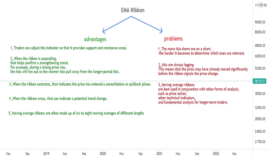
now it's time to show you the EMA Ribbons advantages and problem in one clear picture :
Did you remember that in the example 3 (bull flag) I said that the EMA Ribbon flipped to the bearish and also the price retest it as a resistance but price didn't break below again and after that BTC was breaked to the upside , this is what I mention the reason in the problem number 3 :
3_Moving average ribbons are best used in conjunction with other forms of analysis, such as price action, other technical indicators, and fundamental analysis for longer-term traders.
you must know that it's better to use EMA Ribbon in conjunction with other indicators for example , personally like to use it in conjunction by the RSI and TSI and also the price actions .
in the example number 3 , the overall trend is still bullish and price is above the support structure and also it's on the bullish pattern , so there is strong chance for goes above the Ribbon again .
now it's seems to we reach to the end of the idea and I must appreciate you my friends to read my idea , don't forgot to leaves your idea about this symmetrical triangle and help me with your likes and comments ; thank you for reading my idea .
A Deep Dive Into The MACD1. Introduction
The Moving Average Convergence Divergence (MACD) indicator created by Gerald Appel in 1979 (1) is part of the pantheon of technical indicators, being one of the most used and influential ever created. The popularity of the MACD allowed further studies and more varied applications of the indicator, from signal processing in neuroscience (2), prediction of hospitalizations (3)...etc.
In this post, we will highlight extensive details, calculations, and usages of this legendary indicator. If you wanted to go beyond what you learned about the MACD, then this post is for you.
Note that some contents of this post can be complex and might not suit certain readers, feel free to skip the sections of your choice.
2. Details
This oscillator returns 3 time-series, the MACD, obtained from the difference between two exponential moving averages of different periods, a signal line, obtained from the exponential moving average of the MACD, and a histogram obtained from the difference between the MACD and the signal line.
Each MACD component allows evaluating the current market trend direction, momentum, and acceleration. Many traders believe the amount of information the MACD can return is sufficient to be used as a standalone for both trend-following and contrarian trading.
In terms of digital signal processing, the MACD can be classified as an infinite impulse response (IIR) bandpass filter, filtering out both lower and higher frequency components of a signal, thus having the ability to both detrend and smooth. The MACD filter satisfies the conditions for being a discreet time linear time-invariant (DLTI) system, it is linear and time-invariant:
macd_(a + b) = macd_(a) + macd_(b) -> Additivity
K × macd_(x) = macd_(K × x) -> Homogeneity
macd_(x ) = macd_(x) -> Time Invariance
3. Calculation
The MACD oscillator is obtained from the difference of two exponential moving averages (ExpMA), one using a faster period (often 12) and one using a slower period (often 26).
MACD_ = ExpMA(price,fast) - ExpMA(price,slow)
We can also obtain the MACD from the following difference equation:
y = (price - price ) × g + ((1 - a1) + (1 - a2)) × y - (1 - a1) × (1 - a2) × y
where a1 is the smoothing constant of the fast ExpMA, a2 the smoothing constant of the slow ExpMA, and g is the gain constant obtained from the difference between the smoothing constant of the two ExpMA's:
g = a1 - a2
= 2/(fast+1) - 2/(slow+1)
4. Impulse Response
The impulse response of the MACD is the result obtained by applying the MACD to a unit impulse signal, given by the Kronecker delta function d .
d = 1 if t = 0, else 0
The impulse response fully describes the properties of the MACD and can be obtained from the difference between the impulse response of two ema's with periods fast and slow .
The impulse response of an exponential moving average h(ExpMA) over time t with smoothing constant a is given by:
h(ExpMA) = a × (1 - a)^t
As such for the impulse response of the MACD h(MACD) over time t we obtain:
h(MACD_) = a1 × (1 - a1)^t - a2 × (1 - a2)^t
Like with an exponential moving average, the impulse response of the MACD does not become steady, instead continuing indefinitely, hence why it is classified as an infinite impulse response filter.
5. Frequency Response
The frequency response of filters allows us to determine how they affect the frequency content of a signal. The frequency response can be directly obtained from the discrete-time Fourier transform (DTFT) of the impulse response, which for the MACD returns:
H(e^iw) = SUM h × e^-iwn, for n = 0 to ∞
= SUM (a1 × (1 - a1)^n - a2 × (1 - a2)^n) × e^-iwn
with w = 2 × pi × f . The infinite sum makes its direct computation infeasible.
It is generally more common to evaluate the filter transfer function H(e^iw) obtained from the Z transform given by:
A(iw) = b + b × z^-iw + ... + b × z^-iwP
-------------------------------------------------
B(iw) = a + a × z^-iw + ... + a × z^-iwQ
With feed-forward coefficient b and feedback coefficients a . This transfer function assumes a filter of the form:
y = SUM b × x - SUM a × y , for p = 0 to P & for q = 1 to Q
This is the reverse ordering used by the MACD difference equation previously described, as such the MACD transfer function is given by:
g + -g × z^-iw
----------------------------------------------------------
1 + × z^-iw + × z^-iw2
The frequency response is then obtained by evaluating the above transfer function for z = e .
5.1 Magnitude Response
The magnitude response describes how a filter attenuates the amplitude of the frequencies composing a signal. It is obtained from the absolute value of the transfer function |H(e^iw)| , that is:
|H(e^iw)| = sqrt(Real ^2 + Imag ^2)
For the MACD we obtain the closed-form solution:
sqrt(g^2 × sin(2 × pi × f)^2 + (g - g × cos(2 × pi × f))^2)
|H(f)| = ----------------------------------------------------------------------------------------------------------
sqrt( ^2 + ^2)
with A1 = (a1 - 1) + (a2 - 1) and A2 = (a1 - 1) × (a2 - 1) .
In the previous figure we can see the magnitude response of the MACD using fast = 12 and slow = 26 . This magnitude response is asymmetric, we can see attenuation of lower frequency components, and a poor attenuation of high-frequency components.
The above figure shows various MACD magnitude responses for various configurations of the fast and slow settings. We can see on the left that a fast period closer to the slow period return magnitude responses with fatter tails as well as a decreasing resonant frequency (frequency where the filter returns the least attenuation), on the right, we can see how increasing the slow period returns a lower attenuation of the peak frequency.
6. Usage
The MACD has known a wide variety of usages amongst traders, extending from trend-following to contrarian methodologies.
The most basic usage of the MACD is given by evaluating the sign of the MACD, with a positive sign (fast ExpMa > slow ExpMA) indicating an uptrend and a negative sign (fast ExpMa < slow ExpMA) indicating a downtrend. We can see that this usage does not differ from the one given by a simple MA cross strategy. The user might also suffer from the excessive lag produced by this simplistic approach.
The strength of the indicator can come from the usage of the MACD with the signal line and histogram. A timelier approach would identify an uptrend when the MACD is above its signal line (histogram above 0) and a downtrend when the MACD is under the signal line (histogram under 0). This approach makes better use of the leading characteristic of the MACD oscillator, thus offering more predictive insights. However, an increment in timing does not come at no cost, with the more recurrent of whipsaw trades.
Notice in the image above how the usage of the MACD with the signal line allows for a faster trend detection compared to using the MACD alone. We can also see how this usage of the indicator is more sensitive to shorter-term price variations, inducing potential whipsaw trades. This is caused by the common tendencies that oscillators have to increase the presence of noise in an input series.
It is also possible to use a combination of both usages in order to avoid their disadvantages, for example opening trades based on the sign of the MACD while exiting trades when the MACD crosses the signal line. However, the main disadvantage of using the histogram can appear when the user must optimize indicator settings, with a usage based only on the MACD meaning that two settings would need to be optimized, while usage based on the histogram would mean optimizing three settings, which is computationally more expensive.
6.1 Divergences
Divergences are commonly used with oscillators. A divergence occurs when the price tops/bottoms and MACD tops/bottoms are negatively correlated. This can indicate a trend impulse of lower amplitude, which could highlight a potential reversal.
6.2 Fast > Slow Period MACD
The MACD already possesses some leading characteristics, allowing to anticipate turning points. However, the ability of the MACD to provide signals anticipating future trends mostly depends on the current market conditions, with certain price variations complicating the leading ability of the MACD. The predictive abilities of the MACD can be improved using a fast period higher than the slow period.
Assuming the user uses the histogram of the MACD, cyclical variations within a price trend will generally prove to be problematic if the signal length excessively delays the MACD. Inverting the fast and slow period can help signal early reversal, instead of suffering from the excessive delay introduced by the histogram.
The practice of inverting MACD fast and slow period was proposed by Ehlers (4), we can also see that optimizing MACD settings in mean reverting markets can tend to return fast periods higher than slow periods. We can see that such an approach is directed toward contrarian traders.
7. MACD Using Different Type of Moving Averages
The MACD uses exponential for the calculation of the fast, slow, and signal moving averages by default, however different types of moving averages can be used. The MACD would directly inherit the characteristics of the type of moving average used, thus improving characteristics such as reactivity and smoothness.
For example, certain users prefer using the simple moving average, returning slightly lower reactive MACD with a slightly higher degree of filtering.
Using low lag moving averages would return a very reactive MACD, with a histogram able to anticipate MACD turning points due to the ability of low lag moving averages to over/undershoot the input signal.
Notice in the above chart how the MACD based on the Hull moving average (bottom) is more reactive than a regular MACD (top) with equal settings. Also, notice how the signal line is able to exceed the MACD before the occurrence of its turning point.
However, it can be more interesting to use more than one kind of moving averages for the MACD calculation, using a type of moving average that is suitable for each MACD component. As such it would be more interesting to have a low lag moving average as fast-moving average, and a more classical one as slow and signal moving average.
References
(1) Appel, Gerald. "Technical Analysis Power Tools for Active Investors." Financial Times Prentice Hall. p. 166 (2005)
(2) Durantin, Gautier, et al. "Moving Average Convergence Divergence filter preprocessing for real-time event-related peak activity onset detection: Application to fNIRS signals." 2014 36th Annual International Conference of the IEEE Engineering in Medicine and Biology Society. IEEE, 2014.
(3) Zhang, Jufen, et al. "Predicting hospitalization due to worsening heart failure using daily weight measurement: analysis of the Trans‐European Network‐Home‐Care Management System (TEN‐HMS) study." European journal of heart failure 11.4 (2009): 420-427.
(4) Ehlers, John F. "The MACD Indicator Revisited." (1991).

How to Catch a Falling Knife by the HandleI'm not suggesting here that the broader equity market is going to violently sell-off soon or anything like that. I figure that posting an idea on such a scenario might be useful just in case volatility picks up a few knots with some foreseeable seasonal headwinds.
Also, the broader equity market is probably going to sell off soon.
Now that the possibility of such an event has been thrown out there, I offer something that could make the whole experience even more fun than meme stocks. That would be the use of the 186-period exponential moving average to locate the approximate price level where the first safe area to take profits would be under a crash scenario. Typically, you don't want to "catch falling knives", or any other falling weapon because it is assumed that the trader catching said knife/weapon thinks he has caught the bottom. Of course, he has done the opposite and is in fact, holding a bag of something that will drop in value very soon and the hand he is holding it with can barely hang on because he missed the knife's handle on the way down.
While this scenario happens all too often, i believe that catching a falling knife can be done safely and profitably if using the 186 EMA and a SHORT position. What you are then catching is not the stock/derivative itself at a discount long, but rather closing out a short knife that you threw a while back for extreme profits. The key is that the 186 EMA offers you a nearly perfect target to safely exit an extreme short position, without using complicated time/price methods that are usually esoteric to some extent.
Just take a look at the chart displayed above, which offers a detailed look into the kind of weapons that SP Futures traders had to deal with over the years. To fully appreciate the results of this demonstration, you must understand the difficulty of trading this futures market. The degree of leverage is high enough to wipe out new entrants within hours and is also severe enough whereby the assumptions required to use Wave Principle cannot be relied upon.
In summary, the fact that this EMA either caught outright or was the cause of the first major bounce of ALL significant selloffs over the past 10 years is remarkable. On the weekly timeframe, it will undoubtedly prove useful for bearish swing traders using an intermediate time horizon. In a whipsaw scenario intraday, the 186 can be quickly applied in a pinch, which can prevent panic selling in all sorts of situations.
The uses for this tool are many and I am lucky to have randomly stumbled upon it about a year ago when messing around with pinescript for the first time. In fact - see for yourself how the 186 EMA somehow plays a structural role in at least one timeframe (even the 5-min at times) of any given price chart. The key is to find which timeframe the 186 is fitting most closely with at the current time.
Remember, use wisely when catching weapon-profits, not weapon-long-positions.
-PiggishMagician
AMEX:SPY
SP:SPX
GLOBALPRIME:US500

“HOW TO” Video Overview “Jerry J5 Dashboard & Buy Sell Strategy"Hello Investors!!!
This is a detailed video overview of the “Jerry J5 Dashboard & Buy Sell Strategy” release.
I will post the link to the strategy within a few minutes after this video goes live on TradingView in either the Related Ideas, or as a comment below with the link.
This is my first idea post and hopefully I set it up correctly.
Thank you for your support and patience.

MOVING AVERAGE | 4 Efficient Methods To Apply
Hey traders,
The moving average is one of the most popular technical indicators.
It is applied in stocks/forex/crypto trading and proved its high level of efficiency.
There are hundreds of trading strategies based on MA.
In this post, we will discuss the 4 most popular ways to apply the moving average.
1️⃣The first method is applied to identify the market trend.
While the price keeps trading above the MA, one considers the trend to be bullish and looks for buying opportunities.
Once the price starts trading below the MA, the trend is considered to be bearish and a trader is looking for shorting opportunities.
2️⃣The second method applies the combination of 2 MA's: preferably a long-term one and a short-term one.
The point is that once a short-term moving average crosses above a long-term MA, with high probability it signifies the initiation of a bullish trend.
Alternatively, a crossover of short-term and long-term MA's to the downside indicates a start of a bearish trend.
3️⃣The third method applies MA as a structure.
While the moving average is lying above the price, it is considered to be a dynamic resistance.
Staying below the price it serves as a strong dynamic support.
Perceiving MA as the structure, one applies that for trade entries.
4️⃣The fourth method is aimed to track the crossover of the moving average and the price.
The idea is that a bullish violation of the MA by the price gives an early signal for a possible trend reversal.
While a bearish breakout of the MA by the market indicates a highly probable bullish trend violation.
Backtest different MA's inputs and learn to apply that for predicting the future direction of the market and for trading it.
Do you use MA?
❤️Please, support this idea with like and comment!❤️

An introduction to the MACD indicatorHere is my quick and dirty introduction/explanation of what the Moving Average Convergence Divergence (MACD) indicator………… indicates.
The Moving Average Convergence Divergence (MACD) is a trend following momentum indicator that follows the intimate relationship between a 12-Period EMA and a 26-Period EMA on a price chart in whatever timeframe you are in.
The MACD indicator is made up of 6 parts, the MACD Line, the Signal Line, the Histogram, the 0.00 Base Line, the Positive Zone and the Negative Zone.
As default, the MACD Line is calculated by subtracting the value of a 26-Period EMA from the value of a 12-Period EMA on your chart to give you your MACD Line value. The MACD indicator will give a MACD Line value in whatever timeframe you are in.
The Signal Line is a 9-Period EMA of the MACD Line and is used with the MACD Line to generate/trigger Buy and Sell Signals. If the MACD Line crosses ABOVE the Signal Line, that is considered a Buy Signal. If the MACD Line crosses BELOW the Signal Line, that is considered a Sell Signal. Note that Buy and Sell Signals can be generated in both the Positive and Negative Zones
The Histogram is a graphical representation of the distance between the MACD Line and the Signal Line (9-Period EMA).
Green Histograms will appear above the 0.00 Base Line when the MACD Line crosses ABOVE the Signal Line. The Green Histograms will Increase in size the further the MACD Line moves upwards & away from its Signal Line. The Green Histogram will also lighten in colour if the MACD Line fails to move higher to create a higher Green Histogram Bar.
Red Histograms will appear below the 0.00 Base Line when the MACD Line crosses below the Signal Line. The Red Histograms will increase in size the further the MACD Line moves downwards & away from its Signal Line. The Red Histogram will also lighten in colour if the MACD Line fails to move lower to create a lower Red Histogram Bar.
The Positive Zone is the area ABOVE the 0.00 Base Line. If the MACD Line crosses above the 0.00 Base Line, this means that a 12-Period EMA is ABOVE a 26-Period EMA on your price chart in whatever timeframe you are in. So to reiterate, the MACD Line will be ABOVE the 0.00 Base Line when a 12-Period EMA is ABOVE a 26-Period EMA on your price chart.
The Negative Zone is the area BELOW the 0.00 Base Line. If the MACD Line crosses below the 0.00 Base Line, this means that a 12-Period EMA is BELOW a 26-Period EMA on your price chart in whatever timeframe you are in. So to reiterate, the MACD Line will be BELOW the 0.00 Base Line when a 12-Period EMA is BELOW a 26-Period EMA on your price chart.
Note that the MACD indicator has no upper limit in the Positive Zone and no lower limit in the Negative Zone.
The MACD indicator can also be used to show Divergence between the Price and the MACD Line. In a Bullish scenario, if the Price is making Lower Lows and the MACD Line is making Higher Lows then this is potentially Bullish.
For a Bearish scenario, if the Price is making Higher Highs and the MACD Line is making Lower Highs then this is potentially Bearish.
The MACD indicator can also be used to show Hidden Divergence between the Price and the Histogram. In a Bullish scenario, if the Price is making Higher Lows but the Histogram is making Lower Lows then this is potentially Bullish. For a Bearish scenario, if the Price is making Lower Highs but the Histogram is making Higher Highs then this is potentially Bearish.
The MACD can sometimes produce false positive as can be seen here where we have Bullish Divergence with the Price Converging with the MACD Line but no real breakout happened.
Note that the MACD Line and Signal Line will be in line with the current Candle Wick in whatever timeframe you are in.
The MACD indicator is a lagging indicator but it also has the power to be predictive especially with potential upcoming Buy and Sell signals, divergence and when used with other indicators like Volume, the Ichimoku Cloud, Bollinger Bands, MAs or EMAs, RSI, ADX DI to name but a few as these can help complement the MACD signals to help get a much clearer picture as to what is going on and what may happen on your chart in whatever timeframe you are in, because there is a lot of BS, FUD, FOMO and utter crap out there so a little clarity is always helpful ;-)
For me the MACD is a very useful indicator with my trading, so I hope you have found this quick and dirty MACD educational post helpful. Happy trading.
Notes:
MACD Line = 26-Period EMA Value - 12-Period EMA Value = MACD Line Value
Signal Line = 9-Period EMA of the MACD Line. Used with the MACD Line to trigger Buy and Sell Signals
Histogram = Distance between the MACD Line and the Signal Line
0.00 Base Line = Crossover point to the Positive Zone and/or Negative Zone
Positive Zone = a 12-Period EMA is ABOVE a 26-Period EMA on your price chart
Negative Zone = a 12-Period EMA is BELOW a 26-Period EMA on your price chart
EMA = Exponential Moving Average.

RSI Indicator & How To Use ItHello everyone, today, we´re gonna talk about an RSI and how to use it.
What is an RSI?
Basically, it´s an indicator that shows if the asset is overpriced or underpriced.
Basic information
RSI is 0-100
if the price is at 0-30, the asset is underpriced and theoretically it should go up.
if the price is at 70-100, the asset is overpriced and theoretically it should go down.
Professional information
You can set an MA based or RSI moves. And this is getting really interesting right now :)
Every time, the MA is touching bottoms or tops of RSI, it will go up or down (touch bottom = go up, touch top = go down.)
It works like an ball and floor. You just drop the ball on the floor and everytime the ball touches the floor, ball will just bounce and go up.
I drew it to the chart (green circles).
Okay guys, seems like we are in the end. Hope this helped you to make greater decisions and take good view at RSI.
Personally, I use RSI a lot and it´s really saving my a$$.
Thank you so much for reading my post, I´ll be really glad if you will hit that like button and follow me, so you can see other tutorials.
Have a nice rest of your day and stay safe.
Tommy.

📚#e04 : A Journey Of Inversion ♋ Bond Masters💰Of Us All ⚖️💫An Education🎓
Series Continuation
Prior Episodes Found
In The Content Below
❔ What Are Bonds
Bonds Are The Foundation
Of A Debt Based Monetary
System
Bonds Define The Cost Of
Money Over Time
Put Simply Bonds Are
Future Dollars
Read That Again🔂
US Treasury Bonds Are
Future US Dollars Deliverable
At A Specified Time
In The Future I.e
30 Years Henceforth
By Purchasing A
US Treasury Bond
You Enter Into A
Legal Contract With
The Treasury Wherein
You Will Receive
The Principle Or
"Face Value" Of The
Bond Plus The Rate
Of Interest Specified
At The Time Of Purchase
❔ A Traders Role
To Make Money I Hear You Say
Well Yes Of Course
But What Exactly As Bond Traders
Are We Getting Paid For ?
To Provide A Service
Our Collective Actions
Expressed Through The
Trading Of Bond Instruments
Determine The Cost Of Money
Yes This Is True
Bet You Didn't Know That
Regardless Of Your Trading
Size We Are All Interacting
With The Free Market
Our Role Is To Correctly
Price The Cost Of Money
When We Trade Bonds
Profitably
Our Roles Are Fulfilled
❔ Why Else Ultra Bonds
Low Operation Costs
Only Pay Spread Fee
Regardless Of Trade Size
As Futures Contracts
Zero Overnight
Cost To Carry
Operation Costs Will
Kill A Trader Over Time
Same As Any Business
d-MR96nBa
nvrBrkagn
ℹ️ CME Group Official
Ultra Bond Trader Site
www.cmegroup.com
Starblazers 🌠
Dreamscapers 🧙🏼♂️
Rebellion 🧗🏻♀️
Join Me On A Journey Of Mastery
Utilising The Instruments
Symbolising Our Servitude
Slaves Will Topple Masters
Behold.. The
Ultra Bond Future 🗽
US 30 Year Yields📊
📚#e03 :
📚#e02 :
📚#e01 :
CBOT:UB1!
TVC:US30Y

Trading StrategyDoesn't matter which coin I used, KAVA was picked at random for back testing. The 7, 30, and 100 are used for trend analysis. When both the RSI and MFI are in confluence with support, that is the entry trigger. When above the 7, 30, 100 ride the trend and only exit when bear div on 4hr is apparent, MFI RSI in confluence at overbought, price drops below the 30. Once below the 100, the 100 becomes resistance and the exit trigger. I had one loss when back testing this method. Since these are lagging indicators (especially on the daily) use the 4hr for entry while looking for candle reversal signals at support. 8 trades here = less stress, bigger rewards, less risk. SL should be placed below support at -5%. No leverage, just spot, slow and steady wins the race.

How To Trade Ascending Triangle Using A Buy Limit Order (CADJPY)Price closed above horizontal support resistance level. Set Buy Limit Order. Set entry at horizontal level.
Note: Trend is up; Horizontal Level has 4 touches. EMA 10 EMA 20 has a positive slope.

How To Trade Yen Pair With Ascending Triangle (CADJPY)Price closed above 90.334. Now, wait for a price action signal at 90.334.
First price action signal is engulfing candlestick. Enter at 90.505.
Second price action signal is engulfing candlestick. Enter at 90.538. Set Take Profit at 91.185. Set Stop Loss at 90.312. The Reward:Risk Ratio is 2.86.
Note: The EMA 10, EMA 20, and Trend Line have a positive slope. The higher low touches the Horizontal Support, EMA 10 Support, EMA 20 Support, and Trend Line Support.

Moving Average Convergence Divergence Indicator Visual EducationHello Traders,
Today I wanted to go over one of my favorite as well as one of the most widely used tools in trading, the Moving Average Convergence Divergence (MACD) indicator.
This moving average indicator was created invented in 1979 by Gerald Appel responsible for the MACD line and Signal line and later added to this was the histogram, developed by Thomas Aspray in 1986.
Now that you know who created the MACD indicator lets discuss the components of the indicator. The MACD indicator consists of 4 main components, the Signal line , the MACD line , the histogram and the zero line of the histogram often referred to as the baseline.
Below are the calculations of the different components to help you better understand what makes up this indicator.
MACD Indicator Components and Calculations (White Labelling)
Signal Line
Red colored smooth line
The signal line is simply an exponential (weighted) moving average (EMA) based on the prior 26 days closing price.
As with any EMA the formula looks like this: EMA = Closing price x 26 + EMA (previous day) x (1-26)
MACD Line
Blue colored rigid line
The MACD line, similarly to the Signal Line is also an EMA based on the prior 12 day closing price.
Also, similarly to the signal line it uses a similar equation to display the line which is: EMA = Closing price x 12 + EMA (previous day) x (1-12)
Histogram
Green and Red vertical bars charted around a horizontal axis known as the baseline.
The histogram is determined by subtracting the signal line from the MACD line. This is easier to interpret than looking at the two lines alone,
since it is sometimes difficult to tell if one curve is steeper than the other. The histogram is positive when MACD is higher than its nine-day EMA, and negative when it is lower. This oscillator is
definitely a nice touch to the indicator as a whole and my personal favorite indication for divergence which I will teach you more about in part 2 of this series.
Histogram Zero line Aka "Baseline"
This is the line in the center of the histogram oscillator that is also referred to as the baseline. This line is important as you will see later when I explain the signals this indicator creates. This line is calculated by the MACD Line and the Signal line crossing. Which is another way for you to see that the lines are crossing both bullish and bearish crosses.
The calculations behind each part of the indicator is not really information that you need to remember as @TradingView has put a nice suite of house tools for you to use that
calculate this for you but, I find that the more you know the better you are able to understand these charts and who knows, maybe someday this will help you crate your own
indicator using the pine script editor they also make available to us for free. Also, if you understand the math it helps you when editing the settings to adjust indicators better
per the asset you are trading.
MACD Indicator Signals (Yellow and Teal Labelling)
Now lets go over the signals that this indicator produces help with the way you can utilize this indicator to help you trade. A key note to remember is that the MACD indicator is a Moving average
indicator and is best used in a trending market. You can identify a trending market by looking for price action that is heading in one solid direction up or down. Tending markets are usually noted by “higher highs”
and “higher lows” in an uptrend and “lower highs” and “lower lows” in a downtrend . This indicator is best used to help you determine trend reversals. There are also 3 major signal components to this indicator but, in this first series we are only going to discuss 2 as it is important to understand this indicator before moving onto the next step and applying the more advanced features. These 3 major components are MACD line crossing over the Signal line and both signal line and MACD lines crossing over the zero line on the histogram .
MACD Cross (Yellow)
The top MACD line (red rigid line) crossing down over the Signal line (Blue smooth line) is a bearish signal and generally indicates a sell signal letting you know that the price action has potentially came to the end of an uptrend. Again, this is used mainly in trending markets and can be very helpful to assisting in taking profit in a long position or starting a new short position.
In contrast to the bearish MACD cross , you can also see on the bottom of the chart that there is an indication of a bullish cross of the MACD line (Red rigid line) over the Signal line (Blue smooth line). This would be a good indication the the downtrend has ended and it may be a good time to start a long position or close a short position.
The Histogram Zero line cross (Teal)
There are 2 signals you can get from this but the one that matters in my opinion the most is the signal line. So for the sake of explanation I have shown them both together as both bearish and bullish signals on the chart. Now that you know about the signal line and the MACD line it should be easy to identify when these two lines are crossing the zero line of the histogram that we have also discussed. As shown in the chart you can see that the bullish cross is showing the two lines coming from below the Zero Line and crossing above which would be a bullish signal and you would be looking for a buy, potential start of or continuation of an uptrend. On the contrary, if these lines crossed from above the Zero line below then this would be a bearish sell signal and you would be looking to open a short position, be looking for a reversal of an uptrend or continuation of a downtrend.
Now here are some key takeaways and tips you will want to always follow when using this or any other indicator.
#1: Make sure you know the type of market you are trading by analyzing the market structure. Is it trending and creating higher highs and higher lows, lower highs and lower lows? Or is it ranging in almost a rectangular box?
#2: KNOW YOUR INDICATOR and the best market it is used in, again, the MACD Indicator is best used in a trending market!
#3: This is probably the most important of the 3, It is a must that you learn everything about each indicator you are using and to never use ONE indicator/Oscillator for signals stand alone by itself. Trading just like anything else in life is a numbers game and the better statistics you have, the better outcome you will receive.
Congratulations Traders! You now know the basics of the MACD Indicator!!! I hope you will come back for part two and three of this series that I will be releasing after the new year to help some of the new traders entering this ever expanding community here on TradingVeiw!
Part 2: MACD and RSI Divergences Visual Education Release 01/01/2022
Part 3: Falling wedges and Fibs Release 01/02/2022
I hope you had a green year and look forward to learning and trading with all of you winners next year!
Happy New Years,
Savvy

The power of the VWAP!As day traders we use the VWAP lots in our trading and have even created custom versions of it which help us manage our trades.
In this video I go over exactly what happened to US30 / Down Jones at the Frankfurt open and the New York open, and by using the VWAP today we could have taken advantage of these moves, both up and down!
Do you use the VWAP? Let us know in the comments below!
Also attached to this video are other educaitonal videos you might find value in!

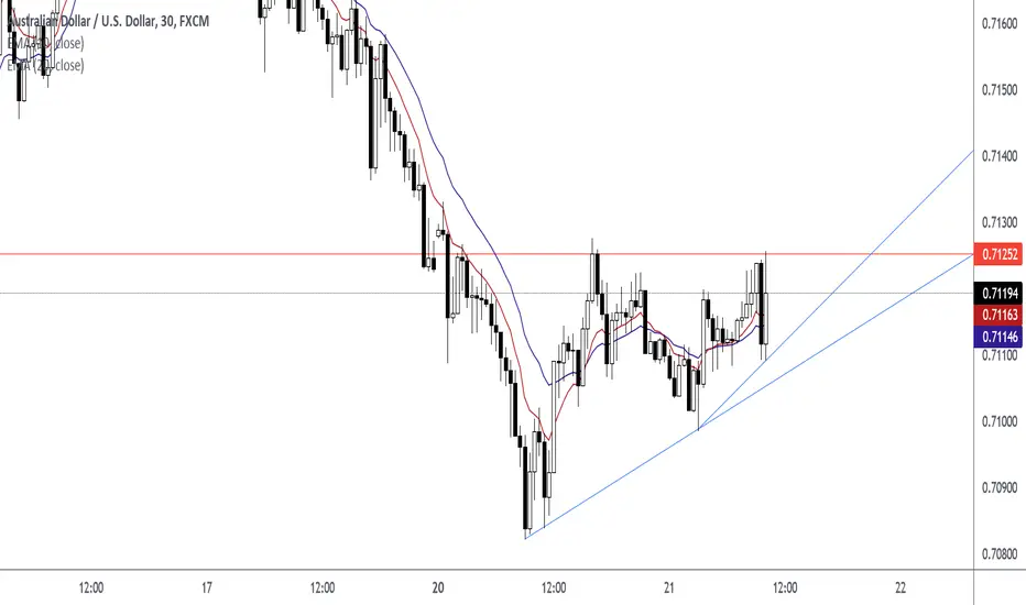
How To Trade The Ascending Triangle Before The BreakoutHow I Trade The Ascending Triangle
Engulfing Candle (Price Action Signal)
First Entry at 0.71194
Candlestick Closed Above Level
Second Entry at 0.71273
Retest Candlestick and Rejection Candlestick at 0.71295
Third Entry
Moving Average ChannelA lot of traders like myself, like to visualize the moving averages on their chart and incorporate them in their trading strategies. But what is extremely common in doing this, is traders being under the assumption that a moving average is the exact price in which we see supply and demand in the market.
In this video, I clearly outline how to add a channel around your moving averages, to give you an idea of where we may see a change in supply and demand. Having clarity in an area can help traders understand the moving average better than just a thin line.
If you do use moving averages in your trading strategies, I recommend trying this little trick to improve your success rate and understand breakouts better.
- Jordon

Weekly Line Chart DivergencesHello traders,
I am not a financial advisor. I am not telling you to trade any asset. I am simply sharing my ideas on how to use tools to implement my own investment strategy.
Here is a zoomed-out look you can use to come up with some of your own ideas on where the $SPX may go and how to manage your risk. Most of my core strategies are developed on the indices so I will have to implement them on individual tickers unless the comments are interesting.
This is a lagging indicator and should put me on the side of the trade that is *probably* likely to continue. By probably, I mean you need to do your own research and look at what the markets want to go and develop your own tools to work with the data.
Orientation:
Line Chart of ticker on weekly time frame
RSI using 12 periods (or weeks, in this case)
Signals can be marked using a vertical line or time-based axis marker . In this case, I am using 3 colors of lines, explained by the "Monday Action" legend. We will dive into more detail later on.
I also have EMA using ohlc4 on periods (or weeks) 10, 25, 50, 100, 200.
Now to the good stuff:
Divergences have been around for quite some time. Research about the RSI (Relative Strength Index) and it's roots
It is much easier to see something that is larger, than smaller, thus we look at weekly time frames
One can use volume, closing price and RSI to help manage one's risk
Narrowing a decision to 3 choices can help alleviate indecision
So for this application of the RSI and divergence, one can use a simple line chart on a weekly time frame (this chart is based on the closing price from what I can tell, but I was unable to confirm that with the Help Center. I was able to confirm by checking yesterday's close with current reading - it will be different after this post as the weekly close will come in today (writing before market close Friday morning)).
We can start at the March 2020 rally. We can see the March 23rd, 2020 weekly close paint a divergence
on the RSI. One can see the price close at a higher high when compared to March, 16th, 2020. The RSI values remain relatively flat: 17.95 to 18.04.
Find entry
One might conclude this is a time to buy. Because of the magnitude of the move DOWN, the move up was also shorted. One would have to employ the use of other tools in order to find entry in the following week. (Use the white anchored notes to see the explanations of thought process).
Find an entry in the next week. One can place orders on the weekend in "shotgun fashion" perhaps placing 50% order above current price and 50% below, or whatever method suits you.
Hedge Risk
The next yellow line is 08/24 - 31/2020.
The close indicates indecision in the market. Since this is the first divergence I would simply hedge the FANTASTIC long during the March 2020 buy. This can help to be determined from YELLOW vs RED using the 10 period moving-average of volume.
Use options or other means to protect one's long investments
Sell of Heavy Hedge
The next divergence is JAN 2021. This is the second one so I would probably sell at this point.
I would use my other tools to figure out what to do. Heavy hedging can be using derivatives or shorting your long positions.
Timing
A simple way to use this strategy might be to use the color's GREEN, YELLOW, RED, just like traffic lights. There will be deviations, and variations to the method, but if you back-test this you will probably find this works generally well.
Monday Action
Now I used the words Monday Action simply because that was the next possible day to make a decision. I can make my decision probably anytime within Friday if I feel comfortable with it. I can also place actions for Monday on the weekend.
Bottom Line
This week's close is very important. If we follow the green, yellow, red method from above, this very well can be a RED. It can also be another YELLOW. Volume is indicating something big, but we will see!
