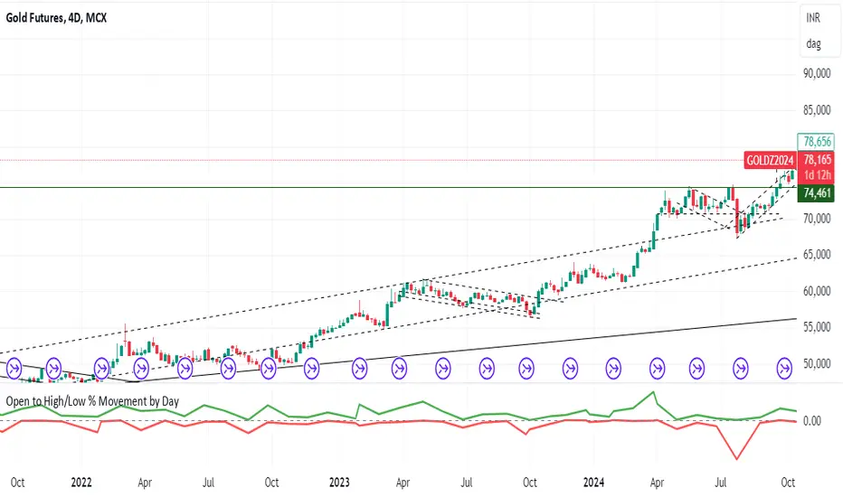
Open to High/Low % Movementto track the movement of open to low and open to high in % terms, please create a trading view pine script which can plot this movement in a separate chart
Breadth Indicators
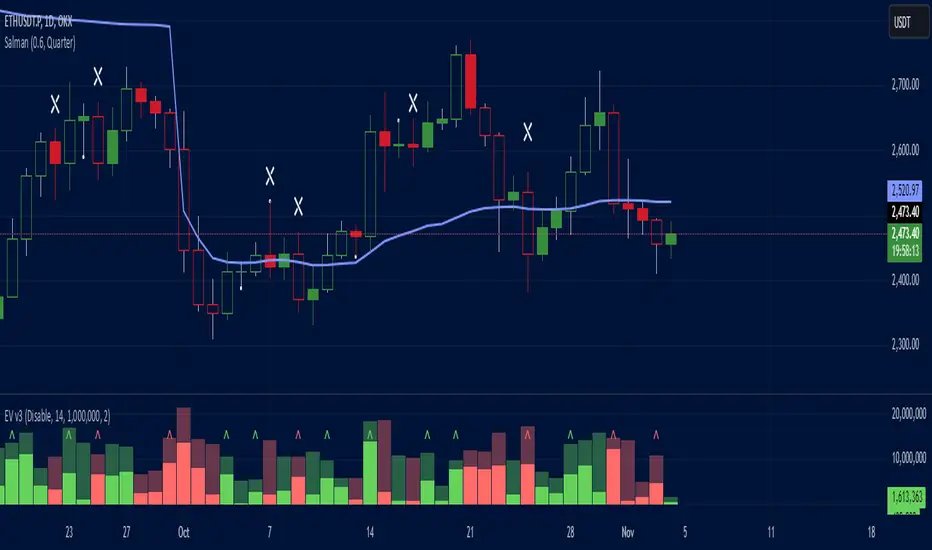
Effective Volume (ADV) v3Effective Volume (ADV) v3: Enhanced Accumulation/Distribution Analysis Tool
This indicator is an updated version of the original script by cI8DH, now upgraded to Pine Script v5 with added functionality, including the Volume Multiple feature. The tool is designed for analyzing Accumulation/Distribution (A/D) volume, referred to here as "Effective Volume," which represents the volume impact in alignment with price direction, providing insights into bullish or bearish trends through volume.
Accumulation/Distribution Volume Analysis : The script calculates and visualizes Effective Volume (ADV), helping traders assess volume strength in relation to price action. By factoring in bullish or bearish alignment, Effective Volume highlights points where volume strongly supports price movements.
Volume Multiple Feature for Volume Multiplication : The Volume Multiple setting (default value 2) allows you to set a multiplier to identify bars where Effective Volume exceeds the previous bar’s volume by a specified factor. This feature aids in pinpointing significant shifts in volume intensity, often associated with potential trend changes.
Customizable Aggregation Types : Users can choose from three volume aggregation types:
Simple - Standard SMA (Simple Moving Average) for averaging Effective Volume
Smoothed - RMA (Recursive Moving Average) for a less volatile, smoother line
Cumulative - Accumulated Effective Volume for ongoing trend analysis
Volume Divisor : The “Divide Vol by” setting (default 1 million) scales down the Effective Volume value for easier readability. This allows Effective Volume data to be aligned with the scale of the price chart.
Visualization Elements
Effective Volume Columns : The Effective Volume bar plot changes color based on volume direction:
Green Bars : Bullish Effective Volume (volume aligns with price movement upwards)
Red Bars : Bearish Effective Volume (volume aligns with price movement downwards)
Moving Average Lines :
Volume Moving Average - A gray line representing the moving average of total volume.
A/D Moving Average - A blue line showing the moving average of Accumulation/Distribution (A/D) Effective Volume.
High ADV Indicator : A “^” symbol appears on bars where the Effective Volume meets or exceeds the Volume Multiple threshold, highlighting bars with significant volume increase.
How to Use
Analyze Accumulation/Distribution Trends : Use Effective Volume to observe if bullish or bearish volume aligns with price direction, offering insights into the strength and sustainability of trends.
Identify Volume Multipliers with Volume Multiple : Adjust Volume Multiple to track when Effective Volume has notably increased, signaling potential shifts or strengthening trends.
Adjust Volume Display : Use the volume divisor setting to scale Effective Volume for clarity, especially when viewing alongside price data on higher timeframes.
With customizable parameters, this script provides a flexible, enhanced perspective on Effective Volume for traders analyzing volume-based trends and reversals.
Jackson Volume breaker Indication# Jackson Volume Breaker Beta
### Advanced Volume Analysis Indicator
## Description
The Jackson Volume Breaker Beta is a sophisticated volume analysis tool that helps traders identify buying and selling pressure by analyzing price action and volume distribution. This indicator separates and visualizes buying and selling volume based on where the price closes within each candle's range, providing clear insights into market participation and potential trend strength.
## Key Features
1. **Smart Volume Distribution**
- Automatically separates buying and selling volume
- Color-coded volume bars (Green for buying, Red for selling)
- Winning volume always displayed on top for quick visual reference
2. **Real-time Volume Analysis**
- Shows current candle's buy/sell ratio
- Displays total volume with smart number formatting (K, M, B)
- Percentage-based volume distribution
3. **Technical Overlays**
- 20-period Volume Moving Average
- Dynamic scaling relative to price action
- Clean, uncluttered visual design
## How to Use
### Installation
1. Add the indicator to your chart
2. Adjust the Volume Scale input based on your preference (default: 0.08)
3. Toggle the Moving Average display if desired
### Reading the Indicator
#### Volume Bars
- **Green Bars**: Represent buying volume
- **Red Bars**: Represent selling volume
- **Stacking**: The larger volume (winning side) is always displayed on top
- **Height**: Relative to the actual volume, scaled for chart visibility
#### Information Table
The top-right table shows three key pieces of information:
1. **Left Percentage**: Winning side's volume percentage
2. **Middle Percentage**: Losing side's volume percentage
3. **Right Number**: Total volume (abbreviated)
### Trading Applications
1. **Trend Confirmation**
- Strong buying volume in uptrends confirms bullish pressure
- High selling volume in downtrends confirms bearish pressure
- Volume divergence from price can signal potential reversals
2. **Support/Resistance Breaks**
- High volume on breakouts suggests stronger moves
- Low volume on breaks might indicate false breakouts
- Monitor volume distribution for break direction confirmation
3. **Reversal Identification**
- Volume shift from selling to buying can signal potential bottoms
- Shift from buying to selling can indicate potential tops
- Use with price action for better entry/exit points
## Input Parameters
1. **Volume Scale (0.01 to 1.0)**
- Controls the height of volume bars
- Default: 0.08
- Adjust based on your chart size and preference
2. **Show MA (True/False)**
- Toggles 20-period volume moving average
- Useful for identifying volume trends
- Default: True
3. **MA Length (1+)**
- Changes the moving average period
- Default: 20
- Higher values for longer-term volume trends
## Best Practices
1. **Multiple Timeframe Analysis**
- Compare volume patterns across different timeframes
- Look for volume convergence/divergence
- Use higher timeframes for major trend confirmation
2. **Combine with Other Indicators**
- Price action patterns
- Support/resistance levels
- Momentum indicators
- Trend indicators
3. **Volume Pattern Recognition**
- Monitor for unusual volume spikes
- Watch for volume climax patterns
- Identify volume dry-ups
## Tips for Optimization
1. Adjust the Volume Scale based on your chart size
2. Use smaller timeframes for detailed volume analysis
3. Compare current volume bars to historical patterns
4. Watch for volume/price divergences
5. Monitor volume distribution changes near key price levels
## Note
This indicator works best when combined with proper price action analysis and risk management strategies. It should not be used as a standalone trading system but rather as part of a comprehensive trading approach.
## Version History
- Beta Release: Initial public version
- Features buy/sell volume separation, moving average, and real-time analysis
- Optimized for both intraday and swing trading timeframes
## Credits
Developed by Jackson based on other script creators
Special thanks to the trading community for feedback and suggestions

Volume/Price Divergence v2The "Volume/Price Divergence v2" indicator is designed to analyze the relationship between volume and price movements in a financial market. It helps traders identify potential divergences that may indicate a change in market trends. Here’s a breakdown of how it works:
### Key Components
1. **Volume Calculation**:
- **Buying Volume**: This is calculated based on the relationship between the closing price and the high/low range. If the closing price is closer to the low, more volume is attributed to buying.
- **Selling Volume**: Conversely, if the closing price is closer to the high, more volume is considered selling.
The formulas used are:
```pinescript
buyVolume = high == low ? 0 : volume * (close - low) / (high - low)
sellVolume = high == low ? 0 : volume * (high - close) / (high - low)
```
2. **Plotting Volume**:
- The total volume is plotted in red and buying volume is plotted in teal. This helps visualize the volume distribution during different price movements.
3. **Rate of Change (ROC)**:
- The indicator calculates the rate of change for both volume and price over a specified period. This allows traders to see how volume and price are changing relative to each other.
```pinescript
roc = source / source
roc2 = source2 / source2
```
4. **Volume/Price Divergence (VPD)**:
- The VPD is derived from the ratio of the ROC of volume to the ROC of price. This ratio helps identify divergences:
- A VPD significantly above 10 may indicate strong divergence, suggesting that price movements are not supported by volume.
- A VPD around 1 indicates that volume and price are moving in harmony.
5. **Horizontal Lines**:
- The indicator includes horizontal lines at levels 10 (high divergence) and 1 (low divergence), serving as visual cues for traders to assess the market's state.
### Interpretation
- **Divergence**: If price makes a new high but volume does not follow (or vice versa), it may signal a potential reversal or weakness in the trend.
- **Volume Trends**: Analyzing the buying vs. selling volume can provide insights into market sentiment, helping traders make informed decisions.
- **Potential for a Strong Move**: A high VPD during a breakout indicates that while volume is increasing, the price isn’t moving significantly, suggesting that a big price move could be imminent.
- **Caution Before Entry**: Traders should be aware that the lack of price movement relative to high volume may signal an impending volatility spike, which could lead to a rapid price change in either direction.
Overall, this indicator is useful for traders looking to gauge the strength of price movements and identify potential reversals or breakouts based on volume trends.

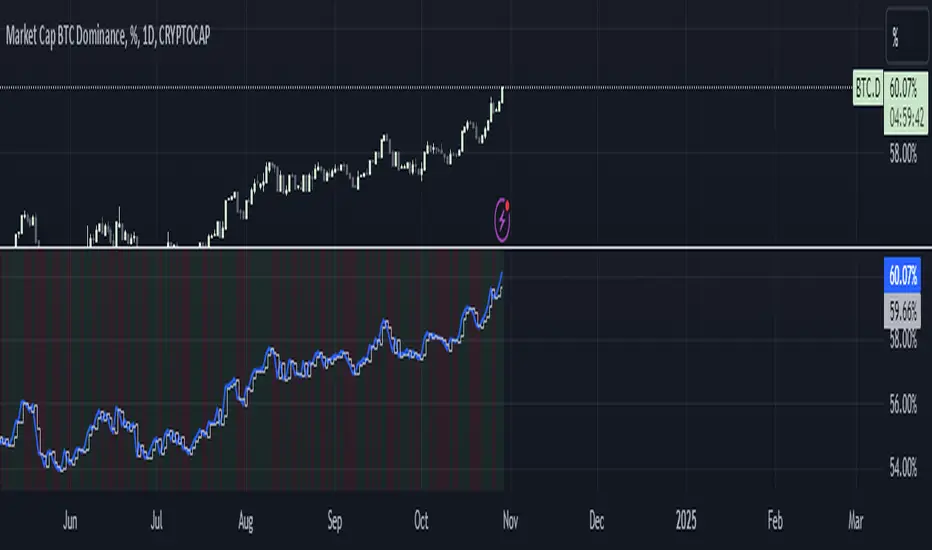
BTC Dominance Trend CheckerThis monitors the Bitcoin dominance (BTC.D) in the market. It retrieves the current and previous day's BTC dominance values, determines whether dominance is increasing or decreasing, and visually displays the trend.
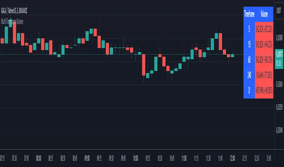
Multi TimeFrame VolumeThis script, "Multi TimeFrame Volume," is a TradingView Pine Script indicator that displays volume data across five user-selected timeframes in a table. Each volume is formatted in thousands (K) or millions (M) and color-coded based on the percentage change from the previous value (green for increase, red for decrease, gray if unchanged). The table's position and header colors can be customized. This helps traders quickly see volume trends at different intervals on a single chart
Heikin Line - TB365Heikin Line - An Enhanced Smoothed Heiken Ashi Overlay
Built on the foundation of TheBacktestGuy’s Smoothed Heiken Ashi indicator, Heikin Line takes trend analysis to the next level with versatile enhancements and adaptable settings.
This indicator offers selectable moving averages both before and after Heiken Ashi (HA) calculation, adding an additional layer of smoothness to traditional HA candles.
Key Features:
Trend Identification: Detects short and long-term trend directions with greater clarity.
Dynamic Support and Resistance: Not limited to a single line, Heikin Line creates a dynamic support/resistance zone, offering a visual “height” that adjusts with market shifts.
Trailing Stop: Effective as a trailing stop for enhanced risk management.
Trend Reversal Detection: Quickly identifies potential reversals when price crosses above or below the Heiken Ashi candle.
Improvements:
Trend Strength Visualization: Uses a cord-like appearance to reflect trend strength, making it easier to spot strong or weak trends.
Quick Reversal Detection: Enhanced responsiveness to detect rapid market reversals.
Easy Integration: Seamlessly combines with other indicators for a comprehensive trading setup.
With numerous moving average options, Heikin Line is adjustable to suit various market conditions and trading styles. Additionally, it leverages my TAExt library, so you can use it within your own strategies for added versatility.

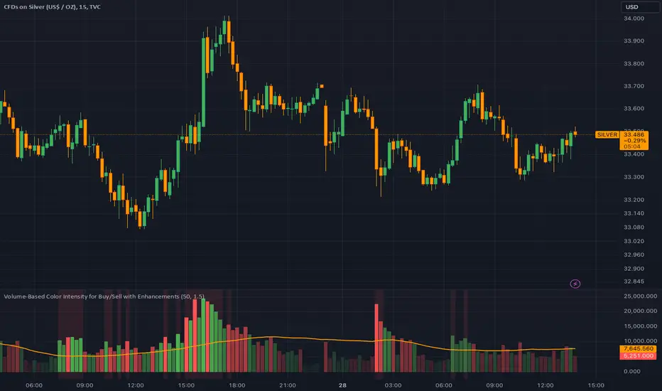
Dynamic Volume-Based Buy/Sell IndicatorThis script provides a powerful volume-based indicator that visualizes buy and sell volumes, issues alerts for volume spikes, and adjusts color intensity dynamically based on volume size. It includes customizable settings for volume averaging and thresholds, making it adaptable to various trading strategies.
Dynamic Box IndicatorThe BOX Indicator is a sophisticated trading tool designed to operate on 15-minute charts, aimed at enhancing market analysis. This indicator identifies the highest and lowest values of the first bar of each day, providing traders with strategic buy and sell signals. As a new day begins, the indicator dynamically updates these values to reflect current market conditions.
When the closing price surpasses the established highest level, a buy signal (LONG) is generated, signaling a strong potential upward movement in price. Conversely, when the closing price falls below the lowest level, a sell signal (SHORT) is activated, indicating that the price may experience a downward correction. On the chart, these critical levels are highlighted in eye-catching colors, while buy and sell signals are represented by symbols.
Additionally, the indicator includes an alert system for buy and sell conditions, allowing traders to minimize the risk of missing significant trading opportunities. This alert system enables users to monitor market changes in real time and take swift action when necessary.
Overall, the BOX Indicator serves as an effective tool that helps traders gain a deeper understanding of market movements and refine their trading strategies. It empowers users to enhance their technical analysis skills while maximizing their potential to capitalize on market fluctuations.

Normalized ATRWhat is Normalized ATR?
Normalized ATR (Average True Range) is an indicator used to assess the volatility of a financial asset in a more understandable way. Normalized ATR normalizes the Average True Range (ATR) over a specific period relative to the current price level, providing a more comparable measure of volatility. It gives appropriate volatility across all timeframes.
What is ATR (Average True Range)?
ATR is a technical indicator used to measure the volatility of an asset's price. ATR is calculated by taking the highest value from the following three values:
Daily High - Daily Low: The difference between the highest and lowest prices within the day.
Daily High - Previous Day's Close: The difference between today's highest price and the previous day's closing price.
Daily Low - Previous Day's Close: The difference between today's lowest price and the previous day's closing price.
The largest value among these three is then averaged over a specified period (usually 14 days) to calculate the ATR.
Why Use Normalized ATR?
Normalized ATR provides a way to compare the ATR relative to the current price level. This is particularly useful when comparing assets with different price levels. For example, two assets may have the same ATR value, but due to differing price levels, the perception of volatility could vary. Normalization helps eliminate these discrepancies, enabling more consistent analysis. It gives appropriate volatility across all timeframes.
Normalized ATR Calculation
Normalized ATR is calculated by dividing the ATR value by the current price level:
Normalized ATR
=
(
ATR
Current Price
)
×
Normalization Factor
Normalized ATR=(
Current Price
ATR
)×Normalization Factor
Here, the "Normalization Factor" is typically a multiplier (e.g., 100) to convert the result into a more readable format.
Example Usage
Investors can use the Normalized ATR value to determine the volatility of an asset and formulate risk management strategies. A high Normalized ATR indicates that the asset has high volatility, while a low value suggests lower volatility.
This indicator helps investors better understand market conditions and make informed trading decisions.

Harmony Signal Flow By ArunThis Pine Script strategy, titled "Harmony Signal Flow By Arun," uses the Relative Strength Index (RSI) indicator to generate buy and sell signals based on custom thresholds. The script incorporates stop-loss and target management and restricts new trades until the previous position closes. Here's a detailed description:
Custom RSI Metric:
The strategy calculates a 5-period RSI based on the closing price, aiming for a more responsive measure of price momentum.
RSI thresholds are defined:
Lower threshold (30): Indicates oversold conditions, triggering a potential buy.
Upper threshold (70): Indicates overbought conditions, prompting a possible sell.
Entry Conditions:
Buy Signal: The strategy initiates a buy order when the RSI crosses above the lower threshold (30), indicating a shift from oversold conditions.
Sell Signal: A sell order is triggered when the RSI crosses below the upper threshold (70), suggesting an overbought reversal.
Only one order (buy or sell) can be active at a time, ensuring that a new trade begins only when there’s no existing position.
Stop-Loss and Target Management:
For each trade, stop-loss and target conditions are applied to manage risk and secure profits.
For Buy Positions:
Stop-loss is set 100 points below the entry price.
Target is set 150 points above the entry price.
For Sell Positions:
Stop-loss is set 100 points above the entry price.
Target is 150 points below the entry price.
The strategy closes the trade when either the stop-loss or target is met, marking the trade as "closed" and allowing a new trade entry.
Trade Sequencing:
A new trade (buy or sell) is only permitted after the previous position hits either its stop-loss or target, preventing overlapping trades and ensuring clear trade sequences.
This sequential approach enhances risk management by ensuring only one active position at any time.
End-of-Day Closure:
All open positions are closed automatically at 3:25 PM (Indian market time) to avoid overnight exposure, ensuring the strategy remains strictly intraday.
The flag for trade entry is reset at the end of each day, enabling fresh trades the next day.
Chart Indicators:
The script plots buy and sell signals directly on the chart with visible labels.
It also displays the custom RSI metric with horizontal lines for the lower and upper thresholds, providing visual cues for entry and exit points.
Summary
This strategy is a momentum-based intraday trading approach that uses the RSI for identifying potential reversals and manages trades through predefined stop-loss and target levels. By enforcing trade sequencing and closing positions at the end of the trading day, it prioritizes risk management and seeks to capitalize on short-term trends while avoiding overnight market risks.

SimpleChart Indicator V1copyThe SimpleChart Indicator V1 is a technical analysis tool designed to facilitate trading decisions by providing clear buy and sell signals based on the relationship between the price and a Simple Moving Average (SMA). This indicator is especially useful for traders who prefer a straightforward, rule-based approach to market analysis.
Key Features:
Simple Moving Average (SMA): The core of the indicator is the SMA, which smooths price data over a specified period (default is 14 periods). This helps to identify the overall trend direction by filtering out short-term fluctuations.
Buy Signal: A buy signal is generated when the price crosses above the SMA. This indicates a potential upward trend, suggesting that it may be a good time to enter a long position.
Sell Signal: Conversely, a sell signal is triggered when the price crosses below the SMA. This suggests a potential downward trend, indicating that it may be time to exit a long position or consider a short position.
Visual Representation: The indicator provides clear visual cues on the chart:
Buy signals are marked with green labels below the bars.
Sell signals are marked with red labels above the bars.
The SMA line is plotted in blue, making it easy to identify the trend.
Benefits of Using SimpleChart Indicator V1:
User-Friendly: The indicator is easy to understand and implement, making it suitable for both novice and experienced traders.
Clarity in Decision Making: By providing distinct signals, the indicator helps traders make quick decisions based on the market's behavior concerning the moving average.
Trend Following: The SimpleChart Indicator V1 is particularly effective in trending markets, allowing traders to capture significant price movements.
Use Cases:
Day Trading: Traders can use the indicator for short-term trades by reacting quickly to buy and sell signals.
Swing Trading: The SMA helps identify trends over a longer period, making it suitable for swing traders looking to capitalize on price movements.
In summary, the SimpleChart Indicator V1 is a valuable tool for traders seeking a straightforward and effective way to analyze market trends and make informed trading decisions.

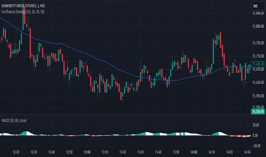
Confluence StrategyOverview of Confluence Strategy
The Confluence Strategy in trading refers to the combination of multiple technical indicators, support/resistance levels, and chart patterns to identify high-probability trading opportunities. The idea is that when several indicators agree on a price movement, the likelihood of that movement being successful increases.
Key Components
Technical Indicators:
Moving Averages (MA): Commonly used to determine the trend direction. Look for crossovers (e.g., the 50-day MA crossing above the 200-day MA).
Relative Strength Index (RSI): Helps identify overbought or oversold conditions. A reading above 70 may indicate overbought conditions, while below 30 suggests oversold.
MACD (Moving Average Convergence Divergence): Useful for spotting changes in momentum. Look for MACD crossovers and divergence from price.
Support and Resistance Levels:
Identify key levels where price has historically reversed. These can be drawn from previous highs/lows, Fibonacci retracement levels, or psychological price levels.
Chart Patterns:
Patterns like head and shoulders, double tops/bottoms, or flags can indicate potential reversals or continuations in price.
Strategy Implementation
Set Up Your Chart:
Add the desired indicators (e.g., MA, RSI, MACD) to your TradingView chart.
Mark significant support and resistance levels.
Identify Confluence Points:
Look for situations where multiple indicators align. For instance, if the price is near a support level, the RSI is below 30, and the MACD shows bullish divergence, this may signal a buying opportunity.
Entry and Exit Points:
Entry: Place a trade when your confluence conditions are met. Use limit orders for better prices.
Exit: Set profit targets based on resistance levels or use trailing stops. Consider the risk-reward ratio to ensure your trades are favorable.
Risk Management:
Always implement stop-loss orders to protect against unexpected market moves. Position size should reflect your risk tolerance.
Example of a Confluence Trade
Setup:
Price approaches a strong support level.
RSI shows oversold conditions (below 30).
The 50-day MA is about to cross above the 200-day MA (bullish crossover).
Action:
Enter a long position as the conditions align.
Set a stop loss just below the support level and a take profit at the next resistance level.
Conclusion
The Confluence Strategy can significantly enhance trading accuracy by ensuring that multiple indicators support a trade decision. Traders on TradingView can customize their indicators and charts to fit their personal trading styles, making it a flexible approach to technical analysis.
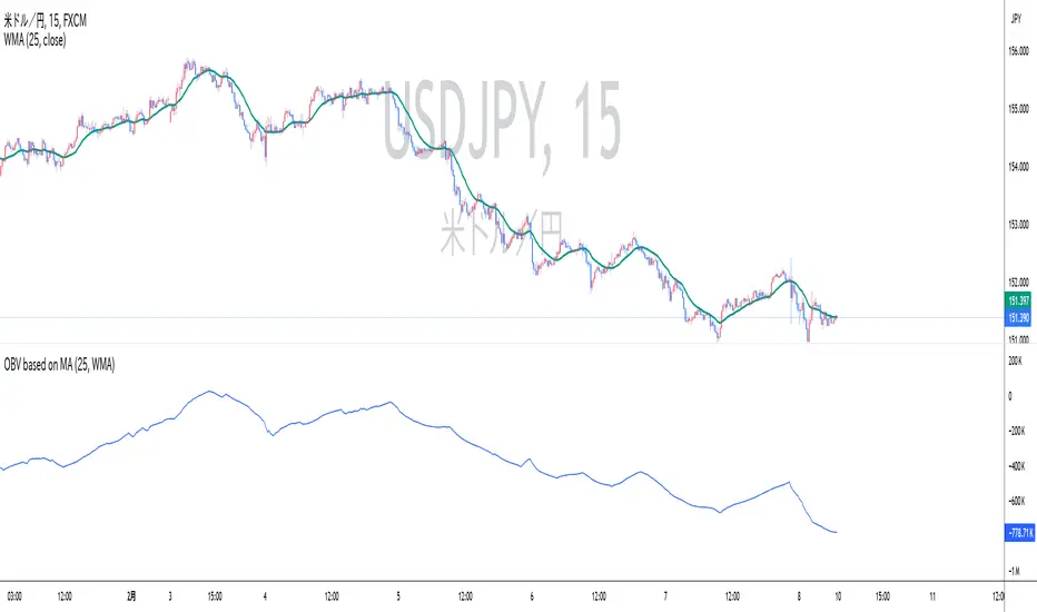
OBV based on MADescription:
This indicator calculates On-Balance Volume (OBV) based on the direction of a Simple Moving Average (SMA). Instead of using price movements, this OBV adds or subtracts volume depending on whether the SMA is rising or falling.
SMA-based OBV: When the SMA rises, the volume is added to the OBV. When the SMA falls, the volume is subtracted from the OBV. This allows traders to observe cumulative volume in relation to the wave patterns created by the SMA.
SMA Period: The period of the SMA can be customized, allowing traders to adjust it according to the wave size they want to observe.
While the cumulative volume indicator already exists, traders who analyze volume patterns can use this indicator to more easily conduct volume analysis across different wave sizes.
Inputs:
SMA Period: Defines the lookback period for calculating the Simple Moving Average (default is 25).
Ideal for:
Traders who want to analyze volume flow relative to moving average trends, rather than price movements. This can help identify underlying strength or weakness in market trends.
説明:
このインジケーターは、単純移動平均(SMA)の方向に基づいてオンバランス・ボリューム(OBV)を計算します。価格の動きではなく、SMAが上昇しているときは出来高を加算し、SMAが下降しているときは出来高を減算します。
SMA基準のOBV: SMAが上昇している場合はOBVに出来高が加算され、SMAが下降している場合は出来高が減算されます。これにより、SMAが作る波形に即した累積出来高を観察することができます。
SMA期間: トレーダーが見たい波のサイズ感に応じて、SMAの期間をカスタマイズできます。
既に累積出来高(Cumulative Volume)というインジケーターは存在しますが、波形を基に出来高を分析しているトレーダーは、このインジケーターを使うことで、様々なサイズの波形に即した出来高分析をより簡単に行うことができます。
入力項目:
SMA期間: 単純移動平均の計算に使用される期間を定義します(デフォルトは25)。
適しているトレーダー:
より波形に即した累積出来高分析を重視するトレーダーに最適です。
Daily Volume Metrics BoxDaily Volume Metrics Box
A powerful tool for monitoring intraday trading metrics in real-time. This indicator provides a clean, customizable display of key market statistics that reset daily.
🔑 Key Features:
- Daily Volume Distribution - Track positive and negative volume separately
- Net Volume Analysis - Monitor the balance of buying vs selling volume
- Average Candle Size - Dynamic calculation of recent price movement magnitude
- Flexible Positioning - Place the metrics box in any corner of your chart
- Auto-Reset - All metrics automatically reset at the start of each trading day
- Current Date Display - Always know which day's data you're viewing
📊 Metrics Explained:
1. Avg Size: Average candle size over your specified lookback period
2. Pos Vol: Accumulated volume from up-moves during the current day
3. Neg Vol: Accumulated volume from down-moves during the current day
4. Net Vol: The difference between positive and negative volume (Pos Vol - Neg Vol)
⚙️ Customization Options:
- Number of candles for average (1-∞)
- Background color and transparency
- Text color
- Box position (Top/Bottom, Left/Right)
- Distance from chart edge (1-5 bars)
📌 Usage Tips:
- Use larger lookback periods for more stable average candle size
- Position the box where it won't interfere with your chart analysis
- Monitor net volume for potential trend strength confirmation
- Compare positive and negative volume for insight into price momentum
🔄 Daily Reset:
All volume metrics reset at the start of each trading day, ensuring you're always looking at current day data only.
Perfect for day traders, swing traders, and anyone who wants to monitor intraday market dynamics with clean, organized metrics.
Note: This indicator works best on intraday timeframes where volume data is available.

VX DailyCycle PD Table (Levang)**Futures trading dependent**
QT Theory dependent (Daye) --> VX Theory DailyCycle with 3 ranges using detailing extreme premium range to mean range to extreme discount range *ONLY* 15min timeframe that start at 7:30am every trading day. This data table compares 3 triads (default qt triads as inputs) detailing what range each asset is currently in.
**continuous contracts are default as inputs but monthly contracts works best.**
Overview
This indicator creates a dynamic table showing the current market position of multiple assets across three major market segments: Equity Index futures, Currency futures, and Bond futures. Each asset's position is analyzed using VX Daily Cycle levels and displayed with intuitive color-coding and symbols.
Assets Tracked
Equity Triad: ES1!, NQ1!, YM1!
Currency Triad: DXY (Capital.com), 6E1!, 6B1!
Bond Triad: ZB1!, TN1!, ZF1!
Visual Interpretation
The table uses three main colors to indicate market positioning:
Green: Asset is trading at a discount
Yellow: Asset is trading in the mean range
Red: Asset is trading at a premium
Symbols (▲▲, ▲, △, ▽, ▼, ▼▼) provide additional detail about position within each range:
Double symbols (▲▲, ▼▼): Extreme levels
Solid symbols (▲, ▼): Strong moves
Hollow symbols (△, ▽): Moderate moves
Updates
The table updates every 15 minutes
Works on all timeframes while maintaining consistency
Position calculations are based on recent price action
Usage
This indicator is particularly useful for:
Cross-market analysis
Identifying relative value opportunities
Multi-timeframe market analysis
Understanding market correlations
Spotting potential reversals or continuations
Note
The indicator requires access to all listed symbols for full functionality. Some brokers may not provide access to all market
Legend:
VX Levels Color and Symbol Cheat Sheet
Upper Extension Range (Red)
▲▲ : (Extreme Premium)
▲ : (High Premium)
△ : (Moderate Premium)
Mean Range (Yellow)
△ : (Upper Mean)
▽ : (Lower Mean)
Lower Extension Range (Green)
▽ : (Moderate Discount)
▼ : (High Discount)
▼▼ : (Extreme Discount)

OBV based on Heikin-AshiDescription
This indicator calculates the On-Balance Volume (OBV) based on Heikin-Ashi candles rather than regular candlesticks.
OBV based on Heikin-Ashi: The OBV is calculated based on Heikin-Ashi candle trends. Volume is added when the Heikin-Ashi close is above the open (bullish) and subtracted when the close is below the open (bearish).
Volume Analysis: This approach helps traders identify significant volume shifts in a smoother trend environment, reducing market noise that often accompanies traditional candlestick charts.
説明
このインジケーターは、通常のローソク足ではなく、平均足(Heikin-Ashi)を基にオンバランス・ボリューム(OBV)を計算します。
平均足に基づくOBV: OBVは、平均足のトレンドに基づいて計算されます。平均足の終値が始値を上回った場合(陽線)は出来高が加算され、終値が始値を下回った場合(陰線)は出来高が減算されます。
出来高分析: この手法により、通常のローソク足チャートで発生するノイズを軽減し、滑らかなトレンド環境で重要な出来高の変化を把握できます。

Advanced Supply and Demand Indicator# Advanced Supply and Demand Indicator
This Pine Script™ indicator helps traders identify potential supply and demand zones in financial markets. It uses price action, volume, and historical data to plot these zones on your chart, providing valuable insights for trading decisions.
## Key Features:
- Automatically detects and plots supply and demand zones
- Customizable lookback period for zone identification
- Adjustable strength multiplier for more precise zone detection
- User-defined opacity for visual clarity
- Combines price action and volume analysis for improved accuracy
## How It Works:
1. Identifies significant price levels using a specified lookback period
2. Analyzes volume data to confirm potential supply and demand zones
3. Plots supply zones in red and demand zones in green
4. Displays the current price for easy reference
## Customization Options:
- Lookback Period: Adjust the historical data range (1-100 bars)
- Zone Strength Multiplier: Fine-tune the sensitivity of zone detection (1.0-3.0)
- Zone Opacity: Set the transparency of plotted zones (10-100%)
This indicator is designed to help traders identify potential areas of support and resistance, allowing for more informed entry and exit decisions in their trading strategies.

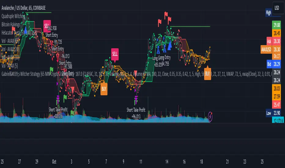
Gabriel's Witcher Strategy [65 Minute Trading Bot]Strategy Description: Gabriel's Witcher Strategy
Author: Gabriel
Platform: TradingView Pine Script (Version 5)
Backtested Asset: Avalanche (Coinbase Brokage for Volume adjustment)
Timeframe: 65 Minutes
Strategy Type: Comprehensive Trend-Following and Momentum Strategy with Scalping and Risk Management Features
Overview
Gabriel's Witcher Strategy is an advanced trading bot designed for the Avalanche pair on a 65-minute timeframe. This strategy integrates a multitude of technical indicators to identify and execute high-probability trading opportunities. By combining trend-following, momentum, volume analysis, and range filtering, the strategy aims to capitalize on both long and short market movements. Additionally, it incorporates scalping mechanisms and robust risk management features, including take-profit (TP) levels and commission considerations, to optimize trade performance and profitability.
====Key Components====
Source Selection:
Custom Source Flexibility: Allows traders to select from a wide range of price and volume sources (e.g., Close, Open, High, Low, HL2, HLC3, OHLC4, VWAP, On-Balance Volume, etc.) for indicator calculations, enhancing adaptability to various trading styles.
Various curves of Volume Analysis are employed:
Tick Volume Calculation: Utilizes tick volume as a fallback when actual volume data is unavailable, ensuring consistency across different data feeds.
Volume Indicators: Incorporates multiple volume-based indicators such as On-Balance Volume (OBV), Accumulation/Distribution (AccDist), Negative Volume Index (NVI), Positive Volume Index (PVI), and Price Volume Trend (PVT) for comprehensive market analysis.
Trend Indicators:
ADX (Average Directional Index): Measures trend strength using either the Classic or Masanakamura method, with customizable length and threshold settings. It's used to open positions when the mesured trend is strong, or exit when its weak.
Jurik Moving Average (JMA): A smooth moving average that reduces lag, configurable with various parameters including source, resolution, and repainting options.
Parabolic SAR: Identifies potential reversals in market trends with adjustable start, increment, and maximum settings.
Custom Trend Indicator: Utilizes highest and lowest price points over a specified timeframe to determine current and previous trend bases, visually represented with color-filled areas.
Momentum Indicators:
Relative Strength Index (RSI): Evaluates the speed and change of price movements, smoothed with a custom length and source. It's used to not enter the market for shorts in oversold or longs for overbought conditions, and to enter for long in oversold or shorts for overboughts.
Momentum-Based Calculations: Employs both Double Exponential Moving Averages (DEMA) on a MACD-based RSI to enhance momentum signal accuracy which is then further accelerated by a Hull MA. This is the technical analysis tool that determines bearish or bullish momentum.
OBV-Based Momentum Conditions: Uses two exponential moving averages of OBV to determine bullish or bearish momentum shifts, anomalities, breakouts where banks flow their funds in or Smart Money Concepts trade.
Moving Averages (MA):
Multiple MA Types: Includes Simple Moving Average (SMA), Exponential Moving Average (EMA), Weighted Moving Average (WMA), Hull Moving Average (HMA), and Volume-Weighted Moving Average (VWMA), selectable via input parameters.
MA Speed Calculation: Measures the percentage change in MA values to determine the direction and speed of the trend.
Range Filtering:
Variance-Based Filter: Utilizes variance and moving averages to filter out trades during low-volatility periods, enhancing trade quality.
Color-Coded Range Indicators: Visualizes range filtering with color changes on the chart for quick assessment.
Scalping Mechanism:
Heikin-Ashi Candles: Optionally uses Heikin-Ashi candles for smoother price action analysis.
EMA-Based Trend Detection: Employs fast, medium, and slow EMAs to determine trend direction and potential entry points.
Fractal-Based Filtering: Detects regular or BW (Black & White) fractals to confirm trade signals.
Take Profit (TP) Management:
Dynamic TP Levels: Calculates TP levels based on the number of consecutive long or short entries, adjusting targets to maximize profits.
TP Signals and Re-Entry: Plots TP signals on the chart and allows for automatic re-entry upon TP hit, maintaining continuous trade flow.
Risk Management:
Commission Integration: Accounts for trading commissions to ensure net profitability.
Position Sizing: Configured to use a percentage of equity for each trade, adjustable via input parameters.
Pyramiding: Allows up to one additional position per direction to enhance gains during strong trends.
Alerts and Visual Indicators:
Buy/Sell Signals: Plots visual indicators (triangles and flags) on the chart to signify entry and TP points.
Bar Coloring: Changes bar colors based on ADX and trend conditions for immediate visual cues.
Price Levels: Marks significant price levels related to TP and position entries with cross styles.
Input Parameters
Source Settings:
Custom Sources (srcinput): Choose from various price and volume sources to tailor indicator calculations.
ADX Settings:
ADX Type (ADX_options): Select between 'CLASSIC' and 'MASANAKAMURA' methods.
ADX Length (ADX_len): Defines the period for ADX calculation.
ADX Threshold (th): Sets the minimum ADX value to consider a strong trend.
RSI Settings:
RSI Length (len_3): Period for RSI calculation.
RSI Source (src_3): Source data for RSI.
Trend Strength Settings:
Channel Length (n1): Period for trend channel calculation.
Average Length (n2): Period for smoothing trend strength.
Jurik Moving Average (JMA) Settings:
JMA Source (inp): Source data for JMA.
JMA Resolution (reso): Timeframe for JMA calculation.
JMA Repainting (rep): Option to allow JMA to repaint.
JMA Length (lengths): Period for JMA.
Parabolic SAR Settings:
SAR Start (start): Initial acceleration factor.
SAR Increment (increment): Acceleration factor increment.
SAR Maximum (maximum): Maximum acceleration factor.
SAR Point Width (width): Visual width of SAR points.
Trend Indicator Settings:
Trend Timeframe (timeframe): Period for trend indicator calculations.
Momentum Settings:
Source Type (srcType): Select between 'Price' and 'VWAP'.
Momentum Source (srcPrice): Source data for momentum calculations.
RSI Length (rsiLen): Period for momentum RSI.
Smooth Length (sLen): Smoothing period for momentum RSI.
OBV Settings:
OBV Line 1 (e1): EMA period for OBV line 1.
OBV Line 2 (e2): EMA period for OBV line 2.
Moving Average (MA) Settings:
MA Length (length): Period for MA calculations.
MA Type (matype): Select MA type (1: SMA, 2: EMA, 3: HMA, 4: WMA, 5: VWMA).
Range Filter Settings:
Range Filter Length (length0): Period for range filtering.
Range Filter Multiplier (mult): Multiplier for range variance.
Take Profit (TP) Settings:
TP Long (tp_long0): Percentage for long TP.
TP Short (tp_short0): Percentage for short TP.
Scalping Settings:
Scalping Activation (ACT_SCLP): Enable or disable scalping.
Scalping Length (HiLoLen): Period for scalping indicators.
Fast EMA Length (fastEMAlength): Period for fast EMA in scalping.
Medium EMA Length (mediumEMAlength): Period for medium EMA in scalping.
Slow EMA Length (slowEMAlength): Period for slow EMA in scalping.
Filter (filterBW): Enable or disable additional fractal filtering.
Pullback Lookback (Lookback): Number of bars for pullback consideration.
Use Heikin-Ashi Candles (UseHAcandles): Option to use Heikin-Ashi candles for smoother trend analysis.
Strategy Logic
Indicator Calculations:
Volume and Source Selection: Determines the primary data source based on user input, ensuring flexibility and adaptability.
ADX Calculation: Computes ADX using either the Classic or Masanakamura method to assess trend strength.
RSI Calculation: Evaluates market momentum using RSI, further smoothed with custom periods.
Trend Strength Assessment: Utilizes trend channel and average lengths to gauge the robustness of current trends.
Jurik Moving Average (JMA): Smooths price data to reduce lag and enhance trend detection.
Parabolic SAR: Identifies potential trend reversals with adjustable parameters for sensitivity.
Momentum Analysis: Combines RSI with DEMA and OBV-based conditions to confirm bullish or bearish momentum.
Moving Averages: Employs multiple MA types to determine trend direction and speed.
Range Filtering: Filters out low-volatility periods to focus on high-probability trades.
Trade Conditions:
Long Entry Conditions:
ADX Confirmation: ADX must be above the threshold, indicating a strong uptrend.
RSI and Momentum: RSI below 70 and positive momentum signals.
JMA and SAR: JMA indicates an uptrend, and Parabolic SAR is below the price.
Trend Indicator: Confirms the current trend direction.
Range Filter: Ensures market is in an upward range.
Scalping Option: If enabled, additional scalping conditions must be met.
Short Entry Conditions:
ADX Confirmation: ADX must be above the threshold, indicating a strong downtrend.
RSI and Momentum: RSI above 30 and negative momentum signals.
JMA and SAR: JMA indicates a downtrend, and Parabolic SAR is above the price.
Trend Indicator: Confirms the current trend direction.
Range Filter: Ensures market is in a downward range.
Scalping Option: If enabled, additional scalping conditions must be met.
Position Management:
Entry Execution: Places long or short orders based on the identified conditions and user-selected position types (Longs, Shorts, or Both).
Take Profit (TP): Automatically sets TP levels based on predefined percentages, adjusting dynamically with consecutive trades.
Re-Entry Mechanism: Allows for automatic re-entry upon TP hit, maintaining active trading positions.
Exit Conditions: Closes positions when TP levels are reached or when opposing trend signals are detected.
Visual Indicators:
Bar Coloring: Highlights bars in green for bullish conditions, red for bearish, and orange for neutral.
Plotting Price Levels: Marks significant price levels related to TP and trade entries with cross symbols.
Signal Shapes: Displays triangle and flag shapes on the chart to indicate trade entries and TP hits.
Alerts:
Custom Alerts: Configured to notify traders of long entries, short entries, and TP hits, enabling timely trade management and execution.
Usage Instructions
Setup:
Apply the Strategy: Add the script to your TradingView chart set to BTCUSDT with a 65-minute timeframe.
Configure Inputs: Adjust the input parameters under their respective groups (e.g., Source Settings, ADX, RSI, Trend Strength, etc.) to match your trading preferences and risk tolerance.
Position Selection:
Choose Position Type: Use the Position input to select Longs, Shorts, or Both based on your market outlook.
Execution: The strategy will automatically execute and manage positions according to the selected type, ensuring targeted trading actions.
Signal Interpretation:
Buy Signals: Blue triangles below the bars indicate potential long entry points.
Sell Signals: Red triangles above the bars indicate potential short entry points.
Take Profit Signals: Flags above or below the bars signify TP hits for long and short positions, respectively.
Bar Colors: Green bars suggest bullish conditions, red bars indicate bearish conditions, and orange bars represent neutral or consolidating markets.
Risk Management:
Default Position Size: Set to 100% of equity. Adjust the default_qty_value as needed for your risk management strategy.
Commission: Accounts for a 0.1% commission per trade. Adjust the commission_value to match your broker's fees.
Pyramiding: Allows up to one additional position per direction to enhance gains during strong trends.
Backtesting and Optimization:
Historical Testing: Utilize TradingView's backtesting features to evaluate the strategy's performance over historical data.
Parameter Tuning: Optimize input parameters to align the strategy with current market dynamics and personal trading objectives.
Alerts Configuration:
Set Up Alerts: Enable and configure alerts based on the predefined alertcondition statements to receive real-time notifications of trade signals and TP hits.
Additional Features
Comprehensive Indicator Integration: Combines multiple technical indicators to provide a holistic view of market conditions, enhancing trade signal accuracy.
Scalping Options: Offers an optional scalping mechanism to capitalize on short-term price movements, increasing trading flexibility.
Dynamic Take Profit Levels: Adjusts TP targets based on the number of consecutive trades, maximizing profit potential during favorable trends.
Advanced Volume Analysis: Utilizes various volume indicators to confirm trend strength and validate trade signals.
Customizable Range Filtering: Filters trades based on market volatility, ensuring trades are taken during optimal conditions.
Heikin-Ashi Candle Support: Optionally uses Heikin-Ashi candles for smoother price action analysis and reduced noise.
====Recommendations====
Thorough Backtesting:
Historical Performance: Before deploying the strategy in a live trading environment, perform comprehensive backtesting to understand its performance under various market conditions. These are the premium settings for Avalanche Coinbase.
Optimization: Regularly review and adjust input parameters to ensure the strategy remains effective amidst changing market volatility and trends. Backtest the strategy for each crypto and make sure you are in the right brokage when using the volume sources as it will affect the overall outcome of the trading strategy.
Risk Management:
Position Sizing: Adjust the default_qty_value to align with your risk tolerance and account size.
Stop-Loss Implementation: Although the strategy includes TP levels, they're also consided to be a stop-loss mechanisms to protect against adverse market movements.
Commission Adjustment: Ensure the commission_value accurately reflects your broker's fees to maintain realistic backtesting results. Generally, 0.1~0.3% are most of the average broker's comission fees.
Slipage: The slip comssion is 1 Tick, since the strategy is adjusted to only enter/exit on bar close where most positions are available.
Continuous Monitoring:
Strategy Performance: Regularly monitor the strategy's performance to ensure it operates as expected and make adjustments as needed. A max-drawndown hit has been added to operate in case the premium Avalanche settings go wrong, but you can turn it off an adjust the equity percentage to 50% if you are confortable with the high volatile max-drown or even 100% if your account allows you to borrow cash.
Customization:
Indicator Parameters: Tailor indicator settings (e.g., ADX length, RSI period, MA types) to better fit your specific trading style and market conditions.
Scalping Options: Enable or disable scalping based on your trading preferences and risk appetite.
Conclusion
Gabriel's Witcher Strategy is a robust and versatile trading solution designed to navigate the complexities of the Crypto market. By integrating a wide array of technical indicators and providing extensive customization options, this strategy empowers traders to execute informed and strategic trades. Its comprehensive approach, combining trend analysis, momentum detection, volume evaluation, and range filtering, ensures that trades are taken during optimal market conditions. Additionally, the inclusion of scalping features and dynamic take-profit management enhances the strategy's adaptability and profitability potential. Unlike any trading strategy, with both diligent testing and continuous monitoring under the strategy tester, it's possible to achieve sustained success by adjusting the settings to the individual Crypto that need it, for example this one is preset for Avalanche Coinbase 65 Miinutes but it can be adjust for BTCUSD or Etherium if you backtest and search for the right settings.
Order Flow / Delta Volume IndicatorOrder Flow / Delta Volume Indicator
The Order Flow / Delta Volume Indicator is designed to give traders a comprehensive view of market activity by combining delta volume analysis, order flow imbalances, and momentum filters. This indicator is not just a mashup of components, but a carefully crafted tool that enhances decision-making by integrating various layers of market analysis into one powerful system.
How the Components Work Together:
1. Delta Volume Bars: The core of this indicator, delta volume shows the difference between buy and sell orders, allowing traders to see real-time shifts in market sentiment. Green bars indicate buy-side pressure, while red bars show sell-side dominance. By visualizing this in bar form, traders can easily spot significant shifts in order flow that could signal trend changes or momentum shifts.
2. Cumulative Delta Line (Rescaled): The cumulative delta is rescaled to plot under the price candles, giving traders a clear, contextualized view of how net buyer or seller dominance is developing over time. This line helps identify potential market reversals when price moves diverge from cumulative delta trends.
3. Order Flow Imbalance Detection: Imbalances in buy and sell volumes are automatically detected using a threshold, ensuring that traders are alerted to significant market moves. These imbalances provide insight into aggressive buying or selling behavior, which is crucial for identifying points of high trading activity or potential breakout/reversal zones.
4. VWAP Filter: Volume Weighted Average Price (VWAP) is included as a filter to confirm trend direction. The VWAP ensures that buy signals are only triggered when price action is above the VWAP (indicating strength), and sell signals are triggered when price is below the VWAP (indicating weakness). This ensures that signals are not just based on volume, but also on where price is relative to a critical benchmark.
5. RSI Filter: The inclusion of the Relative Strength Index (RSI) adds a momentum check to the signals. By using RSI, traders can avoid taking trades during low-momentum periods, ensuring they only act when market conditions favor a stronger move.
6. Signal Cooldown Feature: To avoid clutter and noise from frequent signals, this indicator includes a cooldown period between signals, ensuring that traders don’t receive excessive alerts in a short timeframe. This feature prevents overtrading and helps focus on high-quality signals.
Why This Combination is Useful:
• Comprehensive Market Insight: By combining delta volume analysis with order flow imbalance detection, this indicator provides a deep understanding of market sentiment, showing not only price movement but the underlying volume dynamics driving those moves.
• Signal Accuracy: The VWAP and RSI filters ensure that signals are only generated in strong market conditions, filtering out weak or false signals that often occur in choppy markets.
• Divergence Detection: The cumulative delta line provides traders with a tool for spotting divergences between price action and underlying volume, allowing for earlier detection of potential reversals.
This indicator is more than a simple combination of existing tools—it’s a strategic fusion of volume analysis, order flow, and momentum filters designed to provide traders with a clearer view of market activity and to generate more reliable buy/sell signals.
This description explains how the components work together and highlights the indicator’s usefulness, which should address TradingView’s concerns about originality and purpose.

DMR By ANTExplanation of the DMR by ANT Script
a. What is This Script and How Is It Useful?
This Pine Script, named "DMR by ANT, " is designed for use on TradingView, focusing on dynamically assessing market conditions. It calculates key levels, specifically the high and low of the previous two days, to establish trading zones that assist traders in making informed decisions.
The script highlights:
Previous Day's High and Low : It captures the high and low prices from the previous two days to help set up trading ranges.
First 15 Minutes Candles High and low is marked with Orange Lines .
Trade Zones : It identifies whether the current price is in a 'tradeable' zone or 'non-tradeable' zone. The zones are determined based on the relationship between the current price, today's open price, and the calculated high and low levels.
Targets and Stop Losses : The script dynamically provides target and stop-loss levels based on user-defined input points, which can help manage risk effectively.
This script is beneficial for traders looking to enter (or avoid) trades based on defined price action criteria and can effectively streamline the analysis process in fast-moving markets.
Customize Input Parameters:(settings)
Adjust the ATR, based on ATR target and stop-loss is calculated and displayed. The default values 7(rest see the help), Dynamics changes based on ATR values changes in real time.
b. How to Effectively Use This Script
The DMR script can be utilized across various trading instruments, including:
Indexes: Suitable for gauging market sentiment and overall trends; can assist in short-term trading strategies.
Options: Helps determine the likely movement of the underlying assets, providing insight into probable volatility and directional bias.
ETFs (Exchange-Traded Funds): Useful for trading diversified portfolios; traders can define entry and exit points relevant to the basket of stocks.
Stocks: Ideal for individual stock trading, as traders can analyze stock movements concerning broader market trends.
When utilizing this script, traders should:
Identify key trading levels before entering trades based on the calculated high and low ranges.
Use the dynamic targets and stop-loss levels to protect capital and maximize potential gains.
Continuously monitor the script's signals and adapt to ongoing market changes.
c. Best Time Frames for Different Instruments
The optimal time frames for using the DMR script can vary based on the trading instrument.
Here’s a summary in tabular format for clearer guidance:
Instrument Best Time Frames
Index 5-minute, 15-minute, 1-hour
Options 1-minute, 5-minute, 15-minute
ETF 5-minute, 15-minute, 1-hour
Stocks 5-minute, 15-minute, 1-hour, Daily
Indexes: Shorter time frames (5 to 15 minutes) can capture quick market movements, while 1-hour frames can provide a broader market overview.
Options Trading: Given the time sensitivity of options, using very short time frames (1-5 minutes) can be effective to seize rapid price movements before expiry.
ETFs: Similar to indices, shorter frames help in effectively tracking movements of the underlying assets.
Stocks: A mix of short (5-15 minutes) for day trading and daily charts for swing trading can provide balanced insights.
Conclusion
Utilizing the DMR by ANT script can greatly enhance a trader's ability to analyze market conditions, identify opportunities, and manage risk effectively. By adapting the script through the different listed recommendations, traders can maximize their trading strategy’s effectiveness across various instruments.
Do comment below for further improvement.

Liquidity Analysis with Volume, ATR, and Chaikin Oscillator
Script Name: Liquidity Analysis with Volume, ATR, and Chaikin Oscillator
Description: This script analyzes market liquidity using three key indicators: Volume, ATR (Average True Range), and the Chaikin Oscillator. Based on the combination of these indicators, the script identifies three market conditions and visually highlights them with background colors:
High Liquidity Uptrend (Green Background):
Occurs when volume is high, ATR is above the threshold, and the Chaikin Oscillator is positive. This indicates strong liquidity with an upward trend in the market.
Alert: "High Liquidity Uptrend detected."
High Liquidity Downtrend (Red Background):
Occurs when volume is high, ATR is above the threshold, and the Chaikin Oscillator is negative. This signals strong liquidity but with a downward market trend.
Alert: "High Liquidity Downtrend detected."
Low Liquidity Stagnant Market (Yellow Background):
Occurs when volume is low, and ATR is below the threshold. This suggests a market with low liquidity and minimal price movement, indicating a range or stagnant phase.
Alert: "Low Liquidity Stagnant market detected."
Input Settings Panel:
Volume Threshold: This value sets the minimum volume required to determine high liquidity. If the volume is above this value, it is considered "high volume."
ATR Length: Defines the number of periods used to calculate ATR. The higher the value, the more smoothed the ATR calculation.
ATR Threshold: This sets the minimum ATR value required to signal a market with significant volatility. If ATR is above this value, the market is considered to have high volatility.
These settings allow you to fine-tune the script based on the characteristics of the asset being analyzed.
スクリプト名: 出来高、ATR、チャイキンオシレーターを用いた流動性分析
説明: このスクリプトは、出来高、ATR(平均真値幅)、およびチャイキンオシレーターという3つの主要な指標を用いて市場の流動性を分析します。これらの指標の組み合わせに基づいて、3つの市場状況を特定し、背景色で視覚的にハイライトします。
流動性が高い上昇相場(背景色:緑):
出来高が高く、ATRがしきい値を超え、チャイキンオシレーターがプラスの場合に発生します。これは、強い流動性と市場の上昇トレンドを示します。
アラート: 「高流動性の上昇トレンドが検出されました。」
流動性が高い下降相場(背景色:赤):
出来高が高く、ATRがしきい値を超え、チャイキンオシレーターがマイナスの場合に発生します。これは、強い流動性を伴う下降トレンドを示します。
アラート: 「高流動性の下降トレンドが検出されました。」
流動性が低い停滞相場(背景色:黄色):
出来高が低く、ATRがしきい値以下の場合に発生します。これは流動性が低く、価格変動が少ない、レンジまたは停滞フェーズを示しています。
アラート: 「低流動性の停滞相場が検出されました。」
設定パネルの入力項目:
出来高のしきい値: 高流動性を判定するために必要な最小の出来高を設定します。この値を超える場合、「高出来高」と見なされます。
ATRの期間: ATRを計算する際に使用される期間数を定義します。値が大きいほど、ATRの計算が滑らかになります。
ATRのしきい値: しきい値を超えた場合に市場に大きなボラティリティがあると判断します。この値を上回るATRであれば、ボラティリティが高いと見なされます。
これらの設定により、分析対象の資産の特性に応じてスクリプトを調整できます。

PavanDeshetty-CallThe PavanDeshetty-Call indicator is a custom Pine Script tool designed to track options price movements for a specific call option and generate entry and exit signals based on predefined conditions. Below is a description of its key components:
Key Features:
Index Selection: Allows the user to select from major indices like NIFTY, BANKNIFTY, FINNIFTY, and MIDCPNIFTY. The selected index forms part of the option symbol.
Expiry Date Input: The user inputs the expiry day, month, and year, which helps to construct the full symbol for the call option being tracked.
Strike Price Selection: Allows the user to input a specific strike price for the call option, further refining the option symbol.
Option Symbol Generation: Based on the selected index, expiry date, and strike price, the indicator generates the symbol for the selected call option.
Data and Plotting:
Option Premium Data: The indicator fetches the open, high, low, and close data for the selected call option symbol using the request.security() function, which is then plotted as a candle chart. Green candles indicate price increases (close > open), while red candles indicate price decreases (close < open).
Entry and Exit Logic:
Entry Condition:
The indicator checks if the current option price is greater than or equal to 100.5% of the highest high of the previous "n" candles (the number of previous candles can be specified by the user).
If true, and if the user is not already in a position, a buy signal is generated.
Exit Condition:
The indicator checks if the option price has crossed below 99.5% of the previous candle's low.
If true, and if the user is in a position, a sell signal is generated.
Position Tracking:
The script uses a boolean variable in_position to track whether the user is currently in a trade. This prevents multiple entries and ensures that the exit condition resets the trade status.
Visual Signals:
Buy and Sell Signals:
Buy signals are plotted as green "Buy" labels at the bottom of the chart.
Sell signals are plotted as red "Sell" labels at the top of the chart.
After each signal, the flags for plotting the signals are reset.
Alerts:
Buy and Sell Alerts: The indicator includes alert conditions for both the buy and sell signals, allowing users to set up notifications when the entry or exit conditions are met.
This indicator is useful for traders looking to automate or track options trading based on specific strike prices and options expiry dates, combined with simple price-action-based entry and exit conditions.
