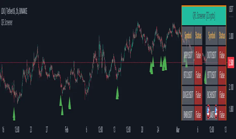
QFL Screener [ ZCrypto ]The QFL Screener is a robust tool inspired by Quickfingersluc's trading strategy.
Known as the Base Strategy or Mean Reversals, QFL focuses on identifying moments of panic selling and buying , presenting opportunities to enter trades at deeply discounted prices.
The QFL Screener is designed to enhance your trading efficiency by simultaneously scanning 40 symbols.
You have the flexibility to enable or disable specific symbols from the screening process, allowing you to tailor the screener to your preferred markets and instruments.
The Screener has a built-in alerts system . As soon as the QFL conditions align for any of the scanned symbols, you'll receive instant notifications, empowering you to take prompt action and seize potential trading opportunities.
In addition, I've incorporated a visual element to complement the alerts. Once the conditions are true, a green arrow shape will appear directly on the chart, providing a clear and intuitive signal of the QFL opportunity.
To provide a clear overview, our screener presents a comprehensive table that highlights when the QFL condition becomes true for each symbol. This table acts as a visual guide, enabling you to monitor the status of multiple symbols at a glance, streamlining your trading decision-making process.
With the QFL Screener, you gain an edge in identifying profitable trade setups based on Quickfingersluc's renowned approach. Experience the convenience of simultaneous screening, real-time alerts, and an intuitive table display, all in one user-friendly tool.
Breadth Indicators
#TheStrat Based Sector Rotation on an intraday basis This script will show the close to close change on any timeframe it is set to across all the SPDR sector selectors
Green colors dictate a positive close to close change on the specified timeframe.
Red colors dictate a negative close to close change on the specified timeframe.
When all of the values flip red or a wave of red or green begins to come over it signals a move that is supported by all of the underlying components of the SPY. This is important to know because when you get a simultaneous break you will then have aggressive participants. This is because the whole market is moving the same, meaning 'the big boys' are buying or selling everything all at once! When that happens the moves are much greater.
Tickers can be changed in settings, OF NOTE. When a ticker is changed the table cell name will not change. I have not found a way to use ticker names in the table cells so just will be a quirk for now.
% Stocks Above MABreadth indicator showing % stocks above various moving averages. Histogram is positive (blue) when % stocks above selected MA is greater than 50%. Histogram is negative (red) when % of stocks above selected MA is less than 50%. Data manipulation causes the actual % value in y-axis to be incorrect but enhances visualization. Actual %'s are simply the displayed values + 50.
Improvements / suggestions welcome.
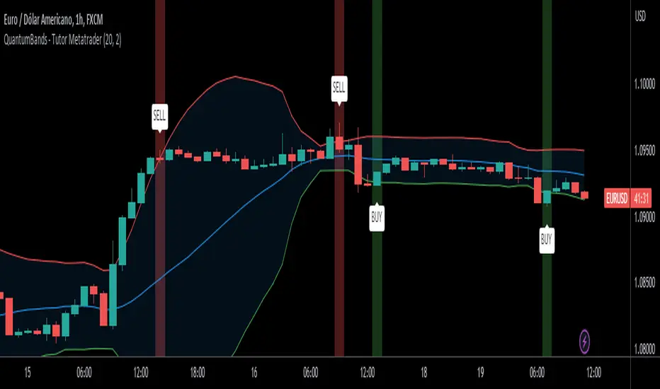
QuantumBands - Tutor Metatrader🚀 QuantumBands - Tutor Metatrader 🚀
📖 Description:
QuantumBands is a powerful technical indicator designed to enhance your trading analysis. It combines the popular Bollinger Bands with a unique twist, providing you with valuable insights into market dynamics. This indicator is presented by the Tutor Metatrader channel, offering expert guidance and education on using the indicator effectively.
🔍 How it Works:
QuantumBands calculates the Bollinger Bands based on a defined period and multiplier. The indicator plots the middle band (basis), the upper band, and the lower band on your chart, visualizing potential price volatility and areas of support and resistance. Additionally, it generates buy and sell signals when the price crosses the bands, helping you identify potential entry and exit points in your trading strategy.
🎯 Key Features:
- Customizable period and multiplier for the Bollinger Bands.
- Clear visual representation of the bands for easy analysis.
- Buy and sell signals for potential trading opportunities.
- Backed by the expertise of Tutor Metatrader channel.
📚 How to Use:
1. Set the desired period and multiplier for the Bollinger Bands.
2. Look for price action near the bands and monitor for potential reversals or breakouts.
3. Pay attention to buy and sell signals generated when the price crosses the bands.
4. Consider additional factors and perform proper risk management before executing trades.
⚠️ Disclaimer: Trading involves risk, and this indicator should be used as a tool to support your analysis. Always perform your due diligence and combine the indicator with other technical and fundamental analysis methods.
🌟 Enjoy using QuantumBands for your trading analysis, and remember to check out the Tutor Metatrader channel for expert guidance and educational content!
💡 Share your feedback and trading experiences with QuantumBands - Tutor Metatrader in the comments below. Happy trading!
HL ATRUnlocking Market Volatility: The Adaptive Highest High Lowest Low Indicator
As seasoned traders know, accurately identifying and leveraging market highs and lows can significantly impact your trading performance. One innovative tool for harnessing these inflection points is the Adaptive Highest High Lowest Low Indicator. Built for intuitive trading, this indicator offers a distinctive edge in identifying key trading signals in volatile markets.
1. Understanding the Indicator
At its core, the Adaptive Highest High Lowest Low Indicator operates by pinpointing the highest highs and lowest lows within a specified lookback period. What sets it apart is its ability to adapt and respond to market volatility, enhancing its utility in various market conditions.
Key parameters include the lookback period, the number of confirmation candles, the number of previous high/low lines to display, and the Average True Range (ATR) period. Each of these inputs offers the trader flexibility to fine-tune the indicator to suit their specific trading style and the prevailing market conditions.
2. Harnessing the Power of Highs and Lows
The indicator begins by charting the highest high and the lowest low within your chosen lookback period. These highs and lows are treated as levels of resistance and support, respectively. Once identified, lines are drawn at these points, offering visual cues for strategic trading.
However, the indicator doesn't stop at identifying these levels. It waits for the price to confirm these levels, using a user-defined number of 'Confirmation Candles'. This ensures that the highs and lows are robust and significant, thereby minimizing the risk of false breakouts or breakdowns.
3. Volatility Filter: The ATR
The incorporation of the ATR into this indicator is a key distinguishing feature. The ATR measures market volatility by calculating the range of price movements over a given period. By incorporating the ATR, this indicator can adapt to changes in volatility. Specifically, the ATR acts as a filter for the buy and sell signals, helping to avoid false signals during low volatility periods and highlight meaningful breaks during high volatility periods.
4. Deciphering Buy and Sell Signals
The Adaptive Highest High Lowest Low Indicator offers clear signals for potential entry points. A 'Buy' label appears when the price breaks and closes above a previously identified high by an amount greater than the ATR. Conversely, a 'Sell' label is generated when the price breaks and closes below a previously identified low by an amount greater than the ATR.
5. Where Does This Indicator Shine?
This indicator thrives in markets characterized by high volatility. The ATR component allows the tool to adjust itself to changing market conditions, enhancing its effectiveness in volatile markets. It suits various financial markets, including stocks, forex, commodities, and cryptocurrencies, among others.
However, it's crucial to remember that this tool should not be used in isolation. It's most effective when used in conjunction with other indicators and within the context of a well-planned trading strategy. Always remember to use good risk management and adjust the settings of the indicator as per changing market conditions.
In conclusion, the Adaptive Highest High Lowest Low Indicator is a versatile and powerful tool for traders seeking to capitalize on market volatility. By combining the power of highs, lows, and the ATR, this indicator offers an innovative approach to navigating the financial markets.
Basic steps of how you could use this indicator for trading.
Identify Highs and Lows: The indicator draws lines at the highest high and lowest low of a given lookback period. Use these lines to identify key levels of support (lows) and resistance (highs).
Confirm the Trend: Wait for the price to confirm these levels. This is done by the number of 'Confirmation Candles'. For example, if 'Confirmation Candles' is set to 7, then a high or low is confirmed if the price has not broken that level in the past 7 candles.
Use the ATR as a Filter: The Average True Range (ATR) is used as a volatility filter. It can help to filter out signals that occur during low volatility periods, which might be false breakouts or breakdowns.
Entry Points: Entry points are determined by the labels "Buy" and "Sell" that appear on the chart.
Buy Signal: When a 'Buy' label appears, this indicates the price has broken above a previously identified high and closed above it by an amount greater than the ATR. This could be considered a bullish signal and a potential point to enter a long position.
Sell Signal: When a 'Sell' label appears, this indicates the price has broken below a previously identified low and closed below it by an amount greater than the ATR. This could be considered a bearish signal and a potential point to enter a short position.
Exit Points: The indicator does not provide specific exit points. These would need to be based on your risk tolerance, trading strategy, and other factors. You might consider exiting a position when the price reaches a new high/low, when a contrary signal appears, or when the price breaks a certain level of support or resistance.
Risk Management: It's important to set stop-loss levels and take-profit levels for each trade. This could be based on a fixed percentage, the ATR, or the highs and lows identified by the indicator.
Periodically Adjust Settings: Depending on market conditions, you might need to adjust the settings of the indicator, like the lookback period, confirmation candles, and ATR period.
Remember, this indicator should not be used in isolation. It's best to use it in combination with other tools and techniques, and always in the context of a well-planned trading strategy. It's also important to backtest any strategy before using it in live trading.

OBVoscillatorTitle: OBV Oscillator
Author: OsborneCapital
The OBV (On Balance Volume) Oscillator developed by OsborneCapital is a distinctive variant from commonly published OBV indicators. This script capitalizes on the primary concept of the OBV, which is to cumulatively add or subtract the entire volume of each bar to a total, based on whether the closing price was higher or lower than the previous close. However, the OBV Oscillator by OsborneCapital improves upon this by introducing an additional layer of analysis.
Key Differences:
Oscillator Formulation:
The original OBV serves as a cumulative measure of buying and selling pressure. It does not naturally oscillate around a zero line. This script transforms OBV into an oscillator, offering a normalized view around a baseline (zero) for a more intuitive interpretation of buying and selling pressure.
Normalized Scaling:
The OBV Oscillator scales the OBV values down by a user-defined factor (default 1000), helping adapt the indicator to the magnitudes of the underlying market's volume profile.
Moving Average Comparison:
This script compares the scaled OBV with a Moving Average (MA) over a user-defined period, enhancing the visibility of divergences and convergences between volume trends and price action.
Usage:
The OBV Oscillator by OsborneCapital provides visual cues about the underlying buying or selling pressure, which is not directly visible from the price chart:
- Above zero line: Suggests the dominance of buying pressure, which may indicate an ongoing bullish sentiment.
- Below zero line: Indicates the dominance of selling pressure, hinting at bearish sentiment.
- Crossing the zero line: A change in the trend's direction, from bullish to bearish or vice versa.
Markets and Conditions:
The OBV Oscillator can be used across various markets, including but not limited to stocks, forex, cryptocurrencies, commodities, and futures. As this script fundamentally builds on volume analysis, it tends to be more effective in markets where volume information is reliable and significant.
It's always recommended to use this tool in conjunction with other indicators and analysis methods, as it mainly provides insights into volume trends and doesn't consider price levels or price-based trends. The indicator can be particularly effective in identifying potential breakouts when there's a divergence between the OBV Oscillator and the price trend.
Please remember, no indicator alone can guarantee success in trading, and a comprehensive approach, including risk management, should always be employed.

On-Balance Accumulation Distribution (Volume-Weighted)The On-Balance Accumulation Distribution (OBAD) indicator is designed to analyze the accumulation and distribution of assets based on volume-weighted price movements. The indicator helps traders identify periods of buying and selling pressure and assess the strength of market trends. By incorporating volume and price data, the OBAD indicator provides valuable insights into the flow of funds in the market.
To calculate the OBAD, the indicator multiplies the volume, price, and volume factor (user-defined) with the price change and aggregates the values over a specified length. This results in a histogram and a line plot representing the OBAD values. The OBAD signal line is derived by applying a simple moving average (SMA) to the OBAD values over a shorter period (9 by default). The crossover of the OBAD line and signal line can indicate potential entry or exit points.
The OBAD indicator utilizes coloration to enhance its visual representation and interpretation. The OBAD background is colored based on the relationship between the OBAD values and the OBAD signal line. When the OBAD values are above the signal line, the background is displayed in lime, suggesting a bullish accumulation scenario. Conversely, when the OBAD values are below the signal line, the background is colored fuchsia, indicating a bearish distribution pattern. The bar coloration is also applied to provide further visual cues, with lime representing bullish conditions and fuchsia denoting bearish conditions. When the OBAD signal line is above 0, it is colored green. Conversely, if the signal line is below 0, it is colored maroon.
The length parameter in the OBAD indicator determines the number of periods used in the calculation. Shorter lengths, such as 10 or 20, can make the indicator more responsive to recent price and volume changes, providing quicker signals. This can be beneficial for short-term traders or in fast-paced markets. Conversely, longer lengths, such as 50 or 100, smooth out the indicator and provide a broader view of accumulation and distribution over a more extended period. This may suit longer-term traders or when analyzing trends in less volatile markets. Traders should experiment with different lengths to find the optimal balance between responsiveness and smoothness that aligns with their trading goals.
The volume factor parameter allows traders to adjust the weighting of volume in the OBAD calculation. By modifying this factor, traders can emphasize the impact of volume on the indicator. Increasing the volume factor amplifies the influence of volume in the OBAD calculation, making it more sensitive to volume changes. This can be advantageous when volume is considered a significant driver of price movements, such as during news events or market catalysts. On the other hand, decreasing the volume factor reduces the impact of volume, making the indicator less sensitive to volume fluctuations. Traders can experiment with different volume factors to align the indicator's responsiveness with their analysis of volume patterns and its importance in their trading decisions.
The signal line period parameter determines the number of periods used to calculate the moving average of the OBAD values. Adjusting this parameter can help smooth out the indicator and filter out short-term noise or provide more timely signals. A shorter signal line period, such as 5 or 7, provides more sensitive and frequent crossovers with the OBAD values, potentially offering early entry or exit signals. This can be useful for traders seeking shorter-term trades or more agile trading strategies. Conversely, a longer signal line period, such as 9 or 14, smooths out the indicator and provides more stable signals. This may suit traders who prefer longer-term trends or a more conservative approach. Traders should consider their trading timeframe and the desired balance between responsiveness and stability when adjusting the signal line period.
The OBAD indicator can be applied in various trading strategies and scenarios. It helps traders identify potential trend reversals, confirm existing trends, and generate entry and exit signals. For example, when the OBAD histogram transitions from fuchsia to lime, it may suggest a shift from selling to buying pressure, signaling a potential buying opportunity. Traders can also use the OBAD indicator in conjunction with other technical analysis tools, such as trendlines or support/resistance levels, to confirm signals and make more informed trading decisions.
-- Trend Reversal Identification : The OBAD indicator can be useful in identifying potential trend reversals. When the OBAD values cross above the signal line after being below it, it may suggest a shift from bearish distribution to bullish accumulation. Conversely, when the OBAD values cross below the signal line after being above it, it may indicate a transition from bullish accumulation to bearish distribution. Traders can use these crossovers as potential signals to enter or exit trades in anticipation of a trend reversal.
-- Confirmation of Trend Strength : The OBAD indicator can act as a confirmation tool for assessing the strength of existing trends. When the OBAD values remain consistently above the signal line, it confirms the presence of strong bullish accumulation and validates the upward trend. Similarly, when the OBAD values stay consistently below the signal line, it confirms the presence of strong bearish distribution and validates the downward trend. Traders can use this confirmation to have more confidence in the prevailing trend and adjust their trading strategies accordingly.
-- Divergence Analysis : Divergence between the price and the OBAD indicator can provide valuable insights. Bullish divergence occurs when the price forms lower lows while the OBAD indicator forms higher lows, suggesting a potential trend reversal to the upside. Conversely, bearish divergence occurs when the price forms higher highs while the OBAD indicator forms lower highs, indicating a potential trend reversal to the downside. Traders can use these divergences as additional confirmation signals in their trading decisions.
-- Volume Analysis : The OBAD indicator incorporates volume data, making it particularly useful for volume analysis. Traders can analyze the relationship between OBAD values and volume levels to gauge the strength and validity of price movements. Higher OBAD values accompanied by higher volume can indicate strong accumulation or distribution, providing confirmation for potential trade setups. On the other hand, lower OBAD values accompanied by low volume may suggest a lack of participation and potentially signal caution in trading decisions.
It is important to note that the OBAD indicator, like any other technical indicator, has certain limitations. It relies on historical price and volume data, which may not always accurately reflect current market conditions or future price movements. Traders should exercise caution and use the OBAD indicator in conjunction with other analysis techniques and risk management strategies. Additionally, customization of the OBAD parameters, such as adjusting the length or volume factor, can provide flexibility to adapt the indicator to different market conditions and trading preferences.
Overall, the OBAD indicator serves as a valuable tool for traders to gauge the accumulation and distribution patterns in the market. Its calculation based on volume-weighted price movements and the coloration enhancements make it visually appealing and intuitive to interpret. By incorporating the OBAD indicator into trading strategies and considering its limitations, traders can potentially improve their decision-making process and enhance their trading outcomes.

Hui-Heubel Liquidity RatioThe Hui-Heubel Liquidity Ratio (lhh) is a measurement of market resiliency and liquidity. Higher values indicate a more liquid and resilient market, lower values indicate a more fragile market susceptible to volatile moves. It does not work on all tickers (for example, if something does not report volume).
Generally, you will see lhh rise when stocks sell off and fall when they are bought. Occasionally you will see scenarios where price will go up while lhh does as well, often this is a symptom of short covering.
Includes two configurable SMAs and a configurable lookback window.

OBV MA x 4 by LYKStrong banker control:
1. OBV(blue line) always above OBV MA20(orange line);
2. OBV MA20 pointed upward; and
3. close to All time high OBV(purple line).
Weak banker control
1. OBV pointed downward; and
2. OBV cross under OBV MA20.
Do not trade if OBV crossed under OBV MA40(green).
When OBV crosses under OBV MA20 and OBV MA40, both will turn red.
累积能量线(OBV)又称能量潮,它的理论基础是“能量是因,股价是果”,即股价的上升要依靠资金能量源源不断的输入才能完成,是从成交量变动趋势来分析股价转势的技术指标。
OBV能量潮是一个能有效地将股价与成交量综合在一起考虑的技术指标。下面小编为大家介绍OBV能量潮使用方法。
一、实用方法
1、当股价上升而OBV线下降,表示买盘无力,股价可能会回跌。(顶背离)
2、股价下降时而OBV线上升,表示买盘旺盛,逢低接手强股,股价可能会止跌回升。(底背驰)
3、OBV线缓慢上升,表示买气逐渐加强,为买进信号

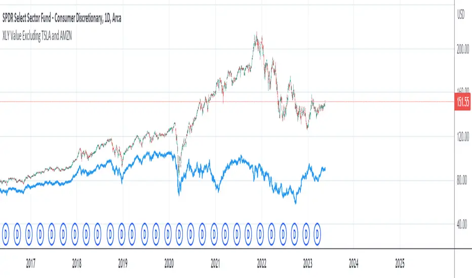
XLY Value Excluding TSLA and AMZNThe XLY Chart if TESLA and Amazon are removed. This indicator shows what the XLY value would be (hypothetically) if you could remove Tesla and Amazon from the price.
Intraday Intensity ModesIntraday Intensity Index was created by David Bostian and its use was later featured by John Bollinger in his book "Bollinger on Bollinger Bands" . It is categorically a volume indicator and considered to be a useful tool for analyzing supply and demand dynamics in the market. By measuring the level of buying and selling pressure within a given trading session it attempts to provide insights into the strength of market participants' interest and their aggressiveness in executing trades throughout the day. It can be used in conjunction with Bollinger Bands® or other envelope type indicators as a complimentary indicator to aid in trying to identify potential turning points or trends.
Intraday intensity is calculated based upon the relationship between the price change and the volume of shares traded during each daily interval. It aims to capture the level of buying or selling activity relative to the overall volume. A high intraday intensity value suggests a higher level of buying or selling pressure, indicating a more active and potentially volatile market. Conversely, a low intraday intensity value indicates less pronounced trading activity and a potentially quieter market. Overall, intraday intensity provides a concise description of the intensity of trading activity during a particular trading session, giving traders an additional perspective on market dynamics. Note that because the calculation uses volume this indicator will only work on symbols where volume is available.
While there are pre-existing versions within community scripts, none were found to have applied the calculations necessary for the various modes that are presented within this version, which are believed to be operating in the manner originally intended when first described by Bostian and again later by Bollinger. When operating in default modes on daily or lower chart timeframes the logic used within this script tracks the intraday high, low, close and volume for the day with each progressing intraday bar.
The BB indicator was included on the top main chart to help illustrate example usage as described below. The Intraday Intensity Modes indicator is pictured operating in three different modes beneath the main chart:
• The top pane beneath the main chart shows the indicator operating as a normalized 21 day II% oscillator. A potential use while in this mode would be to look for positive values as potential confirmation of strength when price tags the upper or lower Bollinger bands, and to look for negative values as potential confirmation of weakness when price tags the upper or lower Bollinger bands.
• The middle pane shows the indicator operating as an "open ended" cumulative sum of II. A potential use while in this mode would be to look for convergence or divergence of trend when price is making new highs or lows, or while price is walking the upper or lower Bollinger bands.
• The bottom pane shows the indicator operating in standard III mode, which provides independent values per session.
Indicator Settings: Inputs tab:
Osc Length : Set to 1 disables oscillation, values greater than 1 enables oscillation for II% (Intraday Intensity percent) mode.
Tootip : Hover mouse over (i) to show recommended example Settings for various modes.
Cumulative : When enabled values are cumulatively summed for the entire chart and indicator operates in II mode.
Normalized : When enabled a rolling window of Osc Length values are summed and normalized to the rolling window's volume.
Intrabar : When enabled price range and volume are evaluated for intensity per bar instead of per day which is a departure from the original
concept. Whenever this setting is enabled the indicator should be regarded as operating in an experimental mode.
Colors For Up Down : Sets the plot colors used, may be overridden in Settings:Style tab.
Styles / Width : Sets the plot style and width used, may be overridden in Settings:Style tab.
This indicator is designed to work with any chart timeframe, with the understanding that when used on timeframes higher than daily the indicator becomes "IntraPeriod" intensity, for example on weekly bars it would be "IntraWeek" intensity. On Daily or lower timeframes the indicator operates as "IntraDay" intensity and is being updated on each bar as each day progresses. If the experimental setting Intrabar is enabled then the indicator operates as "IntraBar" intensity and is no longer constrained to daily or higher evaluations, for example with Intrabar enabled on a 4H timeframe the indicator would operate as "Intra4H" intensity.
NOTICE: This is an example script and not meant to be used as an actual strategy. By using this script or any portion thereof, you acknowledge that you have read and understood that this is for research purposes only and I am not responsible for any financial losses you may incur by using this script!

Tick Weighted Average PriceTick Weighted Average Price
"TiWAP" is an indicator that tracks the NYSE TICK by default and plots weighted average price on the charted security based only off of extreme TICK movement. NASDAQ TICK is also supported and future updates may add others if they provide value, or if requested.
What makes this different?
Quite simply there isn't another indicator that plots weighted average price based on TICK movement as done here, this is showing the correlation between the entire markets volatile price movement and the charted security. It provides a sense of established fair value given the entire NYSE/NASDAQ, given the automated nature of the markets there's a strong correlation between highly liquid ETFs/Indexes and the whole market.
How to use
Using this is similar to volume or time weighted average price, there is the average price line that is only adjusted when TICK movement breaches configured thresholds via sensitivity. Standard deviation bands are calculated and can be enabled up to 3rd deviation as per standard configuration, the further deviations being broken can serve as valuable signals for reversals.
As price is affected by market volatility look to see the weighted price adjust to actual price and combine with other trading strategies to take advantage of the data. Rejections and bounces near standard deviations as well as the weighted average price line can provide excellent trade setups, or they could be utilized in advanced options strategies such as straddles, strangles, iron condors, etc.
Anchor points can be utilized to track how the market is adjusting broad value for the week, month, quarter, etc. The higher timeframe based anchor points will need higher periods for the chart or a max bars lookback error may occur.
Sensitivity should be adjusted as changes in TICK occur, this is commonly correlated with NYSE adjustments but the tooltip provides some guidance on value selection based on current conventional wisdom.
Markets
TICK tracks the entire market and as such whatever the entire market is doing will most likely apply to any individual security charted so give this a shot with anything you trade and let me know your results :)
Usage Conditions
Currently I'm finding the most success with this weighted average price on various intra-day timeframes, but anchored on weekly or higher and utilizing other timeframes may net some interesting swing trading opportunities.
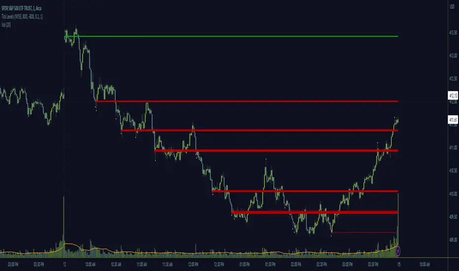
Tick LevelsTick Levels
This indicator is designed to be a companion to "MIT" .
It tracks the NYSE TICK by default and plots key levels on the charted security based off of extreme TICK movement. NASDAQ TICK is also supported and future updates may add others if they provide value, or if requested.
What makes this different?
Quite simply there isn't another indicator that plots levels based on TICK as done here, the signal and proximity sensing features added give context to which levels may provide the best entries, trims and exits for day traders.
How to use
Ensure adjustments are set for TICK, it changes over time but currently I've found the defaults to be best suited for me - your results may vary.
Watch price around the tick levels plotted on the chart to combine with other trading strategies. Use the proximity tolerance setting to ensure multiple TICK movements within the region as other movements are combined to lessen any possible noise, or disable this feature if each individual line is desired, though be warned extremely volatile days may produce noise.
Currently, the tick levels are reset on first new bar on regular sessions, but perhaps a future update will allow past sessions lines to stay with setting adjustment.
Diamonds above or below candles signify extreme highs and lows of TICK respectively, and triangles above or below candles signify extreme closures of TICK - if you're using this indicator in combination with "MIT" it may be redundant and you can disable the signals should you so choose.
Markets
TICK tracks the entire market and as such whatever the entire market is doing will most likely apply to any individual security charted so give this a shot with anything you trade and let me know your results :)
Usage Conditions
Currently I'm finding the most success with these levels on various intra-day timeframes, the more fine grained the more levels you can expect potentially but at key areas.
Index Strength Strategy with Signal Using the Index Strength Strategy Indicator for Trading
Introduction:
In this article, we'll explore the Index Strength Strategy Indicator and how it can be used for trading. The Index Strength Strategy Indicator is a technical analysis tool designed to help traders identify trends, determine trend strength, and generate buy and sell signals.
Overview of the Index Strength Strategy Indicator:
The Index Strength Strategy Indicator is based on two moving averages - a fast moving average and a slow moving average - and the Relative Strength Index (RSI). The fast and slow moving averages are used to determine the trend direction, while the RSI is used to calculate the trend strength. The indicator assigns a strength score to the current trend, which is then classified into one of four categories - Very Weak, Weak, Strong, or Very Strong. Traders can use this information to identify the strength of the trend and adjust their trading strategy accordingly.
The indicator also generates buy and sell signals based on a user-defined threshold level. When the strength score crosses above the threshold level, a buy signal is generated, and when the strength score crosses below the threshold level, a sell signal is generated.
Using the Index Strength Strategy Indicator for Trading:
Traders can use the Index Strength Strategy Indicator to identify trends, determine trend strength, and generate buy and sell signals. To use the indicator, traders should first determine the appropriate fast and slow moving average periods and the strength threshold level for their trading style. These input parameters can be adjusted in the indicator's settings.
Once the indicator is added to the chart, traders can use the strength score and trend direction to identify potential trading opportunities. If the trend is classified as Strong or Very Strong, traders may look for opportunities to enter long or short positions in the direction of the trend. If the trend is classified as Very Weak or Weak, traders may look for opportunities to exit or avoid positions.
Traders can also use the buy and sell signals generated by the indicator to enter or exit positions. When a buy signal is generated, traders can enter a long position, and when a sell signal is generated, traders can enter a short position. Traders should set stop-loss and take-profit levels based on their risk management strategy.
Avoiding Mistakes:
To avoid mistakes when using the Index Strength Strategy Indicator, traders should keep the following tips in mind:
Don't rely solely on the indicator - it should be used in conjunction with other technical analysis tools and fundamental analysis.
Use appropriate risk management strategies, including setting stop-loss and take-profit levels.
Adjust the input parameters of the indicator to match your trading style and preferences.
Avoid overtrading and chasing trades - wait for the right opportunities to enter or exit positions.
Trading Strategy Test Results: Time Frame Tested for 15 Mins
To provide an idea of the potential performance of the Index Strength Strategy Indicator, let's look at some recent test results for two popular indices - Bank Nifty and Nifty 50.
From 1-May-2023 to 12-May-2023, using 2 lots of Bank Nifty with the Index Strength Strategy Indicator, a profit of 15,175 was achieved, with a percentage profitable trade rate of 80% and a profit factor of 3.395. The maximum drawdown was 7,000, and the average trade was 3,035.
During the same time period, using 1 lot of Nifty 50 with the Index Strength Strategy Indicator, a profit of 8,187 was achieved
Conclusion:
The Index Strength Strategy Indicator is a useful tool for traders to identify trends, determine trend strength, and generate buy and sell signals. Traders can use the indicator in conjunction with other technical analysis tools and fundamental analysis to make informed trading decisions. By following proper risk management strategies and avoiding common mistakes, traders can use the indicator to improve their trading performance.

Auction Theory Price LevelsKnowing the levels where price might find support or resistance is critical in trading. These are the levels where buyer or sellers previously showed up.
A bull trend is recognized by higher highs and higher lows on a daily or weekly chart whereas a bear trend is recognized by lower highs and lower lows. Knowing where these daily and weekly levels are will help to expect when and where a bounce or rejection might occur. Alternatively a break of these levels might hint at a change in trend. As they say, never get bullish at the top or bearish at the bottom until the level is broken and held.
This indicator adds these critical levels to the chart and let you hide the ones that are not important to your style of trading (all times are in US Eastern)
- pre-market (4am to 9:30am): low, high, mid
- previous day; low, high, close
- previous week: low, high
- current week: high, low
- initial balance (9:30am to 10:30am): low, high
- current session: open, low, high, mid
If you like the indicator, please like and share!
Thank you!

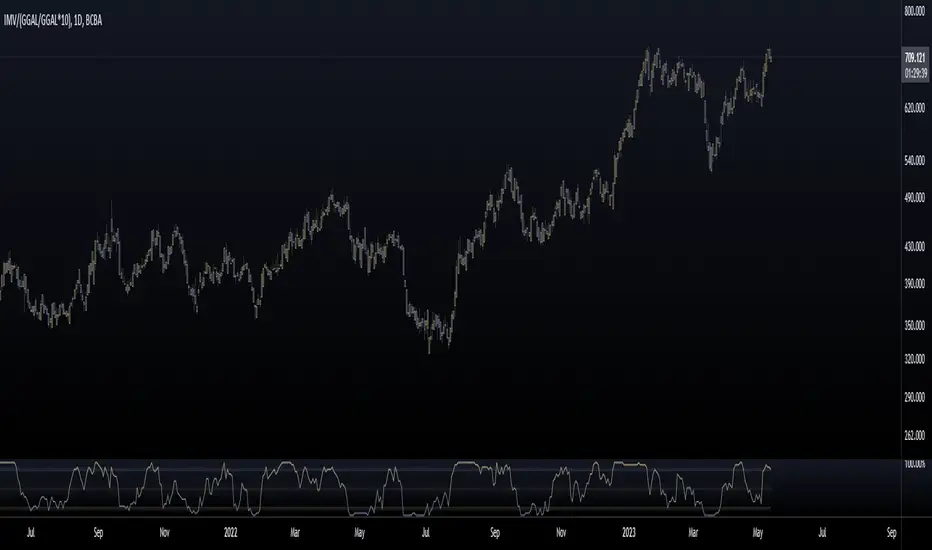
Mervaleta BreadthFellow Merval investors/traders , I'm sharing this script with you that allows you to calculate a breadth indicator using the components of the Merval Index (IMV) from Argentina.
This breadth indicator shows the percentage of stocks that are above a moving average. In this case, you can choose between an EMA or SMA, and you can select the period of the moving average.
The components that make up the index and were used for this script are as follows:
AGRO
ALUA
BBAR
BMA
BYMA
CEPU
COME
CRES
CVH
EDN
GGAL
HARG
LOMA
MIRG
PAMP
SUPV
TECO2
TGNO4
TGSU2
TRAN
TXAR
VALO
YPFD
For all of them, their dollar value in CCL was used, calculated with GGAL.
Enjoy :)
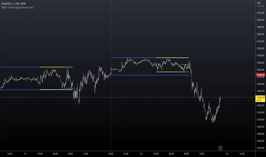
NSDT Custom High and Low LinesFirst, the credit for the original script to plot a High and Low between a certain time goes to developer paaax.
I took that idea, converted it to Pinescript V5, cleaned up the code, and added a few more lines so you can plot different levels based on time of day.
Published open source like the original.
The example shown has:
Blue - plotting from the start of the Futures Asian session to the start of the Futures USA Session. (6:00PM - 9:30AM Eastern)
Yellow - plotting from the start of the Futures Europe session to the start of the Futures USA Session. (3:00AM - 9:30AM Eastern)
Green - plotting from the start of the Futures US Premarket session to the start of the Futures USA Session. (8:00AM - 9:30AM Eastern)
These are great levels to use for breakouts and/or support and resistance.
Combine these levels with the 5 min Open Range levels, as you have some good trades.
Each of the three sessions have individual start and end times that can be modified by the trader, so you can easily mark off important areas for your style of trading.
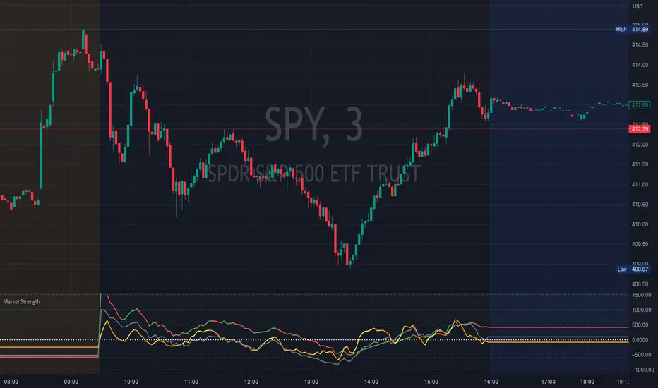
Market StrengthThis indicator tracks USI:ADD , USI:TICK , USI:VOLD on the chart while sharing the same space. This allows you to watch these important indicators without the need to give up separate dedicated space for each of them.
USI:ADD is the number of NYSE stocks advancing vs declining
USI:TICK is the number NYSE stocks trading on an uptick vs downtick
USI:VOLD is the NYSE Volume Difference and is the difference between the up volume and down volume
Zero is considered to be the pivot. The more positive the values, the more bullish in nature, while the more negative the values, the more bearish in nature.
When these are at an extreme, they indicate a possible market trend while smaller directional changes may foreshadow a market move in that direction.
If you like the indicator, please like and share!
Thank you!
TVM Market BreadthReadings for VOLD Market Breadth. Gives readings based upon the ratio of VOLD. Will give a No Trend, Potential Trend, and Trend reading for either direction depending on the data.

Market Internal TrendMIT - Market Internal Trend
I've developed what I consider to be the best market internals, market breadth indicator on Trading View to date :)
Market internals (sometimes referred to as Market Breadth) are built-in indicators of the market, there are the following main indicators:
TICK - Uptick or downtick transaction of market (NYSE/NASDAQ)
ADD - Advancing or declining issues/stocks of the market
VOLD - Up volume or down volume of the issues/stocks of the market
TRIN - Trend of market based on ADD and VOLD
VIX - Volatility of the market
PCN - Options market puts vs calls
What makes this different?
This single compact indicator delivers an "eyes on glass" style presentation to detail extreme movements of TICK, sentiment analysis of ADD and VOLD as well as their trends and report when the market is most likely balanced or an in imbalance. No need to study multiple clouds and amassing a ton of different charts all with similar indicator setups and candle analysis in the heat of the moment.
Use this to determine the overall initial trend at open, watching for imbalance and extreme movement on TICK as a signal to prepare for potential trades. The metrics table is useful to see where potential rejections/bounces may occur on the volatility index.
Extreme tick closures (see below) can provide excellent trim or exit signals for existing trades depending on the market structure of the day (trending or ranging).
How To Use
The main histogram represents the highs and lows of TICK, anything within the +/- $500 region is most likely normal movement while anything outside of that will brighten in color and indicates potential larger reactions. Extreme highs and lows will be represented by white diamonds by default, closures are indicated by bright colored crosses at $0. Price levels should be noted on the securities being traded during TICK extreme movement, these usually act as dynamic support and resistance from my observations but your results may vary (please share in comments your experiences!).
There is a smoothed trend line over the histogram, by default it's white in color, and this represents simply a trend of TICK closures - when it's trending down the market should be following in kind and vice versa; adjust the smoothing length in settings to suit your trading style.
The center line will have colored dots, by default yellow for balanced markets or white for imbalanced markets. When the market is in an imbalance that's when trending moves have been observed and balanced markets are usually choppy with sideways price action not suitable for quick scalp type trading styles.
The upper colored band represents the market overall advancing or declining issues/stocks within the market, by default green tones are bullish for a advancing market and red tones represent bearish market - the brighter the tone the strong the sentiment. There are triangles at all times above this band and that represents a smoothed trend status as compared to the current amount of stocks in advance or decline, if the smoothed trend is above then it's potentially a signal of reversal (red triangles over green band would be bearish reversal and vice versa).
The lower colored band works the exact same as the upper band but it tracks the up and down volume of the issues/stocks within the market, it utilizes the same color and triangle logics as the upper band.
Markets
Currently this will present internals data for NYSE and NASDAQ, I'm still researching other markets internals and their particulars.
The signals on this indicator will best apply to SPY, QQQ, ES, NQ or highly liquid ETFs largely affected by NYSE or NASDAQ - individual stocks may have mixed results depending on how they're moving with major indexes so keep that in mind when watching for sympathy moves with the indicator.
Usage Conditions
All of the market internals are fantastic indicators when day trading, I've had great success on 1-15 minute and even higher for scalps or intra-day swings. Observing the middle dots will save those of you that struggle in choppy markets from being too aggressive when opportunities don't exist.
Use the triangles, diamonds, dots and crosses to your advantage to manage your scalps and intra-day swings, or gain an edge in preparation for entering trades!
I hope this indicator is a benefit to all for day trading, provide any feedback or feature requests in the comments.

Z-Score(Slope(OBV(LBC)))Summary : Market price is simply a dance of liquidity to the specific market.
tl;dr: "Cash come-in, market moon; Cash go-out, market doom"
In Simple Language : Large changes in the money flow to an asset often mark local price extremia.
Academic paper:
Title: Z-Score(Slope(OBV)): An Efficient Indicator for Identifying Local Extremes in Asset Prices
Abstract: This paper presents a novel trading indicator, Z-Score(Slope(OBV)), that aims to predict local extremes in asset prices by analyzing the patterns of money flow. The indicator is constructed using the Z-score of the slope of the On Balance Volume (OBV).
Hypothesis: The price levels at which the money flows into and out of an asset often mark local extremes. This notion underpins our exploration of the Z-Score(Slope(OBV)) indicator's potential in identifying these critical points.
1. On Balance Volume (OBV): The OBV is a momentum indicator that leverages the volume flow to forecast potential changes in asset prices. It operates on the premise that changes in volume often presage shifts in price. The OBV algorithm adds a period's volume to the cumulative total when the closing price is up and subtracts it when the closing price is down. Therefore, an ascending OBV suggests positive volume pressure, potentially heralding higher prices, while a declining OBV signifies negative volume pressure, possibly indicating lower prices.
2. Slope: In this context, the slope represents the rate of change of the OBV. It is a measure of the rise-over-run for a linear regression line through the OBV data points. By evaluating the slope of the OBV, we can extract valuable insights into the momentum of the volume. A positive slope indicates increasing volume momentum, suggesting growing interest in the asset, while a negative slope implies declining volume momentum, potentially reflecting dwindling interest.
3. Z-Score: The Z-score is a statistical measure that delineates a data point's relationship to the mean of a group of values, expressed in terms of standard deviations from the mean. For instance, a Z-score of 0 reveals that the data point's score aligns with the mean score. Positive Z-scores indicate values higher than the mean, and negative Z-scores represent values lower than the mean. Applying the Z-score to the slope of the OBV allows us to comprehend the degree of deviation of the current OBV slope from its historical mean.
A Z-score of 1 suggests that the OBV's slope is one standard deviation from the mean, which implies that the slope is within the range of values where approximately 68% (not 67%) of all values lie.
A Z-score of 2 implies that the slope is two standard deviations from the mean, thus within the range where roughly 95% of all values lie.
A Z-score of 3 indicates that the slope is three standard deviations from the mean, putting it within the range where about 99.7% of all values lie.
Z-scores of 4 and 5 and beyond are increasingly rare and represent extreme values.
4. The Z-Score(Slope(OBV)) Indicator and Line Break Chart Synergy: The Z-Score(Slope(OBV)) indicator's efficiency is further amplified when visualized using a Line Break chart. This chart type disregards time, concentrating solely on price changes, thus providing a clear visualization of market trends. When combined with the Line Break chart, the Z-Score(Slope(OBV(LBC))) indicator can help traders identify trend shifts more accurately and promptly, reinforcing the hypothesis that price levels where money flows into and out of an asset often mark local extremes.
In summary, the Z-Score(Slope(OBV)) indicator, combining volume, momentum, and statistical analysis, provides a robust tool for traders to predict local extremes in asset prices.
Regarding Implementation:
- This is implemented using Pinescript V5
- Uses inbuilt ta module
- Very effective and simple and efficient computation in 30 lines of code

Tick Profile HeatmapThis is a market internal TICK heatmap with the intent of displaying areas of price associated to stronger reactions with NYSE TICK (by default).
This code is based off of a variation of a Volume Profile coded originally by colejustice who originally used code from LuxAlgo . The full-width volume bars that colejustice setup were replaced with full-width bars representative of TICK breaking +/- $500, the current cumulative value representing the "heat" is comprised of hlc3 by default but that can be changed. In a future update I may add additional logic here to capture highs and lows in the heatmap specifically, and perhaps additional colors.
As with other traditional profiling studies, this indicators purpose is to visualize correspondence to specific price levels, allowing rapid assessment where the most TICK activity is occurring, and where it hasn't been. This information may provide areas of support and resistance and regions where price may move quickly repeatedly.
All of the same input guidance that colejustice provided is the same for those pre-existing inputs:
Inputs are set up such that you can customize the lookback period, number of rows, and width of rows for most major timeframes individually. Timeframes between those available will use the next lower timeframe settings (e.g., 2m chart will use the 1m settings.)
Zero usage of volume is present in this indicator, only TICK data so please don't confuse it with volume studies.
