Conteo de velasCuenta velas en un periodo determinado
En ese periodo se cuentan las velas verdes y las velas rojas, y en cada vela repite el proceso
Breadth Indicators

Stairs Gain Strategy - MGI will explain step by step.
1- The position order filtering option is used to filter out duplicate positions.
2- The reason I use an ATR multiplier is to balance the ATR value that differs in instruments.
3- ATR lower limit and ATR upper limit values are to reduce unnecessary transactions and commission expenses in the horizontal market.
4- Strategy take profit and stop loss levels are calculated as percentages. The reason why there is no point account is that it can be used in the stock market.
5- Developer friends can get a more efficient result in forex market instruments by converting this to a point account.
Notice :
Variables are different in each instrument. Therefore, this strategy should be optimized for each instrument used.

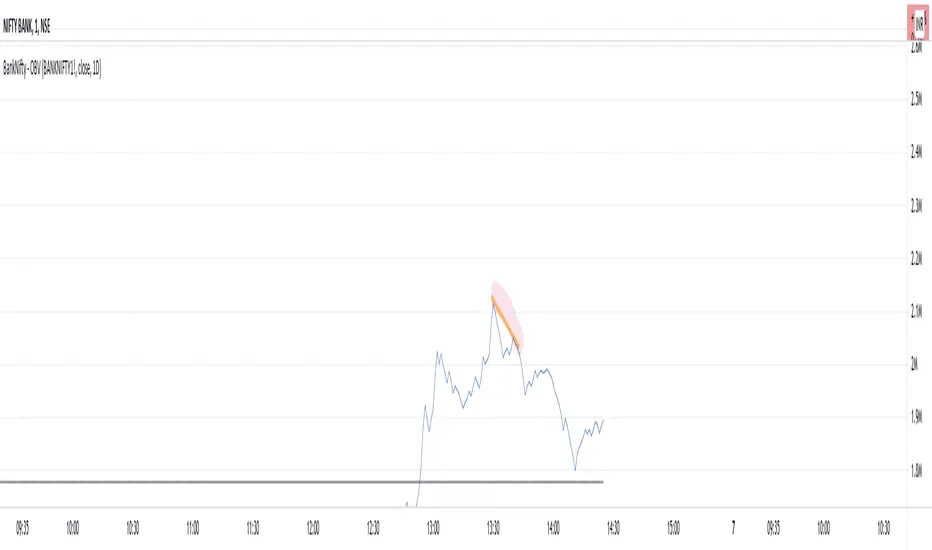
BankNifty - OBVThis script tries to draw OBV for BankNifty using Futures Volume along with Average OBV. For Nifty50 just change the Futures Volume symbol in settings. Look at devations in Price vs OBV or Average OBV breakout.
NSE:NIFTY
NSE:BANKNIFTY
xBrat BIAS DEPTH HeatmapThis Trading Indicator is the "Go - No Go Gauge" for any trading signals strategy. A Sub-Chart that looks up 6 time frames and gives you real time BIAS. Bullish, Neutral or Bearish on each level. Making decisions, acting on trading signals easier! Only identifying those highest probability trades, no matter what signals trading indicator you are using. Ideal for Forex Trading, Futures Trading, Crypto Trading and Stocks Trading
This BIAS Depth Heatmap includes:
6 Levels of BIAS Depth
Scalping Setting
Day Trading Setting
Swing Trading Setting
And by only concentrating on trading the highest probability trades of any trading strategy, we can block out all the other noise and concentrate on a simple set of rules!
This is why our Founder, Paul Bratby, decided to help filter out all the noise and allow traders to see what's going off on higher timeframes "in depth" to help make those important trade entry decisions. This more global view of the BIAS DEPTH is designed to help traders make decisions faster!

Sector Performance TableThis is a simple performance table for the SPY and its component sectors as well as VIX.
Importantly, the performance is intraday from session open time.
It is NOT a daily change - credit to ShadowTrader for this distinction.
Credit also to PineCoders for their string manipluation instructions for Pine Script.
Each of the 14 symbols in the table can be set by the user.
The table can be placed Top or Bottom, Left or Right
The user will need to set the cell width and height and transparency and bulilsh/ bearish colors to best suit their own displays.
There are two color gradients built in to help illustrate which symbols are leading or lagging
I have also published one for the FANGMANT stocks that is otherwise very similar to this
FANGMANT Performance TableThis is a simple performance table for QQQ, SPY and the main FANGMANT stocks shown left to right by current order of weighting.
Importantly, the performance is intraday from session open time.
It is NOT a daily change - credit to ShadowTrader for this distinction.
Credit also to PineCoders for their string manipluation instructions for Pine Script.
Each of the 12 symbols in the table can be set by the user.
For publication purposes I have included QQQ, SPY, VXN and TNX as these are all relevant to Nasdaq performance too
The table can be placed Top or Bottom, Left or Right
The user will need to set the cell width and height and transparency and bulilsh/bearish colors to best suit their own displays.
There are two color gradients built in to help illustrate which symbols are leading or lagging
I will also publish one for the SPY sectors that will otherwise be very similar to this

Correction TerritoryA simple indicator showing how much percentage has been corrected since a recent highest high.
You can set 3 horizontal line to compare with past correction rates.
直近の最高値からの調整率を表示するインジケーターです。
過去の調整規模との比較のため、3本の水平線も設定可能です。

Trending Bar SRTrending Bar SR is a simple script define a Bar called "Trending Bar".
Depend on direction of Trending Bar, if Trending Bar is UpTrend then this indicator plot Bar's Low Price as Support and if Trending Bar is DownTrend then it plot Bar's High Price as Resistance.
Beside, this indicaor also plot 4 levels retracement of Trending Bar for trading.
1. Define Trending Bar
1.1 Uptrend Bar
+ Close Price higher than previous High Price
+ Body greater than sum of shadows (up and down)
+ Color: A green dot is plotted at bottom chart.
1.2 Downtrend Bar
+ Close Price lower than previous Low Price
+ Body greater than sum of shadows (up and down)
+ Color: A red dot is plotted at bottom chart.
2. Retracement Level
+ Trending Bar Retracement 0.5 is called Equerium.
+ Trending Bar Retracement 0.618 is called Perfect Entry.
+ Trending Bar Retracement 0.705 is called Optimal Entry.
+ Trending Bar Retracement 0.79 is called Max Entry.
3. Trading
+ When Price crossed Equerium, consider open position at Perfect Entry, Optimal Entry with stoploss place at Max Entry.
+ If place order at Max Entry, stoploss can place at Support or Resistance.

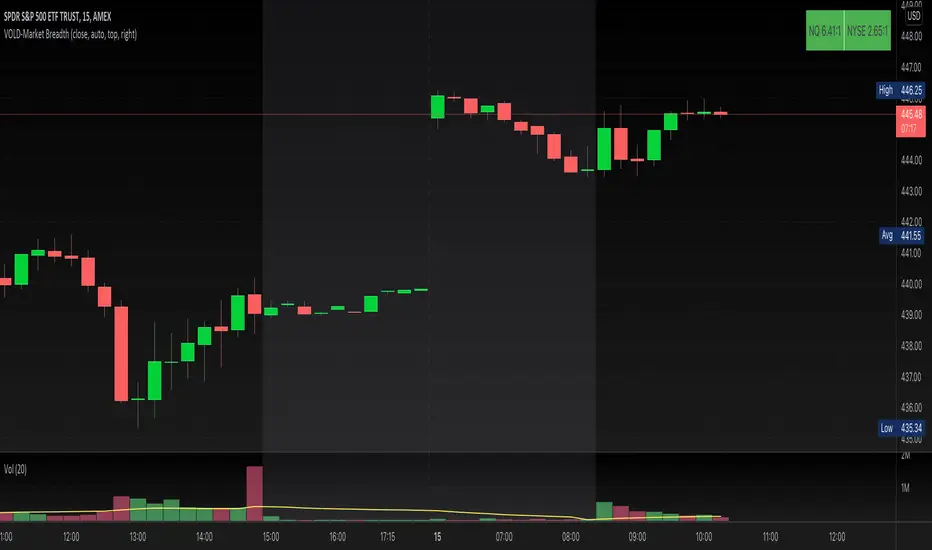
VOLD-MarketBreadth-RatioThis script provides NASDAQ and NYSE Up Volume (volume in rising stocks) and Down Volume (volume in falling stocks) ratio. Up Volume is higher than Down Volume, then you would see green label with ratio e.g 3.5:1. This means Up Volume is 3.5 times higher than Down Volume - Positive Market Breadth. If Down Volume is higher than Up Volume, then you would see red label with ratio e.g -4.5:1. This means Down Volume is 4.5 times higher than Up Volume.
For example, ratio is 1:1, then it is considered Market Breadth is Neutral.
PS: Currently TradingView provides only NASDAQ Composite Market volume data. I have requested them to provide Primary NASDAQ volume data. If they respond with new ticket for primary NQ data, I will update the script and publish the updated version. So if you have got similar table on ToS, you would see minor difference in NQ ratio.
Intrabar OBV/PVTI got this idea from @fikira's script Intrabar-Price-Volume-Change-experimental
The indicator calculates OBV and PVT based on ticks. Since, the indicator relies on live ticks, it only starts execution after it is put on the charts. The script can be useful in analysing intraday buy and sell pressure. Details are color coded based on the values.
Data is presented in simple tabular format.
Formula for OBV and PVT can be found here:
www.investopedia.com
www.investopedia.com

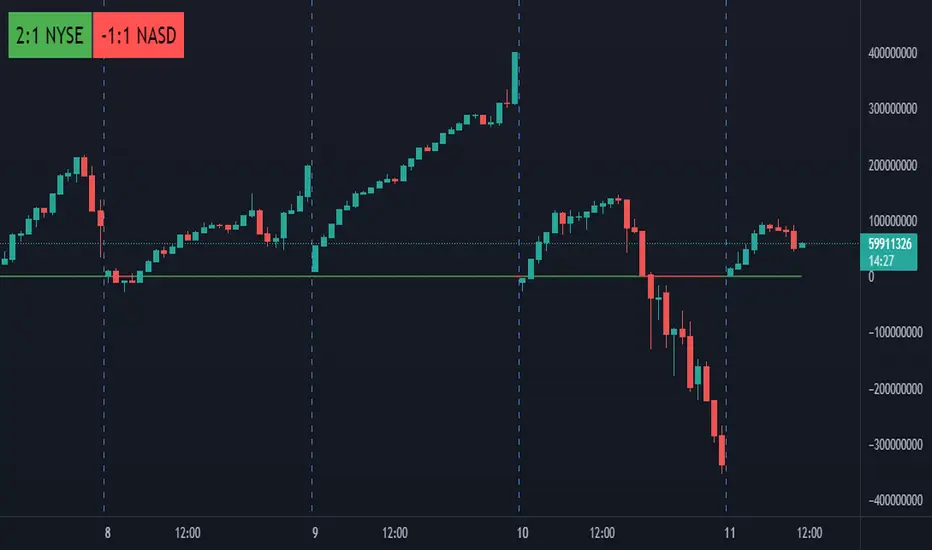
Breadth Ratio BubblesBubbles for ADD thats shows ratios between up and down volumes for the NYSE and NASDAQ
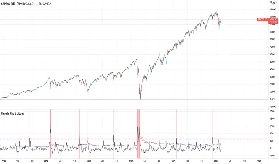
Here Is The Bottom(VIX and Its MA Deviation Rate)I found a very interesting article on Bloomberg with the title “JP Morgan Strategists See Sure Fire Sign It Is Time to Buy Stocks”.
It says when VIX index far exceeds its 1 month MA by 50%, then stock prices rise later except recession period. This buying signals are almost 100% accurate and now is the time to buy stocks as the VIX met the condition on Jan25 this year, the article says.
I can’t post the URL of the article here as it violates TradingView house rules, so if you are interested, you just google it with the title.
Anyway, I have developed this indicator to see what JP Morgan says.
It draws VIX, its MA and its MA deviation rate.
You will see the truth.
Enjoy!
World Markets Open/Close BackgroundIndicator fills background color on the chart for different markets around the world.
This can be helpful in some markets to understand after hours and premarket price action. User can study if there is correlation between highs/low in whole session or open/close of different markets.
Tokyo, Hong Kong and Shanghai are Asian Markets in Red are combined
Bombay, London and NYSE are individually plotted.
Times can be changed for each session to include the entire session, or selected block of 15 minutes.
Less than 15 minutes will need to be changed in the default value of the code which is why I'm publishing it open source.
All coded default times for each market are in CST.
Background color can be turned off individually under the Style tab, and can also be unchecked under Inputs and can just be used for source for further coding.
My intentions for this script is to use it and its variable value to plot the highs and lows just in the specific times in a session and to more easily visualize those sessions with color coding.
I hope this is useful
Cheers!

S&P Sector Advance/Decline Weighted -Tom1traderEnjoy, enhance your trading (I hope), copy or adapt to your needs and keep smiling!
Thanks to @MartinShkreli. The sector variables and the "repaint" option (approx lines 20 through 32 of this script) are used directly from your script "Sectors"
RECOMMENDATION: Update the sector weightings -inputs are provided. They change as often as monthly and the
annual changes are certainly significant. When updating weighting percentages use the decimal value. I.E. 29% is .29
Good on any time frame. Especially SPY, SPX and ES scalpers and 0DTE options traders may like this a lot.
This gives good signals on S & P and related (ES, SPY) and indicates / plots differently than the AD line or ratio.
Each sector's entire % weight is added or subtracted depending of whether that sector advanced or declined.
Example: Information Tech weight at 29% so that % of 500 (145) is added if InfoTech is up a penny and subtracted if it is
down a penny. All sectors processed the same way so that for a given bar/candle the value will be between +500 (all
sectors up) and -500 (all sectors down). This weighted AD line of sectors is scaled to +/- 350 and plotted as a red/green line
along with aqua/fuchsia columns of its 5 period ema. The line is actual sector behavior and the columns seem to make a
good signal with column zero crosses standing out.
The columns aqua / fuchsia are a 5 period ema of the Sector AD line and give pretty good signals at
zero cross for SPX. I colored the AD red green line also to emphasize the times it opposes the ema
for example the histo/colums zero cross signal is NOT true when the AD line is showing all or most sectors
going the other way.
For readability, the AD line itself is scaled to 350. This lets the columns of the ema stand out better. The hlines at
350 and at 175 give an idea for the AD green red line how much of the sector's weight is up or down.
350 is all sectors up (advancing) and -350 is all sectors down (declining). The hlines at +/- 175 seem to outline
a more or less "neutral" zone. For example in an uptrend with most of the AD level positive and the columns positive;
a negative spike that does not pass the -175 line and returns positive does not seem to impact the price as much as
a deeper negative spike.
IB + ExtensionsInitial Balance with Extensions.
Other traders have posted similar indicators. I wrote my own because I wanted additional features.
Features:
Supports up to 9 extensions. Default = 3.
Each extension is filled using an automatic gradient. Fill can be disabled if you like.
IB levels extend into the future to the end of the current session.
By default only the current IB levels are shown, but you can enable past IB's as well.
When showing past IB's, each session has a clean break - no awkward lines connecting one session to the other (this really annoyed me about other IB indicators!)
The IB midpoint is also supported. It is on by default, but can be disabled.
You may notice the midpoint of past IB's looks different than the current IB . There is a technical reason for this that I won't go into here. Ask if you want the full explanation.
NOTE: This indicator was designed for the crypto charts. It may have some rendering issues when used with other markets.

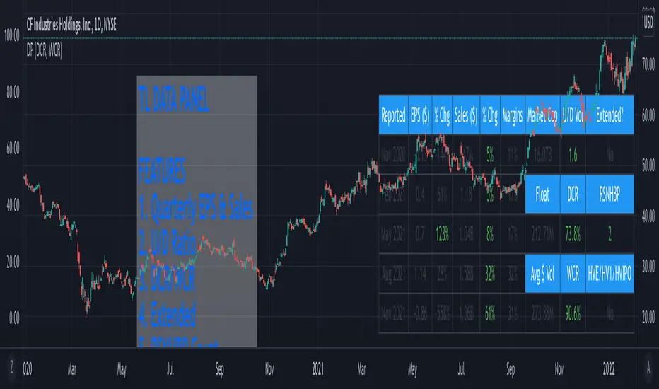
TL Data PanelIntroducing the TraderLion Data Panel
Features
1. Plot Quarterly EPS & Sales in a table. Disclaimer | TradingView data for EPS & Sales can be highly inaccurate in some cases.
2. U/D Ratio - Calculates the Up/Down Volume Ratio on a 50 Day Average or 20 Day Average. A number above 1.5 will show in green.
3. DCR - Calculates the Daily Closing Range for the stock. It's green when the DCR is greater than your benchmark (set in indicator settings) and greater than 50%.
4. WCR - Calculates the Weekly Closing Range for the stock. It's green when the DCR is greater than your benchmark (set in indicator settings) and greater than 50%.
5. Extended - Calculates if the stock is extended vs the 10DMA and 10WMA. The output will be Yes or No.
6. RSNHBP Count - Counts the number of RSNHBP in the past 30 sessions. Higher the count the better the odds of a stock performing well in the markets.
7. HV Stats - This shows if a stock meets the HVE/HV1/HVIPO criteria. HVE - Highest Volume Ever. HV1 - Highest Volume in One Year. HVIPO - Highest Volume Since IPO.
Customizations
Up Down Volume Length - Toggle between 50 Day or 20 Day.
Average $ Volume Length - Toggle between 50 Day or 20 Day.
Closing Range Benchmark - Set your benchmark vs any index.
RS Benchmark - Calculate RSNHBP benchmark vs any index.
Table Size - Tweak table size on personal preference.
Table Position - Tweak table position to top right, bottom left, bottom right, or top left.
Margins vs ROE - Toggle this setting to display Margins or ROE.
Color Theme - Toggle between Light or Dark Theme.
If you have any questions, please post them in the comments below!
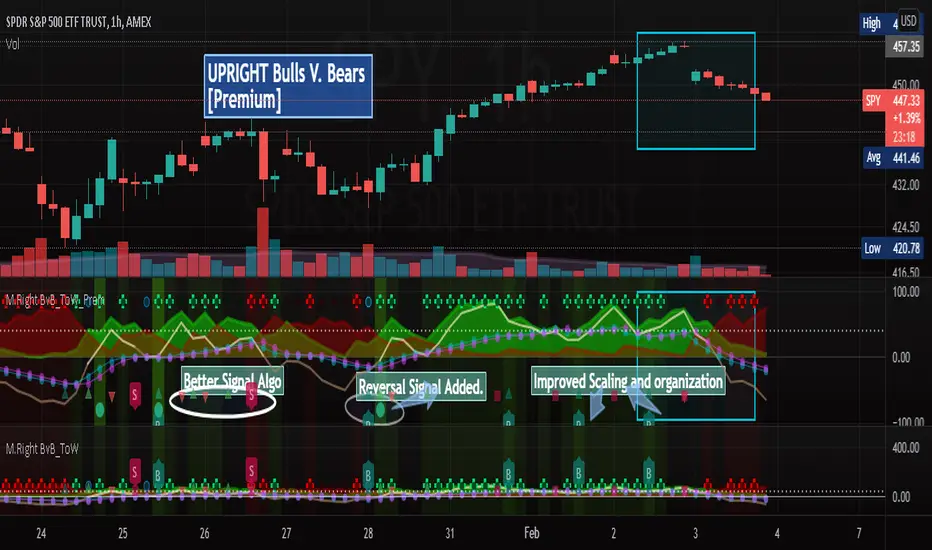
[UPRIGHT] Bulls-V-Bears Tug-of-War SquidGame [Premium] (cc)Hello Traders,
Today I'm updating the Bull V. Bears with a Premium version. (Note: the other version is shown below the Premium on the chart above)
……"The game is Tug of War, the side that pulls the rope from the middle to their side wins. Let the game begin."……
How it works:
This indicator is not a typical one.
1) It shows visually when Bull volume or Bear volume is ‘pulling the rope to their side’.
2) It uses several different formulas to get an accurate read on the level of volume , but still keeps peaks and troughs within 100 for easy reading.
3) Update: It was originally meant to be used strictly with other indicators, but it can now be used as a standalone indicator.
__________________________________
Legend:
1) The top line signals give the major signals –
a. Red cross = Bearish volume strength and continuation.
b. Green cross = Bullish volume strength and continuation.
i. + Green Dot inside enhances signal.
ii. + Red Dot inside weakens signal.
c. Blue circle = Can indicate the beginning of a reversal to the upside or downside.
d. Pink circle = Can indicate the beginning of a reversal to the downside.
2) The Bottom signals are triggered when one circle-rope crosses over the other, these signals give confirmation to the top line signals – Red bearish / Green bullish .
3) As shown on the chart, the Reversal setup usually consists of a blue circle, followed by a red or green cross, then confirmation from the bottom signal.
4) Without the signals: green obviously is Bullish especially above the threshold set --Red bearish . The regular rope gives trend indication.
I've added tooltips to make it easy to understand, feel free to leave a comment if you still have a question!
__________________________________
Features:
-Tooltips (hover over - Info) for understanding.
-Works well on all timeframes; even 5min, I made a tooltip for recommended lengths.
-Customizable Signals; with the ability to turn on and off.
-Reversal signals: Pink and Blue circles can indicate reversals coming.
-Works well as a leading standalone indicator.
-Adjustable top signal row.
-Background Highlights.
-Alerts
-Rules added (hover over).
__________________________________
Premium :
-Better signal algo (will likely be updated again soon)
-Reversal Signal added (Large Circle)
-Improved Scaling and Organization - Now easier to see large moves/signals on Multiple timeframes.
Chart should look like:
Cheers,
Mike
(UPRIGHT Trading)
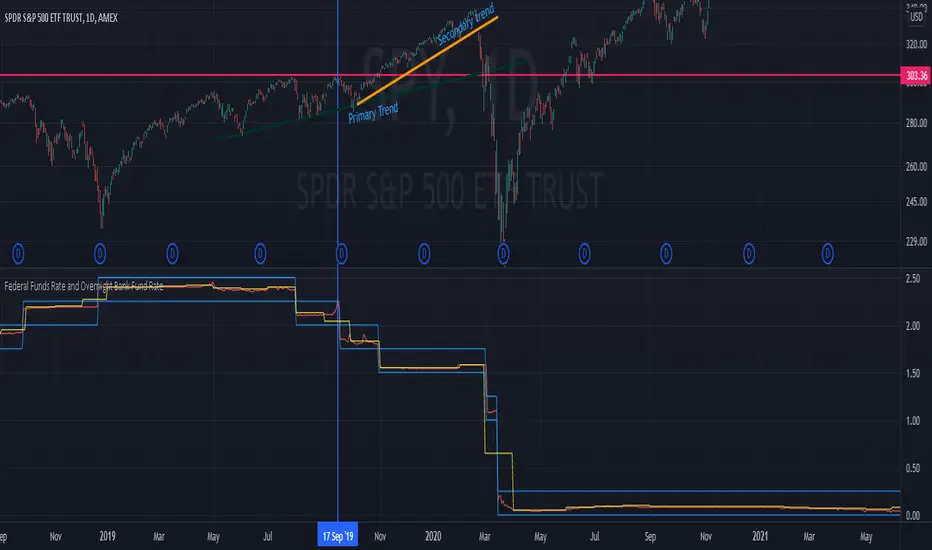
Federal Funds Rate and Overnight Bank Fund RateAMEX:SPY
Comparison of the Overnight Bank Fund Rate and the Effective Federal Funds Rate.
The Fed sets a discount rate of 100 basis points above the effective federal funds rate to discourage ("penalize") banks from borrowing from its reserves. If lending banks have excess in their reserves, the borrowing banks have ease in negotiating a lower rate overnight to maintain its requirements. For this reason its a good indicator of the economy. If it becomes more difficult for banks to maintain the required reserve amount they may charge borrowing banks higher rates.
Both the Effective Federal Funds Rate and Overnight Bank Fund Rate use the same data. Except, the OBFR includes overnight Eurodollar transaction data and certain overnight “selected deposit” transactions that are placed at domestic bank branches controlled by a U.S. banking office.
The indicator includes the lower and upper bound target rate set by the Federal Reserve.
An interesting note:
Notice the jump in the Overnight Bank Rate followed by Fed buying to provide liquidity and lower rates in Sept 2019.
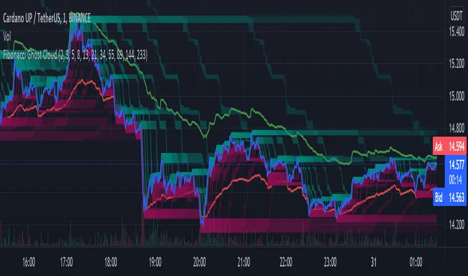
Fibonacci Ghost CloudHello my nocturnal minions.... This is your dark knight in the crypto light.... your alpha and omega, your crypto king reigning wisdom down from my gilded throne of code!
Enjoy the spooky Fibonacci Ghost Cloud. Shadows of previous Fibonacci look-back levels provide possible entries, stop losses, and take profit levels for intrepid crypto travelers.
DESCRIPTION
This indicator is front weighted by using the Fibonacci integer sequence..... 2,3,5,8,13. Each green and red "ghost" is a reflection of the highest highs and lowest lows of a given FIB lookback. The guide lines, red and green, are averages of the highs (green) and the lows (red).
USAGE
The "ghosts" can be used as possible support and resistance levels. They diminish in intensity (they become more transparent) as these ghosts move back further in time. When multiple greens overlap it is an indicator of a lot of recent price action at that level. The same is true of overlapping red.
In addition, the amount of ghosts above and/or below are indicative of recent price action taking place at a higher or a lower level
CURRENT PRICE IS LOWER THAN RECENT PA - There will be many green ghosts above, but few or no red ghosts below.
CURRENT PRICE IS HIGHER THAN RECENT PA- There will be many red ghosts below, but few or no green above
TAKE PROFIT - Possible take profit targets could be on the approach to a previous green level
STOP LOSS - Possible stop losses could be at lower red level
Like Bollinger bands, the green and red "average" lines can help to indicate that a security is oversold or underbought according to how close it is to a recent average. Nearing the red line can indicate that the security is oversold - and the converse is also true.
DERIVATIONS
Within the code is additional greyed-out lines which could be activated allowing you to target the open or close, instead of the High-Low - the current settings
SETTINGS:
You can change the FIB levels and substitute your own integer sequence to use as the lookback.
Feel free to offer feedback and/or suggest features you would like to have added.
SPX DivergenceScript plots divergence of SPX sectors and world markets based on 3 months return of various ETF's.
Excessive divergence in returns typically preceeds strong market downturns 1-2 weeks ahead of time.

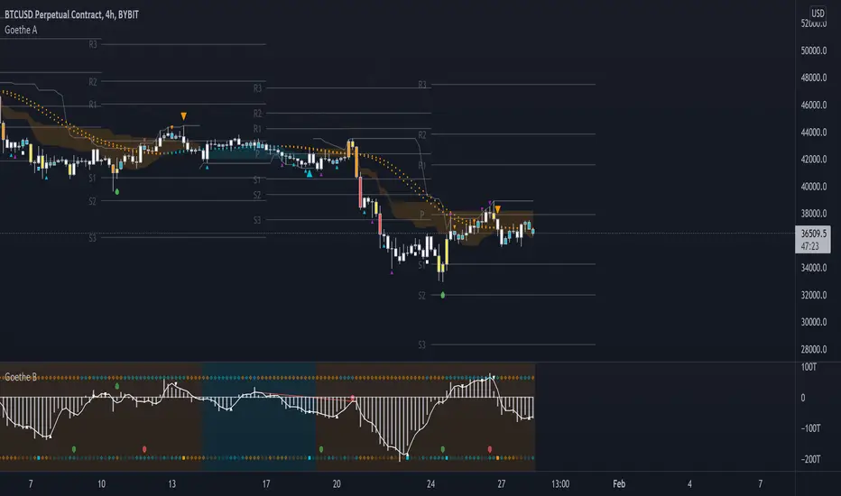
Goethe A - Multiple Leading Indicator PackageGoethe A is an Indicator Package that contains multiple leading and lagging indicators.
The background is that shows the local trend is calculated by either two Moving Averages or by a Kumo Cloud. By default the Kumo Cloud calculation is used.
What are those circles?
-These are OBV (or VPT, can be set in the options) Divergences. Red for Regular-Bearish. Orange for Hidden-Bearish. Green for Regular-Bullish. Aqua for Hidden-Bullish.
What this middle line?
-The middle line is calculated by a smoothed Heikin-Ashi indicator. I can be used as a dynamic zone of support and resistance. Many times this indicator is used as entry signal giver in trend following strategies.
What are those background lines?
-The background contains a simple Daily Pivots indicator. This indicator can be read as zones of Support and Resistance that updated based on the used timeframe.
What is this smaller thin grey line?
-This is a very simple Stoploss indicator based on Donchian Channels. The trade direction is based and calculated by the local trend (background color)
What are those small orange or aqua triangles?
- These are Pivots . They show when the OBV or wolfpack oscillators (or a double confirmation of both) might reverse, this is important to know because many times the price action follows this move.
What are those purple triangles?
- These are Pivots . They show when the PVT oscillator might reverse, this is important to know because many times the price action follows this move.
What are those big orange or aqua triangles?
- These are TSI (true strength indicator) entry signals . They are calculated by the TSI entry signal, the TSI oscillator treshold and in conjunction with the overall local trend (background color).
What are those white squares?
- These are Overbought or Oversold regions of the build-in RSI bands indicator. Every time the price crosses one of the RSI bands those squares are printed. Most of the time this happens after a move and indicates that this strong move has come to an end.
Most settings of the indicator package can be modified to your liking and based on your chosen strategy might have to be modified. Please keep in mind that this indicator is a tool and not a strategy, do not blindly trade signals, do your own research first! Use this indicator in conjunction with other indicators to get multiple confirmations.
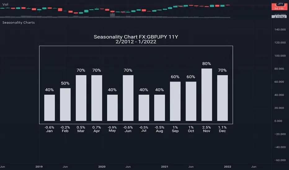
Seasonality ChartsHow to use: open monthly chart
What this chart show: The seasonality tool calculates two numbers: the percentage of time that the month is positive above histogram and the average gain/loss for the month below histogram
Seasonality tells us what has happened in the past, which is the historical tendency. There is certainly no guarantee that past performance will equal future performance, but traders can look for above average tendencies to complement other signals. On the face of it, a bullish bias is present when a security shows gains more than 50% of the time for a particular month. Conversely, a bearish bias is present when a security rises less than 50% of the time. While 50% represents the exact middle, chartists should look for more extreme readings that suggest a relatively strong tendency.