Multitimeframe
Session Highs and Lows LevelsMarks out Previous Days Highs and Lows, 1min ORB, 5min ORB, 15min ORB and other feautures in settings.

HBD.PUMPThis indicator shows the points with potential decline after sudden and strong increases with a vertical line from top to bottom.

Dobrunia trader 3in1Данный индикатор предназначен для трейдеров торгующих по стратегии Smart Money в объяснении Dobrunia trader.
Задача индикатора выделять свечи, которые находятся внутри предыдущих свечей и показывать kill zones для упрощение процесса анализа графика, показывать после графика свечи старшего таймфрейма
1 индикатор вместо 3х разных - экономим место для индикаторов
This indicator is designed for traders trading with Smart Money strategy as explained by Dobrunia trader.
The task of the indicator is to highlight candles that are inside the previous candles and show kill zones to simplify the process of analysing the chart, to show after the chart candles of the older timeframe.
1 indicator instead of 3 different ones - save space for indicators

SL/TP Dynamic based on ATRSL/TP Dynamic Based on ATR
This script calculates dynamic Stop Loss and Take Profit levels based on the Average True Range (ATR), with full support for both long and short positions. It’s designed for traders who want to align their risk management with actual market volatility instead of relying on fixed distances.
Key Features:
Dynamic or fixed SL/TP levels based on ATR and custom entry date/time
Just put your entry price on any pair you want. If Dynamic is on, it keeps updating your risk in real time and changes your SL/TP according to the price movement.
Supports both automatic (live) and manual (timestamped) trade tracking
Displays R (risk) value and SL/TP levels visually with lines and optional labels
Clean, toggleable table with SL, R, and TP values
Fully customizable line colors, table position, and trade direction
Alert conditions for SL and TP hits
Useful for scalpers, swing traders, or anyone planning risk-defined trades based on structure and volatility. Not a signal generator — this is a planning and tracking tool.
Simple, precise, and built for real-time decision-making.
Just message me on Twitter to get access for free. x.com/salarbb

Time Frame Color ClassifierTime Frame Colour Classifier
A professional Pine Script indicator that provides instant visual identification of trading sessions through intelligent colour-coded backgrounds.
Key Features
📅 Daily Session Colours
- Monday: Green | Tuesday: Blue | Wednesday: Yellow | Thursday: Red | Friday: Purple
📊 Weekly Classification
- Week 1-5 : Colour-coded by week of the month using the same colour scheme
## How It Works
Intraday Charts (1min-4H) : Shows daily colours - every candle on Monday displays green background, Tuesday shows blue, etc.
Daily/Weekly Charts : Switches to weekly colours - all days in Week 1 show green, Week 2 shows blue, etc.
Professional Applications
✅ Multi-Timeframe Analysis : Seamlessly switch between timeframes whilst maintaining visual context
✅ Session Recognition : Instantly identify which trading day you're analysing
✅ Pattern Analysis : Spot recurring patterns on specific days of the week
✅ Strategy Development : Incorporate temporal factors into trading strategies
✅ Performance Attribution : Correlate results with specific trading sessions
Customisation Options
- Toggle daily/weekly colours on/off
- Fully customisable colour schemes
- Adjustable background transparency
- Optional day labels
Technical Details
- Pine Script v5for optimal performance
- Automatic timeframe detection - no manual configuration required
- Minimal resource usage - won't slow down your charts
- Works on all chart types and timeframes
Perfect For
- Day traders switching between multiple timeframes
- Swing traders analysing weekly patterns
- Algorithmic strategy development
- Multi-timeframe market analysis
- Trading education and research
---
Developed by @wyckoffnawaf
Transform your chart analysis with visual timeframe clarity

DriftLine - Pivot Open Zones [SiDec]What is DriftLine?
DriftLine is your visual roadmap for navigating the markets — designed for both day traders and swing traders who want to understand where price truly matters.
It automatically plots the most meaningful price levels on your chart:
dOpen → today’s open
pdOpen → yesterday’s open
bpdOpen → two days ago
wOpen → this week’s open
mOpen → this month’s open
yOpen → this year’s open
These are not just lines — they are the milestones big traders, funds, and algos watch to measure bias, performance, and momentum across timeframes.
DriftLine also layers on:
Fib zones (50%, 61.8%, 78.6%) between today’s and yesterday’s opens — highlighting natural pullback or continuation areas.
Fade bands around monthly and yearly opens — showing where the market may be overextended, exhausted, or ripe for reversal.
Optional % distance labels — letting you instantly see how stretched or compressed price is relative to key opens.
How to Use DriftLine
1️⃣ Daily setups:
Trade with the daily bias (dOpen vs. pdOpen). Use the fib pocket as a pullback zone or continuation platform.
2️⃣ Weekly trends:
Watch wOpen breaks + retests — often the start of powerful multi-day moves.
3️⃣ Monthly & yearly pivots:
Treat mOpen and yOpen as heavyweight macro levels — they shape sentiment and direction.
4️⃣ Fade bands:
Spot reactions at the outer bands around mOpen and yOpen — these zones often mark where trends pause or reverse.
Why Are Daily Opens So Important?
Many traders overlook dOpen (today’s open), pdOpen (yesterday’s open) and bpdOpen (before previous daily open) — but they’re the heartbeat of intraday trading.
Here’s why they matter:
🔷 Above dOpen → bullish bias.
The market is paying more than it opened — intraday momentum leans long.
🔷 Below dOpen → bearish bias.
We’re under today’s open — cautious, risk-off, or short setups.
🔷 pdOpen/bpdOpen as magnet & target.
Even in strong trends, price often revisits yesterday’s open. It can act as support, resistance, or a key flip level.
🔷 The Fib pocket between dOpen and pdOpen.
The 50–78.6% zone is a dynamic battleground. Watch for price to bounce, reverse, or break through here.
In short:
dOpen and pdOpen are your intraday compass, showing you whether you’re trading with or against the day’s flow.
Why Are Monthly Opens So Powerful?
The monthly open (mOpen) is a macro anchor for institutional traders.
It answers:
✅ Are we green or red for the month?
✅ Are big funds defending long exposure, or trimming risk?
🔷 Above mOpen = bullish tone, momentum follows.
🔷 Below mOpen = caution, risk-off, defensive market.
You’ll often see sharp reactions at mOpen — even when lower timeframes look messy.
Aligning your intraday or swing trades with the monthly bias improves your edge dramatically.
Why Is the Yearly Open (yOpen) Critical?
The yearly open (yOpen) is the king of all opens — the most powerful macro line on the chart.
Big funds, asset managers, and long-term traders benchmark everything against yOpen:
🔷 Above yOpen → bullish year tone.
Funds are green on the year; dips are often bought aggressively.
🔷 Below yOpen → bearish year tone.
Caution dominates; rallies tend to be sold or fade.
🔷 Sharp reactions at yOpen.
Expect explosive moves or violent rejections when price approaches this level — it’s where macro players act.
And when price hits the fade bands around yOpen?
It's a prime territory for reversals or profit-taking.
How to Add DriftLine to Your Chart
✅ Easiest way → Go to my TradingView profile, open the Scripts tab, and ⭐ Add to Favourites.
Then, on your chart:
1️⃣ Click Indicators → Favourites → select DriftLine
2️⃣ Done — you’re live!
Can I Customise It?
Absolutely!
You can:
🎨 Change line colours and thickness.
🎨 Pick fade band colours to match your theme.
🎨 Adjust fade zone width (e.g., 0.5% or 1%).
🎨 Toggle % distance labels on/off for a clean or detailed view.
⚡ Pro Tip: Use DriftLine With Confluence! ⚡
DriftLine is not a buy/sell signal tool.
It’s your map — but you need your own compass.
Combine it with:
Fibonacci retracements & extensions
Elliott Wave patterns
Order flow or volume profile
Momentum or trend indicators
Other tools
When multiple tools align at a DriftLine level, that’s where the magic happens — and where the highest-probability trades live.
Key Takeaway
DriftLine doesn’t predict the future — it frames the battlefield.
It highlights where the real action is happening:
Where price flips, where traders fight, and where momentum builds.
Use it as your market map, combine it with your favourite strategies, and let it sharpen your decisions.
🌊 Read the currents. Trade the flow.
Stay sharp, stay patient and trade with clarity.
Happy trading!

Daily SMA Levels on Intraday📌 Indicator Overview: Daily SMA Levels on Intraday
🔧 What It Does
- Plots horizontal lines for up to eight daily SMAs: 5, 10, 20, 50, 100, 150, 200
- Displays dynamic labels at the end of each line showing both the SMA name and current value
- Works on intraday timeframes, pulling daily calculations for reference
- Lets you toggle each SMA line individually from the settings
- Offers three line styles—Solid, Dashed, and Dotted
- Includes a line thickness slider, giving you visual control
- Positions labels with left-pointing arrows for visual alignment without clutter
💡 Benefits of This Indicator,
🎯 Precision Entry & Exit Zones
Daily SMAs often act as support or resistance levels on lower timeframes. This indicator shows where these zones are in real time—even on a 1-minute chart.
🔍 Visual Trend Context
You see instantly if price is above or below critical SMAs like the 50 or 200, helping gauge bullish vs bearish bias.
⏱️ Intraday Awareness Without Clutter
Instead of switching to a daily chart, you can stay zoomed in and still track major daily trend lines.
Think of it like your intraday roadmap showing where institutional players might have interest—and where price could react.

Trend Reversal Strength Indicator 2Trend reversal strength indicator that monitors bullish or bearish sentiment for scalpers.

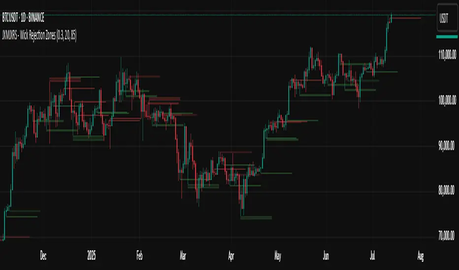
JXMJXRS - Wick Rejection ZonesWick Rejection Zones indicator is designed to identify key price levels where strong rejections occur, typically marked by long wicks and small candle bodies. These zones often signal areas of supply and demand where price was forcefully rejected, making them useful for anticipating potential support or resistance.
The script detects bullish rejection zones when a candle shows a long lower wick, a small body near the top of the candle, and a close above the open. Conversely, bearish rejection zones are identified by long upper wicks, small bodies near the candle low, and a close below the open. This stricter version only highlights the most decisive rejections by enforcing wick dominance and body positioning filters.
When these conditions are met, the indicator draws a colored zone above or below the candle wick to visually represent the rejection area. These zones persist on the chart for a fixed number of bars, allowing traders to reference them for potential reaction levels.
Settings:
Zone Duration (Bars) allows you to control how long each rejection zone remains visible on the chart. A higher number keeps zones active for more bars, while a lower number removes them sooner.
Zone Transparency adjusts the visual opacity of the rejection zones. A lower value makes the zone more visible, while a higher value makes it more transparent.
Bullish Zone Color and Bearish Zone Color let you customize the colors used for bullish and bearish rejection zones, respectively.
This tool is particularly effective in volatile crypto markets where wicks often mark sharp reversals or failed breakout attempts. It can be used as a reference for entries, exits, or stop-loss placement depending on market context.
StratNinjaTableThe StratNinjaTable is a comprehensive technical analysis tool for TradingView designed to provide traders with a multi-timeframe overview of a security's performance and key metrics in a single, customizable table.
This indicator is built around "The Strat" candlestick methodology, which focuses on inside bars (1), trending bars (2U for up, 2D for down), and outside bars (3). It displays this information across multiple, user-selected timeframes simultaneously, from minutes to yearly charts.
Key Features
Multi-Timeframe "Strat" Analysis: The core of the indicator is a table that shows the current "Strat" number (1, 2U, 2D, or 3) and the directional bias (▲ for up, ▼ for down) for each selected timeframe. This allows for a quick assessment of market structure and potential setups across different chart periods.
Customizable Timeframe Selection: Users can easily select which timeframes they want to monitor, including standard intervals like 5-minute, 15-minute, hourly, daily, weekly, and monthly charts.
Comprehensive Data Table: Beyond the "Strat" analysis, the indicator populates a detailed table with essential market data:
Ticker Information: Displays the current ticker and the chart's timeframe.
Money Flow Index (MFI): Shows the MFI value, with color-coded backgrounds to highlight overbought (>80) and oversold (<20) conditions.
Average True Range (ATR): Provides the ATR value and its percentage relative to the closing price, with color signals for low or high volatility.
Market Cap: Calculates and displays the security's market capitalization.
Sector Information: Shows the sector the security belongs to.
Moving Average Data: Includes the distance of the current price from the 20-day Simple Moving Average (SMA), expressed as a percentage.
Volume: Displays the 30-day average trading volume.
Strat Pattern Prediction: Shows a historical sequence of the last two Strat patterns and a potential future pattern based on the current bar's direction.
Timeframe Countdown: A timer for each timeframe shows how much time is left until the current candle closes.
Customizable Appearance: The indicator offers extensive customization options for the table's position on the screen and the colors used for different "Strat" bar types, allowing users to tailor the visual presentation to their preferences.
In essence, the StratNinjaTable serves as an all-in-one dashboard, enabling traders to quickly gauge market sentiment, identify confluence across timeframes, and access key technical data without cluttering their charts with multiple separate indicators.

CloudHidden - 4H FVG on 15mSee title, plots 4 hour fvg's on the 15 minute chart. ONLY WORKS ON A 15 MINUTE CHART!

Lucid Lion Entry Sniper V1This indicator was built to help you find a decent entry. There is no guarantee that you will profit. Please use along with your current trading plan. Feel free to email me at LucidLionTrading@gmail.com with any suggestions or feedback. God Bless

GOJWH Stochastic Relative strength IchimokuSRI (Stochastic Relative Strength Ichimoku)
The SRI basically follows the number of Ichimoku.
The basic principle is similar to Ichimoku, but you can think of the role of Base Line and Conversion Line as "Stochastic" and "RSI" as Cloud.
And SRI is based on oscillator. This is the biggest difference. Therefore, it does not affect viewing the moving average.
There are three main things to check.
1. Cross of "KDJ"
2. See if the "stochastic" line runs through the clouds.
3. It is necessary to check what the next cloud forms.
The signal from the bar is displayed when the conditions of "1 ,3" and the position of the stock relative to the moving average line are simultaneously satisfied.
2020년 10월 13일
릴리즈 노트
*10.13 Updates
- Add RSI line to know directionality
(Each line repeats convergence and divergence)
- Candle Stick Color Segmentation
- Added On/Off buttons for each function.
- Readability improvement
- The maximum and minimum values are fixed at absolute values to eliminate the change in height due to chart movement. (0 - 100)
- Single mode added to Stochastic. (The single mode is based on Open and serves as a magnet.)
- The Stochastic Cloud feature has been added. (It serves as a sort of gateway and I want you to observe and master the details.)
This indicator is optimized for dark color theme.

GOJWH Balance Of ForceBOF ( Balance Of Force )
The BOF is a centred overlay indicator based on trading volume.
This is overlays "SRI" on the chart and works with it.
- You can understand the flow of volume, and you can see over-buying and over-selling at a glance.
- For channels, the Bollinger Bands and Keltner Channels and Chandelier Exit Strategy were used in combination.
- Trend Cloud is a value that overlays the position on the oscillator of the current price compared to the high and low prices in a chart, showing support and resistance, and also shows the trend.
- Centered Line is marked using a formula based on the open price of 52 candles, and when the closing price exceeds or falls below it, the momentum at that moment is confirmed.
- #1, 2 Support/Resistance play the same role as the trend cloud, but make a difference in resolution.
- "The lagging span" is omitted because there are many explanations on the Internet.

Kc ATR 1ATR Strategy with take profit and stop loss. Also included is the Volume threshold, RSI, Volatility threshold and an EMA Trend Filter!

Market Structure Break & Order BlockThis is a Market Structure Break & Order Block indicator.this indicator help you to find market movement and structure of market.inshallah it will help you guys.

Essa's Sessions IndicatorOverview
This powerful tool is designed to visually map out the key trading sessions: Asia, London, and New York directly on your chart. By highlighting these periods and plotting their respective highs and lows, it helps you identify critical price levels, gauge market sentiment, and pinpoint potential breakout opportunities with ease.
What It Does
Visualizes Key Trading Sessions: Automatically draws colored backgrounds for the Asia, London, and New York sessions to show you exactly when the most important market activity is happening.
Plots Session Highs & Lows: Displays precise horizontal lines for the highest and lowest prices reached during each session, acting as key support and resistance levels.
Dual Timezone Mode: Easily switch between London (GMT/BST) and New York (EST/EDT) timezones with a single click. The indicator automatically adjusts all session times for you, ensuring accuracy no matter where you are.
Interactive & Informative Labels: Hover over any session high or low label to see a detailed tooltip containing:
The exact price level.
The session's price range (calculated in pips or points).
The total daily price range for broader context.
A simple volatility gauge (from "Low Vol 😴" to "High Vol 🔥").
Customizable Alerts: Enable breakout alerts to receive instant notifications the moment the price closes above a session high or below a session low.
Simple, powerful, and highly informative, this indicator is an essential tool for traders looking to build strategies around session-based price action.

CISD & OB - The Real ICT Way [BLAZ]ICT Order Blocks & CISD
This indicator is based on the ICT (Inner Circle Trader) methodology and highlights Order Blocks (OB) and Changes in State of Delivery (CISD) — two foundational concepts for understanding institutional order flow and potential market turning points.
Order Block (OB)
An Order Block represents a specific price zone where institutional participants (“smart money”) have executed substantial buy or sell orders. These zones often precede significant price movements and are commonly identified on candlestick charts by observing the following behaviour:
A strong impulsive move in price that closes above or below the open price of an opposing candle (or series of candles).
Types of Order Blocks:
Bullish Order Block
A bullish OB forms when a bullish impulsive move closes above the open of the first bearish candle (or sequence of bearish candles). This signals strong buying interest at that level.
Bearish Order Block
A bearish OB forms when a bearish impulsive move closes below the open of the first bullish candle (or sequence of bullish candles). This indicates significant selling pressure.
These areas often act as high-probability zones for price reversals, continuation, or liquidity grabs, and are widely monitored by ICT-based traders.
Change in State of Delivery (CISD)
A CISD marks a shift in market sentiment, structure, or institutional order flow. It is represented by the first OB that forms in the opposite direction of the prevailing market trend or prior OB.
Types of CISD:
Bullish CISD: The first bullish OB following a bearish OB or bearish CISD.
Bearish CISD: The first bearish OB following a bullish OB or bullish CISD.
CISDs are critical in identifying potential trend reversals or transitions between accumulation and distribution phases. They help traders anticipate shifts in directional bias and refine entry timing.
This indicator is designed to visually capture these important zones and transitions, providing users with a clearer understanding of where institutional activity may influence price and where key structural shifts occur.
Note: Labels displayed on the chart are included for illustrative purposes only and do not represent part of the indicator's functional features.
Core Functionality:
This indicator offers a precise and rules-based plotting of ICT Order Blocks (OB) and Changes in State of Delivery (CISD), faithfully adhering to the original concepts as taught within the ICT framework. It is designed to function seamlessly across any asset class and timeframe, enabling users to accurately interpret market structure, institutional order flow, and potential directional shifts.
Flexible Line Display
To provide clarity without overwhelming the chart, users can individually control the number of bullish and bearish lines displayed, with up to 25 OB/CISD per direction (bullish and bearish). This feature helps tailor the indicator to specific trading styles or charting preferences, making it suitable for both scalping and higher timeframe structural analysis.
Visual Customisation
Users can fully tailor the appearance of Order Block and CISD lines to align with their chart preferences. Customisation includes:
Individual colour selection for bullish and bearish OBs, and for bullish and bearish CISDs.
Adjustable line width, up to a maximum of 10 pixels, allowing clear visual distinction even in high-density chart environments.
Selective visibility: Users can toggle OB or CISD lines independently, allowing full attention on structural breaks or trend reversal zones as needed.
Built for Precision, Designed for Clarity
This indicator is built for serious traders who demand mechanical consistency in identifying institutional footprints. It is not based on subjective interpretation but on strict, codified rules that reflect actual ICT principles. Whether you are analysing a change in delivery state or mapping historical OB zones, the ICT CISD & OB indicator ensures you are equipped with:
Real-time and historical OB/CISD detection
Multi-timeframe compatibility
Instant structure recognition
This tool bridges the gap between theory and execution, giving you the edge in identifying where smart money is active and how to position around it.
Disclaimer:
By using this indicator, you acknowledge and agree to the following terms:
Educational and Informational Use Only
This indicator is provided strictly for educational and informational purposes. It is not intended to serve as financial advice, investment advice, trading advice, or a recommendation to buy or sell any financial instrument. The content and outputs of this indicator are based on historical price action and mechanical logic derived from widely taught ICT concepts, and should not be interpreted as predictive or guaranteed in any form.
No Financial Relationship or Advisory Role
The author of this indicator is not a financial advisor, registered broker, or licensed asset manager. No fiduciary relationship is created between the author and the user through the use of this tool. Users are fully responsible for their own trading decisions and financial outcomes.
Past Performance Is Not Indicative of Future Results
While this indicator may identify historical zones of interest or highlight structural patterns, it does not guarantee future price movement or accuracy in all market conditions. Market behaviour is subject to unpredictable external factors including liquidity, volatility, and macroeconomic news events.
Use at Your Own Risk
All users are advised to perform their own due diligence and risk assessments before making any trading decisions. By applying this script to your charts, you accept full liability for any losses, gains, or financial decisions that may result from its use. The author, publisher, and affiliated platforms shall not be held liable for any direct or indirect damages, including financial loss, data loss, or missed opportunities.
Access and Licensing
Access to the indicator is managed through a third-party licensing platform. Unauthorised redistribution, sharing, reselling, or republishing of the script is strictly prohibited and may result in termination of access and reporting to TradingView for violation of vendor policies. For full access, refer to the author’s section.
Indicator Limitations and Scope
The indicator is a technical analysis tool and should be treated as one of many inputs in a broader trading or investing strategy.
Labels, visual illustrations, or annotations shown in sample images are for demonstration purposes only and are not part of the indicator’s functional output.
Refund Policy
By purchasing access to this indicator, you expressly agree that all sales are final. Once access is granted, no refunds, reimbursements, or chargebacks will be issued under any circumstances. Any attempt to initiate a chargeback will be interpreted as a breach of this agreement and may result in immediate termination of access.
By continuing to use this indicator, you confirm that you have read, understood, and accepted the terms outlined above.

Fractal Model [BLAZ]TTrades Fractal Model (TTFM) operates on a foundational principle: price moves in fractal cycles, alternating between consolidation, reversal and expansion. By leveraging this, the model identifies key HTF swing formations following liquidity sweeps and validates directional bias through confirmed HTF candle closures. Once these macro-level cues are established, TTFM monitors the Change in State of Delivery (CISD) on the LTF, highlighting the exact instant momentum shifts in favour of a potential move. This allows traders to position themselves at the optimal point within the broader HTF expansion phase.
Built with versatility in mind, TTFM is compatible across all asset classes—including Indices, Futures, Forex, Commodities, and Crypto—and can be applied effectively on any timeframe, from intraday scalping to position trading. The indicator also offers a high degree of customisation, giving users the ability to tailor timeframes, visual display, and bias filters to match their personal strategy and chart aesthetics.
Developed by a trader, for traders, providing a structured model that transforms complex price action into clear, actionable insight. Whether you're seeking refined entries, greater context behind price movement, or a consistent edge rooted in ICT principles, TTFM delivers a powerful framework to support your trading journey.
Core Functionality
1) Setup Display Control:
Users can customise how many historical setups are shown on the chart, with support for up to 50 combined entries. The indicator displays both bullish and bearish TTFM setups within the selected limit, including invalidated scenarios. As an example in the image below, selecting “4 setups” will plot the most recent mix of bullish and bearish opportunities based on model logic.
2) Bias Filter:
The indicator includes a built-in bias filter that allows you to control which setups are displayed based on your directional outlook. You can choose to view only bullish setups, only bearish setups, or select a balanced mode to show both. This flexibility helps traders align the model's output with their own market bias or broader trading framework.
The previous image demonstrates the balanced setting, while the example below illustrates the same chart but when filtered to show only bearish setups.
3) Custom Timeframe Alignment:
Multi-timeframe analysis is a core principle of ICT methodology, enabling traders to align entries on lower timeframes with structure and bias defined on higher timeframes. The TTFM indicator incorporates this principle by allowing users to manually configure their preferred combination of High Timeframe (HTF) and Low Timeframe (LTF) for setup generation.
While the indicator is designed with optimal default alignments (e.g., 1W–4H, 1D–1H, 4H–15M, 1H–5M), traders can explore and define their own configurations to suit their strategies and market focus. This flexibility allows for more refined trade planning, ensuring entries are framed within meaningful HTF context.
The image below illustrates an example of 4H-based HTF reversals confirmed on the 15-minute LTF, displayed while viewing a 5-minute chart.
4) Invalidated Setups Display:
The indicator provides an option to display or hide setups that have been invalidated. This feature helps traders maintain clarity on the chart while still being aware of historical model behaviour. Invalidated setups are visually marked with distinct labels: amber if invalidated at Candle 3 (C3) and red if invalidated at Candle 4 (C4).
Even when toggled off for visual purposes, invalidated setups remain part of the total setup count, preserving analytical consistency. The images below compare chart views with and without invalidated setups displayed, offering flexibility between comprehensive review and a cleaner, focused display of higher-probability setups.
With invalidated setups:
Without invalidated setups:
5) Visibility Filters:
The indicator includes advanced filtering options that allow traders to control when and where setups appear on the chart. Users can restrict TTFM setups to specific intraday time windows, such as active trading sessions like New York (NY) or London, helping them focus on high-volume, high-opportunity periods.
Additionally, the indicator offers the ability to limit visibility by higher timeframe (HTF), which is particularly useful when conducting macro-level analysis to define market bias or structural narrative.
The examples below show the contrast between a full-day setup display and a filtered view showing only NY session setups on the NQ1! chart.
6) High Timeframe (HTF) Annotations:
The indicator includes a comprehensive HTF annotation system designed to enhance structural clarity directly on lower timeframe charts. It visualises the Power of 3 (PO3) across the most recent five HTF candles, offering detailed insight into HTF price behaviour and key levels of interest.
Displayed elements include:
HTF liquidity sweeps
Current HTF candle open
Previous candle equilibrium level
HTF Fair Value Gaps (FVGs)
Candle-specific labels and a live countdown to HTF closure
LTF open labels within each HTF candle
All components are fully customisable—traders can toggle visibility, adjust colour schemes, thickness, width, spacing, and how far back the HTF annotations appear relative to the current bar. This level of control allows for seamless integration with any charting style while maintaining visual clarity and precision.
In addition to the standard five-candle view, the indicator offers the flexibility to display between five to ten High Timeframe (HTF) candles, empowering traders to broaden their market context and better understand unfolding price action within a structured HTF narrative. By visualizing extended HTF sequences—including liquidity sweeps, Fair Value Gaps (FVGs), and critical reference levels—users are able to identify and react to price activity within defined Premium and Discount Arrays (PDAs). This enhanced visibility allows traders to strategically position themselves in alignment with institutional order flow and capitalize on potential HTF expansions, thereby increasing the probability of trade success through deeper market alignment.
7) Low Timeframe (LTF) Annotations:
To support efficient and precise trade execution, the indicator displays detailed LTF-level annotations derived from the TTFM framework. These visual cues are designed to align entries with the structural context of HTF setups and provide clear reference points throughout the trade.
Key LTF components include:
Vertical separation lines marking each of the 5 HTF candles
Sweeps of prior HTF highs and lows
CISD (Change in State of Delivery) level
Consequent Encroachment (CE) of the CISD
Midpoint of the previous HTF candle
Potential holding zones (T-Spots)
Potential liquidity targets related to each setup
All elements are fully customisable, allowing traders to adjust visibility, colours, and styling preferences to maintain chart clarity while focusing on execution.
Disclaimer & Terms of Use
The concept behind the Fractal Model was originally introduced by TTrades. This indicator, titled Fractal Model , has been independently developed by the author based on their own study, interpretation, and practical application of the model. The code and structure of this indicator are original and were written entirely from scratch to reflect the author's unique understanding and experience.
This tool is provided solely for educational and informational purposes. It is not intended—and must not be interpreted—as financial advice, investment guidance, or a recommendation to buy or sell any financial instrument. The indicator is designed to assist with technical analysis based on market structure theory but does not guarantee accuracy, profitability, or specific results.
Trading financial markets involves significant risk, including the possibility of loss of capital. By using this indicator, you acknowledge and accept that you are solely responsible for any decisions you make while using the tool, including all trading or investment outcomes. No part of this script or its features should be considered a signal or assurance of success in the market.
By subscribing to or using the indicator, you agree to the following:
You fully assume all responsibility and liability for the use of this product.
You release the author from any and all liability, including losses or damages arising from its use.
You acknowledge that past performance—real or hypothetical—does not guarantee future outcomes.
You understand that this indicator does not offer personalised advice, and no content associated with it constitutes a solicitation of financial action.
You agree that all purchases are final. Once access is granted, no refunds, reimbursements, or chargebacks will be issued under any circumstance.
You agree to not redistribute, resell, or reverse engineer the script or any part of its logic.
Users are expected to abide by all platform guidelines while using or interacting with this tool. For access instructions, please refer to the Author's Instructions section or access the tool through the verified vendor platform.

BG 3:00 / 2:00 Candle High/Low LinesBG 3:00 Candle High/Low Lines
This indicator highlights the high and low of the 1-hour candle exactly at 3:00 AM Bulgarian local time (EET/EEST). Horizontal lines are drawn at these levels and extended 5 hours forward, providing clear visualization of key daily levels.
Key Features:
Automatically adjusts for Bulgarian local time, including daylight saving time changes.
Marks only the 3:00 AM candle on the 1-hour chart for a clean and focused view.
Allows customizable colors for the high and low lines separately.
Lines extend 5 hours ahead to aid in tracking important support and resistance levels.
Ideal for traders analyzing the Bulgarian market or anyone interested in monitoring the 3:00 AM Europe/Sofia time frame.
Use this tool to identify crucial price levels aligned with Bulgarian time and enhance your intraday trading strategy.

CISD Engine & FVG/iFVG [Herman]CISD Engine & FVG/iFVG
Purpose:
The CISD Engine & FVG/iFVG is designed to help traders identify potential shift points in market structure and delivery dynamics, as well as price imbalances (FVG/iFVG) that often act as magnets or reaction zones.
This tool is meant as confluence—an additional layer of confirmation alongside any trade entry model you prefer (e.g. ICT-style entries, breakouts, reversals).
How It Works:
1️⃣ CISD Engine (Change in State of Delivery)
The CISD Engine identifies shifts in the "State of Delivery"—that is, a confirmed change from bearish to bullish order flow or vice versa.
It uses a pullback-filtered breakout logic:
-Detects valid pullback candles (based on body % filter to avoid weak signals like dojis).
-Confirms the breakout in the opposite direction with strong displacement.
-Plots CISD levels (lines on chart) showing the price where the change of state was confirmed.
-Labels them as +CISD (bullish) or -CISD (bearish).
-These levels act as potential support/resistance areas and can be used to anticipate reaction zones or trend shifts.
Customization:
-Choose bullish and bearish line colors.
-Adjust line style and thickness.
-Configure how many bars forward lines are extended.
-Optionally keep or discard older CISD levels to reduce clutter.
2️⃣ FVG and iFVG Detection
What is FVG?
A Fair Value Gap (FVG) is a price imbalance between three candles where the middle candle’s high or low leaves a gap against the neighboring candles. It's considered an area of inefficiency that price often seeks to revisit.
What is iFVG?
An inverted Fair Value Gap (iFVG) is a confirmation of an FVG that has been traded back through and invalidated. This level can act as a stronger confluence for reversals.
Logic in this Indicator:
-Automatically detects and plots FVG zones (boxes on chart).
-Waits for price to invalidate these zones (e.g. by closing through them) to confirm them as iFVGs.
-Allows setting minimum size filters to avoid noise.
-Color-coded bullish/bearish FVG and iFVG zones for easy reading.
Customization:
-Toggle FVG and iFVG detection on/off.
-Adjust max number of displayed FVG/iFVG zones.
-Configure box colors, borders, and labels.
-Control extension and appearance of boxes.
Main Features
✅ CISD Engine with custom pullback filtering to avoid weak setups.
✅ Dynamic detection of bullish/bearish order flow shifts with plotted levels.
✅ Automatic FVG detection (imbalance zones) as magnets or reaction targets.
✅ iFVG detection (invalidation of prior imbalance) for extra confirmation.
✅ Fully customizable visuals: colors, opacity, number of boxes, borders, labels.
✅ Designed to be used as confluence with any entry/exit strategy.
Suggested Use:
-Combine CISD levels with your OHLC Statistical Map Indicator
-Watch for price to react to FVG or iFVG levels.
-Use as an extra filter for scalping or swing setups.
This tool is ideal for traders who want structured market reading, clear levels, and mechanical confirmation of delivery shifts and imbalance zones without subjective drawing.

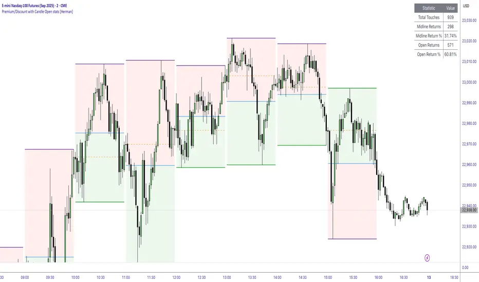
Premium/Discount with Candle Open stats [Herman]Premium/Discount with Stats
This indicator is designed to help traders identify and analyze premium/discount zones on any timeframe while automatically tracking statistics on price behavior relative to these zones. It is especially valuable for traders looking to structure entries, manage targets, and quantify market reactions to prior session ranges.
What it draws on the chart
✅ Range High and Low Lines
For each selected timeframe period (15min, 30min 1H, 4H, Daily), the indicator plots the high and low of the completed previous period.
These lines are color-coded dynamically based on sweep detection:
If the high was swept (price broke the previous high), the high line is marked as Premium.
If the low was swept, the low line is marked as Discount.
If both were swept or neither, it uses the default color settings.
✅ Midline
An optional midline at the 50% level of the previous period’s high-low range.
Helpful for mean-reversion traders or anyone watching for retests of equilibrium.
✅ Quartile Lines (25%–75%)
Optional additional lines at 25% and 75% of the previous range, helping traders visualize inner range subdivisions.
✅ Open Price Line
Marks the open price of the previous period as a horizontal reference.
✅ Background Fills
The region between low and midline is shaded with the Discount color.
The region between high and midline is shaded with the Premium color.
These optional fills help highlight the premium and discount zones visually.
✅ Current Incomplete Period Lines (optional)
You can choose to display provisional high, low, midline, quartiles, and open for the current forming period.
These update in real-time until the period closes.
Sweep Detection Logic
The indicator automatically tracks if the current period price sweeps above the previous period’s high or below the low.
A "sweep" is simply defined as price exceeding the previous high/low while tracking is active.
The sweep status affects the colors of the premium/discount lines, helping traders see potential liquidity grabs or stop hunts.
What it counts and tracks (Statistics)
The script automatically compiles statistics over time:
✅ Total Touches
Counts how many times the price in a new period touches either the previous period’s high or low.
A “touch” is registered once per side per period.
✅ Midline Returns
Counts how often, after touching the previous high/low, price returns to the previous period’s midline.
Gives you a measure of mean-reversion success.
✅ Open Returns
Similarly, tracks how often price returns to the previous period’s open after touching the previous high/low.
✅ Return Percentages
Displays the percentage of touches that result in a return to midline or open.
These percentages are calculated live on your chart and updated after each period closes.
✅ Stats Table
A customizable on-chart table summarizing all of these stats in real-time.
Helps traders evaluate the effectiveness of range-based trading setups over time.
How it Works (Technical details)
On each new bar, the script checks if a new period (as defined by your timeframe selection) has begun.
When a new period starts, the previous period’s high, low, open, midline, quartiles are recorded and drawn on the chart.
The script then “watches” the current period:
Updates provisional high and low.
Detects sweeps of previous highs/lows.
Tracks if price returns to the previous period’s midline or open after those sweeps.
Increments statistical counters if conditions are met.
Background fills and lines update dynamically based on real-time data.
Intended Use Cases
This indicator is ideal for:
✅ Identifying premium/discount zones for swing or intraday trades.
✅ Spotting liquidity sweeps and possible manipulation zones.
✅ Structuring trades with logical, data-driven target zones (midline, open).
✅ Quantifying the probability of mean-reversion moves after liquidity events.
✅ Developing and backtesting range-based trading models with live stats.
Highly Customizable
Choose any timeframe for defining the premium/discount range.
Toggle visibility of midline, quartiles, open line, current period preview.
Full control over colors, line styles, line widths, and background shading.
Optional real-time statistical table with total counts and return percentages.