FVG MTF + 50%
// This indicator identifies Fair Value Gaps (FVGs) on M15, H1, and H4 timeframes, highlights them on the chart as colored boxes, draws the 50% median line,
// and displays price labels for the 0%, 50%, and 100% levels of each gap.
// It also tracks when gaps are “filled” (mitigated) and logs counts on a dashboard, providing real-time metrics on open/filled FVGs for liquidity analysis.
//
// Key Features:
// 1. Multi‐Timeframe Detection: Scans M15, H1, H4 for three‐bar FVG patterns using a configurable threshold.
// 2. Colored Zones and Median Lines: Draws bullish (green) and bearish (red) gap boxes, bordered in white, with a dashed white line at the midpoint.
// 3. Price Labels: Optionally annotates each gap with “0% FVG = $X,” “50% FVG = $Y,” and “100% FVG = $Z” at the moment of detection.
// 4. Gap Mitigation: Monitors price re‐entry into a gap; when filled, it removes the box and logs a dashed line at the fill price.
// 5. Dashboard: Counts total bullish/bearish FVGs and calculates the percentage filled on each timeframe.
// 6. Alerts: Configurable alerts for new gap creation and fill events at 0%, 50%, and 100% levels.
//
// Implementation Details:
// • Detection Logic: A three-bar gap occurs when the middle bar’s low is above the prior bar’s high (bullish) or its high is below the prior bar’s low (bearish).
// A “threshold” parameter filters minor gaps based on relative size.
// • Data Structures: Uses Pine v6’s user‐defined “fvg” type to store gap high, low, direction, and timestamp. Arrays track open boxes, lines, labels for each timeframe.
// • Drawing:
// – box.new() draws transparent rectangles spanning 500 bars into the future.
// – line.new() draws dashed median lines and mitigation lines when gaps are filled.
// – label.new() places price annotations at the current right edge with textalign=text.align_right.
// • Dashboard: table.new() creates a 3×3 panel showing “Bullish”/“Bearish” counts and “Mitigated” percentages in real time.
// • Alerts: alertcondition() triggers when new gaps form or are mitigated at specified percentages.
//
// Usage:
// • Add to chart: Apply the script; enable or disable timeframes via checkboxes (Enable FVG M15, H1, H4).
// • Configure text labels: Toggle “Text” to show or hide on‐chart price annotations.
// • Monitor dashboard: Observe counts and fill rates to gauge market liquidity pressure.
// • Set alerts: Enable alerts for specific levels (0%, 50%, 100%) and timeframes as needed.
//
// Potential Extensions:
// • Customizable lookback on fill monitoring (beyond “showLast” parameter).
// • Dynamic threshold based on ATR or volatility metrics instead of static percentage.
// • Integration with order‐flow or volume data to refine gap significance.
// • Expanded timeframes (D1, W, etc.) for higher‐timeframe liquidity profiling.
//
// =============================================================================
//
// © 2025. Licensed under CC BY‐NC‐SA 4.0 International.
// Feel free to reference academic works (Hasbrouck, Bouchaud, O’Hara) for theoretical context.
//
// End of Description.
Multitimeframe

Kc Quad MACustom and Premade strategies for the Nasdaq 100 and Dow Jones. Save your own user defined settings as strategies. Quadrouple moving average strategy with small take profits. Utilizing several aspects including ATR, RSI, Volume threshold, change of character, break of structure and more! Stop loss, take profit, max daily loss and max daily profit built in. Don't want to trade during closed hours or the holidays? The strategy automatically shuts off and closes out your trades, when the market is closed. If you want a strategy that runs on full auto-pilot, this is the one to get!

DS FLUXO 1.0# 🔥 DS FLUXO 1.0 - Flow Analysis and Zone Indicator
## 📋 **OVERVIEW**
DS FLUXO is an advanced indicator that identifies trend changes and operational zones based on price flow analysis. It combines structural breakout detection with automatic support/resistance zone creation, offering a comprehensive approach to technical analysis.
## 🎯 **KEY FEATURES**
### **Breakout Detection**
- Identifies trend changes through structural breakouts
- Clear BUY/SELL signals at flow change points
- Breakout line history control (1-10 lines)
- Customizable reference lines (color, thickness, style)
### **Dynamic Zones**
- Automatic creation of support zones (uptrend) and resistance zones (downtrend)
- Zones based on candle wicks and bodies
- Central line (50%) for additional reference
- Visual zone filling with adjustable transparency
### **Complete Alert System**
- 🟢🔴 Breakout alerts for trend changes
- 🎯 First touch alerts on zones
- Individual control for each alert type
- Controlled frequency (no spam)
## ⚙️ **AVAILABLE SETTINGS**
### **🔥 Breakout**
- Maximum number of lines in history
- Visual customization (color, thickness, style)
- Line extension control
### **🏷️ Labels**
- Customizable colors for BUY/SELL
- Adjustable font size
- Configurable text color
### **🎯 Zones**
- Line colors (top, middle, bottom)
- Zone filling and borders
- Temporal displacement of zones
- Line thickness and style
### **🔔 Alerts**
- General alert control
- Specific alerts by type (breakout/zones)
- Clean messages with timeframe
## 🎨 **HOW TO USE**
### **Trend Identification**
1. Wait for BUY/SELL signals for flow changes
2. Observe breakout lines as reference
3. Use zones for entry/exit points
### **Zone Trading**
1. **Uptrend**: Wait for touches on buy zone (green)
2. **Downtrend**: Wait for touches on sell zone (red)
3. **First Touch**: Higher probability of reaction
### **Alert Configuration**
1. Enable desired alerts in settings
2. Configure notifications in TradingView
3. Receive real-time alerts for opportunities
## 📊 **RECOMMENDED TIMEFRAMES**
- **Swing Trade**: 4H, 1D, 1W
- **Day Trade**: 15M, 30M, 1H
- **Scalp**: 1M, 3M, 5M
## 🔧 **TECHNICAL CHARACTERISTICS**
- Compatible with Pine Script v5
- Overlay: Yes (draws over chart)
- Alerts: Yes (complete system)
- Configurable: Highly customizable
- Performance: Optimized for multiple timeframes
## 💡 **SUGGESTED STRATEGIES**
### **Breakout Strategy**
- Enter in direction of confirmed breakout
- Use zones as targets or support/resistance
- Manage risk with structural stop loss
### **Zone Strategy**
- Wait for first touch on zone for entry
- Confirm with other indicators
- Use central line (50%) as partial reference
## ⚠️ **IMPORTANT NOTICE**
This indicator is a technical analysis tool and does not constitute investment advice. Always conduct your own analysis and properly manage risk in your trades.
---
**Developed by**: Diogo Stefani
**Version**: 1.0
**Last Update**: 2025

Previous Day High/Low/Close - Static Daily LinesIndicator gives the information about the previous day high low and close price in the form o. horizantal lines

EMAs + LSMA Cross Alert (Mejorado)his indicator is designed to identify buy and sell signals based on the behavior of multiple exponential moving averages (EMAs) and a Least Squares Moving Average (LSMA). It includes 5 EMAs and one LSMA, with visual and alert features.
📌 Components:
EMA 4 (purple)
EMA 9 (Fuchsia)
EMA 21 (blue)
EMA 50 (Green)
EMA 200 (maroon)
LSMA 30 (Orange)
🔍 Signal Logic:
✅ Buy Signal:
The LSMA (30) must be below both EMA 4 and EMA 9.
A bullish crossover occurs: EMA 4 crosses above EMA 9.
Only one signal is triggered per crossover, avoiding repeated alerts during trend continuation.
❌ Sell Signal:
The LSMA (30) must be above both EMA 4 and EMA 9.
A bearish crossover occurs: EMA 4 crosses below EMA 9.
Only one signal is triggered per crossover, avoiding repeated alerts during trend continuation.
🖥️ Visual Features:
Option to show/hide each EMA and the LSMA.
Buy/Sell markers appear at cross points.
A white background highlight marks the candle where the signal occurs (optional).
Visuals scale dynamically with the chart zoom and axes.
🔔 Alerts:
Custom alert conditions for Buy and Sell.
Alerts can trigger push notifications to the TradingView mobile app, email, or webhook.
Configured to avoid repeating alerts unless the trend resets and a new valid crossover occurs.

Kc Quad MA 7Custom and Premade strategies for the Nasdaq 100 and Dow Jones. Quadrouple moving average strategy with small take profits. Utilizing several aspects including ATR, RSI, Volume threshold, change of character, break of structure and more! Stop loss, take profit, max daily loss and max daily profit built in. Don't want to trade during closed hours or the holidays? The strategy automatically shuts off and closes out your trades, when the market is closed. If you want a strategy that runs on full auto-pilot, this is the one to get!

Custom MTF DBoardSimple MTF Dboard to use with other indicators as a confluence.
Uses LuxAlgo's SMC concepts to show PA's trend direction- the idea is , if the trends dont align fully, dont take the trade. Or if one of the timeframes are different, maybe its time to get out of a trade cus its gonna reverse into your face?
Try it Lemme know lol

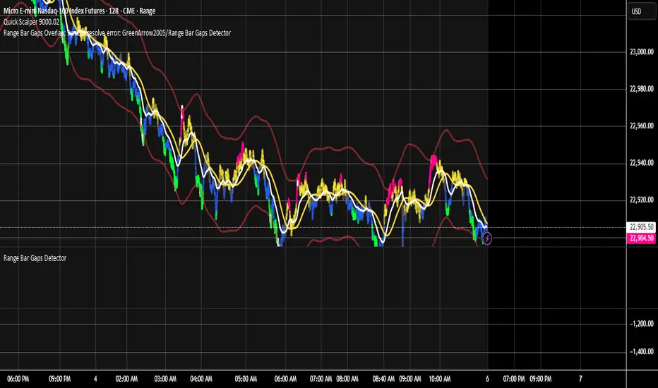
Range Bar Gaps DetectorRange Bar Gaps Detector
Overview
The Range Bar Gaps Detector identifies price gaps across multiple range bar sizes (12, 24, 60, and 120) on any trading instrument, helping traders spot potential support/resistance zones or breakout opportunities. Designed for Pine Script v6, this indicator detects gaps on range bars and exports data for use in companion scripts like Range Bar Gaps Overlap, making it ideal for multi-timeframe gap analysis.
Key Features
Multi-Range Gap Detection: Identifies gaps on 12, 24, 60, and 120-range bars, capturing both bullish (gap up) and bearish (gap down) price movements.
Customizable Sensitivity: Includes a user-defined minimum deviation (default: 10% of 14-period SMA) for 12-range gaps to filter out noise.
7-Day Lookback: Automatically prunes gaps older than 7 days to focus on recent, relevant price levels.
Data Export: Serializes up to 10 gaps per range (tops, bottoms, start bars, highest/lowest prices, and age) for seamless integration with overlap analysis scripts.
Debugging Support: Plots gap counts and aggregation data in the Data Window for easy verification of detected gaps.
How It Works
The indicator aggregates price movements to simulate higher range bars (24, 60, 120) from a base range bar chart. It detects gaps when the price jumps significantly between bars, ensuring gaps meet the minimum deviation threshold for 12-range bars. Gaps are stored in arrays, serialized for external use, and pruned after 7 days to maintain efficiency.
Usage
Add to your range bar chart (e.g., 12-range) to detect gaps across multiple ranges.
Use alongside the Range Bar Gaps Overlap indicator to visualize gaps and their overlaps as boxes on the chart.
Check the Data Window to confirm gap counts and sizes for each range (12, 24, 60, 120).
Adjust the "Minimal Deviation (%) for 12-Range" input to control gap detection sensitivity.
Settings
Minimal Deviation (%) for 12-Range: Set the minimum gap size for 12-range bars (default: 10% of 14-period SMA).
Range Sizes: Fixed at 24, 60, and 120 for higher range bar aggregation.
Notes
Ensure the script is published under your TradingView username (e.g., GreenArrow2005) for use with companion scripts.
Best used on range bar charts to maintain consistent gap detection.
For advanced overlap analysis, pair with the Range Bar Gaps Overlap indicator to highlight zones where gaps from different ranges align.
Ideal For
Traders seeking to identify key price levels for support/resistance or breakout strategies.
Multi-timeframe analysts combining gap data across various range bar sizes.
Developers building custom indicators that leverage gap data for advanced charting.
SMA Crossing Background Color (Multi-Timeframe)When day trading or scalping on lower timeframes, it’s often difficult to determine whether the broader market trend is moving upward or downward. To address this, I usually check higher timeframes. However, splitting the layout makes the charts too small and hard to read.
To solve this issue, I created an indicator that uses the background color to show whether the current price is above or below a moving average from a higher timeframe.
For example, if you set the SMA Length to 200 and the MT Timeframe to 5 minutes, the indicator will display a red background on the 1-minute chart when the price drops below the 200 SMA on the 5-minute chart. This helps you quickly recognize that the trend on the higher timeframe has turned bearish—without having to open a separate chart.
デイトレード、スキャルピングで短いタイムフレームでトレードをするときに、大きな動きは上に向いているのか下に向いているのかトレンドがわからなくなることがあります。
その時に上位足を確認するのですが、レイアウトをスプリットすると画面が小さくて見えにくくなるので、バックグラウンドの色で上位足の移動平均線では価格が上なのか下なのかを表示させるインジケーターを作りました。
例えば、SMA Length で200を選び、MT Timeframeで5分を選べば、1分足タイムフレームでトレードしていて雲行きが怪しくなってくるとBGが赤になり、5分足では200線以下に突入しているようだと把握することができます。

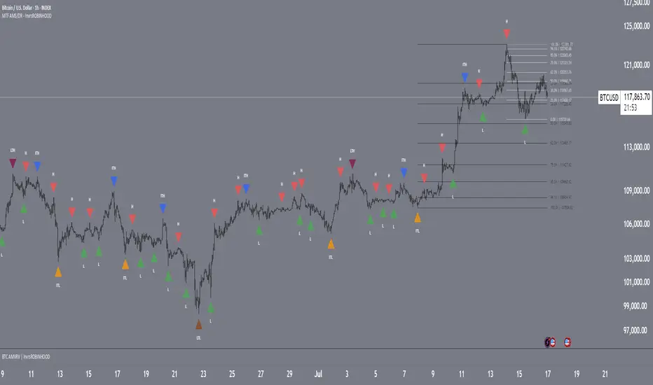
MTF Market Structure Pivots/Dealing Ranges | InvrsROBINHOODMulti-Timeframe Advanced Market Structure Pivots - Dealing Ranges | InvrsROBINHOOD
This indicator provides a sophisticated framework for analyzing market structure by identifying and classifying key pivot points on the user defined higher timeframes. It automatically draws the most relevant bullish and bearish dealing ranges based on this structure, equipping traders with a clear and objective view of the market's flow and potential areas of interest whilst on the lower timeframes.
Understanding Market Structure
At its core, market structure is the sequence of highs and lows that form the trend. This indicator demystifies market structure by categorizing pivots into a three-tiered hierarchy, allowing you to instantly gauge the significance of a swing point.
The Hierarchy of Pivots
Short Term Highs (H) & Lows (L)
These are the most basic swing points in price action, representing minor, localized turning points. They are the fundamental building blocks of all larger trends and structures. While common, they help define the immediate price action and short-term directional bias.
Intermediate Highs (ITH) & Lows (ITL)
An Intermediate High (ITH) is a short-term high that is higher than the short-term highs immediately preceding and succeeding it. Similarly, an Intermediate Low (ITL) is a short-term low that is lower than its neighboring lows.
Importance: These pivots are significantly more important than standard H/L points. They represent a more substantial shift in supply and demand and often mark the beginning or end of a corrective wave within a larger trend. A break of an ITH or ITL suggests a potential change in the intermediate-term trend.
Long Term Highs (LTH) & Lows (LTL)
These are the most critical pivots identified by the indicator. A Long Term High (LTH) is an intermediate high that is higher than the intermediate highs on either side of it. A Long Term Low (LTL) is an intermediate low that is lower than its neighboring intermediate lows.
Importance: LTH and LTL points represent major structural anchors. They often define the boundaries of long-term trading ranges, mark the conclusion of major market cycles, or signal a significant trend reversal. A price break beyond an LTH or LTL is a powerful confirmation that the long-term market structure has shifted.
By understanding this hierarchy, a trader can better assess the strength of a trend. For example, in a strong uptrend, price will consistently form higher L's, IPL's, and LTL's. A break of a key ITL would be the first major warning sign that the dominant bullish structure is in jeopardy.
The Dealing Range: Fibonacci Analysis
Beyond identifying pivots, the indicator's primary function is to establish the current Dealing Range. A dealing range is the price zone between a significant structural pivot and the subsequent impulse move away from it. The indicator uses a proprietary scoring system to objectively identify the most probable and "protected" high or low to anchor these ranges.
How to Use the Dealing Ranges
The indicator will plot two potential dealing ranges, one bullish and one bearish, complete with key Fibonacci retracement levels.
Bullish Dealing Range (Black):
This range is drawn from a significant low (the anchor) up to the highest high formed after that low.
Application: This range highlights potential "discount" buying opportunities. When price pulls back from the high, the Fibonacci levels (e.g., 50%, 61.8%, 78.6%) serve as high-probability zones where buyers may step in to resume the upward trend. The original low of the range is the ultimate invalidation point for this bullish idea.
Invalidation: The bullish range is considered complete and will be removed if the price breaks above the high of the range, as the market has shown its intention to continue higher. The indicator will then seek to establish a new range.
Bearish Dealing Range (White):
This range is drawn from a significant high (the anchor) down to the lowest low formed after that high.
Application: This range identifies potential "premium" selling opportunities. As price rallies from the low, the Fibonacci levels act as potential resistance zones where sellers may re-emerge to continue the downward trend. The original high of the range is the ultimate invalidation for this bearish scenario.
Invalidation: The bearish range is considered complete and will be removed if the price breaks below the low of the range, signaling a continuation of the downtrend. The indicator will then await a new structure to form.
By combining a hierarchical understanding of market structure with automatically drawn Fibonacci dealing ranges, this tool helps traders to objectively identify the trend, frame high-probability trade ideas, and manage risk with clearly defined levels of interest and invalidation.
SimpleBias ProSimpleBias PRO - Advanced Multi-Timeframe Bias Analysis System
SimpleBias PRO is an advanced multi-timeframe bias analysis system, specifically designed for professional traders who need in-depth analysis and integrated risk management. A major upgrade from the free version, it features 6 separate table systems and sophisticated trading logic.
Key Features
Multi-Table Analysis System
SimpleBias Table - Core bias analysis across 8 timeframes
Logic Table - Advanced trading logic with confluence requirements
EMA Table - Trend analysis with customizable EMA system
Time Table - Session-based timing optimization
Time & Price Table - Combined temporal and price analysis
Risk Management Table - Automated position sizing calculations
Advanced EMA Integration
Multiple source options: Open, Close, High, Low
Dynamic color modes with bullish/bearish visualization
EMA direction analysis (RISE/FALL/NEUTRAL)
Customizable periods (1-9999) with plot capability
Professional line width control (1-5 pixels)
Smart Time-Based Analysis
Optimized trading hours for different timeframes
New York timezone integration for global markets
Time status indicators with visual confirmation
Session-specific filtering for 15m, 5m, 1m strategies
Enhanced Trading Logic
Multi-timeframe confluence requirements
Mid-timeframe bias analysis
EMA direction confirmation system
Time-based entry filtering
Separate conditions for scalping (1m), day trading (5m), and swing (15m)
Professional Risk Management
Balance input with validation ($100 - $10,000,000)
Risk percentage control (0.1% - 10.0%)
Stop loss configuration in pips (5-5000)
Automatic position sizing calculations
Real-time risk assessment display
How It Works
Bias Calculation
The indicator determines market bias by comparing the current timeframe's open price with the previous period's open price:
BULLISH: Current open > Previous open
BEARISH: Current open < Previous open
NEUTRAL: Current open = Previous open
Multi-Timeframe Confluence The system requires alignment across multiple timeframes before generating signals:
15-Minute Strategy:
4h, 1h, 15m bias alignment
1H mid-timeframe confirmation
EMA direction confirmation
Optimal time session validation
5-Minute Strategy:
1h, 15m, 5m bias alignment
15M mid-timeframe confirmation
EMA trend validation
Session timing optimization
1-Minute Strategy:
15m, 5m, 1m bias alignment
5M mid-timeframe confirmation
EMA direction sync
Precise timing windows
Risk Management Integration Automatic position sizing based on:
Account balance
Risk percentage
Stop loss distance
Current market conditions
Advanced Customization
Theme & Display Options
Light/Dark mode with automatic color adaptation
Transparent background options
Individual table toggle controls
Position control (Top/Middle/Bottom Right)
Text size optimization (Tiny/Small/Normal)
Professional Color Schemes
Separate bias color customization
Dynamic EMA coloring
Signal color differentiation
Theme-adaptive interface elements
Best Practices
For Professional Day Trading
Use 15-minute charts with 15M strategy
Focus on 4H and 1H bias alignment
Enable EMA confirmation
Trade during optimal NY sessions
Apply 0.25-0.5% risk per trade
For Advanced Scalping
Use 5-minute charts with 5M strategy
Require 1H and 15M bias confluence
Monitor EMA direction changes
Focus on high-probability time windows
Use tight risk management (0.1-0.25%)
For Swing Trading
Use 15-minute+ charts
Focus on higher timeframe bias alignment
Allow wider stop losses
Use longer EMA periods
Apply conservative risk (0.5-1%)
Technical Specifications
Pine Script Version: v6
Performance: Multi-table system with efficient rendering
Compatibility: All TradingView timeframes and instruments
Updates: Real-time bias detection and signal generation
Important Disclaimers
This indicator is for educational and analysis purposes only. Not financial advice - always conduct your own research and risk assessment. Past performance does not guarantee future results. Proper risk management is essential for all trading activities.

Two Poles Trend Finder MTF [BigBeluga]🔵 OVERVIEW
Two Poles Trend Finder MTF is a refined trend-following overlay that blends a two-pole Gaussian filter with a multi-timeframe dashboard. It provides a smooth view of price dynamics along with a clear summary of trend directions across multiple timeframes—perfect for traders seeking alignment between short and long-term momentum.
🔵 CONCEPTS
Two-Pole Filter: A smoothing algorithm that responds faster than traditional moving averages but avoids the noise of short-term fluctuations.
var float f = na
var float f_prev1 = na
var float f_prev2 = na
// Apply two-pole Gaussian filter
if bar_index >= 2
f := math.pow(alpha, 2) * source + 2 * (1 - alpha) * f_prev1 - math.pow(1 - alpha, 2) * f_prev2
else
f := source // Warm-up for first bars
// Shift state
f_prev2 := f_prev1
f_prev1 := f
Trend Detection Logic: Trend direction is determined by comparing the current filtered value with its value n bars ago (shifted comparison).
MTF Alignment Dashboard: Trends from 5 configurable timeframes are monitored and visualized as colored boxes:
• Green = Uptrend
• Magenta = Downtrend
Summary Arrow: An average trend score from all timeframes is used to plot an overall arrow next to the asset name.
🔵 FEATURES
Two-Pole Gaussian Filter offers ultra-smooth trend curves while maintaining responsiveness.
Multi-Timeframe Trend Detection:
• Default: 1H, 2H, 4H, 12H, 1D (fully customizable)
• Each timeframe is assessed independently using the same trend logic.
Visual Trend Dashboard positioned at the bottom-right of the chart with color-coded trend blocks.
Dynamic Summary Arrow shows overall market bias (🢁 / 🢃) based on majority of uptrends/downtrends.
Bold + wide trail plot for the filter value with gradient coloring based on directional bias.
🔵 HOW TO USE
Use the multi-timeframe dashboard to identify aligned trends across your preferred trading horizons.
Confirm trend strength or weakness by observing filter slope direction .
Look for dashboard consensus (e.g., 4 or more timeframes green] ) as confirmation for breakout, continuation, or trend reentry strategies.
Combine with volume or price structure to enhance entry timing.
🔵 CONCLUSION
Two Poles Trend Finder MTF delivers a clean and intuitive trend-following solution with built-in multi-timeframe awareness. Whether you’re trading intra-day or positioning for swing setups, this tool helps filter out market noise and keeps you focused on directional consensus.

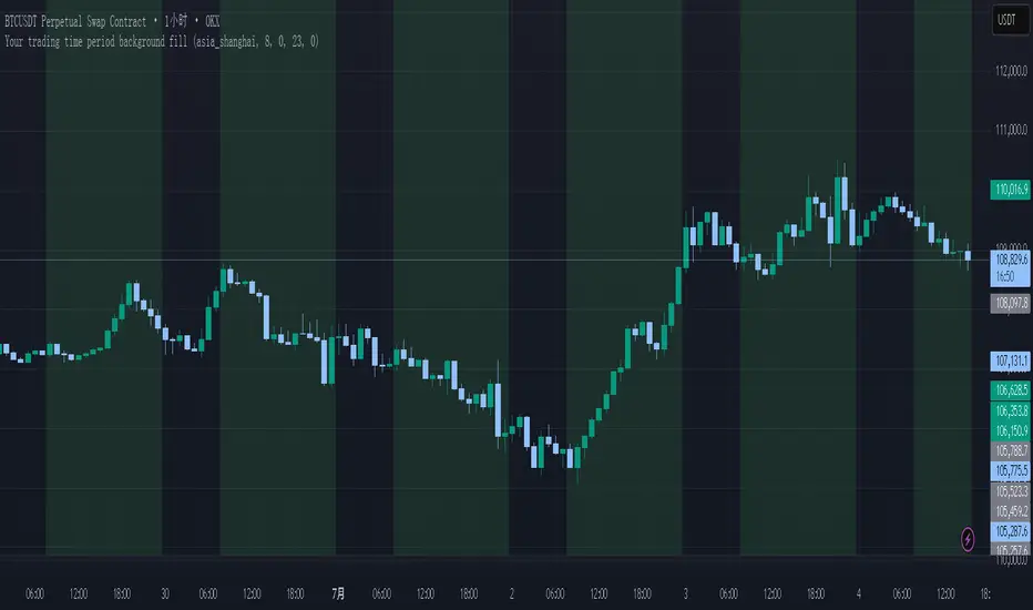
Your trading time period background fillThis script allows you to add background highlights to charts during any regional trading session, customize your own trading time, and is precise and customizable yet simple and easy to use, making it more convenient to review transactions.
Support global mainstream time zones: The drop-down list includes 30 commonly used IANA time zones (default is Asia/Shanghai) (such as Asia/Shanghai, America/New_York, Europe/London, etc.), one-click switching, no need to manually calculate the time difference.
Fully localized time input: "Start hour/minute" and "End hour/minute" are filled in with the local time of the selected time zone. The end hour defaults to 23:00 and can be adjusted to 0-23 at will.
Accurate time difference splitting: The script internally splits the time zone offset into whole hours and remainder minutes (supports half-hour zones, such as UTC+5:30), and ensures that all parameters are integers when calling timestamp to avoid errors.
Dynamic background rendering: Each K-line is judged according to the UTC timestamp whether it falls within the set range. If it meets the time period, it will be marked with a semi-transparent green background, and it will return to its original state after crossing the time period, helping you to identify the opening, closing or active period of any market at a glance.
Wide range of scenarios: It can be used for time-sharing highlighting of all-weather varieties of foreign exchange and cryptocurrency, and can also be used in conjunction with backtesting and timing strategies to only send signals during the active period of the target market, greatly improving trading efficiency and strategy accuracy.
Just select the region and set the time, and the script will automatically complete all complex time zone conversions and drawing, allowing you to focus on the transaction itself.
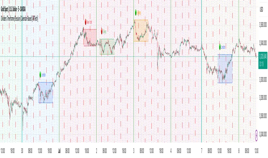
Dividers Timeframe/Session/Calendar-Based [ARTech]Dividers Timeframe/Session/Calendar-Based
This indicator provides customizable visual dividers for multiple timeframes, trading sessions, and calendar-based periods (daily, weekly, monthly). It helps traders visually separate chart areas by key time boundaries without cluttering the chart with price lines.
Key Features:
Multi-Timeframe Dividers: Select up to 4 timeframes (e.g., 60 min, 4 hours, daily, weekly) to display customizable lines marking the start of each timeframe’s candle.
Session Dividers: Define up to 4 trading sessions with user-defined time zones, colors, and active weekdays. The indicator highlights the session’s highest and lowest price range using a box, and compares the session’s opening and closing prices. Based on this comparison, it displays a green or red emoji to indicate bullish or bearish sessions, making it easy to identify session momentum visually.
Calendar-Based Dividers: Enable daily, weekly, or monthly background color zones, with individual toggles and color settings for each day, week, or month. Perfect for visually distinguishing trading periods.
Why use this indicator?
Divider Indicator helps keep your chart organized by visually segmenting timeframes, sessions, and calendar periods, aiding in better analysis of price action relative to important time boundaries.
How to Use
███████ Timezone ███████
A valid timezone name exactly as it appears in the chart’s lower-right corner (e.g. New York, London).
A valid UTC offset in ±H:MM or ±HH:MM format. Hours: 0–14 (zero-padded or not, e.g. +1:30, +01:30, -0:00). Minutes: Must be 00, 15, 30, or 45.
Examples;
UTC → ✅ Valid
Exchange → ✅ Valid
New York → ✅ Valid
London → ✅ Valid
Berlin → ✅ Valid
America/New York → ❌ Invalid. (Use "New York" instead)
+1:30 → ✅ Valid offset with single-digit hour
+01:30 → ✅ Valid offset with zero-padded hour
-05:00 → ✅ Valid negative offset
-0:00 → ✅ Valid zero offset
+1:1 → ❌ Invalid (minute must be 00, 15, 30, or 45)
+2:50 → ❌ Invalid (minute must be 00, 15, 30, or 45)
+15:00 → ❌ Invalid (hour must be 14 or below)
███████ Timeframe ███████
Use this section to display vertical divider lines at the opening of higher timeframe candles (e.g., 1H, 4H, Daily, Weekly). This helps visually separate price action according to larger market structures.
1. Enable a Timeframe:
Turn on one or more timeframes (e.g., 60, 240, D, W) by checking their respective toggle boxes.
2. Lines Mark Candle Opens:
Each active timeframe will draw a vertical line at the start of its candle , making it easier to align intraday moves with larger timeframe shifts.
3. Customize Line Style:
For each timeframe, you can individually set:
Line Style: Solid, dashed, or dotted.
Line Width: From 1 to 10 pixels.
Line Color: Pick any color to match your chart theme.
Opacity: Use transparent colors to avoid overwhelming the chart.
4. Use Multiple Timeframes Together:
You can enable multiple timeframe dividers simultaneously. To maintain clarity:
Use distinct colors for each timeframe.
Use thinner or dotted lines for lower timeframes and bolder lines for higher ones.
Match line style and color intensity to reflect timeframe importance. (e.g., a thick green solid line for Weekly, a thin gray dotted line for 1H)
5. Visual Tip:
These dividers are especially useful for identifying higher timeframe candle opens during intraday trading, spotting breaks above/below previous candle ranges, or aligning session-based strategies with higher timeframe trends.
███████ Session ███████
Use this section to visually highlight specific trading sessions (e.g., London, New York, Tokyo, Sydney) on your chart using time zones, session ranges, and optional weekday filters. This helps focus your analysis on active market hours.
1. Enable a Session:
Activate up to 4 separate trading sessions. Each session can be named (e.g., "London") and customized independently.
2. Set Session Time and Days:
Define session time using the hhmm-hhmm format. (e.g., 0800-1700)
Select which days of the week the session applies to (Sunday through Saturday)
Set your preferred time zone (UTC, Exchange, etc.) from the global settings.
3. Session Box Drawing:
For each active session, the indicator will:
Draw a background-colored box from the session’s start to end time.
Stretch the box to fit the highest and lowest price within that time window.
Draw an outline using customizable border style and width.
4. Session Labels and Directional Hints:
Optionally display the session’s name as a label.
The indicator compares the session’s opening and closing prices . Based on the result:
📈 Green emoji shows a bullish session (close >= open)
📉 Red emoji shows a bearish session (close < open)
5. Display Options:
Show all sessions, only the last session, or a specific number of previous sessions.
Customize label size, location (top/bottom), and whether it appears inside or outside the box.
Adjust background opacity to blend the sessions neatly into your chart.
6. Visual Tip:
Session boxes are particularly useful for:
Spotting repeated highs/lows during active trading hours.
Recognizing session-based breakouts or consolidations.
Comparing performance across different markets and time zones.
███████ Calendar-Based ███████
This section helps you visually segment your chart based on calendar periods: daily, weekly, and monthly. You can enable background color highlighting for individual days, weeks, or months to better track price movements within these time frames.
1. Enable Daily, Weekly, or Monthly Highlighting:
Toggle on the options for Daily, Weekly, and/or Monthly highlighting according to your needs.
2. Select Specific Days, Weeks, or Months:
For Daily, enable any combination of days (up to 7) to color-code.
For Weekly, enable up to 5 weeks per month to cover partial weeks.
For Monthly, enable up to 12 months with individual toggles and colors.
3. Customize Colors for Each Period:
Assign distinct colors to each day, week, or month for easy differentiation. Choose hues that stand out but avoid colors that are too close in tone for adjacent periods.
4. Background Opacity:
Adjust the opacity level of the background coloring to ensure it complements your chart without obscuring price data.
5. Handling Partial Weeks and Overlaps:
The weekly highlighting accounts for months that span 4 to 6 weeks by allowing toggles up to 5 weeks, including weeks that may partially overlap with previous or next months.
6. Visual Tip:
Calendar-based backgrounds are excellent for:
Quickly identifying price behavior within specific calendar units.
Comparing price action across days, weeks, or months.
Spotting seasonal trends or recurring patterns tied to calendar cycles.
Multi-Timeframe PivotDescription:
This script provides an advanced tool for multi-timeframe pivot point
analysis. It identifies swing points based on a candle's relationship to
its neighbors. The default strength settings of 1 align with the Inner
Circle Trader (ICT) concept of market structure.
The ICT concept defines a swing point based on a simple 3-candle pattern:
- A swing high is a candle where the candles to the immediate left and right
both have lower highs.
- A swing low is a candle where the candles to the immediate left and right
both have higher lows.
A key feature is its ability to accurately calculate and translate pivot
points from up to five higher timeframes (HTFs) and display them
precisely on a lower timeframe (LTF) chart.
NOTE: This indicator is designed to show HTF data on an LTF chart.
If you select a timeframe in the settings that is lower than your
current chart's timeframe, it will show pivots for the chart's
timeframe instead.
Core Features:
- Up to five independent higher timeframes.
- Per-timeframe customization for pivot strength (left/right bars) and color.
- Optional "Watchlines" that project the price of each pivot forward,
complete with a text label identifying the timeframe.
- An optional "Alignment Model" that colors the background when price is
aligned across all active timeframes (requires at least 2 TFs to be enabled).
Default State:
For a clean initial application, the Watchlines and Alignment Model features
are disabled by default but can be enabled in the settings.

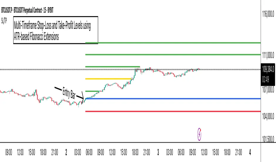
ATR Stop-Loss with Fibonacci Take-Profit [jpkxyz]ATR Stop-Loss with Fibonacci Take-Profit Indicator
This comprehensive indicator combines Average True Range (ATR) volatility analysis with Fibonacci extensions to create dynamic stop-loss and take-profit levels. It's designed to help traders set precise risk management levels and profit targets based on market volatility and mathematical ratios.
Two Operating Modes
Default Mode (Rolling Levels)
In default mode, the indicator continuously plots evolving stop-loss and take-profit levels based on real-time price action. These levels update dynamically as new bars form, creating rolling horizontal lines across the chart. I use this mode primarily to plot the rolling ATR-Level which I use to trail my Stop-Loss into profit.
Characteristics:
Levels recalculate with each new bar
All selected Fibonacci levels display simultaneously
Uses plot() functions with trackprice=true for price tracking
Custom Anchor Mode (Fixed Levels)
This is the primary mode for precision trading. You select a specific timestamp (typically your entry bar), and the indicator locks all calculations to that exact moment, creating fixed horizontal lines that represent your actual trade levels.
Characteristics:
Entry line (blue) marks your anchor point
Stop-loss calculated using ATR from the anchor bar
Fibonacci levels projected from entry-to-stop distance
Lines terminate when price breaks through them
Includes comprehensive alert system
Core Calculation Logic
ATR Stop-Loss Calculation:
Stop Loss = Entry Price ± (ATR × Multiplier)
Long positions: SL = Entry - (ATR × Multiplier)
Short positions: SL = Entry + (ATR × Multiplier)
ATR uses your chosen smoothing method (RMA, SMA, EMA, or WMA)
Default multiplier is 1.5, adjustable to your risk tolerance
Fibonacci Take-Profit Projection:
The distance from entry to stop-loss becomes the base unit (1.0) for Fibonacci extensions:
TP Level = Entry + (Entry-to-SL Distance × Fibonacci Ratio)
Available Fibonacci Levels:
Conservative: 0.618, 1.0, 1.618
Extended: 2.618, 3.618, 4.618
Complete range: 0.0 to 4.764 (23 levels total)
Multi-Timeframe Functionality
One of the indicator's most powerful features is timeframe flexibility. You can analyze on one timeframe while using stop-loss and take-profit calculations from another.
Best Practices:
Identify your entry point on execution timeframe
Enable "Custom Anchor" mode
Set anchor timestamp to your entry bar
Select appropriate analysis timeframe
Choose relevant Fibonacci levels
Enable alerts for automated notifications
Example Scenario:
Analyse trend on 4-hour chart
Execute entry on 5-minute chart for precision
Set custom anchor to your 5-minute entry bar
Configure timeframe setting to "4h" for swing-level targets
Select appropriate Fibonacci Extension levels
Result: Precise entry with larger timeframe risk management
Visual Intelligence System
Line Behaviour in Custom Anchor Mode:
Active levels: Lines extend to the right edge
Hit levels: Lines terminate at the breaking bar
Entry line: Always visible in blue
Stop-loss: Red line, terminates when hit
Take-profits: Green lines (1.618 level in gold for emphasis)
Customisation Options:
Line width (1-4 pixels)
Show/hide individual Fibonacci levels
ATR length and smoothing method
ATR multiplier for stop-loss distance
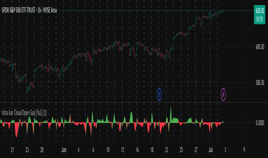
Intra-bar Close/Open Gap [YuL]Just checking one idea: look at gaps between close and open bars on lower timeframe to try to estimate how much slippage exists there that may be a result of buying or selling pressure.
Perhaps it only useful in real time to see if situation of the current bar is changing.
Open to ideas and suggestions.
Pattern Finder with MTF Boxes (Break - Fixed)Script Title:
MTF Supply/Demand Zone Indicator with Candlestick Pattern Confirmation
Short Description:
This advanced strategy identifies key Supply and Demand zones (Order Blocks) on higher timeframes (30m & 1h) and then waits for a pullback to these zones on the current timeframe. The final entry signal is triggered upon the appearance of a valid candlestick pattern (e.g., Hammer, Engulfing) within these zones.
Full Description:
Introduction & Core Concept
This script is a powerful trading tool based on a combination of the following concepts:
Multi-Timeframe (MTF) Analysis: Identifying significant structures on higher timeframes to understand the bigger market picture.
Supply and Demand Zones: Finding areas where an imbalance between buyers and sellers has caused strong price movements.
Candlestick Patterns: Using classic candlestick patterns as the final confirmation for entering a trade at these key zones.
The main idea is to avoid trading blindly and instead wait for the price to react to a significant zone, then enter with a confirmation signal.
How the Strategy Works (Step-by-Step)
Identifying the Key Pattern on Higher Timeframes:
The script continuously monitors the 30-minute and 1-hour charts to find a specific pattern: a short consolidation period (usually 1-4 candles) immediately followed by a breakout with a powerful, high-momentum candle (Long Bar). This pattern indicates the formation of a fresh Supply or Demand Zone.
Drawing the Supply and Demand Boxes:
Green Box (Demand Zone): When a minor high is broken by a bullish Long Bar, this area is identified as potential support and marked with a green box.
Red Box (Supply Zone): When a minor low is broken by a bearish Long Bar, this area is identified as potential resistance and marked with a red box.
White Box (Long Bar / Trigger Zone): This box highlights the range of the Long Bar candle itself. A break of or return to this zone provides important signals.
Waiting for a Pullback:
After a zone is identified and drawn, the strategy waits for the price on your current chart to pull back into this box.
Entry Confirmation with Candlestick Patterns:
Once the price enters the box, the script looks for reversal candlestick patterns:
In a Demand Zone (Green Box): It looks for bullish patterns like the Hammer, Bullish Engulfing, Bullish Harami, and Morning Star. Upon detection, a BUY label appears on the chart.
In a Supply Zone (Red Box): It looks for bearish patterns like the Hanging Man, Shooting Star, Bearish Engulfing, Bearish Harami, and Evening Star. Upon detection, a SELL label appears.
Breakout Signal:
In addition to reversal signals, if the price breaks the White Box (Long Bar Zone) in the opposite direction, a breakout signal is generated, which could indicate a trend continuation.
Visual Elements on the Chart
Green/Red Boxes: The primary Supply and Demand zones from higher timeframes.
White Boxes: The range of the Long Bar candle that activated the primary zone.
BUY/SELL Labels: Trade signals that appear after a candlestick confirmation within the zones.
Moving Averages (SMA 100 & 200): Included to help identify the overall market trend. Trades aligned with the trend are generally more reliable.
Input Settings
period ATR & Bar multiplayer: Allow you to customize the definition of a "Long Bar" based on market volatility.
Number of candle for long bar avrage: The lookback period for calculating the average candle body size.
multiplayer for tp: A multiplier to calculate the take-profit based on the stop-loss size (Risk-to-Reward ratio).
How to Use This Strategy
Apply the script to your main trading timeframe (e.g., 5-minute or 15-minute).
Wait for a Supply (Red) or Demand (Green) zone to be drawn on your chart.
Be patient and wait for the price to return to this zone.
If a BUY or SELL label appears, consider it a valid entry signal.
Always combine these signals with your own analysis and the overall market context.
Disclaimer: This script is an analytical tool and should not be the sole basis for your trading decisions. Always practice proper risk management and thoroughly backtest its performance before using it in a live account.

EMA Trend Dashboard
Trend Indicator using 3 custom EMA lines. Displays a table with 5 rows(position configurable)
-First line shows relative position of EMA lines to each other and outputs Bull, Weak Bull, Flat, Weak Bear, or Bear. EMA line1 should be less than EMA line2 and EMA line 2 should be less than EMA line3. Default is 9,21,50.
-Second through fourth line shows the slant of each EMA line. Up, Down, or Flat. Threshold for what is considered a slant is configurable. Also added a "steep" threshold configuration for steep slants.
-Fifth line shows exhaustion and is a simple, configurable calculation of the distance between EMA line1 and EMA line2.
--Lines one and five change depending on its value but ALL other colors are able to be changed.
--Default is somewhat set to work well with Micro E-mini Futures but this indicator can be changed to work on anything. I created it to help get a quick overview of short-term trend on futures. I used ChatGPT to help but I am still not sure if it actually took longer because of it.

MTF Order Flow DashboardThe MTF Order Flow Dashboard is a compact, real-time table overlay that provides an at-a-glance view of market structure across three key timeframes:
✅ 1-Minute
✅ 5-Minute
✅ 1-Hour
//If extra 1 min is added to candle closure countdown wait till next tick for correction//
This tool is designed to help traders quickly assess directional bias, detect structure shifts, and stay aware of upcoming candle closes — a powerful aid for scalping, day trading, or momentum-based strategies.
Pivot-Based Market Structure Detection
Uses user-defined pivot length to determine if the market is showing a Bullish, Bearish, or Neutral structure on each timeframe.
Color-Coded Structure
Easily visualize the current trend per timeframe:
🟢 Bullish | 🔴 Bearish | ⚪ Neutral
Live Candle Countdown Timers
Displays time remaining until the next candle close for each timeframe, using timenow for near real-time updates (as fast as ticks arrive).
Compact Table Display
Non-intrusive table displayed in the top-right of your chart with clean formatting for fast decision-making.
Built-in Alerts
Optional alerts when all timeframes align bullish or bearish, giving potential trade setup signals.
Inputs:
Select timeframes for structure analysis (1m, 5m, 1h)
Adjust pivot sensitivity with the Pivot Length input

Order + Breaker Blocks MTF - Vees Hidden LiquidityThis indicator is a Hidden Liquidity Script, being a much more refined and precise version of "Order Blocks" also known as "Supply and Demand" zones.
This script is more refined and precise as this script is the only script that displays the exact body part of blocks on multiple timeframes, showing potentially powerful price reversal zones for taking a long or short.
This is a PRICE ACTION indicator, demonstrating price action that can result in potential good support/resistance levels for taking a long or short trade.
This indicator only displays the body part of order blocks, instead of including wicks that all other indicators do. That makes this script a much more refined version of all other scripts out there.
Not only that, this script can collate multiple timeframes into one indicator, again something other scripts cannot do.
This script is also unique compared to other Hidden Liquidity style scripts in that you have full control over each Order Block so you can see each individual block on a chart, whilst other charts combine them into a zone instead. This refined version gives you precise potential entries and much further refinement as well as more thorough backtesting capabilities.
This script also can highlight order blocks that pass THROUGH a Fair Value Gap. These are known as 'Breaker Blocks'. These powerful blocks can be places of interest as support or resistance for a long or short trade. Note: This script shows the body part of a block only and not the wick.
Breaker Blocks, where significant displacement has occurred in price past a block can be more powerful. This script does not highlight Fair Value Gaps themselves, only order blocks (supply and demand) and breaker blocks through displacement in price (through an FVG). FVGs on their own can be weaker without order blocks behind them hence they are not highlighted.
The BODY of the order block, and the 0.5 of the order block are key regions for considering a trade, treating that level as either resistance or support.
Important: PLEASE NOTE: This indicator will only show timeframes that are higher than or the same as the current chart timeframe.
For Example, only blocks 3 Days or higher will show on a 3D chart. It will not show 12h blocks on a 3D chart. You would need to go to a 12 hour chart with the 12h blocks showing to see all Blocks that are 12h or higher drawn.
SETTINGS:
There is options to change the colours of the boxes and to differentiate between Order Blocks and stronger Breaker Blocks if desired.
If this is NOT desired, make all color options the same color,.
Shown below is blue Order Blocks (Supply and Demand
Shown below there is Pink Breaker Blocks.
There is options to weaken the colour of blocks that have been tapped by a wick and thus partially used up, also called partially "mitigated".These blocks can be considered weaker support/resistance.
Once a block has had a wick or body close over it entirely, the block can be considered fully "mitigated" and will disappear from the indicator once that candle has closed. This block level can now be considered too weak. You can also choose to not show these partially mitigated blocks at all.
The charts above shows pale Violet blocks as partially mitigated or "tapped" blocks.
The blocks in HOT BRIGHT Violet are untapped and potentially stronger levels for a Long or Short trade. See below the 7h.
Additional SETTINGS:
Further options include, if selected: Counting the number of fair value gaps an order block may pass through. More FVGs an order block (now a breaker block) passes through can strengthen the support of that block level, making a reversal more likely.
There is an option of showing old mitigated order blocks and changing the color of these on the chart. This can aid in backtesting of levels.
Further Settings include:
- an option to remove very thin blocks that may not be strong points.
- an option to denote with a character such as a * blocks that have their EQ 0.5 region wicked - these can be considered weaker.
- an option to denote with an additional * or another character blocks that are barely tapped by a small percent so you know they are still considered quite strong.
- an option to show how many candles form the order block.
Additional Options include:
- an option to show blocks only within a specific price range or percent range of the current price.
- an option to only look X number of bars back.
There is Options regarding labelling, and Border widths on boxes.
It is ESSENTIAL to do your own research and backtesting!
It is recommended to combine these levels with other concepts for added confluence.
Other indicators are NOT included in this script. This is purely a refined order block script for the BODY of a block only.
You can combine Order Blocks and stronger versions known as Breaker Blocks in this script with other indicators or concepts to form a Full Trading Strategy.
Other potential concepts to combine, not shown in this script can include Smart Money Concepts, Market Structure, Fibonnaccis, SMAs, EMAs or any other concept to give added confluence to the support / resistance levels identified in this script that may indicate that the level is stronger.
This indicator is not a trading strategy on its own. It is best used in combination with other concepts to improve the success.
Backtesting this indicator is highly recommended and incorporated into a full trading system of your own design. This only identifies possible key regions based on Price Action Strategies.
This indicator simply makes the identification of these hot levels easier and simpler to find, especially across multiple timeframes.
A strong bright zone on the indicator can be a stronger level than a weak partial block that is in light colours.
Again -Please do your own research and backtesting.
These indicators make finding these levels much much simpler and easier when combined with a full trading strategy.
Any feedback is welcome.

Multi-Timeframe OHLC Levels█ OVERVIEW
A fully customizable multi-timeframe indicator that independently plots levels based on the open, previous close, previous high, previous low, and previous mid-price.
This tool is ideal for traders who require a high level of tailoring and usability.
█ FEATURES
Multi-timeframe
Select the timeframe for each level separately. The indicator shows higher timeframe levels down to the 1-second chart.
Multi-source
Choose the source for each level individually from the current open, previous close, previous high, previous low, and previous mid-price.
Past levels
Manage the number of relevant levels displayed on historical bars for trading or backtesting.
Projections
Extend the levels to the current price action with clear and clean options.
Styling
Adjust the appearance according to your preferences and screen size using options for color, line style, line thickness, custom name, and text size.
█ NOTES
This is a PREMIUM indicator.
You may also find my free Daily Weekly Monthly Yearly Opens and Previous Day Week Highs & Lows indicators helpful.

Normalized Volume IndexIn the realm of technical analysis, volume is more than just a measure of market activity—it’s a window into trader psychology. Two classic indicators that harness this insight are the Positive Volume Index (PVI) and Negative Volume Index (NVI). Developed in the early 20th century by Paul L. Dysart and later refined by Norman G. Fosback in 1976, these tools aim to distinguish between the behavior of the so-called “smart money” and the broader market crowd.
- Positive Volume Index (PVI) tracks price changes only on days when trading volume increases. It assumes that rising volume reflects the actions of less-informed retail traders—those who follow the herd.
- Negative Volume Index (NVI), on the other hand, focuses on days when volume decreases, under the premise that institutional investors (the “smart money”) are more active when the market is quiet.
This dichotomy allows traders to interpret market sentiment through the lens of volume behavior. For example, a rising NVI during a price uptrend may suggest that institutional investors are quietly accumulating positions—often a bullish signal.
Traders use PVI and NVI to:
- Confirm trends: If NVI is above its moving average, it often signals a strong underlying trend supported by smart money.
- Spot reversals: Divergences between price and either index can hint at weakening momentum or upcoming reversals.
- Gauge participation: PVI rising faster than price may indicate overenthusiastic retail buying—potentially a contrarian signal.
These indicators are often paired with moving averages (e.g., 255-day EMA) to generate actionable signals. Fosback’s research suggested that when NVI is above its one-year EMA, there’s a high probability of a bull market.
While PVI and NVI are cumulative indices, normalizing them—for example, by rebasing to 100 or converting to percentage changes—offers several benefits:
- Comparability: Normalized indices can be compared across different assets or timeframes.
- Clarity: It becomes easier to visualize relative strength or weakness.
- Backtesting: Normalized values are more suitable for algorithmic strategies and statistical analysis.
Normalization also helps when combining PVI/NVI with other indicators in multi-factor models, ensuring no single metric dominates due to scale differences
In essence, PVI and NVI offer a nuanced view of market dynamics by separating the noise of volume surges from the quiet confidence of institutional moves. When normalized and interpreted correctly, they become powerful allies in a trader’s decision-making toolkit.
How to use this (Educational material):
For instance, on average, when the Negative Volume Index (NVI) remains above its midline, the market tends to trend positively, reflecting consistent institutional participation. However, when the NVI dips and stays below the midline, it often signals a negative trend, indicating that smart money is stepping away or reducing exposure.
Another telling scenario occurs when the Positive Volume Index (PVI) drops below the NVI. While this might coincide with a brief price dip, institutions often interpret this as an opportunity to buy the dip, quietly accumulating positions while retail participants exit in panic. The result? A market recovery driven by smart money.
Conversely, when the PVI consistently remains above the NVI, it may point to retail enthusiasm outpacing institutional support. This imbalance can flag a tired or overextended trend, where the smart money has already positioned itself defensively. When this pattern persists, there's a high likelihood that institutions will pull the plug, leading to a pronounced trend reversal.
