The 50/50 Account Management Scam- How it WorksFrom Cold Calling to Telegram
I’ve been in the markets for so long I feel like a dinosaur, and I’ve probably seen every scam out there.
The truth is, none of them are really new — they’re just adapted to the new social paradigm.
What was done in the 2000s through cold calling is now done through Telegram, Instagram, X, and other social platforms.
I didn’t really want to write this article, in case it gave someone ideas.
But since anyone who wants to be a scammer already knows how it works, maybe this article can warn those who still have no idea how the so-called account management scam operates — especially its most common form: the coin flip scam (50/50 scam, Opposite trades scam, Split-direction scam, Two-group margin call trick, as is also known)
Step-by-Step: How the Coin Flip Scam Works
1. Gathering the victims
The scammer starts by fishing for victims through Telegram channels/groups, Instagram profiles, Facebook groups, or even X posts.
They present fabulous profits, post ads with guaranteed return offers, and flood the feed with so-called “proofs” — screenshots of winning trades, client testimonials, and account statements. Most of these are either fabricated or selectively chosen to show only the winning side.
Once someone shows interest, the scammer’s first move is to earn their trust.
They’ll tell you the broker doesn’t matter, that you can choose it, and that they have no access to your money — which is, technically, true.
Then comes the closer:
“You don’t have to pay me upfront. I only get paid if I make you money, so it’s in my best interest not to lose. You see? We’re on the same side.”
This combination of flashy results and “risk-free” terms makes you feel safe enough to hand them trading access.
________________________________________
2. Splitting into two groups
The accounts are divided into two equal batches:
• Group A → All-in BUY
• Group B → All-in SELL
With high leverage (e.g., 1:200), a 50-pip move means either doubling the account or wiping it out completely.
Note: I won’t go too deep into the details here, because the exact margin call level depends on the broker. But trust me, it’s easy for a scammer to plan the money split based on the different brokers’ rules. What we’re talking about here is just the general principle.
________________________________________
3. Guaranteed winners and losers
The market moves.
One group hits margin call and loses, while the other doubles or triples its capital (depending on broker's leverage, even more on 1:500).
The scammer now has perfect marketing material: “Look how I doubled my client’s account!”
________________________________________
4. Milking the winners
Clients who made a profit are celebrated and told something like:
“I only worked with low capital this time just to show you I can do it. I have big clients and serious strategies — now that you’ve seen the proof, deposit more so we can make real money.”
The scammer frames the initial gain as a “demo run” to gain the client’s confidence, pushing them to commit much larger sums next.
________________________________________
5. Recycling the losers
The wiped-out clients are told:
“It was an unusual market move. Deposit another $1,000 and we’ll recover it tomorrow.”
Some quit, but others fall for it again.
________________________________________
6. Repeat the process
The cycle continues. There’s always a “happy” group and real account statements to attract fresh victims, while the losers are quietly discarded or convinced to reinvest.
________________________________________
Why the scam works
• The proof are authentic – Screenshots and MT4/MT5 statements for the winners are real.
• Survivorship bias – Prospects only see the successes, never the failures.
• Hope psychology – Losers believe “next time” will be different (and it can be if they end up in the "winner group" next time
________________________________________
Final word
If someone promises to double your account quickly and safely — walk away.
Real trading is about risk management and long-term consistency, not betting your capital on a 50/50 gamble.
Don’t be the next screenshot in a scammer’s sales pitch. 🚀
P.S.
Stop believing they “made you money on purpose” at the beginning and then “lost it on purpose” after you deposited more.
If they truly had the skill to do that, they wouldn’t need to be scammers in the first place.
The reality is simple — once you put in more money, you just happened to land on the losing side of their scam.
Trading Tools

How to Read COT Data: Understanding Big Players’ Order FlowHey whats up traders, today Im going to reveal my COT approach. If you’re serious about finding higher timeframe bias based on what the big players are doing, then COT data is a tool you need to know. It offers unique insights into the positioning of institutional traders—and if read correctly, it can help you align with real market momentum rather than noise.
Before we break it down step-by- step. I want to mention that this is my personal approach. Larry Williams is doing it differently and I have seen some other approaches. This is what works for me, might you find it also usefull.
What Is COT Data?
The Commitment of Traders (COT) report is published every Friday by the CFTC (U.S. Commodity Futures Trading Commission). It shows the open positions of various market participants in the futures markets as of the previous Tuesday.
This data is based on the requirement that large traders must report their positions once they pass a certain threshold. In short, we’re peeking into the order flow of institutions—excluding high-frequency trading and market making noise.
Hope you already recognized small disadvantage to us as retail traders.
Big players report data on Tuesday and it's published on Friday. So we basically have it late and we dont know what has happen in last 3 days. But no worry I will show you my trick how to read between the lines.
COT helps us:
• Understand HTF (Higher Timeframe) bias
• Spot shifts in institutional positioning
• Identify trend continuations or potential reversals
• Avoid getting trapped in retail sentiment traps
It’s not a standalone entry tool, but rather a macro confirmation layer for swing or position trades. Huge advantage by following large players is that they are trading on fundamentals and you dont need to worry about that - you just follow them. But you must follow the right participants, because there is few.
Who Are the Market Participants?
The COT report breaks down traders into several categories. Each one has a different motive and behavior in the market:
1. Commercials
• Think of them as hedgers.
• These are producers, manufacturers, and institutions trying to lock in prices for raw materials or currencies.
• They are usually contrarian at extremes.
When they reach record net long or net short positions, reversals often follow.
2. Non-Commercials (Speculators)
• These are institutional funds, hedge funds, and large speculators.
• Their goal? Profit.
• Often, they follow trends and their positioning reflects the broader market sentiment of the big money.
3. Dealers
• Mostly big banks and institutions facilitating trades.
• They manage risk rather than speculate heavily, so they typically take the opposite side of speculative flows.
4. Leveraged Money
• Hedge funds using high leverage.
• Their positions often reflect short-term speculative behavior.
• Watching their net positioning and changes week-to-week can give clues on momentum exhaustion.
Now you might think which one to follow and Yes you can build your strategy on following any of them fore example
Larry Williams - been trading base on Commercials
Anton Kreil - suggest following Leveraged money
I tried both but for me works best - Non commercials ( Speculators)
Again here you cant say definitely which one is right or wrong. What works for you is right. Thats it.
There are multiple versions of the report, but here are the most commonly used, Im using - ✅ Traders in Financial Futures (TFF)
• Focused on financial markets like forex, bonds, and indexes.
Where to find COT data?
It's free and you can find it on the SEC website there is simple week to week format. As you can see below. Many traders are watching this.
I dont say this is wrong but you dont have complete data - missing big picture.
As you can see here these data below are clearly giving you a picture about an order flow and positioning changedsvn the positions which can confirm trend or help you spot potential reversal you need to watch bigger data sample. Institutions doesnt reverse market in a week, they need to of load positions and I it takes them some time. Which will explain later.
Im collecting the data to the collums. I want see longs, shorts of commercials and from that I calculate. Following
Longs % exposure
Shorts % exposure
Net positions
13 weeks average
Historical Highest positions
Historical Lowest Positions
Relationship between these numbers helps me justify whats going behind the price action, but also spot strong levels. I will show you how to put it together with the context of the charts and then I will show you few order flow patterns examples, it's not difficult but it requires a bit of practice.
Bullish Pattern - Longs growing / Shorts being closed
This is the strongest COT patter and clean sign of buying
This is classing pattern what we have just seen on the EURUSD
Notice how longs has been growing constantly and net positions confirms that.
In may been able to see rapid shorts closing, which and confirmed bullish trend and we can look just for the bullish setups.
Now lets look to the USDJPY chart it will be tricky because it's all red and looks tricky but focus to the numbers and price action, how longs are growing while shorts being closed. Very weak JPY.
Bearish consolidation Shorts being build
Massive shorts being added int he consolidation phase longs doenst move at all. Further big drop coming. This is now happening on the AUDUSD. Look at this tight price consolidation and let's read what is happening. just look at the COT its clean longs around 23K constantly while they are building massive shorts. Whats gonna happens next is clear.
Profit taking move
This ofter occurs when we can see sharp move above the highs but without real longs being added, rather they being closed. As on our example below on the gold. We can see massive profit taking on longs while price was moving up. But they were not been adding shorts. What doest it tell us. They do not want to trade full reversal - not building short position, but market is overheated and they taking profits to buy later for lower or price can go to the consolidation where they will be building short, but definitely its late for us to go long.
Here is another example on USDCHF
Notice longs positions in the moment where there was 46K long and then next week change -12K net. It's a huge change which has started Sell off. But look in to Shorts , there is no heavy shorting, price simply go down based on huge longs profit taking. This is why its important to look in to bigger picture because if you look only in to week to week data. You will still see bigger longs than shorts and it will give you bullish opinion. Hope it's clear. And by the way now we can see 2 weeks with more then +3.4K longs. Its getting bullish IMO.
Now lets look to the another example on the USDCAD
Now we will use one of my past analysis where based on the data I predicted further move. And here I want to mention one thing. Even though we can see COT being bearish. It doesnt mean that price cant go up in short term (can be be 2- 3 weeks) There for you still need to use price action and dont just blindly short, but short run above the highs, because this is where big players add shorts. Not on the lows.
P rice moving up shorts being added - Reversal coming
This is showing positions building for the sell. In this case you can see both growing longs and shorts remember. Big players are hedgers, they are taking longs to move price up so they build shorts. Once they got their positions they close longs and sell of starts.
Lets look to my TV analysis where I have seen shorts grown recently while GBP was moving up close the Monthly Order block , but notice the shorts colum how the shorts were growing recently and also longs dropped from 110K to 100K.
Clena signs of the reversal but again I waited for a pullback above the weekly highs. Click to open a chart bellow
This was a prediction from few week ago. Now let's look how the data looks right now. On the GBPUSD chart below we can see reveal in the data. Long significantly dropped by 50% and shorts increased by 50%. This is a clean reversal pattern in the COT. Look at net positions it clearly flipped to the bearish and big drop is coming.
Few more tips
Remember they know we are watching this data and what we see is what they want us to see, so they are often trying to hide their positions as long as possible. Thats why intra-week reversal are happening on Wednesday after they report their positions.
They cannot hide the data forever, follow the data week by week to keep in track whats happening. It will increase your winning ratio.
Every 3 months there is a new futures contract. The must close the positions and reopen them in to the new contract, They are using it for reversals.
Also some if there is some US holidays on the day when report should be released to the public its delayed to the next week. And thats when they do biggest positions changes secretly.
COT data isn’t a magic crystal ball—but it’s a powerful tool if you know how to combine it with technical analysis. You need to use your mechanical system. It perfectly fits with my CLS strategy and It's suitable for swing traders.
Think outside the box. Even when you see bearish COT - dont be stupid to sell low. It's not NOD order flow for intraday scalping, you have time. But if you something is clearly bearish every run above weekly and daily highs is high probability Sell in the smart money trend.
Dont hesitate to ask any questions and follow. I share COT weekly updates.
“Adapt what is useful. Reject whats useless and add whats is specifically yours.”
David Perk aka Dave FX Hunter

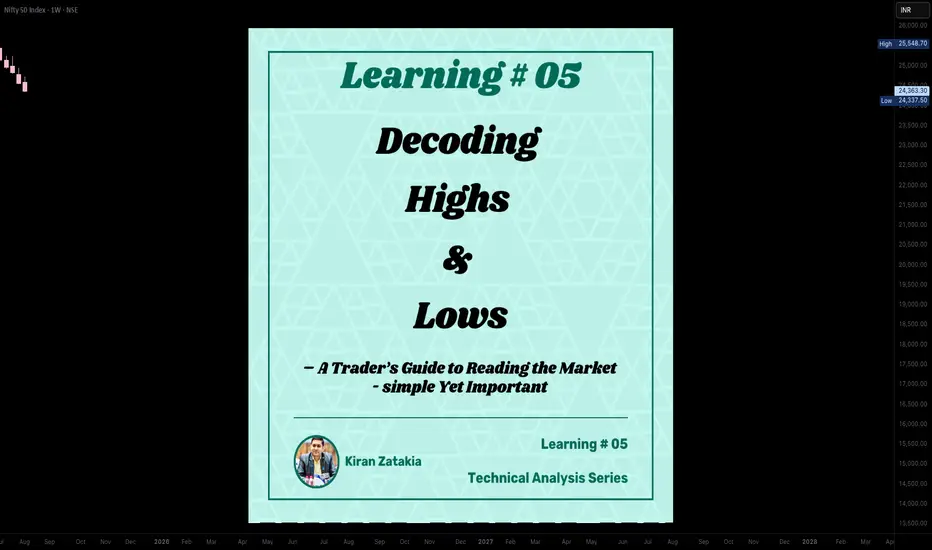
Learning#05 : Decoding Highs and Lows📚 Learning#05 : Decoding Highs and Lows
- A Trader’s Guide to Reading the Market - Simple Yet Important
If the market were a book, the trend would be its storyline — and as traders, our job is to read that story without skipping pages. Trading with the trend puts the odds in your favor because you’re flowing with the market’s natural momentum, not fighting it.
Whether it’s an uptrend, downtrend, or a sideways grind, spotting it early gives you a big edge in deciding when to enter, when to exit, and when to simply step aside.
One of the simplest yet most reliable ways to read that story?
👉 Story of Highs and Lows
Let’s break it down.
📚 Understanding Highs and Lows in Trading
In technical analysis, highs and lows are the market’s way of leaving breadcrumbs.
A high is a peak before the market pulls back.
A low is a trough before the market bounces.
Track these points over time and you start to see patterns that reveal the market’s mood — bullish, bearish, or indecisive.
This isn’t about guessing; it’s about observing price action as it is.
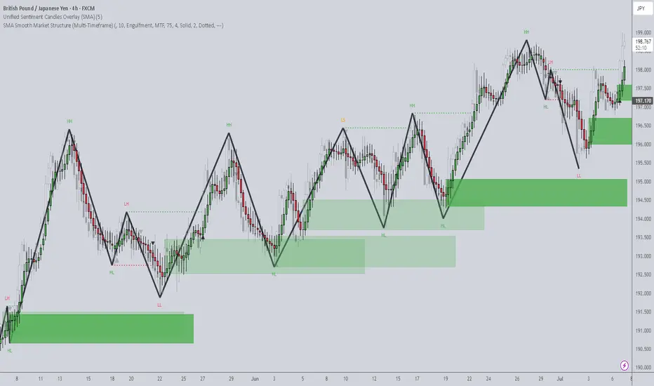
📌 The Four Key Building Blocks of Market Structure
1️⃣ Higher Highs (HH)
Each new high is higher than the one before.Paired with higher lows, this signals an uptrend. Buyers are in control, and demand is pushing price upward.
Example: Nifty rallies from 22,000 to 22,200, pulls back to 22,100, and then rallies to 22,350. That second high (22,350) is higher than the first, confirming bullish momentum.
2️⃣ Higher Lows (HL)
Each pullback low is higher than the last.This tells you that sellers tried to push the market down — but buyers stepped in sooner this time, showing strength.
HLs often precede trend continuation and give great spots for entering long positions with tight risk.
3️⃣ Lower Lows (LL)
Each new low is lower than the previous one.Paired with lower highs, this marks a downtrend. Selling pressure is in charge, and rallies are being sold into.
4️⃣ Lower Highs (LH)
Each bounce high is lower than the last.This shows weakening buying pressure and often leads to another push lower.
Think of it like climbing stairs vs. walking down a hill:
📌 HH + HL = Stairs up → Bull trend.
📌 LL + LH = Hill down → Bear trend.
📈 HH+HL : Bullish Setup :
📉 LL+LH : Bearish Setup :
📌 Why It Matters for Traders
Price action is the most honest information in the market — no lag, no magic, no guesswork.
HH/HL → Bulls in control → Look for long setups.
LL/LH → Bears in control → Look for short setups.
Spotting these patterns on the fly means you can align with the dominant side instead of fighting it.
🧩 Combining HH & LL With Other Tools
📏 Fibonacci Retracements
Once you’ve identified the trend:
In an uptrend, draw Fibonacci from the latest HL to HH for pullback buying zones.
In a downtrend, draw from the latest LH to LL to find shorting opportunities.
⛰️ Fractals for Clarity
Fractals help pinpoint swing highs and lows without guesswork. I personally track HH/HL/LL/LH on a 1-minute chart for intraday trading — this keeps me in sync with the micro-trend while avoiding sideways traps.
🔀 Trendlines & VWAP
Trendlines show the bigger path, VWAP confirms intraday balance. When HH or LL aligns with these, you’ve got high-confluence setups.
🥷 Kiran’s Approach
For intraday, I start by mapping the structure: HH, HL, LL, LH. This gives me the immediate trend bias and alerts me to potential reversals early. I track them on a 1-min chart, combine with Fibonacci and trendlines, and trail stops as the structure unfolds.
It’s simple, visual, and keeps me out of bad trades and warns me to stay out of a sideways market situation, too.
🔑 Key Takeaway
Market structure is like a language — HH, HL, LL, and LH are its alphabet. Once you learn to read it, you’ll never trade blind again.
💡 “Trade what you see, not what you think. The chart always whispers first — you just have to listen.”
Start marking highs and lows on your chart tomorrow. Watch the story unfold. Trade in sync, and you’ll notice your entries become sharper, your exits cleaner, and your confidence higher.
See you in the next one — and until then:
Keep it simple. Trade with structure. Trust the levels.
— Kiran Zatakia
How to Use AI for Crypto Trading (The Right Way)lemme answer real quick: YOU DON’T.
Most traders using AI in crypto are straight up doing it wrong.
Here’s the usual story:
They open ChatGPT and ask,
“Hey… uhm… tell me which altcoin will 100x… Bruh, I heard you know everything, bet you know the next 10x coin!”
ChatGPT confidently replies,
“Sure, buy this coin right now…”
And the trader’s like,
“Ok, thanks.”
Then they jump on Binance, smash that buy button, and lose money faster than you can say ‘left trading’.
Don’t be that guy. Tools like ChatGPT weren’t made for this wild crypto jungle. Crypto’s a messy, super risky market, and ChatGPT’s language models mostly have old info anyway. They can’t give you solid, grounded analysis of what’s really going on — on-chain or across exchanges.
BUT, if you wanna cut through the hype and dodge the FOMO, this quick guide is for you. I’ll show you how to use AI the right way — with real on-chain and off-chain data, and special AI agents built specifically for crypto research.
Wanna keep going? Cool, let’s dive in. If not, peace out and don’t waste your time.
1. Use AI That Actually Processes On-Chain and Off-Chain Data
Real AI power kicks in when you talk about scale — thousands of tokens, millions of wallet moves, shifting stories everywhere. Humans can’t keep up, but AI can process it all instantly, in real time.
Look for AI tools that analyze stuff like:
Wallet behavior and how smart money moves.
Token velocity and decentralized exchange volumes.
Social sentiment from Twitter, Reddit, Discord, Telegram.
Developer activity, governance updates, protocol changes.
How market narratives pop up and spread.
2. Use AI Agents Made Just for Crypto Research
Crypto’s not like stocks or forex. It’s faster, fragmented, and shaped by both on-chain wallet moves and off-chain communities.
That’s where specialized AI agents shine. They understand stuff like:
How wallets behave during airdrops.
How Telegram groups hype early projects.
How dev activity correlates with price moves.
Instead of raw data dumps, these crypto-native AI agents spot patterns that’d take humans days to find. Like spotting when big wallet clusters start accumulating in a new ecosystem, or when a protocol suddenly blows up on social media.
3. Combine Research & Automation for Full-Spectrum Edge
I’m personally pumped about this part. Imagine an AI agent tracking low-cap funds moving into Telegram channels, running sentiment analysis, then tracking smart wallets accumulating tokens (even mixing in technical analysis).
Finally, it finds your risk management , sets triggers, and helps you enter trades with clear stop-loss and target levels.
Quick heads-up: Because of TradingView’s house rules, I can’t drop any links here — you gotta search and find your best AI tools on your own.
Remember : The only way to survive this market is to stay skeptical , watch risk management like a hawk, and keep your head cool. So if you feel FOMO creeping in or money management slipping — close your laptop, hit a coffee shop, and order a espresso. Trust me, it’s worth it.
Thanks for sticking with me till the end of this lesson. Im Skeptic from Skeptic Lab & If this helped, smash that boost button and I’ll catch you in the next one! :)
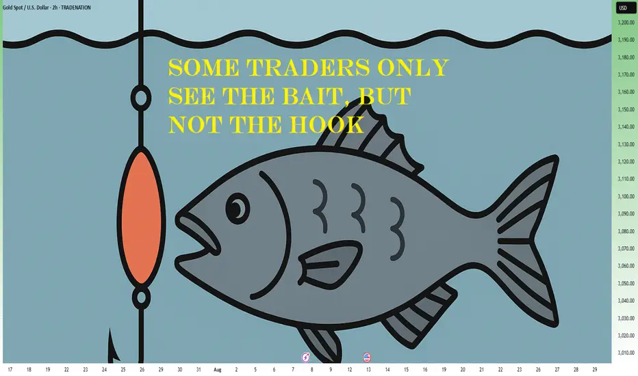
Some Traders Only See The Bait, But Not The HookLet’s get one thing straight: if you seriously think you’ve discovered a “secret” setup that you saw in a YouTube video with 1 million views, and it’s right there on the chart – clean, centered, elegant – congrats. You’re already on the hook.
Welcome. You’re liquidity.
🧼 “Clean breakout” = dig your own grave, enthusiastically
It’s honestly beautiful how thousands of traders see the same “clean breakout,” the same “double bottom,” the same “bullish engulfing,” and all believe they’re geniuses. They enter confidently, with a “perfect oversold” RSI, a “confirmed” MACD, and maybe even the moon in Capricorn.
Then, of course, the market spits their orders back in their face at 300 km/h.
Standard response? “It was manipulation.”
No, bro. It was bait. You were the fish. You bit. The market says thank you for your participation and moves on.
🧠 If you see what everyone else sees, it’s useless
What most don’t get is this: if a setup looks “too clean,” it will most probably not work. If you see it, everyone sees it. If everyone thinks something is “about to explode,” that means it’s being used – to attract orders. Your money. Your emotions. Exactly what bigger players need to exit, gracefully – on your dime.
The market is like an exclusive party: if you found out about it, it’s already lame.
💅 That warm feeling of “certainty”? Yeah, you’re screwed
The irony? The moments when a trader feels most certain are exactly the moments when they’re most exposed. The market wants you to feel relaxed. Wants you to think “this is the one.” It’s like a drug dealer giving you your first hit for free, with a smile. Not because he likes you, but because he knows you’re hooked.
So when you feel “sure” – check your mouth. You might already be on the hook.
🤡 “But it was an A+ setup!”
Of course it was. The A+ setup – seen, tested, recycled, and re-sold thousands of times. The one that works great in textbooks, backtests, webinars, and in the wet dreams of those who think they just need “a perfect strategy”.
But the market isn’t here to validate your setup. It’s here to take your money. From whom? From those who still think it’s a “fair game.”
Spoiler: it’s not.
🤔 If you’re gonna bite, at least ask: who’s holding the line?
Look at any “clear opportunity” and ask the magic question:
“Who benefits from what I’m seeing right now?”
If the answer is “me ” – you’re in trouble.
If you don’t know – you’re in even more trouble.
The market is full of traps dressed up as opportunities. Hooks that move slowly, with sexy candles, to lure in the kind of trader who only learned the “buy low, sell high” part – but skipped the chapter on “ don’t bite every shiny thing you see. ”
🎬 Bottom line:
The market doesn’t try to fool you. You’re already doing that yourself.
The market doesn’t need complex tricks. All it needs is people in a hurry, easy to excite, who never ask the right questions. Who see a green candle and think, “This is it.”
Who don’t bother looking for the hook because they’re too busy dreaming about the profits.
If you want to trade seriously, it’s simple:
Don’t ask “Where do I enter?”
Ask: “Where do they want me to enter?”
And if you’re already there… run.
🧭 Alright, now seriously
( I mean, I tried to be funny above – but let’s get real for a second )
Let’s look at a few concrete recent examples from the market:
📉 EUR/USD
On Monday, I mentioned that price was testing resistance and could offer a nice selling opportunity.
But… I changed my mind. (You know... dynamic probabilities )
The pattern was way too clean, too clear, too pretty.
And of course, price broke above.
Because if it looks too obvious – it’s probably already bait.
🟡 XAU/USD (Gold)
Since yesterday, I’ve been talking about the potential for an upside breakout.
Why?
Because 3380–3385 resistance zone is way too clean.
Everyone sees it. Everyone talks about it. Everyone sells there.
Which makes me ask: if everyone’s expecting a drop… isn’t that, once again, just bait?
Here is my Gold analysis from today:
BTC/USD
We all see the confluence of support. The perfect alignment. The setup that screams “Buy me.”
But what if it’s too perfect to be true?
What if it’s just another classic trap – the kind that gets everyone excited before the drop comes.
💡 Now don’t get me wrong – this isn’t about abandoning technical analysis.
Far from it. For me, it’s essential.
But we’ve got to use it differently.
✅ Not as a treasure map
❌ But as a battlefield map showing us where the traps are laid
So maybe… don’t bite like a lizard the second something shiny pops up on your chart.
Instead, ask yourself:
“Does this make sense… or does it make too much sense? ”
Because in trading, when something looks too clean – that’s exactly when it gets dirty.
Disclosure: I am part of TradeNation's Influencer program and receive a monthly fee for using their TradingView charts in my analyses and educational articles.
Learning#04 : PDH & PDL🎯 Learning#04 : PDH & PDL
- The 2 Levels Every Intraday Trader Must Watch
Turn Yesterday’s Levels into Today’s Profits – PDH/PDL Playbook
In intraday trading, simplicity often beats complexity.
You don’t always need fancy indicators, dozens of lines, or complicated systems. Sometimes, two levels are all it takes to stay in sync with the market:
👉 Previous Day’s High (PDH)
👉 Previous Day’s Low (PDL)
These levels may look basic, but they carry psychological weight and often mark where real action — and opportunity — unfolds.
Let’s break it down into a practical strategy you can start using as early as tomorrow morning 👇
🧠 What Are PDH and PDL?
PDH = The highest price the market reached yesterday
PDL = The lowest price the market reached yesterday
That’s it. No calculations. No indicators. Just two simple levels from the previous session.
But here’s why they matter:
They’re visible to everyone — retail traders, institutional desks, even algo systems. These are “memory zones” where the market often reacts — bouncing, breaking, or trapping traders in fakeouts.
Think of them as psychological boundaries.
When price approaches these levels, traders ask:
“Will it break or bounce?”
That hesitation — that moment of decision — is your opportunity.
⚡ Why These Levels Work So Well
✅ They’re objective — no subjectivity involved. Anyone can mark them.
✅ They’re reaction zones — price often stalls, breaks, or rejects here.
✅ They reflect sentiment — how price behaves around them reveals market strength or weakness.
PDH and PDL often act like turning points — or springboards for continuation. The key is in reading how price behaves when it gets there.
📊 3 Smart Ways to Trade Around PDH/PDL
Let’s look at three powerful setups based on how price behaves near these levels:
1️⃣ Rejection at PDH or PDL (Classic Reversal)
This is the simplest setup — and one of the most effective.
When price tests PDH or PDL but fails to break, it often leaves signs:
Long upper/lower wicks
Rejection candles (like pin bars or inside bars)
Sudden volume drop
💡 Example:
Nifty rallies to PDH at 22,180, prints a long upper wick, then forms a red candle closing below. That’s a reversal clue.
You could enter short below the rejection candle, with a stop just above the high and a target near VWAP or mid-range.
🎯 Why this setup works: Tight risk. Logical context. High clarity.
2️⃣ Breakout and Retest (Trend Continuation)
If price breaks through PDH/PDL with strength, don’t chase it.
Wait for price to pull back and retest the level.
If PDH was broken, wait for a bullish retest — former resistance becomes support.
If PDL was broken, wait for a bearish retest — former support becomes resistance.
💡 Example:
BankNifty breaks PDH, pulls back, then prints a bullish engulfing candle right at the level — confirmation to go long.
📌 This setup works best on trending days and offers cleaner entries than chasing breakouts.
3️⃣ The Failed Breakout (Trap Setup)
One of the most high-probability setups — and one that traps many.
Here’s how it plays out:
Price breaks PDH/PDL
But immediately snaps back inside the range
Traders who chased the breakout are now trapped
💡 Signal to watch:
A candle closes above PDH, followed by a candle that closes back below — that’s your short signal. Reverse for long setups around PDL.
🚨 Even more effective when the breakout happens on low volume — no real conviction behind the move.
🔧 Tools That Amplify These Setups
These setups work great with a clean chart — but a few tools can boost your edge:
VWAP: Check if price is extended or supported near PDH/PDL. When VWAP aligns with these levels — confluence zone!
Candlestick patterns: Look for pin bars, inside bars, or engulfing patterns at the level.
Opening range: If price breaks PDH/PDL early in the day,
especially within the first 30 minutes, it signals directional intent.
Volume: Strong breakouts need volume. Weak volume = likely fakeout.
🔑 Remember: You don’t trade the level — you trade the reaction at the level.
✅ Why This Simple Strategy Works
Don’t underestimate the power of PDH and PDL. These levels:
Show where emotions exist — greed and fear often play out here.
Create natural reaction zones — ideal spots for clean entries and exits.
Let you trade with structure, not guesswork.
Instead of chasing price all day, do this:
Mark PDH and PDL
Wait for price to approach the zone
Watch how it behaves
React with a plan — not emotion
✨ Simple, repeatable, and highly effective — if you stay patient and disciplined.
✍️ Final Thoughts
In a world full of overcomplicated strategies, PDH/PDL trading is a refreshing reminder that clarity often comes from simplicity.
These levels won’t give you 10 trades a day — but they will give you high-quality, context-driven opportunities that align with how real price and volume work.
See you in the next one — and until then:
Keep it simple. Trade with structure. Trust the levels.
— Kiran Zatakia

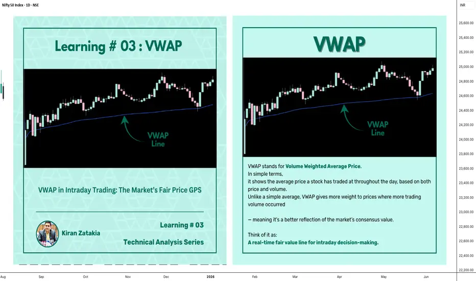
Learning#03 : VWAP in Intraday TradingLearning#03 : VWAP in Intraday Trading
📊 VWAP in Intraday Trading: The Market’s Fair Price GPS
Ever wondered if there’s a level that shows where the real trading action is happening? That’s exactly what VWAP does — it’s like a volume-weighted compass that intraday traders use to orient themselves in the market.
It’s not just another line on your chart. VWAP reflects where institutions and volume-heavy participants are active. That’s why understanding how price interacts with it can give you a serious edge.
Let’s break it down 👇
🧠 What is VWAP?
VWAP stands for Volume Weighted Average Price.
In simple terms, it shows the average price a stock has traded at throughout the day, based on both price and volume.
Unlike a simple average, VWAP gives more weight to prices where more trading volume occurred — meaning it's a better reflection of the market’s consensus value.
Think of it as:
A real-time fair value line for intraday decision-making.
📈 Why VWAP Matters for Intraday Traders
VWAP acts as an intraday anchor. It tells you whether the price is currently trading above or below the day’s volume-weighted average — giving you quick insight into who's in control.
Here’s how to interpret it:
When price is above VWAP, buyers are in control and the bias is bullish.
When price is below VWAP, sellers are dominating and the bias is bearish.
When price is hovering near VWAP, the market is undecided, consolidating, or lacking direction.
In short, VWAP tells you who’s winning the intraday tug of war — and whether it’s even worth stepping in.
⚙️ How to Use VWAP in Your Intraday Strategy
1️⃣ VWAP as a Trend Filter
Before entering a trade, check where price is relative to VWAP:
Price above VWAP with higher lows → Focus on long setups
Price below VWAP with lower highs → Focus on short setups
🔁 Skip counter-trend trades. Stay with the flow.
This helps in trending markets by keeping you aligned with momentum.
2️⃣ VWAP as Dynamic Support or Resistance
VWAP behaves like a magnet. Price often pulls back to it and either:
Rejects (respects the level as support/resistance), or
Breaks and reclaims (signaling a potential reversal)
Use it alongside:
Flag patterns
Inside bars
Break-and-retest structures
3️⃣ VWAP Reversion Play (Snapback Trade)
This is a mean-reversion setup:
Price moves quickly away from VWAP at open
No strong follow-through, signs of exhaustion
Take a counter-trend trade back to VWAP
⚠️ Avoid this in strong trending markets — best used in choppy or fading environments.
4️⃣ VWAP with Price Action for Structure
Pair VWAP with clean price action:
Mark support and resistance zones
Observe price behavior near VWAP
Look for confirmation: inside bars, rejection wicks, engulfing candles
🎯 This adds logic and clarity to your entries — no random trades.
🔍 Bonus VWAP Tips
Combine VWAP with:
CPR (Central Pivot Range) for confluence zones
Opening range for breakout bias
Volume profile to spot high interest areas
These combos create strong, repeatable trade setups.
✅ VWAP Recap: Why It Matters
Here’s a quick breakdown of how VWAP can sharpen your intraday trading game:
Bias Building: VWAP helps confirm whether the market structure is bullish or bearish, giving you a reliable directional bias.
Trend Filtering: It keeps you aligned with the current momentum by filtering out counter-trend trades.
Pullback Entries: VWAP acts as a dynamic support or resistance level, offering clean zones to enter trades during pullbacks.
Mean Reversion: In sideways or fading markets, VWAP becomes a natural magnet — allowing you to target price reversions.
Risk Management: It provides logical reference points for placing stop-losses and defining entry zones, adding clarity to your risk-reward planning.
✍️ Final Thoughts
VWAP may sound simple, but it brings real structure to intraday trading.
It tells you where volume met price, and that’s powerful. When used with price action, it creates a solid framework for:
Building directional bias
Finding clean entries
Managing risk like a pro
VWAP doesn’t predict — it reflects. And in trading, reflection is more useful than prediction.
🛎️ Respect VWAP. Trade with structure.
— Kiran Zatakia
Beyond ICT & SMC: The Mathematical Revolution in Zone TradingIn the world of trading, there's a fundamental divide between traders who rely on subjective interpretation and those who trust mathematical precision. While concepts like ICT (Inner Circle Trader), SMC (Smart Money Concepts), and naked chart analysis have gained popularity, they all share one critical flaw: they're based entirely on personal interpretation.
The Subjectivity Problem
Ask ten ICT traders to mark their Order Blocks, Fair Value Gaps, or Breaker Blocks on the same chart, and you'll get ten different answers. Why? Because these concepts rely on:
Personal bias in identifying "significant" levels
Subjective interpretation of market structure
Discretionary decision-making on what constitutes a valid setup
Emotional influence on analysis
The same issue plagues SMC, CRT (Candle Range Theory), time-based analysis, and naked chart trading. One trader's "liquidity grab" is another trader's "breakout." One person's "strong support" is another's "weak bounce zone."
The Mathematical Solution
This indicator eliminates this guesswork entirely. Instead of relying on subjective interpretation, it:
Calculates exact entry levels using mathematical formulas based on session params
Identifies precise support/resistance zones
Standardises signals across all timeframes, ensuring consistency whether you're on 1m or 15m charts
Removes emotional bias by using algorithmic detection of significant price levels
Numbers Don't Lie
While an ICT trader might debate whether a level is "mitigation" or "inducement," our indicator simply states: "Entry at 1.0847, Stop at 1.0832." No interpretation needed. No second-guessing. Just mathematical precision derived from actual price action.
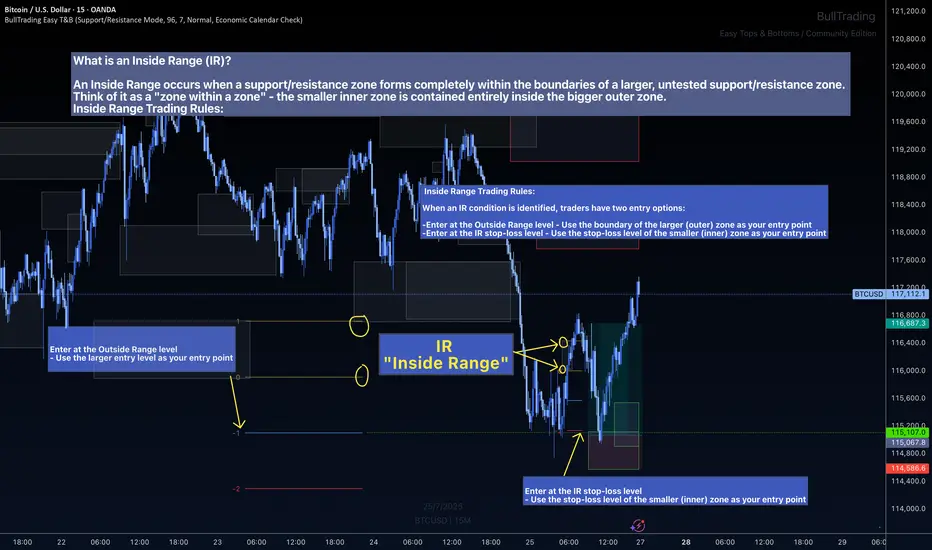
The Inside Range Advantage: When Zones Within Zones Create Superior Trading Opportunities
Most traders miss one of the most powerful setups in technical analysis: the Inside Range (IR). While ICT traders debate "nested order blocks" and SMC followers argue about "refined zones," you can easily identify Inside Ranges with this indicator and mathematically identify these high-probability setups with zero ambiguity.
What Makes Inside Ranges Special?
An Inside Range occurs when a new support/resistance zone forms completely within an untested larger zone. Think of it as the market revealing its hand twice – first showing you the broader area of interest, then pinpointing the precise level within it.
The Mathematical Edge
While discretionary traders struggle to identify these setups consistently, this indicator:
Automatically detects when a smaller zone forms within a larger untested zone
Calculates two precise entry options without any guesswork
Eliminates the confusion of nested levels that plague subjective analysis
Two Entries, Zero Confusion
Documentation and full trading system instructions can be found on the indicator's publication
When an IR forms, the indicator provides exactly two mathematically-derived entry options:
The Outside Range entry – Using the larger zone's entry level
The IR Stop-Loss entry – Converting the inner zone's stop level into an entry point
Compare this to SMC's "refined OB" or ICT's "nested FVG" concepts where traders endlessly debate which level is valid. With Inside Ranges, there's no debate – just two clear, calculated levels.
Inside Ranges represent areas where institutional interest overlaps. The larger zone shows initial interest, while the smaller zone within reveals refined positioning. By mathematically identifying these setups, you're trading where smart money has shown its hand twice.
Real Consistent Precision
Instead of squinting at charts trying to identify subjective "zones within zones," let mathematics do the heavy lifting.
In trading, consistency beats creativity. Stop drawing arbitrary lines and hoping for the best. Start trading with mathematical precision.
Documentation and full trading system instructions can be found on the indicator's publication →
Trade with confidence. Trust in mathematics. Trust in your Edge.
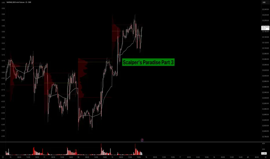
Scalper’s Paradise Part 3 – The Power of Order Flow and DOMWelcome back to Scalper’s Paradise! In this third part of the series, I want to take you into one of the most powerful tools in professional trading: Order Flow and the Depth of Market (DOM).
I chose this topic because during my time as an institutional trader, this was our entire world. We didn’t use indicators. We didn’t guess. We traded exclusively based on what we could see happening live in the DOM and Time & Sales. Every decision was made tick by tick, based on real market activity.
That experience shaped the way I view markets forever—and today, I want to share that perspective with you.
What Is Order Flow, Really?
To me, Order Flow is the most honest information the market can give you. It doesn’t predict, it reveals. It shows who is actually making moves right now. When I was sitting at my institutional desk, I didn’t look at moving averages or oscillators. I looked at who was being aggressive: were market buyers lifting offers, or were sellers smashing the bid?
Watching the tape (Time & Sales) and the footprint chart was like watching a fight unfold in real time. No filters, no guesses. Just raw interaction between buyers and sellers. That’s where real decisions are made.
The DOM: My Daily Reality as a Trader
The DOM (Depth of Market) was the first thing I looked at every morning, and the last thing I closed at night. It shows all visible limit orders resting at each price level. But there’s a catch: not everything you see is real.
In the institution, we were trained to spot real interest versus manipulation. Stacked bids might look strong, but if they disappear the moment price drops tells you that there was never a true intent. Iceberg orders were more interesting, when price gets hit again and again and doesn’t move, that usually meant someone was absorbing quietly.
Reading the DOM is like reading an X-ray of the market’s intentions. And yes, there’s a lot of noise, a lot of deception. But once you learn to read through it, it’s the most powerful tool you’ll ever have.
How We Used Order Flow on the Institutional Side
At the institution, we never chased price. That was rule number one. We let the market come to us (meaning: we used Limit Orders as often as possible) and we used Order Flow to guide every decision.
One of the most important concepts was absorption . If we needed to build a large long position, we didn’t just slam the ask. We would let sellers come in and hit our bids again and again and again. If price didn’t break lower, that told us we were in control.
On the flip side, when we needed to move the market , we switched gears. We used market orders aggressively to push through key levels, forcing reactions, triggering stops, and creating follow-through.
And yes, there were times when we intentionally created traps . We’d push price into obvious zones, make it look like a breakout, then fade it, because we knew how the market reacts afterwards. Order Flow was the only way to read those games in real time.
How You Can Use This as a Retail Trader
I know what you might be thinking: “I’m just a retail trader, how can I possibly use tools like Order Flow or DOM the way institutions do?”
The good news is: you don’t have to compete with institutions, you just need to read their intentions.
Here’s how I would approach it today:
1) Open a footprint chart and look for imbalances, areas where one side is clearly more aggressive. Watch for absorption or sudden volume spikes.
2) Watch the Time & Sales feed. Is there a flurry of trades hitting the ask, but price isn’t moving? That’s someone selling into strength.
3) Use the DOM around key areas like VWAP, previous day high/low, or liquidity clusters. Are orders getting pulled? Is size appearing suddenly? These are all signals.
You don’t need to be early. Let the big player act first, then confirm what you’re seeing across Order Flow and DOM. When everything aligns, that’s your edge.
Bringing It All Together
In Part 1, I shared how we used VWAP and Volume Profile as benchmarks to evaluate execution quality. In Part 2, I showed you how I identify institutional activity using raw volume and 10-second charts. And now, in Part 3, you’ve seen the real-time decision-making tools: Order Flow and DOM.
These aren’t indicators. They’re not theories. They’re the actual battlefield where institutions operate and where I learned to trade.
My goal with this series has always been simple: to give you access to the same mindset I used at the institutional level, but through a lens that makes sense for your reality as a retail trader.
Don’t try to outsmart the market. Observe it. Align with the big players. Let their behavior guide your decisions.
That’s how I learned to trade professionally—and it’s exactly how you can start thinking and acting like a pro, even without the size.
Part 1:
Part 2:
Learning#02 : Fractals⛰️ Learning#02 : Fractals
The Cleanest Clue on a Cluttered Chart
If you like clean charts and smart price behaviour, Fractals are one of those tools that give subtle but powerful signals. They’re not magic. They simply reflect what price is telling you—if you’re willing to listen.
Let’s unpack the concept and learn how to use Fractals like a pro.
🔍 What Is a Fractal in Trading?
In technical analysis, a Fractal is a five-candle pattern that marks a local top or bottom in price. It’s a pure price-action signal that doesn’t rely on lagging indicators.
There are two types of Fractals:
Bearish Fractal (Top): The 3rd candle has the highest high, surrounded by two lower highs on each side.
Bullish Fractal (Bottom): The 3rd candle has the lowest low, flanked by two higher lows on each side.
These formations are Price's way of saying: *"I tried to go further, but couldn't."
📊 What Do Fractals Indicate?
A shift in short-term control (bulls vs. bears)
Minor support or resistance zones
Useful markers for entries, exits, or trailing stop levels
They don't guarantee reversals but are excellent at highlighting where price momentum may pause, reverse, or build structure.
📈 How to Use Fractals – A Practical Guide
Let’s be clear: Fractals are not trade signals by themselves.
Instead, they work best when used in confluence with your strategy. Think of them as tools that:
Help confirm breakout levels
Refine pullback entries
Guide you in drawing cleaner trendlines, fib zones, and support/resistance levels
Assist in identifying swing highs and lows for Dow Theory-style trend analysis
🔗 Fractals + Strategy = Smart Trading
Whether you trade breakouts or mean reversion, Fractals help clarify:
Which highs or lows matter
Where to place stop losses with structure-based logic
How to trail SL as the trade progresses
They quietly organize your chart into readable, tradeable levels.
🚀 Practical Uses of Fractals
Fractals are the first tool I add to any chart—they instantly reveal structure and guide every step of my analysis.
1. Breakout Confirmation
Wait for a candle to close above a bullish fractal high or below a bearish fractal low.
Useful when the market is trending or forming structures like double bottoms/tops.
2. Pullback with Confirmation
Use the fractal zone as a short-term S/R level. If price returns and shows signs of rejection (like an inside bar, wick rejections, or low volume), consider entries based on confirmation.
Great in sideways or swing environments.
3. Trend Structure Validation
Fractals reveal clear pivot highs/lows, helping:
Confirm higher highs/higher lows
Mark structure for trendline drawing
Validate Fib levels or S/R zones
4. Trailing Stop Loss
Update your SL to trail behind the most recent opposite-side fractals.
In longs: SL below new bullish fractals
In shorts: SL above new bearish fractals
This lets you stay in the move while managing risk like a pro.
How it’s Look Like on Chart
snapshot
⚠️ Common Mistakes to Avoid
Trading every fractal blindly
Ignoring price context or trend
Relying on fractals in low-volume, choppy markets
📝 Final Thoughts
Fractals are like breadcrumbs left by price action. They quietly point to areas where the market faced resistance or found support. Alone, they’re not enough. But in the hands of a price-action trader, they’re incredibly useful.
Used alongside market structure, confirmation signals, and clean charting habits, Fractals become:
Trend identifiers
Entry enhancers
Stop loss trail markers
⭐ Bonus Tip
Next time you mark a level, Fibonacci or draw a trendline, check if a Fractal confirms it. You’ll be surprised how often it does.
Trade simple. Trade clean.
— Kiran Zatakia

Timeframes: Why They’re Fundamentally Flawed (And What To Do)When analyzing price action, timeframes serve as a convenient lens through which traders attempt to make sense of the market. They help us categorize price movement — bullish , bearish , ranging , trending , and so on — within a structured framework. But here’s the reality: candlesticks themselves aren’t real . Much like clocks or calendars, they’re simply man-made constructs — tools we've invented to measure and scale something intangible: time . I know that might sound a bit abstract, but stay with me.
While traders commonly rely on standard timeframes like the Daily, 4H, 1H, 15M , etc., it’s important to recognize that price doesn’t conform to these rigid intervals. The market moves continuously, and the “spaces between” those timeframes — like a 27-minute or 3-hour chart — are just as real . These non-standard timeframes often offer better clarity depending on the speed and rhythm of the market at any given moment.
This begs the question: How do we keep up with this ever-shifting pace? Do we constantly toggle between similar timeframes to recalibrate our analysis? Do we measure volatility? Amplitude? Period length? There’s no clear consensus, which leads to inefficiency — and in trading, inefficiency costs.
In my view, the solution lies in blending multiple nearby timeframes into a single, adaptive framework . We need a representation of price action that adjusts automatically with the speed of the market. And the answer is surprisingly simple — literally . It’s called the Simple Moving Average (SMA) .
Think an SMA is just a line representing past highs, lows, or closes? It’s much more than that. When used creatively, the SMA becomes a dynamic lens that filters noise, reveals trend clarity, and smooths out irregularities in price behavior. Rather than relying on a single metric, we can combine multiple SMA variations — highs, lows, opens, closes — into one composite view of the market . This gives us a continuously adjusting snapshot of average price action.
Once we adopt this approach, everything starts to click.
• Engulfing patterns become more reliable
• Liquidity sweeps occur less frequently
• Supply and demand zones become more precise
• Market structure begins to make consistent sense
With SMA-based price action , our strategies don’t just become clearer — they become smarter .
Want to See It in Action?
If you’re interested in applying this concept to your own trading strategy, check out my TradingView profile: The_Forex_Steward . There, you’ll find the SMA Price Action indicator used in the examples shown, as well as tools that apply this methodology to:
• Supply and Demand
• Market Structure
• Market Balance Levels
• Velocity & Momentum
• And more to come!
If you found this idea helpful, be sure to follow the page. I’ll be releasing more exclusive indicators and trading concepts soon — so stay tuned!
All Binance Coins Watchlist 2025 JULY If you want to create a full list of all coins from the exchange you use, you can:
1. Go to Screeners
2. Set these filters:
a. Exchange (eg. Binance)
b. Quote currency - USDT
c. Symbol type - Perpetual
3. Keep Scrolling till the end of the list so that all coins are populated. There should be about 400+ coins.
4. Select one of the coins, then click Ctrl A to select all.
5. Right click > Add to an existing Watchlist or Create a new watchlist.
Here's my list i created on 4th July 2025. You can import it if you want.
www.tradingview.com

My Ideal Elliott Wave Entry ModelThe IMSETT 3/C Entry Model.
Every trader wants to catch the big moves the ones that pay quickly and decisively. In Elliott Wave, those moves often come during Wave 3. It's the strongest part of the trend, and when you're positioned early, the risk-to-reward is unmatched.
But not every opportunity hands you a clean Wave 3 on a silver platter. Sometimes you’re looking at a Wave C instead. That’s where the 3/C Entry Model comes in. It’s designed to get you aligned with high-conviction moves—whether the market is in a trend or a zig zag.
Here’s the edge: both Wave 3 and Wave C often start the same way—a strong, motive push off an AOI (area of interest), followed by a retracement. That shared structure gives us an anchor. Whether we’re labeling it a 3 or a C doesn’t change the fact that the initial impulse gives us clarity, direction, and a place to manage risk.
That’s what the IMSETT Model is built around:
Identify
Motive
Scout
Entry Plan
Track
Trade
Each step is focused, actionable, and repeatable. You're not trying to outguess the market—you’re reacting to structure, preparing for common behavior, and executing with intent.
I do have a video with a walk through.
This just the way I look for clarity in setups. As with everything in trading, nothing will work every time so do your own research this is not financial advice.
Cheers!
Trade Safe, Trade Clarity.

Skeptic | RSI Masterclass: Unlock Pro-Level Trading Secrets!Hey traders, it’s Skeptic ! 😎 Ready to transform your trading? 95% of you are using the Relative Strength Index wrong , and I’m here to fix that with a game-changing strategy I’ve backtested across 200+ trades. This isn’t a generic RSI tutorial—it’s packed with real-world setups, myth-busting insights, and precise rules to trade with confidence. Join me to master the art of RSI and trade with clarity, discipline, and reason. Big shoutout to TradingView for this epic free tool! 🙌 Let’s dive in! 🚖
What Is RSI? The Core Breakdown
The Relative Strength Index (RSI) , crafted by Welles Wilder, is a momentum oscillator that measures a market’s strength by comparing average gains to average losses over a set period. Here’s the formula:
G = average gains over n periods, L = average losses.
Relative Strength (RS) = | G / L |.
RSI = 100 - (100 / (1 + RS)).
Wilder used a 14-period lookback , and I stick with it—it’s smooth, filters noise, and gives a crystal-clear read on buyer or seller momentum. Let’s get to the good stuff—how I use RSI to stack profits! 📊
My RSI Strategy: Flipping the Script
Forget what you’ve read in books like The Handbook of Technical Analysis by Mark Andrew Lim— overbought (70) and oversold (30) aren’t just for shorting or buying. I go long when RSI hits overbought, and it’s been a goldmine. I’ve backtested over 200 trades with this approach, and it’s my go-to confirmation for daily setups. Why does it work? When RSI hits overbought on my 15-minute entry chart, it signals explosive buyer momentum. Here’s what you get:
Lightning-Fast R/R: I hit risk/reward targets in 30 minutes to 2 hours on 15-minute entries (longer for 1-hour entries, depending on your timeframe).
Massive R/R Potential: An overbought RSI on 15-minute can push 1-hour and 4-hour RSI into overbought, driving bigger moves. I hold for R/Rs of 5 or even 10, not bailing early. 🚀
Rock-Solid Confirmation: RSI confirms my entry trigger. Take BTC/USD:
BTC bounces off a key support at 76,000, sparking an uptrend.
It forms a 4-hour box range, but price tests the ceiling more than the floor, hinting at a breakout.
Trigger: Break above the box ceiling at 85,853.57.
On 15-minute, a powerful candle breaks the ceiling, and RSI hits overbought—that’s my green light. I open a long.
Soon, 1-hour and 4-hour RSI go overbought, signaling stronger momentum. I hold, and BTC pumps hard, hitting high R/R in a short window.
This keeps trades fast and efficient—quick wins or quick stops mean better capital management and less stress. Slow trades? They’re a mental grind, pushing you to close early for tiny R/Rs. 😴
Pro Rules for RSI Success
Here’s how to wield RSI like a trading weapon:
Stick to the Trend : Use RSI in the direction of the main trend (e.g., uptrend = focus on longs).
Confirmation Only: Never use RSI solo for buy/sell signals. Pair it with breakouts or support/resistance triggers.
Fresh Momentum: RSI is strongest when it just hits overbought/oversold. If the move’s already rolling, skip it—no FOMO, walk away!
Customize Zones: Overbought (70) and oversold (30) can shift—it might show reactions at 65 or 75. Adjust to your market’s behavior.
Backtesting RSI: Your Path to Mastery
To make RSI yours, backtest it across at least 30 trades in every market cycle— uptrend, downtrend, and range. Test in volatile markets for extra edge. 😏 Key takeaways:
Range Markets Kill RSI: Momentum oscillators like RSI (or SMA) are useless in ranges—no momentum, no signal. Switch to ROC (Rate of Change) for ranges—I use it, and it’s a beast. Want an ROC guide? Hit the comments!
Overextended RSI Zones: On your entry timeframe (e.g., 15-minute), check higher timeframes (e.g., 4-hour) for past RSI highs/lows. These are overextended zones—price often rejects or triggers a range. Use them to take profits.
Final Vibe Check
This RSI masterclass is your key to trading like a pro—fast R/Rs, big wins, and unshakable confidence . At Skeptic Lab, we live by No FOMO, no hype, just reason. Guard your capital— max 1% risk per trade, no excuses. Want an ROC masterclass or more tools? Drop a comment! If this fired you up, smash that boost—it means everything! 😊 Got a setup or question? Hit me in the comments. Stay sharp, fam! ✌️

How to Spot Head & Shoulders Patterns in TradingViewDiscover how to identify and validate Head & Shoulders patterns using TradingView's built-in pattern recognition tools in this detailed tutorial from Optimus Futures. Chart patterns are essential tools for many futures traders, and the Head & Shoulders formation is among the most recognized reversal patterns in technical analysis.
What You'll Learn:
• Understanding the Head & Shoulders pattern: a key reversal formation in technical analysis
• How to access and use TradingView's pattern drawing tools and objects
• Step-by-step process for identifying potential Head & Shoulders formations on any timeframe
• Techniques for spotting the "head" by locating the highest high or lowest low pivot points
• How to identify matching "shoulders" on either side of the head formation
• Validating your pattern identification using TradingView's drawing tools
• Real-world example using crude oil futures on an hourly chart from October 2024
• Key characteristics that distinguish bearish Head & Shoulders reversal patterns
• Best practices for using pivot points and swing analysis in pattern recognition
This tutorial may benefit futures traders, swing traders, and technical analysts who want to improve their chart pattern recognition skills in TradingView. The techniques demonstrated could help you identify potential reversal opportunities and make more informed trading decisions when these classic formations appear on your charts.
Keywords: Head and Shoulders pattern, TradingView tutorial, chart patterns, technical analysis, reversal patterns, futures trading, pivot points, swing analysis, pattern recognition, trading education
Visit Optimus Futures to learn more about trading futures with TradingView:
optimusfutures.com
Disclaimer:
There is a substantial risk of loss in futures trading. Past performance is not indicative of future results. Please trade only with risk capital. We are not responsible for any third-party links, comments, or content shared on TradingView. Any opinions, links, or messages posted by users on TradingView do not represent our views or recommendations. Please exercise your own judgment and due diligence when engaging with any external content or user commentary.
This video represents the opinion of Optimus Futures and is intended for educational purposes only. Chart interpretations are presented solely to illustrate objective technical concepts and should not be viewed as predictive of future market behavior. In our opinion, charts are analytical tools—not forecasting instruments. Market conditions are constantly evolving, and all trading decisions should be made independently, with careful consideration of individual risk tolerance and financial objectives.

Automated Execution: TradingView Alerts → Tradovate using AWS LaI’ve built a fully automated pipeline that takes live TradingView alerts and turns them into real orders in Tradovate. Here’s how it works, step by step (I will provide a video on it):
PineScript Alerts
My indicator/strategy in TradingView fires alert() with a JSON payload (symbol, side, qty, price, ATR, ENV).
Webhook to AWS
Alerts hit an API Gateway endpoint in AWS, invoking a Lambda function.
Lambda Processing
Parse the JSON from TradingView.
Calculate Stop‐Loss & Take‐Profit using ATR.
Authenticate to the Tradovate API (demo & live environments).
Place an OCO order (placeOSO) with proper bracket legs.
Send a confirmation message to my Telegram channel.
Tradovate REST API
Auth: POST /auth/accesstokenrequest → accessToken
List accounts: GET /account/list → find accountId
Place OCO: POST /order/placeOSO with entry, SL, TP
Testing & Monitoring
Local smoke tests of Telegram bot.
Lambda console test events for sample payloads.
CloudWatch logs for debugging & alerts on errors.
Why it matters:
Zero manual steps from signal to fill.
Consistent risk management via ATR‐based SL/TP.
Clear audit trail: logs in AWS + Telegram notifications.
Educational resource for anyone building similar setups
Feel free to ask questions or suggest improvements! Please leave comments.

CME FedWatch : the essential tool to consult before the FedThe CME FedWatch Tool is a free and widely used resource offered by CME Group. It has become a key reference in the financial industry for tracking, in real time, market expectations about upcoming interest rate decisions by the U.S. Federal Reserve (Fed). Frequently cited in financial media, this tool allows traders and analysts to assess the likelihood of a rate hike, hold, or cut ahead of each scheduled FOMC meeting.
How does it work?
At the core of the FedWatch Tool lies data derived from 30-day Fed Funds Futures, which reflect the average federal funds rate expected for a given month. These contracts follow a simple rule:
Implied Rate = 100 – Futures Price
So if a futures contract trades at 95.67, the implied average rate is 4.33%. This is then compared not just to the Fed’s current target range (4.25% to 4.50%), but more specifically to the Effective Federal Funds Rate (currently around 4.33%) to estimate the market-implied probability of a rate hike, hold, or cut.
The FedWatch Tool then distributes these probabilities across expected scenarios for each upcoming meeting, allowing users to see, for instance, a 99.9% probability of a hold or a 0.1% chance of a cut. This makes it a real-time barometer of monetary policy expectations.
The Historical section: analyze and backtest
Beyond the live probabilities, the tool also features a Historical section. This shows how rate expectations evolved ahead of past FOMC meetings and what the Fed ultimately decided.
Users can download this data for further study, enabling a better understanding of how market sentiment shifted over time, particularly in reaction to speeches, inflation data, or jobs reports. This is especially valuable for those looking to backtest trading or hedging strategies tied to rate decisions.
The “Dot Plot”: insight into the Fed’s own outlook
Another key feature of the tool is the Dot Plot, which displays individual FOMC participants’ rate projections over time. Each dot represents a member’s view of where the fed funds rate should be by the end of a given year.
The Dot Plot is only updated four times per year, in March, June, September, and December, during the Fed’s so-called “summary of economic projections” meetings. These quarterly meetings are particularly market-sensitive because they are accompanied by updated economic forecasts and a press conference. While the dots do not reflect a formal voting commitment, they offer valuable insight into the Fed’s collective sentiment and long-term bias.
How to Interpret the Data?
A key takeaway for traders: don’t confuse the direction of interest rates with the overall message. A rate cut may not be “dovish” if paired with cautious language or projections. Conversely, holding rates steady may be interpreted as “hawkish” if the market was expecting a cut.
What really moves markets is the difference between expectations and what the Fed actually says or does. That includes the language of the statement, any changes in the dot plot, and Chair Powell’s comments in the post-decision press conference. These factors often matter more than the rate move itself.
The situation on Wednesday, June 18, 2025: what to expect?
The June 18 meeting is one of the quarterly meetings, meaning it will come with a press conference and a release of a new dot plot. As of now, the FedWatch Tool shows an extremely high probability (99.9%) of a rate hold within the current 4.25% to 4.50% range.
However, what matters most on this occasion is the guidance for the second half of the year. As of now:
The market assigns a 56% probability to a first rate cut by September,
A 41% chance to two cumulative 25 bp cuts (down to 3.75–4.00%) and a 21% chance of a more aggressive easing path (3.50–3.75%) by December.
This means the market still expects some policy easing later in the year, but not aggressively. If Powell opens the door more clearly to cuts, or if the new dot plot shows a downward shift in the median rate projection for 2025, the dollar could weaken and rate-sensitive assets might rally. On the other hand, if the Fed maintains a cautious stance and the dots remain unchanged, markets may interpret that as hawkish.
This is why knowing what the market has already priced in before the announcement is essential: the reaction depends not on the raw decision, but on how it compares to expectations.
In short…
For all these reasons, I believe the FedWatch Tool is a simple yet extremely powerful resource for anyone interested in U.S. monetary policy. It allows users to track market expectations and compare them with official Fed communications. It’s definitely a key part of my trading arsenal.
To go deeper, other tools can complement this analysis—especially implied volatility data from rate options markets. These don’t signal directional bias, but rather how large a move the market expects. That will be the focus of an upcoming article.

How to Calculate Forex Lot Size on TradingView. Free Calculator
Do you know that TradingView has a built-in Forex position size calculator?
It is completely free, it is simple to use, and it does not require a paid subscription to use it.
In this article, I will teach you how to calculate a lot size for your trades on TradingView easily in 3 simple steps.
Step 1 - Setting Up the Calculator
First, open a price chart on TradingView and find a "Trading Panel" button in the bottom of the window.
Click "Maximize Panel" afterward.
In the list of brokers, select " TradingView Paper Trading" and click "Connect".
Paper Trading is built in demo trading account on TradingView.
It does not require KYC or any other verification.
Choose "Account" list box and tap "Create Account" .
Then fill all the inputs with exactly the same parameters as your real trading account has.
Type in your exact account size, leverage and commission rate.
Then click "Create".
TradingView position size calculator is ready to use.
Step 2 - Find the Trading Opportunity
Find a trading setup to trade. Make sure that you know the exact entry level and stop loss.
Imagine that you want to buy EURUSD from 1.0899 price level with 1.08846 stop loss level.
Step 3 - Measure a Proper Lot Size
Right-click on a price chart and choose "Trade" and in the appeared menu select "Create New Order".
Fill the following fields:
"Price" - your entry level,
"% risk" - your desired risk per trade in %,
"Stop Loss price" - your stop loss price level.
Your lot size will be based on the calculated units .
In forex trading 1 standard lot equals 100000 units.
The only thing that you should do is to take the exact units number and divide it by 100000.
In our case we have 704225 units.
704225 / 100000 = 7,04 lot.
That will be your lot size for buying EURUSD with 1% risk for 100000 trading account.
If you apply TradingView for market analysis and charting and your trading terminal does not have a lot size calculator, this method will be the quickest and the easiest to apply for measuring the position size.
❤️Please, support my work with like, thank you!❤️
I am part of Trade Nation's Influencer program and receive a monthly fee for using their TradingView charts in my analysis.

Intro to my python-tradingview strategyAfter three years working on multiple trading strategies, I decided to share my experience and my trades. But before going live, I think I need to explain the roadmap I’ve followed so far.
I initially started coding my strategy in PineScript, which is a powerful tool. It allowed me to simply code my ideas and turn them into trading signals using alerts and conditions. I’m sure you’ve already watched dozens of YouTube videos on how to use webhooks and TradingView to send signals to your trading platform. Anyway, I began developing my strategy in Pine and used webhooks to connect to Tradovate. I went live after a few months of testing—which, of course, was my first mistake. In January 2022, my algo went live. I traded on a strategy that was just tuned on seen data, manually flipping parameters to maximize PnL—a purely overfit model—and I went live with real money. Anyway, the first month was positive and I thought I was the best trader in the world. I even told my wife we were going to be rich, like nothing could stop us. But after three months of trading, I lost—obviously. It was a bummer, but I knew where the problem was: lack of proper backtesting.
So that was the moment I moved my code to Python. It took me a couple of weeks to build an end-to-end backtesting framework in Python. I used Backtrader as a backtesting tool, which is awesome. I’ll have some videos soon to explain more about that. Anyway, moving my code to Python gave me the luxury of backtesting and creating rolling walk-forward optimizations, allowing me not only to refine my strategies but also to test them on 5–6 years of historical data.
Long story short, working with Python enabled me to come up with five different strategies for NQ and ES. I plan to share those trades, but before that, I thought I should share my journey first.
Please leave comments and follow my channel. More to come.

Learn What is TRAILING STOP LOSS | Risk Management Basics
In the today's article, we will discuss a trailing stop loss. I will explain to you its concept in simple words and share real market examples.
🛑Trailing stop loss is a risk management tool that allows to protect unrealized profits of an active trading position as long as the price moves in the desired direction.
Traditionally, traders trade with fixed stop loss and take profit. Following such an approach, one knows exactly the level where the trade will be closed in a profit and the level where it will be closed in a loss.
Take a look at a long trade on USDCAD above.
The trade has fixed TP Level - 1.354 and fixed SL Level - 1.341.
Once one of these levels is reached, the trade will be closed.
Even though the majority of the traders stick to fixed sl and tp, there is one important disadvantage of such an approach – substantial gains could be easily missed .
After the market reached TP in USDCAD trade, the price temporarily dropped, then a strong bullish rally initiated and the price went way above the Take Profit level. Potential gains with that long position could be much bigger.
Trailing stop solves that issue.
With a trailing stop loss, the trader usually opens the trade with Stop Loss and WITHOUT Take Profit.
Take a look at a long trade on USDCHF.
Trader expects growth, he opens a long position and sets stop loss – 0.8924, while take profit level is not determined.
With a trailing stop loss, the trader usually opens the trade with Stop Loss and WITHOUT Take Profit.
As the market starts growing, one decides not to close the trade in profit, but modify stop loss – trail it to the level above the entry.
As the market keeps rallying, one TRAILS a stop loss in the direction of the market, protecting the unrealized gains.
When the market finally starts falling, the price hits stop loss and a trader closes the trade in a substantial profit.
The main obstacle with the application of a trailing stop is to keep it at a distance from current price levels that is not too narrow nor too wide.
With a wide stop loss distance, substantial unrealized gains might be washed out with the market reversal.
Imagine you predicted a nice bullish rally on Bitcoin.
The market bounced nicely after you opened a long position.
Trailing stop loss too far from current price levels, all the gains could be easily wiped out.
While with a narrow trailing stop distance, one can be stop hunted before the move in the desired direction continues.
A trader opens a long trade on EURJPY and the price bounces perfectly as predicted.
One immediately trails the stop loss.
However, the distance between current prices was too narrow and the position was closed after a pullback.
And then market went much higher.
In conclusion, I want to note that fixed SL & TP approach is not bad , it is different and for some trading strategies it will be more appropriate. However, because of its limitations, occasionally big moves will be missed.
Try trailing stop by your own, combine it with your strategy and I hope that you will make a lot of money with that!
❤️Please, support my work with like, thank you!❤️
I am part of Trade Nation's Influencer program and receive a monthly fee for using their TradingView charts in my analysis.

Trading Without an Edge Is Like Gambling Without the FunAt least in Vegas, you get free drinks.
Let’s cut the fluff.
You want to make money trading.
But here’s the problem no one wants to admit:
Most traders don’t have an edge. And they trade anyway.
Which means they’re not traders.
They’re just expensive gamblers in denial.
🎰 W elcome to the Casino Called “Charts”
In Vegas, the odds are clearly displayed.
You know the house has the advantage.
But in trading? You convince yourself you are the house.
You say things like:
-“This setup worked for someone on YouTube.”
- “Price is oversold, so it has to bounce.”
- “I just have a feeling it’ll go up.”
That’s not a strategy. That’s astrology.
If you can’t define your edge in one sentence, you don’t have one.
And if your edge isn’t tested over at least 100 trades — it’s fantasy.
🧠 What Is an Edge, Anyway?
An edge is not a pattern. It’s not always your gut.
It’s a repeatable, testable advantage in the market.
It could be:
- A statistical tendency in price behavior
- A setup with positive risk-to-reward over time
- A timing structure that aligns with volume or volatility
- Even psychological edge (you stay calm when others panic)
But here’s the key:
An edge is something that works often enough, with controlled risk, and consistent execution.
☠️ What Happens When You Don’t Have One
Let’s break it down.
Trading without an edge leads to:
- Random outcomes that feel emotional
- Overtrading because you’re chasing the next “feel good” moment
- Misplaced confidence after a few lucky wins
- Explosive losses when luck runs out
And worst of all?
You think you’re improving…
But in reality, you’re just getting better at losing slower.
🍹 At Least Vegas Gives You Something Back
Here’s the irony:
In Vegas, the drinks are free.
You get a show. You laugh. You know it’s a gamble.
In trading?
- You pay for your losses
- You pay for your education
- You pay for your psychology coach
- And nobody even gives you a free mojito.
If you're going to lose money without an edge, you might as well enjoy the music.
🎯 So How Do You Actually Get an Edge?
1. Backtest.
Find a setup that repeats. Track it. Chart it. Obsess over it.
2. Track your stats.
Your win rate, average R, time in trade. Know thyself.
3. Simplify.
An edge isn’t 12 indicators. It’s one thing done well.
4. Survive first, thrive later.
If you’re not around after 100 trades, your edge won’t matter anyway.
5. Learn from pain, not just profit.
Your losers have more to teach than your winners.
🧘 Final Thought – Stop Playing Pretend
If you wouldn’t go to a casino and bet $1000 on 25 without knowing the odds…
Why are you doing that in the markets?
Don’t call it trading if it’s actually coping.
Don’t call it strategy if it’s actually guessing.

How to Choose Chart Types in TradingViewThis tutorial covers the 21 chart types available in TradingView, explaining what each one is, how to read it, as well as the advantages and drawbacks.
Learn more about trading futures with Optimus Futures using the TradingView platform here: www.optimusfutures.com
Disclaimer:
There is a substantial risk of loss in futures trading. Past performance is not indicative of future results. Please trade only with risk capital. We are not responsible for any third-party links, comments, or content shared on TradingView. Any opinions, links, or messages posted by users on TradingView do not represent our views or recommendations. Please exercise your own judgment and due diligence when engaging with any external content or user commentary.
This video represents the opinion of Optimus Futures and is intended for educational purposes only. Chart interpretations are presented solely to illustrate objective technical concepts and should not be viewed as predictive of future market behavior. In our opinion, charts are analytical tools—not forecasting instruments. Market conditions are constantly evolving, and all trading decisions should be made independently, with careful consideration of individual risk tolerance and financial objectives.

Understanding VWAP In TradingWhat is VWAP?
VWAP is a price benchmark that gives more importance to prices where higher trading volume occurs. Unlike simple moving averages, which treat each price point equally, VWAP provides a volume-weighted perspective, making it more representative of market activity.
Traders use VWAP to gauge market trends, confirm trade entries and exits, and measure the quality of executions relative to the market's liquidity.
How Institutional Traders Use VWAP
Large financial institutions and mutual funds execute large orders over time to minimize their market impact.
VWAP helps them:
Achieve better execution by ensuring their orders are filled at a price close to the session's average.
Reduce market impact by avoiding aggressive buying or selling at extreme price points.
Gauge liquidity and time their orders efficiently.
Role of VWAP in Algorithmic Trading
VWAP is integral to algorithmic trading strategies that automate order execution.
Algorithms use VWAP in:
VWAP Trading Strategies: Algorithms execute orders in line with VWAP to avoid moving the market.
Mean Reversion Trading: Traders look for deviations from VWAP, buying when the price is below and selling when it is above.
Liquidity-Based Order Execution: Algorithms track VWAP to execute trades more efficiently, particularly in high-frequency trading (HFT).
Why VWAP is a Critical Benchmark for Intraday Traders
For short-term traders, VWAP provides key insights into market behavior:
Trend Confirmation: If the price is above VWAP, it indicates bullish sentiment; below VWAP suggests bearish conditions.
Entry and Exit Points: Traders use VWAP as support/resistance for trade decisions.
Institutional Footprint: Retail traders track VWAP to understand where large orders might be executing.
Since VWAP resets daily, it remains a highly relevant indicator for gauging intraday momentum and trend strength.
Calculation
Where:
Price = (High + Low + Close) / 3 (Typical Price for each period)
Volume = The total number of shares/contracts traded in the period
Understanding How VWAP is Calculated:
Calculate the Typical Price (TP): TP=High+Low+Close/3
Multiply TP by Volume for each time period to get the Cumulative Price-Volume product.
Sum the Price-Volume values cumulatively throughout the day.
Divide by the cumulative volume up to that time.
Since VWAP is cumulative from the market open, it resets at the start of each trading day.
Difference Between VWAP and Moving Averages
VWAP
Volume-weighted
Resets daily
Determines fair value in a session
Reacts to volume spikes
Moving Averages (SMA/EMA)
Equal-weighted (SMA) or Exponentially weighted (EMA)
Continuous across multiple sessions
Identifies overall trend direction
Reacts to price changes
How to Interpret VWAP
When the price is above VWAP: It suggests that the market is in an uptrend, and VWAP may act as support if the price retraces.
When the price is below VWAP: It signals a downtrend, and VWAP may act as resistance if the price attempts to rise.
Reclaiming VWAP: If the price moves below VWAP but then breaks back above it, this could signal a bullish reversal. The opposite is true for a bearish scenario.
VWAP and Market Trend Identification
Uptrend: If the price remains consistently above VWAP and VWAP itself is sloping upward, the market is in an uptrend.
Downtrend: If the price stays below VWAP and VWAP is sloping downward, the market is in a downtrend.
Sideways Market: If the price oscillates around VWAP and VWAP remains flat, the market is range-bound.
VWAP Standard Deviations (Bands) and Their Significance
First Standard Deviation (VWAP ±1σ)
Represents a normal fluctuation around VWAP.
Prices bouncing within this range indicate balanced market activity.
Second Standard Deviation (VWAP ±2σ)
Suggests stronger price movement.
A move beyond this level may indicate an overbought (above VWAP) or oversold (below VWAP) condition.
Third Standard Deviation (VWAP ±3σ)
Extreme price movement; rarely sustained.
A reversion back toward VWAP is highly likely.
Misinterpreting VWAP Signals
Many traders assume that VWAP alone dictates market direction. However, simply being above or below VWAP does not automatically mean the market is bullish or bearish. Market structure, momentum, and external factors such as news events or institutional order flows must also be considered.
How to Avoid It?
Look for Confirmation: Use VWAP in combination with price action and other indicators, such as volume, market structure, and momentum oscillators (e.g., RSI or MACD).
Check the Trend of VWAP: If VWAP is sloping upward and price is above it, this signals strength. Conversely, a downward-sloping VWAP with price below it indicates weakness.
Observe Price Interaction with VWAP: If the price consistently bounces off VWAP and continues in the trend direction, it confirms its role as dynamic support or resistance. If the price frequently crosses VWAP back and forth without clear direction, it signals a choppy, range-bound market.
Strategies
VWAP Bounce
If the price pulls back to VWAP and holds, traders may look for a long entry (in an uptrend) or a short entry (in a downtrend).
Stop-loss orders are often placed slightly beyond VWAP in case of a trend reversal.
VWAP Breakout
If the price consolidates near VWAP and then breaks out strongly, traders may enter in the direction of the breakout.
A sustained break above VWAP signals strength, while a break below VWAP signals weakness.
VWAP as a Reversion Point
Traders monitor price deviations from VWAP. If the price moves too far from VWAP, a reversion trade back toward VWAP may be expected.
Key Takeaways
VWAP Represents Fair Value – It calculates the average price of a security, weighted by volume, giving traders insight into where most of the trading activity has occurred.
Intraday Benchmark – VWAP resets daily and is primarily used by intraday traders and institutions to assess whether prices are trading at a premium or discount.
Support and Resistance Tool – VWAP often acts as dynamic support in uptrends and resistance in downtrends, helping traders make entry and exit decisions.
Institutional Trading Guide – Large institutions use VWAP to execute orders efficiently, minimizing market impact and ensuring better fills.
VWAP vs. Moving Averages – Unlike moving averages, which continue across multiple sessions, VWAP is cumulative from the market open and resets each day.
Trend Confirmation – Price above a rising VWAP signals a strong uptrend, while price below a declining VWAP suggests a downtrend.
Avoid Over-Reliance – While useful, VWAP should be combined with volume analysis, price action, and other indicators to avoid false signals.
VWAP Bands for Overbought/Oversold Levels – Standard deviation bands around VWAP can help identify price extremes and potential mean reversion setups.
VWAP is more than just an average—it's the heartbeat of market sentiment, revealing where true liquidity and fair value align.
Stay sharp, stay ahead, and let’s make those moves. Until next time, happy trading!
