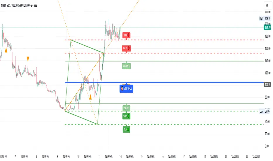
Angled Gann Time-Price Squares with S/RThis is a Pine Script indicator that implements Angled Gann Time-Price Squares based on W.D. Gann's trading theory. Here's what it does:
Core Functionality
Detects pivot highs and lows using a configurable lookback period
Creates angled squares by connecting pivot points to current price action when specific geometric conditions are met
Validates square formation by checking if the price movement follows proper Gann angles (typically 45°, 135°, etc.) within a tolerance range
Key Features
Real-time square tracking: Shows both completed squares and forming squares in progress
Support/Resistance levels: Automatically generates S/R lines from:
Square edge extensions
Diagonal extensions (pivot centers)
Quarter/half levels within squares (25%, 50%, 75%)
Visual feedback: Color-coded squares (green for up, red for down, orange for forming)
Projection lines: Predicts where squares might complete based on Gann angle theory
Gann Theory Application
The indicator follows Gann's principle that time and price move in geometric harmony. It looks for price movements that form perfect squares when plotted on a chart, where the diagonal of the square represents the natural flow of price and time at specific angles.
The generated support/resistance levels are particularly valuable because they're based on completed geometric patterns rather than just horizontal price levels, making them potentially more significant according to Gann methodology.
Indicators and strategies

HTF Rejection Block [TakingProphets]HTF Rejection Block
This advanced smart money indicator by Taking Prophets helps traders pinpoint Higher Timeframe Rejection Blocks, where institutional price manipulation often leads to sharp reversals. Whether you're trading Forex, Indices, Crypto, or Futures, this tool gives you a real-time view of bullish and bearish rejection zones across up to 4 higher timeframes.
🧠 ICT-Aligned + Inspired by Powell
This concept was popularized by Powell, a respected voice in the ICT community known for spotlighting how aggressive wicks signal Smart Money activity. His insights helped bring Rejection Blocks to the forefront as a critical SMC tool—marking where price fails to hold after liquidity runs.
This script enhances Powell's foundational idea with full automation, multi-timeframe analysis, and customizable visuals.
🔍 What It Does
Detects Bullish/Bearish Rejection Blocks where long wicks reject institutional levels.
Tracks blocks on the current timeframe plus up to 4 custom HTFs.
Displays 50% midpoint levels (optional) for further precision.
Automatically removes blocks once price mitigates them.
Includes a stylish info box with asset, date, and timeframe context.
✅ How to Use
Enable your preferred HTFs (e.g., 1H, 4H, 1D).
Wait for price to form a Rejection Block after a liquidity raid.
Monitor for CHoCH, displacement, or retracement into the block.
Use the 50% level or body extreme as your entry zone.
🧠 Pro Tip: Combine this tool with Killzones, SMT divergence, and OTE entries for elite ICT-style setups.

TRIVI(Trend Risk Institutional Volume Indicator)
TRIVI – Trend Risk Institutional Volume Indicator
This custom indicator combines price momentum, volume spikes, and trend strength into one powerful tool — ideal for traders who want to visually assess the health of a stock at a glance.
✅ What's Included
1. 📈 Swing Momentum
Momentum-based strength (similar to RSI)
Plotted with color-coded bars:
🟩 Green = bullish momentum
🟥 Red = bearish momentum
Helps identify trend shifts and potential entry/exit points
2. 🔥 Institutional Volume Spikes (IV Zones)
Highlights candles with exceptionally high volume and strong close
Auto-plots support/resistance zones based on past institutional buying/selling
Useful for breakout and liquidity-based traders
3. 📊 TPR Score (Trend + Power + Risk)
Combines trend structure, relative strength vs benchmark (e.g., SPX), and volatility
Color bands on the chart indicate:
🟢 Strong Trend
🟠 Neutral Zone
🔴 Weak or Risky Trend
Perfect for aligning trades with market strength
Smart Metrics Table (Top Right)
Shows live values like:
TPR Score – Combines trend strength, price power, and risk to assess overall technical quality.
RS Rank – Ranks the stock’s relative strength vs. benchmark (e.g., NIFTY) from 0 to 100.
IV Range vs ADR – Compares institutional volume zone range to average daily range for volatility insight.
Relative Volume (%) – Shows current volume strength vs. average volume.
EMA Gap – Distance between price and key EMAs, helping assess momentum extension.
MA Trend Confirm – Confirms if short/long-term moving averages are aligned for trend confirmation.
Chart Back Ground - Captures short- and long-term momentum shifts; green for strength, red for weakness.
TPR Ribbon – Color-coded (green/orange/red) to quickly visualize overall technical rating based on trend, power, and risk.
📈 Volume Conditions -Ribbon
Color-coded volume bars highlight key activity:
Green for above-average volume,
Orange for weak volume,
Black for sudden spikes (1.5x previous),
Blue for strong institutional spikes (3x 50-SMA),
helping traders spot accumulation or exhaustion.
🚀 How This Helps You
Quickly assess whether a stock is under accumulation, trending, or weakening
Visual confirmation of volume-based entry points
Stay on the right side of trend using the TPR score logic
Suitable for swing traders, breakout traders, and momentum investors
DM on X Handle @AarveeHere

HuntXHuntX is a comprehensive visual tool designed to support decision-making for intraday and swing traders. Built to simplify complex market data into actionable insights, this tool brings together multiple technical signals in a clean and easy-to-read format.
The core logic uses a combination of market structure, momentum detection, trend-following principles, and price confirmation triggers. Every component is built to reduce clutter and eliminate unnecessary noise found in traditional indicators.
Whats included:
Buy/Sell Signals
Real-time, color-coded signals based on momentum, trend alignment, and confirmation logic.
Dynamic Trend Bands
Visually track price direction and volatility zones using adaptive upper and lower fibonacci bands.
Auto Trendlines
Automatically draws relevant diagonal trendlines based on recent price structure and breakout potential.
Trend Direction System
Built-in engine to detect and filter trades based on macro direction — avoids choppy zones and whipsaws.
Institutional Volume Zones
Highlights areas where large volume may indicate smart money activity.
Wave Overlay System
Visualizes trending vs ranging environments using subtle wave patterns to guide entries/exits.
Support/Resistance Zones
Automatically detects and plots key levels where price has historically reacted.
Multi-Timeframe Awareness
Optional filters based on higher timeframe trends to align with broader market context.
Alerts Ready
Supports custom TradingView alerts for buy, sell, or other internal logic triggers.
Opening Range Breakout (ORB)
It contains a customizable ORB with suggested SL and TP
Clean UI and Customization
Easily toggle components on or off, adjust colors, and tailor the visual look to your chart style.
This script is invite-only and not visible by default. Access is only granted upon request.

Variance and Moving Averages StrategyThe Variance and Moving Averages Strategy is a long-only trend-following system that combines volatility filtering with classic moving-average signals. It computes 5-, 15-, and 30-period simple moving averages (MA5, MA15, MA30) to identify a clear uptrend (MA5 > MA15 > MA30) and only enters when recent price variance (measured over the past 30 bars as the variance of (high–low)/close) is very low—avoiding choppy or noisy conditions. Once in a position, it employs a dual exit: a trend-based stop-loss (closing when MA5 falls below MA30) and a volatility-based take-profit (exiting when variance spikes above a high threshold), thus “buying low-volatility breakouts” and “selling on trend reversal or volatility expansion.”

Price and Delivery AnalysisPrice & Delivery AnalysisOverviewThis script provides a simple yet effective way to visualize the relationship between price movement and trading volume (interpreted as "delivery"). By analyzing the confluence or divergence between price and volume on a candle-by-candle basis, traders can get at-a-glance insights into market conviction and potential turning points.The indicator plots distinct labels on the chart to signal four different scenarios, helping you quickly identify patterns of accumulation, distribution, and trend strength or weakness.How It WorksThe script evaluates two simple conditions for each new candle:Did the price increase or decrease compared to the previous candle?Did the volume (delivery) increase or decrease compared to the previous candle?Based on the outcome, it plots one of four labels:X (Green, above candle): Price Increased & Delivery IncreasedIndication: Strong bullish conviction. This suggests that the upward price move is well-supported by high trading activity, signaling a potentially strong trend.X1 (Red, below candle): Price Increased & Delivery DecreasedIndication: Weakening bullish momentum. The price is rising, but on lower volume. This could be a warning sign that the uptrend is losing steam and may be due for a reversal or consolidation.Z (Blue, above candle): Price Decreased & Delivery IncreasedIndication: Strong bearish conviction. The downward price move is backed by high volume, suggesting strength in the downtrend.Z1 (Orange, below candle): Price Decreased & Delivery DecreasedIndication: Weakening bearish momentum. The price is falling, but on lower volume. This may signal that the selling pressure is easing, and the downtrend could be nearing its end.How to UseAdd the "Price and Delivery Analysis" indicator to your chart.Observe the labels (X, X1, Z, Z1) as they appear in real-time or on historical data.Use these signals as a supplementary tool alongside your existing trading strategy to confirm trends, spot divergences, and identify potential reversals. For example, a series of 'X1' labels during an uptrend might prompt you to tighten your stop-loss or look for bearish confirmation.Disclaimer: This indicator is a tool for analysis and should not be used as a standalone trading signal. Always use proper risk management and combine it with other forms of analysis.


RSI(14) Custom by ChadRSI 14 : this indicator works in low time frame like 1h and 4h, for entry long position and short position. when the line touch 70 mean the price is overbought, when the line touch 50 it"s neutral, and when the line touch 30 mean price is oversold.

5-Indicator Swing StrategyCustom 5-Indicator Swing Strategy for 4H Chart
---
Key Features:
1. Price Uptrend Detection
Uses 50-period EMA as trend filter
Only takes long positions when price is above EMA
2. RSI Momentum Confirmation
RSI must be above 40 and rising (3-bar confirmation)
Includes overbought exit at RSI > 70
3. MACD Bullish Crossover
Detects when MACD line crosses above signal line
Uses standard 12/26/9 settings (customizable)
4. Volume Spike Detection
Identifies volume spikes 1.5x above 20-period average
Confirms breakout strength
5. Fibonacci Retracement Levels
Calculates dynamic Fibonacci levels from recent swing high/low
Enters when price is near 38.2% to 61.8% support levels
Additional Features:
Risk Management: Stop Loss: 2 x ATR below entry price / Take Profit: 3 x ATR above entry price
ATR Length: 14 periods
Visual Indicators: Clear entry/exit signals with shapes
Information Table: Real-time status of all 5 conditions
Multi-Panel Display: RSI, MACD, and Volume in separate panels
Customizable Parameters: All inputs can be adjusted
Alert System: Built-in alerts for entry and exit signals

Price and Volume AnalysisPrice-Volume Analysis Labels (PVA)SummaryThis indicator provides simple, at-a-glance insights into the relationship between price movement and trading volume. It plots clear labels on the chart to signify four key scenarios, helping traders quickly assess the strength and conviction behind price action. By analyzing whether volume is confirming or diverging from the price trend, you can gain a deeper understanding of market dynamics.How It WorksThe script analyzes each candle in relation to the previous one and checks two things:Did the price increase or decrease?Did the volume increase or decrease?Based on the combination of these two factors, it plots one of four labels on the chart.The Labels ExplainedThis indicator uses four distinct labels to mark specific price-volume conditions:X (Green, Above Candle): Price Increased & Volume IncreasedWhat it means: This is often seen as a bullish confirmation. The rising price is supported by rising volume, suggesting strong buying interest and conviction behind the upward move.X1 (Blue, Below Candle): Price Increased & Volume DecreasedWhat it means: This indicates potential weakness in the uptrend. Although the price is rising, the decreasing volume suggests that fewer participants are driving the move. This could be a warning sign of a potential reversal or exhaustion.Z (Red, Above Candle): Price Decreased & Volume IncreasedWhat it means: This is often seen as a bearish confirmation. The falling price is accompanied by rising volume, suggesting strong selling pressure and conviction behind the downward move.Z1 (Orange, Below Candle): Price Decreased & Volume DecreasedWhat it means: This indicates potential weakness in the downtrend. The price is falling, but on diminishing volume. This could signal that sellers are losing momentum, and the downtrend may be nearing its end.How to Use in Your TradingThis indicator is not a standalone trading system but a powerful tool for confluence and analysis. Use these labels to:Confirm Trend Strength: Look for "X" in an uptrend and "Z" in a downtrend to confirm the move has momentum.Spot Potential Reversals: Be cautious when you see "X1" during a rally or "Z1" during a sell-off, as these can be early signs of a trend losing steam.Enhance Other Indicators: Use these signals in combination with your other favorite tools like moving averages, RSI, or support and resistance levels to build a more robust trading strategy.Feel free to adjust the colors in the script's settings to match your chart's theme. Happy trading!Disclaimer: This script is for educational and informational purposes only. Trading involves risk, and past performance is not indicative of future results. Always do your own research and risk management before making any trading decisions.

FoundryFutures Volatility Deviations
🔍 What This Tool Does
This indicator is designed to help traders visualize volatility-based expected move zones around the daily close and VWAP (Volume Weighted Average Price).
It applies a simple but widely used approach:
Uses volatility (from the VIX):
Calculates standard deviation/Sigma Levels(σ) around key reference prices (prior close and prior VWAP) to show reversion or extension from mean trade scenarios
✅ Key features:
Multi-day VWAP calculations
Customizable colors, line styles, and widths
Optional deviation labels for quick reading
Visual fills between zones for clear context
📈 How It Works (Methodology)
Implied Volatility Input:
The script pulls the previous day’s VIX close as a baseline implied volatility estimate.
This value is normalized and scaled for the number of trading days in a year (user can choose 252 or 365).
Deviation / Sigma Levels:
Expected daily price movement is calculated using the classic square root of time method.
Bands are plotted above and below the prior day’s closing price and VWAP.
Users can adjust line appearance and labels to fit their style.
VWAP Context:
Includes daily VWAP and a rolling multi-day VWAP.
VWAP help frame intraday mean reversion or trend continuation scenarios.
⚙️ How To Use It📚 Educational Use Only!
This is not a buy/sell signal generator. It is an analytical framework to support your own research.
✅ Add it to your favorites/chart:
Click Add to Chart in the TradingView Indicator Library (once published).
Customize inputs:
Choose deviation settings and trading days
Adjust colors, line width, and styles
Toggle labels on/off
Observe how price interacts with deviation zones during your intraday analysis.
💡 Best Practices
Treat deviation bands as contextual zones, not hard levels.
Combine with your other frameworks (VWAP, order flow, market profile) to develop hypotheses for trade setups.
Use the fills between VWAP and Close deviations to spot compression or expansion phases.
⚠️ Important Risk Disclosures
📉 No Guaranteed Outcomes: Markets are uncertain and volatile.
These deviation levels do not predict future price moves with certainty.
🧩 Use With Other Tools: This indicator works best when combined with a robust trade plan, risk management, and other forms of market context.
❗ Not Financial Advice: This is an educational tool only. It does not recommend specific trades or guarantee profits.
📝 Full Release of Liability
Disclaimer:
This indicator is provided as is for educational purposes only.
The creator, contributors, and TradingView do not accept any liability for losses, damages, or risks incurred by using this tool.
By adding this indicator to your charts, you agree that you are solely responsible for your own trading decisions and outcomes.
Always consult with a qualified financial advisor before making trading or investment decisions.
Happy charting, stay disciplined, and use it wisely!
📊 — FoundryFutures

2Saucy custom MA'sEMA's 9/21/50/200 - Designated for "scalping" 1m/3m/5m/15/1h/4h. Works best as it EMA's move faster with price.
SMA's 10/20/50/200 - Works more for swing trading and/or finding setups on weekly and daily time frames.
By combining these two simultaneously trading intra-day is made much simpler.
Yours truly,
#2Saucy

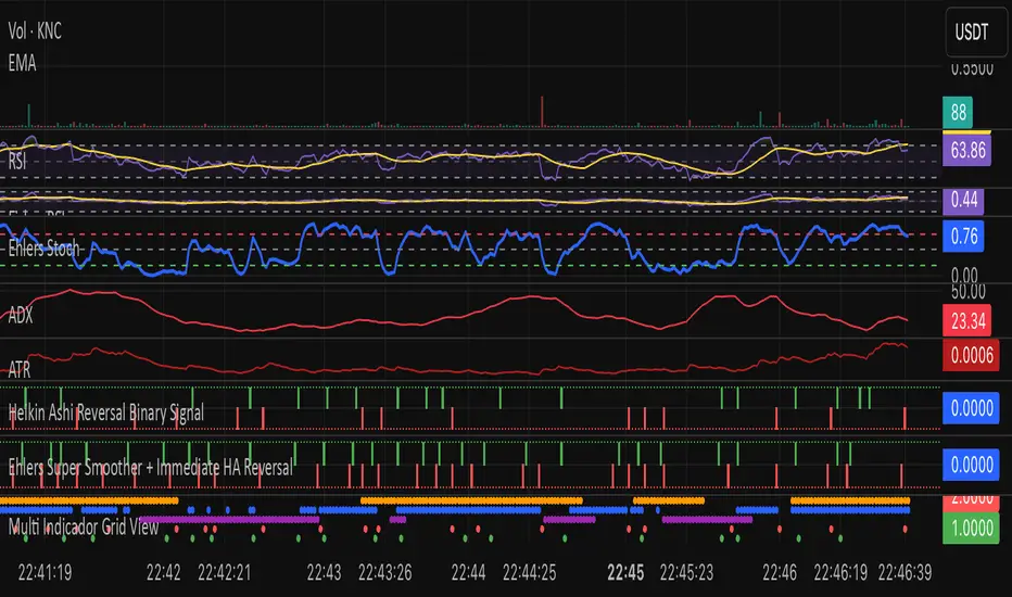
Ehlers Two-Pole StochasticThis indicator implements John Ehlers' Two-Pole Stochastic Filter, a smoother alternative to the traditional stochastic oscillator. Instead of relying on raw %K values, it applies a second-order IIR filter (recursive smoothing) to reduce noise and improve trend clarity.
It outputs a single line oscillating between 0 and 1, with less lag and false signals compared to standard stochastic implementations.
Key Features:
Uses a two-pole filter to smooth the normalized stochastic (%K).
Ideal for detecting clean reversals and trend continuations.
Designed for minimal visual noise and greater signal confidence.
Interpretation:
Values near 1.0 may suggest overbought conditions.
Values near 0.0 may suggest oversold conditions.
Crosses above 0.5 can signal bullish shifts, and below 0.5 bearish shifts.
Recommended Settings:
Default smoothing factor (alpha) is 0.7 — higher values make the output more responsive, while lower values smooth further.
Inspired by concepts from Cybernetic Analysis for Stocks and Futures by John F. Ehlers.
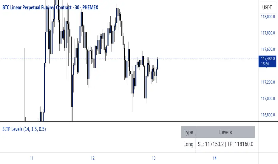
Dynamic SL/TP Levels (ATR or Fixed %)This indicator, "Dynamic SL/TP Levels (ATR or Fixed %)", is designed to help traders visualize potential stop loss (SL) and take profit (TP) levels for both long and short positions, refreshing dynamically on each new bar. It assumes entry at the current bar's close price and uses a fixed 1:2 risk-reward ratio (TP is twice the distance of SL in the profit direction). Levels are displayed in a compact table in the chart pane for easy reference, without cluttering the main chart with lines.
Key Features:
Calculation Modes:
ATR-Based (Dynamic): SL distance is derived from the Average True Range (ATR) multiplied by a user-defined factor (default 1.5x). This adapts to the asset's volatility, providing breathing room based on recent price movements.
Fixed Percentage: SL is set as a direct percentage of the current close price (default 0.5%), offering consistent gaps regardless of volatility.
Long and Short Support: Calculates and shows SL/TP for longs (SL below close, TP above) and shorts (SL above close, TP below), with toggles to hide/show each.
Real-Time Updates: Levels recalculate every bar, making them readily available for entry decisions in your trading system.
Display: Outputs to a table in the top-right pane, showing precise values formatted to the asset's tick size (e.g., full decimal places for crypto).
How to Use:
Add the indicator to your chart via TradingView's Pine Editor or library.
Adjust settings:
Toggle "Use ATR?" on/off to switch modes.
Set "ATR Length" (default 14) and "ATR Multiplier for SL" for dynamic mode.
Set "Fixed SL %" for percentage mode.
Enable/disable "Show Long Levels" or "Show Short Levels" as needed.
Interpret the table: Use the displayed SL/TP values when your strategy signals an entry. For risk management, combine with position sizing (e.g., risk 1% of account per trade based on SL distance).
Example: On a volatile asset like BTC, ATR mode might set a wider SL for realism; on stable pairs, fixed % ensures predictability.
This tool promotes disciplined trading by tying levels to price action or fixed rules, but it's not financial advice—always backtest and use with your full strategy. Feedback welcome!
Nadaraya,poly100,MA ribbon,volume nến,RSInadaraya
polynomial 100
volume nến
rsi break out 75,25
MA Ribbon

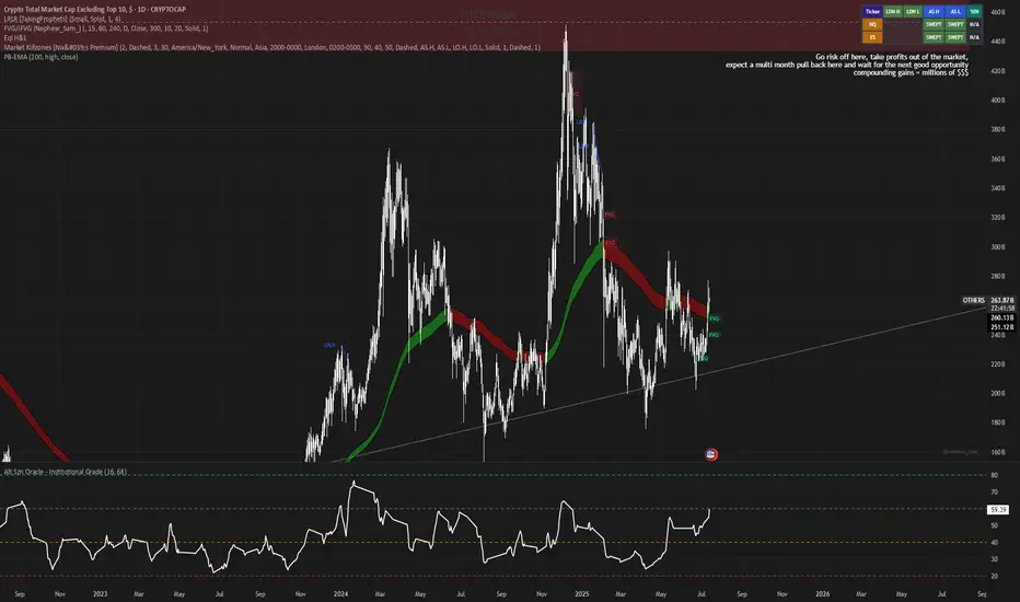
Alt Szn Oracle - Institutional GradeThe Alt Szn Oracle is a macro-level indicator built to help traders front-run altseason by tracking liquidity, dominance rotation, sentiment, and capital flows—all in one signal. It’s designed for those who don’t just chase pumps, but want to understand when the tide is turning and why. This tool doesn't predict specific coin breakouts—it tells you when the market as a whole is gearing up to rotate into higher beta assets like altcoins, including memes and microcaps.
The index consolidates ten macro inputs into a normalized, smoothed score from 0–100. These include Bitcoin and Ethereum dominance, ETH/BTC, altcoin market cap (Total3), relative volume flows, and stablecoin supply (USDT, USDC, DAI)—which act as proxies for risk-on appetite and dry powder entering the system. It also incorporates manually updated sentiment metrics from Google Trends and the Fear & Greed Index, giving it a behavioral edge that most indicators lack.
The logic is simple but powerful: when BTC dominance is falling, ETH/BTC is rising, altcoin volume increases relative to BTC/ETH, and stablecoins start moving—you're likely in the early innings of rotation. The index is also filtered through a volatility threshold and smoothed with an EMA to eliminate chop and fakeouts.
Use this indicator on macro charts like TOTAL3, TOTAL2, or ETHBTC to gauge market health, or overlay it on specific coins like PEPE, DOGE, or SOL to confirm if the tide is in your favor. Interpreting the score is straightforward: readings above 80 suggest euphoria and signal it’s time to de-risk, 60–80 indicates expansion and confirms altseason is underway, 40–60 is neutral, and 20–40 is a capitulation zone where smart money accumulates.
What sets this apart is that it doesn’t just track price—it reflects the flow of capital, the positioning of liquidity, and the sentiment of the crowd. Most altseason indicators are lagging, overfitted, or too simplistic. This one is modular, forward-looking, and grounded in real capital rotation theory.
If you're a trader who wants to time the cycle, not guess it, this is your tool. Refine it, fork it, or expand it to your niche—DeFi, NFTs, meme coins, or L1s. It’s a framework for reading the macro winds, not a signal service. Use it with discipline, and you’ll catch the wave while others drown in noise.
B/S signal + 3 EMA🎯 What does this indicator do?
This is an improved version of the previous signal indicator. It still looks for Buy/Sell moments, but now it also displays three moving averages (EMA) on the chart - 50, 100 and 200 periods. This helps to better understand the general trend and filter out false signals.
🔍 How does "B/S signal + 3 EMA" work
💡 Main goal:
Show market entry points taking into account:
Trend dynamics
Price volatility
Confirmation via exponential moving average (EMA)
🧱 Parts of the indicator
1. ATR Trailing Stop
This is like a "smart stop level" that follows the price.
Uses ATR (Average True Range) - a measure of volatility.
Calculates how far the price can deviate from the current level.
Sets a dynamic support/resistance level (called xATRTrailingStop).
If the price is above this level → bullish trend, if below → bearish .
📌 Imagine: it's like a rubber band under the price. When the price falls too much, the band breaks, and we get a signal about a possible change in direction.
2. Trend detection
The indicator monitors how the price crosses this ATR stop.
If the price crosses it from bottom to top → possible BUY signal.
If from top to bottom → possible SELL signal.
3. Confirmation via EMA(1)
To avoid false movements, an exponential moving average with a period of 1 is used (very sensitive).
Buy signal appears when:
Price is above ATR stop
EMA(1) crosses ATR stop from bottom to top
Sell signal appears when:
Price is below ATR stop
EMA(1) crosses ATR stop from top to bottom
📌 It's like a second voice: "Are you sure? Yeah, I can see that the price has started to move in the other direction."
4. Signals on the chart
Arrows appear on the chart:
🟢 Up — BUY signal
🔴 Down — SELL signal
5. Three EMAs added
Now the indicator also shows long-term trends.
EMA 50 — fast (thin line)
EMA 100 — medium (thicker)
EMA 200 — slow (thicker)
Colors:
EMA 50 — red
EMA 100 — green
EMA 200 — yellow
📌 These lines help to see the general trend:
If all three are directed upwards → bullish trend
If downwards → bearish
The intersection between them may indicate a trend reversal
📌 Example of work:
Let's say the price has been growing for a long time, the ATR stop is pulled up behind it. Then the price starts to fall and crosses the stop from the bottom up. At the same time, EMA(1) also crosses the stop from the bottom up.
👉 A BUY signal appears — a new uptrend may have begun.
Or vice versa: the price falls, crosses the stop from the top down, and so does the EMA.
👉 A SELL signal — a fall may have begun.
✅ Who is it useful for?
Traders who trade on the trend
Those who want automatic Buy/Sell signals
Those who like to use several moving averages in their strategy
--------------------------------------------------------------------------------------------------------------
🎯 Что делает этот индикатор?
Это улучшенная версия предыдущего сигнального индикатора. Он всё так же ищет моменты для покупки и продажи (Buy/Sell), но теперь ещё и отображает три скользящих средних (EMA) на графике — 50, 100 и 200 периодов. Это помогает лучше понимать общий тренд и фильтровать ложные сигналы.
🔍 Как работает "B/S signal + 3 EMA"
💡 Основная цель:
Показывать точки входа в рынок с учётом:
Трендовой динамики
Волатильности цены
Подтверждения через экспоненциальное скользящее среднее (EMA)
🧱 Части индикатора
1. ATR Trailing Stop
Это как "умный стоп-уровень", который следует за ценой.
Использует ATR (Average True Range) — меру волатильности.
Считает, насколько далеко цена может отклониться от текущего уровня.
Устанавливает динамический уровень поддержки/сопротивления (называется xATRTrailingStop).
Если цена выше этого уровня → бычий тренд , если ниже → медвежий .
📌 Представь: это как резиновый шнурок под ценой. Когда цена падает слишком сильно — шнурок рвётся, и мы получаем сигнал о возможном изменении направления.
2. Определение тренда
Индикатор следит за тем, как цена пересекает этот ATR-стоп.
Если цена пересекает его снизу вверх → возможный сигнал BUY.
Если сверху вниз → возможный сигнал SELL.
3. Подтверждение через EMA(1)
Чтобы не попадаться на ложные движения, используется экспоненциальное скользящее среднее с периодом 1 (очень чуткое).
Сигнал Buy появляется, когда:
Цена выше ATR-стопа
EMA(1) пересекает ATR-стоп снизу вверх
Сигнал Sell появляется, когда:
Цена ниже ATR-стопа
EMA(1) пересекает ATR-стоп сверху вниз
📌 Это как второй голос: «Ты уверен? Ага, я тоже вижу, что цена начала двигаться в другую сторону».
4. Сигналы на графике
На графике появляются стрелочки :
🟢 Вверх — сигнал BUY
🔴 Вниз — сигнал SELL
5. Добавлены три EMA
Теперь индикатор ещё и показывает долгосрочные тренды .
EMA 50 — быстрая (тонкая линия)
EMA 100 — средняя (потолще)
EMA 200 — медленная (самая толстая)
Цвета:
EMA 50 — красная
EMA 100 — зелёная
EMA 200 — жёлтая
📌 Эти линии помогают видеть общий тренд:
Если все три направлены вверх → бычий тренд
Если вниз → медвежий
Пересечение между ними может говорить о развороте тренда
📌 Пример работы:
Допустим, цена долго растёт, ATR-стоп подтягивается за ней. Затем цена начинает падать и пересекает стоп снизу вверх. При этом EMA(1) тоже пересекает стоп снизу вверх.
👉 Появляется сигнал BUY — возможно, начался новый восходящий тренд.
Или наоборот: цена падает, пересекает стоп сверху вниз, и EMA тоже.
👉 Сигнал SELL — возможно, начало падения.
✅ Для кого полезен?
Трейдерам, которые торгуют по тренду
Тем, кто хочет автоматические сигналы Buy/Sell
Тем, кто любит использовать несколько скользящих средних в своей стратегии

EMA Reclaim Alert - FVG StrategyThis script identifies momentum-based trend reclaims using two Exponential Moving Averages (EMAs), and plots entry, stop-loss, and take-profit levels for trade signals. It also highlights potential fakeouts.

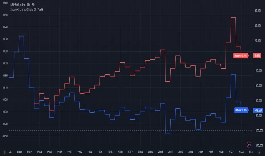
ShadowStats vs Official CPI YoY%This chart visualizes and compares the year-over-year (YoY) percentage change in the Consumer Price Index (CPI) as calculated by the U.S. government versus the alternative methodology used by ShadowStats, which reflects pre-1980 inflation measurement techniques. The red line represents ShadowStats' CPI YoY% estimates, while the blue line shows the official CPI YoY% reported by government sources. This side-by-side view highlights the divergence in reported inflation rates over time, particularly from the 1980s onward, offering a visual representation of how different calculation methods can lead to vastly different interpretations of inflation and purchasing power loss.
FGIHow it Works
The FGI uses two main conditions to determine fear and greed:
Fear Zone: This condition is met when the current price is significantly lower than its recent highest price, relative to its standard deviation. This suggests that the market may be experiencing a rapid decline, indicating fear among participants. When active, it plots a pink candlestick below the price bars.
Greed Zone: This condition is met when the inverse of the current price is significantly lower than the inverse of its recent highest price, also relative to its standard deviation. In simpler terms, this means the price is significantly higher than recent averages, suggesting excessive buying or greed. When active, it plots a green candlestick above the price bars.
Customizable Settings:
Source: You can choose the price data (e.g., ohlc4 which is the average of open, high, low, and close) the indicator uses for its calculations.
High Period: This setting determines the look-back period for calculating the highest price.
Stdev Period: This setting defines the period used for calculating the standard deviation.
Average Type: You can select whether the indicator uses a Weighted Moving Average (WMA) or a Simple Moving Average (SMA) for its internal calculations.
Show Alert Circle: This option allows you to display a small circle on the chart when a fear or greed condition is triggered.

Central Info Panel (DavidTacuriE) ✭
📌 "Central Info Panel" (DavidTacuriE) ★
Description:
This script displays a customizable panel on the chart with key trading information such as the asset symbol, current timeframe, date, and personalized motivational messages.
It's designed to help traders stay visually organized and mentally focused during trading sessions.
✦ Features:
- Motivational quote or custom message display.
- Symbol information: ticker, timeframe, and current date.
- Flexible positioning anywhere on the chart.
- Adjustable text size, color, and border visibility.
Developed by:
@DavidTacuriE

Dual MACD + TSI [CryptoSmart] by IgnotusA sophisticated dual momentum indicator combining a custom MACD Histogram with Divergence Detection and a TSI (True Strength Index) oscillator, designed for advanced technical analysis in crypto and other fast-moving markets.
---
🔍 Key Features:
- Custom MACD Histogram (MACD 1):
- Configurable fast/slow lengths and signal smoothing method (EMA/SMA).
- Advanced divergence detection (Regular & Hidden Bullish/Bearish patterns).
- Visual alerts and labels directly on the chart.
- Built-in divergence alerts for easy integration with TradingView alerts.
- TSI Oscillator (MACD 2):
- True Strength Index with customizable fast/slow periods and signal line smoothing.
- Overbought/oversold levels and optional background shading for quick visual cues.
- Fully optional elements (TSI Line, Signal Line, OB/OS levels) – disabled by default for clean charting.
- User-Friendly Design:
- Optional components can be toggled on/off via the settings panel.
- Works great as a standalone momentum filter or as part of a multi-indicator dashboard.
---
📈 How to Use:
- Use the MACD Histogram divergences to spot potential reversals.
- Combine with the TSI oscillator to confirm trend strength or detect overextended moves.
- Enable/disable components to avoid clutter and focus on what matters most.
---
Crafted for traders who want precision, flexibility, and visual clarity in their charts. Whether you're scalping or swing trading, this indicator helps you stay ahead of the curve.
---
Feel free to tweak the values and customize it to your strategy. Happy trading!
