TRIPLE TOPHello everyone
Today I want to share with you a figure of technical analysis called the TRIPLE TOP.
This figure occurs quite often and brings excellent profit.
What does it look like?
The figure looks like three maxima, approximately at the same level.
These peaks are formed because the buyers' forces are drying up and with each new peak, the bears are getting stronger.
Very often, the third peak will be higher than the previous two - this is the last gasp of buyers, before capitulation.
How to trade?
The main criterion is the formation of three peaks, after a strong uptrend.
After that, the price makes the last spurt (the third peak) and breaks through the support.
This breakout is the first possible entry point .
Often you will observe how the price makes a retest of the level, after which it turns down.
The second possible entry point will be this retest of the level.
To calculate the potential profit point , you need to measure the height from the minimum to the maximum of the vertices.
This value, plotted below the breakout, will be a potential profit point.
The stop loss is set above the maximum of the vertices.
Conclusion
The figure is very profitable and often found.
In addition, you can find a triple bottom on the chart, which trades in the same way as a triple top, only in the opposite direction.
Very often, after a triple top, a strong downtrend begins and holding a part of the position can bring big profits.
Traders, if you liked this idea or if you have your own opinion about it, write in the comments. I will be glad 👩
Harmonic Patterns

HOW-TO: Auto Harmonic Projections - Ultimate [Trendoscope]Have made this video to give brief demonstration on Auto Harmonic Projections. Hope you enjoy the video and the indicator. Please let me know if you have any questions.

HOW-TO: Manual Harmonic Patterns and ProjectionsHi All,
I have created this brief video to demonstrate how to use manual harmonic patterns and projections scripts.
Hope this is useful and please let me know your feedback :)

A well structured AB=CD patternLeg A and C had an identical structure where they both created internal AB=CD patterns. The best location for trade was the c point in which Fibo projection reached level 1

ready to jump Ascending Triangle: An ascending triangle is a breakout pattern that forms when the price breaches the upper horizontal trendline with rising volume. It is a bullish formation. The upper trendline must be horizontal, indicating nearly identical highs, which form a resistance level. The lower trendline is rising diagonally, indicating higher lows as buyers patiently step up their bids. Eventually, the buyers lose patience and rush into the security above the resistance price, which triggers more buying as the uptrend resumes. The upper trendline, which was formerly a resistance level, now becomes support.

ABC waveswhy kite crypto does this strategy, most of the trades are with low winrate but by adding conflence like divergence or levels we can easily make up the winrate, since we have low winrate always use proper risk management

Day or Swing Trading Avoid impulse Buying
To be successful in Market : Buy or Sell at price intervals {Buying all your available money at one price may cost you time and profit opportunity }
Before trading identify two key point that is lowest price and highest price of the candle or series of candles
Instead buying at highest point with all the allocated money Buy 20% quantity at the current price
Set the next buy order when the price corrects to 5% from the previous buy (% may vary based on the price value of the stock)
Repeat this cost averaging 5 to 10 times during the buy prices
In this way more quantity ,reasonable averaged price entry is possible
Set a target price ,Do not sell all the quantity at one price
Follow the ladder selling approach to maximize your returns
Mainly such standards helps avoids impulse buying ,Gives more Mind contro l ,Helps reducing emotional attack over a period of time.
A Rhythm is set in your mind not to panic by seeing the fluctuated volatility of the market ,Market goes up or down you will be cool to get your fish at right price

HEAD AND SHOUKDERS PATTERNWhile we get ready for the holidays we thought we would post some chart patterns for our newbies over the next few days.
The head and shoulders pattern is a formation of 3 peaks with the head being the highest peak (Lowest on inverse). The entry should be below the neckline (Above on inverse). The measure of take profit can be taken by measuring the peak of the head from neckline and using this range, as an indicator of the take profit level.
Please do give us a like, comment and follow to support us.
GoldViewFX
XAUUSD TOP AUTHOR

EURUSD REVERSAL / WKH I tried to show you in this example how price was manipulated on a intra-week basis, taking liquidity aka sell stop losses above weekly high and then reverse, to understand why there is manipulation just take a look at the volumes of the candles huge momentum after taking the buy side liquidity.
Try to understand the liquidity, if you dont see it you are it.

EURUSD, AUDUSD, AUDCAD, .... and More ALL WINS!!! Don't Lose. EURUSD, AUDUSD, AUDCAD, CADCHF, CADJPY, AUDCHF, EURAUD, EURCAD, EURNZD, EURGBP, GBPAUD.. ALL into profit. How did I pull this off? Harmonics. But not the same way you may have been taught. RSAI Blueprint Strategy allowed me to do it. All calls and no misses.

DESCENDING BROADENING WEDGEDescending broadening wedge happens during a downtrend. which in case of breaking the Resistance of the wedge it can bring in a good setup for a long on the asset.
Price makes a low and rises. We then track price as it rises away from the low. We are looking for lower highs and lower lows in a tight range.
The lower highs make a falling trendline, this forms the upper boundary to our pattern. The lower lows make a lower falling trendline, this forms the lower boundary to our pattern.
With the Descending Broadening Wedge formation, we are looking for two touches to each trendline.
Both the upper and lower trendlines should fall. The lower trend line should fall more steeply than the upper trendline thus forming the broadening wedge.

Win size matters - Irrespective of Market TrendWe provide daily technical analysis for educational purposes and real-time trading purposes only

Fibonacci Waves / Weak Market Hypotheses
On the above chart I investigated the relationship and continuation of 'waves' within the Fibonacci Circle. Due to its incredible success, I decided to look over it again.
On this chart I show very comparable formations (formation 1) (formation 2)
Formation 1 is contained within 0.786, while formation 2 extends through the 1 level
Applying the same Logic with the continuation through 2.618, the bars pattern placed is price inverted from previous move through 2.618
The Weak (form) Market Hypothesis suggests " that today’s stock prices reflect all the data of past prices and that no form of technical analysis can be effectively utilized to aid investors in making trading decisions."
I find this interestingly applicable to this scenario, with repeated formations, in repeating fib levels.

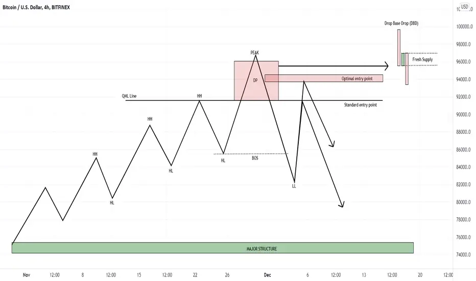
Quasidomo - A simple yet effective set-up (Reversal)Greetings my fellow traders, today we'll be talking about a set-up which I find, is often underused. A simple yet effective set-up that gives you extra confluences on your trend reversal trades - Quasimodo.
There are different kinds of Quasimodo entries that a trader can engage in, but today, we'll be talking about the trend reversal variation.
Structure movement : Price is trending, making higher highs and higher lows, before breaking structure to the downside after Peak is formed. We then have a Quasimodo line, defined as the last higher high before the Peak, which signals a possible trend reversal.
Entry : Set-up is commonly known to be entered directly at the QML line, placing stop losses right above the peak. But what I have found, in which I have back-tested and deem optimal, is to also look for possible entries in the whole DP(Decision Point) area as marked in the chart. There is a possibility price could present a stronger supply zone to enter from in the form of Drop base drops(DBD), or other formations like Wyckoff in lower timeframes, etc. The main point is to look for the ORIGIN of the move that supplied the downward move, causing the Break of Structure(BOS). Doing this makes yourself less vulnerable to liquidity grabs/stop-hunts, while greatly increasing your R:R.
Points to note : Stop losses should always be set at the Peak or a few pips above maximum as set-up is invalidated once Peak is broken.
: Set-up applies to ALL timeframes.
: Set-up is also invalidated if price breaks below MAJOR STRUCTURE after BOS.
That's all from me today, a little quick-guide to share. If you're interested in the other variations of Quasimodo set-ups, do let me know and show your support, I'll be happy to start a series of quick-guides for Quasimodo set-ups.
Like to support, comment/dm me if you have any questions!
As always, stay safe.
MARKET STRUCTURE 🗒🗒🗒I am not the best painter, but i tried to show you the difference between the structure that we have in every market. And it doesnt depend if its crypto/stocks or forex everything is the same in terms of structure.
Trade in the direction of the HTF MARKET STRUCTURE.
Do you want more examples like that ? Comment below ..

USDCAD LONGS EDUCATIONAL 📉📉📉Its not a trading signal, i will look to long only if pric will return back into bullish orderblocks + imbalances confirmed with a HTF bullish market structure. Thats a perfect setup that i wait when i enter trades, htf structure combined with smart money concepts for entries.
What do you think ? Comment below..

C & H pattern potential of 400 and above Hello everyone
Support with your Comment and like if you fund this Educational Article helpful.
What Is A Cup And Handle?
A cup and handle price pattern on a security's price chart is a technical indicator that resembles a cup with a handle, where the cup is in the shape of a "u" and the handle has a slight downward drift. The cup and handle is considered a bullish signal, with the right-hand side of the pattern typically experiencing lower trading volume. The pattern's formation may be as short as seven weeks or as long as 65 weeks.
KEY TAKEAWAYS
A cup and handle is a technical chart pattern that resembles a cup and handle where the cup is in the shape of a "u" and the handle has a slight downward drift.
A cup and handle is considered a bullish signal extending an uptrend, and is used to spot opportunities to go long.
Technical traders using this indicator should place a stop buy order slightly above the upper trendline of the handle part of the pattern.
It is worth considering the following when detecting cup and handle patterns:
Length: Generally, cups with longer and more "U" shaped bottoms provide a stronger signal. Avoid cups with a sharp "V" bottoms.
Depth: Ideally, the cup should not be overly deep. Avoid handles that are overly deep also, as handles should form in the top half of the cup pattern.
Volume: Volume should decrease as prices decline and remain lower than average in the base of the bowl; it should then increase when the stock begins to make its move higher, back up to test the previous high.
A retest of previous resistance is not required to touch or come within several ticks of the old high; however, the further the top of the handle is away from the highs, the more significant the breakout needs to be.
What Is a Cup and Handle?
A cup and handle is a technical indicator where the price movement of a security resembles a “cup” followed by a downward trending price pattern. This drop, or “handle” is meant to signal a buying opportunity to go long on a security. When this part of the price formation is over, the security may reverse course and reach new highs. Typically, cup and handle patterns fall between seven weeks to over a year.
Is a Cup and Handle Pattern Bullish?
As a general rule, cup and handle patterns are bullish price formations. Founder of the term, William O’Neil identified four primary stages of this technical trading pattern. First, approximately one to three months before the “cup” pattern begins, a security will reach a new high in an uptrend. Second, the security will retrace, dropping no more than 50% of the previous high creating a rounding bottom. Third, the security will rebound to its previous high, but subsequently decline, forming the “handle” part of the formation. Finally, the security breaks out again, surpassing its highs that are equal to the depth of the cup’s low point.
How Do You Find a Cup and Handle Pattern?
Consider a scenario where a stock has recently reached a high after significant momentum, but has since corrected, falling almost 50%. At this point, an investor may purchase the stock, anticipating that it will bounce back to previous levels. The stock then rebounds, testing the previous high resistance levels, after which it falls into a sideways trend. In the final leg of the pattern, the stock exceeds these resistance levels, soaring 50% above the previous high.
Investopedia .
Always Enter the market base on your Knowledge and decision.
Happy Trading

RISK ON vs RISK OFFI tried to show you in this example what is the difference between risk on and risk off, what financial instrumnets rise during times of finacial stress aka risk off and what instruments rise during time of financial optimism aka risk on.
RISK ON - is when investor are looking to multiply their money, they are looking for RISK. MORE RISK - MORE MONEY
RISK OFF - is when investors are looking to keep/save their money, they are looking to protect more than to RISK. MORE PROTECTION - LESS MONEY
P.S - Where do you think CRYPTOCURRENCY market goes? Into a RISK ON or RISK OFF financial instrument ? Comment below

DGATE CYPHER Formation(TP1) CD hareketinin 0.382 fibonacci düzeltme seviyesi, ikinci pozisyon kar alma noktası ise CD hareketinin 0.618 fibonacci seviyesidir. YTD.

USDJPY - Combination of Three Harmonic Pattern* Gartley Pattern
* Shark Pattern
* Butterfly Patern
The three patterns are inside the inverted symmetrical triangle pattern .
"TA is just a probabilistic analysis- not certainty. Everything is possible. The analysis just points to what is likely probable. TA is not 100% correct." - George Tan

how to find entry price to open position or spot tradinghello guys
i hope it can help a little but you have to analyse the chart in 1week then 1day and above time frames
then you can open it in 5min TF ..
its not easy and 100% true but it works:D
good luck

understand the CRYPTO market from the 10% view ditch retail PT 1here we have the total crypto market cap chart at first glance many will just see a "pull back or simply an engulfing. first thing retail will draw is try to call a random bottom without any price action to follow only hope or for the slightly advanced they will try to find some fib and use a random high to open. WRONG WRONG WRONG
looking at the rules from the chart the number one thing is that higher tf prices must and always come exactly or under an open this is law u can look on any time frame and draw a simple line from a wick and it will match up exactly or very close to a previous open balance of the given trend ! why is this ? because large funds or "they" must always pair orders. it is key to understand that large funds banks, prop firms, are naturally net long so the only way the can get in and out and keep good returns is by selling when retail buys, and buys with retail sells. and like mentioned before these buys or sells coming at a previous open. reason being " they are re-entering their original position to finish a move. or in a "pull back" scenario they are booking profits meaning that they are closing large orders automatically taking the other side of retail positions causing a dip in the market. this how wicks are formed
WICKS ARE NOT A REJECTIN OF PRICE! this will be explained shortly
lets think about the facts of the market and the conundrum retail logic has:
fact:1 90% OF RETAIL TRADERS LOSE MONEY
fact2: 80% of free content and 70% of courses are just teaching you the same recycled garbage "support & resistance " "supply & demand"(s&d zones is literally s&r with lipstick) harmonics, elliot wave, fibs, CANDLE STICK PATTERNS, TREND LINES or worst of all the "break out trader"
Now working off of these key 2 facts lets paint a picture of a world where 10% win and 90% lose
first let me preface this by saying that yes all of these pattern can be found on the chart but all of these patterns have one flaw they always leave a gap in understanding how price is delivered, and leaves traders to take mid probability guesses at the end of the day. this is not to say that money is not made off these concepts im simply pointing out the error in this approach to a market so lets dive in.
if 90% traders lose money and 70-80% of trading content are these retail concepts, then it is safe to assume that all traders are fundamentally trading the same patterns and if large a majority are trading the same patterns shouldn't that mean a larger percentage of traders make money? yes indeed but this is not the case for a number of reasons
REASON#1: these patterns are too simple and easy to trade any body can draw magical support and resistance lines. do you really think large fund traders are opening their charts and finding 3 wicks marking a line saying this is support and resistance ? i think not if trading was that simple and easy everyone would make money but once again we know this is not true.
REASON#2: these pattern dont give a real understanding of the market or how would large funds enter exit or book profits. at best s&R /s&D just gives you areas of accumulation, and cant tell you when price should move or even gives signs of price getting ready to move instead the trader is stuck on the side waiting for a "rejection" at a magical line they drew on there charts. how can you understand price from this logic. then for the times traders enter off of a "rejection" and lose that given trade their best reason behind why is that the s/r area just failed or "broke out" in the opposite direction. this lack of understanding/wishful thinking leaves traders to believe that the markets are random and price has no set rules. when this is simply not true. if price was random what will keep it from falling to zero or shooting to the sky at any given moment. there is always rules, structure , and control in every market.
REASON#3 : you cant gather accurate data based on a random outcome if i was to ask any trader what is the probability of there given support line OR the probability of a given candle stick pattern such as the a bull/ bear flag they couldnt answer this question. this a major issue without accurate info for your case study you cant improve on your strategy. you cant find high probability set ups. then we all know what happens after s/r isnt good enough because their lack of understanding ... INDIDCATORS
REASON #4: all retail logic is subjective with no hard set rules of how price should move or high probability outcomes of what price is expected to do
REASON #5 INDICATORS ARE LAGGING: most to all indicators are lagging indicators meaning they only print a result or show "divergence" after price has showed its hand so while retail has 10 different indicators because there logic doesnt help them predict the market or understand price action. they use lagging indicators that FOLLOWS AND PRINTS AFTER PRICE. how ironic is this , most people think that crypto is too volatile and random and you need indicators to help make decision or where price is headed this is simply false if you can see the set up in real time you will get the alert before any indicator. not to mentions 9/10 the traders given indicators doesnt always give the same signal. so what do you do when you have an price at support, macd alerting a sell, an evening star formed (BULLISH PATTERN) and a rsi saying overbought? see how this can be confusing and leave you with no clue what to do. even then what happens when price is showing you bullish behavior while all of your indicators are flashing sell, and you end up taking a sell to lose the trade because you believed in the holy grail indicator set up.
By now you should be able to see the huge problem with this approach to the market. so now lets explore my "theory" or approach to the market and see if i can correct all these problems WITH NO CONTRADICTIONS
1. the market is not random at all
if the market was random there would be no way to profit on a mechanical level
2. the market is a living creature.
3 just like humans the market has habits and rules it must follow to live
4. there is always somebody in control & THEYRE TOO BIG TO HIDE THEIR FOOT STEPS!
lets dig deeper before we start lets remember the natural law of polarity. if one thing is true then in turn the opposite must be true. simple if then statements should equate to one statement of truth with no contradictions. like mentioned previously there is no way a market can be random how in the world would hedge fund be able to offer a set rate of return in a random market. who would put such large sums of money in a casino like environment. with this understanding there should be key things or signs to give us a high probability in which way the market would move, and their is exactly that. (we will get to this in part two) So if the markets are not random then we should be able to see signs or repeatable patterns. this we know is true ie candle stick patterns. expanding on this belief this must also mean the market has habits just like any other living creature these habits easily identifiable once we look for them. next the market must follows rules to live this idea is backing of the thesis that markets are not random, in order for anything to survive it must have some type of discipline. Lastly their is always somebody in control and "they" are way to large to hide their footsteps. where is the proof for this??
ex#1 if you open any chart of your choosing on any time you and mark all wicks you will quickly realize that all wicks are exactly or very close to an previous open on that tf. this is most easily seen on higher timeframes (pt2 will show many examples) as stated in the beginning the reason behind this occurrence is that the people or algo thats moving price loves to get back in at previous opens of large moves or opens right before the " break out". if you take the time to go on your charts you will see its always been there. this is true for reversals as well but that wont be covered on this post for now im laying down the foundation. another reason for price to come back to previous opens is that this is the easiest way to pair orders and 9/10 at these key open levels retail will have limit orders making it easy for "them" to get out/ book profit.
ex#2 if you take a look you will see that crypto always move during london session with the low almost always coming in within 3:am then a pull back / reversal at 5:am to continue into ny open at 7/8 am if you open any chart you can clearly see the low or high of the day being set around 3 then some type pf pullback/ reversal to continue with original move at 7/8 am with the high/ low of 7/8 am NY SESION staying in tact for the rest of the day. also if the pull back didnt happen by 8 most likely at 9:00 am it will occur. now the reason is due to the natural way funds flow in any market london is the most liquid session so traders are able to move price then from 8-11 am is an overlap, which will give a reason for price to pull back/ reverse allowing ny traders to enter and also catch the move of the day. from there the next key time is 8:00 pm. you will notice price always does a fake out or run up in the opposite direction during these times. why ? to entice retail to think they are missing a move fomo in only profit for a little bit then loose it all at london open/ session . its key to note that if price is moving in the opposite way of the trend around 8/9 pm that is a sign of time divergence (will cover clearly in pt 2) , and also a continuation sign. the reason its a sign of time divergence is because large position traders are not in the market most traders around this time are not on their chart to move the market. large funds dont trade 24/7 dont be fooled by this move its just a trap and a easy way for "them" to entice you to take the opposite of "their" trades. to finish this point its a sign of continuation also for the simple fact that if price ran in the given trend all day there wouldnt be much room to take positions at good prices and price will leave the "market movers" which we know cant happen. with these two examples we can see 1 the predictability of the markets leaving randomness out, we can see the market happens, we can see how the markets rest just like any other creature, and lastly see how "they" control and leave footprints on the chart without most people even seeing it.
now i will like to explain what are wicks in relativity to how they are formed and also fits into this understanding. wicks are not REJECTIONS thats retail ignorance. going back to the fact that 90% lose money this must also mean that 10% of the winners HAVE 90% OF THE MONEY IN THE MARKET. this must be true if this doesnt make sense or you cant grasp this ask yourself if 90% of people loose money where is these funds going ? TO THE 10% very simple concept and if not the 10 % who else could possibly have the money ?? exactly ! so if the 10% have 90% of the money how cold price get "rejected" if there is no opposing force to reject price. do you really think that out of that small 10% of winners they would fight for price and reject each others orders when its alot easier to work together or take to the same trade ideas and take the larger percentage of traders money.
also remember for this rejection to happen this must mean an entity buying or selling at the wick (at price forming the wick in real time) and we know retail cant move price. i hope this is starting to make sense. this another reason why retail concepts doesnt work.
instead a wick is simply accumulations at premium prices and profit booking. picture this the 10 % opens a position at premium price in the form of a wick priofits 5,10 even 15% profit with a large position size at some point they want to book profits. so what happens they close orders at previous open of a move where there is liquidity resting, and when this happens their large positions automatically goes against the trend simply being because the size of their orders moves prices. so now if most or all of the 10% does this at the same time or close to the same time what will we see on a chart? a wick or even a huge wick, which retail will think its a rejection, some break out traders enter, some traders panic and close making it even easier for them to exit and cause more pressure in the wick formation. i hope you can start to see the real beauty of this market and understand how prices really moves. this is the foundation of my approach to the market i will probably do a 7 part series showing live examples previous examples and go in great detail to further prove my point
BACK to the charts if you look u can see a classic jefe bear pattern that just formed( will explain this pattern next lesson ) and the 3d/ and 1w open has not yet been reached showing signs of further downward movement REMEMBER ALL OPENS MUST GET HIT ALL ORDERS ,MUST BE PAIRED
now once the 3d open has been hit we can look for sign of reversal until the bears are in control
key take aways 3d open still not hit and 1d open are still not hit with 1w jefe playing out meaning market will follow 1w strucutre untill a open is met
WHATEVER TIMEFRAME U FIND OPENS BEING HIT OR ORDERS BEING PAIRED THEN 80-90% OF THE TIME THEY WILL TARGET OPEN BALANCES ON THAT TIME FRAME do dont get faked out by a wick and by now you should know how wicks work
IF you enjoyed this post make sure to like comment share amd follow for more updates . FOLLOW ME ON TWITTER @YEKUNA1

BA- Break out over the Breaks outsNYSE:BA
BA has already hit the target price range at lower time frame.
if you remember I posted yesterday an update about BA’s break out of its resistance and possible target price in the lower time frame “if you will open a NEW position”.
"TA is just a probabilistic analysis- not certainty. Everything is possible. The analysis just points to what is likely probable. TA is not 100% correct." - George Tan
Symmetrical Triangle Pattern
