Ascending Triangle Definition and TacticsHello my friend | Welcome Back.
Please support this idea with LIKE if you find it useful.
***
* The trendlines of a triangle need to run along at least two swing highs and two swing lows.
* Ascending triangles are considered a continuation pattern, as the price will typically breakout of the triangle in the price direction prevailing before the triangle. Although, this won't always occur. A breakout in any direction is noteworthy.
* A long trade is taken if the price breaks above the top of the pattern.
* A short trade is taken if the price breaks below the lower trendline.
* A stop loss is typically placed just outside the pattern on the opposite side from the breakout.
* A profit target is calculated by taking the height of the triangle, at its thickest point, and adding or subtracting that to/from the breakout point.
Thank you
Harmonic Patterns


ICHIMOKU AND RVI BEGINNERS PLAY BOOKNow ichimoku is relatively simple look for buys above the cloud and look for sells under the cloud. so when we backtest that over our 5/5 winners with rvi we get two less entrys, however as a beginner to avoid them whipsaw movements that isnt always a bad thing. The cloud itself offers dynamic support and resistance based of averages. price breaking through the cloud signals a breakout and a change in the trend usually. if new to trading I recommend learning about ichimoku on youtube, its not the all time great plan but if you have no plan its better than that. to keep discipline and entry requirements.

ICHIMOKU AND RVI BEGINNERS PLAY BOOKNow ichimoku is relatively simple look for buys above the cloud and look for sells under the cloud. so when we backtest that over our 5/5 winners with rvi we get two less entrys, however as a beginner to avoid them whipsaw movements that isnt always a bad thing. The cloud itself offers dynamic support and resistance based of averages. price breaking through the cloud signals a breakout and a change in the trend usually. if new to trading I recommend learning about ichimoku on youtube, its not the all time great plan but if you have no plan its better than that. to keep discipline and entry requirements.

Secret Indicator 100% Win For Free Educational Hello Trader's ♥
We Have Today Secret And Great Indicator Give You Signals With 100% Win Rate
conditions of Buy :
---------------------
1- Buy When The Price Arrive To Down Line Of Indicator
2- Buy When The Price Touch The Middle Line
!! If The Price Break Out Down Line Wait For Back And Close In Pattern And Buy To Middle Line
conditions of Sell :
---------------------
1- Sell When The Price Arrive To Upper Line Of Indicator
2- Sell When The Price Touch The Middle Line
!! If The Price Break Out Up Line Wait For Back And Close In Pattern And Sell To Middle Line
Sell When The Price Break Out Middle Line Down
Buy When The Price Break Out Middle Line Up
Stop Lose For Buy Down Up Line +50 Pips / Or Down Middle Line With 50Pips Take Profit +100
Stop Lose For Sell Up Down Line +50 Pips / Or Up Middle Line With 50Pips Take Profit +100
Risk 2 - 4 % For Any Trade
For More Explain Or Questions Tell Us In Comments
The Name Of Indicator : Bollinger Band + Rsi Strategy
Best Time Frames : 15M / 30M / 1 Hour / 4 Hours ----------


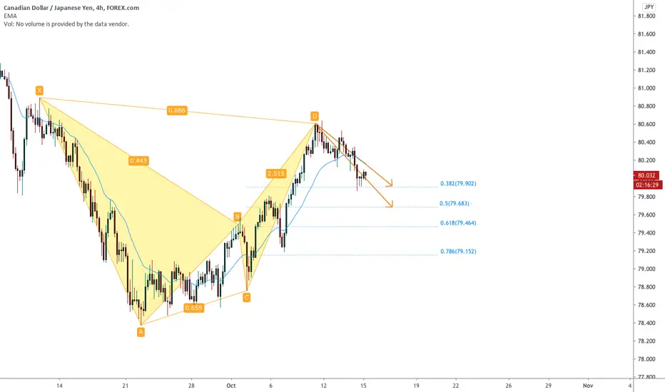
CADJPY Perfect BAT Harmonic Pattern 🦐🦇The Bat pattern is similar to the Gartley pattern in that it is a retracement and continuation pattern that occurs when a trend temporarily reverses its direction but then continues on its original course .
It gives you the opportunity to enter the market at a good price, just as the pattern ends and the trend resumes.
The Bat's main difference to the Gartley pattern is where it completes – at an 88.6% Fibonacci retracement of the X-A leg. Its inner retracements are also slightly different.
As with many patterns, there is a bullish and a bearish version of the Bat.
X-A
In its bullish version, the first leg forms when the price rises sharply from point X to point A. This is the pattern's longest leg.
A-B
The A-B leg then sees the price change direction and retrace 38.2% to 50% of the distance covered by the X-A leg.
Note that the A-B leg can never retrace beyond point X – if it does, the pattern is no longer valid.
B-C
In the B-C leg, the price changes direction again and moves back up, retracing anything from 38.2% to 88.6% of the distance covered by the A-B leg. If it retraces up beyond the high of point A, the pattern becomes invalid.
C-D
The C-D leg is the final and most important part of the pattern. As with the Gartley pattern, this is where the Bat pattern completes and you place your long (buy) trade at point D.
With the Bat pattern, however, you look to place your trade entry order at the point where the C-D leg has achieved an 88.6% retracement of the X-A leg. Ideally, point D should also represent a 161.8% to 261.8% extension of the B-C leg.
How to Find the Best Support and Resistance LevelsRISK DISCLAIMER
Information and opinions contained with this video are for educational purposes only and do not constitute trading recommendations. Trading Forex on margin carries a high level of risk and may not be suitable for all investors.

Trader Psychology, Money Management, managing risk Before we got the BIG 14 day correction I was doing EXTREMELY well in my trades (30 winning trades in a row over 30 days). My contract (work) ended the same day the correction started... This post is not about me, it is what I learned that might help others...
I also did OK shorting. I was buying SQQQ and SPXS as shorts and selling them the next day, along with a small long position, in case we went up. I changed my account to be able to trade Futures, out of an idea that I couldn't set STOPS with these ETFs, due to
what is called a "good faith violation" (if you buy an ETF you can't sell it the same day, without a daytrading violation).
Here are the BIGGGEST lessons. The first day I could trade futures I picked a Futures product that has too much leverage called ES1! in TV ( SPX $50/point) in a matter of seconds It was down $6,000. We might THINK that we will think clearly with a big loss.
We might think we will logically think, "I had better take a loss now before it get's worse" but when we are in a trade with a big loss (for us) FEAR set's in and the higher brain functions aren't available.... Our brain core is in control (animal instincts) flight or
fight, ideas like "I know I am right, it will come back", or we go into denial unwilling to accept a loss....
in reality A TRADE sometimes continue to run against us, no matter how good we are we all have losing trades When we have a big (for us) loss, we feel we must IMMEDIATELY get our money back. The reality is that Paper takes advantage of these irrational
feelings, we go into reaction mode, and LOSE more, and more.
So, now that it's clear to me that Futures really are dangerously leveraged... I pick in advance a predetermined loss that I can come back from... For example a single YM (DOW futures) contract at $5 per point with a 20 point stop $100... In advance I dedided
I will stop trading for the day if I have 2 losing trades in a row... The other key is letting your winners RUN... many new traders see a small win and grab the profit before it can run big (like an unmanaged loss does... In fact if you lose big it is proof that you can win biog too!
If you let your winners run.
So beginning on Monday I am going back to my beloved ETFs... TQQQ and SPXL for longs and SQQQ and SPXS for shorts... By buying both just before the market closes, one will go up in value between 9:30 and 10 AM, and as Mojo points out every day, the market usually, more
often than not will run the opposite direction between 10 AM and 10:30. This removes all the stress from trading... all you or I have to do is to sell the winner at 10 AM and dump the other one at 10;30 and we are free for the rest of the day, which is mostly chop anyway
the market can reverse many times a day, and the more we trade the more losing trades we can rack up... For me at least I always make the most from 9:30 to 10;30 if I keep trading I usually give it all back.
I hope this helps those new to trading. As for predictions I think we will probably go up on Monday until 10 AM or so, then reverse to around 10:30.
Another "Paper" strategy i want to point out I have observed is, quite often, Those who Own the Markets, whom I call Paper in chat (The Bilderbergs) take the market one direction from 9:30 to 9:35 or 9:40 then reverse, or reverse several times before picking a direction..
My advice is to be patient and not enter a trade until 9:40.
Good Luck Friends, Kauai Dave


RISK MANAGEMENT : Not more than 1%Many traders would have you believe that a certain trade or indicator is the best way to manage your risk in the Crypto market. But the truth is, the best risk management strategy, is self-discipline.
Specifically, as a trader, you must never risk more than 1% of your total capital on a single trade.
The main reason for this rule is to minimize capital losses in case of harsh market conditions.
By adhering to this rule, you would need to lose 100 trades in a row to wipe out your account. You could even implement stop loss orders to further minimize such losses. Trailing stop loss has proven itself to be the life saver.
Thus, if you risk 1%, you should set your profit goal on each successful trade to 1.5 – 2% or more. When making several trades a day, gaining a few percentage points each day is entirely possible, even if you only win half of your trades.
Trading is about preserving your capital as much as it is gaining profit. By controlling your losses, you can endure tough market conditions and be ready for profitable opportunities once they appear.


USDJPY Stop hunt move up and how to trade it (UPDATE)Hi Traders, thank you for watching my multi-timeframe analysis of this pair.
My trading strategy is based on the simplicity and core of the markets which is Buying and selling.
I'm trying to spot the next steps of the big players by using the Market profile, Volume and COT (commitment of traders)
The way I think about the markets is based on the fact that Market makers (banks, hedge funds)can do their operations only when other side (traders like you and me)
provide them liquidity = We must sell so they can buy and opposite. So I'm looking for the Stop loss zones, fake outs and other confluences to enter the markets.
My battlefield is defined by the channels on the higher timeframes, I mostly play on the upper bands and middle bands in the directions of the COT .'
I'm swing trading not intraday trading, so my ideas always takes a time and patience to play out and most important is to do the good risk management, se we can stay emotionless in a trades.
Don't hesitate to comment with any questions and if you learning something support this idea with like or share it in other trading forums.
Wish you good hunt !!
Dave FX Hunter
Previous analysis:
------------------------------------------------------------------------------------------------------------------------------------------------------------
Upgrade your trading view with my free indicators:
FX HUNTER WEALTH COT DATA - Click the script picture below and add it to your trading view
FX HUNTER COT CANDLE REPORT - - Click the script picture below and add it to your trading view

USDCHF why it didnt bounced as you expected? (UPDATE)Hi Traders, thank you for watching my multi-timeframe analysis of this pair.
My trading strategy is based on the simplicity and core of the markets which is Buying and selling.
I'm trying to spot the next steps of the big players by using the Market profile, Volume and COT (commitment of traders)
The way I think about the markets is based on the fact that Market makers (banks, hedge funds)can do their operations only when other side (traders like you and me)
provide them liquidity = We must sell so they can buy and opposite. So I'm looking for the Stop loss zones, fake outs and other confluences to enter the markets.
My battlefield is defined by the channels on the higher timeframes, I mostly play on the upper bands and middle bands in the directions of the COT .'
I'm swing trading not intraday trading, so my ideas always takes a time and patience to play out and most important is to do the good risk management, se we can stay emotionless in a trades.
Don't hesitate to comment with any questions and if you learning something support this idea with like or share it in other trading forums.
Wish you good hunt !!
Dave FX Hunter
Previous analysis:
------------------------------------------------------------------------------------------------------------------------------------------------------------
Upgrade your trading view with my free indicators:
FX HUNTER WEALTH COT DATA - Click the script picture below and add it to your trading view
FX HUNTER COT CANDLE REPORT - - Click the script picture below and add it to your trading view

Dollar index Accumulation phase (UPDATE)Hi Traders, thank you for watching my multi-timeframe analysis of this pair.
My trading strategy is based on the simplicity and core of the markets which is Buying and selling.
I'm trying to spot the next steps of the big players by using the Market profile, Volume and COT (commitment of traders)
The way I think about the markets is based on the fact that Market makers (banks, hedge funds)can do their operations only when other side (traders like you and me)
provide them liquidity = We must sell so they can buy and opposite. So I'm looking for the Stop loss zones, fake outs and other confluences to enter the markets.
My battlefield is defined by the channels on the higher timeframes, I mostly play on the upper bands and middle bands in the directions of the COT .'
I'm swing trading not intraday trading, so my ideas always takes a time and patience to play out and most important is to do the good risk management, se we can stay emotionless in a trades.
Don't hesitate to comment with any questions and if you learning something support this idea with like or share it in other trading forums.
Wish you good hunt !!
Dave FX Hunter
Previous analysis:
------------------------------------------------------------------------------------------------------------------------------------------------------------
Upgrade your trading view with my free indicators:
FX HUNTER WEALTH COT DATA - Click the script picture below and add it to your trading view
FX HUNTER COT CANDLE REPORT - - Click the script picture below and add it to your trading view


Classic Double Top, Bear Flag & 5-0 Pattern lined up all-in-one.Classic Double Top, Bear Flag & 5-0 Pattern lined up all-in-one. What could it signify? Am I just transposing an image onto a market that is not really a reflection of reality? Let's see.
Short NDUSD:
Reasons:
Classic Double Top, Bear Flag & 5-0 Pattern lined up together
volume confirmed the double top
Intermarket confirmation: It appears as though the US Dollar has found support and will rally: s3.amazonaws.com
Inside Bars on the 8 hour chart. Thus, expect a volatility expansion:
MACD Divergence
Do chart patterns work? Well, they certainly gives the trader a disciplined method for attacking the markets. Chart patterns can prevent the trader from overtrading. Certainly, if a chart pattern confirms something fundamental or if one believe it confirms something from sentiment or intermarket analysis, then go for it with proper risk management.

