Intraday Trading IndicatorIndicator Overview
Moving Averages: Uses a fast EMA (9-period) and a slow EMA (21-period) to determine the trend direction.
Market Profile Approximation: Utilizes VWAP (Volume Weighted Average Price) as a simplified proxy for value area, acting as a dynamic support/resistance level.
SMC: Incorporates the concept of trend confirmation and price interaction with key levels, focusing on pullbacks to the fast EMA within a trending market.
Signals: Generates buy and sell signals when price crosses the fast EMA, filtered by the trend (fast EMA vs. slow EMA) and VWAP position, aiming for high-probability setups.
This design ensures responsiveness on short timeframes while filtering out noise, aligning with the goal of accurate signals for intraday trading.
Chart patterns

Session + FVG + Order Blocks + EMAs1. Overall Purpose
This indicator combines four key functions into one pane to help you:
Highlight major market sessions (Asia, London, New York)
Plot Fair Value Gaps (FVG) and Order Blocks
Display up to four fully customizable Exponential Moving Averages (EMAs)
Shift all times via a configurable UTC offset
Together, these features let you see session activity zones, price imbalances, and underlying trend direction all at a glance.
2. Time Zone
Input: “Time Zone”
Set your chart’s UTC offset (e.g. “UTC+2”) so that each session box aligns with your local clock.
3. Market Sessions
Each session is drawn as a shaded rectangle labeled by name:
Session Default UTC Hours Color Toggle Visibility
Asia 00:00 – 08:15 Light blue fill ☑️ Show Asia session
London 09:00 – 12:00 Light green fill ☑️ Show London session
New York 14:30 – 18:00 Soft red fill ☑️ Show NY session
Enable or disable each session via its checkbox.
Adjust start/end times and the fill color for any session.
Border style and thickness are set in “Box Line Style” and “Box Line Thickness.”
4. Fair Value Gaps & Order Blocks
Controls for identifying imbalances and institutional zones:
Setting Description
Max Blocks Maximum number of gaps/order-blocks to display
Filter Gaps by % Only show gaps larger than this percentage
Lookback Bars How many bars back to scan for gaps and blocks
Bullish OB/FVG Color Fill color for bullish blocks & gaps
Bearish OB/FVG Color Fill color for bearish blocks & gaps
Show Fair Value Gaps Toggle visibility of FVG rectangles
Show Order Blocks Toggle visibility of Order Block rectangles
Fair Value Gaps mark small untraded price areas.
Order Blocks highlight previous zones of major buying or selling.
5. EMAs (Exponential Moving Averages)
Up to four EMAs can be displayed independently:
EMA Enable? Length (periods) Color
EMA 1 ☑️ Show EMA 1 20 Orange
EMA 2 ☑️ Show EMA 2 50 Blue
EMA 3 ☑️ Show EMA 3 100 Green
EMA 4 ☑️ Show EMA 4 200 Red
Tick the box to plot an EMA on your chart.
Change its length to match your strategy’s lookback.
Pick a color that stands out against your background.
6. Recommended Workflow
Set your Time Zone so session boxes align with your local trading hours.
Enable only the sessions you trade (e.g. deselect Asia if you focus on London & NY).
Tweak FVG/Order Block parameters:
Adjust Lookback Bars and Filter Gaps by % to fine-tune the number of zones.
Customize your EMAs (periods and colors) to suit your trend-following or mean-reversion approach.
Combine the layers: watch how price behaves within session boxes, around FVG/Order Blocks, and relative to your EMAs to plan entries and exits.

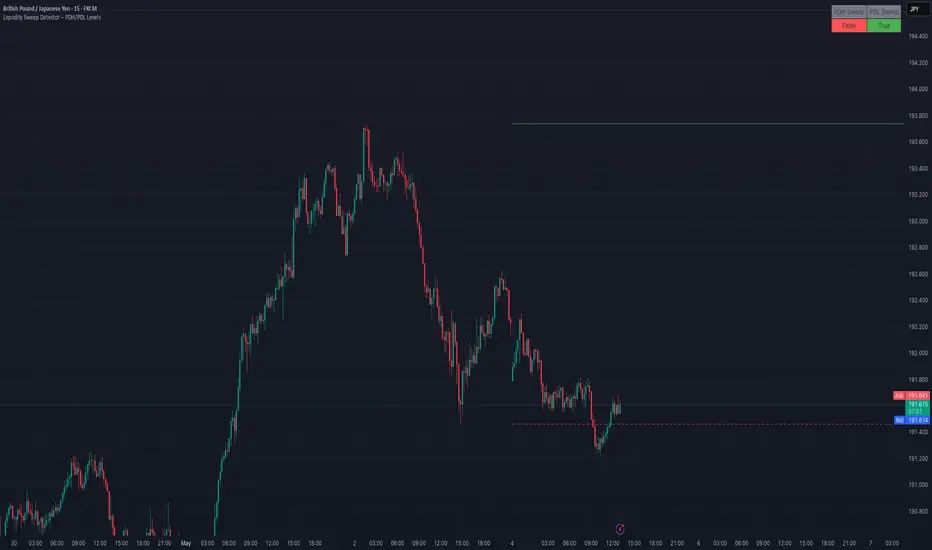
Liquidity Sweep Detector – PDH/PDL LevelsPrevious Day High/Low Liquidity Sweep Detector (Intraday Accurate)
This indicator tracks the previous day's high and low using intraday data, rather than the daily candle, ensuring precise sweep detection across lower timeframes (15m to 4H).
It monitors for liquidity sweeps—moments when price briefly moves above the previous high or below the previous low—and visually marks these events on the chart.
Key Features
Intraday-accurate PDH/PDL tracking
Real-time sweep detection
On-chart labels marking sweep events
Toggleable table showing sweep status
Alert conditions for PDH/PDL sweep triggers
Best For
Traders who use Smart Money Concepts (SMC), liquidity-based strategies, or look for stop hunts and reversal zones tied to key prior-day levels.
Works well across FX, crypto, and indices on 15m, 1H, and 4H charts.
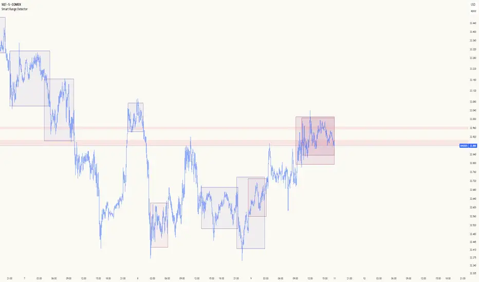
Smart Range DetectorSmart Range Detector
What It Does
This indicator automatically detects and validates significant trading ranges using pivot point analysis combined with logarithmic fibonacci relationships. It operates by identifying specific pivot patterns (High-Low-High and Low-High-Low) that meet fibonacci validation criteria to filter out noise and highlight only the most reliable trading ranges. Each range is continuously monitored for potential mitigation (breakout) events.
Key Features
Identifies both High-Low-High and Low-High-Low range patterns
Validates each range using logarithmic fibonacci relationships (more accurate than linear fibs)
Detects range mitigations (breakouts) and visually differentiates them
Shows fibonacci levels within ranges (25%, 50%, 75%) for potential reversal points
Visualizes extension levels beyond ranges for breakout targets
Analyzes volume profile with customizable price divisions (default: 60)
Displays Point of Control (POC) and Value Area for traded volume analysis
Implements performance optimization with configurable range limits
Includes user-adjustable safety checks to prevent Pine Script limitations
Offers fully customizable colors, line widths, and transparency settings
How To Use It
Identify Valid Ranges : The indicator automatically detects and highlights trading ranges that meet fibonacci validation criteria
Monitor Fibonacci Levels : Watch for price reactions at internal fib levels (25%, 50%, 75%) for potential reversal opportunities
Track Extension Targets : Use the extension lines as potential targets when price breaks out of a range
Analyze Volume Structure : Enable the volume profile mode to see where most volume was traded within mitigated ranges
Trade Range Boundaries : Look for reactions at range highs/lows combined with volume POC for higher probability entries
Manage Performance : Adjust the maximum displayed ranges and history bars settings for optimal chart performance
Settings Guide
Left/Right Bars Look Back : Controls how far back the indicator looks to identify pivot points (higher values find more ranges but may reduce sensitivity)
Max History Bars : Limits how far back in history the indicator will analyze (stays within Pine Script's 10,000 bar limitation)
Max Ranges to Display : Restricts the total number of ranges kept in memory for improved performance (1-50)
Volume Profile : When enabled, shows volume distribution analysis for mitigated ranges
Volume Profile Divisions : Controls the granularity of the volume analysis (higher values show more detail)
Display Options : Toggle visibility of range lines, fibonacci levels, extension lines, and volume analysis elements
Transparency & Color Settings : Fully customize the visual appearance of all indicator elements
Line Width Settings : Adjust the thickness of lines for better visibility on different timeframes
Technical Details
The indicator uses logarithmic fibonacci calculations for more accurate price relationships
Volume profile analysis creates 60 price divisions by default (adjustable) for detailed volume distribution
All timestamps are properly converted to work with Pine Script's bar limitations
Safety checks prevent "array index out of bounds" errors that plague many complex indicators
Time-based coordinates are used instead of bar indices to prevent "bar index too far" errors
This indicator works well on all timeframes and instruments, but performs best on 5-minute to daily charts. Perfect for swing traders, range traders, and breakout strategists.
What Makes It Different
Most range indicators simply draw boxes based on recent highs and lows. Smart Range Detector validates each potential range using proven fibonacci relationships to filter out noise. It then adds sophisticated volume analysis to help traders identify the most significant price levels within each range. The performance optimization features ensure smooth operation even on lower timeframes and extended history analysis.
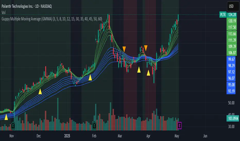
Guppy Multiple Moving Average (GMMA)The GMMA Momentum Indicator plots 12 EMAs on your chart, divided into two groups:
Short-term EMAs (6 lines, default periods: 3, 5, 8, 10, 12, 15): Represent short-term trader sentiment and momentum.
Long-term EMAs (6 lines, default periods: 30, 35, 40, 45, 50, 60): Reflect long-term investor behavior and broader market trends.
By analyzing the interaction between these two groups, the indicator identifies:
Bullish and bearish trends based on the relative positions of the short- and long-term EMAs.
Momentum strength through the spread or convergence of the EMAs.
Potential reversals or breakouts via compression signals.
This PineScript version enhances the traditional GMMA by adding visual cues like background colors, bearish signals, and compression detection, making it ideal for swing traders seeking clear, actionable insights.
The GMMA Momentum Indicator provides several key features:
1. Trend Identification
Bullish Trend: When the short-term EMAs (green lines) are above the long-term EMAs (blue lines) and spreading apart, it signals strong upward momentum. The chart background turns light green to highlight this condition.
Bearish Trend: When the short-term EMAs cross below the long-term EMAs and converge, it indicates downward momentum. The background turns light red, and an orange downward triangle appears above the bar to mark a new bearish signal.
2. Momentum Analysis
The spread between the short-term EMAs reflects the strength of short-term momentum. A wide spread suggests strong momentum, while a tight grouping indicates weakening momentum or consolidation. Similarly, the long-term EMAs act as dynamic support or resistance, guiding traders on the broader trend.
3. Compression Detection
Compression occurs when both the short-term and long-term EMAs converge, signaling low volatility and a potential breakout or reversal. A yellow upward triangle appears below the bar when compression is detected, alerting traders to watch for price action.
4. Visual Cues
Green short-term EMAs: Show short-term trader activity.
Blue long-term EMAs: Represent long-term investor sentiment.
Background colors: Light green for bullish trends, light red for bearish trends, and transparent for neutral conditions.
Orange downward triangles: Mark new bearish trends.
Yellow upward triangles: Indicate compression, hinting at potential breakouts.
How to Use the GMMA Momentum Indicator for Swing Trading
Swing trading involves capturing price moves over days to weeks, and the GMMA Momentum Indicator is an excellent tool for this strategy. Here’s how to use it effectively:
1. Identifying Trade Entries
Buy Opportunities:
Look for a bullish trend (green background) where the short-term EMAs are above the long-term EMAs and spreading apart, indicating strong momentum.
A compression signal (yellow triangle) followed by a breakout above resistance or a bullish candlestick pattern can confirm an entry.
Example: On a daily chart, if the short-term EMAs cross above the long-term EMAs and the background turns green, consider entering a long position, especially if volume supports the move.
Sell Opportunities:
Watch for a bearish signal (orange downward triangle) or a bearish trend (red background) where the short-term EMAs cross below the long-term EMAs.
Example: If the short-term EMAs collapse below the long-term EMAs and an orange triangle appears, it may signal a shorting opportunity or a time to exit longs.
2. Managing Trades
Use the long-term EMAs as dynamic support (in uptrends) or resistance (in downtrends) to set stop-loss levels or trail stops.
Monitor the spread of the short-term EMAs. A widening spread suggests the trend is strong, while convergence may indicate it’s time to take profits or tighten stops.
3. Anticipating Reversals
Compression signals (yellow triangles) highlight periods of low volatility, often preceding significant price moves. Combine these with price action (e.g., breakouts or reversals) or other indicators (e.g., RSI or volume) for confirmation.
Example: If a compression signal appears near a key support level and the price breaks upward, it could signal the start of a new bullish swing.
4. Best Practices
Timeframes: The indicator works well on daily or 4-hour charts for swing trading, but you can adjust the EMA periods for shorter (e.g., 1-hour) or longer (e.g., weekly) timeframes.
Confirmation: Combine the GMMA with other tools like support/resistance levels, candlestick patterns, or oscillators (e.g., MACD) to reduce false signals.
Risk Management: Always use proper position sizing and stop-losses, as EMAs are lagging indicators and may produce delayed signals in choppy markets.
EMA Cross w/ RSI & Volume Spike (Full Setup)📈 EMA Cross w/ RSI & Volume Spike (Full Setup)
This custom indicator is designed for traders seeking precise buy/sell signals based on a powerful combination of Exponential Moving Averages (EMAs), RSI, and Volume Spikes. It is optimized for both spot and futures trading, especially effective on lower timeframes (like 5m–15m) and swing trading charts.
🔧 Key Features
✅ EMA Stack – Includes 6 EMAs:
Short-Term: EMA 9, 21
Mid-Term: EMA 26, 50
Long-Term: EMA 100, 200
✅ Cross Alerts –
BUY signals: When faster EMAs cross above slower EMAs
SELL signals: When faster EMAs cross below slower EMAs
Covers short-, mid-, and long-term crossovers
✅ Confluence Signals –
BUY+ / SELL+ signals trigger only when an EMA cross is confirmed by:
• RSI (Relative Strength Index) confirmation
• Volume spike above 1.5× 20-period volume average
✅ Visual Markers on Chart –
📗 BUY – Basic EMA cross up
📘 BUY+ – EMA cross + RSI > 50 + volume spike
📕 SELL – Basic EMA cross down
🟧 SELL+ – EMA cross + RSI < 50 + volume spike
✅ Built-in Alerts –
All signal types (BUY, SELL, BUY+, SELL+) can be used with TradingView alerts.
🧠 Best Use Case
This indicator is perfect for:
Scalping (5m / 15m charts)
Spot trading pullbacks
Futures momentum breakouts
Identifying early trend shifts or confirmations

Time-Based Fair Value Gaps (FVG) with Inversions (iFVG)Overview
The Time-Based Fair Value Gaps (FVG) with Inversions (iFVG) (ICT/SMT) indicator is a specialized tool designed for traders using Inner Circle Trader (ICT) methodologies. Inspired by LuxAlgo's Fair Value Gap indicator, this script introduces significant enhancements by integrating ICT principles, focusing on precise time-based FVG detection, inversion tracking, and retest signals tailored for institutional trading strategies. Unlike LuxAlgo’s general FVG approach, this indicator filters FVGs within customizable 10-minute windows aligned with ICT’s macro timeframes and incorporates ICT-specific concepts like mitigation, liquidity grabs, and session-based gap prioritization.
This tool is optimized for 1–5 minute charts, though probably best for 1 minute charts, identifying bullish and bearish FVGs, tracking their mitigation into inverted FVGs (iFVGs) as key support/resistance zones, and generating retest signals with customizable “Close” or “Wick” confirmation. Features like ATR-based filtering, optional FVG labels, mitigation removal, and session-specific FVG detection (e.g., first FVG in AM/PM sessions) make it a powerful tool for ICT traders.
Originality and Improvements
While inspired by LuxAlgo’s FVG indicator (credit to LuxAlgo for their foundational work), this script significantly extends the original concept by:
1. Time-Based FVG Detection: Unlike LuxAlgo’s continuous FVG identification, this script filters FVGs within user-defined 10-minute windows each hour (:00–:10, :10–:20, etc.), aligning with ICT’s emphasis on specific periods of institutional activity, such as hourly opens/closes or kill zones (e.g., New York 7:00–11:00 AM EST). This ensures FVGs are relevant to high-probability ICT setups.
2. Session-Specific First FVG Option: A unique feature allows traders to display only the first FVG in ICT-defined AM (9:30–10:00 AM EST) or PM (1:30–2:00 PM EST) sessions, reflecting ICT’s focus on initial market imbalances during key liquidity events.
3. ICT-Driven Mitigation and Inversion Logic: The script tracks FVG mitigation (when price closes through a gap) and converts mitigated FVGs into iFVGs, which serve as ICT-style support/resistance zones. This aligns with ICT’s view that mitigated gaps become critical reversal points, unlike LuxAlgo’s simpler gap display.
4. Customizable Retest Signals: Retest signals for iFVGs are configurable for “Close” (conservative, requiring candle body confirmation) or “Wick” (faster, using highs/lows), catering to ICT traders’ need for precise entry timing during liquidity grabs or Judas swings.
5. ATR Filtering and Mitigation Removal: An optional ATR filter ensures only significant FVGs are displayed, reducing noise, while mitigation removal declutters the chart by removing filled gaps, aligning with ICT’s principle that mitigated gaps lose relevance unless inverted.
6. Timezone and Timeframe Safeguards: A timezone offset setting aligns FVG detection with EST for ICT’s New York-centric strategies, and a timeframe warning alerts users to avoid ≥1-hour charts, ensuring accuracy in time-based filtering.
These enhancements make the script a distinct tool that builds on LuxAlgo’s foundation while offering ICT traders a tailored, high-precision solution.
How It Works
FVG Detection
FVGs are identified when a candle’s low is higher than the high of two candles prior (bullish FVG) or a candle’s high is lower than the low of two candles prior (bearish FVG). Detection is restricted to:
• User-selected 10-minute windows (e.g., :00–:10, :50–:60) to capture ICT-relevant periods like hourly transitions.
• AM/PM session first FVGs (if enabled), focusing on 9:30–10:00 AM or 1:30–2:00 PM EST for key market opens.
An optional ATR filter (default: 0.25× ATR) ensures only gaps larger than the threshold are displayed, prioritizing significant imbalances.
Mitigation and Inversion
When price closes through an FVG (e.g., below a bullish FVG’s bottom), the FVG is mitigated and becomes an iFVG, plotted as a support/resistance zone. iFVGs are critical in ICT for identifying reversal points where institutional orders accumulate.
Retest Signals
The script generates signals when price retests an iFVG:
• Close: Triggers when the candle body confirms the retest (conservative, lower noise).
• Wick: Triggers when the candle’s high/low touches the iFVG (faster, higher sensitivity). Signals are visualized with triangular markers (▲ for bullish, ▼ for bearish) and can trigger alerts.
Visualization
• FVGs: Displayed as colored boxes (green for bullish, red for bearish) with optional “Bull FVG”/“Bear FVG” labels.
• iFVGs: Shown as extended boxes with dashed midlines, limited to the user-defined number of recent zones (default: 5).
• Mitigation Removal: Mitigated FVGs/iFVGs are removed (if enabled) to keep the chart clean.
How to Use
Recommended Settings
• Timeframe: Use 1–5 minute charts for precision, avoiding ≥1-hour timeframes (a warning label appears if misconfigured).
• Time Windows: Enable :00–:10 and :50–:60 for hourly open/close FVGs, or use the “Show only 1st presented FVG” option for AM/PM session focus.
• ATR Filter: Keep enabled (multiplier 0.25–0.5) for significant gaps; disable on 1-minute charts for more FVGs during volatility.
• Signal Preference: Use “Close” for conservative entries, “Wick” for aggressive setups.
• Timezone Offset: Set to -5 for EST (or -4 for EDT) to align with ICT’s New York session.
Trading Strategy
1. Macro Timeframes: Focus on New York (7:00–11:00 AM EST) or London (2:00–5:00 AM EST) kill zones for high institutional activity.
2. FVG Entries: Trade bullish FVGs as support in uptrends or bearish FVGs as resistance in downtrends, especially in :00–:10 or :50–:60 windows.
3. iFVG Retests: Enter on retest signals (▲/▼) during liquidity grabs or Judas swings, using “Close” for confirmation or “Wick” for speed.
4. Session FVGs: Use the “Show only 1st presented FVG” option to target the first gap in AM/PM sessions, often tied to ICT’s market maker algorithms.
5. Risk Management: Combine with ICT concepts like order blocks or breaker blocks for confluence, and set stops beyond FVG/iFVG boundaries.
Alerts
Set alerts for:
• “Bullish FVG Detected”/“Bearish FVG Detected”: New FVGs in selected windows.
• “Bullish Signal”/“Bearish Signal”: iFVG retest confirmations.
Settings Description
• Show Last (1–100, default: 5): Number of recent iFVGs to display. Lower values reduce clutter.
• Show only 1st presented FVG : Limits FVGs to the first in 9:30–10:00 AM or 1:30–2:00 PM EST sessions (overrides time window checkboxes).
• Time Window Checkboxes: Enable/disable FVG detection in 10-minute windows (:00–:10, :10–:20, etc.). All enabled by default.
• Signal Preference: “Close” (default) or “Wick” for iFVG retest signals.
• Use ATR Filter: Enables ATR-based size filtering (default: true).
• ATR Multiplier (0–∞, default: 0.25): Sets FVG size threshold (higher values = larger gaps).
• Remove Mitigated FVGs: Removes filled FVGs/iFVGs (default: true).
• Show FVG Labels: Displays “Bull FVG”/“Bear FVG” labels (default: true).
• Timezone Offset (-12 to 12, default: -5): Aligns time windows with EST.
• Colors: Customize bullish (green), bearish (red), and midline (gray) colors.
Why Use This Indicator?
This indicator empowers ICT traders with a tool that goes beyond generic FVG detection, offering precise, time-filtered gaps and inversion tracking aligned with institutional trading principles. By focusing on ICT’s macro timeframes, session-specific imbalances, and customizable signal logic, it provides a clear edge for scalping, swing trading, or reversal setups in high-liquidity markets.

Pivot Candle PatternsPivot Candle Patterns Indicator
Overview
The PivotCandlePatterns indicator is a sophisticated trading tool that identifies high-probability candlestick patterns at market pivot points. By combining Williams fractals pivot detection with advanced candlestick pattern recognition, this indicator targets the specific patterns that statistically show the highest likelihood of signaling reversals at market tops and bottoms.
Scientific Foundation
The indicator is built on extensive statistical analysis of historical price data using a 42-period Williams fractal lookback period. Our research analyzed which candlestick patterns most frequently appear at genuine market reversal points, quantifying their occurrence rates and subsequent success in predicting reversals.
Key Research Findings:
At Market Tops (Pivot Highs):
- Three White Soldiers: 28.3% occurrence rate
- Spinning Tops: 13.9% occurrence rate
- Inverted Hammers: 11.7% occurrence rate
At Market Bottoms (Pivot Lows):
- Three Black Crows: 28.4% occurrence rate
- Hammers: 13.3% occurrence rate
- Spinning Tops: 13.1% occurrence rate
How It Works
1. Pivot Point Detection
The indicator uses a non-repainting implementation of Williams fractals to identify potential market turning points:
- A pivot high is confirmed when the middle candle's high is higher than surrounding candles within the lookback period
- A pivot low is confirmed when the middle candle's low is lower than surrounding candles within the lookback period
- The default lookback period is 2 candles (user adjustable from 1-10)
2. Candlestick Pattern Recognition
At identified pivot points, the indicator analyzes candle properties using these parameters:
- Body percentage threshold for Spinning Tops: 40% (adjustable from 10-60%)
- Shadow percentage threshold for Hammer patterns: 60% (adjustable from 40-80%)
- Maximum upper shadow for Hammer: 10% (adjustable from 5-20%)
- Maximum lower shadow for Inverted Hammer: 10% (adjustable from 5-20%)
3. Pattern Definitions
The indicator recognizes these specific patterns:
Single-Candle Patterns:
- Spinning Top : Small body (< 40% of total range) with significant upper and lower shadows (> 25% each)
- Hammer : Small body (< 40%), very long lower shadow (> 60%), minimal upper shadow (< 10%), closing price above opening price
- Inverted Hammer : Small body (< 40%), very long upper shadow (> 60%), minimal lower shadow (< 10%)
Multi-Candle Patterns:
- Three White Soldiers : Three consecutive bullish candles, each closing higher than the previous, with each open within the previous candle's body
- Three Black Crows : Three consecutive bearish candles, each closing lower than the previous, with each open within the previous candle's body
4. Visual Representation
The indicator provides multiple visualization options:
- Highlighted candle backgrounds for pattern identification
- Text or dot labels showing pattern names and success rates
- Customizable colors for different pattern types
- Real-time alert functionality on pattern detection
- Information dashboard displaying pattern statistics
Why It Works
1. Statistical Edge
Unlike traditional candlestick pattern indicators that simply identify patterns regardless of context, PivotCandlePatterns focuses exclusively on patterns occurring at statistical pivot points, dramatically increasing signal quality.
2. Non-Repainting Design
The pivot detection algorithm only uses confirmed data, ensuring the indicator doesn't repaint or provide false signals that disappear on subsequent candles.
3. Complementary Pattern Selection
The selected patterns have both:
- Statistical significance (high frequency at pivots)
- Logical market psychology (reflecting institutional supply/demand changes)
For example, Three White Soldiers at a pivot high suggests excessive bullish sentiment reaching exhaustion, while Hammers at pivot lows indicate rejection of lower prices and potential buying pressure.
Practical Applications
1. Reversal Trading
The primary use is identifying potential market reversals with statistical probability metrics. Higher percentage patterns (like Three White Soldiers at 28.3%) warrant more attention than lower probability patterns.
2. Confirmation Tool
The indicator works well when combined with other technical analysis methods:
- Support/resistance levels
- Trend line breaks
- Divergences on oscillators
- Volume analysis
3. Risk Management
The built-in success rate metrics help traders properly size positions based on historical pattern reliability. The displayed percentages reflect the probability of the pattern successfully predicting a reversal.
Optimized Settings
Based on extensive testing, the default parameters (Body: 40%, Shadow: 60%, Shadow Maximums: 10%, Lookback: 2) provide the optimal balance between:
- Signal frequency
- False positive reduction
- Early entry opportunities
- Pattern clarity
Users can adjust these parameters based on their timeframe and trading style, but the defaults represent the statistically optimal configuration.
Complementary Research: Reclaim Analysis
Additional research on "reclaim" scenarios (where price briefly breaks a level before returning) showed:
- Fast reclaims (1-2 candles) have 70-90% success rates
- Reclaims with increasing volume have 53.1% success rate vs. decreasing volume at 22.6%
This complementary research reinforces the importance of candle patterns and timing at critical market levels.

Multi Year BreakoutWhat the Script Does (Simple Summary)
Name: It's called "Multi Year Breakout" (or MYBO for short) and shows up right on your main price chart.
Settings You Control: You can easily change settings like:
How many months or years back the script should look to find the important old highest price and lowest price.
How many months back it should look for the recent highest price.
Whether you want to see the lines drawn on the chart for these highs and lows.
The color, thickness, and style (solid, dashed, dotted) of the lines.
An optional info box showing the price levels, where it appears, and the text size.
What it Calculates: It finds the exact price for the highest high in the "older" period you set, the highest high in the "recent" period, and the lowest low in the "older" period.
What it Draws:
It draws horizontal lines on your chart at these key price levels. Think of the high lines (Fuchsia for older, Orange for recent) as price ceilings (resistance).
It draws small triangle arrows below the price bars when a potential breakout happens.
The Breakout Signal:
It checks if today's closing price moved above the highest ceiling (either the older Fuchsia line or the recent Orange line, whichever was higher yesterday).
If it did, you get an arrow:
Fuchsia Arrow: Price broke above the older high ceiling (often more important).
Orange Arrow: Price broke above the recent high ceiling.
Alerts:
The script creates alert conditions. If you want a notification (popup, email, etc.), you MUST manually create an alert in TradingView's alert menu, choosing this script and selecting either the "Fuchsia Breakout" or "Orange Breakout" condition.
Best Way to Use It (Simple Guide)
Goal: Use this script to help find stocks that are breaking through significant past price ceilings. This might signal the start of a new upward move.
Best Charts: Works best on Daily or Weekly charts to see the bigger picture price action over months and years.
Setup:
Add the script to your preferred chart.
Adjust the settings (gear icon ⚙️) to define your "older" and "recent" periods (e.g., 60 months back for the older start, 12 months back for the older end / recent end).
Choose which lines you want to see (usually the Fuchsia and Orange high lines are most useful).
Reading the Chart:
Fuchsia Line: A major price level that stopped the price going higher in the more distant past. Breaking this is often significant.
Orange Line: The highest price reached more recently. Breaking this shows current momentum.
Arrows: An arrow appears when the price closes above the relevant high line (based on yesterday's level). The color tells you if it cleared the older (Fuchsia) or recent (Orange) hurdle.
Very Important - Use Other Tools Too! Don't trade based only on an arrow. Always look for extra confirmation:
Volume: Was there a lot more trading activity than usual on the breakout day? (High volume is a good sign).
Chart Pattern: Was the stock building up energy in a pattern before breaking out?
Market Direction: Is the overall stock market also looking positive?
Set Up Alerts (If Wanted): If you want TradingView to notify you, go to the 'Alert' menu, select this script (MYBO), choose the "Fuchsia Breakout" or "Orange Breakout" condition, and set how you want to be notified.
Manage Risk: Sometimes breakouts look good but then fail. Always decide before you trade how much you're willing to risk and where you'll exit if the price falls back down (use a stop-loss).
Think of this script as a signal that says "Hey, look at this stock, it just cleared an important level!". It's your cue to investigate further using other analysis before making any trading decisions.

London Judas Swing Indicator by PoorTomTradingThis indicator is designed to help people identify and trade the London Judas Swing by Inner Circle Trader (ICT).
UPDATES IN V2:
This is a v2 update with automatic timezone settings, there is no longer any need to adjust the time or offset for DST.
It will now also work on any chart that trades during the Asia and London sessions (20:00 - 05:00 NY Time), including crypto.
It is recommended to use this indicator on the 5 minute timeframe.
INTRODUCTION OF KEY CONCEPTS:
Swing Points are a candle patterns defining highs and lows, these are explained further down in the description in more detail. They are shown on the indicator by arrows above and below candles. They can be removed if you wish by turning their opacity to 0% in settings. Swing points are automatically removed when price trades beyond them (above swing highs, below swing lows).
The Asia Session can be set by the user, but is defined by default as 20:00 - 00:00 NY time. Lines are drawn at the high and low of the Asia Session and the Asian Range is set at midnight.
The London Session is defined as 02:00 - 05:00 NY time.
The user can also include the pre-London session (00:00 - 02:00) for detection of breakouts and Market Structure Breaks (MSBs - explained lower down in the description with examples). This is selected by default.
EXPLANATION OF INDICATOR:
During the London Session, the indicator will wait for a break of either the high or low of the Asian Range.
When this is detected, it will draw a dashed line where the breakout occurred and trigger an alert.
After the break of the Asian Range, the indicator will look for an MSB in the opposite direction, which is when price closes beyond a swing point opposing current price direction. The indicator will draw a line indicating the MSB point and trigger an alert.
Finally, the indicator will also trigger an alert when price returns to this MSB level, which is the most simple Judas Swing entry method.
The Judas swing
Example with chart for Judas Swing short setups -
Price breaks above the Asia High, no candle close is required, the indicator will then wait for price to close a candle below the last swing low.
A swing low is defined as a 3 candle pattern, with two candles on either side of the middle one having higher lows. When a candle closes below the middle candle's low, that is an MSB.
When price returns to the MSB point, the Take Profit and Stop Loss levels will appear.
When price goes to either the Stop Loss or Take Profit level, the MSB, TP and SL, lines will be removed.
After this, if price creates a new setup in the opposite direction, the indicator will also work for this, as shown in this example that occurred right after the first example
SETTINGS:
- The "Swing Point strength" can be adjusted in the settings.
Example:
For a swing low:
The default setting is 1 (one candle on each side of a middle candle has a higher low).
You can change this setting to 2, for a 5 candle pattern (two candles on each side of the middle candle have higher lows).
This can be changed to a maximum of 10. But only 1 or 2 is recommended especially on the 5 minute chart.
- ATR Length and Triangle Distance Multiplier settings are for adjusting how the swing point symbols appear on the chart.
This is to ensure triangles are not drawn over candles when price gets volatile.
The default setting is ideal for almost all market conditions, but you can play around with it to adjust to your liking.
- Alerts.
For alerts to be triggered, they must first be selected in settings.
Then you need to go on to the chart and right-click on an element of the indicator (such as the swing point symbols) and select "add alert on PTT-LJS-v2".
If after this, you change any settings on the indicator such as session times or pre-London session, you must add the alert again, and delete the old one if you wish.

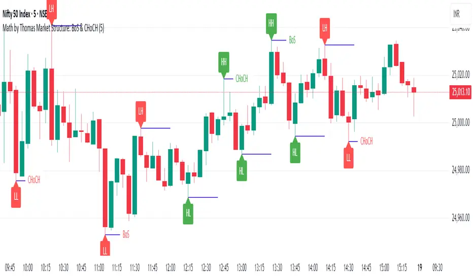
Market Structure: BoS & CHoCH (Math by Thomas)📌 Description:
Market Structure: BoS & CHoCH (Math by Thomas) is a clean and reliable market structure tool designed to visually mark Swing Highs, Swing Lows, and classify each one as HH (Higher High), LH (Lower High), LL (Lower Low), or HL (Higher Low) based on price action. It also detects and labels Break of Structure (BoS) and Change of Character (CHoCH) to help identify potential continuation or reversal in trend.
🛠️ How to Use:
Add the indicator to your chart (works on any timeframe and asset).
Adjust the "Swing Sensitivity" input to fine-tune how many bars the script uses to detect a swing high/low. A higher number smooths out noise.
The script will automatically:
Mark every confirmed swing high or low with a solid line.
Label the swing as HH, LH, HL, or LL depending on its relative position.
Show BoS (trend continuation) or CHoCH (trend reversal) labels with the current trend direction.
Toggle labels or lines on or off with the corresponding checkboxes in settings.
🔍 Tip:
Use this indicator alongside other tools like volume or RSI for more confident entries. A CHoCH followed by two BoS in the same direction often signals a strong trend reversal.
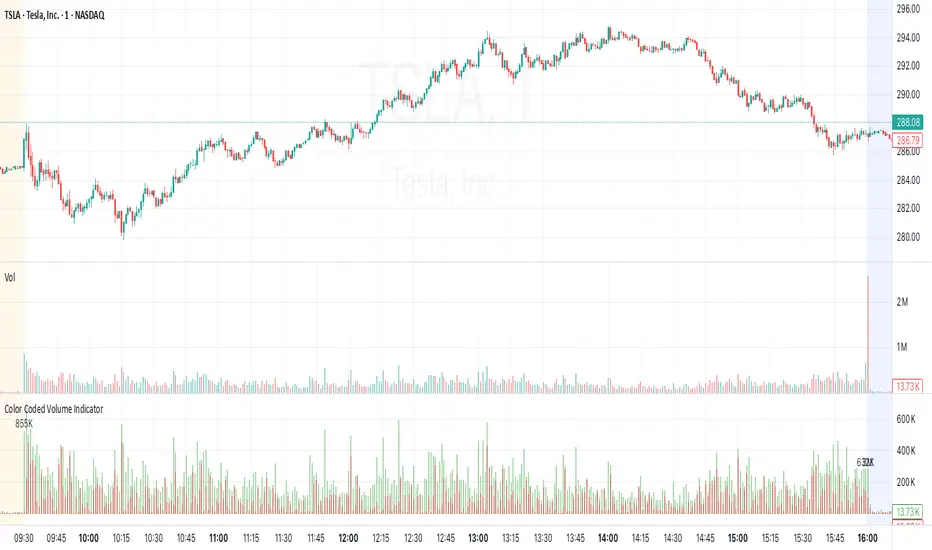
Color Coded Volume IndicatorColor Coded Volume Indicator
Overview
Splits each bar’s total volume into estimated buy-side vs. sell-side components and displays them as stacked two-tone columns (red = sell, green = buy). Axis labels and tooltips use “K”/“M” formatting.
Features
Stacked Two-Tone Columns
Red Base : estimated sell volume (50% opacity)
Green Top : remaining buy volume (50% opacity)
Automatic K/M Formatting via format=format.volume
Zero Baseline for clean reference at zero
Positive-Only Bars (no negatives)
How It Works
True-Range Guard
Skips bars where high == low to avoid divide-by-zero.
Volume Split
BuyVol = Volume × (Close − Low) / (High − Low)
SellVol = Volume × (High − Close) / (High − Low)
Both series clamped ≥ 0.
Layered Plot
Draw semi-transparent green at full height, then overlay red sell portion.
Usage
Open TradingView’s Pine Editor
Paste in the full script
Click “Save & Add to Chart”
In the Publish dialog, title it “Color Coded Volume Indicator” and paste this description.
Interpretation
Green-dominant bars → strong buying pressure
Red-dominant bars → strong selling pressure
Equal halves → balanced activity
Reintegration OPR zone 9h30📝 Indicator Description (for TradingView):
Name: Reintegration OPR Zone – 9:30 AM EST (UTC-4)
Purpose:
This indicator is designed for US indices like NAS100, US30, or SPX500. It helps identify potential false breakouts or retests by tracking when the price re-enters the Opening Price Range (OPR) after an initial breakout.
🔍 How it works:
At 9:30 AM New York time (UTC-4), the script captures the high and low of the first 15-minute candle (which is key for the US session open).
It then draws a horizontal box (rectangle) from the high to the low of that candle.
The box extends horizontally for 7 hours (28 candles on a 15-minute chart).
The script tracks if price:
Breaks above or below the OPR zone
Then re-enters the zone (a potential "fakeout" or "retest" signal)
No label or text is displayed on the chart (you requested it to be hidden).
🕒 Timeframe:
Designed for the 15-minute chart (M15)
Assumes New York session open at 9:30 AM EST (UTC-4)
Order Blocks [TakingProphets]The Order Blocks indicator automatically finds and highlights institutional Order Blocks (OBs) on your chart — powerful price zones where smart money has previously entered the market with large orders. These areas often act as strong support or resistance, and they’re key tools for traders using ICT (Inner Circle Trader) and Smart Money Concepts (SMC) strategies.
📘 What’s an Order Block?
An Order Block is usually the last bullish or bearish candle before a big move or shift in market structure. It represents where banks, funds, or institutions placed large buy or sell orders. Retail traders often miss these zones, but smart money traders use them to anticipate where price may return, stall, or even reverse.
This indicator identifies these zones for you — both bullish and bearish — so you don’t have to manually mark them.
🔍 How the Indicator Works
It waits for a market structure shift — when price breaks out of a recent high or low range.
Then it looks back to find the last opposite candle before that breakout — that candle becomes the OB.
It draws a box from the open of that candle to the high/low (depending on type) and keeps updating the box forward.
You can choose how strict the OBs need to be (Small, Medium, or Large) using ATR-based size filtering.
🔄 Breaker Blocks (Optional Feature)
If price closes through an Order Block in the opposite direction, that OB is considered invalid. But instead of deleting it, the indicator can automatically draw a Breaker Block. Breakers are important because they often become new support or resistance zones — a sign the market has flipped direction and is now respecting that level in a new way.
🎛 Custom Settings
Choose OB detection sensitivity: High (shows smaller moves), Medium, or Low (only the biggest institutional moves).
Customize colors and whether you want to show borders on each block.
Turn Breaker Blocks on or off based on your strategy.
Everything is dynamic and updates live as price evolves.
💡 Why Use It?
Knowing where smart money entered the market gives you a huge edge. Price often returns to these Order Blocks to "rebalance" or fill unfilled orders. With this indicator, you’ll:
Spend less time marking charts.
Spot high-probability entry zones faster.
Avoid common retail traps and trade with the algorithm.

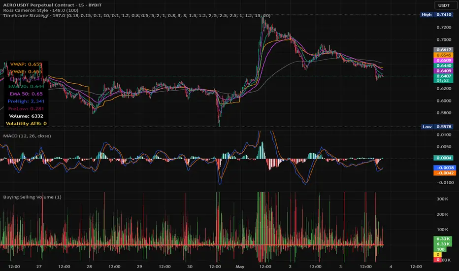
Timeframe StrategyThis is a multi-timeframe trading strategy inspired by Ross Cameron's style, optimized for scalping and trend-following across various timeframes (1m, 5m, 15m, 1h, and 1D). The strategy integrates a comprehensive set of technical indicators, dynamic risk management, and visual tools.
Core Features
Dynamic Take Profit, Stop Loss & Trailing Stop
> Separate settings per timeframe for:
-TP% (Take Profit)
-SL% (Stop Loss)
-Trailing Stop %
-Cooldown bars
> Configurable via UI inputs.
>Smart Entry Conditions
Bullish entry: EMA9 crossover EMA20 and EMA50 > EMA200
Bearish entry: EMA9 crossunder EMA20 and EMA50 < EMA200
>Additional confirmation filters:
-Volume Filter (enabled/disabled via UI)
-Time Filter (e.g., only between 15:00–20:00 UTC)
-Spike Filter: rejects high-volatility candles
-RSI Filter: above/below 50 for trend confirmation
-ADX Filter (only applied on 1m, e.g., ADX > 15)
-Micro-Volatility Filter: minimum range percentage (1m only)
-Trend Filter (1m only): price must be above/below EMA200
>Trailing Stop Logic
-Configurable for each timeframe.
- Optional via toggle (use_trailing).
>Trade Cooldown Logic
-Prevents consecutive trades within X bars, configurable per timeframe.
>Technical Indicators Used
-EMA 9 / 20 / 50 / 200
-VWAP
-RSI (14)
-ATR (14) for volatility-based spike filtering
-Custom-calculated ADX (14) (manually implemented)
>Visual Elements
🔼/🔽 Entry signals (long/short) plotted on the chart.
📉 Table in bottom-left:
Displays current values of EMA/VWAP/volume/ATR/ADX.
> Optional "Tab info" panel in top-right (toggleable):
-Timeframe & strategy settings
-Live status of filters (volume, time, cooldown, spike, RSI, ADX, range, trend)
-Uses emoji (✅ / ❌) for quick diagnostics.
>User Customization
-Inputs per timeframe for all key parameters.
-Toggle switches for:
-Trailing stop
-Volume filter
-Info table visibility
This strategy is designed for active traders seeking a balance between momentum entry, risk control, and adaptability across timeframes. It's ideal for backtesting quick reversals or breakout setups in fast markets, especially at lower timeframes like 1m or 5m.
Opening Range Breakout Cloud Indicator by TenAMTraderOpening Range Breakout Cloud Indicator – by TenAMTrader
This indicator visually maps out the Opening Range of the trading day — the price high and low between a configurable start and end time (default: 9:30 AM–10:00 AM EST). It helps traders identify breakout levels, key intraday zones, and price behavior relative to the early range.
🔹 What It Shows:
Opening High, Low, and Midpoint lines for each day.
Clouds between the midpoint and high/low for visual clarity.
Optional Second Range (e.g., 9:30–9:45 AM) for more aggressive early signals.
Historical Ranges are preserved, allowing you to view previous days' levels on the chart.
Custom Alerts when price crosses the Opening High, Low, or Midpoint.
Full customization: colors, range times, and display toggles.
🔔 Use It For:
Spotting breakouts or rejections at key levels.
Finding early support/resistance zones.
Planning trades using intraday structure.
⚠️ Use this tool as part of a broader trading strategy. No indicator guarantees results — always trade at your own discretion.
[Pandora's Chambers] BUY/SELL Blocks + Strength FCBased on the secret technique of ATTA,
Traditional price action analysis techniques, such as ICT (Inner Circle Trader), are often based on subjective interpretations and frequently miss the true structure of the market according to the Wyckoff method. The " BUY/SELL Blocks + Strength FC" indicator aims to correct this problem by automatically and accurately identifying buy/sell "blocks" according to Wyckoff principles, calculating volume strength, filtering breached blocks, and displaying precise support and resistance levels.
Indicator Highlights
Buy/Sell Blocks Identification
Uses the ta.pivothigh and ta.pivotlow functions to locate upper and lower pivot points, and draws a "box" between the two points to represent the block.
Each block is automatically extended to the right of the chart (can be disabled in settings) for a fixed number of bars or until the end of the chart.
Colors are configurable: turquoise shades for buy blocks, and purple for sell blocks.
Volume Strength Calculation and Update
In each candle, positive volume (in a rising market) or negative volume (in a falling market) is added to the relevant block.
Displays in percentages which side (buyers/sellers) controls the block: a label on the block shows +XX% or -XX%.
Changes the background color of the box to gray when the net volume flips (e.g., a strong sell block receives a net positive).
Filtering Breached Blocks
Option to automatically filter and remove blocks where the price has closed above the top of the sell block or below the bottom of the buy block, in order to maintain a clean and focused chart.
"Adjusted" Fibonacci Grid
In the last calculated bars, the indicator identifies the nearest high support level (sup) and the nearest low resistance level (res) among all existing blocks.
Based on sup and res, a Fibonacci grid of 0%, 25%, 50%, 75%, and 100% is constructed, automatically updating as the chart progresses.
What is so new here?
Accuracy according to Wyckoff and not personal interpretation: In the Wyckoff method, market oscillations are built on supply and demand balances in precise price gaps. Here, each block is built directly on pivots from a number of bars back, and not on feelings of an "area" as is sometimes done in ICT techniques.
Quantitative measurement of control: The indicator does not settle for a visual identification of a block but calculates for each block the buy volume versus the sell volume, and clearly displays who is in control.
Automatic filtering to maintain relevance: Breached blocks are removed, so only the strong areas that have not yet been closed remain.
Full integration with modern price action: Understanding price movement is measured here objectively, leaving no room for subjective interpretations of "structure breaks" or "diagonal waves" that standard tools do not support.
Why is the existing price action not enough?
Inconsistency in defining supply and demand zones: Many techniques rely on manual marking of "buy zones" only, without fixed criteria (number of bars back, low highs, volume, etc.).
Scarcity of quantitative indicators: Without calculating net volume, it is difficult to know if a particular block is truly supported by the power of buyers or sellers.
Net invalidation of blocks that have been violated: Repeated breaches of support and resistance areas below/above their boundaries confuse the trader, while here they are automatically removed.
The " BUY/SELL Blocks + Strength FC" indicator comes to correct all these shortcomings, and provides the user with an objective, accurate, and quantitative framework for understanding the dynamics of the market and identifying volume-based support and resistance areas, according to the principles of the Wyckoff method.
Momentum Pull Back Stratergy"Master Pull Back Strategy" is a highly detailed momentum and volume-based trading system designed for Trading View. It visually annotates the chart, detects buy/sell signals, tracks market phases, and evaluates retracements and confirmations. Below is a full breakdown of its logic and components:
🔷 1. Volume Profile Highlights (Arrow Emojis)
Purpose: Show volume strength vs. average using color-coded arrows.
Calculates average volume over a user-defined period (length = 10).
Divides current volume by average volume to get volRatio.
Based on volRatio, plots small arrows (acting like diamonds) in various colors:
Low volume (black, navy, blue...) to high volume (yellow, red, purple).
Visual Purpose: Give a quick sense of how "loud" or "quiet" a candle's volume is.
📈 2. Highs of Day Tracking
Purpose: Track the high price reached during different trading sessions.
Defines pre-market, regular, and post-market sessions.
Tracks the highest price (high) in each session.
Plots colored lines:
Orange: Pre-market high
Red: Regular market high
Blue: Post-market high
🟩 3. Green Candle Pattern Detection
Purpose: Detect bullish patterns formed by consecutive green candles.
Key Conditions:
Count green candles (greenCount) until a red candle appears or 10 candles max.
Require at least 1 silver-or-above volume candle (volRatio >= 1.0).
Must have ≥3% price gain during the green sequence.
Must accumulate >20,000 volume during the green run.
If Valid:
Locks the pattern.
Records important values:
patternStartPrice, patternEndPrice, totalPatternVolume, patternHigh, patternBars
Marks the bar after which red starts (redStartBar)
⬇️ 4. Retracement Monitoring
Purpose: Track retracement from the pattern high after it locks.
Defines retracement percentage:
(greenPatternHigh - low) / (greenPatternHigh - greenPatternLow)
If retracement exceeds 80%, it invalidates the pattern.
Buy signal is disabled if pattern retraces too far.
✅ 5. Buy Signal Logic
Purpose: Fire a buy signal after pattern lock if price breaks above local high.
Conditions:
Pattern is locked (patternLocked).
Price breaks above a short-term high (triggerBreak).
It's not the first red candle.
Price is within 8.5% above EMA9.
Buy signal fires and:
Sets buyActive = true
Tracks highest price after buy
Stores buyPrice = close
❌ 6. Sell Signal Logic
Purpose: Exit signal after retracement from post-buy high.
While buy is active:
If price retraces ≥3% from the post-buy high → sellSignal = true
Resets buyActive, trackedHigh, and buyPrice
Plots a red "SELL" label above the bar.
🎨 7. Buy Signal Visual Color Coding
Purpose: Color buy signal based on how deep the retracement is.
Uses retracement percentage:
≥65% → Red (high risk)
45–65% + MACD bullish → Yellow (moderate)
<45% + MACD bullish → Green (ideal)
Plots BUY label below bar in the respective color.
🔻 8. Retracement Triangle Visuals
Purpose: Shows retracement progression while pattern is locked.
If pattern is locked and not ready for buy:
Plots triangle below bar in the buyColor for visual tracking.
⭐ 9. Star Markers Above Lock Candle
Purpose: Confirmations when pattern locks.
First Star:
Plotted above the first red candle after green pattern lock.
Second Star (⭐⭐):
Additional confirmations:
Volume OK (less than previous)
MACD bullish
Price > VWAP
VolAtLock > 100K
Price up >6% from first green candle
Price below 75% of daily EMA200 or above EMA200
Third Star (⭐⭐⭐):
Even stricter confirmations:
Volume < 60% of previous
High <= previous high
VolAtLock > 500K
Price > $3
Gain >9% from first green
Price < 50% of daily EMA200 or above EMA200
📊 10. Bar Coloring
Purpose: Visually highlight bars based on pattern phase and MACD.
Gray: MACD Bearish
Light Green: Part of active green pattern
Blue: In locked phase but no buy triggered
🔄 11. Reset Logic
Purpose: Clears all tracking variables once a buy signal fires or pattern is invalidated.
Also resets if:
Retracement is too deep
10 candles pass post-lock without a trigger
⛰️ 12. Double Top Detection
Purpose: Basic visual marker when current high == previous high.
Plots a gray triangle if current and previous bar highs match.
📌 Summary: What This Strategy Shows
Buy Opportunities: Based on high-volume green runs and confirmed breakouts.
Sell Triggers: Once a retracement from peak exceeds 3%.
Visuals for Confirmation:
Diamonds for volume
Stars for lock confidence
Colors for retracement strength
Risk Management:
Retracement filtering
Time limits on locked phases
Volume filters
Market Context: Tracks pre/regular/post market highs and daily EMA 200.

PoiBox# PoiBox: Advanced Market Structure and POI Visualization Tool
PoiBox is a comprehensive market structure analysis tool designed to identify high-probability trading zones through advanced internal market structure (IDM) detection and points of interest (POI) calculation.
## How It Works
The indicator uses a multi-step approach to analyze price action:
1. **Market Structure Identification**: The script identifies significant highs and lows within your selected time range to determine the overall market structure direction (up or down).
2. **IDM Pattern Detection**: It then analyzes internal market structure patterns within this range, focusing on significant price movements that create trading opportunities.
3. **POI Calculation**: Using adaptive ATR measurements across multiple timeframes, the indicator calculates precise POI zones where price is likely to react. These zones are calibrated based on the volatility profile of each identified structure.
4. **Timeframe Correlation**: The script automatically determines which timeframe best matches each structure's size, providing valuable context for your trading decisions.
5. **Technical Implementation**: The indicator uses a sophisticated algorithm to analyze price swings, identify pivot points, and calculate market structure connections. It maintains a database of significant highs/lows and uses these to determine trend direction and potential reversal zones.
## Display Modes
PoiBox offers three powerful display options:
- **Main BOS**: Shows only the most significant breakout structure with its associated POI zone
- **Leg**: Displays the largest price leg within the selected range along with percentage-based POI zones
- **All IDMs**: Reveals all detected internal market structures and their POI zones
## Advanced Features
- **QM Mode**: Visualizes important market structure relationships with dashed lines connecting significant highs and lows
- **Trick Display**: Identifies nested market structures (tricks) within larger patterns, perfect for precision entries
- **Customizable POI Labels**: Control which price labels appear to maintain chart clarity
- **Extensive Color Settings**: Fully customizable colors for all visual elements
- **Safety Functions**: Includes built-in buffer management and error prevention algorithms to ensure stable performance across all timeframes and market conditions
## Trading Examples
**Downtrend Example:**
When PoiBox identifies a downtrend structure (Higher High → High → Low → Lower Low), it creates POI zones based on the market structure. As shown in the chart, these zones provide excellent entry opportunities when price returns to test previous structure. In this example, entering at the red POI zone with a stop above the zone and target at the QM level resulted in a 3.45 risk/reward trade.
**How to Read QM Lines:**
The dashed lines connecting High → Low → Higher High → Lower Low reveal the market's true structure. These connections help you anticipate where price might head next. When price breaks below a significant Low and creates a Lower Low, it confirms the downtrend continuation and provides a trading opportunity when price retests the broken structure.
**POI Zone Interpretation:**
- Red zones indicate bearish POI areas (ideal for short entries)
- Green zones indicate bullish POI areas (ideal for long entries)
- Yellow zones highlight the identified market structure
## Practical Application Example
In the GBP/USD example shown in the chart:
1. PoiBox identified a downtrend structure with Higher High → High → Low → Lower Low
2. The yellow box shows the main market structure area
3. The red POI zone appeared when price returned to test previous structure
4. Entry was taken at the POI zone with stop loss above structure
5. Target was placed at the QM level, resulting in a 3.45 risk/reward ratio trade
6. The dashed QM lines showed the overall market flow and direction
This demonstrates how PoiBox automatically identifies optimal entry and exit points based on market structure, without requiring manual analysis of each price swing.
## Mathematical Approach
PoiBox uses several mathematical concepts to determine market structure and calculate POI zones:
1. **Adaptive ATR Integration**: The script analyzes ATR (Average True Range) across multiple timeframes (M1, M5, M15, H1, H4, D1, W1, MN1) to determine the appropriate volatility context for each structure.
2. **Height-to-ATR Ratio**: The indicator calculates the ratio between structure height and the closest matching ATR value to determine the structure's timeframe context.
3. **Dynamic POI Calculation**: POI values are calculated using the formula:
`POI = factor * (atr_trigger + atr_double_trigger)`
where `factor` is derived from the structure's height-to-ATR ratio.
4. **Self-Adjusting Limits**: If the calculated POI value exceeds certain thresholds relative to structure height, the script automatically applies proportional adjustments to maintain optimal zone sizing.
## What Makes PoiBox Unique
While many indicators use common concepts like support/resistance or trend analysis, PoiBox stands apart through its:
1. **Adaptive POI Calculation**: Unlike static indicators, PoiBox automatically calibrates POI zones based on each market structure's volatility profile by analyzing ATR across multiple timeframes.
2. **Smart Timeframe Detection**: The indicator automatically determines the most relevant timeframe for each structure, eliminating guesswork and helping you align your trading with the appropriate market cycles.
3. **QM Visualization System**: Our proprietary QM visualization method reveals hidden market structure relationships that standard indicators cannot detect, giving you an edge in anticipating price movements.
4. **Nested Pattern Recognition**: The "Trick" detection feature identifies high-probability setups where smaller patterns form within larger ones, creating precise entry opportunities missed by conventional tools.
5. **Self-Adjusting Analysis**: PoiBox dynamically adapts to changing market conditions without requiring manual parameter adjustments, saving you time and increasing accuracy.
These innovations combine to create a truly original trading system that transforms complex market structure concepts into clear, actionable signals.
## How To Use
1. Define your analysis area using the time range selectors (X1 and X2)
2. Choose your preferred display mode based on your trading style
3. Enable QM Mode for additional market structure context if needed
4. Use the POI zones as potential entry and exit areas for your trades
5. Reference the automatically detected timeframe indicators to align your trading with the appropriate timeframe
### Settings Explanation
**Display Settings:**
- Display Mode: Choose between Main BOS, Leg, or All IDMs visualization
- QM Mode: Enable to see market structure connections with dashed lines
**Trick Settings:**
- Trick Display: Show the main trick or all nested patterns
- Trick POI: Control which POI zones appear for trick patterns
**Label Settings:**
- Leg POI %: Customize percentage-based POI zones in Leg mode
- POI Labels: Control which price labels appear on your chart
**Time Range:**
- X1 and X2: Define the analysis area for market structure detection
**Colors:**
- TF Color: Color for timeframe labels
- H/L Color: Color for high/low labels
- QM Lines: Color for market structure connection lines
- Trick Color: Color for nested pattern visualization
This indicator is designed for traders who understand market structure concepts and want a powerful tool that automatically identifies high-probability trading zones based on structural price patterns and volatility-adjusted measurements.

FVG [TakingProphets]🧠 Purpose
This indicator is built for traders applying Inner Circle Trader (ICT) methodology. It detects and manages Fair Value Gaps (FVGs) — price imbalances that often act as future reaction zones. It also highlights New Day Opening Gaps (NDOGs) and New Week Opening Gaps (NWOGs) that frequently play a role in early-session price behavior.
📚 What is a Fair Value Gap?
A Fair Value Gap forms when price moves rapidly, skipping over a portion of the chart between three candles — typically between the high of the first candle and the low of the third. These zones are considered inefficient, meaning institutions may return to them later to:
-Rebalance unfilled orders
-Enter or scale into positions
-Engineer liquidity with minimal slippage
In ICT methodology, FVGs are seen as both entry zones and targets, depending on market structure and context.
⚙️ How It Works
-This script automatically identifies and manages valid FVGs using the following logic:
-Bullish FVGs: When the low of the current candle is above the high from two candles ago
-Bearish FVGs: When the high of the current candle is below the body of two candles ago
-Minimum Gap Filter: Gaps must be larger than 0.05% of price
-Combine Consecutive Gaps (optional): Merges adjacent gaps of the same type
-Consequent Encroachment Line (optional): Plots the midpoint of each gap
-NDOG/NWOG Tracking: Labels gaps created during the 5–6 PM session transition
-Automatic Invalidation: Gaps are removed once price closes beyond their boundary
🎯 Practical Use
-Use unmitigated FVGs as potential entry points or targets
-Monitor NDOG and NWOG for context around daily or weekly opens
-Apply the midpoint (encroachment) line for precise execution decisions
-Let the script handle cleanup — only active, relevant zones remain visible
🎨 Customization
-Control colors for bullish, bearish, and opening gaps
-Toggle FVG borders and midpoint lines
-Enable or disable combining of consecutive gaps
-Fully automated zone management, no manual intervention required
✅ Summary
This tool offers a clear, rules-based approach to identifying price inefficiencies rooted in ICT methodology. Whether used for intraday or swing trading, it helps traders stay focused on valid, active Fair Value Gaps while filtering out noise and maintaining chart clarity.

OTC COT / smart money Index 2.0 COT/ Smart money Indicator – Institutional Commitment & Position Sizing (Inspired by Bernd Skorupinski Methodology)
📈 Description:
This indicator focuses on visualizing net positions held by commercials (smart money) and other key market participants, using data from the Commitments of Traders (COT) report. Inspired by Bernd Skorupinski’s institutional approach, the tool works hand-in-hand with the COT Index to provide a full picture of institutional sentiment and positioning strength.
👉 Core Functionality:
Displays net-long and net-short positions over time, helping traders understand how heavily institutions are positioned in a market.
Highlights historical extremes in net positions, which can act as warning signs or entry points when combined with technical analysis.
Supports customizable timeframes and asset selection (commodities, forex, indices) for maximum flexibility.
Best used in combination with the COT Index, offering a layered view of both relative extremes (COT Index) and absolute exposure (Net Positions).
The tool is designed to act as a contextual filter—it should complement technical setups rather than provide standalone trade signals.
📊 Applied Example – Gold Trade Using COT Net Position Analysis
To show the practical application, here’s a breakdown of a Gold (GC1!) trade that leveraged both COT Index and COT Net Positions to identify a high-probability setup.
Step 1️⃣ – Identifying Technical Structure:
The analysis started with classic price action review: Gold was approaching a significant demand zone, a well-established area that has historically triggered institutional buying.
Step 2️⃣ – COT Index Confirmation:
Upon reviewing the COT Index, the data revealed a 312-week buying extreme—the most aggressive commercial buying seen in over six years, signaling strong institutional accumulation.
Step 3️⃣ – COT Net Positions Validation:
Next, the COT Net Position Indicator showed that commercials were holding their largest net-long position in over 15 years—a rare and powerful signal of institutional conviction.
Step 4️⃣ – Divergence Check:
For added confirmation, divergence between commercials and retail traders was assessed:
✅ Commercials: Strongly net-long.
❌ Retail traders: Heavily net-short.
This clear divergence between smart money and retail sentiment further validated the setup.
Step 5️⃣ – Trade Execution:
With everything aligned:
Demand zone identified,
312-week COT Index extreme,
15-year high in net positions,
Divergence between commercials and retail,
…the trade was entered with a stop-loss placed just below the demand zone and a target set at a significant prior high. The result: a risk-reward ratio of 1:14.8, reflecting the strength and precision of the setup.
⚙️ What Sets This Tool Apart:
Provides deep insight into institutional exposure, showing both the magnitude of positions and how they evolve over time.
Enhances decision-making by cross-validating positioning extremes with technical levels.
Flexible design allows use across multiple asset classes and timeframes.
📌 Best Practices:
Always pair COT Net Position data with the COT Index to gauge both relative and absolute strength.
Use in conjunction with demand/supply zones or key technical levels for the strongest setups.
Look for divergence signals (institutions vs. retail) to confirm potential reversals.
Indicators Used in the Example:
This trade combined:
🧠 COT Net Position Indicator – to measure institutional exposure.
📊 COT Index – to identify positioning extremes.
📅 Seasonality Forecasting Tool – for time-based confirmation.
Together, these indicators provided a robust, multi-layered framework for high-confidence trading decisions.
OTC - COT Net positions 2.0 COT Net Position Indicator – Institutional Commitment & Position Sizing (Inspired by Bernd Skorupinski Methodology)
📈 Description:
This indicator focuses on visualizing net positions held by commercials (smart money) and other key market participants, using data from the Commitments of Traders (COT) report. Inspired by Bernd Skorupinski’s institutional approach, the tool works hand-in-hand with the COT Index to provide a full picture of institutional sentiment and positioning strength.
👉 Core Functionality:
Displays net-long and net-short positions over time, helping traders understand how heavily institutions are positioned in a market.
Highlights historical extremes in net positions, which can act as warning signs or entry points when combined with technical analysis.
Supports customizable timeframes and asset selection (commodities, forex, indices) for maximum flexibility.
Best used in combination with the COT Index, offering a layered view of both relative extremes (COT Index) and absolute exposure (Net Positions).
The tool is designed to act as a contextual filter—it should complement technical setups rather than provide standalone trade signals.
📊 Applied Example – Gold Trade Using COT Net Position Analysis
To show the practical application, here’s a breakdown of a Gold (GC1!) trade that leveraged both COT Index and COT Net Positions to identify a high-probability setup.
Step 1️⃣ – Identifying Technical Structure:
The analysis started with classic price action review: Gold was approaching a significant demand zone, a well-established area that has historically triggered institutional buying.
Step 2️⃣ – COT Index Confirmation:
Upon reviewing the COT Index, the data revealed a 312-week buying extreme—the most aggressive commercial buying seen in over six years, signaling strong institutional accumulation.
Step 3️⃣ – COT Net Positions Validation:
Next, the COT Net Position Indicator showed that commercials were holding their largest net-long position in over 15 years—a rare and powerful signal of institutional conviction.
Step 4️⃣ – Divergence Check:
For added confirmation, divergence between commercials and retail traders was assessed:
✅ Commercials: Strongly net-long.
❌ Retail traders: Heavily net-short.
This clear divergence between smart money and retail sentiment further validated the setup.
Step 5️⃣ – Trade Execution:
With everything aligned:
Demand zone identified,
312-week COT Index extreme,
15-year high in net positions,
Divergence between commercials and retail,
…the trade was entered with a stop-loss placed just below the demand zone and a target set at a significant prior high. The result: a risk-reward ratio of 1:14.8, reflecting the strength and precision of the setup.
⚙️ What Sets This Tool Apart:
Provides deep insight into institutional exposure, showing both the magnitude of positions and how they evolve over time.
Enhances decision-making by cross-validating positioning extremes with technical levels.
Flexible design allows use across multiple asset classes and timeframes.
📌 Best Practices:
Always pair COT Net Position data with the COT Index to gauge both relative and absolute strength.
Use in conjunction with demand/supply zones or key technical levels for the strongest setups.
Look for divergence signals (institutions vs. retail) to confirm potential reversals.
Indicators Used in the Example:
This trade combined:
🧠 COT Net Position Indicator – to measure institutional exposure.
📊 COT Index – to identify positioning extremes.
📅 Seasonality Forecasting Tool – for time-based confirmation.
Together, these indicators provided a robust, multi-layered framework for high-confidence trading decisions.

OTC Seasonal forecasting tool 2.0Seasonality Forecasting Tool – Advanced Seasonal Pattern Analysis (Inspired by Bernd Skorupinski Methodology)
📈 Description:
This script provides a structured way to analyze seasonal trends across financial markets, helping traders identify historical patterns that tend to repeat at specific times of the year. Inspired by Bernd Skorupinski’s institutional strategy, it has been refined with enhanced smoothing and customization options to improve adaptability across asset classes like commodities, forex, and indices.
👉 Core Functionality:
Analyzes historical price data over multiple lookback periods (5, 10, and 15 years) to calculate average seasonal performance.
Generates a smoothed seasonal curve that visually highlights periods of expected strength or weakness.
Allows users to customize lookback periods and adjust smoothing parameters, offering flexibility based on market type and volatility.
This tool is designed to be used as a contextual filter rather than a trade trigger—adding a layer of time-based confluence to enhance decision-making.
📊 Applied Example – Crude Oil Seasonality & Demand Zone Alignment
To demonstrate practical usage, here’s an example using Light Crude Oil Futures (CL1!) where seasonal tendencies and price structure aligned to create a high-probability setup.
Setup Steps:
1️⃣ Structural Context – Price Reaching a Demand Zone:
The market had been in a decline and approached a well-defined institutional demand area, which historically attracts buying interest.
2️⃣ Seasonality Analysis – Bullish Bias Identified:
The Seasonality Tool was applied using three distinct lookback windows:
5-year average 🟢
10-year average 🔴
15-year average 🔵
All three seasonal curves showed consistent upward trends during the late December to February period, historically signaling accumulation phases in crude oil markets.
3️⃣ Execution – Trade Setup:
With both:
Price action confirming a technical demand zone,
and seasonality indicating a strong historical bullish period,
a long position was taken targeting the next significant supply zone.
Result:
The trade unfolded as anticipated, with price rebounding strongly and delivering a risk-reward ratio of approximately 1:5.8—an outcome consistent with historical seasonal performance patterns.
⚙️ What Sets This Tool Apart:
Combines multi-timeframe seasonal data into a unified, easy-to-interpret visual output.
Includes custom smoothing algorithms to reduce noise, making the seasonal curves clearer and more reliable in fast-moving markets.
Offers flexibility to analyze not only commodities but also forex, indices, and other instruments influenced by recurring cycles (e.g., agricultural products, metals).
📌 Best Practices for Use:
Apply the tool alongside key technical zones (demand/supply) to find optimal trade timing.
Look for confluence across at least two of the seasonal curves (e.g., 5-year and 10-year averages agreeing on direction).
Use in combination with other market analysis tools—such as valuation indicators, COT data, or smart money flow—for full confirmation.
