Last Week's APM FX pairs only📖 Description:
This script is designed for precision-focused forex traders who understand the power of volatility measurement. It calculates the Average Price Movement (APM) from the previous week by measuring the full wick-to-wick range (high to low) of each daily candle from Monday to Friday, then averaging them across the five sessions.
🔍 Core Features:
✅ Accurate APM Calculation:
Pulls daily high-low ranges from last week using locked daily timeframe data, ensuring stable and reliable pip range measurements across all chart timeframes.
✅ Auto-Adjusts for Pip Precision:
Detects whether the pair is JPY-based or not, and automatically adjusts the pip multiplier (100 for JPY pairs, 10,000 for all others) to give true pip values.
✅ Visual Display in Clean UI:
The calculated APM is displayed in a non-intrusive, fixed-position table in the top-right corner of the chart — making it ideal for traders who want continuous awareness of recent market behavior without visual clutter.
✅ Timeless on Any Timeframe:
Whether you’re on the 1-minute chart or the daily, the script remains anchored and accurate because it sources raw data from the daily chart internally.
📈 How It Helps Your Trading:
🧠 Volatility Awareness: Know how much a pair typically moves per day based on recent historical behavior — great for range analysis, target setting, or session biasing.
📊 Week-to-Week Comparison: Use it as a benchmark to compare current volatility to last week’s. Great for identifying if the market is expanding, contracting, or stabilizing.
🔗 Perfect for Confluence: APM can serve as a supporting metric when combined with order blocks, liquidity zones, news catalysts, or other volatility-based tools like ATR.
🛠️ Ideal For:
Professional and prop firm traders
Institutional model traders (ICT-style or SMC)
Volatility scalpers and range-based intraday traders
Anyone building a rules-based trading system with data-driven logic
🔐 Clean. Reliable. Focused.
If you value structure, volatility awareness, and pip precision — this tool belongs in your chart workspace.
Candlestick analysis

[Remora] Previous Day Value This TradingView script plots horizontal lines showing the previous day’s high, low, and midpoint levels on your current chart. These lines help traders identify key support and resistance zones based on the last day’s price range.
🛠️ Features:
Previous Day High Line (🔴 Red):
Shows the highest price from the previous trading day.
Previous Day Low Line (🟢 Green):
Shows the lowest price from the previous trading day.
Previous Day Midpoint Line (🟣 Fuchsia, Dashed):
Shows the average of the previous day’s high and low — a useful reference for intraday bias or fair value.
Customizable Display:
You can turn each of these lines on or off using checkboxes in the settings.
This script will help traders make decisions like:
Watching for price rejection or breakout at these levels.
Identifying areas to take profits or set stops.

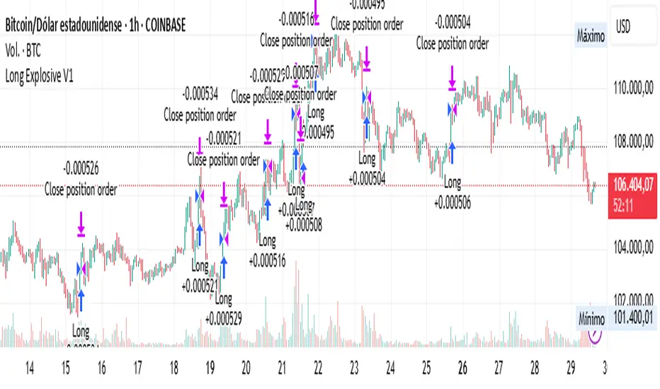
Long Explosive V1The “Long Explosive V1” strategy calculates the percentage change in price from the last closing price of the candlestick, so that if it increases by a certain percentage it goes long, but if it decreases by another percentage it sends an exit order, so that the percentage limits above and below the current price function as inherent stop loss and take profit, with the benefit of taking advantage of the volatility of the bull market.
Entries and exits are always at the market and based on percentage changes in the price. Of course, the default configuration of the strategy considers a position with a 5% risk control, modest initial capital and standard commissions, which helps to obtain realistic results and protect the user from unexpectedly controlled potential losses.
It is again emphasized that it is always advisable to adjust the parameters of the strategy well, so that the risk-reward is well controlled.
FNO Straddle/Strangle Premium TrackerThe FNO Straddle/Strangle Premium Tracker is a powerful Pine Script indicator designed for options traders to monitor the combined premium of a straddle or strangle strategy for Indian F&O instruments. It tracks the sum of call and put option prices, visualizes the premium as a candlestick or line chart, and includes technical indicators like EMAs and premium percentage change. The indicator also provides a real-time data table, alerts for key events, and exportable data for analysis, making it ideal for tracking premium movements and identifying trading opportunities.
Key Features
Customizable Inputs: Select from a wide range of underlying symbols (e.g., NIFTY, BANKNIFTY, stocks like RELIANCE, TCS), expiry date, call/put strike prices, chart type (Candlestick or Line), and timeframe (1-min to Daily).
Premium Visualization: Plots the combined premium (Call + Put) as a candlestick or line chart, with customizable colors for easy trend identification.
Exponential Moving Averages (EMAs): Displays 21, 100, and 200-period EMAs to track premium trends, with alerts for premium crossing above/below the 21-period EMA.
Premium % Change: Shows the percentage change in the combined premium as a histogram for quick momentum analysis.
Real-Time Data Table: A table in the top-right corner displays the latest premium, call/put Last Traded Prices (LTP), and EMA values (21, 100, 200).
Error Handling: Alerts users with a warning label if the selected symbol, expiry, or strike is invalid or data is unavailable.
Data Export: Outputs the latest premium, call LTP, and put LTP as a text string for easy copying or analysis.
LTP Label: Displays the current premium value every 5 bars for quick reference.
How It Works
Input Selection: Choose the underlying symbol, expiry date (YYMMDD format, e.g., 250626 for June 26, 2025), call and put strike prices, chart type, and timeframe.
Data Fetching: The script fetches real-time OHLC (Open, High, Low, Close) data for the selected call and put options using the specified symbol and expiry.
Premium Calculation: Combines the call and put option prices to calculate the straddle/strangle premium (Open, High, Low, Close).
Visualization: Plots the premium as a candlestick (green for bullish, red for bearish) or a blue line chart, along with EMAs, call/put LTP lines, and a premium % change histogram.
Alerts & Notifications: Triggers alerts when the premium crosses the 21-period EMA and displays a warning if data is invalid.
Data Display: Shows key metrics in a table and provides exportable data for further analysis.
Inputs
Select Symbol: Choose the underlying instrument (e.g., NIFTY, BANKNIFTY, RELIANCE, etc.).
Expiry Date: Enter the option expiry in YYMMDD format (e.g., 250626).
Call/Put Strike: Specify the strike prices for the call and put options.
Chart Type: Select "Candlestick" or "Line" to visualize the premium.
Timeframe: Choose the data aggregation period (e.g., 1-min, 5-min, Daily).
Outputs
Chart: Candlestick or line plot of the combined premium, with EMAs (21, 100, 200), call/put LTP, and premium % change histogram.
Table: Real-time display of premium, call/put LTP, and EMA values.
Alerts: Notifications for premium crossing EMA21 or invalid data.
Export Data: A text string with the latest premium, call LTP, and put LTP for external use.
Use Cases
Straddle/Strangle Trading: Monitor premium movements for at-the-money (ATM) straddles or out-of-the-money (OTM) strangles to time entries/exits.
Trend Analysis: Use EMAs to identify bullish or bearish trends in the premium.
Momentum Trading: Leverage the premium % change histogram to spot rapid price movements.
Risk Management: Track call and put LTP individually to assess option price behavior.
Data Analysis: Export premium data for backtesting or strategy development.
How to Use
Add the indicator to your TradingView chart.
Configure the inputs (symbol, expiry, strikes, chart type, timeframe) based on your trading setup.
Monitor the chart for premium trends, EMA crossovers, and % change signals.
Use the table and export data for real-time insights or external analysis.
Set up alerts to get notified when the premium crosses the 21-period EMA.
Notes
Ensure the symbol, expiry, and strike prices are valid for your data provider to avoid "Invalid Symbol" errors.
The indicator works best on Indian F&O instruments (NSE/BSE) with active options chains.
For optimal performance, use shorter timeframes (e.g., 1-min, 5-min) for intraday trading or Daily for positional analysis.
The premium % change histogram helps identify volatility spikes, useful for breakout strategies.
Limitations
Requires valid option chain data from TradingView’s data provider.
Performance may vary on low-liquidity instruments or illiquid strike prices.
Alerts are limited to EMA21 crossovers; additional custom alerts can be added as needed.
Feedback
If you have suggestions or need additional features (e.g., Bollinger Bands, RSI, or volatility metrics), feel free to comment! Happy trading!

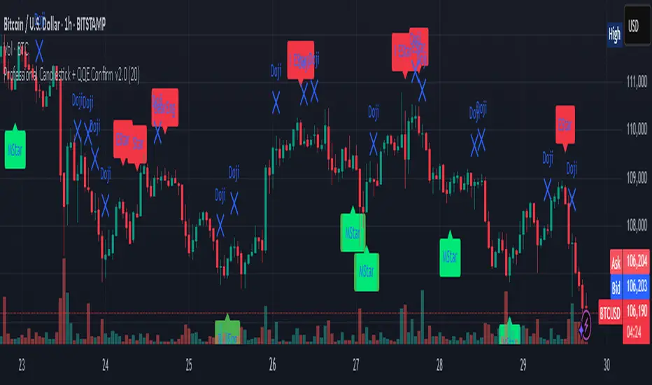
Professional Candlestick + QQE Confirm v2.0 Professional Candlestick + QQE Confirm v1.0
This script combines powerful candlestick pattern detection with QQE momentum confirmation to improve signal reliability for swing trading and trend entries.
🔍 What It Does:
- Detects high-probability candlestick patterns (e.g. Pin Bars, Engulfing, Morning/Evening Stars)
- Confirms signals with the QQE indicator to reduce false entries
- Highlights buy/sell zones using combined logic
⚙️ Key Features:
- Multiple candlestick patterns, each toggleable
- QQE filtering to confirm valid breakouts or reversals
- Signal labels with strength grading
- Optional alert settings
📊 Best Use:
- Works well on 1H, 4H, and Daily charts
- Combine with trendlines or support/resistance for stronger entries
- Avoids signals in sideways/choppy markets
---
This is a tool for traders who want to filter out weak candlestick signals using a trusted momentum indicator (QQE) for more accurate entries.
Simple Candle Countdown TimerDescription:
This lightweight and customizable TradingView indicator displays a real-time countdown timer for the current candle directly on your chart. The timer updates every second and shows the time remaining until the current candle closes, in the format MM:SS.
🔧 Features:
Adjustable X/Y offset to position the timer anywhere on the chart
Customizable text color, background color, and text size
Clear and minimal design for easy visibility
Ideal for scalpers, intraday traders, or anyone who wants precise awareness of candle close timing.

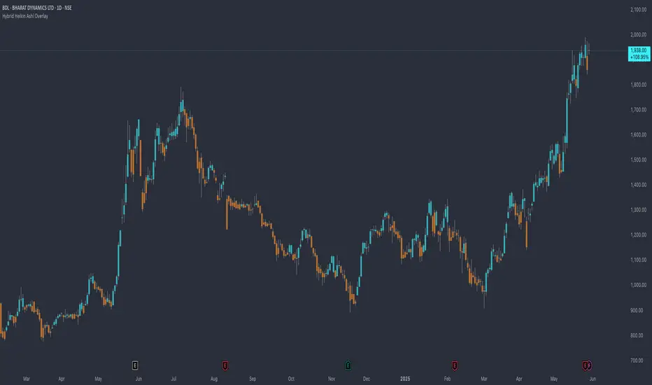
Hybrid Heikin Ashi OverlayHybrid Heikin Ashi Overlay
I personally like Heikin Ashi for its simplicity in showing clean trends. However, it tends to smooth out price action so much that we sometimes miss key signals from the actual candles.
This indicator overlays Heikin Ashi-style background colors while keeping regular candles intact — giving you the best of both worlds:
• Smoother trend visibility
• No loss of execution precision
• Customizable colors & transparency
🔹 No repainting
🔹 No strategy logic — purely visual
🔹 Designed to reduce clutter and help traders stay focused on structure
Created by: @yug_and_her
Algo BOT 3.0Algo BOT 3.0 is a sophisticated, rule-based intraday trading strategy designed for index option traders who seek high-probability entries based on market structure, institutional zones, and controlled risk management. This strategy intelligently identifies BUY and SELL trade opportunities using price action, Fibonacci retracements, and pivot confluences, layered with dynamic trade management through trailing stop loss (TSL) and predefined profit/loss thresholds.
🔍 Strategic Foundation
Algo BOT 3.0 combines multiple proven intraday trading concepts into a single unified system:
Candle Behavior Analysis:
Detects strong green (bullish) and red (bearish) candles based on configurable range filters, wick/body ratios, and volume-backed movement.
Ensures only impactful candles are considered for signal generation, filtering out noise.
Dynamic Candle Range Filtering:
Filters out low-momentum candles by comparing their range against a dynamically calculated threshold (based on recent 30-minute close).
Prevents premature or weak entries by focusing on high-volatility structures.
Fibonacci Entry Zones:
Automatically calculates 0.382 and 0.618 Fibonacci levels between the most recent key candles (highest green & lowest red).
These fib levels are used to define entry zones for BUY (above red fib 0.382) and SELL (below green fib 0.382).
Optional fib zones can be visually shown on the chart with real-time drawing.
📈 Signal Generation Logic
The core BUY/SELL signals are triggered based on a combination of:
Green/Red Candle Identification:
A green candle qualifies if:
Open is near the bottom 38.2% of its range.
Close is above the top 61.8% of the range.
High is above a pivot or institutional level.
A red candle qualifies if:
Open is near the top 38.2% of its range.
Close is below the bottom 61.8% of the range.
Low is below a pivot or institutional level.
Support/Resistance Touch Confirmation:
Signals are only considered valid if the qualifying candle touches:
CPR Top/Bottom
Daily Pivot Points (PP, R1–R4, S1–S4)
VWAP or MVWAP
CE Entry (BOT BUY):
Occurs when the price crosses above red fib 0.382 after red candle touch at support.
PE Entry (BOT SELL):
Occurs when the price crosses below green fib 0.382 after green candle touch at resistance.
Signal Controls:
Only one active signal per type (BUY/SELL) at a time.
Real-time tracking of active trade with condition-based resets.
🎯 Exit Management
Built-in risk and profit control with dynamic logic:
Trailing Stop Loss (TSL):
TSL is dynamically adjusted based on peak price after entry.
Trail distance is customizable via input (% below peak).
Visual alerts notify when TSL is hit.
Profit Target:
Trade exits automatically when desired % profit is achieved from entry.
Loss Limit:
Trade exits immediately if unrealized loss exceeds a set % threshold.
Helps prevent large drawdowns during volatile market moves.
🧠 Technical Indicator Integration
To enhance trade accuracy, the strategy includes several optional filters:
RSI: Momentum confirmation or divergence filtering.
SMA/EMA: Trend direction confirmation.
MVWAP: Modified VWAP for smoother institutional bias tracking.
🖼️ Visuals & Alerts
BOT BUY and BOT SELL Signal Labels appear directly on the chart with trade type and candle reference.
TSL, Target, and SL Exits shown as label markers with optional background highlight.
Live Alerts:
BOT BUY (CE Entry)
BOT SELL (PE Entry)
Trailing Stop Loss Triggered
Profit Target Hit
Stop Loss Triggered
⚙️ Customizable Settings
Users can fine-tune the strategy using the following input options:
MVWAP Length
RSI / SMA / EMA Lengths
Candle Range Sensitivity
TSL Distance (%)
Profit Target (%)
Loss Limit (%)
Enable/Disable Background Highlights & Labels
Display Fib Zones
⏱️ Best Use Case & Timeframes

Candle Body/Wick PercentagesHere's a breakdown of what it does:
Enables/Disables Coloring: It first checks the enable_body_coloring input. If this is set to false, no custom coloring will be applied, and candles will retain their default TradingView colors.
Determines Candle Direction: It identifies if the current candle is is_bull_candle (close > open) or is_bear_candle (close < open).
Applies Colors Based on Thresholds and Direction:
Strong Movement: If the body_pct is greater than or equal to the high_body_pct_threshold (meaning a large body relative to the total range), it then checks the candle's direction:
If it's a bullish candle, it applies the strong_bull_color.
If it's a bearish candle, it applies the strong_bear_color.
Indecisive Movement: If the body_pct is less than or equal to the low_body_pct_threshold (meaning a small body and relatively large wicks, indicating indecision), it again checks the candle's direction:
If it's a bullish candle, it applies the indecisive_bull_color.
If it's a bearish candle, it applies the indecisive_bear_color.
If the candle is a pure doji (open equals close), it colors it gray.
Default Color: For any candles that don't meet the "high" or "low" body percentage thresholds, the candle_color is set to na, which tells TradingView to use its default candle coloring (usually green for bullish, red for bearish).
Applies Color to Chart: Finally, the barcolor(candle_color) function applies the determined candle_color to the actual candle on the chart for the current bar.
In essence, this script visually highlights candles that show either very strong directional conviction (large body) or significant indecision (small body with large wicks) by changing their color, while still differentiating between bullish and bearish movements.

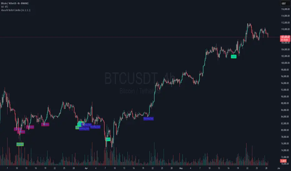
Abusuhil Bullish Candles (Label + Table)Abusuhil Bullish Candles is a pattern recognition indicator designed to identify key bullish reversal candlestick formations including Hammer, Bullish Engulfing, Morning Star, Piercing Line, Three White Soldiers, and Three Inside Up.
The script includes optional filters such as Stochastic and Volume Confirmation, providing more precise signal detection.
Each pattern and filter is fully customizable via settings. Alerts are also included to support active trading workflows.
This script was written originally and does not copy open-source indicators. It's ideal for traders seeking visual clarity on bullish opportunities with professional-grade logic.
مؤشر الشموع الصعودية هو مؤشر احترافي يكتشف أبرز نماذج الانعكاس الصعودي في الشموع اليابانية مثل: Hammer، Bullish Engulfing، Morning Star، Piercing Line، Three White Soldiers، و Three Inside Up.
يوفر المؤشر فلاتر إضافية مثل فلتر Stochastic وفلتر الفوليوم لتعزيز دقة الإشارات. جميع الإعدادات قابلة للتعديل بما يتناسب مع احتياج كل متداول.
يحتوي المؤشر أيضًا على تنبيهات تلقائية لدعم استراتيجيات التداول اللحظي. تمت برمجة المؤشر من الصفر ويعتمد على منطق خاص غير منسوخ من سكربتات مفتوحة المصدر.
--------------------------------------------------------------------------------------------------------------------
🇸🇦 التحديثات – النسخة الجديدة (Abusuhil Bullish Candles)
✅ تم تغيير الملصقات بشكل أوضح: باستخدام دوائر ملونة أسفل الشموع بدلًا من المربعات لتفادي التراكب.
🟦 إضافة جدول تفاعلي على الشارت يعرض أسماء النماذج وألوانها المخصصة.
🎨 إمكانية تغيير ألوان كل نموذج من الإعدادات حسب رغبة المستخدم.
🧩 تفعيل/تعطيل كل نموذج على حدة من خلال إعدادات منفصلة.
🔔 إضافة تنبيه احترافي واحد يتم تفعيله عند تحقق أي نموذج نشط من النماذج المحددة.
📋 توافق كامل مع سياسة TradingView:
لا يحتوي على أكواد منسوخة أو مبنية على مؤشرات داخلية.
لا تكرار للوظائف أو العناوين.
وصف واضح مع تحكم كامل للمستخدم.
🇬🇧 Updates – Latest Version (Abusuhil Bullish Candles)
✅ Clearer Signal Labels: Now uses colored circles under candles instead of labels to avoid overlapping.
🟦 Interactive Table showing pattern names and user-defined colors.
🎨 Customizable colors for each candlestick pattern from the settings menu.
🧩 Toggle each pattern independently using dedicated checkboxes.
🔔 Single professional alert condition that triggers only when any enabled pattern is detected.
📋 Fully compliant with TradingView's publishing policy:
No reused or built-in indicator code.
No duplicated logic or misleading titles.
Clean and modular design with full user customization.

Candle Countdown TimerA simple candle countdown that aligns with price, so you dont need to take your eyes off the current candle at its close.
It has 2 rows defaulted to 1m and 5m.

Delta Volume Color CoderDelta Volume Color Coder - Smart Money Footprint Visualizer
OVERVIEW
The Delta Volume Color Coder is a clean, minimalist indicator that highlights candles with exceptional delta volume, helping you instantly identify where smart money is actively trading. Unlike complex volume indicators that clutter your chart, this tool simply colors candles when institutional-level volume appears, leaving your normal price action untouched.
WHAT IS DELTA VOLUME?
Delta volume represents the difference between buying and selling pressure within each candle. Positive delta indicates more aggressive buying, while negative delta shows stronger selling. When delta reaches extreme levels, it often signals institutional activity or significant market events.
KEY FEATURES
- Clean Chart Design - Only colors candles with significant delta volume
- No Chart Compression - Overlay indicator that doesn't distort price scales
- Smart Detection - Automatically calculates dynamic thresholds based on recent activity
- Customizable Thresholds - Adjust sensitivity to match your trading style
- Multiple Calculation Methods - Classic or Range-Based delta calculations
COLOR CODING (Default)
- White Candles - Extreme positive delta (massive institutional buying)
- Green Candles - High positive delta (strong buying pressure)
- Red Candles - High negative delta (strong selling pressure)
- Violet Candles - Extreme negative delta (massive institutional selling)
- Normal Candles - Unchanged (standard TradingView red/green)
HOW TO USE
1. Add to any chart - Works on all timeframes and instruments
2. Look for colored candles - These mark significant volume events
3. White/Violet candles often mark reversals or breakouts
4. Multiple colored candles in sequence indicate strong trends
5. Colored candles at support/resistance levels are especially significant
SETTINGS EXPLAINED
- Lookback Period (20) - Bars used to calculate average delta
- High Delta Threshold (1.5x) - Triggers green/red coloring
- Extreme Delta Threshold (2.5x) - Triggers white/violet coloring
- Delta Calculation - Classic (open/close) or Range Based (close position)
- Color Wicks - Option to color entire candle or just the body
- All colors fully customizable
TRADING APPLICATIONS
- Reversal Detection - White/violet candles often mark exhaustion points
- Breakout Confirmation - Colored candles on breakouts show conviction
- Support/Resistance - High delta at key levels indicates significance
- Trend Strength - Frequency of colored candles shows trend momentum
- Institutional Tracking - Extreme delta reveals where big players are active
BEST PRACTICES
- Lower timeframes (1-15m) - Use for scalping and day trading entries
- Higher timeframes (1H+) - Identify major accumulation/distribution
- Combine with price action - Most effective at key technical levels
- Watch for clusters - Multiple extreme candles = major event
- Volume confirmation - Extreme delta + high volume = highest significance
TIPS FOR SUCCESS
1. White candles after downtrends often mark bottoms
2. Violet candles after uptrends often mark tops
3. Consecutive colored candles confirm trend direction
4. Lack of colored candles = low volatility, potential breakout ahead
5. Extreme delta at round numbers indicates institutional interest
WHY THIS INDICATOR?
- Simple Yet Powerful - No complex analysis needed
- Instant Visual Feedback - See institutional activity at a glance
- Clean Charts - No overlays, lines, or clutter
- Real-Time Detection - Updates with each new candle
- Universal Application - Works on stocks, forex, crypto, futures
UNIQUE ADVANTAGES
Unlike traditional volume indicators that require separate panes or compress your chart, the Delta Volume Color Coder seamlessly integrates with your existing setup. It answers one simple question: "Where is the smart money trading RIGHT NOW?"
Perfect for traders who want institutional-level insights without the complexity. Just add to your chart and let the colors guide you to where the real action is happening.

Abusuhil Bullish CandlesAbusuhil Bullish Candles is a pattern recognition indicator designed to identify key bullish reversal candlestick formations including Hammer, Bullish Engulfing, Morning Star, Piercing Line, Three White Soldiers, and Three Inside Up.
The script includes optional filters such as Stochastic and Volume Confirmation, providing more precise signal detection.
Each pattern and filter is fully customizable via settings. Alerts are also included to support active trading workflows.
This script was written originally and does not copy open-source indicators. It's ideal for traders seeking visual clarity on bullish opportunities with professional-grade logic.
مؤشر الشموع الصعودية هو مؤشر احترافي يكتشف أبرز نماذج الانعكاس الصعودي في الشموع اليابانية مثل: Hammer، Bullish Engulfing، Morning Star، Piercing Line، Three White Soldiers، و Three Inside Up.
يوفر المؤشر فلاتر إضافية مثل فلتر Stochastic وفلتر الفوليوم لتعزيز دقة الإشارات. جميع الإعدادات قابلة للتعديل بما يتناسب مع احتياج كل متداول.
يحتوي المؤشر أيضًا على تنبيهات تلقائية لدعم استراتيجيات التداول اللحظي. تمت برمجة المؤشر من الصفر ويعتمد على منطق خاص غير منسوخ من سكربتات مفتوحة المصدر.
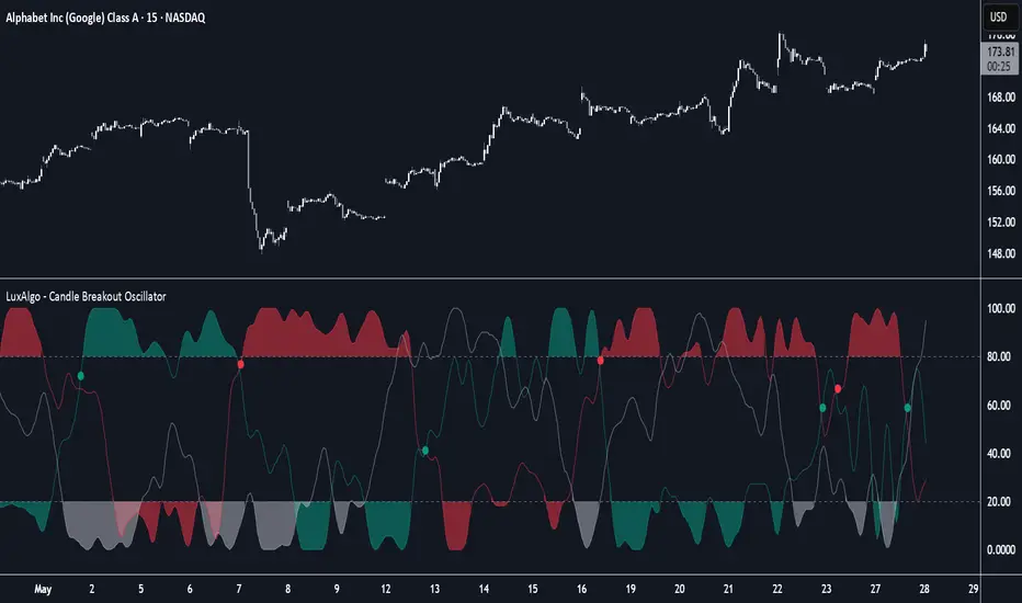
Candle Breakout Oscillator [LuxAlgo]The Candle Breakout Oscillator tool allows traders to identify the strength and weakness of the three main market states: bullish, bearish, and choppy.
Know who controls the market at any given moment with an oscillator display with values ranging from 0 to 100 for the three main plots and upper and lower thresholds of 80 and 20 by default.
🔶 USAGE
The Candle Breakout Oscillator represents the three main market states, with values ranging from 0 to 100. By default, the upper and lower thresholds are set at 80 and 20, and when a value exceeds these thresholds, a colored area is displayed for the trader's convenience.
This tool is based on pure price action breakouts. In this context, we understand a breakout as a close above the last candle's high or low, which is representative of market strength. All other close positions in relation to the last candle's limits are considered weakness.
So, when the bullish plot (in green) is at the top of the oscillator (values above 80), it means that the bullish breakouts (close below the last candle low) are at their maximum value over the calculation window, indicating an uptrend. The same interpretation can be made for the bearish plot (in red), indicating a downtrend when high.
On the other hand, weakness is indicated when values are below the lower threshold (20), indicating that breakouts are at their minimum over the last 100 candles. Below are some examples of the possible main interpretations:
There are three main things to look for in this oscillator:
Value reaches extreme
Value leaves extreme
Bullish/Bearish crossovers
As we can see on the chart, before the first crossover happens the bears come out of strength (top) and the bulls come out of weakness (bottom), then after the crossover the bulls reach strength (top) and the bears weakness (bottom), this process is repeated in reverse for the second crossover.
The other main feature of the oscillator is its ability to identify periods of sideways trends when the sideways values have upper readings above 80, and trending behavior when the sideways values have lower readings below 20. As we just saw in the case of bullish vs. bearish, sideways values signal a change in behavior when reaching or leaving the extremes of the oscillator.
🔶 DETAILS
🔹 Data Smoothing
The tool offers up to 10 different smoothing methods. In the chart above, we can see the raw data (smoothing: None) and the RMA, TEMA, or Hull moving averages.
🔹 Data Weighting
Users can add different weighting methods to the data. As we can see in the image above, users can choose between None, Volume, or Price (as in Price Delta for each breakout).
🔶 SETTINGS
Window: Execution window, 100 candles by default
🔹 Data
Smoothing Method: Choose between none or ten moving averages
Smoothing Length: Length for the moving average
Weighting Method: Choose between None, Volume, or Price
🔹 Thresholds
Top: 80 by default
Bottom: 20 by default
Configurable Vertical LineThis indicator adds a vertical line at a set amount of bars back. Specifically for when you are using the "auto" chart sizing and the long or short position on auto.
this will allow consistent measuring without using the measuring tool.

High/Low last 1-3 candlesHere you can display the high and low of the last 1, 2 or 3 candles. The whole thing is updated with every new candle. you can also switch the lines on or off as you wish and adjust the colour of the lines. have fun with it
Liquidity Sweep Reversal [Grimoire]The Liquidity Sweep Reversal indicator is designed to spot potential turning points by watching for “liquidity sweeps” above key prior highs. Specifically, it marks when price briefly pushes above levels such as:
The high of the previous candle
The high of the prior trading day
The high of the previous week
These sweeps often trigger stop-hunts or liquidity hunts, after which price frequently reverses. By highlighting those moments, the indicator helps you anticipate and trade these reversal moves more easily.

Multi Session LQ Tracker by DeadcatDisplays session ranges and identifies when price sweeps session highs/lows (liquidity) . Shows up to 5 sessions with customizable times.
Setup
Timezone - Must match your chart timezone
Sessions - 2 active by default (Asia and London), add up to 5 total
LQ Trigger Session - Time window for liquidity detection (default: 0800-1600), If LQ sweeps happen before this time, they will not be marked.
Key Features
Session Boxes: Visual range of each session high/low
Extended Lines: Continue until price breaks level
LQ Markers: Red "LQ" circles when session levels swept during trigger hours
Liquidity Toggle: Turn off to use as standard session indicator.
Customize it according to your needs. If LQ detection is off, it will function as a normal session indicator.
Very useful for ICT traders who often track session highs/lows to make trading decisions, or for someone who just wants to use a session indicator.

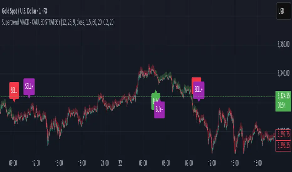
Supertrend MACD - XAUUSD STRATEGY 🔶 Supertrend MACD - XAUUSD STRATEGY (v6) (XAUUSD ONLY FOR NOW)
A high-performance, multi-filtered MACD-based strategy tailored for XAUUSD (Gold) traders seeking precision entries during trending conditions. This indicator intelligently combines multiple technical layers—momentum, trend strength, volatility, and market structure—to help identify high-probability trade setups with improved reliability.
🧠 Core Logic & Features Explained:
🔸 MACD Momentum Engine
At the heart of the strategy lies the traditional MACD indicator (Moving Average Convergence Divergence), calculating the difference between two EMAs (fast and slow) and smoothing it with a signal line.
Buy Signal: Triggered when the MACD line crosses above the signal line.
Sell Signal: Triggered when the MACD line crosses below the signal line.
These signals are the foundation, but only the beginning of a layered decision-making process.
🔸 Higher Timeframe (HTF) Trend Confirmation
To filter out noise and false breakouts, the indicator references MACD values from a higher timeframe (configurable by the user). This powerful multi-timeframe approach ensures that entries only occur in alignment with the dominant macro-trend.
Ensures entries are not taken counter to larger market movements.
Helps identify momentum continuation setups and avoid chop.
🔸 Support Arrow Display (Optional)
For visual traders, an option to display support arrows on the chart can be enabled. These assist in identifying visually intuitive entry points and enhance situational awareness.
⚙️ User-Customizable Inputs:
MACD Settings: Fast EMA, Slow EMA, Signal EMA lengths.
Signal Offset: For visual alignment and candle matching.
HTF MACD Settings: Select any timeframe for higher timeframe filtering.
ATR and ADX Thresholds: Fine-tune filters to match your trading style.
Structure Break Lookback: Adjust BOS+ logic sensitivity.
Arrow Toggles: Enable or disable visual support arrows as needed.
THIS indicator is in its alpha stage, currently it only works on XAUUSD pairs, i plan to update this indicator so that it functions on every single pair available on Trading view
Another note, the signals given only become solid after the second the candlestick, after this the signal becomes solid. REPAINTING CAN HAPPEN AFTER THE FIRST CANDLE STICK OF THE SIGNAL BUT NOT AFTER THE SECOND
As this indicator is only in its alpha stage it should be used as such, every person is responsible for there own personal investments
Best FracktalsKey Features:
Fractal Detection: The script detects both top and bottom fractals using custom logic based on candle body highs and lows, not wicks.
Customizable Parameters:
Number of candles (len) to check on each side of the central bar to determine if it forms a fractal.
Number of fractals (fractalCount) to remember and draw lines for.
Visual Indicators:
A red downward triangle marks top fractals above the bar.
A green upward triangle marks bottom fractals below the bar.
Fractal Lines:
Draws up to fractalCount horizontal lines across the chart at the levels of the most recent fractals.
Lines update dynamically as new fractals are detected.
Logic Overview:
Top Fractal: The central candle has a higher body high than surrounding candles.
Bottom Fractal: The central candle has a lower body low than surrounding candles.
Ensures no duplicate fractals are marked on equal highs or lows.

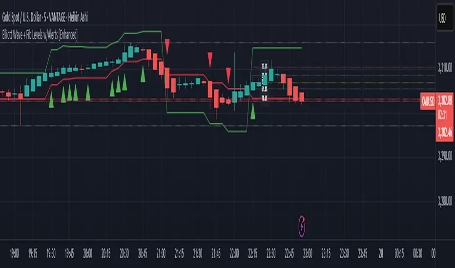
Elliott Wave + Fib Levels w/Alerts [Enhanced]Elliott Wave + Fibonacci Levels with Alerts
This powerful TradingView indicator combines Elliott Wave detection with customizable Fibonacci retracement levels to help identify key price zones and potential trade opportunities. It automatically detects bullish and bearish waves based on recent highs and lows, with an optional EMA filter to improve trend accuracy.
Key features include:
Dynamic detection of Elliott Waves based on configurable wave length.
Visualization of Fibonacci retracement levels on detected waves, with customizable percentage levels and optional labels for clarity.
ATR-based automatic calculation of stop loss and take profit levels with adjustable multipliers.
Real-time alerts triggered on new wave formations, indicating bullish or bearish setups with precise entry price details.
Clean plotting of entry signals, stop loss, and take profit zones directly on the chart.
User-friendly input controls to tailor the indicator to your trading style, including options to toggle EMA filtering, Fibonacci level display, and alert activation.
Ideal for traders looking to combine classic wave analysis with Fibonacci support/resistance levels and actionable trade alerts, this indicator streamlines technical analysis and trade management in one easy-to-use tool.
Indicator: Volatility Candle Based 📊 Volatility Candle-Based Indicator (Pine Script v6)
This custom TradingView indicator is designed for futures traders who want to analyze volatility, candle patterns, and support/resistance zones within specific market hours. It overlays price charts and provides visual signals that help determine potential momentum shifts, trend continuations, or reversals.
🔧 Core Features
⏰ Futures Time Filter
The indicator activates only during specific trading hours, customized per futures contract (e.g., NQ, ES, GC).
Time is adjusted to the New York (EST) timezone.
This ensures the logic only runs during relevant futures market sessions.
💹 Contract-Specific Multipliers
Applies custom point multipliers for futures contracts (e.g., GC = 30, ES = 24).
Supports three types of multipliers:
Trailing Stop
Trailing Plot Stop
Stop Loss
Ensures accurate backtesting and risk modeling for each contract.
📈 Trendline Support & Resistance
Uses pivot high/low logic to dynamically plot:
Central pivot zones
Step-like support/resistance lines
These trendlines update based on price behavior and can indicate bullish or bearish control.
🔍 Candle Momentum Analysis
Evaluates each candle's:
Body-to-range ratio (e.g., Marubozu, Doji)
Shadow dominance (upper/lower wicks)
Detects important reversal or continuation patterns such as:
Bullish/Bearish Inside Candles
Doji Star formations
Uses a custom moving average to confirm directional bias.
🕯️ Plotter Candle Signals
Identifies BullishPlotter and BearishPlotter candles:
Highlights candles likely to signal upcoming momentum.
Also accounts for neutral signals when no clear bias is detected.
Tracks the high/low of recent signal candles for reference.
📌 Visual Elements (not shown in snippet but implied by logic)
Signal arrows, dashed current levels, and filled support/resistance zones can be plotted to provide real-time feedback.
These are useful for both manual trading and strategy development.
🎯 Use Case
Perfect for intraday or short-term futures traders on instruments like:
🟡 Gold (GC), 🟠 Silver (SI)
📉 Nasdaq (NQ/MNQ), S&P 500 (ES/MES)
This script provides both structural context (trendlines, pivots) and price action signals (candle formations, momentum shifts), helping traders align their decisions with the underlying market flow.

Multi-Period ChartsThis Pine Script v6 indicator is titled "Multi-Period Charts" and is designed to provide traders with dynamic support/resistance levels, momentum-based trendlines, and shaded areas representing higher timeframes—all layered over the current chart to offer multi-timeframe market context.
🔍 Overview
The script offers a comprehensive view of market structure, combining:
Pivot-based support and resistance
Momentum-driven trendlines
MACD-style candle coloring
Higher-timeframe box overlays
Each element is modular and can be customized through inputs for different strategies and timeframes.
🧱 Key Features
1. Pivot-Based Support & Resistance Lines
Uses ta.pivothigh and ta.pivotlow to detect significant swing highs/lows.
A dynamic centerline is calculated from recent pivots.
Generates TUp and TDown bands that evolve with price action.
Determines the trend direction based on whether the price is above or below these bands.
2. Trendline Signal Support
Based on moving averages of high/low and close prices across a long period.
Draws a support line with a slope-check to determine if the market is bullish or bearish.
Support lines are color-coded to reflect the directional bias (bullish, bearish, or neutral).
3. Candle Coloring Logic
Candles are categorized into:
LongCandles (above both trend and support lines)
ShortCandles (below both lines)
NeutralCandle (between them)
Candles can also be shaded differently when they are downward candles, even within a bullish setup.
4. Multi-Timeframe Box Overlays
Automatically selects a higher timeframe (HTF) based on the current chart.
Draws boxes that represent the range of the selected HTF bar (e.g., day, week, month).
Boxes are colored based on whether price closed up or down.
Supports multiple methods to determine the top/bottom of the box:
High/Low Range (HLR)
True Range (TR)
Heikin Ashi Range (HAR)
5. Period Line
Calculates a smoothed line from the average of each HTF box’s top/bottom.
Useful for identifying long-term trend alignment.
⚙️ Inputs & Customizations
Pivot settings: Number of bars to look back and forward, factor, and spread.
Trendline settings: Moving average lengths and slope sensitivity.
HTF box settings: Resolution (manual or auto), color options, calculation method.
📈 Visual Output
Trendline and support line (optional display).
HTF range boxes (highlighting bullish or bearish sessions).
Color-coded candles indicating alignment or divergence from trend.
Invisible PeriodLine for advanced strategy developers.
💡 Use Case
This indicator is ideal for:
Swing and intraday traders who want to trade in the direction of larger trends.
Traders who rely on multi-timeframe analysis to find confluence.
Users looking to combine price structure (pivot-based) and momentum (moving average-based) for trend validation.
