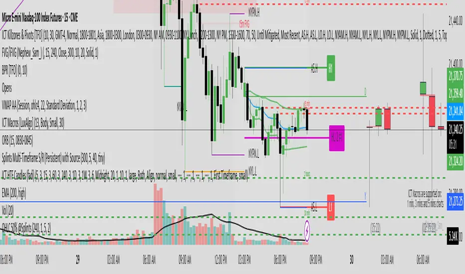
OHLC 0.5 @SplintsThis indicator provides a dynamic visualization of OHLC levels, allowing traders to analyze price action across multiple candles with enhanced clarity. It features customizable options for timeframe selection, candle count, and mid-level calculations (High/Low 50% and Open/Close 50%). The script utilizes gradient-based coloring for a clear distinction between levels and supports dynamic extension for better visibility.
Key Features:
Displays Open, High, Low, and Close levels with adjustable extension lengths
Supports mid-level calculations for enhanced trade decision-making
Gradient coloring for improved visual clarity across multiple candles
Configurable labels for quick reference to key price points
Efficient object management using arrays for optimized performance
Perfect for traders seeking structured insights into candle dynamics and session-based analysis.
Candlestick analysis
Order Blocks📈 Order Blocks Only (With Mitigation Alerts)
This indicator identifies bullish and bearish order blocks on your chart and alerts you when they are formed or mitigated . Order blocks are key institutional price levels where strong buying or selling has previously occurred, often leading to significant future price reactions.
🔍 How It Works:
-Bullish Order Block: Formed when price closes above the high of a recent bearish candle. This suggests buyers have taken control.
-Bearish Order Block: Formed when price closes below the low of a recent bullish candle. This signals seller dominance.
-Once an order block is formed, a box is drawn on the chart to highlight the zone.
-These boxes last for a user-defined number of bars (default is 20) and can be automatically removed when price mitigates (retests and closes beyond) the zone.
🛠 User Settings:
-Show Bullish Order Blocks – Toggle green zones on/off.
-Show Bearish Order Blocks – Toggle red zones on/off.
-Order Block Duration – How many bars the boxes should remain on the chart.
-Delete Mitigated Boxes – If enabled, mitigated zones are automatically removed.
-Custom Colors – Personalize the fill and border colors of bullish and bearish blocks.
🔔 Alerts:
This tool supports four built-in alert types:
-Bullish Order Block Formed
-Bearish Order Block Formed
-Bullish Order Block Mitigated
-Bearish Order Block Mitigated
Set these alerts to stay on top of key price reactions.
✅ How to Use It:
1. Apply the indicator to any chart and timeframe.
2. Watch for new order blocks to form after strong price breaks.
3. Use these zones as potential entry points, stop placement areas, or take profit zones.
4. Enable alerts to catch key institutional levels as they form or are retested.

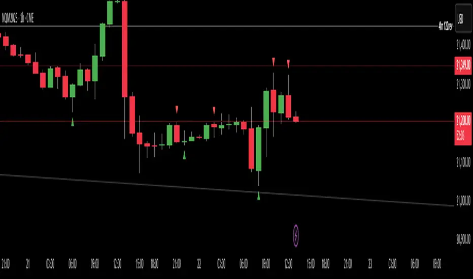
Failed 2s - The StratDescription:
This indicator detects and highlights "Failed 2" candlestick patterns from The Strat methodology — key price action setups signaling potential reversals or continuation points. It automatically identifies Failed 2 Down (Failed 2D) and Failed 2 Up (Failed 2U) signals by analyzing two consecutive bars, with special attention to price interaction at the 50% midpoint of the previous candle.
Visuals:
- Green upward triangles mark Failed 2 Down signals (bullish setups).
- Red downward triangles mark Failed 2 Up signals (bearish setups).
- Special signals that touch the 50% midpoint of the previous candle are emphasized but use the same shapes.
Alerts:
Built-in alert conditions let you receive notifications when these patterns occur, so you never miss a trade opportunity.
How to Use ALERTS in TradingView
- Paste this code into Pine Editor on TradingView.
- Click Add to Chart.
Set alerts:
- Click "Alerts" → "Condition" = your indicator name
- Choose the alert type (e.g. "Failed 2D Bar Alert")
- Set "Once per bar close"
- Customize the notification method (pop-up, app, email, etc.)
Auto Price Action SR Levels by Chaitu50cAuto Price Action SR Levels by Chaitu50c:
This is a session-based support and resistance indicator that identifies price levels based on actual candle activity, without relying on traditional indicators. It works by clustering open, high, low, or close values of past candles that frequently occur within a defined price range, making it a reliable price action-based tool for intraday traders.
The indicator calculates these levels at the start of each new trading session (based on NSE 09:15 time) and keeps them static throughout the session. This avoids unnecessary noise or flickering due to live price action, giving traders consistent zones to work with during the day.
FEATURES:
* Automatic detection of support and resistance levels based on candle price hits
* Cluster formation using high/low or open/close logic
* Static levels: calculated once per session and remain unchanged until the next session
* Adjustable settings for:
* Cluster range (in points)
* Number of lookback candles
* Line width
* Line color (default: black)
* Minimalist design for a clean chart experience
HOW IT WORKS:
The indicator looks back over a defined number of candles at the beginning of each session. It clusters prices that fall within a specified range (e.g., 250 points) and counts how many times they appear as open, high, low, or close values. If a price level is hit at least once (default), it is considered significant and a line is plotted.
Because clustering is done once per session, the lines do not shift during the session. This allows traders to base decisions on fixed, stable levels formed by prior market structure.
RECOMMENDED FOR:
* Intraday traders
* Price action traders
* Traders who prefer clean charts with logical SR zones
* Nifty, BankNifty, and stock-based day trading
Created by Chaitu50c for traders who rely on logic and structure, not signals.
Disclaimer:
This indicator is intended for educational and informational purposes only. It does not constitute financial advice or trading recommendations. Use at your own discretion and always manage risk responsibly.
---
Let me know if you’d like to include use-case examples or screenshots before publishing.

HVC Daily LevelsDaily High Volume Candle Levels Marked on all Timeframes
HVC Level Sentinel v6 — High Volume Candle Levels
HVC Level Sentinel v6 automatically detects and highlights “High Volume Candles” (HVCs) — bars with the highest trading volume in a rolling, user-defined window (e.g., 30 days). This tool helps you spot key price levels where significant trading activity occurred, which can act as important support or resistance zones.
Features
Customizable Lookback: Choose how many bars to look back for HVC detection (default: 30 days, adjustable).
Automatic Highlighting: HVC candles are highlighted on your chart with a customizable color.
Level Lines: Draws horizontal lines at the Open, High, Low, and Close of each recent HVC, so you can easily track these key levels.
Line Fading: Only the most recent N HVCs (user-adjustable) have lines, with older lines fading out or disappearing for clarity.
Per-Line Control: Turn on/off Open, High, Low, and Close lines individually in the settings.
Fully Customizable: Adjust colors, line styles, widths, and opacity to fit your chart style.
How It Works
On each new bar, the script checks if the current bar’s volume is the highest in the last N bars.
If so, it marks the bar as an HVC and draws lines at its O/H/L/C (if enabled).
You can highlight all HVCs historically, but only the most recent N will have lines for a clean, focused chart.
Use Cases
Identify major breakout or reversal points driven by high volume.
Track where institutional or “smart money” activity may have occurred.
Use HVC levels as dynamic support/resistance for entries, exits, or stop placement.
Tip :
Adjust the lookback window and number of HVCs with lines to match your trading style—shorter for active trading, longer for swing/position trading.
High Low Levels by JZCustom High Low Levels Indicator - features
Clearly plotted high and low levels for specific trading sessions. This indicator provides visual representations of key price levels during various trading periods. Below are the main features and benefits of this indicator:
1. Display high and low levels for each session
- previous day high/low: display the high and low from the previous day, giving you a better understanding of how the price moves compared to the prior day.
- asia, london, and custom sessions: track the high and low levels for the major trading sessions (asian and london) and two custom user-defined sessions.
2. Complete line and label customization
- custom line appearance: choose the color, line style (solid, dashed, dotted), and line thickness for each trading session. you can also decide if the lines should extend beyond the current price action.
- custom labels: define your own label texts for each custom session. this way, you can label the levels precisely and easily track price movements.
3. Define your own trading sessions
- add up to two custom sessions (custom and custom 2), which can be defined using precise start and end times (hour and minute).
- each custom session allows you to specify the label text for the high and low levels, enabling you to easily differentiate different parts of the day on the chart.
4. Clear and intuitive design
- grouped settings: all settings are grouped based on trading sessions, so you can easily customize every aspect of the visual representation.
- simple toggle on/off: you can easily enable or disable each line (previous day, asia, london, custom 1, custom 2). this allows you to keep your chart clean and focus only on the important levels you need at any moment.
5. Flexible time zones
- time zone settings: set the time zone (utc, europe/london, america/new_york, asia/tokyo) to properly align the timeframes for each level depending on the market you're focusing on.
6. Automatic cleanup of old lines and labels
- old levels removal: automatically remove old lines and labels to prevent clutter on your chart. this ensures that only current, relevant levels for each trading day or session are displayed.
7. Precise plotting and line extension
- accurate level markings: the indicator calculates the precise times when the high and low levels were reached and plots lines that visually represent these levels.
- line extension options: you have the option to extend the high/low lines beyond their point of calculation, which helps with identifying price action trends beyond the current period.
Dec 7, 2024
Release Notes
Changes and Improvements for Users:
1. Customizable Offset for Lines and Labels:
- A new input, `Line and Label Offset`, allows users to control how far the lines and their associated text labels extend. This ensures the labels and lines remain aligned and can be adjusted as needed.
2. Unified Offset Control:
- The same offset value is applied to all types of lines and labels (e.g., Previous Day High/Low, Asia High/Low, London High/Low, and custom sessions). Users can change this in one place to affect the entire script consistently.
3. Enhanced Flexibility:
- Users now have more control over the appearance and position of their lines and labels, making the indicator adaptable to different chart setups and personal preferences.
These updates aim to enhance user convenience and customization, ensuring a more tailored charting experience.

Break-out DailyBreakout - with body - of yesterday's daily high or low.
With body we mean that the indicator only signals if the candle has closed above the high (Breakout - Long) or below the low (Breakout - Short).
This indicator can make mistakes such as not signaling a breakout or signaling it at the wrong level (this is because it is based on the highs/lows recorded in the daily candle, not the daily high/low in the reference timeframe).
I recommend always checking if the breakout has actually occurred.
I hope it will make it easier for you to read the charts and happy trading to everyone! :)
###################################################################################
Rottura strutturale - con corpo - del massimo o minimo giornaliero di ieri.
Con corpo si intende che l'indicatore segnala solo se la candela ha chiuso al di sopra del massimo(Break-out - Long) o al di sotto del minimo(Break-out - Short).
Questo indicatore può fare degli errori come non segnalare una rottura strutturale o segnalarla su un livello sbagliato(questo perché si basa sui massimi/minimi registrati nella candela giornaliera, non il massimo/minimo giornaliero nel timeframe di riferimento).
Consiglio di controllare sempre se effettivamente è avvenuta la rottura.
Spero che vi semplificherà la lettura dei grafici e buon trading a tutti! :)

TripleTrend with RSI ReversalTripleTrend with RSI Reversal
The TripleTrend with RSI Reversal indicator is a comprehensive trading tool designed to identify trend direction, potential trend reversals, and trade entry/exit signals. It combines three independent SuperTrend indicators with varying sensitivities to provide a multi-layered view of the market trend. Additionally, it incorporates an RSI (Relative Strength Index) module to detect potential price reversals based on overbought/oversold conditions and to filter trend flip signals.
This indicator aims to provide clear visual cues on the chart, including trend lines, trend flip labels, and RSI-based reversal warnings, helping traders make more informed decisions.
Key Features
Triple SuperTrend Analysis
Utilizes three configurable SuperTrend lines, each with its own ATR period and multiplier, allowing for a nuanced view of short, medium, and long-term trends.
RSI Reversal Signals
Identifies potential market turning points when the RSI deeply penetrates overbought or oversold zones, plotting distinct visual cues and labels.
Trend Flip Labels
Displays labels on the chart when one, two, or all three SuperTrends change direction simultaneously, indicating the strength of the new trend. These labels also include the current RSI value.
Customizable RSI Filtering
Offers an option to filter out trend flip labels when the RSI is within a user-defined neutral range, reducing signals in choppy market conditions.
Configurable Alerts
Provides various alert conditions for trend flips and signal confirmations.
How It Works
SuperTrend Calculation:
- The indicator plots three separate SuperTrend lines. Each SuperTrend is calculated using an Average True Range (ATR) period and a multiplier.
- A SuperTrend line below the price indicates an uptrend (typically colored green).
- A SuperTrend line above the price indicates a downtrend (typically colored red).
- The sensitivity of each SuperTrend can be adjusted independently.
RSI Reversal Detection:
- A standard RSI is calculated.
- The indicator monitors if the RSI moves significantly beyond the user-defined Upper Threshold (overbought) or Lower Threshold (oversold).
- The depth of this penetration is measured as a percentage. If this percentage exceeds the Upper reversal range percent trigger (for overbought) or Lower reversal range percent trigger (for oversold), a blue line is plotted above the high (for potential bearish reversal) or below the low (for potential bullish reversal) of the signal candle.
- A "REV" label appears at the start of this blue line, showing the penetration percentage and the current RSI value.
Trend Flip Labels:
- When one or more SuperTrends flip direction, the indicator checks RSI conditions.
- For buy signals (trend flips upwards), labels appear if the RSI is below the RSI Upper threshold (i.e., not extremely overbought).
- For sell signals (trend flips downwards), labels appear if the RSI is above the RSI Lower threshold (i.e., not extremely oversold).
- Labels indicate which SuperTrend(s) flipped ("1", "2", "3", "1 2", etc.) and the current RSI value.
- An optional Custom RSI Filter can be enabled. If active, trend flip labels will not be shown if the RSI value is between the Custom RSI filter high limit and Custom RSI filter low limit, helping to avoid signals during market indecision.
Usage Guide
Interpreting SuperTrend Lines:
- The three SuperTrend lines act as dynamic levels of support (in an uptrend) or resistance (in a downtrend).
- A break of a SuperTrend line by the price suggests a potential change in that specific trend's direction.
- Confluence of trends (e.g., all three lines indicating an uptrend) suggests a stronger overall trend.
Trend Flip Labels:
- Single Trend Flip Labels ("1", "2", or "3"): Indicate an early change in one of the SuperTrends. These can be used for more aggressive entries or to signal a potential shift in momentum. The label includes the RSI value at the time of the flip.
- Double Trend Flip Labels ("1 2", "1 3", "2 3"): Offer stronger confirmation as two SuperTrends align in a new direction.
- Triple Trend Flip Labels ("1 2 3"): Represent the strongest trend confirmation, as all three SuperTrends have flipped simultaneously.
- Green labels suggest buy signals; red labels suggest sell signals.
- Always consider the accompanying RSI value on the label and the overall market context.
RSI Reversal Signals (Blue Lines & "REV" Labels):
- REV is for Reverse
- A blue line appearing above the price with a "REV" label suggests the RSI is deeply overbought, indicating potential uptrend exhaustion or a bearish reversal.
- A blue line appearing below the price with a "REV" label suggests the RSI is deeply oversold, indicating potential downtrend exhaustion or a bullish reversal.
- These are counter-trend signals and should be used with caution, preferably with confirmation from other indicators or price action. They can also serve as warnings to take profit on existing trend-following trades.
- Trend flip labels are suppressed when an RSI Reversal line is active, prioritizing the exhaustion signal.
Combining Signals:
- Look for trend flip labels (especially double or triple) that align with the broader market structure and occur when the RSI is not in extreme territory (as per label logic).
- Use RSI Reversal signals as potential early warnings of a trend ending or for high-probability counter-trend setups if strongly supported by other factors.
- If the Use custom RSI filter is enabled, be aware that trend flip labels will be hidden if the RSI is within the specified neutral zone. This can help avoid weaker signals in range-bound markets.
Settings Customization
Trend 1, 2, 3 Settings:
- ATR Period: Adjusts the lookback period for ATR calculation. Shorter periods make the SuperTrend more sensitive to price changes.
- Source: The price source used for calculations (default is hl2).
- ATR Multiplier: Controls the distance of the SuperTrend line from the price. Smaller multipliers result in tighter stops and more signals; larger multipliers result in wider stops and fewer signals.
- Show single/double/triple trend flip labels: Toggle visibility for these specific label types.
Label settings:
- Label Size: Adjusts the size of all indicator labels.
- Show reversal labels: Toggles visibility for the "REV" labels associated with RSI Reversal signals.
RSI Settings (Change often):
- RSI Length: The lookback period for the RSI calculation.
- RSI Upper threshold: The RSI level considered overbought.
- RSI Lower threshold: The RSI level considered oversold.
RSI Reversal detection settings:
- Upper reversal range percent trigger: Percentage of penetration into the (RSI Upper Threshold to 100) zone required to trigger an upper reversal signal. Higher values mean RSI needs to be deeper into overbought.
- Lower reversal range percent trigger: Percentage of penetration into the (RSI Lower Threshold to 0) zone required to trigger a lower reversal signal. Higher values mean RSI needs to be deeper into oversold.
Custom RSI filter settings:
- Use custom RSI filter: Enable/disable this filter for trend flip labels.
- Custom RSI filter high limit: If the filter is active, no trend flip labels will show if RSI is below this value (and above the low limit).
- Custom RSI filter low limit: If the filter is active, no trend flip labels will show if RSI is above this value (and below the high limit).
Alerts
- Individual trend flips (TripleTrend: Trend 1/2/3 flipped).
- Multiple trend flips (TripleTrend: 2 Trends flipped, TripleTrend: 3 Trends flipped).
- Confirmed buy/sell signals based on label logic (TripleTrend: Early/Double/Triple trend buy/sell signals).
- Configure these alerts in TradingView to receive notifications for specific market events detected by the indicator.
How I use TripleTrend with RSI Reversal
I use it on 5, 10 and 30 minute time frames.
I adjust the settings, especially the RSI thresholds for what I am trading, the day could be in the lower or upper regions of the RSI, I adjust as needed, when needed. I then use the REV (aka REVERSAL) indicators to indicate when to get out or caution me to not enter at that point. Unless I see something else which indicates otherwise.
Disclaimer
Trading involves substantial risk of loss and is not suitable for every investor. The TripleTrend indicator is to be used at your own risk and is only created to help you make decisions, it is not intended to make decisions for you. Past performance is not indicative of future results. Always do your own research and risk assessment before making any trading decisions. By using this indicator you use it at your own risk.

MestreDoFOMO Future Projection BoxMestreDoFOMO Future Projection Box - Description & How to Use
Description
The "MestreDoFOMO Future Projection Box" is a TradingView indicator tailored for crypto traders (e.g., BTC/USDT on 1H, 4H, or 1D timeframes). It visualizes current price ranges, projects future levels, and confirms trends using semi-transparent boxes. With labeled price levels and built-in alerts, it’s a simple yet powerful tool for identifying support, resistance, and potential price targets.
How It Works
Blue Box (Current Channel): Shows the recent price range over the last 10 bars (adjustable). The top is the highest high plus an ATR buffer, and the bottom is the lowest low minus the buffer. Labels display exact levels (e.g., "Top: 114000", "Bottom: 102600").
Green Box (Future Projection): Projects the price range 10 bars ahead (adjustable) based on the trend slope of the moving average. Labels show "Proj Top" and "Proj Bottom" for future targets.
Orange Box (Moving Average): Traces a 50-period EMA (adjustable) to confirm the trend. An upward slope signals a bullish trend; a downward slope signals a bearish trend. A label shows the current MA value (e.g., "MA: 105000").
Alerts: Triggers when the price nears the projected top or bottom, helping you catch breakouts or retracements.
How to Use
Add the Indicator: Apply "MestreDoFOMO Future Projection Box" to your chart in TradingView.
Interpret the Trend: Check the orange box’s slope—upward for bullish, downward for bearish.
Identify Key Levels: Use the blue box’s top as resistance and bottom as support. On a 4H chart, if the top is 114,000, expect resistance; if the bottom is 102,600, expect support.
Plan Targets: Use the green box for future targets—top for profit-taking (e.g., 114,000), bottom for stop-loss or buying (e.g., 102,600).
Set Alerts: Enable alerts for "Near Upper Projection" or "Near Lower Projection" to get notified when the price hits key levels.
Trade Examples:
Bullish: If the price breaks above the blue box top (e.g., 114,000), buy with a target at the green box top. Set a stop-loss below the green box bottom.
Bearish: If the price rejects at the blue box top and drops below the orange MA, short with a target at the blue box bottom.
Customize: Adjust the lookback period, projection bars, ATR multiplier, and MA length in the settings to fit your trading style.
Tips
Use on 1H for short-term trades, 4H for swing trades, or 1D for long-term trends.
Combine with volume or RSI to confirm signals.
Validate levels with market structure (e.g., candlestick patterns).

VWAP + Candle-Rating SELL (close, robust)This multi‐timeframe setup first scans the 15-minute chart for strong bearish candles (body position in the bottom 40% of their range, i.e. rating 4 or 5) that close below the session VWAP. When it finds the first such “setup” of a trading period, it pins the low of that 15-minute candle as a trigger level and draws a persistent red line there. On the 5-minute chart, the strategy then waits for a similarly strong bearish candle (rating 4 or 5) to close below that marked low—at which point it emits a one‐time SELL signal. The trigger level remains in place (and additional sell signals are locked out) until the market “rescues” the price: a 15-minute bullish candle (rating 1 or 2) closing back above VWAP clears the old setup and allows the next valid bearish 15-minute candle to form a new trigger. This design ensures you only trade the most significant breakdowns after a clear bearish bias and avoids repeated signals until a genuine bullish reversal resets the system.

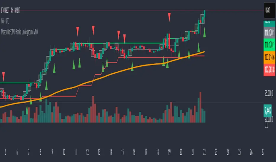
MestreDoFOMO Renko Underground v4.0Description:
The "MestreDoFOMO Renko Underground v4.0" is a custom indicator for TradingView that creates a dynamic Renko chart to help identify trends and reversal points in the market. Unlike traditional candlestick charts, Renko focuses solely on significant price movements, ignoring time and market noise. This script includes advanced features like support and resistance channels, moving averages, and alerts to assist with your trading decisions.
How It Works:
Dynamic Renko Bricks:
The brick size (price units to form each "box" on the chart) is calculated automatically using the ATR (Average True Range) with an adjustable multiplier. This means the size adapts to the asset's volatility (e.g., BTC/USDT). When the price moves up or down by the brick size, a new brick is created (green for up, red for down).
Reversal Signals:
Green triangles (🔼) appear below bars when the trend shifts to bullish, and red triangles (🔽) appear above when it shifts to bearish. These signals only appear on direction changes, reducing false signals.
Renko Channel:
The script draws two lines (green for resistance and red for support) based on the highs and lows of the last 10 bricks (or the value you set). This helps identify key price zones.
Moving Average on Bricks:
An orange line shows the moving average (EMA or SMA, your choice) of the last 20 bricks, helping confirm the overall trend.
Alerts:
You can set up alerts in TradingView to be notified when the trend shifts to bullish or bearish, perfect for active trading.
Visualization:
A gray dashed line shows the level of the last brick, providing a clear reference for the next expected move.
How to Use:
Add the indicator to your chart (e.g., BTC/USDT 1D).
Adjust parameters like the ATR multiplier, channel length, and moving average type in the settings menu.
Watch the bricks and signals to identify trends, and use the channels and moving average to plan entries and exits.
Enable alerts to receive real-time notifications.
Tip:
Test on different timeframes (1H, 4H, 1D) and adjust the ATR multiplier to match the volatility of the asset you're trading. Combine with other indicators (like RSI) for better results!
Mits Pixel BTCUSDStrategy
Using Rsi Stochastic, Hull Moving Average, Price Action and volume differences to get signals
HOW IT WORKS
Pixel parts :
- (U) The first pixel is a pixel that shows a trend during an uptrend, a trend when the market is considered bullish (above the MA line)
- (V) The second pixel is the volume pixel, showing the up and down movement of the buy / sell volume .
- (M) The third pixel is the momentum pixel, showing the market momentum whether it is overbought or oversold.
- (D) The fourth pixel is a pixel that shows a trend during a downtrend, a trend when the market is considered bearish (below the MA line)
When the price opens above the MA line, 3 pixels will appear, namely the first Pixel which is called the Trend up Pixel, Pixel Volume , and also the Momentum Pixel.
When the price opens below the MA line, 3 pixels will appear, namely Pixel Volume , Pixel Momentum, and the bottom one is the Pixel Down Trend.
* Pixel up trend (appears when the open is above the MA line)
- The pixel will show a solid green color when a gap up is opened or volume up, then the close price is greater than the open price.
- The pixel will show a light green color if there is normal strengthening (the close is bigger than the previous day's close without creating a gap up), then the close price is bigger than the open price.
- Pixel will show yellow color if it meets several criteria, for example, close is equal to open or close is bigger than the previous close but close is smaller than open.
- The pixel will show a dark red color when there is attenuation and a Gap down is created, then the close price is smaller than the open price.
- Pixel will show red color if there is normal weakening (close is smaller than the close of the previous day without creating a gap down), then the close price is smaller than the open price.
* Pixel down trend (appears when the open is below the Moving Average)
The pixel color indication is the same as the Trend up Pixel
* Volume Pixel
- The pixel is dark green when there is an increase and a gap up is created and the volume for that day is bigger than the volume of the previous day.
- The pixel will be green if there is a normal strengthening and also the volume for that day is greater than the volume of the previous day, or there is a gap up but the volume is smaller than the volume of the previous day.
- The pixel is yellow if it meets several conditions, for example, the volume of the day is the same as the volume of the previous day.
- The pixel is dark red when there is weakness and a Gap down is created and also the volume of the day's weakness is greater than the volume of the previous day.
- The pixel is red if there is normal weakening and also the volume of the day's weakness is bigger than the previous day's volume , or if there is a gap down but the volume is smaller than the previous day's volume .
* Momentum Pixel (basically StochRSI combined with other HMA , TopBox (Resistance), BottomBox(Support)).
- The pixel is dark green when it meets several conditions, for example the golden cross is below 50.
- The pixel is green if it meets several conditions, for example a golden cross below 50 without Gap up.
- Pixel will be yellow if it meets several conditions, for example k is greater than d and k has entered the overbought area (greater than 80).
- Pixel is dark red when it meets several conditions, for example k is smaller than d and k has entered the overbought area.
- Pixel is red when it meets several conditions, for example k is smaller than d and k is greater than 50 and k is less than 80.
Bar Color
Dark Green : Price Up + Volume Up
Green : Price Up + Volume Down
Dark Red : Price Down + Volume Up
Red : Price Down + Volume Down
Too many details that cannot be detailed one by one , but in broad outline as explained above.
HOW TO USE
* Signals Buy
- Strong Buy : All pixels are green, and Momentum Pixel is dark green.
- Normal Buy : All pixels are green or two dark green (one of them must momentum pixel) and one yellow.
- Spek Buy : * Two green pixels (one of them must momentum pixel) and one yellow or 1 green/dark green in momentum pixel, and other pixels yellow
* Signals Sell
- Strong Sell : All pixels are red, and Momentum Pixel is dark red.
- Normal Sell : All pixels are either red or two dark red (one of them must momentum pixel) and one yellow.
- Spek Sell : Two red pixels (one of them must momentum pixel) and one yellow or 1 dark red in momentum pixel, and other pixels yellow
- Warning Sell : Momentum pixels are dark red, regardless of the color of the other pixels.
* Best use for trading in BTCUSD markets
Thanks for Moderators

ORB - Opening Range Breakout + AlertsThe only ORB indicator you'll ever need.
- Flexible Range: Tailor the opening range (e.g., 5m, 15m, 30m) to your trading style.
- Key Levels: Auto-plots striking pink/purple support/resistance lines post-range for clear trade setups.
- Breakout Alerts: Reliable LONG/SHORT signals on 5m chart for confirmed breakouts; enable/disable as needed.
- Personalized Design: Customize line color and thickness for optimal visibility.
A friendly reminder that no tool or indicator guarantees success. Integrate this into a robust trading plan.

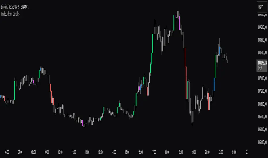
Tradecademy CandlesThe script highlights high-volume candles .
Upward candles with significantly increased volume = green
Upward candles with moderately increased volume = blue
Downward candles with significantly increased volume = red
Downward candles with moderately increased volume = pink
Recent Session High Low Marker - SimpleDescription:
This Pine Script marks the high and low points of the most recent trading sessions: Asian, London, and New York.
Asian Session: From 19:00 to 21:00 New York time (UTC-4).
London Session: From 02:00 to 05:00 New York time (UTC-4).
New York Session: From 07:00 to 10:00 New York time (UTC-4).
For each session, the script draws two lines:
One for the high of the session.
One for the low of the session.
The lines are drawn horizontally across the chart, making them easy to spot. Each session is marked by two lines with specific colors:
Orange for the Asian session.
Blue for the London session.
Purple for the New York session.
The lines are dynamically updated during the active session, and they will reset when the next session begins. The width of the lines is set to 2 to ensure they are visible without being too thick.
Credits:
Script created by Jdv.

PSP/TrueOpen💎 Precision Swing Point (PSP) & True Open Levels Indicator 🚀
This advanced tool highlights Precision Swing Points (PSPs) and plots True Open Levels across major timeframes. It’s designed to help you spot potential reversals, align with institutional bias, and build higher-probability setups — all while giving you full customization over how everything looks and feels.
🔥 Key Features:
PSP Candle Highlighting
Automatically detects and highlights candles that meet the PSP criteria — usually found at major turning points in the market. Full customization options for wick color, border color, and visual appearance.
True Open Levels
TSO – True Session Open
TDO – True Day Open
TWO – True Week Open
TMO – True Month Open
Customization Options (for each True Open level):
Color
Line type – solid, dashed, or checkered
Line length – full-width or shortened
Custom Text Labels – Add your own notes to each level (e.g., “Weekly Bias,” “Institutional Anchor”)
🌟 What is a PSP?
A Precision Swing Point is a specific candle formation that shows up before strong moves. It usually sweeps a key level and closes with intent. PSPs often confirm SMT or SSMT divergences with a candle close at key levels — adding conviction to the idea that a reversal or expansion is about to unfold.
These points offer clean, asymmetric opportunities when aligned with structure or higher-timeframe bias. This indicator spots them automatically for you — no more guessing.
🚨 How to Use True Opens to Your Advantage:
True Opens act as precision anchors for market bias. When you compare the current cycle’s open to the higher timeframe’s open, it gives instant insight into context.
If the current session/day/week opens below the higher timeframe’s open, you’re operating in extreme discount.
If it opens above, you’re sitting in extreme premium.
That tells you whether you’re trading from a favorable location or chasing into poor pricing — especially when combined with PSPs, SMT, or Fair Value Gaps.
✨ Why Use True Opens?
True Opens aren’t just lines — they represent where institutions reset the auction. Price respects them across all timeframes. Whether you're scalping NY session or planning a swing entry, these levels help frame the market, highlight where power shifts, and clarify if you're early or late to a move.
⚠️ Caution:
If you find the PSP candle colors aren’t visible or appear behind other chart elements, right-click on the candles, select Visual Order, then choose Send to Back. This will ensure the highlights display properly.
🌠 Thank you for using my indicator. I appreciate your trust and support — wishing you success and clarity in your trading journey.

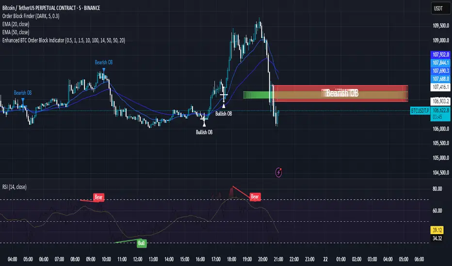
Enhanced BTC Order Block IndicatorThe script you provided is an "Enhanced BTC Order Block Indicator" written in Pine Script v5 for TradingView. It is designed to identify and visually mark Order Blocks (OBs) on a Bitcoin (BTC) price chart, specifically tailored for a high-frequency scalping strategy on the 5-minute (M5) timeframe. Order Blocks are key price zones where institutional traders are likely to have placed significant buy or sell orders, making them high-probability areas for reversals or continuations. The script incorporates customizable filters, visual indicators, and alert functionality to assist traders in executing the strategy outlined earlier.
Key Features and Functionality
Purpose:
The indicator detects bullish Order Blocks (buy zones) and bearish Order Blocks (sell zones) based on a predefined percentage price movement (default 0.5–1%) and volume confirmation.
It marks these zones on the chart with colored boxes and provides alerts when an OB is detected.
User-Configurable Inputs:
Price Move Range: minMovePercent (default 0.5%) and maxMovePercent (default 1.0%) define the acceptable price movement range for identifying OBs.
Volume Threshold: volumeThreshold (default 1.5x average volume) ensures OB detection is backed by significant trading activity.
Lookback Period: lookback (default 10 candles) determines how many previous candles are analyzed to find the last candle before a strong move.
Wick/Body Option: useWick (default false) allows users to choose whether the OB zone is based on the candle’s wick or body.
Colors: bullishOBColor (default green) and bearishOBColor (default red) set the visual appearance of OB boxes.
Box Extension: boxExtension (default 100 bars) controls how far the OB box extends to the right on the chart.
RSI Filter: useRSI (default true) enables an RSI filter, with rsiLength (default 14), rsiBullishThreshold (default 50), and rsiBearishThreshold (default 50) for trend confirmation.
M15 Support/Resistance: useSR (default true) and srLookback (default 20) integrate M15 timeframe swing highs and lows for additional OB validation.
Core Logic:
Bullish OB Detection: Identifies a strong upward move (0.5–1%) with volume above the threshold. It then looks back to the last bearish candle before the move to define the OB zone. RSI > 50 and proximity to M15 support/resistance (optional) enhance confirmation.
Bearish OB Detection: Identifies a strong downward move (0.5–1%) with volume confirmation, tracing back to the last bullish candle. RSI < 50 and M15 resistance proximity (optional) add validation.
The OB zone is drawn as a rectangle from the high to low of the identified candle, extended rightward.
Visual Output:
Boxes: Uses box.new to draw OB zones, with left set to the previous bar (bar_index ), right extended by boxExtension, top and bottom defined by the OB’s high and low prices. Each box includes a text label ("Bullish OB" or "Bearish OB") and is semi-transparent.
Colors distinguish between bullish (green) and bearish (red) OBs.
Alerts:
Global alertcondition definitions trigger notifications for "Bullish OB Detected" and "Bearish OB Detected" when the respective conditions are met, displaying the current close price in the message.
Helper Functions:
f_priceChangePercent: Calculates the percentage price change between open and close prices.
isNearSR: Checks if the price is within 0.2% of M15 swing highs or lows for support/resistance confluence.
How It Works
The script runs on each candle, evaluating the current price action against the user-defined criteria.
When a bullish or bearish move is detected (meeting the percentage, volume, RSI, and S/R conditions), it identifies the preceding candle to define the OB zone.
The OB is then visualized on the chart, and an alert is triggered if configured in TradingView.
Use Case
This indicator is tailored for your BTC scalping strategy, where trades last 1–15 minutes targeting 0.3–0.5% gains. It helps traders spot institutional order zones on the M5 chart, confirmed by secondary M1 analysis, and integrates with your use of EMAs, RSI, and volume. The customizable settings allow adaptation to varying market conditions or personal preferences.
Limitations
The M15 S/R detection is simplified (using swing highs/lows), which may not always align perfectly with manual support/resistance levels.
Alerts depend on TradingView’s alert system and require manual setup.
Performance may vary with high volatility or low-volume periods, necessitating parameter adjustments.
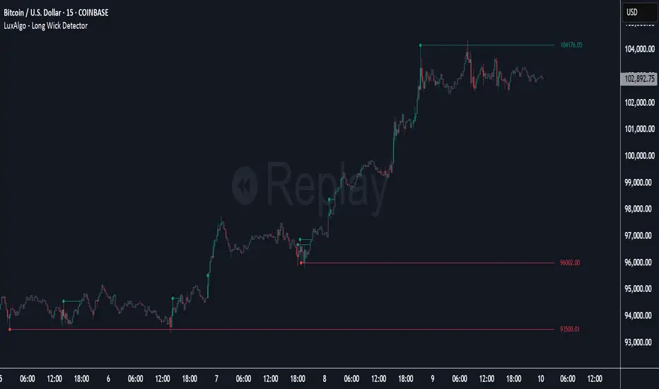
Long Wick Detector [LuxAlgo]The Long Wick Detector tool allows traders to identify candle wicks longer than a user-defined volatility threshold. This makes it useful for spotting zones with high supply or demand.
The tool displays mitigated and unmitigated levels and changes the color of the candles based on wick size and level breakouts.
🔶 USAGE
By default, the tool displays long mitigated and unmitigated candle wicks, with a maximum duration for an unmitigated long wick of 1,000 bars. What does all this mean?
🔹 Wick Threshold
Traders can adjust the volatility threshold to identify long wicks, with a higher threshold detecting more significant wicks.
As we can see in the image above, the tool detects more wicks with a smaller threshold compared to a higher one.
🔹 Level %
Traders can choose the percentage of the wick at which the level is located. By default, the level is displayed at the extremes of the wick. This parameter accepts values between 0 and 100.
100: extreme of the wick
50: middle of the wick
0: start of the wick
🔹 Max Duration
This parameter allows traders to specify the number of bars for the levels. The tool will only display mitigated or unmitigated levels up to the specified number of bars.
As shown in the above image, a longer duration allows more room for mitigation, displaying more levels.
🔹 Colored Candles
The tool allows for color customization using two parameters from the settings panel. The chart shows the different outputs.
The setting "Wick-Based Transparency" makes candles with smaller wicks less visible and candles with longer wicks more visible.
On the other hand, "Breakout-Based Color" changes the base color of the candles based on the mitigation of long wicks. When the price breaks above a detected top wick, the bullish color is used. When the price breaks below a detected bottom wick, the bearish color is used.
🔶 SETTINGS
Wick Threshold: The volatility threshold for wick detection. Use a smaller value to detect smaller wicks.
Level %: Placement of the plotted level relative to the wick.
Max Duration: The maximum duration in bars of mitigated wicks.
Mitigated Wicks: Enable or disable mitigated wicks.
🔹 Style
Wick Based Transparency: Make candles with smaller wicks more transparent and candles with longer wicks more solid.
Breakout Based Color: Change the base color based on wick mitigation.
Bullish & Bearish Colors
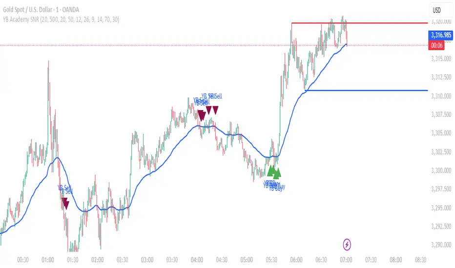
YB Academy SNRThe YB Academy SNR indicator is a complete swing-based Support & Resistance mapping tool with powerful built-in entry/exit signals. Designed for traders who want to identify high-probability reaction zones and get real-time alerts for the best buy and sell opportunities, this script helps you trade with structure, confidence, and discipline—on any time frame.
How It Works
1. Automatic Support & Resistance Detection
The indicator automatically scans for major swing highs and swing lows on your chart using a sensitivity parameter.
Every time a new swing high/low forms, a horizontal SNR line is drawn at that price level.
Both support and resistance lines automatically extend to the right of your chart, providing a persistent map of key levels for future entries and exits.
You can control how many recent zones are shown (max_snrs), keeping your chart clean and focused.
2. Smart Buy/Sell Signal Generation
Buy signals (“YB Buy”): Trigger when price touches or bounces off a support line, with trend/momentum/freshness filters:
Price is above the EMA50 (trend filter)
MACD is bullish (momentum)
RSI confirms no overbought
Sell signals (“YB Sell”): Trigger when price hits resistance, with strict confirmation:
Price is below EMA50
MACD is bearish
RSI not oversold
Both signals are shown as clear up/down triangle arrows directly on your chart.
3. Powerful Alerts
Never miss a trade: Real-time alerts fire as soon as a valid buy or sell condition appears.
Use with TradingView app, web, or SMS for 24/7 notification—no chart-watching needed.
4. Fully Customizable
Change sensitivity for tighter/looser SNR mapping.
Control the look and feel: colors for SNR, signals, number of zones, extension distance.
Works on any market: gold, forex, indices, crypto, stocks.
5. Clean Visuals, Zero Clutter
SNR lines are automatically managed—older zones are removed as new ones appear.
Only the latest/best buy/sell signals are shown, so you can act quickly and decisively.
Perfect For:
Scalpers, Day Traders, Swing Traders
Anyone who wants to trade using clean price action levels, NOT lagging indicators
Traders looking for rule-based, mechanical entries and exits
What Makes This Unique?
Precision: Uses swing structure, not arbitrary pivots or moving averages, for SNR.
Multi-Filter Entries: Combines trend, momentum, and overbought/oversold logic for high-probability signals.
Alerts & Automation: Built-in, with no need for manual chart watching.
Simple to Use: Add to any TradingView chart, adjust settings, and go.
Upgrade your trading with the YB Academy SNR!
Get alerted to the real opportunities—right at the key price zones, with all the discipline of a professional.
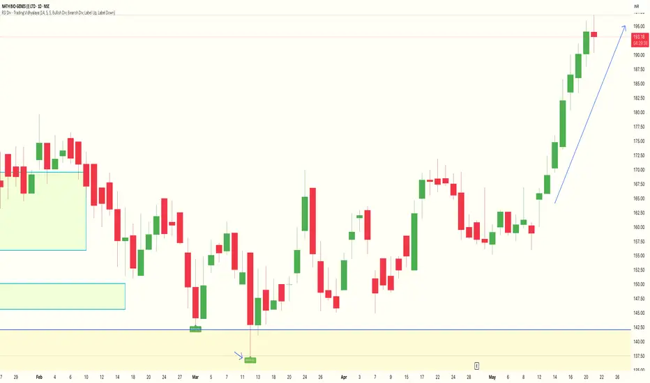
RSI Divergence Indicator - Trading VidhyalayaThis indicator automatically identifies RSI-based bullish and bearish divergences and visually marks them directly on the candlestick chart, making it easier for traders to spot potential reversals.
✅ Key Features:
Bullish Divergence
When the price makes a lower low, but the RSI makes a higher low, the indicator highlights the candle with a green arrow or label to signal potential upward reversal.
Bearish Divergence
When the price makes a higher high, but the RSI forms a lower high, the indicator marks the candle with a red arrow or label to indicate a possible downside move.
Real-time Detection
Divergences are plotted in real-time, helping traders react quickly to changing market conditions.
Candlestick Overlay
Signals are shown directly on the chart, rather than below in a separate panel, allowing for faster and clearer decision-making.
📊 Benefits:
Helps in identifying early trend reversals
Works well with other indicators like MACD, Moving Averages, or Volume
Great for both beginners and advanced traders
Saves time by automating divergence spotting, reducing manual errors
Volume-Weighted Price MovementThe Volume-Weighted Price Movement (VWPM) indicator is an easy to read technical analysis tool that analyses how volume and price movement work together to drive market momentum.
How It Works
The VWPM indicator tracks two primary components:
Bullish Movement (green line): Measures the upward price movement weighted by volume. When price closes above the open, this component calculates how much buying pressure exists by multiplying the price change (close - open) by the volume of that period.
Bearish Movement (red line): Measures the downward price movement weighted by volume. When price closes below the open, this component calculates how much selling pressure exists by multiplying the price change (open - close) by the volume of that period.
Bull-Bear Difference (lime/orange line): Shows the net momentum by subtracting bearish movement from bullish movement, providing an at-a-glance view of which force is dominant.
The VWPM integrates volume data to identify whether price movements are backed by significant participation. A large price move with low volume carries less weight than the same move with high volume, providing a more accurate reflection of market strength.
A shorter lookback period makes the indicator more responsive to recent price action, while a longer period smooths out market noise for trend identification.
Interpretation
Bullish Signals
When the green line (bull movement) rises and stays above the red line
When the Bull-Bear Difference line crosses above zero and maintains positive momentum
Divergence between price making lower lows but the bull line making higher lows (hidden strength)
Bearish Signals
When the red line (bear movement) rises and stays above the green line
When the Bull-Bear Difference line crosses below zero and maintains negative momentum
Divergence between price making higher highs but the bull line making lower highs (hidden weakness)
open source, if anyone makes the script better please let me know :)

Van|TVT trendVan Trend-Volume Track (TVT) Indicator
Overview
The TVT Indicator is a multi-functional tool designed to identify market trends and key support/resistance levels. It combines dynamic trend channels with customizable EMA lines, offering clear visual signals for trading decisions.
Key Features
Trend Identification
Green Channel: Indicates a strong bullish trend.
Red Channel: Signals a strong bearish trend.
Gray Channel: Suggests trend uncertainty or consolidation.
Support & Resistance
The upper band acts as a dynamic resistance zone.
The lower band serves as a dynamic support zone.
Customizable EMA Lines
Displays 6 adjustable EMA lines simultaneously.
Flexible settings for periods and colors to match your strategy.
中文介绍:
Van TVT指标 是一款多功能交易工具,用于识别市场趋势及关键支撑/阻力位。它结合动态趋势轨道与可自定义EMA均线,为交易决策提供清晰的视觉信号。
核心功能
趋势判定
绿色轨道:代表强势上涨趋势。
红色轨道:代表强势下跌趋势。
灰色轨道:提示趋势不明或震荡行情。
支撑与阻力
上轨 具有动态阻力作用。
下轨 具有动态支撑作用。
可调EMA均线
同时显示6条EMA均线,支持自由设置周期与颜色,适配不同交易策略。

Liquidity ZonesWhat It Does:
Liquidity Zones identifies key areas where institutional traders target stop orders. The indicator automatically detects significant price swings and maps the upper and lower wick zones where liquidity pools form. These zones represent high-probability areas where price is likely to return to collect stop orders before continuing its next move.
How To Use:
Identify Key Zones:
-Red zones highlight Buy Side Liquidity (resistance areas)
-Green zones highlight Sell Side Liquidity (support areas)
Trading Opportunities:
-Enter trades when price respects these zones
-Watch for zone breaks and re-tests for continuation signals
-Use alerts to notify you when price enters a zone or when new zones form
Optimization Tips:
-Adjust lookback periods based on volatility (higher for calmer markets)
-Enable auto-threshold for adaptive sensitivity to market conditions (default setting)
-Most effective on timeframes 4H and above
The indicator tracks when zones are broken and automatically removes them when price returns, providing a clean, uncluttered view of the most relevant liquidity areas on your chart.
