GOD Complex Trading By QTX Algo SystemsGOD Complex Trading by QTX Algo Systems
Overview
GOD Complex Trading is a comprehensive signal engine that combines multiple QTX Algo Systems indicators into a unified framework for identifying high-confluence reversal and continuation setups. It includes dynamic entry detection, adaptive stop loss logic, multi-timeframe analysis, score-based risk scaling, and real-time trade visualization.
This script is designed for discretionary traders who want to see structured trade logic unfold directly on the chart, with visual labeling of entry type, dynamic stop loss placement, exit score computation, and key trade metrics shown in an on-chart table.
How It Works
Each trade is classified into one of four categories:
Reversal Long
Reversal Short
Continuation Long
Continuation Short
Each trade type has a distinct confluence requirement involving real-time and higher-timeframe inputs. The indicator calculates a confluence score out of 200 and determines HTF (high-timeframe) directional bias across three layers (HTF1, HTF2, HTF3), which are configurable.
QTX Indicators Used
This script integrates internal logic from the following proprietary QTX tools:
VBM (Volatility-Based Momentum) – Confirms directional bias using momentum slope and volatility increase.
VBSMI (Volatility-Based SMI) – Detects early momentum shifts via band exits and crossovers of adaptive smoothed SMI values.
SEA (Statistically Extreme Areas) – Highlights exhaustion zones using normalized volatility, smoothed range deviation, and SMI divergence.
SPB (Statistical Price Bands) – Uses volatility and trend-adjusted percentiles to define dynamic overbought/oversold zones.
COI (Continuation Opportunity Indicator) – Validates re-entry opportunities following a pullback during trend continuation.
Signal Logic – Examples
Each entry type is built from layered logic:
Reversal Long (Example)
Triggers when:
VBSMI is in dynamic oversold and crosses up
SEA level is at or below threshold (signaling statistical exhaustion)
SPB confirms recent low percentile hit
VBM and COI do not indicate trend continuation in the opposite direction
Continuation Long (Example)
Triggers when:
No recent extreme zones (SPB or SEA) are present
VBM confirms continued trend momentum
VBSMI crosses up and confirms strength
COI may confirm re-entry conditions
High-timeframe bias scores show alignment
All entries are subject to filter checks, including:
Minimum confluence score
HTF bias thresholds (HTF1, HTF2, HTF3)
Position type and trade history
Key Features
Trade Type Auto-Labeling
Each signal is labeled (“Rev Long”, “Cont Short”, etc.) directly on the chart for instant identification.
Stop Loss Visualization
Stop loss levels are calculated using a weighted average of ATR-based padding and prior swing highs/lows. Ghost lines are drawn for Add trades.
TP1 / TP2 Logic
TP1: Fires on opposite VBSMI crossover (momentum loss).
TP2: Fires when the opposite side’s reversal score exceeds a user-defined threshold.
Position Size & Risk Table
The on-chart table shows estimated trade size (based on max risk input), stop loss price, and calculated exit score. Reversal trades scale based on confluence score, while continuation trades use linear scaling.
Multi-Timeframe Confluence
The script uses three automatic higher timeframes to calculate directional bias and exit score amplification. This allows scoring logic to reflect broader trend alignment.
Add Trade Logic
The indicator detects both same-style and cross-style Add setups. Add signals are labeled and visualized, but should be used cautiously.
Auto-Close on Opposite Signal
When an opposite entry signal is triggered (e.g. Cont Short after Rev Long), the current trade is automatically considered closed, resetting tracking variables and metrics.
Additional Features
Fully bar-closed logic: no repainting or mid-bar recalculation.
High-precision control over alert triggering using bias filters and score ranges.
Dedicated alert conditions for all key trade types and TP/SL events.
Score-based position sizing using dynamic confluence score caps.
Table remains visible for a configurable number of bars after trade close.
Use Cases
Manual discretionary entries with clearly labeled setups and real-time validation
Score-based trade review and journaling using TP1/TP2 and exit score
Optimizing trade filters using alerts with HTF bias and confluence thresholds
Data-driven strategy refinement by observing which trades reach full exits
Disclaimer
This tool is provided for educational and informational purposes only. It does not guarantee any particular outcome or profitability. Always use proper risk management, backtest thoroughly, and consult a financial professional if needed.
Statistics

Grid Trade Helper📌 Grid Trade Helper – Range-Based Grid Planning Tool
This tool is designed for range-based traders and manual grid strategy operators, providing a framework to balance execution efficiency and risk exposure.
By referencing historical weekly volatility, it helps estimate a reasonable grid width, visualizes key levels, and supports position management with quantitative guidance.
🧭 Design Philosophy:
In multi-entry systems like grid trading, there's always a tradeoff:
"Tighter grids improve opportunity density but increase risk; wider grids reduce risk but lower efficiency."
This tool seeks to provide a dynamic equilibrium between the two, using past volatility to determine practical grid intervals and suggest safe leverage thresholds.
✨ Core Features:
Weekly open level tracking (custom time + time zone support)
Volatility-based suggestions for grid width and safe grid count
Visual range plotting with optional stop-line overlay
Compact live table showing key metrics: average range, grid width, grid count, leverage cap
🔧 Customizable Parameters:
Time zone and custom weekly open hour
Max number of visual elements (lines, boxes)
Color and line style options
📈 Suggested Use Cases:
Planning manual grid structures with volatility-adjusted intervals
Visual support for range-bound or sideways market strategies
Estimating leverage exposure and grid density for better position control
⚠️ This indicator is intended as a strategic support tool and does not constitute financial advice. Use according to your own risk framework and market understanding.

Z-Score IndicatorWhat it does:
Calculates the Z-Score: (Current Price - Average Price) / Standard Deviation
Plots the Z-Score in a separate panel below your main chart.
Allows you to customize the Lookback Period (default is 30 bars) to suit your trading style and the asset's characteristics. A shorter period is more sensitive, while a longer period provides a smoother output.
Key Features:
Clear Z-Score Line: Visualizes the current Z-Score value.
Reference Lines:
Zero Line (Gray, Dotted): Indicates the price is at its average for the lookback period.
+2 Standard Deviations (Red, Dotted): Highlights when the price is significantly above its recent average. Often interpreted as potentially overbought.
-2 Standard Deviations (Red, Dotted): Highlights when the price is significantly below its recent average. Often interpreted as potentially oversold.
How to use it:
Look for Z-Score values moving towards or beyond the +2 or -2 standard deviation lines. These extremes can signal that the price has moved unusually far from its mean and might be due for a reversion or a pause.
Use it in conjunction with other indicators and your overall market analysis to make more informed trading decisions.
Experiment with the "Lookback Period" setting to find what works best for different assets and timeframes.
Feigenbaum Projection Zones [ALLDYN]🔷 Feigenbaum Projection Zones
This tool visualizes non-overlapping projection zones above and below a manually defined price range (C.E. – Center Equilibrium) using Feigenbaum constants as spacing multipliers. It’s ideal for traders who prefer structured, mathematically grounded projection layers over standard Fibonacci tools.
📌 Features:
Manual high/low range input (C.E. zone)
Feigenbaum-based zone scaling with interleaved gaps
Color-coded zones (🟥 below CE, 🟩 above CE, 🟨 CE range)
Dotted midlines through each zone
Timeframe-restricted to 15m and below for clarity
Clean label/box/line management for minimal clutter
🔒 Source code is protected to preserve custom zone spacing logic.
🧠 Designed for advanced technical analysts who want mathematical projection zones based on deterministic scaling constants.
🔍 Feigenbaum Projections: Overview
Feigenbaum Projections are derived from chaos theory, specifically Mitchell Feigenbaum’s work on bifurcations and the universality of nonlinear systems. In market terms, they attempt to map fractal or recursive structures in price movements, especially those that might echo repeating patterns in chaotic systems.
✅ Benefits:
Captures fractal and nonlinear dynamics better than Fibonacci.
Self-similarity and scaling laws can offer insights into repeating structures not seen with classical tools.
Can help model transitions between trend and consolidation through bifurcation patterns.
Tied to mathematical constants (Feigenbaum constants), offering theoretical rigor in modeling chaotic price movement.
***Compact chart view to show the full range of the FGBZ Calculations***

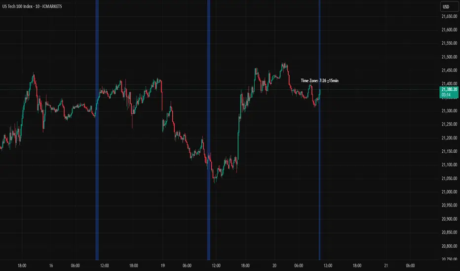
Current Time Zone HighlighterHow the indicator works:
Highlights with a background color the zone of 15 minutes before and 15 minutes after the current time for each day
Displays a vertical dashed line at the exact moment corresponding to the current time
Adds reference points at price highs and lows for the current time
Includes an informative label showing the current time and the set interval
Configurable parameters:
Color of the highlighted time zone
Number of minutes before and after the current time (default 15 minutes)
Option to show or hide the line at the exact current time
Color of the current time line
How to use the indicator:
Open TradingView and access the Pine Script editor
Copy the code from the artifact above
Save the script
Apply the indicator to any chart
The indicator will work automatically, highlighting the time zone that falls within the interval of ±15 minutes (or other interval you configure) from the current time, for each day in history and in real-time for the current day.
Risk Calculator PRO — manual lot size + auto lot-suggestionWhy risk management?
90 % of traders blow up because they size positions emotionally. This tool forces Risk-First Thinking: choose the amount you’re willing to lose, and the script reverse-engineers everything else.
Key features
1. Manual or Market Entry – click “Use current price” or type a custom entry.
2. Setup-based ₹-Risk – four presets (A/B/C/D). Edit to your workflow.
3. Lot-Size Input + Auto Lot Suggestion – you tell the contract size ⇒ script tells you how many lots.
4. Auto-SL (optional) – tick to push stop-loss to exactly 1-lot risk.
5. Instant Targets – 1 : 2, 1 : 3, 1 : 4, 1 : 5 plotted and alert-ready.
6. P&L Preview – table shows potential profit at each R-multiple plus real ₹ at SL.
7. Margin Column – enter per-lot margin once; script totals it for any size.
8. Clean Table UI – dark/light friendly; updates every 5 bars.
9. Alert Pack – SL, each target, plus copy-paste journal line on the chart.
How to use
1. Add to chart > “Format”.
2. Type the lot size for the symbol (e.g., 1250 for Natural Gas, 1 for cash equity).
3. Pick Side (Buy / Sell) & Setup grade.
4. ✅ If you want the script to place SL for you, tick Auto-SL (risk = 1 lot).
5. Otherwise type your own Stop-loss.
6. Read the table:
• Suggested lots = how many to trade so risk ≤ setup ₹.
• Risk (currency) = real money lost if SL hits.
7. Set TradingView alerts on the built-in conditions (T1_2, SL_hit, etc.) if you’d like push / email.
8. Copy the orange CSV label to Excel / Sheets for journalling.
Best practices
• Never raise risk to “fit” a trade. Lower size instead.
• Review win-rate vs. R multiple monthly; adjust setups A–D accordingly.
• Test Auto-SL in replay before going live.
Disclaimer
This script is educational. Past performance ≠ future results. The author isn’t responsible for trading losses.

FII SMART KEY LEVELSIntroducing the **Global Institutional Flow Indicator (GIFI)**—your all-in-one guide to the levels that matter most, powered by real-time foreign institutional activity. GIFI seamlessly adapts to any market—be it NSE and BSE equities, major cryptocurrencies, or the world’s most liquid forex pairs—so you never miss a beat.
Key Features:
Foreign Institutional Footprint
Tracks aggregated buy and sell volumes of FIIs (Foreign Institutional Investors) and equivalent large players across markets, highlighting where “smart money” is concentrating their capital.
* **Dynamic Support & Resistance Levels**
Automatically calculates high-conviction zones—zones where institutional orders have previously clustered—so you can pinpoint ultra-reliable levels for entries, exits, and stop placements.
* **Multi-Asset Compatibility**
One unified indicator that works out of the box on NSE and BSE stocks, top crypto tokens, and major FX crosses. No need to switch tools when you move between markets.
* **Trend-Aligned Signals**
Overlays institutional levels on your favorite trend filters—moving averages, ADX, or MACD—so you only trade in the direction that big players are committing.
* **Volume-Weighted Confirmation**
Confirms level-breaks and bounces with volume delta analysis, ensuring you’re following genuine institutional commitment rather than retail noise.
* **Adaptive Timeframes**
From 5-minute scalps to daily swing setups, GIFI adjusts its sensitivity so you capture the most meaningful levels on any timeframe.
**Why It Works:**
Foreign institutions often leave telltale footprints when they build or unwind positions at scale. GIFI decodes those footprints into actionable levels—revealing where the “smart money” is most willing to buy or sell. When price approaches one of these institutional zones, you gain:
* **Higher Probability Entries**
Enter trades alongside large-ticket players rather than against them.
* **Optimized Risk Management**
Place stops just beyond genuine institutional commitment zones, reducing the odds of false breakouts.
* **Clearer Exit Strategies**
Target profit levels where institutions are likely to take profits or enter fresh positions.
Whether you’re scalping Nifty futures, swing-trading mid-cap stocks, riding crypto trends, or trading EUR/USD, the Global Institutional Flow Indicator equips you with the insights you need to trade confidently—knowing you’re aligning with the forces that really move the markets.
Uptrick: Asset Rotation SystemOverview
The Uptrick: Asset Rotation System is a high-level performance-based crypto rotation tool. It evaluates the normalized strength of selected assets and dynamically simulates capital rotation into the strongest asset while optionally sidestepping into cash when performance drops. Built to deliver an intelligent, low-noise view of where capital should move, this system is ideal for traders focused on strength-driven allocation without relying on standard technical indicators.
Purpose
The purpose of this tool is to identify outperforming assets based strictly on relative price behavior and automatically simulate how a portfolio would evolve if it consistently moved into the strongest performer. By doing so, it gives users a realistic and dynamic model for capital optimization, making it especially suitable during trending markets and major crypto cycles. Additionally, it includes an optional safety fallback mechanism into cash to preserve capital during risk-off conditions.
Originality
This system stands out due to its strict use of normalized performance as the only basis for decision-making. No RSI, no MACD, no trend oscillators. It does not rely on any traditional indicator logic. The rotation logic depends purely on how each asset is performing over a user-defined lookback period. There is a single optional moving average filter, but this is used internally for refinement, not for entry or exit logic. The system’s intelligence lies in its minimalism and precision — using normalized asset scores to continuously rotate capital with clarity and consistency.
Inputs
General
Normalization Length: Defines how many bars are used to calculate each asset’s normalized score. This score is used to compare asset performance.
Visuals: Selects between Equity Curve (show strategy growth over time) or Asset Performance (compare asset strength visually).
Detect after bar close: Ensures changes only happen after a candle closes (for safety), or allows bar-by-bar updates for quicker reactions.
Moving Average
Used internally for optional signal filtering.
MA Type: Lets you choose which moving average type to use (EMA, SMA, WMA, RMA, SMMA, TEMA, DEMA, LSMA, EWMA, SWMA).
MA Length: Sets how many bars the moving average should calculate over.
Use MA Filter: Turns the filter on or off. It doesn’t affect the signal directly — just adds a layer of control.
Backtest
Used to simulate equity tracking from a chosen starting point. All calculations begin from the selected start date. Prior data is ignored for equity tracking, allowing users to isolate specific market cycles or testing periods.
Starting Day / Month / Year: The exact day the strategy starts tracking equity.
Initial Capital $: The amount of simulated starting capital used for performance calculation.
Rotation Assets
Each asset has 3 controls:
Enable: Include or exclude this asset from the rotation engine.
Symbol: The ticker for the asset (e.g., BINANCE:BTCUSDT).
Color: The color for visualization (labels, plots, tables).
Assets supported by default:
BTC, ETH, SOL, XRP, BNB, NEAR, PEPE, ADA, BRETT, SUI
Cash Rotation
Normalization Threshold USDC: If all assets fall below this threshold, the system rotates into cash.
Symbol & Color: Sets the cash color for plots and tables.
Customization
Dynamic Label Colors: Makes labels change color to match the current asset.
Enable Asset Label: Plots asset name labels on the chart.
Asset Table Position: Choose where the key asset usage table appears.
Performance Table Position: Choose where the backtest performance table appears.
Enable Realism: Enables slippage and fee simulation for realistic equity tracking. Adjusted profit is shown in the performance table.
Equity Styling
Show Equity Curve (STYLING): Toggles an extra-thick visual equity curve.
Background Color: Adds a soft background color that matches the current asset.
Features
Dual Visualization Modes
The script offers two powerful modes for real-time visual insights:
Equity Curve Mode: Simulates the growth of a portfolio over time using dynamic asset rotation. It visually tracks capital as it moves between outperforming assets, showing compounded returns and the current allocation through both line plots and background color.
Asset Performance Mode: Displays the normalized performance of all selected assets over the chosen lookback period. This mode is ideal for comparing relative strength and seeing how different coins perform in real-time against one another, regardless of price level.
Multi-Asset Rotation Logic
You can choose up to 10 unique assets, each fully customizable by symbol and color. This allows full flexibility for different strategies — whether you're rotating across majors like BTC, ETH, and SOL, or including meme tokens and stablecoins. You decide the rotation universe. If none of the selected assets meet the strength threshold, the system automatically moves to cash as a protective fallback.
Key Asset Selection Table
This on-screen table displays how frequently each enabled asset was selected as the top performer. It updates in real time and can help traders understand which assets the system has historically favored.
Asset Name: Shortened for readability
Color Box: Visual color representing the asset
% Used: How often the asset was selected (as a percentage of strategy runtime)
This table gives clear insight into historical rotation behavior and asset dominance over time.
Performance Comparison Table
This second table shows a full backtest vs. chart comparison, broken down into key performance metrics:
Backtest Start Date
Chart Asset Return (%) – The performance of the asset you’re currently viewing
System Return (%) – The equity growth of the rotation strategy
Outperformed By – Shows how many times the system beat the chart (e.g., 2.1x)
Slippage – Estimated total slippage costs over the strategy
Fees – Estimated trading fees based on rotation activity
Total Switches – Number of times the system changed assets
Adjusted Profit (%) – Final net return after subtracting fees and slippage
Equity Curve Styling
To enhance visual clarity and aesthetics, the equity curve includes styling options:
Custom Thickness Curve: A second stylized line plots a shadow or highlight of the main equity curve for stronger visual feedback
Dynamic Background Coloring: The chart background changes color to match the currently held asset, giving instant visual context
Realism Mode
By enabling Realism, the system calculates estimated:
Trading Fees (default 0.1%)
Slippage (default 0.05%)
These costs are subtracted from the equity curve in real time, and shown in the table to produce an Adjusted Return metric — giving users a more honest and execution-aware picture of system performance.
Adaptive Labeling System
Each time the asset changes, an on-chart label updates to show:
Current Asset
Live Equity Value
These labels dynamically adjust in color and visibility depending on the asset being held and your styling preferences.
Full Customization
From visual position settings to table placements and custom asset color coding, the entire system is fully modular. You can move tables around the screen, toggle background visuals, and control whether labels are colored dynamically or uniformly.
Key Concepts
Normalized values represent how much an asset has changed relative to its past price over a fixed period, allowing performance comparisons across different assets. Outperforming refers to the asset with the highest normalized value at a given time. Cash fallback means the system moves into a stable asset like USDC when no strong performers are available. The equity curve is a running total of simulated capital over time. Slippage is the small price difference between expected and actual trade execution due to market movement.
Use Case Flexibility
You don’t need to use all 10 assets. The system works just as effectively with only 1 asset — such as rotating between CASH and SOL — for a simple, minimal strategy. This is ideal for more focused portfolios or thematic rotation systems.
How to Use the Indicator
To use the Uptrick: Asset Rotation System, start by selecting which assets to include and entering their symbols (e.g., BINANCE:BTCUSDT). Choose between Equity Curve mode to see simulated portfolio growth, or Asset Performance mode to compare asset strength. Set your lookback period, backtest start date, and optionally enable the moving average filter or realism settings for slippage and fees. The system will then automatically rotate into the strongest asset, or into cash if no asset meets the strength threshold. Use alerts to be notified when a rotation occurs.
Asset Switch Alerts
The script includes built-in alert conditions for when the system rotates into a new asset. You can enable these to be notified when the system reallocates to a different coin or to cash. Each alert message is labeled by target asset and can be used for automation or monitoring purposes.
Conclusion
The Uptrick: Asset Rotation System is a next-generation rotation engine designed to cut through noise and overcomplication. It gives users direct insight into capital strength, without relying on generic indicators. Whether used to track a broad basket or focus on just two assets, it is built for accuracy, adaptability, and transparency — all in real-time.
Disclaimer
This script is for research and educational purposes only. It is not intended as financial advice. Past performance is not a guarantee of future results. Always consult with a financial professional and evaluate risks before trading or investing.

Orderflow Pro+Description:
OrderFlow Pro+ is an advanced volume analysis tool designed to detect absorption events in market data. This professional tool identifies when significant trading volume occurs with minimal price movement, indicating potential support or resistance levels. The indicator uses statistical methods to establish dynamic volume thresholds, allowing it to adapt to different market conditions. OrderFlow Pro+ classifies absorption events as either bid or ask absorption, visualizes them with customizable highlighting, and identifies recurring patterns to form absorption zones. The tool includes a trend analysis component that evaluates the balance between bid and ask absorption over a configurable lookback period, providing users with insights into the dominant market force. With adjustable confidence levels, volume divisors, and visualization options, OrderFlow Pro+ delivers actionable order flow intelligence suitable for various purposes and timeframes.
Key Features:
Absorption Detection: Identifies when significant volume is absorbed at specific price levels with minimal price movement
Volume Analysis: Dynamically calculates volume thresholds based on statistical methods to filter meaningful readings.
Absorption Zones: Visualizes areas where multiple absorption events occur, potentially indicating strong support/resistance
Trend Assessment: Provides absorption trend readings to gauge market bias direction
Customizable Sensitivity: Adjust confidence levels for conservative, balanced, or aggressive signal detection
Visual Alerts: Optional alerts for bid/ask absorption events and significant trend changes
Benefits:
Gain deeper insights into market structure through volume behaviour analysis
Identify potential reversal zones where large orders are being absorbed
Understand the strength of buying and selling pressure
Make more informed entries and exits based on orderflow dynamics
Complement your existing technical analysis with volume-price relationship data
Disclaimer: Orderflow Pro+ is developed with a purpose and goal to understand and decode market movements for learning and informative purposes but does not generate any buy/sell/hold signals and it does not provide any target price. It is not shared with an aim to induce or encourage trading/investing but with a goal to enhance a user's understanding of markets. Trading/Investing are risky endeavours with risk of partial or complete erosion of capital. Please consult a registered financial advisor before venturing into trading/investing

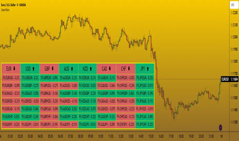
CANX Pairs Table© CanxStixTrader
This Indicator simply shows the change in movement of all the major currency pairs using custom time frames and percentage.
Customize time frame, background, text colors and indicator location to suit.
Keep it simple!
Adaptive Pulsar Momentum | QuantEdgeB⚡ Adaptive Pulsar Momentum | QuantEdgeB
🔭 What is Adaptive Pulsar Momentum?
The Adaptive Pulsar Momentum (APM) is a high-performance, modular trading system designed to decode market momentum across a range of conditions. It combines multi-indicator adaptability (RSI, MFI, Z-Score, ROC, and a hybrid AVG mode) with dynamic signal generation using five advanced "modes" of signal logic: Impulse, Trend, Heikin-Ashi Candles, Statistical Deviation, and MACD.
💡 Think of APM as a scientific instrument, scanning, adapting, and broadcasting precision-tuned momentum data in real-time, helping traders eliminate noise, guesswork, and lag.
___________________________________
1.🔧 System Core: Customizability and Adaptation
📊 Indicator Modes
• 𝓡𝓢𝓘 (Relative Strength Index): Classic oscillator detecting overbought/oversold zones.
• 𝓩-𝓢𝓒𝓞𝓡𝓔: Normalized deviation from mean; ideal for statistical reversion plays.
• 𝓜𝓕𝓘 (Money Flow Index): Volume-weighted RSI-style metric.
• 𝓡𝓞𝓒 (Rate of Change): Measures the velocity of price change.
• 𝓐𝓥𝓖: Combines RSI, MFI, Z-Score, and ROC into a unified signal (normalized to 0–100 scale).
🧠 MA Engine (Smoothing)
Over a dozen moving average types:
• Includes ALMA, TEMA, JMA, SMMA, HMA, LSMA, VWMA, and more.
• Dynamic smoothing makes this system versatile across markets and timeframes.
___________________________________
2.🧨 SIGNAL MODES – THE ENGINE ROOM
Each mode turns the raw smoothed indicator into a powerful momentum signal with thresholds and logic specific to the use case.
1️⃣ 𝓘𝓶𝓹𝓾𝓵𝓼𝓮 Mode
🚀 Use case:
Best for detecting explosive, fast-moving momentum before the crowd catches on.
🔍 Logic:
• Thresholds can be Static, Percentile-based, or Standard Deviation derived.
• Dynamic signal: +1 for breakout, -1 for breakdown, 0 for neutral.
• Custom threshold percentiles enable precise tuning.
🎯 Ideal for:
• Scalping breakouts
• Event-driven spikes (e.g., CPI, FOMC)
• Early trend initiation
2️⃣ 𝓣𝓻𝓮𝓷𝓭 Mode
🧭 Use case:
Built to identify and follow trends with minimal noise. Stable, low-churn logic for riding moves.
🔍 Logic:
• Signal generated via cross above/below a calculated midline (either fixed or dynamic mean).
• Best paired with SMMA or TEMA smoothing.
🎯 Ideal for:
• Swing traders
• Momentum trend followers
• Portfolio rotation strategies
3️⃣ 𝓗𝓐 𝓒𝓪𝓷𝓭𝓵𝓮𝓼 Mode
🔥 Use case:
Filters volatility while capturing structural momentum shifts using Heikin-Ashi logic on smoothed indicators.
🔍 Logic:
• Converts the smoothed signal into Heikin-Ashi candles.
• Measures close vs open to determine trend direction.
• Thresholds again can be static, percentile, or SD-based.
🎯 Ideal for:
• Visual trend clarity
• Avoiding whipsaws in sideways markets
• Discretionary trading with cleaner structure
• Mean-Reverting
4️⃣ 𝓢𝓽𝓪𝓽𝓲𝓼𝓽𝓲𝓬𝓪𝓵 𝓓𝓮𝓿𝓲𝓪𝓽𝓲𝓸𝓷 Mode
🧪 Use case:
Detects high-volatility expansions before or during major directional surges.
🔍 Logic:
• Calculates absolute deviation using HA open vs close.
• Filters this with a moving average and overlays a volatility cloud.
• Breaks above/below the cloud signal directional surge.
🎯 Ideal for:
• Pre-breakout scanning
• Identifying regime shifts
• Options traders looking for volatility expansions
5️⃣ 𝓜𝓐𝓒𝓓 Mode
🧲 Use case:
Classic MACD principles adapted to smoothed momentum indicators—ideal for trend continuation or crossovers.
🔍 Logic:
• MACD line = Pulsar signal - EMA of signal.
• Thresholds (up/down) define bias.
• Optional extra filter to validate with midline crossing.
🎯 Ideal for:
• Trend confirmation
• Crossover-based entry strategies
• Confluence with higher timeframe bias
___________________________________
3.📊 System Sensor Table
Adaptive Pulsar Momentum includes a live multi-layered analytics table designed to give traders a complete pulse on current market behavior. Here's what each section reveals:
🔁 System Signal
At any given bar, the algorithm outputs one of three states:
• Long ⟹ Bullish conditions are active and sustained
• Short ⟹ Bearish momentum dominates
• Cash ⟹ Neutral zone — conditions lack a strong directional bias
This is dynamically adjusted based on the selected signal mode (Impulse, Trend, etc.) and adapts in real time to shifts in smoothed oscillator logic or candle structure.
📊 Strength: Conviction & Potential
Unlike binary signals, this table offers graded insights into how strong or fragile the signal actually is, a huge upgrade from traditional systems.
There are two distinct layers:
1. Conviction Strength –> shown when the system is in a full long or short signal.
- A value like “Long Strength: 84%” means there's high confidence in the continuation or follow-through of the current bias.
- It blends distance from threshold, momentum velocity (Rate of Change), and position in range to avoid false positives and overstretched signals.
2. Potential Strength –> shown during neutral (Cash) periods.
- Two bars appear: one for bullish potential, another for bearish potential.
- These answer: “If the market were to move soon, which side has the edge?”
- Example: "↗ 68% / ↘ 32%" means bulls have more pent-up energy or structure.
These bars provide pre-signal tension, helping traders anticipate breakouts or avoid traps during choppy periods.
🔸 HA Candle Phase (When Mode = HA Candles)
Instead of showing strength bars, this mode displays a phase label, interpreting the Heikin-Ashi candle structure in context of momentum and thresholds:
- Momentum Up / Down –> Strong impulse direction confirmed above or below dynamic bounds.
- Reversal Up / Down –> Early signs of potential reversals (price beyond bounds but opposite signal ).
- Continuation Up / Down –> Sustained movement after a signal confirmation (post-threshold cross).
- Chop –> Sideways indecisiveness, often signaling to reduce risk or await clarity.
- Neutral –> No active momentum or pattern signal.
This provides a narrative view of market behavior, ideal for discretionary traders who rely on visual rhythm and pattern recognition.
___________________________________
5. 🧠 Optional Smart Configuration
Enable “Use Recommended Settings” to auto-configure:
• Optimized lengths
• Best-suited moving averages
• Signal type filters
• Volatility lookbacks
Perfect for those wanting precision without manual tuning.
___________________________________
6.🧪 Use Cases by Mode Summary
🔹 Impulse Mode
Ideal for traders looking to capitalize on sharp breakouts or high-momentum reversals. This mode is built for speed and sensitivity, making it a go-to for scalping, reacting to news events, or identifying trends at their earliest inflection points.
🔹 Trend Mode
Engineered for longer-term positioning, this mode tracks sustained directional bias over time. Best suited for swing traders or those managing portfolio allocations, it's focused on the midline dynamics that define trend health and commitment.
🔹 HA Candles Mode
This mode filters out noise through smoothed Heikin-Ashi transformations, providing clean visual structure. It's perfect for discretionary traders, pattern recognizers, or those looking to enter pullbacks within broader trends. The phase system (e.g. Momentum, Reversal, Chop) adds narrative context to price action.
🔹 Statistical Deviation Mode
A quantitative engine for traders who thrive on volatility exploitation. By modeling deviations from mean behavior, it's particularly powerful in options strategies, regime detection, or scanning for expansion conditions. This mode excels when price breaks away from standard norms.
🔹 MACD Mode
The classic concept of momentum meets modern smoothing in this variant. Use this for confirmation, spotting divergences, or executing crossover-based strategies. MACD mode gives clarity in ambiguous zones, favoring structured continuation or reversal bias.
Each mode is uniquely crafted for a different style of trader and market environment, and switching between them transforms the entire engine’s behavior
___________________________________
🧭 Conclusion
Adaptive Pulsar Momentum isn’t just a signal tool, it’s a market intelligence system. Whether you’re scalping volatility, swinging trends, or navigating uncertain chop, APM dynamically adjusts to the rhythm of the market. With precision-tuned signal modes, a smart strength matrix, and plug-and-play configuration, it transforms raw momentum into actionable clarity.
📌 Trade with Statistical Precision | Powered by QuantEdgeB
🔹 Disclaimer: Past performance is not indicative of future results.
🔹 Strategic Advice: Always backtest, optimize, and align parameters with your trading objectives and risk tolerance before live trading.

Index Futures vs Cash ArbitrageThis indicator measures the statistical spread between major stock index futures and their corresponding cash indices (e.g., ES vs SPX, NQ vs NDX) using Z-score normalization. It automatically detects commonly traded index pairs (S&P 500, Nasdaq, Dow Jones, Russell 2000) and calculates a smoothed spread between futures and spot prices. A Z-score is then derived from this spread to highlight potential overpricing or underpricing conditions.
Traders can use customizable thresholds to identify mean-reversion opportunities where the futures contract may be temporarily overvalued or undervalued relative to the index. The histogram highlights the direction of the Z-score (green = futures > index, red = futures < index), while built-in alerts notify users of key threshold breaches or zero-line crosses.
This tool is designed for discretionary traders, pairs traders, or anyone exploring statistical arbitrage strategies between futures and spot markets. It is not a buy/sell signal by itself and should be used with additional confluence or risk management techniques.

Seasonality DOW CombinedOverall Purpose
This script analyzes historical daily returns based on two specific criteria:
Month of the year (January through December)
Day of the week (Sunday through Saturday)
It summarizes and visually displays the average historical performance of the selected asset by these criteria over multiple years.
Step-by-Step Breakdown
1. Initial Settings:
Defines minimum year (i_year_start) from which data analysis will start.
Ensures the user is using a daily timeframe, otherwise prompts an error.
Sets basic display preferences like text size and color schemes.
2. Data Collection and Variables:
Initializes matrices to store and aggregate returns data:
month_data_ and month_agg_: store monthly performance.
dow_data_ and dow_agg_: store day-of-week performance.
COUNT tracks total number of occurrences, and COUNT_POSITIVE tracks positive-return occurrences.
3. Return Calculation:
Calculates daily percentage change (chg_pct_) in price:
chg_pct_ = close / close - 1
Ensures it captures this data only for the specified years (year >= i_year_start).
4. Monthly Performance Calculation:
Each daily return is grouped by month:
matrix.set updates total returns per month.
The script tracks:
Monthly cumulative returns
Number of occurrences (how many days recorded per month)
Positive occurrences (days with positive returns)
5. Day-of-Week Performance Calculation:
Similarly, daily returns are also grouped by day-of-the-week (Sunday to Saturday):
Daily return values are summed per weekday.
The script tracks:
Cumulative returns per weekday
Number of occurrences per weekday
Positive occurrences per weekday
6. Visual Display (Tables):
The script creates two visual tables:
Left Table: Monthly Performance.
Right Table: Day-of-the-Week Performance.
For each table, it shows:
Yearly data for each month/day.
Summaries at the bottom:
SUM row: Shows total accumulated returns over all selected years for each month/day.
+ive row: Shows percentage (%) of times the month/day had positive returns, along with a tooltip displaying positive occurrences vs total occurrences.
Cells are color-coded:
Green for positive returns.
Red for negative returns.
Gray for neutral/no change.
7. Interpreting the Tables:
Monthly Table (left side):
Helps identify seasonal patterns (e.g., historically bullish/bearish months).
Day-of-Week Table (right side):
Helps detect recurring weekday patterns (e.g., historically bullish Mondays or bearish Fridays).
Practical Use:
Traders use this to:
Identify patterns based on historical data.
Inform trading strategies, e.g., avoiding historically bearish days/months or leveraging historically bullish periods.
Example Interpretation:
If the table shows consistently green (positive) for March and April, historically the asset tends to perform well during spring. Similarly, if the "Friday" column is often red, historically Fridays are bearish for this asset.

Crypto_in_details_MAlibCrypto_in_details_MaLib — Advanced Moving Average Library for Pine Script
Overview:
Crypto_in_details_MaLib is a comprehensive, performance-optimized Moving Average (MA) library designed specifically for Pine Script v6 users seeking advanced technical analysis tools. Developed by Crypto_in_details, this library consolidates the most popular and sophisticated MA calculation methods — including classical, weighted, exponential, and Hull variants — into one seamless package.
Key Features:
Implements a wide range of Moving Averages: SMA, EMA, WMA, RMA, VWMA, HMA, TEMA, EHMA, THMA.
Designed for precision and flexibility — suitable for diverse trading strategies and indicator development.
Fully typed functions compatible with Pine Script v6 standards.
Simplifies your scripting workflow by providing ready-to-use MA functions via clean and easy-to-import methods.
Well-documented and maintained by an experienced Pine Script developer.
Why Use Crypto_in_details_MaLib?
Gain access to advanced MA calculations that enhance trend analysis, smoothing, and signal accuracy.
Save time on coding complex moving averages from scratch.
Easily extend or combine with your own strategies or indicators for improved performance.
Rely on a tested and community-driven solution backed by a prolific Pine Script author.
Ideal for:
Traders and developers building custom indicators or strategies requiring versatile MA techniques.
Anyone looking to improve their Pine Script efficiency and code maintainability.
Pine Script enthusiasts wanting a professional-grade MA toolkit.

VolumeFlowOscillatorLibVolume Flow Oscillator Library
Overview
The Volume Flow Oscillator library provides a comprehensive framework for analyzing directional volume flow in financial markets. It creates a multi-band oscillator system that transforms price and volume data into a spectrum of sensitivity bands, revealing the underlying buying and selling pressure.
Technical Approach
The library combines price direction with trading volume to generate an oscillator that fluctuates around a zero line, with positive values indicating buying pressure and negative values showing selling pressure. Using sophisticated ALMA (Arnaud Legoux Moving Average) smoothing techniques with asymmetric sensitivity, the library creates seven distinct bands that help identify various intensity levels of volume flow.
Key Features
Multi-band oscillator system with seven sensitivity levels
Directional volume flow analysis combining price movement and volume
Zero-line oscillation showing the balance between buying and selling pressure
Asymmetric ALMA smoothing for different sensitivity on positive/negative bands
Customizable lookback periods and multipliers for fine-tuning
Color-coded visualization for intuitive chart reading
Applications
This library offers developers a versatile foundation for creating volume-based indicators that go beyond simple volume measurement to reveal the directional force behind market movements. Ideal for confirming price trends, detecting divergences, identifying volume climaxes, and assessing overall market strength.

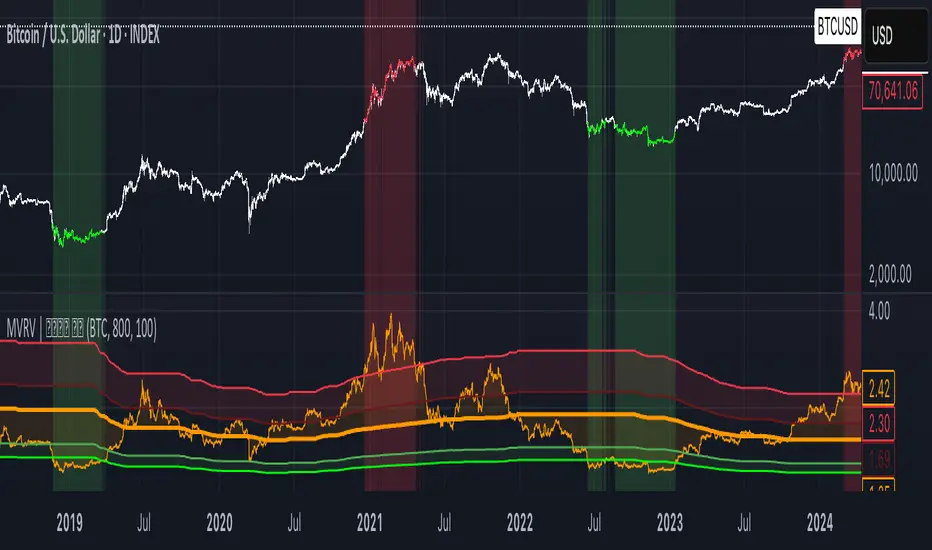
MVRV | Lyro RS📊 MVRV | Lyro RS is a powerful on-chain valuation tool designed to assess the relative market positioning of Bitcoin (BTC) or Ethereum (ETH) based on the Market Value to Realized Value (MVRV) ratio. It highlights potential undervaluation or overvaluation zones, helping traders and investors anticipate cyclical tops and bottoms.
✨ Key Features :
🔁 Dual Asset Support: Analyze either BTC or ETH with a single toggle.
📐 Dynamic MVRV Thresholds: Automatically calculates median-based bands at 50%, 64%, 125%, and 170%.
📊 Median Calculation: Period-based median MVRV for long-term trend context.
💡 Optional Smoothing: Use SMA to smooth MVRV for cleaner analysis.
🎯 Visual Threshold Alerts: Background and bar colors change based on MVRV position relative to thresholds.
⚠️ Built-in Alerts: Get notified when MVRV enters under- or overvalued territory.
📈 How It Works :
💰 MVRV Calculation: Uses data from IntoTheBlock and CoinMetrics to obtain real-time MVRV values.
🧠 Threshold Bands: Median MVRV is used as a baseline. Ratios like 50%, 64%, 125%, and 170% signal various levels of market extremes.
🎨 Visual Zones: Green zones for undervaluation and red zones for overvaluation, providing intuitive visual cues.
🛠️ Custom Highlights: Toggle individual threshold zones on/off for a cleaner view.
⚙️ Customization Options :
🔄 Switch between BTC or ETH for analysis.
📏 Adjust period length for median MVRV calculation.
🔧 Enable/disable threshold visibility (50%, 64%, 125%, 170%).
📉 Toggle smoothing to reduce noise in volatile markets.
📌 Use Cases :
🟢 Identify undervalued zones for long-term entry opportunities.
🔴 Spot potential overvaluation zones that may precede corrections.
🧭 Use in confluence with price action or macro indicators for better timing.
⚠️ Disclaimer :
This indicator is for educational purposes only. It should not be used in isolation for making trading or investment decisions. Always combine with price action, fundamentals, and proper risk management.
Regime Scope | mad_tiger_slayerRegimeScope by mad_tiger_slayer
Adapt to the Market’s Mood. Trade in Sync with Regime Scope.
Overview
Regime Scope is an advanced multi-factor market regime identifier meticulously engineered to determine whether an asset is exhibiting trending behavior (Markup/Markdown phases) or mean-reverting dynamics (Sideways - Accumulation/Distribution). By integrating and synthesizing outputs from nine rigorously chosen statistical and volatility-based models, this tool offers a unified framework for assessing regime conditions with precision.
This indicator is best used in conjunction with other tools in your trading arsenal—serving not as a standalone signal generator, but as a high-value filter for confluence and strategic alignment. Whether you're trading breakouts, reversals, or mean-reversion setups, Regime Scope can elevate your system’s contextual awareness and execution timing.
How It Works – Part 1
Regime Scope calculates a composite "regime score" by normalizing and averaging a range of volatility and statistical measures. This score, which ranges between -1 and +1, indicates the likelihood of the market being in a trending versus mean-reverting state.
Values near +1 suggest a strong trending environment.
Values near -1 suggest strong mean-reversion (sideways, volatile) conditions.
Values between -0.30 and +0.30 are considered neutral and indicate choppy or range-bound market behavior.
When the average regime score crosses above the upper threshold, the asset likely enters a trending state.
When it crosses below the lower threshold, the market likely shifts to a volatile, mean-reverting state.
The histogram and dynamic background color provide an intuitive visual guide to the current regime.
How It Works – Part 2: Components
Each of the following sub-models has been carefully selected for its contribution to understanding price behavior. All components are normalized to create a consistent, unified score:
Phillips-Perron Test: Detects the presence of a unit root to infer stationarity and mean-reverting characteristics.
Hurst Exponent: Measures long-term memory in a time series to identify persistence or anti-persistence.
KPSS Test: Tests for level stationarity to contrast against unit-root behavior and validate trending assumptions.
GARCH Volatility: Captures volatility clustering and regime shifts in conditional variance.
Wavelet Transform: Decomposes price action into time-frequency space to extract non-linear and localized dynamics.
Half-Life of Mean Reversion: Estimates the speed at which price returns to its mean, enhancing the timing of reversion plays.
Augmented Dickey-Fuller (ADF) Test: Statistically verifies whether a series exhibits mean-reverting tendencies.
Garman-Klass-Yang-Zhang Volatility: A robust historical volatility measure using open-high-low-close data.
ADX (Average Directional Index): A classic technical tool for quantifying the strength of trend directionality.
How It Works – Part 3: Output Interpretation
All sub-models are normalized and synthesized into a single histogram plot shown in the lower chart panel.
+1.0 to +0.30: Indicates high probability of a directional, trending market.
-1.0 to -0.30: Indicates high probability of a sideways, mean-reverting regime.
-0.30 to +0.30: Suggests a neutral, uncertain market condition.
Transitions above or below these thresholds signal regime shifts.
Background shading adapts in real-time to visually reflect regime classification.
Features
Customizable thresholds to fine-tune sensitivity for regime classification.
Visual overlay positioning (choose from top-left, bottom-right, etc.).
Toggleable reference lines for regime thresholds.
Cross-timeframe consistency through dynamic normalization.
Each sub-model includes adjustable settings for personalized optimization.
Use Cases
Dynamically switch between trend-following and mean-reversion strategies.
Filter out choppy, low-probability zones by avoiding neutral regime periods.
Use regime score as confluence with entry/exit signals from other indicators.
Adapt strategies across timeframes—works well from scalping to swing trading.
Best used on timeframes ≥12H for macro regime context, but scalpers can benefit by using it on shorter windows with tuned parameters.
Scalping Use Case
Overlay the regime score on low timeframes (e.g., 1m–15m) and use it to avoid high chop zones or confirm breakout volume spikes during trending periods.
Long-Term Use Case
On 1D–1W charts, Regime Scope can filter false breakouts and confirm macro trend alignment for position trades or swing setups.
Tip
Combine Regime Scope with traditional technical tools like RSI, MACD, Bollinger Bands, or moving average crossovers to enhance strategic coherence.
For example, only act on breakout or trend-following signals when the regime score exceeds the upper threshold, confirming a high-trend environment.
Conversely, mean-reversion strategies like fading RSI extremes or trading Bollinger Band bounces work best when the regime score is in the lower range.
Aligning your tactical entries with the broader regime can significantly reduce false signals, enhance trade probability, and improve overall system robustness.

Anchored Probability Cone by TenozenFirst of all, credit to @nasu_is_gaji for the open source code of Log-Normal Price Forecast! He teaches me alot on how to use polylines and inverse normal distribution from his indicator, so check it out!
What is this indicator all about?
This indicator draws a probability cone that visualizes possible future price ranges with varying levels of statistical confidence using Inverse Normal Distribution , anchored to the start of a selected timeframe (4h, W, M, etc.)
Feutures:
Anchored Cone: Forecasts begin at the first bar of each chosen higher timeframe, offering a consistent point for analysis.
Drift & Volatility-Based Forecast: Uses log returns to estimate market volatility (smoothed using VWMA) and incorporates a trend angle that users can set manually.
Probabilistic Price Bands: Displays price ranges with 5 customizable confidence levels (e.g., 30%, 68%, 87%, 99%, 99,9%).
Dynamic Updating: Recalculates and redraws the cone at the start of each new anchor period.
How to use:
Choose the Anchored Timeframe (PineScript only be able to forecast 500 bars in the future, so if it doesn't plot, try adjusting to a lower anchored period).
You can set the Model Length, 100 sample is the default. The higher the sample size, the higher the bias towards the overall volatility. So better set the sample size in a balanced manner.
If the market is inside the 30% conifidence zone (gray color), most likely the market is sideways. If it's outside the 30% confidence zone, that means it would tend to trend and reach the other probability levels.
Always follow the trend, don't ever try to trade mean reversions if you don't know what you're doing, as mean reversion trades are riskier.
That's all guys! I hope this indicator helps! If there's any suggestions, I'm open for it! Thanks and goodluck on your trading journey!
AQPRO Block Force
📝 INTRODUCTION
AQPRO Block Force is a powerful trading tool designed to identify and track Orderblocks (OBs) in real-time based on Fair Value Gap (FVG) principles. This indicator employs quite strict yet effective FVG filtering criteria to ensure only significant OBs are displayed, avoiding minor inefficiencies or duplicates within the same impulse or corrective moves. Each OB adapts dynamically to price action and can be categorized as Classic, Strong, or Extreme, based on proprietary conditions and best ideas from SMC (Smart Money Concepts).
In addition to plotting Orderblocks, the indicator offers useful filtering systems like an Age Filter to ensure cleanliness of the OB data on the chart and prevent old, irrelevant OBs from obstructing the chart. Users can also enable MTF (Multi-Timeframe) functionality to view OBs from other timeframes, providing a comprehensive analysis across multiple levels of market structure. With extensive customization options, AQPRO Block Force allows traders to tailor the visuals and behavior to fit their specific trading preferences.
This indicator does not parse any instituotinal data, order books and other fancy financial sources for finding order blocks nor it uses them for confirmation purposes. Calculations algorithms of order blocks are based purely on current asset's price history.
IMPORTANT NOTE: in the sections below term 'quality' will be applied to orderblocks quite a number of times. By 'quality' in the context of orderblocks we mean the reaction of price upon the sweep of orderblock. Basically, if the price reverses after reaching the orderblock, this orderblock is considered to be of high quality. Definition for low -quality orderblock can be deducted by analogy.
🎯 PURPOSE OF USAGE
This indicator serves one and only purpose — help traders identify most lucrative institutional orderblocks on the chart in real time. Even though event of price reaching an orderblock cannot be considered as a sole signal in many trading strategies without proper confirmation, such event nevertheless is quite important in SMC-based trading, because when price sweeps OB it usually means, that a reversal will soon follow, but, of course, this is not the case every time.
Traders should not expect from this indicator detection of perfect orderblocks, which would surely revese the price on encounter, but they can expect is a time-proven algorithm of determing orderblocks that on average produces more high-quality orderblocks than simple similar tools from open-source libraries.
More in-depth advices on the usage will be given in the sections below, but for now let's summarise subgoals of the indicator:
Detecting orderblocks filtered through strict FVG validation rules to improve overall quality of orderblocks;
Classifying orderblocks as Classic, Strong, or Extreme based on wether or not classic orderblocks pass filtering conditions, which are based on crossing critical price levels and SMC principles like ChoCh (Change of Character);
Eliminating clutter and manage chart space with the Age Filter, removing old OBs outside a user-defined age range;
Utilizing MTF functionality to track significant OBs from other timeframes alongside current timeframe analysis;
Providing traders with customization options for indicator's visuals to help them organize information on the chart in a clean way.
⚙️ SETTINGS OVERVIEW
This indicator's customization options allow you to fully control its functionality and visuals. Below is a breakdown of the settings grouped by the exact setting sections and parameters from the indicator:
🔑 Main Settings
Show OBs from current timeframe — toggles the display of OBs from the current timeframe on the chart;
Show classic OBs — enables or disables the display of Classic OBs;
Show strong OBs — enables or disables the display of Strong OBs, which meet the ChoCh-based filter criteria;
Show extreme OBs — enables or disables the display of Extreme OBs, which exceed proprietary price level risk thresholds.
⏳ Filter: Age
Use Age Filter — toggles the Age Filter, which removes old OBs based on their age;
Max Age — sets the maximum age of OBs to be displayed (in bars). OBs older than this value will be hidden;
Min Age — sets the minimum age of OBs to be displayed (in bars). OBs younger than this value will not be shown.
🌋 MTF Settings
Show MTF OBs — toggles the display of OBs from higher timeframes;
Timeframe — select the timeframe to use for MTF OB detection (e.g., 15m, 1h).
⏳ MTF / Filter: Age
Use Age Filter (MTF) — toggles the Age Filter for MTF OBs;
Max Age — sets the maximum age of MTF OBs to be displayed (in bars);
Min Age — sets the minimum age of MTF OBs to be displayed (in bars).
🎨 Visual Settings
Classic OB (Bullish) — sets the color for bullish Classic OBs;
Classic OB (Bearish) — sets the color for bearish Classic OBs;
Strong OB (Bullish) — sets the color for bullish Strong OBs;
Strong OB (Bearish) — sets the color for bearish Strong OBs;
Extreme OB (Bullish) — sets the color for bullish Extreme OBs;
Extreme OB (Bearish) — sets the color for bearish Extreme OBs.
📈 APPLICATION GUIDE
Application methodology of this indicator is pretty much the same as with any other indicator, whose purpose is to find and display orderblocks on the chart. However, before actually diving into the guide on application, we want to make a small step back to remind traders of the history of orderblocks as a concept, its limitations and benefits.
Orderblocks themselves are essentially just zones of potential institutional interest, which if reached are expected to reverse the price in the opposite direction. 'Potential' is a suitable remark for indicator's success probability, because, as was mentioned above, orderblocks don't guarantee price reversal regardless of quality of the indicator. This is the case for the simplest of reasons — orderblocks are based solely on price history and thus are to be considered a mathematical model , degree of success of which is never 100%, because all mathematical models abide by a "golden rule of trading" : past performance doesn't guarantee future results.
However, the extensive history of orderblocks clearly shows that this tool, despite being decades old, can still help traders produce market insights and improve any strategy's performance. Orderblocks can be used both as a primary source of signals and as confirmation tool, but from our experience they are better to be used as confirmation tool. Our indicator is not an exception in this matter and we advice any trader to use it mainly for confirmation purposes, because use-case of orderblocks as confirmation tools have much success stories on average than being used as primary signal source.
This being said, let's return to the application guide and start reviewing the indicator from the most basic step — how it will look like when you first load it on your chart:
This indicator consisis of 3 main logic blocks:
Orderblock evaluation;
MTF Orderblock evaluation;
Orderblock post-filtering.
The principles behind these logic blocks will be easy to understand for truly experiences traders, but we understand the need to explain them to a wider audience, so let's review each of these logic blocks below.
ORDERBLOCK EVALUATION
Principles behind our orderblock detection logic are as follows:
Find FVG (Fair Value Gap) .
Note: this indicator uses only three-candle FVGs and doesn't track FVGs with insidebars after third (farther) candle.
If you don't know what FVG means, we recommend researching this term in the Internet, but the basic explanation is this: FVG is the formation of candles, which are positioned in a way that there are an unclosed price area between 1st and 3rd candle.
Conditions:
bullish FVG = high of 3rd candle < low of 1st candle AND high of 3rd candle < close of 2nd candle AND high of 2nd candle < close of 1st candle AND low of 3rd candle < low of 2nd candle ;
bearish FVG = low of 3rd candle < high of 1st candle AND low of 3rd candle > close of 2nd candle AND low of 2nd candle > close of 1st candle AND high of 3rd candle > high of 2nd candle .
See visual showcase of valid & invalid bullish & bearish FVGs on the screenshot below:
As was shown on the screenshot above, the only correc t formation for FVGs are considered to be just like on pictures 1 and 2 (leftmost column of patterns) . Only these formations will take part in further determenings orderblocks.
Send FVGs through filtering conditions.
This is the truly important part. Without properly filtering FVGs we would get huge clusters of FVGs on the chart and they will not make sense to be reviewed, because there will be just too much of them and their quality will be very questionable .
Even though there is a quite number of ways to filter FVGs, we decided to go with the ones we deem actually useful. For this indicator we chose two methods, that work in tandem — 1) base candle's inside bar condition and 2) single appearance on current impulse/correction line. Let's review these conditions below and start with looking at the examples of them on the screenshot below:
Examples of 1st & 2nd conditions are displayed on the left and right charts respectively.
The filtering logic in 1st and 2nd is quite connected and further explanation should help you understand it just enough to start trading with our indicator.
Let's start with explaining the term 'base candle' and logic behind it. Base candle candle be explained quite shortly: it is the latest candle on the chart, whose high or low broke previous base candle's high or low respectively. The first candle in the time series of price data is by default considered the base candle. If any new candle after base candle doesn't overtake base candle's high or low (meaning, that this candle is inside the range of base candle), such candle is called an "inside bar" .
Inside bar's term is important to understand, because FVGs, which appear inside the inside bars are usually quite useless, because price doesn't react from them, so orderblocks with such FVGs are also of bad quality as well. Clear depiction of inside bar was provided in the screenshot of conditions above on the left chart, so we won't waste time making another example.
However, this is not it. Base candle, inside bars and a few other types of bars are all a part of SMC ideas and in the world of SMC there is a special term, that hold the most important place and is considered the cornerstone of SMC methodology — impulse/correction lines (valid pullbacks) . The average definition of impulse/correction lines is quite hard to understand for an average trader, but we can summarise like this:
Impulse/correction line is a line, that starts at the beginning of the sequence of base candles, each new candle of which consistently updates previous base candle's respective high/low.
We won't go into description of this principle because it is outside of scope of this indicator, but you can research this topic in the Internet by keywords ' impulse correction trading ' or 'valid pullback principles trading '. The general idea of usage of impulse/correction lines in the context of this indicator is that each such lines 'holds' inside at least one FVG and we need to find exactly the first FVG, while leaving all other FVGs behind, because they to be of worse quality on average.
Basically, by using translating these terms into conditions from example above, we have achieved a simple yet powerful filtering system. system for FVGs, which allows us to work with orderblocks of much higher quality than average open-source indicators.
If FVG passed filters, evaluate its OB.
When FVG is confirmed, we can start the evaluation of its orderblock. The evaluation of orderblocks consists of several checkpoints: 1) is orderblock beyond current ChoCh* AND/OR 2) is orderblock from extreme price levels, calculated by our proprietary risk system. Let's review these checkpoints below.
* ChoCh (Change of Character, fundamental SMC idea) — price level, which if broken by close of price can potentially cause a revesal of the trend to direction opposite to the the previous one. To learn more about ChoCh please research the term on the Internet, because this indicator uses its standard definition and explaining of this term goes beyond the scope of this indicator.
To determine if orderblock is beyond current ChoCh levels, we need to first determine where these levels are on the chart. ChoCh levels of this indicator are calculated with a very lite approach, which is based on pivot points.
You can see basic demonstration of ChoCh levels in action on the screenshot below:
IMPORTANT NOTE: pivot period for pivots points inside our indicator is by default equal to 5 and cannot be changed in settings at the moment of publication.
On the screenshot above you can clearly see that ChoCh levels are essentially highest/lowest pivot point levels in between certain range of bars, where price doesn't update its extremum. You can see on there screenshot a new type of line — BoS (Break of Structure). BoS is almost the same thing as ChoCh, but with one change: it is a confirmation of price updating its extremum in the same direction as it was before, while ChoCh updates price extremum in the direction opposite to which it was before .
Why do these levels matter when evaluating the orderblocks? Orderblocks, which are located beyond current BoS/ChoCh levels, are of much higher quality on average than average orderblocks and they are called Strong Orderblocks .
On the chart such orderblocks are marked with 'Strong OB' label inside the body of an orderblock.
You can see the examples of Strong OBs on the screenshot below:
That was the explanation of the 1st orderblock evaluation criteria. Now let's talk about the 2nd one.
Our 2nd evaluation criteria for orderblocks is a test on whether or price is behind specific price level, which is calculated by our proprietary risk system, which is based on fundamental of statistics, such as 'standard deviation' and etc.
This criteria allows us to catch orderblocks, which are located at quite extreme price levels, and mark them on trader's chart explicitly. Orderblocks, which are above our custom price levels, are called Extreme Orderblocks an are marked with 'Extreme OB' label inside orderblock's body.
You can see the example of Extreme OB on the screenshot below:
That was the explanation of the 2nd evaluation criteria of the orderblock.
If an orderblock doesn't pass any of these two criterias, it is considered a classic orderblock. These orderblock are most common ones and have the lowest success rate among other types of orderblocks, listed above. Such orderblocks are marked with 'OB' label inside the orderblock's body.
You can see the examples of classic OB on the screenshot below:
This is it for orderblock evaluation logic. After doing all these steps, all orderblocks that we found are collected and displayed on the chart with their bodies and label marks.
What happens after the detection of the orderblocks?
All active orderblocks are being tracked in real time and their statuses are being updated as well (Strong orderblock can become Extreme orderblock and vice versa) . By an active orderblock we mean an orderblock, which wasn't swept by price's high or low. Bodies of active orderblocks are prolonged to the next candle on each new candle.
If an orderblock was swept, indicator will stop prolonging this orderblock and will mark it as swept on the chart with almost hollow body and dashed border line of the orderblock's body. Also swept orderblocks lose their name label, so you won't see any text in the orderblock after it was swept, but you will see its colour.
You can see the example of an active & swept orderblocks on the screenshot below:
This functionality helps distinguish active orderblocks from swept ones (inactive) and make more informed decisions.
MTF OB EVALUATION
Principles of MTF OBs evaluation are exactly the same as they are for current timeframe's OBs.
MTF OBs are displayed on the chart in same way as other OBs, but with one little change: to the right side of MTF OB's status will be postfix of the timeframe, from which this OB came from. Timeframe for MTF OBs can be chosen by user in the settings of the indicator.
MTF OBs also preserve their statuses (Strong, Extreme and Classic) when displayed on the current timeframe, so you won't stack of mistakenly marked MTF OBs as Extreme just because they are far away from the price.
You can see the example of MTF OBs on the screenshot below:
Also MTF OBs when swept lose only their name label, but the timeframe postfix will still be there, so you could distinguish MTF OBs from OBs of the current timeframe.
See the example of swept MTF OBs below:
Overall MTF orderblocks is a very useful to get a sense of where the higher timeframe liquidity reside and then adjust your strategy accordingly. Taking your trades from the place of high liquidity, like orderblocks, doesn't guarantee certain solid price reaction, but it definitely provides a trader with much a greater change of 1) catching a decent price move 2) not losing money white trading against institutional players.
As was stated above, we recommend using this tool as a confirmation system for your main trading strategy, because its usage as primary source of signals in the long-run is not viable, judging from historical backtest results and general public opinions of traders.
ORDERBLOCK POST-FILTERING
To enhance filtering capabilities of this indicator even further, we decided to add two filters, which would help reduce the amount of bad and untradeable orderblocks. These two filters are 1) age filter and 2) cancellation filter. Let's review both of them below.
Talking about the age filter , this filter was designed to help get rid of old orderblocks, which clutter the chart with visual noise and make it harder to find valueable orderblocks. This filter has to parameters: min age and max age . What does age mean in the context of an orderblock? It is the distance between OB's left border's bar and current bar. If this distance is between min age and max age values, such orderblock is considered valid and age filter passes it for further evaluation, but this distance is too short or too long, age filter deletes this orderblock from the chart.
You can the example of an orderblock which didn't pass age filter requirements and was deleted from the chart on the screenshot below:
It is important to mention that the missing orderblock from the right chart will be appear on the chart right when its age will exceed min age parameter of age filter.
The principle of work for max age parameter can be deducted by analogy: if the orderblock's age in bigger than max age value of age filter, this orderblock will be deleted from the chart .
For MTF OBs we decided to their own age filter, so that it won't abide by current timeframe's restrictions, because MTF OBs are usually much older than OB from current timeframe, so they would deleted a lot of time before they even appear on the chart, if they would abide by the age filter of current timeframe.
Default parameters of age filter are "max age = 500" and "min age = 0" . "Min age = 0" means that there is restrictions on the minimum age of orderblocks and they will appear on the chart as soon as the indicator validates them.
That was the explanation of the age filter.
Talking about the cancellation filter , this filter was intended to spot orderblocks which were extremely untradable and visually alert traders about them on the chart. In this indicator this filter works like this: for each orderblock cancellation filter creates a special price level and checks if it was broken by the close of price.
This special price level consists of the farthest border. of the orderblock ( top border for bearish OBs and bottom border for bullish OBs) and a certain threshold, which is added to the farthest border. This threshold is based on the current ATR value of the asset. This filter helps detect the orderblocks which should not be considered for trading, because price has already went too far beyond the liquidity of this orderblock.
Orderblocks, which are spotted by this filter, are marked with '❌' emoji on the price history.
You can see the example of an orderblock which was spotted by the cancellation filter in the screenshot below:
This filter is applied to both current timeframe and MTF timeframe and is NOT configurable in the settings.
🔔 ALERTS
This indicator employs alerts for an event when new signal occurs on the current timeframe or on MTF timeframe. While creating the alert below 'Condition' field choose 'any alert() function call'.
When this alert is triggered, it will generate this kind of message:
// Alerts for current timeframe
string msg_template = "EXCHANGE:ASSET, TIMEFRAME: BULLISH_OR_BEARISH OB at SWEPT_OB_BORDER_PRICE was reached."
string msg_example = "BINANCE:BTCUSDT, 15m: bearish OB at 170000.00 was reached."
// Alerts for MTF timeframe
string msg_template_mtf = "EXCHANGE:ASSET, TIMEFRAME: BULLISH_OR_BEARISH MTF OB at SWEPT_OB_BORDER_PRICE was reached."
string msg_example_mtf = "BINANCE:BTCUSDT, 15m: bearish MTF OB at 170000.00 was reached."
📌 NOTES
These OBs work on any timeframe, but we would advise to to use on higher timeframes, starting from at least 15m, because liquidity from higher timeframe tends to be much valuable when deciding which orderblock to take for a trade;
Use these OBs as a confirmation tool for your main strategy and refrain from using them as primary signal source. Traders, which use SMC-based strategies, will benefit from these orderblocks the most;
We recommend trading only with Strong and Extreme orderblocks, because they are proved to be of much greater quality than classic orderblocks and they work quite well in mid-term and long-term trading strategies. Classic orderblocs can be used for short-term trading strategies, but even in this case these OBs cannot be blindly trusted;
We strongly advise against take for a trading orderblocks, which were spotted by cancellation filter, because they are considered to be voided of liquidity;
Don't forget that you can toggle different types of OBs, MTF settings and visual settings in the settings of the indicator and fine-tune them to your liking.
🏁 AFTERWORD
AQPRO Block Force is an indicator which designed with idea of helping trading save time on automatically detecting valuable orderblocks on the chart, evaluate their strength and filter out bad orderblocks. These employ the best principles of SMC, including FVGs, valid pullbacks and etc. FVGs play the key role in validating the existence of a particular orderblock and work in tandem with valid pullback to determine the maximum amount of true FVGs even in the most cluttered impulse/correction moves of the price. Our filters — Age Filter and Cancellation Filter — enhance the quality of the orderblocks by allowing only the newest and liquid orderblocks to appear on the chart. Additional MTF functionality allow trader to see orderblocks from other timeframe, which can be chosen in the settings, and get a sense of where the global liquidity resides. This indicator will be a useful confirmation tool to any trading strategy, but the SMC traders will surely get the most benefits out of it.
ℹ️ If you have questions about this or any other our indicator, please leave it in the comments.

BPCO Z-ScoreBPCO Z-Score with Scaled Z-Value and Table
Description:
This custom indicator calculates the Z-Score of a specified financial instrument (using the closing price as a placeholder for the BPCO value), scales the Z-Score between -2 and +2 based on user-defined thresholds, and displays it in a table for easy reference.
The indicator uses a simple moving average (SMA) and standard deviation to calculate the original Z-Score, and then scales the Z-Score within a specified range (from -2 to +2) based on the upper and lower thresholds set by the user.
Additionally, the scaled Z-Score is displayed in a separate table on the right side of the chart, providing a clear, numerical value for users to track and interpret.
Key Features:
BPCO Z-Score: Calculates the Z-Score using a simple moving average and standard deviation over a user-defined window (default: 365 days). This provides a measure of how far the current price is from its historical average in terms of standard deviations.
Scaled Z-Score: The original Z-Score is then scaled between -2 and +2, based on the user-specified upper and lower thresholds. The thresholds default to 3.5 (upper) and -1.5 (lower), and can be adjusted as needed.
Threshold Bands: Horizontal lines are plotted on the chart to represent the upper and lower thresholds. These help visualize when the Z-Score crosses critical levels, indicating potential market overbought or oversold conditions.
Dynamic Table Display: The scaled Z-Score is shown in a dynamic table at the top-right of the chart, providing a convenient reference for traders. The table updates automatically as the Z-Score fluctuates.
How to Use:
Adjust Time Window: The "Z-Score Period (Days)" input allows you to adjust the time period used for calculating the moving average and standard deviation. By default, this is set to 365 days (1 year), but you can adjust this depending on your analysis needs.
Set Upper and Lower Thresholds: Use the "BPCO Upper Threshold" and "BPCO Lower Threshold" inputs to define the bands for your Z-Score. The default values are 3.5 for the upper band and -1.5 for the lower band, but you can adjust them based on your strategy.
Interpret the Z-Score: The Z-Score provides a standardized measure of how far the current price (or BPCO value) is from its historical mean, relative to the volatility. A value above the upper threshold (e.g., 3.5) may indicate overbought conditions, while a value below the lower threshold (e.g., -1.5) may indicate oversold conditions.
Use the Scaled Z-Score: The scaled Z-Score is calculated based on the original Z-Score, but it is constrained to a range between -2 and +2. When the BPCO value hits the upper threshold (3.5), the scaled Z-Score will be +2, and when it hits the lower threshold (-1.5), the scaled Z-Score will be -2. This gives you a clear, easy-to-read value to interpret the market's condition.
Data Sources:
BPCO Data: In this indicator, the BPCO value is represented by the closing price of the asset. The calculation of the Z-Score and scaled Z-Score is based on this price data, but you can modify it to incorporate other data streams as needed (e.g., specific economic indicators or custom metrics).
Indicator Calculation: The Z-Score is calculated using the following formulas:
Mean (SMA): A simple moving average of the BPCO (close price) over the selected period (365 days by default).
Standard Deviation (Std): The standard deviation of the BPCO (close price) over the same period.
Z-Score: (Current BPCO - Mean) / Standard Deviation
Scaled Z-Score: The Z-Score is normalized to fall within a specified range (from -2 to +2), based on the upper and lower threshold inputs.
Important Notes:
Customization: The indicator allows users to adjust the period (window) for calculating the Z-Score, as well as the upper and lower thresholds to suit different timeframes and trading strategies.
Visual Aids: Horizontal lines are drawn to represent the upper and lower threshold levels, making it easy to visualize when the Z-Score crosses critical levels.
Limitations: This indicator relies on historical price data (or BPCO) and assumes that the standard deviation and mean are representative of future price behavior. It does not account for potential market shifts or extreme events that may fall outside historical norms.
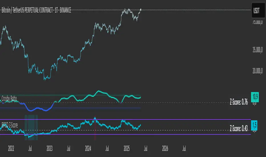
SOPR with Z-Score Table📊 Glassnode SOPR with Dynamic Z-Score Table
ℹ️ Powered by Glassnode On-Chain Metrics
📈 Description:
This indicator visualizes the Spent Output Profit Ratio (SOPR) for major cryptocurrencies — Bitcoin, Ethereum, and Litecoin — along with a dynamically normalized Z-Score. SOPR is a key on-chain metric that reflects whether coins moved on-chain are being sold at a profit or a loss.
🔍 SOPR is calculated using Glassnode’s entity-adjusted SOPR feed, and a custom SMA is applied to smooth the signal. The normalized Z-Score helps identify market sentiment extremes by scaling SOPR relative to its historical context.
📊 Features:
Selectable cryptocurrency: Bitcoin, Ethereum, or Litecoin
SOPR smoothed by user-defined SMA (default: 10 periods)
Upper & lower bounds (±4%) for SOPR, shown as red/green lines
Background highlighting when SOPR moves outside normal range
Normalized Z-Score scaled between –2 and +2
Live Z-Score display in a compact top-right table
🧮 Calculations:
SOPR data is sourced daily from Glassnode:
Bitcoin: XTVCBTC_SOPR
Ethereum: XTVCETH_SOPR
Litecoin: XTVCLTC_SOPR
Z-Score is calculated as:
SMA of SOPR over zscore_length periods
Standard deviation of SOPR
Z-Score = (SOPR – mean) / standard deviation
Z-Score is clamped between –2 and +2 for visual consistency
🎯 Interpretation:
SOPR > 1 implies coins are sold in profit
SOPR < 1 suggests coins are sold at a loss
When SOPR is significantly above or below its recent range (e.g., +4% or –4%), it may signal overheating or capitulation
The Z-Score contextualizes how extreme the current SOPR is relative to history
📌 Notes:
Best viewed on daily charts
Works across selected assets (BTC, ETH, LTC)
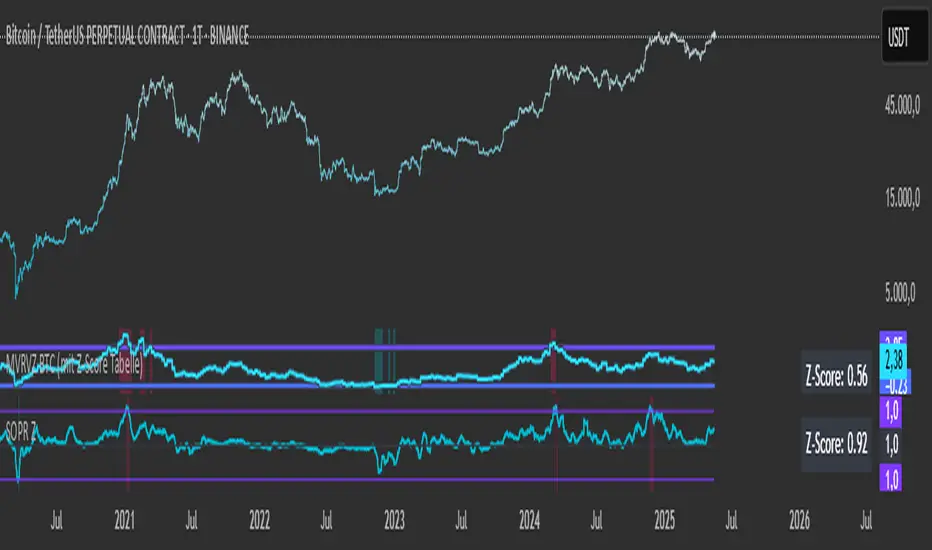
MVRVZ BTCMVRVZ BTC (Market Value to Realized Value Z-Score)
Description:
The MVRVZ BTC indicator provides insights into the relationship between the market value and realized value of Bitcoin, using the Market Value to Realized Value (MVRV) ratio, which is then adjusted using a Z-Score. This indicator highlights potential market extremes and helps in identifying overbought or oversold conditions, offering a unique perspective on Bitcoin's valuation.
How It Works:
MVRVZ is calculated by taking the difference between Bitcoin's Market Capitalization (MC) and Realized Capitalization (MCR), then dividing that by the Standard Deviation (Stdev) of the price over a specified period (usually 104 weeks).
The resulting value is plotted as the MVRVZ line, representing how far the market price deviates from its realized value.
Z-Score is then applied to the MVRVZ line, with the Z-Score bounded between +2 and -2, which allows it to be used within a consistent evaluation framework, regardless of how high or low the MVRVZ line goes. The Z-Score will reflect overbought or oversold conditions:
A Z-Score above +2 indicates the market is likely overbought (possible market top).
A Z-Score below -2 indicates the market is likely oversold (possible market bottom).
Values between -2 and +2 indicate more neutral market conditions.
How to Read the Indicator:
MVRVZ Line:
The MVRVZ line shows the relationship between market cap and realized cap. A higher value indicates the market is overvalued relative to the actual capital realized by holders.
The MVRVZ line can move above or below the top and bottom lines you define, which are adjustable according to your preferences. These lines act as trigger levels.
Top and Bottom Trigger Lines:
You can customize the Top Line and Bottom Line values to your preference.
When the MVRVZ line crosses the Top Line, the market might be considered overbought.
When the MVRVZ line crosses the Bottom Line, the market might be considered oversold.
SCDA Z-Score:
The Z-Score is displayed alongside the MVRVZ line and is bounded between -2 and +2. It scales proportionally based on the MVRVZ line's position relative to the top and bottom trigger lines.
The Z-Score ensures that even if the MVRVZ line moves beyond the trigger lines, the Z-Score will stay within the limits of -2 to +2, making it ideal for your custom evaluation system (SCDA).
Background Highlighting:
The background color changes when the MVRVZ line crosses key levels:
When the MVRVZ line exceeds the Top Trigger, the background turns red, indicating overbought conditions.
When the MVRVZ line falls below the Bottom Trigger, the background turns green, indicating oversold conditions.
Data Sources:
The data for the MVRVZ indicator is sourced from Glassnode and Coinmetrics, which provide the necessary values for:
BTC Market Cap (MC) – The total market capitalization of Bitcoin.
BTC Realized Market Cap (MCR) – The capitalization based on the price at which Bitcoin was last moved on the blockchain (realized value).
How to Use the Indicator:
Market Extremes:
Use the MVRVZ and Z-Score to spot potential market tops or bottoms.
A high Z-Score (above +2) suggests the market is overbought, while a low Z-Score (below -2) suggests the market is oversold.
Adjusting the Triggers:
Customize the Top and Bottom Trigger Lines to suit your trading strategy. These lines can act as dynamic reference points for when to take action based on the Z-Score or MVRVZ line crossing these levels.
Market Evaluation (SCDA Framework):
The bounded Z-Score (from -2 to +2) is tailored for your SCDA evaluation system, allowing you to assess market conditions based on consistent criteria, no matter how volatile the MVRVZ line becomes.
Conclusion:
The MVRVZ BTC indicator is a powerful tool for assessing the relative valuation of Bitcoin based on its market and realized capitalization. By combining it with the Z-Score, you get an easy-to-read, bounded evaluation system that highlights potential market extremes and helps you make informed decisions about Bitcoin's price behavior.

Capital Flow StrengthCapital Flow Strength Indicator Guide
This is a comprehensive technical indicator that measures capital flow into or out of an asset, combined with volume analysis. Here's how to use it effectively:
Basic Understanding
The indicator shows capital flow strength on a scale from -100 to +100
Positive values (green) indicate money flowing into the asset
Negative values (red) indicate money flowing out
The blue/gray volume bars show relative volume compared to recent average
Key Components
Capital Flow Line
Green line above zero: Buying pressure dominates
Red line below zero: Selling pressure dominates
Crossing zero: Potential shift in market sentiment
Reference Lines
0 line: Neutral balance between buyers and sellers
+50 line: Strong buying pressure
-50 line: Strong selling pressure
Volume Strength Bars
Blue bars: Volume exceeding threshold (currently 1.5x average)
Gray bars: Normal volume levels
Taller bars: Higher relative volume
Trading Applications
Entry Signals
Strong buying setup: Capital flow above +50 with blue volume bars
Strong selling setup: Capital flow below -50 with blue volume bars
Confirmation Tool
Use with price action and other indicators for confirmation
Strong readings are more reliable when volume is higher than average
Divergence Analysis
Bullish divergence: Price making lower lows but capital flow making higher lows
Bearish divergence: Price making higher highs but capital flow making lower highs
Customization Options
Length (14): Adjust the calculation period
Volume Threshold (1.5): Modify sensitivity to volume spikes
Alert Conditions
The indicator has two built-in alerts:
"Strong Capital Inflow" - triggers when flow > 50 with high volume
"Strong Capital Outflow" - triggers when flow < -50 with high volume
These alerts can help you identify significant buying or selling pressure as it emerges.
