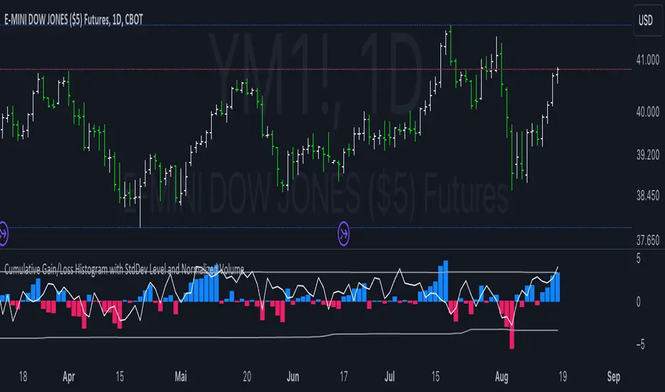
Cumulative Gain/Loss Histogram This TradingView Pine Script indicator combines several analytical tools to assist traders in making informed investment decisions. It calculates and visualizes cumulative gain/loss percentage, standard deviation levels, and normalizes trading volume on a reversed scale.
Components:
Basis for Calculation:
Users can select the basis data for the calculations: Price, VIX (Volatility Index), VVIX (Volatility of Volatility Index), or MOVE (Volatility Index for Treasury Securities).
Cumulative Gain/Loss:
This is computed based on the selected basis. The script tracks the cumulative percentage change in the selected basis data. Positive changes are aggregated to track gains, while negative changes accumulate to track losses.
Standard Deviation Levels:
The script calculates standard deviation (StdDev) for the cumulative gain/loss data over a specified period. Two levels are determined:
Positive StdDev Level: Shows the upper threshold for gains.
Negative StdDev Level: Shows the lower threshold for losses.
These levels are useful for identifying extreme deviations in the data.
Normalized Volume:
The trading volume is normalized to fit within a -5 to 5 scale, but the scale is reversed. Higher trading volumes will be represented by lower values on this scale. This normalized volume is plotted as a gray line on the chart.
How to Use This Indicator:
Identify Trends and Extremes:
Cumulative Gain/Loss: Look for periods where the cumulative gain/loss exceeds the standard deviation levels. This can indicate significant trend changes or potential reversals. Standard Deviation Levels: Use these levels to gauge whether the market is experiencing extreme conditions. For example, if the cumulative gain/loss crosses above the positive StdDev level, it might suggest an overbought condition.
Volume Analysis:
Normalized Volume: Analyze the volume trends with the reversed scale. Higher normalized volume values (which are lower on the -5 to 5 scale) could indicate high trading activity or market interest, potentially signaling a strong move or trend. Conversely, lower normalized volume values (which are higher on the -5 to 5 scale) may suggest lower trading activity or consolidation.
Decision-Making:
Combine the insights from cumulative gain/loss and standard deviation levels with volume analysis to make more informed trading decisions.
Buy Signal: Consider entering a position when the cumulative gain/loss reaches or exceeds the negative StdDev level and volume analysis supports increased market activity.
Sell Signal: Consider exiting a position when the cumulative gain/loss exceeds the positive StdDev level, indicating possible overbought conditions, especially if volume trends also align with the potential reversal.
Summary:
This script is designed to help traders understand market dynamics through cumulative gain/loss trends, standard deviation thresholds, and volume analysis. By interpreting these elements together, traders can identify potential trading opportunities and make more informed decisions based on market conditions and trends.
Statistics
Correlation Clusters [LuxAlgo]The Correlation Clusters is a machine learning tool that allows traders to group sets of tickers with a similar correlation coefficient to a user-set reference ticker.
The tool calculates the correlation coefficients between 10 user-set tickers and a user-set reference ticker, with the possibility of forming up to 10 clusters.
🔶 USAGE
Applying clustering methods to correlation analysis allows traders to quickly identify which set of tickers are correlated with a reference ticker, rather than having to look at them one by one or using a more tedious approach such as correlation matrices.
Tickers belonging to a cluster may also be more likely to have a higher mutual correlation. The image above shows the detailed parts of the Correlation Clusters tool.
The correlation coefficient between two assets allows traders to see how these assets behave in relation to each other. It can take values between +1.0 and -1.0 with the following meaning
Value near +1.0: Both assets behave in a similar way, moving up or down at the same time
Value close to 0.0: No correlation, both assets behave independently
Value near -1.0: Both assets have opposite behavior when one moves up the other moves down, and vice versa
There is a wide range of trading strategies that make use of correlation coefficients between assets, some examples are:
Pair Trading: Traders may wish to take advantage of divergences in the price movements of highly positively correlated assets; even highly positively correlated assets do not always move in the same direction; when assets with a correlation close to +1.0 diverge in their behavior, traders may see this as an opportunity to buy one and sell the other in the expectation that the assets will return to the likely same price behavior.
Sector rotation: Traders may want to favor some sectors that are expected to perform in the next cycle, tracking the correlation between different sectors and between the sector and the overall market.
Diversification: Traders can aim to have a diversified portfolio of uncorrelated assets. From a risk management perspective, it is useful to know the correlation between the assets in your portfolio, if you hold equal positions in positively correlated assets, your risk is tilted in the same direction, so if the assets move against you, your risk is doubled. You can avoid this increased risk by choosing uncorrelated assets so that they move independently.
Hedging: Traders may want to hedge positions with correlated assets, from a hedging perspective, if you are long an asset, you can hedge going long a negatively correlated asset or going short a positively correlated asset.
Grouping different assets with similar behavior can be very helpful to traders to avoid over-exposure to those assets, traders may have multiple long positions on different assets as a way of minimizing overall risk when in reality if those assets are part of the same cluster traders are maximizing their risk by taking positions on assets with the same behavior.
As a rule of thumb, a trader can minimize risk via diversification by taking positions on assets with no correlations, the proposed tool can effectively show a set of uncorrelated candidates from the reference ticker if one or more clusters centroids are located near 0.
🔶 DETAILS
K-means clustering is a popular machine-learning algorithm that finds observations in a data set that are similar to each other and places them in a group.
The process starts by randomly assigning each data point to an initial group and calculating the centroid for each. A centroid is the center of the group. K-means clustering forms the groups in such a way that the variances between the data points and the centroid of the cluster are minimized.
It's an unsupervised method because it starts without labels and then forms and labels groups itself.
🔹 Execution Window
In the image above we can see how different execution windows provide different correlation coefficients, informing traders of the different behavior of the same assets over different time periods.
Users can filter the data used to calculate correlations by number of bars, by time, or not at all, using all available data. For example, if the chart timeframe is 15m, traders may want to know how different assets behave over the last 7 days (one week), or for an hourly chart set an execution window of one month, or one year for a daily chart. The default setting is to use data from the last 50 bars.
🔹 Clusters
On this graph, we can see different clusters for the same data. The clusters are identified by different colors and the dotted lines show the centroids of each cluster.
Traders can select up to 10 clusters, however, do note that selecting 10 clusters can lead to only 4 or 5 returned clusters, this is caused by the machine learning algorithm not detecting any more data points deviating from already detected clusters.
Traders can fine-tune the algorithm by changing the 'Cluster Threshold' and 'Max Iterations' settings, but if you are not familiar with them we advise you not to change these settings, the defaults can work fine for the application of this tool.
🔹 Correlations
Different correlations mean different behaviors respecting the same asset, as we can see in the chart above.
All correlations are found against the same asset, traders can use the chart ticker or manually set one of their choices from the settings panel. Then they can select the 10 tickers to be used to find the correlation coefficients, which can be useful to analyze how different types of assets behave against the same asset.
🔶 SETTINGS
Execution Window Mode: Choose how the tool collects data, filter data by number of bars, time, or no filtering at all, using all available data.
Execute on Last X Bars: Number of bars for data collection when the 'Bars' execution window mode is active.
Execute on Last: Time window for data collection when the `Time` execution window mode is active. These are full periods, so `Day` means the last 24 hours, `Week` means the last 7 days, and so on.
🔹 Clusters
Number of Clusters: Number of clusters to detect up to 10. Only clusters with data points are displayed.
Cluster Threshold: Number used to compare a new centroid within the same cluster. The lower the number, the more accurate the centroid will be.
Max Iterations: Maximum number of calculations to detect a cluster. A high value may lead to a timeout runtime error (loop takes too long).
🔹 Ticker of Reference
Use Chart Ticker as Reference: Enable/disable the use of the current chart ticker to get the correlation against all other tickers selected by the user.
Custom Ticker: Custom ticker to get the correlation against all the other tickers selected by the user.
🔹 Correlation Tickers
Select the 10 tickers for which you wish to obtain the correlation against the reference ticker.
🔹 Style
Text Size: Select the size of the text to be displayed.
Display Size: Select the size of the correlation chart to be displayed, up to 500 bars.
Box Height: Select the height of the boxes to be displayed. A high height will cause overlapping if the boxes are close together.
Clusters Colors: Choose a custom colour for each cluster.

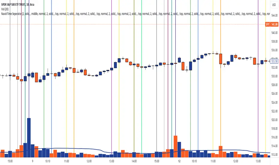
Navid-Time SeperatorTitle: Pine Script Guide: Creating 15 Customizable Vertical Lines with Labels
In this guide, we'll walk through how to create a TradingView script using Pine Script that draws 15 customizable vertical lines on your chart. Each line can be configured with specific time, color, width, style, and label options, making it a powerful tool for highlighting important moments during a trading session.
Key Features:
15 Customizable Vertical Lines: Each line is independently configurable, allowing for unique settings.
Time-Based Line Placement: Lines are drawn based on the user-defined time, making them applicable across different trading sessions without needing to specify dates.
Customizable Labels: Each line has an optional label that displays the time by default, but users can modify the text, color, background color, position, and font size of the label.
User-Friendly Inputs: The script uses Pine Script’s input functions, making it easy to adjust the parameters directly from the TradingView interface.
How It Works:
The script uses a loop structure to check the time of each bar on the chart. When a bar matches the user-defined time, a vertical line is drawn from the top to the bottom of the chart. A label is then placed on the line, displaying the time or custom text as defined by the user.
Code Overview:
The script is divided into 15 sections, one for each line. Each section contains input fields where users can specify the time, color, width, style, label text, label color, label background color, label position, and label font size.
This script is ideal for traders who need to mark key times during the trading day, such as market open/close, significant economic events, or custom-defined moments.
Conclusion:
This Pine Script provides a versatile tool for traders who want to enhance their chart analysis with precise, customizable markers. Whether you're tracking market opens or key price levels, this script helps keep your chart organized and informative.
Reward Ratio ValidatorThis PineScript code creates an indicator called "Reward Ratio Validator" that helps traders evaluate potential trade setups based on pivot points, standard deviation, and risk/reward ratios. Here's a breakdown of what the code does:
1. Input parameters:
- Pivot: Number of bars for pivot calculation
- STDEV Length: Number of bars for standard deviation calculation
- Risk / Reward: The desired risk-to-reward ratio
- STDEV Multiplier: Multiplier for the standard deviation
- On : Short | Off : Long: A toggle to switch between short and long trade analysis
2. Pivot point calculation:
- The code calculates pivot highs and lows using the specified pivot length
- It stores the last pivot high and low in an array
3. Standard deviation calculation:
- Calculates the standard deviation of closing prices over the specified length
4. Risk/Reward deviation calculation:
- For long trades (when show is false):
Calculates the price level where the reward would be 'rvr' times the risk, based on the last pivot low
- For short trades (when show is true):
Calculates the price level where the reward would be 'rvr' times the risk, based on the last pivot high
5. Plotting:
- Plots the calculated risk/reward levels for both long and short trades
- Plots the multiplied standard deviation
6. Visual representation:
- Fills the area between the risk/reward levels and the standard deviation plot
- Uses color coding to indicate whether the current price movement exceeds the standard deviation threshold:
- Green: The move is within the standard deviation threshold
- Red: The move exceeds the standard deviation threshold
This indicator helps traders visually assess whether a potential trade setup offers the desired risk/reward ratio while considering the recent price volatility (represented by the standard deviation). It can be used to identify possible entry points for both long and short trades that meet specific risk/reward criteria.

ICT - MTF Bias ProbabilityThe ICT - MTF Bias Probability Statistics is a sophisticated trading tool designed to help traders identify and leverage market bias across multiple timeframes. By analyzing price actions relative to key levels, such as the previous day's high and low, this indicator provides a clear directional bias—bullish, bearish, or neutral—based on specific market conditions.
Key Features
1. Multi-Timeframe Analysis
- The indicator evaluates price movements on various timeframes, including 15-minute, 1-hour, 4-hour, daily, and weekly charts.
- It determines the bias for each timeframe, helping traders understand the broader market context.
2. Bias Determination
- A bullish bias is established when the current price closes above the previous day’s high, while a bearish bias is indicated by a close below the previous day’s low.
- Additional conditions consider price wicks and closings within the previous day's range to refine the bias determination.
3. Advanced Probability Calculations
- The indicator employs a unique probability calculation that factors in proximity to key levels, price momentum, volatility, and time decay.
- These probabilities give traders an edge by quantifying the likelihood of the market reaching the previous day’s high or low, depending on the bias.
4. Visual Table Display
- A table is displayed on the chart, summarizing the bias and probability for each timeframe, alongside an overall market bias.
- This feature allows traders to quickly assess market conditions and make informed decisions.
5. Ideal Trade Levels
- For traders looking to optimize entry points, the indicator suggests ideal buy and sell levels based on New York midnight open prices, adjusted according to the overall bias.
The ICT - MTF Bias Probability Statistics is a powerful tool for traders who want to align their strategies with higher timeframe market trends while leveraging advanced probability analysis to improve decision-making.

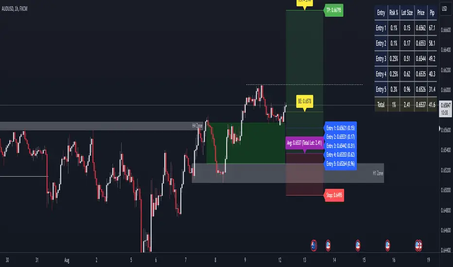
LOT-R:R Multi Entries
This advanced TradingView indicator is designed to help traders manage multiple entry points with precise risk management and lot sizing calculations. It's particularly useful for scaling in and out of positions while maintaining a predetermined risk-to-reward ratio.
Key Features:
Multiple Entry Points: Supports up to 5 entry points, allowing for sophisticated scaling strategies.
Custom Risk Management: Set individual risk percentages for each entry point.
Automatic Lot Size Calculation: Calculates optimal lot sizes based on account balance and risk preferences.
Flexible Boundary Setting: Use custom or auto-calculated upper and lower boundaries for entries.
Stop Loss and Take Profit Visualization: Clearly displays SL and TP levels with customizable options.
Break-Even Point Calculation: Automatically computes and displays the break-even point.
Risk-to-Reward Ratio: Calculates and displays the overall risk-to-reward ratio for the trade.
Visual Aids: Includes lines, labels, and background colors to clearly represent different levels and zones.
Detailed Information Table: Provides a comprehensive table with entry prices, lot sizes, and risk percentages.
Multi-Instrument Support: Adapts pip value calculations for various forex pairs and instruments like XAUUSD and BTCUSD.
This indicator is perfect for traders who want to implement scaling strategies while maintaining strict risk management. It offers a visual and numerical breakdown of your trade plan, helping you make informed decisions about entries, exits, and position sizing.
Whether you're a scalper looking to refine your entries or a swing trader planning a complex position, this indicator provides the tools you need to execute your strategy with precision.
Monte Carlo (Polyline Traceback) [Kioseff Trading]Hello!
This script "Monte Carlo (Polyline Traceback) " performs a Monte Carlo simulation using polylines!
By using polylines, and tracing back the initial simulation to its origin point, we can better replicate the ideal output of a Monte Carlo simulation!
Such as:
The image above shows the output of a simulation (image sourced outside TV).
With this script, and polyline capabilities, we can come quite close on TradingView.
The image above shows the indicator in action! Not bad considering the ideal output.
Of course, the script is quite heavy and tries its best to circumvent limitations :D
You might run into load time errors, in which case you might try applying the built-in setting "Force Script Load". This setting will cut-off the visuals for some simulations, but has a higher chance of passing load-time limitations!
As shown in the image above, you can select to only show worst-case and best-case simulations. Using this option will reduce chart lag and improve load times.
Features
Monte Carlo Simulation: Performs Monte Carlo simulation to generate multiple future paths.
Asset Price: Can simulate future asset prices based on historical log returns.
Statistical Methods: Offers two simulation methods—Gaussian (Normal) distribution and Bootstrapping.
Adjustable Parameters: Offers numerous user-adjustable settings like number of simulations, forecast length, and more.
Historical Data Points: Option to specify the amount of historical data to be used in the simulation (price).
Best/Worst Case: Allows you to show only the best case / worst case outcome (range) for all simulations!
Thank you!

Tick CVD [Kioseff Trading]Hello!
This script "Tick CVD" employs live tick data to calculate CVD and volume delta! No tick chart required.
Features
Live price ticks are recorded
CVD calculated using live ticks
Delta calculated using live ticks
Tick-based HMA, WMA, EMA, or SMA for CVD and price
Key tick levels (S/R CVD & price) are recorded and displayed
Price/CVD displayable as candles or lines
Polylines are used - data visuals are not limited to 500 points.
Efficiency mode - remove all the bells and whistles to capitalize on efficiently calculated/displayed tick CVD and price
How it works
While historical tick-data isn't available to non-professional subscribers, live tick data is programmatically accessible. Consequently, this indicator records live tick data to calculate CVD, delta, and other metrics for the user!
Generally, Pine Scripts use the following rules to calculate volume/price-related metrics:
Bullish Volume: When the close price is greater than the open price.
Bearish Volume: When the close price is less than the open price.
This script, however, improves on that logic by utilizing live ticks. Instead of relying on time-series charts, it records up ticks as buying volume and down ticks as selling volume. This allows the script to create a more accurate CVD, delta, or price tick chart by tracking real-time buying and selling activity.
Price can tick fast; therefore, tick aggregation can occur. While tick aggregation isn't necessarily "incorrect", if you prefer speed and efficiency it's advised to enable "efficiency mode" in a fast market.
The image above highlights the tick CVD and price tick graph!
Green price tick graph = price is greater than its origin point (first script load)
Red price tick graph = price is less than its origin point
Blue tick CVD graph = CVD, over the calculation period, is greater than 0.
Red tick CVD graph = CVD is less than 0 over the calculation period.
The image above explains the right-oriented scales. The upper scale is for the price graph and the lower scale for the CVD graph.
The image above explains the circles superimposed on the scale lines for the price graph and the CVD graph.
The image above explains the "wavy" lines shown by the indicator. The wavy lines correspond to tick delta - whether the recorded tick was an uptick or down tick and whether buy volume or sell volume transpired.
The image above explains the blue/red boxes displayed by the indicator. The boxes offer an alternative visualization of tick delta, including the magnitude of buying/selling volume for the recorded tick.
Blue boxes = buying volume
Red boxes = selling volume
Bright blue = high buying volume (relative)
Bright red = high selling volume (relative)
Dim blue = low buying volume (relative)
Dim red = low selling volume (relative)
The numbers displayed in the box show the numbered tick and the volume delta recorded for the tick.
The image above further explains visuals for the CVD graph.
Dotted red lines indicate key CVD peaks, while dotted blue lines indicate key CVD bottoms.
The white dotted line reflects the CVD average of your choice: HMA, WMA, EMA, SMA.
The image above offers a similar explanation of visuals for the price graph.
The image above offers an alternative view for the indicator!
The image above shows the indicator when efficiency mode is enabled. When trading a fast market, enabling efficiency mode is advised - the script will perform quicker.
Of course, thank you to @RicardoSantos for his awesome library I use in almost every script :D
Thank you for checking this out!

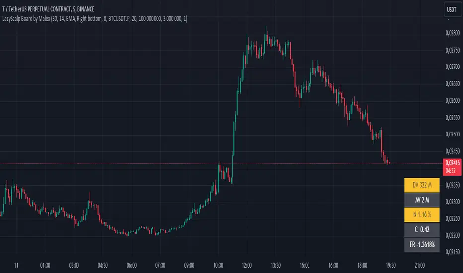
LazyScalp Board by MalexThis indicator offers a quick view of essential trading parameters in a customizable table format.
The table displays key metrics such as daily volume, average volume over a chosen period, volatility (normalized ATR), correlation coefficient, and funding rate, all of which can be tailored to your preferences.
You can also adjust the table's appearance, style, and layout to better fit your needs.
Designed with intraday traders and scalpers in mind, this indicator helps you swiftly identify the most suitable trading instruments.
Based on LazyScalp Board by Aleksandr400
BTC Coinbase PremiumThis script is designed to compare the price of Bitcoin on two major exchanges: Coinbase and Binance. It helps you see if there’s a difference in the price of Bitcoin between these two exchanges, which is known as a “premium” or “discount.”
Here’s how it works in simple terms:
Getting the Prices:
The script first fetches the current price of Bitcoin from Coinbase and Binance. It looks at the closing price, which is the price at the end of the selected time period on your chart.
Calculating the Difference:
It then calculates the difference between these two prices. If Bitcoin is more expensive on Coinbase than on Binance, this difference will be positive, indicating a “premium.” If it’s cheaper on Coinbase, the difference will be negative, indicating a “discount.”
Visualizing the Difference:
The script creates a visual chart that shows this price difference over time. It uses green bars to show when there’s a premium (Coinbase is more expensive) and red bars to show when there’s a discount (Coinbase is cheaper).
Optional Table Display:
If you choose to, the script can also show this price difference in a small table at the top right corner of your chart. The table displays the words “Coinbase Premium” and the exact dollar amount of the premium or discount.
Why does it matter?
Traders and investors have spotted a correlation between bullish strength on BTC and a strong Coinbase premium along with the inverse of a strong Coinbase discount and BTC price weakness.

Total Bars CalculatorThis indicator simply plots how much bars are available to the user in the respective chart.
For Example if plot shows 5000 , therefore you have total 5000 bars of OHLC available.

US Market Real Value Adjusted for CPI and Dollar IndexUS Market Real Value Adjusted for CPI and Dollar Index
Provides quick access to this formula: (SP:SPX+NASDAQ_DLY:IXIC+TVC:DJI+CAPITALCOM:RTY)/4/(ECONOMICS:USCPI*TVC:DXY*100)
Overview:
This indicator provides a dynamic view of the US stock market's real value, adjusted for inflation and currency strength. It combines major stock indices including the S&P 500, NASDAQ, Dow Jones, and Russell 2000, and adjusts the composite index using the US Consumer Price Index (CPI) and the US Dollar Index (DXY). This adjustment helps to reveal the true market performance, stripped of inflationary effects and currency valuation changes.
Key Features:
Composite Index Calculation: Averages the prices of SPX, IXIC, DJI, and RTY to create a broad market overview.
Inflation Adjustment: Uses the CPI to adjust for the effects of inflation, ensuring that the real value changes in the stock market are highlighted.
Currency Strength Adjustment: Applies the DXY to account for fluctuations in the strength of the US dollar, providing insights into how currency variations impact market valuation.
Dynamic Base Calculation: Utilizes a rolling window to dynamically update base values, allowing for continuous reassessment of the market’s adjusted value as new data becomes available.
This indicator provides:
Real Value Insights: By adjusting for both inflation and currency strength, this indicator offers a more accurate measure of the underlying market conditions.
Dynamic Updates: With a rolling window approach, the indicator continually adapts, providing up-to-date information.
Strategic Decisions: Helps in identifying true market growth or decline periods, aiding in strategic investment planning.
Usage:
To use this indicator, simply add it to your chart, and it will automatically display the adjusted composite index. This index can be particularly useful for investors looking to understand underlying market trends beyond nominal price movements, helping in making more informed investment decisions when comparing certain tickers to an average of the major US stock market indexes, adjusted for inflation and the strength of the US dollar.
Example Use Case:
A typical use case might involve comparing periods of high inflation to see how the overall US stock market performed in real terms, not just nominal terms. This can indicate whether the market growth was genuine or merely a reflection of inflation. By comparing this result to an average of these major indexes without adjusting for inflation or currency strength changes, you can see how significantly these forces can impact real gains or losses.

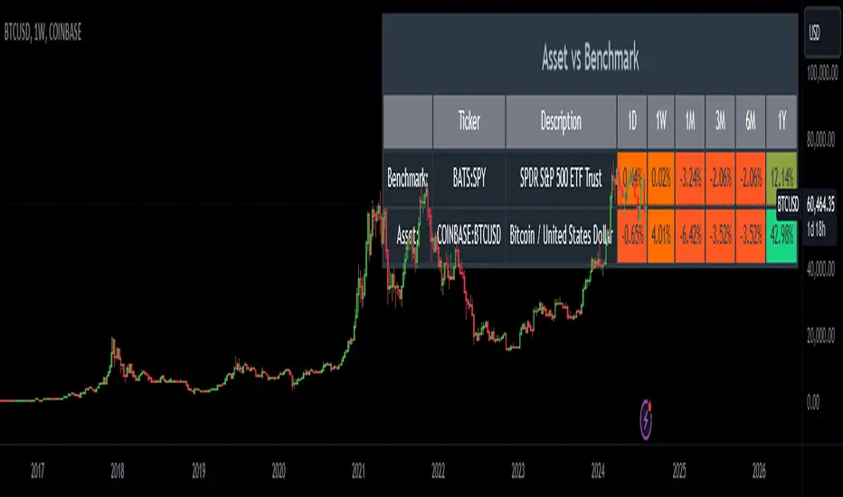
Relative Performance AnalysisRelative Performance Analysis Script
This Pine Script creates a detailed table on your TradingView chart to compare the performance of a specified asset against a benchmark over multiple time frames. The table is fully customizable, allowing you to select its location on the chart and display performance metrics for different periods.
Features:
Customizable Table Location: Choose where the table appears on your chart from a range of predefined positions (e.g., bottom left, top center).
Dynamic Column Headers: The table includes columns for the ticker, description, and performance metrics for various time periods (1 day, 1 week, 1 month, 3 months, 6 months, and 1 year).
Performance Calculation: Calculates the percentage change in performance between the current close price and the previous close price for each time frame.
Color-Coded Performance: Uses a color scheme to highlight performance levels, with specific colors for positive and negative changes to easily visualize performance trends.
Benchmark and Asset Comparison: Displays performance metrics for both a benchmark (e.g., SPY) and the asset currently viewed on the chart, providing a clear comparison.
Inputs:
Benchmark Symbol: Specify the symbol of the benchmark asset (e.g., SPY).
Benchmark Description: Provide a description for the benchmark asset.
Chart Symbol: Automatically uses the symbol of the chart for comparison.
Usage:
Add the script to your TradingView chart.
Configure the benchmark symbol and description as needed.
The table will automatically populate with performance data and be positioned according to your selection.
Disclaimer:
This script is for informational and educational purposes only and is not intended as financial advice. The performance data displayed in the table is based on historical prices and is not indicative of future performance. Trading involves risk, and you should always do your own research and consult with a qualified financial advisor before making any investment decisions. The creator of this script assumes no responsibility for any losses or damages incurred as a result of using this tool.
SPX Mapped Gaps [Mxwll]Hello traders 👋
This indicator "SPX Mapped Gaps" detects gaps from the SPX (or the trader's choice of index/asset) and plots them for the asset on your chart!
Features
Selectable comparison symbol
Gaps from the selected symbol (SPX by default) are plotted for the asset on your chart - serving as potential support/resistance levels!
Closest gaps from comparison symbol displayed in upper-right table
Overlapped gaps deleted automatically - less clutter!
How this script works
The "SPX Mapped Gaps" is designed to help traders determine price levels for the asset on their chart where a major index (any asset) gapped up or down.
Of course, a gap that occurs on SPX (4-digit price) is incompatible with the price chart of BTC (5-digit price). To circumvent this, the percentage distance of the gap from SPX is determined, and a gap level is drawn equidistantly (up/down) from the open price of the asset on your chart. With this method, the proportion of the gap is maintained at the price area it occurred for the asset on your chart!
The image above outlines functionality for the indicator!
Key points:
Up gaps are denoted by green boxes
Down gaps are denoted by red boxes
All gaps are listed with their start and end price for the comparison asset (SPX for the example). These labels can be hidden at the user's discretion.
Gaps are expected to act as support/resistance during their lifetime
The image above explains the output of the script, including line style indications!
Solid lines indicate that the leverage used for at your entry price constitutes an active trade. Dotted lines mean the trade has already achieved your profit target for that leverage, or stopped out.
The image above explains the table attached to the indicator!
This table displays the closest gaps to the current asset price. The status (up gap or down gap) from the gap to the current price is also detailed.
Why are gaps on the SPX, or major index, relevant to BTC and other assets?
When a gap on the major indices occurs, it's expected that strong aggregate buying or selling pressure will transpire for BTC and other coins. Due to this, the presence of a gap on a major index might correspond to increased activity on smaller market-cap assets with some degree of positive correlation to the index. Consequently, the price level for the asset at which a gap for the major index occurred may function as support/resistance for future price!
That is all for this - thanks traders!

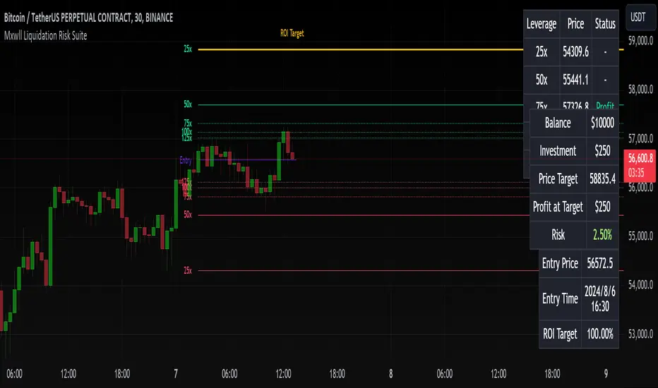
Liquidation Risk Suite [Mxwll]Hello traders 👋
This indicator "Liquidation Risk Suite" hosts various features that allow the trade to determine optimal position sizing, leverage, profit targets, and more!
Features
Customizable entry price and time
From the entry price, a user-defined number of liquidation levels by leverage are shown
From the entry price, a user-defined number of profit targets by leverage are shown
User-defined ROI % target. Liquidation levels and profit targets automatically change to account for the traders' desired profit percentage.
Calculate for long and short positions
Trader can set portfolio balance and investment per trade - indicator will warn the trader when the investment per trade is too high relative to the portfolio balance.
How this script works
The Liquidation Risk Suite is designed to help traders determine position sizing, appropriate risk for their position (leverage, etc.), and potential profit targets from their entry point.
Upon loading the script, the script will prompt you for an entry price and entry time. Simply click the screen at the appropriate locations (your entry price and entry bar) and, from there, the script will calculate various liquidation levels, determine whether your trade has achieved the desired profit at various leverages, and provide various trading metrics such as % risk of portfolio, ROI target %, profit at target, and more!
The image above outlines various trade-related metrics for your position!
These metrics include:
Status of trade (profit or loss) for various common leverage amounts
Portfolio balance
Investment amount
Price target (calculated from desired ROI%)
Profit at target (calculated from desired ROI% and leverage used)
Portfolio risk
Entry price
Entry time
ROI Target %
The image above explains the output of the script, including line style indications!
Solid lines indicate that the leverage used for at your entry price constitutes an active trade. Dotted lines mean the trade has already achieved your profit target for that leverage, or stopped out.
Additionally, the script can calculate pertinent metrics for short positions!
That's all, just a simple, sweet script to help traders figure out what leverage to use for their positions, the risk they're taking on, and potential stop and profit levels!
Thank you to kaigouthro for his colors library!
[2024] Inverted Yield CurveInverted Yield Curve Indicator
Overview:
The Inverted Yield Curve Indicator is a powerful tool designed to monitor and analyze the yield spread between the 10-year and 2-year US Treasury rates. This indicator helps traders and investors identify periods of yield curve inversion, which historically have been reliable predictors of economic recessions.
Key Features:
Yield Spread Calculation: Accurately calculates the spread between the 10-year and 2-year Treasury yields.
Visual Representation: Plots the yield spread on the chart, with clear visualization of positive and negative spreads.
Inversion Highlighting: Background shading highlights periods where the yield curve is inverted (negative spread), making it easy to spot critical economic signals.
Alerts: Customizable alerts notify users when the yield curve inverts, allowing timely decision-making.
Customizable Yield Plots: Users can choose to display the individual 2-year and 10-year yields for detailed analysis.
How It Works:
Data Sources: Utilizes the Federal Reserve Economic Data (FRED) for fetching the 2-year and 10-year Treasury yield rates.
Spread Calculation: The script calculates the difference between the 10-year and 2-year yields.
Visualization: The spread is plotted as a blue line, with a grey zero line for reference. When the spread turns negative, the background turns red to indicate an inversion.
Customizable Plots: Users can enable or disable the display of individual 2-year and 10-year yields through simple input options.
Usage:
Economic Analysis: Use this indicator to anticipate potential economic downturns by monitoring yield curve inversions.
Market Timing: Identify periods of economic uncertainty and adjust your investment strategies accordingly.
Alert System: Set alerts to receive notifications whenever the yield curve inverts, ensuring you never miss crucial economic signals.
Important Notes:
Data Accuracy: Ensure that the FRED data symbols (FRED
and FRED
) are correctly referenced and available in your TradingView environment.
Customizations: The script is designed to be flexible, allowing users to customize plot colors and alert settings to fit their preferences.
Disclaimer:
This indicator is intended for educational and informational purposes only. It should not be considered as financial advice. Always conduct your own research and consult with a financial advisor before making investment decisions.

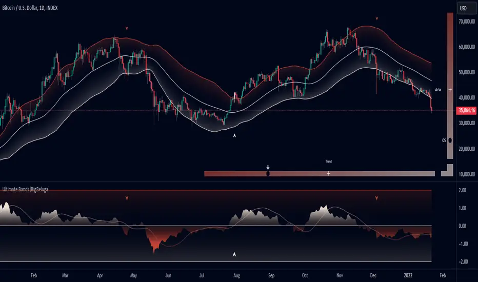
Ultimate Bands [BigBeluga]Ultimate Bands
The Ultimate Bands indicator is an advanced technical analysis tool that combines elements of volatility bands, oscillators, and trend analysis. It provides traders with a comprehensive view of market conditions, including trend direction, momentum, and potential reversal points.
🔵 KEY FEATURES
● Ultimate Bands
Consists of an upper band, lower band, and a smooth middle line
Based on John Ehler's SuperSmoother algorithm for reduced lag
Bands are calculated using Root Mean Square Deviation (RMSD) for adaptive volatility measurement
Helps identify potential support and resistance levels
● Ultimate Oscillator
Derived from the price position relative to the Ultimate Bands
Oscillates between overbought and oversold levels
Provides insights into potential reversals and trend strength
● Trend Signal Line
Based on a Hull Moving Average (HMA) of the Ultimate Oscillator
Helps identify the overall trend direction
Color-coded for easy trend interpretation
● Heatmap Visualization
Displays the current state of the oscillator and trend signal
Provides an intuitive visual representation of market conditions
Shows overbought/oversold status and trend direction at a glance
● Breakout Signals
Optional feature to detect and display breakouts beyond the Ultimate Bands
Helps identify potential trend reversals or continuations
Visualized with arrows on the chart and color-coded candles
🔵 HOW TO USE
● Trend Identification
Use the color and position of the Trend Signal Line to determine the overall market trend
Refer to the heatmap for a quick visual confirmation of trend direction
● Entry Signals
Look for price touches or breaks of the Ultimate Bands for potential entry points
Use oscillator extremes in conjunction with band touches for stronger signals
Consider breakout signals (if enabled) for trend-following entries
● Exit Signals
Use opposite band touches or breakouts as potential exit points
Monitor the oscillator for divergences or extreme readings as exit signals
● Overbought/Oversold Analysis
Use the Ultimate Oscillator and heatmap to identify overbought/oversold conditions
Look for potential reversals when the oscillator reaches extreme levels
● Confirmation
Combine Ultimate Bands, Oscillator, and Trend Signal for stronger trade confirmation
Use the heatmap for quick visual confirmation of market conditions
🔵 CUSTOMIZATION
The Ultimate Bands indicator offers several customization options:
Adjust the main calculation length for bands and oscillator
Modify the number of standard deviations for band calculation
Change the signal line length for trend analysis
Toggle the display of breakout signals and candle coloring
By fine-tuning these settings, traders can adapt the Ultimate Bands indicator to various market conditions and personal trading strategies.
The Ultimate Bands indicator provides a multi-faceted approach to market analysis, combining volatility-based bands, oscillator analysis, and trend identification in one comprehensive tool. Its adaptive nature and visual cues make it suitable for both novice and experienced traders across various timeframes and markets. The integration of multiple analytical elements offers traders a rich set of data points to inform their trading decisions.
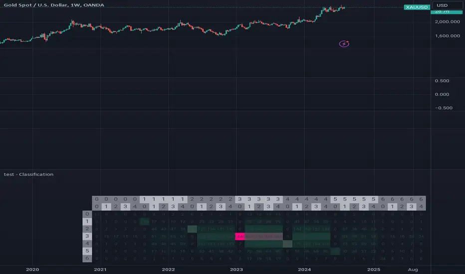
test - ClassificationTensor-Based Classification Experiment
This innovative script represents an experimental foray into classification techniques, specifically designed to analyze returns within a compact time frame. By leveraging tensor-based analytics, it generates a comprehensive table that visually illustrates the distribution of counts across both current and historical bars, providing valuable insights into market patterns.
The script's primary objective is to classify returns over a small window, using this information to inform trading decisions. The output table showcases a normal distribution of count values for each bar in the lookback period, allowing traders to gain a deeper understanding of market behavior and identify potential opportunities.
Key Features:
Experimental classification approach utilizing tensor-based analytics
Compact time frame analysis (small window)
Comprehensive table displaying return counts across current and historical bars
Normal distribution visualization for better insight into market patterns
By exploring this script, traders can gain a deeper understanding of the underlying dynamics driving market movements and develop more effective trading strategies.
Outside Bar ProbabilityOutside Bar Percentage by Hour Indicator
Description:
The "Outside Bar Percentage by Hour" indicator is a powerful tool designed to analyze the occurrence of outside bars within each hour of the trading day. This indicator not only tracks the frequency of these key market events but also provides a detailed breakdown of their distribution, allowing traders to identify potential patterns and key trading hours.
What It Does:
Outside Bar Detection: The indicator identifies "outside bars," which occur when the high of a bar is higher than the previous bar's high, and the low is lower than the previous bar's low. These bars often signal significant market moves and potential reversals.
Hourly Analysis: The script tracks the total number of bars and outside bars for each hour (0 to 23) of the trading day. This granular analysis helps traders pinpoint specific hours when outside bars are more likely to occur.
Percentage Calculation: It calculates the percentage chance of an outside bar occurring for each hour, based on the total bars observed. This percentage provides a clear view of the likelihood of encountering an outside bar within a given hour, which can be critical for timing entries and exits.
Visual Representation: The data is displayed in a table format directly on the chart, showing:
Hour: The specific hour of the day.
Total Bars: The total number of bars observed during each hour.
Outside Bar Count: The number of outside bars detected in that hour.
Percentage: The calculated percentage chance of an outside bar occurring in each hour.
How It Works:
The indicator uses a loop to analyze each bar in real-time, checking if it qualifies as an outside bar. It then records the occurrence in arrays that track data for each hour.
At the start of each new day, the counts are reset to ensure the data remains relevant and accurate.
The percentage chance of an outside bar occurring is computed using the formula: (Outside Bar Count / Total Bar Count) * 100.
The results are neatly organized in a table that updates dynamically, providing traders with real-time insights.
How to Use It:
Identify Key Trading Hours: Use the table to observe the distribution of outside bars across different hours. This can help you identify when significant market moves are more likely to occur.
Time Your Entries and Exits: Understanding the likelihood of outside bars can assist in timing your trades, particularly if you use strategies that rely on volatility or market reversals.
Market Analysis: The percentage data can provide insights into the market's behavior during specific times, helping you refine your trading strategy based on historical patterns.
Concepts Underlying the Calculations:
The script leverages the concept of "outside bars," which are often considered indicators of potential reversals or significant market movements. By analyzing these bars across different hours, the indicator provides a temporal dimension to market analysis, helping traders understand when these pivotal events are most likely to occur.
The detailed hourly breakdown and percentage calculations offer a nuanced view of market activity, making it a valuable tool for traders looking to enhance their timing and strategic decision-making.
This indicator is suitable for all types of traders, including those focused on day trading, swing trading, or even longer-term analysis. It provides a unique perspective on market activity that can complement other technical indicators and analyses.

[KF] Sector & Industry RemappingThis script remaps TradingView's sector and industry categories to standard classifications and displays them in the top-right corner of the chart making it easy to quickly identify a security's sector and industry. This tool is useful for traders and analysts who prefer standard industry classifications while using TradingView's charts.

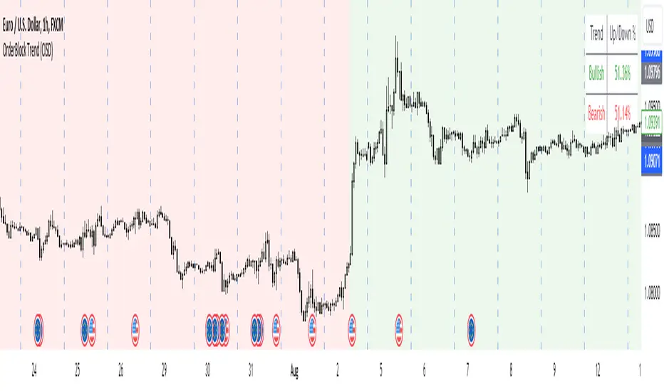
OrderBlock Trend (CISD)OrderBlock Trend (CISD) Indicator
Overview:
The "OrderBlock Trend (CISD)" AKA: change in state of delivery by ICT inner circle trader this indicator is designed to help traders identify and visualize market trends based on higher timeframe candle behavior. This script leverages the concept of order blocks, which are price levels where significant buying or selling activity has occurred, to signal potential trend reversals or continuations. By analyzing bullish and bearish order blocks on a higher timeframe, the indicator provides visual cues and statistical insights into the market's current trend dynamics.
Key Features:
Higher Timeframe Analysis: The indicator uses a higher timeframe (e.g., Daily) to assess the trend direction based on the open and close prices of candles. This approach helps in identifying more significant and reliable trend changes, filtering out noise from lower timeframes.
Bullish and Bearish Order Blocks: The script detects the first bullish or bearish candle on the selected higher timeframe and uses these candles as reference points (order blocks) to determine the trend direction. A bullish trend is indicated when the current price is above the last bearish order block's open price, and a bearish trend is indicated when the price is below the last bullish order block's open price.
Visual Trend Indication: The indicator visually represents the trend using background colors and plot shapes:
A green background and a square shape above the bars indicate a bullish trend.
A red background and a square shape above the bars indicate a bearish trend.
Candle Count and Statistics: The script keeps track of the number of up and down candles during bullish and bearish trends, providing percentages of up and down candles in each trend. This data is displayed in a table, giving traders a quick overview of market sentiment during each trend phase.
User Customization: The higher timeframe can be adjusted according to the trader's preference, allowing flexibility in trend analysis based on different time horizons.
Concepts and Calculations:
The "OrderBlock Trend (CISD)" indicator is based on the concept of order blocks, a key area where institutional traders are believed to place large orders, creating significant support or resistance levels. By identifying these blocks on a higher timeframe, the indicator aims to highlight potential trend reversals or continuations. The use of higher timeframe data helps filter out minor fluctuations and focus on more meaningful price movements.
The candle count and percentage calculations provide additional context, allowing traders to understand the proportion of bullish or bearish candles within each trend. This information can be useful for assessing the strength and consistency of a trend.
How to Use:
Select the Higher Timeframe: Choose the higher timeframe (e.g., Daily) that best suits your trading strategy. The default setting is "D" (Daily), but it can be adjusted to other timeframes as needed.
Interpret the Trend Signals:
A green background indicates a bullish trend, while a red background indicates a bearish trend. The corresponding square shapes above the bars reinforce these signals.
Use the information on the proportion of up and down candles during each trend to gauge the trend's strength and consistency.
Trading Decisions: The indicator can be used in conjunction with other technical analysis tools and indicators to make informed trading decisions. It is particularly useful for identifying trend reversals and potential entry or exit points based on the behavior of higher timeframe order blocks.
Customization and Optimization: Experiment with different higher timeframes and settings to optimize the indicator for your specific trading style and preferences.
Conclusion:
The "OrderBlock Trend (CISD)" indicator offers a comprehensive approach to trend analysis, combining the power of higher timeframe order blocks with clear visual cues and statistical insights. By understanding the underlying concepts and utilizing the provided features, traders can enhance their trend detection and decision-making processes in the markets.
Disclaimer:
This indicator is intended for educational purposes and should be used in conjunction with other analysis methods. Always perform your own research and risk management before making trading decisions.
Some known bugs when you switch to lower timeframe while using daily timeframe data it didn't use the daily candle close to establish the trend change but your current time frame If some of you know how to fix it that would be great if you help me to I would try my best to fix this in the future :) credit to ChatGPT 4o
[SGM Ordinal Patterns]An ordinal pattern is a concept used in mathematics and time series analysis. It is a way of describing the relative order of values in a sequence. Rather than focusing on the exact values, we are interested in how they compare to each other.
An ordinal pattern will tell you how these values are positioned relative to each other.
We do not look at the exact values, but only their order.
Concrete Example
• 4 (position 1 in the original sequence) is in position 2 in the ordered sequence.
• 7 (position 2 in the original sequence) is in position 3 in the ordered sequence.
• 2 (position 3 in the original sequence) is in position 1 in the ordered sequence.
The ordinal pattern for this sequence is then (2,3,1)(2, 3, 1)(2,3,1).
Script Explanation
This script analyzes ordinal patterns based on the closing prices of the last three bars and calculates the future gains associated with each ordinal pattern.
The main elements of the script are:
1. ordinal_pattern Function:
o Determines the ordinal pattern based on three past closing values.
o Returns an index (from 0 to 5) corresponding to one of the six possible ordinal patterns.
2. Calculations and Storage:
o For each new bar, the last three closes are used to identify the ordinal pattern.
o Future gains are calculated and associated with the previous ordinal pattern.
o Return statistics (mean, standard deviation and Sharpe ratio) are calculated for each pattern.
3. Visualization:
o Draws lines connecting the last three closes.
o Tables displaying the number of occurrences, distributions, and return statistics for each ordinal pattern.
What the Script Shows:
• Table motifs_table : Number of occurrences and distribution of each ordinal pattern. An uneven distribution between patterns (different by one sixth for each pattern) can indicate market inefficiency.
• Table pattern_analysis : Analysis of returns (mean, standard deviation, Sharpe ratio) for each ordinal pattern.
• Table current_motif_table : Ordinal pattern of the last bar.
This script helps to understand and visualize how ordinal patterns influence future returns of financial asset prices. An uneven distribution of patterns can indicate market inefficiencies.

Oscillator Scatterplot Analysis [Trendoscope®]In this indicator, we demonstrate how to plot oscillator behavior of oversold-overbought against price movements in the form of scatterplots and perform analysis. Scatterplots are drawn on a graph containing x and y-axis, where x represent one measure whereas y represents another. We use the library Graph to collect the data and plot it as scatterplot.
Pictorial explanation of components is defined in the chart below.
🎲 This indicator performs following tasks
Calculate and plot oscillator
Identify oversold and overbought areas based on various methods
Measure the price and bar movement from overbought to oversold and vice versa and plot them on the chart.
In our example,
The x-axis represents price movement. The plots found on the right side of the graph has positive price movements, whereas the plots found on the left side of the graph has negative price movements.
The y-axis represents the number of bars it took for reaching overbought to oversold and/or oversold to overbought. Positive bars mean we are measuring oversold to overbought, whereas negative bars are a measure of overbought to oversold.
🎲 Graph is divided into 4 equal quadrants
Quadrant 1 is the top right portion of the graph. Plots in this quadrant represent the instances where positive price movement is observed when the oscillator moved from oversold to overbought
Quadrant 2 is the top left portion of the graph. Plots in this quadrant represent the instances where negative price movement is observed when the oscillator moved from oversold to overbought.
Quadrant 3 is the bottom left portion of the chart. Plots in this quadrant represent the instances where negative price movement is observed when the oscillator moved from overbought to oversold.
Quadrant 4 is the bottom right portion of the chart. Plots in this quadrant represent the instances where positive price movement is observed when the oscillator moved from overbought to oversold.
🎲 Indicator components in Detail
Let's dive deep into the indicator.
🎯 Oscillator Selection
Select the Oscillator and define the overbought oversold conditions through input settings
Indicator - Oscillator base used for performing analysis
Length - Loopback length on which the oscillator is calculated
OB/OS Method - We use Bollinger Bands, Keltener Channel and Donchian channel to calculate dynamic overbought and oversold levels instead of static 80-10. This is also useful as other type of indicators may not be within 0-100 range.
Length and Multiplier are used for the bands for calculating Overbought/Oversold boundaries.
🎯 Define Graph Properties
Select different graph properties from the input settings that will instruct how to display the scatterplot.
Type - this can be either scatterplot or heatmap. Scatterplot will display plots with specific transparency to indicate the data, whereas heatmap will display background with different transparencies.
Plot Color - this is the color in which the scatterplot or heatmap is drawn
Plot Size - applicable mainly for scatterplot. Since the character we use for scatterplot is very tiny, the large at present looks optimal. But, based on the user's screen size, we may need to select different sizes so that it will render properly.
Rows and Columns - Number of rows and columns allocated per quadrant. This means, the total size of the chart is 2X rows and 2X columns. Data sets are divided into buckets based on the number of available rows and columns. Hence, changing this can change the appearance of the overall chart, even though they are representing the same data. Also, please note that tables can have max 10000 cells. If we increase the rows and columns by too much, we may get runtime errors.
Outliers - this is used to exclude the extreme data. 20% outlier means, the chart will ignore bottom 20% and top 20% when defining the chart boundaries. However, the extreme data is still added to the boundaries.
