Chau RSI+MA for DHChau RSI+MA for DH – Indicator Description & Usage
Overview:
The Chau RSI+MA for DH indicator is a custom RSI-based analysis tool designed to provide a deeper and more dynamic view of market momentum. It plots three configurable RSI lines along with three moving averages (MA) of the main RSI, helping traders identify overbought/oversold zones, trend strength, and potential reversal points.
🔧 Inputs & Configuration:
Three RSI Lines:
RSI 1 (default: 7)
RSI 2 (default: 14) → used as the base for MA calculations
RSI 3 (default: 21)
These allow multi-timeframe or multi-speed momentum analysis in a single panel.
Three MAs of RSI 2:
MA 1, MA 2, MA 3 – customizable lengths, defaulting to 5, 10, and 20
These help smooth out RSI 2 to detect trend direction or divergence.
Overbought/Oversold Levels:
Customizable dual thresholds (Level 1 & Level 2), offering flexible signal filtering.
🎯 Core Features & Strengths:
Multi-RSI Display:
Combines short, mid, and long RSI to give a layered view of market strength and potential turning points.
RSI MA Tracking:
Smoothing RSI 2 with three MAs helps visualize momentum trends and potential trend-following signals.
Dynamic Signal Zones:
Overbought and Oversold regions are highlighted with background colors.
Dual level alert system (e.g., 70/80 and 30/20) increases precision and adaptability for different strategies.
Highly Customizable Visualization:
Fully adjustable color schemes for all RSI and MA lines.
Easily identify confluences or divergences at a glance.
✅ Best Use Cases:
Trend Confirmation:
Use RSI 2 crossing above/below its MAs as a momentum confirmation signal.
Reversal Detection:
Identify overbought or oversold conditions combined with RSI-MA divergence.
Filtering Entries/Exits:
Combine with price action or other indicators to filter out low-probability trades.
Scalping & Swing Trading:
Adaptable to multiple timeframes and styles due to customizable RSI/MA settings.
Statistics

Delta Zones🔶 Delta Zones — A Precision Tool for Time-Price Mapping 🔶
The Delta Zones indicator is a refined structure-mapping tool that dynamically tracks zones of dominant trading activity across recent sessions.
These zones are projected forward in time, offering traders a reliable visual guide to where significant interactions between buyers and sellers are likely to take place.
This tool was designed for intraday use, but its adaptability makes it powerful even on higher timeframes, giving traders insights into market behavior without the noise. You need to change session setting from indicator to higher TF that the chart. For intra, its by default on daily.
🔧 What This Indicator Does
Detects and displays the key activity zone for the current session (today).
Recalls the most active zone from the previous session, allowing you to track momentum or reversal bias.
Color codes each zone based on where price currently trades relative to it:
Neutral gradient (orange/white) for today’s zone, showing where price is consolidating or reacting.
Bullish green fade if price is trading above yesterday’s zone.
Bearish red fade if price is trading below yesterday’s zone.
Extends each zone forward (default 200 bars) so you can observe price behavior as it revisits these areas over time.
📈 How to Use Delta Zones
Trend Continuation:
If price pushes beyond today's zone and maintains momentum, it may suggest strength in that direction. Watch how price reacts on retests of this zone.
Fade or Mean Reversion:
When price strays far from a Delta Zone and struggles to gain ground, it often rotates back into that region. These situations can offer attractive risk-reward setups.
Zone Polarity from Prior Sessions:
Yesterday’s zone serves as a directional cue — if price opens and stays above it (green-filled), sentiment favors strength. If it stays below (red-filled), weakness may persist.
Support/Resistance Anchors:
Use zones as dynamic S/R levels — watch for wick tests, engulfing candles, or volume surges at zone edges for potential trade entries or exits.
🎛️ Inputs You Can Control
Session Length (Default: Daily): Defines how often a new zone is calculated.
💡 Pro Tip
These zones act like magnetic fields around price — not only can they contain price, but they also attract it. The key is to recognize when price is respecting, rejecting, or absorbing at the edges of the zone.
Pair Delta Zones with your favorite price action, momentum, or volume tools for sharper decision-making. For example, "Accumulation/Distribution Money Flow" script which I published few days ago.
⚠️ Note
This is a conceptually adaptive framework designed to simplify the visual structure of the market. While no model guarantees predictive accuracy, Delta Zones are especially useful for contextualizing price behavior and anticipating where meaningful reactions may occur.
This is an educational idea, use it at your own risk.
Past performance does not guarantee future success.

Intrinsic Event (Multi DC OS)Overview
This indicator implements an event-based approach to analyze price movements in the foreign exchange market, inspired by the intrinsic time framework introduced in Fractals and Intrinsic Time - A Challenge to Econometricians by U. A. Müller et al. (1995). It identifies significant price events using an intrinsic time perspective and supports multi-agent analysis to reflect the heterogeneous nature of financial markets. The script plots these events as lines and labels on the chart, offering a visual tool for traders to understand market dynamics at different scales.
Key Features
Intrinsic Events : The indicator detects directional change (DC) and overshoot (OS) events based on user-defined thresholds (delta), aligning with the paper’s concept of intrinsic time (Section 6). Intrinsic time redefines time based on market activity, expanding during volatile periods and contracting during inactive ones, rather than relying on a physical clock.
Multi-Agent Analysis : Supports up to five agents, each with its own threshold and color settings, reflecting the heterogeneous market hypothesis (Section 5). This allows the indicator to capture the perspectives of market participants with different time horizons, such as short-term FX dealers and long-term central banks.
How It Works
Intrinsic Events Detection : The script identifies two types of events using intrinsic time principles:
Directional Change (DC) : Triggered when the price reverses by the threshold (delta) against the current trend (e.g., a drop by delta in an uptrend signals a "Down DC").
Overshoot (OS) : Occurs when the price continues in the trend direction by the threshold (e.g., a rise by delta in an uptrend signals an "Up OS").
DC events are plotted as solid lines, and OS events as dashed lines, with labels like "Up DC" or "OS Down" for clarity. The label style adjusts based on the trend to ensure visibility.
Multi-Agent Setup : Each agent operates independently with its own threshold, mimicking market participants with varying time horizons (Section 5). Smaller thresholds detect frequent, short-term events, while larger thresholds capture broader, long-term movements.
Settings
Each agent can be configured with:
Enable Agent : Toggle the agent on or off.
Threshold (%) : The percentage threshold (delta) for detecting DC and OS events (default values: 0.1%, 0.2%, 0.5%, 1%, 2% for agents 1–5).
Up Mode Color : Color for lines and labels in up mode (DC events).
Down Mode Color : Color for lines and labels in down mode (OS events).
Usage Notes
This indicator is designed for the foreign exchange market, leveraging its high liquidity, as noted in the paper (Section 1). Adjust the threshold values based on the instrument’s volatility—higher volatility leads to more intrinsic events (Section 4). It can be adapted to other markets where event-based analysis applies.
Reference
The methodology is based on:
Fractals and Intrinsic Time - A Challenge to Econometricians by U. A. Müller, M. M. Dacorogna, R. D. Davé, O. V. Pictet, R. B. Olsen, and J. R. Ward (June 28, 1995). Olsen & Associates Preprint.

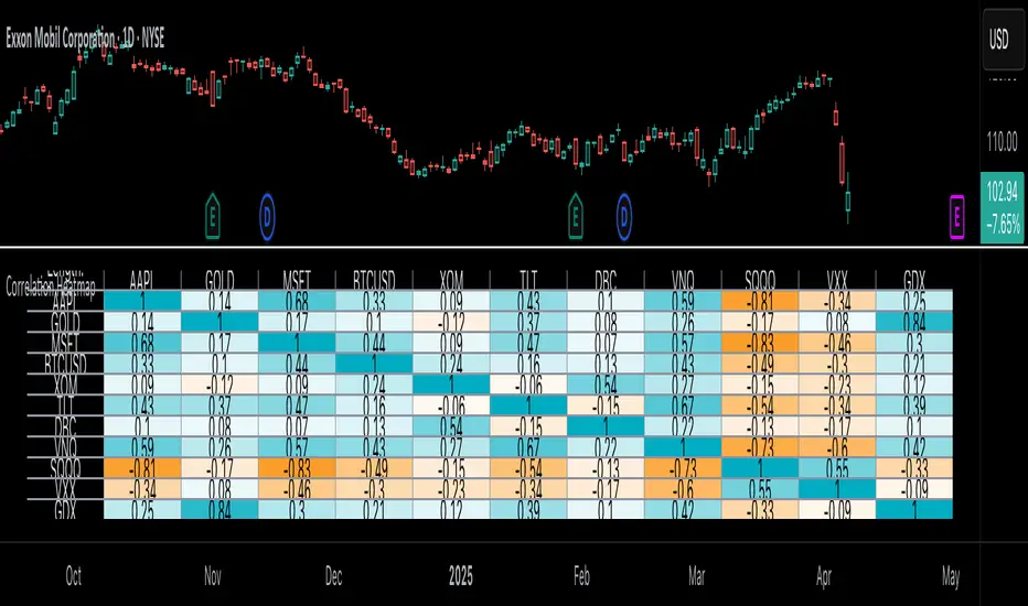
Correlation Heatmap█ OVERVIEW
This indicator creates a correlation matrix for a user-specified list of symbols based on their time-aligned weekly or monthly price returns. It calculates the Pearson correlation coefficient for each possible symbol pair, and it displays the results in a symmetric table with heatmap-colored cells. This format provides an intuitive view of the linear relationships between various symbols' price movements over a specific time range.
█ CONCEPTS
Correlation
Correlation typically refers to an observable statistical relationship between two datasets. In a financial time series context, it usually represents the extent to which sampled values from a pair of datasets, such as two series of price returns, vary jointly over time. More specifically, in this context, correlation describes the strength and direction of the relationship between the samples from both series.
If two separate time series tend to rise and fall together proportionally, they might be highly correlated. Likewise, if the series often vary in opposite directions, they might have a strong anticorrelation . If the two series do not exhibit a clear relationship, they might be uncorrelated .
Traders frequently analyze asset correlations to help optimize portfolios, assess market behaviors, identify potential risks, and support trading decisions. For instance, correlation often plays a key role in diversification . When two instruments exhibit a strong correlation in their returns, it might indicate that buying or selling both carries elevated unsystematic risk . Therefore, traders often aim to create balanced portfolios of relatively uncorrelated or anticorrelated assets to help promote investment diversity and potentially offset some of the risks.
When using correlation analysis to support investment decisions, it is crucial to understand the following caveats:
• Correlation does not imply causation . Two assets might vary jointly over an analyzed range, resulting in high correlation or anticorrelation in their returns, but that does not indicate that either instrument directly influences the other. Joint variability between assets might occur because of shared sensitivities to external factors, such as interest rates or global sentiment, or it might be entirely coincidental. In other words, correlation does not provide sufficient information to identify cause-and-effect relationships.
• Correlation does not predict the future relationship between two assets. It only reflects the estimated strength and direction of the relationship between the current analyzed samples. Financial time series are ever-changing. A strong trend between two assets can weaken or reverse in the future.
Correlation coefficient
A correlation coefficient is a numeric measure of correlation. Several coefficients exist, each quantifying different types of relationships between two datasets. The most common and widely known measure is the Pearson product-moment correlation coefficient , also known as the Pearson correlation coefficient or Pearson's r . Usually, when the term "correlation coefficient" is used without context, it refers to this correlation measure.
The Pearson correlation coefficient quantifies the strength and direction of the linear relationship between two variables. In other words, it indicates how consistently variables' values move together or in opposite directions in a proportional, linear manner. Its formula is as follows:
𝑟(𝑥, 𝑦) = cov(𝑥, 𝑦) / (𝜎𝑥 * 𝜎𝑦)
Where:
• 𝑥 is the first variable, and 𝑦 is the second variable.
• cov(𝑥, 𝑦) is the covariance between 𝑥 and 𝑦.
• 𝜎𝑥 is the standard deviation of 𝑥.
• 𝜎𝑦 is the standard deviation of 𝑦.
In essence, the correlation coefficient measures the covariance between two variables, normalized by the product of their standard deviations. The coefficient's value ranges from -1 to 1, allowing a more straightforward interpretation of the relationship between two datasets than what covariance alone provides:
• A value of 1 indicates a perfect positive correlation over the analyzed sample. As one variable's value changes, the other variable's value changes proportionally in the same direction .
• A value of -1 indicates a perfect negative correlation (anticorrelation). As one variable's value increases, the other variable's value decreases proportionally.
• A value of 0 indicates no linear relationship between the variables over the analyzed sample.
Aligning returns across instruments
In a financial time series, each data point (i.e., bar) in a sample represents information collected in periodic intervals. For instance, on a "1D" chart, bars form at specific times as successive days elapse.
However, the times of the data points for a symbol's standard dataset depend on its active sessions , and sessions vary across instrument types. For example, the daily session for NYSE stocks is 09:30 - 16:00 UTC-4/-5 on weekdays, Forex instruments have 24-hour sessions that span from 17:00 UTC-4/-5 on one weekday to 17:00 on the next, and new daily sessions for cryptocurrencies start at 00:00 UTC every day because crypto markets are consistently open.
Therefore, comparing the standard datasets for different asset types to identify correlations presents a challenge. If two symbols' datasets have bars that form at unaligned times, their correlation coefficient does not accurately describe their relationship. When calculating correlations between the returns for two assets, both datasets must maintain consistent time alignment in their values and cover identical ranges for meaningful results.
To address the issue of time alignment across instruments, this indicator requests confirmed weekly or monthly data from spread tickers constructed from the chart's ticker and another specified ticker. The datasets for spreads are derived from lower-timeframe data to ensure the values from all symbols come from aligned points in time, allowing a fair comparison between different instrument types. Additionally, each spread ticker ID includes necessary modifiers, such as extended hours and adjustments.
In this indicator, we use the following process to retrieve time-aligned returns for correlation calculations:
1. Request the current and previous prices from a spread representing the sum of the chart symbol and another symbol ( "chartSymbol + anotherSymbol" ).
2. Request the prices from another spread representing the difference between the two symbols ( "chartSymbol - anotherSymbol" ).
3. Calculate half of the difference between the values from both spreads ( 0.5 * (requestedSum - requestedDifference) ). The results represent the symbol's prices at times aligned with the sample points on the current chart.
4. Calculate the arithmetic return of the retrieved prices: (currentPrice - previousPrice) / previousPrice
5. Repeat steps 1-4 for each symbol requiring analysis.
It's crucial to note that because this process retrieves prices for a symbol at times consistent with periodic points on the current chart, the values can represent prices from before or after the closing time of the symbol's usual session.
Additionally, note that the maximum number of weeks or months in the correlation calculations depends on the chart's range and the largest time range common to all the requested symbols. To maximize the amount of data available for the calculations, we recommend setting the chart to use a daily or higher timeframe and specifying a chart symbol that covers a sufficient time range for your needs.
█ FEATURES
This indicator analyzes the correlations between several pairs of user-specified symbols to provide a structured, intuitive view of the relationships in their returns. Below are the indicator's key features:
Requesting a list of securities
The "Symbol list" text box in the indicator's "Settings/Inputs" tab accepts a comma-separated list of symbols or ticker identifiers with optional spaces (e.g., "XOM, MSFT, BITSTAMP:BTCUSD"). The indicator dynamically requests returns for each symbol in the list, then calculates the correlation between each pair of return series for its heatmap display.
Each item in the list must represent a valid symbol or ticker ID. If the list includes an invalid symbol, the script raises a runtime error.
To specify a broker/exchange for a symbol, include its name as a prefix with a colon in the "EXCHANGE:SYMBOL" format. If a symbol in the list does not specify an exchange prefix, the indicator selects the most commonly used exchange when requesting the data.
Note that the number of symbols allowed in the list depends on the user's plan. Users with non-professional plans can compare up to 20 symbols with this indicator, and users with professional plans can compare up to 32 symbols.
Timeframe and data length selection
The "Returns timeframe" input specifies whether the indicator uses weekly or monthly returns in its calculations. By default, its value is "1M", meaning the indicator analyzes monthly returns. Note that this script requires a chart timeframe lower than or equal to "1M". If the chart uses a higher timeframe, it causes a runtime error.
To customize the length of the data used in the correlation calculations, use the "Max periods" input. When enabled, the indicator limits the calculation window to the number of periods specified in the input field. Otherwise, it uses the chart's time range as the limit. The top-left corner of the table shows the number of confirmed weeks or months used in the calculations.
It's important to note that the number of confirmed periods in the correlation calculations is limited to the largest time range common to all the requested datasets, because a meaningful correlation matrix requires analyzing each symbol's returns under the same market conditions. Therefore, the correlation matrix can show different results for the same symbol pair if another listed symbol restricts the aligned data to a shorter time range.
Heatmap display
This indicator displays the correlations for each symbol pair in a heatmap-styled table representing a symmetric correlation matrix. Each row and column corresponds to a specific symbol, and the cells at their intersections correspond to symbol pairs . For example, the cell at the "AAPL" row and "MSFT" column shows the weekly or monthly correlation between those two symbols' returns. Likewise, the cell at the "MSFT" row and "AAPL" column shows the same value.
Note that the main diagonal cells in the display, where the row and column refer to the same symbol, all show a value of 1 because any series of non-na data is always perfectly correlated with itself.
The background of each correlation cell uses a gradient color based on the correlation value. By default, the gradient uses blue hues for positive correlation, orange hues for negative correlation, and white for no correlation. The intensity of each blue or orange hue corresponds to the strength of the measured correlation or anticorrelation. Users can customize the gradient's base colors using the inputs in the "Color gradient" section of the "Settings/Inputs" tab.
█ FOR Pine Script® CODERS
• This script uses the `getArrayFromString()` function from our ValueAtTime library to process the input list of symbols. The function splits the "string" value by its commas, then constructs an array of non-empty strings without leading or trailing whitespaces. Additionally, it uses the str.upper() function to convert each symbol's characters to uppercase.
• The script's `getAlignedReturns()` function requests time-aligned prices with two request.security() calls that use spread tickers based on the chart's symbol and another symbol. Then, it calculates the arithmetic return using the `changePercent()` function from the ta library. The `collectReturns()` function uses `getAlignedReturns()` within a loop and stores the data from each call within a matrix . The script calls the `arrayCorrelation()` function on pairs of rows from the returned matrix to calculate the correlation values.
• For consistency, the `getAlignedReturns()` function includes extended hours and dividend adjustment modifiers in its data requests. Additionally, it includes other settings inherited from the chart's context, such as "settlement-as-close" preferences.
• A Pine script can execute up to 40 or 64 unique `request.*()` function calls, depending on the user's plan. The maximum number of symbols this script compares is half the plan's limit, because `getAlignedReturns()` uses two request.security() calls.
• This script can use the request.security() function within a loop because all scripts in Pine v6 enable dynamic requests by default. Refer to the Dynamic requests section of the Other timeframes and data page to learn more about this feature, and see our v6 migration guide to learn what's new in Pine v6.
• The script's table uses two distinct color.from_gradient() calls in a switch structure to determine the cell colors for positive and negative correlation values. One call calculates the color for values from -1 to 0 based on the first and second input colors, and the other calculates the colors for values from 0 to 1 based on the second and third input colors.
Look first. Then leap.
US Recessions with SPX reversals v3 [FornaxTV]In addition to highlighting periods of official US recessions (as defined by the NBER) this script also displays vertical lines for the SPX market top and bottom associated with each recession .
This facilitates more detailed analysis of potential leading and coincident indicators for market tops and bottoms. This is particularly relevant for market tops, which typically precede the start of a recession by several months.
In addition to recessions with SPX market tops and market bottoms:
- A horizontal line can optionally be displayed for the last market top . (NOTE: this line will only be displayed for SPX tickers.)
- Labels can optionally be displayed for market tops & bottoms, plus the start and end of recessions. If the statistics are enabled (see below) these labels will also indicate the number of weeks between key market events, e.g. a market top and the start of a recession.
- A statistics table can optionally be displayed, contained statistics such as the number of weeks wince the last recession & market bottom, as well as averages for all recessions included in the analysis set.
For the recession statistics:
- "Outlier" recessions such as 1945 (WWII, where the market top occurred well after the recession itself) and 2020 (COVID pandemic, which was arguably not a "true" economic recession) can optionally be excluded.
- You can choose to exclude recessions occurring before a specific year.

Timed Reversion Markers (Custom Session Alerts)This script plots vertical histogram markers at specific intraday time points defined by the user. It is designed for traders who follow time-based reversion or breakout setups tied to predictable market behavior at key clock times, such as institutional opening moves, midday reversals, or end-of-day volatility.
Unlike traditional price-action indicators, this tool focuses purely on time-based triggers, a technique often used in time cycle analysis, market internals, and volume-timing strategies.
The indicator includes eight fully customizable time inputs, allowing users to mark any intraday minute with precision using a decimal hour format (for example, 9.55 for 9:55 AM). Each input is automatically converted into hour and minute format, and a visual histogram marker is plotted once per day at that exact time.
Example use cases:
Mark institutional session opens (e.g., 9:30, 10:00, 15:30)
Time-based mean reversion or volatility windows
Backtest recurring time-based reactions
Highlight algorithmic spike zones
The vertical plots serve as non-intrusive, high-contrast visual markers for scalping setups, session analysis, and decision-making checkpoints. All markers are displayed at the top of the chart without interfering with price candles.

Statistical OHLC Projections [neo|]█ OVERVIEW
Statistical OHLC Projections is an indicator designed to offer users a customizable deep-dive on measuring historical price levels for any timeframe. The indicator separates price into two distinct levels, "Manipulation" and "Distribution", where the idea is that for higher timeframe candles, e.g. an up-close candle, the distance from the open to the bottom of the wick would constitute the Manipulation, and the rest would be considered the Distribution. By measuring out these levels, we can gain insight on how far the market may move from higher timeframe opens to their manipulations and distributions, and apply this knowledge to our analysis.
IMPORTANT: Since levels are based on the lookback available on your chart, if the levels aren't being displayed this likely means you don't have enough lookback for your selected timeframe. To check this, enable the stat table to see how many values are available for your timeframe, and either reduce the lookback or increase your chart timeframe.
█ CONCEPTS
The core concept revolves around understanding market behavior through the lens of historical candle structure. The indicator dissects OHLC data to provide statistical boundaries of expected price movement.
- Manipulation Levels: These represent the areas typically seen as liquidity grabs or false moves where price extends in one direction before reversing.
- Distribution Levels: These highlight where the bulk of directional movement tends to occur, often following the manipulation move.
The tool aggregates this data across your selected timeframe to inform you of potential levels associated with it.
█ FEATURES
Multiple Display Types: Display statistical data through two sleek styles, areas or lines. Where areas represent the area between two customizable lookback values, and lines represent one average value.
Adjustable Timeframe Selection: Whether you want to see data based on the 1D chart, or the 1W chart, anything is possible. Simply change the timeframe on the dropdown menu and if there is sufficient lookback the indicator will adjust to your requested timeframe.
Customizable Historical Lookback: By default, the indicator will measure the average 60 values of your requested timeframe, however this may be adjusted to be higher or lower based on your preference. If you want to measure recent moves, 10-20 lookback may be better for you, or if you want more data for less volatile instruments, a value of 100 may be better.
Historical Display: Prevent historical levels from being removed by unchecking the "Remove Previous Drawings" option, this will allow you to examine how the levels previously interacted with price.
NY Midnight Anchoring: By checking the "Use NY Midnight" option, you may see the projection anchored to the New York midnight open time, which is often a significant level on indices.
Alerts: You may enable alerts for any of the indicator's provided levels to stay informed, even when off the charts.
█ How to use
To use the indicator, simply apply it to your chart and modify any of your desired inputs.
By default, the indicator will provide levels for the "1D" timeframe, with a desired lookback of 60, on most instruments and plans this can be gotten when you are on the 30 minute timeframe or above.
When price reaches or extends beyond a manipulation level, observe how it reacts and whether it rejects from that level, if it does this may be an indication that the candle for the timeframe you selected may be reversing.
█ SETTINGS AND OPTIONS
Customize the indicator’s behavior, timeframe sources, and visual appearance to fit your analysis style. Each setting has been designed with flexibility in mind, whether you're working on lower or higher timeframes.
Display Mode: Switch between different display styles for levels: - Default: Shows all statistical levels as individual lines.
- Areas: Plots filled zones between two customizable lookbacks to represent the range between them.
This is ideal for visually mapping high-probability zones of price activity.
Timeframe Settings:
- Show First/Second Timeframe: Choose to show one or both timeframe projections simultaneously.
- First Timeframe / Second Timeframe: Define the higher timeframe candle you want to base calculations on (e.g., 1D, 1W).
- Use NY Midnight: When enabled and using the daily timeframe, the levels will be anchored to the New York Midnight Open (00:00 EST), a key institutional timing reference, especially useful for indices and forex.
Calculation Settings:
- Main Lookback Period: The number of historical candles used in the statistical calculations. A lower number focuses on recent price action, while a higher number smooths results across broader history.
- First Lookback / Second Lookback: Used when “Areas” mode is selected to define the range of the shaded zone. For example, an area from 20 to 60 candles creates a band between short- and long-term price behavior averages.
Visual Settings:
- Line Style: Set your preferred visual style: Solid, Dashed, or Dotted.
- Remove Previous Drawings: When enabled, only the most recent projection is shown on the chart. Disable to retain previous levels and visually backtest their reactions over time.
Color Settings:
Customize each level independently to match your chart theme:
- Manipulation High/Low
- Distribution High/Low
- Open Level
- Label Text Color
Premium/Discount Zones:
- Enable Premium/Discount Zones: Overlay price zones above and below equilibrium to visualize potential overbought (premium) and oversold (discount) areas.
- Premium/Discount Colors: Fully customizable zone colors for clarity and emphasis.
Table Settings:
- Show Statistics Table: Adds an on-chart table summarizing key levels from your active timeframe(s).
- Table Cell Color: Set the background color of the table cells for visibility.
- Table Position: Choose from preset chart locations to position the table where it works best for your layout.
Alerts:
Stay on top of price interactions with key levels even when you're away from the charts.
- Manipulation Hits (High)
- Manipulation Hits (Low)
- Distribution Hits (High)
- Distribution Hits (Low)

TrendLibrary "Trend"
calculateSlopeTrend(source, length, thresholdMultiplier)
Parameters:
source (float)
length (int)
thresholdMultiplier (float)
Purpose:
The primary goal of this function is to determine the short-term trend direction of a given data series (like closing prices). It does this by calculating the slope of the data over a specified period and then comparing that slope against a dynamic threshold based on the data's recent volatility. It classifies the trend into one of three states: Upward, Downward, or Flat.
Parameters:
`source` (Type: `series float`): This is the input data series you want to analyze. It expects a series of floating-point numbers, typically price data like `close`, `open`, `hl2` (high+low)/2, etc.
`length` (Type: `int`): This integer defines the lookback period. The function will analyze the `source` data over the last `length` bars to calculate the slope and standard deviation.
`thresholdMultiplier` (Type: `float`, Default: `0.1`): This is a sensitivity factor. It's multiplied by the standard deviation to determine how steep the slope needs to be before it's considered a true upward or downward trend. A smaller value makes it more sensitive (detects trends earlier, potentially more false signals), while a larger value makes it less sensitive (requires a stronger move to confirm a trend).
Calculation Steps:
Linear Regression: It first calculates the value of a linear regression line fitted to the `source` data over the specified `length` (`ta.linreg(source, length, 0)`). Linear regression finds the "best fit" straight line through the data points.
Slope Calculation: It then determines the slope of this linear regression line. Since `ta.linreg` gives the *value* of the line on the current bar, the slope is calculated as the difference between the current bar's linear regression value (`linRegValue`) and the previous bar's value (`linRegValue `). A positive difference means an upward slope, negative means downward.
Volatility Measurement: It calculates the standard deviation (`ta.stdev(source, length)`) of the `source` data over the same `length`. Standard deviation is a measure of how spread out the data is, essentially quantifying its recent volatility.
Adaptive Threshold: An adaptive threshold (`threshold`) is calculated by multiplying the standard deviation (`stdDev`) by the `thresholdMultiplier`. This is crucial because it means the definition of a "flat" trend adapts to the market's volatility. In volatile times, the threshold will be wider, requiring a larger slope to signal a trend. In quiet times, the threshold will be narrower.
Trend Determination: Finally, it compares the calculated `slope` to the adaptive `threshold`:
If the `slope` is greater than the positive `threshold`, the trend is considered **Upward**, and the function returns `1`.
If the `slope` is less than the negative `threshold` (`-threshold`), the trend is considered **Downward**, and the function returns `-1`.
If the `slope` falls between `-threshold` and `+threshold` (inclusive of 0), the trend is considered **Flat**, and the function returns `0`.
Return Value:
The function returns an integer representing the determined trend direction:
`1`: Upward trend
`-1`: Downward trend
`0`: Flat trend
In essence, this library function provides a way to gauge trend direction using linear regression, but with a smart filter (the adaptive threshold) to avoid classifying minor noise or low-volatility periods as significant trends.
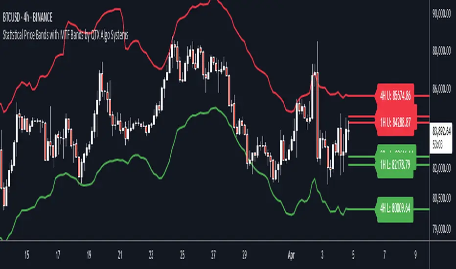
Statistical Price Bands with MTF Bands by QTX Algo SystemsStatistical Price Bands with MTF Bands by QTX Algo Systems
Overview
This indicator builds on the original Statistical Price Bands with Trend Filtering script by introducing Multi-Timeframe (MTF) Band Visualization. While the base version calculated adaptive price bands using statistical percentiles, trend filtering, and volatility adjustments, this enhanced version adds support/resistance bands from multiple timeframes onto the current chart.
This is not a minor cosmetic update. The MTF version includes additional request.security() logic and significantly increases context by allowing traders to reference band extremes from longer or shorter timeframes without switching charts. For this reason, the original and MTF versions are maintained separately, as this script requires a Pro+ or Premium TradingView plan to function correctly.
What’s New in This Version
Multi-Timeframe Band Support: Fetches and displays upper and lower bands from other timeframes (e.g., 30min, 1H, 4H, 1D, 1W, 1M).
Chart-Based MTF Labels: Each band is labeled with its source timeframe (e.g., “1D U” = 1-Day Upper Band) for easy visual reference.
Custom Timeframe Control: Users can toggle specific timeframes on/off depending on their preferences and strategy.
Core Calculation Method (Unchanged)
Statistical Percentile Calculation:
Determines upper and lower thresholds using a historical percentile method applied to price deviations from a VWMA anchor.
Volatility Adjustment:
Dynamically scales the percentile thresholds based on a volatility factor (standard deviation vs. moving average).
Trend Filtering:
Adds a directional bias based on whether price is above or below its VWMA, pushing the bands higher in uptrends and lower in downtrends.
MTF Band Integration
This version calculates additional statistical bands using the same logic as the chart’s timeframe, but applies it to other timeframes selected by the user. These values are fetched using request.security() and then plotted onto the current chart using lines and labels.
This functionality allows traders to:
See if current price is extended compared to higher timeframe extremes.
Spot trend continuation or exhaustion relative to intraday or macro levels.
Identify areas of confluence for trade entries, exits, or stop placement.
Inputs & Customization
Statistical Percentile (default: 95)
Controls how extreme the bands are. Higher values = wider bands.
Lookback Period (default: 350)
Number of bars used to calculate percentiles. Longer = smoother bands.
VWMA Length (default: 20)
Sets the moving average anchor for calculating relative price deviation.
Volatility Factor Multiplier (default: 1.0)
Scales the influence of market volatility on band width.
Trend Strength Multiplier (default: 10.0)
Adjusts how far bands shift in the direction of the trend.
Timeframe Toggles (MTF)
Select which timeframes (e.g., 1H, 4H, 1D, 1W) to show on the chart.
Label Offset
Controls how far right MTF labels appear on the chart.
Use Case Scenarios
Overextension Detection:
Price touching or breaching an MTF band may suggest exhaustion, especially if confirmed by confluence or divergence.
Trend Confirmation:
Bands tilting in one direction across multiple timeframes can suggest strong trend alignment.
Risk Management:
Use bands from higher timeframes as trailing stops or invalidation zones.
Why This Is a Separate Script
This version uses request.security() to retrieve values from multiple timeframes, which:
Requires an upgraded TradingView plan (Pro+ or higher).
May impact performance on lower-tier plans.
Provides a major functional difference from the original, not a minor tweak or cosmetic upgrade.
To maintain compatibility and accessibility for all users, both versions are published separately:
The original for single-timeframe users.
This version for those using a multi-timeframe workflow.
Disclaimer
This script is for educational purposes only. It is intended to support your analysis—not to predict outcomes or replace risk management. Past performance is not indicative of future results. Always perform your own analysis and trade responsibly.
Chonky ATR Levels 2.0Show ATR based high/low projections.
Choose a custom ATR calculation in the indicator's settings.
The default is a 20day RMA based ATR.
----------How projections are calculated----------
To project the ATR High, the ATR value is added to the low of the current candle that matches the ATR's timeframe.
To project the ATR Low, the ATR value is subtracted from the high of the current candle that matches the ATR's timeframe.
Example:
If a 20day RMA ATR is used:
- the ATR High will be the current day's low + the ATR value.
- the ATR Low will be the current day's high - the ATR value.
*However*, if the price action exceeds either ATR projection, the opposite ATR level will be fixed to the extreme of the period.
See the AUDUSD screenshot above for an example.
The ATR Low was exceeded, so the ATR High projection is capped at the high of day.
If the ATR High is exceeded, the ATR Low would be capped at the low of day.

Metatrader CalculatorThe “ Metatrader Calculator ” indicator calculates the position size, risk, and potential gain of a trade, taking into account the account balance, risk percentage, entry price, stop loss price, and risk/reward ratio. It supports the XAUUSD, XAGUSD, and BTCUSD pairs, automatically calculating the position size (in lots) based on these parameters. The calculation is displayed in a table on the chart, showing the lot size, loss in dollars, and potential gain based on the defined risk.

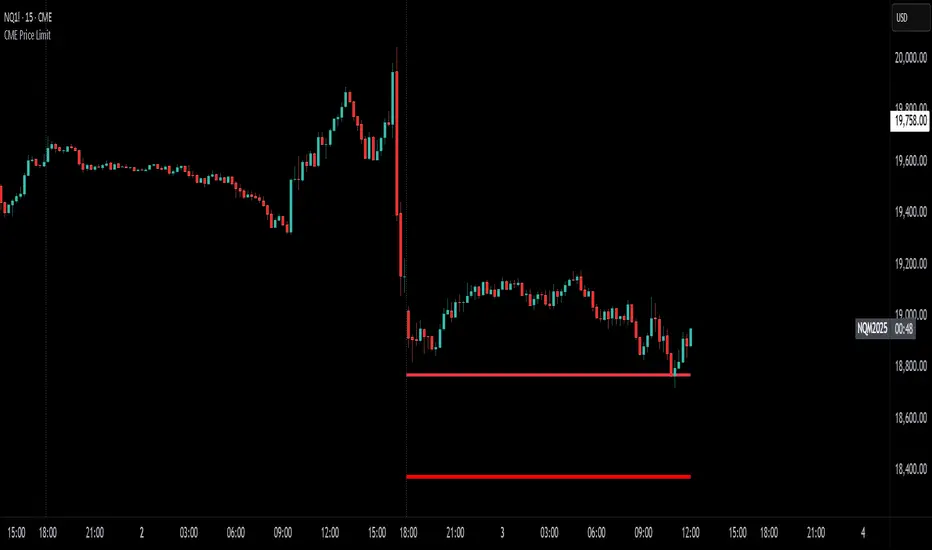
CME Price LimitCalculates the CME Price Limit
The reference price is obtained from the previous day's closing settlement price
(data pulled from the asset's daily chart with settlement enabled)
Percentage limit can be modified in settings
Buffer can be enabled (for example, 2% buffer on a 7% limit, so a line gets drawn at 5% too)
Alert can be enabled for price crossing a certain percentage from reference on the day
You can choose to plot the historical lines on every day, or the current day only
The reference price output can be found in the data window, or in the indicator status line if enabled in the settings.
Before placing real trades with this, you should compare the indicator's reference price to what's shown on CME's website, to double check that TradingView's data matches for your contract.
www.cmegroup.com
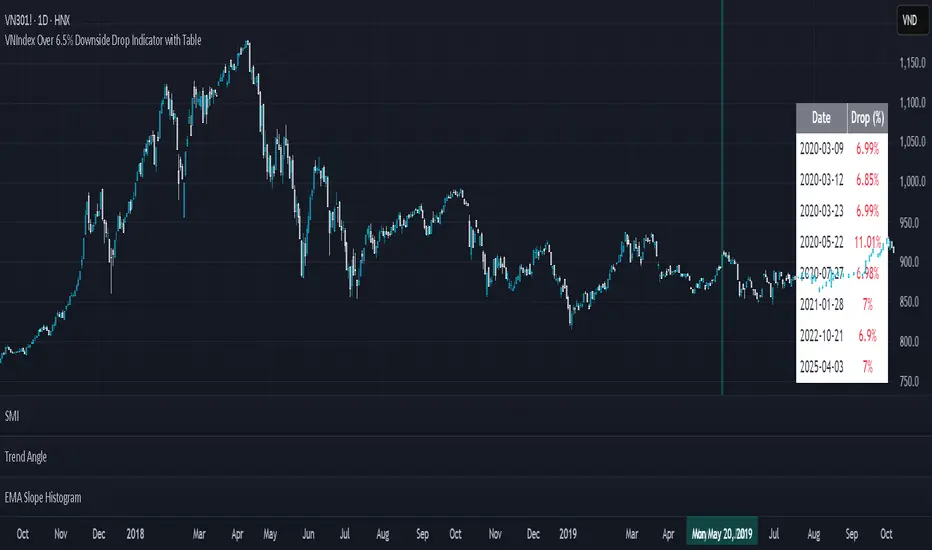
VNIndex Over 6.5% Downside Drop Indicator with TableOverview: The VNIndex 6.5% Downside Drop Indicator is a powerful tool designed to help traders and investors identify significant market drops on the VNIndex (or any other asset) based on a 6.5% downside threshold. This Pine Script® indicator automatically detects when the price of an asset drops by more than 6.5% within a single day, and visually marks those events on the chart.
Key Features:
6.5% Downside Drop Detection: Automatically calculates the daily percentage drop and identifies when the price falls by more than 6.5%.
Table Display: Displays the dates and corresponding percentage drops of all identified instances in a convenient table at the bottom right of the chart.
Markers: Red down-pointing markers are plotted above bars where the price drop exceeds the 6.5% threshold, making it easy to spot critical drop events at a glance.
Easy-to-Read Table: The table lists the date and drop percentage, updating dynamically as new drops are detected. This allows for easy tracking of significant downside moves over time.
How to Use:
Install the Script: Add this indicator to your TradingView chart.
Monitor Price Drops: The indicator will automatically detect when the price drops by over 6.5% from the previous close and display a marker on the chart and the table in the bottom right corner.
View the Table: The table displays the date and the percentage drop of each detected event, making it easy to track past significant moves.
Alerts: You can set an alert for 6.5% drops to receive notifications in real-time.
Customization Options:
The drop percentage threshold (6.5%) can be adjusted in the script to fit other market conditions or assets.
The table can be resized or styled based on user preference for better visibility.
Why Use This Indicator? This indicator is perfect for traders looking to spot large, significant price movements quickly. Large downside drops can signal potential market reversals or trading opportunities, and this tool helps you track such events effortlessly. Whether you're monitoring the VNIndex or any other asset, this indicator provides crucial insights into volatile price action, helping you make more informed decisions.
Open Source License: This indicator is open source and free to use under the Mozilla Public License 2.0. You are welcome to modify, distribute, and contribute to the project.
Contributions: Feel free to contribute improvements, fixes, or new features by creating a pull request. Let’s collaborate to make this indicator even better for the community!
IBAC Strategy - ZygoraIBAC - Intrinsic Binary Averaging based Contrarian
A contrarian scalping strategy in the futures market, designed to stabilize market efficiency by capitalizing on price reversals. The strategy has no stop loss, instead employing a cascading approach—adding to the position size each time the price moves in the wrong direction—and closes the full position when the target profit is reached. Without delving into intricate details, the strategy adheres to the following basic rules:
Position sizing is determined by a customized indicator based on cumulative reversal probability, which also contributes to identifying the signal’s direction.
Direction is determined by the Moving Average: price above the Moving Average signals a Short position, while price below it signals a Long position.
The threshold for entries and exits is adjusted based on the range between extremes (highest high minus lowest low) over the past 100 historical bars.
The next limit entry is placed at a distance equal to the threshold length below (for Long) or above (for Short) the current average price.
The next target profit is set at a distance equal to the threshold length above (for Long) or below (for Short) the current average price.
A signal is triggered when there is a sudden price movement detected by the RSI (Relative Strength Index).
When a signal is identified, the strategy starts with a risk-reward ratio (RR) of 1:1. However, the RR worsens as the cascading steps—referred to as inventory I—increase, because the average entry price shifts unfavorably with each new position added. To mitigate the risk of liquidation, the strategy aims to hold a smaller inventory amount over time. This is achieved by using a multiple threshold multiplier: when a specified inventory limit is reached, the threshold for the next entry increases, and the threshold for the next target profit decreases. As a result, with higher inventory levels, the strategy accepts a lower RR but increases the likelihood of hitting the target profit.
The target profit is always set above the average entry price (for Long) or below it (for Short), ensuring that the strategy eventually closes at a profit. This leads to a 100% win rate but comes with relatively high drawdowns due to the absence of a stop loss and the cascading nature of the positions. The strategy performs best in a consolidation market in 1 minute timeframe, where price tends to oscillate within a range, allowing the contrarian approach to capitalize on reversals. The strategy’s name is derived from its customized indicator for position sizing, which leverages cumulative reversal probability to optimize position sizes and assist in determining the signal’s direction.

Manual Trade Ledger# Manual Options Trade Journal – Pine Script
This project is a Pine Script implementation for TradingView that allows users to manually log options trades into a live table overlay on a chart.
## ✨ Features
- 📥 Manual entry of ticker, premium, contracts, strike, expiry, notes
- 📈 Auto-filled live data: timestamp, price, and % change since first log
- 🧾 Tabular logging for trade journaling and exporting to Google Sheets
- 🔧 Fully customizable and designed to support product experimentation
## 🎯 Use Case
This project was built to support a real-world trading workflow for options traders who:
- Prefer to manually log trades while watching charts
- Want a visual, copyable ledger that evolves in real-time
- Want to later analyze entries/exits in spreadsheets or dashboards
## 🛠 How It Works
1. Toggle the `Log Trade` switch inside TradingView’s indicator settings
2. Fill in your trade metadata (ticker, premium, etc.)
3. The script captures timestamp, price, and calculates % change
4. Each new trade adds a row to the table (up to 50 max)

Zig Zag Trend Metrics“ Zig Zag Trend Metrics ” is a highly versatile indicator, built on the classic Zig Zag concept and thoughtfully designed for technical traders seeking a deeper, more structured view of market dynamics. This tool identifies significant swing highs and lows, classifies them, and annotates each with key metrics, offering a precise snapshot of each movement. It enhances visual analysis by drawing connecting lines that outline the flow of market structure, making trend progression and reversals instantly recognizable. Beyond visual mapping, it features a compact, real-time statistics table that calculates the average price and time deltas for both bullish and bearish swings, giving traders deep insights into trend momentum and rhythm. With extensive customization options, this indicator adapts seamlessly to vast trading styles or chart setups, empowering traders to spot patterns, evaluate trend strength, and make more confident, data-backed decisions.
❖ FEATURES
✦ Automatic Swing Detection
At its core, this indicator automatically identifies swing highs and lows based on a customizable lookback period (default: 10 bars).
✦ Labeling Swing Points
Each swing is visualized with a label that includes:
Swing Classification : “HH” (Higher High), “LH” (Lower High), “LL” (Lower Low), or “HL” (Higher Low).
Price Difference : Displayed in percentage or absolute value from the previous opposite swing.
Time Difference : The number of bars since the previous swing of the opposite type.
These labels offer traders clear, immediate insight into price movements and structural changes.
✦ Visual Lines
The indicator draws three types of lines:
Bullish Lines: Connect recent swing lows to new swing highs, indicating uptrends.
Bearish Lines: Connect recent swing highs to new swing lows, indicating downtrends.
Range Lines: Connect consecutive highs or lows to outline price channels.
Each line type can be color-coded and customized for visibility.
✦ Statistics Table
An on-screen metrics table provides a live summary of trends. Script uses Relative Averaging to smooth price and time changes. This prevents outliers from distorting the data and provides a more reliable sense of typical swing behavior.
Uptrend Metrics: Shows average price and time differences from recent bullish swings.
Downtrend Metrics: Shows the same for bearish swings.
🛠️ Customization Options
Ability to tailor the indicator to suit their strategy and aesthetic preferences:
Swing Period: Adjust sensitivity to short- or long-term swings.
Color Settings: Customize line and label colors.
Label Display: Choose between absolute or percentage price differences.
Table Settings: Modify size, location, or visibility.
This makes the indicator highly flexible and useful across various timeframes and assets.

Gioteen-NormThe "Gioteen-Norm" indicator is a versatile and powerful technical analysis tool designed to help traders identify key market conditions such as divergences, overbought/oversold levels, and trend strength. By normalizing price data relative to a moving average and standard deviation, this indicator provides a unique perspective on price behavior, making it easier to spot potential reversals or continuations in the market.
The indicator calculates a normalized value based on the difference between the selected price and its moving average, scaled by the standard deviation over a user-defined period. Additionally, an optional moving average of this normalized value (Green line) can be plotted to smooth the output and enhance signal clarity. This dual-line approach makes it an excellent tool for both short-term and long-term traders.
***Key Features
Divergence Detection: The Gioteen-Norm excels at identifying divergences between price action and the normalized indicator value. For example, if the price makes a higher high while Red line forms a lower high, it may signal a bearish divergence, hinting at a potential reversal.
Overbought/Oversold Conditions: Extreme values of Red line (e.g., significantly above or below zero) can indicate overbought or oversold conditions, helping traders anticipate pullbacks or bounces.
Trend Strength Insight: The normalized output reflects how far the price deviates from its average, providing a measure of momentum and trend strength.
**Customizable Parameters
Traders can adjust the period, moving average type, applied price, and shift to suit their trading style and timeframe.
**How It Works
Label1 (Red Line): Represents the normalized price deviation from a user-selected moving average (SMA, EMA, SMMA, or LWMA) divided by the standard deviation over the specified period. This line highlights the relative position of the price compared to its historical range.
Label2 (Green Line, Optional): A moving average of Label1, which smooths the normalized data to reduce noise and provide clearer signals. This can be toggled on or off via the "Draw MA" option.
**Inputs
Period: Length of the lookback period for normalization (default: 100).
MA Method: Type of moving average for normalization (SMA, EMA, SMMA, LWMA; default: EMA).
Applied Price: Price type used for calculation (Close, Open, High, Low, HL2, HLC3, HLCC4; default: Close).
Shift: Shifts the indicator forward or backward (default: 0).
Draw MA: Toggle the display of the Label2 moving average (default: true).
MA Period: Length of the moving average for Label2 (default: 50).
MA Method (Label2): Type of moving average for Label2 (SMA, EMA, SMMA, LWMA; default: SMA).
**How to Use
Divergence Trading: Look for discrepancies between price action and Label1. A bullish divergence (higher low in Label1 vs. lower low in price) may suggest a buying opportunity, while a bearish divergence could indicate a selling opportunity.
Overbought/Oversold Levels: Monitor extreme Label1 values. For instance, values significantly above +2 or below -2 could indicate overextension, though traders should define thresholds based on the asset and timeframe.
Trend Confirmation: Use Label2 to confirm trend direction. A rising Label2 suggests increasing bullish momentum, while a declining Label2 may indicate bearish pressure.
Combine with Other Tools: Pair Gioteen-Norm with support/resistance levels, RSI, or volume indicators for a more robust trading strategy.
**Notes
The indicator is non-overlay, meaning it plots below the price chart in a separate panel.
Avoid using a Period value of 1, as it may lead to unstable results due to insufficient data for standard deviation calculation.
This tool is best used as part of a broader trading system rather than in isolation.
**Why Use Gioteen-Norm?
The Gioteen-Norm indicator offers a fresh take on price normalization, blending statistical analysis with moving average techniques. Its flexibility and clarity make it suitable for traders of all levels—whether you're scalping on short timeframes or analyzing long-term trends. By publishing this for free, I hope to contribute to the TradingView community and help traders uncover hidden opportunities in the markets.
**Disclaimer
This indicator is provided for educational and informational purposes only. It does not constitute financial advice. Always backtest and validate any strategy before trading with real capital, and use proper risk management.

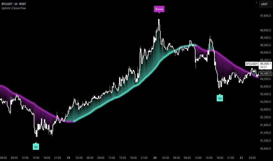
Uptrick: Z-Score FlowOverview
Uptrick: Z-Score Flow is a technical indicator that integrates trend-sensitive momentum analysi s with mean-reversion logic derived from Z-Score calculations. Its primary objective is to identify market conditions where price has either stretched too far from its mean (overbought or oversold) or sits at a statistically “normal” range, and then cross-reference this observation with trend direction and RSI-based momentum signals. The result is a more contextual approach to trade entry and exit, emphasizing precision, clarity, and adaptability across varying market regimes.
Introduction
Financial instruments frequently transition between trending modes, where price extends strongly in one direction, and ranging modes, where price oscillates around a central value. A simple statistical measure like Z-Score can highlight price extremes by comparing the current price against its historical mean and standard deviation. However, such extremes alone can be misleading if the broader market structure is trending forcefully. Uptrick: Z-Score Flow aims to solve this gap by combining Z-Score with an exponential moving average (EMA) trend filter and a smoothed RSI momentum check, thus filtering out signals that contradict the prevailing market environment.
Purpose
The purpose of this script is to help traders pinpoint both mean-reversion opportunities and trend-based pullbacks in a way that is statistically grounded yet still mindful of overarching price action. By pairing Z-Score thresholds with supportive conditions, the script reduces the likelihood of acting on random price spikes or dips and instead focuses on movements that are significant within both historical and current contextual frameworks.
Originality and Uniquness
Layered Signal Verification: Signals require the fulfillment of multiple layers (Z-Score extreme, EMA trend bias, and RSI momentum posture) rather than merely breaching a statistical threshold.
RSI Zone Lockout: Once RSI enters an overbought/oversold zone and triggers a signal, the script locks out subsequent signals until RSI recovers above or below those zones, limiting back-to-back triggers.
Controlled Cooldown: A dedicated cooldown mechanic ensures that the script waits a specified number of bars before issuing a new signal in the opposite direction.
Gradient-Based Visualization: Distinct gradient fills between price and the Z-Mean line enhance readability, showing at a glance whether price is trading above or below its statistical average.
Comprehensive Metrics Panel: An optional on-chart table summarizes the Z-Score’s key metrics, streamlining the process of verifying current statistical extremes, mean levels, and momentum directions.
Why these indicators were merged
Z-Score measurements excel at identifying when price deviates from its mean, but they do not intrinsically reveal whether the market’s trajectory supports a reversion or if price might continue along its trend. The EMA, commonly used for spotting trend directions, offers valuable insight into whether price is predominantly ascending or descending. However, relying solely on a trend filter overlooks the intensity of price moves. RSI then adds a dedicated measure of momentum, helping confirm if the market’s energy aligns with a potential reversal (for example, price is statistically low but RSI suggests looming upward momentum). By uniting these three lenses—Z-Score for statistical context, EMA for trend direction, and RSI for momentum force—the script offers a more comprehensive and adaptable system, aiming to avoid false positives caused by focusing on just one aspect of price behavior.
Calculations
The core calculation begins with a simple moving average (SMA) of price over zLen bars, referred to as the basis. Next, the script computes the standard deviation of price over the same window. Dividing the difference between the current price and the basis by this standard deviation produces the Z-Score, indicating how many standard deviations the price is from its mean. A positive Z-Score reveals price is above its average; a negative reading indicates the opposite.
To detect overall market direction, the script calculates an exponential moving average (emaTrend) over emaTrendLen bars. If price is above this EMA, the script deems the market bullish; if below, it’s considered bearish. For momentum confirmation, the script computes a standard RSI over rsiLen bars, then applies a smoothing EMA over rsiEmaLen bars. This smoothed RSI (rsiEma) is monitored for both its absolute level (oversold or overbought) and its slope (the difference between the current and previous value). Finally, slopeIndex determines how many bars back the script compares the basis to check whether the Z-Mean line is generally rising, falling, or flat, which then informs the coloring scheme on the chart.
Calculations and Rational
Simple Moving Average for Baseline: An SMA is used for the core mean because it places equal weight on each bar in the lookback period. This helps maintain a straightforward interpretation of overbought or oversold conditions in the context of a uniform historical average.
Standard Deviation for Volatility: Standard deviation measures the variability of the data around the mean. By dividing price’s difference from the mean by this value, the Z-Score can highlight whether price is unusually stretched given typical volatility.
Exponential Moving Average for Trend: Unlike an SMA, an EMA places more emphasis on recent data, reacting quicker to new price developments. This quicker response helps the script promptly identify trend shifts, which can be crucial for filtering out signals that go against a strong directional move.
RSI for Momentum Confirmation: RSI is an oscillator that gauges price movement strength by comparing average gains to average losses over a set period. By further smoothing this RSI with another EMA, short-lived oscillations become less influential, making signals more robust.
SlopeIndex for Slope-Based Coloring: To clarify whether the market’s central tendency is rising or falling, the script compares the basis now to its level slopeIndex bars ago. A higher current reading indicates an upward slope; a lower reading, a downward slope; and similar readings, a flat slope. This is visually represented on the chart, providing an immediate sense of the directionality.
Inputs
zLen (Z-Score Period)
Specifies how many bars to include for computing the SMA and standard deviation that form the basis of the Z-Score calculation. Larger values produce smoother but slower signals; smaller values catch quick changes but may generate noise.
emaTrendLen (EMA Trend Filter)
Sets the length of the EMA used to detect the market’s primary direction. This is pivotal for distinguishing whether signals should be considered (price aligning with an uptrend or downtrend) or filtered out.
rsiLen (RSI Length)
Defines the window for the initial RSI calculation. This RSI, when combined with the subsequent smoothing EMA, forms the foundation for momentum-based signal confirmations.
rsiEmaLen (EMA of RSI Period)
Applies an exponential moving average over the RSI readings for additional smoothing. This step helps mitigate rapid RSI fluctuations that might otherwise produce whipsaw signals.
zBuyLevel (Z-Score Buy Threshold)
Determines how negative the Z-Score must be for the script to consider a potential oversold signal. If the Z-Score dives below this threshold (and other criteria are met), a buy signal is generated.
zSellLevel (Z-Score Sell Threshold)
Determines how positive the Z-Score must be for a potential overbought signal. If the Z-Score surpasses this threshold (and other checks are satisfied), a sell signal is generated.
cooldownBars (Cooldown (Bars))
Enforces a bar-based delay between opposite signals. Once a buy signal has fired, the script must wait the specified number of bars before registering a new sell signal, and vice versa.
slopeIndex (Slope Sensitivity (Bars))
Specifies how many bars back the script compares the current basis for slope coloration. A bigger slopeIndex highlights larger directional trends, while a smaller number emphasizes shorter-term shifts.
showMeanLine (Show Z-Score Mean Line)
Enables or disables the plotting of the Z-Mean and its slope-based coloring. Traders who prefer minimal chart clutter may turn this off while still retaining signals.
Features
Statistical Core (Z-Score Detection):
This feature computes the Z-Score by taking the difference between the current price and the basis (SMA) and dividing by the standard deviation. In effect, it translates price fluctuations into a standardized measure that reveals how significant a move is relative to the typical variation seen over the lookback. When the Z-Score crosses predefined thresholds (zBuyLevel for oversold and zSellLevel for overbought), it signals that price could be at an extreme.
How It Works: On each bar, the script updates the SMA and standard deviation. The Z-Score is then refreshed accordingly. Traders can interpret particularly large negative or positive Z-Score values as scenarios where price is abnormally low or high.
EMA Trend Filter:
An EMA over emaTrendLen bars is used to classify the market as bullish if the price is above it and bearish if the price is below it. This classification is applied to the Z-Score signals, accepting them only when they align with the broader price direction.
How It Works: If the script detects a Z-Score below zBuyLevel, it further checks if price is actually in a downtrend (below EMA) before issuing a buy signal. This might seem counterintuitive, but a “downtrend” environment plus an oversold reading often signals a potential bounce or a mean-reversion play. Conversely, for sell signals, the script checks if the market is in an uptrend first. If it is, an overbought reading aligns with potential profit-taking.
RSI Momentum Confirmation with Oversold/Overbought Lockout:
RSI is calculated over rsiLen, then smoothed by an EMA over rsiEmaLen. If this smoothed RSI dips below a certain threshold (for example, 30) and then begins to slope upward, the indicator treats it as a potential sign of recovering momentum. Similarly, if RSI climbs above a certain threshold (for instance, 70) and starts to slope downward, that suggests dwindling momentum. Additionally, once RSI is in these zones, the indicator locks out repetitive signals until RSI fully exits and re-enters those extreme territories.
How It Works: Each bar, the script measures whether RSI has dropped below the oversold threshold (like 30) and has a positive slope. If it does, the buy side is considered “unlocked.” For sell signals, RSI must exceed an overbought threshold (70) and slope downward. The combination of threshold and slope helps confirm that a reversal is genuinely in progress instead of issuing signals while momentum remains weak or stuck in extremes.
Cooldown Mechanism:
The script features a custom bar-based cooldown that prevents issuing new signals in the opposite direction immediately after one is triggered. This helps avoid whipsaw situations where the market quickly flips from oversold to overbought or vice versa.
How It Works: When a buy signal fires, the indicator notes the bar index. If the Z-Score and RSI conditions later suggest a sell, the script compares the current bar index to the last buy signal’s bar index. If the difference is within cooldownBars, the signal is disallowed. This ensures a predefined “quiet period” before switching signals.
Slope-Based Coloring (Z-Mean Line and Shadow):
The script compares the current basis value to its value slopeIndex bars ago. A higher reading now indicates a generally upward slope, while a lower reading indicates a downward slope. The script then shades the Z-Mean line in a corresponding bullish or bearish color, or remains neutral if little change is detected.
How It Works: This slope calculation is refreshingly straightforward: basis – basis . If the result is positive, the line is colored bullish; if negative, it is colored bearish; if approximately zero, it remains neutral. This provides a quick visual cue of the medium-term directional bias.
Gradient Overlays:
With gradient fills, the script highlights where price stands in relation to the Z-Mean. When price is above the basis, a purple-shaded region is painted, visually indicating a “bearish zone” for potential overbought conditions. When price is below, a teal-like overlay is used, suggesting a “bullish zone” for potential oversold conditions.
How It Works: Each bar, the script checks if price is above or below the basis. It then applies a fill between close and basis, using distinct colors to show whether the market is trading above or below its mean. This creates an immediate sense of how extended the market might be.
Buy and Sell Labels (with Alerts):
When a legitimate buy or sell condition passes every check (Z-Score threshold, EMA trend alignment, RSI gating, and cooldown clearance), the script plots a corresponding label directly on the chart. It also fires an alert (if alerts are set up), making it convenient for traders who want timely notifications.
How It Works: If rawBuy or rawSell conditions are met (refined by RSI, EMA trend, and cooldown constraints), the script calls the respective plot function to paint an arrow label on the chart. Alerts are triggered simultaneously, carrying easily recognizable messages.
Metrics Table:
The optional on-chart table (activated by showMetrics) presents real-time Z-Score data, including the current Z-Score, its rolling mean, the maximum and minimum Z-Score values observed over the last zLen bars, a percentile position, and a short-term directional note (rising, falling, or flat).
Current – The present Z-Score reading
Mean – Average Z-Score over the zLen period
Min/Max – Lowest and highest Z-Score values within zLen
Position – Where the current Z-Score sits between the min and max (as a percentile)
Trend – Whether the Z-Score is increasing, decreasing, or flat
Conclusion
Uptrick: Z-Score Flow offers a versatile solution for traders who need a statistically informed perspective on price extremes combined with practical checks for overall trend and momentum. By leveraging a well-defined combination of Z-Score, EMA trend classification, RSI-based momentum gating, slope-based visualization, and a cooldown mechanic, the script reduces the occurrence of false or premature signals. Its gradient fills and optional metrics table contribute further clarity, ensuring that users can quickly assess market posture and make more confident trading decisions in real time.
Disclaimer
This script is intended solely for informational and educational purposes. Trading in any financial market comes with substantial risk, and there is no guarantee of success or the avoidance of loss. Historical performance does not ensure future results. Always conduct thorough research and consider professional guidance prior to making any investment or trading decisions.
Session Range (Pips/Points) Marcos Trader## English Description
Title: Session Range Indicator (Pips/Points)
Summary:
This indicator calculates and displays the price range (high - low) for the Asian, London, and New York trading sessions directly on your chart. It helps you quickly visualize the volatility of each recent session, showing the result in whole Pips for Forex or in Points for other instruments.
Key Features:
Calculates the High-Low range for the Asia, London, & NY sessions.
Displays the range in whole Pips for Forex (automatically detects JPY pairs for correct calculation).
Displays the range in Points (based on syminfo.mintick) for Indices, Crypto, Commodities, Stocks, etc.
100% Configurable Session Times: Define the exact start time, end time, and most importantly, the Time Zone for each session (Asia, London, NY) in the indicator settings. This ensures accuracy regardless of Daylight Saving Time or your chart's timezone!
Shows clear labels with the range near the end of each calculated session.
Options to individually show or hide the labels for each session.
Allows configuration of label transparency.
Allows defining how many past session labels to display on the chart (default is 5).
Developed in Pine Script v6.
How to Use:
Add the indicator to your chart.
Open the indicator Settings (gear icon).
Go to the "Session Times" section.
For each session (Asia, London, NY), enter the schedule in HHMM-HHMM format and ensure you add the correct Time Zone using a colon followed by the standard name (e.g., :Europe/London, :America/New_York, :Asia/Tokyo, :UTC+2, :UTC-5). This step is crucial.
Adjust the display options under "Show Sessions" and "Appearance" according to your preferences.
Click "OK".
Notes:
The accuracy of the indicator critically depends on the correct configuration of the times and time zones in the settings. The range label appears near the last bar belonging to the defined session.
Magnetic Trend filterMagnetic Trend Filter – A Smarter Way to Trade Trends 🚀
I’m excited to introduce a powerful trend filtering method that I’ve been working on—Magnetic Trend Filter (MTF). If you’ve ever struggled with noisy price action, false signals, or unclear trends, this indicator might be just what you need!
🔍 What is the Magnetic Trend Filter?
MTF is designed to smooth out market noise and help traders focus on clean, high-probability trend signals. It works by applying an intelligent filtering mechanism to Close price data, reducing whipsaws while maintaining trend sensitivity.
Instead of relying solely on conventional moving averages or lagging indicators, MTF adapts dynamically to market conditions, providing a more refined view of trend direction.
🎯 How it Works
• MTF processes filtered Close price data, making trends more visible.
• It reduces unnecessary price fluctuations, helping you stay in trades longer.
• The filtering mechanism ensures better accuracy in defining trend direction.
📈 How to Use It
• Buy Signals: When the trend filter turns bullish (uptrend confirmation).
• Sell Signals: When the trend filter turns bearish (downtrend confirmation).
• Combine with Other Indicators: MTF works great alongside VWAP, Bollinger Bands, and Ichimoku Cloud for added confluence.
Personally, I use it with my price range filter to catch good exits. Have added that to the Magnetic trend filter and will also publish advanced version independently.
🛠 Customization & Optimization
I’ve optimized the script to reduce computation load, making it efficient and responsive even on lower timeframes. You can tweak smoothing parameters to adjust the sensitivity of the filter based on your trading style.
📌 Final Thoughts
Magnetic Trend Filter is an efficient way to identify trends while avoiding unnecessary noise in price movements. Whether you’re a day trader or swing trader, this tool can help improve decision-making and increase trading accuracy.
💡 Try it out and let me know your thoughts! I’d love to hear feedback and explore potential improvements together. 🚀
Disclaimer:
This is for educational purpose only, no matter how promising things look on chart, they are past performances and reality may vary in real-time.
So use at your own risk.

IQ Liquidation Heatmap [TradingIQ]Introducing "IQ Liquidation Heatmap".
IQ Liquidation Heatmap is a proprietary indicator designed to identify and display price zones where large numbers of crypto position liquidations are likely to occur. It presents both current liquidation zones—areas where a cascade of liquidations would be triggered if the price is reached—and historical liquidation zones, where such events have taken place before.
Why Liquidations and Liquidation Cascades Are Important
Liquidation cascades are important because they can lead to rapid and significant price moves in the market. When many traders have set stop-loss orders or are highly leveraged at similar price levels, a move that hits these zones can force a large number of positions to close at once. This mass closing of positions not only accelerates the price movement but can also trigger further liquidations in a self-reinforcing loop.
Understanding where these cascades occur helps traders recognize potential support and resistance levels. It also provides insights into where market participants are most vulnerable, allowing for better risk management and more informed trading decisions. In short, liquidation cascades highlight key areas of market stress that can lead to increased volatility and opportunities for those prepared to act.
In short, if a lot of short positions are liquidated simultaneously, an upside liquidation cascade can occur. During an upside liquidation cascade, price will increase intensely to the upside with high volatility.
If a lot of long positions are liquidated simultaneously, a downside liquidation cascade can occur. During a downside liquidation cascade, price will decrease intensely to the downside with high volatility.
Knowing where these liquidation cascades can occur is invaluable information for crypto traders.
What IQ Liquidation Heatmap Does
IQ Liquidation Heatmap visually maps price levels that have seen or may see liquidation cascades. In plain terms, it shows you where many stop-losses or leveraged positions have been triggered in the past and where similar events can occur in the future. By highlighting these zones, the indicator helps you understand areas of market stress that could lead to rapid price movements.
The image above shows a historical liquidation cascade occurring. Clustered bubbles show large amounts of liquidations occurring - the more bubbles and the brighter they are, the stronger the liquidation cascade. During a liquidation cascade, there is a higher chance that a strong downtrend or uptrend will continue.
Current Liquidation Levels
The image above explains current liquidation levels.
Current liquidations levels are price areas where a large number of positions will be liquidated. If a liquidation level is above the current price, then it is considered a price zone where shorts will be liquidated. If a liquidation level is below the current price, then it is considered a price zone where longs will be liquidated.
In this image, bright green levels represent price areas where the highest amount of positions will be liquidated, while dark purple levels represent price areas where the lowest amount of positions will be liquidated.
An active (current) liquidation level will extend to the right beyond the current price because they have not yet been hit.
When strong liquidation levels (green - bright green) are hit and are above price, it is expected that an upside liquidation cascade will occur. When strong liquidations are hit and are below price, it is expected that a downside liquidation cascade will occur.
Historical Liquidation Levels
The image above explains historical liquidation levels.
Historical liquidation levels stop at the bar where they are hit, so you can see how price responded to hitting a key liquidation level.
In this image, bright green levels represent price areas where the highest amount of positions will be liquidated, while dark purple levels represent price areas where the lowest amount of positions will be liquidated.
If price moves up into a liquidation level, then shorts are being liquidated. If price moves down into a liquidation level, then longs are being liquidated. In the image, we can see that when bright green liquidation levels were hit - a liquidation cascade occurred. During this cascade, price continued to move strongly to the downside with high volatility.
During the uptrend after the downtrend, we can see some bright green liquidation levels were also hit - causing an upside liquidation cascade that resulted in strong, volatile upside price moves.
Gradient Bar
The image above explains the liquidations gradient bar.
The bar located on the right of your chart shows what colors correspond to low, medium, and high liquidation levels.
In this image, bright green means the liquidation level is strong, while dark purple means the liquidation level is weak. By extension, we would expect liquidation cascades or strong price moves to more likely occur when a cluster of bright green liquidation zones are hit. Additionally, we would expect a small reaction (or no reaction at all) when dark purple liquidation zones are hit.
Colors are customizable.
Liquidation Cluster Bar
The image above explains the liquidation cluster bar.
The liquidation cluster bar aggregates liquidation zones and shows the approximate price areas where the highest number of liquidation points are located.
In this image, the green portion of the bar represents where the largest number of traders will be liquidated in aggregate. While the purple portions of the bar shows where the smallest number of traders will be liquidated in aggregate.
This bar is useful for clustering liquidations zones across larger price areas to see where the highest number of traders are likely to be liquidated.
Concept Behind IQ Liquidation Heatmap
The basic idea is simple: in crypto markets, when price reaches certain levels, many traders’ positions can be liquidated at once, causing sharp moves in price. These zones are not random. They are built on historical price data and statistical analysis of past liquidation events. IQ Liquidation Heatmap captures this information and presents it in an easy-to-read format.
Key points include:
Current Liquidation Zones: These are the areas where, if the price moves into them, a high number of liquidations could occur.
Historical Liquidation Zones: These show where liquidation cascades have happened in the past, offering context on how the market has behaved under stress.
Key Features of IQ Liquidation Heatmap
Real-Time and Historical Data:
The indicator combines current market conditions with historical liquidation events. It updates dynamically to reflect real-time data while also showing past liquidation zones.
Visual Heatmap:
The display uses color gradients to represent the intensity of liquidation activity. Brighter or more intense colors indicate zones with a higher likelihood of triggering liquidations, while darker colors represent areas with lower activity.
User-Friendly Interface:
IQ Liquidation Heatmap is designed to be simple and straightforward. The visual output clearly marks the price levels of interest, making it easy for traders to see where liquidations might occur.
Proprietary Calculation:
The data behind the indicator is calculated using proprietary methods that consider historical price action, statistical ranges, and liquidity distribution. This means the indicator adapts to the specific characteristics of different crypto assets and timeframes.
Dynamic Updates:
The indicator recalculates its output in real time as new price data comes in. This ensures that the displayed liquidation zones are always current and reflect the latest market conditions.
How IQ Liquidation Heatmap Works
Data Collection:
IQ Liquidation Heatmap gathers historical price data as well as data on liquidation events. This data is used to identify key price ranges and levels where liquidations have previously occurred.
Statistical Analysis:
The indicator applies statistical methods—such as calculating medians and percentiles—to determine the significance of each price range. This analysis helps to rank the importance of various liquidation zones.
Liquidity Clustering:
Areas with a high concentration of liquidations are identified by examining how many positions or stop orders are clustered at specific price levels. These clusters are then represented on the chart using a heatmap style.
Visual Mapping:
The calculated data is overlaid onto the trading chart. Graphical elements like lines, boxes, or filled regions mark the identified liquidation zones. Color gradients help to differentiate between zones with high versus low liquidation risk.
Real-Time Recalculation:
As new price data becomes available, IQ Liquidation Heatmap continuously updates its analysis. This ensures that the indicator remains relevant throughout the trading session and can quickly adjust if market conditions change.
Using IQ Liquidation Heatmap
Traders can use IQ Liquidation Heatmap as an additional tool to support their trading decisions. Here are some practical applications:
Trade Entry And Exit Planning:
The visual cues provided by the indicator can serve as reference points for planning entries and exits. When the price nears a zone known for triggering liquidations, traders can adjust their strategies accordingly.
Risk Management:
By identifying key liquidation zones, traders can better manage risk. Knowing where a liquidation cascade is likely to occur helps in setting more effective stop-loss orders and managing overall exposure.
Market Structure Analysis:
The historical data offered by IQ Liquidation Heatmap gives insight into how the market has reacted in the past during periods of stress. This historical perspective can help in understanding broader market trends and potential future movements.
Summary
IQ Liquidation Heatmap is a straightforward indicator that provides clear visual information about price levels where liquidation cascades have occurred or are likely to occur. By merging historical data with real-time updates and proprietary liquidity analysis, it offers traders a neutral and data-driven way to understand areas of potential market stress for entries and exits. The indicator is simple to use and does not require complex adjustments, making it suitable for traders looking for clear visual cues in the crypto market.
By incorporating IQ Liquidation Heatmap into your analysis toolkit, you can gain a better understanding of key price zones, support effective risk management, and identify liquidation cascades before they occur and potentially identify breakouts before they occur.

15% Below Daily LowESPP discount pricing (15%) - Line chart that follows the daily low of the chart to show what price you could buy a company stock with the typical discount of 15%.
Ratio S/RRatio S/R - Intraday Support & Resistance Levels
Introduction
This script identifies key intraday support and resistance (S/R) levels where price tends to reverse frequently. It is designed specifically for intraday trading and aims to help traders find high-probability reversal zones.
The logic behind the script revolves around logarithmic returns, historical volatility, and ratio-based price levels. The script dynamically calculates price ranges using standard deviation-based volatility and applies preset ratio levels to determine potential support and resistance zones.
How It Works
Dynamic Range Calculation
The script calculates the price range based on the previous day’s logarithmic return volatility.
The range is then used to project different levels of price movement.
Reference Price
You can choose whether the reference price is from today’s open or yesterday’s close (oporcl setting).
This helps adapt the levels based on market behavior.
Ratio-Based Levels
The script applies specific ratios to the calculated range:
0.0833 (Minor Reversal Zone)
0.25 & 0.38 (Primary Reversal Zones)
0.62 & 0.75 (Significant Reversal Zones)
1.0 & 1.25 (Extreme Reversal Zones)
These levels act as potential support and resistance points.
Disclaimer: This is just for educational purpose . Trading is risky activity and how you use this tool is your own responsibility. The publisher of this tool does not make any claims.