Ln(close)Natural log indicator for normalizing data. SMA applied so you can take the average of that normalization factor. Personally use it for US economic data where the value is very large (GDI, Fed Balance Sheet, USM2 etc.) and the year over year delta is not pertinent (USM2) or not available (GDI.. although I did make an indicator to get YoY :D). Any additional ideas leave a comment and I'll take a look.
Statistics
Returns Since PivotReturns Since Pivot (RSP) helps to analyze the trend and seasonality.
This indicator draws 2 separate lines
green - upward movement
red - downward movement
Unlike other trend indicators, it's important that even while uptrend you can still see the power of downward moves that occurred during move up.
Hints and setups:
1) Helps to identify clear up trend from the noisy/mixed one: clearly growing non-interrupted green line, without significant negative red lines.
2) Helps to see potential trend reversal: for example, clear strong green line was interrupted for a brief price drop. Then the uptrend continues, you see clear green line again. But -- it's visible that new green line is way less strong, so the price might have exhausted.
3) While trading on 5 min chart, you can set RSP to 1 hour, or 4 hours to get a clear picture of price action on macro timeframe.
4) Indicator is normalized, so you can compare different coins. For example, after the big drop and rebound, you can use RSP to understand which coin had more powerful rebound, thus potentially will be a best gainer in case if the market continues go up.

Uptrick: Complex WMA Indicator with Trend Transitions
The "Complex WMA Indicator with Trend Transitions" is a technical analysis tool designed to help traders identify and visualize market trends using three Weighted Moving Averages (WMAs) of varying lengths. The primary purpose of this indicator is to provide a clearer and more nuanced view of market trends by highlighting bullish and bearish phases and filtering out noise, thereby enabling more informed trading decisions.
Detailed Explanation
This indicator allows users to set the lengths of three WMAs through input parameters. The default lengths are set to 10, 20, and 50, but users can customize these values according to their trading strategy. The WMAs are calculated using the closing prices of the specified periods, and the results are plotted on the chart in red, green, and blue, corresponding to the first, second, and third WMAs, respectively.
The indicator defines two primary conditions for trend analysis: bullish and bearish trends. A bullish trend is identified when both the shorter WMAs (first and second) are above the longest WMA (third), indicating upward momentum. Conversely, a bearish trend is identified when both the shorter WMAs are below the longest WMA, signaling downward momentum.
Crossover Signals and Trend Transitions
The script also identifies crossover signals between the first and second WMAs. A bullish crossover occurs when the first WMA crosses above the second WMA, generating a buy signal. This event is marked on the chart with a green upward label. A bearish crossover, marked with a red downward label, occurs when the first WMA crosses below the second WMA, indicating a sell signal.
To track the trend transitions effectively, the indicator employs a state machine. It maintains two variables, currentTrend and prevTrend, to store the current and previous trend states. The trend state is updated based on the defined trend conditions. When the trend changes from one state to another (e.g., from a bullish trend to a bearish trend), the indicator creates a label at the beginning of the new trend to mark this transition. This helps traders quickly recognize significant changes in market direction.
Visual Enhancements
The indicator enhances visual clarity by coloring the background of the chart based on the identified trend. When a bullish trend is detected, the background turns green, and when a bearish trend is identified, it turns red. The script ensures that only clear bullish and bearish trends are highlighted by excluding the "No Clear Trend" state, which reduces noise and prevents false signals.
Alerts
To further aid traders, the indicator includes alert conditions for both bullish and bearish crossovers. These alerts notify traders when a crossover occurs, enabling them to take timely action based on the identified signals.
Purpose and Unique Features
The primary purpose of the "Complex WMA Indicator with Trend Transitions" is to provide traders with a more precise and actionable analysis of market trends. Unlike simple moving average indicators, this tool uses multiple WMAs and incorporates a state machine to track and highlight trend transitions more effectively. By focusing on clear trend signals and filtering out noise, it helps traders make more informed decisions.
This indicator differs from other moving average-based tools in several ways:
Multi-WMA Analysis: It uses three WMAs of different lengths, providing a more comprehensive view of the market trend.
State Machine for Trends: The use of a state machine to track trend transitions ensures that only significant trends are highlighted, reducing noise.
Visual Clarity: The combination of colored backgrounds and labeled transitions makes it easier for traders to identify and act on trends.
Customization: Users can adjust the lengths of the WMAs to suit their trading strategies, making the indicator versatile.
In summary, the "Complex WMA Indicator with Trend Transitions" offers a sophisticated and customizable approach to trend analysis, providing clear visual cues and alerts for significant market movements, which sets it apart from simpler moving average indicators.

Introducing the Markov Chain Model IndicatorThis powerful tool leverages Markov chain theory to help traders predict stock price movements by analyzing historical price data and calculating transition probabilities between different states: "Up by >1%", "Stable", and "Down by <1%". This post will provide a comprehensive overview of the indicator, its advantages and disadvantages, and how it can be used effectively in trading decisions.
How It Works
The Markov Chain Model indicator calculates the daily percentage changes in stock prices and categorizes them into three states:
Up by >1%
Stable (between -1% and +1%)
Down by <1%
By analyzing these transitions, the script constructs a transition matrix that shows the probability of moving from one state to another. This matrix is then displayed on the chart, providing traders with valuable insights into potential future price movements.
Advantages of the Markov Chain Model Indicator
Data-Driven Predictions : Utilizes historical price data to calculate probabilities, offering a statistical foundation for predictions.
Visual Representation : Displays the transition matrix directly on the chart, making it easy to interpret and use in trading decisions.
Adaptability : Allows users to customize the percentage threshold, enabling fine-tuning based on different market conditions.
Comprehensive Analysis : Considers multiple states (up, stable, down), providing a more nuanced view of price movements.
Disadvantages of the Markov Chain Model Indicator
Historical Dependence : The model relies on historical data, which may not always accurately predict future movements, especially in volatile markets.
Simplified States : The use of only three states might oversimplify complex market behaviors, potentially missing out on subtler trends.
Limited Scope : Designed for short-term predictions and may not be as effective for long-term investment strategies.
Example Interpretation
Transition Matrix:
From/To | Up >1% | Stable | Down <1% |
---------------------------------------
Up >1% | 0.30 | 0.40 | 0.30 |
Stable | 0.33 | 0.44 | 0.23 |
Down <1% | 0.34 | 0.36 | 0.30 |
Latest 3 States: S2 -> S1 -> S1
Total Bars: 2523
Decision Making Based on the Transition Matrix:
Current State: Up >1%
Next State Probabilities : 30% Up >1%, 40% Stable, 30% Down <1%
Decision : Given the balanced probabilities, a trader might decide to hold the position but set a trailing stop-loss to protect against sudden downturns. If other technical indicators also suggest continued upward momentum, they might increase their position cautiously.
Current State : Stable
Next State Probabilities : 33% Up >1%, 44% Stable, 23% Down <1%
Decision : With a high probability of stability, a cautious approach might be to hold or make small incremental trades, keeping an eye on other market indicators for confirmation.
Conclusion
The Markov Chain Model indicator is a powerful tool for traders looking to leverage statistical models to predict stock price movements. By understanding the transition probabilities between different states, traders can make more informed decisions and better manage their risk. We hope this tool helps enhance your trading strategy and provides you with a deeper understanding of market behaviors.
Try It Out
Copy the script above into TradingView and start exploring the potential of the Markov Chain Model indicator. Happy trading!
Feel free to share your feedback and let us know how this indicator works for you. Your insights can help us improve and develop even more effective trading tools.

MathTransformLibrary "MathTransform"
Auxiliary functions for transforming data using mathematical and statistical methods
scaler_zscore(x, lookback_window)
Calculates Z-Score normalization of a series.
Parameters:
x (float) : : floating point series to normalize
lookback_window (int) : : lookback period for calculating mean and standard deviation
Returns: Z-Score normalized series
scaler_min_max(x, lookback_window, min_val, max_val, empiric_min, empiric_max, empiric_mid)
Performs Min-Max scaling of a series within a given window, user-defined bounds, and optional midpoint
Parameters:
x (float) : : floating point series to transform
lookback_window (int) : : int : optional lookback window size to consider for scaling.
min_val (float) : : float : minimum value of the scaled range. Default is 0.0.
max_val (float) : : float : maximum value of the scaled range. Default is 1.0.
empiric_min (float) : : float : user-defined minimum value of the input data. This means that the output could exceed the `min_val` bound if there is data in `x` lesser than `empiric_min`. If na, it's calculated from `x` and `lookback_window`.
empiric_max (float) : : float : user-defined maximum value of the input data. This means that the output could exceed the `max_val` bound if there is data in `x` greater than `empiric_max`. If na, it's calculated from `x` and `lookback_window`.
empiric_mid (float) : : float : user-defined midpoint value of the input data. If na, it's calculated from `empiric_min` and `empiric_max`.
Returns: rescaled series
log(x, base)
Applies logarithmic transformation to a value, base can be user-defined.
Parameters:
x (float) : : floating point value to transform
base (float) : : logarithmic base, must be greater than 0
Returns: logarithm of the value to the given base, if x <= 0, returns logarithm of 1 to the given base
exp(x, base)
Applies exponential transformation to a value, base can be user-defined.
Parameters:
x (float) : : floating point value to transform
base (float) : : base of the exponentiation, must be greater than 0
Returns: the result of raising the base to the power of the value
power(x, exponent)
Applies power transformation to a value, exponent can be user-defined.
Parameters:
x (float) : : floating point value to transform
exponent (float) : : exponent for the transformation
Returns: the value raised to the given exponent, preserving the sign of the original value
tanh(x, scale)
The hyperbolic tangent is the ratio of the hyperbolic sine and hyperbolic cosine. It limits an output to a range of −1 to 1.
Parameters:
x (float) : : floating point series
scale (float)
sigmoid(x, scale, offset)
Applies the sigmoid function to a series.
Parameters:
x (float) : : floating point series to transform
scale (float) : : scaling factor for the sigmoid function
offset (float) : : offset for the sigmoid function
Returns: transformed series using the sigmoid function
sigmoid_double(x, scale, offset)
Applies a double sigmoid function to a series, handling positive and negative values differently.
Parameters:
x (float) : : floating point series to transform
scale (float) : : scaling factor for the sigmoid function
offset (float) : : offset for the sigmoid function
Returns: transformed series using the double sigmoid function
logistic_decay(a, b, c, t)
Calculates logistic decay based on given parameters.
Parameters:
a (float) : : parameter affecting the steepness of the curve
b (float) : : parameter affecting the direction of the decay
c (float) : : the upper bound of the function's output
t (float) : : time variable
Returns: value of the logistic decay function at time t

Sharpe and Sortino Ratios█ OVERVIEW
This indicator calculates the Sharpe and Sortino ratios using a chart symbol's periodic price returns, offering insights into the symbol's risk-adjusted performance. It features the option to calculate these ratios by comparing the periodic returns to a fixed annual rate of return or the returns from another selected symbol's context.
█ CONCEPTS
Returns, risk, and volatility
The return on an investment is the relative gain or loss over a period, often expressed as a percentage. Investment returns can originate from several sources, including capital gains, dividends, and interest income. Many investors seek the highest returns possible in the quest for profit. However, prudent investing and trading entails evaluating such returns against the associated risks (i.e., the uncertainty of returns and the potential for financial losses) for a clearer perspective on overall performance and sustainability.
The profitability of an investment typically comes at the cost of enduring market swings, noise, and general uncertainty. To navigate these turbulent waters, investors and portfolio managers often utilize volatility , a measure of the statistical dispersion of historical returns, as a foundational element in their risk assessments because it provides a tangible way to gauge the uncertainty in returns. High volatility suggests increased uncertainty and, consequently, higher risk, whereas low volatility suggests more stable returns with minimal fluctuations, implying lower risk. These concepts are integral components in several risk-adjusted performance metrics, including the Sharpe and Sortino ratios calculated by this indicator.
Risk-free rate
The risk-free rate represents the rate of return on a hypothetical investment carrying no risk of financial loss. This theoretical rate provides a benchmark for comparing the returns on a risky investment and evaluating whether its excess returns justify the risks. If an investment's returns are at or below the theoretical risk-free rate or the risk premium is below a desired amount, it may suggest that the returns do not compensate for the extra risk, which might be a call to reassess the investment.
Since the risk-free rate is a theoretical concept, investors often utilize proxies for the rate in practice, such as Treasury bills and other government bonds. Conventionally, analysts consider such instruments "risk-free" for a domestic holder, as they are a form of government obligation with a low perceived likelihood of default.
The average yield on short-term Treasury bills, influenced by economic conditions, monetary policies, and inflation expectations, has historically hovered around 2-3% over the long term. This range also aligns with central banks' inflation targets. As such, one may interpret a value within this range as a minimum proxy for the risk-free rate, as it may correspond to the minimum rate required to maintain purchasing power over time. This indicator uses a default value of 2% as the risk-free rate in its Sharpe and Sortino ratio calculations. Users can adjust this value from the "Risk-free rate of return" input in the "Settings/Inputs" tab.
Sharpe and Sortino ratios
The Sharpe and Sortino ratios are two of the most widely used metrics that offer insight into an investment's risk-adjusted performance . They provide a standardized framework to compare the effectiveness of investments relative to their perceived risks. These metrics can help investors determine whether the returns justify the risks taken to achieve them, promoting more informed investment decisions.
Both metrics measure risk-adjusted performance similarly. However, they have some differences in their formulas and their interpretation:
1. Sharpe ratio
The Sharpe ratio , developed by Nobel laureate William F. Sharpe, measures the performance of an investment compared to a theoretically risk-free asset, adjusted for the investment risk. The ratio uses the following formula:
Sharpe Ratio = (𝑅𝑎 − 𝑅𝑓) / 𝜎𝑎
Where:
• 𝑅𝑎 = Average return of the investment
• 𝑅𝑓 = Theoretical risk-free rate of return
• 𝜎𝑎 = Standard deviation of the investment's returns (volatility)
A higher Sharpe ratio indicates a more favorable risk-adjusted return, as it signifies that the investment produced higher excess returns per unit of increase in total perceived risk.
2. Sortino ratio
The Sortino ratio is a modified form of the Sharpe ratio that only considers downside volatility , i.e., the volatility of returns below the theoretical risk-free benchmark. Although it shares close similarities with the Sharpe ratio, it can produce very different values, especially when the returns do not have a symmetrical distribution, since it does not penalize upside and downside volatility equally. The ratio uses the following formula:
Sortino Ratio = (𝑅𝑎 − 𝑅𝑓) / 𝜎𝑑
Where:
• 𝑅𝑎 = Average return of the investment
• 𝑅𝑓 = Theoretical risk-free rate of return
• 𝜎𝑑 = Downside deviation (standard deviation of negative excess returns, or downside volatility)
The Sortino ratio offers an alternative perspective on an investment's return-generating efficiency since it does not consider upside volatility in its calculation. A higher Sortino ratio signifies that the investment produced higher excess returns per unit of increase in perceived downside risk.
The risk-free rate (𝑅𝑓) in the numerator of both ratio formulas acts as a baseline for comparing an investment's performance to a theoretical risk-free alternative. By subtracting the risk-free rate from the expected return (𝑅𝑎−𝑅𝑓), the numerator essentially represents the risk premium of the investment.
Comparison with another symbol
In addition to the conventional Sharpe and Sortino ratios, which compare an instrument's returns to a risk-free rate, this indicator can also compare returns to a user-specified benchmark symbol , allowing the calculation of Information ratios .
An Information ratio is a generalized form of the Sharpe ratio that compares an investment's returns to a risky benchmark , such as SPY, rather than a risk-free rate. It measures the investment's active return (the difference between its returns and the benchmark returns) relative to its tracking error (i.e., the volatility of the active return) using the following formula:
𝐼𝑅 = (𝑅𝑝 − 𝑅𝑏) / 𝑇𝐸
Where:
• 𝑅𝑝 = Average return on the portfolio or investment
• 𝑅𝑏 = Average return from the benchmark instrument
• 𝑇𝐸 = Tracking error (volatility of 𝑅𝑝 − 𝑅𝑏)
Comparing returns to a benchmark instrument rather than a theoretical risk-free rate offers unique insights into risk-adjusted performance. Higher Information ratios signify that the investment produced higher active returns per unit of increase in risk relative to the benchmark. Conventional choices for non-risk-free benchmarks include major composite indices like the S&P 500 and DJIA, as the resulting ratios can provide insight into the effectiveness of an investment relative to the broader market.
Users can enable this generalized calculation for both the Sharpe and Sortino ratios by selecting the "Benchmark symbol returns" option from the "Benchmark type" dropdown in the "Settings/Inputs" tab.
It's crucial to note that this indicator compares the charts symbol's rate of change (return) to the rate of change in the benchmark symbol. Consequently, not all symbols available on TradingView are suitable for use with these ratios due to the nature of what their values represent. For instance, using a bond as a benchmark will produce distorted results since each bar's values represent yields rather than prices, meaning it compares the rate of change in the yield. To maintain consistency and relevance in the calculated ratios, ensure the values from the compared symbols strictly represent price information.
█ FEATURES
This indicator provides traders with two widely used metrics for assessing risk-adjusted performance, generalized to allow users to compare the chart symbol's price returns to a fixed risk-free rate or the returns from another risky symbol. Below are the key features of this indicator:
Timeframe selection
The "Returns timeframe" input determines the timeframe of the calculated price returns. Users can select any value greater than or equal to the chart's timeframe. The default timeframe is "1M".
Periodic returns tracking
This indicator compounds and collects requested price returns from the selected timeframe over monthly or daily periods, similar to how the Broker Emulator works when calculating strategy performance metrics on trade data. It employs the following logic:
• Track returns over monthly periods if the chart's data spans at least two months.
• Track returns over daily periods if the chart's data spans at least two days but not two months.
• Do not track or collect returns if the data spans less than two days, as the amount of data is insufficient for meaningful ratio calculations.
The indicator uses the returns collected from up to a specified number of periods to calculate the Sharpe and Sortino ratios, depending on the available historical data. It also uses these periodic returns to calculate the average returns it displays in the Data Window.
Users can control the maximum number of periods the indicator analyzes with the "Max no. of periods used" input in the "Settings/Inputs" tab. The default value is 60 periods.
Benchmark specification
The "Benchmark return type" input specifies the benchmark type the indicator compares to the chart symbol's returns in the ratio calculations. It features the following two options:
• "Risk-free rate of return (%)": Compares the price returns to a user-specified annual rate of return representing a theoretical risk-free rate (e.g., 2%).
• "Benchmark symbol return": Compares the price returns to a selected benchmark symbol (e.g., "AMEX:SPY) to calculate Information ratios.
When comparing a chart symbol's returns to a specified benchmark symbol, this indicator aligns the times of data points from the benchmark with the times of data points from the chart's symbol to facilitate a fair comparison between symbols with different active sessions.
Visualization and display
• The indicator displays the periodic returns requested from the specified "Returns timeframe" in a separate pane. The plot includes dynamic colors to signify positive and negative returns.
• When the "Returns timeframe" value represents a higher timeframe, the indicator displays background highlights on the main chart pane to signify when a new value is available and whether the return is positive or negative.
• When the specified benchmark return type is a benchmark symbol, the indicator displays the requested symbol's returns in the separate pane as a gray line for visual comparison.
• Within the separate pane, the indicator displays a single-cell table that shows the base period it uses for periodic returns, the number of periods it uses in the calculation, the timeframe of the requested data, and the calculated Sharpe and Sortino ratios.
• The Data Window displays the chart symbol and benchmark returns, their periodic averages, and the Sharpe and Sortino ratios.
█ FOR Pine Script™ CODERS
• This script utilizes the functions from our RiskMetrics library to determine the size of the periods, calculate and collect periodic returns, and compute the Sharpe and Sortino ratios.
• The `getAlignedPrices()` function in this script requests price data for the chart's symbol and a benchmark symbol with consistent time alignment by utilizing spread symbols , which helps facilitate a fair comparison between different symbol types. Retrieving prices from spreads avoids potential information loss and data misalignment that can otherwise occur when using separate requests from each symbol's context when those symbols have different sessions or data times.
• For consistency, the `getAlignedPrices()` function includes extended hours and dividend adjustment modifiers in its data requests. Additionally, it includes other settings inherited from the chart's context, such as "settlement-as-close" preferences for fair comparison between futures instruments.
• This script uses the `changePercent()` function from our ta library to calculate the percentage changes of the requested data.
• The newly released `force_overlay` parameter in display-related functions allows indicators to display visuals on the main chart and a separate pane simultaneously. We use the parameter in this script's bgcolor() call to display background highlights on the main chart.
Look first. Then leap.

RiskMetrics█ OVERVIEW
This library is a tool for Pine programmers that provides functions for calculating risk-adjusted performance metrics on periodic price returns. The calculations used by this library's functions closely mirror those the Broker Emulator uses to calculate strategy performance metrics (e.g., Sharpe and Sortino ratios) without depending on strategy-specific functionality.
█ CONCEPTS
Returns, risk, and volatility
The return on an investment is the relative gain or loss over a period, often expressed as a percentage. Investment returns can originate from several sources, including capital gains, dividends, and interest income. Many investors seek the highest returns possible in the quest for profit. However, prudent investing and trading entails evaluating such returns against the associated risks (i.e., the uncertainty of returns and the potential for financial losses) for a clearer perspective on overall performance and sustainability.
One way investors and analysts assess the risk of an investment is by analyzing its volatility , i.e., the statistical dispersion of historical returns. Investors often use volatility in risk estimation because it provides a quantifiable way to gauge the expected extent of fluctuation in returns. Elevated volatility implies heightened uncertainty in the market, which suggests higher expected risk. Conversely, low volatility implies relatively stable returns with relatively minimal fluctuations, thus suggesting lower expected risk. Several risk-adjusted performance metrics utilize volatility in their calculations for this reason.
Risk-free rate
The risk-free rate represents the rate of return on a hypothetical investment carrying no risk of financial loss. This theoretical rate provides a benchmark for comparing the returns on a risky investment and evaluating whether its excess returns justify the risks. If an investment's returns are at or below the theoretical risk-free rate or the risk premium is below a desired amount, it may suggest that the returns do not compensate for the extra risk, which might be a call to reassess the investment.
Since the risk-free rate is a theoretical concept, investors often utilize proxies for the rate in practice, such as Treasury bills and other government bonds. Conventionally, analysts consider such instruments "risk-free" for a domestic holder, as they are a form of government obligation with a low perceived likelihood of default.
The average yield on short-term Treasury bills, influenced by economic conditions, monetary policies, and inflation expectations, has historically hovered around 2-3% over the long term. This range also aligns with central banks' inflation targets. As such, one may interpret a value within this range as a minimum proxy for the risk-free rate, as it may correspond to the minimum rate required to maintain purchasing power over time.
The built-in Sharpe and Sortino ratios that strategies calculate and display in the Performance Summary tab use a default risk-free rate of 2%, and the metrics in this library's example code use the same default rate. Users can adjust this value to fit their analysis needs.
Risk-adjusted performance
Risk-adjusted performance metrics gauge the effectiveness of an investment by considering its returns relative to the perceived risk. They aim to provide a more well-rounded picture of performance by factoring in the level of risk taken to achieve returns. Investors can utilize such metrics to help determine whether the returns from an investment justify the risks and make informed decisions.
The two most commonly used risk-adjusted performance metrics are the Sharpe ratio and the Sortino ratio.
1. Sharpe ratio
The Sharpe ratio , developed by Nobel laureate William F. Sharpe, measures the performance of an investment compared to a theoretically risk-free asset, adjusted for the investment risk. The ratio uses the following formula:
Sharpe Ratio = (𝑅𝑎 − 𝑅𝑓) / 𝜎𝑎
Where:
• 𝑅𝑎 = Average return of the investment
• 𝑅𝑓 = Theoretical risk-free rate of return
• 𝜎𝑎 = Standard deviation of the investment's returns (volatility)
A higher Sharpe ratio indicates a more favorable risk-adjusted return, as it signifies that the investment produced higher excess returns per unit of increase in total perceived risk.
2. Sortino ratio
The Sortino ratio is a modified form of the Sharpe ratio that only considers downside volatility , i.e., the volatility of returns below the theoretical risk-free benchmark. Although it shares close similarities with the Sharpe ratio, it can produce very different values, especially when the returns do not have a symmetrical distribution, since it does not penalize upside and downside volatility equally. The ratio uses the following formula:
Sortino Ratio = (𝑅𝑎 − 𝑅𝑓) / 𝜎𝑑
Where:
• 𝑅𝑎 = Average return of the investment
• 𝑅𝑓 = Theoretical risk-free rate of return
• 𝜎𝑑 = Downside deviation (standard deviation of negative excess returns, or downside volatility)
The Sortino ratio offers an alternative perspective on an investment's return-generating efficiency since it does not consider upside volatility in its calculation. A higher Sortino ratio signifies that the investment produced higher excess returns per unit of increase in perceived downside risk.
█ CALCULATIONS
Return period detection
Calculating risk-adjusted performance metrics requires collecting returns across several periods of a given size. Analysts may use different period sizes based on the context and their preferences. However, two widely used standards are monthly or daily periods, depending on the available data and the investment's duration. The built-in ratios displayed in the Strategy Tester utilize returns from either monthly or daily periods in their calculations based on the following logic:
• Use monthly returns if the history of closed trades spans at least two months.
• Use daily returns if the trades span at least two days but less than two months.
• Do not calculate the ratios if the trade data spans fewer than two days.
This library's `detectPeriod()` function applies related logic to available chart data rather than trade data to determine which period is appropriate:
• It returns true if the chart's data spans at least two months, indicating that it's sufficient to use monthly periods.
• It returns false if the chart's data spans at least two days but not two months, suggesting the use of daily periods.
• It returns na if the length of the chart's data covers less than two days, signifying that the data is insufficient for meaningful ratio calculations.
It's important to note that programmers should only call `detectPeriod()` from a script's global scope or within the outermost scope of a function called from the global scope, as it requires the time value from the first bar to accurately measure the amount of time covered by the chart's data.
Collecting periodic returns
This library's `getPeriodicReturns()` function tracks price return data within monthly or daily periods and stores the periodic values in an array . It uses a `detectPeriod()` call as the condition to determine whether each element in the array represents the return over a monthly or daily period.
The `getPeriodicReturns()` function has two overloads. The first overload requires two arguments and outputs an array of monthly or daily returns for use in the `sharpe()` and `sortino()` methods. To calculate these returns:
1. The `percentChange` argument should be a series that represents percentage gains or losses. The values can be bar-to-bar return percentages on the chart timeframe or percentages requested from a higher timeframe.
2. The function compounds all non-na `percentChange` values within each monthly or daily period to calculate the period's total return percentage. When the `percentChange` represents returns from a higher timeframe, ensure the requested data includes gaps to avoid compounding redundant values.
3. After a period ends, the function queues the compounded return into the array , removing the oldest element from the array when its size exceeds the `maxPeriods` argument.
The resulting array represents the sequence of closed returns over up to `maxPeriods` months or days, depending on the available data.
The second overload of the function includes an additional `benchmark` parameter. Unlike the first overload, this version tracks and collects differences between the `percentChange` and the specified `benchmark` values. The resulting array represents the sequence of excess returns over up to `maxPeriods` months or days. Passing this array to the `sharpe()` and `sortino()` methods calculates generalized Information ratios , which represent the risk-adjustment performance of a sequence of returns compared to a risky benchmark instead of a risk-free rate. For consistency, ensure the non-na times of the `benchmark` values align with the times of the `percentChange` values.
Ratio methods
This library's `sharpe()` and `sortino()` methods respectively calculate the Sharpe and Sortino ratios based on an array of returns compared to a specified annual benchmark. Both methods adjust the annual benchmark based on the number of periods per year to suit the frequency of the returns:
• If the method call does not include a `periodsPerYear` argument, it uses `detectPeriod()` to determine whether the returns represent monthly or daily values based on the chart's history. If monthly, the method divides the `annualBenchmark` value by 12. If daily, it divides the value by 365.
• If the method call does specify a `periodsPerYear` argument, the argument's value supersedes the automatic calculation, facilitating custom benchmark adjustments, such as dividing by 252 when analyzing collected daily stock returns.
When the array passed to these methods represents a sequence of excess returns , such as the result from the second overload of `getPeriodicReturns()`, use an `annualBenchmark` value of 0 to avoid comparing those excess returns to a separate rate.
By default, these methods only calculate the ratios on the last available bar to minimize their resource usage. Users can override this behavior with the `forceCalc` parameter. When the value is true , the method calculates the ratio on each call if sufficient data is available, regardless of the bar index.
Look first. Then leap.
█ FUNCTIONS & METHODS
This library contains the following functions:
detectPeriod()
Determines whether the chart data has sufficient coverage to use monthly or daily returns
for risk metric calculations.
Returns: (bool) `true` if the period spans more than two months, `false` if it otherwise spans more
than two days, and `na` if the data is insufficient.
getPeriodicReturns(percentChange, maxPeriods)
(Overload 1 of 2) Tracks periodic return percentages and queues them into an array for ratio
calculations. The span of the chart's historical data determines whether the function uses
daily or monthly periods in its calculations. If the chart spans more than two months,
it uses "1M" periods. Otherwise, if the chart spans more than two days, it uses "1D"
periods. If the chart covers less than two days, it does not store changes.
Parameters:
percentChange (float) : (series float) The change percentage. The function compounds non-na values from each
chart bar within monthly or daily periods to calculate the periodic changes.
maxPeriods (simple int) : (simple int) The maximum number of periodic returns to store in the returned array.
Returns: (array) An array containing the overall percentage changes for each period, limited
to the maximum specified by `maxPeriods`.
getPeriodicReturns(percentChange, benchmark, maxPeriods)
(Overload 2 of 2) Tracks periodic excess return percentages and queues the values into an
array. The span of the chart's historical data determines whether the function uses
daily or monthly periods in its calculations. If the chart spans more than two months,
it uses "1M" periods. Otherwise, if the chart spans more than two days, it uses "1D"
periods. If the chart covers less than two days, it does not store changes.
Parameters:
percentChange (float) : (series float) The change percentage. The function compounds non-na values from each
chart bar within monthly or daily periods to calculate the periodic changes.
benchmark (float) : (series float) The benchmark percentage to compare against `percentChange` values.
The function compounds non-na values from each bar within monthly or
daily periods and subtracts the results from the compounded `percentChange` values to
calculate the excess returns. For consistency, ensure this series has a similar history
length to the `percentChange` with aligned non-na value times.
maxPeriods (simple int) : (simple int) The maximum number of periodic excess returns to store in the returned array.
Returns: (array) An array containing monthly or daily excess returns, limited
to the maximum specified by `maxPeriods`.
method sharpeRatio(returnsArray, annualBenchmark, forceCalc, periodsPerYear)
Calculates the Sharpe ratio for an array of periodic returns.
Callable as a method or a function.
Namespace types: array
Parameters:
returnsArray (array) : (array) An array of periodic return percentages, e.g., returns over monthly or
daily periods.
annualBenchmark (float) : (series float) The annual rate of return to compare against `returnsArray` values. When
`periodsPerYear` is `na`, the function divides this value by 12 to calculate a
monthly benchmark if the chart's data spans at least two months or 365 for a daily
benchmark if the data otherwise spans at least two days. If `periodsPerYear`
has a specified value, the function divides the rate by that value instead.
forceCalc (bool) : (series bool) If `true`, calculates the ratio on every call. Otherwise, ratio calculation
only occurs on the last available bar. Optional. The default is `false`.
periodsPerYear (simple int) : (simple int) If specified, divides the annual rate by this value instead of the value
determined by the time span of the chart's data.
Returns: (float) The Sharpe ratio, which estimates the excess return per unit of total volatility.
method sortinoRatio(returnsArray, annualBenchmark, forceCalc, periodsPerYear)
Calculates the Sortino ratio for an array of periodic returns.
Callable as a method or a function.
Namespace types: array
Parameters:
returnsArray (array) : (array) An array of periodic return percentages, e.g., returns over monthly or
daily periods.
annualBenchmark (float) : (series float) The annual rate of return to compare against `returnsArray` values. When
`periodsPerYear` is `na`, the function divides this value by 12 to calculate a
monthly benchmark if the chart's data spans at least two months or 365 for a daily
benchmark if the data otherwise spans at least two days. If `periodsPerYear`
has a specified value, the function divides the rate by that value instead.
forceCalc (bool) : (series bool) If `true`, calculates the ratio on every call. Otherwise, ratio calculation
only occurs on the last available bar. Optional. The default is `false`.
periodsPerYear (simple int) : (simple int) If specified, divides the annual rate by this value instead of the value
determined by the time span of the chart's data.
Returns: (float) The Sortino ratio, which estimates the excess return per unit of downside
volatility.

TASC 2024.07 Gaps and Extreme Closes█ OVERVIEW
This script, inspired by Perry Kaufman's article "Trading Opening Gaps and Extreme Closes in Stocks" from the TASC's July 2024 edition of Traders' Tips , provides analytical insights into stock price behaviors following significant price moves. The information about the frequency, pullbacks, and closing patterns of these extreme price movements can aid in developing more effective trading strategies by understanding what to expect during volatile market conditions.
█ CONCEPTS
Perry Kaufman's article investigates the behavior of stock prices following substantial opening gaps and extreme closing moves to identify patterns and expectations that traders can utilize to make informed decisions. The motivation behind the article is to offer traders a more scientific approach to understanding price movements during volatile market conditions, particularly during earnings season or significant economic events. Kaufman's analysis reveals that stock prices have a history of exhibiting certain behaviors after substantial price gaps and extreme closes. This script follows Perry Kaufman's study and helps provide insight into how prices often behave after significant price changes. This analysis can help traders establish price movement expectations and potential strategies for trading such occurrences.
█ CALCULATIONS
Input Parameters:
This script offers users the choice to analyze "Opening Gaps" or "Extreme Closes" for price movements of different predefined magnitudes in a specified direction ("Upward" or "Downward").
Outputs:
Based on the specified inputs, the script performs the following calculations for the active ticker displayed on the chart:
Frequency of Extreme Price Movements : Quantifies the occurrences of directional price movements within predefined percentage ranges.
Average Pullbacks : Computes the average retracement (pullback) from analyzed price movements within each percentage range.
Average Closes : Analyzes the typical closing behavior relative to the directional price movements within each range.
The script organizes the results from these calculations within the table on a separate chart pane, providing users with helpful insights into how a stock historically behaved following significant price movements.

Dickey-Fuller Test for Mean Reversion and Stationarity **IF YOU NEED EXTRA SPECIAL HELP UNDERSTANDING THIS INDICATOR, GO TO THE BOTTOM OF THE DESCRIPTION FOR AN EVEN SIMPLER DESCRIPTION**
Dickey Fuller Test:
The Dickey-Fuller test is a statistical test used to determine whether a time series is stationary or has a unit root (a characteristic of a time series that makes it non-stationary), indicating that it is non-stationary. Stationarity means that the statistical properties of a time series, such as mean and variance, are constant over time. The test checks to see if the time series is mean-reverting or not. Many traders falsely assume that raw stock prices are mean-reverting when they are not, as evidenced by many different types of statistical models that show how stock prices are almost always positively autocorrelated or statistical tests like this one, which show that stock prices are not stationary.
Note: This indicator uses past results, and the results will always be changing as new data comes in. Just because it's stationary during a rare occurrence doesn't mean it will always be stationary. Especially in price, where this would be a rare occurrence on this test. (The Test Statistic is below the critical value.)
The indicator also shows the option to either choose Raw Price, Simple Returns, or Log Returns for the test.
Raw Prices:
Stock prices are usually non-stationary because they follow some type of random walk, exhibiting positive autocorrelation and trends in the long term.
The Dickey-Fuller test on raw prices will indicate non-stationary most of the time since prices are expected to have a unit root. (If the test statistic is higher than the critical value, it suggests the presence of a unit root, confirming non-stationarity.)
Simple Returns and Log Returns:
Simple and log returns are more stationary than prices, if not completely stationary, because they measure relative changes rather than absolute levels.
This test on simple and log returns may indicate stationary behavior, especially over longer periods. (The test statistic being below the critical value suggests the absence of a unit root, indicating stationarity.)
Null Hypothesis (H0): The time series has a unit root (it is non-stationary).
Alternative Hypothesis (H1): The time series does not have a unit root (it is stationary)
Interpretation: If the test statistic is less than the critical value, we reject the null hypothesis and conclude that the time series is stationary.
Types of Dickey-Fuller Tests:
1. (What this indicator uses) Standard Dickey-Fuller Test:
Tests the null hypothesis that a unit root is present in a simple autoregressive model.
This test is used for simple cases where we just want to check if the series has a consistent statistical property over time without considering any trends or additional complexities.
It examines the relationship between the current value of the series and its previous value to see if the series tends to drift over time or revert to the mean.
2. Augmented Dickey-Fuller (ADF) Test:
Tests for a unit root while accounting for more complex structures like trends and higher-order correlations in the data.
This test is more robust and is used when the time series has trends or other patterns that need to be considered.
It extends the regular test by including additional terms to account for the complexities, and this test may be more reliable than the regular Dickey-Fuller Test.
For things like stock prices, the ADF would be more appropriate because stock prices are almost always trending and positively autocorrelated, while the Dickey-Fuller Test is more appropriate for more simple time series.
Critical Values
This indicator uses the following critical values that are essential for interpreting the Dickey-Fuller test results. The critical values depend on the chosen significance levels:
1% Significance Level: Critical value of -3.43.
5% Significance Level: Critical value of -2.86.
10% Significance Level: Critical value of -2.57.
These critical values are thresholds that help determine whether to reject the null hypothesis of a unit root (non-stationarity). If the test statistic is less than (or more negative than) the critical value, it indicates that the time series is stationary. Conversely, if the test statistic is greater than the critical value, the series is considered non-stationary.
This indicator uses a dotted blue line by default to show the critical value. If the test-static, which is the gray column, goes below the critical value, then the test-static will become yellow, and the test will indicate that the time series is stationary or mean reverting for the current period of time.
What does this mean?
This is the weekly chart of BTCUSD with the Dickey-Fuller Test, with a length of 100 and a critical value of 1%.
So basically, in the long term, mean-reversion strategies that involve raw prices are not a good idea. You don't really need a statistical test either for this; just from seeing the chart itself, you can see that prices in the long term are trending and no mean reversion is present.
For the people who can't understand that the gray column being above the blue dotted line means price doesn't mean revert, here is a more simple description (you know you are):
Average (I have to include the meaning because they may not know what average is): The middle number is when you add up all the numbers and then divide by how many numbers there are. EX: If you have the numbers 2, 4, and 6, you add them up to get 12, and then divide by 3 (because there are 3 numbers), so the average is 4. It tells you what a typical number is in a group of numbers.
This indicator checks if a time series (like stock prices) tends to return to its average value or time.
Raw prices, which is just the regular price chart, are usually not mean-reverting (It's "always" positively autocorrelating but this group of people doesn't like that word). Price follows trends.
Simple returns and log returns are more likely to have periods of mean reversion.
How to use it:
Gray Column (the gray bars) Above the Blue Dotted Line: The price does not mean revert (non-stationary).
Gray Column Below Blue Line: The time series mean reverts (stationary)
So, if the test statistic (gray column) is below the critical value, which is the blue dotted line, then the series is stationary and mean reverting, but if it is above the blue dotted line, then the time series is not stationary or mean reverting, and strategies involving mean reversion will most likely result in a loss given enough occurrences.

[Pandora] Error Function Treasure Trove - ERF/ERFI/Sigmoids+PRAISE:
At this time, I have to graciously thank the wonderful minds behind the new "Pine Profiler Mode" (PPM). Directly prior to this release, it allowed me to ascertain script performance even more. While I usually write mostly in highly optimized Pine code, PPM visually identified a few bottlenecks that would otherwise be hard to identify. Anyone who contributed to PPMs creation and testing before release... BRAVO!!! I commend all of those who assisted in it's state-of-the-art engineering and inception, well done!
BACKSTORY:
This script is specifically being released in defense of another member, an exceptionally unique PhD. It was brought to my attention that a script-mod-event occurred, regarding the publishing of a measly antiquated error function (ERF) calculation within his script. This sadly resulted in the now former member jumping ship after receiving unmannerly responses amidst his curious inquiries as to why his erf() was modded. To forbid rusty and rudimentary formulations because a mod-on-duty is temporally offended by a non-nefarious release of code, is in MY opinion an injustice to principles of perpetuating open-source code intended to benefit thousands to millions of community members. While Pine is the heart and soul of TV, the mathematical concepts contributed from the minds of members is the inspirational fuel of curiosity that powers it's pertinent reason to exist and evolve.
It is an indisputable fact that most members are not greatly skilled Pine Poets. Many members may be incapable of innovating robust function code in Pine, even if they have one or more PhDs. We ALL come from various disciplines of mathematical comprehension and education. Some mathematicians are not greatly skilled at coding, while some coders are not exceptional at math. So... what am I to do to attempt to resolve this circumstantial challenge??? Those who know me best are aware that I will always side with "the right side of history" in order to accomplish my primary self-defined missions I choose to accept. Serving as an algorithmic advocate, I felt compelled to intercede by compiling numerous error functions into elegant code of very high caliber that any and every TV member may choose to employ, so this ERROR never happens again.
After weeks of contemplation into algorithms I knew little about, I prioritized myself to resolve an unanticipated matter by creating advanced formulas of exquisitely crafted error functions refined to the best of my current abilities. My aversion for unresolved problems motivated me to eviscerate error function insufficiencies with many more rigid formulations beyond what is thought to exist. ERF needed a proper algorithmic exorcism anyways. In my furiosity, I contemplated an array of madMAXimum diplomatic demolition methods, choosing the chain saw massacre technique to slaughter dysfunctionalities I encountered on a battered ERF roadway. This resulted in prolific solutions that should assuredly endure the test of time. Poetically, as you will come to see, I am ripping the lid off of Pandora's box of error functions in this case to correct wrongs into a splendid bundle of rights for members.
INTENTION:
Error function (ERF) enthusiasts... PREPARE FOR GLORY!! The specific purpose of this script is to deprecate classic error functions with the creation of a fierce and formidable army of superior formulations, each having varying attributes of computational complexity with differing absolute error ranges in their results for multiple compute scenarios. This is NOT an indicator... It is intended to allow members to embark on endeavors to advance the profound knowledge base of this growing worldwide community of 60+ million inquisitive minds. For those of you who believe computational mathematics and statistics is near completion at its finest; I am here to inform you, this is ridiculous to ponder. We are no where near statistical excellence that can and will exist eventually. At this time, metaphorically speaking, we are merely scratching microns off of the surface of the skin of a statistical apple Isaac Newton once pondered.
THIS RELEASE:
Following weeks of pondering methodical experiments beyond the ordinary, I am liberating these wild notions of my error function explorations to the entire globe as copyleft code, not just Pine. This Pandora's basket of ERFs is being openly disclosed for the sake of the sanctity of mathematics, empirical science (not the garbage we are told by CONTROLocrats to blindly trust), revolutionary cutting edge engineering, cosmology, physics, information technology, artificial intelligence, and EVERY other mathematical branch of human knowledge being discovered over centuries. I do believe James Glaisher would favor my aims concerning ERF aspirations embracing the "Power of Pine".
The included functions are intended for TV members to use in any way they see fit. This is a gift to ALL members to foster future innovative excellence on this platform. Any attempt to moderate this code without notification of "self-evident clear and just cause" will be considered an irrevocable egregious action. The original foundational PURPOSE of establishing script moderation (I clearly remember) was primarily to maintain active vigilance over a growing community against intentional nefarious actions and/or behaviors in blatant disrespect to other author's works AND also thwart rampant copypasting bandit operations, all while accommodating balanced principles of fairness for an educational community cause via open source publishing that should support future algorithmic inventions well beyond my lifespan.
APPLICATIONS:
The related error functions are used in probability theory, statistics, and numerous and engineering scientific disciplines. Its key characteristics and applications are innumerable in computational realms. Its versatility and significance make it a fundamental tool in arenas of quantitative analysis and scientific research...
Probability Theory - Is widely used in probability theory to calculate probabilities and quantiles of the normal distribution.
Statistics - It's related to the Gaussian integral and plays a crucial role in statistics, especially in hypothesis testing and confidence interval calculations.
Physics - In physics, it arises in the study of diffusion equations, quantum mechanics, and heat conduction problems.
Engineering - Applications exist in engineering disciplines such as signal processing, control theory, and telecommunications.
Error Analysis - It's employed in error analysis and uncertainty quantification.
Numeric Approximations - Due to its lack of a closed-form expression, numerical methods are often employed to approximate erf/erfi().
AI, LLMs, & MACHINE LEARNING:
The error function (ERF) is indispensable to various AI applications, particularly due to its relation to Gaussian distributions and error analysis. It is used in Gaussian processes for regression and classification, probabilistic inference for Bayesian networks, soft margin computation in SVMs, neural networks involving Gaussian activation functions or noise, and clustering algorithms like Gaussian Mixture Models. Improved ERF approximations can enhance precision in these applications, reduce computational complexity, handle outliers and noise better, and improve optimization and convergence, possibly leading to more accurate, efficient, and robust AI systems.
BONUS ALGORITHMS:
While ERFs are versatile, its opposite also exists in the form of inverse error functions (ERFIs). I have also included a modified form of the inverse fisher transform along side MY sigmoid (sigmyod). I am uncertain what sigmyod() may be used for, but it's a culmination of my examinations deep into "sigmoid domains", something I am fascinated by. Whatever implications it may possess, I am unveiling it along with it's cousin functions. For curious minds, this quality of composition seen here is ideally what underlies what I would term "Pandora functionality" that empowers my Pandora indication. I go through hordes of formulations, testing, and inspection to find what appears to be the most beneficial logical/mathematical equation to apply...
SCRIPT OPERATION:
To showcase the characteristics and performance of my ERF/ERFI formulations, I devised a multi-modal script. By using bar_index , I generated a broad sequence of numeric values to input into the first ERF/ERFI parameter. These sequences allow you to inspect the contours of the error function's outputs for both ERF and ERFI. When combined with compute-intensive precision functions (CIPFs), the polynomial function output values can be subtracted from my CIPFs to obtain results of absolute error, displaying the accuracy of the many polynomial estimation functions I tuned in testing for Pine's float environment.
A host of numeric input settings are wildly adjustable to inspect values/curvatures across the range of numeric input sequences. Very large numbers, such as Divisor:100,000,100/Offset:200,000,000 for ERF modes or... Divisor:100,000,100/Offset:100,000,000 for ERFI modes, will display miniscule output values calculated from input values in close proximity to 0.0 for the various estimates, similar to a microscope. ERFI approximations very near in proximity to +/-1.0 will always yield large deviations of absolute error. Dragging/zooming your chart or using the Offset input will aid with visually clipping off those ERFI extremes where float precision functions cannot suffice.
NOTICE:
perf() and perfi() are intended for precision computation (as good as it basically gets) in a float environment. However, they are CPU intensive (especially perfi). I wouldn't recommend these being used in ANY Pine script unless it's an "absolute necessity" to do so to accomplish your goal. I only built them to obtain "absolute error curvatures" of the error functions for the polynomial approximations. These are visible in the accuracy modes in the indicator Settings.
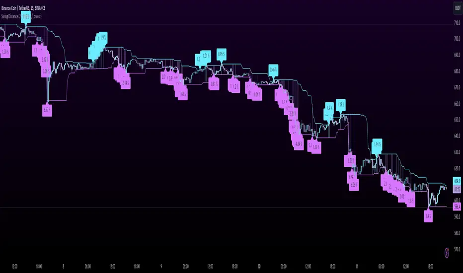
Swing DistanceHello fellas,
This simple indicator helps to visualize the distance between swings. It consists of two lines, the highest and the lowest line, which show the highest and lowest value of the set lookback, respectively. Additionally, it plots labels with the distance (in %) between the highest and the lowest line when there is a change in either the highest or the lowest value.
Use Case:
This tool helps you get a feel for which trades you might want to take and which timeframe you might want to use.
Side Note: This indicator is not intended to be used as a signal emitter or filter!
Best regards,
simwai
Ticker Performance ComparisonTicker Performance Comparison Indicator
With this tool you can compare how three different tickers of your choice have performed over a specific period you choose. It can be used on any timeframe.
As you can see in the image above, I am comparing Nvidia, Bitcoin and Wadzpay over a 365 day period. This shows me at glance which asset has done better and by how much.
It shows how the closing prices have changed from the start of your chosen period to now, by automatically drawing lines on the same scale.
Key Features:
Lookback Period: You decide how many bars (days, weeks, etc.) back to look from today.
Three Tickers: Enter up to three different ticker symbols to see how they stack up against each other
Percentage Change: The tool calculates how much each ticker's closing price has changed, in percentage terms, from the start of your lookback period.
Performance Labels: Labels at the end of the period show the percentage change for each ticker.
Important:
Ignore the lines that are drawn before your lookback period: The lines before your chosen lookback period might be misleading. They appear due to the way historical data is processed and should be ignored. Only consider the data and trends from the start of the lookback period you entered to the present for an accurate comparison.
Use this tool to easily compare how different assets have performed over the timeframe that matters to you.

Downside DeviationDownside deviation is a measure of downside risk that focuses on returns that fall below a minimum threshold or minimum acceptable return (MAR). It is used in the calculation of the Sortino ratio, a measure of risk-adjusted return. The Sortino ratio is like the Sharpe ratio, except that it replaces the standard deviation with downside deviation.

Sortino RatioThe Sortino ratio is a variation of the Sharpe ratio that differentiates harmful volatility from total overall volatility by using the asset's standard deviation of negative portfolio returns—downside deviation—instead of the total standard deviation of portfolio returns. The Sortino ratio takes an asset or portfolio's return and subtracts the risk-free rate, and then divides that amount by the asset's downside deviation. The ratio was named after Frank A. Sortino.

Normalized Performance ComparisonThis script visualizes the relative performance of a primary asset against a benchmark composed of three reference assets. Here's how it works:
User Inputs:
- Users specify ticker symbols for three reference assets (default: Platinum, Palladium, Rhodium).
Data Retrieval:
- Fetches closing prices for the primary asset (the one the script is applied to) and the three reference assets.
Normalization:
- Each asset's price is normalized by dividing its current price by its initial price at the start of the chart. This allows for performance comparison on a common scale.
Benchmark Creation:
- The normalized prices of the three reference assets are combined to create a composite benchmark.
Ratio Calculation:
- Computes the ratio of the normalized primary asset price to the combined normalized benchmark price, highlighting relative performance.
Plotting:
- Plots this ratio as a blue line on the chart, showing the primary asset's performance relative to the benchmark over time.
This script helps users quickly assess how well the primary asset is performing compared to a set of reference assets.

RTH/ETH Session RangesSimple script that adds a table to the bottom left of the chart - shows the high and low of the Full Session with range, and shows the high and low of the RTH/USA session with same calculations.
This simple script enhances your charting experience by adding a comprehensive table to the bottom left corner of your trading chart. The table is designed to provide key market data at a glance, specifically focusing on the high and low metrics for different trading sessions. Here's a breakdown of what the script offers:
Features of the Script
Full Session Data:
High: The highest price point reached during the entire trading session.
Low: The lowest price point reached during the entire trading session.
Range: The difference between the high and low prices, providing insight into the session's volatility.
RTH/USA Session Data (Regular Trading Hours):
High: The highest price point reached during the RTH, typically reflecting the most active part of the trading day.
Low: The lowest price point reached during the RTH.
Range: The difference between the high and low prices during the RTH, indicating the session's intraday volatility.
How to Use the Script for Trading
Identify Key Levels:
Use the high and low points to identify significant support and resistance levels. These levels can guide your entry and exit points, helping you make informed trading decisions.
Gauge Market Volatility:
The range values for both the Full Session and RTH provide a quick snapshot of market volatility. Higher ranges suggest more significant price movements, which can inform your risk management strategies and position sizing.
Compare Sessions:
By comparing the Full Session data with the RTH data, you can identify differences in price behavior between the broader market hours and the more active trading periods. This comparison can help in understanding market dynamics and planning trades accordingly.
Unique Aspects of the Script
Ease of Access: The table's placement in the bottom left corner ensures that it is always visible without obstructing the main chart view, allowing for quick reference without disrupting your analysis.
Comprehensive Insights: By covering both the Full Session and RTH, the script provides a holistic view of the market, catering to traders who focus on different timeframes.
Customization Potential: Although simple, the script can be customized further to include additional metrics or visual tweaks to better suit individual trading strategies.
Practical Example
Imagine you're trading a particular stock and want to decide on a potential breakout strategy. By using this script, you can quickly identify the high of the Full Session as a potential breakout point. If the price approaches this level during the RTH, you can prepare to enter a trade with the confidence that this level has previously acted as a significant resistance. Conversely, knowing the low of the RTH can help you set stop-loss orders to manage risk effectively.

Random Entry and ExitStrategy for Researching Whether It Is Possible to Earn Consistently by Opening Random Trades
The essence of the strategy lies in generating random entries and exits based on pseudorandom numbers. The generation of pseudorandom numbers is performed by the function random_number based on the value of the seed variable. The variables entry_threshold and exit_threshold control the frequency of entries and exits. Lower values mean less frequent trades. To increase the number of trades, increase the values of these variables.
The strategy was created as part of research into whether it is possible to earn randomly in financial markets by making chaotic actions of opening and closing trades. However, it adheres to a few rules: open only long positions (in the direction of the global trend) and do not use leverage. Positions are opened with the entire available capital.
100 generations of the strategy on the daily chart of the S&P 500 (seed 1-101) give 100% positive mathematical expectations. Similar results are observed on higher timeframes of assets that are in a global uptrend.
There is also the possibility of opening only short positions for the research. Note that the logic of the strategy is built in such a way that only one trading direction can operate simultaneously (either longs or shorts). On higher timeframes, random shorts show negative results. Positive mathematical expectations for short positions can be found on lower timeframes (1 min, etc.), where a large amount of noise is observed.
---------------------------------------------------------------------------------------------------
Стратегия для исследования, можно ли стабильно зарабатывать при открытии случайных сделок
Суть стратегии заключается в генерации случайных входов и выходов на основе псевдослучайных чисел. Генерация псевдослучайных чисел происходит функцией random_number на основе значения переменной seed. Переменные entry_threshold и exit_threshold контролируют частоту входов и выходов. Более низкие значения означают менее частые сделки. Для увеличения количества сделок - увеличивайте значения переменных.
Стратегия создавалась в рамках исследования вопроса, можно ли случайным образом зарабатывать на фин. рынках, совершая хаотичные открытия и закрытия сделок. НО, придерживаясь нескольких правил: открывать только длинные позиции (в сторону глобального тренда) и не использовать кредитные плечи. Открытие позиций происходит на весь доступный капитал.
100 генераций стратегии на дневном графике S&P500 (seed 1-101) дают 100% положительных математических ожиданий. Похожие результаты наблюдаются на высоких таймфреймах активов, которые глобально находятся в восходящем тренде.
Также для исследования предусмотрена возможность открытия только коротких позиций. Обратите внимание, что логика стратегии построена таким образом, что одновременно может работать только одно направление торговли (либо лонги, либо шорты). На старших таймфреймах случайные шорты показывают негативные результаты. Положительное математическое ожидание для коротких позиций можно обнаружить на младших таймфреймах (1 min, etc), где наблюдается большое количество шумов.

[InvestorUnknown] Performance MetricsOverview
The Performance Metrics indicator is a tool designed to help traders and investors understand and utilize key performance metrics in their strategies. This indicator is inspired by the Rolling Risk-Adjusted Performance Ratios created by @EliCobra, but it offers enhanced usability and additional features to provide a more user-friendly code for understanding the calculations.
Features
Rolling Lookback:
Dynamic Lookback Calculation: The indicator automatically calculates the number of bars from the start of the asset's price history, up to a maximum of 5000 bars due to TradingView platform restrictions.
Adjustable Lookback Period: Users can manually set a lookback period or choose to use the rolling lookback feature for dynamic calculations.
RollingLookback() =>
x = bar_index + 1
y = x > 4999 ? 5000 : x > 1 ? (x - 1) : x
y
Trend Analysis
The Trend Analysis section in this indicator helps traders identify the direction of the market trend based on the balance of positive and negative returns over time. This is achieved by calculating the sums of positive and negative returns and optionally smoothing these values to provide a clearer trend signal.
Configuration: Enable smoothing if you want to reduce noise in the trend analysis. Choose between EMA and SMA for smoothing. Set the length for smoothing according to your preference for sensitivity (shorter lengths are more sensitive to changes, longer lengths provide smoother signals).
Interpretation:
- A positive trend difference (filled with green) indicates a bullish trend, suggesting more positive returns.
- A negative trend difference (filled with red) indicates a bearish trend, suggesting more negative returns.
- Colored bars provide a quick visual cue on the trend direction, helping to make timely trading decisions.
// The Trend Analysis section calculates and optionally smooths the sums of positive and negative returns.
// This helps identify the trend direction based on the balance of positive and negative returns over time.
Ps = Smooth ? Smooth_type == "EMA" ? ta.ema(pos_sum, Smooth_len) : ta.sma(pos_sum, Smooth_len) : pos_sum
Ns = Smooth ? Smooth_type == "EMA" ? ta.ema(neg_sum, Smooth_len) : ta.sma(neg_sum, Smooth_len) : neg_sum
// Calculate the difference between smoothed positive and negative sums
dif = Ps + Ns
Performance Metrics Table
Visual Table Display: Option to display a table on the chart with calculated performance metrics. This table includes comprehensive metrics like Mean Return, Positive and Negative Mean Return, Standard Deviation, Sharpe Ratio, Sortino Ratio, and Omega Ratio.
Performance Metrics Calculated
Mean Return:
Description: The average return over the lookback period.
Purpose: Helps in understanding the overall performance of the asset by providing a simple average of returns.
Positive Mean Return:
Description: The average of all positive returns over the lookback period.
Purpose: Highlights the average gain during profitable periods, giving insight into the asset's potential upside.
Negative Mean Return:
Description: The average of all negative returns over the lookback period.
Purpose: Focuses on the average loss during unprofitable periods, helping to assess the downside risk.
Standard Deviation (STDEV):
Description: A measure of volatility that calculates the dispersion of returns from the mean.
Purpose: Indicates the risk associated with the asset. Higher standard deviation means higher volatility and risk.
Sharpe Ratio:
Description: A risk-adjusted return metric that divides the mean return by the standard deviation of returns. It can be annualized if selected.
Purpose: Provides a standardized way to compare the performance of different assets by considering both return and risk. A higher Sharpe Ratio indicates better risk-adjusted performance.
sharpe_ratio = mean_all / stddev_all * (Annualize ? math.sqrt(Lookback) : 1)
Sortino Ratio:
Description: Similar to the Sharpe Ratio but focuses only on downside volatility. It divides the mean return by the standard deviation of negative returns. It can be annualized if selected.
Purpose: Offers a better assessment of downside risk by ignoring upside volatility. A higher Sortino Ratio indicates a higher return per unit of downside risk.
sortino_ratio = mean_all / stddev_neg * (Annualize ? math.sqrt(Lookback) : 1)
Omega Ratio:
Description: The ratio of the probability-weighted average of positive returns to the probability-weighted average of negative returns.
Purpose: Measures the overall likelihood of positive returns compared to negative returns. An Omega Ratio greater than 1 indicates more frequent and/or larger positive returns compared to negative returns.
omega_ratio = (prob_pos * mean_pos) / (prob_neg * -mean_neg)
By calculating and displaying these metrics, the indicator provides a comprehensive view of the asset's performance, enabling traders and investors to make informed decisions based on both returns and risk-adjusted metrics.
Use Cases:
Performance Evaluation: Assesses an asset's performance by analyzing both returns and risk factors, giving a clear picture of profitability and volatility.
Risk Comparison: Compares the risk-adjusted returns of different assets or portfolios, aiding in identifying investments with superior risk-reward trade-offs.
Risk Management: Helps manage risk exposure by evaluating downside risks and overall volatility, enabling more informed and strategic investment decisions.

Bayesian Trend Indicator [ChartPrime]Bayesian Trend Indicator
Overview:
In probability theory and statistics, Bayes' theorem (alternatively Bayes' law or Bayes' rule), named after Thomas Bayes, describes the probability of an event, based on prior knowledge of conditions that might be related to the event.
The "Bayesian Trend Indicator" is a sophisticated technical analysis tool designed to assess the direction of price trends in financial markets. It combines the principles of Bayesian probability theory with moving average analysis to provide traders with a comprehensive understanding of market sentiment and potential trend reversals.
At its core, the indicator utilizes multiple moving averages, including the Exponential Moving Average (EMA), Simple Moving Average (SMA), Double Exponential Moving Average (DEMA), and Volume Weighted Moving Average (VWMA) . These moving averages are calculated based on user-defined parameters such as length and gap length, allowing traders to customize the indicator to suit their trading strategies and preferences.
The indicator begins by calculating the trend for both fast and slow moving averages using a Smoothed Gradient Signal Function. This function assigns a numerical value to each data point based on its relationship with historical data, indicating the strength and direction of the trend.
// Smoothed Gradient Signal Function
sig(float src, gap)=>
ta.ema(source >= src ? 1 :
source >= src ? 0.9 :
source >= src ? 0.8 :
source >= src ? 0.7 :
source >= src ? 0.6 :
source >= src ? 0.5 :
source >= src ? 0.4 :
source >= src ? 0.3 :
source >= src ? 0.2 :
source >= src ? 0.1 :
0, 4)
Next, the indicator calculates prior probabilities using the trend information from the slow moving averages and likelihood probabilities using the trend information from the fast moving averages . These probabilities represent the likelihood of an uptrend or downtrend based on historical data.
// Define prior probabilities using moving averages
prior_up = (ema_trend + sma_trend + dema_trend + vwma_trend) / 4
prior_down = 1 - prior_up
// Define likelihoods using faster moving averages
likelihood_up = (ema_trend_fast + sma_trend_fast + dema_trend_fast + vwma_trend_fast) / 4
likelihood_down = 1 - likelihood_up
Using Bayes' theorem , the indicator then combines the prior and likelihood probabilities to calculate posterior probabilities, which reflect the updated probability of an uptrend or downtrend given the current market conditions. These posterior probabilities serve as a key signal for traders, informing them about the prevailing market sentiment and potential trend reversals.
// Calculate posterior probabilities using Bayes' theorem
posterior_up = prior_up * likelihood_up
/
(prior_up * likelihood_up + prior_down * likelihood_down)
Key Features:
◆ The trend direction:
To visually represent the trend direction , the indicator colors the bars on the chart based on the posterior probabilities. Bars are colored green to indicate an uptrend when the posterior probability is greater than 0.5 (>50%), while bars are colored red to indicate a downtrend when the posterior probability is less than 0.5 (<50%).
◆ Dashboard on the chart
Additionally, the indicator displays a dashboard on the chart , providing traders with detailed information about the probability of an uptrend , as well as the trends for each type of moving average. This dashboard serves as a valuable reference for traders to monitor trend strength and make informed trading decisions.
◆ Probability labels and signals:
Furthermore, the indicator includes probability labels and signals , which are displayed near the corresponding bars on the chart. These labels indicate the posterior probability of a trend, while small diamonds above or below bars indicate crossover or crossunder events when the posterior probability crosses the 0.5 threshold (50%).
The posterior probability of a trend
Crossover or Crossunder events
◆ User Inputs
Source:
Description: Defines the price source for the indicator's calculations. Users can select between different price values like close, open, high, low, etc.
MA's Length:
Description: Sets the length for the moving averages used in the trend calculations. A larger length will smooth out the moving averages, making the indicator less sensitive to short-term fluctuations.
Gap Length Between Fast and Slow MA's:
Description: Determines the difference in lengths between the slow and fast moving averages. A higher gap length will increase the difference, potentially identifying stronger trend signals.
Gap Signals:
Description: Defines the gap used for the smoothed gradient signal function. This parameter affects the sensitivity of the trend signals by setting the number of bars used in the signal calculations.
In summary, the "Bayesian Trend Indicator" is a powerful tool that leverages Bayesian probability theory and moving average analysis to help traders identify trend direction, assess market sentiment, and make informed trading decisions in various financial markets.

Bitcoin Futures vs. Spot Tri-Frame - Strategy [presentTrading]Prove idea with a backtest is always true for trading.
I developed and open-sourced it as an educational material for crypto traders to understand that the futures and spot spread may be effective but not be as effective as they might think. It serves as an indicator of sentiment rather than a reliable predictor of market trends over certain periods. It is better suited for specific trading environments, which require further research.
█ Introduction and How it is Different
The "Bitcoin Futures vs. Spot Tri-Frame Strategy" utilizes three different timeframes to calculate the Z-Score of the spread between BTC futures and spot prices on Binance and OKX exchanges. The strategy executes long or short trades based on composite Z-Score conditions across the three timeframes.
The spread refers to the difference in price between BTC futures and BTC spot prices, calculated by taking a weighted average of futures prices from multiple exchanges (Binance and OKX) and subtracting a weighted average of spot prices from the same exchanges.
BTCUSD 1D L/S Performance
█ Strategy, How It Works: Detailed Explanation
🔶 Calculation of the Spread
The spread is the difference in price between BTC futures and BTC spot prices. The strategy calculates the spread by taking a weighted average of futures prices from multiple exchanges (Binance and OKX) and subtracting a weighted average of spot prices from the same exchanges. This spread serves as the primary metric for identifying trading opportunities.
Spread = Weighted Average Futures Price - Weighted Average Spot Price
🔶 Z-Score Calculation
The Z-Score measures how many standard deviations the current spread is from its historical mean. This is calculated for each timeframe as follows:
Spread Mean_tf = SMA(Spread_tf, longTermSMA)
Spread StdDev_tf = STDEV(Spread_tf, longTermSMA)
Z-Score_tf = (Spread_tf - Spread Mean_tf) / Spread StdDev_tf
Local performance
🔶 Composite Entry Conditions
The strategy triggers long and short entries based on composite Z-Score conditions across all three timeframes:
- Long Condition: All three Z-Scores must be greater than the long entry threshold.
Long Condition = (Z-Score_tf1 > zScoreLongEntryThreshold) and (Z-Score_tf2 > zScoreLongEntryThreshold) and (Z-Score_tf3 > zScoreLongEntryThreshold)
- Short Condition: All three Z-Scores must be less than the short entry threshold.
Short Condition = (Z-Score_tf1 < zScoreShortEntryThreshold) and (Z-Score_tf2 < zScoreShortEntryThreshold) and (Z-Score_tf3 < zScoreShortEntryThreshold)
█ Trade Direction
The strategy allows the user to specify the trading direction:
- Long: Only long trades are executed.
- Short: Only short trades are executed.
- Both: Both long and short trades are executed based on the Z-Score conditions.
█ Usage
The strategy can be applied to BTC or Crypto trading on major exchanges like Binance and OKX. By leveraging discrepancies between futures and spot prices, traders can exploit market inefficiencies. This strategy is suitable for traders who prefer a statistical approach and want to diversify their timeframes to validate signals.
█ Default Settings
- Input TF 1 (60 minutes): Sets the first timeframe for Z-Score calculation.
- Input TF 2 (120 minutes): Sets the second timeframe for Z-Score calculation.
- Input TF 3 (180 minutes): Sets the third timeframe for Z-Score calculation.
- Long Entry Z-Score Threshold (3): Defines the threshold above which a long trade is triggered.
- Short Entry Z-Score Threshold (-3): Defines the threshold below which a short trade is triggered.
- Long-Term SMA Period (100): The period used to calculate the simple moving average for the spread.
- Use Hold Days (true): Enables holding trades for a specified number of days.
- Hold Days (5): Number of days to hold the trade before exiting.
- TPSL Condition (None): Defines the conditions for taking profit and stop loss.
- Take Profit (%) (30.0): The percentage at which the trade will take profit.
- Stop Loss (%) (20.0): The percentage at which the trade will stop loss.
By fine-tuning these settings, traders can optimize the strategy to suit their risk tolerance and trading style, enhancing overall performance.

PE BandThe PE Band shows the highest and lowest P/E in the previous period with TTM EPS. If the current P/E is lower than the minimum P/E, it is considered cheap. In other words, higher than the maximum P/E is considered expensive.
PE Band consists of 2 lines.
- Firstly, the historical P/E value in "green" (if TTM EPS is positive) or "red" (if TTM EPS is negative) states will change according to the latest high or low price of TTM EPS, such as: :
After the second quarter of 2023 (end of June), how do prices from 1 July – 30 September reflect net profits? The program will get the highest and lowest prices during that time.
After the 3rd quarter of 2023 (end of September), how do prices from 1 Oct. - 31 Dec. reflect net profits? The program will get the highest and lowest prices during that time.
- Second, the blue line is the closing price divided by TTM EPS, which shows the current P/E.
Volatility DashboardThis indicator calculates and displays volatility metrics for a specified number of bars (rolling window) on a TradingView chart. It can be customized to display information in English or Thai and can position the dashboard at various locations on the chart.
Inputs
Language: Users can choose between English ("ENG") and Thai ("TH") for the dashboard's language.
Dashboard Position: Users can specify where the dashboard should appear on the chart. Options include various positions such as "Bottom Right", "Top Center", etc.
Calculation Method: Currently, the script supports "High-Low" for volatility calculation. This method calculates the difference between the highest and lowest prices within a specified timeframe.
Bars: Number of bars used to calculate the volatility.
Display Logic
Fills the islast_vol_points array with the calculated volatility points.
Sets the table cells with headers and corresponding values:
=> Highest Volatility: The maximum value in the islast_vol_points array
=> Mean Volatility: The average value in the islast_vol_points array,
=> Lowest Volatility: The minimum value in the islast_vol_points array, Number of Bars: The rolling window size.

Bull Market Drawdowns V1.0 [ADRIDEM]Bull Market Drawdowns V1.0
Overview
The Bull Market Drawdowns V1.0 script is designed to help visualize and analyze drawdowns during a bull market. This script calculates the highest high price from a specified start date, identifies drawdown periods, and plots the drawdown areas on the chart. It also highlights the maximum drawdowns and marks the start of the bull market, providing a clear visual representation of market performance and potential risk periods.
Unique Features of the New Script
Default Timeframe Configuration: Allows users to set a default timeframe for analysis, providing flexibility in adapting the script to different trading strategies and market conditions.
Customizable Bull Market Start Date: Users can define the start date of the bull market, ensuring the script calculates drawdowns from a specific point in time that aligns with their analysis.
Drawdown Calculation and Visualization: Calculates drawdowns from the highest high since the bull market start date and plots the drawdown areas on the chart with distinct color fills for easy identification.
Maximum Drawdown Tracking and Labeling: Tracks the maximum drawdown for each period and places labels on the chart to indicate significant drawdowns, helping traders identify and assess periods of higher risk.
Bull Market Start Marker: Marks the start of the bull market on the chart with a label, providing a clear reference point for the beginning of the analysis period.
Originality and Usefulness
This script provides a unique and valuable tool by combining drawdown analysis with visual markers and customizable settings. By calculating and plotting drawdowns from a user-defined start date, traders can better understand the performance and risks associated with a bull market. The script’s ability to track and label maximum drawdowns adds further depth to the analysis, making it easier to identify critical periods of market retracement.
Signal Description
The script includes several key visual elements that enhance its usefulness for traders:
Drawdown Area : Plots the upper and lower boundaries of the drawdown area, filling the space between with a semi-transparent color. This helps traders easily identify periods of market retracement.
Maximum Drawdown Labels : Labels are placed on the chart to indicate the maximum drawdown for each period, providing clear markers for significant drawdowns.
Bull Market Start Marker : A label is placed at the start of the bull market, marking the beginning of the analysis period and helping traders contextualize the drawdown data.
These visual elements help quickly assess the extent and impact of drawdowns within a bull market, aiding in risk management and decision-making.
Detailed Description
Input Variables
Default Timeframe (`default_timeframe`) : Defines the timeframe for the analysis. Default is 720 minutes
Bull Market Start Date (`start_date_input`) : The starting date for the bull market analysis. Default is January 1, 2023
Functionality
Highest High Calculation : The script calculates the highest high price on the specified timeframe from the user-defined start date.
```pine
var float highest_high = na
if (time >= start_date)
highest_high := na(highest_high ) ? high : math.max(highest_high , high)
```
Drawdown Calculation : Determines the drawdown starting point and calculates the drawdown percentage from the highest high.
```pine
var float drawdown_start = na
if (time >= start_date)
drawdown_start := na(drawdown_start ) or high >= highest_high ? high : drawdown_start
drawdown = (drawdown_start - low) / drawdown_start * 100
```
Maximum Drawdown Tracking : Tracks the maximum drawdown for each period and places labels above the highest high when a new high is reached.
```pine
var float max_drawdown = na
var int max_drawdown_bar_index = na
if (time >= start_date)
if na(max_drawdown ) or high >= highest_high
if not na(max_drawdown ) and not na(max_drawdown_bar_index) and max_drawdown > 10
label.new(x=max_drawdown_bar_index, y=drawdown_start , text="Max -" + str.tostring(max_drawdown , "#") + "%",
color=color.red, style=label.style_label_down, textcolor=color.white, size=size.normal)
max_drawdown := 0
max_drawdown_bar_index := na
else
if na(max_drawdown ) or drawdown > max_drawdown
max_drawdown := drawdown
max_drawdown_bar_index := bar_index
```
Drawdown Area Plotting : Plots the drawdown area with upper and lower boundaries and fills the area with a semi-transparent color.
```pine
drawdown_area_upper = time >= start_date ? drawdown_start : na
drawdown_area_lower = time >= start_date ? low : na
p1 = plot(drawdown_area_upper, title="Drawdown Area Upper", color=color.rgb(255, 82, 82, 60), linewidth=1)
p2 = plot(drawdown_area_lower, title="Drawdown Area Lower", color=color.rgb(255, 82, 82, 100), linewidth=1)
fill(p1, p2, color=color.new(color.red, 90), title="Drawdown Fill")
```
Current Maximum Drawdown Label : Places a label on the chart to indicate the current maximum drawdown if it exceeds 10%.
```pine
var label current_max_drawdown_label = na
if (not na(max_drawdown) and max_drawdown > 10)
current_max_drawdown_label := label.new(x=bar_index, y=drawdown_start, text="Max -" + str.tostring(max_drawdown, "#") + "%",
color=color.red, style=label.style_label_down, textcolor=color.white, size=size.normal)
if (not na(current_max_drawdown_label))
label.delete(current_max_drawdown_label )
```
Bull Market Start Marker : Places a label at the start of the bull market to mark the beginning of the analysis period.
```pine
var label bull_market_start_label = na
if (time >= start_date and na(bull_market_start_label))
bull_market_start_label := label.new(x=bar_index, y=high, text="Bull Market Start", color=color.blue, style=label.style_label_up, textcolor=color.white, size=size.normal)
```
How to Use
Configuring Inputs : Adjust the default timeframe and start date for the bull market as needed. This allows the script to be tailored to different market conditions and trading strategies.
Interpreting the Indicator : Use the drawdown areas and labels to identify periods of significant market retracement. Pay attention to the maximum drawdown labels to assess the risk during these periods.
Signal Confirmation : Use the bull market start marker to contextualize drawdown data within the overall market trend. The combination of drawdown visualization and maximum drawdown labels helps in making informed trading decisions.
This script provides a detailed view of drawdowns during a bull market, helping traders make more informed decisions by understanding the extent and impact of market retracements. By combining customizable settings with visual markers and drawdown analysis, traders can better align their strategies with the underlying market conditions, thus improving their risk management and decision-making processes.