Liquidation Heatmap ║ BullVision 🧠Overview
The Liquidation Heatmap ║ BullVision 💥 is a high-precision visualization tool engineered to highlight probable liquidation levels in crypto markets. It leverages multi-exchange Open Interest data, real-time volume dynamics, and structure-aware volatility signals to reveal where leveraged traders are most at risk of forced position closures.
📖 What Are Liquidations?
In leveraged derivatives markets, a liquidation occurs when a trader’s margin becomes insufficient to maintain their position, triggering an automatic force-close by the exchange. These events are typically clustered around price levels where large volumes of overleveraged positions accumulate. When breached, they often result in sharp, aggressive price movements — also known as liquidation cascades.
This indicator is designed to detect and project such high-risk zones before they trigger, giving traders an edge in visualizing hidden pressure points in the market.
🧠 How It Works
The core engine aggregates real-time ∆OI (Open Interest delta) data from multiple major exchanges and applies a layered filtering system that considers:
Relative Open Interest shifts, normalized against an adaptive moving average baseline
Volume acceleration patterns, compared to a rolling historical benchmark
Market structure context, identifying meaningful directional breaks and failed retests
Leverage-tier modeling, using probabilistic distance rules to simulate where liquidations from 5x to 100x positions would be triggered
Each qualifying liquidation level is rendered using dynamic gradient lines and optional glow-enhanced zone visuals. The display adapts in real time to structural confirmation, volatility regime, and liquidity depth.
Exemple of Liquidation cascades
Exemple of Liquidation rejection
🔍 Key Features
🔗 Multi-Exchange OI Aggregation: Binance, OKX, BitMEX, Kraken (toggleable)
📊 Leverage-Tier Mapping: 5x, 10x, 25x, 50x, 100x projections
🎨 Gradient Zones: Custom color ramps reflect level significance
🧱 Structure-Sensitive Filtering: Noise reduction via multi-condition confirmation logic
🧠 Contextual Directional Bias: Zones filtered based on recent bullish/bearish transitions
⚙️ Fully Customizable: User-defined intensity thresholds, color palette, and range filtering
🧩 Why It’s Worth Paying For
This is not a mashup of public indicators. The script introduces an original, multi-layered architecture combining real-time Open Interest dynamics, structural analysis, and custom liquidation modeling.
Unlike speculative support/resistance plots or volume-only heatmaps, this tool is built to:
Detect liquidation zones before they cascade
React dynamically to market shifts
Filter noise through structural confirmation
Retain historical zones for visual learning and backtesting
✅ Compliance & Originality
This script was developed entirely in-house with original detection logic. No reused open-source components are included. Data requests are made through TradingView’s native .P_OI feeds, and all calculations, signal conditions, and visual logic were coded from scratch for this script.
⚠️ Risk Disclaimer & Access Policy
This script is a visual risk-awareness tool, not a signal generator or financial advice mechanism. No guarantee is made regarding future price action, liquidation triggers, or trading performance.
Use at your own discretion, with proper position sizing, risk management, and awareness of the market's inherent uncertainty.
🔒 Why This Script Is Invite-Only and Closed-Source
To protect its proprietary detection engine, this script is both closed-source and invite-only. The algorithm uses original methods to:
Aggregate real-time Open Interest delta across exchanges
Simulate leverage-based liquidation zones
Dynamically filter zones using structure and volatility layers
Opening the source would expose core detection logic to copycats or misuse. Likewise, access is limited to ensure the tool is used responsibly by serious traders and not distributed or repackaged unethically.
This model preserves the script’s quality, originality, and intended value.
Statistics

Candle Range % vs 8-Candle AvgCandle % Indicator – Measure Candle Strength by Range %
**Overview:**
The *Candle % Indicator* helps traders visually and analytically gauge the strength or significance of a price candle relative to its recent historical context. This is particularly useful for detecting breakout moves, volatility shifts, or overextended candles that may signal exhaustion.
**What It Does:**
* Calculates the **percentage range** of the current candle compared to the **average range of the past N candles**.
* Highlights candles that exceed a user-defined threshold (e.g., 150% of the average range).
* Useful for **filtering out extreme candles** that might represent anomalies or unsustainable moves.
* Can be combined with other strategies (like EMA crossovers, support/resistance breaks, etc.) to improve signal quality.
**Use Case Examples:**
***Filter out fakeouts** in breakout strategies by ignoring candles that are overly large and may revert.
***Volatility control**: Avoid entries when market conditions are erratic.
**Confluence**: Combine with EMA or RSI signals for refined entries.
**How to Read:**
* If a candle is larger than the average range by more than the set percentage (default 150%), it's flagged (e.g., no entry signal or optional visual marker).
* Ideal for intraday, swing, or algorithmic trading setups.
**Customizable Inputs:**
**Lookback Period**: Number of previous candles to calculate the average range.
**% Threshold**: Maximum percentage a candle can exceed the average before being filtered or marked.

ALEX - ATR Extensions + ADR + TableALEX - ATR Extensions + ADR + Table
Overview
The ALEX ATR Extensions indicator is a comprehensive volatility and momentum analysis tool that combines Average True Range (ATR), Average Daily Range (ADR), and moving average distance calculations in a single, customizable display. This indicator helps traders assess current price action relative to historical volatility and key moving averages, providing crucial context for risk management and trade planning.
Key Features
Multi-Metric Analysis
- ATR Percentage: Current ATR as a percentage of price for volatility assessment
- ADR Percentage: Average Daily Range as a percentage for typical daily movement
- Low of Day Distance: Distance from current price to daily low
- Moving Average Distance: ATR-normalized distance from 21 and 50 period moving averages
Flexible Moving Average Options
- Configurable MA Types: Choose between EMA or SMA for both 21 and 50 period averages
- Customizable Periods: Adjust moving average lengths to suit your trading style
- Daily Timeframe Data: Uses daily moving averages regardless of chart timeframe
ATR Extension Levels
- Dynamic Price Targets: Calculate extension levels based on ATR multiples from moving averages
- Visual Reference Lines: Optional overlay lines showing ATR extension targets
- Customizable Multipliers: Adjust ATR multipliers for different risk/reward scenarios
Smart Visual Alerts
- Color-Coded Distance Metrics: Automatic color changes based on distance thresholds
- Symbol Plotting: Customizable chart symbols when distance thresholds are exceeded
- Threshold-Based Alerts: Visual cues when price reaches significant ATR distances
Comprehensive Data Table
- Real-Time Metrics: Live updating table with all key measurements
- Customizable Display: Toggle individual metrics on/off based on preference
- Professional Styling: Adjustable colors, fonts, and transparency
How to Use
Volatility Assessment
- High ATR%: Indicates elevated volatility, larger position sizing considerations
- Low ATR%: Suggests compressed volatility, potential for expansion
- ADR% Comparison: Compare current day's range to historical average
Moving Average Analysis
- ATR Distance 21/50: Normalized distance showing how extended price is from key levels
- Positive Values: Price above moving average (bullish positioning)
- Negative Values: Price below moving average (bearish positioning)
- Color Changes: Automatic alerts when reaching threshold levels
Extension Target Planning
- ATR Extension Lines: Visual price targets based on volatility-adjusted projections
- Risk/Reward Planning: Use extension levels for profit target placement
- Breakout Confirmation: Extension levels can confirm breakout validity
Symbol Alert System
- Chart Symbols: Automatic plotting when distance thresholds are breached
- Customizable Triggers: Set your own threshold levels for alerts
- Visual Scanning: Quick identification of extended conditions across multiple charts
Settings
Display Controls
- Show ADR%: Toggle average daily range percentage display
- Show ATR%: Toggle average true range percentage display
- Show LoD Distance: Toggle low of day distance calculation
- Show LoD Price: Toggle actual low of day price display
- Show ATR Distance from 21/50 DMA: Toggle moving average distance metrics
- Show 21/50 DMA Price: Toggle actual moving average price display
- Show ATR Extension Levels: Toggle extension target display in table
Moving Average Configuration
- 21/50 DMA Type: Choose between EMA or SMA calculation methods
- 21/50 DMA Period: Customize moving average lengths
- ADR/ATR Length: Adjust calculation periods for range measurements
Color Thresholds
- Threshold Levels: Set distance levels for color changes (default 2.0 and 5.0)
- Custom Colors: Choose colors for different threshold breaches
- Separate 21/50 Settings: Independent color schemes for each moving average
Symbol Settings
- Show Char Symbol: Toggle symbol plotting for each moving average
- Custom Symbols: Choose any character for chart plotting
- Symbol Colors: Customize colors for visual distinction
- Threshold Levels: Set trigger points for symbol appearance
ATR Extension Lines
- Show Extension Lines: Toggle visual extension level lines
- ATR Multipliers: Customize extension distance (default 2.0x)
- Line Colors: Choose colors for extension level visualization
Table Customization
- Background Color: Adjust table transparency and color
- Text Color: Customize default text appearance
- Font Size: Choose from tiny to huge font options
Advanced Applications
Trend Strength Analysis
- Large ATR distances suggest strong trending moves
- Small ATR distances indicate potential consolidation or reversal zones
- Compare current readings to recent historical ranges
Risk Management
- Use ATR% for position sizing calculations
- Extension levels provide natural profit target zones
- Distance metrics help identify overextended conditions
Multi-Timeframe Context
- Apply to different timeframes for comprehensive analysis
- Daily data provides consistency across all chart intervals
- Combine with weekly/monthly analysis for broader context
Market Regime Identification
- High volatility periods: Increased ATR% readings
- Low volatility periods: Compressed ATR% readings
- Trending markets: Sustained high distance readings
- Consolidating markets: Low distance readings with frequent color changes
Best Practices
Volatility-Adjusted Trading
- Increase position sizes during low volatility periods
- Reduce position sizes during high volatility periods
- Use ATR% for stop-loss placement relative to normal market movement
Extension Level Usage
- Primary targets: 1.5-2.0x ATR extensions
- Secondary targets: 2.5-3.0x ATR extensions
- Avoid chasing prices beyond 3x ATR extensions
Threshold Optimization
- Backtest different threshold levels for your trading style
- Consider market conditions when setting alert levels
- Adjust thresholds based on instrument volatility characteristics
Integration Strategies
- Combine with momentum indicators for confirmation
- Use alongside support/resistance levels
- Incorporate into systematic trading approaches
Technical Specifications
- Compatible with Pine Script v6
- Uses daily timeframe data for consistency
- Optimized for real-time performance
- Works on all chart types and timeframes
- Supports all tradeable instruments
Ideal For
- Swing traders using daily charts
- Position traders seeking volatility context
- Day traders needing intraday reference levels
- Risk managers requiring volatility metrics
- Systematic traders building rule-based strategies
Disclaimer
This indicator is for educational and informational purposes only. It should not be used as the sole basis for trading decisions. Always combine with other forms of analysis, proper risk management techniques, and consider your individual trading plan and risk tolerance. Past performance does not guarantee future results.
Compatible with Pine Script v6 | Optimized for daily timeframe analysis | Works across all markets and instruments

21DMA Structure Counter (EMA/SMA Option)21DMA Structure Counter (EMA/SMA Option)
Overview
The 21DMA Structure Counter is an advanced technical indicator that tracks consecutive periods where price action remains above a 21-period moving average structure. This indicator helps traders identify momentum phases and potential trend exhaustion points using statistical analysis.
Key Features
Moving Average Structure
- Configurable MA Type: Choose between EMA (Exponential Moving Average) or SMA (Simple Moving Average)
- 21-Period Default: Optimized for the widely-watched 21-period moving average
- Triple MA Structure: Tracks high, close, and low moving averages for comprehensive analysis
Statistical Analysis
- Cycle Counting: Automatically counts consecutive periods above the MA structure
- Historical Data: Maintains up to 2,500 historical cycles (approximately 10 years of daily data)
- Z-Score Calculation: Provides statistical context using mean and standard deviation
- Multiple Standard Deviation Levels: Displays +1, +2, and +3 standard deviation thresholds
Visual Indicators
Color-Coded Bars:
- Gray: Below 10-year average
- Yellow: Between average and +1 standard deviation
- Orange: Between +1 and +2 standard deviations
- Red: Between +2 and +3 standard deviations
- Fuchsia: Above +3 standard deviations (extreme readings)
Breadth Integration
- Multiple Breadth Options: NDFI, NDTH, NDTW (NASDAQ breadth indicators), or VIX
- Background Shading: Visual alerts when breadth reaches extreme levels
- High/Low Thresholds: Customizable levels for breadth analysis
- Real-time Display: Current breadth value shown in data table
Smart Reset Logic
- High Below Structure Reset: Automatically resets count when daily high falls below the lowest MA
- Flexible Hold Period: Continues counting during temporary weakness as long as structure isn't violated
- Precise Entry/Exit: Strict criteria for starting cycles, flexible for maintaining them
How to Use
Trend Identification
- Rising Counts: Indicate sustained momentum above key moving average structure
- Extreme Readings: Z-scores above +2 or +3 suggest potential trend exhaustion
- Historical Context: Compare current cycles to 10-year statistical averages
Risk Management
- Breadth Confirmation: Use breadth shading to confirm market-wide strength/weakness
- Statistical Extremes: Exercise caution when readings reach +3 standard deviations
- Reset Signals: Pay attention to structure violations for potential trend changes
Multi-Timeframe Application
- Daily Charts: Primary timeframe for swing trading and position management
- Weekly/Monthly: Longer-term trend analysis
- Intraday: Shorter-term momentum assessment (adjust MA period accordingly)
Settings
Moving Average Options
- Type: EMA or SMA selection
- Period: Default 21 (customizable)
- Reset Days: Days below structure required for reset
Visual Customization
- Standard Deviation Lines: Toggle and customize colors for +1, +2, +3 SD
- Breadth Selection: Choose from NDFI, NDTH, NDTW, or VIX
- Threshold Levels: Set custom high/low breadth thresholds
- Table Styling: Customize text colors, background, and font size
Technical Notes
- Data Retention: Maintains 2,500 historical cycles for robust statistical analysis
- Real-time Updates: Calculations update with each new bar
- Breadth Integration: Uses security() function to pull external breadth data
- Performance Optimized: Efficient array management prevents memory issues
Best Practices
1. Combine with Price Action: Use alongside support/resistance and chart patterns
2. Monitor Breadth Divergences: Watch for breadth weakness during strong readings
3. Respect Statistical Extremes: Exercise caution at +2/+3 standard deviation levels
4. Context Matters: Consider overall market environment and sector rotation
5. Risk Management: Use appropriate position sizing, especially at extreme readings
Disclaimer
This indicator is for educational and informational purposes only. It should not be used as the sole basis for trading decisions. Always combine with other forms of analysis and proper risk management techniques.
Compatible with Pine Script v6 | Optimized for daily timeframes | Best used on major indices and liquid stocks
Pair TradingPAIR TRADING
Description:
This indicator is a simple and intuitive tool for rotating between two assets based on their relative price ratio. By comparing the prices of Asset A and Asset B, it plots a “ratio line” (gray) with dynamic upper and lower boundaries (red and blue).
When the ratio reaches the red line, Asset A is expensive → rotate out of A and into B.
When the ratio touches the blue line, Asset A is cheap → rotate back into A.
The chart also shows:
🔹 Background highlights for visual cues
🔹 “Rotate to A” or “Rotate to B” markers for easy decisions
🔹 A live summary table with mean ratio, upper/lower boundaries, and current ratio
How to Use:
Select Asset A and Asset B in the settings.
Adjust the Lookback Period and Threshold if needed.
Watch the gray ratio line as it moves:
Above red line? → Consider rotating into B
Below blue line? → Consider rotating into A
Use the background color changes and rotation labels to spot clear rotation opportunities!
Why Pair Trading?
Pair trading is a powerful way to manage a portfolio because it neutralizes market direction risk and focuses on relative value.
By rotating between correlated assets, you can:
Smooth out returns
Avoid holding a weak asset too long
Capture reversion when assets diverge too far
This approach can enhance risk-adjusted returns and help keep your portfolio balanced and nimble!
How to Pick Pairs:
Choose assets with strong correlation or similar drivers.
Look for common trends (sector, macro).
Start with assets you know best (high-conviction ideas).
Make sure both have good liquidity for reliable trading!
TO HELP FIND CORRELATED ASSETS:
Use the Correlation Coefficient indicator in TradingView:
Click Indicators
Search for “Correlation Coefficient”
Add it to your chart
Input the symbol of the second asset (e.g., if you’re on MSTR, input TSLA).
This plots the rolling correlation coefficient — super helpful!
Pair trading can turn big swings into steady rotations and help you stay active even when the market is choppy. It’s a simple, practical approach to keep your portfolio balanced.

Linear Regression Channel Pro# Linear Regression Channel Pro - Script Description
## English Description
### What it does
The **Linear Regression Channel Pro** is a technical analysis indicator that creates a statistical channel around price movements using linear regression mathematics. The script calculates the best-fit line through a specified number of price bars and then adds parallel boundaries based on standard deviation calculations.
### Key Features
- **Main Regression Line**: Shows the statistical trend direction of the price over the selected period
- **Channel Boundaries**: Upper and lower bands that contain most price movements (typically 95% when using 2.0 multiplier)
- **Inner Boundaries**: Additional reference lines for more precise analysis
- **Future Projection**: Extends all lines into the future to show potential price paths
- **Customizable Parameters**: Adjustable period length, deviation multipliers, and projection distance
### How it works
1. **Data Collection**: Gathers price data over the specified regression length (default 400 bars)
2. **Linear Regression**: Calculates the mathematical best-fit line through the price data
3. **Standard Deviation**: Measures how much prices deviate from the regression line
4. **Channel Creation**: Creates parallel lines above and below the regression line
5. **Future Projection**: Extends the channel into the future using the same slope
### Statistical Foundation and Band Settings
**The 68-95-99.7 Rule**
The indicator is based on the statistical principle that in a normal distribution:
- **1 Standard Deviation (σ)**: Contains approximately **68%** of price movements
- **2 Standard Deviations (σ)**: Contains approximately **95%** of price movements
- **3 Standard Deviations (σ)**: Contains approximately **99.7%** of price movements
**Outer Bands (Default 2.0 Multiplier)**
- **Coverage**: Approximately **95%** of price movements
- **Meaning**: Only 5% of price action should exceed these bands
- **Usage**: Identification of extreme overbought/oversold conditions
- **Signal**: Touching outer bands often indicates potential reversal points
**Inner Bands (Default 1.0 Multiplier)**
- **Coverage**: Approximately **68%** of price movements
- **Meaning**: 32% of movements can normally exceed these bands
- **Usage**: Identification of significant but not extreme price moves
- **Signal**: Breaking inner bands suggests meaningful directional movement
### Recommended Settings by Market Type
**Standard Configuration**
```
- Outer Bands: 2.0 (95% coverage)
- Inner Bands: 1.0 (68% coverage)
```
**High Volatility Markets (Crypto, Emerging Markets)**
```
- Outer Bands: 2.5-3.0 (99%+ coverage)
- Inner Bands: 1.5 (85% coverage)
```
**Low Volatility Markets (Major Forex, Blue Chip Stocks)**
```
- Outer Bands: 1.5 (86% coverage)
- Inner Bands: 0.5 (38% coverage)
```
### Trading Applications
**Trend Analysis**
- The slope of the regression line indicates the overall trend direction
- Steep slopes suggest strong trends, flat slopes suggest consolidation
- Price above center line = bullish bias, below = bearish bias
**Support and Resistance Levels**
- **Inner bands**: Act as first level support/resistance (68% probability)
- **Outer bands**: Act as strong support/resistance (95% probability)
- **Dynamic levels**: Bands adjust automatically to market conditions
**Entry and Exit Strategies**
*Using Inner Bands (1.0σ):*
- **Breakout signals**: Price breaking through inner bands with volume confirms direction
- **Pullback entries**: Price returning to inner band after breakout offers entry opportunity
- **Range trading**: Price oscillating between inner bands suggests consolidation
*Using Outer Bands (2.0σ):*
- **Reversal signals**: Price touching outer bands often indicates exhaustion
- **Extreme conditions**: Only 5% of movements reach these levels
- **Profit taking**: Consider closing positions when price reaches outer bands
**Risk Management Applications**
- **Stop Loss Placement**: Use opposite band as stop level (high probability of not being hit randomly)
- **Position Sizing**: Wider channels = higher volatility = smaller position sizes
- **Risk/Reward**: Measure potential moves using band distances
**Future Planning with Projections**
- **Target Setting**: Orange projection lines show potential future support/resistance
- **Trade Duration**: Plan holding periods based on projected channel direction
- **Market Timing**: Anticipate when price might reach significant levels
### Practical Trading Examples
**Bullish Trend Scenario**
1. Price consistently above center line (trend confirmed)
2. Bounces from inner lower band = re-entry opportunity
3. Reaching outer upper band = consider profit taking
4. Break above outer upper band = potential trend acceleration
**Range-Bound Market**
1. Price oscillates between inner bands = range trading mode
2. Sell near inner upper band, buy near inner lower band
3. Breakout from outer bands = range breakout signal
**Bearish Trend Scenario**
1. Price consistently below center line (downtrend confirmed)
2. Bounces from inner upper band = short entry opportunity
3. Reaching outer lower band = potential oversold bounce
4. Break below outer lower band = trend continuation likely
### Best Practices and Tips
- **Timeframe Selection**: Use higher timeframes (4H, Daily) for more reliable statistical significance
- **Confirmation**: Combine with volume analysis and other indicators
- **Market Adaptation**: Adjust multipliers based on asset volatility characteristics
- **Regression Length**: Shorter periods (100-200) for reactive signals, longer (400-800) for stable trends
- **False Breakouts**: Wait for close beyond bands rather than just touching
- **Volume Confirmation**: Higher volume on band breakouts increases signal reliability
---
## Descrizione Italiana
### Cosa fa
Il **Linear Regression Channel Pro** è un indicatore di analisi tecnica che crea un canale statistico intorno ai movimenti di prezzo utilizzando la matematica della regressione lineare. Lo script calcola la linea di miglior adattamento attraverso un numero specificato di barre di prezzo e aggiunge quindi confini paralleli basati sui calcoli della deviazione standard.
### Caratteristiche Principali
- **Linea di Regressione Principale**: Mostra la direzione statistica del trend del prezzo nel periodo selezionato
- **Confini del Canale**: Bande superiori e inferiori che contengono la maggior parte dei movimenti di prezzo (tipicamente il 95% usando il moltiplicatore 2.0)
- **Confini Interni**: Linee di riferimento aggiuntive per un'analisi più precisa
- **Proiezione Futura**: Estende tutte le linee nel futuro per mostrare potenziali percorsi di prezzo
- **Parametri Personalizzabili**: Lunghezza del periodo, moltiplicatori di deviazione e distanza di proiezione regolabili
### Come Funziona
1. **Raccolta Dati**: Raccoglie i dati di prezzo per la lunghezza di regressione specificata (default 400 barre)
2. **Regressione Lineare**: Calcola matematicamente la linea di miglior adattamento attraverso i dati di prezzo
3. **Deviazione Standard**: Misura quanto i prezzi si discostano dalla linea di regressione
4. **Creazione del Canale**: Crea linee parallele sopra e sotto la linea di regressione
5. **Proiezione Futura**: Estende il canale nel futuro usando la stessa pendenza
### Fondamenti Statistici e Impostazione delle Bande
**La Regola 68-95-99.7**
L'indicatore si basa sul principio statistico che in una distribuzione normale:
- **1 Deviazione Standard (σ)**: Contiene circa il **68%** dei movimenti di prezzo
- **2 Deviazioni Standard (σ)**: Contiene circa il **95%** dei movimenti di prezzo
- **3 Deviazioni Standard (σ)**: Contiene circa il **99.7%** dei movimenti di prezzo
**Bande Esterne (Moltiplicatore Default 2.0)**
- **Copertura**: Circa il **95%** dei movimenti di prezzo
- **Significato**: Solo il 5% dell'azione di prezzo dovrebbe superare queste bande
- **Utilizzo**: Identificazione di condizioni estreme di ipercomprato/ipervenduto
- **Segnale**: Il tocco delle bande esterne spesso indica potenziali punti di inversione
**Bande Interne (Moltiplicatore Default 1.0)**
- **Copertura**: Circa il **68%** dei movimenti di prezzo
- **Significato**: Il 32% dei movimenti può normalmente superare queste bande
- **Utilizzo**: Identificazione di movimenti di prezzo significativi ma non estremi
- **Segnale**: La rottura delle bande interne suggerisce un movimento direzionale significativo
### Impostazioni Raccomandate per Tipo di Mercato
**Configurazione Standard**
```
- Bande Esterne: 2.0 (copertura 95%)
- Bande Interne: 1.0 (copertura 68%)
```
**Mercati ad Alta Volatilità (Crypto, Mercati Emergenti)**
```
- Bande Esterne: 2.5-3.0 (copertura 99%+)
- Bande Interne: 1.5 (copertura 85%)
```
**Mercati a Bassa Volatilità (Forex Maggiori, Azioni Blue Chip)**
```
- Bande Esterne: 1.5 (copertura 86%)
- Bande Interne: 0.5 (copertura 38%)
```
### Applicazioni nel Trading
**Analisi del Trend**
- La pendenza della linea di regressione indica la direzione generale del trend
- Pendenze ripide suggeriscono trend forti, pendenze piatte suggeriscono consolidamento
- Prezzo sopra la linea centrale = bias rialzista, sotto = bias ribassista
**Livelli di Supporto e Resistenza**
- **Bande interne**: Agiscono come supporto/resistenza di primo livello (probabilità 68%)
- **Bande esterne**: Agiscono come supporto/resistenza forte (probabilità 95%)
- **Livelli dinamici**: Le bande si adattano automaticamente alle condizioni di mercato
**Strategie di Entrata e Uscita**
*Usando le Bande Interne (1.0σ):*
- **Segnali di breakout**: Il prezzo che rompe le bande interne con volume conferma la direzione
- **Entrate su pullback**: Il prezzo che ritorna alla banda interna dopo un breakout offre opportunità di entrata
- **Range trading**: Il prezzo che oscilla tra bande interne suggerisce consolidamento
*Usando le Bande Esterne (2.0σ):*
- **Segnali di inversione**: Il prezzo che tocca le bande esterne spesso indica esaurimento
- **Condizioni estreme**: Solo il 5% dei movimenti raggiunge questi livelli
- **Presa di profitto**: Considera di chiudere posizioni quando il prezzo raggiunge le bande esterne
**Applicazioni di Gestione del Rischio**
- **Posizionamento Stop Loss**: Usa la banda opposta come livello di stop (alta probabilità di non essere colpito casualmente)
- **Dimensionamento Posizioni**: Canali più larghi = volatilità maggiore = posizioni più piccole
- **Rischio/Rendimento**: Misura i movimenti potenziali usando le distanze delle bande
**Pianificazione Futura con Proiezioni**
- **Impostazione Target**: Le linee di proiezione arancioni mostrano potenziali supporti/resistenze futuri
- **Durata del Trade**: Pianifica i periodi di detenzione basandoti sulla direzione del canale proiettato
- **Timing di Mercato**: Anticipa quando il prezzo potrebbe raggiungere livelli significativi
### Esempi Pratici di Trading
**Scenario Trend Rialzista**
1. Prezzo costantemente sopra la linea centrale (trend confermato)
2. Rimbalzi dalla banda interna inferiore = opportunità di re-entrata
3. Raggiungimento banda esterna superiore = considera presa di profitto
4. Rottura sopra banda esterna superiore = potenziale accelerazione del trend
**Mercato in Range**
1. Prezzo oscilla tra bande interne = modalità range trading
2. Vendi vicino alla banda interna superiore, compra vicino a quella inferiore
3. Breakout dalle bande esterne = segnale di rottura del range
**Scenario Trend Ribassista**
1. Prezzo costantemente sotto la linea centrale (downtrend confermato)
2. Rimbalzi dalla banda interna superiore = opportunità di short
3. Raggiungimento banda esterna inferiore = potenziale rimbalzo da ipervenduto
4. Rottura sotto banda esterna inferiore = probabile continuazione del trend
### Migliori Pratiche e Consigli
- **Selezione Timeframe**: Usa timeframe più alti (4H, Giornaliero) per maggiore significatività statistica
- **Conferma**: Combina con analisi del volume e altri indicatori
- **Adattamento al Mercato**: Regola i moltiplicatori in base alle caratteristiche di volatilità dell'asset
- **Lunghezza Regressione**: Periodi più corti (100-200) per segnali reattivi, più lunghi (400-800) per trend stabili
- **Falsi Breakout**: Aspetta la chiusura oltre le bande piuttosto che solo il tocco
- **Conferma del Volume**: Volume più alto sui breakout delle bande aumenta l'affidabilità del segnale

Stop Hunt Indicator ║ BullVision 🧠 Overview
The Stop Hunt Indicator (SmartTrap Radar) is an original tool designed to identify potential liquidity traps caused by institutional stop hunts. It visually maps out historically significant levels where price has repeatedly reversed or rejected — and dynamically detects real-time sweep patterns based on volume, structure, and candle rejection behavior.
This script does not repurpose existing public indicators, nor does it use default TradingView built-ins such as RSI, MACD, or MAs. Its core logic is fully proprietary and was developed from scratch to support discretionary and data-driven traders in visualizing volatility risks and manipulation zones.
🔍 What the Indicator Does
This indicator identifies and visualizes potential stop hunt zones using:
Historical structure analysis: Swing highs/lows are identified via a configurable lookback period.
Liquidity level tracking: Once detected, levels are monitored for touches, age, and volume strength.
Proprietary scoring model: Each level receives a real-time significance score based on:
Age (how long the level has held)
Number of rejections (touches)
Relative volume strength
Proximity to current price
The glow intensity of plotted levels is dynamically mapped based on this score. Bright glow = higher institutional interest probability.
⚙️ Stop Hunt Detection Logic
A stop hunt is flagged when all of the following are met:
Price sweeps through a high/low beyond a user-defined penetration threshold
Wick rejection occurs (i.e., candle closes back inside the level)
Volume spikes above the average in a recent window
The script automatically:
Detects bullish stop hunts (below support) and bearish ones (above resistance)
Marks detected sweeps on-chart with optional 🔰/🚨 signals
Adjusts glow visuals based on score even after the sweep occurs
These sweeps often precede local reversals or high-volatility zones — this is not predictive, but rather a reactive mapping of market manipulation behavior.
📌 Why This Is Not Just Another Liquidity Tool
Unlike typical liquidity heatmaps or S/R indicators, this script includes:
A proprietary significance score instead of fixed rules
Multi-layer glow rendering to reflect level importance visually
Real-time scoring updates as new volume and touches occur
Combined volume × rejection × structure logic to validate stop hunts
Fully customizable detection logic (lookback, wick %, volume filters, max bars, etc.)
This indicator provides a specialized view focused solely on visualizing trap setups — not generic trend signals.
🧪 Usage Recommendations
To get started:
Add the indicator to your chart (volume-enabled instruments only)
Customize detection:
Lookback Period for structure
Penetration % for how far price must sweep
Volume Spike Multiplier
Wick rejection strength
Enable/disable features:
Glow effects
Hunt markers
Score labels
Volume highlights
Watch for:
🔰 Bullish Sweeps (below support)
🚨 Bearish Sweeps (above resistance)
Bright glowing zones = high-liquidity targets
This tool can be used for both confluence and risk assessment, especially around high-impact sessions, liquidation events, or range extremes.
📊 Volume Dependency Notice
⚠️ This indicator requires real volume data to function correctly. On instruments without volume (e.g., synthetic pairs), certain features like spike detection and scoring will be disabled or inaccurate.
🔐 Closed-Source Disclosure
This script is published as invite-only to protect its proprietary scoring, glow mapping, and detection logic. While the full implementation remains confidential, this description outlines all key mechanics and configurable logic for user transparency.

P&L Entry Zone Marker (clean)This indicator is a simple visual calculator for futures traders.
It helps you track your long and short entry zones based on position size and average price.
🔹 Green line – recalculated long entry after averaging down.
🔹 Red line – short entry point.
You can manually input your initial entry, volume, averaging volume, and averaging price.
The script calculates your new average entry for long positions and plots both lines as full horizontal levels across the chart.
✳️ Useful for:
Visualizing break-even zones
Planning P&L zones for hedged positions
Quickly aligning your trades with market structure
✅ Clean version — no labels, just lines.
📉 Works on all symbols and timeframes.
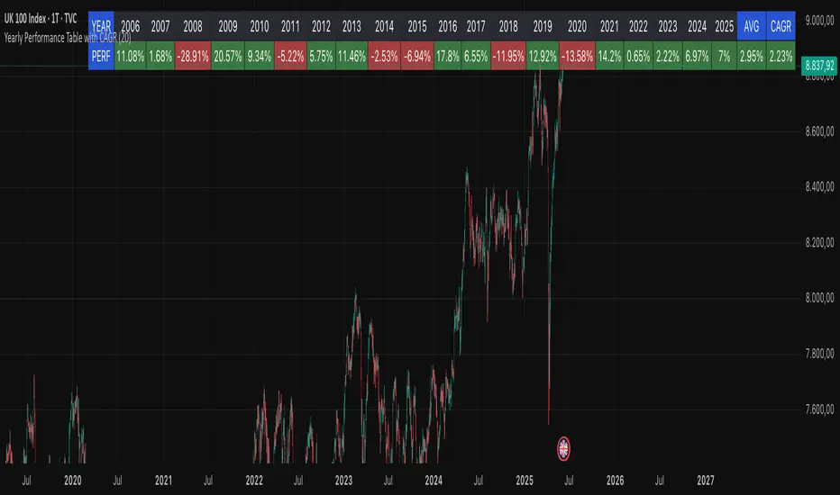
Yearly Performance Table with CAGROverview
This Pine Script indicator provides a clear table displaying the annual performance of an asset, along with two different average metrics: the arithmetic mean and the geometric mean (CAGR).
Core Features
Annual Performance Calculation:
Automatically detects the first trading day of each calendar year.
Calculates the percentage return for each full calendar year.
Based on closing prices from the first to the last trading day of the respective year.
Flexible Display:
Adjustable Period: Displays data for 1-50 years (default: 10 years).
Daily Timeframe Only: Functions exclusively on daily charts.
Automatic Update: Always shows the latest available years.
Two Average Metrics:
AVG (Arithmetic Mean)
A simple average of all annual returns. (Formula: (R₁ + R₂ + ... + Rₙ) ÷ n)
Important: Can be misleading in the presence of volatile returns.
GEO (Geometric Mean / CAGR)
Compound Annual Growth Rate. (Formula: ^(1/n) - 1)
Represents the true average annual growth rate.
Fully accounts for the compounding effect.
Limitations
Daily Charts Only: Does not work on intraday or weekly/monthly timeframes.
Calendar Year Basis: Calculations are based on calendar years, not rolling 12-month periods.
Historical Data: Dependent on the availability of historical data from the broker/data provider.
Interpretation of Results
CAGR as Benchmark: The geometric mean is more suitable for performance comparisons.
Annual Patterns: Individual year figures can reveal seasonal or cyclical trends.
Simple Position CalculatorThis indicator provides a real-time position sizing calculator designed for fast momentum trading. It instantly calculates optimal trade size based on your risk parameters, entry/exit prices, and exchange conditions (fees/slippage). Perfect for high-speed entries during candle closes and breakouts.

Bilateral Filter For Loop [BackQuant]Bilateral Filter For Loop
The Bilateral Filter For Loop is an advanced technical indicator designed to filter out market noise and smooth out price data, thus improving the identification of underlying market trends. It employs a bilateral filter, which is a sophisticated non-linear filter commonly used in image processing and price time series analysis. By considering both spatial and range differences between price points, this filter is highly effective at preserving significant trends while reducing random fluctuations, ultimately making it suitable for dynamic trend-following strategies.
Please take the time to read the following:
Key Features
1. Bilateral Filter Calculation:
The bilateral filter is the core of this indicator and works by applying a weight to each data point based on two factors: spatial distance and price range difference. This dual weighting process allows the filter to preserve important price movements while reducing the impact of less relevant fluctuations. The filter uses two primary parameters:
Spatial Sigma (σ_d): This parameter adjusts the weight applied based on the distance of each price point from the current price. A larger spatial sigma means more smoothing, as further away values will contribute more heavily to the result.
Range Sigma (σ_r): This parameter controls how much weight is applied based on the difference in price values. Larger price differences result in smaller weights, while similar price values result in larger weights, thereby preserving the trend while filtering out noise.
The output of this filter is a smoothed version of the original price series, which eliminates short-term fluctuations, helping traders focus on longer-term trends. The bilateral filter is applied over a rolling window, adjusting the level of smoothing dynamically based on both the distance between values and their relative price movements.
2. For Loop Calculation for Trend Scoring:
A for-loop is used to calculate the trend score based on the filtered price data. The loop compares the current value to previous values within the specified window, scoring the trend as follows:
+1 for upward movement (when the filtered value is greater than the previous value).
-1 for downward movement (when the filtered value is less than the previous value).
The cumulative result of this loop gives a continuous trend score, which serves as a directional indicator for the market's momentum. By summing the scores over the window period, the loop provides an aggregate value that reflects the overall trend strength. This score helps determine whether the market is experiencing a strong uptrend, downtrend, or sideways movement.
3. Long and Short Conditions:
Once the trend score has been calculated, it is compared against predefined threshold levels:
A long signal is generated when the trend score exceeds the upper threshold, indicating that the market is in a strong uptrend.
A short signal is generated when the trend score crosses below the lower threshold, signaling a potential downtrend or trend reversal.
These conditions provide clear signals for potential entry points, and the color-coding helps traders quickly identify market direction:
Long signals are displayed in green.
Short signals are displayed in red.
These signals are designed to provide high-confidence entries for trend-following strategies, helping traders capture profitable movements in the market.
4. Trend Background and Bar Coloring:
The script offers customizable visual settings to enhance the clarity of the trend signals. Traders can choose to:
Color the bars based on the trend direction: Bars are colored green for long signals and red for short signals.
Change the background color to provide additional context: The background will be shaded green for a bullish trend and red for a bearish trend. This visual feedback helps traders to stay aligned with the prevailing market sentiment.
These features offer a quick visual reference for understanding the market's direction, making it easier for traders to identify when to enter or exit positions.
5. Threshold Lines for Visual Feedback:
Threshold lines are plotted on the chart to represent the predefined long and short levels. These lines act as clear markers for when the market reaches a critical threshold, triggering a potential buy (long) or sell (short) signal. By showing these threshold lines on the chart, traders can quickly gauge the strength of the market and assess whether the trend is strong enough to warrant action.
These thresholds can be adjusted based on the trader's preferences, allowing them to fine-tune the indicator for different market conditions or asset behaviors.
6. Customizable Parameters for Flexibility:
The indicator offers several parameters that can be adjusted to suit individual trading preferences:
Window Period (Bilateral Filter): The window size determines how many past price values are used to calculate the bilateral filter. A larger window increases smoothing, while a smaller window results in more responsive, but noisier, data.
Spatial Sigma (σ_d) and Range Sigma (σ_r): These values control how sensitive the filter is to price changes and the distance between data points. Fine-tuning these parameters allows traders to adjust the degree of noise reduction applied to the price series.
Threshold Levels: The upper and lower thresholds determine when the trend score crosses into long or short territory. These levels can be customized to better match the trader's risk tolerance or asset characteristics.
Visual Settings: Traders can customize the appearance of the chart, including the line width of trend signals, bar colors, and background shading, to make the indicator more readable and aligned with their charting style.
7. Alerts for Trend Reversals:
The indicator includes alert conditions for real-time notifications when the market crosses the defined thresholds. Traders can set alerts to be notified when:
The trend score crosses the long threshold, signaling an uptrend.
The trend score crosses the short threshold, signaling a downtrend.
These alerts provide timely information, allowing traders to take immediate action when the market shows a significant change in direction.
Final Thoughts
The Bilateral Filter For Loop indicator is a robust tool for trend-following traders who wish to reduce market noise and focus on the underlying trend. By applying the bilateral filter and calculating trend scores, this indicator helps traders identify strong uptrends and downtrends, providing reliable entry signals with minimal market noise. The customizable parameters, visual feedback, and alerting system make it a versatile tool for traders seeking to improve their timing and capture profitable market movements.
Thus following all of the key points here are some sample backtests on the 1D Chart
Disclaimer: Backtests are based off past results, and are not indicative of the future.
INDEX:BTCUSD
INDEX:ETHUSD
CRYPTO:SOLUSD
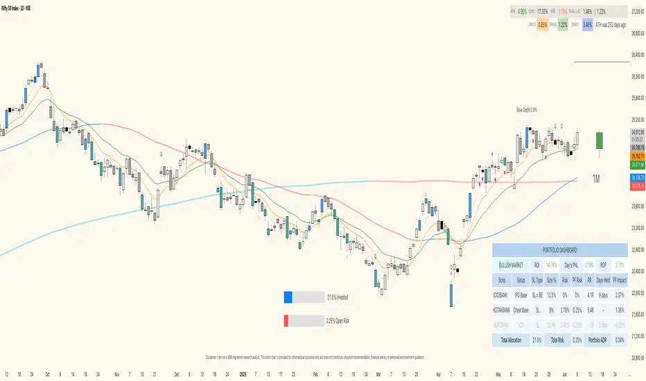
Portfolio Dashboard by DTRThe Portfolio Dashboard by DTR is a sophisticated yet user-friendly Pine Script indicator for TradingView, designed to empower traders with a comprehensive tool for managing and monitoring investment portfolios. Supporting up to 10 stocks, it delivers real-time performance metrics, risk analysis, and market insights in an intuitive, customizable dashboard—perfect for traders of all experience levels.
Key Features
Real-Time Portfolio Metrics: Tracks Return on Investment (ROI), Day's Profit and Loss (PNL), Risk of Profit (ROP), and Average Daily Range (ADR) with color-coded indicators for quick insights.
Individual Stock Insights: Displays detailed data for each stock, including ticker, trading setup, Last Traded Price (LTP) or Stop Loss (SL) status, position size, risk, portfolio risk, Risk-Reward (RR) or Gain%, daily change%, portfolio impact, and optional ADR.
Market Condition Analysis: Evaluates broader market trends using NSE:CNXSMALLCAP data, categorizing conditions as CHOPPY, BULL MARKET, BEAR MARKET, SHAKEOUT, or BEAR RALLY with visual color cues.
Customization Options:
Input total capital (scalable in Thousands, Lacs, or Crores) and maximum risk percentage.
Choose from B&W, Blue, Green, Red, Purple, or Transparent themes, with Dark Mode support.
Adjust dashboard and gauge positions (top/middle/bottom, left/center/right) and text sizes (tiny to huge).
Toggle display options like LTP, % change color, total row, ADR column, RR/Gain%, and empty rows.
Risk Management Tools: Calculates position sizes, individual and portfolio-level risks, and offers visual gauges for total allocation (% invested) and open risk (% of max risk). Supports setting Stop Loss to Break-Even (SL=BE).
Chart Enhancements: Optionally displays entry and stop loss lines on the chart with customizable styles (Dashed, Dotted, Normal) and dynamic labels for precise trade management.
How It Works
Setup: Users input portfolio details—ticker symbols, quantities, entry prices, stop losses, exits, and setups—for up to 10 stocks, along with capital and risk settings.
Data Processing: The indicator fetches daily high, low, close, and previous close data to compute metrics like ADR, percentage change, and Day's PNL for each stock.
Visualization: On the last bar, it generates a detailed table summarizing portfolio and stock-level data, alongside two gauges for allocation and risk, positioned per user preferences.
Chart Integration: When enabled, entry and SL lines with labels appear on the chart for the current ticker, updating dynamically based on price action.
How to Use
Add to Chart: Apply the indicator to your TradingView chart.
Configure Settings: In the settings panel, enter your total capital, stock details, and customize themes, positions, and display preferences.
Monitor Portfolio: Use the dashboard to assess portfolio health, risk exposure, and market conditions in real time.
Manage Trades: Leverage chart lines and labels to execute and adjust trades with precision.
Benefits
Centralized Oversight: Consolidates all essential portfolio data into one view.
Enhanced Risk Control: Provides real-time risk metrics and visual tools for proactive management.
Flexible Design: Adapts to various trading strategies and aesthetic preferences.
Intuitive Interface: Combines detailed analytics with clear, visually appealing presentation.
Important Notes
Accuracy: Ensure correct ticker symbols (e.g., NSE:RELIANCE) and price inputs for reliable results.
Timeframes: Optimized for daily or intraday charts; updates occur on the last bar.
Dependencies: Market condition and ADR calculations rely on NSE:CNXSMALLCAP data availability.
Elevate your trading with the Portfolio Dashboard by DTR—a powerful, all-in-one solution for portfolio management on TradingView. Take control of your investments today!
Cross-Sectional Altcoin Portfolio [BackQuant]Cross-Sectional Altcoin Portfolio
Introducing BackQuant's Cross-Sectional Altcoin Portfolio, a sophisticated trading system designed to dynamically rotate among a selection of major altcoins. This portfolio strategy compares multiple assets based on real-time performance metrics, such as momentum and trend strength, to select the strongest-performing coins. It uses a combination of adaptive scoring and regime filters to ensure the portfolio is aligned with favorable market conditions, minimizing exposure during unfavorable trends.
This system offers a comprehensive solution for crypto traders who want to optimize portfolio allocation based on cross-asset performance, while also accounting for market regimes. It allows traders to compare multiple altcoins dynamically and allocate capital to the top performers, ensuring the portfolio is always positioned in the most promising assets.
Key Features
1. Dynamic Asset Rotation:
The portfolio constantly evaluates the relative strength of 10 major altcoins: SOLUSD, RUNEUSD, ORDIUSD, DOGEUSDT, ETHUSD, ENAUSDT, RAYUSDT, PENDLEUSD, UNIUSD, and KASUSDT.
Using a ratio matrix, the system selects the strongest asset based on momentum and trend performance, dynamically adjusting the allocation as market conditions change.
2. Long-Only Portfolio with Cash Reserve:
The portfolio only takes long positions or remains in cash. The system does not enter short positions, reducing the risk of exposure during market downturns.
A powerful regime filter ensures the system is inactive during periods of market weakness, defined by the Universal Trend Performance Indicator (TPI) and other market data.
3. Equity Tracking:
The script provides real-time visualizations of portfolio equity compared to buy-and-hold strategies.
Users can compare the performance of the portfolio against holding individual assets (e.g., BTC, ETH) and see the benefits of the dynamic allocation.
4. Performance Metrics:
The system provides key performance metrics such as:
Sharpe Ratio: Measures risk-adjusted returns.
Sortino Ratio: Focuses on downside risk.
Omega Ratio: Evaluates returns relative to risk.
Maximum Drawdown: The maximum observed loss from a peak to a trough.
These metrics allow traders to assess the effectiveness of the strategy versus simply holding the assets.
5. Regime Filter:
The system incorporates a regime filter that evaluates the overall market trend using the TPI and other indicators. If the market is in a downtrend, the system exits positions and moves to cash, avoiding exposure to negative market conditions.
Users can customize the thresholds for the long and short trends to fit their risk tolerance.
6. Customizable Parameters:
Traders can adjust key parameters, such as the backtest start date, starting capital, leverage multiplier, and visualization options, including equity plot colors and line widths.
The system supports different levels of customizations for traders to optimize their strategies.
7. Equity and Buy-and-Hold Comparisons:
This script enables traders to see the side-by-side comparison of the portfolio’s equity curve and the equity curve of a buy-and-hold strategy for each asset.
The comparison allows users to evaluate the performance of the dynamic strategy versus holding the altcoins in isolation.
8. Forward Test (Out-of-Sample Testing):
The system includes a note that the portfolio provides out-of-sample forward tests, ensuring the robustness of the strategy. This is crucial for assessing the portfolio's performance beyond historical backtesting and validating its ability to adapt to future market conditions.
9. Visual Feedback:
The system offers detailed visual feedback on the current asset allocation and performance. Candles are painted according to the trend of the selected assets, and key metrics are displayed in real-time, including the momentum scores for each asset.
10. Alerts and Notifications:
Real-time alerts notify traders when the system changes asset allocations or moves to cash, ensuring they stay informed about portfolio adjustments.
Visual labels on the chart provide instant feedback on which asset is currently leading the portfolio allocation.
How the Rotation Works
The portfolio evaluates 10 different assets and calculates a momentum score for each based on their price action. This score is processed through a ratio matrix, which compares the relative performance of each asset.
Based on the rankings, the portfolio allocates capital to the top performers, ensuring it rotates between the strongest assets while minimizing exposure to underperforming assets.
If no asset shows strong performance, the system defaults to cash to preserve capital.
Final Thoughts
BackQuant’s Cross-Sectional Altcoin Portfolio provides a dynamic and systematic approach to altcoin portfolio management. By employing real-time performance metrics, adaptive scoring, and regime filters, this strategy aims to optimize returns while minimizing exposure to market downturns. The inclusion of out-of-sample forward tests ensures that the system remains robust in live market conditions, making it an ideal tool for crypto traders seeking to enhance their portfolio's performance with a data-driven, momentum-based approach.

Candle Body TableCandle Body Table is a lightweight, easy-to-use indicator that displays a live summary of candle “body strength” across multiple timeframes, along with how much time is left on each candle. Simply choose up to five timeframes (1, 5, 15, 30, and 60 minutes by default), adjust the table’s corner and font size, and you’ll always have a quick, at-a-glance view of:
OC (Body %): The percentage of the candle that’s composed of its body (|open – close| divided by high–low).
Strength: A label (Weak, Balanced, or Strong) based on the body percentage.
Time Left: How many minutes and seconds remain before the current candle closes.
The table updates in real time (using lookahead), coloring each row background green if that timeframe’s current candle is bullish, or red if it’s bearish. That way, you can instantly see which timeframes have strong momentum, which are balanced or weak, and exactly when each candle will finish.
Use Cases
Multi-Timeframe Momentum Check:
If you want to confirm that both your 1m and 5m candles have “Strong” bodies before entering a trade, Candle Body Table shows you that instantly. No more switching back and forth between charts—just glance at the table.
Time-Sensitive Entries/Exits:
Suppose you trade breakouts only at the close of a 5-minute candle. The “Time Left” column counts down so you know exactly when that candle is about to close—down to the second—letting you prepare your order.
Quick Visual Scan:
When markets are choppy, you may want to see which timeframes are weak or balanced rather than diving into each timeframe separately. If the 15m row says “Weak” (small body %), you might avoid taking a trend-following position at that moment.
Session Overlaps & Volatility Windows:
During London/N.Y. overlap or U.S. cash close, traders often check for stronger bodies on higher timeframes (e.g., 30m or 60m). The table immediately highlights if that timeframe’s candle body heats up, indicating increased volatility.
Swing-to-Scalp Transition:
If you typically scalp on 1m but only when the 15m candle is “Strong,” this table gives a green/red cue and a strength label. That makes it easier to wait patiently until multiple timeframes align.
FAQ
Q1. What does “OC” mean, and why is it shown as a percentage?
A1. “OC” stands for Open/Close difference. So it reflects how much of the candle’s total range (high–low) is taken up by its body(open-close). A high OC% means the candle body is large relative to its wick. In other words a strong Bullish/Bearish candle.
Q2. How is “Strength” determined?
A2. The script uses three buckets:
Weak if OC% ≤ 30%
Balanced if 30% < OC% ≤ 55%
Strong if OC% > 55%
This gives you a quick label instead of having to interpret raw percentages every time.
Q3. Why do some rows have a green background and others red?
A3. If close > open (bullish candle), that entire row’s background is shaded green(70%). If close < open (bearish candle), it’s shaded red(70%). If open = close (doji), there’s no background shade. This lets you instantly spot bullish vs. bearish candles across your chosen timeframes.
Q4. Will this repaint?
A4. No. Because each OHLC value is requested with lookahead_on, you see the live developing OHLC. However, once a candle closes, those values are final. The “Time Left” column dynamically changes throughout the bar but does not redraw past values.
DCA Investment Tracker Pro [tradeviZion]DCA Investment Tracker Pro: Educational DCA Analysis Tool
An educational indicator that helps analyze Dollar-Cost Averaging strategies by comparing actual performance with historical data calculations.
---
💡 Why I Created This Indicator
As someone who practices Dollar-Cost Averaging, I was frustrated with constantly switching between spreadsheets, calculators, and charts just to understand how my investments were really performing. I wanted to see everything in one place - my actual performance, what I should expect based on historical data, and most importantly, visualize where my strategy could take me over the long term .
What really motivated me was watching friends and family underestimate the incredible power of consistent investing. When Napoleon Bonaparte first learned about compound interest, he reportedly exclaimed "I wonder it has not swallowed the world" - and he was right! Yet most people can't visualize how their $500 monthly contributions today could become substantial wealth decades later.
Traditional DCA tracking tools exist, but they share similar limitations:
Require manual data entry and complex spreadsheets
Use fixed assumptions that don't reflect real market behavior
Can't show future projections overlaid on actual price charts
Lose the visual context of what's happening in the market
Make compound growth feel abstract rather than tangible
I wanted to create something different - a tool that automatically analyzes real market history, detects volatility periods, and shows you both current performance AND educational projections based on historical patterns right on your TradingView charts. As Warren Buffett said: "Someone's sitting in the shade today because someone planted a tree a long time ago." This tool helps you visualize your financial tree growing over time.
This isn't just another calculator - it's a visualization tool that makes the magic of compound growth impossible to ignore.
---
🎯 What This Indicator Does
This educational indicator provides DCA analysis tools. Users can input investment scenarios to study:
Theoretical Performance: Educational calculations based on historical return data
Comparative Analysis: Study differences between actual and theoretical scenarios
Historical Projections: Theoretical projections for educational analysis (not predictions)
Performance Metrics: CAGR, ROI, and other analytical metrics for study
Historical Analysis: Calculates historical return data for reference purposes
---
🚀 Key Features
Volatility-Adjusted Historical Return Calculation
Analyzes 3-20 years of actual price data for any symbol
Automatically detects high-volatility stocks (meme stocks, growth stocks)
Uses median returns for volatile stocks, standard CAGR for stable stocks
Provides conservative estimates when extreme outlier years are detected
Smart fallback to manual percentages when data insufficient
Customizable Performance Dashboard
Educational DCA performance analysis with compound growth calculations
Customizable table sizing (Tiny to Huge text options)
9 positioning options (Top/Middle/Bottom + Left/Center/Right)
Theme-adaptive colors (automatically adjusts to dark/light mode)
Multiple display layout options
Future Projection System
Visual future growth projections
Timeframe-aware calculations (Daily/Weekly/Monthly charts)
1-30 year projection options
Shows projected portfolio value and total investment amounts
Investment Insights
Performance vs benchmark comparison
ROI from initial investment tracking
Monthly average return analysis
Investment milestone alerts (25%, 50%, 100% gains)
Contribution tracking and next milestone indicators
---
📊 Step-by-Step Setup Guide
1. Investment Settings 💰
Initial Investment: Enter your starting lump sum (e.g., $60,000)
Monthly Contribution: Set your regular DCA amount (e.g., $500/month)
Return Calculation: Choose "Auto (Stock History)" for real data or "Manual" for fixed %
Historical Period: Select 3-20 years for auto calculations (default: 10 years)
Start Year: When you began investing (e.g., 2020)
Current Portfolio Value: Your actual portfolio worth today (e.g., $150,000)
2. Display Settings 📊
Table Sizes: Choose from Tiny, Small, Normal, Large, or Huge
Table Positions: 9 options - Top/Middle/Bottom + Left/Center/Right
Visibility Toggles: Show/hide Main Table and Stats Table independently
3. Future Projection 🔮
Enable Projections: Toggle on to see future growth visualization
Projection Years: Set 1-30 years ahead for analysis
Live Example - NASDAQ:META Analysis:
Settings shown: $60K initial + $500/month + Auto calculation + 10-year history + 2020 start + $150K current value
---
🔬 Pine Script Code Examples
Core DCA Calculations:
// Calculate total invested over time
months_elapsed = (year - start_year) * 12 + month - 1
total_invested = initial_investment + (monthly_contribution * months_elapsed)
// Compound growth formula for initial investment
theoretical_initial_growth = initial_investment * math.pow(1 + annual_return, years_elapsed)
// Future Value of Annuity for monthly contributions
monthly_rate = annual_return / 12
fv_contributions = monthly_contribution * ((math.pow(1 + monthly_rate, months_elapsed) - 1) / monthly_rate)
// Total expected value
theoretical_total = theoretical_initial_growth + fv_contributions
Volatility Detection Logic:
// Detect extreme years for volatility adjustment
extreme_years = 0
for i = 1 to historical_years
yearly_return = ((price_current / price_i_years_ago) - 1) * 100
if yearly_return > 100 or yearly_return < -50
extreme_years += 1
// Use median approach for high volatility stocks
high_volatility = (extreme_years / historical_years) > 0.2
calculated_return = high_volatility ? median_of_returns : standard_cagr
Performance Metrics:
// Calculate key performance indicators
absolute_gain = actual_value - total_invested
total_return_pct = (absolute_gain / total_invested) * 100
roi_initial = ((actual_value - initial_investment) / initial_investment) * 100
cagr = (math.pow(actual_value / initial_investment, 1 / years_elapsed) - 1) * 100
---
📊 Real-World Examples
See the indicator in action across different investment types:
Stable Index Investments:
AMEX:SPY (SPDR S&P 500) - Shows steady compound growth with standard CAGR calculations
Classic DCA success story: $60K initial + $500/month starting 2020. The indicator shows SPY's historical 10%+ returns, demonstrating how consistent broad market investing builds wealth over time. Notice the smooth theoretical growth line vs actual performance tracking.
MIL:VUAA (Vanguard S&P 500 UCITS) - Shows both data limitation and solution approaches
Data limitation example: VUAA shows "Manual (Auto Failed)" and "No Data" when default 10-year historical setting exceeds available data. The indicator gracefully falls back to manual percentage input while maintaining all DCA calculations and projections.
MIL:VUAA (Vanguard S&P 500 UCITS) - European ETF with successful 5-year auto calculation
Solution demonstration: By adjusting historical period to 5 years (matching available data), VUAA auto calculation works perfectly. Shows how users can optimize settings for newer assets. European market exposure with EUR denomination, demonstrating DCA effectiveness across different markets and currencies.
NYSE:BRK.B (Berkshire Hathaway) - Quality value investment with Warren Buffett's proven track record
Value investing approach: Berkshire Hathaway's legendary performance through DCA lens. The indicator demonstrates how quality companies compound wealth over decades. Lower volatility than tech stocks = standard CAGR calculations used.
High-Volatility Growth Stocks:
NASDAQ:NVDA (NVIDIA Corporation) - Demonstrates volatility-adjusted calculations for extreme price swings
High-volatility example: NVIDIA's explosive AI boom creates extreme years that trigger volatility detection. The indicator automatically switches to "Median (High Vol): 50%" calculations for conservative projections, protecting against unrealistic future estimates based on outlier performance periods.
NASDAQ:TSLA (Tesla) - Shows how 10-year analysis can stabilize volatile tech stocks
Stable long-term growth: Despite Tesla's reputation for volatility, the 10-year historical analysis (34.8% CAGR) shows consistent enough performance that volatility detection doesn't trigger. Demonstrates how longer timeframes can smooth out extreme periods for more reliable projections.
NASDAQ:META (Meta Platforms) - Shows stable tech stock analysis using standard CAGR calculations
Tech stock with stable growth: Despite being a tech stock and experiencing the 2022 crash, META's 10-year history shows consistent enough performance (23.98% CAGR) that volatility detection doesn't trigger. The indicator uses standard CAGR calculations, demonstrating how not all tech stocks require conservative median adjustments.
Notice how the indicator automatically detects high-volatility periods and switches to median-based calculations for more conservative projections, while stable investments use standard CAGR methods.
---
📈 Performance Metrics Explained
Current Portfolio Value: Your actual investment worth today
Expected Value: What you should have based on historical returns (Auto) or your target return (Manual)
Total Invested: Your actual money invested (initial + all monthly contributions)
Total Gains/Loss: Absolute dollar difference between current value and total invested
Total Return %: Percentage gain/loss on your total invested amount
ROI from Initial Investment: How your starting lump sum has performed
CAGR: Compound Annual Growth Rate of your initial investment (Note: This shows initial investment performance, not full DCA strategy)
vs Benchmark: How you're performing compared to the expected returns
---
⚠️ Important Notes & Limitations
Data Requirements: Auto mode requires sufficient historical data (minimum 3 years recommended)
CAGR Limitation: CAGR calculation is based on initial investment growth only, not the complete DCA strategy
Projection Accuracy: Future projections are theoretical and based on historical returns - actual results may vary
Timeframe Support: Works ONLY on Daily (1D), Weekly (1W), and Monthly (1M) charts - no other timeframes supported
Update Frequency: Update "Current Portfolio Value" regularly for accurate tracking
---
📚 Educational Use & Disclaimer
This analysis tool can be applied to various stock and ETF charts for educational study of DCA mathematical concepts and historical performance patterns.
Study Examples: Can be used with symbols like AMEX:SPY , NASDAQ:QQQ , AMEX:VTI , NASDAQ:AAPL , NASDAQ:MSFT , NASDAQ:GOOGL , NASDAQ:AMZN , NASDAQ:TSLA , NASDAQ:NVDA for learning purposes.
EDUCATIONAL DISCLAIMER: This indicator is a study tool for analyzing Dollar-Cost Averaging strategies. It does not provide investment advice, trading signals, or guarantees. All calculations are theoretical examples for educational purposes only. Past performance does not predict future results. Users should conduct their own research and consult qualified financial professionals before making any investment decisions.
---
© 2025 TradeVizion. All rights reserved.

Enhanced Seasonality Trade BacktestEnhanced Seasonality Trade Backtest
Overview
A comprehensive Pine Script indicator that backtests seasonal trading strategies by analyzing historical price performance during specific date ranges. The tool provides detailed statistics, visual markers, and election cycle filtering to identify profitable seasonal patterns.
Key Features
📊 Backtesting Engine
Tests up to 50 years of historical data
Configurable entry/exit dates (day/month)
Automatic holiday/weekend date adjustment
Separate analysis for long and short positions
🗳️ Election Cycle Filter
All Years: Test every year in the lookback period
Election Years: US presidential election years only (2024, 2020, 2016...)
Pre-Election Years: Years before elections (2023, 2019, 2015...)
Post-Election Years: Years after elections (2021, 2017, 2013...)
📈 Comprehensive Statistics
Win rate percentage
Total and average returns
Best/worst performing years
Detailed trade-by-trade breakdown
Years tested vs. years filtered
🎯 Visual Indicators
Entry/exit lines for all historical trades
Future trade date projections
Background highlighting during trade periods
Color-coded performance labels
⚙️ Customization Options
Toggle between long/short analysis
Show/hide price and date details
Adjustable table position
Future trade date visualization
Use Cases
Seasonal Trading: Identify recurring profitable periods (e.g., "Sell in May")
Election Cycle Analysis: Test how political cycles affect market performance
Strategy Validation: Backtest specific date-range strategies
Risk Assessment: Analyze worst-case scenarios and drawdowns
Perfect For
Swing traders looking for seasonal edges
Portfolio managers timing market entries/exits
Researchers studying market cyclicality
Anyone wanting to quantify seasonal market behavior
ONLY WORKS IN 1D TIME FRAME

Session Status Table📌 Session Status Table
Session Status Table is an indicator that displays the real-time status of the four major trading sessions:
* 🇯🇵 Asia (Tokyo)
* 🇬🇧 London
* 🇺🇸 New York AM
* 🇺🇸 New York PM
It shows which sessions are currently open, how much time remains until they open or close, and optionally sends alerts in advance.
🧩 Features:
* Real-time session table — shows the status of each session on the chart.
* Color-coded statuses:
* 🟢 Green – Session is open
* 🔴 Red – Session is closed
* ⚪ Gray – Weekend
* Countdown timers until session open or close.
* User alerts — receive a notification a custom number of minutes before a session starts.
⚙️ Customization:
* Table position — fully configurable.
* Session colors — customizable for open, closed, and weekend states.
* Session labels — customizable with icons.
* Notifications:
* Enabled through TradingView's Alerts panel.
* User-defined lead time before session opens.
🕒 Time Zones:
All times are calculated in UTC to ensure consistency across different markets and regions, avoiding discrepancies from time zones and daylight saving time.
🚨 How to enable alerts:
1. Open the "Alerts" panel in TradingView.
2. Click "Create Alert".
3. In the condition dropdown, choose "Session Status Table".
4. Set to any alert() trigger.
5. Save — you'll be notified a set number of minutes before each session begins.
ℹ️ Technical Notes:
* Built with Pine Script version 6.
* Logically divided into clear sections: inputs, session calculations, table rendering, and alerts.
* Optimized for performance and reliability on all timeframes.
Ideal for traders who use session activity in their strategies — especially in Forex, crypto, and futures markets.
time-specific standard devs [keypoems]Time-Specific Net Change Percentage Standard Deviations Extensions
A candlestick is the story of how price moved during a single period: it opens, explores a high and a low, and finally closes.
The indicator asks one question:
“By what percentage did price change from open to close?”
That single percentage value – called the net-change % – is the raw material for everything that follows.
Why net-change % matters
If you collect that percentage for thousands of finished candles (daily candles, 1-hour, 4-hour – whatever you close) you get a probability distribution: most candles move only a little, a few move a lot. When you plot those percentages you get the familiar bell-curve. From any bell-curve you can read two key statistics:
Mean – the “typical” net-change.
Standard Deviation (σ) – how far a candle normally wanders from that mean.
A well-known property of a bell-curve is that ≈68 % of all observations stay between –1 σ and +1 σ, and ≈95 % stay within ±2 σ.
For traders that translates into a probabilistic map of where an unfinished candle is likely to close.
What the indicator draws
Open-anchored levels
Every box is centred on the candle’s open price.
The indicator draws boxes that mark +σ, +½ σ, –½ σ, –σ … as selected in the Inputs.
Time-specific calculation
Instead of mixing all 1-hour candles together, the script isolates only the 09:00-10:00 New-York hour (or any other slot you are at that moment) and builds a bell-curve from that subset.
The result is a set of expectations truly tailored to that exact hour’s behaviour.
Generic and Specific Std Dev Box
Indicator computes both generic levels – the classic “all candles aggregated” standard deviations, and specific levels – the refined, hour-by-hour (or 4-hour-by-4-hour, etc.) deviations.
The indicator shows Boxes that represent both aggregated values and "per period" standard deviation projection levels.
Mirrored levels (optional)
Negative σ levels are drawn automatically so you have symmetrical upside & downside projections.
Math behind the scenes
For each chosen higher-timeframe (HTF):
Collect the last N net-change % values (user-defined look-back, default 5 000 candles).
Compute:
μ = mean(net-change %)
σ = stdev(net-change %)
Project prices:
LevelPrice = Open × (1 + k × σ)
where k is 0 , ±0.5 , ±1 , ±1.5 … as enabled in the inputs.
Because everything is done in percentage space the technique adapts automatically to instruments that trade at very different absolute prices (equities, futures, crypto, FX).
How to read it in real time
When a developing candle races straight into +1 σ with plenty of time left, statistics say “68 % of the time it will finish back inside the box.”
A tag of +2 σ is an even rarer event (~5 % probability) – a natural place to look for exhaustion or take-profit cues.
Conversely, if price refuses to reverse at +1 σ and instead sticks above that edge, it is signalling an unusually strong session and may warrant trend-continuation tactics.
Key Inputs
Higher Timeframe Choose 5m to H8 reference frame
Show levels for last X periods
Look-back length Sample size for σ
StdDev Fibs Fib1 … Fib9 toggles & values: Decide which σ multiples to plot
Mirror levels Draw matching negative projections
Extend boxes Keep boxes visible beyond their candle
Best-practice usage
Combine with structure – treat σ edges as context, not automatic entry.
Mind the sample size – if you choose extremely narrow windows (e.g., Sunday 18:00-19:00 futures open) make sure your look-back still captures hundreds of cases.
Disclaimer
Trading involves risk. The author and this indicator simply display historical probability ranges; they do not assure profits or prevent losses. Always perform your own due diligence and, if necessary, consult a licensed financial professional before dealing in any financial instrument.

Money Risk Management with Trade Tracking
Overview
The Money Risk Management with Trade Tracking indicator is a powerful tool designed for traders on TradingView to simplify trade simulation and risk management. Unlike the TradingView Strategy Tester, which can be complex for beginners, this indicator provides an intuitive, beginner-friendly interface to evaluate trading strategies in a realistic manner, mirroring real-world trading conditions.
Built on the foundation of open-source contributions from LuxAlgo and TCP, this indicator integrates external indicator signals, overlays take-profit (TP) and stop-loss (SL) levels, and provides detailed money management analytics. It empowers traders to visualize potential profits, losses, and risk-reward ratios, making it easier to understand the financial outcomes of their strategies.
Key Features
Signal Integration: Seamlessly integrates with external long and short signals from other indicators, allowing traders to overlay TP/SL levels based on their preferred strategies.
Realistic Trade Simulation: Simulates trades as they would occur in real-world scenarios, accounting for initial capital, risk percentage, leverage, and compounding effects.
Money Management Dashboard: Displays critical metrics such as current capital, unrealized P&L, risk amount, potential profit, risk-reward ratio, and trade status in a customizable, beginner-friendly table.
TP/SL Visualization: Plots TP and SL levels on the chart with customizable styles (solid, dashed, dotted) and colors, along with optional labels for clarity.
Performance Tracking: Tracks total trades, win/loss counts, win rate, and profit factor, providing a clear overview of strategy performance.
Liquidation Risk Alerts: Warns traders if stop-loss levels risk liquidation based on leverage settings, enhancing risk awareness.
Benefits for Traders
Beginner-Friendly: Simplifies the complexities of the TradingView Strategy Tester, offering an intuitive interface for new traders to simulate and evaluate trades without confusion.
Real-World Insights: Helps traders understand the actual profit or loss potential of their strategies by factoring in capital, risk, and leverage, bridging the gap between theoretical backtesting and real-world execution.
Enhanced Decision-Making: Provides clear, real-time analytics on risk-reward ratios, unrealized P&L, and trade performance, enabling informed trading decisions.
Customizable and Flexible: Allows customization of TP/SL settings, table positions, colors, and sizes, catering to individual trader preferences.
Risk Management Focus: Encourages disciplined trading by highlighting risk amounts, potential profits, and liquidation risks, fostering better financial planning.
Why This Indicator Stands Out
Many traders struggle to translate backtested strategy results into real-world outcomes due to the abstract nature of percentage-based profitability metrics. This indicator addresses that challenge by providing a practical, user-friendly tool that simulates trades with real-world parameters like capital, leverage, and compounding. Its open-source nature ensures accessibility, while its integration with other indicators makes it versatile for various trading styles.
How to Use
Add to TradingView: Copy the Pine Script code into TradingView’s Pine Editor and add it to your chart.
Configure Inputs: Set your initial capital, risk percentage, leverage, and TP/SL values in the indicator settings. Select external long/short signal sources if integrating with other indicators.
Monitor Dashboards: Use the Money Management and Target Dashboard tables to track trade performance and risk metrics in real time.
Analyze Results: Review win rates, profit factors, and P&L to refine your trading strategy.
Credits
This indicator builds upon the open-source contributions of LuxAlgo and TCP , whose efforts in sharing their code have made this tool possible. Their dedication to the trading community is deeply appreciated.
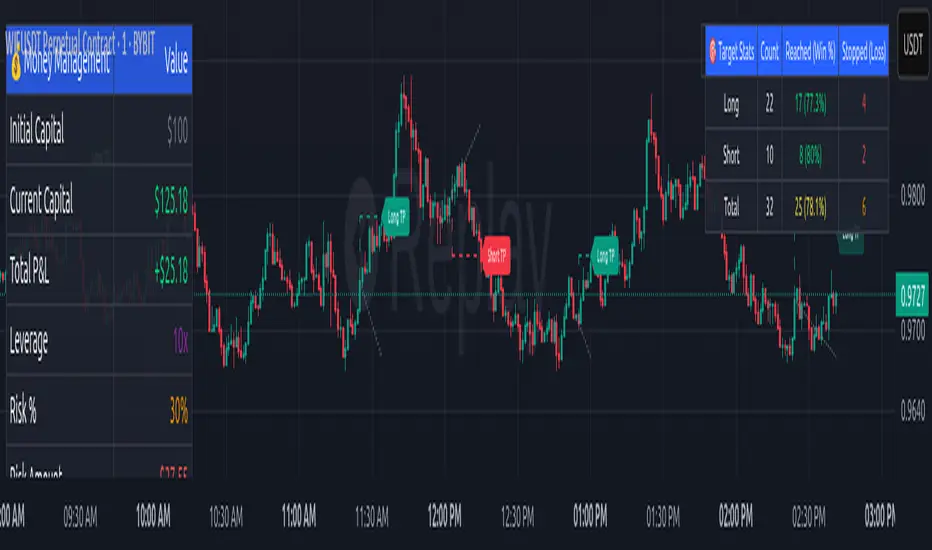
Nova SMC Key TimesThe Nova SMC Key Times is a focused TradingView® indicator tailored for futures traders who want clear visual markers at key session transitions. Designed with simplicity in mind, it automatically plots two dashed vertical lines each trading day to highlight the pre-market and official market-open times (adjusted for Micro E-mini S&P 500 and Micro Gold contracts).
Pre-Market Marker: A semi-transparent white dashed line drawn at the start of pre-market activity, helping you observe early liquidity movements and potential order accumulation.
Market-Open Marker: A fully opaque white dashed line at the exact opening bar of the main session, providing a clear reference for breakout attempts and volatility spikes.
Because LSF detects the appropriate timestamps based on the loaded symbol (MES1! or MGC1!), you never need to manually set session times. If applied to other symbols, it remains silent, ensuring that charts stay uncluttered.
You can easily customize line colors to match your visual preferences under the provided style settings. By visually framing these two critical moments each day, Nova LSF helps traders anticipate stop hunts, breakout retests, and initial momentum moves—making it a useful complement to any liquidity-oriented or order-flow strategy.
PLR-Z For Loop🧠 Overview
PLR-Z For Loop is a trend-following indicator built on the Power Law Residual Z-score model of Bitcoin price behavior. By measuring how far price deviates from a long-term power law regression and applying a custom scoring loop, this tool identifies consistent directional pressure in market structure. Designed for BTC, this indicator helps traders align with macro trends.
🧩 Key Features
Power Law Residual Model: Tracks deviations of BTC price from its long-term logarithmic growth curve.
Z-Score Normalization: Applies long-horizon statistical normalization (400/1460 bars) to smooth residual deviations into a usable trend signal.
Loop-Based Trend Filter: Iteratively scores how often the current Z-score exceeds prior values, emphasizing trend persistence over volatility.
Optional Smoothing: Toggleable exponential smoothing helps filter noise in choppier market conditions.
Directional Regime Coloring: Aqua (bullish) and Red (bearish) visuals reinforce trend alignment across plots and candles.
🔍 How It Works
Power Law Curve: Price is compared against a logarithmic regression model fitted to historical BTC price evolution (starting July 2010), defining structural support, resistance, and centerline levels.
Residual Z-Score: The residual is calculated as the log-difference between price and the power law center.
This residual is then normalized using a rolling mean (400 days) and standard deviation (1460 days) to create a long-term Z-score.
Loop Scoring Logic:
A loop compares the current Z-score to a configurable number of past bars.
Each higher comparison adds +1, and each lower one subtracts -1.
The result is a trend persistence score (z_loop) that grows with consistent directional momentum.
Smoothing Option: A user-defined EMA smooths the score, if enabled, to reduce short-term signal noise.
Signal Logic:
Long signal when trend score exceeds long_threshold.
Short signal when score drops below short_threshold.
Directional State (CD): Internally manages the current market regime (1 = long, -1 = short), controlling all visual output.
🔁 Use Cases & Applications
Macro Trend Alignment: Ideal for traders and analysts tracking Bitcoin’s structural momentum over long timeframes.
Trend Persistence Filter: Helps confirm whether the current move is part of a sustained trend or short-lived volatility.
Best Suited for BTC: Built specifically on the BNC BLX price history and Bitcoin’s power law behavior. Not designed for use with other assets.
✅ Conclusion
PLR-Z For Loop reframes Bitcoin’s long-term power law model into a trend-following tool by scoring the persistence of deviations above or below fair value. It shifts the focus from valuation-based mean reversion to directional momentum, making it a valuable signal for traders seeking high-conviction participation in BTC’s broader market cycles.
⚠️ Disclaimer
The content provided by this indicator is for educational and informational purposes only. Nothing herein constitutes financial or investment advice. Trading and investing involve risk, including the potential loss of capital. Always backtest and apply risk management suited to your strategy.

M2 Lag Correlation | QuantumResearch🧠 M2 Lag Correlation | QuantumResearch
Global M2 vs. Asset Lagged Correlation Dashboard
Measuring delayed macroeconomic impact across regions and asset classes
🌍 Why Is It Unique?
This is the first macro-financial correlation tool on TradingView that tracks and aggregates lagged money supply (M2) data across 20 global economies, FX-adjusted into USD equivalence, and overlays it against your selected chart (BTC, ETH, SPX, etc.).
It does more than just plot macro data — it quantifies the delayed correlation between asset price action and macro liquidity trends, providing a unique macro-lag insight tool for serious analysts and long-term investors.
📌 What It Does:
Computes the global M2 aggregate using 20 region-specific M2 datasets, normalized via local exchange rates
Lets you shift the M2 data forward using a customizable day offset (default: 96D) to model macro lag effects
Calculates rolling Pearson correlation between your charted asset and the lagged M2 line
Outputs correlation scores across four windows:
🟢 30D (Monthly)
🟢 90D (Quarterly)
🟢 182D (Semester)
🟢 365D (Yearly)
➕ Includes a composite Average Score
Displays values in a clean dashboard-style table with color-coded feedback
🔍 Use Cases:
Detect how macro liquidity expansion or contraction influences your asset
Determine the macro lag window — the period after which monetary supply affects asset prices
Validate cycle transitions using data-backed macro alignment
Compare lag response between assets (e.g., BTC vs. ETH vs. NASDAQ)
📊 Macro Lag Insight:
As of recent data:
Bitcoin (BTC) shows the strongest correlation with global M2 at approximately 97 days of lag
Ethereum (ETH) shows its peak correlation around 108 days of lag
These lag values are not static and may evolve over time as macro conditions shift. The script allows users to explore such relationships interactively.
⚙️ Customizable Parameters:
🔄 Offset (Days) – Slide the M2 curve forward to match historical asset reactions
🎨 Color Mode – 8 color palettes to match your visual preferences
📍 Table Position – Place the correlation display wherever you want on your chart
✅ Requirements:
Access to ECONOMICS and FX_IDC feeds on TradingView
Chart timeframe: preferably daily or higher for macro relevance
⚠️ Disclaimer:
Disclaimer: The content on this indicator is for informational and educational purposes only. Nothing contained within should be considered financial, investment, legal, or other professional advice. Past performance does not guarantee future results. Trading cryptocurrencies involves substantial risk of loss and is not suitable for every investor.
Correlation does not imply causation. This tool offers macro-aligned insight, not direct price prediction. Use it alongside a broader macro and market framework.

Last Week's APM & Daily % Move(Corrected)Last Week's Average Price Movement + Daily Percentage Move (based on NY time)
This indicator accurately displays last week's Average Pip Movement (APM) consistently across all timeframes and tracks the true daily percentage move relative to that APM in a clear table in the top-right corner.
Key Features:
-Consistent Last Week's APM: Calculates the average pip movement from Monday to Friday of the previous trading week (based on daily wick-to-wick ranges, divided by 5). This APM value is now stable and the same across all chart timeframes.
-Accurate Live Daily % Move: Tracks the maximum percentage the price has moved (either up or down) since the 5 PM New York time daily open, compared to last week's APM. The percentage holds the maximum value reached during the day and resets at the next 5 PM NY open.
-NY Time Alignment: All time-based calculations are aligned with the New York time zone
Pip Adjustment: Automatically adjusts for JPY pairs.
⚠️ Important: For the intended display and relevance of the daily percentage move, this indicator is best used on timeframes 4-hour and under. On Daily and Weekly timeframes, the APM display will show a message indicating this.
We hope this indicator enhances your trading analysis.
