Quantum Shift [MOT]🔷 Quantum Shift — Multi-Timeframe Reversal System with EMA-Based Structure Mapping
Quantum Shift is a multi-timeframe trading system designed to help traders identify high-probability reversal zones, breakout continuations, and trend shifts using a combination of real-time signal detection and structural level plotting.
This tool is built for precision execution — especially for traders working on futures markets, indices, and high-frequency assets using 30-second, 1-minute, and 5-minute charts.
Rather than relying on traditional lagging methods, Quantum Shift combines exponential moving averages, volume-triggered reversal candles, and dynamic structure logic to help you interpret market changes with greater clarity and confluence.
________________________________________
🔍 What Does It Do?
Quantum Shift continuously monitors price action and trend pressure across multiple timeframes. When the system detects that the current price behavior has reversed direction and aligns across multiple perspectives, it triggers an actionable visual signal. These signals are plotted on the chart with entry zones, optional stop levels, and color-coded background clouds to represent broader trend flow.
________________________________________
🧠 Core Features & How They Work
________________________________________
✅ 1. Multi-Timeframe Reversal Signals
At the heart of the script is a custom-built engine that detects momentum reversals using:
Reversal candles (Blue for bullish setups, Purple for bearish setups)
Price relationship to exponential moving averages
Agreement across multiple timeframes (typically current, lower, and higher)
This triple-confirmation approach filters out low-conviction setups and focuses on structural shifts that are likely to result in a directional move.
📸 Image: A blue candle signal forming on a 1-minute chart with green background cloud.
________________________________________
✅ 2. EMA-Based Support & Resistance Plotting
When a significant crossover occurs between two exponential moving averages, Quantum Shift automatically plots a horizontal level at the crossover price. These levels are interpreted as dynamic support or resistance zones, based on the direction of the signal.
Bullish EMA crossover → support level is plotted
Bearish EMA crossover → resistance level is plotted
These levels appear on 1-minute and 5-minute charts, and remain until they are invalidated by price
If price breaks back through the level in the opposite direction, it is automatically removed
📸 Image: Dynamic support and resistance lines in action — dashed lines represent 1-minute levels, while solid lines indicate 5-minute levels.
________________________________________
✅ 3. Trend Clouds
Quantum Shift overlays the chart with trend clouds that respond to directional pressure in real time. These zones are calculated using multi-tiered Supertrend logic and provide an at-a-glance way to:
Confirm broader trend bias
Avoid entering against strong directional moves
Visually align entry signals with the current market regime
📸 Image: Background fill transitioning from red to green, with signal appearing shortly after.
________________________________________
✅ 4. Volume & Risk Filters
To enhance quality and reduce noise, Quantum Shift includes:
Volume spike filtering — signals require above-average volume (configurable)
Stop range limitation — filters out setups with excessive risk
Chop zone detection — suppresses signals in sideways markets
These filters can be toggled and adjusted to suit different strategies and risk profiles.
📸 Image: All possible signal filters in the settings
________________________________________
✅ 5. Smart Entry Labeling & Dynamic Stop Loss
Upon confirmation of a valid reversal signal:
The script plots a Buy or Sell label at the entry candle
A dynamic stop-loss level is plotted below/above the reversal point
Alerts can be triggered based on:
Initial candle formation
Breakout of the trigger candle
Confluence of trend filters and volume
📸 Image: A “Sell” label and dynamic stop plotted above purple reversal candle.
________________________________________
✅ 6. Multi-Timeframe Trend Table
The live dashboard provides a simplified view of trend alignment and recent signals across timeframes:
Lower timeframe trend state
Higher timeframe trend state
Last signal candle type
Timeframe labels for clarity
This allows traders to confirm confluence without switching between charts.
📸 Image: Trend table showing last trend and candle state on HTF and LTF
________________________________________
⚙️ Customizable Settings
Quantum Shift is built with flexibility in mind. You can:
• Toggle between fast or slow trend models per timeframe
• Enable/disable filters for volume, chop, trend alignment, and stop distance
• Choose whether entries occur on the trigger candle or the breakout
• Adjust all visuals including cloud transparency, line widths, label offsets
• Use on both premium and non-premium TradingView accounts
________________________________________
🧩 Designed For:
• Futures scalpers working with NQ, ES, MNQ, RTY, etc.
• Intraday traders who need clarity during volatility spikes
• Traders who want EMA structure + price confirmation + trend confluence
• Anyone seeking a visual, rule-based system for reacting to real-time market behavior
________________________________________
🔔 Alerts Built In
• Reversal trigger detection
• Breakout confirmation
• Multi-timeframe trend shift
• Invalidated stop zones
• Complete entry-ready alert logic
________________________________________
⚠️ Disclaimer
This script is for educational and informational purposes only. It does not provide financial advice, and past performance does not guarantee future results. Trading carries risk, and all decisions are your responsibility. Redistribution or unauthorized use is strictly prohibited.
Trend Analysis

Intraday BUY/SELL & AUTO SL (5-min timeframe only) by chaitu50c)Intraday BUY/SELL & AUTO SL (5-min timeframe only) by chaitu50c
This indicator provides intraday traders with BUY/SELL reversal signals and automated SL (Stoploss) tracking, based on a 3-candle reversal block logic — designed to work exclusively on the 5-min timeframe.
Key Features:
• 3-Candle Reversal Logic — Signals are generated when a defined 3-candle reversal pattern is detected (body-close breakout).
• Current Session Only — All signals and SL lines are valid only for the current session and automatically reset at session start.
• BUY/SELL Signal Labels — Visual ▲ and ▼ labels mark valid reversal signals on the chart.
• Dynamic Auto SL Lines — Plots dashed SL lines based on the reversal block's low/high.
• SL HIT Tracking — If SL is broken, the line stops extending and a ‘SL HIT’ label is displayed at the midpoint of the SL line.
• Adjustable Visual Settings — Customize signal label size, SL line width, colors, and more.
• Clean & Lightweight — Optimized for intraday use without cluttering the chart.
How to Use:
You can trade this indicator in two ways:
1. Direct Signal Entry — Take a BUY or SELL trade when a valid ▲/▼ reversal signal forms.
2. SL HIT Re-entry — If an existing SL line is broken and ‘SL HIT’ appears, you can optionally take an opposite side trade in the direction of the SL HIT.
Example:
A BUY signal is generated and an SL line is plotted below.
If price breaks the SL (SL HIT appears), you may consider entering a SELL trade at that point — as it indicates weakness.
Important Notes:
• Works only on 5-min timeframe — Set your chart to 5-min for correct behavior.
• Designed for intraday trading — all signals and SL levels reset at session start.
• Does not carry signals between sessions.
• SL lines and HIT labels provide a clear and simple visual aid for trade management.
---

Mahnam BTC with breake outThis strategy is designed and coded specifically for trading Bitcoin in the 15-minute timeframe.
Of course, those who are skilled in coding can use it in other timeframes and currencies by changing its codes and personalizing it.
Of course, it is strongly recommended that people who want to use it first perform the necessary backtests or test this strategy on demo sites and then trade on the Tetri platform.
In this strategy, it only checks the entry and exit conditions and connects to the exchange using the API code and trades completely automatically.
This strategy determines the stop loss and take profit points on the exchange at the same time as entering the transaction and sets them.
///////////////////////// Code ////////////////////////////////
//@version=5
// Copyright (c) 2021-present, Alex Orekhov (everget)
//indicator('HalfTrend and TMA', overlay=true , max_lines_count = 500, max_labels_count = 500)
strategy(title='Mahnam BTC with breake out', overlay=true , max_bars_back=5000 , max_labels_count= 500 , max_boxes_count = 500,max_lines_count = 500, initial_capital=1000, currency = currency.USDT, default_qty_type=strategy.cash )
import PineCoders/Time/4
/////////////////////////////////////////////////////////////////////////////////////////////////////////////////
newyork = '0000-2400' // input.session(title='Session', defval='0000-2400')
time_newyork = time(timeframe.period, newyork)
///////////////////////////////////////////////////////////////////////////////////////////////////////////
// تعیین تاریخ شروع و پایان (بر حسب timestamp یونیکس)
// تنظیمات Input برای تاریخ شروع و پایان
startDate = input.time(timestamp('01 Jan 2025 00:00 UTC'), "📅 تاریخ شروع معاملات", inline="dateRange")
endDate = input.time(timestamp('31 Dec 2025 23:59 UTC'), "📅 تاریخ پایان معاملات", inline="dateRange")
// بررسی اینکه آیا زمان فعلی در بازه مجاز است یا خیر
isTradeEnabled = (time >= startDate) //and (time <= endDate)
///////////////////////////////////////////////////////////////////////////////////////////
// currentTime = time("15", "GMT+0")
// hourOfDay = hour(currentTime)
// notrade_hours1 = input.(12 , minval = 0 , maxval = 24 , title = "Hours Friday")
// notrade_hours2 = input.int(12 , minval = 0 , maxval = 24 , title = "Hours Monday")
////////////////////////////////////////////////////////////Holidays/////////////////////
// تعریف روزهای هفته
isSaturday = dayofweek == dayofweek.saturday //and hourOfDay > 12
isSunday = dayofweek == dayofweek.sunday
// isMonday = dayofweek == dayofweek.monday and hourOfDay < notrade_hours1
// isFriday = dayofweek == dayofweek.friday and hourOfDay > notrade_hours2
// رنگآمیزی پسزمینه برای شنبه (آبی کمرنگ) و یکشنبه (نارنجی کمرنگ)
bgcolor(isSaturday ? color.new(color.blue, 90) : isSunday ? color.new(color.orange, 90) : na)
//bgcolor(isMonday ? color.new(color.white, 90) : isFriday ? color.new(color.green, 90) : na)
//////////////////////////////////////////////////////////////////////////////////////////////////////////////////////////////
//تنظیمات پوزیشن
leverage = input.int(defval = 10 , title = "leverage" , minval = 1 , maxval = 20,step = 5 , group="Posistion Settings==========================================")
quantity = input.float(defval = 500 , title = "quantity" , minval = 1, group="Posistion Settings==========================================")
sl_manager = input.float(defval = 0.5 , step = 0.1 , title = "Risk Percent Of Capital", group="Posistion Settings==========================================")
persent_fee = input.float(defval = 0.05 , title = "Persent Fee Eexchange" , minval = 0 , maxval = 1,step = 0.01 , group="Posistion Settings==========================================")
position_type = input.string(defval = "Buy_And_Sell" , title = "Position_type" , options = , group="Posistion Settings==========================================" )
r_r_long = input.float(defval = 2 , step = 0.1 , title = "R - R =>", group="Posistion Settings==========================================")
r_r_short = r_r_long // input.float(defval = 1.8 , step = 0.1 , title = "r_r Short =>")
//////////////////////////////////////////////////////// END ROC /////////////////////////////////////
day_of_week = input.bool(false , title = "Trade in 7 days", group="Posistion Settings==========================================")
show_tp_sl_ent = true // input.bool(defval=true, title= "Show Tp Sl Ent Box", group="Posistion Settings==========================================")
show_qty = true // input.bool(defval = true , title = "Show Qty Label", group="Posistion Settings==========================================")
//////////////////////////////////////////////////////// Information Position ////////////////////////////////////////////////////
var short_is_open = false
var long_is_open = false
//variant for sell position
var sl1 = 0.0
var tp1 = 0.0
var ent1 = 0.0
var equity1 = 0.0
var qty1 = ""
//variant for buy position
var sl3 = 0.0
var qty2 = ""
var tp3 = 0.0
var ent2 = 0.0
var equity2 = 0.0
symbol = str.tostring(syminfo.basecurrency + "-" + syminfo.currency )
////////////////////////////////////////////////////////////////////////////////////////////////////////
var long_condition = false
var short_condition = false
persent_candel = 0.7 // input.float(defval = 0.7 , step = 0.1 , title = "درصد حرکت آخرین کندل", group="CANDEL Settings==========================================")
////////////////////////////////////////////////////////////////////////////////////////////////////////
amplitude = 2 // input.int(title='Amplitude', defval=2)
channelDeviation =2 //input.int(title='Channel Deviation', defval=2)
showChannels =true // input.bool(title='Show Channels', defval=true)
var int trend = 0
var int nextTrend = 0
var float maxLowPrice = nz(low , low)
var float minHighPrice = nz(high , high)
var float up = 0.0
var float down = 0.0
float atrHigh = 0.0
float atrLow = 0.0
float arrowUp = na
float arrowDown = na
len_atr = 130 // input.int(130 , title = "Len Half Trend")
atr2 = ta.atr(len_atr) / 2
dev = channelDeviation * atr2
highPrice = high
lowPrice = low
highma = ta.sma(high, amplitude)
lowma = ta.sma(low, amplitude)
if nextTrend == 1
maxLowPrice := math.max(lowPrice, maxLowPrice)
if highma < maxLowPrice and close < nz(low , low)
trend := 1
nextTrend := 0
minHighPrice := highPrice
minHighPrice
else
minHighPrice := math.min(highPrice, minHighPrice)
if lowma > minHighPrice and close > nz(high , high)
trend := 0
nextTrend := 1
maxLowPrice := lowPrice
maxLowPrice
if trend == 0
if not na(trend ) and trend != 0
up := na(down ) ? down : down
arrowUp := up - atr2
arrowUp
else
up := na(up ) ? maxLowPrice : math.max(maxLowPrice, up )
up
atrHigh := up + dev
atrLow := up - dev
atrLow
else
if not na(trend ) and trend != 1
down := na(up ) ? up : up
arrowDown := down + atr2
arrowDown
else
down := na(down ) ? minHighPrice : math.min(minHighPrice, down )
down
atrHigh := down + dev
atrLow := down - dev
atrLow
//////////////////////////////////////////////////////////////////////////////////////////////////////////
len_rsi = 14 // input.int(14, group = "RSI Setting=================================")
rsi = ta.rsi(close , len_rsi)
//////////////////////////////////////////////////////////////////////////////////
// محاسبات مربوط به تعیین خطوط حمایت و مقاومت و شکست آنها
show_ATR = input.bool(false)
lookback_15 = 4 // input.int(4, title = "====>Look Back 1H=====>", inline = "2", group = "Setting Pivot======================", tooltip = "Drawing support and resistance in time frame 15 min in selected look back")
pl60 = fixnan(ta.pivotlow( low , lookback_15 , lookback_15 ))
ph60 = fixnan(ta.pivothigh( high , lookback_15 , lookback_15 ))
plot(show_ATR ? pl60 : na , color = color.red)
plot(show_ATR ? ph60 : na , color = color.green)
//////////////////////////////////////////////////////////////////////////////////////////////////////////
/////////////////////////////////////////////////////////////
len_ema_fast_long = 2 // input.int(2)
sorce_tma_long = low // input.source(low)
ema_fast_long = ta.ema(sorce_tma_long , len_ema_fast_long)
len_ema_slow_long = 25 // input.int(25)
ema_slow_long = ta.ema(sorce_tma_long , len_ema_slow_long)
//**********************************
len_ema_fast_short = 2 // input.int(2)
sorce_tma_short = high // input.source(close)
ema_fast_short = ta.ema(sorce_tma_short , len_ema_fast_short)
len_ema_slow_short = 25 // input.int(25)
ema_slow_short = ta.ema(sorce_tma_short , len_ema_slow_short)
///////////////////////////////////////////////////////////////////////////////////////////////////////////
bars = 2 // input.int(9,title="Volume Previous bars to check")
//one_side = input.bool(false, title="Positive values only")
float volume_up = 0
float volume_down = 0
for i = 0 to bars
if (close >open )
volume_up:=volume_up+volume
else
volume_down:=volume_down+volume
total_up_down_vol= volume_up-volume_down
vol_bb = 8 // input.int(8)
vol_aa = 2 // input.int(2)
pivot_high_vol = fixnan(ta.pivothigh(total_up_down_vol , vol_bb , vol_aa ))
pivot_low_vol = fixnan(ta.pivotlow(total_up_down_vol , vol_bb , vol_aa ))
///////////////////////////////////////////////////////////////////////////////////////////////////////////
//////////////////////////////////////////////////////////////////////////////////
CLOSE = close
LOW = low
HIGH = high
//////////////////////////////////////////////////////////////////////////////////
//
//reg_trend_on = input(true, 'Activate Reg Trend Line')
length_bull_bear = 4 // input.int(defval= 4, title='🔹 Length Reg Trend line=', minval=1)
//
BullTrend_hist = 0.0
BearTrend_hist = 0.0
BullTrend = (CLOSE - ta.lowest(LOW, length_bull_bear)) / (ta.sma(ta.tr(true), length_bull_bear ))
BearTrend = (ta.highest(HIGH, length_bull_bear) - CLOSE) / (ta.sma(ta.tr(true), length_bull_bear ))
BearTrend2 = -1 * BearTrend
Trend = BullTrend - BearTrend
// plot columun
if BullTrend < 2
BullTrend_hist := BullTrend - 2
BullTrend_hist
if BearTrend2 > -2
BearTrend_hist := BearTrend2 + 2
BearTrend_hist
//alexgrover-Regression Line Formula
x = bar_index
y = Trend
x_ = ta.sma(x, length_bull_bear)
y_ = ta.sma(y, length_bull_bear)
mx = ta.stdev(x, length_bull_bear)
my = ta.stdev(y, length_bull_bear)
c = ta.correlation(x, y, length_bull_bear)
slope = c * (my / mx)
inter = y_ - slope * x_
reg_trend = x * slope + inter
/////////////////////////////////////////////////
long2 = true
short2 = true
close_H = request.security("" , "" , close )
open_H = request.security("" , "" , open )
if close_H > open_H and close_H > open_H
short2 := false
if close_H < open_H and close_H < open_H
long2 := false
nnn = 1.4 // input.float(1.4 , step = 0.1)
long_1 = BullTrend > nnn and ta.sma(reg_trend , 4 ) > ta.sma(reg_trend , 8 )
short_1 = BearTrend2 < -nnn and ta.sma(reg_trend , 4 ) < ta.sma(reg_trend , 8 )
///////////////////////////////////////////////////
lensig_mdi = 8 // input.int(8, title="ADX Smoothing", minval=1)
len_mdi = 2 // input.int(2, minval=1, title="DI Length")
up_mdi = ta.change(high)
down_mdi = -ta.change(low)
plusDM = na(up_mdi) ? na : (up_mdi > down_mdi and up_mdi > 0 ? up_mdi : 0)
minusDM = na(down_mdi) ? na : (down_mdi > up_mdi and down_mdi > 0 ? down_mdi : 0)
trur_mdi = ta.rma(ta.tr, len_mdi)
plus_mdi = fixnan(100 * ta.rma(plusDM, len_mdi) / trur_mdi)
minus_mdi = fixnan(100 * ta.rma(minusDM, len_mdi) / trur_mdi)
sum = plus_mdi + minus_mdi
adx = 100 * ta.rma(math.abs(plus_mdi - minus_mdi) / (sum == 0 ? 1 : sum), lensig_mdi)
/////////////////////////////////////////////////////////////////////////////////////////////////////////////
//////////////////////////////////////////////////////////////////////////////////////////////////////////////////////////
// تنظیمات SuperTrend
atrPeriod = 28 // input(28, title="ATR Period Super Trend")
factor = 3 // input(3.0, title="Multiplier")
= ta.supertrend(factor, atrPeriod)
// تعریف تایمفریمهای بالاتر
htf0 = "30" // input.timeframe("30", title="تایمفریم تأیید اول (1H)")
htf1 = "60" // input.timeframe("60", title=" ایمفریم تأیید دوم (1H)")
htf2 = "240" // input.timeframe("240", title="تایمفریم تأیید سوم (4H)")
// محاسبه SuperTrend در تایمفریمهای بالاتر
supertrend1 = request.security(syminfo.tickerid, htf0, supertrend)
direction1 = request.security(syminfo.tickerid, htf0, direction)
supertrend1H = request.security(syminfo.tickerid, htf1, supertrend )
direction1H = request.security(syminfo.tickerid, htf1, direction)
supertrend4H = request.security(syminfo.tickerid, htf2, supertrend )
direction4H = request.security(syminfo.tickerid, htf2, direction)
// شرایط ورود
Condition_supertrend_long = (direction1H > 0 or direction4H > 0 or direction1 > 0) and volume > fixnan(ta.pivotlow(volume , 16 , 2 ))
Condition_supertrend_short = (direction1H < 0 or direction4H < 0 or direction1 < 0) and volume > fixnan(ta.pivotlow(volume , 16 , 2 ))
//////////////////////////////////////////////////////////////////////////////////////////////////////////
open_4h = request.security("" , "240" , open )
close_4h = request.security("" , "240" , close )
//////////////////////////////////////////////////////////////////////////////////
//////////////////////////////////////////////////////////////////////////////////////////////////////////////
if day_of_week == false
if isTradeEnabled == true and time == time_newyork and not isSaturday and not isSunday //and not isFriday and not isMonday
long_condition := long_is_open == false and short_is_open == false and total_up_down_vol > pivot_low_vol and rsi > 51 and rsi < 80
and math.abs(close - open) < (persent_candel/100) * close and ema_fast_long > ema_slow_long and high > ph60 and open < ph60 and long_1 == true and long2 == true
and plus_mdi > minus_mdi and Condition_supertrend_long == true and high > close_4h and close > atrHigh
short_condition := long_is_open == false and short_is_open == false and total_up_down_vol > pivot_low_vol and rsi < 49 and rsi > 20
and math.abs(close - open) < (persent_candel/100) * close and ema_fast_short < ema_slow_short and low < pl60 and open > pl60 and short_1 == true and short2 == true
and plus_mdi < minus_mdi and Condition_supertrend_short == true and low < close_4h and close < atrLow
if day_of_week == true
if isTradeEnabled == true and time == time_newyork
long_condition := long_is_open == false and short_is_open == false and total_up_down_vol > pivot_low_vol and rsi > 51 and rsi < 80
and math.abs(close - open) < (persent_candel/100) * close and ema_fast_long > ema_slow_long and high > ph60 and open < ph60 and long_1 == true and long2 == true
and plus_mdi > minus_mdi and Condition_supertrend_long == true and high > close_4h and close > atrHigh
short_condition := long_is_open == false and short_is_open == false and total_up_down_vol > pivot_low_vol and rsi < 49 and rsi > 20
and math.abs(close - open) < (persent_candel/100) * close and ema_fast_short < ema_slow_short and low < pl60 and open > pl60 and short_1 == true and short2 == true
and plus_mdi < minus_mdi and Condition_supertrend_short == true and low < close_4h and close < atrLow
////////////////////////////////////////////////////////////////////////////////////////////////////////////////////////////////
//تنظیمات استاپ سل پوزیشن شورت و لانگ بر اساس ATR
length_atr = 2 // input.int(title='Length', defval=2, minval=1, group = "StopLoss Setting=================================")
m = 0.9 // input.float(0.9,step = 0.1,title = 'Multiplier', group = "StopLoss Setting=================================")
show_atr = false // input.bool(false, group = "StopLoss Setting=================================")
src1_atr = high //input(high , title = "Stoploss Short")
src2_atr = low //input(low ,title = "Stoploss Long")
collong_atr = color.rgb(0,255,0,0)
colshort_atr = color.rgb(255,0,0,0)
a1 = (ta.sma(ta.tr(true), length_atr) * m) / 2 + (ta.wma(ta.tr(true), length_atr) * m) / 2
stop_loss_short = src1_atr + a1
stop_loss_long = src2_atr - a1
p1_atr1 = plot(show_atr ? stop_loss_long : na, title='ATR Short Stop Loss', color=colshort_atr, style=plot.style_circles)
p2_atr1 = plot(show_atr ? stop_loss_short : na, title='ATR Long Stop Loss', color=collong_atr, style=plot.style_circles)
/////////////////////////////////////////////////////////////////Start Stop Loss///////////////////////////////////////////////
/////////////////////////////////////////////////////////////////END Stop Loss///////////////////////////////////////////////
var total_long_trade = 0
var loss_long = 0
var profit_long = 0
var sood_pos_long = 0.00
var zarar_pos_long = 0.00
var kol_sood_long = 0.00
var total_short_trade = 0
var loss_short = 0
var profit_short = 0
var sood_pos_short = 0.00
var zarar_pos_short = 0.00
var kol_sood_short = 0.00
/////////////////////////////////////////////////////////////////////////////////////////////////////////////////////////////////
// ━━━━━━━━━━━━━━━━━━ تنظیمات ورودی ━━━━━━━━━━━━━━━━━━
var int candlesToWait = 12 // input.int(1, "تعداد کندلهای انتظار پس از معامله", minval=1)
// ━━━━━━━━━━━━━━━━━━ شناسایی آخرین معامله ━━━━━━━━━━━━━━━━━━
var int lastTradeCloseBar = na
var bool isCoolDownOver = true
// اگر معاملهای بسته شد، شماره کندل آن را ذخیره کن
if strategy.closedtrades > 0 and (na(lastTradeCloseBar) or strategy.closedtrades != strategy.closedtrades )
lastTradeCloseBar := bar_index
isCoolDownOver := false
// بررسی آیا تعداد کندلهای موردنظر گذشته است؟
if not na(lastTradeCloseBar) and (bar_index - lastTradeCloseBar) >= candlesToWait
isCoolDownOver := true
bgcolor(isCoolDownOver ? na : color.new(color.red, 90), title="Cooldown Status")
/////////////////////////////////////////////////////////////////////////////////////////////////////////////////////////////////////
////////////////////////////////////////////////////////////////////////////////////////////////////////////////////////////////
// تنظیمات دستورات لازم برای ارسال به صرافی جهت پوزیشن لانگ
//ADD_quantity = 1.5 // input.float(2 , title = "در صورت واگرایی ماجین رو چند بابر کنم؟")
if position_type == "Buy" or position_type == "Buy_And_Sell"
if long_condition and isCoolDownOver
ent2 := close
sl3 :=stop_loss_long - (stop_loss_long * (0.5 / leverage) / 100 )
tp3 := ent2 + ((ent2 - sl3) * r_r_long)
number_coin = ((quantity * leverage * sl_manager) / ((ent2 - sl3) *100))
equity2 := math.round ((number_coin * close ) , 3)
if equity2 > quantity * leverage
equity2 := quantity * leverage
//////////////////////////////////////////////////////////////////////////////////
if show_qty
label.new(bar_index , low , str.tostring(equity2) + "$" , color = color.rgb(0, 255, 0,0) , size = size.normal , style = label.style_label_up)
strategy.entry(id="buy", direction = strategy.long , qty=(equity2/close) )
if close >= 10 and close < 500
qty2 := str.tostring(math.round(equity2/close , 2))
else
qty2 := str.tostring(math.round(equity2/close , 0))
if close > 500
qty2 := str.tostring(math.round(equity2/close , 3 ))
if symbol == "AAVEUSDT"
qty2 := str.tostring(math.round(equity2/close , 1))
// ================/ برای باز کردن پوزیشن از این مقدار استفاده میکند /======================
message1 = '{"symbol":"'+symbol+'","type":"MARKET", "side":"BUY", "positionSide": "LONG", "quantity":"'+qty2+'","leverage": "'+str.tostring(leverage)+'","marginMode": "Isolated","botmix-action":"open-market-order-v2"}'
// message1 = '{ "side":"Ask","symbol":"'+symbol+'","tradeType":"Market","entrustVolume":"'+qty1+'","action":"Open","marginMode":"Isolated","leverage":"'+str.tostring(leverage)+'", "takerProfitPrice":"'+str.tostring(tp1)+'","stopLossPrice":"'+str.tostring(sl1)+'","botmix-action":"open-market-order" }'
// message1 = '{ "batchOrders": ,"botmix-action":"open-multiple-order" }'
alert(message1 , alert.freq_once_per_bar)
message2 = '{"symbol":"'+symbol+'","type":"LIMIT","side":"SELL", "positionSide": "LONG","delay": 5 ,"quantity":"'+qty2+'","price": "'+str.tostring(tp3)+'", "botmix-action":"open-market-order-v2"}'
alert(message2 , alert.freq_once_per_bar)
message3 = '{"symbol":"'+symbol+'","type":"STOP_MARKET","side":"SELL","positionSide": "LONG","delay": 10 ,"quantity":"'+qty2+'","price": "'+str.tostring(sl3)+'", "stopPrice": "'+str.tostring(sl3)+'","botmix-action":"open-market-order-v2"}'
alert(message3 , alert.freq_once_per_bar)
long_is_open := true
if show_tp_sl_ent
line.new(bar_index, tp3, bar_index + 15, tp3, xloc= xloc.bar_index, color= color.rgb(0, 255, 0,0 ), width = 1)
box.new(bar_index , tp3 , bar_index + 15 , ent2 ,bgcolor = color.rgb(0, 255, 0 , 90) , border_color = color.rgb(0, 255, 0 , 80) )
line.new(bar_index, (tp3 - ((tp3 - ent2) /2)), bar_index + 15, (tp3 - ((tp3 - ent2) /2)), xloc= xloc.bar_index, color= color.rgb(0, 17, 255), width = 2 , style = line.style_dashed)
line.new(bar_index, sl3, bar_index + 15, sl3, xloc= xloc.bar_index, color= color.rgb(255, 0, 0,0), width = 1)
box.new(bar_index , sl3 , bar_index + 15 , ent2 ,bgcolor = color.rgb(255, 0, 0, 90) , border_color = color.rgb(255, 0, 0 , 80) )
line.new(bar_index , ent2 , bar_index + 15 , ent2 , color = color.rgb(255, 255, 0, 0))
/////////////////////////////////////////////////////////
total_long_trade := total_long_trade + 1
if low <= sl3 and long_is_open == true
loss_long := loss_long + 1
zarar_pos_long := zarar_pos_long + (((ent2 - sl3) / ent2) * equity2)
if high >= tp3 and long_is_open == true
profit_long := profit_long + 1
sood_pos_long := sood_pos_long +(((tp3 - ent2) / ent2) * equity2)
kol_sood_long := sood_pos_long - zarar_pos_long
/////////////////////////////////////////////////////////////
if (low <= sl3 or high >= tp3) and long_is_open == true
long_is_open := false
strategy.exit( id = "buy" , from_entry = "buy" , limit = tp3 , stop = sl3 , qty_percent = 100 , comment_profit = "tp" , comment_loss = "sl" )
color_kol_pos_long = kol_sood_long >0 ? color.rgb(0,255,0) : color.rgb(255,0,0)
// //////////////////////LONG___ENNNDD//////////////////////////////////////////////////////////
// تظیمات دستورات لازم برای ارسال به صرافی جهت پوزیشن شورت
if position_type == "Sell" or position_type == "Buy_And_Sell"
if short_condition and isCoolDownOver
ent1 := close
sl1 :=stop_loss_short + (stop_loss_short * (0.5 / leverage) / 100 )
tp1 := ent1 - ((sl1 - ent1 ) * r_r_short)
number_coin = ((quantity * leverage * sl_manager) / ((sl1 - ent1) *100))
equity1 := math.round ((number_coin * close ) , 3)
if equity1 > quantity * leverage
equity1 := quantity * leverage
/////////////////////////////////////////////////////////////////////////////////////////
if show_qty
label.new(bar_index , high , str.tostring(equity1) + "$" , color = color.rgb(255, 0, 0,0) , size = size.normal , style = label.style_label_down)
strategy.entry(id="sell", direction = strategy.short, qty=(equity1/close) )
if close >= 10 and close < 500
qty1 := str.tostring(math.round(equity1/close , 2))
else
qty1 := str.tostring(math.round(equity1/close , 0))
if close > 500
qty1 := str.tostring(math.round(equity1/close , 3))
if symbol == "AAVEUSDT"
qty1 := str.tostring(math.round(equity1/close , 1))
// ================/ برای باز کردن پوزیشن از این مقدار استفاده میکند /======================
message1 = '{"symbol":"'+symbol+'","type":"MARKET", "side":"SELL", "positionSide": "SHORT", "quantity":"'+qty1+'","leverage": "'+str.tostring(leverage)+'","marginMode": "Isolated","botmix-action":"open-market-order-v2"}'
// message1 = '{ "side":"Ask","symbol":"'+symbol+'","tradeType":"Market","entrustVolume":"'+qty1+'","action":"Open","marginMode":"Isolated","leverage":"'+str.tostring(leverage)+'", "takerProfitPrice":"'+str.tostring(tp1)+'","stopLossPrice":"'+str.tostring(sl1)+'","botmix-action":"open-market-order" }'
// message1 = '{ "batchOrders": ,"botmix-action":"open-multiple-order" }'
alert(message1 , alert.freq_once_per_bar)
message2 = '{"symbol":"'+symbol+'","type":"LIMIT","side":"BUY", "positionSide": "SHORT","delay": 5 ,"quantity":"'+qty1+'","price": "'+str.tostring(tp1)+'", "botmix-action":"open-market-order-v2"}'
alert(message2 , alert.freq_once_per_bar)
message3 = '{"symbol":"'+symbol+'","type":"STOP_MARKET","side":"BUY","positionSide": "SHORT","delay": 10 ,"quantity":"'+qty1+'","price": "'+str.tostring(sl1)+'", "stopPrice": "'+str.tostring(sl1)+'","botmix-action":"open-market-order-v2"}'
alert(message3 , alert.freq_once_per_bar)
short_is_open := true
if show_tp_sl_ent
line.new(bar_index, tp1, bar_index + 15, tp1, xloc= xloc.bar_index, color= color.rgb(0, 255, 0,0 ), width = 1)
box.new(bar_index , tp1 , bar_index + 15 , ent1 ,bgcolor = color.rgb(0, 255, 0 , 90) , border_color = color.rgb(0, 255, 0 , 80) )
line.new(bar_index, (tp1+((ent1 - tp1)/2)), bar_index + 15, (tp1+((ent1 - tp1)/2)), xloc= xloc.bar_index, color= color.rgb(4, 0, 255), width = 2 , style= line.style_dashed)
line.new(bar_index, sl1, bar_index + 15, sl1, xloc= xloc.bar_index, color= color.rgb(255, 0, 0,50), width = 1)
box.new(bar_index , sl1 , bar_index + 15 , ent1 ,bgcolor = color.rgb(255, 0, 0, 90) , border_color = color.rgb(255, 0, 0 , 80) )
line.new(bar_index , ent1 , bar_index + 15 , ent1 , color = color.rgb(255, 255, 0,0))
////////////////////////////////////////////////////////////////////////////////////
total_short_trade := total_short_trade + 1
if high >= sl1 and short_is_open == true
loss_short := loss_long + 1
zarar_pos_short := zarar_pos_short + (((sl1 - ent1) / ent1) * equity1)
if low <= tp1 and short_is_open == true
profit_short := profit_short + 1
sood_pos_short := sood_pos_short +(((ent1 - tp1) / ent1) * equity1)
kol_sood_short := sood_pos_short - zarar_pos_short
///////////////////////////////////////////////////////////////////////////////////
if (high >= sl1 or low <= tp1 ) and short_is_open == true
short_is_open := false
strategy.exit( id = "sellext1" , from_entry = "sell" , limit = tp1 , stop = sl1 , qty_percent = 100 , comment_profit = "tp" , comment_loss = "sl" )
color_kol_pos_short = kol_sood_short > 0 ? color.rgb(0,255,0) : color.rgb(255,0,0)
////////////////////////////////////////////////////////////////////////////////////////////
kol_trade = loss_short + loss_long + profit_long + profit_short
/////////////////////SHORT___ENNNDD//////////////////////////////////////////////////////
closed_trades = (loss_short + loss_long + profit_long + profit_short) // strategy.closedtrades
kolfee = (closed_trades * quantity * leverage * persent_fee) / 100
net_profit = math.round((kol_sood_short + kol_sood_long) , 2 ) - kolfee
net_percent = math.round((net_profit / quantity) * 100 , 2)
win_rate = math.round(((profit_long + profit_short) / kol_trade) * 100 , 2) //math.round((strategy.wintrades / strategy.closedtrades) * 100 , 2)
ending = math.round((quantity + net_profit) , 2)
profit_factor = math.round((sood_pos_long + sood_pos_short) / math.abs(zarar_pos_long + zarar_pos_short) , 2)
drow_down = math.round((strategy.max_drawdown / quantity) * 100, 2 )
show_reportTabel = input.bool(true)
if show_reportTabel
table_color = color.rgb(0, 0, 0)
var table result_table = table.new(position.top_right, 30, 40, bgcolor=color.rgb(255,255,255,0), frame_color=color.rgb(0, 0, 0,0), frame_width=1, border_width=2)
table.cell(result_table , column = 0 , row = 0 , text = "TEST BTC with breake out: " + str.tostring(kol_trade) , bgcolor = table_color , text_color = color.rgb(255,255,255,0))
table.cell(result_table , column = 1 , row = 0 , text = "starting: " + str.tostring(quantity) + "$" , bgcolor = table_color, text_color = color.rgb(255,255,255,0))
table.cell(result_table , column = 2 , row = 0 , text = "Net Profit: " + str.tostring(net_profit) + "$: " + " fee = " + str.tostring(kolfee) , bgcolor = table_color, text_color = net_profit > 0 ? color.rgb(0,255,0,0) : color.rgb(255,0,0,0))
table.cell(result_table , column = 0 , row = 1 , text = "Win Rate: " + str.tostring(win_rate) + "%" , bgcolor = table_color, text_color = color.rgb(255,255,255,0))
table.cell(result_table , column = 1 , row = 1 , text = "Ending: " + str.tostring(ending) + "$" , bgcolor = table_color, text_color = color.rgb(255,255,255,0))
table.cell(result_table , column = 2 , row = 1 , text = "Profit Factor: " + str.tostring(profit_factor) , bgcolor = table_color, text_color = color.rgb(255,255,255,0))
table.cell(result_table , column = 3 , row = 0 , text = "Net Percent: " + str.tostring(net_percent) + "%" , bgcolor = table_color, text_color = net_percent > 0 ? color.rgb(0,255,0,0) : color.rgb(255,0,0,0))
table.cell(result_table , column = 3 , row = 1 , text = "Draw Down: " + str.tostring(drow_down) + "%" , bgcolor = table_color, text_color = color.rgb(255,255,255,0))
table.cell(result_table , column = 4 , row = 0 , text = "Stop: " + "Short =" + str.tostring(loss_short)+ " " +"Long =" + str.tostring(loss_long) , bgcolor = table_color, text_color = color.rgb(255,0,0,0))
table.cell(result_table , column = 4 , row = 1 , text = "TP: " + "Short =" + str.tostring(profit_short)+ " " +"Long =" + str.tostring(profit_long) , bgcolor = table_color, text_color = color.rgb(0,255,0,0))
table.cell(result_table , column = 5 , row = 0 , text = "Short: " + "sood =" + str.tostring(math.round(sood_pos_short,2)) + " " + "Zarar =" + str.tostring(math.round(zarar_pos_short,2)) , bgcolor = table_color, text_color = color.rgb(0,255,0,0))
table.cell(result_table , column = 5 , row = 1 , text = "Long: " + "sood =" + str.tostring(math.round(sood_pos_long,2)) + " " + "Zarar =" + str.tostring(math.round(zarar_pos_long,2)) , bgcolor = table_color, text_color = color.rgb(0,255,0,0))
table.cell(result_table , column = 6 , row = 0 , text = "Kol Sood Short: " + "Short =" + str.tostring(math.round(kol_sood_short,2)) , bgcolor = table_color, text_color = color_kol_pos_short)
table.cell(result_table , column = 6 , row = 1 , text = "Kol Sood Long: " + "LONG =" + str.tostring(math.round(kol_sood_long,2)) , bgcolor = table_color, text_color = color_kol_pos_long)
///////////////////////////////////////////////////////////////////////////////////////////////////////////////////////////////////////
// //////////////////////////////////////////////////////////////////////////////////////////////////////
// // ********** تنظیمات **********
// show_monthly_Report = input.bool(false, "نمایش گزارش ماهیانه")
// exchange_fee_percent = 0.05 / 100 // input.float(0.05, "کارمزد صرافی (%)", step=0.01) / 100
// indicator_name = 'BTC with breake out' // input.string("تحلیلگر حرفه ای - گزارش ماهیانه", "عنوان اندیکاتور")
// show_total_row = true // input.bool(true, "نمایش سطر جمع کل")
// // ********** ایجاد جدول **********
// var table monthlyReport = table.new(position = position.top_right, columns = 6,rows = 21,bgcolor = color.rgb(33, 33, 33),
// border_width = 2,border_color = color.rgb(80, 80, 80),frame_width = 1,frame_color = color.rgb(50, 50, 50))
// // ********** متغیرهای ماهیانه **********
// var int currentMonth = na
// var int monthTrades = 0
// var int monthWinningTrades = 0
// var float totalFees = 0.0
// var float monthNetProfit = 0.0
// // ********** متغیرهای جمع کل **********
// var float totalAllTrades = 0.0
// var float totalAllFees = 0.0
// var float totalAllNetProfit = 0.0
// var int totalAllWinningTrades = 0
// var int totalAllMonths = 0
// // ********** تشخیص تغییر ماه **********
// isNewMonth = ta.change(month) or ta.change(year)
// // ********** محاسبات معاملات **********
// tradeClosed = strategy.closedtrades > strategy.closedtrades
// if tradeClosed
// lastTradeIndex = strategy.closedtrades - 1
// tradeSize = math.abs(strategy.closedtrades.size(lastTradeIndex) * strategy.closedtrades.exit_price(lastTradeIndex))
// tradeFee = tradeSize * exchange_fee_percent
// totalFees := totalFees + tradeFee
// tradeProfit = strategy.closedtrades.profit(lastTradeIndex)
// monthNetProfit := monthNetProfit + tradeProfit
// monthTrades := monthTrades + 1
// if tradeProfit > 0
// monthWinningTrades := monthWinningTrades + 1
// // ********** مدیریت گزارش ماهیانه **********
// if isNewMonth and show_monthly_Report and not na(currentMonth)
// // محاسبات ماهانه
// grossProfit = monthNetProfit
// netProfit = grossProfit - totalFees
// winRate = monthTrades > 0 ? (monthWinningTrades/monthTrades)*100 : 0
// // به روزرسانی جمع کل
// totalAllTrades := totalAllTrades + monthTrades
// totalAllFees := totalAllFees + totalFees
// totalAllNetProfit := totalAllNetProfit + netProfit
// totalAllWinningTrades := totalAllWinningTrades + monthWinningTrades
// totalAllMonths := totalAllMonths + 1
// // نمایش در جدول
// row = (month % 12 == 0 ? 12 : month % 12) + 2 // +2 برای جا دادن سطرهای عنوان
// monthName = str.tostring(year ) + "-" + str.tostring(month , "00")
// table.cell(monthlyReport, 0, row, monthName, text_color=color.white)
// table.cell(monthlyReport, 1, row, str.tostring(monthTrades), text_color=color.white)
// table.cell(monthlyReport, 2, row, str.tostring(grossProfit, "0.00") + " $")
// table.cell(monthlyReport, 3, row, str.tostring(totalFees, "0.00") + " $")
// table.cell(monthlyReport, 4, row, str.tostring(netProfit, "0.00") + " $")
// table.cell(monthlyReport, 5, row, str.tostring(winRate, "1.0") + "%")
// // رنگ آمیزی سود/زیان
// textColor = netProfit >= 0 ? color.rgb(0, 200, 0) : color.rgb(200, 0, 0)
// for i = 2 to 5
// table.cell_set_text_color(monthlyReport, i, row, textColor)
// // ********** سطر جمع کل **********
// if show_monthly_Report and show_total_row and totalAllMonths > 0
// totalWinRate = totalAllTrades > 0 ? (totalAllWinningTrades/totalAllTrades)*100 : 0
// table.cell(monthlyReport, 0, 15, "جمع کل (" + str.tostring(totalAllMonths) + " ماه)",
// text_color=color.yellow,
// bgcolor=color.rgb(50, 50, 50),
// width=6)
// table.cell(monthlyReport, 1, 15, str.tostring(totalAllTrades),
// text_color=color.yellow,
// bgcolor=color.rgb(50, 50, 50))
// table.cell(monthlyReport, 2, 15, str.tostring(totalAllNetProfit + totalAllFees, "0.00") + " $",
// text_color=color.yellow,
// bgcolor=color.rgb(50, 50, 50))
// table.cell(monthlyReport, 3, 15, str.tostring(totalAllFees, "0.00") + " $",
// text_color=color.yellow,
// bgcolor=color.rgb(50, 50, 50))
// table.cell(monthlyReport, 4, 15, str.tostring(totalAllNetProfit, "0.00") + " $",
// text_color = totalAllNetProfit >= 0 ? color.green : color.red,
// bgcolor=color.rgb(50, 50, 50))
// table.cell(monthlyReport, 5, 15, str.tostring(totalWinRate, "1.0") + "%",
// text_color=color.yellow,
// bgcolor=color.rgb(50, 50, 50))
// // ********** ریست ماهیانه **********
// if isNewMonth
// currentMonth := month
// monthTrades := 0
// monthWinningTrades := 0
// totalFees := 0.0
// monthNetProfit := 0.0
// // ********** عنوانهای جدول **********
// if barstate.isfirst and show_monthly_Report
// // عنوان اصلی (یکپارچه در سطر اول)
// table.cell(
// monthlyReport,
// column = 4, // ستون شروع (0 = اولین ستون)
// row = 0, // ردیف 0 (اولین ردیف)
// text = indicator_name,
// bgcolor = color.rgb(0, 0, 0),
// text_size = size.small,
// text_color = color.rgb(255,255,0),
// width = 12, // گسترش روی تمام 6 ستون
// height = 4 // ارتفاع بیشتر برای وضوح بهتر
// )
// // عنوان ستونها (در ردیف دوم)
// headers = array.from("ماه", "تعداد", "سود ناخالص", "کارمزد", "سود خالص", "نرخ برد")
// for i = 0 to 5
// table.cell(
// monthlyReport,
// column = i,
// row = 1, // ردیف بعد از عنوان اصلی
// text = array.get(headers, i),
// text_color = color.white,
// bgcolor = color.rgb(60, 60, 60),
// width = 1 // عرض معمولی برای هر ستون
// )

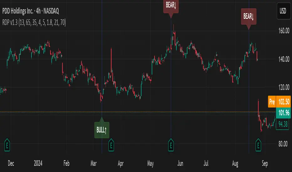
RSI Divergence Pro+ VolumeRSI Divergence Pro+ Volume
What It Does:
RSI Divergence Pro+ Volume is a non-repainting indicator that helps traders spot potential bullish and bearish reversal zones using a classic technical analysis concept—RSI divergence—combined with advanced volume confirmation. The script highlights moments when price and RSI disagree, filtering for signals only when there is a significant volume spike, which helps reduce false positives in quiet or illiquid markets.
How It Works:
Bullish Divergence: Triggered when price makes a lower low but RSI forms a higher low, suggesting possible exhaustion in selling pressure.
Bearish Divergence: Triggered when price makes a higher high but RSI forms a lower high, signaling potential buying exhaustion.
Volume Confirmation: Signals only appear when trading volume exceeds a dynamic threshold (based on a user-defined moving average and multiplier), making alerts more reliable.
Visual Features: Customizable labels and optional gradient highlights mark the exact bars where divergence with volume confirmation occurs, making signals easy to see.
Alert System: Built-in alerts for both bullish and bearish divergences so traders can receive instant notifications.
How to Use:
Apply the script to any timeframe or liquid asset (15m–4H recommended for best results).
Watch for green “BULL↑” labels below bars (bullish divergence) and red “BEAR↓” labels above bars (bearish divergence).
Blue/violet background highlights confirm volume-verified signals.
Combine with your own risk management and confirmation tools for trade entries/exits.
Adjust lookback and volume settings to match your asset and style.
Originality & Usefulness:
This indicator stands out by combining traditional RSI divergence with advanced volume filtering, giving more credible and actionable reversal alerts. All logic is non-repainting and calculated on closed bars only. Settings are fully grouped and customizable, with professional visuals for clarity.
Limitations & Disclaimers:
Not every divergence results in a major reversal—use with other analysis.
More effective in trending or volatile markets; may produce more false signals in choppy/range conditions.
Signals are generated on bar close and do not repaint.
No indicator is a substitute for proper trading discipline and risk management.
SimpleBias ProTransform your trading with professional-grade bias analysis that automatically adapts to your current timeframe. SimpleBias Pro delivers institutional-level market insights through sophisticated algorithmic analysis in a clean, easy-to-read format.
What Makes SimpleBias Pro Special
Unlike traditional indicators that show fixed timeframes, SimpleBias Pro intelligently selects the most relevant higher timeframes based on your current chart. This means you always get contextually appropriate analysis without information overload - whether you're analyzing monthly trends or scalping on 1-minute charts.
How It Works
The indicator analyzes market bias by comparing opening prices across multiple timeframes, giving you a clear picture of whether the market sentiment is bullish, bearish, or neutral at different time horizons. It automatically displays three relevant higher timeframes - for example, if you're on a 15-minute chart, you'll see 4-hour, 1-hour, and 15-minute bias analysis.
Key Features
Smart Timeframe Selection - Automatically chooses relevant higher timeframes based on your current chart (supports everything from 1-minute to monthly charts)
Integrated EMA Analysis - Includes customizable moving average with trend direction detection to confirm bias signals
Professional Risk Management - Built-in position sizing calculator that works with Forex, Crypto, Stocks, Indices, and Commodities
Session Optimization - Time-based filtering focused on high-probability New York trading sessions
Clean Interface - Fully customizable table display with light/dark themes and flexible positioning
Best Use Cases
Multi-Timeframe Confirmation - Perfect for traders who need to align bias across different timeframes before entering trades
Precision Entry Timing - Ideal for scalpers and day traders on lower timeframes (15M and below) who want systematic entry signals
Risk-Managed Trading - Helps maintain consistent position sizing across different instruments and market conditions
Session-Based Trading - Optimized for traders who focus on specific market sessions, particularly New York hours
How to Get the Best Results
Start by checking the higher timeframe bias before making any trading decisions. Use the built-in risk calculator to determine proper position sizes based on your account balance and risk tolerance. Focus your trading during the highlighted session times for better probability outcomes.
The indicator works best when combined with other forms of technical analysis like support/resistance levels, volume analysis, or momentum indicators. It's designed to eliminate guesswork and provide a systematic framework for consistent market analysis.
Trading Logic for Lower Timeframes
On timeframes 15 minutes and below, SimpleBias Pro generates clear buy/sell signals when multiple conditions align - bias confirmation across timeframes, EMA direction agreement, and optimal session timing. The system limits signals to prevent overtrading while maintaining high-probability setups.
Professional Interface
All information is presented in a clean, organized table that integrates seamlessly with your chart. The interface adapts to different screen sizes and trading setups while maintaining readability and professional appearance.
Ready to eliminate emotional bias and trade systematically? SimpleBias Pro provides the systematic framework professional traders use for consistent multi-timeframe analysis and proper risk management.
Disclaimer: Trading involves substantial risk of loss. This indicator is designed for educational and informational purposes to assist in market analysis. Always implement proper risk management and consider seeking independent financial advice before making trading decisions.

Volatility-Adjusted Momentum Score (VAMS) [QuantAlgo]🟢 Overview
The Volatility-Adjusted Momentum Score (VAMS) measures price momentum relative to current volatility conditions, creating a normalized indicator that identifies significant directional moves while filtering out market noise. It divides annualized momentum by annualized volatility to produce scores that remain comparable across different market environments and asset classes.
The indicator displays a smoothed VAMS Z-Score line with adaptive standard deviation bands and an information table showing real-time metrics. This dual-purpose design enables traders and investors to identify strong trend continuation signals when momentum persistently exceeds normal levels, while also spotting potential mean reversion opportunities when readings reach statistical extremes.
🟢 How It Works
The indicator calculates annualized momentum using a simple moving average of logarithmic returns over a specified period, then measures annualized volatility through the standard deviation of those same returns over a longer timeframe. The raw VAMS score divides momentum by volatility, creating a risk-adjusted measure where high volatility reduces scores and low volatility amplifies them.
This raw VAMS value undergoes Z-Score normalization using rolling statistical parameters, converting absolute readings into standardized deviations that show how current conditions compare to recent history. The normalized Z-Score receives exponential moving average smoothing to create the final VAMS line, reducing false signals while preserving sensitivity to meaningful momentum changes.
The visualization includes dynamically calculated standard deviation bands that adjust to recent VAMS behavior, creating statistical reference zones. The information table provides real-time numerical values for VAMS Z-Score, underlying momentum percentages, and current volatility readings with trend indicators.
🟢 How to Use
1. VAMS Z-Score Bands and Signal Interpretation
Above Mean Line: Momentum exceeds historical averages adjusted for volatility, indicating bullish conditions suitable for trend following
Below Mean Line: Momentum falls below statistical norms, suggesting bearish conditions or downward pressure
Mean Line Crossovers: Primary transition signals between bullish and bearish momentum regimes
1 Standard Deviation Breaks: Strong momentum conditions indicating statistically significant directional moves worth following
2 Standard Deviation Extremes: Rare momentum readings that often signal either powerful breakouts or exhaustion points
2. Information Table and Market Context
Z-Score Values: Current VAMS reading displayed in standard deviations (σ), showing how far momentum deviates from its statistical norm
Momentum Percentage: Underlying annualized momentum displayed as percentage return, quantifying the directional strength
Volatility Context: Current annualized volatility levels help interpret whether VAMS readings occur in high or low volatility environments
Trend Indicators: Directional arrows and change values provide immediate feedback on momentum shifts and market transitions
3. Strategy Applications and Alert System
Trend Following: Use sustained readings beyond the mean line and 1σ band penetrations for directional trades, especially when VAMS maintains position in upper or lower statistical zones
Mean Reversion: Focus on 2σ extreme readings for contrarian opportunities, particularly effective in sideways markets where momentum tends to revert to statistical norms
Alert Notifications: Built-in alerts for mean crossovers (regime changes), 1σ breaks (strong signals), and 2σ touches (extreme conditions) help monitor multiple instruments for both continuation and reversal setups

FIVEX Kombine Trend AnalizörüFIVEX doesn’t look at the market through the lens of just one indicator — it combines the insights of six powerful tools working together in harmony. This system brings together RSI, EMA, Bollinger Bands, OBV, MACD, and Fibonacci-based Pivot levels to deliver highly accurate signals for both trend direction and momentum.
Each indicator evaluates the chart based on its own logic and produces a decision: LONG, SHORT, or NEUTRAL. FIVEX collects these individual insights and only generates a trading signal when at least three indicators agree on the same direction. This significantly reduces false signals caused by random price movements.
At a glance, the table in the top right corner of your chart shows exactly what each indicator is thinking in real-time. Background color changes only occur when the signal is strong and stable — this keeps your screen clean and your decisions clear. If a signal appears, you'll immediately understand why.
Thanks to dynamic parameter adjustments based on timeframes, FIVEX behaves more aggressively on 15-minute charts and more refined on daily charts. It’s compatible with every trading style — from scalping to swing trading.
FIVEX isn’t just an indicator; it’s a consensus engine.
It questions, waits for confirmation, and shows only what’s truly strong.
It doesn’t shout the final word — it delivers the collective judgment of market logic.

Average price trend (Magistr)The indicator is a combined market analysis tool, which allows you to identify key support and resistance levels. The trend line is built on the basis of price behavior for a certain period and serves as a visual reference point of the market movement direction. The average buy price by players shows the level at which small market participants make their purchases, which allows to understand their probable entry and exit zones.

Reversal Levels (Magistr)The REVERSAL LEVELS indicator is designed to detect major reversals and track dynamic support/resistance zones.
This indicator analyzes price fluctuations using reversal highs/minima and a smoothed baseline trendline. It highlights key reversal levels and keeps them active until they are broken, providing a clear visual basis for price structure and trend alignment. The reversals are calculated in real time using lag-free logic, making it very responsive to market conditions.

QQE Momentum Trend FilterRecommended for use in 1 hour time frame
Recommended for use in long/short arrangements

ORB Strategy Professional FinalORB (Opening Range Breakout) Strategy Guide – Updated Outline
Overview
I asked this script to be programmed based on my parameters and strategy. Feel free to utilize it.
A structured approach to trading the Opening Range Breakout (ORB) strategy, emphasizing:
Confirmation-based entries
Time-based high-probability setups
Contextual filters for directional bias
Robust risk management and scaling protocols
ORB Entry Criteria
A. Identify the Opening Range (ORB)
Define the ORB using the session’s initial breakout (up or down).
B. Confirm the Breakout Direction
Wait for a 5-minute candle close in the direction of the breakout.
Alternatively, use candlestick confirmation, such as the 3-bar play.
C. Optional Entry Confirmations
Magic 8 Ball Algo – Adds confidence to directional entries.
Gamma Levels – Identify potential support/resistance zones.
Context Filter: 200 SMA (5-Minute Chart)
Use the 200-period Simple Moving Average (SMA) to validate trade direction:
Price above 200 SMA → Favor long trades.
Price below 200 SMA → Favor short trades.
If signal suggests short, but price is above the 200 SMA, wait for a third confirmation candle before entry.
I had the please of working with SpeedEdge_Securities who kind enogh to program it feel free to contact them.
api.whatsapp.com

Aqua MTF Stochastic Oscillator——————————————————————————————————————————————————————————
The Aqua Multi-Timeframe (MTF) Stochastic Oscillator is a comprehensive momentum analysis tool that synthesizes
stochastic data from up to five distinct, user-configurable sources and timeframes into a single, unified view.
--- CORE CONCEPT ---
Traditional oscillators provide insight into one specific timeframe. This indicator overcomes that limitation by
aggregating momentum readings from multiple timeframes. The core principle is to gauge the confluence of momentum
across different market cycles. A strong trend is often characterized by aligned momentum across short-term,
medium-term, and long-term perspectives. This tool visualizes that alignment in a clear, intuitive oscillator.
--- METHODOLOGY ---
For each of the five analysis slots, the script calculates the Stochastic %K line and its corresponding %D signal line.
To allow for direct comparison and weighting, each of these standard 0-100 oscillator values is then normalized
to a bipolar scale of -100 to +100, where 0 represents the neutral midline.
These normalized scores are then blended, according to user-defined weights, into two master composite lines:
1. A master "Score Line" representing the weighted average of the raw %K momentum values.
2. A master "Signal Line" representing the weighted average of the smoothed %D signal values.
--- KEY FEATURES ---
• Multi-Timeframe & Multi-Symbol Analysis: Configure up to five slots, each with its own symbol, timeframe, price source, and stochastic settings.
• Normalized Momentum Scale: All stochastic values are re-scaled to a -100 to +100 range, providing a standardized measure of momentum. Values above 0 indicate bullish momentum, while values below 0 indicate bearish momentum.
• Weighted Composite Score: User-defined weights allow for prioritizing certain timeframes, creating a custom-tailored final momentum reading.
• Dynamic Color-Coding: The color of the master Score Line and each individual timeframe's line instantly changes based on its position relative to its signal line (%K vs. %D). This provides immediate visual feedback on momentum acceleration (bullish) or deceleration (bearish).
--- HOW TO INTERPRET ---
• Crossovers: The interaction between the master Score Line and the Signal Line can be used to identify potential shifts in momentum, similar to a traditional MACD.
• Line Color: The color of the master Score Line itself serves as a primary signal. A bullish color indicates that overall raw momentum is leading smoothed momentum, and vice-versa.
• Overbought/Oversold Levels: Extreme readings near the +100 or -100 levels suggest that the aggregated momentum may be overextended and due for a reversion.
• Zero Line Crosses: When the oscillator crosses above the zero line, it signals that the balance of momentum has shifted to positive territory. A cross below zero signals a shift to negative territory.
• Divergence: Look for divergences where price makes a new high or low, but the oscillator fails to confirm it. This can often signal a pending reversal.
Author: Aquaritek
——————————————————————————————————————————————————————————

Hội Đồng Hành - Trader NghèoThe indicator was originally programmed based on algorithmic logic for ** Super Resistance Support **, but it has now been upgraded with an additional auxiliary indicator to support more entry points.
Please ** trade according to the instructions in the video I provided **, as that is the most effective trading method.

MML Multi-Timeframe Overlapin testing working for multi time frame this will be based off MMLs and updates to tradingview for integration.

ORB + Fib ZoneAllows user to adjust range of ORB. The box in the middle is the Fibonacci range between 38.2% and 61.8% designed for pullbacks into the ORB as confirmation before entry.

ACE FVG & IFVG Trading System1. What the Script Does
The "ACE FVG & IFVG Trading System " is a TradingView Pine Script (version 5) that identifies and trades Fair Value Gaps (FVGs) and Inverse Fair Value Gaps (IFVGs). It offers:
Detection of bullish/bearish FVGs and IFVGs with customizable parameters.
Multiple entry types: regular FVG retracement, Break of Structure (BOS), breakaway gaps, and Immediate/Retrace IFVG entries.
A pending setup system showing potential trades before they trigger.
Risk management with configurable stop loss (SL) and take profit (TP) based on FVG levels, swing points, or risk-reward ratios.
Market structure analysis using swing highs/lows, BOS, and Market Structure Shifts (MSS).
Time filters to restrict trading to specific sessions.
Visualizations including FVG boxes, trade boxes, pivot lines, and labels.
Entry and performance tables displaying trade details and metrics like win rates and P&L by entry type.
2. How It Works
The script is organized into modular sections for efficient execution:
Inputs: Extensive customization options (e.g., FVG size, entry types, SL/TP modes, time filters) grouped for clarity.
Data Structures: Custom types (FVGData, SwingPoint, EntryData) store FVG, pivot, and trade data in arrays.
Utility Functions: Handle calculations like risk-reward ratios, time validation, and trade size filtering.
Swing Point Detection: Uses ta.pivothigh/ta.pivotlow to identify pivots, supporting BOS/MSS and SL/TP calculations.
FVG Detection: Identifies regular FVGs (low > high or high < low ) and IFVGs (mitigated FVGs with immediate or retrace signals).
Entry Logic: Triggers trades based on user-enabled conditions (e.g., retracement, BOS, breakaway gaps) with dynamic SL/TP.
Trade Management: Tracks active/pending trades, updates visualizations (boxes, lines, labels), and handles cancellations/invalidations.
Main Logic: Executes on each bar to detect FVGs, process entries, update trades, and manage visualizations.
Tables: Displays recent trades and performance stats (e.g., win rates by entry type) on the last bar.
Pivot Visualization: Plots swing points with dynamic extensions and mitigation status (solid/dotted lines).
3. How to Use It
Add to TradingView:
Open Pine Editor, paste the script, save it, and add to chart.
Configure Inputs:
Access settings via chart (right-click indicator > Settings).
Adjust:
fvgMinSize for market volatility (e.g., 5 for forex).
Entry types (e.g., enable IFVG, disable breakaway gaps).
SL/TP modes and minimum R:R (e.g., 2.0 for 1:2).
Time filters for active sessions (e.g., 09:30-16:00).
Visual settings (box transparency, table positions).
Interpret Output:
FVG Boxes: Green (bullish), red (bearish), purple (IFVG/mitigated).
Trade Boxes: Gray-green/red-gray (pending), green/red (active), updated for win/loss.
Pivot Lines: Solid (unmitigated), dotted (mitigated).
Tables: Entry table shows trade details; performance table shows win rates/P&L.
Trading:
Monitor pending setups for entry signals.
Enter manually at active trade levels, following SL/TP.
Use performance stats to refine settings.
Test on demo charts and adjust for market/timeframe.
Best Practices:
Use higher timeframes (e.g., 1H, 4H) for less noise.
Combine with other analysis (e.g., support/resistance).
Backtest using TradingView’s replay feature.
Originality
The script is original due to its unique combination of features:
Enhanced IFVG Strategy: Dual Immediate/Retrace IFVG modes with a novel “Immediate Then Retrace” preference.
Pending Setup System: Proactive visualization of potential trades with auto-cancellation.
Granular Performance Tracking: Detailed breakdown of win rates/P&L by entry type (regular FVG, IFVG, breakaway).
Dynamic Pivot Visualization: Real-time mitigation updates (solid to dotted lines).
Modular Design: Custom types and organized logic for extensibility. It builds on general FVG concepts (e.g., from ICT) but implements unique logic and features not found in standard
TradingView FVG scripts, distinguishing it from both open-source and premium indicators.
Credit of Concepts to ICT
Collaborations with JMAC and Timeless

Heikin RiderHeikin Rider
Smoothed Heikin Ashi Breakout Signals with Flow Confirmation
by Ben Deharde, 2025
Overview:
Heikin Rider is a trend-following indicator that detects clean breakout signals using a custom smoothed Heikin Ashi wave (the H-Wave) with optional confirmation from a flow-based filter. It's designed for traders who want precise, momentum-aligned entries.
What It Does:
Plots dynamic high/low bands from smoothed Heikin Ashi candles.
Triggers Buy/Sell signals on full candle breakouts above/below the wave.
Colors bars based on price position and momentum relative to a custom flow line.
Optionally filters signals based on flow direction.
How the H-Wave Works:
The H-Wave is a two-stage smoothed Heikin Ashi construction:
Pre-smoothing: Price is smoothed using a short-length MA (SMA, EMA, or HMA).
HA Calculation: Heikin Ashi values are calculated from the smoothed data.
Post-smoothing: A second, longer MA is applied to the HA values.
Wave Envelope: The high and low wicks of the final smoothed HA candles form the H-Wave envelope.
Signals are generated when price fully breaks this envelope, with optional confirmation from the flow color.
Inputs:
Trend timeframe
Pre/Post smoothing type and length
Flow MA type and length
Toggle for bar coloring and signal filtering
Notes:
Built with original logic, using the open-source TAExt library (credited).
No repainting — all signals are confirmed at close.
For use on standard candles only (not HA or Renko).
Alerts:
Long Signal (Buy)
Short Signal (Sell)

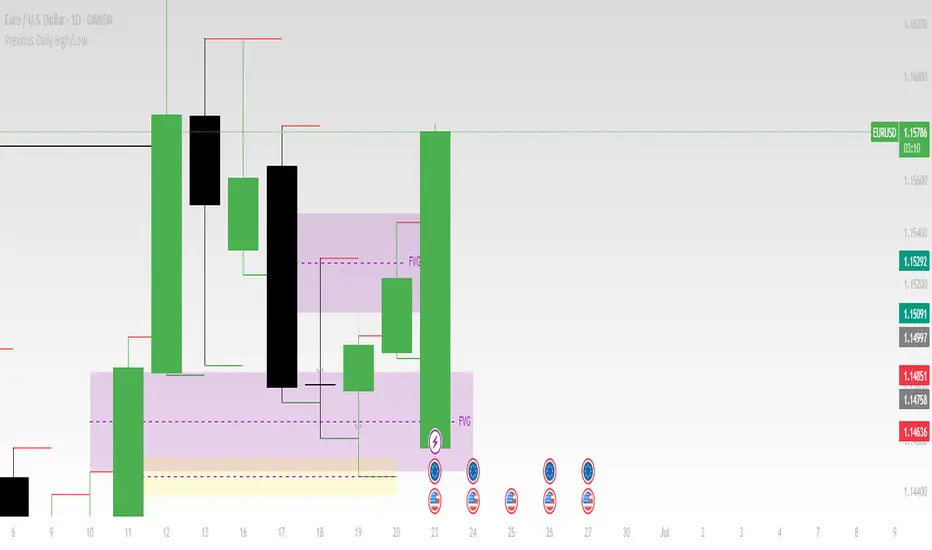
Previous Daily High/LowThe previous day’s high and low are critical price levels that traders use to identify potential support, resistance, and intraday trading opportunities. These levels represent the highest and lowest prices reached during the prior trading session and often act as reference points for future price action.
Why Are Previous Daily High/Low Important?
Support & Resistance Zones
The previous day’s low often acts as support (buyers defend this level).
The previous day’s high often acts as resistance (sellers defend this level).
Breakout Trading
A move above the previous high suggests bullish momentum.
A move below the previous low suggests bearish momentum.
Mean Reversion Trading
Traders fade moves toward these levels, expecting reversals.
Example: Buying near the previous low in an uptrend.
Institutional Order Flow
Market makers and algos often reference these levels for liquidity.
How to Use Previous Daily High/Low in Trading
1. Breakout Strategy
Long Entry: Price breaks & closes above previous high → bullish continuation.
Short Entry: Price breaks & closes below previous low → bearish continuation.
2. Reversal Strategy
Long at Previous Low: If price pulls back to the prior day’s low in an uptrend.
Short at Previous High: If price rallies to the prior day’s high in a downtrend.
3. Range-Bound Markets
Buy near previous low, sell near previous high if price oscillates between them.
Example Trade Setup
Scenario: Price opens near the previous day’s high.
Bullish Case: A breakout above it targets next resistance.
Bearish Case: Rejection at the high signals a pullback.
Market Regime Detector (1D RSI/ATR/MA) - Weekly ConsensusMarket Regime Detector (1D RSI/ATR/MA) — Weekly Consensus
© Łukasz Wędel
🎯 Purpose
This indicator analyzes daily (1D) price data to determine the current market regime — Bullish , Bearish , or Choppy — and displays it on an intraday chart (e.g., 1H).
It acts as a higher‑timeframe trend filter, making trend‑following or range‑trading strategies more robust.
⚡️ How It Works
RSI + ATR Method: Bullish if RSI > Bull Threshold and ATR > Threshold; Bearish if RSI < Bear Threshold and ATR > Threshold; Choppy if RSI is between thresholds and ATR <= Threshold
Moving Averages Method: Bullish if Short‑term MA > Long‑term MA, Bearish if Short‑term MA < Long‑term MA, Choppy if MAs are neutral
Final Regime Decision: Final regime is confirmed if the same state occurs in 5 out of the last 7 daily bars
🕓 Timeframe Compatibility
Works best when applied to a 1H chart (or any intraday timeframe). RSI, ATR, and MA calculations are sourced from the 1D timeframe .
🎨 Visual Output
Green background: Final regime is Bullish
Red background: Final regime is Bearish
Yellow background: Final regime is Choppy
🚨 Alerts
Three alert conditions available:
Final Bull Regime
Final Bear Regime
Final Chop Regime
✅ Why Use This?
Provides a higher‑level trend context for lower‑timeframe trading
Reduces noise by focusing only on confirmed trend regimes
Supports trend‑following and range‑trading strategies
🔥 Ideal For
Swing traders relying on trend and volatility confirmation
Day traders seeking trend context from higher timeframes
Algorithmic strategies that benefit from higher‑level trend filtering

Liquidity Sweeps [SB1]### 🧠 **Liquidity Sweeps \ – Enhanced by SamB817**
> ⚠️ **Original Credit:** This script is built on the excellent foundation by **LuxAlgo**, licensed under (creativecommons.org). All core functionality and visual logic originates from LuxAlgo’s open-source framework. This version adds enhanced functionality tailored for precision intraday and swing entries using sweep behavior.
🔹 Overview
The Liquidity Sweeps indicator is designed to help traders spot bullish and bearish liquidity grabs, a key concept in smart money trading. It automatically detects swing highs and lows, identifies stop hunts, and highlights areas where institutional traders might be sweeping liquidity before price reverses.
🔹 How It Works
Detects liquidity sweeps by tracking swing points based on a user-defined lookback period.
Differentiates between:
✅ Wick-based liquidity grabs (stop hunts).
✅ Breakouts & retests (confirming liquidity sweeps).
✅ Both combined for deeper analysis.
Draws liquidity zones with extendable boxes to visualize areas where liquidity was taken.
Provides alerts when a liquidity sweep occurs. ---
---
### 📈 **WHAT THIS INDICATOR DOES**
This tool identifies **liquidity sweeps**—key moments where price **wicks above/below swing highs/lows**, often triggering stop losses or absorbing institutional orders. These zones frequently precede powerful reversals or continuations.
It draws:
* 🔹 **Dotted lines** at the top or bottom of the candle wicks when a sweep is confirmed.
* 🔹 **Shaded sweep zones** (boxes) which extend until price decisively trades through them.
* 🔹 **Breakout confirmation lines** when price reclaims or mitigates a swept level.
---
### 🔧 **FEATURES & ENHANCEMENTS BY SAM**
* ✅ **Dotted Lines Extension**: Liquidity sweep dotted lines now **automatically extend** until they’re traded through, allowing for reliable reference levels even dozens of bars later.
* ✅ **Thickness Upgrade**: Dotted lines now appear **thicker** for better visibility during fast market conditions.
* ✅ **Visual Cleanup**: Auto-deletion of outdated sweeps (older than 2000 bars or already mitigated).
* ✅ **Optimized Wicks-Only Mode**: Improved behavior when in *Only Wicks* mode, ideal for tracking stop hunts without false triggers.
---
### 🚨 **ALERTS INCLUDED**
1. 🔔 **New Bullish Sweep (Wick)**
2. 🔔 **New Bearish Sweep (Wick)**
These alerts let you react **in real-time** when liquidity has been swept and price is beginning to show directional intent.
---
### 📚 **HOW TO USE IT EFFECTIVELY**
1. **Timeframes**:
* Use on **2H / 4H** for swing setups.
* Use on **1min–15min** for scalping or day trading around NY/LO open.
2. **Entry Logic**:
* Wait for the **dotted line to form after a sweep**.
* **Do not enter immediately.** Wait for: Close of candle!!!!
* A clean **break of the sweep line**, OR
* A **retest of the line within 3–45 bars**, followed by rejection.
3. **Best When Combined With**:
* Fair Value Gaps (FVGs)
* Market Structure Shift (MSS)
* Order Flow Clusters
* Anchored VWAP and Volume Profile
---
### 💡 **TIPS & STRATEGIC INSIGHTS**
* **Sweeps on higher timeframes** (like 2H/4H) are more powerful and often mark **institutional reversals**.
* **Double lines** (dotted lines on both wick ends) = high-volatility trap. Wait for a clean break before entry.
* Use the **sweep box + dotted line** as a **zone**, not a pinpoint level.
* Be patient. Sweeps are **traps first**, **opportunities second**.
---
### 🔓 Attribution
Script forked and expanded from the open-source **LuxAlgo Liquidity Sweeps**. Original License: (creativecommons.org).
Enhancements by **SamB817**.
--- 🧠 1. It Tracks Sweep Behavior — Not Just Breakouts
Purpose: It identifies where liquidity has been taken — stops hit — not where price is "breaking out" in the traditional sense.
The dotted lines show wick-based stop hunts (liquidity raids).
The boxes show sweep zones, including body-to-wick range when applicable.
🟢 Use case: Smart money is taking stops here → expect reaction, not chase the move.
🕓 2. Timeframe Matters — Sweeps on Higher TF = More Impact
15m & 1h: Intraday trap sweeps, good for scalps or fast directional shifts.
2h/4h: Institutional-level sweeps. Often lead to major intraday reversals or the start of a new leg.
Daily/Weekly: Macro-level stops taken → these are often trend changers.
🔑 Rule of thumb: The higher the timeframe the sweep occurs on, the more meaningful the response tends to be.
🎯 3. Entry Logic: Always Wait for Price to Show Direction
After a sweep appears:
Wait for price to break above/below the dotted line or box, depending on the direction.
Don’t enter blindly on the sweep — it's a trap until proven otherwise.
✅ Best entries often occur on retests of the sweep line or area, especially 3–45 bars later (as you’ve already implemented).
🧲 4. Sweeps Often Magnetize Price
Liquidity sweeps act like magnets — if a sweep hasn't been hit yet, price may drift toward it to "collect" those orders.
Use this to anticipate potential targets and reversal zones.
🧪 5. Sweeps Work Best With These Confirmations:
🔹 FVG (Fair Value Gaps) in the same direction immediately after a sweep.
🔹 Market Structure Shift (MSS) right after a sweep = high-probability reversal.
🔹 Order Flow Confirmation: Strong buy/sell imbalances, absorption at sweep level.
🔹 Liquidity voids: If price sweeps and then enters an inefficient zone — fast move likely.
📊 6. Combines Best With These Tools:
Tool Why It Works Well With Sweeps
1.🎯🎯🧠 🧠 Order Flow (AlgoAlpha)Confirm absorption or intent at sweep zone🎯🎯🧠🧠 2.✅ Volume Profile - See if the sweep occurred at a low-volume node (ideal)
3.✅ VWAP or Anchored VWAP - Catch reclaims or rejections off institutional zones
4.✅ Session Highs/Lows Sweeps of session extremes are often the trap setups
🧩 7. Psychology Behind the Sweeps
Sweeps represent stop runs, trap moves, or liquidity grabs by larger players.
The goal is to trigger weak hands before moving in the true direction.
Train yourself to:
Expect the opposite of the sweep direction once structure confirms.
Think like the liquidity provider, not the victim.

TS Multi-Indicator Trend Detector📌 TS Multi-Indicator Trend Detector
This indicator is built for traders who want trend confirmation from multiple technical signals before making a move. It combines 5 powerful trend indicators—EMA, RSI, MACD, ADX, and DMI—into a single score system.
🔍 How It Works
If at least 3 of the 5 indicators confirm a trend, the script plots a floating trend line above the price:
• Yellow Line = Bullish Trend Detected
• Blue Line = Bearish Trend Detected
This makes it easier to visually identify trend bias and filter noise from the market.
🧠 Why It’s Useful
• Helps avoid false signals by requiring confirmation from multiple sources
• Works on any timeframe and instrument
• No repainting
• Fully customizable input values
• Designed for traders who prefer confirmation-based strategies
⸻
✅ Step 3: Screenshots for Publishing
Take 2–3 screenshots on different chart types and timeframes, for example:
1. 1-hour chart on NASDAQ
2. Daily chart on EUR/USD
3. 15-min chart on BTC/USD
Make sure both yellow (bullish) and blue (bearish) lines are shown if possible.

DisplacementAndPinBar [TFO]# DisplacementAndPinBar v1.5 - Advanced Market Structure Indicator
## Overview
DisplacementAndPinBar v1.5 is a sophisticated technical indicator that combines displacement detection with advanced pin bar analysis to identify high-probability trading opportunities. Unlike traditional pin bar indicators that create chart clutter with insignificant signals, this indicator uses mathematical filtering to show only meaningful market structure patterns.
## Key Features
### 🎯 **True Pin Bar Detection**
- **Level Rejection Logic**: Pin bars must break recent highs/lows (adjustable lookback period)
- **Statistical Significance**: Uses standard deviation to filter candle size
- **Smart Classification**: Distinguishes between true pin bars and momentum impulse candles
- **Visual Clarity**: Green/red circles with "PIN" text for easy identification
### 📈 **Displacement Detection**
- **Momentum Identification**: Detects large body candles showing strong directional movement
- **Open-to-Close Analysis**: Measures true momentum (not just volatility)
- **Objective Filtering**: Uses standard deviation over customizable lookback period
- **Market Structure**: Identifies significant shifts in buying/selling pressure
### ⚡ **Advanced Signal Types**
#### 1. Pin Bar Signals
- **Bullish Pin Bars**: Long lower wicks rejecting at key support levels
- **Bearish Pin Bars**: Long upper wicks rejecting at key resistance levels
- **Requirements**: Must break recent 20-candle highs/lows + meet wick-to-body ratios
#### 2. Confirmation Signals
- **Follow-Through Detection**: Validates pin bar signals with directional movement
- **Smart Filtering**: Requires proper body size and minimal opposing wicks
- **Visual**: Large yellow/pink triangles (semi-transparent)
#### 3. Displacement Momentum Signals
- **Continuation Pattern**: Two displacement candles in same direction within timeframe
- **No Opposing Signal**: Ensures clean momentum without conflicting moves
- **Trade Signal**: Huge yellow/pink triangles indicating strong momentum building
#### 4. Impulse & Indecision Detection
- **Impulse Candles**: Large wicks without level rejection (gray triangles)
- **Indecision Patterns**: Range-bound rejection patterns (gray diamonds)
- **Context Awareness**: Helps understand market state and volatility
## Technical Specifications
### Mathematical Foundation
- **Standard Deviation Filtering**: Eliminates noise by requiring statistical significance
- **Historical Comparison**: Manual loop calculations for reliable level detection
- **Independent Criteria**: Pin bars use High-to-Low, Displacement uses Open-to-Close
- **Multi-Timeframe Logic**: Optimized for 5-minute charts but works on all timeframes
### Default Settings (Optimized for 5-minute)
- **Displacement Length**: 40 periods
- **Displacement Strength**: 4.0x standard deviation
- **Pin Bar Lookback**: 20 periods
- **Pin Bar Body-to-Wick Ratio**: 4.0
- **Displacement Signal Lookback**: 6 periods
- **FVG Requirement**: OFF (recommended for optimal signals)
## Visual Hierarchy
### Signal Priority (Most to Least Important)
1. **🔴🟢 PIN Circles**: True pin bars at key levels (highest probability reversals)
2. **🔺 Huge Triangles**: Displacement momentum signals (strong continuation)
3. **🔺 Large Triangles**: Pin bar confirmations (validation signals)
4. **🔺 Small Triangles**: Impulse patterns (momentum without level interaction)
5. **💎 Diamonds**: Indecision at range extremes
6. **🟡🟣 Colored Candles**: Base displacement detection
### Visual Enhancements
- **Semi-Transparent Triangles**: Prevents hiding pin bar signals when zoomed out
- **Black Text on Circles**: Enhanced readability
- **Size Differentiation**: Clear hierarchy through symbol sizing
- **Color Coding**: Intuitive green/red for direction, blue for momentum
## Trading Applications
### Reversal Trading
- **Pin Bar Entries**: High-probability reversals at key support/resistance
- **Confirmation Required**: Wait for follow-through triangle for validation
- **Stop Placement**: Just beyond pin bar wick for optimal risk/reward
### Momentum Trading
- **Displacement Signals**: Trade continuation when two displacement candles align
- **Trend Following**: Excellent for catching momentum shifts and breakouts
- **Multiple Timeframes**: Combine with higher timeframe bias for best results
### Market Context
- **Impulse Analysis**: Understand when market is in momentum vs. consolidation
- **Indecision Patterns**: Identify range-bound conditions and potential breakouts
- **Volume Confirmation**: Displacement often coincides with volume spikes
## Alert System
Comprehensive alert functionality for all major signals:
- Bullish/Bearish Pin Bar detection
- Pin Bar confirmation signals
- Displacement momentum signals
- Customizable alert messages with context
## Settings Organization
### 🎯 Trading Signals (Priority Settings)
- Displacement trade signal toggle and lookback period
- Pin bar and confirmation detection toggles
### 📊 Core Settings Groups
- **Displacement Settings**: Length, strength, FVG requirements
- **Pin Bar Settings**: Lookback periods, ratios, thresholds
- **Visual Settings**: Colors and display preferences
### 💡 Helpful Tooltips
- Detailed explanations for each setting
- Optimization recommendations
- Best practices for different timeframes
## Why This Indicator is Different
### ❌ **What Most Pin Bar Indicators Do Wrong**
- Show every candle with long wicks (creates noise)
- No context about market structure or significance
- Fixed parameters that don't adapt to volatility
- No distinction between rejection and momentum patterns
### ✅ **What DisplacementAndPinBar v1.5 Does Right**
- **Quality Over Quantity**: Only shows statistically significant patterns
- **Market Structure Awareness**: Considers recent highs/lows and volatility
- **Multiple Signal Types**: Comprehensive pattern recognition
- **Visual Clarity**: Clean, organized display with logical hierarchy
- **Professional Features**: Proper alerts, settings organization, documentation
## Best Practices
### Timeframe Recommendations
- **Primary**: 5-minute charts (optimized settings)
- **Secondary**: 15-minute and 1-hour for confirmation
- **Scalping**: 1-minute with adjusted sensitivity
### Market Application
- **Forex**: Excellent during London/NY sessions
- **Crypto**: Particularly effective on Bitcoin and major altcoins
- **Stocks**: Works well on liquid stocks and indices
- **Futures**: Optimal on high-volume contracts
### Risk Management
- **Stop Losses**: Use pin bar wicks and displacement candle extremes
- **Position Sizing**: Reduce size in low-probability setups
- **Confirmation**: Wait for follow-through signals when possible
- **Context**: Consider higher timeframe trends and major support/resistance
## Version History
- **v1.1**: Initial pin bar and displacement integration
- **v1.3**: Added confirmation logic and refined indecision detection
- **v1.5**: Added displacement momentum signals, organized settings, comprehensive alerts
## Credits
Based on original displacement work by tradeforopp, enhanced with advanced pin bar detection and signal classification by AleksandarPesic & Claude (Anthropic).
---
*DisplacementAndPinBar v1.5 represents a new standard in technical analysis, combining mathematical rigor with practical trading applications. Perfect for traders who want quality signals without the noise.*
