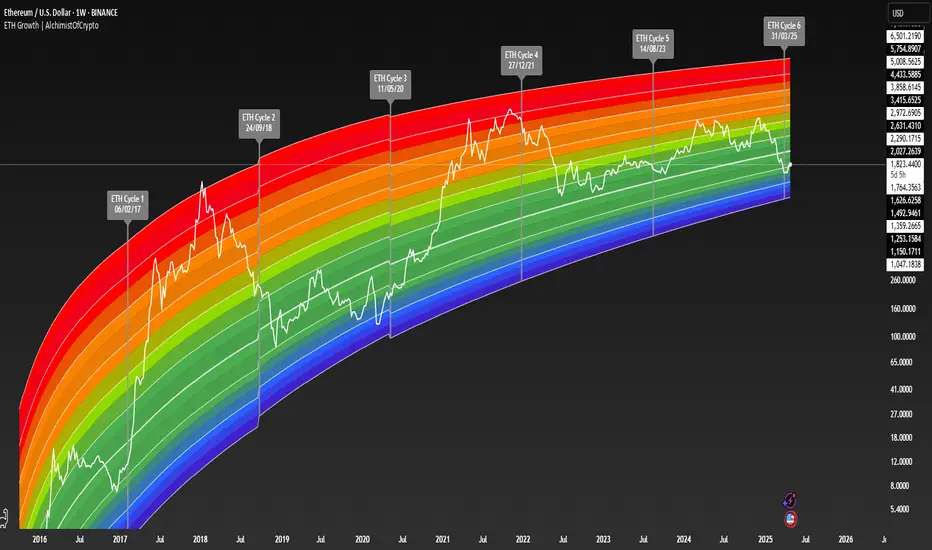
ETH Growth | AlchimistOfCrypto⚠️ DISCLAIMER: This indicator's source code is kept private as it represents a first-of-its-kind innovation in algorithmic cycle detection and visualization for Ethereum. The mathematical models and proprietary algorithms powering this indicator are the result of extensive research and development.
🌈 ETH Growth Rainbow – Unveiling Ethereum's Logarithmic Growth Fields 🌈
"The ETH Growth Rainbow, engineered through advanced logarithmic mathematics, visualizes the probabilistic distribution of Ethereum's price evolution within a multi-cycle growth paradigm. This indicator employs principles from logarithmic regression where coefficients p001, p002, and p003 create mathematical boundaries that define Ethereum's long-term value progression. Our implementation features algorithmically enhanced rainbow visualization derived from Fast Fourier Transform (FFT) spectral analysis, creating a dynamic representation of Ethereum's logarithmic growth with adaptive color gradients that highlight critical cycle-based phase transitions in the asset's monetary evolution."
📊 Professional Trading Application
The ETH Growth Rainbow transcends traditional price prediction models with a sophisticated multi-band illumination system that reveals the underlying structure of Ethereum's monetary evolution. Scientifically calibrated across multiple 85-week cycles (detected through spectral analysis) and featuring seamless rainbow visualization, it enables investors to perceive Ethereum's position within its macro growth trajectory with unprecedented clarity.
- Cycle Detection Methodology 🔬
The 85-week Ethereum cycle was discovered through sophisticated Fast Fourier Transform (FFT) analysis:
- Logarithmic price returns extracted from historical Ethereum data
- FFT decomposition identifies dominant frequency components in price movements
- Signal amplitude analysis reveals the 85-week cycle as the most statistically significant periodicity
- Adaptive frequency filtering validates cycle consistency across multiple market phases
- Cycle duration rounded to nearest week for practical application
- Visual Theming 🎨
Scientifically designed rainbow gradient optimized for cycle pattern recognition:
- Violet-Blue: Lower value accumulation zones with highest mathematical growth potential
- Green: Fair value equilibrium zone representing the regression mean
- Yellow-Orange: Moderate overvaluation regions indicating potential resistance
- Red: Statistical extreme zones indicating mathematical cycle peaks
- Deep Red: New euphoria band (+6) capturing exceptional market extremes
- Cycle Visualization 🔍
- Precise cycle boundaries demarcating Ethereum's fundamental cycle events
- Adaptive band spacing based on mathematical cycle progression (p003 = 0.858)
- Multiple sub-cycle markers revealing the probabilistic nature of Ethereum's trajectory
- Initial cycle starting from 0.1639 (August 3, 2015) to preserve historical accuracy
🚀 How to Use
1. Identify Macro Position ⏰: Locate Ethereum's current price relative to regression bands
2. Understand Cycle Context 🎚️: Note position within the current 85-week cycle for time-based analysis
3. Assess Mathematical Value 🌈: Determine potential over/undervaluation based on band location
4. Adjust Investment Strategy 🔎: Modulate position sizing based on mathematical value assessment
5. Identify Cycle Phases ✅: Monitor band transitions to detect accumulation and distribution zones
6. Invest with Precision 🛡️: Utilize lower bands for strategic accumulation, upper bands for strategic reduction
7. Manage Risk Dynamically 🔐: Scale investment allocations based on mathematical cycle positioning
#ethereum #ETH #cryptocurrency #tradingview #technicalanalysis #logarithmicregression #rainbowchart #cryptotrading #tradingstrategy #priceaction #cryptoinvesting #ethanalysis #tradingbands #cryptoresearch #FFTanalysis #cyclicalanalysis #ethinvestment #ethusd #buyandsell #accumulation #macroindicator #valueanalysis #priceprediction #ethgrowth #cryptosignals #cyclicpatterns #mathematicaltrading #AI #smartmoney #cryptowhales
Trend Analysis
Binary Strategy (with SMI logic)🧠 How to Use:
Chart Timeframe: 5-minute
Setup: Wait for an arrow to appear
Green arrow = BUY a 20-min binary in uptrend with positive momentum
Red arrow = SELL a 20-min binary in downtrend with negative momentum
SMI Logic: Entry only when SMI crosses its signal line in the trend direction and above/below zero
Works for Nadex 20-Minute $&P 500 Binary
If long at 75 get out at 50, or if short at 25 get out at 50. This allow you to be trading at a 1:1 ratio. (Approx.)

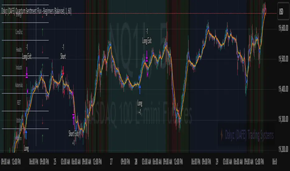
Dskyz (DAFE) Quantum Sentiment Flux - Beginners Dskyz (DAFE) Quantum Sentiment Flux - Beginners:
Welcome to the Dskyz (DAFE) Quantum Sentiment Flux - Beginners , a strategy and concept that’s your ultimate wingman for trading futures like MNQ, NQ, MES, and ES. This gem combines lightning-fast momentum signals, market sentiment smarts, and bulletproof risk management into a system so intuitive, even newbies can trade like pros. With clean DAFE visuals, preset modes for every vibe, and a revamped dashboard that’s basically a market GPS, this strategy makes futures trading feel like a high-octane sci-fi mission.
Built on the Dskyz (DAFE) legacy of Aurora Divergence, the Quantum Sentiment Flux is designed to empower beginners while giving seasoned traders a lean, sentiment-driven edge. It uses fast/slow EMA crossovers for entries, filters trades with VIX, SPX trends, and sector breadth, and keeps your account safe with adaptive stops and cooldowns. Tuned for more action with faster signals and a slick bottom-left dashboard, this updated version is ready to light up your charts and outsmart institutional traps. Let’s dive into why this strat’s a must-have and break down its brilliance.
Why Traders Need This Strategy
Futures markets are a wild ride—fast moves, volatility spikes (like the April 28, 2025 NQ 1k-point drop), and institutional games that can wreck unprepared traders. Beginners often get lost in complex systems or burned by impulsive trades. The Quantum Sentiment Flux is the antidote, offering:
Dead-Simple Setup: Preset modes (Aggressive, Balanced, Conservative) auto-tune signals, risk, and sizing, so you can trade without a quant degree.
Sentiment Superpower: VIX filter, SPX trend, and sector breadth visuals keep you aligned with market health, dodging chop and riding trends.
Ironclad Safety: Tighter ATR-based stops, 2:1 take-profits, and preset cooldowns protect your capital, even in chaotic sessions.
Next-Level Visuals: Green/red entry triangles, vibrant EMAs, a sector breadth background, and a beefed-up dashboard make signals and context pop.
DAFE Swagger: The clean aesthetics, sleek dashboard—ties it to Dskyz’s elite brand, making your charts a work of art.
Traders need this because it’s a plug-and-play system that blends beginner-friendly simplicity with pro-level market awareness. Whether you’re just starting or scalping 5min MNQ, this strat’s your key to trading with confidence and style.
Strategy Components
1. Core Signal Logic (High-Speed Momentum)
The strategy’s engine is a momentum-based system using fast and slow Exponential Moving Averages (EMAs), now tuned for faster, more frequent trades.
How It Works:
Fast/Slow EMAs: Fast EMA (Aggressive: 5, Balanced: 7, Conservative: 9 bars) and slow EMA (12/14/18 bars) track short-term vs. longer-term momentum.
Crossover Signals:
Buy: Fast EMA crosses above slow EMA, and trend_dir = 1 (fast EMA > slow EMA + ATR * strength threshold).
Sell: Fast EMA crosses below slow EMA, and trend_dir = -1 (fast EMA < slow EMA - ATR * strength threshold).
Strength Filter: ma_strength = fast EMA - slow EMA must exceed an ATR-scaled threshold (Aggressive: 0.15, Balanced: 0.18, Conservative: 0.25) for robust signals.
Trend Direction: trend_dir confirms momentum, filtering out weak crossovers in choppy markets.
Evolution:
Faster EMAs (down from 7–10/21–50) catch short-term trends, perfect for active futures markets.
Lower strength thresholds (0.15–0.25 vs. 0.3–0.5) make signals more sensitive, boosting trade frequency without sacrificing quality.
Preset tuning ensures beginners get optimized settings, while pros can tweak via mode selection.
2. Market Sentiment Filters
The strategy leans hard into market sentiment with a VIX filter, SPX trend analysis, and sector breadth visuals, keeping trades aligned with the big picture.
VIX Filter:
Logic: Blocks long entries if VIX > threshold (default: 20, can_long = vix_close < vix_limit). Shorts are always allowed (can_short = true).
Impact: Prevents longs during high-fear markets (e.g., VIX spikes in crashes), while allowing shorts to capitalize on downturns.
SPX Trend Filter:
Logic: Compares S&P 500 (SPX) close to its SMA (Aggressive: 5, Balanced: 8, Conservative: 12 bars). spx_trend = 1 (UP) if close > SMA, -1 (DOWN) if < SMA, 0 (FLAT) if neutral.
Impact: Provides dashboard context, encouraging trades that align with market direction (e.g., longs in UP trend).
Sector Breadth (Visual):
Logic: Tracks 10 sector ETFs (XLK, XLF, XLE, etc.) vs. their SMAs (same lengths as SPX). Each sector scores +1 (bullish), -1 (bearish), or 0 (neutral), summed as breadth (-10 to +10).
Display: Green background if breadth > 4, red if breadth < -4, else neutral. Dashboard shows sector trends (↑/↓/-).
Impact: Faster SMA lengths make breadth more responsive, reflecting sector rotations (e.g., tech surging, energy lagging).
Why It’s Brilliant:
- VIX filter adds pro-level volatility awareness, saving beginners from panic-driven losses.
- SPX and sector breadth give a 360° view of market health, boosting signal confidence (e.g., green BG + buy signal = high-probability trade).
- Shorter SMAs make sentiment visuals react faster, perfect for 5min charts.
3. Risk Management
The risk controls are a fortress, now tighter and more dynamic to support frequent trading while keeping accounts safe.
Preset-Based Risk:
Aggressive: Fast EMAs (5/12), tight stops (1.1x ATR), 1-bar cooldown. High trade frequency, higher risk.
Balanced: EMAs (7/14), 1.2x ATR stops, 1-bar cooldown. Versatile for most traders.
Conservative: EMAs (9/18), 1.3x ATR stops, 2-bar cooldown. Safer, fewer trades.
Impact: Auto-scales risk to match style, making it foolproof for beginners.
Adaptive Stops and Take-Profits:
Logic: Stops = entry ± ATR * atr_mult (1.1–1.3x, down from 1.2–2.0x). Take-profits = entry ± ATR * take_mult (2x stop distance, 2:1 reward/risk). Longs: stop below entry, TP above; shorts: vice versa.
Impact: Tighter stops increase trade turnover while maintaining solid risk/reward, adapting to volatility.
Trade Cooldown:
Logic: Preset-driven (Aggressive/Balanced: 1 bar, Conservative: 2 bars vs. old user-input 2). Ensures bar_index - last_trade_bar >= cooldown.
Impact: Faster cooldowns (especially Aggressive/Balanced) allow more trades, balanced by VIX and strength filters.
Contract Sizing:
Logic: User sets contracts (default: 1, max: 10), no preset cap (unlike old 7/5/3 suggestion).
Impact: Flexible but risks over-leverage; beginners should stick to low contracts.
Built To Be Reliable and Consistent:
- Tighter stops and faster cooldowns make it a high-octane system without blowing up accounts.
- Preset-driven risk removes guesswork, letting newbies trade confidently.
- 2:1 TPs ensure profitable trades outweigh losses, even in volatile sessions like April 27, 2025 ES slippage.
4. Trade Entry and Exit Logic
The entry/exit rules are simple yet razor-sharp, now with VIX filtering and faster signals:
Entry Conditions:
Long Entry: buy_signal (fast EMA crosses above slow EMA, trend_dir = 1), no position (strategy.position_size = 0), cooldown passed (can_trade), and VIX < 20 (can_long). Enters with user-defined contracts.
Short Entry: sell_signal (fast EMA crosses below slow EMA, trend_dir = -1), no position, cooldown passed, can_short (always true).
Logic: Tracks last_entry_bar for visuals, last_trade_bar for cooldowns.
Exit Conditions:
Stop-Loss/Take-Profit: ATR-based stops (1.1–1.3x) and TPs (2x stop distance). Longs exit if price hits stop (below) or TP (above); shorts vice versa.
No Other Exits: Keeps it straightforward, relying on stops/TPs.
5. DAFE Visuals
The visuals are pure DAFE magic, blending clean function with informative metrics utilized by professionals, now enhanced by faster signals and a responsive breadth background:
EMA Plots:
Display: Fast EMA (blue, 2px), slow EMA (orange, 2px), using faster lengths (5–9/12–18).
Purpose: Highlights momentum shifts, with crossovers signaling entries.
Sector Breadth Background:
Display: Green (90% transparent) if breadth > 4, red (90%) if breadth < -4, else neutral.
Purpose: Faster breadth_sma_len (5–12 vs. 10–50) reflects sector shifts in real-time, reinforcing signal strength.
- Visuals are intuitive, turning complex signals into clear buy/sell cues.
- Faster breadth background reacts to market rotations (e.g., tech vs. energy), giving a pro-level edge.
6. Sector Breadth Dashboard
The new bottom-left dashboard is a game-changer, a 3x16 table (black/gray theme) that’s your market command center:
Metrics:
VIX: Current VIX (red if > 20, gray if not).
SPX: Trend as “UP” (green), “DOWN” (red), or “FLAT” (gray).
Trade Longs: “OK” (green) if VIX < 20, “BLOCK” (red) if not.
Sector Breadth: 10 sectors (Tech, Financial, etc.) with trend arrows (↑ green, ↓ red, - gray).
Placeholder Row: Empty for future metrics (e.g., ATR, breadth score).
Purpose: Consolidates regime, volatility, market trend, and sector data, making decisions a breeze.
- VIX and SPX metrics add context, helping beginners avoid bad trades (e.g., no longs if “BLOCK”).
Sector arrows show market health at a glance, like a cheat code for sentiment.
Key Features
Beginner-Ready: Preset modes and clear visuals make futures trading a breeze.
Sentiment-Driven: VIX filter, SPX trend, and sector breadth keep you in sync with the market.
High-Frequency: Faster EMAs, tighter stops, and short cooldowns boost trade volume.
Safe and Smart: Adaptive stops/TPs and cooldowns protect capital while maximizing wins.
Visual Mastery: DAFE’s clean flair, EMAs, dashboard—makes trading fun and clear.
Backtestable: Lean code and fixed qty ensure accurate historical testing.
How to Use
Add to Chart: Load on a 5min MNQ/ES chart in TradingView.
Pick Preset: Aggressive (scalping), Balanced (versatile), or Conservative (safe). Balanced is default.
Set Contracts: Default 1, max 10. Stick low for safety.
Check Dashboard: Bottom-left shows preset, VIX, SPX, and sectors. “OK” + green breadth = strong buy.
Backtest: Run in strategy tester to compare modes.
Live Trade: Connect to Tradovate or similar. Watch for slippage (e.g., April 27, 2025 ES issues).
Replay Test: Try April 28, 2025 NQ drop to see VIX filter and stops in action.
Why It’s Brilliant
The Dskyz (DAFE) Quantum Sentiment Flux - Beginners is a masterpiece of simplicity and power. It takes pro-level tools—momentum, VIX, sector breadth—and wraps them in a system anyone can run. Faster signals and tighter stops make it a trading machine, while the VIX filter and dashboard keep you ahead of market chaos. The DAFE visuals and bottom-left command center turn your chart into a futuristic cockpit, guiding you through every trade. For beginners, it’s a safe entry to futures; for pros, it’s a scalping beast with sentiment smarts. This strat doesn’t just trade—it transforms how you see the market.
Final Notes
This is more than a strategy—it’s your launchpad to mastering futures with Dskyz (DAFE) flair. The Quantum Sentiment Flux blends accessibility, speed, and market savvy to help you outsmart the game. Load it, watch those triangles glow, and let’s make the markets your canvas!
Official Statement from Pine Script Team
(see TradingView help docs and forums):
"This warning may appear when you call functions such as ta.sma inside a request.security in a loop. There is no runtime impact. If you need to loop through a dynamic list of tickers, this cannot be avoided in the present version... Values will still be correct. Ignore this warning in such contexts."
(This publishing will most likely be taken down do to some miscellaneous rule about properly displaying charting symbols, or whatever. Once I've identified what part of the publishing they want to pick on, I'll adjust and repost.)
Use it with discipline. Use it with clarity. Trade smarter.
**I will continue to release incredible strategies and indicators until I turn this into a brand or until someone offers me a contract.
Created by Dskyz, powered by DAFE Trading Systems. Trade fast, trade bold.
WREKS Theory📊 WREKS Theory – Advanced Market Structure & Auto-Fibonacci Indicator
By WREKS Trading Community
📊 WREKS Theory – Advanced Market Structure & Auto-Fibonacci Indicator
By WREKS Trading Community
✅ Overview
The WREKS Theory indicator is a robust, all-in-one technical analysis tool designed to identify trend direction, generate buy/sell signals, and project key Fibonacci levels for precision trading. It merges the logic of Dow Theory (Higher Highs & Higher Lows), SMA filtering, and automated Fibonacci clusters based on ZigZag pivots to highlight optimal price zones for entry, reversal, and take-profit.
🧠 Built-in Logic
Dow Theory Engine: Detects confirmed uptrends and downtrends based on recent pivot highs and lows.
SMA-144 Filter: Confirms signal strength by filtering trades aligned with the dominant trend.
ZigZag-based Auto-Fibonacci: Dynamically maps Fibonacci retracement and extension levels from the most recent swing, with color-coded visual lines and labels.
Signal Dashboard: Displays trend change counts (Uptrends / Downtrends) and real-time status in a clean table on the chart.
Smart Alerts: Triggers when buy/sell signals occur or when price crosses Fibonacci levels.
📌 Key Features
🔺 Buy / Sell Markers: Auto-labeled on the chart using real-time trend shift confirmation.
📈 Fibonacci Cluster Map: Automatically draws up to 22 customizable Fib levels including negative retracements and advanced extensions (0.236 to 4.618+).
🎯 Trend Labels: Clearly marks “Uptrend” and “Downtrend” zones.
💡 Visual Table: Quick reference for signal frequency and trend transitions.
🔔 Alerts: Built-in alerts for trade signals and price interactions with Fib levels.
⚙️ Fully Customizable: Modify SMA, pivot length, depth, deviation multiplier, line extension style, color themes, and more.
📈 Benefits for Traders
✅ Enhanced Trend Confirmation using Dow Theory logic with SMA filtering.
✅ Precision Entry & Exit Zones through auto-drawn Fibonacci retracement and extension levels.
✅ Reduces False Signals by requiring both market structure and trend alignment.
✅ Saves Time with automated drawing and real-time alerts.
✅ Ideal for All Assets & Timeframes: Works seamlessly across Forex, Crypto, Stocks, and Commodities.
💼 Best Use Cases
Intraday & swing trading using market structure.
Identifying major retracement zones for pullback entries.
Recognizing Fibonacci confluence zones to set stop-loss and take-profit levels.
Trend-following strategies validated by SMA and Dow confirmation.
RTB - Momentum Breakout Strategy V3
📈 RTB - Momentum Breakout Strategy V3 is a directional breakout strategy based on momentum. It combines exponential moving averages (EMAs), RSI, and recent support/resistance levels to detect breakout entries with trend confirmation. The system includes dynamic risk management using ATR-based stop-loss and trailing stop levels. Webhook alerts are supported for external automated trading integrations.
🔎 The strategy was backtested using default parameters on BTCUSDT Futures (Bybit) with 4-hour timeframe and a 0.05% commission per trade.
⚠️ This script is for educational purposes only and does not constitute financial advice. Always do your own research before trading.

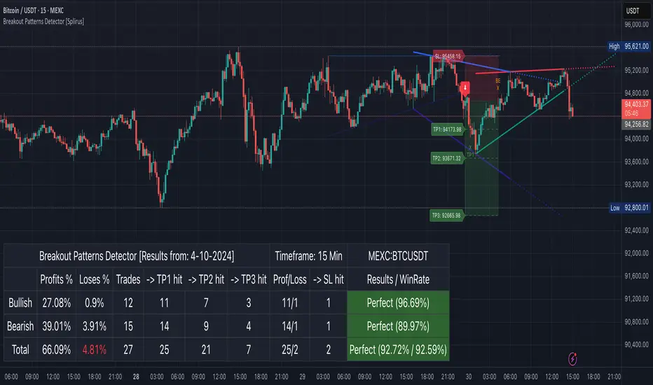
Breakout Patterns Detector: Triangle & Wedge [Splirus]This indicator identifies Breakout Patterns such as Ascending Triangles , Descending Triangles , Symmetric Triangles , Ascending Wedges , and Descending Wedges , using candlestick charts and Trendlines. It provides visual cues, stop-loss (SL), and take-profit (TP) levels, alongside a detailed dashboard to evaluate performance. The indicator supports two alert modes: Manual Mode for trader notifications and Bot Mode for automated trading signals.
To achieve optimal results, users are encouraged to experiment with indicator parameters and analyze the dashboard summary to find the perfect configuration for each timeframe, pair, and market condition.
Pattern Identification
The indicator detects the following breakout patterns based on pivot highs and lows:
Ascending Triangle : Flat upper trendline, rising lower trendline.
Descending Triangle : Flat lower trendline, declining upper trendline.
Symmetric Triangle : Converging trendlines with similar slopes (within a user-defined threshold).
Ascending Wedge : Both trendlines slope upward, converging.
Descending Wedge : Both trendlines slope downward, converging.
Patterns are identified using configurable left and right bars for small and big patterns, with slope thresholds normalized by ATR. A trend confirmation filter ensures breakouts align with market direction, and users can adjust breakout confirmation bars to validate signals.
The goal is to fine-tune these settings to suit specific timeframes and pairs, as each combination may require a unique setup for optimal performance.
Stop-Loss Calculation
Stop-loss levels are calculated dynamically based on pattern type and breakout direction:
Symmetric Triangle : SL is set at the first pivot of the opposite trendline, adjusted by a buffer percentage.
Ascending/Descending Triangle : SL is placed at the breakout trendline’s price, plus the buffer.
Ascending/Descending Wedge : SL is set at the second pivot of the opposite trendline, adjusted by the buffer.
The indicator calculates leverage based on a user-defined risk tolerance percentage. Users should adjust the SL buffer and risk tolerance to balance risk and reward, monitoring the dashboard to assess how these settings impact performance across different timeframes and pairs.
Take-Profit Calculation
Three take-profit levels ( TP1 , TP2 , TP3 ) are calculated using pattern height and user-defined multipliers:
For Ascending/Descending Triangles, height is the difference between the max and min prices within the pattern.
For Symmetric Triangles and Wedges, height is the vertical distance between trendlines at the pattern’s start.
TP levels are set as:
TP1 = Breakout price ± (Height × TP1 Multiplier).
TP2 = Breakout price ± (Height × TP2 Multiplier).
TP3 = Breakout price ± (Height × TP3 Multiplier, with a 1.5x adjustment for Wedges).
Experiment with TP multipliers to optimize the risk-reward ratio, using the dashboard to evaluate TP hit rates and overall profitability for each configuration.
Symmetric Triangle:
Ascending/Descending Wedge:
Ascending/Descending Triangles:
Finding the Perfect Configuration
The indicator’s dashboard provides a comprehensive summary of performance metrics, including total trades, TP1/TP2/TP3 hits, SL hits, profit/loss percentages, and win rates for bullish, bearish, and combined trades. These metrics are crucial for identifying the ideal parameter settings:
Timeframe and Pair Variability : Each timeframe (e.g., 15m, 30min, 1H, 4H, Daily) and pair (e.g., BTC/USD, EUR/USD) behaves differently. Adjust parameters like left/right bars, minimum pattern length, and breakout confirmation bars to match the volatility and trend characteristics of the chosen pair and timeframe.
Parameter Tuning : Modify slope thresholds, trend confirmation filters, and bars inside the pattern to filter out false breakouts. For example, a higher breakout confirmation bar setting may reduce signals but increase reliability on longer timeframes.
Dashboard Analysis : Focus on the dashboard’s win rate, profit/loss ratio, and TP/SL hit frequencies. A “Perfect” win rate (>66%) or high TP hit rate indicates a strong configuration. If the SL hit rate is high, consider tightening the trend confirmation filter or increasing the SL buffer.
Iterative Testing : Test different combinations of settings (e.g., small vs. big patterns, aggressive vs. conservative breakout confirmation) and compare dashboard results over time. The goal is to find a balance where the indicator consistently delivers high win rates and profitability for your specific trading setup.
Alert Modes
The indicator supports two alert modes to suit different trading styles:
Manual Mode : Generates alerts for breakouts with entry price, SL, TP1/TP2/TP3, and leverage, tailored for Crypto or Forex markets. Use this mode to manually evaluate signals while refining configurations.
Bot Mode : Sends automated trading signals. To avoid conflicts, Bot Mode ensures no short position alert is triggered while a long position is active, and vice versa. This mode is ideal once you’ve identified an optimal configuration via the dashboard.
Additional Features
Historical Patterns : Displays past trendlines with customizable transparency and extension, helping users analyze how patterns performed under different settings.
Customizable Settings : Adjust pattern size, breakout confirmation, trend filters, and visual preferences (colors, dashboard location) to match your trading style.
Market Compatibility : Supports Crypto and Forex markets across all timeframes, but requires careful tuning for each market type.
Usage Notes
Start with default settings and monitor the dashboard to establish a baseline performance for your chosen timeframe and pair.
Gradually adjust one parameter at a time (e.g., left/right bars, TP multipliers) and compare dashboard results to identify improvements.
Use historical pattern analysis to understand how past breakouts performed under different configurations, guiding your optimization process.
Once a high win rate and profitability are achieved, consider automating trades with Bot Mode for consistent execution.
Disclaimer
This indicator is intended for educational purposes only and should not be considered financial advice. Trading involves significant risk, and past performance is not indicative of future results. Users are strongly advised to thoroughly test and validate the indicator’s signals in a demo environment before using it in live trading. The author is not responsible for any financial losses incurred while using this indicator. Always conduct your own research and consult with a qualified financial advisor before making trading decisions.
RSI + Composite RSI with Regular & Hidden Divergences📌 Description (for TradingView Public Publishing):
RSI Composite Pro is a reimagined version of the classic RSI indicator, enhanced with deeper insights. This tool displays both the standard RSI of the current asset and a normalized RSI derived from a reference index (e.g., XU100, NDX, SPX), all on the same panel.
By default, the composite RSI source is automatically selected based on the exchange you're viewing (e.g., BIST → XU100, NASDAQ → NDX, NYSE → SPX). However, users can also manually input any symbol through the settings panel.
Additionally, you can apply smoothing filters such as SMA, EMA, or Bollinger Bands to both RSI lines.
The script also detects regular and hidden divergences on RSI, helping to identify potential trend reversal points.
Key Features:
Dual RSI view: asset RSI vs. composite market RSI
Auto or manual selection of composite RSI source
Supports MA smoothing and Bollinger Band overlays
Automatic detection of regular & hidden divergences
Clean and customizable visualization on a single chart
This indicator is flexible and can be tailored to your trading style, suitable for both short-term trading and trend analysis.

SwingArm ATR Trend (Blackflag FTS) + HTF Zones & Trail📐 SwingArm ATR Trend + HTF Zones | Blackflag FTS Concept
A precision-engineered volatility mapping and trend-trailing system inspired by the Blackflag FTS / SwingArm ATR methodology — now enhanced with multi-timeframe confluence, adaptive ATR zones, and Fibonacci-level support/resistance architecture.
Designed for trend traders, scalpers, and swing specialists, this tool visually defines where price is likely to pivot, trend, or exhaust — based entirely on structure and volatility, not lagging signals.
🧩 Core Logic
🔹 Adaptive Swing Zones (Current TF)
Built using Fibonacci-scaled ATR offsets from a dynamic midline (the average of the session high/low), these zones evolve with price structure:
Zone +1 / -1: Primary volatility boundaries — breakout or pullback zones.
Zone +2 / -2: Extended moves — high-momentum areas.
Zone +3 / -3: Exhaustion zones — potential reversal or take-profit areas.
Color shifts dynamically based on directional bias (bullish/bearish).
🟨 Trailing Stop (Current TF)
An adaptive trailing stopline that follows trend shifts using midline ± ATR logic.
Acts as a bias filter and exit manager.
Color-coded for clarity.
Flips based on price’s relationship to the trail.
🔶 Higher Timeframe Zones (HTF Overlay)
Optional overlay that mirrors the full structure — zones + trailing stop — from a higher timeframe of your choice.
Perfect for:
Validating local moves against macro context.
Spotting higher-timeframe traps or confluence breakouts.
🛠️ Settings & Customization
ATR Period — default is 14, but adaptable to asset volatility.
Source — usually close, but adjustable for experimentation.
Show/Hide Toggles — independently control visibility for:
Current TF zones & trail
HTF overlay
Zone Colors — full control for bullish/bearish bias on both timeframes.
Line Widths — customize to fit any chart style or background.
🎯 Real-World Trade Examples
📈 Long Trend + Pullback
Price breaks through Zone +1 with momentum.
Trail flips bullish; price holds above it.
HTF trail and zones are also bullish.
Entry: On retracement to the trail or Zone +1.
Exit: At Zone +2 or a trail break.
📉 Short Reversal
Price rejects Zone +2 with bearish candle.
Trail flips to bearish shortly after.
HTF trail confirms downtrend.
Entry: On retest of Zone +1 or failed bounce at trail.
Exit: At Zone -1/-2 or upon trail break.
🔁 Range or Fade Play
In low-trend conditions, Zones +2/-2 act as mean-reversion pivot points.
Scalp entries can be taken with tight stops near those extremes.
Avoid during clear HTF directional bias.
🧠 Trading Tips
Trend + Structure + Volatility = edge.
Let zones act as your pre-defined decision map.
Use the HTF layer to validate or fade local setups.
Great in combination with:
Price action or liquidity maps
Volume profile / OBV
Oscillators for entry timing
✅ Summary
This indicator helps you:
Stay in trends longer with smart trailing logic.
Know exactly where volatility could expand or exhaust.
Align entries with multi-timeframe structure.
Visually separate trending from ranging conditions.
It's an educational idea, and it doesn’t predict the future — it frames it with objective volatility zones so you can trade with clarity and confidence.
Regards!

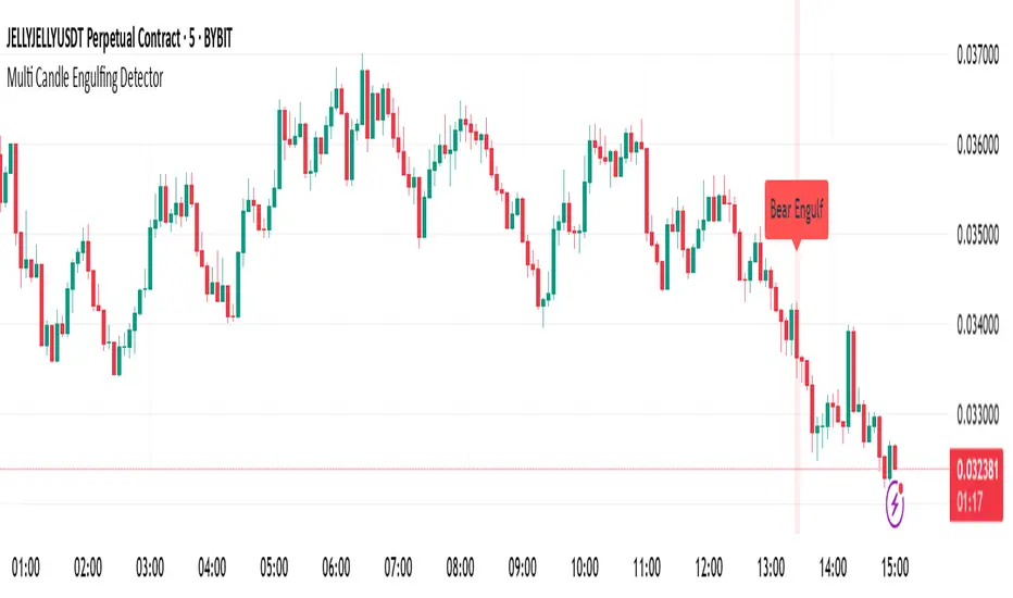
Multi Candle Engulfing Detector🔍 Multi Candle Engulfing Detector
This indicator identifies powerful engulfing candles that consume three or more previous candles — a signal often tied to strong market reversals or continuation moves.
🧠 Features
Detects candles that fully engulf the previous 3 or more candles
Optional filtering: only trigger when the engulfed candles are of the opposite color
Customizable engulf count for greater pattern control
Clear bullish and bearish signal labels on the chart
Alerts integrated: get notified the moment a setup forms
Background highlighting for enhanced visibility
⚙️ Settings
Minimum Number of Candles to Engulf: Default is 3, but can be adjusted
Require Opposite Color: When enabled, the engulfing candle must be opposite in color to the engulfed ones (e.g., green engulfing red)
📈 Use Cases
Spot strong reversal signals at tops and bottoms
Confirm breakout momentum on trend continuation
Use in confluence with other tools like volume or support/resistance
🚨 Alerts
Alerts fire when a bullish or bearish engulfing pattern is detected, allowing for mobile, email, or webhook notifications.
✅ Notes
This script is fully customizable and can be extended into a strategy or scanning tool. Feedback and suggestions are always welcome!
Schaff Trend Cycle (STC) - t0rdn3Schaff Trend Cycle (STC)
By t0rdn3 (original STC by , now with more descriptive naming)
Description
The Schaff Trend Cycle (STC) is a momentum-based oscillator that combines the speed of a fast EMA crossover with cyclical normalization. Developed by Doug Schaff, it identifies market turning points more responsively than MACD or RSI.
How It Works
1. EMA Difference : Calculates the difference between two EMAs of the source series (default: close).
2. Cycle Percentage : Normalizes that difference to a 0–100 range over the cycle period.
3. Smoothing : Applies exponential smoothing twice—first to the cycle percentage, then to its normalized cycles—to reduce noise.
4. Final STC Line : Produces a smoothed oscillator oscillating between 0 and 100.
Alerts
- "STC turned down above 75" : Fires once when STC makes a local peak above the upper threshold ( 75 ).
- "STC turned up below 25" : Fires once when STC makes a local trough below the lower threshold ( 25 ).
Inputs
Cycle Period : 12 — Lookback in bars for normalization
Fast EMA Length : 26 — Period of the fast EMA
Slow EMA Length : 50 — Period of the slow EMA
Smoothing Factor : 0.5 — Exponential smoothing coefficient (0–1)
Usage
Readings above 75 indicate an overbought cycle; readings below 25 indicate an oversold cycle. Crossings of the 50 midline can confirm trend direction:
- STC rising through 50 → bullish shift
- STC falling through 50 → bearish shift
Combine STC with price action or other trend filters to improve signal quality. You can adjust the cycle period and EMA lengths to match different timeframes or instruments.

Smart Adaptive MACDAn advanced MACD variant that dynamically adapts to market volatility using ATR-based scaling.
Key Features:
Volatility-sensitive MACD and Signal lengths
Optional smoothed MACD line
Dynamic histogram heatmap (strong vs. weak momentum)
Built-in Regular and Hidden Divergence detection
Clear visual signals via solid (regular) and dashed (hidden) divergence lines
What makes this different:
Unlike traditional MACD indicators with fixed-length settings, this version adapts in real time
to changing volatility conditions. It shortens during high-momentum environments for faster
reaction, and lengthens during low-volatility phases to reduce noise. This allows better
alignment with market behavior and cleaner momentum signals.
Divergence Detection – How It Works
The Smart Adaptive MACD detects both regular and hidden divergences by comparing price action with the smoothed MACD line. It uses recent pivot highs and lows to evaluate divergence and draws lines on the chart when conditions are met.
Regular Divergence Detection
This type of divergence signals potential reversals. It occurs when the price moves in one
direction while the MACD moves in the opposite.
Bullish Regular Divergence:
Price makes lower lows, but MACD makes higher lows.
Result: A solid green line is plotted beneath the MACD curve.
Bearish Regular Divergence:
Price makes higher highs, but MACD makes lower highs.
Result: A solid red line is plotted above the MACD curve.
Hidden Divergence Detection
This type of divergence signals trend continuation. It occurs when price pulls back slightly,
but the MACD shows deeper movement in the opposite direction.
Bullish Hidden Divergence:
Price makes higher lows, but MACD makes lower lows.
Result: A dashed green line is plotted below the MACD curve.
Bearish Hidden Divergence:
Price makes lower highs, but MACD makes higher highs.
Result: A dashed red line is plotted above the MACD curve.
How to Use:
This tool is best used alongside price structure, key support/resistance levels, or as a
secondary confirmation for your trend or reversal strategy. It is designed to enhance your
interpretation of market momentum and divergence without needing extra chart clutter.
Disclaimer:
This script is provided for educational and informational purposes only. It is not intended as
financial advice or a recommendation to buy or sell any asset. Always conduct your own
research and consult with a licensed financial advisor before making trading decisions. Use
at your own risk.
License:
This script is published under the Mozilla Public License 2.0 and is fully open-source.
Built by AresIQ | 2025
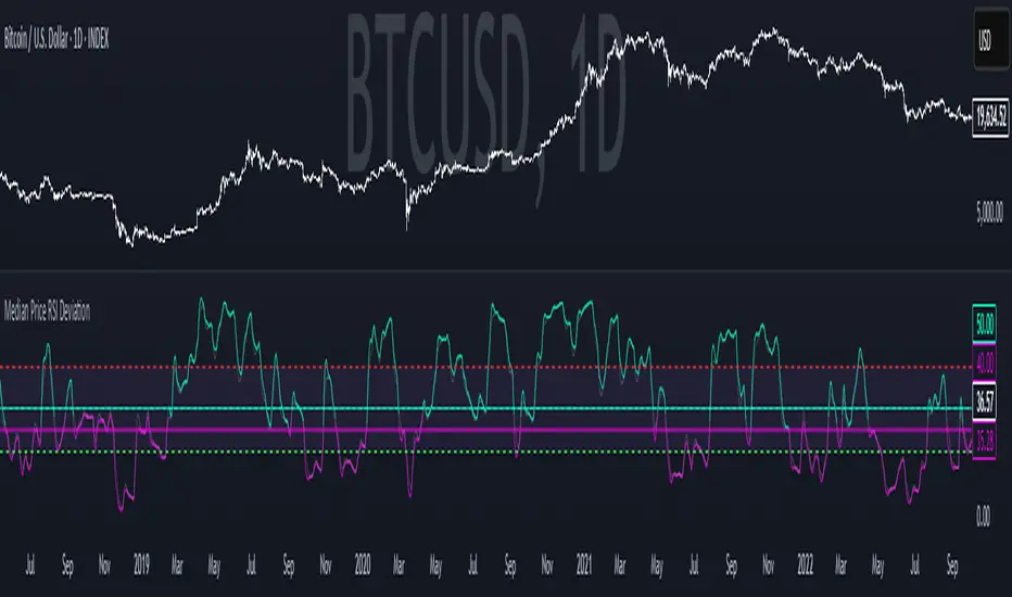
Median Price RSI DeviationThis indicator is a smoothed RSI-based trend filter that combines median price smoothing, customizable moving averages, and standard deviation bands to identify bullish or bearish conditions:
=> It first smooths price using a median filter.
=> Then it calculates RSI on that smoothed price.
=> The RSI is further smoothed using a selectable moving average (e.g., DEMA, EMA).
=> Standard deviation bands are applied around this smoothed RSI.
Signals:
=> A bullish signal is triggered when the upper band exceeds a long threshold (default 50).
=> A bearish signal occurs when the smoothed RSI drops below a short threshold (default 40).
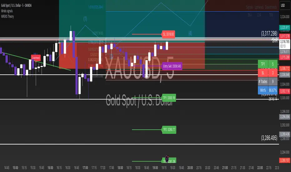
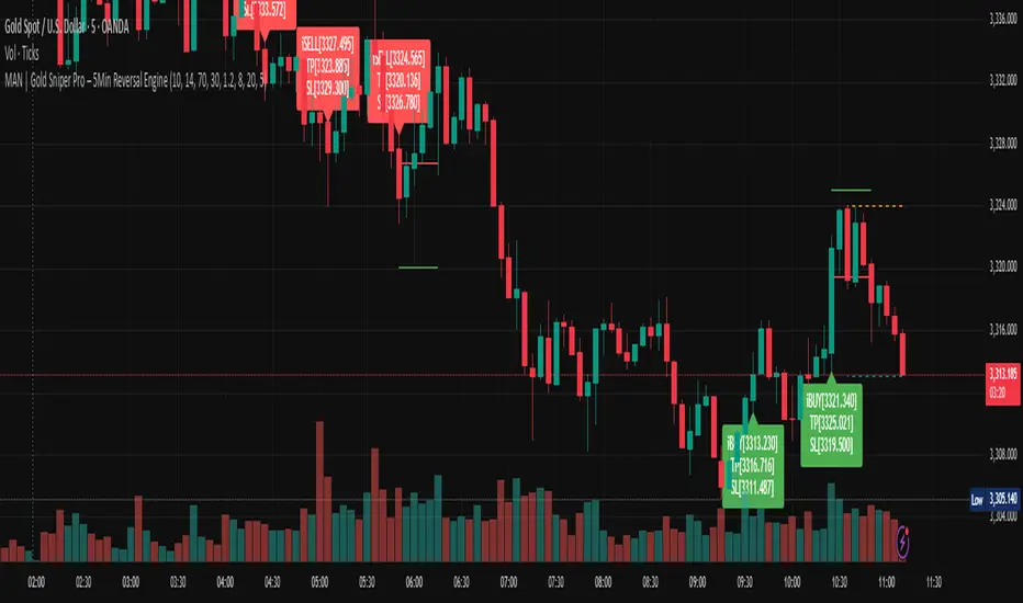
MAN | Gold Sniper Pro – 5Min Reversal EngineThis advanced scalping indicator is designed for high-precision entries and exits on the 5-minute timeframe, combining price action, volume analytics, and momentum filtering.
🔍 Core Features:
Price Action Engine: Detects powerful bullish and bearish engulfing patterns, enhanced with ATR-based body size filters to avoid weak signals.
Dynamic Support/Resistance Zones: Automatically tracks recent high/low zones to confirm trade validity and prevent chasing trades.
Smart RSI Filter: Filters trades based on momentum to avoid buying overbought or selling oversold conditions.
Volume Spike + OBV Filter: Confirms entries with strong volume spikes and OBV (On-Balance Volume) alignment, improving signal quality.
Time-based Session Filter: Optional filter to restrict signals to high-liquidity market hours (configurable).
Auto TP/SL Levels: Calculates Take Profit and Stop Loss dynamically using ATR multipliers, with customizable multipliers per timeframe.
Clear Entry Labels + Optional TP/SL Lines: Visual labels for each signal, with the option to show SL/TP as horizontal lines for precision monitoring.
Real-time Alerts: Set alerts for BUY and SELL conditions — stay informed and trade instantly.
📈 Recommended Usage:
Optimized for Gold (XAUUSD) on the 5-minute chart, but configurable for any fast-moving asset.
Ideal for scalpers and intraday traders seeking high-quality, low-latency entries with built-in protection mechanisms.
Works well in trending or range-bound conditions, thanks to volume and price action synergy.
⚙️ Customizable Parameters:
RSI length & thresholds
ATR-based SL/TP multipliers
Volume spike threshold
Session window
TP/SL visibility toggle
🟢 Built by traders, for traders.
Sharpen your edge with this smart, visual, and momentum-aware scalping tool.
Coinbase BTC Premium by BIGTAKERBTC Premium Gap Analysis: Binance, Coinbase, Upbit
This indicator provides real-time analysis and visualization of the premium gap between the Binance BTCUSDT price and the BTC prices on Coinbase (BTCUSD) and Upbit (BTCKRW).
Key Features
Coinbase Premium Gap
Measures the price difference between Coinbase and Binance as a percentage.
To improve visibility, the Coinbase premium is visually amplified by 10x.
Upbit Premium Gap
Calculates the premium by comparing Upbit's BTCKRW price (converted into USD using the real-time USDKRW exchange rate) against Binance BTCUSDT.
Dynamic Color Coding
Premiums above 0% are displayed in lime green, indicating positive premiums.
Premiums below 0% are displayed in red, indicating discounts.
Real-Time Labels
Displays real-time premium values for both Coinbase and Upbit on the right side of the chart.
Additional Notes
Upbit premiums are adjusted for the USD/KRW exchange rate to ensure accurate USD-based comparison.
The Coinbase premium is magnified visually (10x) to better capture minor movements, while the actual premium value remains correctly displayed.
The indicator is optimized for traders who monitor global BTC market price disparities across major exchanges.
How to Use
Quickly track global BTC price discrepancies across Binance, Coinbase, and Upbit.
Detect "Kimchi Premium" conditions in the Korean market through Upbit premiums.
Analyze buying and selling pressure in North American markets through Coinbase premiums.

MTF Analysis Panel [Invesmate]MTF Analysis Panel
This indicator provides a compact Multi-Timeframe (MTF) view of trend and momentum conditions directly on the chart. It combines EMA trend checks, RSI momentum checks, and optional Relative Strength analysis to offer an intuitive overview of market structure across intraday, daily, weekly, and monthly timeframes.
Trend and Momentum Analysis
The script uses two primary methods for assessing the market:
Trend Detection: Based on price relation to a user-selected EMA for each timeframe.
Momentum Detection: Based on whether RSI is above or below 50 for each timeframe.
Users can independently toggle these modules through inputs to customize the panel for different analysis needs.
Trend and momentum are calculated separately to avoid bias, helping traders capture the real state of the market across multiple timeframes.
Relative Strength (Optional)
If enabled, when either Weekly or Monthly timeframes are selected, the panel will display Relative Strength (RS ) data.
RS measures the stock's performance relative to a benchmark symbol (like NSE:NIFTY).
This value shows the percent outperformance or underperformance over a user-defined period (default 55 days), allowing deeper market strength analysis.
Table and Display Logic
The indicator draws a neat panel on the chart using TradingView’s table functionality.
Each selected timeframe (15m, 1h, 4h, 1D, 1W, 1M) will display:
Trend (EMA): Green for bullish trend (Price > EMA), Red for bearish trend (Price < EMA), Gray if neutral or not applicable.
Momentum (RSI): Green if RSI > 50, Red if RSI < 50, Gray if neutral.
Symbols for trend and momentum can be customized between:
Emoji mode (e.g., 🟢, 🔴, 🟦, 🟥)
Text mode (e.g., UP, DOWN, NEUTRAL)
The panel is customizable for position (Top Left, Top Right, Bottom Left, Bottom Right) to fit user preference.
Color Codes
Strong Bullish: All selected timeframes are trending up and momentum is rising — shown with a light green background.
Strong Bearish: All selected timeframes are trending down and momentum is falling — shown with a light red background.
Mixed: Any mixed state (some up, some down) — shown with a neutral gray background.
This helps traders instantly recognize overall market sentiment without manually checking individual timeframes.
Summary Labels
At the bottom of the panel, two powerful summaries are displayed:
Trend Summary: Overall trend aggregation across selected timeframes ("STRONG BULLISH", "STRONG BEARISH", or "MIXED").
Momentum Summary: Overall momentum aggregation ("MOMENTUM UP", "MOMENTUM DOWN", or "MOMENTUM MIXED").
When Relative Strength is available (Weekly or Monthly enabled), it is also shown separately at the bottom, providing a complete strength-versus-benchmark view.
Input Controls
Enable EMA Trend Check: Toggle EMA-based trend detection.
Enable RSI Momentum Check: Toggle RSI-based momentum detection.
Timeframes to Display: 15m, 1h, 4h, 1D, 1W, 1M can be independently turned on or off.
EMA Length per Timeframe: Customize EMA lengths for different timeframes.
RSI Length: Set RSI calculation period.
Comparative Symbol: Select the benchmark symbol for Relative Strength calculations.
RS Period: Choose the lookback period for Relative Strength.
Emoji Display Toggle: Switch between emoji-based or text-based display styles.
Table Location: Choose where the analysis panel appears on the chart.
Special Features
Realtime Updating: The panel updates dynamically as bars close, maintaining real-time relevance.
Maximum Label Control : Designed to respect TradingView's maximum label limits to avoid runtime errors.
Optimized for Performance: Uses conditional requests and security calls efficiently, minimizing script execution load.
Known Limitations
Request.security limitations: Relative Strength is only calculated on Daily data for stability; lower timeframe RS is not implemented.
TradingView Table Size: On some screen sizes or with many timeframes selected, table may overlap candles. Adjust panel location accordingly.

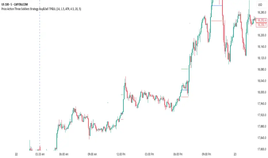
Price Action Three Soldiers Strategy Buy&Sell TP&SLStrategy Overview:
This indicator detects a "Three White Soldiers" bullish pattern to suggest potential buy opportunities. It uses dynamic Stop Loss (SL) and Take Profit (TP) management, based on either market volatility (ATR) or liquidity zones.
This tool is intended for educational and informational purposes only.
📈 Key Features:
Entry: Based on detecting Three White Soldiers candle pattern.
Exit: Targets are managed through ATR multiples or previous liquidity levels (swing highs).
Smart Liquidity: Optionally identify deeper liquidity targets.
Full Alerts: Buy and Sell signals supported with customizable alerts.
Visualized Trades: Entry, SL, and TP levels are plotted on the chart.
⚙️ User Inputs:
ATR Length, ATR Multipliers
Take Profit Mode (Liquidity/ATR)
Swing Lookback and Strength
Toggleable Buy/Sell alerts
📖 How to Use:
Add the Indicator:
Apply the script to your chart from the TradingView indicators panel.
Look for Buy Signals:
A buy signal is triggered when the script detects a "Three White Soldiers" bullish pattern.
Entry, Stop Loss, and Take Profit levels are plotted automatically.
Choose Take Profit Mode:
ATR Mode: TP is based on a volatility target.
Liquidity Mode: TP is based on past swing highs.
Set Alerts (Optional):
Enable Buy/Sell alerts in the settings to receive real-time notifications.
Practice First:
Always backtest and paper trade before live use.
📜 Disclaimer:
This script does not offer financial advice.
No guarantees of profit or performance are made.
Use in demo accounts or backtesting first.
Always practice proper risk management and seek advice from licensed professionals if needed.
✅ Script Compliance:
This script is designed in full accordance with TradingView’s House Rules for educational tools.
No financial advice is provided, no performance is guaranteed, and users are encouraged to backtest thoroughly.
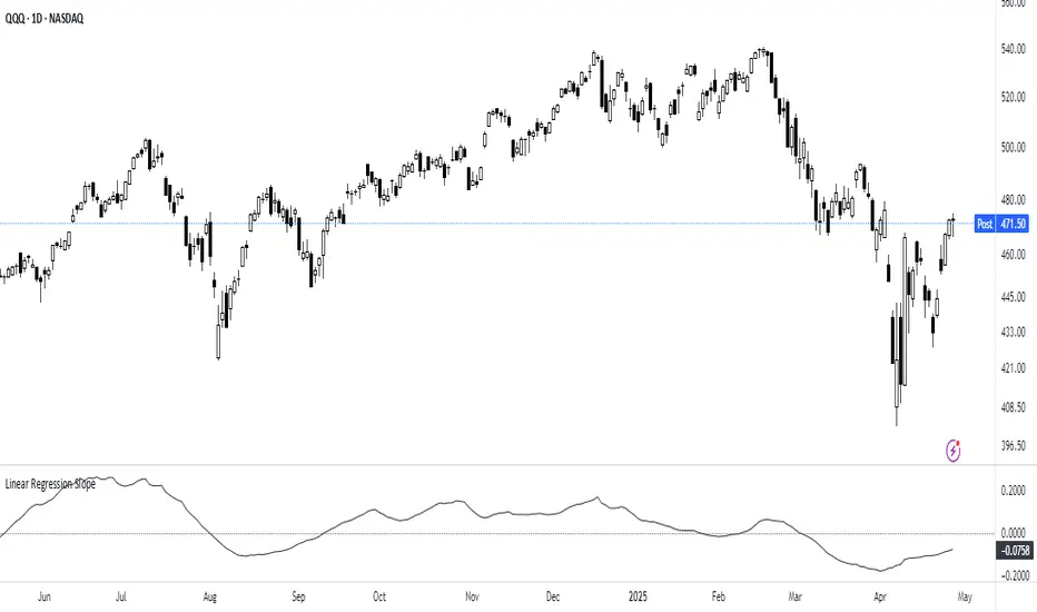
Linear Regression Slope The Linear Regression Slope provides a quantitative measure of trend direction. It fits a linear regression line to the past N closing prices and calculates the slope, representing the average rate of price change per bar.
To ensure comparability across assets and timeframes, the slope is normalized by the ATR over a shorter window. This produces a volatility-adjusted measure which allows for the slope to be interpreted relative to typical price fluctuations.
Mathematically, the slope is derived by minimizing the sum of squared deviations between actual prices and the fitted regression line. A positive normalized slope indicate upwards movement; a negative slope indicate downwards movement. Persistent values near zero could indicate an absence of clear trend, with price dominated by short-term fluctuations or noise.
The definition of a trend depends on the period of observation. The lookback setting should be set based on to the desired timeframe. Shorter lookbacks will respond faster to recent changes but may be more sensitive to noise, while longer lookbacks will emphasize broader structures.
While effective at quantifying existing trends, this method is not predictive. Sudden regime changes, volatility shocks, and non-linear dynamics can all cause rapid slope reversals. Therefore, it is best applied as part of a broader analytical framework.
In summary, the Linear Regression Slope quantifies price direction and serves as a measurable supplement to the visual assessment of trends on price charts.
Additional Features:
Option to display or hide the normalized slope line.
Option to enable background coloring when the slope is above or below zero.
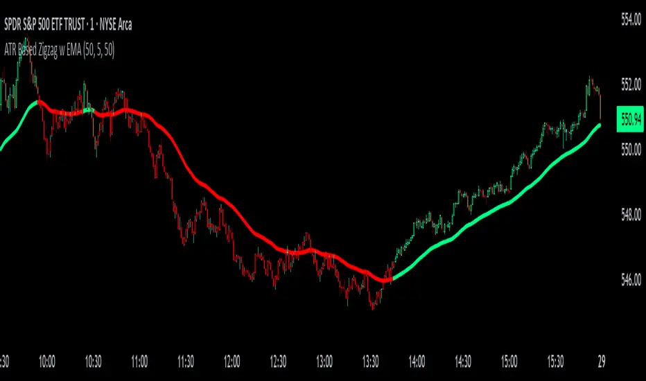
ATR Based Zigzag w EMAThe "ATR Based Zigzag with EMA" indicator is a refined trend-following tool designed for traders who demand clarity, precision, and robust trend detection. This script uses an ATR (Average True Range)-based breakout mechanism to dynamically determine the current market trend, while overlaying a clean, smoothed EMA (Exponential Moving Average) line to visually represent the active directional bias.
The indicator continuously tracks new swing highs and lows based on ATR volatility thresholds. When price moves sufficiently against the current trend — exceeding an ATR-multiplied distance — the trend is considered reversed. This adaptive method ensures that trend flips are based not on arbitrary price action, but on meaningful, volatility-adjusted movements.
Instead of plotting zigzag-style pivots which can create visual noise, the indicator draws a single, smooth EMA line calculated from the median price ((high + low) / 2). The color of the line shifts instantly based on the active trend: green (or your customized color) for uptrends, and red for downtrends. In addition, individual price bars are optionally colored to match the trend, further enhancing at-a-glance clarity without cluttering the chart.
Key user-defined inputs include the ATR length, ATR multiplier (sensitivity for trend flips), EMA smoothing length (responsiveness of the trend line), and full color customization for uptrend and downtrend states.
This indicator excels at providing a clear and immediate understanding of trend conditions, making it highly effective for:
Trend-following strategies
Reversal spotting based on volatility breaks
Entry/exit confirmation
Visual chart cleanliness and minimalism
Whether used standalone or alongside other tools, the "ATR Based Zigzag with EMA" offers a disciplined, volatility-sensitive view of market structure — engineered for traders who refuse to tolerate noise, hesitation, or ambiguity in their decision-making.
Trend and Trendline DetectorTrend and Trendline Detector
Overview
The Trend and Trendline Detector indicator provides both major and minor trend analysis using Simple Moving Averages (SMA) and automatically plots dynamic support and resistance trendlines based on pivot highs and lows.
Key Features
Major Trend Detection: Uses a configurable SMA to determine primary market direction.
Minor Trend Visualization: Optional minor SMA with color-coded line segments to mark smaller trend fluctuations.
Dynamic Pivot Trendlines: Automatically detects pivot highs/lows and draws major (solid) and minor (dashed) trendlines, with user-controlled extension modes.
Customizable Inputs: User can adjust SMA lengths, pivot look back/look forward periods, line extend mode, and toggle features on/off.

RSI with HMA & Momentum ZonesRSI with HMA & Momentum Zones — Indicator Description
This indicator combines Relative Strength Index (RSI) analysis with Hull Moving Averages (HMA) and Momentum Zone detection to provide a multi-layered view of market strength, trend shifts, and divergence signals.
It includes:
Main Features:
RSI Core:
Standard RSI calculated from a customizable source (close, open, etc.) with adjustable length.
A dynamic RSI Signal Line is plotted with selectable smoothing types (SMA, EMA, SMMA, WMA, VWMA) to enhance trend-following signals.
RSI crossovers of its signal line change color (green for bullish crossovers, red for bearish crossunders).
Hull Moving Averages (HMA):
Two HMA lines are plotted based on the RSI:
Short HMA (fast) and Long HMA (slow).
Color shifts indicate crossovers between RSI and Short HMA (short-term trend change) and Short HMA vs Long HMA (longer-term trend shifts).
Momentum Zones:
When the gap between the RSI and the Long HMA exceeds a user-defined threshold:
A green background highlights strong bullish momentum.
A red background highlights strong bearish momentum.
Helps visualize when momentum becomes extended.
Divergence Detection (Optional):
Regular and hidden bullish and bearish divergences are automatically detected between price and RSI.
Divergences are plotted on the RSI pane with labels ("Bull", "H Bull", "Bear", "H Bear").
Adjustable lookback settings for fine-tuning sensitivity.
Alerts are available for all divergence events.
Visual Enhancements:
A shaded cloud fills between RSI and its signal line, green for bullish bias and red for bearish bias.
Horizontal bands at 70, 50, and 30 levels to mark traditional RSI zones (overbought, neutral, oversold).
Customization Options:
All major components — RSI settings, Signal Line type, HMA lengths, Momentum Zone threshold, and Divergence controls — are fully adjustable.
Stormer setupHere's a trading setup with reversal candle coloring and simple market structure analysis:
Based on the experienced trader Stormer (Alexandre Wolwacz), to be used with combined price action.
Key improvements added:
1. **Smart Reversal Candles**:
- Detects hammer/shooting star patterns and engulfing candles
- Colors candles based on confluence with market structure
- Teal for bullish reversals, Maroon for bearish reversals
2. **Dynamic Confluence System**:
- Uses MA trend direction to determine if SR levels should be prioritized
- Adjustable sensitivity threshold for SR proximity
- Combines price action with stochastic position
3. **Enhanced Market Structure**:
- Improved trend detection using ROC instead of slope
- Adaptive logic that uses SR levels when MA is flat
4. **Advanced Visualization**:
- Semi-transparent candle coloring preserves original colors
- Dotted SR lines with automatic cleanup
- Clear triangle markers for entries
5. **Efficiency Improvements**:
- Limited historical SR storage for better performance
- Automatic line management to prevent chart clutter
To use this enhanced version:
1. Bullish reversal candles appear teal when:
- Hammer/engulfing pattern forms
- Near support (if MA flat) or stochastic oversold
- Price above MA
2. Bearish reversal candles appear maroon when:
- Shooting star/engulfing pattern forms
- Near resistance (if MA flat) or stochastic overbought
- Price below MA
3. Signals combine all elements (MA position, stochastic, SR levels, and candle patterns) for higher probability trades

RSI_Heikinashi📜 Title:
Heikin-Ashi RSI Candle Plot with Multi-Timeframe Analysis and EMA Overlay
📖 Full Description:
This is an original custom indicator that transforms the traditional Relative Strength Index (RSI) into a Heikin-Ashi (HA) candle representation, allowing traders to visualize RSI trends with greater clarity, less noise, and multi-timeframe perspective.
🛠️ Core Concept and Original Method:
Rather than plotting a single RSI line, this script recalculates RSI into a Heikin-Ashi candle format, using a double EMA smoothing method on the RSI data itself.
Here's how the transformation works:
RSI Calculation:
RSI is computed traditionally using Wilder's Moving Average (RMA) for smoothing gains and losses.
The RSI period and price source are fully customizable (default length = 28, source = close).
Heikin-Ashi Style Smoothing (applied to RSI):
The HA Close is calculated as the EMA of the average between the current RSI and previous HA Close.
The HA Open is calculated as the EMA of the average between the previous HA Open and the current HA Close.
The HA High and HA Low are dynamically calculated based on the maximum/minimum values of the current RSI, HA Open, and HA Close.
Smoothing is done via 5-period EMA, which adds a unique layer of trend smoothing without traditional price-based HA calculation.
Multi-Timeframe Comparison:
In addition to plotting the chart timeframe HA RSI, the indicator retrieves the 1-hour timeframe HA RSI using request.security.
This allows traders to align trades with higher timeframe RSI trends, a powerful technique for multi-timeframe confirmation.
50 EMA Overlay:
A 50-period Exponential Moving Average (EMA) is plotted over both the chart timeframe HA RSI and the 1-hour HA RSI.
EMA acts as a trend filter or dynamic support/resistance for RSI behavior.
RSI Bands and Visual Aids:
Standard RSI bands at 70 (Overbought), 50 (Midline), and 30 (Oversold) are plotted.
A shaded background between the 30–70 levels helps highlight RSI range-bound movements versus breakout momentum.
🔥 Why this script is original and useful:
Unique Application:
This is not a simple RSI plot or standard Heikin-Ashi candle — it is a specialized smoothing method applied directly to RSI values for a clearer, noise-reduced momentum reading.
Multi-Timeframe Advantage:
Unlike typical RSI indicators, it includes a 1-hour timeframe comparison alongside the chart timeframe, improving decision-making across intraday and swing strategies.
Advanced Smoothing Logic:
Double EMA smoothing of RSI and HA-style recalculations offer a much smoother signal than traditional RSI or basic RSI/EMA crossovers.
Visualized Trend Strength:
Using colored candles instead of just a line enhances readability and gives an intuitive sense of momentum direction, strength, and possible reversals.
Fully Customizable:
Traders can adjust the RSI period and source depending on asset volatility or timeframe preferences.
📋 How to Use:
Look for HA RSI candles color changes for early momentum shifts.
Use the 50 EMA crossovers on HA RSI to confirm larger trend changes.
Compare chart timeframe vs 1H timeframe HA RSI for stronger signal alignment.
Watch for overbought/oversold breaks beyond the 70/30 bands for trade entries or exits.
⚙️ Inputs:
RSI Length (Default: 28)
RSI Source (Default: Close)
📢 Important Note:
This script is originally conceptualized and custom-built.
It is not a mashup of existing open-source indicators and introduces a new smoothing technique for RSI visualization.
🙏 Credits:
Script developed by Sri_RSI.
KeyLevelsPivotsIndicator Name: Key Levels with Pivots
This indicator identifies key support and resistance levels using pivot high and pivot low values derived from TradingView’s built-in functions (ta.pivothigh and ta.pivotlow). When a new pivot is detected, the indicator checks if a similar level—within a specified percentage threshold (for example, ±1%) of the pivot value—already exists. If no such level is present, a horizontal line is drawn at that pivot level.
The drawn level extends to the right, automatically updating until one of two conditions occurs:
A breakout takes place—defined as the price moving beyond the level by the specified percentage—and then the level is fixed (truncated) at the bar where the breakout occurred.
The level reaches a maximum age (expressed in bars, e.g., 750 bars for a daily timeframe which approximates 3 years). In this case, the level is fixed at that maximum age.
Once fixed, the level no longer updates, allowing traders to view historically significant support and resistance levels from today's date up to approximately three years back. Additionally, the indicator prevents the re-plotting of a level if a similar level already exists within the defined percentage threshold, thereby avoiding duplicate reflections of the same level unless a breakout occurs.
