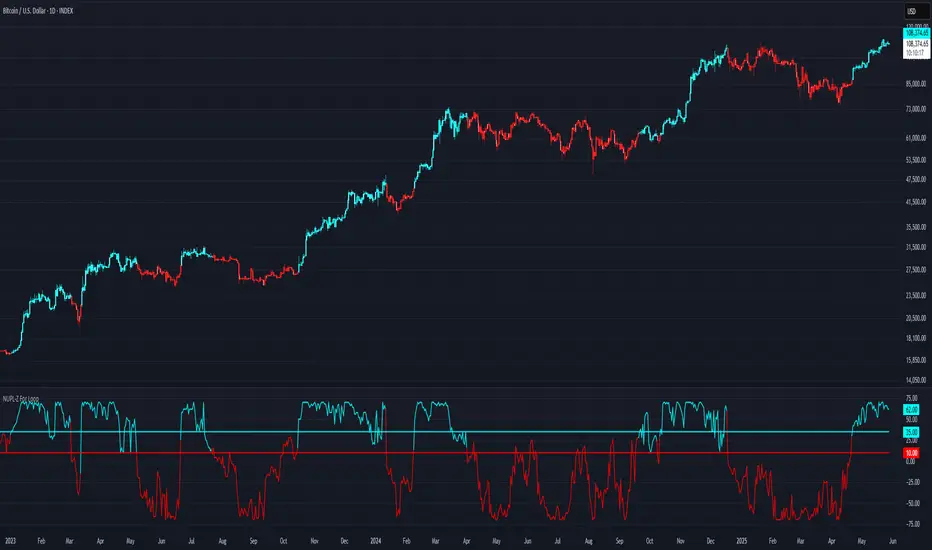
NUPL-Z For Loop🧠 Overview
NUPL-Z For Loop is a trend-following indicator built on Bitcoin’s on-chain Net Unrealized Profit/Loss (NUPL) metric. It uses a Z-scored transformation of NUPL and a custom loop-based scoring system to measure the consistency of directional movement. Rather than identifying tops and bottoms, this tool is designed to track sustained trends and filter out short-term noise, making it ideal for momentum-aligned strategies.
🧩 Key Features
Loop-Based Trend Logic: Assesses trend strength by summing the number of upward vs. downward moves in Z-scored NUPL across a custom lookback.
Z-Score Normalization: Applies long-term statistical normalization to NUPL to emphasize deviation from average behavior over time.
Threshold-Based Regime Shifts: Custom input thresholds define when trend strength is significant enough to trigger long or short signals.
Directional Market State Tracking: Internally tracks bullish, bearish, or neutral conditions to guide trend entries.
BTC-Focused On-Chain Analysis: Tailored specifically for Bitcoin using Market Cap and Realized Cap inputs.
🔍 How It Works
NUPL Calculation: Derived as the percentage of net unrealized profit relative to market cap: (MC - RMC) / MC * 100.
Z-Scoring: NUPL is normalized using a rolling mean and standard deviation over a long window (default 1300 days) to create a smoothed trend signal.
Directional Loop: A custom loop iterates from the start_loop to the end_loop, comparing the current Z-score to past values.
Each instance where NUPL_Z > NUPL_Z adds +1 to the score; otherwise, it subtracts -1.
This cumulative score reflects how consistently NUPL-Z has been trending.
Signal Logic:
Long signal when loop score exceeds long_threshold.
Short signal when score falls below short_threshold.
CD State Engine: Maintains the current trend regime (1 for long, -1 for short), which drives plot coloring and overlays.
🔁 Use Cases & Applications
Momentum Trend Filter: Detects and confirms sustained directional strength in BTC’s profit/loss positioning.
Noise Suppression: Avoids reactive signals from one-off spikes or dips in NUPL by requiring a consistent trend before confirming bias.
Best Suited for BTC: Designed specifically for Bitcoin’s price and on-chain structure, using its unique NUPL dynamics.
✅ Conclusion
NUPL-Z For Loop transforms a traditionally mean-reverting indicator into a trend-following signal engine. By scoring the consistency of movement in normalized NUPL, this tool identifies trend strength rather than reversal potential — providing more reliable context for momentum-aligned trades on Bitcoin.
⚠️ Disclaimer
The content provided by this indicator is for educational and informational purposes only. Nothing herein constitutes financial or investment advice. Trading and investing involve risk, including the potential loss of capital. Always backtest and apply risk management suited to your strategy.
Trend Analysis
MVRV-Z For Loop🧠 Overview
MVRV-Z For Loop is a trend-following indicator that applies a custom directional for-loop logic to the MVRV Z-score. By evaluating the number of consecutive Z-score improvements or deteriorations over time, it identifies sustained directional pressure in Bitcoin’s on-chain trend — helping traders align with prevailing market strength rather than reacting to single-point extremes.
🧩 Key Features
Loop-Based Trend Filter: Applies a running comparison loop to assess whether MVRV-Z has been consistently strengthening or weakening.
Directional Scoring System: Each upward movement contributes positively, and each downward movement negatively, producing a cumulative trend score.
Z-Scored MVRV: Leverages on-chain valuation via the Market Cap to Realized Cap ratio, normalized using a long-term rolling average and standard deviation.
Custom Thresholds: User-defined thresholds for long and short signals based on trend score magnitude.
Dynamic Candle Coloring: Visually reinforces trend state with aqua for bullish and red for bearish environments.
🔍 How It Works
Z-score Transformation: The MVRV ratio is normalized over a long lookback (default 1050 days), creating a standardized valuation signal.
For-Loop Engine: A directional loop compares the current MVRV-Z value to previous values within a defined range (start to end).
If today’s value is higher than ma , it adds +1 to the score; otherwise, it subtracts -1.
This loop effectively measures momentum consistency rather than magnitude alone.
Signal Logic:
A Long signal is triggered when the cumulative trend score exceeds the long_threshold.
A Short signal is triggered when the score drops below the short_threshold.
State Variable (CD): Tracks the market regime (1 = long, -1 = short), updating only when a valid condition is met.
🔁 Use Cases & Applications
Trend Confirmation Tool: Helps traders assess whether a directional move has been sustained over time before committing.
Momentum Alignment: Filters out short-term noise by scoring consistency in MVRV-Z movement rather than relying on single-bar reversals.
Best Suited for BTC: This indicator is specifically built using Bitcoin’s Market Cap and Realized Cap metrics, making it ideal for BTC trend tracking.
✅ Conclusion
MVRV-Z For Loop transforms the traditional MVRV Z-score into a trend-following signal using a cumulative scoring approach. It excels in highlighting sustained directional strength and avoids premature entries during valuation whipsaws. This makes it a strong tool for traders looking to stay on the right side of the trend without overreacting to short-term fluctuations.
⚠️ Disclaimer
The content provided by this indicator is for educational and informational purposes only. Nothing herein constitutes financial or investment advice. Trading and investing involve risk, including the potential loss of capital. Always backtest and apply risk management suited to your strategy.

Melody Markets Moving Average Transitions🎵 Melody Markets Moving Average Transitions – The Ultimate Trend State Indicator 🎵
📌 Indicator Description
Melody Markets Moving Average Transitions is a powerful indicator designed to accurately represent the market trend state by combining the 5 main moving averages (MA7, MA20, MA50, MA100, MA200) and their 120 possible configurations.
Unlike traditional indicators that display moving averages separately, this tool synthesizes these multiple combinations into a dynamic trend line, which can be displayed directly on the selected moving average or via a specially calculated dynamic moving average.
It provides a clear and precise view of trend strength and momentum, helping traders better anticipate price movements.
🔍 Key Features
✅ Comprehensive Trend State → Analyzes up to 120 configurations between 5 moving averages for a detailed trend state.
✅ Dynamic Trend Line → Simple and intuitive visualization of the trend via a single line, shown directly on the chosen MA or the dynamic MA.
✅ Signal Visualization → Displays signals generated by each moving average, facilitating decision-making.
✅ Relevant Pullbacks Display → Highlights meaningful pullbacks according to trend strength and context.
✅ Fully Customizable → Choose moving averages, toggle signals and pullbacks, and customize colors.
✅ Overlay on Price Chart → Smooth and clear integration directly on the price chart.
📖 How to Use Melody Markets Moving Average Transitions?
1️⃣ Select the moving average (MA7, MA20, MA50, MA100, MA200) to track the trend state.
2️⃣ Activate the dynamic trend line to visualize overall market direction in real-time.
3️⃣ Enable signal and pullback displays to catch key trade setups and corrections.
4️⃣ Customize colors and display options to suit your trading style.
5️⃣ Combine with other technical tools for enhanced entry and exit confirmations.
🎯 Who Is This Indicator For?
🔹 Trend Traders & Swing Traders → Get a clear, precise overview of trend strength and pullbacks.
🔹 Day Traders & Scalpers → Quickly identify relevant signals without clutter.
🔹 Beginner to Advanced Traders → Intuitive and comprehensive trend analysis for all levels.
🔥 Conclusion
Melody Markets Moving Average Transitions revolutionizes trend analysis by combining complex moving average configurations into a single, clear dynamic line and signal system. It empowers traders with a deeper understanding of market conditions, improving decision-making and timing.
📌 Add it to your chart now and experience trend analysis like never before! 🚀

SD Median MVRV-Z🧠 Overview
SD Median MVRV-Z is a trend-following indicator that uses on-chain valuation signals as a supportive filter. It blends the momentum of the MVRV Z-score with a dynamic median-based price structure to provide cleaner, more reliable directional signals. This tool is designed to identify when price and trend align with favorable broader context — not to pinpoint overbought or oversold extremes.
🧩 Key Features
Trend-Following Core: Signals are built around directional strength, not reversion.
MVRV Z-Score Momentum: Utilizes the statistical momentum of Market Cap vs Realized Cap as a macro trend driver.
Rolling Median Filter: Applies a price-based condition to ensure trend signals are not triggered during short-term counter-moves or noise.
Threshold Customization: Input controls allow traders to define the strength required to trigger long or short signals.
Dynamic Visualization: Candle coloring and filled zones provide instant feedback on current market regime.
🔍 How It Works
Trend Signal: The MVRV ratio is normalized via Z-scoring to produce a momentum-like signal based on how far current valuation deviates from its rolling average.
Price Filter: A rolling median and standard deviation of price define an upper and lower band. These serve to filter out MVRV-Z signals that occur when price is moving against the perceived direction.
Signal Logic:
Long signal = MVRV-Z above threshold and price is not in the lower volatility band.
Short signal = MVRV-Z below threshold, regardless of price band (more aggressive condition).
Directional Engine (CD): Encodes the market regime state (1 for long, -1 for short, 0 for neutral), and drives all visual outputs.
🔁 Use Cases & Applications
Momentum Confirmation: Identify when on-chain momentum and price structure both confirm a trend direction.
Reduced Whipsawing: Filter out weak or conflicting trend signals that would otherwise lead to false entries.
Best Suited for BTC: This indicator is specifically tailored for Bitcoin, using BTC’s Market Cap and Realized Cap data from on-chain sources.
✅ Conclusion
SD Median MVRV-Z is a trend-centric tool that ensures directional conviction by requiring agreement between price structure and underlying market momentum. It is not meant to detect tops or bottoms, but instead to help traders participate in sustainable moves with greater confidence.
⚠️ Disclaimer
The content provided by this indicator is for educational and informational purposes only. Nothing herein constitutes financial or investment advice. Trading and investing involve risk, including the potential loss of capital. Always backtest and apply risk management suited to your strategy.

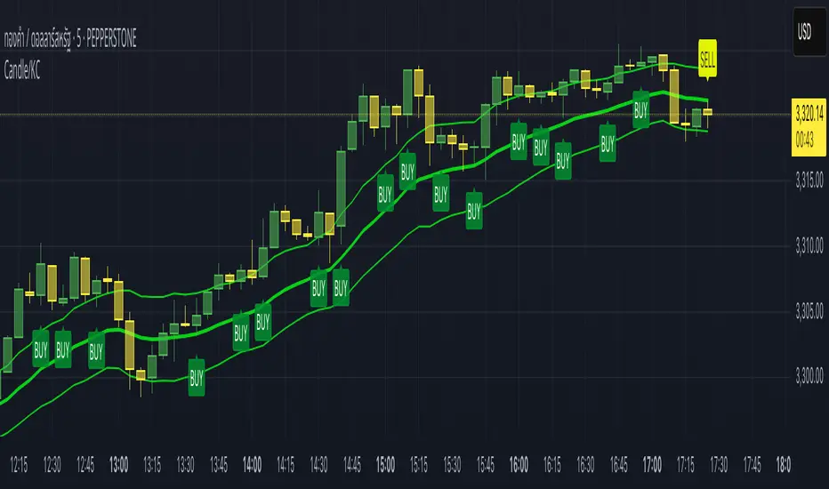
Candle/Keltner Channels BUY SELLWhy Use Candlesticks?
They help traders visualize price action
Used in technical analysis and price pattern recognition (e.g., Doji, Engulfing, Hammer)
Assist in determining entry and exit points
Why Traders Use Keltner Channels?
Keltner Channels are widely used by traders for identifying trends, detecting volatility, and spotting trade opportunities.
1. Trend Identification
The middle line (EMA) shows the general trend.
If price consistently stays above the middle line, it indicates a strong uptrend.
If price stays below, it signals a downtrend.
Use: Traders follow the trend direction to enter trades in line with momentum.
2. Volatility Measurement
The width of the channel expands and contracts based on Average True Range (ATR).
Wider channels = high volatility, tighter channels = low volatility.
Use: Helps traders decide when to expect breakouts or calm periods.
3. Breakout Signals
A break above the upper band can signal a bullish breakout.
A break below the lower band can signal a bearish breakout.
Use: Traders use this for momentum trading and breakout entries.
4. Overbought/Oversold Conditions
Price touching or crossing the upper band may suggest it's overbought.
Price touching or crossing the lower band may suggest it's oversold.
Use: Traders combine this with RSI or MACD to confirm reversal setups.
5. Trade Entry and Exit
When price pulls back to the middle EMA during a trend, it may present a buy/sell opportunity.
Exits can also be planned if price returns inside the bands after a breakout.
Use: Helps with precise entry and exit timing.
6. Combines Well With Other Indicators
Commonly used with:
RSI (for confirmation)
MACD (for momentum)
Candlestick patterns (for price action signals)
Combining Candlestick Patterns with Keltner Channels gives traders a powerful method to confirm entries, spot reversals, and improve accuracy. Here’s why this combination works so well:
1. Context for Candlestick Signals
Candlestick patterns (like doji, engulfing, or pin bars) show potential price reversals, but they need context to be reliable. Keltner Channels provide that context:
A bullish candlestick near the lower band suggests a stronger buy signal.
A bearish candlestick near the upper band strengthens a sell signal.
2. Filtering False Signals
Candlestick patterns occur frequently, and not all are meaningful.
The location within the Keltner Channel helps filter out weak or false patterns.
Example: A bullish engulfing candle outside the lower band = high-probability reversal.
3. Improved Entry Timing
Traders wait for a candlestick pattern confirmation when price touches or crosses a Keltner band.
This avoids premature entries and allows tighter stop-losses.
4. Better Risk-Reward Setup
Candlestick entry near channel extremes (upper/lower band) lets traders place stop-losses just beyond recent highs/lows.
The target can be the opposite side of the channel or the middle EMA.
5. Visual Simplicity
Keltner Channels + Candles are visually intuitive.
Even beginner traders can easily recognize:
Overextended candles near channel edges.
Confirmed breakouts or reversals.
This Timeframe 5 min : XAUUSD
21-Day Trend Direction📈 21-Day Trend Direction Indicator
📊 How It Works:
🎯 Trend Detection Logic:
Analyzes last 21 daily candles
Calculates total price change from start to end
Compares against sideways threshold (default 2%)
Counts bullish vs bearish days
Tracks higher highs and lower lows
📈 Trend Classifications:
• 📈 UPTREND: Price change > +2% over 21 days
• 📉 DOWNTREND: Price change < -2% over 21 days
• ➡️ SIDEWAYS: Price change between -2% and +2%
💪 Trend Strength Levels:
• 🔥 Very Strong: >5% price change
• 💪 Strong: 3-5% price change
• 📊 Moderate: 1.5-3% price change
• 📉 Weak: <1.5% price change
🎨 Visual Features:
📋 Information Table Shows:
• Trend Direction with color coding
• Price Change % over 21 days
• Trend Strength classification
• Bull/Bear Days count
• Higher Highs/Lower Lows count
• Analysis Period (customizable)
📊 Chart Indicators:
• Trend Line (21-day moving average)
• Background Color for quick trend identification
• Trend Arrows (▲ ▼ ➡) on chart
• Customizable display options
⚙️ Customizable Settings:
🎯 Analysis Settings:
• Lookback Days: 5-50 days (default: 14)
• Sideways Threshold: 0.5-10% (default: 2%)
• Trend Strength: Low/Medium/High sensitivity
🎨 Display Options:
• Table Position: 9 different positions
• Table Size: Tiny to Large
• Show/Hide: Table, Trend Line, Background, Arrows
🚨 Alert Options:
• Trend Change to Uptrend
• Trend Change to Downtrend
• Trend Change to Sideways
This indicator gives you a clear, objective view of the 21-day trend with multiple confirmation signals! 🚀

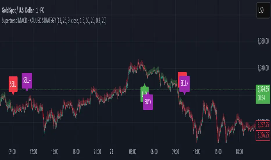
Supertrend MACD - XAUUSD STRATEGY 🔶 Supertrend MACD - XAUUSD STRATEGY (v6) (XAUUSD ONLY FOR NOW)
A high-performance, multi-filtered MACD-based strategy tailored for XAUUSD (Gold) traders seeking precision entries during trending conditions. This indicator intelligently combines multiple technical layers—momentum, trend strength, volatility, and market structure—to help identify high-probability trade setups with improved reliability.
🧠 Core Logic & Features Explained:
🔸 MACD Momentum Engine
At the heart of the strategy lies the traditional MACD indicator (Moving Average Convergence Divergence), calculating the difference between two EMAs (fast and slow) and smoothing it with a signal line.
Buy Signal: Triggered when the MACD line crosses above the signal line.
Sell Signal: Triggered when the MACD line crosses below the signal line.
These signals are the foundation, but only the beginning of a layered decision-making process.
🔸 Higher Timeframe (HTF) Trend Confirmation
To filter out noise and false breakouts, the indicator references MACD values from a higher timeframe (configurable by the user). This powerful multi-timeframe approach ensures that entries only occur in alignment with the dominant macro-trend.
Ensures entries are not taken counter to larger market movements.
Helps identify momentum continuation setups and avoid chop.
🔸 Support Arrow Display (Optional)
For visual traders, an option to display support arrows on the chart can be enabled. These assist in identifying visually intuitive entry points and enhance situational awareness.
⚙️ User-Customizable Inputs:
MACD Settings: Fast EMA, Slow EMA, Signal EMA lengths.
Signal Offset: For visual alignment and candle matching.
HTF MACD Settings: Select any timeframe for higher timeframe filtering.
ATR and ADX Thresholds: Fine-tune filters to match your trading style.
Structure Break Lookback: Adjust BOS+ logic sensitivity.
Arrow Toggles: Enable or disable visual support arrows as needed.
THIS indicator is in its alpha stage, currently it only works on XAUUSD pairs, i plan to update this indicator so that it functions on every single pair available on Trading view
Another note, the signals given only become solid after the second the candlestick, after this the signal becomes solid. REPAINTING CAN HAPPEN AFTER THE FIRST CANDLE STICK OF THE SIGNAL BUT NOT AFTER THE SECOND
As this indicator is only in its alpha stage it should be used as such, every person is responsible for there own personal investments
Dynamic Range Filter with Trend Candlesticks (Zeiierman)█ Overview
Dynamic Range Filter with Trend Candlesticks (Zeiierman) is a volatility-responsive trend engine that adapts in real-time to market structure, offering a clean and intelligent visualization of directional bias. It blends dynamic range calculation with customizable smoothing techniques and layered trend confirmation logic, making it ideal for traders who rely on clear trend direction, structural range analysis, and momentum-based candlestick signals.
By measuring scaled volatility over configurable lengths and applying advanced moving average techniques, this indicator filters out market noise while preserving true directional intent. Complementing this, a dual-trend system (range-based and candle-based) enhances clarity and responsiveness, particularly during shifting market conditions.
█ How It Works
⚪ Scaled Volatility Band Calculation
At the core lies a volatility engine that constructs adaptive range bands around price using smoothed high/low calculations. The bands are dynamically adjusted using:
High/Low Smoothing – Applies a moving average to the raw high and low data before calculating the range.
Scaled Range Volatility – A 2.618 multiplier scales the distance between smoothed highs and lows, forming a responsive volatility envelope.
Band Multiplier – Controls how wide the upper/lower range bands extend from the mean.
This filtering process minimizes false signals and highlights only structurally meaningful moves.
⚪ Multi-Type Smoothing Engine
Users can choose from a wide array of smoothing algorithms for trend construction, including:
HMA (default), SMA, EMA, RMA
KAMA – Adapts to market volatility using efficiency ratios.
VIDYA – Momentum-sensitive smoothing using CMO logic.
FRAMA – Dynamically adjusts to fractal dimension in price.
Super Smoother – Ideal for eliminating aliasing in range signals.
This provides the trader with fine-tuned control over reactivity vs. smoothness.
⚪ Trend Detection (Dual Engine)
The indicator includes two independent trend tracking systems:
Main Trend Filter – Based on adaptive volatility band shifts.
Candle Trend Filter – A second-tier confirmation using smoothed candle data, ideal for directional candles and confirmation entries.
█ How to Use
⚪ Trend Confirmation
Use the Trend Line and colored candlesticks for high-probability entries in the trend direction. The more trend layers that align, the higher the confidence.
⚪ Reversal Zones
When the price reaches the outer bands or fails to break them, look for candle color shifts or a crossover in the range to anticipate possible reversals or consolidations.
█ Settings
Scaled Volatility Length – Controls the lookback used to stabilize the base volatility band.
MA Type & Length – Choose and fine-tune the smoothing method (HMA, EMA, KAMA, etc.)
High/Low Smoother – Pre-smoothing for structural high/low banding.
Band Multiplier – Adjusts the width of the dynamic bands.
Trend Length (Candles) – Length used for candle-based trend confirmation.
-----------------
Disclaimer
The content provided in my scripts, indicators, ideas, algorithms, and systems is for educational and informational purposes only. It does not constitute financial advice, investment recommendations, or a solicitation to buy or sell any financial instruments. I will not accept liability for any loss or damage, including without limitation any loss of profit, which may arise directly or indirectly from the use of or reliance on such information.
All investments involve risk, and the past performance of a security, industry, sector, market, financial product, trading strategy, backtest, or individual's trading does not guarantee future results or returns. Investors are fully responsible for any investment decisions they make. Such decisions should be based solely on an evaluation of their financial circumstances, investment objectives, risk tolerance, and liquidity needs.
EMA Trend Cloud with HH/LL Counter [RanAlgo]Indicator Overview:
This indicator combines EMA-based trend analysis with pivot point detection to identify market trends and potential reversal points. It features:
EMA Cloud System: Dual cloud layers (8/22 EMA and 21/49 EMA) for trend visualization
Pivot Analysis: Identifies Higher Highs (HH), Lower Highs (LH), Higher Lows (HL), and Lower Lows (LL)
Counter System: Tracks daily and session counts of HH/LL patterns
Key Components:
EMA Configuration:
Fast EMAs: 8, 21, 22
Medium EMAs: 49, 50
Slow EMA: 100
Cloud formations between EMAs (8/22 and 21/49) with adjustable opacity
Trend Signals:
Buy signals when EMA8 crosses above EMA22 (green cloud)
Sell signals when EMA8 crosses below EMA22 (red cloud)
Additional confirmation from 21/49 EMA cloud
Pivot Point System:
Customizable lookback period (default 16 bars)
Four pivot types with customizable visuals:
HH (Higher High) - Green
HL (Higher Low) - Blue
LH (Lower High) - Red
LL (Lower Low) - Orange
Extended lines with adjustable length
Counter Table:
Displays daily counts of HH and LL patterns
Six position options for table placement
Color-coded to match pivot line colors
Trading Rules:
Trend Following:
Go long when both clouds are green (EMA8 > EMA22 AND EMA21 > EMA49)
Go short when both clouds are red (EMA8 < EMA22 AND EMA21 < EMA49)
Pivot Confirmation:
Strong uptrend confirmed by consecutive HH and HL patterns
Strong downtrend confirmed by consecutive LH and LL patterns
Potential reversals when pattern sequences break
Counter Interpretation:
Increasing HH count suggests strong bullish momentum
Increasing LL count suggests strong bearish momentum
Divergences between price and counts may signal weakening trends
Customization Options:
Adjustable EMA lengths (hardcoded but can be modified)
Cloud opacity controls
Pivot line colors, styles, and thickness
Lookback period for pivot detection
Line extension length
Table visibility and positioning
Display Features:
Clean visual design that doesn't obscure price action
Non-repainting elements (uses confirmed pivots only)
Minimal screen space usage with optional table
This indicator complies with TradingView's guidelines by:
Using non-repainting calculations (confirmed pivots only)
Providing clear source code with comments
Offering comprehensive customization without overcrowding
Including proper input validation
Maintaining readable visuals at all zoom levels
The tool is designed for trend identification and confirmation, suitable for various timeframes and instruments. Users should combine it with other analysis techniques for best results.

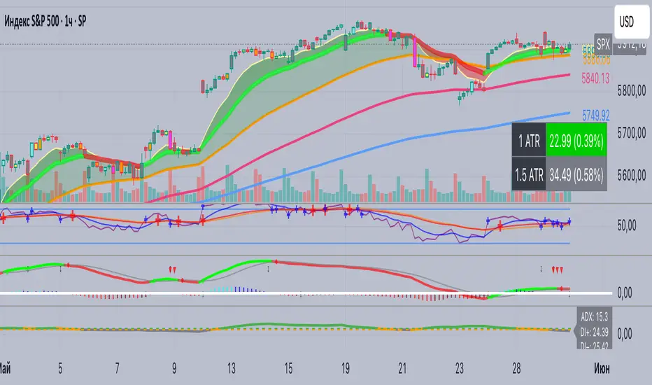
ADX+ Oscillator📈 ADX+ Oscillator — Enhanced Trend Strength Indicator
🔹 Description:
A modified oscillator based on the ADX (Average Directional Index), providing both visual and digital interpretation of trend strength and direction. A powerful tool for filtering sideways markets and identifying strong impulses across any timeframe.
🔹 Features:
• ADX line to assess trend strength
• DI+ and DI− lines to determine trend direction
• Colored background zones:
• Gray: ranging market (ADX < 20)
• Orange: transition zone (20 ≤ ADX < 25)
• Green: strong trend (ADX ≥ 25)
• Digital value labels for ADX / DI+ / DI− on the latest candle
• Signal arrows when DI+ crosses DI− and vice versa
🔹 Why use it:
• Signal filtering: avoid trades in flat markets (ADX < 20)
• Trend confirmation: enter only when ADX is rising above 25
• Directional guidance via DI+ and DI− behavior
🔹 Best for:
• Scalping (1m, 5m)
• Intraday trading (15m, 1h)
• Swing trading (4h and above)
• Breakout and pullback strategies
RSI Buy Sell Signals[RanaAlgo]Overview
This Premium RSI with Enhanced Signals builds upon the classic Relative Strength Index by incorporating multiple confirmation filters and visual enhancements to improve signal reliability. The indicator goes beyond basic overbought/oversold levels by adding volume confirmation, trend alignment, and peak detection logic.
Key Features
Enhanced Signal Detection
Peak Strength Filter: Requires RSI movements to meet minimum strength criteria (configurable from 1-5 bars)
Volume Confirmation: Optional volume filter to ensure signals occur with above-average trading activity
Trend Alignment: Optional trend confirmation that checks price position relative to 20-period EMA
Visual Improvements
Dynamic coloring of RSI line (green in oversold, red in overbought)
Customizable reference lines and zones
Clear buy/sell signals with triangle markers
Comprehensive info panel showing current RSI status
Alert Capabilities
Ready-to-use alert conditions for both buy and sell signals
Visual and audible alerts when signals trigger
How It Works
Core RSI Calculation: Uses standard RSI formula with configurable length (default 14)
Signal Generation:
Buy signals require either:
RSI rising from oversold with volume/trend confirmation (when enabled)
Simple crossover above oversold level (when filters disabled)
Sell signals require either:
RSI falling from overbought with volume/trend confirmation
Simple crossunder below overbought level
Additional Filters:
Minimum peak strength prevents weak, insignificant movements from generating signals
Volume filter helps confirm institutional participation
Trend filter aligns signals with broader price direction
Usage Instructions
Apply to any chart timeframe (works best on 1H or higher)
Configure settings in the input panel:
Adjust RSI length if needed
Set overbought/oversold levels (default 70/30)
Enable/disable volume and trend filters
Customize visual elements
Signals appear as triangles below/above the RSI line
Use alerts to get notified of new signals
Differentiation from Standard RSI
This indicator adds several layers of confirmation that aren't present in the basic RSI:
Multi-bar momentum requirement for peaks/troughs
Volume validation option
Trend confirmation option
Smoothed RSI line for cleaner visualization
Comprehensive info panel with current status
The combination of these features helps filter out false signals that commonly occur with traditional RSI implementations.

Visually Layered OscillatorVisually Layered Oscillator User's Manual
Visually Layered Oscillator is a multi-oscillator designed to provide an intuitive visualization of RSI, MACD, ADX + DMI, allowing traders to interpret multiple signals at a glance.
It is designed to allow comparison within the same panel while maintaining the inherent meaning of each oscillator and compensating for visual distortion issues caused by size differences.
Component Overview
Item Description
RSI (x10) Displays relative buy/sell strength. Values above 70 are overbought; values below 30 are oversold.
MACD (3,16,10) Momentum indicator showing the difference between moving averages. Consists of lines and histograms
ADX ×50 + DMI Indicates the strength of the trend; ADX determines the strength of the trend and DMI determines whether it is buy/sell dominant.
White background color treatment Removes difficult-to-see grid lines to improve visibility.
🖥️ Screen Example
The panel is divided into the following three layers
mathematica
Copy
Edit
Top: ⬆️ RSI (purple)
Middle: 📈 MACD, Signal, Histogram + Color Fill
Bottom: 📉 ADX × 50, DMI+ / DMI- (Red, Blue, Orange)
TIP: If you zoom in on the indicators at a larger scale, you can see that each indicator is drawn at a different height level and placed in such a way that they do not overlap.
⚙️ Settings
Fast Length: MACD Quick Line Duration (Basic 3)
Slow Length: MACD slow line period (basic 16)
Smoothing: Signal line smoothing value (basic 10)
Notes and Tips
RSI × 10 and ADX × 50 are for visualization purposes only multiplied by multiples of the actual values. It does not affect the calculation and maintains the original RSI/ADX characteristics.
The MACD fill color visually highlights crossing conditions.
The background is treated in full white, making the indicator look clean without grid lines.

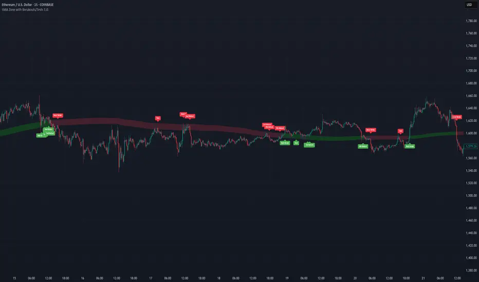
SMA Zone with Breakouts/Tests 1.0.This indicator plots a dynamic “SMA Zone” between two simple moving averages (one applied to lows, one to highs) and highlights key interaction points with the zone:
Breakouts
Bull Break: price closes above the upper SMA
Bear Break: price closes below the lower SMA
Requires confirmation via either above-average volume or an unusually wide bar (spread > ATR) closing near its extreme
Tests & Retests
After a breakout, the first re-entry into the zone edge is labeled “Test,” subsequent re-entries are numbered “Retest,” “2nd Retest,” etc.
Zone Weakening: each additional Test/Retest signifies diminished zone strength—fewer reliable boundaries remain (Traditional S/R theory)
Alerts
Fires a unified “Zone Signal” alert on every Break, Test, and Retest (set condition to “Any alert() function call”).
Disclaimer:
This is not financial advice and should not be used as a standalone trading signal.
It’s designed to draw your attention to important price-zone interactions so you can manually tune in.
The logic can be further enhanced or combined with other indicators/algorithms as part of a more complex trading system.
Malama's market chopMalama's Market Chop is a technical analysis indicator designed to help traders quickly identify periods of market "choppiness"—that is, when price action is range-bound, lacking clear direction, and prone to false breakouts. By highlighting these sideways, indecisive market conditions, the indicator enables traders to avoid entering trend-following trades during unfavorable environments, or to adapt their strategies for range trading.
Problem Solved:
Many trading strategies perform poorly in choppy, non-trending markets, leading to whipsaws and false signals. This indicator provides a clear, visual method to detect such conditions, allowing traders to filter out low-probability setups and improve their overall decision-making.
While the Choppiness Index is a known concept, this script offers a streamlined, user-friendly implementation with several enhancements:
Custom Summation Function: The script uses a custom function to calculate the sum of bar ranges, ensuring precise control over the calculation and compatibility with Pine Script v6.
Visual Alerts: It provides immediate, on-chart visual cues (background highlights and triangle markers) to signal choppy conditions, making it easy to spot at a glance.
Real-Time Labeling: The current Choppiness Index value is displayed directly on the chart, keeping traders informed of the latest market state.
User Customization: Key parameters such as the lookback period and threshold are fully adjustable, allowing adaptation to different assets and timeframes.
Usefulness:
This indicator is especially valuable for:
Trend-following traders who want to avoid entering trades during sideways markets.
Range traders seeking to identify optimal periods for mean-reversion strategies.
Algorithmic/systematic traders who wish to use choppiness as a filter in their strategies.
How It Works: Detailed Methodology
1. Choppiness Index Calculation
Range Summation:
The script calculates the sum of the absolute price ranges (high minus low) for each bar over a user-defined period (chopPeriod).
Total Range:
It also computes the difference between the highest high and the lowest low over the same period.
Choppiness Index Formula:
The Choppiness Index is then calculated as:
Choppiness Index = 100 × log10(rangeSum / rangeTotal) / log10(chopPeriod)
This normalizes the value, making it comparable across different assets and timeframes.
Division by Zero Protection:
If the total range is zero (i.e., no price movement), the index is set to zero to avoid errors.
2. Choppy Market Detection
Threshold Comparison:
The indicator compares the current Choppiness Index value to a user-defined threshold (chopThreshold).
If the index is above the threshold, the market is considered "choppy" (sideways).
If below, the market is likely trending.
3. Visual and Signal Logic
Background Highlight:
When a choppy condition is detected, the chart background is softly highlighted in yellow, making it easy to spot periods of indecision.
Triangle Marker:
A small blue triangle is plotted below each bar where the market is choppy, providing a clear, bar-by-bar signal.
Current Value Label:
On the most recent bar, a blue label displays the current Choppiness Index value, keeping traders informed in real time.
Strategy Results and Risk Management
Note:
This script is an indicator and does not generate buy/sell signals or execute trades. Therefore, it does not include backtesting, position sizing, or risk management features. However, it is designed to be used as a filter within broader trading strategies, helping traders avoid entering positions during choppy conditions.
Guidance for Use:
Trend Strategies: Consider pausing or reducing position size when the indicator signals a choppy market.
Range Strategies: Consider activating mean-reversion or range-bound strategies during choppy periods.
User Settings and Customization
The indicator provides the following user-adjustable inputs:
Choppiness Period (chopPeriod):
Default: 14
Description: The number of bars used to calculate the Choppiness Index.
Effect: Shorter periods make the indicator more sensitive to recent price action; longer periods smooth out short-term noise.
Choppiness Threshold (chopThreshold):
Default: 61.8
Description: The Choppiness Index value above which the market is considered choppy.
Effect: Lowering the threshold will classify more periods as choppy; raising it will make the filter stricter.
These settings allow traders to tailor the indicator to different assets, timeframes, and personal trading styles.
Visualizations and Chart Setup
The indicator plots the following elements directly on the price chart:
Background Color:
Yellow (semi-transparent): Highlights periods where the Choppiness Index exceeds the threshold, signaling a choppy market.
Triangle Markers:
Blue triangles below bars: Mark each bar where a choppy condition is detected.
Current Value Label:
Blue label on the latest bar: Displays the current Choppiness Index value for quick reference.
Clarity:
Only elements relevant to the indicator’s function are plotted, ensuring a clean and focused chart presentation.

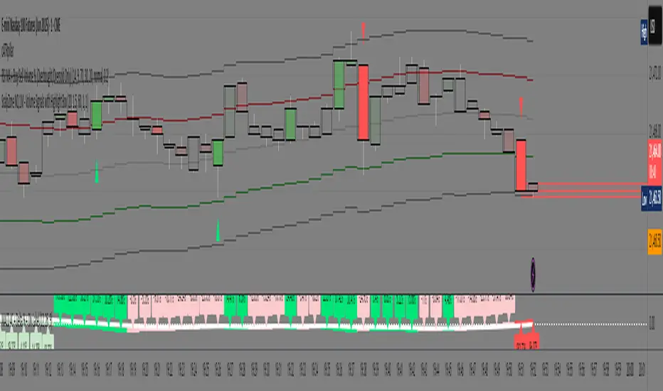
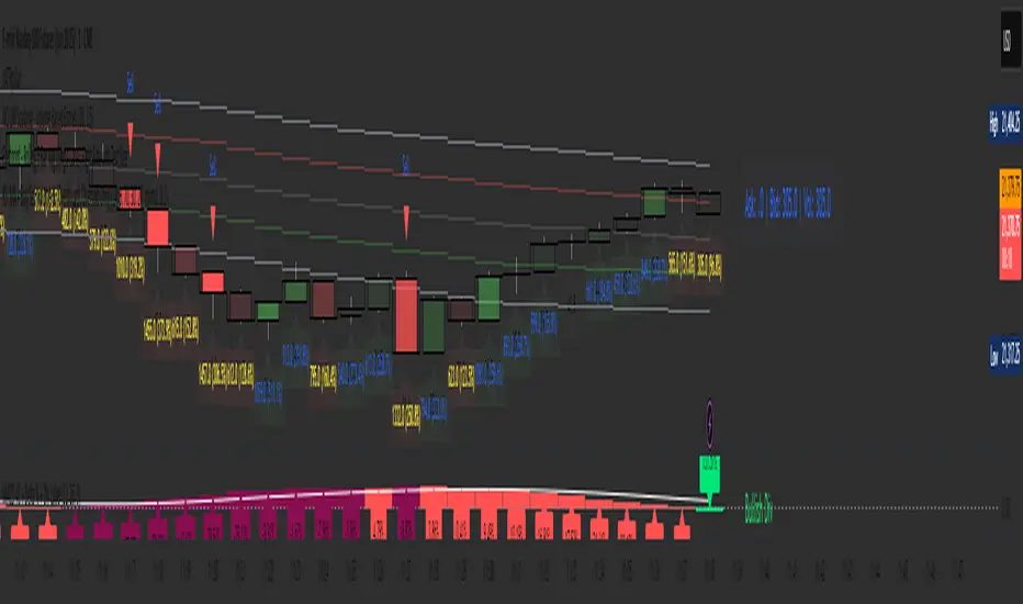
ScalpZone NQ 1M - Volume Signals with Highlight Box📊 ScalpZone NQ 1M - Volume Signals with Highlight Box
ScalpZone is a professional-grade indicator designed specifically for 1-minute scalping on Nasdaq Futures (NQ), focusing on high-volume price action zones. It automatically detects aggressive buying/selling activity based on volume spikes and visualizes potential entry zones with dynamic horizontal lines and price boxes.
🔍 Key Features:
Volume Spike Detection: Identifies high-volume candles using an adjustable EMA-based volume threshold.
Directional Volume Signals: Highlights candles with directional momentum (bullish or bearish) based on real-time volume dominance.
Scalp Zone Visualization:
Draws horizontal support/resistance lines at volume signal prices.
Renders price boxes around those levels to highlight actionable zones.
Zones automatically extend when respected by price, and disappear when invalidated.
Visual Candle Enhancement: Dynamically colors candles to reflect normalized volume intensity and direction.
Customizable Parameters:
Volume EMA & threshold multiplier
Line and box dimensions
Toggle zone visibility
🛠️ Use Case:
Perfect for scalpers and short-term traders looking to exploit volume-based reversals or breakout traps on the NQ 1-minute chart. Traders can use the visual cues to time entries, manage stops, or validate confluence with other tools (e.g., order flow, delta spikes, or footprint charts).
4 colour MACD with Delta % + Div LabelMACD 4C + Delta % + Divergence Label
This advanced MACD-based indicator is designed for professional traders seeking enhanced momentum analysis with visual clarity. It offers a multi-faceted view of MACD behavior with real-time insights into trend strength, acceleration, and divergence signals.
Key Features:
4-Color MACD Histogram:
Visually distinguishes between rising and falling MACD bars in both bullish and bearish zones for quicker momentum assessment.
Delta % Labels:
Each bar displays the percentage change in MACD compared to the previous bar, providing instant feedback on MACD acceleration and shift in momentum.
Automatic Divergence Detection:
Identifies regular bullish and bearish divergences using pivot-based logic. Displays clear, compact labels near MACD bars to highlight potential reversal zones.
Clean, Minimalist Design:
Divergence labels are sized for readability and positioned to avoid overlapping with MACD data, ensuring clean chart presentation.
No repainting or lag:
All divergence calculations are based on confirmed pivots, ensuring reliable signal generation without false alerts.
This tool is ideal for scalpers, swing traders, and momentum traders who rely on MACD dynamics for precise timing and directional bias. Use it to improve your entry and exit accuracy by combining traditional MACD signals with real-time volume and divergence insight.
🔹 Usage Notes
Recommended Timeframes:
Works well on all timeframes. For scalping, use 1m–5m; for swing trading, use 15m–1H+.
Best for:
Traders looking for a fast, visual way to assess trend strength and spot divergence-based reversal opportunities.
Pair With:
Can be used alongside price action, volume profile, RSI, or order flow-based indicators for confirmation.
How to Read:
Green/Red MACD bars indicate bullish/bearish momentum.
Delta % shows MACD change rate — increasing positive delta = strengthening trend.
Arrows/text labels signal potential divergence — pay attention when divergence aligns with support/resistance or price structure.
Notes:
No repainting — divergence is only drawn after pivots are confirmed.
All labels are automatically managed for clean display.
Can be customized further for hidden divergences or alert integration.
TCT - Envelope MatrixTCT - Envelope Matrix
A powerful multi-envelope indicator that creates a comprehensive price channel system with 4 customizable envelopes and multiple intermediate levels for precise price action analysis.
Key Features:
• 4 customizable envelopes with adjustable percentages (0.2%, 0.4%, 0.6%, 0.8% by default)
• Optional EMA or SMA basis calculation
• Color-coded bands for easy visual identification
• Automatic horizontal lines showing current band values
• Midpoint lines between adjacent bands
• Additional 25%, 50%, and 75% levels between each band pair
The indicator provides:
- Clear visual representation of price channels
- Multiple support and resistance levels
- Dynamic price boundaries that adapt to market conditions
- Enhanced precision with intermediate levels between bands
Perfect for:
• Identifying potential support and resistance zones
• Spotting overbought/oversold conditions
• Finding potential reversal points
• Analyzing price volatility and channel width
• Making informed trading decisions based on price position relative to multiple bands
Customization Options:
• Adjustable length for the basis calculation
• Choice between EMA and SMA
• Customizable colors for each envelope
• Flexible percentage settings for each band
• Optional basis line color adjustment
This indicator is particularly useful for traders who want to analyze price action within multiple dynamic channels and identify potential trading opportunities based on price interactions with various support and resistance levels.
Diagonal Support and Resistance Trend LinesA simple indicator to plot trend lines.
1. Adjust the "Pivot Lookback" (default: 20) to control pivot sensitivity. Larger values detect more significant pivots.
2. Adjust the "Max Trend Lines" (default: 4) to control how many support/resistance lines are drawn.
The indicator will plot:
1. Red dashed lines for resistance (based on pivot highs).
2. Green dashed lines for support (based on pivot lows).
3. Small red triangles above bars for pivot highs and green triangles below bars for pivot lows.
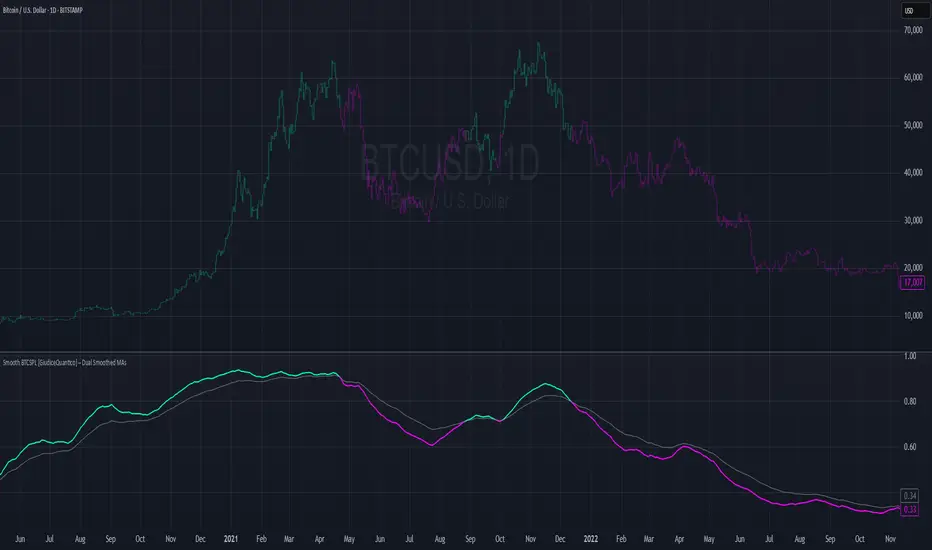
Smooth BTCSPL [GiudiceQuantico] – Dual Smoothed MAsSmooth BTCSPL – Dual Smoothed MAs
What it measures
• % of Bitcoin addresses in profit vs loss (on-chain tickers).
• Spread = profit % − loss % → quick aggregate-sentiment gauge.
• Optional alpha-decay normalisation ⇒ keeps the curve on a 0-1 scale across cycles.
User inputs
• Use Alpha-Decay Adjusted Input (true/false).
• Fast MA – type (SMA / EMA / WMA / VWMA) & length (default 100).
• Slow MA – type & length (default 200).
• Colours – Bullish (#00ffbb) / Bearish (magenta).
Computation flow
1. Fetch daily on-chain series.
2. Build raw spread.
3. If alpha-decay enabled:
alpha = (rawSpread − 140-week rolling min) / (1 − rolling min).
4. Smooth chosen base with Fast & Slow MAs.
5. Bullish when Fast > Slow, bearish otherwise.
6. Bars tinted with the same bull/bear colour.
How to read
• Fast crosses above Slow → rising “addresses-in-profit” momentum → bullish bias.
• Fast crosses below Slow → stress / capitulation risk.
• Price-indicator divergences can flag exhaustion or hidden accumulation.
Tips
• Keep in a separate pane (overlay = false); bar-colouring still shows on price chart.
• Shorter lengths for swing trades, longer for macro outlook.
• Combine with funding rates, NUPL or simple price-MA crossovers for confirmation.
ZigZag ProZigZag Pro is a precise market structure indicator that automatically detects two independent ZigZag patterns and highlights breakouts whenever significant highs or lows are breached.
The indicator calculates two separate ZigZag structures in real time. ZigZag1 captures the broader market swings and is ideal for trend or swing trading. ZigZag2 is optional and reacts more quickly – perfect for intraday or scalping setups. Both layers are fully customizable in terms of depth, color, and line width.
What makes this tool especially useful: whenever a previous swing high (for long trades) or swing low (for short trades) is broken, the indicator draws a horizontal breakout line on the chart. This makes it easy to spot structural breakouts and take advantage of potential momentum moves.
ZigZag Pro is designed for traders who rely on clean, rule-based market structure — whether you're trading classic breakouts, smart money concepts, or simply want a clearer view of trend shifts. The visuals are minimal, responsive, and suitable for any timeframe.
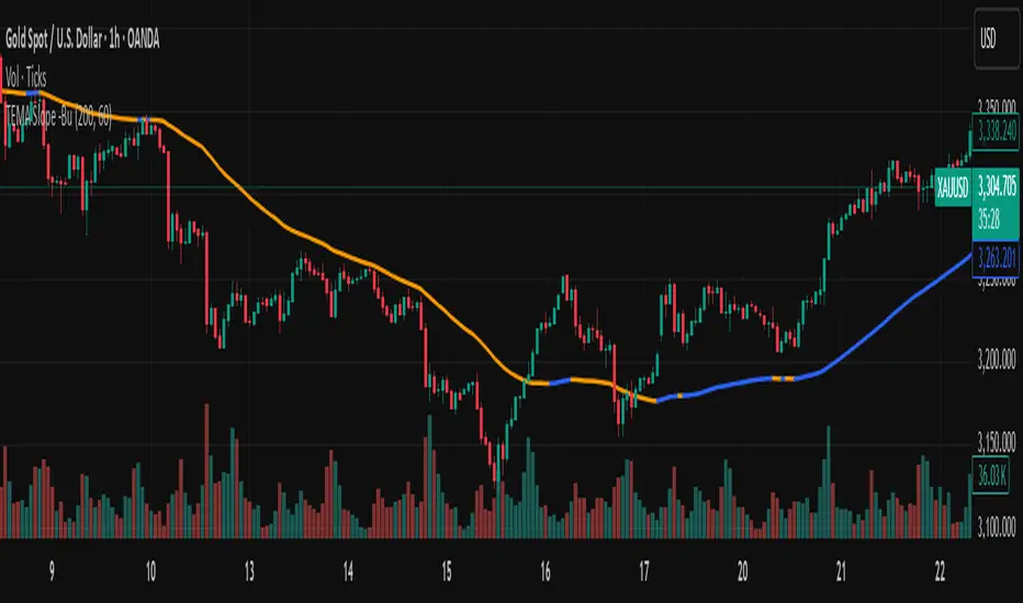
TEMA with Slope Color [MrBuCha]This TEMA indicator is particularly useful for trend following strategies. The key innovation here is using a higher timeframe (default 1-hour) to get a broader perspective on the trend direction, while the color-coding makes it immediately obvious whether the momentum is bullish (blue) or bearish (orange).
The 200-period length makes this more suitable for swing trading rather than day trading, as it filters out short-term noise and focuses on significant trend movements.
//
What is TEMA and How Does It Work?
TEMA (Triple Exponential Moving Average) is a technical indicator that builds upon the standard EMA to reduce lag and provide faster response to price changes. The calculation process is:
EMA1 = EMA of closing price with specified length
EMA2 = EMA of EMA1 with the same length
EMA3 = EMA of EMA2 with the same length
TEMA = 3 × (EMA1 - EMA2) + EMA3
This formula helps reduce the lag inherent in smoothing calculations, making TEMA more responsive to price movements compared to other moving averages.
Default Values
Length: 200 periods
Timeframe: "60" (1 hour)
Slope Colors
Blue: When TEMA is trending upward (tema_current > tema_previous)
Orange: When TEMA is trending downward (tema_current ≤ tema_previous)
Pros and Cons Summary
Advantages:
Fast Response: Reduces lag better than SMA and regular EMA
Easy to Use: Color-coded slope makes trend direction immediately visible
Multi-timeframe Capability: Can display TEMA from higher timeframes
Trend Following: Excellent for identifying trend direction
Visual Clarity: Clear color signals help with quick decision making
Disadvantages:
False Signals: Prone to whipsaws in sideways/choppy markets
Noise in Volatility: Frequent color changes during high volatility periods
Not Suitable for Scalping: Length of 200 is quite long for short-term trading
Still Lagging: Despite improvements, it remains a lagging indicator
Requires Confirmation: Should be used with other indicators for better accuracy
Best Use Cases:
Medium to long-term trend following
Identifying major trend changes
Multi-timeframe analysis
Combine with momentum oscillators for confirmation
Trading Tips:
Wait for color confirmation before entering trades
Use higher timeframe TEMA for overall trend bias
Combine with support/resistance levels
Avoid trading during consolidation periods
RSI.TrendContext
The Relative Strength Index (RSI) is one of the most widely used classical indicators in technical analysis, typically employed to identify overbought or oversold market conditions. It reflects the degree of upside or downside dominance within a specified period. However, in its standard form, RSI is not particularly effective as a standalone entry trigger.
The RSI.Trend indicator enhances the RSI to provide a more reliable method for distinguishing between bullish and bearish market regimes and offers specific entry triggers. It adds supplementary value to the pure RSI read.________________________________________
Concept
In trending markets, an Exponential Moving Average (EMA) of the price is often smoother and more stable than raw price data. As a result, the RSI calculated on this smoothed price (i.e., the EMA) tends to react earlier and more consistently than the standard RSI. Specifically:
• In uptrends, the RSI of the EMA tends to exceed the RSI of the original price.
• In downtrends, it tends to lag behind.
The difference between these two RSI readings provides a stable and less noisy measure of market bias—positive in uptrends, negative in downtrends. The crossing points can serve as entry triggers. This is, what the RSI.Trend is trying to capture.
________________________________________
The RSI.Trend indicator operates as follows:
• It first computes the 5-period EMA of the price series of the underlying ("EMA5").
• It calculates the 14-period RSI of the original price series ("RSI") as well as the 14-period RSI of EMA5 ("RSIEMA").
• It then determines the 14-period EMA of RSI ("RSI.MA") and RSIEMA ("RSIEMA.MA").
These values are used to define a Baseline and a Trigger Line:
• Baseline: The average of RSI and RSI.MA.
• Trigger Line: The average of RSIEMA and RSIEMA.MA.
Essentially, the baseline represents a smoother version of the RSI of the original price series, while the trigger line is a smoother version of the RSI on the EMA5 of the original price series.
Additionally, the RSI.Trend Background Value is calculated as the difference between the Trigger Line and the Baseline, slightly accelerated by incorporating the current bias of this difference. This acceleration causes the Background Value to react somewhat faster than the pure difference between the two lines.
How to use the RSI.Trend:
• As mentioned in the introductory context, during uptrends, the trigger line remains above the baseline; in downtrends, it stays below the baseline.
• A crossover of the baseline by the trigger line indicates a regime shift from bearish to bullish and can signal avoiding adding short positions, closing short positions, or adding long positions.
• A crossunder of the baseline by the trigger line indicates a regime shift from bullish to bearish and can signal avoiding adding long positions, closing long positions, or adding short positions.
• The level of the Trigger Line can serve as a confidence indicator; for instance, if the trigger line crosses under the baseline coming from very high values, it implies high confidence.
• The Background Value indicates the accelerated difference between the two lines:
o > 0 (Green background): Indicates a Bullish regime.
o < 0 (Red background): Indicates a Bearish regime.
The Background Value reacts slightly faster than line crossings due to its acceleration relative to the difference of the two lines.
Including these lines in the script besides the Background Value, provides insight into their levels and their origins, aiding in formulating confidence in an entry trigger, which the background value alone cannot provide. The change in slope of the trigger Line can also be used as an early and fast position-trigger.
Finally, the Background Value can be utilized in continuous trading scenarios (i.e., no entry points, always engaged) as a multiplier on a predefined max-exposure value, representing the current exposure as a fraction of that max-exposure.
The usage of RSI.Trend is also exemplified in the introductory chart.________________________________________
Final Notes
As with all indicators, the RSI.Trend is most effective when used in conjunction with other technical tools and market context. It does not predict future price movements; rather, it reflects current market dynamics and recent directional tendencies. Use it with discretion and as part of a broader trading strategy.
Enhanced Stock Ticker with 50MA vs 200MADescription
The Enhanced Stock Ticker with 50MA vs 200MA is a versatile Pine Script indicator designed to visualize the relative position of a stock's price within its short-term and long-term price ranges, providing actionable bullish and bearish signals. By calculating normalized indices based on user-defined lookback periods (defaulting to 50 and 200 bars), this indicator helps traders identify potential reversals or trend continuations. It offers the flexibility to plot signals either on the main price chart or in a separate lower pane, leveraging Pine Script v6's force_overlay functionality for seamless integration. The indicator also includes a customizable ticker table, visual fills, and alert conditions for automated trading setups.
Key Features
Dual Lookback Indices: Computes short-term (default: 50 bars) and long-term (default: 200 bars) indices, normalizing the closing price relative to the high/low range over the specified periods.
Flexible Signal Plotting: Users can toggle between plotting crossover signals (triangles) on the main price chart (location.abovebar/belowbar) or in the lower pane (location.top/bottom) using the Plot Signals on Main Chart option.
Crossover Signals: Generates bullish (Golden Cross) and bearish (Death Cross) signals when the short or long index crosses above 5 or below 95, respectively.
Visual Enhancements:
Plots short-term (blue) and long-term (white) indices in a separate pane with customizable lookback periods.
Includes horizontal reference lines at 0, 20, 50, 80, and 100, with green and red fills to highlight overbought/oversold zones.
Dynamic fill between indices (green when short > long, red when long > short) for quick trend visualization.
Displays a ticker and legend table in the top-right corner, showing the symbol and lookback periods.
Alert Conditions: Supports alerts for bullish and bearish crossovers on both short and long indices, enabling integration with TradingView's alert system.
Technical Innovation: Utilizes Pine Script v6's force_overlay parameter to plot signals on the main chart from a non-overlay indicator, combining the benefits of a separate pane and chart-based signals in a single script.
Technical Details
Calculation Logic:
Uses confirmed bars (barstate.isconfirmed) to calculate indices, ensuring reliability by avoiding real-time bar fluctuations.
Short-term index: (close - lowest(low, lookback_short)) / (highest(high, lookback_short) - lowest(low, lookback_short)) * 100
Long-term index: (close - lowest(low, lookback_long)) / (highest(high, lookback_long) - lowest(low, lookback_long)) * 100
Signals are triggered using ta.crossover() and ta.crossunder() for indices crossing 5 (bullish) and 95 (bearish).
Signal Plotting:
Main chart signals use force_overlay=true with location.abovebar/belowbar for precise alignment with price bars.
Lower pane signals use location.top/bottom for visibility within the indicator pane.
Plotting is controlled by boolean conditions (e.g., bullishLong and plot_on_chart) to ensure compliance with Pine Script's global scope requirements.
Performance Considerations: Optimized for efficiency by calculating indices only on confirmed bars and using lightweight plotting functions.
How to Use
Add to Chart:
Copy the script into TradingView's Pine Editor and add it to your chart.
Configure Settings:
Short Lookback Period: Adjust the short-term lookback (default: 50 bars) to match your trading style (e.g., 20 for shorter-term analysis).
Long Lookback Period: Adjust the long-term lookback (default: 200 bars) for broader market context.
Plot Signals on Main Chart: Check this box to display signals on the price chart; uncheck to show signals in the lower pane.
Interpret Signals:
Golden Cross (Bullish): Green (long) or blue (short) triangles indicate the index crossing above 5, suggesting a potential buying opportunity.
Death Cross (Bearish): Red (long) or white (short) triangles indicate the index crossing below 95, signaling a potential selling opportunity.
Set Alerts:
Use TradingView's alert system to create notifications for the four alert conditions: Long Index Valley, Long Index Peak, Short Index Valley, and Short Index Peak.
Customize Visuals:
The ticker table displays the symbol and lookback periods in the top-right corner.
Adjust colors and styles via TradingView's settings if desired.
Example Use Cases
Swing Trading: Use the short-term index (e.g., 50 bars) to identify short-term reversals within a broader trend defined by the long-term index.
Trend Confirmation: Monitor the fill between indices to confirm whether the short-term trend aligns with the long-term trend.
Automated Trading: Leverage alert conditions to integrate with bots or manual trading strategies.
Notes
Testing: Always backtest the indicator on your chosen market and timeframe to validate its effectiveness.
Optional Histogram: The script includes a commented-out histogram for the index difference (index_short - index_long). Uncomment the plot(index_diff, ...) line to enable it.
Compatibility: Built for Pine Script v6 and tested on TradingView as of May 27, 2025.
Acknowledgments
This indicator was inspired by the need for a flexible tool that combines lower-pane analysis with main chart signals, made possible by Pine Script's force_overlay feature. Share your feedback or suggestions in the comments below, and happy trading!
