EWMA & EWVar + EWStd Expansion with MTF_V.5EWMA & EWVar + EWStd Expansion with MTF_V.5
This indicator combines adaptive trend smoothing (EWMA), variance estimation (EWVar) and dynamic volatility “bursts” (EWStd Expansion) with optional higher-timeframe confirmation. It’s designed both for visual chart analysis and for automated alerts on regime changes.
Key Features
EWMA (Exponential Smoothing):
• Computes an exponential moving average with either a custom α or a length-derived α = 2/(N+1).
• Option to recalculate only every N bars (reduces CPU load).
EWVar & EWStd (Variance & Standard Deviation):
• Exponentially weighted variance tracks recent price dispersion.
• EWStd (σ) is computed alongside the EWMA.
• Z-score (deviation in σ units) shows how far price has diverged from trend.
Multi-Timeframe Filter (MTF):
• Optionally require the same trend direction on a chosen higher timeframe (e.g. Daily, Weekly, H4).
• Real-time lookahead available (may repaint).
Gradient Around EWMA:
• A multi-layer “glow” zone of ±1σ, broken into up to 10 steps.
• Color interpolates between “upper” and “lower” shades for bullish, bearish and neutral regimes.
Instantaneous Trendline (ITL):
• Ultra-fast trend filter with slope-based coloring.
• Highlights micro-trends and short-lived accelerations.
Cross-Over Signals (ITL ↔ EWMA):
• Up/down triangles plotted when the ITL crosses the main EWMA.
EWStd Expansion (Volatility Bursts):
• Automatically detects σ expansions (σ growth above a set % threshold).
• Price filter: only when price moves beyond EWMA ± (multiplier·σ).
• Optional higher-timeframe confirmation.
Labels & Alerts:
• Text labels and circular markers on bars where a volatility burst occurs.
• Built-in alertcondition calls for both bullish and bearish expansions.
How to Use
Visual Analysis:
• The gradient around EWMA shows the width of the volatility channel expanding or contracting.
• ITL color changes instantly highlight short-term impulses.
• EWMA line color switches (bullish/bearish/neutral) indicate trend state.
Spotting Volatility Breakouts:
• “EWStd Expansion” labels and circles signal the onset of strong moves when σ spikes.
• Useful for entering at the start of new impulses.
Automated Alerts:
• Set alerts on the built-in conditions “Bullish EWStd Expansion Alert” or “Bearish EWStd Expansion Alert” to receive a popup or mobile push when a burst occurs.
This compact tool unifies trend, volatility and multi-timeframe analysis into a single indicator—ideal for traders who want to see trend direction, current dispersion, and timely volatility burst signals all at once.
Trend Analysis

EMD Trend [InvestorUnknown]EMD Trend is a dynamic trend-following indicator that utilizes Exponential Moving Deviation (EMD) to build adaptive channels around a selected moving average. Designed for traders who value responsive trend signals with built-in volatility sensitivity, this tool highlights directional bias, market regime shifts, and potential breakout opportunities.
How It Works
Instead of using standard deviation, EMD Trend employs the exponential moving average of the absolute deviation from a moving average—producing smoother, faster-reacting upper and lower bounds:
Bullish (Risk-ON Long): Price crosses above the upper EMD band
Bearish (Risk-ON Short): Price crosses below the lower EMD band
Neutral: Price stays within the channel, indicating potential mean reversion or low momentum
Trend direction is defined by price interaction with these bands, and visual cues (color-coded bars and fills) help quickly identify market conditions.
Features
7 Moving Average Types: SMA, EMA, HMA, DEMA, TEMA, RMA, FRAMA
Custom Price Source: Choose close, hl2, ohlc4, or others
EMD Multiplier: Controls the width of the deviation envelope
Bar Coloring: Candles change color based on current trend
Intra-bar Signal Option: Enables faster updates (with optional repainting)
Speculative Zones: Fills highlight aggressive momentum moves beyond EMD bounds
Backtest Mode
Switch to Backtest Mode for performance evaluation over historical data:
Equity Curve Plot: Compare EMD Trend strategy vs. Buy & Hold
Trade Metrics Table: View number of trades, win/loss stats, profits
Performance Metrics Table: Includes CAGR, Sharpe, max drawdown, and more
Custom Start Date: Select from which date the backtest should begin
Trade Sizing: Configure capital and trade percentage per entry
Signal Filters: Choose from Long Only, Short Only, or Both
Alerts
Built-in alerts let you automate entries, exits, and trend transitions:
LONG (EMD Trend) - Trend flips to Long
SHORT (EMD Trend) - Trend flips to Short
RISK-ON LONG - Price crosses above upper EMD band
RISK-OFF LONG - Price crosses back below upper EMD band
RISK-ON SHORT - Price crosses below lower EMD band
RISK-OFF SHORT - Price crosses back above lower EMD band
Use Cases
Trend Confirmation with volatility-sensitive boundaries
Momentum Entry Filtering via breakout zones
Mean Reversion Avoidance in sideways markets
Backtesting & Strategy Building with real-time metrics
Disclaimer
This indicator is intended for informational and educational purposes only. It does not constitute investment advice. Historical performance does not guarantee future results. Always backtest and use in simulation before live trading.

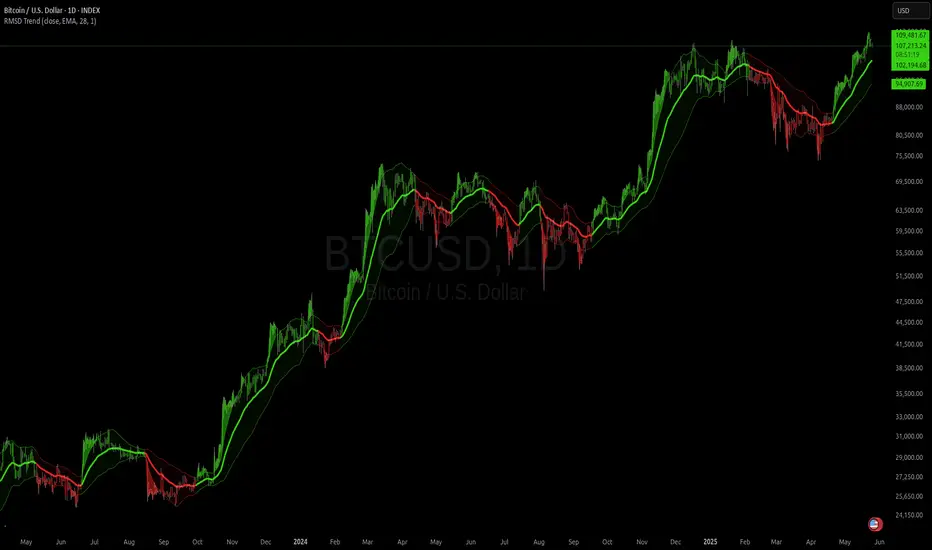
RMSD Trend [InvestorUnknown]RMSD Trend is a trend-following indicator that utilizes Root Mean Square Deviation (RMSD) to dynamically construct a volatility-weighted trend channel around a selected moving average. This indicator is designed to enhance signal clarity, minimize noise, and offer quantitative insights into market momentum, ideal for both discretionary and systematic traders.
How It Works
At its core, RMSD Trend calculates a deviation band around a selected moving average using the Root Mean Square Deviation (similar to standard deviation but with squared errors), capturing the magnitude of price dispersion over a user-defined period. The logic is simple:
When price crosses above the upper deviation band, the market is considered bullish (Risk-ON Long).
When price crosses below the lower deviation band, the market is considered bearish (Risk-ON Short).
If price stays within the band, the market is interpreted as neutral or ranging, offering low-risk decision zones.
The indicator also generates trend flips (Long/Short) based on crossovers and crossunders of the price and the RMSD bands, and colors candles accordingly for enhanced visual feedback.
Features
7 Moving Average Types: Choose between SMA, EMA, HMA, DEMA, TEMA, RMA, and FRAMA for flexibility.
Customizable Source Input: Use price types like close, hl2, ohlc4, etc.
Volatility-Aware Channel: Adjustable RMSD multiplier determines band width based on volatility.
Smart Coloring: Candles and bands adapt their colors to reflect trend direction (green for bullish, red for bearish).
Intra-bar Repainting Toggle: Option to allow more responsive but repaintable signals.
Speculation Fill Zones: When price exceeds the deviation channel, a semi-transparent fill highlights potential momentum surges.
Backtest Mode
Switching to Backtest Mode unlocks a robust suite of simulation features:
Built-in Equity Curve: Visualizes both strategy equity and Buy & Hold performance.
Trade Metrics Table: Displays the number of trades, win rates, gross profits/losses, and long/short breakdowns.
Performance Metrics Table: Includes key stats like CAGR, drawdown, Sharpe ratio, and more.
Custom Date Range: Set a custom start date for your backtest.
Trade Sizing: Simulate results using position sizing and initial capital settings.
Signal Filters: Choose between Long & Short, Long Only, or Short Only strategies.
Alerts
The RMSD Trend includes six built-in alert conditions:
LONG (RMSD Trend) - Trend flips from Short to Long
SHORT (RMSD Trend) - Trend flips from Long to Short
RISK-ON LONG (RMSD Trend) - Price crosses above upper RMSD band
RISK-OFF LONG (RMSD Trend) - Price falls back below upper RMSD band
RISK-ON SHORT (RMSD Trend) - Price crosses below lower RMSD band
RISK-OFF SHORT (RMSD Trend) - Price rises back above lower RMSD band
Use Cases
Trend Confirmation: Confirms directional bias with RMSD-weighted confidence zones.
Breakout Detection: Highlights moments when price breaks free from historical volatility norms.
Mean Reversion Filtering: Avoids false signals by incorporating RMSD’s volatility sensitivity.
Strategy Development: Backtest your signals or integrate with a broader system for alpha generation.
Settings Summary
Display Mode: Overlay (default) or Backtest Mode
Average Type: Choose from SMA, EMA, HMA, DEMA, etc.
Average Length: Lookback window for moving average
RMSD Multiplier: Band width control based on RMS deviation
Source: Input price source (close, hl2, ohlc4, etc.)
Intra-bar Updating: Real-time updates (may repaint)
Color Bars: Toggle bar coloring by trend direction
Disclaimer
This indicator is provided for educational and informational purposes only. It is not financial advice. Past performance, including backtest results, is not indicative of future results. Use with caution and always test thoroughly before live deployment.
Trailing Stop Loss [TradingFinder] 4 Machine Learning Methods🔵 Introduction
The trailing stop indicator dynamically adjusts stop-loss (SL) levels to lock in profits as price moves favorably. It uses pivot levels and ATR to set optimal SL points, balancing risk and reward.
Trade confirmation filters, a key feature, ensure entries align with market conditions, reducing false signals. In 2023 a study showed filtered entries improve win rates by 15% in forex. This enhances trade precision.
SL settings, ranging from very tight to very wide, adapt to volatility via ATR calculations. These settings anchor SL to previous pivot levels, ensuring alignment with market structure. This caters to diverse trading styles, from scalping to swing trading.
The indicator colors the profit zone between the entry point (EP) and SL, using light green for buy trades and light red for sell trades. This visual cue highlights profit potential. It’s ideal for traders seeking dynamic risk management.
A table displays real-time trade details, including EP, SL, and profit/loss (PNL). Backtests show trailing stops cut losses by 20% in trending markets. This transparency aids decision-making.
🔵 How to Use
🟣 SL Levels
The trailing stop indicator sets SL based on pivot levels and ATR, offering four options: very tight, tight, wide, or very wide. Very tight SLs suit scalpers, while wide SLs fit swing traders. Select the base level to match your strategy.
If price hits the SL, the trade closes, and the indicator evaluates the next trade using the selected filter. This ensures disciplined trade management. The cycle restarts with a new confirmed entry.
Very tight SLs, set near recent pivots, trigger exits early to minimize risk but limit profits in volatile markets. Wide SLs, shown as farther lines, allow more price movement but increase exposure to losses. Adjust based on ATR and conditions, noting SL breaches open new positions.
🟣 Visualization
The indicator’s visual cues, like colored profit zones, simplify monitoring, with light green showing the profit area from EP to trailed SL. Dashed lines mark entry points, while solid lines track the trailed SL, triggering new positions when breached.
When price moves into profit, the area between EP and SL is colored—light green for longs, light red for shorts. This highlights the profit zone visually. The SL trails price, locking in gains as the trade progresses.
🟣 Filters
Upon trade entry, the indicator requires confirmation via filters like SMA 2x or ADX to validate momentum. Filters reduce false entries, though no guarantee exists for improved outcomes. Monitor price action post-entry for trade validity.
Filters like Momentum or ADX assess trend strength before entry. For example, ADX above 25 confirms strong trends. Choose “none” for unfiltered entries.
🟣 Bullish Alert
For a bullish trade, the indicator opens a long position with a green SL Line (after optional filters), trailing the SL below price. Set alerts to On in the settings for notifications, or Off to monitor manually.
🟣 Bearish Alert
In a bearish trade, the indicator opens a short position with a red SL Line post-confirmation, trailing the SL above price. With alerts On in the settings, it notifies the potential reversal.
🟣 Panel
A table displays all trades’ details, including Win Rates, PNL, and trade status. This real-time data aids in tracking performance. Check the table to assess trade outcomes instantly.
Review the table regularly to evaluate trade performance and adjust settings. Consistent monitoring ensures alignment with market dynamics. This maximizes the indicator’s effectiveness.
🔵 Settings
Length (Default: 10) : Sets the pivot period for calculating SL levels, balancing sensitivity and reliability.
Base Level : Options (“Very tight,” “Tight,” “Wide,” “Very wide”) adjust SL distance via ATR.
Show EP Checkbox : Toggles visibility of the entry point on the chart.
Show PNL : Displays profit/loss data for active and closed trades.
Filter : Options (“none,” “SMA 2x,” “Momentum,” “ADX”) validate trade entries.
🔵 Conclusion
The trailing stop indicator, a dynamic risk management tool, adjusts SLs using pivot levels and ATR. Its confirmation filters reduce false entries, boosting precision. Backtests show 20% loss reduction in trending markets.
Customizable SL settings and visual profit zones enhance usability across trading styles. The real-time table provides clear trade insights, streamlining analysis. It’s ideal for forex, stocks, or crypto.
While filters like ADX improve entry accuracy, no setup guarantees success in all conditions. Contextual analysis, like trend strength, is key. This indicator empowers disciplined, data-driven trading.

Lyapunov Market Instability (LMI)Lyapunov Market Instability (LMI)
What is Lyapunov Market Instability?
Lyapunov Market Instability (LMI) is a revolutionary indicator that brings chaos theory from theoretical physics into practical trading. By calculating Lyapunov exponents—a measure of how rapidly nearby trajectories diverge in phase space—LMI quantifies market sensitivity to initial conditions. This isn't another oscillator or trend indicator; it's a mathematical lens that reveals whether markets are in chaotic (trending) or stable (ranging) regimes.
Inspired by the meditative color field paintings of Mark Rothko, this indicator transforms complex chaos mathematics into an intuitive visual experience. The elegant simplicity of the visualization belies the sophisticated theory underneath—just as Rothko's seemingly simple color blocks contain profound depth.
Theoretical Foundation (Chaos Theory & Lyapunov Exponents)
In dynamical systems, the Lyapunov exponent (λ) measures the rate of separation of infinitesimally close trajectories:
λ > 0: System is chaotic—small changes lead to dramatically different outcomes (butterfly effect)
λ < 0: System is stable—trajectories converge, perturbations die out
λ ≈ 0: Edge of chaos—transition between regimes
Phase Space Reconstruction
Using Takens' embedding theorem , we reconstruct market dynamics in higher dimensions:
Time-delay embedding: Create vectors from price at different lags
Nearest neighbor search: Find historically similar market states
Trajectory evolution: Track how these similar states diverged over time
Divergence rate: Calculate average exponential separation
Market Application
Chaotic markets (λ > threshold): Strong trends emerge, momentum dominates, use breakout strategies
Stable markets (λ < threshold): Mean reversion dominates, fade extremes, range-bound strategies work
Transition zones: Market regime about to change, reduce position size, wait for confirmation
How LMI Works
1. Phase Space Construction
Each point in time is embedded as a vector using historical prices at specific delays (τ). This reveals the market's hidden attractor structure.
2. Lyapunov Calculation
For each current state, we:
- Find similar historical states within epsilon (ε) distance
- Track how these initially similar states evolved
- Measure exponential divergence rate
- Average across multiple trajectories for robustness
3. Signal Generation
Chaos signals: When λ crosses above threshold, market enters trending regime
Stability signals: When λ crosses below threshold, market enters ranging regime
Divergence detection: Price/Lyapunov divergences signal potential reversals
4. Rothko Visualization
Color fields: Background zones represent market states with Rothko-inspired palettes
Glowing line: Lyapunov exponent with intensity reflecting market state
Minimalist design: Focus on essential information without clutter
Inputs:
📐 Lyapunov Parameters
Embedding Dimension (default: 3)
Dimensions for phase space reconstruction
2-3: Simple dynamics (crypto/forex) - captures basic momentum patterns
4-5: Complex dynamics (stocks/indices) - captures intricate market structures
Higher dimensions need exponentially more data but reveal deeper patterns
Time Delay τ (default: 1)
Lag between phase space coordinates
1: High-frequency (1m-15m charts) - captures rapid market shifts
2-3: Medium frequency (1H-4H) - balances noise and signal
4-5: Low frequency (Daily+) - focuses on major regime changes
Match to your timeframe's natural cycle
Initial Separation ε (default: 0.001)
Neighborhood size for finding similar states
0.0001-0.0005: Highly liquid markets (major forex pairs)
0.0005-0.002: Normal markets (large-cap stocks)
0.002-0.01: Volatile markets (crypto, small-caps)
Smaller = more sensitive to chaos onset
Evolution Steps (default: 10)
How far to track trajectory divergence
5-10: Fast signals for scalping - quick regime detection
10-20: Balanced for day trading - reliable signals
20-30: Slow signals for swing trading - major regime shifts only
Nearest Neighbors (default: 5)
Phase space points for averaging
3-4: Noisy/fast markets - adapts quickly
5-6: Balanced (recommended) - smooth yet responsive
7-10: Smooth/slow markets - very stable signals
📊 Signal Parameters
Chaos Threshold (default: 0.05)
Lyapunov value above which market is chaotic
0.01-0.03: Sensitive - more chaos signals, earlier detection
0.05: Balanced - optimal for most markets
0.1-0.2: Conservative - only strong trends trigger
Stability Threshold (default: -0.05)
Lyapunov value below which market is stable
-0.01 to -0.03: Sensitive - quick stability detection
-0.05: Balanced - reliable ranging signals
-0.1 to -0.2: Conservative - only deep stability
Signal Smoothing (default: 3)
EMA period for noise reduction
1-2: Raw signals for experienced traders
3-5: Balanced - recommended for most
6-10: Very smooth for position traders
🎨 Rothko Visualization
Rothko Classic: Deep reds for chaos, midnight blues for stability
Orange/Red: Warm sunset tones throughout
Blue/Black: Cool, meditative ocean depths
Purple/Grey: Subtle, sophisticated palette
Visual Options:
Market Zones : Background fields showing regime areas
Transitions: Arrows marking regime changes
Divergences: Labels for price/Lyapunov divergences
Dashboard: Real-time state and trading signals
Guide: Educational panel explaining the theory
Visual Logic & Interpretation
Main Elements
Lyapunov Line: The heart of the indicator
Above chaos threshold: Market is trending, follow momentum
Below stability threshold: Market is ranging, fade extremes
Between thresholds: Transition zone, reduce risk
Background Zones: Rothko-inspired color fields
Red zone: Chaotic regime (trending)
Gray zone: Transition (uncertain)
Blue zone: Stable regime (ranging)
Transition Markers:
Up triangle: Entering chaos - start trend following
Down triangle: Entering stability - start mean reversion
Divergence Signals:
Bullish: Price makes low but Lyapunov rising (stability breaking down)
Bearish: Price makes high but Lyapunov falling (chaos dissipating)
Dashboard Information
Market State: Current regime (Chaotic/Stable/Transitioning)
Trading Bias: Specific strategy recommendation
Lyapunov λ: Raw value for precision
Signal Strength: Confidence in current regime
Last Change: Bars since last regime shift
Action: Clear trading directive
Trading Strategies
In Chaotic Regime (λ > threshold)
Follow trends aggressively: Breakouts have high success rate
Use momentum strategies: Moving average crossovers work well
Wider stops: Expect larger swings
Pyramid into winners: Trends tend to persist
In Stable Regime (λ < threshold)
Fade extremes: Mean reversion dominates
Use oscillators: RSI, Stochastic work well
Tighter stops: Smaller expected moves
Scale out at targets: Trends don't persist
In Transition Zone
Reduce position size: Uncertainty is high
Wait for confirmation: Let regime establish
Use options: Volatility strategies may work
Monitor closely: Quick changes possible
Advanced Techniques
- Multi-Timeframe Analysis
- Higher timeframe LMI for regime context
- Lower timeframe for entry timing
- Alignment = highest probability trades
- Divergence Trading
- Most powerful at regime boundaries
- Combine with support/resistance
- Use for early reversal detection
- Volatility Correlation
- Chaos often precedes volatility expansion
- Stability often precedes volatility contraction
- Use for options strategies
Originality & Innovation
LMI represents a genuine breakthrough in applying chaos theory to markets:
True Lyapunov Calculation: Not a simplified proxy but actual phase space reconstruction and divergence measurement
Rothko Aesthetic: Transforms complex math into meditative visual experience
Regime Detection: Identifies market state changes before price makes them obvious
Practical Application: Clear, actionable signals from theoretical physics
This is not a combination of existing indicators or a visual makeover of standard tools. It's a fundamental rethinking of how we measure and visualize market dynamics.
Best Practices
Start with defaults: Parameters are optimized for broad market conditions
Match to your timeframe: Adjust tau and evolution steps
Confirm with price action: LMI shows regime, not direction
Use appropriate strategies: Chaos = trend, Stability = reversion
Respect transitions: Reduce risk during regime changes
Alerts Available
Chaos Entry: Market entering chaotic regime - prepare for trends
Stability Entry: Market entering stable regime - prepare for ranges
Bullish Divergence: Potential bottom forming
Bearish Divergence: Potential top forming
Chart Information
Script Name: Lyapunov Market Instability (LMI) Recommended Use: All markets, all timeframes Best Performance: Liquid markets with clear regimes
Academic References
Takens, F. (1981). "Detecting strange attractors in turbulence"
Wolf, A. et al. (1985). "Determining Lyapunov exponents from a time series"
Rosenstein, M. et al. (1993). "A practical method for calculating largest Lyapunov exponents"
Note: After completing this indicator, I discovered @loxx's 2022 "Lyapunov Hodrick-Prescott Oscillator w/ DSL". While both explore Lyapunov exponents, they represent independent implementations with different methodologies and applications. This indicator uses phase space reconstruction for regime detection, while his combines Lyapunov concepts with HP filtering.
Disclaimer
This indicator is for research and educational purposes only. It does not constitute financial advice or provide direct buy/sell signals. Chaos theory reveals market character, not future prices. Always use proper risk management and combine with your own analysis. Past performance does not guarantee future results.
See markets through the lens of chaos. Trade the regime, not the noise.
Bringing theoretical physics to practical trading through the meditative aesthetics of Mark Rothko
Trade with insight. Trade with anticipation.
— Dskyz , for DAFE Trading Systems

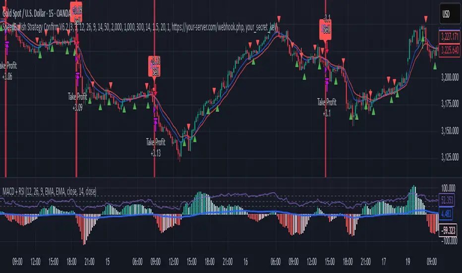
SpeedBullish Strategy Confirm V6.2SpeedBullish Strategy Confirm V6.2
SpeedBullish V6.2 is an advanced price-action + indicator-based strategy designed to confirm trend strength and signal entries with high precision. This version builds on the W/M pattern structure and adds dynamic filtering with EMA, MACD Histogram, RSI, ATR, and Volume.
✅ Signal Conditions
🔹 Buy Signal:
Price above EMA10 or EMA15
MACD Histogram crosses above 0
RSI > 50
(Optional) Higher low via Pivot Low
(Optional) ATR > ATR SMA * Multiplier
(Optional) Volume > SMA * Multiplier
🔻 Sell Signal:
Price below EMA10 or EMA15
MACD Histogram crosses below 0
RSI < 50
(Optional) Lower high via Pivot High
(Optional) Confirmed high volatility and volume
⚙️ Strategy Features
MACD Histogram for momentum shift detection
RSI filtering for momentum confirmation
EMA10/15 for trend direction
ATR-based volatility filter
Volume confirmation filter
Dynamic TP/SL + Trailing Stop
Webhook Integration for MT5 auto-trade
Visual signal markers + background highlight
🔔 Alerts
Alerts are sent in JSON format via alert() with the current symbol, action (buy/sell), and price. Webhook endpoint and secret key are configurable.
📈 How to Use
Attach the strategy to any symbol and timeframe
Customize filters and confirmations to fit your market conditions
Enable webhook alerts for integration with your MT5 Expert Advisor or trading bot
Backtest and optimize before live deployment
Support and Resistance Profile with Volatility ClusteringThe indicator begins by looking at recent volatility behavior in the market: it measures the average true range over your chosen “Length” and compares it to the average true range over ten times that period. When volatility over the short window is high relative to longer-term volatility, we mark that period as a “cluster.” As price moves through these clusters—whether in a quiet period or a sudden burst of activity—the script isolates each cluster and examines the sequence of closing prices within it.
Within every cluster, the algorithm next finds the points along the price path that matter most to a human eye, smoothing out minor wobbles and highlighting the peaks and valleys that define the cluster’s shape. It does this by drawing a straight line between the beginning and end of the cluster, then repeatedly snapping the single point that deviates most from that line back onto it and re-interpolating, until it has identified a fixed number of perceptually important points. Those points capture where price really turned or accelerated, stripping away noise so that you see the genuine memory-markers in each volatility episode.
Each of those important points inherits a “weight” based on the cluster’s normalized volatility—essentially how large the average true range in that cluster was relative to its average close. Over your “Main Length for Profile” window, every time one of these weighted points occurs at a particular price level, it adds to a running total in that level’s bin. At the end of the window you see a silhouette of boxes extending to the right of the chart: where boxes are wide, many important points (with high volatility weight) have happened there in the past; where boxes are thin or absent, price memory is light.
For a trader, the value of this profile lies in spotting zones where the market has repeatedly “remembered” price extremes during volatile episodes—those are areas where support or resistance is likely to be strongest. Conversely, gaps in the profile—price levels with little weighted history—suggest frictionless zones. If price enters such a gap, it may move swiftly until it encounters another region of heavy memory. You can use this in several ways: as a filter on breakouts and breakdowns (only trade through a gap when you see sufficient momentum), as a guide for scaling into positions (add when price enters a low-memory zone and tighten stops where memory boxes thicken), or to anticipate where price might pause or reverse (when it reaches a band of wide boxes). By turning raw volatility clusters into a human-readable map of price memory, this tool helps you see at a glance where the market is likely to push or pause—and plan entries, exits, and risk targets accordingly.

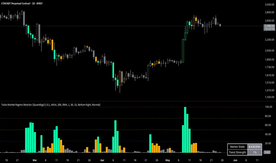
Turbo Market Regime Detector [QuantAlgo]The Turbo Market Regime Detector is a market state classification system that combines volatility-adaptive filtering with slope analysis to identify and categorize market regimes. It helps traders and investors distinguish between trending and ranging market conditions across different timeframes and asset classes.
🟢 Technical Foundation
The Turbo Market Regime Detector employs a multi-layered analytical approach to market regime identification, incorporating:
Volatility-Adaptive Regime Filter (VARF) : Uses dynamic alpha calculation based on price volatility and range to create an adaptive filter that responds to changing market conditions
Slope Analysis : Calculates the absolute slope of the VARF curve and applies customizable moving average smoothing to determine trend strength and market regime classification
Normalized Histogram : Transforms raw slope data into percentage-based metrics (0-100%) for interpretation of market conditions
Multi-Threshold Classification System : Implements user-defined thresholds to categorize markets into Strong Trend, Weak Trend, and Ranging regimes
The indicator processes price data through mathematical operations including volatility adjustment, slope normalization, and statistical range analysis. This creates a regime detection system that adapts to market volatility while maintaining classification consistency across different timeframes and asset classes.
🟢 Key Features & Signals
1. Market Regime Classification
The indicator presents market conditions through a normalized histogram that distinguishes between three distinct market states:
1/ Strong Trend Regime: When the histogram exceeds the strong trend threshold (default 30%), indicating directional market movement with sustained momentum
2/ Weak Trend Regime: When the histogram falls between weak trend (default 10%) and strong trend thresholds, representing transitional market conditions with moderate directional bias
3/ Ranging Regime: When the histogram remains below the weak trend threshold, signaling consolidation periods with limited directional movement
This classification system provides insights into:
→ Current market state with percentage-based quantification
→ Regime transitions and their timing
→ Market momentum strength across different timeframes
2. Visual Feedback System
The indicator features multiple visualization options for market analysis:
Background Coloring: Optional chart background coloring that applies regime-based colors to both the indicator pane and main price chart for visual context
Bar Coloring: Price bar coloring based on current market regime, providing visual feedback on market conditions
Reference Lines: Horizontal reference lines at 25%, 50%, 75%, and 100% levels for percentage assessment and historical comparison
Information Table: Real-time status display showing current market state and trend strength percentage with customizable positioning and sizing options
3. Alert and Notification System
The indicator generates alerts for regime transitions:
State Change Alerts: Notifications triggered when the market transitions between regime states (Strong Trend ↔ Weak Trend ↔ Ranging)
Specific Regime Entry Alerts: Individual alert conditions for entering Strong Trend, Weak Trend, or Ranging regimes for targeted trading strategies
Customizable Alert Messages: Pre-formatted alert messages including exchange and ticker information for context and decision-making
🟢 Practical Usage Guidelines
→ Regime-Based Strategy Selection: Use the indicator to identify potential trading strategies - trend-following during Strong Trend regimes, mean-reversion during Ranging periods, and adjusted position sizing during Weak Trend transitions
→ Multi-Timeframe Analysis: Apply the indicator across different timeframes to understand market regime hierarchy and identify confluence between short-term and long-term market states
→ Threshold Optimization: Adjust regime thresholds based on market volatility and asset characteristics - lower thresholds for more sensitive regime detection, higher thresholds for more definitive regime changes
🟢 Configuration Tips
VARF settings optimization:
→ Lower thresholds (-0.3 to -0.5) for more responsive regime detection in volatile markets
→ Higher thresholds (-0.1 to 0.1) for smoother signals in stable market conditions
→ Enable adaptive VARF for automatic volatility adjustment across different market cycles
Slope analysis parameter tuning:
→ Shorter MA lengths (100-200) for faster regime transition signals
→ Longer MA lengths (300-500) for more stable regime identification
→ Adjust sensitivity multiplier based on desired responsiveness vs. stability balance
Regime interpretation framework:
→ Strong Trend regimes for momentum-based strategies and trend following
→ Ranging regimes for mean-reversion and support/resistance trading
→ Weak Trend periods for reduced position sizing and cautious market approach
Complementary analysis integration:
→ Volume analysis for regime change confirmation
→ Support/resistance levels for entry/exit timing within regime contexts
→ Price action patterns for validation of regime-based trading decisions
→ Economic calendar events that may influence regime transitions
Malama's Candle Sniper Malama's Candle Sniper
This Pine Script is an overlay indicator crafted for TradingView to detect and highlight a variety of bullish and bearish candlestick patterns directly on the price chart. Its primary goal is to assist traders in identifying potential reversal or continuation signals by marking these patterns with labeled visual cues. The indicator is versatile, applicable across different markets (e.g., stocks, forex, cryptocurrencies) and timeframes, making it a valuable tool for enhancing technical analysis and informing trading decisions.
Originality and Usefulness
While the candlestick patterns detected by this script are well-established in technical analysis, "Malama's Candle Sniper" stands out due to its comprehensive nature. It consolidates the detection of numerous patterns—ranging from engulfing patterns to doji variations and multi-candle formations—into a single, unified indicator. This eliminates the need for traders to apply multiple individual indicators, streamlining their charting process and saving time.
The indicator’s usefulness lies in its ability to:
Provide Visual Clarity: Labels are plotted on the chart when patterns are detected, offering immediate recognition of potential trading opportunities.
Broad Pattern Coverage: It identifies both bullish and bearish patterns, accommodating various market conditions and trading strategies.
This makes it an ideal tool for traders who incorporate candlestick analysis into their decision-making, whether for spotting trend reversals or confirming ongoing momentum.
How It Works
"Malama's Candle Sniper" operates by defining helper functions in Pine Script that evaluate whether specific candlestick pattern conditions are met for the current bar. Each function returns a boolean value (true/false) based on predefined criteria involving the open, high, low, and close prices of the candles. The script then checks for transitions from false to true (i.e., a pattern newly appearing) and plots a corresponding label on the chart.
Bullish Patterns Detected
The script identifies the following bullish patterns, which typically signal potential upward price movements:
Bullish Engulfing: A small bearish candle followed by a larger bullish candle that engulfs it.
Three White Soldiers: Three consecutive bullish candles with higher closes.
Bullish Three Line Strike: Three bullish candles followed by a bearish candle that doesn’t negate the prior uptrend.
Three Inside Up: A bearish candle, a smaller bullish candle within its range, and a strong bullish confirmation candle.
Dragonfly Doji: A doji with a long lower wick and little to no upper wick, opening and closing near the high.
Piercing Line: A bearish candle followed by a bullish candle that opens below the prior low and closes above the midpoint of the prior candle.
Bullish Marubozu: A strong bullish candle with no upper or lower wicks.
Bullish Abandoned Baby: A bearish candle, a doji gapped below it, and a bullish candle gapped above the doji.
Rising Window: A gap up between two candles, with the current low above the prior high.
Hammer: A candle with a small body and a long lower wick, indicating rejection of lower prices.
Morning Star: A three-candle pattern with a bearish candle, a small-bodied middle candle, and a strong bullish candle.
Bearish Patterns Detected
The script also detects these bearish patterns, which often indicate potential downward price movements:
Bearish Engulfing: A small bullish candle followed by a larger bearish candle that engulfs it.
Three Black Crows: Three consecutive bearish candles with lower closes.
Bearish Three Line Strike: Three bearish candles followed by a bullish candle that doesn’t reverse the downtrend.
Three Inside Down: A bullish candle, a smaller bearish candle within its range, and a strong bearish confirmation candle.
Gravestone Doji: A doji with a long upper wick and little to no lower wick, opening and closing near the low.
Dark Cloud Cover: A bullish candle followed by a bearish candle that opens above the prior high and closes below the midpoint of the prior candle.
Bearish Marubozu: A strong bearish candle with no upper or lower wicks.
Bearish Abandoned Baby: A bullish candle, a doji gapped above it, and a bearish candle gapped below the doji.
Falling Window: A gap down between two candles, with the current high below the prior low.
Hanging Man: A candle with a small body and a long lower wick after an uptrend, signaling potential reversal.
Label Plotting
When a pattern is detected (i.e., its condition transitions from false to true):
Bullish Patterns: A label is plotted at the high of the bar, using a green background with white text and a downward-pointing style (e.g., "Bull Engulf" for Bullish Engulfing).
Bearish Patterns: A label is plotted at the low of the bar, using a red background with white text and an upward-pointing style (e.g., "Bear Engulf" for Bearish Engulfing).
This visual distinction helps traders quickly differentiate between bullish and bearish signals and their precise locations on the chart.
Strategy and Risk Management
Backtesting: "Malama's Candle Sniper" is strictly an indicator and does not include backtesting capabilities or automated trading signals. It does not simulate trades or provide performance statistics such as win rates or profit/loss metrics.
Risk Management: As an informational tool, it lacks built-in risk management features. Traders must independently implement strategies like stop-loss orders, take-profit levels, or position sizing to manage risk when acting on the detected patterns. For example, a trader might place a stop-loss below a Hammer pattern’s low or above a Hanging Man’s high to limit potential losses.
User Settings and Customization
Inputs: The script does not offer user-configurable inputs. All pattern detection logic is hardcoded, meaning traders cannot adjust parameters such as lookback periods or pattern sensitivity through the interface.
Customization: Advanced users with Pine Script knowledge can modify the code directly to:
Add or remove patterns.
Adjust the conditions (e.g., tweak the wick-to-body ratio for a Hammer).
Change label styles or colors.
However, the default version is fixed and ready-to-use as is.
Visualizations and Chart Setup
Plotted Elements:
Bullish Labels: Appear at the candle’s high with a green background, white text, and a downward-pointing arrow (e.g., "Hammer").
Bearish Labels: Appear at the candle’s low with a red background, white text, and an upward-pointing arrow (e.g., "Hanging Man").
Chart Setup: The indicator is configured as an overlay (overlay=true), meaning it integrates seamlessly with the price chart. Labels are displayed directly on the candlesticks, eliminating the need for a separate pane and keeping the focus on price action.
Usage Example
To use "Malama's Candle Sniper":
Add the indicator to your TradingView chart via the Indicators menu.
Observe the price chart for green (bullish) or red (bearish) labels as they appear.
Analyze the context of each pattern (e.g., trend direction, support/resistance levels) to decide on potential trades.
Apply your own entry, exit, and risk management rules based on the signals.
For instance, spotting a "Morning Star" label during a downtrend near a support level might prompt a trader to consider a long position, while a "Dark Cloud Cover" at resistance could signal a short opportunity.

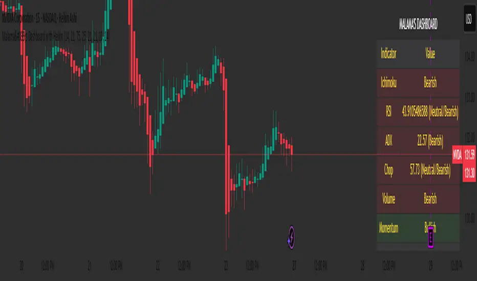
Malama's Dashboard with HeikinMalama's Dashboard with Heikin is a comprehensive trading indicator designed to provide traders with a consolidated view of market sentiment across multiple technical indicators. It combines Ichimoku Cloud, RSI, ADX, Choppiness Index, volume analysis, momentum, divergence detection, and multi-timeframe (MTF) MACD and volume trends to generate a composite sentiment score. The indicator displays these metrics in a visually intuitive table, enabling traders to quickly assess market conditions and make informed decisions. Optionally, it supports Heikin Ashi candles to smooth price data and reduce noise, aiding in trend identification. The script solves the problem of information overload by presenting key indicators in a single, trader-friendly dashboard, reducing the need for multiple charts or indicators.
Originality and Usefulness
This script is a unique mashup of several well-known technical indicators, integrated into a cohesive dashboard with a composite sentiment score. Unlike standalone indicators like RSI or Ichimoku, this script synthesizes signals from Ichimoku Cloud, RSI, ADX, Choppiness, volume, momentum, divergence, and MTF analysis into a unified sentiment metric. The inclusion of Heikin Ashi candles as an optional input adds flexibility for traders preferring smoothed price action. The composite score, derived from weighted contributions of each indicator, provides a novel way to gauge overall market direction, which is not commonly found in public open-source scripts. While individual components like RSI or Ichimoku are widely available, the script’s originality lies in its integrated approach, clear table visualization, and customizable settings, making it a practical tool for traders seeking a holistic market view.
Detailed Methodology ("How It Works")
The script processes multiple technical indicators and aggregates their signals into a composite sentiment score, displayed in a table. Below is a breakdown of its core components and logic:
Heikin Ashi Candles:
Logic: Optionally applies Heikin Ashi calculations to smooth price data. Heikin Ashi candles are computed using formulas for open, high, low, and close prices, reducing market noise and emphasizing trends.
Usage: When enabled, all subsequent calculations (Ichimoku, RSI, ADX, etc.) use Heikin Ashi prices instead of regular OHLC data, potentially improving trend clarity.
Ichimoku Cloud:
Logic: Calculates the Conversion Line (9-period high/low average), Base Line (26-period high/low average), Leading Span A (average of Conversion and Base Lines), and Leading Span B (52-period high/low average).
Signals: Bullish if the close price is above both Leading Spans; bearish if below; neutral otherwise.
Average Directional Index (ADX):
Logic: Computes ADX using a 14-period (default) directional movement index, measuring trend strength. PlusDI and MinusDI are calculated from price movements, and ADX is derived from their difference.
Signals: Bullish if PlusDI > MinusDI; bearish otherwise. ADX value indicates trend strength but is not used directly in sentiment scoring.
Relative Strength Index (RSI):
Logic: Calculates RSI over a 21-period (default) using the closing price. Overbought (>75) and oversold (<25) levels are user-defined.
Signals: Bullish if RSI > 50; bearish if RSI < 50. Overbought/oversold conditions are displayed but not used in the composite score.
Momentum:
Logic: Measures the difference between the current close and the close 10 periods ago (default).
Signals: Bullish if momentum > 0; bearish if < 0; neutral if 0.
Choppiness Index:
Logic: Calculates choppiness over a 14-period (default) using ATR and price range, normalized to a 0–100 scale. Values >61.8 indicate a sideways market; <38.2 indicate a trending market.
Signals: Bullish if choppiness < 38.2; bearish otherwise.
Volume Analysis:
Logic: Compares current volume to a 21-period (default) simple moving average (SMA). Bullish or bearish pressure is determined by whether the close is above or below the open.
Signals: Bullish if volume > 1.2x SMA and bullish pressure dominates; bearish if bearish pressure dominates; neutral otherwise.
Divergence Detection:
Logic: Identifies RSI divergences over a 5-period lookback. A bullish divergence occurs when price makes a lower low, but RSI makes a higher low; bearish divergence is the opposite.
Signals: Bullish or bearish based on divergence detection; neutral if no divergence.
Multi-Timeframe (MTF) Analysis:
Logic: Retrieves daily MACD (12, 26, 9) and volume SMA (21-period) from a higher timeframe. MACD is bullish if the MACD line > signal line; volume is bullish if current volume > daily SMA.
Signals: Bullish or bearish based on MACD and volume trends.
Composite Sentiment Score:
Logic: Aggregates signals from Ichimoku (±2), RSI (±1), ADX (±1), momentum (±1), choppiness (±1), divergence (±1), MTF MACD (±1), and MTF volume (±1). The score ranges from -8 to +8.
Signals: Bullish if score > 0; bearish if < 0; neutral if 0.
Alert Condition:
Triggers an alert when the composite sentiment flips (e.g., from bullish to bearish).
Strategy Results and Risk Management
This script is an indicator, not a strategy, and does not include backtesting or automated trade signals. However, the composite sentiment score can guide trading decisions. Assumptions for practical use include:
Commission and Slippage: Traders should account for realistic trading costs (e.g., 0.1% per trade) when acting on signals, though the script does not model these.
Risk Limits: Traders are advised to risk 5–10% of equity per trade, depending on their strategy and the strength of the composite score (e.g., higher scores may justify larger positions).
Trade Frequency: The script’s signals are based on multiple indicators, ensuring sufficient trade opportunities across trending and ranging markets.
Customization: Traders can adjust risk by modifying input parameters (e.g., RSI overbought/oversold levels or lookback periods) to align with their risk tolerance. For example, tightening RSI thresholds may reduce signal frequency but increase precision.
User Settings and Customization
The script offers several user-configurable inputs, allowing traders to tailor its behavior:
Use Heikin Ashi Candles (Boolean, default: false): Enables/disables Heikin Ashi smoothing for all calculations, affecting trend clarity.
ADX Length (Integer, default: 14, min: 1): Sets the period for ADX calculations, influencing trend strength sensitivity.
RSI Length (Integer, default: 21, min: 1): Adjusts RSI calculation period, impacting overbought/oversold detection.
RSI Overbought Level (Integer, default: 75, min: 1): Sets the RSI overbought threshold.
RSI Oversold Level (Integer, default: 25, min: 1): Sets the RSI oversold threshold.
Volatility Length (Integer, default: 21, min: 1): Controls the ATR period for volatility (used in Choppiness).
Volume MA Length (Integer, default: 21, min: 1): Sets the SMA period for volume analysis.
Momentum Length (Integer, default: 10, min: 1): Defines the lookback for momentum calculations.
Choppiness Length (Integer, default: 14, min: 1): Sets the period for Choppiness Index calculations.
These settings allow traders to adjust the indicator’s sensitivity to market conditions. For example, shorter RSI or ADX periods increase responsiveness but may generate more noise, while longer periods smooth signals but may lag.
Visualizations and Chart Setup
The script plots a table in the top-right corner of the chart, summarizing the following:
Header: Displays “MALAMA’S DASHBOARD” in white text on a black background.
Indicator Rows: Each row corresponds to an indicator (Ichimoku, RSI, ADX, Choppiness, Volume, Momentum, Divergence, MTF MACD, MTF Volume, Composite).
Columns:
Indicator: Lists the indicator name.
Value: Shows the calculated value (e.g., RSI value, composite score) and sentiment (e.g., Bullish, Bearish, Neutral).
Color Coding: Bullish signals are green, bearish signals are red, and neutral signals are gray, all with 85% transparency for readability.
Composite Sentiment: The final row displays the composite score and sentiment, providing a quick summary of market direction.
No trend lines, signal markers, or additional overlays are plotted, ensuring the chart remains uncluttered and focused on the dashboard’s insights.
Directionality OscillatorDirectionality Oscillator is a simple momentum tool that measures net price displacement against total price activity over a chosen look-back period. It takes today’s closing price minus the close from “len” bars ago and divides that by the sum of all absolute bar-to-bar moves across the same span. The result is a value between –1 and +1, where positive values show that upward moves dominated and negative values show that downward moves prevailed.
To smooth out short-term noise, the indicator applies a five-bar simple moving average to the normalized value. A color gradient—from red at –1, through gray at 0, to green at +1—paints the line, making it easy to see whether bearish or bullish pressure is strongest. Two horizontal lines at the user-defined threshold and its negative mark zones of extreme directional strength. Readings above the positive threshold signal strong bullish momentum, and readings below the negative threshold signal strong bearish momentum.
Traders can watch for crossings above or below these threshold lines as trend confirmations or potential reversal warnings. A cross of the zero line indicates a shift in net directional control and can serve as an early trend-change alert when supported by price action or volume. Because it filters out sideways noise by normalizing against total activity, it highlights sustained directional thrust more clearly than a raw price-change measure.

Eigenvector Centrality Drift (ECD) - Market State Network What is Eigenvector Centrality Drift (ECD)?
Eigenvector Centrality Drift (ECD) is a groundbreaking indicator that applies concepts from network science to financial markets. Instead of viewing price as a simple series, ECD models the market as a dynamic network of “micro-states”—distinct combinations of price, volatility, and volume. By tracking how the influence of these states changes over time, ECD helps you spot regime shifts and transitions in market character before they become obvious in price.
This is not another moving average or momentum oscillator. ECD is inspired by eigenvector centrality—a measure of influence in network theory—and adapts it to the world of price action, volatility, and volume. It’s about understanding which market states are “in control” and when that control is about to change.
Theoretical Foundation
Network Science: In complex systems, nodes (states) and edges (transitions) form a network. Eigenvector centrality measures how influential a node is, not just by its direct connections, but by the influence of the nodes it connects to.
Market Micro-States: Each bar is classified into a “state” based on price change, volatility, and volume. The market transitions between these states, forming a network of possible regimes.
Centrality Drift: By tracking the centrality (influence) of the current state, and how it changes (drifts) over time, ECD highlights when the market’s “center of gravity” is shifting—often a precursor to major moves or regime changes.
How ECD Works
State Classification: Each bar is assigned to one of N market micro-states, based on a weighted combination of normalized price change, volatility, and volume.
Transition Matrix: Over a rolling window, ECD tracks how often the market transitions from each state to every other state, forming a transition probability matrix.
Centrality Calculation: Using a simplified eigenvector approach, ECD calculates the “influence” score for each state, reflecting how central it is to the network of recent market behavior.
Centrality Drift: The indicator tracks the Z-score of the change in centrality for the current state. Rapid increases or decreases, or a shift in the dominant state, signal a potential regime shift.
Dominant State: ECD also highlights which state currently has the highest influence, providing insight into the prevailing market character.
Inputs:
🌐 Market State Configuration
Number of Market States (n_states, default 6): Number of distinct micro-states to track.
3–4: Simple (Up/Down/Sideways)
5–6: Balanced (recommended)
7–9: Complex, more nuanced
Price Change Weight (price_weight, default 0.4):
How much price movement defines a state. Higher = more directional.
Volatility Weight (vol_weight, default 0.3):
How much volatility defines a state. Higher = more regime focus.
Volume Weight (volume_weight, default 0.3):
How much volume defines a state. Higher = more participation focus.
🔗 Network Analysis
Transition Matrix Window (transition_window, default 50): Lookback for building the state transition matrix.
Shorter: Adapts quickly
Longer: More stable
Influence Decay Factor (influence_decay, default 0.85): How much influence propagates through the network.
Higher: Distant transitions matter more
Lower: Only immediate transitions matter
Drift Detection Sensitivity (drift_sensitivity, default 1.5): Z-score threshold for significant centrality drift.
Lower: More signals
Higher: Only major shifts
🎨 Visualization
Show Network Visualization (show_network, default true): Background color and effects based on network structure.
Show Centrality Score (show_centrality, default true): Plots the current state’s centrality measure.
Show Drift Indicator (show_drift, default true): Plots the centrality drift Z-score.
Show State Map (show_state_map, default true): Dashboard showing all state centralities and which is dominant.
Color Scheme (color_scheme, default "Quantum"):
“Quantum”: Cyan/Magenta
“Neural”: Green/Blue
“Plasma”: Yellow/Pink
“Matrix”: Green/Black
Color Schemes
Dynamic gradients reflect the current state’s centrality and drift, using your chosen color palette.
Background network effect: The more central the current state, the more intense the background.
Centrality and drift lines: Color-coded for clarity and regime shift detection.
Visual Logic
Centrality Score Line: Plots the influence of the current state, with glow for emphasis.
Drift Indicator: Histogram of centrality drift Z-score, green for positive, red for negative.
Threshold Lines: Dotted lines mark the drift sensitivity threshold for regime shift alerts.
State Map Dashboard: Top-right panel shows all state centralities, highlights the current and dominant state, and visualizes influence with bars.
Information Panel: Bottom-left panel summarizes current state, centrality, dominant state, drift Z-score, and regime shift status.
How to Use ECD
Centrality Score: High = current state is highly influential; low = state is peripheral.
Drift Z-Score:
Large positive/negative = rapid change in influence, regime shift likely.
Near zero = stable network, no major shift.
Dominant State: The state with the highest centrality is “in control” of the market’s transitions.
State Map: Use to see which states are rising or falling in influence.
Tips:
Use fewer states for simple markets, more for nuanced analysis.
Watch for drift Z-score crossing the threshold—these are your regime shift signals.
Combine with your own system for confirmation.
Alerts:
ECD Regime Shift: Significant centrality drift detected—potential regime change.
ECD State Change: Market state transition occurred.
ECD Dominance Shift: Dominant market state has changed.
Originality & Usefulness
ECD is not a mashup or rehash of standard indicators. It is a novel application of network science and eigenvector centrality to market microstructure, providing a new lens for understanding regime shifts and market transitions. The state network, centrality drift, and dashboard are unique to this script. ECD is designed for anticipation, not confirmation—helping you see the market’s “center of gravity” shift before price action makes it obvious.
Chart Info
Script Name: Eigenvector Centrality Drift (ECD) – Market State Network
Recommended Use: Any asset, any timeframe. Tune parameters to your style.
Disclaimer
This script is for research and educational purposes only. It does not provide financial advice or direct buy/sell signals. Always use proper risk management and combine with your own strategy. Past performance is not indicative of future results.
See the market as a network. Anticipate the shift in influence.
— Dskyz , for DAFE Trading Systems

H4 Swing Grade Checklist English V.1✅ H4 Swing Grade Checklist – Auto Grading for Smart Money Setups
This script helps manual traders assess the quality of a Smart Money swing trade setup by checking 7 key criteria. The system assigns a grade (A+, A, A−, or B) based on how many and which checklist items are met.
📋 Checklist Items (7 total):
✅ Sweep occurs within 4 candles
✅ MSS (strong break candle)
✅ Entry is placed outside the wick of the sweep
✅ FVG is fresh (not previously used)
✅ FVG overlaps Fibonacci 0.705 level
✅ FVG lies within Premium or Discount zone
✅ Entry is placed at 0.705 Fibonacci retracement
🏅 Grading Criteria:
A+ → All 7 checklist items are satisfied
A → Only missing #5 (FVG Overlap with 0.705)
A− → Only missing #4 (FVG Fresh)
B → Only missing #2 (MSS – clear break of structure)
– → Any other combinations / fewer than 6 conditions met
⚙️ Features:
Toggle visibility with one click
Fixed display in top-right or bottom-right of the chart
Color-coded grading logic (Green, Yellow, Orange, Blue)
Clear checklist feedback for trade journaling or evaluation
🚀 Ideal For:
ICT / Smart Money traders
Prop firm evaluations
Swing trade quality control

Reflexivity Resonance Factor (RRF) - Quantum Flow Reflexivity Resonance Factor (RRF) – Quantum Flow
See the Feedback Loops. Anticipate the Regime Shift.
What is the RRF – Quantum Flow?
The Reflexivity Resonance Factor (RRF) – Quantum Flow is a next-generation market regime detector and energy oscillator, inspired by George Soros’ theory of reflexivity and modern complexity science. It is designed for traders who want to visualize the hidden feedback loops between market perception and participation, and to anticipate explosive regime shifts before they unfold.
Unlike traditional oscillators, RRF does not just measure price momentum or volatility. Instead, it models the dynamic feedback between how the market perceives itself (perception) and how it acts on that perception (participation). When these feedback loops synchronize, they create “resonance” – a state of amplified reflexivity that often precedes major market moves.
Theoretical Foundation
Reflexivity: Markets are not just driven by external information, but by participants’ perceptions and their actions, which in turn influence future perceptions. This feedback loop can create self-reinforcing trends or sudden reversals.
Resonance: When perception and participation align and reinforce each other, the market enters a high-energy, reflexive state. These “resonance” events often mark the start of new trends or the climax of existing ones.
Energy Field: The indicator quantifies the “energy” of the market’s reflexivity, allowing you to see when the crowd is about to act in unison.
How RRF – Quantum Flow Works
Perception Proxy: Measures the rate of change in price (ROC) over a configurable period, then smooths it with an EMA. This models how quickly the market’s collective perception is shifting.
Participation Proxy: Uses a fast/slow ATR ratio to gauge the intensity of market participation (volatility expansion/contraction).
Reflexivity Core: Multiplies perception and participation to model the feedback loop.
Resonance Detection: Applies Z-score normalization to the absolute value of reflexivity, highlighting when current feedback is unusually strong compared to recent history.
Energy Calculation: Scales resonance to a 0–100 “energy” value, visualized as a dynamic background.
Regime Strength: Tracks the percentage of bars in a lookback window where resonance exceeded the threshold, quantifying the persistence of reflexive regimes.
Inputs:
🧬 Core Parameters
Perception Period (pp_roc_len, default 14): Lookback for price ROC.
Lower (5–10): More sensitive, for scalping (1–5min).
Default (14): Balanced, for 15min–1hr.
Higher (20–30): Smoother, for 4hr–daily.
Perception Smooth (pp_smooth_len, default 7): EMA smoothing for perception.
Lower (3–5): Faster, more detail.
Default (7): Balanced.
Higher (10–15): Smoother, less noise.
Participation Fast (prp_fast_len, default 7): Fast ATR for immediate volatility.
5–7: Scalping.
7–10: Day trading.
10–14: Swing trading.
Participation Slow (prp_slow_len, default 21): Slow ATR for baseline volatility.
Should be 2–4x fast ATR.
Default (21): Works with fast=7.
⚡ Signal Configuration
Resonance Window (res_z_window, default 50): Z-score lookback for resonance normalization.
20–30: More reactive.
50: Medium-term.
100+: Very stable.
Primary Threshold (rrf_threshold, default 1.5): Z-score level for “Active” resonance.
1.0–1.5: More signals.
1.5: Balanced.
2.0+: Only strong signals.
Extreme Threshold (rrf_extreme, default 2.5): Z-score for “Extreme” resonance.
2.5: Major regime shifts.
3.0+: Only the most extreme.
Regime Window (regime_window, default 100): Lookback for regime strength (% of bars with resonance spikes).
Higher: More context, slower.
Lower: Adapts quickly.
🎨 Visual Settings
Show Resonance Flow (show_flow, default true): Plots the main resonance line with glow effects.
Show Signal Particles (show_particles, default true): Circular markers at active/extreme resonance points.
Show Energy Field (show_energy, default true): Background color based on resonance energy.
Show Info Dashboard (show_dashboard, default true): Status panel with resonance metrics.
Show Trading Guide (show_guide, default true): On-chart quick reference for interpreting signals.
Color Mode (color_mode, default "Spectrum"): Visual theme for all elements.
“Spectrum”: Cyan→Magenta (high contrast)
“Heat”: Yellow→Red (heat map)
“Ocean”: Blue gradients (easy on eyes)
“Plasma”: Orange→Purple (vibrant)
Color Schemes
Dynamic color gradients are used for all plots and backgrounds, adapting to both resonance intensity and direction:
Spectrum: Cyan/Magenta for bullish/bearish resonance.
Heat: Yellow/Red for bullish, Blue/Purple for bearish.
Ocean: Blue gradients for both directions.
Plasma: Orange/Purple for high-energy states.
Glow and aura effects: The resonance line is layered with multiple glows for depth and signal strength.
Background energy field: Darker = higher energy = stronger reflexivity.
Visual Logic
Main Resonance Line: Shows the smoothed resonance value, color-coded by direction and intensity.
Glow/Aura: Multiple layers for visual depth and to highlight strong signals.
Threshold Zones: Dotted lines and filled areas mark “Active” and “Extreme” resonance zones.
Signal Particles: Circular markers at each “Active” (primary threshold) and “Extreme” (extreme threshold) event.
Dashboard: Top-right panel shows current status (Dormant, Building, Active, Extreme), resonance value, energy %, and regime strength.
Trading Guide: Bottom-right panel explains all states and how to interpret them.
How to Use RRF – Quantum Flow
Dormant (💤): Market is in equilibrium. Wait for resonance to build.
Building (🌊): Resonance is rising but below threshold. Prepare for a move.
Active (🔥): Resonance exceeds primary threshold. Reflexivity is significant—consider entries or exits.
Extreme (⚡): Resonance exceeds extreme threshold. Major regime shift likely—watch for trend acceleration or reversal.
Energy >70%: High conviction, crowd is acting in unison.
Above 0: Bullish reflexivity (positive feedback).
Below 0: Bearish reflexivity (negative feedback).
Regime Strength: % of bars in “Active” state—higher = more persistent regime.
Tips:
- Use lower lookbacks for scalping, higher for swing trading.
- Combine with price action or your own system for confirmation.
- Works on all assets and timeframes—tune to your style.
Alerts
RRF Activation: Resonance crosses above primary threshold.
RRF Extreme: Resonance crosses above extreme threshold.
RRF Deactivation: Resonance falls below primary threshold.
Originality & Usefulness
RRF – Quantum Flow is not a mashup of existing indicators. It is a novel oscillator that models the feedback loop between perception and participation, then quantifies and visualizes the resulting resonance. The multi-layered color logic, energy field, and regime strength dashboard are unique to this script. It is designed for anticipation, not confirmation—helping you see regime shifts before they are obvious in price.
Chart Info
Script Name: Reflexivity Resonance Factor (RRF) – Quantum Flow
Recommended Use: Any asset, any timeframe. Tune parameters to your style.
Disclaimer
This script is for research and educational purposes only. It does not provide financial advice or direct buy/sell signals. Always use proper risk management and combine with your own strategy. Past performance is not indicative of future results.
Trade with insight. Trade with anticipation.
— Dskyz , for DAFE Trading Systems

Tangent Extrapolation ForecastTangent Extrapolation Forecast
This indicator visually projects price direction by drawing a smoothed sequence of tangent lines based on recent price movements. For each bar in a user-defined lookback window, it calculates the slope over a smoothing period and extends the projected price forward. The resulting polyline forecast connect the endpoints of the extrapolations, and is color-coded to reflect directional changes: green for upward moves, red for downward, and gray for flat segments. This tool can assist traders in visualizing short-term momentum and potential trend continuity without introducing artificial future gaps.
Inputs:
Bars to Use: Number of historical bars used in the forecast.
Slope Smoothing Window: The number of bars used to calculate slope for projection.
Source: Price input for calculations (default is close).
This indicator does not generate buy/sell signals. It is intended as a visual aid to support discretionary analysis.

Malama's big MACDPurpose: Malama's Big MACD is a multi-faceted Pine Script indicator designed for traders on short timeframes (1-5 minute charts) to identify high-probability trading opportunities. It combines a Stochastic Price Predictor (SPP) with a comprehensive set of technical indicators, including MACD, RSI, moving average crossovers, ATR, volume spikes, and a custom JKH RSI, to generate robust buy and sell signals. The indicator aims to solve the problem of filtering out market noise in fast-moving markets by integrating probability-based predictions with traditional technical analysis, providing traders with clear entry/exit signals, trend visualization, and risk management levels.
Originality and Usefulness
This script is a unique mashup of a Stochastic Price Predictor (SPP) and a comprehensive indicator suite, tailored for short-term trading. The SPP uses a Monte Carlo simulation combined with ATR and Stochastic RSI to forecast price movements, while the comprehensive indicator suite leverages MACD crossovers, RSI overbought/oversold conditions, moving average crossovers, volume spikes, and a custom JKH RSI for confirmation. Unlike standalone MACD or RSI indicators available in TradingView’s public library, this script’s originality lies in its hybrid approach, blending probabilistic forecasting with multiple confirmatory signals to enhance reliability. The integration of user-defined sentiment input and customizable risk management levels further differentiates it from generic open-source alternatives, making it particularly useful for scalpers and day traders seeking precise, actionable signals.
How It Works
The script operates in two primary modules: the Stochastic Price Predictor (SPP) and the Comprehensive Indicator Suite, which work together to generate and confirm trading signals. Signal strength is calculated to quantify the confidence of bullish or bearish conditions.
Stochastic Price Predictor (SPP):
Core Logic: The SPP forecasts price movements using a Monte Carlo simulation based on historical returns, ATR-based volatility, and Stochastic RSI filtering. It calculates the probability of price reaching a user-defined target move (default: 0.3%) within a specified forecast horizon (default: 3 bars).
Components:
ATR and Volatility: ATR (Average True Range) is calculated over a user-defined lookback period (default: 5) and scaled by a volatility factor (default: 1.5) to estimate price volatility. A volatility ratio (current volatility vs. average) filters out signals during extreme volatility (>2x average).
Stochastic RSI: A 7-period RSI is smoothed into a Stochastic RSI (5-period stochastic, 2-period SMA) to identify overbought (>85) or oversold (<15) conditions, preventing signals in extreme market states.
Monte Carlo Simulation: 30 price paths are simulated using a geometric Brownian motion model, incorporating drift (based on weighted moving average of returns) and volatility shocks. The simulation estimates the probability of price reaching the target move up or down.
Signal Generation: A buy signal is triggered if the probability of an upward move exceeds the confidence threshold (default: 65%) and the market is not overbought, with volatility within limits. A sell signal is triggered similarly for downward moves.
Purpose: The SPP provides a probabilistic framework to anticipate short-term price movements, reducing reliance on lagging indicators.
Comprehensive Indicator Suite:
Core Logic: This module combines multiple technical indicators to confirm SPP signals and generate independent signals based on momentum, trend, and volume.
Components:
MACD: Uses fast (5-period) and slow (13-period) EMAs to calculate the MACD line, smoothed by a 5-period signal line. A crossover above a threshold (default: 0.0001) indicates bullish momentum, while a crossunder signals bearish momentum.
RSI: A 14-period RSI identifies overbought (>70) or oversold (<30) conditions to filter signals.
Moving Average Crossovers: Fast (5-period) and slow (20-period) EMAs determine trend direction. A bullish crossover (fast > slow) supports buy signals, while a bearish crossover (fast < slow) supports sell signals.
Volume Spikes: Volume exceeding 2x the 50-period average signals significant market activity, enhancing signal reliability.
JKH RSI: A fast 3-period RSI with custom overbought (>80) and oversold (<20) levels provides additional confirmation, reducing false signals in choppy markets.
Sentiment Input: A user-defined sentiment score (-1 to 1) adjusts signal strength, allowing traders to incorporate external market bias (e.g., news or fundamentals).
Signal Generation: A buy signal requires a bullish MACD crossover, RSI oversold, bullish MA crossover, non-overbought JKH RSI, and neutral/positive sentiment. A sell signal requires the opposite conditions.
Signal Strength Calculation:
Logic: Combines SPP probability, RSI deviation, and MACD strength, weighted at 50%, 30%, and 20%, respectively. Sentiment input scales the final strength (0–100).
Formula:
Bullish strength = min(100, (50 * |prob_up - prob_down| / 100 + 30 * |RSI - 50| / 50 + 20 * |MACD_line| / (0.1 * ATR)) * (1 + max(0, sentiment)))
Bearish strength is calculated similarly, using the absolute negative sentiment.
Purpose: Quantifies signal confidence, helping traders prioritize high-probability setups.
Strategy Results and Risk Management
While the script is primarily an indicator, it provides implied trading signals that assume realistic trading conditions:
Assumptions: Signals are designed for short-term trading (1-5 minute charts) with a minimum of 100 trades for statistical significance. The script assumes typical commission (e.g., 0.1% per trade) and slippage (e.g., 0.05%) for liquid markets. Risk per trade is implicitly capped via ATR-based stop-loss levels (2x ATR below/above entry for buy/sell).
Default Settings:
Lookback (5), volatility factor (1.5), and forecast horizon (3) are optimized for short timeframes.
ATR-based stop-loss and profit target levels (2x ATR) provide a risk-reward ratio of approximately 1:1.
Confidence threshold (65%) balances signal frequency and reliability.
Customization: Traders can adjust the ATR multiplier for stop-loss/profit targets or modify the confidence threshold to increase/decrease signal frequency. Lowering the target move (e.g., to 0.2%) or shortening the forecast horizon (e.g., to 2 bars) can tighten risk parameters for scalping.
Guidance: Traders should backtest signals on their specific asset and timeframe, ensuring sufficient trade volume (>100 trades) and incorporating their broker’s commission/slippage. Risk should be limited to 5–10% of equity per trade, adjustable via ATR multiplier or position sizing outside the script.
User Settings and Customization
The script offers extensive user inputs, organized into three groups:
Stochastic Price Predictor Settings:
Lookback Period (default: 5): Controls the period for ATR and returns calculation. Shorter periods increase sensitivity.
Volatility Factor (default: 1.5): Scales ATR for volatility shocks in the Monte Carlo simulation.
Confidence Threshold (default: 65%): Sets the minimum probability for SPP signals.
Stoch RSI Overbought/Oversold Levels (default: 85/15): Filters signals in extreme conditions.
Forecast Horizon (default: 3): Number of bars for price prediction.
Target Move (default: 0.3%): Expected price movement for probability calculation.
Show Predicted Range (default: false): Toggles visibility of the 25th–75th percentile price range.
Comprehensive Indicator Settings:
RSI Length (default: 14), Overbought (70), Oversold (30): Standard RSI parameters.
ATR Length (default: 14): Period for ATR calculation.
Volume Spike Multiplier (default: 2.0): Threshold for detecting volume spikes.
Sentiment Input (default: 0.0, range: -1 to 1): Scales signal strength based on external bias.
MACD Fast/Slow/Signal Lengths (default: 5/13/5), Crossover Threshold (0.0001): Controls MACD sensitivity.
MA Fast/Slow Lengths (default: 5/20): Defines trend direction.
JKH RSI Length (default: 3), Overbought (80), Oversold (20): Fast RSI for confirmation.
Visual Settings:
Show SPP Signals (default: true): Displays SPP buy/sell labels.
Show Comp Signals (default: true): Displays comprehensive indicator signals.
Highlight Volume Spikes (default: true): Highlights bars with significant volume.
Show ATR Levels (default: true): Plots stop-loss and profit-target lines.
Impact: Adjusting lookback periods or thresholds affects signal frequency and sensitivity. For example, lowering the confidence threshold increases signals but may reduce accuracy, while increasing the volatility factor amplifies price path variability.
Visualizations and Chart Setup
The script plots clear, relevant elements on the chart to aid decision-making:
Trend Line: Plots the close price, colored green (bullish, fast MA > slow MA), red (bearish), or orange (neutral).
SPP Signals: Green "BUY (SPP)" labels below bars and red "SELL (SPP)" labels above bars when conditions are met.
Predicted Range: Optional blue step lines showing the 25th–75th percentile price range from the Monte Carlo simulation, with a semi-transparent fill.
Comprehensive Signals:
Blue upward triangles for bullish MACD crossovers, orange downward triangles for bearish crossovers.
Green circles above bars for RSI overbought, red circles below for oversold.
Green "BUY (Comp)" labels (offset by 1x ATR below) and red "SELL (Comp)" labels (offset by 1x ATR above) for comprehensive signals.
Green upward triangles for bullish MA crossovers, red downward triangles for bearish crossovers.
Volume Spikes: Yellow background highlights bars with volume >2x the 50-period average.
ATR Levels: Purple dotted lines for stop-loss (close - 2x ATR) and profit target (close + 2x ATR).
Moving Averages: Fast MA (blue, 5-period) and slow MA (red, 20-period) for trend reference.
Clarity: Only relevant elements are plotted, ensuring traders can quickly identify trends, signals, and risk levels without clutter.

Math by Thomas Swing RangeMath by Thomas Swing Range is a simple yet powerful tool designed to visually highlight key swing levels in the market based on a user-defined lookback period. It identifies the highest high, lowest low, and calculates the midpoint between them — creating a clear range for swing trading strategies.
These levels can help traders:
Spot potential support and resistance zones
Analyze price rejection near range boundaries
Frame mean-reversion or breakout setups
The indicator continuously updates and extends these lines into the future, making it easier to plan and manage trades with visual clarity.
🛠️ How to Use
Add to Chart:
Apply the indicator on any timeframe and asset (works best on higher timeframes like 1H, 4H, or Daily).
Configure Parameters:
Lookback Period: Number of candles used to detect the highest high and lowest low. Default is 20.
Extend Lines by N Bars: Number of future bars the levels should be projected to the right.
Interpret Lines:
🔴 Red Line: Swing High (Resistance)
🟢 Green Line: Swing Low (Support)
🔵 Blue Line: Midpoint (Mean level — useful for equilibrium-based strategies)
Trade Ideas:
Bounce trades from swing high/low zones.
Breakout confirmation if price closes strongly outside the range.
Reversion trades if price moves toward the midpoint after extreme moves.
Multi-Session ORBThe Multi-Session ORB Indicator is a customizable Pine Script (version 6) tool designed for TradingView to plot Opening Range Breakout (ORB) levels across four major trading sessions: Sydney, Tokyo, London, and New York. It allows traders to define specific ORB durations and session times in Central Daylight Time (CDT), making it adaptable to various trading strategies.
Key Features:
1. Customizable ORB Duration: Users can set the ORB duration (default: 15 minutes) via the inputMax parameter, determining the time window for calculating the high and low of each session’s opening range.
2. Flexible Session Times: The indicator supports user-defined session and ORB times for:
◦ Sydney: Default ORB (17:00–17:15 CDT), Session (17:00–01:00 CDT)
◦ Tokyo: Default ORB (19:00–19:15 CDT), Session (19:00–04:00 CDT)
◦ London: Default ORB (02:00–02:15 CDT), Session (02:00–11:00 CDT)
◦ New York: Default ORB (08:30–08:45 CDT), Session (08:30–16:00 CDT)
3. Session-Specific ORB Levels: For each session, the indicator calculates and tracks the high and low prices during the specified ORB period. These levels are updated dynamically if new highs or lows occur within the ORB timeframe.
4. Visual Representation:
◦ ORB high and low lines are plotted only during their respective session times, ensuring clarity.
◦ Each session’s lines are color-coded for easy identification:
▪ Sydney: Light Yellow (high), Dark Yellow (low)
▪ Tokyo: Light Pink (high), Dark Pink (low)
▪ London: Light Blue (high), Dark Blue (low)
▪ New York: Light Purple (high), Dark Purple (low)
◦ Lines are drawn with a linewidth of 2 and disappear when the session ends or if the timeframe is not intraday (or exceeds the ORB duration).
5. Intraday Compatibility: The indicator is optimized for intraday timeframes (e.g., 1-minute to 15-minute charts) and only displays when the chart’s timeframe multiplier is less than or equal to the ORB duration.
How It Works:
• Session Detection: The script uses the time() function to check if the current bar falls within the user-defined ORB or session time windows, accounting for all days of the week.
• ORB Logic: At the start of each session’s ORB period, the script initializes the high and low based on the first bar’s prices. It then updates these levels if subsequent bars within the ORB period exceed the current high or fall below the current low.
• Plotting: ORB levels are plotted as horizontal lines during the respective session, with visibility controlled to avoid clutter outside session times or on incompatible timeframes.
Use Case:
Traders can use this indicator to identify key breakout levels for each trading session, facilitating strategies based on price action around the opening range. The flexibility to adjust ORB and session times makes it suitable for various markets (e.g., forex, stocks, or futures) and time zones.
Limitations:
• The indicator is designed for intraday timeframes and may not display on higher timeframes (e.g., daily or weekly) or if the timeframe multiplier exceeds the ORB duration.
• Time inputs are in CDT, requiring users to adjust for their local timezone or market requirements.
• If you need to use this for GC/CL/SPY/QQQ you have to adjust the times by one hour.
This indicator is ideal for traders focusing on session-based breakout strategies, offering clear visualization and customization for global market sessions.

Multi-EnvelopeRMA Multi-Envelope Indicator
The RMA Multi-Envelope Indicator is a technical analysis tool designed for TradingView, utilizing Pine Script v6. It creates eight customizable envelope bands around a 200-period Running Moving Average (RMA) on a 5-minute timeframe, based on current market measurements. Each band has independent upper and lower percentage deviations, preset to: Band 1 (0.42%, 0.46%), Band 2 (0.78%, 0.69%), Band 3 (1.01%, 1.03%), Band 4 (1.36%, 1.39%), Band 5 (1.80%, 1.62%), Band 6 (2.15%, 2.13%), Band 7 (2.93%, 2.81%), and Band 8 (4.65%, 4.18%). Users can adjust the timeframe, moving average type (RMA, SMA, or EMA), length, and colors for the basis line and bands via hex codes (e.g., #FF6D00 for the basis and Band 8) with semi-transparent color.rgb fills. Ideal for identifying support/resistance, overbought/oversold conditions, or trend boundaries on a 5-minute chart.

Swing High/Low by %REnglish Description
Swing High/Low by %R
This indicator identifies potential swing high and swing low points by combining William %R overbought/oversold turning points with classic swing price structures.
Swing High: Detected when William %R turns down from overbought territory and the price forms a local high (higher than both neighboring bars).
Swing Low: Detected when William %R turns up from oversold territory and the price forms a local low (lower than both neighboring bars).
This tool is designed to help traders spot possible market reversals and better time their entries and exits.
Customizable parameters:
Williams %R period
Overbought & Oversold thresholds
The indicator plots clear signals above/below price bars for easy visualization.
For educational purposes. Please use with proper risk management!
คำอธิบายภาษาไทย
Swing High/Low by %R
อินดิเคเตอร์นี้ใช้ระบุจุด Swing High และ Swing Low ที่มีโอกาสเป็นจุดกลับตัวของตลาด โดยอาศัยสัญญาณจาก William %R ที่พลิกกลับตัวบริเวณ overbought/oversold ร่วมกับโครงสร้างราคาแบบ swing
Swing High: เกิดเมื่อ William %R พลิกกลับลงจากเขต Overbought และราคาแท่งกลางสูงกว่าทั้งสองแท่งข้างเคียง
Swing Low: เกิดเมื่อ William %R พลิกกลับขึ้นจากเขต Oversold และราคาแท่งกลางต่ำกว่าทั้งสองแท่งข้างเคียง
ช่วยให้เทรดเดอร์สามารถมองเห็นโอกาสในการกลับตัวของราคา และใช้ประกอบการวางแผนจังหวะเข้าหรือออกจากตลาดได้อย่างแม่นยำมากขึ้น
ตั้งค่าได้:
ระยะเวลา Williams %R
ค่าขอบเขต Overbought & Oversold
อินดิเคเตอร์จะแสดงสัญลักษณ์อย่างชัดเจนบนกราฟเพื่อความสะดวกในการใช้งาน
ควรใช้ร่วมกับการบริหารความเสี่ยง
Symbol Seasonality Matrix (w/ BTC Base) Symbol Seasonality Matrix (w/ BTC Base)
Compare monthly performance between Bitcoin and any symbol across time
🧠 Overview
This indicator provides a side-by-side monthly return table of Bitcoin (BTCUSD from Bitfinex) and any selected symbol (e.g., ETH, stocks, etc.). It visualizes seasonality patterns, historical performance shifts, and relative trends in a clean matrix layout with dynamic line overlays.
⚙️ Mechanism
BTC Benchmarking:
BTC monthly returns are always shown as a benchmark against the selected chart symbol.
Monthly ROI Calculation:
For each month, the indicator tracks the open and close price and calculates the monthly return using:
(close_end - close_start) / close_start × 100%
It stores both price and return for BTC and the chart symbol.
Table Structure:
Each year is split into two halves:
2023 (Jan ~ Jun) and 2023 (Jul ~ Dec) for clarity.
Color Coding:
Green for positive months
Red for negative months
Monthly trend lines and labels drawn in consistent colors
Background shading per month helps track seasonality
Plot Modes:
regular: raw price
percent: relative % change from the start of selected period
normalized: base=1 scaling to compare trends
Time Range Selector:
You can define start time and end time for comparison — all logic, including table, plots, and highlights, will focus only on this window.
🧭 How to Use
Set the time range:
Choose a meaningful window such as the past 3 years or 2018–2021 to study behavior.
Compare Symbol vs BTC:
Load BTCUSD in a separate chart for baseline.
Switch to ETHUSD, SPY, or any altcoin/equity to view overlayed performance.
Analyze Seasonality:
Look for months with repeated strong/weak performance (e.g., BTC strong in October).
Compare how your asset aligns with BTC trends or diverges.
Choose View Mode:
Use percent to adjust Y-axis scaling and directly compare relative movements.
Use normalized to detect trend correlation without caring about price level.
🔍 Why It’s Useful
Spot seasonal alpha and align entries with favorable months
See if a symbol outperforms or underperforms BTC consistently
Get price-to-return context visually, not just via numbers
Quickly compare assets in real scale or normalized scale
📌 Tip
Try publishing this to a layout with multiple tickers (ETH, SOL, AAPL) to instantly switch comparisons.
Pair with volume-based or macro indicators to layer signals.

CME Futures RTH net change % levelsRTH Session time calculated for AMERICAN FUTURES ONLY.
Plots the net change % from the last session's RTH close, a.k.a daily % change for that specific instrument. Best used as support and resistance zones in confluence with other analysis, and also serve as a gauge for how volatile the session is.

Beta Tracker [theUltimator5]This script calculates the Pearson correlation coefficient between the charted symbol and a dynamic composite of up to four other user-defined tickers. The goal is to track how closely the current asset’s normalized price behavior aligns with, or diverges from, the selected group (or basket)
How can this indicator be valuable?
You can compare the correlation of your current symbol against a basket of other tickers to see if it is moving independently, or being pulled with the basket.... or is it moving against the basket.
It can be used to help identify 'swap' baskets of stocks or other tickers that tend to generally move together and visually show when your current ticker diverges from the basket.
It can be used to track beta (or negative beta) with the market or with a specific ticker.
This is best used as a supplement to other trading signals to give a more complete picture of the external forces potentially pulling or pushing the price action of the ticker.
🛠️ How It Works
The current symbol and each selected comparison ticker are normalized over a custom lookback window, allowing fair pattern-based comparison regardless of price scale.
The normalized values from 1 to 4 selected tickers are averaged into a composite, which represents the group’s collective movement.
A Pearson correlation coefficient is computed over a separate correlation lookback period, measuring the relationship between the current asset and the composite.
The result is plotted as a dynamic line, with color gradients:
Blue = strongly correlated (near +1)
Orange = strongly inverse correlation (near –1)
Intermediate values fade proportionally
A highlighted background appears when the correlation drops below a user-defined threshold (e.g. –0.7), helping identify strong negative beta periods visually.
A toggleable info table displays which tickers are currently being compared, along with customizable screen positioning.
⚙️ User Inputs
Ticker 1–4: Symbols to compare the current asset against (blank = ignored)
Normalization Lookback: Period to normalize each series
Correlation Lookback: Period over which correlation is calculated
Negative Correlation Highlight: Toggle for background alert and threshold level
Comparison Table: Toggle and position controls for an on-screen summary of selected tickers
imgur.com
⚠️ Notes
The script uses request.security() to pull data from external symbols; these must be available for the selected chart timeframe.
A minimum of one valid ticker must be provided for the script to calculate a composite and render correlation.
