Indicators and strategies

SMA Fecho na Máxima, Mínima e NormalLarry Williams' Strategy - Short Moving Average Channel
✅ Indicators used:
High SMA: 3 periods
Low SMA: 3 periods
30-period Closing SMA: used as a trend filter

Aurum‑CME Harmonic Scanner (v2)Aurum harmonics. Patterns for pro traders looking fast leg of structures


EdgeXplorer – Smart Money StructureEdgeXplorer – Smart Money Structure
A full-spectrum price action tool built to track BOS/CHoCH, swing pivots, order blocks, and institutional liquidity zones — all on one clean chart.
Designed for serious price action traders, this engine gives you a real-time visual breakdown of market structure the way smart money sees it. Whether you’re a scalper, intraday trader, or swing strategist — this tool helps you track momentum shifts, trend flips, and liquidity traps with clarity.
⸻
🧠 What It Does
EdgeXplorer – Smart Money Structure detects and visualizes:
• Break of Structure (BOS) and Change of Character (CHoCH) patterns
• Swing vs. Internal trend structure
• Order blocks with mitigation tracking
• Liquidity points (Equal Highs & Lows)
• Fair Value Gaps (FVGs) and price imbalances
• Premium/Discount zones based on range extremes
All of this is plotted live with customizable visual styles, trend logic, and alert support — no repainting, no guessing.
⸻
⚙️ How It Works (Plain English)
The script uses pivot highs/lows to define structural points on the chart. From there:
• A BOS marks a continuation of the current trend (price breaks the most recent high/low in trend direction).
• A CHoCH flags a potential reversal (price breaks against the current trend direction).
• Structure is tracked internally (short-term pivots) and on a swing basis (larger moves).
• Order blocks are identified at structural breaks using volatility filtering (ATR or Range logic), then highlighted and monitored for mitigation.
• You can also display liquidity pools (Equal Highs/Lows) and FVG zones for imbalance-based setups.
• Optional trend coloring lets you visually follow directional bias.
⸻
📈 Visual Elements Breakdown
Element Meaning
🟢/🔴 BOS or CHoCH Labels Show trend continuation or reversal (internal + swing)
🔷 Zones Order Blocks (bullish/bearish, internal or swing, with mitigation filter)
🔺 HH / HL / LH / LL High/low swing labels based on pivot relationships
🔲 Gray Zones Mitigated order blocks (already tapped)
📊 Background Color Optional trend-based candle coloring
⚪ Fair Value Gaps Imbalance zones between candles
📍 EQH/EQL Equal High / Equal Low liquidity zones
⸻
🔧 Inputs & Settings
🧭 Structure Modes:
• Historical = Plots all historical BOS/CHoCH events
• Present = Keeps the chart clean by only showing the latest active structure
🔁 Internal vs Swing:
• Internal Structure = Short-term pivots (fast reaction, more signals)
• Swing Structure = Higher timeframe trend (stronger confirmation)
🎯 Order Block Filters:
• Choose between ATR-based (volatility-adjusted) or Cumulative Range (fixed width)
• Define how many OB zones to display per structure type
• Enable/disable mitigated OB highlights
💡 Visual Customization:
• Toggle colored vs. monochrome labels
• Turn on/off trend-based candle coloring
• Set custom colors for all bullish/bearish elements
🔍 Liquidity Tools:
• Show Equal High/Low zones with sensitivity threshold
• Display Fair Value Gaps with optional auto-filtering
• Highlight premium/discount zones relative to swing range
⸻
🧠 How to Interpret the Chart
Use BOS/CHoCH for:
• Spotting trend reversals (CHoCH = possible flip)
• Confirming momentum continuation (BOS = trend intact)
Use Order Blocks for:
• Entry areas after a break — especially if price retraces to an unmitigated OB
• Smart money footprints — these zones often align with institutional volume
Use Liquidity Zones for:
• Fade or trap setups — EQH/EQL often precede false breakouts
• Confirming areas where smart money may engineer stops or reactions
Use Premium/Discount Zones to:
• Avoid chasing — enter where price is undervalued (discount) or take profit where it’s overvalued (premium)
⸻
📊 Strategy Tips
• Scalpers: Focus on internal CHoCH + OB zones on 1m–15m
• Swing traders: Watch for swing CHoCH + OB alignment on 1h–4h
• Breakout traders: Use BOS labels with EQH/EQL sweep confirmation
• Confluence traders: Stack internal + swing + OB + FVG for high-probability setups
⸻
📣 Alerts Included:
✅ Internal BOS / CHoCH
✅ Swing BOS / CHoCH
Get notified instantly when structure shifts — no need to babysit the chart.

Williams x Briese Hybrid CoT IndexAfter studying the below CoT (Commitments of Traders) books from ICT's recommended library, I learned that both Larry Williams and Stephen Briese use the same formula for their CoT Index:
COT Index = ((Current Net Position - Lowest Net Position) / (Highest Net Position - Lowest Net Position)) * 100 using a 3-Year lookback period.
Books:
Trade Stocks and Commodities with the Insiders: Secrets of the COT Report by Larry Williams
The Commitments of Traders Bible: How To Profit from Insider Market Intelligence by Stephen Briese
Williams and Briese differ in their plotting of the CoT Index formula in the following ways:
Williams uses a line plot, with thresholds at 25% & 75%
Briese uses a histogram plot, with thresholds at 5% & 90%
I decided to make a "hybrid" indicator of their CoT Index by using Larry Williams' classic line plot instead of a histogram, but with Briese's stricter thresholds of 5% and 95%.
The code is a bit of a remix of the "ICT Commitment of Traders°" indicator by toodegrees and is meant for use in a new pane below a Weekly Chart .
You can complement your usage of this indicator with another indicator I've published as shown in the chart above: Briese CoT Movement Index , which you can find on my scripts page. For proper usage, refer to The Commitments of Traders Bible and Trade Stocks and Commodities with the Insiders
As it is, this indicator incorporates the ±40 point "surge" from the Briese CoT Movement Index indicator in the form of labels that are visible above a below the 100% and 0% levels. The green labels at the top indicate buying surges >=40 while the black labels at the bottom indicate selling surges <=-40. If you hover over these labels, you'll see the tooltip for the value of the Movement Index. Again, if you complement this Williams x Briese Hybrid CoT Index with the Briese CoT Movement Index , you'll see the labels from the index align with the points on the histogram which exceed the ±40 levels.

Institutional Sweep Zone (Range-Based)Institutional Sweep Zone (Range-Based)
This indicator models potential stop sweep zones based on institutional capital ranges, helping traders visualize where high-probability liquidity grabs are likely to occur.
Unlike traditional volatility bands, this tool estimates price movement by calculating how far a specific amount of capital—entered into the market—can push price. By defining a lower and upper capital range (in millions of USD), the indicator dynamically draws bands representing the distance institutions could realistically move price in either direction.
It supports directional control, allowing you to focus on long sweeps, short sweeps, or both simultaneously. The pip cost is auto-calibrated based on the selected currency pair, making it highly adaptive to major FX pairs.
Key Features:
-Capital input range (in millions of USD)
-Directional sweep targeting: Long, Short, or Both
-Auto-detection of pip value based on FX pair
-Visual sweep zone mapped above and below current price
-Designed to highlight areas of institutional stop hunts
Why use it?
-Helps avoid setting stops inside common sweep zones
-Improves trade survivability when paired with higher timeframe strategies
-Offers a unique way to view price through an institutional lens
Created by: The_Forex_Steward
Explore more advanced tools and concepts on my TradingView profile.

Consolidation Zones - Working (v5)Updated from v4 to v5
need to write and entry strategy for breakouts

Briese CoT Movement IndexThis Briese CoT (Commitments of Traders) Movement Index histogram indicator was built based on the formula by Stephen Briese in his book "The Commitments of Traders Bible":
"...difference between the COT Index and its reading of one or several weeks prior. I use six." —Chapter 7, page 75.
The code is a bit of a remix of the "ICT Commitment of Traders°" indicator by toodegrees and is meant for use in a new pane below a Weekly Chart .
The upper and lower thresholds are +40/-40. Some context: "A ± 40 point surge in the COT Index within a six-week period frequently marks the end of a counter-trend price reaction"
40 Point CoT Surge Rules (Commercials) from page 76
"During a correction from a prevailing uptrend, a +40 point movement in the CoT Index within a six-week period often marks the end of a corrective pullback, and the resumption of the major uptrend."
"During a reaction in a prevailing downtrend, a -40 point movement in the CoT Index within a six-week period frequently marks the end of a price reaction, and the resumption of the established downtrend."
"The failure of a ± point CoT Movement Index signal to restart the prevailing trend is a tip-off to a major trend change"
I'd recommend reading Briese's book for examples on how to properly interpret this indictor.
This indicator can be used in conjunction with another one I've published called the "Williams x Briese Hybrid CoT Index" which can be found on my scripts page.

Average Dollar VolumeSimply displays the average daily dollar volume in the top right corner of the chart.

Chiaroscuro Scalp Model A [Signal + Visuals]This indicator is based on the Chiaroscuro Scalp Model A — a precision-based scalping system that identifies high-probability trade setups during the London and New York sessions. It combines daily range expansion, order blocks, fair value gaps, and W/M reversal patterns to generate 20-pip scalping opportunities with clearly plotted stop loss and take profit levels. Ideal for intraday traders seeking structured, rule-based entries.

Crowding model ║ BullVision🔬 Overview
The Crypto Crowding Model Pro is a sophisticated analytical tool designed to visualize and quantify market conditions across multiple cryptocurrencies. By leveraging Relative Strength Index (RSI) and Z-score calculations, this indicator provides traders with an intuitive and detailed snapshot of current crypto market dynamics, highlighting areas of extreme momentum, crowded trades, and potential reversal points.
⚙️ Key Concepts
📊 RSI and Z-Score Analysis
RSI (Relative Strength Index) evaluates the momentum and strength of each cryptocurrency, identifying overbought or oversold conditions.
Z-Score Normalization measures each asset's current price deviation relative to its historical average, identifying statistically significant extremes.
🎯 Crowding Analytics
An integrated analytics panel provides real-time crowding metrics, quantifying market sentiment into four distinct categories:
🔥 FOMO (Fear of Missing Out): High momentum, potential exhaustion.
❄️ Fear: Low momentum, potential reversal or consolidation.
📈 Recovery: Moderate upward momentum after a downward trend.
💪 Strength: Stable bullish conditions with sustained momentum.
🖥️ Visual Scatter Plot
Assets are plotted on a dynamic scatter plot, positioning each cryptocurrency according to its RSI and Z-score.
Color coding, symbol shapes, and sizes help quickly identify main market segments (BTC, ETH, TOTAL, OTHERS) and individual asset conditions.
🧩 Quadrant Classification
Assets are categorized into four quadrants based on their momentum and deviation:
Overbought Extended: High RSI and positive Z-score.
Recovery Phase: Low RSI but positive Z-score.
Oversold Compressed: Low RSI and negative Z-score.
Strong Consolidation: High RSI but negative Z-score.
🔧 User Customization
🎨 Visual Settings
Bar Scale: Adjust the scatter plot visual scale.
Asset Visibility: Optionally display key market benchmarks (TOTAL, BTC, ETH, OTHERS).
Gradient Background: Enhances visual interpretation of asset clusters.
Crowding Analytics Panel: Toggle the analytics panel on/off.
📊 Indicator Parameters
RSI Length: Defines the calculation period for RSI.
Z-score Lookback: Historical lookback period for normalization.
Crowding Alert Threshold: Sets alert sensitivity for crowded market conditions.
🎯 Zone Settings
Quadrant Labels: Displays descriptive labels for each quadrant.
Danger Zones: Highlights extreme RSI levels indicative of heightened market risk.
📈 Visual Output
Dynamic Scatter Plot: Visualizes asset positioning clearly and intuitively.
Gradient and Grid: Professional gridlines and subtle gradient backgrounds assist visual assessment.
Danger Zone Highlights: Visually indicates RSI extremes to warn of potential market turning points.
Crowding Analytics Panel: Real-time summary of market sentiment and asset distribution.
🔍 Use Cases
This indicator is particularly beneficial for traders and analysts looking to:
Identify crowded trades and potential reversal points.
Quickly assess overall market sentiment and individual asset strength.
Integrate a robust momentum analysis into broader technical or fundamental strategies.
Enhance market timing and improve risk management decisions.
⚠️ Important Notes
This indicator does not provide explicit buy or sell signals.
It is intended solely for informational, analytical, and educational purposes.
Past performance and signals are not indicative of future market results.
Always combine with additional tools and analysis as part of comprehensive decision-making.

GG ADRGG ADR Indicator
A compact volatility and price position table displaying key daily metrics:
• ADR% – Average Daily Range Percentage over a custom period
• ATR – Average True Range (daily), measuring market volatility
• LoD Dist – Distance from the current close to the Daily Low, expressed as a % of the ATR
• 8 EMA Distance – % distance from the current price to the 8-day EMA (based on daily timeframe only)
Customize visibility of each metric using the built-in input toggles. Ideal for tracking intraday positioning relative to historical ranges and key dynamic levels.
Based on ADR Indicator by © ArmerSchlucker

TrendZonesTrendZones
This is an indicator which I use, have tested, tweaked and added features to for use in my trend following investing system. I got the idea for it when for some reason I was looking for a dynamic reference to measure the height of a channel or something. In search of this I made MA’s of the high and low borders of a Donchian channel which turned out to be two near parallel and stunningly smooth curves. This visual was so appealing that I immediately tried to turn it into a replacement for the KeltCOG which I previously used in my system. First I created a curve in the middle of the upper and lower curves, which I called COG (Center Of Gravity). Then I decided to enter only one lookback and let the script create a Donchian channel with half the lookback and use this to create the curves with an MA of whole lookback. For this reason the minimum lookback is set to 14, enough room for the Donchian Channel of 7 periods. This Donchian ChanneI has a special way of calculating the borders, involving a 5 period Median value. Thanks to this these borders are really a resistance and support level, which won’t change at a whim, e.g. when a ‘dead cat bounce’ occurs. I prevented the Donchian channel to show itself between the curves and only pop out from behind these. These pop outs now function as “strong trend zones”. I gave it colors (blue:-strong up, green: moderate up, orange: moderate down, red: strong down, near COG: gray, curves horizontal: gray) and it looked very appealing. I tested it in different time frames. In some weekend, when I was bored, I observed for a few hours the minute chart of bitcoin. It turned out that you can reliably tell that an uptrend ends when the candles go under the COG beginning a downtrend. Uptrend starts again once the candles go above COG. As Trends on minute charts only last around half an hour, this entertainment made the potential of this indicator very clear to me in just one afternoon.
Risk Management, Safe Level and Logical Stops.
In the inputs are settings for “Risk Tolerance”, and to activate “Show Logical Stop Level” (activated in example chart) and “Show Safe Level”. As a rule of thump a trade should not expose the invested capital to a risk of losing more than 2 percent. I divided my investment capital in ten equal parts which are allocated to ten different stocks or other instruments or kept liquid. This means that when a position is closed by triggering a Stop with a loss of 20 percent, the invested capital suffers only 2 percent (20% x 10% = 2%). This is why the value for “Risk Tolerance” has a default of 20. Because I put my Stops on the lower curve, a “Safe Level” can be calculated such that when you buy for a price below or at this level, the stop will protect the position sufficiently. Because I only buy when the instrument is in uptrend, the buying price should be between COG and Safe Level. Although I never do that, putting the stop at other curves is feasible and when you want to widen the stop (I never lower my stops btw) in a downtrend situation, even 1 ATR below the “Low Border”. I call these “Logical Stop Levels”, marked with dark green circles on the lower curve when safe buying by placing the Stoploss on this curve is possible, gray circles on the other curves, on the Upper Curve navy when price enters very profitable level. In a downtrend situation maroon circles appear.
Target lines
When I open a position I always set a Stoploss and a Target, for this purpose two types of Target values can be set and corresponding Target lines activated. These lines are drawn above the “High Border” at the set distance. If one expects some price to be used, differences will occur.
Other Features
Support Zone, this is 1 ATR below the “Low Border”, the maroon circles of the “Logal Stops” are placed on this “Support level”.
Stop distance and Channel Width. (activated in example chart) These are reported in a two cell table in the right lower corner of the main panel. I created this because I want to be able to check the volatility, whether the channel shows a situation in which safe buying in most levels of the channel is possible or what risk you take when you buy now and set the Stop at the nearest logical level (which is not always the “Lower curve”). This feature comes in handy for creating a setup I propose in the “Day Trading Fantasy” below.
Some General and User Settings. I never activate this, perhaps you will.
Use Of TrendZones In My System.
Create a list of stocks in uptrend. I define ‘stock in uptrend’ as in uptrend zone in all three monthly, weekly and daily charts, all three should at the same time be in uptrend. The advantage of TrendZones is that you can immediately see in which zone the candle moves.
Opening a position in a stock from the above list. I do this only when in both the daily and weekly the green dot on the lower curve indicates a buying opportunity. This is usually not the case in most of the items of the list, this feature thus provides a good timing for opening a position. Sometimes you need to wait a few weeks for this to happen.
Setting a target over a position. For this I use the Target percent line of the weekly chart with the default value of 10.
Updating the Stoploss and Target values. Every week or two weeks I set these to the new values of the “Lower Curve” and the Target line of the weekly. Attention: never shift down Stops, only up or let them stay the same when the curve moves down. I never use Stop levels on other curves.
I Check the charts whenever I like to do this. Close the position when the uptrend obviously shifts down. Otherwise I let the profits run until the Target triggers which closes the position with some profit.
For selecting stocks an checking charts for volume events, I also use a subpanel indicator called “TZanalyser”, which borrows the visual of my “Fibonacci Zone Oscillator”, is based on TrendZones and includes code from my REVE indicators. I intend to publish that as well.
Day Trading Fantasy.
Day trading is an attempt to earn a dime by opening a position in the morning and close it during the day again with a profit (or a loss). Before the market closes, you close all day trading positions.
In my fantasy the “Logical Stop Level” is repurposed for use as entry point and the ATR-based Target line is used to provide a target setting in an intraday chart, like e.g. 15 minute. To do this the “Safe Level” should be limited to between Channel width and COG. This can be done by showing “Safe Level” and “Channel Width” and then set “Risk Tolerance” to around the shown Channel Width. In this setting you can then wait for the green circle to show up for entering your trade and protect it with the stop.
I don’t know if this works fine or if it’s better than other day trade systems, because I don’t do day trading.
Take care and have fun.


Bitcoin Cycle Log-Curve (JDK-Analysis)Important: The standard parameters provided in the script are specifically tuned for the TradingView Bitcoin Index chart on a monthly timeframe on logarithmic scale, and will yield the most accurate visual alignment when applied to that dataset. (more below)
This very simple script visualizes Bitcoin’s long-term price behavior using a logarithmic regression model designed to reflect the cyclical nature of Bitcoin’s historical market trends. Unlike typical technical indicators that react to recent price movements, this tool is built on the assumption that Bitcoin follows an exponential growth path over time, shaped by its fixed supply structure and four-year halving cycles.
The calculation behind the curved bands:
An upper boundary, a lower boundary, and a central midline, are calculated based on logarithmic functions applied to the bar index (which serves as a proxy for time). The upper and lower bounds are defined using exponential formulas of the type y = exp(constant + coefficient * log(bar_index)), allowing the curves to evolve dynamically over time. These bands serve as a macro-level guide for identifying periods of historical overvaluation (upper red curve) and undervaluation (lower green curve), with a central black curve representing the geometric average of the two.
How to customize the parameters:
The lower1_const and upper1_const values vertically shift the respective lower and upper curves—more negative values push the curve downward, while higher values lift it.
The lower1_coef and upper1_coef control the steepness of the curves over time, with higher values resulting in faster growth relative to time.
The shift_factor allows for uniform vertical adjustment of all curves simultaneously.
Additionally, the channel_width setting determines how far the mirrored bands extend from the original curves, creating a visual “channel” that can highlight more conservative or aggressive valuation zones depending on preference.
How to use this indicator:
This indicator is not intended for short-term trading or intraday signals. Rather, it serves as a contextual framework for long-term investors to identify high-risk zones near the upper curve and potential long-term value opportunities near the lower curve. These areas historically align with cycle tops and bottoms, and the model helps to place current price action within that broader cyclical narrative. While the concept draws inspiration from Bitcoin’s halving-driven market cycles and exponential adoption curve, the implementation is original in its use of time-based logarithmic regression to define dynamic trend boundaries.
It is best used as a strategic tool for cycle analysis, macro positioning, and trend anchoring—rather than as a short-term signal provider.

JWs EMA CrossoversJWs EMA Crossovers - A clean Pine Script v6 indicator that displays 8 and 21 period exponential moving averages with arrow signals when they cross. Shows bullish arrows when the faster EMA crosses above the slower EMA and bearish arrows when it crosses below. Includes customizable EMA periods and built-in alert conditions for trend change notifications. Perfect for identifying trend reversals without chart clutter.

Gil Stocks Custom WatermarkBased on Micha Stock
Adding Sell Based on ATR
stock price
i have noting to say so i write rowa

Intraday vs Overnight OBV🔍 Purpose
This indicator provides a volume-weighted cumulative flow model that mimics On-Balance Volume (OBV) logic but splits the volume impact into intraday vs. overnight sessions. It allows traders to track how volume contributes to price movement in each session and identify whether buying/selling pressure is stronger during or outside of regular trading hours.
This indicator attempts to alleviate some of the downfalls of the standard OBV indicator, which only looks at total volume and total direction. The price of stocks generally behaves extremely differently during market hours and outside market hours, and many of the large moves happen outside of regular market hours on low volume.
⚙️ Core Features
1) OBV-style calculation:
If price increases → volume is added to the OBV stream.
If price decreases → volume is subtracted.
If price is flat → OBV remains unchanged.
2) Session splitting:
Intraday session: movement from today's open to close.
Overnight session: movement from yesterday’s close to today’s open.
Volume is split proportionally between these two periods based on user input.
3) Four visualization modes:
"Intraday" — plots only OBV from intraday price movement.
"Overnight" — plots only OBV from overnight price movement.
"Aggregate" — plots the sum of intraday and overnight OBV for a holistic view.
"Both Intraday and Overnight" — plots intraday and overnight OBV separately on the same chart.
📐 Inputs
1) Synthetic OBV Type:
"Intraday" — Show OBV from open to close only.
"Overnight" — Show OBV from prior close to today's open only.
"Aggregate" — Show a single line combining both.
"Both Intraday and Overnight" — Show both lines on the same chart.
2) Estimated Overnight Volume %:
Percentage of total daily volume assumed to occur during extended hours.
The rest is allocated to regular session (intraday).
Default: 20% overnight, 80% intraday.
🧮 How It Works
Volume Splitting:
Total bar volume is split into overnight Volume and intraday Volume:
Intraday change is the difference between today’s close and open.
Overnight change is the difference between today’s open and yesterday’s close.
Session OBV Calculations:
OBV is incremented/decremented by the session's allocated volume, depending on whether the session’s price change was positive or negative.
Aggregate OBV:
Combines both session deltas for a holistic volume flow view.
📊 Interpretation
Rising OBV (any stream) suggests accumulation; falling OBV suggests distribution.
Divergences between price and OBV lines (especially overnight vs. intraday) can reveal where hidden buying/selling is occurring.
Comparing intraday vs overnight OBV can help:
Spot whether institutional demand is building off-hours.
Detect retail vs. institutional behavior (retail trades often dominate intraday; institutional may prefer after-hours).
💡 Use Cases
Identify whether overnight gaps are supported by overnight volume momentum.
Detect accumulation in low-volume overnight sessions.
Compare intraday and overnight strength during earnings season or news events.
Complement traditional OBV by seeing session-based breakdowns.

ORB Norman (2 Sessions, Auto Timezone)ORB Norman (2 Sessions, Auto Timezone)
This script plots Opening Range Breakout (ORB) levels for two configurable sessions. It’s designed for intraday traders—especially in futures markets like Gold (GC), Nasdaq (NQ), and S&P (ES)—who trade based on early session breakouts or range rejections. Unlike standard indicators, this tool auto-adjusts for timezones based on the instrument, ensuring precise session alignment.
Features:
Automatically adjusts for NQ/ES (Chicago time) and GC (New York time) based on the symbol.
Plots high, low, and optional midpoint lines for each session.
Clean, minimal settings with visual separation for better usability.
Ray extension length is fully customizable.
Works on any intraday chart (recommended: 5–15 minute timeframes).
Includes customizable session times, colors, ray length, and an optional midpoint line.
Default Sessions:
Session 1:
‣ 07:00–08:00 EST for GC
‣ 06:00–07:00 CT for NQ/ES
Session 2:
‣ 09:30–09:45 EST for GC
‣ 08:30–08:45 CT for NQ/ES
This tool is ideal for traders who scalp the early morning breakout or look for range rejections based on the opening auction.
This script was developed from scratch based on the author's own intraday trading needs.

JWs Algo — 8/21 EMA Crossover📊 JWs Algo — 8/21 EMA Crossover (Visual Study)
JWs Algo is a clean, momentum-based visual tool that highlights key trend reversal points using a classic 8/21 EMA crossover strategy.
This study does not place trades but instead helps traders visually spot potential buy/sell moments using:
📈 Green emoji label below candles when the 8 EMA crosses above the 21 EMA (bullish signal)
📉 Red emoji label above candles when the 8 EMA crosses below the 21 EMA (bearish signal)
🔍 Features:
Smooth and responsive EMA trend lines
Clear visual cues without clutter
Emoji signal bubbles with custom-colored backgrounds for enhanced readability
Works on any asset and timeframe
Ideal for trend-following traders and EMA-based setups
🧠 Use Cases:
Confirm momentum shifts visually
Use alongside other indicators (RSI, MACD, etc.)
Build discretionary or rules-based entries around clean signals

ATR Trailing + Alerts + Price LabelsATR Trend is a clean and intelligent trend-following overlay built for traders who want clarity during both trending and ranging markets.
This indicator dynamically detects bullish and bearish market trends using the Average True Range (ATR), applying a confirmation-based approach to filter out false signals and minor pullbacks.
The trend line is:
Blue 🔵 during uptrends.
Black ⚫ during downtrends.
Continuous, recalculating only when the market truly shifts — not just when price temporarily crosses the line.
When a confirmed trend reversal occurs:
A 🔼 or 🔽 label shows the exact price of the flip.
An alert can be triggered to notify the user immediately.
💡 Features:
✅ Single-line trend direction
✅ Filters out short-term noise
✅ Exact price labeling on trend change
✅ Built-in alerts for up/down trend shifts
⚙️ Inputs:
ATR Period – Length of ATR calculation (default: 14)
ATR Multiplier – Offset for trend line placement (default: 2.0)
Flip Sensitivity – Number of bars required to confirm a trend reversal (default: 3)
This tool is suitable for:
Swing traders avoid false breakouts
Scalpers looking for high-probability trend entries
Algorithmic setups requiring structured trend logic
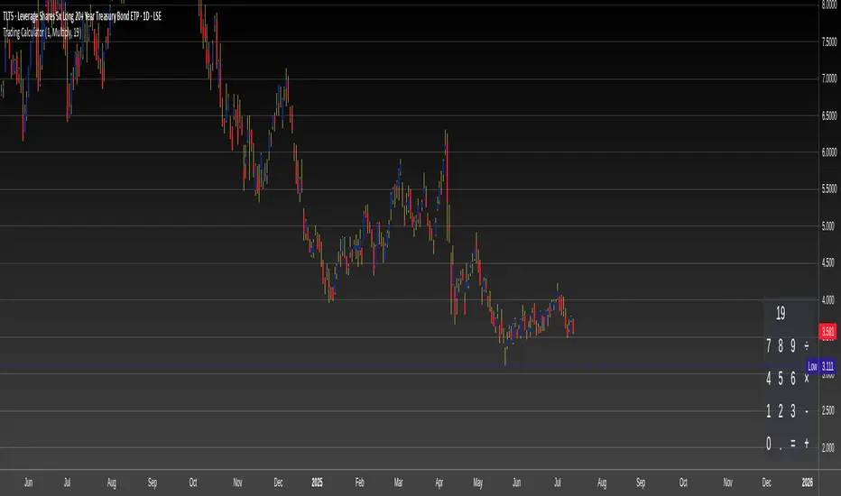
Trading CalculatorTrading Calculator Indicator
VIBE CODED WITH GROK 3
The Trading Calculator is a Pine Script indicator designed to perform quick and useful trading-related calculations directly on your chart. It allows traders to execute basic arithmetic operations—such as addition, subtraction, multiplication, and division—as well as calculate percent change and average using either numerical values or trading variables (e.g., close, open, high, low, volume). The indicator displays its results in a table that resembles a calculator interface, making it both functional and visually intuitive. Unlike typical indicators, it does not overlay on the price chart but instead appears in a separate pane.
Inputs
Formula (new | old): First value or variable (e.g., 100, close, close ). Example: close uses the current closing price.
Operator: Mathematical operation (e.g., Plus, Minus, Multiply). Example: Plus adds the two inputs.
Second Input: Second value or variable (e.g., 50, open, close ). Example: open uses the current opening price.