Indicators and strategies

CoinBot2.0 (Signals Only)CoinBot2.0 is a next-generation crypto trading indicator and webhook-enabled bot system designed for seamless automation and fast signal execution.
This TradingView Pine Script detects potential market reversals by combining Bollinger Band and RSI logic to generate clear “BUY” and “SELL” signals directly on your chart—no clutter, no unnecessary lines, just actionable entries and exits.
With built-in webhook alerts, CoinBot2.0 connects to your Flask/Python bot or any automated trading system. Instantly trigger simulated or real trades the moment a new opportunity appears—no manual intervention required.
Key Features:
Clean chart interface: Only buy/sell signals, no extra overlays or indicators.
Bottom/top detection: Attempts to catch major reversals using dynamic Bollinger Bands and custom RSI thresholds.
Webhook-ready: Sends buy/sell JSON alerts with price and symbol to any compatible endpoint (like your Replit CoinBot dashboard).
Easy integration: Fast setup for automated, paper, or live trading.
Ideal for:
Traders seeking simple, actionable, automation-friendly signals.
Anyone running a webhook-based trading bot, whether on Replit, a VPS, or locally.

4H Box+ m15 Separadorindicates 15-minute time frames in vertical lines and 4-hour time frames in boxes for candle analysis on shorter time frames.


Asset Premium/Discount Monitor📊 Overview
The Asset Premium/Discount Monitor is a tool for analyzing the relative value between two correlated assets. It measures when one asset is trading at a premium or discount compared to its historical relationship with another asset, helping traders identify potential mean reversion opportunities, or pairs trading opportunities.
🎯 Use Cases
Perfect for analyzing:
NASDAQ:MSTR vs CRYPTO:BTCUSD - MicroStrategy's premium/discount to Bitcoin
NASDAQ:COIN vs BITSTAMP:BTCUSD - Coinbase's relative value to Bitcoin
NASDAQ:TSLA vs NASDAQ:QQQ - Tesla's premium to tech sector
Regional banks AMEX:KRE vs AMEX:XLF - Individual bank stocks vs financial sector
Any two correlated assets where relative value matters
Example of a trade: MSTR vs BTC - When indicator shows MSTR at 95% percentile (extreme premium): Short MSTR, Buy BTC. Then exit when the spread reverts to the mean, say 40-60% percentile.
🔧 How It Works
Core Calculation
Ratio Analysis: Calculates the price ratio between your asset and the correlated asset
Historical Baseline: Establishes the "normal" relationship using a 252-day moving average. You can change this.
Premium Measurement: Measures current deviation from historical average as a percentage
Statistical Context: Provides percentile rankings and standard deviation bands
The Math
Premium % = (Current Ratio / Historical Average Ratio - 1) × 100
🎨 Customization Options
Correlated Asset: Choose any symbol for comparison
Lookback Period: Adjust historical baseline (50-1000 days)
Smoothing: Reduce noise with moving average (1-50 days)
Visual Toggles: Show/hide bands and percentile lines
Color Themes: Customize premium/discount colors
📊 Interpretation Guide
Premium/Discount Reading
Positive %: Asset trading above historical relationship (premium)
Negative %: Asset trading below historical relationship (discount)
Near 0%: Asset at fair value relative to correlation
Percentile Ranking
90%+: Near recent highs - potential selling opportunity
10% and below: Near recent lows - potential buying opportunity
25-75%: Normal trading range
Signal Classifications
🔴 SELL PREMIUM: Asset expensive relative to recent range
🟡 Premium Rich: Moderately expensive, monitor for reversal
⚪ NEUTRAL: Fair value territory
🟡 Discount Opportunity: Moderately cheap, potential accumulation zone
🟢 BUY DISCOUNT: Asset cheap relative to recent range
🚨 Built-in Alerts
Extreme Premium Alert: Triggers when percentile > 95%
Extreme Discount Alert: Triggers when percentile < 5%
⚠️ Important Notes
Works best with highly correlated assets
Historical relationships can change - monitor correlation strength
Not investment advice - use as one factor in your analysis
Backtest thoroughly before implementing any strategy
🔄 Updates & Future Features
This indicator will be continuously improved based on user feedback. So... please give me your feedback!

Trendline Breakouts With Targets [ Chartprime ]The Trendline Breakouts With Targets indicator is meticulously crafted to improve trading decision-making by pinpointing trendline breakouts and breakdowns through pivot point analysis.
Here's a comprehensive look at its primary functionalities:
Upon the occurrence of a breakout or breakdown, a signal is meticulously assessed against a false signal condition/filter, after which the indicator promptly generates a trading signal. Additionally, it conducts precise calculations to determine potential target levels and then exhibits them graphically on the price chart.

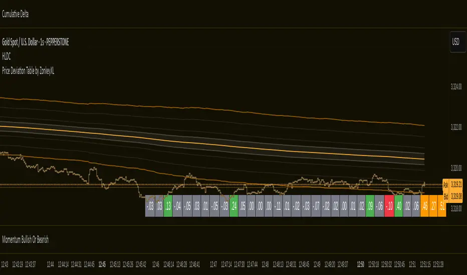
Price Deviation Table by ZonkeyXLProvides a 30 column table showing price deviation per bar close, highlighting larger deviations in red (downside) or green (upside).
Deviations that get highlighted in red/green are calculated to be 2x the amount of price movement in the previous candle, but can be customised to check any deviation size you want in the options panel.
Can be used on any timeframe but you need to specify the number of bars per table column to make it accurate to what you want.
Examples:
If used on the 1 second time frame you could specify bars to 1 and then each column value will check the price as at close on the most recent second for deviations against the close of price on the second prior, showing comparisons up to 30 seconds.
If on the 1 minute time-frame you could specify bars to 2 and then each column value would show deviations from most recent price close to 2 minutes ago, making all 30 columns show deviations for up to an hour.
At the end of the column are 3 orange coloured columns. The first one compares price to 10 bars ago. The second compares current price to 20 bars ago. The 3rd compares current price to 30 bars ago.
In our example on the 1 second above, this would mean deviation is calculated by comparing most recent close to 10 seconds ago, then to 20 seconds ago, and then to 30 seconds ago. The final 3 columns do not highlight red or green, so you can differentiate them properly from the main deviation columns at all times.
Note that the table is rolling - so once it is populated for the first time, only the final column will update while the prior values will shift one column to the left.
MOM Buy/Sell + MACD Histogram Signal TableJarmo script ETGAG to be used for chart analysis
Meant to assist with determining how to choose direction

BOR + 08:28BOR + TIME: Precision 1-Minute Opening Range Analysis
METHODOLOGY OVERVIEW
This indicator implements a proprietary time-based trading methodology that combines opening range analysis with precision timing algorithms designed exclusively for 1-minute charts during the New York trading session.
CORE ALGORITHM COMPONENTS
1. Bond Opening Range (BOR) Identification
- Captures the complete price range during 08:00-09:00 NY time
- Establishes the foundational trading range for the session
- Uses high-precision minute-level data to define exact boundaries
2. Critical Time Level Analysis (08:28 Candle)
- Identifies the 08:28-08:29 minute candle as a key reference point
- This specific timing represents a critical juncture before market open
- Captures the exact high/low range of this precise minute
3. Directional Bias Determination (09:00 Analysis)
- At exactly 09:00, compares current price position relative to 08:28 boundaries
- Above 08:28 High: Activates support-seeking mode (bullish bias)
- Below 08:28 Low: Activates resistance-seeking mode (bearish bias)
- Inside 08:28 Range: No directional bias established
4. Dynamic Standard Deviation Projections
- Uses the 08:28 candle range as the mathematical basis for standard deviation calculations
- Support Mode: Projects levels below 08:28 low using range multipliers (-1σ, -2σ, -3σ, -4σ)
- Resistance Mode: Projects levels above 08:28 high using range multipliers (+1σ, +2σ, +3σ, +4σ)
- Levels are active only during 09:00-10:30 trading window
UNIQUE FEATURES
Conditional Logic Engine
- Real-time directional switching based on 09:00 price position
- No static levels - everything adapts to intraday price action
- Eliminates noise by focusing on specific time windows
Precision Timing Requirements
- Requires exact 1-minute timeframe for accurate calculations
- Time-sensitive algorithm that relies on minute-by-minute analysis
- Optimized for high-frequency intraday trading decisions
Mathematical Framework
- Standard deviations calculated using actual candle range data
- Dynamic level spacing based on market volatility (08:28 range)
- Four-tier projection system for multiple target/stop levels
TRADING APPLICATION
Best Used For:
- ES, NQ, YM and other liquid index futures
- Active day trading during NY session (07:00-12:00)
- Scalping and short-term reversal strategies
- Intraday support/resistance identification
Signal Interpretation:
- Red lines represent potential reversal zones
- Direction determined by 09:00 vs 08:28 relationship
- Multiple standard deviation levels provide layered entry/exit points
- Time-restricted plotting ensures relevance during active trading hours
IMPORTANT REQUIREMENTS
- ONLY works on 1-minute charts - precision timing is essential
- Designed for New York trading session (futures markets)
- Most effective during high-volume trading periods
CUSTOMIZATION OPTIONS
- Toggle BOR box visibility and transparency
- Enable/disable 08:28 candle highlighting
- Adjust visual elements (colors, transparency)
- Show/hide range information labels

EdgeXplorer - Gaussian Forecast GridEdgeXplorer – Gaussian Forecast Grid
The Gaussian Forecast Grid is a forward-looking market modeling tool that uses a Gaussian Process Regression framework to estimate future price behavior. Built around a non-parametric machine learning approach, it maps recent historical price data to generate smoothed forecasts, offering an evolving yet mathematically grounded projection of where price could be headed.
This is not a “signal generator”—it’s a probabilistic estimation tool that overlays a fitted baseline with a future-facing forecast curve, giving traders visual guidance on short-term trend expectations while accounting for noise and variance in price behavior.
⸻
🔍 What Does the Gaussian Forecast Grid Do?
Gaussian Forecast Grid takes a fixed historical training sample of price data and fits it using a Gaussian kernel, generating two key visual elements:
• Fit Line — a smoothed, mathematically reconstructed version of the past data window
• Forecast Line — a forward-projected estimation of price behavior based on the shape and curvature of the past data
Traders can adjust how sensitive the model is to local volatility, how smooth the prediction curve is, and how frequently the forecast updates.
⸻
⚙️ How It Works – Technical Logic Explained
1. Kernel Regression Foundation
The tool applies a Gaussian kernel function that evaluates similarity between time steps in a defined window. This results in a covariance matrix that models how likely different values are to move together.
kernel(x1, x2) = exp( - (x1 - x2)² / (2 * scale²) )
• X-axis: Time steps
• Y-axis: Price deviations from baseline
• Scale: Smoothing factor (determines how tight or loose the fit is)
2. Training Phase
A fixed number of bars (Data Sample Length) are selected as the training window, from which the tool:
• Computes a baseline average (via SMA)
• Normalizes price deviations
• Builds a covariance matrix for training (with optional noise)
• Inverts the matrix to solve for weights
3. Forecast Generation
With the model trained:
• Future time steps (Projection Steps) are mapped
• The kernel is applied between past and future points
• A projected set of values is generated based on how past structure likely evolves
4. Model Refresh Options
Users can control when the model retrains:
• Lock Forecast: Generates forecast once and holds it
• Update Once Reached: Recomputes after reaching the end of the forecast window
• Continuously Update: Recalculates forecast on every new bar
⸻
📈 What Each Visual Element Represents
Visual Component Meaning
Blue Line (Fit) A smoothed curve fitted to historical price behavior
Red Line (Forecast) Projected price path based on Gaussian inference
Baseline The mean price used to normalize the data
Polyline Split Left = historical fit, Right = projected future
These lines are dynamically drawn and cleared based on model refresh mode, ensuring only relevant and current data is displayed.
⸻
📊 Inputs & Settings Explained
Training Inputs
Setting Description
Data Sample Length How many bars are used to fit the model (higher = smoother, slower)
Fit Color Color for the historical fit curve
Forecast Controls
Setting Description
Projection Steps Number of future bars to forecast
Prediction Color Color of the projected forecast line
Model Behavior
Setting Description
Smoothing Factor Controls the “tightness” of the curve; lower values = more reactive
Noise Scale Adds Gaussian noise to prevent overfitting; useful in high-volatility assets
Model Behavior (Refresh Mode)
• Lock Forecast = static output
• Update Once Reached = refresh after forecast ends
• Continuously Update = live update every bar
⸻
🧠 How to Interpret It in Real Markets
This indicator does not tell you where price is going. Instead, it provides a smoothed probabilistic path based on the recent shape of price movement.
Use Cases:
• 🧭 Price Projection Framing: Align other tools (like OBs, liquidity zones, or support/resistance) within the estimated trajectory
• 🔄 Reversion vs. Continuation: Compare current price position relative to the forecast path to judge whether the market is returning to structure or breaking from it
• 📐 Bias Context: Use forecast slope direction to determine short-term directional bias
⸻
🧪 Strategy Integration Tips
• Pair with a volatility filter to use only when price is ranging or compressing
• Overlay with SMC tools like OB, FVG, or BOS indicators for confirmation
• Use as a visual narrative tool to avoid chasing price blindly during uncertain phases

Momentum Buy/Sell IndicatorMomentum indicator that needs to be followed and not relied upon completely

Pivot Tops & BottomsHow it works
strategy() call replaces indicator() and enables backtesting.
Longs are opened at each confirmed swing-low and closed at the next swing-high.
Shorts can be turned on via the Enable Short Side toggle.
Position sizing uses 10% of equity per trade by default—adjust in the default_qty_value input.
Turn on Show Pivot Shapes to see where tops/bottoms land on your chart (shifted back by pivotLen).
Use the built-in Strategy Tester tab to review performance, drawdowns, win rate, etc.

Scalping Candle [Crak x MMT]The Scalping Candle is a TradingView indicator designed for scalping strategies, identifying potential bullish and bearish engulfing patterns on price charts. It overlays directly on the chart and marks specific candle patterns with visual signals, helping traders spot short-term trading opportunities. The indicator includes a customizable bias filter to focus on bullish, bearish, or neutral market conditions.
Features
Overlay Indicator : Displays bullish and bearish signals directly on the price chart.
Bias Filter : Allows users to select a market bias ('Bullish', 'Bearish', or 'Neutral') to filter signals based on their trading preference.
Visual Signals : Plots green upward triangles below bullish candles and red downward triangles above bearish candles.
Alerts : Generates alerts for bullish and bearish engulfing patterns, enabling timely notifications for trade setups.
How It Works
The indicator analyzes the relationship between the current and previous candles to detect engulfing patterns:
Bullish Engulfing : Triggered when the current candle's low is at or below the previous candle's low, and its close is at or above the previous candle's midpoint. This signal is displayed only if the bias filter is set to 'Neutral' or 'Bullish'.
Bearish Engulfing : Triggered when the current candle's high is at or above the previous candle's high, and its close is at or below the previous candle's midpoint. This signal is displayed only if the bias filter is set to 'Neutral' or 'Bearish'.
The previous candle's midpoint is calculated as the average of its high and low prices.
Usage
- Add to Chart : Apply the indicator to any TradingView chart.
- Configure Bias Filter :
Neutral : Displays both bullish and bearish signals.
Bullish : Displays only bullish signals.
Bearish : Displays only bearish signals.
- Interpret Signals :
Green upward triangle below a candle indicates a potential bullish reversal.
Red downward triangle above a candle indicates a potential bearish reversal.
- Set Alerts : Use the built-in alert conditions to receive notifications when bullish or bearish engulfing patterns are detected.
Settings
Bias Filter : Choose between 'Neutral', 'Bullish', or 'Bearish' to control which signals are displayed.
Shape Size : Signals are plotted as small triangles for minimal chart clutter.
Alert Conditions : Enable alerts for 'Bullish Engulfing Detected' or 'Bearish Engulfing Detected' to stay informed of new signals.
Ideal Use Case
This indicator is tailored for scalpers and short-term traders looking to capitalize on quick price movements driven by engulfing candle patterns. It works best on 15-minute chart and can be combined with other technical tools for confirmation.

MP AMS (100 bars)Indicator Name: ICT Nested Pivots: Advanced Structure with Color Control
Description:
This indicator identifies and labels nested pivot points across three levels of market structure:
Short-Term Pivots (STH/STL)
Intermediate-Term Pivots (ITH/ITL)
Long-Term Pivots (LTH/LTL)
It detects local highs and lows using a user-defined lookback period and categorizes them into short, intermediate, and long-term pivots based on their relative strength compared to surrounding pivots.
Key Features:
Multi-level pivot detection: Nested identification of short, intermediate, and long-term highs and lows.
Customizable display: Toggle visibility of each pivot level independently for both highs and lows.
Color control: Customize colors for high and low pivot labels and text for enhanced chart readability.
Clear labeling: Each pivot is marked with intuitive labels ("STH", "ITH", "LTH" for highs and "STL", "ITL", "LTL" for lows) placed above or below bars accordingly.
Safe plotting: Avoids errors by validating data and only plotting labels within the lookback range.
This tool helps traders visually analyze market structure and identify key turning points at different time scales directly on their price charts.

EdgeXplorer - Momentum EngineMomentum Engine by EdgeXplorer
Momentum Engine is a precision-driven oscillator and trend framework engineered to track market momentum with adaptive clarity. Unlike traditional momentum indicators, this engine blends ATR-based envelope logic, multi-mode oscillator scaling, and real-time directional overlays—all in one responsive system.
Designed for intraday traders and swing strategists alike, Momentum Engine offers a streamlined way to visualize momentum direction, impulse strength, and volatility-adaptive trend zones—with minimal noise and maximum context.
⸻
🔍 What Does Momentum Engine Do?
Momentum Engine visualizes market energy through a volatility-aware oscillator and accompanying trend overlays. It adapts dynamically to price behavior and enables traders to:
• Detect momentum waves with real-time visual cues
• Confirm directional bias using trend overlays and impulse zones
• Switch between Regular and Normalized oscillator modes
• See heatmap-based signal confirmation for crossovers
• View optional info panels, labels, and trend bar colors for clarity
It’s a compact yet powerful system built for discretionary and systematic use.
⸻
⚙️ How It Works – Technical Breakdown
1. Trend Envelope Logic
At its core, Momentum Engine constructs a price envelope using:
• The average of the highest closes and highs (Baseline Length)
• The average of the lowest closes and lows
• A multiplied ATR to scale the distance between upper and lower bounds
These bounds determine trend bias:
• Price above the short side of the channel → Bullish
• Price below the long side → Bearish
• In-between → Neutral
A dynamic midline tracks the central channel axis.
2. Oscillator Wave Calculation
The momentum oscillator reacts to price positioning relative to the envelope:
• In Regular Mode, it shows raw price deviation from the trend channel
• In Normalized Mode, it maps price movement into a 0–100 scale with historical scaling logic
Both modes use smoothing (Smoothing) to reduce noise.
3. Overlay Channel (Optional)
• Displays trend floors (bull) and ceilings (bear) on the price chart
• Color-coded trend shifts appear as pulse circles
• Optionally, bars themselves can be recolored for instant trend recognition
4. Heatmap Signal Zones
The background dynamically changes based on oscillator crossovers:
• Bullish signal → Yellow heatmap
• Bearish signal → Blue heatmap
These zones signal momentum ignition, especially helpful for early entries.
⸻
📈 What You See on the Chart
Element Meaning
Green Momentum Wave Bullish pressure (oscillator > midline or >50)
Red Momentum Wave Bearish pressure (oscillator < midline or <50)
Zero Line Base reference in Regular mode
Gray Guide Lines (Normalized) Bands for Overbought (85), Oversold (15), and Neutral (33–50)
Channel Lines Trend bias boundaries (bull/bear zones)
Pulse Marker (Circle) Trend direction change
Bar Colors (Optional) Bull or bear bar overlays for added clarity
Background Heatmap Bullish or bearish impulse confirmation
Info Table (Optional) Real-time trend and oscillator data panel
Debug Labels (Optional) Inline oscillator readings per bar
⸻
📊 Inputs & Settings
Engine Settings
Input Description
Timeframe Optional custom timeframe override
Baseline Length Determines envelope size (larger = smoother trend)
Multiplier Factor Controls ATR-based range expansion
Momentum Wave Settings
Input Description
Mode Regular = raw wave, Normalized = 0–100 scaling
Bull/Bear Colors Wave color customization
Line Width & Smoothing Visual clarity adjustments
Overlay Channel
Input Description
Show Overlay Toggle trend ceilings/floors on chart
Channel Colors Separate bull/bear lines
Trend Bar Color Recolors candle bodies based on trend bias
Signal Heatmap
Input Description
Enable Heatmap Background impulse shading toggle
Bull / Bear Colors Adjust visual tone of crossover zones
Add-ons
Input Description
Show Debug Labels View oscillator values at each bar
Show Info Panel Display current trend, oscillator value, and mode
⸻
🧠 How to Use Momentum Engine
Regular Mode
• Oscillator above 0 = Bullish bias
• Oscillator below 0 = Bearish bias
• Use zero line as your confirmation threshold
Normalized Mode
• 85 → Overbought / exhaustion
• <15 → Oversold / reversal watch
• Crossing 50 → Momentum ignition
• 33–50 → Neutral zone / ranging phase
Visual Interpretation Tips
• Green wave + yellow heatmap = Bull momentum confirmation
• Red wave + blue heatmap = Bear momentum confirmation
• Pulse marker = New trend — evaluate strength with wave slope
• Trend bar coloring = Scan trend alignment at a glance
⸻
🧪 Use Cases & Strategy Ideas
• ⚡ Scalping Impulse Moves
Use oscillator + heatmap crossover to catch directional bursts
• 🔁 Pullback Continuation
Wait for momentum to reset near neutral zone, then re-enter trend
• 📉 Reversal Triggers
Look for divergence or Normalized wave flipping at extremes
• 🎯 Multi-timeframe Confirmation
Set custom timeframe and layer on top of a higher or lower TF structure

GARCH Volatility [Trading Signals]This is a GARCH-like indicator rather than a full academic GARCH model
Current Strengths:
Current Strengths:
Captures core volatility clustering (alpha + beta)
Provides actionable signals
Lightweight for TradingView
When to Use This vs True GARCH:
Use This For: Real-time trading signals, visual market analysis
Use Full GARCH For: Risk modeling, quantitative research

Enhanced Multi-Timeframe Bias Dashboard + VolatilityProvides a table that indicates the RSI, MACD and overall bias across the daily, 4 hour and 1 hour timeframes

Hourly Divider with Opening Price🕐 Hour Lines with Opening Price — Utility Indicator
This lightweight TradingView script helps short-term option traders quickly visualize hourly structure and bias.
What it does:
Draws a vertical blue line at the start of each new hour
Draws a horizontal yellow line from the opening price of the hour, extending until the next hour
Purpose:
This tool makes it easy to:
Track hourly price context on lower timeframes like 1-minute
See how far price moves relative to the hourly open
Identify mean-reversion or breakout conditions around hourly transitions
Best used on:
1-minute (1m) charts, where understanding the position of price relative to the hourly open can inform "Up or Down" binary trades.

EdgeXplorer - Phantom FlowPhantom Flow by EdgeXplorer
Phantom Flow is a high-precision, visual market structure toolkit inspired by core ICT (Inner Circle Trader) concepts — including Order Blocks (OBs), Fair Value Gaps (FVGs), Market Structure Shifts (MSS), Liquidity Zones, Killzones, and Balance Price Ranges (BPRs). Designed for real-time clarity and SMC-aligned trading, this tool enhances raw ICT theory with practical execution features: extended zone logic, session filters, and pivot-sensitive rendering.
Whether you’re swing trading on HTF or scalping intraday moves in New York or London, Phantom Flow gives you a clean, structured lens through which to interpret price behavior — without clutter or noise.
⸻
🔍 What Does Phantom Flow Do?
This indicator maps out multiple price action phenomena in one system. It detects and plots:
• Order Blocks (OBs) — potential institutional footprints
• Fair Value Gaps (FVGs) — inefficiencies or imbalance zones
• Market Structure Shifts (MSS) — directional break points
• Liquidity Zones — buy-side and sell-side wick traps
• Balance Price Ranges (BPRs) — overlap zones from opposing FVGs
• Killzones (Sessions) — session-specific high-probability windows
Each element is toggleable, color-coded, and drawn directly on the chart, creating an intuitive visual environment to identify potential setups or confirm directional bias.
⸻
⚙️ How It Works – Technical Breakdown
1. Pivot Engine
Phantom Flow uses ta.pivothigh() and ta.pivotlow() with a configurable lookback period to establish reactive swing points for structure and liquidity logic.
2. Market Structure Shifts (MSS)
MSS logic checks for breaks above prior highs or below prior lows:
• If price closes above a previous pivot high, it flags a bullish MSS.
• If price closes below a previous pivot low, it flags a bearish MSS.
Each MSS is marked with a line and label at the structure break.
3. Order Blocks (OBs)
When a swing high or low is confirmed:
• A bearish OB is plotted between the open and high of the pivot bar.
• A bullish OB is plotted between the low and open of the pivot bar.
OB zones are drawn as transparent boxes that project forward several candles.
4. Fair Value Gaps (FVGs)
Imbalance zones are defined when:
• A bullish FVG occurs if the current low is above the high from two candles ago, and price closed bullish.
• A bearish FVG occurs if the current high is below the low from two candles ago, and price closed bearish.
These are visualized as boxes with “FVG” labels.
5. Balance Price Ranges (BPRs)
If both a bullish and bearish FVG overlap in the same bar:
• A gray BPR box is plotted to represent the zone where those inefficiencies cancel or compress into a range.
Useful for tracking potential accumulation or consolidation.
6. Liquidity Zones (Wick Detection)
Using ATR-based wick thresholds:
• Buy-side Liquidity is identified where long lower wicks form beneath pivot lows.
• Sell-side Liquidity is identified where long upper wicks form above pivot highs.
These zones indicate where stop hunts or liquidity grabs may occur.
7. Killzones (Sessions)
Two sessions are visualized using background colors:
• New York Killzone (default: 7:00–9:00 EST) — yellow background
• London Killzone (default: 2:00–5:00 GMT) — blue background
Sessions are dynamically aligned with your chart’s timeframe and location.
⸻
📈 What Each Visual Element Represents
Element Meaning
Green OB Box Bullish order block (potential demand zone)
Red OB Box Bearish order block (potential supply zone)
Teal FVG Box Bullish fair value gap (imbalance to the upside)
Maroon FVG Box Bearish fair value gap (imbalance to the downside)
Gray BPR Box Balance price range — compression of opposing gaps
Blue Liquidity Zone Buy-side liquidity below a swing low
Orange Liquidity Zone Sell-side liquidity above a swing high
Lime Line + Label Bullish Market Structure Shift (MSS ↑)
Fuchsia Line + Label Bearish Market Structure Shift (MSS ↓)
Yellow / Blue Background Killzone time blocks for NY or London
All shapes are bounded in time and logic — there are no arbitrary plots.
⸻
📊 Inputs & Settings Explained
Input Description
Execution Mode (Live / Backtest) Determines whether to run real-time or backtest-friendly calculations
Pivot Sensitivity (lookback) Controls how far back to look for pivots — higher values = stronger swing filters
Show MSS Toggle to display Market Structure Shift lines and labels
Show OB Toggle to display Order Block zones from swing points
Show FVG Toggle to visualize Fair Value Gaps as they appear
Show Liquidity Zones Displays wick-based buy/sell-side liquidity traps
Show BPR Zones Highlights overlapping bullish and bearish FVGs as compression zones
Show Killzones Enables session-based background highlighting for NY/London
Color Settings
Customize each visual element with transparency-controlled colors for OBs, FVGs, MSS lines, liquidity zones, and killzones.
⸻
🧠 How Traders Can Use Phantom Flow
Phantom Flow is not a signal generator. It’s a market narrative visualizer. Here’s how to integrate it into your approach:
• OB + FVG = Confluence: Look for fair value gaps forming around order blocks. These often suggest institutional entry zones.
• MSS + Liquidity = Trap Setup: Market structure shifts occurring after price taps liquidity often signal reversals or fakeouts.
• BPRs = Choke Points: If opposing FVGs compress, expect consolidation or expansion shortly after.
• Killzones = Context Windows: Use sessions to filter signal quality. For example, only trade FVGs during the London/NY overlap.
This tool works best when layered with:
• BOS/CHOCH detection
• Premium/Discount logic
• Risk-based execution models
⸻
🧪 Optional Use Case Ideas
• Intraday scalping based on NY/London killzone + MSS
• Swing trading off HTF OB + LQ zones
• Fade or trend-continuation setups using FVGs + BPR
• Combine with displacement candles or volume to validate zones

Hybrid Cumulative DeltaWhat does this indicator show?
This script displays two types of CVD (Cumulative Volume Delta):
1. Simple Cumulative Delta Volume:
This is the basic method:
pinescript
Kopiraj
Uredi
deltaVolume = volume * (close > close ? 1 : close < close ? -1 : 0)
➡️ It increases cumulative volume if the candle closes higher, and decreases it if it closes lower.
It's a simple assumption:
If the candle is bullish → more buying.
If bearish → more selling.
Then it's accumulated with:
pinescript
Kopiraj
Uredi
cumulativeDeltaVolume = ta.cum(deltaVolume)
It's plotted as candlesticks, rising or falling based on delta volume.
2. Monster Cumulative Delta (advanced method):
Uses a more complex formula, taking into account:
Candle range (high - low),
Relationship between open, close, and wicks,
Distribution of volume inside the candle.
pinescript
Kopiraj
Uredi
U1 = (close >= open ...) ? ...
D1 = (close < open ...) ? ...
Delta = close >= open ? U1 : -D1
cumDelta := nz(cumDelta ) + Delta
➡️ Purpose: to more realistically estimate aggressive buyers/sellers.
This is a refined CVD, ideal for markets without real order book data (like forex).
📍 What does the indicator tell us?
➕ If cumulative delta is rising:
Buyers are in control (more aggressive market buys).
➖ If cumulative delta is falling:
Sellers dominate (more aggressive market sells).
📈 How to read it on the chart:
You’ll see 2 candlestick plots:
One for the simple delta (green/red delta volume candles),
One for the monster delta, which is often smoother.
👉 The key is to watch for divergence between price and CVD:
If price goes up but CVD goes down → buyers are weak = potential reversal.
If price drops and CVD rises → selling pressure is weak = potential bounce.
🕐 Best timeframe (interval) for forex?
Timeframe Purpose Recommendation
1m–15m Scalping / short-term flow ✅ Works well, but needs high-volume pairs (e.g., EUR/USD, GBP/USD)
1H–4H Swing trading / intraday ✅ Best balance – reveals smart money movements
1D Macro overview, long-term volume Usable, but less granular info
🔹 Recommendation for forex: 4H interval
Enough volume data to detect shifts in real pressure.
Less noise than lower timeframes.
Great for spotting swing setups (e.g., divergences at support/resistance).

Auto AVWAP (Anchored-VWAP) with Breakout ScreenerAuto AWAP based indicator that is able to idenifty the breakout of AWAP

Previous Day LevelsPrevious Day Levels (PDH, PDL, PDC)
This indicator automatically plots the key price levels from the previous trading day onto your chart: the High (PDH), Low (PDL), Close (PDC), and the Midpoint.
These levels are essential for day traders who use them to identify potential areas of support and resistance, gauge market sentiment, and pinpoint key breakout or breakdown zones.
Key Features:
Smart Drawing: Lines for past days are neatly contained within their daily session, while the current day's lines extend in real-time for live analysis.
Four Key Levels: Plots the Previous Day High, Low, Close, and Midpoint.
Full Customization: Easily toggle the visibility of each line and customize its color, style (solid, dotted, dashed), and width to match your personal chart theme.
This is a clean, lightweight, and fully adjustable tool for adding a classic day trading strategy to your analysis.

OA - RS HistogramOA - RS Histogram Indicator
This indicator displays a histogram representation of Relative Strength (RS) analysis, helping traders visualize the momentum relationship between a security and a reference index.
Key Features:
RS Histogram: Shows the difference between the current RS ratio and its EMA smoothed line
Customizable Reference Index: Default set to XU100, but can be changed to any index
EMA Smoothing: Adjustable EMA period (default 21) for trend analysis
Visual Clarity: Histogram bars are colored aqua for positive values and purple for negative values
Zero Line Reference: Dotted gray line for easy identification of positive/negative zones
How It Works:
The indicator calculates the relative strength by comparing the normalized percentage changes of the current security against the selected reference index. A 5-period EMA is applied to the RS ratio, and then the difference between this smoothed RS line and a longer EMA (default 21 periods) is displayed as a histogram.
Technical Calculation:
Fetches reference index data with proper gap handling
Calculates normalized percentage changes for both security and index
Computes relative strength ratio
Applies EMA smoothing to reduce noise
Displays the difference as a histogram for clear momentum visualization
Customization Options:
Reference index selection (default: XU100)
EMA length adjustment (default: 21 periods)
Color customization for positive and negative histogram bars
Alert Conditions:
Histogram crossing above zero (potential bullish momentum shift)
Histogram crossing below zero (potential bearish momentum shift)
Usage:
This tool helps traders understand relative strength concepts through visual histogram representation. The zero-line crossovers can indicate momentum shifts in the security relative to the chosen benchmark index.
