Correlation Coefficient with MA & BB中文版介紹
相關係數、移動平均線與布林帶指標 (Correlation Coefficient with MA & BB)
這個 Pine Script 指標是一款強大的工具,旨在幫助交易者和投資者深入分析兩個市場標的之間的關係強度與方向,並結合移動平均線 (MA) 和布林帶 (BB) 來進一步洞察這種關係的趨勢和波動性。
無論您是想尋找配對交易機會、管理投資組合風險,還是僅僅想更好地理解市場動態,這個指標都能提供有價值的見解。
指標特色與功能:
動態相關係數計算:
您可以選擇任何您想比較的股票、商品或加密貨幣代號(例如,預設為 GOOG)。
指標會自動計算當前圖表(主數據源,預設為收盤價)與您指定標的之間的相關係數。
相關係數值介於 -1 (完美負相關) 至 1 (完美正相關) 之間,0 表示無線性關係。
視覺化呈現相關係數線,並標示 1、0、-1 參考水平線,同時填充完美相關區間,讓您一目了然。
特別之處:程式碼中包含了 ticker.modify,確保比較標的數據考慮了股息調整或延長交易時段,使相關性分析更加精準。
相關係數的移動平均線 (MA):
為了平滑相關係數的短期波動,指標提供了多種移動平均線類型供您選擇,包括:SMA、EMA、WMA、SMMA。
您可以設定計算 MA 的週期長度(預設 20 週期)。
這條 MA 線有助於識別相關係數的長期趨勢,判斷兩者關係是趨於增強還是減弱。
相關係數的布林帶 (BB):
將布林帶應用於相關係數,以衡量其波動性和相對高低水平。
中軌與您選擇的移動平均線保持一致。
上軌和下軌則根據相關係數的標準差和您設定的 Z 值(預設 2.0 倍標準差)動態調整。
布林帶可以幫助您識別相關係數何時處於極端水平,可能預示著未來會回歸均值。
如何運用這個指標?
配對交易策略:當兩個通常高度相關的資產,其相關係數短期內顯著偏離平均水平(例如,一個資產價格上漲而另一個原地踏步),您可能可以考慮利用此「失衡」進行配對交易。
投資組合多元化:了解不同資產之間的相關性,有助於構建更穩健的投資組合,避免過度集中於同向變動的資產,有效分散風險。
市場趨勢洞察:透過觀察相關係數的趨勢和波動,您可以更好地理解不同市場板塊或資產類別之間的聯動性,為您的宏觀經濟分析提供數據支持。
請注意,相關性不等於因果性。使用此指標時,請結合您的整體交易策略、宏觀經濟分析以及其他技術指標進行綜合判斷。
English Version Introduction
Correlation Coefficient with Moving Average & Bollinger Bands Indicator (Correlation Coefficient with MA & BB)
This Pine Script indicator is a powerful tool designed to help traders and investors deeply analyze the strength and direction of the relationship between two market instruments. It integrates Moving Averages (MA) and Bollinger Bands (BB) to further insight into the trend and volatility of this relationship.
Whether you're looking for pair trading opportunities, managing portfolio risk, or simply aiming to better understand market dynamics, this indicator can provide valuable insights.
Indicator Features & Functionality:
Dynamic Correlation Coefficient Calculation:
You can select any symbol you wish to compare (e.g., default is GOOG), be it stocks, commodities, or cryptocurrencies.
The indicator automatically calculates the correlation coefficient between the current chart (main data source, default is close price) and your specified symbol.
Correlation values range from -1 (perfect negative correlation) to 1 (perfect positive correlation), with 0 indicating no linear relationship.
It visually plots the correlation line, marks 1, 0, -1 reference levels, and fills the perfect correlation zone for clear visualization.
Special Feature: The code includes ticker.modify, ensuring that the comparative symbol's data accounts for dividend adjustments or extended trading hours, leading to more precise correlation analysis.
Moving Average (MA) for Correlation:
To smooth out short-term fluctuations in the correlation coefficient, the indicator offers multiple MA types for you to choose from: SMA, EMA, WMA, SMMA.
You can set the length of the MA period (default 20 periods).
This MA line helps identify the long-term trend of the correlation coefficient, indicating whether the relationship between the two instruments is strengthening or weakening.
Bollinger Bands (BB) for Correlation:
Bollinger Bands are applied to the correlation coefficient itself to gauge its volatility and relative high/low levels.
The middle band aligns with your chosen Moving Average.
The upper and lower bands dynamically adjust based on the correlation coefficient's standard deviation and your set Z-score (default 2.0 standard deviations).
Bollinger Bands can help you identify when the correlation coefficient is at extreme levels, potentially signaling a future reversion to the mean.
How to Utilize This Indicator:
Pair Trading Strategies: When two typically highly correlated assets show a significant short-term deviation from their average correlation (e.g., one asset's price rises while the other stagnates), you might consider exploiting this "imbalance" for pair trading.
Portfolio Diversification: Understanding the correlation between different assets helps build a more robust investment portfolio, preventing over-concentration in co-moving assets and effectively diversifying risk.
Market Trend Insight: By observing the trend and volatility of the correlation coefficient, you can better understand the联动 (interconnectedness) between different market sectors or asset classes, providing data support for your macroeconomic analysis.
Please note that correlation does not imply causation. When using this indicator, combine it with your overall trading strategy, macroeconomic analysis, and other technical indicators for comprehensive decision-making.
Indicators and strategies

Manipulation Candle SignalsManipulation Candle signal. Good signal to be aware when there is a liquidity sweep from the previous candle high or low, and a continuation in the trend. Most recomended in 30 min and 1HR time frame for day trade

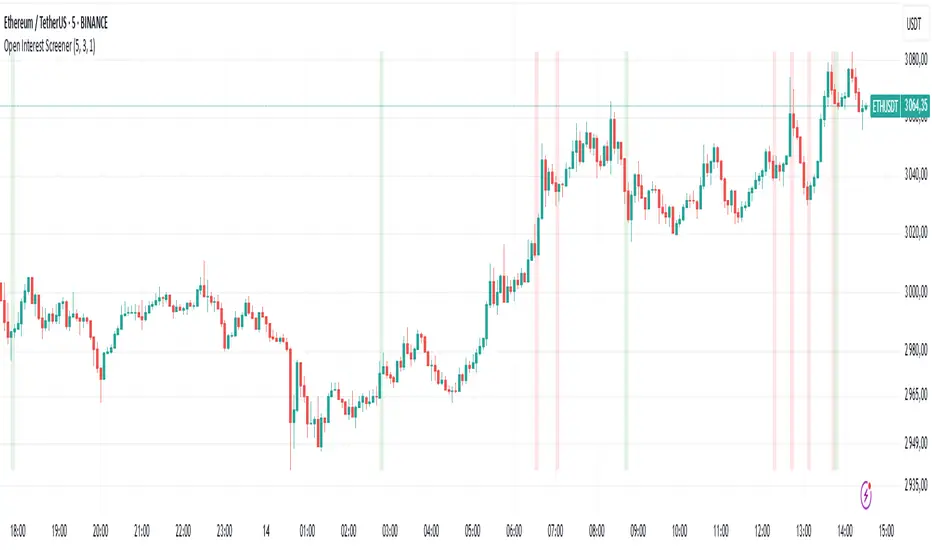
Open Interest Screener
Open Interest Screener
Traders often wonder: how do you enter a trend before it takes off — not at the very peak? Most classic technical indicators lag behind price. So what could you add to your system to catch a move earlier?
🔍 Enter the Open Interest Screener!
I've personally relied on this metric for years while trading crypto. It helps detect abnormal spikes in open interest — sudden increases in the number of outstanding derivative contracts — which often signal that something big is about to happen. These moments can mark the very start of a major trend.
🧠 How to use it:
Go long if price is rising and there's a spike in open interest on the way up.
Go short if price is falling and open interest rises during the decline.
Exit positions when open interest sharply drops — this may indicate the move is losing momentum.
⚙️ Settings & Customization:
Bars to look back — defines how far back the script looks to detect % changes in open interest.
OI % Change Threshold — adjust this to control sensitivity; higher = fewer, stronger signals.
Exchange source toggles — choose between BitMEX (USD/USDT) and Kraken data feeds.
Show Spike Zones — enable or disable visual highlights for detected spikes.
📌 Tips:
Configure the indicator for your preferred cryptocurrency pair and timeframe.
Visually validate that the OI spikes look meaningful and are not cluttering the chart.
Optimal settings vary by asset — take time to test and tune them for each coin.
With this tool, you're no longer guessing where the trend might begin — you're tracking the intent of market participants as it unfolds. Use it as part of a broader system and stay ahead of the herd.

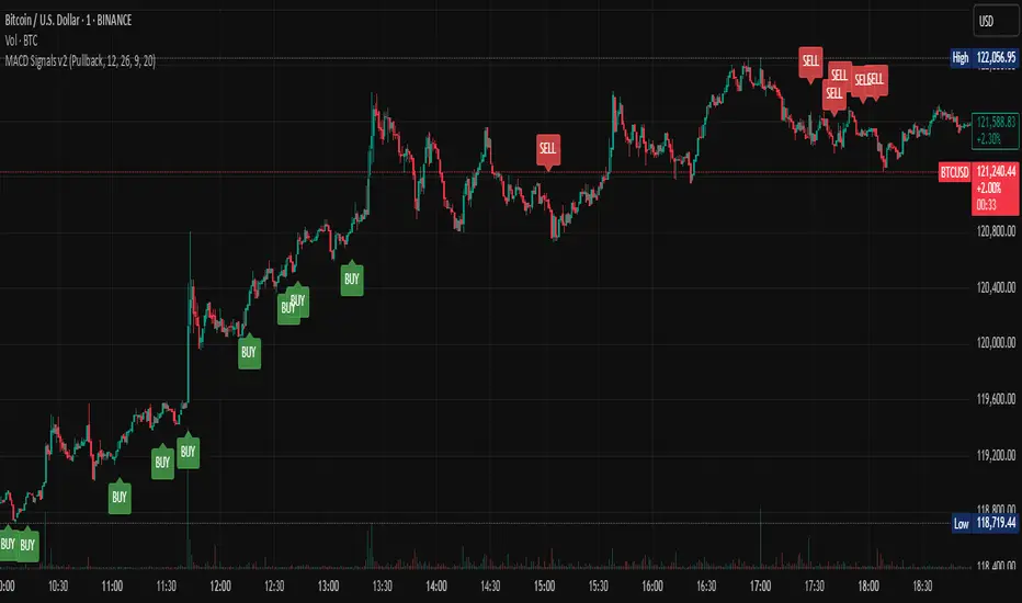
Multi-Mode MACD Signals v2Multi-Mode MACD Signals v2
Signal Types Explained ⚙️
You can now choose your preferred signal from a dropdown menu in the indicator's settings:
Pullback (Default): The original, high-probability strategy. It identifies "buy the dip" and "sell the rally" opportunities within an established trend.
Buy: Triggers on a bullish MACD/Signal line cross above the zero line.
Sell: Triggers on a bearish MACD/Signal line cross below the zero line.
Standard Crossover: The most common MACD signal. It's a pure momentum signal that triggers whenever the MACD line crosses the signal line, regardless of the trend.
Buy: MACD line crosses above the Signal line.
Sell: MACD line crosses below the Signal line.
Zero Line Cross: A trend-change signal. It identifies when the overall momentum shifts from bullish to bearish or vice-versa.
Buy: MACD line crosses above the Zero line.
Sell: MACD line crosses below the Zero line.
How Signals Are Displayed (Real-time vs. Confirmed)
This indicator addresses your request to have signals "display as it occurs" automatically. Here is how it works:
Real-time Alert (As it Occurs): On a live, developing candle, a "BUY" or "SELL" label may appear the instant the MACD conditions are met. This gives you the earliest possible warning.
Signal Repainting: Because the price is still moving within the live candle, the signal may appear and later disappear if the conditions are no longer met by the time the candle closes. This is known as "repainting".
Confirmed Signal: Once the candle closes, the signal is locked in and will never change. This is the confirmed, non-repainting signal.
To create alerts based on these signals, right-click a label on the chart, select "Add alert on Multi-Mode MACD Signals," and choose "Once Per Bar Close" for a confirmed signal or "Once Per Bar" for an earlier, real-time alert.
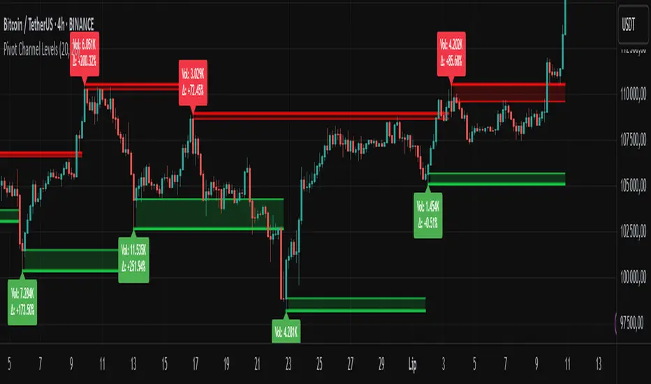
Pivot Channel LevelsPivot Channel Levels
Indicator Description
“Pivot Channel Levels” is an advanced technical analysis tool that identifies key price pivots (highs and lows) and creates dynamic support and resistance levels based on the wicks of candles at these points (or bodies if wicks are minimal). The indicator analyzes the volume at the time of a pivot’s formation, displaying its value and percentage change relative to the volume’s simple moving average (SMA).
It does not generate buy/sell signals but provides a clear visualization of market structure, helping traders identify potential price reaction zones and assess the strength of market movements.
Why Are Wicks Important?
Candle wicks at price pivots indicate significant market reactions in key areas. Depending on the context, they may signal rejection, testing, or absorption of a support or resistance level. Long wicks often appear where large players are active, and the marked zones are frequently retested. The indicator allows for quick identification and observation of their impact on future price action.
Why Use It?
- Precise Support and Resistance Levels: The indicator draws price channels based on candle wicks at pivots (or bodies if wicks are absent), enabling better identification of zones where price may react.
- Volume Analysis: It shows how the volume at a pivot differs from the average, indicating potential activity by large players or key market moments.
- Visual Clarity: Colored lines, channel fills, and clear labels facilitate quick chart analysis, even on short timeframes.
- Flexibility: Adjustable pivot length, volume average, and label colors allow customization to various trading strategies.
How It Works
- Pivot Detection: Automatically identifies local highs and lows based on the “Pivot Length” parameter (default: 20 candles). This means a pivot appears on the chart with a 20-candle delay. Reducing this value allows faster pivot detection (after fewer candles), increasing their number but potentially generating more noise.
- Channel Creation: Draws support and resistance levels based on the wicks of candles at pivot points (or bodies if wicks are minimal) with a delay to confirm zones. A pivot channel is drawn until the next pivot is identified, but if not previously broken, it remains valid as active support or resistance.
- Volume Analysis: Displays the volume at the pivot’s formation and its percentage change relative to the volume’s SMA.
- Visualization: Pivot and channel levels are shown as lines with fills, and labels display volume and its deviation from the average.
Trading Applications
- Swing Trading: Use pivot levels and channels to identify price reversal points or consolidation zones.
- Scalping: Monitor price reactions to channels on short timeframes, especially with high volume.
- Faster Pivot Identification: Switch to a lower timeframe (e.g., from H1 to M15) to identify pivots more quickly, allowing earlier reactions to price changes.
- Market Context Analysis: High volume at pivots may indicate significant levels likely to be retested.
- Combining with Other Tools: The indicator pairs well with Fibonacci retracement, supply/demand zones, or oscillators like RSI.
Settings and Customization
- Pivot Length: Determines how many candles back and forward are analyzed to detect pivots (default: 20). A smaller value increases sensitivity, a larger one enhances stability.
- Volume Average: Length of the SMA for volume (default: 20). Adjust to better reflect market characteristics.
- Label Colors: Choose colors for bullish and bearish pivot labels to match your chart style.
Usage Examples
- Identifying Key Zones: If the price approaches a pivot level with high volume (e.g., +50% relative to SMA), it may signal strong support or resistance.
- Breakout Confirmation: A channel breakout with high volume can indicate trend continuation.
- Price Reaction Analysis: Long wicks at pivots with high volume may signal level rejection by large players.
Notes for Users
- The indicator performs best on highly liquid markets (e.g., Forex, indices, cryptocurrencies).
- On short timeframes (e.g., M1, M5), it may generate more noise—adjust “Pivot Length” to suit your needs.
- Consider combining with other indicators to confirm signals derived from pivot and volume analysis.
BTST Top Gainer ScannerBTST Stock identifier- BETA
scanner configuration based on the validated BTST checklist. This scans for stocks likely to gain 5-10% intraday tomorrow when bought at today's close:
Execution Tips:
Run scanner at 3:20 PM IST daily
Filter stocks with:
FII/DII net buying (check moneycontrol)
Pre-market futures premium > 0.4%
No pending corporate actions
Position sizing formula: Qty = (1% Account Risk) / (1.5 * ta.atr(14))
Cross-verify with FII/DII activity (moneycontrol.com) - stocks with FII net buys have 23% higher success rate.

Pivot Points Standard📄 Indicator Overview
This indicator is an advanced trend-following tool designed to generate entry signals based on EMA 234 and SMA 200, while also providing dynamic ATR-based stop-loss (SL) and take-profit (TP) levels.
Buy (Long) Signal:
Triggered when the price is above both the EMA 234 and SMA 200.
Sell (Short) Signal:
Triggered when the price is below both the EMA 234 and SMA 200.
For each signal, the indicator automatically displays:
✅ Entry price,
✅ Stop-loss (SL) level,
✅ Take-profit (TP) level,
✅ Risk amount,
✅ Reward amount,
✅ Risk/Reward (R/R) ratio.
All past signals and their corresponding entry, SL, and TP levels remain visible on the chart, allowing you to easily review historical trades. Thanks to ATR-based dynamic calculations, stop-loss and take-profit levels adjust to market volatility, providing a flexible and adaptive risk management approach.
⚙️ Features
Trend signals based on EMA 234 and SMA 200
Dynamic stop-loss and take-profit levels calculated with ATR
Persistent historical signal tracking (labels remain on the chart)
Automatic risk/reward calculation and display
Clean, user-friendly design for easy interpretation
💬 Usage Tips
When entering a position, consider the displayed risk and reward values for proper risk management. Since stop-loss and take-profit levels adjust dynamically to volatility, manual adjustment is not necessary.
⚠️ Disclaimer
This indicator is not financial advice. It is intended for educational and informational purposes only to support your personal trading analysis and strategy.
✅ If you'd like, I can also prepare a shorter summary version or add a Turkish + English bilingual version side by side. Just tell me! 🚀

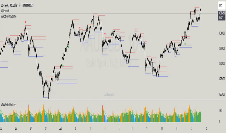
VSA-Stopping VolumeVSA Stopping Volume Indicator
Stopping Volume occurs when candles show decreasing body sizes (narrow spreads) while volume steadily increases.
Example chart:
As you see:
3 consecutive candles in same direction (all green OR all red)
Body sizes (spreads) decreasing progressively: Candle 1 > Candle 2 > Candle 3
Volume increasing progressively: Volume 1 < Volume 2 < Volume 3
This pattern indicates price absorption - increased buying/selling pressure but declining price movement, often signaling exhaustion and potential reversal.
Indicator Features
This indicator detects Stopping Volume candlestick clusters with two signal types:
🔹 BUY/SELL Signals: Generated when pattern occurs at support/resistance zones
🔹 Directional Alerts (▲-green, ▼-red): Generated when pattern occurs outside key levels
Trading Guidelines:
⚠️ Auto-drawn S/R zones are reference only - manual level plotting recommended for accuracy
📊 Best for scalping: M5, M10, M15 timeframes
🛡️ Stop Loss: Place beyond the S/R zone you're trading
🎯 Take Profit: Based on your risk management
Key Concept: Volume expansion + price contraction = potential reversal, especially at SnR levels.
Perfect for scalpers looking to catch reversals at critical zones!
Time Frame Color ClassifierTime Frame Colour Classifier
A professional Pine Script indicator that provides instant visual identification of trading sessions through intelligent colour-coded backgrounds.
Key Features
📅 Daily Session Colours
- Monday: Green | Tuesday: Blue | Wednesday: Yellow | Thursday: Red | Friday: Purple
📊 Weekly Classification
- Week 1-5 : Colour-coded by week of the month using the same colour scheme
## How It Works
Intraday Charts (1min-4H) : Shows daily colours - every candle on Monday displays green background, Tuesday shows blue, etc.
Daily/Weekly Charts : Switches to weekly colours - all days in Week 1 show green, Week 2 shows blue, etc.
Professional Applications
✅ Multi-Timeframe Analysis : Seamlessly switch between timeframes whilst maintaining visual context
✅ Session Recognition : Instantly identify which trading day you're analysing
✅ Pattern Analysis : Spot recurring patterns on specific days of the week
✅ Strategy Development : Incorporate temporal factors into trading strategies
✅ Performance Attribution : Correlate results with specific trading sessions
Customisation Options
- Toggle daily/weekly colours on/off
- Fully customisable colour schemes
- Adjustable background transparency
- Optional day labels
Technical Details
- Pine Script v5for optimal performance
- Automatic timeframe detection - no manual configuration required
- Minimal resource usage - won't slow down your charts
- Works on all chart types and timeframes
Perfect For
- Day traders switching between multiple timeframes
- Swing traders analysing weekly patterns
- Algorithmic strategy development
- Multi-timeframe market analysis
- Trading education and research
---
Developed by @wyckoffnawaf
Transform your chart analysis with visual timeframe clarity

Strict S&D Zones with Real BoS (Wick Breaks)Marking supply and demand zones for you before a 3 candle push. Accurate for supply and demand zones

Fibonacci Retracement levels Automatically D/W/MIndicator Description: Fibonacci Retracement levels Automatically
Fibonacci retracement levels based on the day, week, month High Low range and Fibonacci retracement levels draws automatically .This Pine Script indicator is designed to plot Fibonacci retracement levels based on the high and low prices of a user-selected timeframe (Daily, Weekly, or Monthly). It identifies bullish or bearish candles in the chosen timeframe, draws key price levels, and overlays Fibonacci retracement lines and semi-transparent colored boxes to highlight potential support and resistance zones. The indicator dynamically updates with each new period and extends lines, labels, and boxes to the current bar for real-time visualization. Key Features
1. Timeframe Selection: Users can choose the timeframe for analysis: Daily, Weekly, or Monthly via an input dropdown. The indicator retrieves the open, high, low, and close prices for the selected timeframe using `request.security`.
2. High and Low Tracking : Tracks the highest high and lowest low within the selected timeframe. Stores these values and their corresponding bar indices in arrays (`whigh`, `wlow`, `whighIdx`,`wlowIdx`). Limits the array size to the most recent period to optimize performance.
3. Bullish and Bearish Candle Detection : Identifies whether the previous period’s candle is bullish (`close > open`) or bearish (`close < open`). Uses this to determine the direction for Fibonacci retracement calculations. Bullish candle: Fibonacci levels are drawn from low to high
Bearish candle: Fibonacci levels are drawn from high to low
4. Fibonacci Retracement Levels : Plots Fibonacci levels at 0.236, 0.382, 0.5, 0.618, and 0.786 between the high and low of the period. For bullish candles, levels are calculated from the low (support) to the high (resistance). For bearish candles, levels are calculated from the high (resistance) to the low (support). Each Fibonacci level is drawn as a horizontal line with a unique color:
- 0.236: Blue
- 0.382: Purple
- 0.5: Yellow
- 0.618: Teal
- 0.786: Fuchsia
5. Visual Elements: - High/Low Lines and Labels: Draws a red line and label for the previous period’s high. Draws a green line and label for the previous period’s low. Fibonacci Lines and Labels: Each Fibonacci level has a horizontal line and a label displaying the ratio.
Colored Boxes: Semi-transparent boxes are drawn between consecutive Fibonacci levels (including high and low) to highlight zones.
6. Dynamic Updates:
- At the start of a new period (e.g., new week for Weekly timeframe), the indicator:
- Clears previous Fibonacci lines, labels, and boxes.
- Recalculates the high and low for the new period.
- Redraws lines, labels, and boxes based on the new data.
- Extends all lines, labels, and boxes to the current bar index for real-time tracking.
7. Performance Optimization:
- Deletes old lines, labels, and boxes to prevent clutter.
- Limits the storage of highs and lows to the most recent period.
How It Works
1. Initialization: Defines variables for tracking bullish/bearish candles, lines, labels, and arrays for Fibonacci levels and boxes. Sets up color arrays for Fibonacci lines and boxes with distinct, semi-transparent colors.
2. Data Collection: Fetches the previous period’s OHLC (open, high, low, close) using `request.security`. Detects new periods (e.g., new week or month) using `ta.change(time(tf))`.
3. Fibonacci Calculation: On a new period, stores the high and low prices and their bar indices.
- Identifies the maximum high and minimum low from the stored data. - Calculates Fibonacci levels based on the range (`maxHigh - minLow`) and the direction (bullish or bearish).
4. Drawing:
- Draws high/low lines and labels at the identified price levels. Plots Fibonacci retracement lines and labels for each ratio. Creates semi-transparent boxes between Fibonacci levels to visually distinguish zones.
5. Updates:
- Extends all lines, labels, and boxes to the current bar index when a new period is detected. Clears old Fibonacci elements to avoid overlap and ensure clarity.
Usage
- Purpose: This indicator is useful for traders who use Fibonacci retracement levels to identify potential support and resistance zones in financial markets.
- Application:
- Select the desired timeframe (Daily, Weekly, Monthly) via the input settings.
- The indicator automatically plots the previous period’s high/low and Fibonacci levels on the chart.
- Use the labeled Fibonacci levels and colored boxes to identify key price zones for trading decisions.
- Customization:
- Modify the `timeframe` input to switch between Daily, Weekly, or Monthly analysis.
- Adjust the `fibLineColors` and `fibFillColors` arrays to change the visual appearance of lines and boxes.
- The indicator is designed for use on TradingView with Pine Script.
- The maximum array size for highs/lows is limited to 1 period in this version (can be adjusted by modifying the `array.shift` logic).
- The indicator dynamically updates with each new period, ensuring real-time relevance.
This indicator make educational purpose use only

MA Band Zones with AlertsThis is a simple script with alerts.
Its a tool, helps traders, who works on price average range, to identify zones away from Moving average + and - side.
it will work on sma, ema, wma.
custom TF
custom source
alert 5 alert variation to choose from.
there is small glitch, kindly uncheck both the background boxes in in the input setting. it will removed in the next version

KZ TRADING _ BOT RSI,STOCH, MO HINH NENBot trade demo for m15 . it suitable for XAU, U.J. use RSI + Stoch RSI and candless pattem

Multi-Timeframe Fibonacci Retracement [HG]# 🌀 Fibonacci Multi-Timeframe Indicator
## 🌟 Overview
An advanced Fibonacci-based indicator utilizing three distinct timeframes (5, 14, and 34 periods) to provide comprehensive market analysis. This powerful tool combines short-term momentum with medium and long-term trend perspectives, all based on the mathematical precision of Fibonacci sequence numbers.
## 🔧 Core Features
### 📊 Triple Fibonacci System
- **Fast Signal (5 periods)**: Ultra-responsive for scalping and quick entries
- **Medium Signal (14 periods)**: Balanced approach for swing trading
- **Slow Signal (34 periods)**: Long-term trend identification and confirmation
- **Fibonacci Harmony**: All periods based on authentic Fibonacci sequence
### 🎯 Multi-Timeframe Analysis
- **Convergence Signals**: When all three timeframes align
- **Divergence Detection**: Early warning of potential reversals
- **Momentum Layers**: Different speed signals for complete market picture
- **Trend Strength**: Measured through multiple Fibonacci perspectives
## 🎨 Customization Options
### 🎭 Visual Configuration
- **Individual Colors**: Separate color schemes for each timeframe
- **Line Styles**: Solid, Dashed, or Dotted options for clear differentiation
- **Line Thickness**: Adjustable width (1-5 pixels) for optimal visibility
- **Transparency Control**: Fine-tune opacity for overlapping signals
### ⚙️ Technical Parameters
- **Source Selection**: Configurable input (Close, Open, High, Low, HLC3)
- **Smoothing Options**: Additional filtering for cleaner signals
- **Alert System**: Notifications for convergence and crossover events
- **Display Toggle**: Enable/disable individual timeframe components
## 📈 Trading Applications
### 🎯 Signal Generation
- **Triple Confirmation**: Highest probability when all timeframes agree
- **Early Entry**: Fast signal (5) for quick market entries
- **Trend Confirmation**: Slow signal (34) validates overall direction
- **Exit Timing**: Medium signal (14) for optimal trade management
### 🔍 Market Analysis
- **Trend Identification**: Clear visualization of market direction
- **Momentum Shifts**: Early detection through Fibonacci relationships
- **Support/Resistance**: Dynamic levels based on Fibonacci calculations
- **Market Cycles**: Natural rhythm recognition through mathematical harmony
### ⚡ Trading Strategies
- **Scalping**: Ultra-fast 5-period signals for quick profits
- **Swing Trading**: 14-period balance for medium-term positions
- **Position Trading**: 34-period confirmation for long-term holds
- **Confluence Trading**: Maximum edge when all signals align
## 🚀 Key Benefits
✅ **Fibonacci Precision** - Mathematical accuracy of golden ratio sequences
✅ **Multi-Timeframe Edge** - Complete market perspective in one indicator
✅ **Natural Market Rhythm** - Fibonacci numbers reflect market psychology
✅ **Versatile Application** - Works across all markets and timeframes
✅ **High Probability Setups** - Triple confirmation reduces false signals
✅ **Professional Grade** - Institution-quality analysis tools
## 💡 Pro Trading Tips
- Wait for triple alignment for highest probability trades
- Use fast signal for entries, slow signal for trend bias
- Monitor divergences between timeframes for reversal opportunities
- Combine with support/resistance for confluence trading
- Scale position sizes based on timeframe agreement strength
## 🔢 Fibonacci Magic
The periods 5, 14, and 34 are not random - they represent consecutive Fibonacci numbers that naturally resonate with market movements and trader psychology, providing optimal market timing and trend analysis.
---
*Perfect for traders seeking mathematical precision combined with multi-timeframe market analysis.*

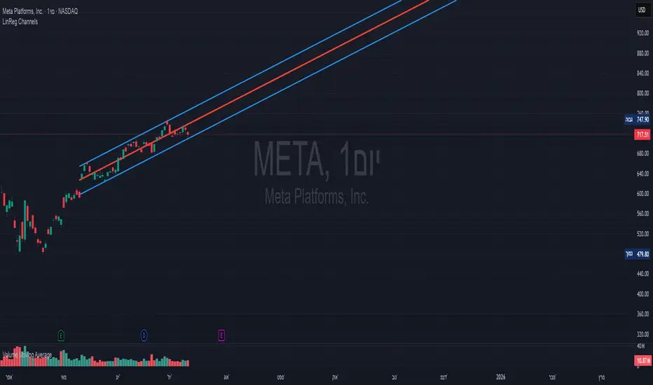
Linear Regression Channels📈 Linear Regression Channels
🌟 Overview
A professional dual linear regression channel indicator designed for comprehensive trend analysis. This powerful tool provides simultaneous short-term and long-term trend perspectives through two independent regression channels with customizable standard deviation bands.
🔧 Core Features
📊 Dual Channel System
Channel 1: 43-period regression analysis for long-term trend identification
Channel 2: 20-period regression analysis for short-term momentum tracking
Independent Configuration: Each channel fully customizable with separate parameters
Real-Time Updates: Dynamic calculations with every new candle
📐 Standard Deviation Bands
Multiple Levels: Configurable deviation bands (1σ, 2σ, 3σ)
Dynamic Support/Resistance: Automatically calculated price levels
Trend Boundaries: Clear visualization of trend strength and direction
Statistical Precision: Mathematically accurate regression calculations
🎨 Customization Options
🎭 Visual Styling
Individual Colors: Separate color schemes for each channel
Line Styles: Choose between Solid, Dashed, or Dotted lines
Line Width: Adjustable thickness (1-5 pixels) for optimal visibility
Extension Options: Project lines into the future for analysis
⚙️ Technical Parameters
Period Length: Fully adjustable lookback periods
Source Selection: Choose from Close, Open, High, Low, or custom sources
Deviation Levels: Customizable standard deviation multipliers
Display Control: Toggle individual channels on/off
📈 Trading Applications
🎯 Trend Analysis
Dual Timeframe Perspective: Simultaneous short and long-term view
Trend Confirmation: When both channels align in direction
Trend Strength: Measured by price position within channels
🔍 Support & Resistance
Dynamic Levels: Standard deviation bands as S/R zones
Channel Boundaries: Natural support and resistance areas
Confluence Trading: Multiple level confirmations
⚡ Entry & Exit Signals
Channel Breakouts: Trend continuation opportunities
Mean Reversion: Trades back to center line
Channel Crossovers: When price moves between timeframes
🚀 Key Benefits
✅ Multi-Timeframe Analysis - Complete market perspective
✅ Mathematical Precision - Least squares regression accuracy
✅ High Customization - Adaptable to any trading style
✅ Clean Interface - Professional chart appearance
✅ Performance Optimized - Smooth real-time operation
✅ Versatile Application - Works on all markets and timeframes
💡 Professional Usage
Combine both channels for confluence signals
Use longer channel for overall trend bias
Trade shorter channel signals within longer trend
Monitor channel width for volatility analysis
Essential tool for traders seeking precise trend analysis and dynamic support/resistance levels.
Recent Swing High/Low Linesit gives the recent swing highs and lows.
for options buyers, they can simply enter on a trade when an opposite option (at the money) goes below the recent swing low.

Japanese Candlestick PatternsCandlestick Pattern Detector – Your Smart Market Insight Tool
Unlock the hidden language of price action with the Candlestick Pattern Detector, an advanced TradingView indicator meticulously crafted to identify powerful candlestick formations in real time. Whether you are a day trader seeking sharp reversals, a swing trader scouting for trend continuations, or an investor who values precise entry signals, this indicator is your indispensable trading companion.
The Candlestick Pattern Detector continuously scans every bar on your chart and highlights over 30 classic and advanced candlestick patterns, including dojis, engulfing candles, hammers, shooting stars, morning stars, evening stars, haramis, and more. Each detected pattern is labeled directly on the chart, providing crystal-clear visual signals without clutter. Customizable settings allow you to choose which patterns to monitor, fine-tune sensitivity, and adjust label colors and styles to match your personal trading aesthetic.
Beyond merely spotting patterns, this indicator empowers traders to understand the psychological forces driving the market. Bullish and bearish signals help you gauge potential trend reversals, momentum shifts, or periods of consolidation. By integrating these time-tested price action signals into your strategy, you gain a powerful edge in anticipating market moves before they unfold.
Key Features:
Detects 30+ popular candlestick patterns in real time
Clear on-chart labels and color-coded signals
Customizable alerts for immediate trading opportunities
Adjustable sensitivity for noise reduction
Perfect for intraday, swing, or long-term trading
Elevate your trading precision and confidence with the Candlestick Pattern Detector. Let the market’s story reveal itself, candle by candle.

Robbin hoodsomething good, this is ewrfiwevdcbdkjsdbvkj vasfdkjvsdvkjae dk;v asd vk;jsbdvkaeskv jkjsD v.kj awerekrv

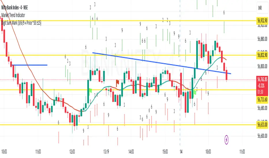
Digit Sum Mark (3/6/9 + Price ~33 ±15)This indicator highlights the price bars where the digit sum of high or low equals 3, 6, or 9, and the closing price is within a specific range (around ₹33 ±15, i.e., mod 100 ∈ ).
✨ Key Features:
Calculates digit sum of high and low values.
Adds +1 if the decimal portion > 0.50 (smart rounding logic).
Only activates when close price mod 100 is between 18 to 48, a zone inspired by the resonance around 33.
Marks the chart with green downward arrows (for high) and red upward arrows (for low) when digit sum = 3, 6, or 9.
📌 Inspired by Gann numerology and price vibration logic – especially the powerful influence of 3, 6, and 9 as noted by Nikola Tesla.
🚨 Best used on intraday or positional charts where price oscillates frequently around round figures.
🧠 Try pairing this with support/resistance tools for better accuracy!
Daily SMA Levels on Intraday📌 Indicator Overview: Daily SMA Levels on Intraday
🔧 What It Does
- Plots horizontal lines for up to eight daily SMAs: 5, 10, 20, 50, 100, 150, 200
- Displays dynamic labels at the end of each line showing both the SMA name and current value
- Works on intraday timeframes, pulling daily calculations for reference
- Lets you toggle each SMA line individually from the settings
- Offers three line styles—Solid, Dashed, and Dotted
- Includes a line thickness slider, giving you visual control
- Positions labels with left-pointing arrows for visual alignment without clutter
💡 Benefits of This Indicator,
🎯 Precision Entry & Exit Zones
Daily SMAs often act as support or resistance levels on lower timeframes. This indicator shows where these zones are in real time—even on a 1-minute chart.
🔍 Visual Trend Context
You see instantly if price is above or below critical SMAs like the 50 or 200, helping gauge bullish vs bearish bias.
⏱️ Intraday Awareness Without Clutter
Instead of switching to a daily chart, you can stay zoomed in and still track major daily trend lines.
Think of it like your intraday roadmap showing where institutional players might have interest—and where price could react.

10 EMA, 20 EMA & 50 SMAThis script plots three key moving averages on the price chart to help identify trends and potential trade opportunities:
10 EMA (Exponential Moving Average):
A fast-reacting average that captures short-term price momentum. Useful for spotting quick trend changes.
20 EMA (Exponential Moving Average):
A medium-term average that smooths out more noise while still being responsive to price changes.
50 SMA (Simple Moving Average):
A widely-used long-term trend indicator. It smooths price data over a longer period and is often used to define overall market direction.

EMA/SMA Distance Percentage TableThis TradingView indicator, "EMA/SMA Distance Percentage Table," is designed to help traders and analysts quickly assess the current price's relationship to key Exponential Moving Averages (EMAs) and Simple Moving Averages (SMAs).
Here's a breakdown of what it does:
Calculates Multiple Moving Averages: It computes EMAs for lengths 10, 30, 50, and 200, and SMAs for lengths 50 and 200. These are commonly used moving averages in technical analysis.
Measures Percentage Distance: For each of these moving averages, it calculates the percentage difference between the current closing price and the moving average's value. This indicates how far, in percentage terms, the price has deviated from that average. A positive percentage means the price is above the MA, while a negative percentage means it's below.
Displays Data in a Table: All the calculated information (MA type and length, its current value, and the percentage distance) is presented in a clear, organized table on the chart. This allows for quick at-a-glance monitoring.
Customizable Visibility: Users have the flexibility to show or hide the plots of the EMAs and SMAs on the chart, as well as the entire data table, through the indicator's settings.
Purpose:
The primary purpose of this indicator is to provide a concise overview of price momentum and potential overbought/oversold conditions relative to various moving averages. Traders often use the distance from MAs to:
Identify Trend Strength: A large distance from a long-term MA might suggest a strong trend.
Spot Potential Reversals: If the price is significantly extended from an MA, it might indicate that a pullback or reversal is due.
Confirm Support/Resistance: Moving averages often act as dynamic support or resistance levels, and their distance can provide context.
In essence, it helps you quickly see if the price is "stretched" or "compressed" relative to its historical averages, which can be valuable for making trading decisions.
