Trend Strength Oscillator📌 Trend Strength Oscillator
📄 Description
Trend Strength Oscillator measures the directional strength of price relative to an adaptive dynamic trend band. It evaluates how far the current price is from the midpoint of a trend channel and normalizes this value by recent volatility range, allowing traders to detect trend strength, direction, and potential exhaustion in any market condition.
📌 Features
🔹 Adaptive Trend Band Logic: Uses a modified ATR and time-dependent spread formula to dynamically adjust upper and lower trend bands.
🔹 Trendline Midpoint Calculation: The central trendline is defined as the average between upper and lower bands.
🔹 Relative Positioning: Measures how far the close is from the center of the band as a percentage.
🔹 Range Normalization: Uses a normalized range to account for recent volatility, reducing noise in the oscillator reading.
🔹 Oscillator Output (±100 scale):
+100 indicates strong bullish momentum
-100 indicates strong bearish momentum
0 is the neutral centerline
🛠️ How to Use
✅ Trend Strength > +50: Indicates a strong bullish phase.
✅ Trend Strength < -50: Indicates a strong bearish phase.
⚠️ Crossing above 0: Potential bullish trend initiation.
⚠️ Crossing below 0: Potential bearish trend initiation.
📉 Values near 0: Suggest trend weakness or ranging conditions.
Best suited timeframes: 1H, 4H, Daily
Ideal combination with: RSI, MACD, volume-based oscillators, moving average crosses
✅ TradingView House Rules Compliance
This indicator is written in Pine Script v5 and fully open-source.
The script does not repaint, does not generate false alerts, and does not access external or private data.
It is intended strictly as a technical analysis tool, and not a buy/sell signal generator.
Users are encouraged to combine this tool with other confirmations and independent judgment in trading decisions.
=========================================================
📌 Trend Strength Oscillator
📄 설명 (Description)
Trend Strength Oscillator는 가격이 동적 추세 밴드 내 어디에 위치해 있는지를 정량적으로 분석하여, 추세의 방향성과 강도를 시각적으로 보여주는 오실레이터 지표입니다. 최근 변동성을 반영한 밴드를 기반으로 가격 위치를 정규화하여, 과매수·과매도 상태나 추세의 소멸 가능성까지 탐지할 수 있도록 설계되었습니다.
📌 주요 특징 (Features)
🔹 적응형 추세 밴드 계산: ATR과 시간 경과를 기반으로 상단/하단 밴드를 동적으로 조정
🔹 중심 추세선 산출: 상단과 하단 밴드의 평균값을 중심선으로 활용하여 기준 축 제공
🔹 상대 위치 계산: 현재 종가가 중심선에서 얼마나 떨어져 있는지를 정규화하여 추세 강도 계산
🔹 변동성 기반 정규화: 최근 밴드 범위를 기준으로 상대 거리를 0~100 사이 값으로 변환
🔹 오실레이터 출력 (범위: ±100):
+100에 가까울수록 강한 상승 추세
-100에 가까울수록 강한 하락 추세
0에 가까울수록 횡보 구간 가능성
🛠️ 사용법 (How to Use)
✅ +50 이상: 강한 상승 추세 지속 중
✅ -50 이하: 강한 하락 추세 지속 중
⚠️ 0선 돌파 상향: 상승 추세 시작 가능성
⚠️ 0선 돌파 하향: 하락 추세 시작 가능성
🟡 0 근처 유지: 추세 약화 또는 횡보장 가능성
추천 시간대: 1시간봉, 4시간봉, 일봉
보조 지표로 추천: RSI, MACD, OBV, 이동평균 크로스 등과 함께 활용 시 효과적
✅ 트레이딩뷰 하우스룰 준수사항 (TradingView House Rules Compliance)
본 지표는 Pine Script v5로 작성된 오픈소스 공개용 스크립트입니다.
리페인트(Repaint) 현상이 없으며, **허위 경고(Spam Alerts)**나 성능 저하 요소도 없습니다.
외부 데이터 접근 없이 완전히 자체 계산으로 동작합니다.
이 지표는 투자 판단을 돕기 위한 분석용 도구이며, 직접적인 매수·매도 신호로 사용해서는 안 됩니다.
모든 트레이딩은 사용자의 독립적인 판단과 책임 하에 이루어져야 합니다.
Indicators and strategies

Trend Band Oscillator📌 Trend Band Oscillator
📄 Description
Trend Band Oscillator is a momentum-based trend indicator that calculates the spread between two EMAs and overlays it with a volatility filter using a standard deviation band. It helps traders visualize not only the trend direction but also the strength and stability of the trend.
📌 Features
🔹 EMA Spread Calculation: Measures the difference between a fast and slow EMA to quantify short-term vs mid-term trend dynamics.
🔹 Volatility Band Overlay: Applies an EMA of standard deviation to the spread to filter noise and highlight valid momentum shifts.
🔹 Color-Based Visualization: Positive spread values are shown in lime (bullish), negative values in fuchsia (bearish) for quick directional insight.
🔹 Upper/Lower Bands: Help detect potential overbought/oversold conditions or strong trend continuation.
🔹 Zero Line Reference: A horizontal baseline at zero helps identify trend reversals and neutral zones.
🛠️ How to Use
✅ Spread > 0: Indicates a bullish trend. Consider maintaining or entering long positions.
✅ Spread < 0: Indicates a bearish trend. Consider maintaining or entering short positions.
⚠️ Spread exceeds bands: May signal overextension or strong momentum; consider using with additional confirmation indicators.
🔄 Band convergence: Suggests weakening trend and potential transition to a ranging market.
Recommended timeframes: 1H, 4H, Daily
Suggested complementary indicators: RSI, MACD, OBV, SuperTrend
✅ TradingView House Rules Compliance
This script is open-source and published under Pine Script v5.
It does not repaint, spam alerts, or cause performance issues.
It is designed as an analytical aid only and should not be considered financial advice.
All calculations are transparent, and no external data sources or insecure functions are used.
====================================================================
📌 Trend Band Oscillator
📄 설명 (Description)
Trend Band Oscillator는 두 개의 EMA 간 스프레드(차이)를 기반으로 한 모멘텀 중심의 추세 오실레이터입니다. 여기에 표준편차 기반의 변동성 밴드를 적용하여, 추세의 방향뿐 아니라 강도와 안정성까지 시각적으로 분석할 수 있도록 설계되었습니다.
📌 주요 특징 (Features)
🔹 EMA 기반 스프레드 계산: Fast EMA와 Slow EMA의 차이를 활용해 시장 추세를 정량적으로 표현합니다.
🔹 표준편차 필터링: Spread에 대해 EMA 및 표준편차 기반의 밴드를 적용해 노이즈를 줄이고 유효한 추세를 강조합니다.
🔹 컬러 기반 시각화: 오실레이터 값이 양수일 경우 초록색, 음수일 경우 마젠타 색으로 추세 방향을 직관적으로 파악할 수 있습니다.
🔹 밴드 범위 시각화: 상·하위 밴드를 통해 스프레드의 평균 편차 범위를 보여주며, 추세의 강약과 포화 여부를 진단할 수 있습니다.
🔹 제로 라인 표시: 추세 전환 가능 지점을 시각적으로 확인할 수 있도록 중심선(0선)을 제공합니다.
🛠️ 사용법 (How to Use)
✅ 오실레이터가 0 이상 유지: 상승 추세 구간이며, 롱 포지션 유지 또는 진입 검토
✅ 오실레이터가 0 이하 유지: 하락 추세 구간이며, 숏 포지션 유지 또는 진입 검토
⚠️ 상·하위 밴드를 이탈: 일시적인 과매수/과매도 혹은 강한 추세 발현 가능성 있음 → 다른 보조지표와 함께 필터링 권장
🔄 밴드 수렴: 추세가 약해지고 있음을 나타냄 → 변동성 하락 또는 방향성 상실 가능성 있음
권장 적용 시간대: 1시간봉, 4시간봉, 일봉
보조 적용 지표: RSI, MACD, OBV, SuperTrend 등과 함께 사용 시 신호 필터링에 유리
✅ 트레이딩뷰 하우스룰 준수사항 (TV House Rules Compliance)
이 지표는 **무료 공개용(Open-Source)**이며, Pine Script Version 5로 작성되어 있습니다.
과도한 리페인트, 비정상적 반복 경고(alert spam), 실시간 성능 저하 등의 요소는 포함되어 있지 않습니다.
사용자는 본 지표를 투자 결정의 참고용 보조 도구로 활용해야 하며, 독립적인 매매 판단이 필요합니다.
데이터 소스 및 계산 방식은 완전히 공개되어 있으며, 외부 API나 보안 취약점을 유발하는 구성 요소는 없습니다.

EdgeXplorer - Battle of the BullsEdgeXplorer – Battle of the Bulls
Momentum isn’t a mystery. It’s a battle. And this tool shows you who’s winning.
Battle of the Bulls is a momentum visualizer built for traders who want to track the tug-of-war between bullish and bearish pressure — in real time. It blends raw market energy with simple visuals to help you interpret power shifts, confirm trends, or anticipate reversals.
⸻
🔍 What It Tracks:
At its core, this tool calculates two things on every candle:
• Bull Power = High − EMA
• Bear Power = Low − EMA
These two values are added together to create a net momentum reading — giving you a unique view of pressure on both ends of the candle. The more aggressively price moves above or below the EMA, the stronger the histogram prints in that direction.
This approach allows you to see not just price movement, but the intensity behind it.
⸻
📊 Visual Breakdown:
• Momentum Histogram:
Colored bars show bullish vs. bearish pressure:
• Green bars = bullish net pressure (momentum > 0)
• Red bars = bearish net pressure (momentum < 0)
• Zero Line:
This baseline acts as a key decision zone. Crosses above zero often signal increasing bullish pressure, while crosses below zero can flag incoming bearish strength.
• Raw Momentum Line (optional):
Toggle this ON if you prefer to see a smoother visual of momentum shifts layered over the histogram. It’s helpful for those who like cleaner entries based on slope or curve behavior.
• Background Tinting:
To keep the screen minimal yet informative, a light red or green background tint reflects the prevailing momentum bias without being visually overwhelming.
⸻
🧠 How to Use It:
1. Confirming Trend Strength:
Use the histogram to validate whether a move is driven by real strength or just noise. A strong uptrend with fading green bars? Momentum might be weakening. Choppy range but rising bars? Breakout may be brewing.
2. Spotting Momentum Shifts Early:
The zero line crossover can be used as an early signal for trend reversals or new legs forming. Pair with your existing structure or pattern analysis for high-conviction entries.
3. Filtering False Breakouts:
Sometimes price breaks a level but momentum doesn’t support it — Battle of the Bulls can help you avoid those traps. If the histogram is neutral or fading while price breaks out, caution may be warranted.
4. Scalping Short-Term Swings:
Scalpers can track short bursts of power, riding histogram pulses in one direction. Set the EMA lookback lower (e.g. 5–8) for ultra-sensitive setups, or go higher (20+) for smoother confirmation.
⸻
⚙️ Customizable Inputs:
• Lookback Length – Controls the EMA length used in calculating momentum.
• Lower = more sensitive.
• Higher = more stable.
• Color Inputs – Change bullish and bearish histogram colors to fit your theme.
• Raw Line Option – Toggle for smoother, minimal overlay of momentum data.
⸻
🔔 Built-In Alerts:
We’ve added alert conditions for both:
• Bullish Cross (Momentum > 0)
• Bearish Cross (Momentum < 0)
So whether you want to automate notifications for scalping, swing confirmations, or divergence watching, this script has you covered.
⸻
🔚 Final Notes:
This script is minimal by design — no clutter, no distractions — just the heartbeat of market pressure visualized in a way you can actually trade. Whether you’re using it for confluence, confirmation, or clean pulse reads, Battle of the Bulls gives you insight without overcomplication.

Absorption DetectorABSORPTION DETECTOR -
The Absorption Detector identifies institutional order flow by detecting "absorption" patterns where smart money quietly accumulates or distributes positions by absorbing retail order flow. This creates high-probability support and resistance zones for trading. This is an approximation only and does not read any footprint data.
WHAT IS ABSORPTION?
Absorption occurs when institutions take the opposite side of retail trades, creating specific candlestick patterns with high volume and significant wicks. The indicator identifies two main patterns:
SELLING ABSORPTION (P-Pattern): Red zones above candles where institutions sell into retail buying pressure, creating resistance levels. Look for high volume candles with large upper wicks that close in the lower half.
BUYING ABSORPTION (B-Pattern): Green zones below candles where institutions buy from retail selling pressure, creating support levels. Look for high volume candles with large lower wicks that close in the upper half.
KEY FEATURES
- Automatic detection of institutional absorption patterns
- Dynamic support and resistance zone creation
- Customizable styling for all visual elements
- Historic zone display for backtesting analysis
- Strength-based filtering to show only high-probability setups
- Real-time alerts for new absorption patterns
- Professional info panel with key statistics
- Multi-timeframe compatibility
MAIN SETTINGS
Volume Threshold (1.2): Minimum volume surge required compared to average. Higher values = fewer but stronger signals.
Minimum Volume (2500): Absolute volume floor to prevent signals during low-volume periods.
Min Wick Size (0.2): Minimum wick size as ATR multiple. Ensures significant rejection occurred.
Minimum Strength (1.5): Combined volume and wick strength filter. Higher values = higher quality signals.
Show Historic Zones (OFF): Enable to see all historical zones for backtesting. Disable for better performance.
Zone Extension (20): How many bars to project zones forward for anticipating future reactions.
TRADING APPROACH
ZONE REACTION STRATEGY: Wait for price to approach absorption zones and trade the bounce or rejection. Use the zones as dynamic support and resistance levels.
BREAKOUT STRATEGY: Trade decisive breaks of strong absorption zones with proper risk management. Failed zones often lead to strong moves.
CONFLUENCE TRADING: Combine absorption zones with other technical analysis for highest probability setups. Look for alignment with trend lines, Fibonacci levels, and key support/resistance.
RISK MANAGEMENT: Always use stop losses beyond the absorption zones. Target minimum 1:2 risk-reward ratios. Position size appropriately based on zone strength.
OPTIMIZATION GUIDE
For Conservative Trading (fewer, higher quality signals):
- Volume Threshold: 1.5
- Minimum Strength: 2.0
- Min Wick Size: 0.3
For Aggressive Trading (more signals, requires careful filtering):
- Volume Threshold: 1.1
- Minimum Strength: 1.0
- Min Wick Size: 0.15
BEST PRACTICES
Markets: Works best on liquid instruments with good volume - major forex pairs, popular stocks, liquid futures, and established cryptocurrencies.
Timeframes: Effective on all timeframes from 1-minute scalping to daily swing trading. Adjust settings based on your timeframe and trading style.
Confirmation: Never trade absorption signals in isolation. Always combine with trend analysis, market structure, and proper risk management.
Session Timing: Be aware of market sessions and avoid trading during low liquidity periods or major news events.
Backtesting: Use the historic zones feature to validate performance on your chosen market and timeframe before live trading.
CUSTOMIZATION
The indicator offers complete visual customization including zone colors, border styles, label appearances, and info panel positioning. All colors can be adapted to match your chart theme and personal preferences.
Alert system provides both basic and custom message alerts for real-time notifications of new absorption patterns.
PERFORMANCE NOTES
Default settings are optimized for most markets and timeframes. For best performance on older charts, keep "Show Historic Zones" disabled unless specifically backtesting.
The indicator maintains excellent performance even with extensive historical analysis enabled, handling up to 500 zones and 100 labels for comprehensive backtesting.

Key Levels Cheat Sheet🎯 Overview
The Key Levels Cheat Sheet is a comprehensive TradingView indicator that displays 25+ critical price levels in a clean, organized table format. Inspired by professional trading platforms, this indicator eliminates chart clutter by
consolidating all essential support and resistance levels into a single, real-time updating reference table.
Perfect for day traders, swing traders, and scalpers who need instant visibility of key levels without drawing multiple lines on their charts.
📊 Features
Volume-Based Levels
- Session VWAP - Current day's volume weighted average price
- Weekly VWAP - Longer-term institutional trading level
- VWAP Bands (1σ, 2σ, 3σ) - Standard deviation bands showing price extension levels
Session-Based Levels (ICT Concepts)
- True Day Open - Midnight EST opening (ICT methodology)
- Futures Session Open - 6 PM EST futures market open
- Asia Session (9 PM - 1 AM EST) - Asian market high/low
- London Session (3 AM - 6 AM EST) - European market high/low
- NY AM Session (9:30 AM - 11 AM EST) - New York morning high/low
- NY PM Session (1:30 PM - 4 PM EST) - New York afternoon high/low
- Opening Range - Customizable 5/15/30-minute opening range
Historical Levels
- Prior Day/Week/Month - Previous period high/low levels
- 52-Week High/Low - Yearly extremes
- All-Time High/Low - Historical extremes
- Current Day High/Low - Today's range
Smart Money Structure
- Advanced Swing Detection - Market structure-based swing highs/lows
- Swept Range Detection - Automatically hides mitigated levels
- Real-Time Updates - Dynamic level detection
Technical Indicators
- EMAs (9, 21, 50) - Exponential moving averages
- SMAs (20, 50, 200) - Simple moving averages
Expected Move Calculation
- VIX-Based Range - Live VIX data integration
- Multiple Anchors - Calculate from True Day Open, NY Open, or Session Start
- Options Trading - Perfect for probability-based strategies
🎨 Display Features
Smart Table Design
- Auto-Sorting - Levels sorted from highest to lowest
- Color Coding - Green above price, red below price
- Distance Display - Shows percentage or points from current price
- 9 Position Options - Place table anywhere on chart
- Customizable Size - Adjustable text and opacity
Intelligent Filtering
- Hide Swept Ranges - Automatically removes broken levels
- Toggle Individual Levels - Show only what you need
- Clean Interface - No chart clutter
💡 Use Cases
Day Trading
- Track key intraday levels without cluttering charts
- Monitor session highs/lows for breakout trades
- Use VWAP and bands for mean reversion
- Opening range breakout strategies
Swing Trading
- Monitor weekly/monthly levels for position entries
- Track 52-week highs/lows for momentum plays
- Use prior period levels for support/resistance
Options Trading
- VIX-based expected move for strike selection
- Probability zones for credit spreads
- Key levels for pin risk assessment
Scalping
- Quick reference for immediate support/resistance
- VWAP bands for quick reversals
- Session levels for range trading
📚 Educational Value
Every setting includes detailed tooltips explaining:
- ICT (Inner Circle Trader) concepts
- Session trading strategies
- VWAP and standard deviation usage
- Expected move calculations
- Smart money structure
Perfect for traders learning advanced concepts while getting practical trading levels.
⚙️ Customization
Smart Defaults
- Essential levels enabled by default
- Less common levels disabled to reduce clutter
- Swept range hiding enabled for clean display
Full Control
- Toggle any level on/off
- Choose percentage or points display
- Adjust table position and appearance
- Customize for your trading style
🚀 Getting Started
1. Add to Chart - Works on any timeframe and instrument
2. Position Table - Choose from 9 positions
3. Enable Levels - Turn on levels relevant to your strategy
4. Start Trading - All levels update in real-time
📈 Why Use This Indicator?
- Save Time - No more drawing levels manually
- Stay Organized - All levels in one place
- Trade Better - Never miss a key level
- Learn Concepts - Educational tooltips included
- Professional Tool - Institutional-grade level tracking
🎓 Tips for Best Results
- Use on 1-15 minute charts for day trading
- Enable session levels for futures/forex trading
- Use expected move for options strategies
- Combine with your existing strategy for confluence
- Hide swept ranges to focus on active levels
---
The Key Levels Cheat Sheet transforms how you view and use support/resistance levels. Stop cluttering your charts with lines and start trading with clarity.
Tags: #levels #support #resistance #vwap #sessions #daytrading #scalping #options #expectedmove #smartmoney #ict #tradingview

AD 4 VWMAs + VWAP [v3]4 Weighted moving averages along with VWAP, you can configure the visibility and period lengths

Futures Support & Resistance LevelsMulti-Timeframe Support & Resistance Levels for Futures Trading
Description:
This indicator automatically identifies and displays key support and resistance levels using multiple technical analysis methods. Designed specifically for futures traders (ES, NQ, etc.), it provides a clean, organized view of important price levels.
Key Features:
Multiple Detection Methods: Combines pivot points, daily ranges, and psychological levels
Smart Ranking System: Levels are numbered by strength (1 = strongest)
Clean Visualization: Extended lines across the chart with clear price labels
Confluence Detection: Highlights areas where multiple levels converge
Customizable Display: Adjust colors, line styles, and label sizes
Level Types Identified:
Daily High/Low (current session)
Previous Daily High/Low
Pivot-based Support/Resistance
Psychological Round Numbers
Confluence Zones (multiple levels clustering)
Technical Approach:
The indicator uses a strength-scoring algorithm to rank levels by importance. Daily levels receive the highest weighting (2.0), followed by previous daily levels (1.5), pivot points (1.0), and psychological levels (0.5). This helps traders focus on the most significant levels.
Visual Elements:
Solid lines = Strong levels
Dashed lines = Medium levels
Dotted lines = Weak levels
Optional technical condition markers for educational analysis
Best Used For:
Identifying key intraday levels for futures trading
Finding high-probability reversal zones
Setting logical stop-loss and take-profit levels
Recognizing confluence areas for stronger setups
Note:
This is a technical analysis tool for educational purposes. No indicator can predict future price movements. Always use proper risk management and combine with other forms of analysis.

Institutional Sessions Overlay (Asia/London/NY)Institutional Sessions Overlay is a professional TradingView indicator that visually highlights the main trading sessions (Asia, London, and New York) directly on your chart.
Customizable: Easily adjust session start and end times (including minutes) for each market.
Timezone Alignment: Shift session boxes using the timezone offset parameter so sessions match your chart’s timezone exactly.
Clear Visuals: Colored boxes and optional labels display session opens and closes for fast institutional market structure reference.
Toggle Labels: Show or hide session open/close labels with a single click for a clean or detailed look.
Intuitive UI: User-friendly grouped settings for efficient configuration.
This tool is designed for day traders, institutional traders, and anyone who wants to instantly recognize global session timing and ranges for SMC, ICT, and other session-based strategies.
How to use:
Set your chart to your local timezone.
Use the "Session timezone offset" setting if session boxes do not match actual session opens on your chart.
Adjust the hours and minutes for each session as needed.
Enable or disable labels in the “Display” settings group.
Tip: Use the overlay to spot session highs and lows, volatility windows, and institutional liquidity sweeps.

SMA+Volume Buy AlertsOverview
This lightweight indicator combines trend and momentum filters to pinpoint high-conviction, oversold entries on ETFs or stocks. It plots your choice of two SMAs (default 100- & 200-day) and a 20-day volume moving average, then only flags a “BUY” when price crosses below an SMA and daily volume exceeds its average.
Use it to capture institutional-strength reversals without alert noise, and receive a single, clear signal exactly when market participants step in.
Key Features
Dual SMA Trend Lines (100/200-day by default)
Volume Filter (20-day avg): only overshoots on above-average volume signal
One-Shot Buy Markers: triangles appear beneath the precise bar that crosses under your SMA on high volume
Alert Conditions: “Buy 100 SMA + High Vol” and “Buy 200 SMA + High Vol” ready for desktop, mobile, or webhooks
Show/Hide Toggle for your SMA lines
100% Pine v6, optimized for speed and compatibility
Inputs
Short SMA Length (default 100)
Long SMA Length (default 200)
Volume MA Length (default 20)
Show SMA Lines toggle
How to Use
Add to Chart: Copy & paste this script into TradingView’s Pine editor, then Save & Add to Chart.
Configure Inputs: Adjust SMA and volume-MA lengths to your trading style.
Create Alerts:
Open “Create Alert,” select the “SMA-VOL-BUY” indicator.
Choose “Buy 100 SMA + High Vol” or “Buy 200 SMA + High Vol.”
Set trigger to “Once Per Bar Close.”
Trade with Confidence: Only the most significant, high-volume overshoots get flagged—no spam, just high-quality setups.
Best Practices
Frame Alignment: Combine daily signals with a weekly SMA trend filter for multi-timeframe confirmation.
Volume Context: Ensure that “high” volume truly represents above-average activity in your chosen security.
Risk Management: Use the signal bar’s low as your stop, and size positions to match your risk tolerance.
Review & Iterate: Tweak SMA or volume lengths to suit fast-moving sectors (e.g. 50/100 SMAs) or slower large-caps.

SMA Undervalue Buy AlertsSMA Undervalue Buy Alerts
Free, open-source Pine v6 indicator for spotting undervalued ETF/stock entries
This simple yet powerful indicator plots two user-configurable Simple Moving Averages (default 100- and 200-day) on your chart and automatically marks any bar where price closes below those SMAs with an on-chart “BUY” triangle. It’s ideal for ETF traders who want a systematic, price-action-based signal whenever a major trend filter is breached to the downside—often a sign of short-term overselling in an otherwise up-trending market.
Key Features
Dual SMA Lines (default 100/200): Smooth out noise and highlight medium- and long-term trend backdrops
Automatic Buy Markers: Triangles appear beneath any candle that closes under your chosen SMA, so you never miss an overshoot
Built-in Alert Conditions: Four alert hooks—“Buy 100 SMA” and “Buy 200 SMA”—let you receive desktop, mobile or webhook notifications the moment a close beneath your SMAs occurs
Show/Hide Toggle: Quickly turn the SMA lines on or off without removing the script
100% Pine v6: Fast, lightweight, and compatible with all TradingView chart types
How to Use
Add to Chart: Copy & paste the Pine v6 code into TradingView’s Pine editor, then Save & Add to Chart.
Configure Inputs: Adjust “Short SMA Length” and “Long SMA Length” to your preferred look-back periods (e.g. 50/200, 20/50, etc.).
Create Alerts: In the Create Alert dialog, choose your indicator, then select “Buy 100 SMA” or “Buy 200 SMA” under Series. Set it to “Once Per Bar Close” for reliable signals.
Trade Management: Use the buy markers as entry triggers or confirm with volume, RSI, or other confluence tools before committing.
Best Practices
Trend Confirmation: Combine with a higher-TF trend filter (e.g. 200 SMA on weekly) to stay aligned with the broader market
Volume Check: Look for above-average volume on overshoot candles to validate institutional interest
Risk Control: Always define your stop (e.g. below the low of the signal bar) and position-size responsibly

EdgeXplorer - Profit Bottoms EdgeXplorer – Profit Bottoms
⸻
🔍 What This Indicator Does
Profit Bottoms is a custom momentum oscillator designed to reveal price strength inflections through correlation logic. It identifies potential market exhaustion zones, highlights overbought/oversold conditions, and visually marks swing tops and bottoms — helping traders pinpoint profit-taking opportunities or early reversals across any asset or timeframe.
It features a flexible histogram view, color-coded background trends, and precision labels for clearer insight into market sentiment momentum shifts.
⸻
⚙️ How It Works
At the core of this indicator is a correlation function:
• It measures how strongly the price (close) correlates with bar index progression over a lookback window — essentially evaluating how directional recent price action has been.
• This results in a “strength index” ranging between +1 (strong uptrend) and -1 (strong downtrend).
• It tracks the slope of this index to infer trend direction and visually represent shifts.
From there, the indicator layers on:
• Dynamic overbought/oversold zones (±0.9)
• Swing high/low detection based on local peaks and troughs
• Trend background shading based on momentum slope
• Optional histogram and fill display styles
⸻
📈 Visual Components Explained
Element Meaning
🔮 Pulse Strength Line (purple line) Primary oscillator showing strength of directional movement
🌈 Colored Fill Fills above/below baseline to represent bullish/bearish intensity
🟢 Green Background Slope of strength index is rising (trend gaining)
🔴 Red Background Slope of strength index is falling (trend weakening)
🔼 ↑ Label Price is entering extreme overbought territory
🔽 ↓ Label Price is entering extreme oversold territory
🟠 Circle Markers Swing Top (Teal) or Swing Bottom (Orange)
📊 Histogram / Line Style Alternate visualizations of the oscillator based on user preference
⸻
📊 Input Settings Explained
Setting Description
Window Size Lookback period for correlation calculation
Bull Fill / Bear Fill Gradient colors for up/down momentum
Mark Tops/Bottoms Enables visual detection of swing highs/lows
Highlight Overbought/Oversold Displays zone entry markers (↑/↓) near extremes
Show Pulse Histogram Adds either histogram or line view
Histogram Style Choose between histogram bars, a thin line, or hide the visual entirely
⸻
🧠 How to Interpret in Different Market Conditions
Condition Interpretation
Strength Index near +1 Strong upward correlation — trend likely maturing or overbought
Strength Index near -1 Strong downward correlation — trend possibly exhausted or oversold
Cross below 0 Momentum shift from bullish to bearish
Cross above 0 Momentum shift from bearish to bullish
Swing Top Detected Potential short-term exhaustion — profit zone for longs
Swing Bottom Detected Early reversal zone or buying opportunity
The colored background makes it easy to visually segment the chart by trend environment, while the swing markers and zone labels add precision entry/exit timing cues.
⸻
🧪 Use Cases & Strategy Tips
• Scalpers & intraday traders: Use swing tops/bottoms with zone labels for tight entries.
• Swing traders: Watch for strength fading as a warning sign to exit positions.
• Divergence Spotting: Compare price action to the oscillator for hidden signals.
• Momentum Riders: Use histogram mode with background coloring to stay in trend longer.
For example:
If you see a swing bottom occur just below the -0.9 zone, paired with a background color flip from red to green — that’s a high-probability setup for reversion or breakout.
⸻
🧷 Alerts Included
This indicator provides built-in alerts for key conditions:
• EPS+ Top Detected → Swing Top
• EPS+ Bottom Detected → Swing Bottom
• EPS+ Overbought Zone → Strength Index > 1
• EPS+ Oversold Zone → Strength Index < -1
These can be used in alert-based automation or simply for manual signal confirmation.

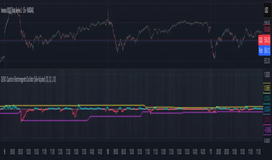
QEMO: Quantum Electromagnetic Oscillator (Safe Adjusted)This is a highly conceptual and oscillator and It attempts to model market dynamics by borrowing concepts from quantum physics and electromagnetism to create a unique oscillator. It does not represent any real physical phenomena but uses these concepts as metaphors for market forces.
Here is a breakdown of its core components:
1. Quantum Price Wavefunction (The Core Price Engine)
This is the most abstract part of the script. It tries to model price not as a single point, but as a "wavefunction" representing a distribution of probable future prices.
Volatility & Price Grid: It first calculates recent market volatility. Based on this volatility, it creates a dynamic grid of possible price levels (price_bins) around the current price.
Probability Density: It assigns a probability to each price level in the grid.
"Energy" Operators:
Kinetic Energy: Metaphorically represents the "momentum" or rate of change of the price probabilities.
Potential Energy: A force field that influences the probabilities, derived from a combination of volatility and trading volume.
Expected Price: After evolving these probabilities, it calculates a single "expected price" which is the weighted average of all prices in the grid, based on their final probabilities.
2. Electromagnetic Fields (Buying vs. Selling Pressure)
This section models the battle between buyers and sellers in a more familiar way:
E-Field (Electric/Buying): Represents buying pressure, calculated from upward price moves (close - open) multiplied by volume.
B-Field (Magnetic/Selling): Represents selling pressure, calculated from downward price moves (open - close) multiplied by volume.
Lorentz Force (F_net): This is the net force (E - B), representing the overall directional pressure in the market. A positive value means buyers are in control; a negative value means sellers are.
3. Entanglement Entropy (Systemic Risk/Stability)
This component aims to measure the market's stability or "systemic risk."
It calculates a form of auto-correlation on recent price returns.
A high degree of instability in this correlation results in a high "Entropy" (S) value.
Essentially, a high S suggests the market is chaotic and unpredictable (low stability), while a low S suggests it is more stable and trending.
4. Final QEMO Calculation & Plotting
All the components are combined to create the final oscillator value:
Final Value: The qemo value is a product of the expected_price, the amplified net force, and the market stability (1 - S).
Smoothing: This raw qemo value is then smoothed with an Adaptive Moving Average (AMA) to produce the final line that gets plotted on the chart.
Visualization:
The main oscillator line is plotted below the chart. Its color changes based on its value (e.g., blue for positive, red for negative).
The background color of the indicator pane changes based on the Entropy (S), providing an immediate visual cue of market stability (e.g., black for stable, white for chaotic).
The script also plots 99th and 1st percentile bands to help identify statistically extreme readings in the oscillator's value.
EdgeXplorer - Sessions Roulette 🕰️ EdgeXplorer – Sessions Roulette
⸻
🔍 What This Indicator Does
Sessions Roulette is a highly customizable tool that visualizes the four primary global trading sessions — New York, London, Tokyo, and Sydney — directly on your chart.
It not only highlights each session’s time window with color-coded boxes, but also tracks key session-level data like:
• Highs and lows
• Average (mean) price
• (Optional) VWAP line (toggle included for future use)
This tool is purpose-built for traders who rely on time-based volatility patterns, session transitions, and liquidity windows.
⸻
⚙️ How It Works (Technical Breakdown in Plain English)
This indicator checks — for each trading session — whether the current bar falls within the defined session time range. If it does:
1. A colored box is drawn from session open to close
2. High/Low levels for that session are tracked dynamically
3. The session’s mean price is calculated incrementally as new bars come in
4. Session labels are rendered as text (optional)
5. Once the session ends, the data locks and resets on the next session start
The timezone can be defined manually via UTC offset or aligned with the chart’s exchange timezone using a toggle.
⸻
📈 Visual Components Explained
Each session (NY, LDN, TYO, SYD) has its own:
• Colored Box Range: This fills the background of the session with a semi-transparent box.
• Session Label: A tag that names the session.
• Mean Line: Tracks average price during the session (toggle).
• High/Low Plots: Draw horizontal lines showing session high and low prices (toggle).
• VWAP Line: Placeholder toggle exists — functionality is not yet implemented.
• Box Outline: Optional stroke around each session box.
⸻
📊 Input Settings & Customization
🔧 General Settings:
• Timezone Offset (UTC ±): Manually adjust sessions to your preferred UTC offset.
• Use Chart Exchange Timezone: Toggle to override the offset and align sessions to the chart’s market timezone.
🎯 Per-Session Settings:
For each of the four sessions, you can configure:
Option Description
Enable Session Toggles the session on or off
Session Label Custom text for labeling
Time Window Start and end time for session
Color Box and line color
Highlight Range Whether to draw the background box
Trend Line (Reserved for future)
Average Line Shows running mean of price during session
VWAP Line (Toggle available; VWAP logic not yet implemented)
High/Low Lines Horizontal lines at the session high/low
🧪 Display Options:
• Range Fill Opacity: Controls transparency of the session box.
• Draw Range Outline: Adds a border to the session box.
• Session Label: Toggles visibility of the session name label.
⸻
🧠 How Traders Can Interpret It
Session tools are most powerful when:
• You trade session-to-session behaviors (e.g., NY open reaction to LDN range)
• You study liquidity zones or order flow around session highs/lows
• You want to anchor technical setups to session timing
• You analyze volatility compression/expansion across global markets
Each session often brings different behaviors:
Session Use Insight
Tokyo Often range-bound, ideal for pre-positioning
London Brings first significant volatility
New York Tends to expand volatility or reverse trends
Sydney Quietest — good for range analysis or preparing for Asia open
⸻
🧪 Use Cases & Strategy Integration
• Breakout Traders: Set alerts when price breaks previous session highs/lows.
• Scalpers: Time entries based on opening ranges.
• Algo Developers: Use plotted session bounds as logic for entry/exit filters.
• Liquidity Tracking: Identify common sweep behavior before/after session shifts.

[Enhanced] L1 Banker Move🧠 L1 Banker Move
This is a multi-layered momentum signal tool designed to reveal institutional activity before major price moves. It combines deep liquidity detection, price pressure dynamics, and short-term investor alignment to deliver actionable signals with clarity and precision.
Key Features:
🔴 Institutional Signal
Detects potential Level 1 banker moves based on deep price compression and long-term sweep logic (Lowest Low 90 + smoothed momentum spikes).
🔵 Institutional Build Phase
Shows stealth accumulation/distribution zones using low volatility buildup and compression-based ratios over the past 30 bars.
🟢 Short-Term Investor Signal
Confirms price shifts with VWAP cross, SMA structure, and fast/slow EMA delta acceleration. Useful for timing precision entries after institutional setups.
💜 Combined Strength Histogram
A composite momentum bar that blends all three layers to visually rank the power of each setup.
🎯 Smart Highlighting & Alerts
Background turns red when an institutional signal appears without retail confirmation—flagging early entry traps or front-running zones. Includes alert conditions to notify you of optimal entry moments.
Customization:
Adjust the EMA delta sensitivity
Choose your preferred institutional timeframe (default: Daily)

[Enhanced] L1 Banker MoveThis is a multi-layered momentum signal tool designed to reveal institutional activity before major price moves. It combines deep liquidity detection, price pressure dynamics, and short-term investor alignment to deliver actionable signals with clarity and precision.
Key Features:
🔴 Institutional Signal
Detects potential Level 1 banker moves based on deep price compression and long-term sweep logic (Lowest Low 90 + smoothed momentum spikes).
🔵 Institutional Build Phase
Shows stealth accumulation/distribution zones using low volatility buildup and compression-based ratios over the past 30 bars.
🟢 Short-Term Investor Signal
Confirms price shifts with VWAP cross, SMA structure, and fast/slow EMA delta acceleration. Useful for timing precision entries after institutional setups.
💜 Combined Strength Histogram
A composite momentum bar that blends all three layers to visually rank the power of each setup.
🎯 Smart Highlighting & Alerts
Background turns red when an institutional signal appears without retail confirmation—flagging early entry traps or front-running zones. Includes alert conditions to notify you of optimal entry moments.
Customization:
Adjust the EMA delta sensitivity
Choose your preferred institutional timeframe (default: Daily)

Quarterly Theory Levels - Period BasedOpen, true open, market close for daily weekly, monthly, quarterly, yearly.

上涨动能This indicator calculates and visualizes the difference between the 20-period EMA and the 120-period EMA, helping traders identify medium-term momentum shifts in price action.
What It Does:
✅ Calculates the difference: Diff=EMA20 − EMA120
✅ Plots a line representing this difference for clear trend tracking.
✅ Plots a histogram (colored bars): Green bars indicate the EMA20 is above EMA120, suggesting bullish momentum. Red bars indicate the EMA20 is below EMA120, suggesting bearish momentum.
✅ Includes a zero baseline for easy reference: When the value crosses above zero, it indicates a potential bullish shift. When it crosses below zero, it indicates a potential bearish shift.
How to Use:
✅Use this indicator to visualize trend momentum in your crypto, forex, or stock trading.
✅Combine with your entry/exit signals (e.g., RSI, volume spikes, price action levels) to refine your strategy.
✅A rising Diff suggests strengthening bullish momentum, while a falling Diff suggests strengthening bearish momentum.
Why It’s Useful:
✅ Filters noise by using EMA smoothing on both short and long periods.
✅ Helps identify momentum shifts early without being overly sensitive to short-term volatility.
✅ Easy to integrate into trend-following or pullback strategies.

Multi-Timeframe Bands (Horizontal Table, Robust, No get_cols)Mulit-timeframe /Kelt Bands with Table Price tracker
This is a simple Kelt style Band indicator draws colored horizontal bands representing the high (top) and low (bottom) for each of the following timeframes:
4h: Blue (bottom), Red (top)
1D: Gold (bottom/top)
1W: Purple (bottom/top)
1M: Orange (bottom/top)
Quarterly: Light purple (bottom/top)
The script works on any chart timeframe, and the bands will update dynamically.
I've added a horizontal box to show the corresponding prices at the top.

Market Breadth TableDisplay overall market condition, can select different trading market NYSE or NASDAQ, if declining stock number is more than advancing same day is not good for heavy traded long position
You can adjust the table position in the chart as well

Enhanced Neowave Wave 1 Finder with ZigZagThis script is an advanced technical analysis indicator for the TradingView platform, written in Pine Script version 5. Its primary goal is to identify potential Elliott Wave "Wave 1" patterns, enhanced with principles from Neowave theory and a custom ZigZag indicator for more accurate pivot detection. The script is designed to be overlaid on the main price chart.
Core Functionality: Blending ZigZag and Neowave
The indicator's methodology is a two-part process. First, it identifies significant price swings using a robust ZigZag indicator. Then, it analyzes these swings based on a set of rules derived from Neowave and classic technical analysis to validate them as potential Wave 1 patterns.
Part 1: ZigZag Integration
The first major component is a comprehensive ZigZag indicator that forms the foundation for all subsequent analysis.
Pivot Detection: The pivots() function is the engine of the ZigZag. It scans the historical price data for significant high and low points (pivots) over a user-defined Length.
Segment Drawing: Once pivots are identified, the script draws lines connecting them, creating the classic ZigZag pattern on the chart.
Extended Direction & Ratios: This is an enhanced feature. The script doesn't just identify highs and lows; it categorizes them as:
Higher High (HH) or Lower High (LH)
Lower Low (LL) or Higher Low (HL)
This classification is crucial for understanding the market structure. It also calculates the price ratio of the most recent ZigZag leg relative to the previous one, which is used later for pattern validation.
Dynamic Updates: The ZigZag is not static. On each new bar, it can update its most recent pivot point if a new, more extreme price (a higher high or a lower low) is printed before the direction officially changes. This ensures the ZigZag is always reflecting the most current and significant price action.
Part 2: Neowave Wave 1 Finder
With the market structure defined by the ZigZag, the second part of the script applies a rigorous set of rules to identify potential Wave 1 patterns. A Wave 1 is the initial move of a new trend in Elliott Wave theory.
Key Validation Criteria
For a price move between two ZigZag pivots to be considered a valid Wave 1, it must pass a series of checks:
Significance: The move must have a minimum percentage change (Minimum Wave Length) and last for a minimum number of bars, filtering out insignificant noise.
Volume Confirmation: A genuine impulse wave is typically supported by increasing volume. The script checks if the volume during the potential Wave 1 is significantly higher than the recent average (Volume Increase Threshold).
Momentum Alignment: The direction of the wave must be confirmed by momentum indicators.
For a bullish (upward) Wave 1, the Relative Strength Index (RSI) must be in a bullish regime (above 50) and the MACD line must be above its signal line.
For a bearish (downward) Wave 1, the RSI must be below 50 and the MACD line must be below its signal line.
Structural Analysis (Impulse vs. Diagonal): The script attempts to differentiate between two types of Wave 1:
Impulse Wave: A strong, clean, and direct move.
Diagonal Wave: A more complex, overlapping, and often wedge-shaped pattern. This is identified by analyzing the time and price complexity of the move, along with the ZigZag leg ratios.
Wave 2 Retracement Check: A critical Neowave rule is that a valid Wave 1 must be followed by a valid Wave 2 retracement. The script looks at the next ZigZag leg to ensure it doesn't retrace more than 100% of the potential Wave 1. It also uses the ZigZag ratios to confirm the retracement falls within typical Fibonacci levels (e.g., 38.2% to 78.6%).
Display and User Interface
The script provides a rich visual experience to aid the trader in their analysis.
Wave Labels and Boxes: When a valid Wave 1 is detected, it is highlighted with a colored line (green for bullish, red for bearish) and a shaded background box. A label clearly marks it as "Wave 1 IMPULSE" or "Wave 1 DIAGONAL".
Fibonacci Retracement Levels: Upon detection of a Wave 1, the script automatically draws key Fibonacci retracement levels (38.2%, 50%, 61.8%, 78.6%). These levels are potential targets for the end of the subsequent Wave 2, offering potential entry points for a Wave 3 trade.
Information Labels: Additional labels provide at-a-glance confirmation of the conditions, showing whether volume and momentum criteria were met.
Customizable Inputs: Users have extensive control over the indicator's parameters, including the ZigZag length, volume thresholds, RSI levels, and the colors of all visual elements.
Alerts: The indicator can be configured to generate an alert whenever a new bullish or bearish Wave 1 pattern is confirmed, allowing traders to be notified of potential opportunities in real-time.

Mongoose Capital: BTC ETF DriftScope ProMongoose Capital: BTC ETF DriftScope Pro
A proprietary indicator for monitoring drift between Bitcoin Spot (BTCUSD) and Bitcoin Spot ETFs (such as IBIT). Designed to detect ETF premium/discount zones and generate actionable Fade or Long bias signals.
What it Does
Tracks IBIT and BTCUSD spread to highlight ETF price deviations.
Calculates correlation Z-Score for ETF/Spot alignment.
Outputs numeric bias signals: Fade (1), Long (1), Neutral (1).
How to Use
Apply to a BTCUSD chart (4H, 1D, or higher recommended).
Open the Data Window to view:
IBIT Spread %
Correlation Z-Score
Correlation %
Bias Flags (Fade, Long, Neutral)
Configure alerts for Fade and Long Bias conditions.
Confirm all signals with your trade plan and risk management.
Methodology
This tool calculates the percentage spread between IBIT and BTC Spot. A rolling Z-Score of the correlation is used to detect periods of significant divergence.
Fade Bias suggests potential short setups in premium zones with high Z-Scores.
Long Bias suggests potential long setups in discount zones with low Z-Scores.
Disclaimer
This indicator is for educational purposes only. It is not financial advice. Use at your own risk and verify signals independently.

Universal Trade Levels & Signal Classifierscript has been enhanced and generalized for all instruments — not just ES or SPX.
You now get the following classifications:
💎 Perfect Trade – trend confirmed, strong signal, ATR + VWAP + volume aligned
🚀 Sure Shot Trade – very high volume + ATR breakout + directional bias
⚡ Quick Call/Put – fast actionable setups
❌ No Trade – avoid/no confirmation
The logic works across any timeframe and any ticker.
You can now test this live on any instrument in TradingView. Let me know if you’d like to add things like:
Multi-timeframe confirmation
Re-entry logic
Heatmap table of confidence levels
Signal filtering based on RSI, OBV, etc.

Aggregated VolumeHow to Read the “Aggregated Volume” Signal
This indicator combines normalized volume, short-term volume bursts, pivot levels, VWAP, and a 200-period EMA to give you a multi-dimensional view of trading activity. Here’s how to interpret each component and synthesize them into actionable insights.
1. Custom Volume Signal (vSignal)
• Calculation
• vSignal = Sum of over bars, divided by the current price.
• A rising vSignal means more volume is being traded per unit of price, signaling growing interest relative to price level.
• Plot styling
• Bars are lime when (bullish volume days)
• Bars are orange when (bearish volume days)
How to read it
• Trend confirmation: Increasing lime bars alongside rising price suggests buyers in control.
• Warning sign: Rising orange bars on a down move indicate accelerating selling pressure.
• Divergence:
• Price making new highs while vSignal stalls or drops → potential top.
• Price making new lows while vSignal holds → potential bottom.
2. Short-Term Volume Bursts
Three semi-transparent histograms show how much the last 2, 5, and 10-bar raw volumes exceed (or fall below) the current vSignal:
• Blue = vol(2) – vSignal
• Green = vol(5) – vSignal
• Red = vol(10) – vSignal
If a colored bar sits above zero, that lookback’s volume is surging relative to the longer-term average (vSignal).
How to read it
• Clustered bursts:
• Blue + Green + Red above zero → strong, broad-based volume surge.
• Great for confirming breakouts and shakeouts.
• Isolated burst:
• Only Blue (> 0) on a small range bar → might be a false breakout or intrabar squeeze.
• Only Red (> 0) on a wide range → institutional involvement; act with caution.
3. Pivot Volume Levels (v & t)
• Every 21 bars, the script finds the highest and lowest vSignal values and plots them as shaded price levels:
• Magenta area = recent vSignal high (resistance)
• Cyan area = recent vSignal low (support)
How to read it
• Rejection/Break:
• Price approaches magenta zone and stalls → sellers defending that volume high.
• Break above magenta with high vSignal → likely sustained rally.
• Support flip:
• Cyan zone hold → buyers stepping in at heavy-volume lows.
• Break below cyan with rising vSignal → bearish conviction.
4. Midline Cross (Volume Equilibrium)
• A 10-bar SMA of
• Drawn as a faint white cross on price
How to read it
• Above midline → overall volume bias is skewed bullish.
• Below midline → bearish volume bias.
Crossovers of vSignal through this midline can signal shifts in underlying conviction.
5. VWAP & 200-Period EMA Overlays
• VWAP (transparent red if above price, green if below)
• EMA(200) plotted as aqua circles
How to read them
• VWAP tells you the intraday “value area.”
• Price above VWAP + rising vSignal = intraday buyers in charge.
• Price below VWAP + rising vSignal = aggressive sellers.
• EMA(200) gives you the longer-term trend.
• Above EMA200 = bullish regime
• Below EMA200 = bearish regime
6. Putting It All Together: Example Scenarios
1. Bullish Entry
• Price > EMA200 & VWAP is green
• vSignal rising in lime
• All three short-term bursts above zero
• Price near or breaking the magenta pivot with volume confirmation
2. Bearish Entry
• Price < EMA200 & VWAP is red
• vSignal rising in orange
• Two-bar burst (blue) spikes on a down bar
• Price failing at magenta pivot or breaking cyan support
3. Divergence Play
• Price makes new high, but vSignal peaks lower than last high → look for a reversal.
• Price drops to new low, but vSignal stays above its last low → prepare for a bounce.
By combining these layers—normalized volume, burst indicators, pivot levels, VWAP, and EMA—you get a clear map of where volume is clustering, which lets you anticipate support/resistance, gauge real interest, and spot potential reversals or breakouts with greater confidence.
