Customizable EMA & SMA ComboThis script includes both EMA and SMA into a single customizable indicatior.
Indicators and strategies

YAS V1This advanced "All-in-One" indicator combines the most powerful smart money concepts (SMC), order blocks (OB), fair value gaps (FVG), support & resistance (SR), and liquidity voids, along with entry signals based on EMA and RSI filters.
💡 Key Features:
✅ Order Blocks (OB):
Highlights potential bullish and bearish order blocks to identify strong institutional zones where price might reverse.
✅ Fair Value Gaps (FVG):
Marks price gaps that indicate imbalance and possible zones for retracement or continuation.
✅ Support & Resistance (SR):
Automatically plots dynamic support and resistance levels using pivots, helping you to spot key reaction areas.
✅ Liquidity Voids:
Visualizes potential liquidity gaps or low-volume areas that can act as price magnets.
✅ Buy & Sell Signals:
Generates dynamic BUY and SELL signals based on a combination of EMA trend filters and RSI overbought/oversold levels.
✅ Fully Configurable:
Choose which features to display (OB, FVG, SR, Liquidity Voids, signals).
Adjust EMA and RSI settings to match your strategy.
Control the number of signals (reduce or increase) using a signal sensitivity filter.
⚙️ How it Works:
Trend Filter (EMA):
Price above EMA confirms a bullish environment, below EMA confirms bearish.
RSI Filter:
Signals are validated with RSI to avoid overtrading in ranging markets.
Zones & Gaps:
Institutional concepts (order blocks, gaps) help traders understand supply/demand and price inefficiencies.
🎯 Usage:
Perfect for:
Scalpers looking for intraday turning points.
Swing traders spotting high-probability levels.
Anyone interested in smart money concepts.
🚨 Alerts:
Includes built-in alerts for both BUY and SELL signals so you can react instantly without watching the screen all the time.
💬 Note:
This is a beta version designed to be improved with community feedback. Use it as a guide, and always confirm signals with your own analysis and risk management.
🔥 Ready to take your trading to the next level? Add this indicator to your chart, customize the settings, and start seeing the market like smart money!

Momentum_EMABandThe Momentum EMA Band V1 is a precision tool designed for intraday traders & scalpers. This is the first version of the script, combining three powerful technical elements to help traders identify directional moves while filtering out weak, choppy market phases.
🔧 How the Indicator Works — Combined Logic
This indicator merges well-known but distinct concepts into a unified visual framework:
1️⃣ EMA Price Band — Dynamic Zone Visualization
Plots upper and lower EMA bands based on user input (default: 9-period EMA).
Price relative to the bands provides immediate visual cues:
Green Band: Price above the upper EMA — bullish strength.
Red Band: Price below the lower EMA — bearish pressure.
Yellow Band: Price within the band — neutral zone.
2️⃣ Supertrend Overlay — Reliable Trend Confirmation
ATR-based Supertrend logic (customizable ATR length & factor).
Green Supertrend Line: Uptrend confirmation.
Red Supertrend Line: Downtrend confirmation.
Helps traders ride trends with dynamic levels that adjust to volatility.
3️⃣ ADX-Based No Trade Zone — Choppy Market Filter
Manual ADX calculation measures trend strength (default ADX length: 14).
When ADX is below a user-defined threshold (default: 20) and price is within the EMA Band buffer, a gray background highlights sideways or indecisive market conditions — suggesting no new trade or low momentum zone
Optional gray triangle marker shows the start of each No-Trade Zone phase.
🎯 Key Features
✅ Combines EMA Bands, Supertrend & ADX filtering for comprehensive market context.
✅ Visual No-Trade Zone shading keeps traders out of low-probability setups.
✅ Supertrend Line tracks evolving trend bias.
✅ Fully customizable — adjust EMA, ATR, ADX settings to match different instruments or styles.
✅ Clean, focused chart presentation for easy interpretation.
💡 Practical Application
Momentum Breakouts: Enter trades when price breaks beyond the EMA Band, with Supertrend confirmation.
Avoid Sideways Traps: Refrain from trading during gray-shaded No-Trade Zones, minimizing exposure to whipsaws.
Scalping & Intraday Edge: Particularly effective on lower timeframes where choppy periods are common.
⚠️ Important Disclaimer
This is Version 1 — future versions may expand on features based on trader feedback.
This script is for educational purposes only. Always combine with risk management and thorough strategy validation.
No indicator guarantees profitability — use this tool as part of a broader trading system.

YAS V1This advanced "All-in-One" indicator combines the most powerful smart money concepts (SMC), order blocks (OB), fair value gaps (FVG), support & resistance (SR), and liquidity voids, along with entry signals based on EMA and RSI filters.
💡 Key Features:
✅ Order Blocks (OB):
Highlights potential bullish and bearish order blocks to identify strong institutional zones where price might reverse.
✅ Fair Value Gaps (FVG):
Marks price gaps that indicate imbalance and possible zones for retracement or continuation.
✅ Support & Resistance (SR):
Automatically plots dynamic support and resistance levels using pivots, helping you to spot key reaction areas.
✅ Liquidity Voids:
Visualizes potential liquidity gaps or low-volume areas that can act as price magnets.
✅ Buy & Sell Signals:
Generates dynamic BUY and SELL signals based on a combination of EMA trend filters and RSI overbought/oversold levels.
✅ Fully Configurable:
Choose which features to display (OB, FVG, SR, Liquidity Voids, signals).
Adjust EMA and RSI settings to match your strategy.
Control the number of signals (reduce or increase) using a signal sensitivity filter.
⚙️ How it Works:
Trend Filter (EMA):
Price above EMA confirms a bullish environment, below EMA confirms bearish.
RSI Filter:
Signals are validated with RSI to avoid overtrading in ranging markets.
Zones & Gaps:
Institutional concepts (order blocks, gaps) help traders understand supply/demand and price inefficiencies.
🎯 Usage:
Perfect for:
Scalpers looking for intraday turning points.
Swing traders spotting high-probability levels.
Anyone interested in smart money concepts.
🚨 Alerts:
Includes built-in alerts for both BUY and SELL signals so you can react instantly without watching the screen all the time.
💬 Note:
This is a beta version designed to be improved with community feedback. Use it as a guide, and always confirm signals with your own analysis and risk management.
🔥 Ready to take your trading to the next level? Add this indicator to your chart, customize the settings, and start seeing the market like smart money!

Buy/Sell Volume + Avg LinesBuy/Sell volume + avg line = avg line * n
set n value
you can set alert by using avg line * n to find pumping coins

Min Forrige Daily CandleBruges til at se forrige daily candle. Daily high, low og close. Kan bruges til teknisk analyse.

Auto-AVWAP from Recent High/Low + MidlineAutomatically takes AVWAP from recent high/lows and helps in trading

Sniper TP & SLStrong indicators combine that show Tp ans SL
An indicator that build from greece with many tries and attempts and this is the final results
The indicator plan was to adapt it in an AI (ML) brain who can make autotrades and also sending signals
This is the indicator our AI model is based on the only difrence is our AI adjust TP and SL with market needs
DONT TRUST this indicator 100% we havent add Support and Resistance yet so use them in combine to see good entries and kill the market

Support Resistance with Order BlocksIndicator Description
Professional Price Level Detection for Smart Trading. Master the Markets with Precision Support/Resistance and Order Block Analysis . It provides traders with clear visual cues for potential reversal and breakout areas, combining both retail and institutional trading concepts into one powerful tool.
The Support & Resistance with Order Blocks indicator is a versatile Pine Script tool designed to empower traders with clear, actionable insights into key market levels. By combining advanced pivot-based support and resistance (S/R) detection with order block (OB) filtering, this indicator delivers clean, high-probability zones for entries, exits, and reversals. With customizable display options (boxes or lines) and intuitive settings, it’s perfect for traders of all styles—whether you’re scalping, swing trading, or investing long-term. Overlay it on your TradingView chart and elevate your trading strategy today!
________________________________________
Key Features
✅ Dynamic Support/Resistance - Auto-adjusting levels based on price action
✅ Smart Order Block Detection - Identifies institutional buying/selling zones
✅ Dual Display Modes - Choose between Boxes or Clean Lines for different chart styles
✅ Customizable Sensitivity - Adjust detection parameters for different markets
✅ Broken Level Markers - Clearly shows when key levels are breached
✅ Timeframe-Adaptive - Automatically adjusts for daily/weekly charts
1. Dynamic Support & Resistance Detection
Identifies critical S/R zones using pivot high/low calculations with adjustable look back periods.
Visualizes active S/R zones with distinct colors and labels ("Support" or "Resistance" for boxes, lines for cleaner charts).
Marks broken S/R levels as "Br S" (broken support) or "Br R" (broken resistance) when historical display is enabled, aiding in breakout and reversal analysis.
2. Smart Order Block Identification
Detects bullish and bearish order blocks based on significant price movements (default: ±0.3% over 5 candles).
Highlights institutional buying/selling zones with customizable colors, displayed as boxes or lines.
Filters out overlapping OB zones to keep your chart clutter-free.
3. Dual Display Options
Boxes or Lines: Choose to display S/R and OB as boxes for detailed zones or lines for a minimalist view.
Line Width Customization: Adjust line widths for S/R and OB (1–5 pixels) for optimal visibility.
Color Customization: Tailor colors for active/broken S/R and bullish/bearish OB zones.
4. Advanced Overlap Filtering
Ensures S/R zones don’t overlap with OB zones or other S/R levels, providing only the most relevant levels.
Limits the number of active zones (default: 10) to maintain chart clarity.
5. Historical S/R Visualization
Optionally display broken S/R levels with distinct colors and labels ("Br S" or "Br R") to track historical price reactions.
Broken levels are dynamically updated and removed (or retained) based on user settings.
6. Timeframe Adaptability
Automatically adjusts pivot detection for daily/weekly timeframes (40-candle look back) versus shorter timeframes (20-candle look back).
Works seamlessly across all asset classes (stocks, forex, crypto, etc.) and timeframes.
________________________________________
How It Works
• Support & Resistance:
Uses ta.pivothigh and ta.pivotlow to detect significant price pivots, with a user-defined look back (default: 5 candles post-pivot).
Plots S/R as boxes (with labels "Support" or "Resistance") or lines, extending to the current bar for real-time relevance.
Broken S/R levels are marked with adjusted colors and labels ("S" or "R" for boxes, "Br S" or "Br R" for lines when historical display is enabled).
• Order Blocks:
Identifies OB based on strong price movements over 4 candles, plotted as boxes or lines at the candle’s midpoint.
Validates OB to prevent overlap, ensuring only significant zones are displayed.
Removes OB zones when price breaks through, keeping the chart focused on active levels.
• Customization:
Toggle S/R and OB visibility, adjust detection sensitivity, and set maximum active zones (4–50).
Fine-tune line widths and colors for a personalized chart experience.
________________________________________
Why Use This Indicator?
• Precision Trading: Pinpoint high-probability entry/exit zones with filtered S/R and OB levels.
• Clean Charts: Overlap filtering and zone limits reduce clutter, focusing on key levels.
• Versatile Display: Switch between boxes for detailed zones or lines for simplicity, with adjustable line widths.
• Institutional Edge: Leverage OB detection to align with institutional activity for smarter trades.
• User-Friendly: Intuitive settings and clear visuals make it accessible for beginners and pros alike.
________________________________________
Settings Overview________________________________________
⚙ Input Parameters
Settings Overview
Display Options:
Display Type: Choose "Boxes" or "Lines" for S/R and OB visualization.
S/R Line Width: Set line thickness for S/R lines (1–5 pixels, default: 2).
OB Line Width: Set line thickness for OB lines (1–5 pixels, default: 2).
Order Block Options:
Show Order Block: Enable/disable OB display.
Bull/Bear OB Colors: Customise border and fill colors for bullish and bearish OB zones.
Support/Resistance Options:
Show S/R: Toggle active S/R zones.
Show Historical S/R: Display broken S/R levels, marked as "Br S" or "Br R" for lines.
Detection Period: Set candle lookback for pivot detection (4–50, default: 5).
Max Active Zones: Limit active S/R and OB zones (4–50, default: 10).
Colors: Customise active and broken S/R colors for clear differentiation.
________________________________________
How to Use
1. Add to Chart: Apply the indicator to your TradingView chart.
2. Customize Settings:
o Select "Boxes" or "Lines" for your preferred display style.
o Adjust line widths, colors, and detection parameters to suit your trading style.
o Enable "Show Historical S/R" to track broken levels with "Br S" and "Br R" labels.
3. Analyze Levels:
o Use support zones (green) for buy entries and resistance zones (red) for sell entries.
o Monitor OB zones for institutional activity, signaling potential reversals or continuations.
o Watch for "Br S" or "Br R" labels to identify breakout opportunities.
4. Combine with Other Tools: Pair with trend indicators, volume analysis, or price action for a robust strategy.
5. Monitor Breakouts: Trade breakouts when price breaches S/R or OB zones, with historical labels providing context.
________________________________________
Example Use Cases
• Swing Trading: Use S/R and OB zones to identify entry/exit points, with historical broken levels for context.
• Breakout Trading: Trade price breaks through S/R or OB, using "Br S" and "Br R" labels to confirm reversals.
• Scalping: Adjust detection period for faster S/R and OB identification on lower timeframes.
________________________________________
• Performance: Optimized for all timeframes, with best results on 5M, 15M, 30M, 1H, 4H, or daily charts for swing trading.
• Compatibility: Works with any asset class and TradingView chart.
________________________________________
Get Started
Transform your trading with Support & Resistance with Order Blocks! Add it to your chart, customize it to your style, and trade with confidence. For questions or feedback, drop a comment on TradingView or message the author. Happy trading! 🚀
________________________________________
Disclaimer: This indicator is for educational and informational purposes only. Always conduct your own analysis and practice proper risk management before trading.

Candle Color Based on 12 month SMAThis indicator is designed to be used on a 1M (monthly) chart. It:
• Calculates the 12-month Simple Moving Average (SMA).
• Colors candles green if the monthly close is above the SMA.
• Colors candles red if the monthly close is below the SMA.
• Plots the 12-month SMA as a cyan stair-step line for clear visual tracking.

YAS GROUPThis script is a powerful combination of Order Blocks (OB), market structure, and liquidity levels. It helps traders easily identify high-probability areas for entries and exits, detect trend shifts (BOS & CHoCH), and highlight strong support/resistance zones. The script is designed for both scalping and swing trading, offering flexibility and precision. Users can adjust OB sensitivity, show or hide structure labels, and customize visual settings to match their style. Alerts are also included for key signals. Perfect for traders looking to read the market like smart money.

IU Engulfing Candlestick PatternDISCRIPTION
📈 The IU Engulfing Candlestick Pattern indicator spotlights both bullish and bearish engulfing formations in real‑time. It shades each pattern with a transparent box and drops a concise label so you can catch potential reversals at a glance—no clutter, no noise, just the candles that matter.
USER INPUTS :
1. Pattern Recognition Based on = “Both” | “Wicks” | “Body” ( Default Both )
• Both → only highlights candles that satisfy **both** wick‑and‑body engulfing rules
• Wicks → checks full candle range (high‑to‑low)
• Body → checks only the real bodies (open‑to‑close)
2. Show Labels ( Default true )
If ticked then it will show the text as "Bullish Engulfing" or "Bearish Engulfing".
3. Show The Box ( Default true)
if ticked then it will show the green or red boxes.
INDICATOR LOGIC:
🔹 Bullish Engulfing (green box)
– Current bar closes higher than it opens and fully “wraps” the prior bar per your chosen rule.
🔹 Bearish Engulfing (red box)
– Current bar closes lower than it opens and fully “wraps” the prior bar per your chosen rule.
🔸 When a pattern confirms:
1. The script records the local high/low range.
2. Draws a semi‑transparent box spanning the engulfing pair.
3. Prints a compact up/down label exactly at the reaction point.
4. Fires a once‑per‑bar alert (“Bullish Engulfing” / “Bearish Engulfing”) you can route to webhooks or notifications.
WHY IT IS UNIQUE:
✨ Combines classic body‑only engulfing with an optional wick filter, letting traders demand stricter confirmation when markets are noisy.
✨ Box overlays visually segment the engulfed range—clearer than single‑bar markers.
✨ Lightweight: one input, zero repaint, and capped at 500 boxes to keep charts responsive.
✨ Ready‑to‑use alerts—no extra code needed for automation.
HOW USER CAN BENIFIT FROM IT :
- Spot early reversal zones or continuation thrusts without scanning candle by candle.
- Pair the alerts with trading bots, TradingView strategy testers, or mobile push notifications.
- Adapt the strictness (Body vs. Wicks vs. Both) to suit different assets, timeframes, or volatility regimes.
- Use the colored range boxes as dynamic support/resistance references for entries, targets, and stop‑loss placement.
📌 Tip: Test on multiple instruments and timeframes to find the sweet spot that matches your risk profile. This script is for educational purposes—always combine with sound risk management and confirm signals with broader market context.
Disclaimer :
This Video is not financial advice, it's for educational purposes only highlighting the power of coding( pine script) in TradingView, I am not a SEBI-registered advisor. Trading and investing involve risk, and you should consult with a qualified financial advisor before making any trading decisions. I do not guarantee profits or take responsibility for any losses you may incur.

MOD_CM_MacD_Ult_MTF_V2.1Basato su “CM_MacD_Ult_MTF_V2.1” di @chadmaurice (CM)
Aggiunto timeframe 2g,3g,4g

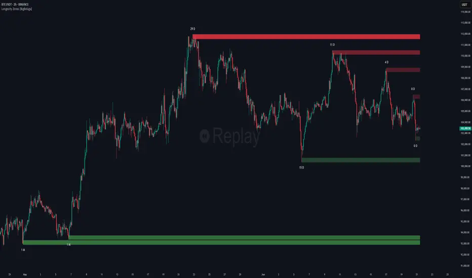
Non-Lagging Longevity Zones [BigBeluga]🔵 OVERVIEW
A clean, non-lagging system for identifying price zones that persist over time—ranking them visually based on how long they survive without being invalidated.
Non-Lagging Longevity Zones uses non-lagging pivots to automatically build upper and lower zones that reflect key resistance and support. These zones are kept alive as long as price respects them and are instantly removed when invalidated. The indicator assigns a unique lifespan label to each zone in Days (D), Months (M), or Years (Y), providing instant context for historical relevance.
🔵 CONCEPTS
Non-Lag Pivot Detection: Detects upper and lower pivots using non-lagging swing identification (highest/lowest over length period).
h = ta.highest(len)
l = ta.lowest(len)
high_pivot = high == h and high < h
low_pivot = low == l and low > l
Longevity Ranking: Zones are preserved as long as price doesn't breach them. Levels that remain intact grow in visual intensity.
Time-Based Weighting: Each zone is labeled with its lifespan in days , emphasizing how long it has survived.
duration = last_bar_index - start
days_ = int(duration*(timeframe.in_seconds("")/60/60/24))
days = days_ >= 365 ? int(days_ / 365) : days_ >= 30 ? int(days_ / 30) : days_
marker = days_ >= 365 ? " Y" : days_ >= 30 ? " M" : " D"
Dynamic Coloring: Older zones are drawn with stronger fill, while newer ones appear fainter—making it easy to assess significance.
Self-Cleaning Logic: If price invalidates a zone, it’s instantly removed, keeping the chart clean and focused.
🔵 FEATURES
Upper and Lower Zones: Auto-detects valid high/low pivots and plots horizontal zones with ATR-based thickness.
Real-Time Validation: Zones are extended only if price stays outside them—giving precise control zones.
Gradient Fill Intensity: The longer a level survives, the more opaque the fill becomes.
Duration-Based Labeling: Time alive is shown at the root of each zone:
• D – short-term zones
• M – medium-term structure
• Y – long-term legacy levels
Smart Zone Clearing: Zones are deleted automatically once invalidated by price, keeping the display accurate.
Efficient Memory Handling: Keeps only the 10 most recent valid levels per side for optimal performance.
🔵 HOW TO USE
Track durable S/R zones that survived price tests without being breached.
Use longer-lived zones as high-confidence confluence areas for entries or targets.
Observe fill intensity to judge structural importance at a glance .
Layer with volume or momentum tools to confirm bounce or breakout probability.
Ideal for swing traders, structure-based traders, or macro analysis.
🔵 CONCLUSION
Non-Lagging Longevity Zones lets the market speak for itself—by spotlighting levels with proven survival over time. Whether you're trading trend continuation, mean reversion, or structure-based reversals, this tool equips you with an immediate read on what price zones truly matter—and how long they've stood the test of time.
High/Low de la Bougie Daily d'Hier🧩 General Description
This indicator plots two horizontal lines on your chart every day:
One line at the High of yesterday’s daily candle
One line at the Low of yesterday’s daily candle
It is designed to help you quickly identify key market levels based on the previous day’s range — often used as:
Support/resistance zones
Breakout or rejection areas
Reference points for intraday strategies (e.g. New York session trading)
⚙️ How It Works
The indicator uses request.security to fetch data from the daily timeframe, regardless of the chart timeframe you're trading on (e.g. M15, H1).
It captures the high and low from yesterday’s daily candle.
These levels are displayed on your current chart using horizontal lines extended to the right, which automatically update every day.
🎨 Visual Style
High of yesterday: green, dashed line
Low of yesterday: red, dashed line
Lines are refreshed on every new bar to stay clean and updated

YAS GROUP✅ يحدد لك مناطق الـ Order Blocks القوية (على فريمات 15 دقيقة، 1 ساعة، و4 ساعات).
✅ حاطين فيبو داخل الـ OB عشان تأكد نقاط الارتداد بدقة.
✅ يعطيك إشارات شراء وبيع أدق من الصقر، وتقدر تشغل أو تطفي فلاتر الـ RSI والـ EMA/SMA حسب راحتك.
✅ بعد، فيه خطوط دعم ومقاومة ديناميكية، شغّالة ع آخر Pivot Highs & Lows.
✅ ينفع حق السكالبينج، التداول اليومي، وحتى الصفقات الطويلة.
🎯 من الإعدادات، تقدر تتحكم في الفلاتر والفريمات اللي تباها.
⚠️ ترى هالمؤشر مش نصيحة مالية مباشرة، دايم خلك حذر، وطبّق إدارة رأس مالك عدل.
🔔 ولاتنسى تحط التنبيهات، عشان توصلك الإشارات وأنت مرتاح.
بالتوفيق ، ورزقك إن شاء الله فوووق!
Hey brother, this indicator is fully loaded and super accurate! 🙌🔥
✅ Detects strong Order Blocks (15m, 1H, 4H).
✅ Adds Fibonacci levels inside OBs to confirm precise reversal points.
✅ Gives you super sharp Buy & Sell signals, with optional RSI and EMA/SMA filters you can toggle on/off.
✅ Also has dynamic Support & Resistance lines, based on the latest pivot highs & lows.
✅ Suitable for scalping, day trading, and swing trading.
🎯 You can easily customize filters and select the timeframes you want from the settings.
⚠️ Note: This is not financial advice — always use proper risk management and stay cautious.
🔔 Don't forget to set alerts so you never miss an opportunity.
Good luck and smash those profits! 🚀🔥
مع تحيات قروب ابو سلطان

Convergence [by Oberlunar]
The Convergence Indicator by Oberlunar is a multi-timeframe analysis tool that identifies and visualizes trend convergence across up to 10 configurable timeframes using advanced customizable moving averages, including Hull, OberX (a Hull mod), THMA, EMA, and SMA, with an optional pseudo-Hilbert Transform.
It provides a clear visual overlay through gradual fill areas that highlight bullish and bearish trends while offering a fully configurable dynamic table to monitor live trend states across all selected timeframes with user-defined colors and positioning.
This tool is designed for traders who seek to pinpoint multi-timeframe convergence points to enhance their decision-making process in trend-following and breakout strategies.
Oberlunar 👁️⭐

YAS GROUPFOR ALL YAS GROUP MEMBERS
🔥 مؤشر متكامل يجمع بين عدة تقنيات احترافية لتحديد أفضل مناطق الدخول والخروج بدقة عالية:
✅ مناطق الـ Order Blocks القوية (15m, 1H, 4H)
✅ نسب الفيبوناتشي داخل الـ OB لتأكيد نقاط الانعكاس
✅ إشارات شراء وبيع دقيقة مع إمكانية تفعيل فلتر RSI و EMA/SMA
✅ خطوط دعم ومقاومة ديناميكية مبنية على آخر Pivot Highs & Lows
✅ مناسب للسكالبينج، التداول اليومي، وحتى الصفقات المتوسطة والطويلة
🎯 يمكنك التحكم في شروط الفلاتر وتخصيص الفريمات التي تهمك بسهولة من الإعدادات.
💡 هدف المؤشر: مساعدة المتداول في اتخاذ قرارات مدروسة ومبنية على مناطق سيولة وتجمع أوامر حقيقية، وليس فقط إشارات عشوائية.
---
⚠️ ملاحظة:
- لا يعتبر هذا المؤشر نصيحة مالية مباشرة.
- يفضل استخدامه مع إدارة رأس المال ومراعاة الأخبار والتحليل الأساسي.
🔔 لا تنسَ تفعيل التنبيهات للإشارات المهمة!
🔥 A complete all-in-one indicator combining multiple professional techniques to accurately detect the best entry and exit zones:
✅ Strong Order Blocks zones (15m, 1H, 4H)
✅ Fibonacci levels inside OBs to confirm reversal points
✅ Highly precise Buy/Sell signals with optional RSI and EMA/SMA filters
✅ Dynamic Support & Resistance lines based on latest pivot highs & lows
✅ Perfect for scalping, day trading, and swing trading
🎯 Easily customize filters and timeframes directly from the settings.
💡 Goal: Help traders make more confident, well-informed decisions based on real liquidity and order flow zones rather than random signals.
---
⚠️ Disclaimer:
- This indicator is not financial advice.
- Always combine it with proper risk management, fundamental analysis, and market context.
🔔 Don’t forget to set alerts to stay on top of key signals!
مع تحيات محمد الابرزي وقروب ابو سلطان

Adaptive Causal Wavelet Trend FilterThe Adaptive Causal Wavelet Trend Filter is a technical indicator implementing causal approximations of wavelet transform properties for better trend detection with adaptive volatility response.
The Adaptive Causal Wavelet Trend Filter (ACWTF) applies mathematical principles derived from wavelet analysis to financial time series, providing robust trend identification with minimal lag. Unlike conventional moving averages, it preserves significant price movements while filtering market noise through signal processing that i describe below.
I was inspired to build this indicator after reading " Wavelet-Based Trend Identification in Financial Time Series " by In, F., & Kim, S. 2013 and reading about Mexican Hat wavelet filters.
The ACWTF maintains optimal performance across varying market regimes without requiring parameter adjustments by adapting filter characteristics to current volatility conditions.
Mathematical Foundation
Inspired by the Mexican Hat wavelet (Ricker wavelet), this indicator implements causal approximations of wavelet filters optimized for real-time financial analysis. The multi-resolution approach identifies features at different scales and the adaptive component dynamically adjusts filtering characteristics based on local volatility measurements.
Key mathematical properties include:
Non-linear frequency response adaptation
Edge-preserving signal extraction
Scale-space analysis through dual filter implementation
Volatility-dependent coefficient adjustment, which I love
Filter Methods
Adaptive: Implements a volatility-weighted combination of multiple filter types to optimize the time-frequency resolution trade-off
Hull: Provides a causal approximation of wavelet edge detection properties with forward-projection characteristics
VWMA: Incorporates volume information into the filtering process for enhanced signal detection
EMA Cascade: Creates a multi-pole filter structure that approximates certain wavelet scaling properties
Suggestion: try all as they will provide slightly different signals. Try also different time-frames.
Practical Applications
Trend Direction Identification: Clear visual trend direction with reduced noise and lag
Regime Change Detection: Early identification of significant trend reversals
Market Condition Analysis: Integrated volatility metrics provide context for current market behavior
Multi-timeframe Confirmation: Alignment between primary and secondary filters offers additional confirmation
Entry/Exit Timing: Filter crossovers and trend changes provide potential trading signals
The comprehensive information panel provides:
Current filter method and trend state
Trend alignment between timeframes
Real-time volatility assessment
Price position relative to filter
Overall trading bias based on multiple factors
Implementation Notes
Log returns option provides improved statistical properties for financial time series
Primary and secondary filter lengths can be adjusted to optimize for specific instruments and timeframes
The indicator performs particularly well during trend transitions and regime changes
The indicator reduces the need for using additional indicators to check trend reversion

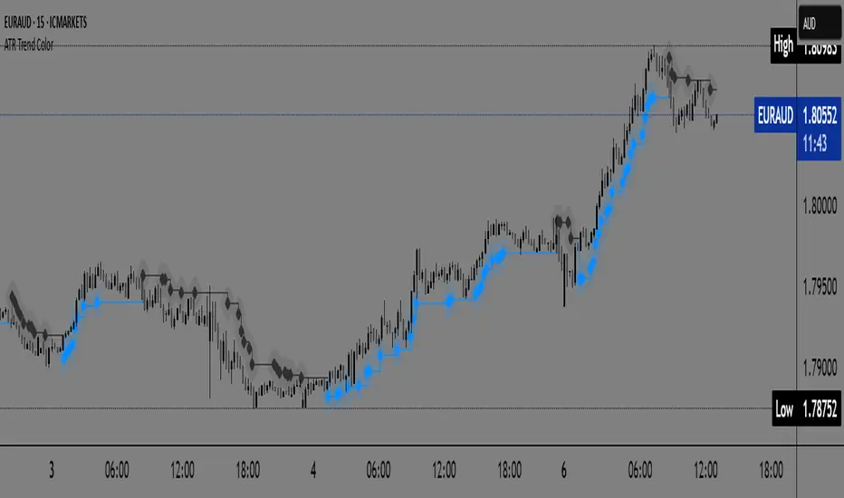
ATR Trend Color📌 ATR Trend Color — Visually clean trend-following tool based on adaptive ATR trailing stop
► Description
ATR Trend Color is a simple yet powerful indicator designed to visually identify and follow the market trend using an adaptive ATR-based trailing stop. Its main advantage lies in clarity — it uses just a single line that dynamically changes color based on trend direction:
✅ Blue line indicates price is above the trailing stop (bullish trend).
🔻 Black line indicates price is below the trailing stop (bearish trend).
This clean display allows for instant trend recognition and potential exit or reversal zones.
► How it works
The indicator uses the Average True Range (ATR) to calculate a dynamic trailing stop level. ATR measures volatility and adjusts the trailing line to match current market conditions:
When the price rises, the line moves up and acts as dynamic support.
When the price drops, the line moves down and acts as resistance.
This behavior makes it ideal for trend following and volatility-adjusted stop-loss placement.
► Key Features:
✅ Clean chart with just one ATR trailing line
✅ Dynamic color changes in real-time
✅ Great for trend confirmation and management
✅ Customizable ATR period and multiplier
✅ Step line with diamonds for high visual clarity
► How to use
Add the indicator to your chart.
Adjust ATR period and multiplier to your strategy (default: ATR 7 / multiplier 3.1).
Follow the line color:
Blue: Bullish trend — may signal to stay in long positions.
Black: Bearish trend — may suggest exit or short entries.
► Originality
Unlike typical ATR trailing stop indicators that display two lines or static colors, ATR Trend Color simplifies visualization by using a single smart line with real-time visual feedback on trend direction.
Additionally, it uses the “Step line with diamonds” display mode to enhance readability in fast or noisy markets.
HSHS Volume Divergence MTF v6 (Final Fix)HSHS Volume Divergence MTF v6
Zmienność
Dywergencja
Momentum
RSI

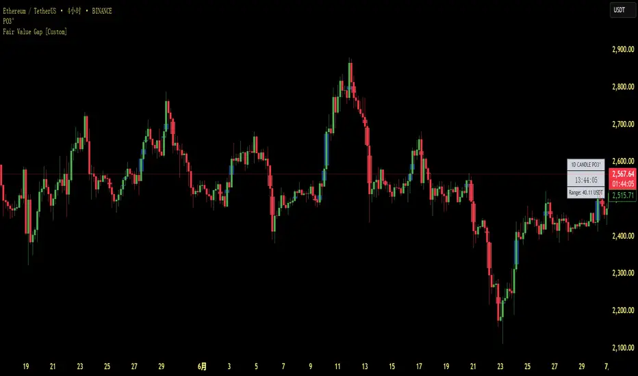
Fair Value Gap [Custom]📌 FVG Indicator – Smart Money Concepts Tool
This script is based on Smart Money Concepts (SMC) and automatically detects and marks Fair Value Gaps (FVG) on the chart, helping traders identify unbalanced price areas left behind by institutional moves.
🧠 What is an FVG?
An FVG (Fair Value Gap) is the price gap formed when the market moves rapidly, leaving behind a candle range where no trading occurred — typically between Candle 1’s high and Candle 3’s low (in a three-candle pattern). These gaps often signal imbalance, created during structural breaks or liquidity grabs, and may act as retrace zones or entry points.
🛠 Features:
✅ Automatically detects and highlights FVG zones (high-low range)
✅ Differentiates between open (unfilled) and closed (filled) FVGs
✅ Adjustable timeframe settings (works best on 1H–4H charts)
✅ Option to toggle display of filled FVGs
✅ Great for identifying pullback entries, continuation zones, or reversal setups
💡 Recommended Use:
After BOS/CHoCH, watch for price to return to the FVG for entry
Combine with Order Blocks and liquidity zones for higher accuracy
Best used as part of an ICT or SMC-based trading system