Trend Continuation IndicatorTrend Continuation Indicator
The Trend Continuation Indicator is designed to assist traders in identifying potential continuation setups within established market trends. It is particularly suited for use in strong trending environments and is optimized for lower timeframes, with a recommended chart setting of 5-minute candles and an EMA timeframe set to 1 hour.
The indicator combines multiple technical elements:
RSI (Relative Strength Index): Used to assess potential overbought and oversold conditions relative to the trend.
EMA (Exponential Moving Average): A multi-timeframe EMA is used as a directional filter, helping to align entries with the broader trend.
Candle Structure and Momentum Filters: The logic includes real-time candle analysis and volume dynamics to identify momentum-driven signals.
Buy signals are generated when price action shows bullish momentum and RSI confirms potential oversold conditions within an uptrend. Conversely, sell signals are triggered when bearish momentum aligns with overbought RSI levels in a downtrend.
This tool is intended for use as part of a broader trading strategy and is best applied in trending markets where continuation patterns are more likely to follow through.
THE INDICATOR ITSELF IS NO FINANCIAL ADVISE!
Here are some usecase examples:
Indicators and strategies

Sessions HH/LLSessions HH and LL everything marked with lines, sessions start and finish, compatible with every timeframe and you can hide whole sessions or just little parts of them.

HY-LevelsA very simple indicator that draws the previous 1H, 4H and 1D high and low levels
It's typically used when trading the 1M charts
The various levels can be turned on and off and the line can be extended left, right or in both directions as you prefer.
The code is simple and should be easy to modify to your preferences

Tension Squeeze Clock v1.0🔥 Tension Squeeze Clock v1.0
Forecast explosive market moves before they happen.
The Tension Squeeze Clock is a cyclical compression detector that identifies when the market is storing energy across multiple dimensions — and signals when that energy is about to uncoil.
This indicator combines three critical components:
🔹 RSI Contraction – Detects when momentum is balanced and compressed
🔹 Volatility Squeeze – Measures low standard deviation in price movement
🔹 Range Tension – Flags tight candle ranges relative to average volatility
When all three compressions align, the indicator prints a clear “Squeeze Ready” signal. When the pressure breaks, it signals “Squeeze Uncoiling” — a prime moment to watch for volatility surges or directional breakouts.
📈 Recommended Usage
🔍 This tool works especially well on the Daily timeframe, where coiled conditions often lead to significant price expansions.
Use it to:
Anticipate breakout setups
Confirm coiled consolidation zones
Add timing precision to your volume or divergence-based strategies
📊 Display Options
Panel view with bar colors to reflect compression strength
On-chart labels for squeeze signals
Optional alerts when a squeeze begins or breaks
Whether you're swing trading, trend riding, or timing reversals, the Tension Squeeze Clock helps you see what most indicators miss: the calm before the storm.

🌀 Vortex Trap OscillatorVortex Oscillator Core
Calculates the difference between upward and downward directional price flow.
Spikes in either direction highlight strong directional bias or potential exhaustion.
Trap Signal Logic
A Bullish Trap is signaled when:
Vortex turns strongly negative (false bearish pressure)
There's a volume burst
Buy/sell tension favors buyers
An RSI bullish divergence is detected
A Bearish Trap is signaled under the inverse conditions.
Volume Burst Filter
Compares current volume to a moving average baseline.
Triggers only when volume surges past a dynamic threshold.
Tension Filter
Compares smoothed buy and sell volumes.
Confirms whether aggressive participants are truly in control.
RSI Divergence Filter
Uses pivot-based divergence detection to validate exhaustion signals.
Adds another layer of trap confirmation.
📈 How To Use:
Overlay Mode: Use alongside price action to visually confirm trap signals.
Entry Timing:
Look for trap markers (▲ for bullish traps below bar, ▼ for bearish traps above bar).
Use confirmation from your own system (e.g. candle patterns, support/resistance).
Exit or Fade Strategy:
Consider fading the trap (trading against the move) if it aligns with higher-timeframe confluence.
Watch for reversal candles near trap zones.
🛠 Settings Tips:
Adjust Vortex Period to control trap sensitivity (shorter = more signals, longer = smoother).
Use Volume Burst Threshold to filter out noise on low-volume assets.
RSI Divergence Depth can be increased on higher timeframes for cleaner divergence reads.
🧠 Best Used For:
Detecting false breakouts
Catching mean reversions after stop hunts
Identifying momentum traps in volatile markets
Filtering aggressive moves that lack volume confirmation

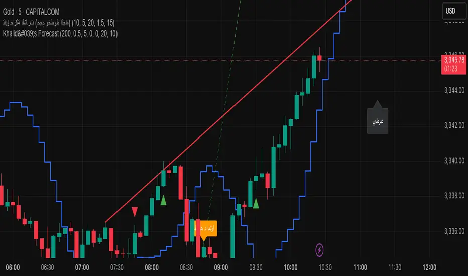
Khalid's Custom Forecastthis is very very improved indicator for daly trading .
please analysis and note the S & R
SOL Smart Alert SystemITECS built this to work alongside my AI agent and scripts to provide a robust notification/alert system that can be configured to best work with the current market conditions.

TRIX Strong Hand - DidiTrix (or TRIX) is a technical analysis oscillator developed in the 1980s by Jack Hutson, editor of Technical Analysis of Stocks and Commodities magazine. It shows the slope (i.e., the derivative) of a triple-smoothed exponential moving average. The name Trix comes from "triple exponential."
The TRIX is a triple-smoothed exponential moving average used in technical analysis to track trends.
This is a customized version for use in conjunction with other indicators in the Didi Aguiar's CST Method. It has a standard setting of 9 periods and a 4-period average to signal crossovers. It is used as one of the indicators to detect trade exits, nicknamed "Strong Hand" and described as having "three coconuts between the legs" due to its strong confidence that the trade can continue in the trend.

Apex Edge - RSI Trend LinesThe Apex Edge - RSI Trend Lines indicator is a precision tool that automatically draws real-time trendlines on the RSI oscillator using confirmed pivot highs and lows. These dynamic trendlines track RSI structure in motion, helping you anticipate breakout zones, reversals, and hidden divergences.
Every time a new pivot forms, the indicator automatically re-draws the RSI trendline between the two most recent pivots — giving you an always-current view of momentum structure. You’ll instantly see when RSI begins compressing or expanding, long before price reacts.
Key Features: • Dynamic RSI trendlines drawn from the last 2 pivots
• Auto re-draws in real-time as new pivots form
• Optional "Full Extend" or "Pivot Only" modes
• Slope color-coded: green = support, red = resistance
• Built-in dotted RSI levels (30/70 default)
• Alert conditions for RSI trendline breakout signals
• Ideal for spotting divergence, compression, and early SMC confluence
This is not your average RSI — it’s a fully reactive momentum edge overlay designed to give you clarity, structure, and timing from within the oscillator itself. Perfect for traders using Smart Money Concepts, divergence setups, or algorithmic trend tracking.
⚔️ Built for precision. Built for edge. Built for Apex.

SOL Elliott Wave 4H with Enhanced ProjectionsThis 4H-optimized version includes:
Key Features for 4H Timeframe:
Optimized Default Settings:
Wave Detection Period: 7 (perfect for 4H)
ZigZag Depth: 3% (captures significant moves on 4H)
Visual Indicators:
Small circles mark pivot points as they form
Blue background on the last bar shows script is active
Clean zigzag lines between pivots
Wave numbers at each pivot
Immediate Feedback:
Pivots show up as soon as they're confirmed
Table shows pivots found count
Current price always visible
To Use This:
Add to your 4H SOL chart
You should immediately see:
Small circles marking recent pivots
The info table in top-right
Blue highlight on the current bar
If you don't see lines yet, try:
Reduce Wave Detection Period to 5
Reduce ZigZag Depth to 2%
Make sure you have at least 100-200 bars of history loaded
Fine-tuning for current market:
If SOL is ranging: Lower ZigZag Depth to 2%
If SOL is trending strongly: Increase to 4-5%
The indicator will start drawing zigzag lines and counting waves as soon as it finds valid alternating highs and lows that meet the minimum percentage move requirement.

RSI with 2-Pole FilterA momentum indicator that tells you if a stock is overbought or oversold.
RSI goes between 0 and 100.
70 = overbought (might fall)
<30 = oversold (might rise)
It often looks jagged or choppy on volatile days.
Think of this filter like a momentum smoother:
It still follows RSI closely,
But it doesn’t react to every little jiggle in price,
Which helps avoid false signals.
it keeps track of:
The current RSI,
The last 2 RSI values (inputs), and
The last 2 outputs (filtered RSIs).
It uses feedback to shape the output based on previous values, making it smoother than a simple moving average.

Session Highs and Lows Indicator (DST + Editable Times)Session Highs and Lows Indicator (DST + Editable Times)

PRO SMC DASHBOARDPRO SMC DASHBOARD - PRO LEVEL
Advanced Supply & Demand / SMC dashboard for scalping and intraday:
Multi-Timeframe Trend: Visualizes trend direction for M1, M5, M15, H1, H4.
HTF Supply/Demand: Shows closest high time frame (HTF) supply/demand zone and distance (in pips).
Smart “Flip” & Liquidity Signals: Flip and Liquidity Sweep arrows/signals are shown only when truly significant:
Near HTF Supply/Demand zone
And confirmed by volume spike or high confluence score
Momentum & Bias: Real-time momentum (RSI M1), H1 bias and fakeout detection.
Confluence Score: Objective score (out of 7) for trade confidence.
Volume Spike, Divergence, BOS: Includes volume spikes, RSI divergence (M1), and Break of Structure (BOS) for both M15 & H1.
Ultra-clean chart: Only valid signals/alerts shown; no spam or visual clutter.
Full dashboard with all signals and context, always visible bottom-right.
Best used for:
Forex, Gold/Silver, US indices, and crypto
Scalping/intraday with fast, clear decisions based on multi-factor SMC logic
Usage:
Add to your chart, monitor the dashboard for valid setups, and trade only when multiple factors align for high-probability entries.
How to Use the PRO SMC DASHBOARD
1. Add the Script to Your Chart:
Apply the indicator to your favorite Forex, Gold, crypto, or indices chart (best on M1, M5, or M15 for entries).
2. Read the Dashboard (Bottom Right):
The dashboard shows real-time information from multiple timeframes and key SMC filters, including:
Trend (M1, M5, M15, H1, H4):
Arrows show up (↑) or down (↓) trend for each timeframe, based on EMA.
Momentum (RSI M1):
Shows “Strong Up,” “Strong Down,” or “Neutral” plus the current RSI value.
RSI (H1):
Higher timeframe momentum confirmation.
ATR State:
Indicates current volatility (High, Normal, Low).
Session:
Detects if the market is in London, NY, or Asia session (based on UTC).
HTF S/D Zone:
Shows the nearest high timeframe Supply or Demand zone, its timeframe (M15, H1, H4), and exact pip distance.
Fakeout (last 3):
Detects recent false breakouts—if there are multiple fakeouts, potential for reversal is higher.
FVG (Fair Value Gap):
Indicates direction and distance to the nearest FVG (Above/Below).
Bias:
“Strong Buy,” “Strong Sell,” or “Neutral”—multi-timeframe, momentum, and volatility filtered.
Inducement:
Alerts for possible “stop hunt” or liquidity grab before reversal.
BOS (Break of Structure):
Recent or live breaks of market structure (for both M15 & H1).
Liquidity Sweep:
Shows if price just swept a key high/low and then reversed (often key reversal point).
Confluence Score (0-7):
Higher score means more factors align—look for 5+ for strong setups.
Volume Spike:
“YES” appears if the current volume is significantly above average—big players are active!
RSI Divergence:
Bullish or bearish divergence on M1—signals early reversal risk.
Momentum Flip:
“UP” or “DN” appears if RSI M1 crosses the 50 line, confirmed by location and other filters.
Chart Signals (Arrows & Markers):
Flip arrows (up/down) and Liquidity markers only appear when price is at/near a key Supply/Demand zone and confirmed by either a volume spike or strong confluence.
No signal spam:
If you see an arrow or LIQ tag, it’s a truly significant moment!
Suggested Trading Workflow:
Scan the Dashboard:
Is the multi-timeframe trend aligned?
Are you near a major Supply or Demand zone?
Is the Confluence Score high (5 or more)?
Check for Signals:
Is there a Flip or LIQ marker near a Supply/Demand zone?
Is volume spiking or a fakeout just occurred?
Look for Reversal or Continuation:
If there’s a Flip at Demand (with high confluence), consider a long setup.
If there’s a LIQ sweep + flip + volume at Supply, consider a short.
Manage Risk:
Don’t chase every signal.
Confirm with your entry criteria and preferred session timing.
Pro Tips:
Highest confidence trades:
When dashboard signals and chart arrows/markers agree, especially with high confluence and volume spike.
Adapt pip distance filter:
Dashboard is tuned for FX and gold; for other assets, adjust pip-size filter if needed.
Use alerts (if enabled):
Set up custom TradingView alerts for “Flip” or “Liquidity” signals for auto-notifications.
Designed to help you make professional, objective decisions—without chart clutter or second-guessing!

Nifty Call/Put/Neutral IndicatorThis is based on RSI indicator will tell you if nifty is call put or neutral

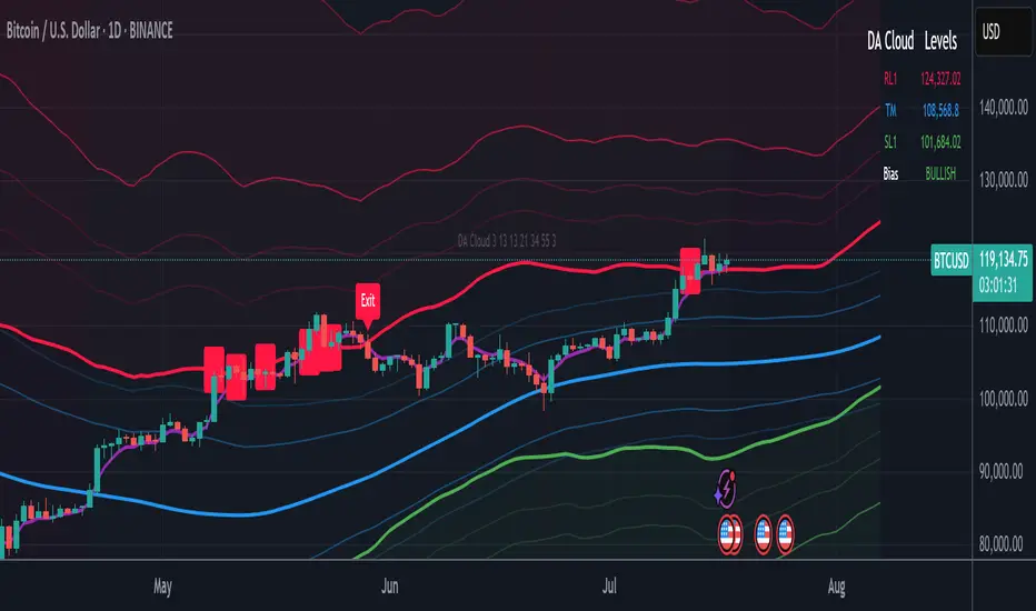
DA Cloud - DynamicDA Cloud - Dynamic | Detailed Overview
🌟 What Makes This Indicator Special
The DA Cloud - Dynamic is an advanced technical analysis tool that creates adaptive support and resistance zones that expand and contract based on market volatility. Unlike traditional static indicators, this cloud system "breathes" with the market, providing dynamic levels that adjust to changing market conditions.
📊 Core Components
1. Multi-Layered Cloud Structure
Resistance Cloud (Red): Three dynamic resistance levels (RL1, RL2, RL3) with intermediate channels (RC1, RC2)
Support Cloud (Green): Three dynamic support levels (SL1, SL2, SL3) with intermediate channels (SC1, SC2)
Trend Cloud (Blue): Five trend lines (TU2, TU1, TM, TL1, TL2) that flow through the center
Confirmation Line (Purple): A fast-reacting line that confirms trend changes
2. Forward Displacement Technology
The entire cloud system is projected 21 bars into the future (Fibonacci number), allowing traders to see potential support and resistance levels before price reaches them. This predictive element is inspired by Ichimoku Cloud theory but enhanced with modern volatility dynamics.
🔬 How It Works (Without Revealing the Secret Sauce)
Volatility-Responsive Design
The indicator continuously measures market volatility across multiple timeframes
During high volatility periods (like major breakouts), clouds expand dramatically
During consolidation, clouds contract and tighten around price
This creates a "breathing" effect that adapts to market conditions
Multi-Timeframe Analysis
Incorporates Fibonacci sequence periods (3, 13, 21, 34, 55) for calculations
Blends short-term responsiveness with long-term stability
Creates smooth, flowing lines that filter out market noise
Dynamic Level Calculation
Levels are not fixed percentages or static bands
Each level adapts based on current market structure and volatility
Channel lines (RC1, RC2, SC1, SC2) provide intermediate support/resistance
🎯 Key Features
1. Touch Point Detection
Colored dots appear when price touches key levels
Red dots = resistance touch
Green dots = support touch
Blue dots = trend median touch
2. Entry/Exit Signals
"Cloud Entry" labels when confirmation line crosses above SL1
"Cloud Exit" labels when confirmation line crosses below RL1
Background color changes based on bullish/bearish bias
3. Information Table
Real-time display of key levels (RL1, TM, SL1)
Current bias indicator (BULLISH/BEARISH)
Updates dynamically as market moves
⚙️ Customization Options
Main Controls:
Sensitivity (5-50): How responsive clouds are to price movements
Smoothing (1-50): Controls the flow and smoothness of cloud lines
Forward Displacement (0-50): How many bars to project the cloud forward
Advanced Volatility Settings:
Volatility Lookback (50-1000): Period for establishing volatility baseline
Volatility Smoothing (1-50): Reduces spikes in volatility expansion
Expansion Power (0.1-2.0): Controls how dramatically clouds expand
Range Divisor (1.0-20.0): Master control for overall cloud width
Level Spacing:
Individual multipliers for each resistance and support level
Allows fine-tuning of cloud structure to match different markets
Trend Spacing:
Separate controls for inner and outer trend bands
Customize the trend cloud density
📈 Trading Applications
1. Trend Identification
Price above TM (Trend Median) = Bullish bias
Price below TM = Bearish bias
Cloud color and width indicate trend strength
2. Support/Resistance Trading
Use RL1/SL1 as primary targets and reversal zones
RC1/RC2 and SC1/SC2 provide intermediate levels
RL3/SL3 mark extreme levels often seen at major tops/bottoms
3. Volatility Analysis
Expanding clouds signal increasing volatility and potential big moves
Contracting clouds indicate consolidation and potential breakout setup
Cloud width helps with position sizing and risk management
4. Multi-Timeframe Confirmation
Works on all timeframes from 1-minute to monthly
Higher timeframes show major market structure
Lower timeframes provide precise entry/exit points
🎓 Best Practices
Combine with Volume: High volume at cloud levels increases reliability
Watch for Touch Clusters: Multiple touches at a level indicate strength
Monitor Cloud Expansion: Sudden expansion often precedes major moves
Use Multiple Timeframes: Confirm signals across different time periods
Respect the Trend Median: This is often the most important level
⚡ Performance Notes
Optimized for up to 2000 bars of historical data
Smooth performance with 500+ lines and labels
Works on all markets: Crypto, Forex, Stocks, Commodities
📝 Version Info
Current Version: 1.0
Dynamic volatility expansion system
Full customization suite
Touch point detection
Entry/exit signals
Forward displacement projection
Asian Session + Break & Retest Helperbrake and retest helper, it helps to see what levels are goin to break to the up or downside etc.

📊 TREND Indicator by Yogesh Mandloi 📊This custom-built TradingView indicator provides a visual and logic-based trend analysis dashboard using 4-hour RSI and EMA/SMA conditions, combined with entry/exit signals, alerts, and a toggle-controlled condition table.
🔍 Core Logic
The strategy uses 4-hour timeframe data to identify potential bullish or bearish trends based on:
RSI (14):
Buy: RSI > 48
Sell: RSI < 52
EMA/SMA (Trend Filters):
Buy: EMA 21 > SMA 55 High → uptrend confirmation
Sell: EMA 21 < SMA 55 Low → downtrend confirmation
Buy Signal = RSI > 48 AND EMA21 > SMA55 High
Sell Signal = RSI < 52 AND EMA21 < SMA55 Low
It only signals on first bar of condition (no repetitive signals) and gives exit alerts when the condition ends.
📈 Features
✅ Signal Plotting
Green "BUY" arrows below bars when buy setup forms
Red "SELL" arrows above bars when sell setup forms
Gray "EXIT" markers when the trend condition invalidates
✅ Real-Time Alerts
Entry alerts for both BUY and SELL signals
Exit alerts to close positions
✅ Dynamic Visual Table
An on-screen signal table shows the live status of each condition with color-coded clarity:
✅ Green: Condition met
❌ Red: Condition not met
🟧 Orange: Warning (bearish potential forming)
✅ Toggle Switches for Sections
Users can control the visibility of each table section:
Buy Conditions ✔️
Sell Conditions 🔻
Signal Summary 📌
Indicator Values 📊
This makes it easier to focus on relevant sections or declutter the chart view.
✅ Customizable Table Position
You can change the table location:
top_left, top_right, bottom_left, bottom_right
✅ Background Highlights
Light Green background when buy conditions are active
Light Red background when sell conditions are active

LANZ Strategy 5.0🔷 LANZ Strategy 5.0 — Intraday BUY Signals, Dynamic Lot Size per Account, Real-Time Dashboard and Smart Execution
LANZ Strategy 5.0 is a powerful intraday tool designed for traders who need a visual-first, data-backed BUY system, enhanced with risk-aware lot size calculation and a real-time performance dashboard. This indicator intelligently detects strong momentum setups and provides visual and statistical clarity throughout the session.
📌 This is an indicator, not a strategy — It does not place trades automatically but provides precise conditions, alerts, and visual guides to support execution.
🧠 Core Logic & Features
BUY Entry Conditions (Signal Engine)
A BUY signal is triggered when:
The current price is above the EMA200 (trend filter)
The last 3 candles are bullish (candle body close > open)
You are within the defined session window (NY time)
When all conditions are met and you haven’t reached the daily trade limit, a signal appears on the chart and an optional alert is triggered.
Operational Hours Filter (NY Time)
You define:
Start time (e.g., 01:15 NY)
End time (e.g., 16:00 NY)
The system only evaluates and executes signals within this period. If a BUY setup occurs outside the window, it’s ignored. The chart is also highlighted with a transparent teal background to visually show active trading hours.
Lot Size Panel with Per-Account Risk Management
Designed for traders managing multiple accounts or capital sources. You can enable up to 5 accounts, each with:
Its own capital
Its own risk percentage per trade
The system uses the defined SL in pips, plus the instrument’s pip value, to calculate the lot size per account. All values are shown in a dedicated panel at the bottom-right, automatically updating with each new trade.
The emojis (🐣🦊🦁🐲🐳) distinguish each account visually.
Trade Visualization with Customizable Lines
When a signal is triggered:
An Entry Point (EP) line is drawn at the candle’s close.
A Stop Loss (SL) line is placed X pips below the entry.
A Take Profit (TP) line is placed Y pips above the entry.
All three lines are fully customizable in style, color, and thickness. You define how many bars the lines should extend.
Outcome Tracking & Real-Time Dashboard
Each trade outcome is measured:
SL hit = –1.00%
TP hit = +3.00%
Manual close = calculated dynamically based on price at close time
Each result is labeled on the chart near its level, and stored.
The top-right dashboard updates in real time:
✅ Number of trades
📈 Cumulative % gain/loss of the day (color-coded)
Alerts You Can Trust:
You’ll get a Buy Alert when a valid signal is formed
You’ll get a Trade Executed Alert when the visual operation is plotted
You’ll get a SL/TP Hit Alert with price and result
You’ll get a Manual Close Alert if the configured time is reached and the trade is still active
⚙️ Step-by-Step Execution Flow
At every bar, the system checks:
Are we within the session time window?
Is price above EMA?
Are the last 3 candles bullish?
✅ If yes:
A BUY signal is plotted
Entry/SL/TP lines are drawn
Lot sizes are calculated and displayed
Trade is added to the daily count
🕐 At the configured Manual Close time (e.g., 16:00 NY):
If the trade is still open, it's closed
A label is added with the exact result in %
💡 Ideal For:
Intraday traders who operate within fixed time sessions
Traders managing multiple accounts or capital pools
Anyone who wants full visual clarity of every decision point
Traders who appreciate dynamic lot size calculation and clean execution tracking
👨💻 Credits:
💡 Developed by: LANZ
🧠 Strategy concept & execution model: LANZ
🧪 Tested on: 1H charts with visual-only execution
📈 Designed for: Clarity, adaptability, and full intraday control

Assaf ATRATR (Average True Range) is a volatility indicator developed by J. Welles Wilder. It measures how much an asset moves (in price), on average, during a specific time period. It does not indicate direction, only the degree of price volatility.

EMA Curl Strength+EMA Curl Strength+
Description:
This indicator provides a statistically normalized view of EMA slope momentum using Z-score transformation. By evaluating the rate of change of an EMA and comparing it against its historical behavior, the script highlights momentum shifts in a dynamic, adaptive way.
⸻
How It Works:
• Calculates the slope (percentage change) of a chosen EMA.
• Normalizes the slope using Z-score over a custom lookback period.
• Smooths the resulting signal and computes two signal lines for comparison.
• Assigns dynamic colors based on user-defined Z-score thresholds for mild, moderate, and strong momentum in both directions.
⸻
Visual Features:
• Gradient fill between the Z Curl Line and Signal 1 to highlight slope acceleration.
• Histogram showing the difference between the Z Curl Line and its signal.
• Optional signal crossover shapes between configurable pairs (e.g., Z Curl vs. Signal).
• Background highlights when the Z Curl Line exceeds ±2, indicating strong trending behavior.
⸻
Customization:
• Adjustable EMA length, smoothing lengths, signal lengths, histogram smoothing, and Z-score lookback.
• Separate color controls for:
• Z-score strength bands (mild/moderate/strong up/down)
• Histogram bars
• Signal lines
• Background highlight zones
• Crossover shapes
⸻
Use Cases:
• Momentum Confirmation: Confirm strength when Z Curl exceeds ±2 with matching background highlights.
• Trend Entry Timing: Look for trades when Z Curl crosses above or below the 0-line.
• Scalping: Capture quick directional moves when momentum accelerates.
• Trend Following: Use strong Z Curl values to confirm trade direction and filter sideways action.
• Divergence Detection: Spot divergences between price and Z Curl movement to anticipate reversals.
SOL Technical Confluence DashboardHow to Use This Confluence Dashboard
Setup Instructions:
Use the other script published as the 1 of 2 scripts to add to your 4-hour SOL chart.
What You'll See:
1. RSI Panel with Enhancements
Colored RSI line (Green = oversold, Red = overbought)
Divergence detection (triangles mark divergences)
Background color changes on strong signals
2. Confluence Table (Top Right)
Shows real-time status of:
RSI: Current value and signal
MACD: Trend direction
Volume: Spike detection and relative volume
Divergence: Bull/Bear divergence alerts
Confluence Scores: 0-10 scale for bull/bear strength
Overall Signal: STRONG BUY/SELL, BUY/SELL, or WAIT
3. Net Confluence Histogram (Bottom)
Green bars = Bullish confluence
Red bars = Bearish confluence
Height = Strength of signal
How It Works with Elliott Waves:
Scenario 1: Wave 5 Top Detection
Elliott Wave shows Wave 5 approaching 261.8%
Confluence Dashboard shows:
RSI: 78 (overbought) ❌
MACD: Bearish cross ❌
Volume: Declining ❌
Divergence: Bearish ❌
Signal: STRONG SELL 🔴
Scenario 2: Wave 2 Bottom
Elliott Wave shows Wave 2 at 61.8% retracement
Confluence Dashboard shows:
RSI: 28 (oversold) ✅
MACD: Bullish cross ✅
Volume: Spike ✅
Divergence: Bullish ✅
Signal: STRONG BUY 🟢
Confluence Scoring System:
The script uses a weighted scoring system:
Divergences: 3 points (most reliable)
RSI extremes: 2 points
Volume spikes: 2 points
MACD signals: 1.5 points
Price action: 1 point
Signals:
Score ≥ 5 = STRONG signal
Score ≥ 3 = Moderate signal
Score < 3 = WAIT
Pro Tips for Maximum Accuracy:
Best Setups: When Elliott Wave completion aligns with STRONG signals
Avoid: Taking trades when confluence is mixed
Volume Confirmation: Always check if volume supports the move
Divergence Priority: RSI divergence at wave endpoints is highly reliable
Alerts Available:
Strong Bullish Confluence
Strong Bearish Confluence
Bullish Divergence
Bearish Divergence
This gives you a complete technical analysis suite that works seamlessly with your Elliott Wave indicator. The combination significantly improves accuracy by confirming wave counts with momentum, volume, and divergence analysis!

Multi-Method Moving Average v6.0Multi-Methods Moving Average Indicator is a versatile tool designed for traders who want to identify key price levels that can act as support and resistance in the market. This indicator utilizes multiple moving averages (MAs) to help visualize price trends and potential reversal points, aiding traders in making informed decisions.
Features
Multiple Moving Averages: The indicator calculates and displays six different moving averages (MA1 to MA6) based on user-defined periods. This allows traders to analyze short-term and long-term trends effectively.
Customizable Inputs: Users can customize the periods for each moving average and select the type of moving average (SMA, EMA, WMA) that best suits their trading strategy.
Price Source Selection: The indicator allows users to choose the price source (Open, Close, High, Low, or the average of Open and Close) for calculating the moving averages, providing flexibility in analysis.
Color-Coded Signals: The moving averages are color-coded based on the current price relative to the moving average, helping traders quickly identify bullish or bearish conditions.
How to Use
Adding the Indicator:
Open TradingView and navigate to the chart you wish to analyze.
Click on the "Indicators" button at the top of the chart.
Search for "Multi-Methods Moving Average" and select the indicator to add it to your chart.
Customizing Settings:
Click on the gear icon next to the indicator's name in the chart legend to open the settings menu.
Adjust the periods for each moving average to fit your trading style. Common settings include 9, 26, 52, 100, 200, and 500 periods.
Choose the type of moving average you prefer (SMA, EMA, or WMA).
Select the price source that aligns with your trading strategy.
Interpreting the Indicator:
Moving Averages: Observe the position of the moving averages relative to the price. If the price is above the moving average, it indicates a bullish trend; if below, it suggests a bearish trend.
Crossover Signals: Look for crossovers between the moving averages. A crossover where a shorter moving average crosses above a longer moving average may signal a potential buy opportunity, while a crossover in the opposite direction may indicate a sell opportunity.
Support and Resistance Levels: Use the moving averages as dynamic support and resistance levels. Price often reacts at these levels, providing potential entry and exit points for trades.
Risk Management:
Always combine the insights from this indicator with other forms of analysis, such as price action, volume analysis, and market sentiment.
Set stop-loss and take-profit levels based on the identified support and resistance levels to manage your risk effectively.
Conclusion
The Support & Resistance Indicator is an essential tool for traders looking to enhance their market analysis. By leveraging multiple moving averages and customizable settings, traders can gain a clearer understanding of market trends and make more informed trading decisions.

HA + HMA + VWAP🔍 Script Overview
This indicator blends Heikin-Ashi smoothing, Hull Moving Average (HMA), and Volume Weighted Average Price (VWAP) to help traders identify trend direction and potential trade setups. The script provides buy/sell signals based on price action relative to HMA while anchoring the view to volume with VWAP.
📈 What It Does and How
- Heikin-Ashi Calculations: Reduces noise by averaging candle structure, revealing clearer trend direction.
- Hull Moving Average (HMA): A fast, smooth-moving average applied to Heikin-Ashi close prices, tuned to respond quickly to shifts in momentum.
- VWAP Line: Acts as a dynamic fair-value reference, balancing price against volume over time.
- Signal Logic: Generates visual Buy/Sell signals when the Heikin-Ashi close crosses the HMA.
🧠 Recommended Enhancements Using RSI + ATR
For more refined entries and exits, use this indicator alongside Relative Strength Index (RSI) and Average True Range (ATR):
- RSI for Momentum Confirmation: Ensure the buy signals align with upward momentum—RSI climbing from oversold zones adds conviction.
- ATR for Volatility Awareness: Use ATR to size stops and evaluate risk. Avoid trades during volatility spikes or when ATR exceeds typical thresholds.
- Three-Leg Alignment: When HA/HMA signal agrees with RSI momentum and ATR shows stable conditions, you get high-quality trade setups with better timing and risk control.
This fusion helps discretionary traders filter noise and make confident decisions rooted in price action, volume, momentum, and volatility.
⚙️ Chart Display
- HMA: red line
- VWAP: gray line
- Buy/Sell labels: green below bars for buys, red above bars for sells
- Clean layout optimized for visual clarity
This script is open-source and does not use future data or issue caution warnings. It’s designed to assist manual trading strategies, not provide automated trading decisions.
