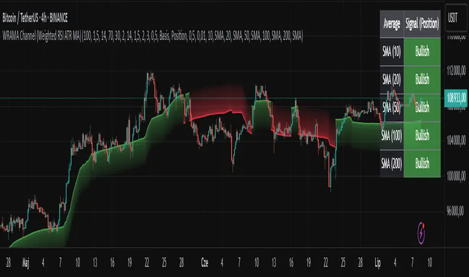
WRAMA Channel (Weighted RSI ATR MA)OVERVIEW
The WRAMA Channel (Weighted RSI ATR MA) is an advanced technical analysis tool designed to react more quickly to price movements compared to indicators using conventional moving averages. It combines the Relative Strength Index (RSI), Average True Range (ATR), and a weighted moving average, resulting in the WRAMA. This indicator forms a dynamic price channel based on a weighted average that incorporates both trend strength (via RSI) and market volatility (via ATR). It helps traders identify trends, potential reversals, and breakout signals, while offering broad customization options.
Key Features
WRAMA Price Channel:
Generates a dynamic channel around the weighted moving average (WRAMA), adapting to market volatility and momentum, similar to Bollinger Bands. Users are encouraged to adjust channel width and length according to their strategy.
The upper and lower channel bands are calculated based on a percentage deviation from the baseline line.
The channel fill color changes depending on the price's position relative to the baseline (green above, red below), with an optional gradient for better visualization.
Weighted Moving Average (WRAMA):
WRAMA is a custom weighted moving average (MA1), where closing prices are weighted based on RSI and ATR, allowing it to dynamically adapt to market conditions.
Baseline: The WRAMA line calculated over a user-defined period.
WRAMA Calculation:
RSI Weight: Based on RSI value. When RSI is in extreme zones (below the lower threshold or above the upper threshold), an extreme weight is applied. Otherwise, the weight is based on the squared RSI value divided by 100, raised to a power defined by the rsi_weight_factor.
ATR Weight: Based on the ATR-to-average-ATR ratio. If ATR exceeds a threshold (atr_threshold × avg_atr), an extreme weight is applied. Otherwise, the weight is based on the squared ratio of ATR to average ATR, raised to the power of the atr_weight_factor.
Combined Weight: RSI and ATR weights are combined using a rsi_atr_balance parameter. Final weight = RSI weight × balance + ATR weight × (1 - balance).
WRAMA Calculation: The closing price is multiplied by the combined weight. The result is averaged over the ma_length period and divided by the average of the weights, forming the WRAMA line. For current WRAMA (ma_length = 1), the calculation simplifies to a single weighted price.
Additional Moving Averages:
For additional confirmations, the indicator supports up to five moving averages (MA1–MA5) with various types (SMA, EMA, WMA, HMA, ALMA) and customizable periods.
All additional MAs are calculated based on WRAMA or its baseline, ensuring consistency and enabling deeper analysis within a unified methodology. MA trend directions can be tracked in a built-in signal table.
Trading Signals:
Breakout Signals: Breakouts above/below the channel are optionally marked with triangle shapes (green for bullish, red for bearish).
MA Signals: Price position relative to MAs or their slope generates bullish/bearish signals. These are optionally visualized with default triangles (green up, red down).
A signal table in the top-right corner summarizes the status of each moving average – bullish, bearish, or neutral.
Customization Options
Channel Settings:
MA Period: Length of the WRAMA baseline (default: 100).
Channel Deviation : Percentage offset from the baseline for upper/lower bands (default: 1.5%).
RSI Settings:
RSI Period: Length of the RSI calculation (default: 14).
RSI Upper/Lower Threshold: Overbought/oversold levels (default: 70/30).
RSI Weight Factor: Influence of RSI on weighting (default: 2.0).
ATR Settings:
ATR Period: ATR calculation length (default: 14).
ATR Threshold: Volatility threshold as a multiple of average ATR (default: 1.5).
ATR Weight Factor: Influence of ATR on weighting (default: 2.0).
RSI & ATR Combined:
Extreme Weight: Weight applied in extreme RSI/ATR conditions (default: 3.0).
RSI/ATR Balance: Balance between RSI and ATR influence (default: 0.5).
Signal Settings:
Show Breakout Signals: Enable/disable breakout triangles.
Show MA Signals: Enable/disable MA-based signals.
MA Signal Source: Choose between current WRAMA or baseline.
MA Signal Analysis: Based on price position or slope.
Neutral Threshold : Minimum distance from MA for signal neutrality (default: 0.5%).
Minimum MA Slope : Minimum slope for trend direction signals (default: 0.01%).
Moving Averages (MA1–MA5):
Options to enable/disable, select type (SMA, EMA, WMA, HMA, ALMA), set period length, and choose color.
Style Settings:
Gradient Fill: Enable/disable gradient coloring within the channel.
Show Baseline: Enable/disable WRAMA baseline visibility.
Colors: Customize line, fill, and signal colors.
Use Cases
Trend Identification: The WRAMA channel highlights trend direction and potential reversal zones when price contacts the channel edges.
Breakout Signals: Channel breakouts may indicate trend shifts or momentum surges.
MA Analysis: The signal table provides a clear summary of market direction (bullish, bearish, or neutral) based on selected moving averages.
Trading Strategies: Suitable for trend-following, mean-reversion, and scalping strategies, depending on user preferences and settings.
Notes
The indicator offers a high degree of flexibility, making it adaptable to various trading styles, instruments, and timeframes.
It is recommended to adjust channel length and width to fit your trading strategy.
Backtesting settings on historical data is advised to optimize parameters for a specific strategy and market.
Indicators and strategies
Fibonacci Retracement Engine (DFRE) [PhenLabs]📊 Fibonacci Retracement Engine (DFRE)
Version: PineScript™ v6
📌 Description
Dynamic Fibonacci Retracement Engine (DFRE) is a sophisticated technical analysis tool that automatically detects important swing points and draws precise Fibonacci retracement levels on various timeframes. The intelligent indicator eliminates the subjectivity of manual Fibonacci drawing using intelligent swing detection algorithms combined with multi timeframe confluence analysis.
Built for professional traders who demand accuracy and consistency, DFRE provides real time Fibonacci levels that adapt to modifications in market structure without sacrificing accuracy in changing market conditions. The indicator excels at identifying key support and resistance levels where price action is more likely to react, giving traders a potent edge in entry and exit timing.
🚀 Points of Innovation
Intelligent Swing Detection Algorithm : Advanced pivot detection with customizable confirmation bars and minimum swing percentage thresholds
Multi-Timeframe Confluence Engine : Simultaneous analysis across three timeframes to identify high-probability zones
Dynamic Level Management : Automatically updates and manages multiple Fibonacci sets while maintaining chart clarity
Adaptive Visualization System : Smart labeling that shows only the most relevant levels based on user preferences
Real-Time Confluence Detection : Identifies zones where multiple Fibonacci levels from different timeframes converge
Automated Alert System : Comprehensive notifications for level breakouts and confluence zone formations
🔧 Core Components
Swing Point Detection Engine : Uses pivot high/low calculations with strength confirmation to identify significant market turns
Fibonacci Calculator : Automatically computes standard retracement levels (0.236, 0.382, 0.5, 0.618, 0.786, 0.886) plus extensions (1.272, 1.618)
Multi-Timeframe Security Function : Safely retrieves Fibonacci data from higher timeframes without repainting
Confluence Analysis Module : Mathematically identifies zones where multiple levels cluster within specified thresholds
Dynamic Drawing Management : Efficiently handles line and label creation, updates, and deletion to maintain performance
🔥 Key Features
Customizable Swing Detection : Adjust swing length (3-50 bars) and strength confirmation (1-10 bars) to match your trading style
Selective Level Display : Choose which Fibonacci levels to show, from core levels to full extensions
Multi-Timeframe Analysis : Analyze up to 3 different timeframes simultaneously for confluence identification
Intelligent Labeling System : Options to show main levels only or all levels, with latest-set-only functionality
Visual Customization : Adjustable line width, colors, and extension options for optimal chart clarity
Performance Optimization : Limit maximum Fibonacci sets (1-5) to maintain smooth chart performance
Comprehensive Alerting : Get notified on level breakouts and confluence zone formations
🎨 Visualization
Dynamic Fibonacci Lines : Color-coded lines (green for uptrends, red for downtrends) with customizable width and extension
Smart Level Labels : Precise level identification with both ratio and price values displayed
Confluence Zone Highlighting : Visual emphasis on areas where multiple timeframe levels converge
Clean Chart Management : Automatic cleanup of old drawing objects to prevent chart clutter
Responsive Design : All visual elements adapt to different chart sizes and timeframes
📖 Usage Guidelines
Swing Detection Settings
Swing Detection Length - Default: 25 | Range: 3-50 | Controls the lookback period for identifying pivot points. Lower values detect more frequent swings but may include noise, while higher values focus on major market turns.
Swing Strength (Confirmation Bars) - Default: 2 | Range: 1-10 | Number of bars required to confirm a swing point. Higher values reduce false signals but increase lag.
Minimum Swing % Change - Default: 1.0% | Range: 0.1-10.0% | Minimum percentage change required to register a valid swing. Filters out insignificant price movements.
Fibonacci Level Settings
Individual Level Toggles : Enable/disable specific Fibonacci levels (0.236, 0.382, 0.5, 0.618, 0.786, 0.886)
Extensions : Show projection levels (1.272, 1.618) for target identification
Multi-Timeframe Settings
Timeframe Selection : Choose three higher timeframes for confluence analysis
Confluence Threshold : Percentage tolerance for level clustering (0.5-5.0%)
✅ Best Use Cases
Swing Trading : Identify optimal entry and exit points at key retracement levels
Confluence Trading : Focus on high-probability zones where multiple timeframe levels align
Support/Resistance Trading : Use dynamic levels that adapt to changing market structure
Breakout Trading : Monitor level breaks for momentum continuation signals
Target Setting : Utilize extension levels for profit target placement
⚠️ Limitations
Lagging Nature : Requires confirmed swing points, which means levels appear after significant moves
Market Condition Dependency : Works best in trending markets; less effective in extremely choppy conditions
Multiple Signal Complexity : Multiple timeframe analysis may produce conflicting signals requiring experience to interpret
Performance Considerations : Multiple Fibonacci sets and MTF analysis may impact indicator loading time on slower devices
💡 What Makes This Unique
Automated Precision : Eliminates manual drawing errors and subjective level placement
Multi-Timeframe Intelligence : Combines analysis from multiple timeframes for superior confluence detection
Adaptive Management : Automatically updates and manages multiple Fibonacci sets as market structure evolves
Professional-Grade Alerts : Comprehensive notification system for all significant level interactions
🔬 How It Works
Step 1 - Swing Point Identification : Scans price action using pivot high/low calculations with specified lookback periods, applies confirmation logic to eliminate false signals, and calculates swing strength based on surrounding price action for quality assessment.
Step 2 - Fibonacci Level Calculation : Automatically computes retracement and extension levels between confirmed swing points, creates dynamic level sets that update as new swing points are identified, and maintains multiple active Fibonacci sets for comprehensive market analysis.
Step 3 - Multi-Timeframe Confluence : Retrieves Fibonacci data from higher timeframes using secure request functions, analyzes level clustering across different timeframes within specified thresholds, and identifies high-probability zones where multiple levels converge.
💡 Note: This indicator works best when combined with other technical analysis tools and proper risk management. The multi-timeframe confluence feature provides the highest probability setups, but always confirm signals with additional analysis before entering trades.
ADR% Table by VikramCalculates ADR on variable time periods and displays the output as table rather than line chart

Initial BalanceInitial balance and extentions for levels 50%, 100%, 150% and 200%.
Alerts avilable for every level separatly or one for any level

🔒 Skrita Znanost - Povprečje🔒 Skrita Znanost – Povprečje
Ta indikator prikazuje dinamično povprečno ceno skozi celotno zgodovino trgovalnega para ter meri trenutno odstotno odstopanje cene od tega povprečja.
Namesto tradicionalnih drsečih povprečij, ki temeljijo na določenem številu svečnikov, ta indikator uporablja kumulativno povprečje od začetka grafikona. S tem omogoča edinstven pogled na to, kako se cena trenutno nahaja v primerjavi z dolgoročnim povprečjem.
🔸 Vizualni elementi:
Oranžna črta prikazuje povprečno ceno skozi celoten časovni obseg.
Na grafu se pojavi dinamična oznaka, ki prikazuje:
Natančno vrednost povprečne cene,
Trenutno odstopanje cene v odstotkih,
Besedno razlago: pozitivno odstopanje ↑, negativno odstopanje ↓ ali brez odstopanja.
📈 Uporaba:
Indikator je uporaben za prepoznavanje potencialnih skrajnosti – ko je cena izrazito nad ali pod dolgoročnim povprečjem, lahko to nakazuje na možen odboj, korekcijo ali nadaljevanje trenda.
This indicator displays a dynamic average price across the full historical range of the selected trading pair and calculates the current percentage deviation from that long-term average.
Unlike traditional moving averages based on a fixed number of candles, this tool uses a cumulative average from the beginning of the chart. This provides a unique perspective on where the price currently stands in relation to its entire historical performance.
🔸 Visual elements:
The orange line represents the cumulative historical average price.
A dynamic label on the chart displays:
The precise value of the average price,
The current deviation in percentage,
A textual note: positive deviation ↑, negative deviation ↓, or no deviation.
📈 Usage:
This indicator is particularly useful for identifying potential extremes – when the price is significantly above or below the historical average, it may signal a possible bounce, correction, or trend continuation.

PitStopPersonal Pit Stop Line drawing tool. It is designed to draw horizontal line every 10 points thus i do not have t draw them manually one by one


Confluence checklistConfluences by Scalpr
Custom Confluences Checklist - Trading Setup Confirmation Tool
A clean and customizable confluence tracking indicator designed to help traders confirm high-probability setups by monitoring multiple technical factors simultaneously.
Key Features:
10 Fully Customizable Confluences - Name each confluence to match your trading strategy (Premium/Discount zones, Liquidity sweeps, Market structure, etc.)
Dynamic Dashboard - Only appears when confluences are active, keeping your chart clean
Visual Confirmation - Green checkmarks (✅) for each confirmed confluence with custom color coding
Flexible Display Options - Choose dashboard position (4 corners) and size (Small/Normal/Large)
Real-time Counter - Shows active confluence count in header
Professional Layout - Confluence names on left, checkmarks on right for easy scanning
How to Use:
Setup Phase - Enable and rename confluences in settings to match your analysis criteria
Analysis Phase - Check/uncheck confluences as market conditions align with your setup
Confirmation Phase - Use the dashboard as a visual checklist to confirm trade entries
Perfect For:
ICT traders tracking premium/discount, liquidity sweeps, and market structure
Multi-timeframe analysis confirmation
Setup validation before trade execution
Educational purposes for learning confluence-based trading

MENOLAK RUGI TRADING PLAN "MENOLAK RUGI TRADING PLAN"
is a customizable trading plan table designed to help Smart Money Concept (SMC) traders visualize their execution checklist directly on the chart.
With this tool, you can select multiple timeframes for analysis, define your POI (Point of Interest) entry types, entry system preferences, stop-loss parameters, target exit strategies, break-even setup conditions, and risk per trade — all displayed in a clean, organized table.
🔧 Features:
Multi-timeframe selection (D1 to M1)
Multi-select POI Entry, Entry System, and Target Exit
Customizable SL levels (10–100 pips)
BEP setup from 1R to 5R
Risk/Trade options from 0.1% to 1%
Full control over table color, font size, and position
Perfect for discretionary and rule-based traders who want to remain consistent, accountable, and structured in their trading approach.

200 EMA, 50 EMA, 21 EMAEMA Indicator 3 in 1 (21,50,200) Why download three individual indicator in you can have all in one.


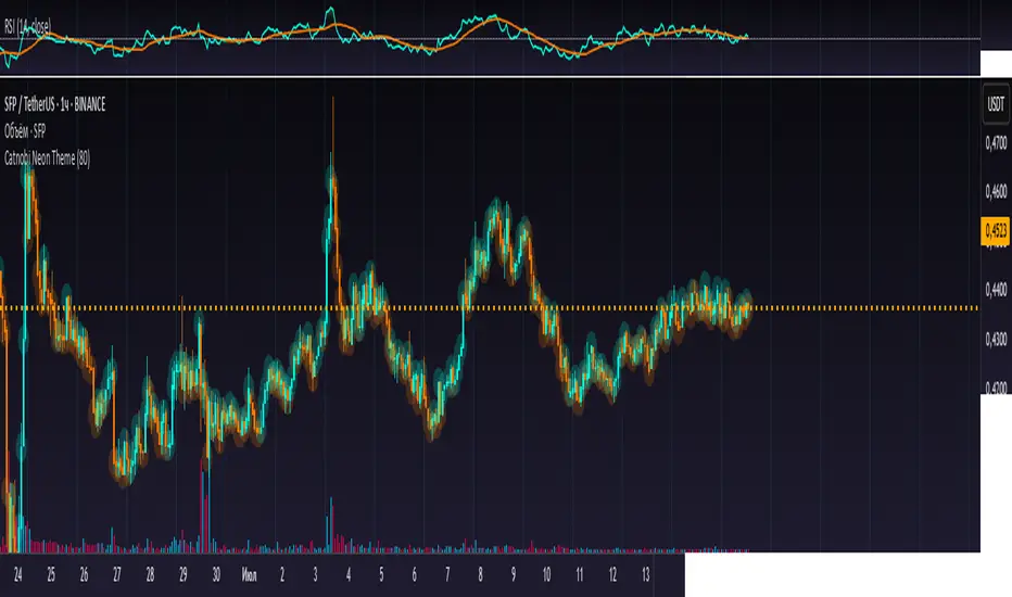
Catnobi Neon ThemeCatnobi Neon Theme 80 — A Purely Visual Candle-Glow Overlay (Open-Source)
What the script does
Catnobi Neon Theme 80 swaps the regular candle view for a vivid neon-glow style:
Candles (body + wicks) show up in bright turquoise when the bar closes up and in bright amber when it closes down.
Glow halo A soft, semi-transparent outline surrounds every candle, giving the impression of neon light.
Volume histogram Bars use the same palette as the candles so the entire chart keeps a consistent, cyber-punk colour scheme.
The script contains no trading signals, alerts, or calculations—it is purely decorative.
How it works (high-level)
Dual plot() technique – Each candle is drawn twice:
an enlarged, low-opacity outline creates the halo;
a second, normal-width layer renders the actual candle.
plotcandle() core – Price is still displayed with Pine’s built-in candle plotting, so the visual effect never distorts OHLC values.
Volume overlay – A simple plot() of volume with the same colour map keeps chart styling unified.
Because only basic Pine primitives are used, the script is light on resources and responsive even on lower-end machines.
Inputs / Settings
Input name Purpose Range / type Default
Theme Pick one of five curated colour sets 1 – 5 3
Glow width Thickness of the halo line (pixels) 1 – 10 4 px
Glow opacity Halo transparency 0 – 100 % 70 %
Hide volume Toggle neon volume bars true/false false
All colours are defined in HSL space, so you can easily tweak hues without losing contrast.
How to use it
Switch to a dark chart background – The glow effect is optimised for dark hex #0e0e0e, but any dark theme works.
Add Catnobi Neon Theme 80 as an overlay indicator.
(Optional) Hide the native candles via Chart settings ▸ Symbol ▸ Bar color opacity = 0 %.
Experiment with Theme, Glow width, and Glow opacity until the style matches your preference.
Why it qualifies for publication
Open-source – Code is fully visible, so the script does not fall under the “closed-source needs unique logic” rule.
Originality is visual, not trading – There are many indicator strategies, but very few lightweight, purely aesthetic glow overlays that rely solely on stock Pine functions.
Clear description – Users know exactly what to expect (no hidden buy/sell logic) and how the glow is generated.
MIT License
This script is released under the MIT licence. Feel free to fork, adapt, or redistribute—just keep the original author attribution somewhere in your code header.
The script is intended for traders who enjoy a cyber-punk vibe on their charts without compromising clarity or performance. Happy glowing!
20 EMA Envelope with Editable %Its Ema envelope with editable feature of EMA and % of EMA how much one want deviation from EMA.

SPY and QQQ Ratio it shows live SPY-ES and QQQ-NQ conversion ratio. it pulls sthe data from API and does the conversion automatically ...................................................................................................................................................


SPY-ES & QQQ-NQ Live Ratiothis shows the live ratios of SPY and QQQs o you can easily convert them into ES and NQ levels

Volumetric Compressed MAVCMA uses the compressor and weighted stdev functions originally translated to pine by @gorx1. Compressor is usually used in audio to avoid clipping of certain frequencies. The original idea is actually pretty simple:
ma(simple string smt, float src, simple int len) =>
switch smt
'RMA' => ta.rma(src, len)
'SMA' => ta.sma(src, len)
'EMA' => ta.ema(src, len)
'WMA' => ta.wma(src, len)
'HMA' => ta.hma(src, len)
'LSMA' => ta.linreg(src, len, 0)
=> na
compressor(float in_1, simple int len, simple int thresh_dn_m, simple int thresh_up_m) =>
data = math.log(math.abs(in_1))
loc = ta.wma(data, len)
dev = wstdev(data, len)
thresh_dn = loc + dev * thresh_dn_m
thresh_up = loc + dev * thresh_up_m
math.exp(math.min(math.max(data, thresh_up), thresh_dn)) - math.exp(thresh_up)
compressed_out = compressor(volume, len_window, up_thresh, down_thresh)
comp_ma = ma(ma_type, close * compressed_out, len_ml) / ma(ma_type, compressed_out, len_ml)
vwma = ma(ma_type, close, len_window)
We get the ratio of the compressed volume calculation and plot it with the base MA. Base MA's length is determined by window size input compared to ML length that is used for compressed version.
This provides us another possible confirmation indicator that can be used to take advantage of volume ranges. Autmated crossover alerts are also added. A reminder is that this kind of indicators should not be used on it's own for trading but rather should be used as a confirmation along with your trend detection and main entry indicators to provide additional confluence.

Range Breakout [sgbpulse]Range Breakout
1. Overview
The "Range Breakout " indicator is a powerful tool designed to identify and visually display price ranges on your chart using pivot points. It dynamically draws two distinct boxes – an External Range and an Internal Range – helping traders pinpoint potential support and resistance zones. Beyond its visual representation, the indicator offers a comprehensive set of 12 unique breakout alerts, providing real-time notifications for significant price movements outside these defined ranges. Additionally, it integrates RSI and MFI metrics for momentum confirmation.
2. How It Works
The indicator operates by identifying pivot points based on user-defined "left" and "right" bar lengths. A high pivot is a bar with a specified number of lower highs both to its left and right, and similarly for a low pivot.
External Range: Calculated using longer pivot lengths (default: 15 bars left, 6 bars right). This range represents broader, more significant price consolidation areas.
Internal Range: Calculated using shorter pivot lengths (default: 4 bars left, 3 bars right). This range captures tighter, more immediate price consolidations within the broader trend.
The External Range will always be greater than or equal to the Internal Range, as it's based on a wider historical context. Both ranges are displayed as transparent boxes on your chart, dynamically adjusting as new pivots are formed.
3. Key Features and Settings
Customizable Pivot Lengths:
External Range (Left/Right Bars): Adjust sensitivity for identifying the broader price range. Longer lengths lead to more stable, but less frequent, range updates.
Internal Range (Left/Right Bars): Adjust sensitivity for the tighter, more immediate price range.
Tool Tips: Minimum 6 bars for the External Range, and minimum 2 bars for the Internal Range.
Customizable Range Colors: Easily change the background colors of the External and Internal Range boxes to match your chart's aesthetic.
Dynamic Range Display: The indicator automatically updates the range boxes as new pivot highs and lows are formed, always presenting the most current valid ranges.
RSI / MFI Settings:
Timeframe Source: Select the timeframe for RSI and MFI calculation.
- Chart: Calculation based on the current chart timeframe.
- Daily: Always calculated based on the daily ("D") timeframe, even if the chart is on a lower timeframe.
RSI Length: Period length for RSI calculation (default: 14).
RSI Overbought Level: Overbought level for RSI (default: 70.0).
RSI Oversold Level: Oversold level for RSI (default: 30.0).
MFI Length: Period length for MFI calculation (default: 14).
MFI Overbought Level: Overbought level for MFI (default: 80.0).
MFI Oversold Level: Oversold level for MFI (default: 20.0).
4. Synergy of Ranges & Breakout Strength
The interaction between the External and Internal Ranges provides deep insights into price movement and breakout strength:
Immediate Direction: The movement of the Internal Range (up or down) indicates the short-term directional bias within the broader framework of the External Range.
Strength Confirmation: A breakout of the External Range, followed by a breakout of the Internal Range, confirms the strength of the move and increases confidence in the breakout.
Strong Momentum ("Leaving" Ranges Behind): When price breaks out with exceptionally strong momentum, it continues to move aggressively and does not immediately form new pivots. In such situations, the existing ranges (External and Internal) remain in place while the candles "leave them behind." A "Full Candle" breakout, where the entire candle moves past both ranges, indicates a particularly powerful and decisive move.
Momentum (RSI / MFI) as Confirmation:
- RSI (Relative Strength Index): Measures the speed and change of price movements. Extreme values (above 70 or below 30) indicate overbought/oversold conditions respectively, confirming strong momentum in a breakout.
- MFI (Money Flow Index): Similar to RSI but incorporates volume. Extreme values (above 80 or below 20) indicate strong money flow in/out, reinforcing breakout confirmation.
- Importance of Confirmation: If a breakout occurs but momentum indicators do not confirm it (for example, an upside breakout while RSI is declining), this could signal weakness in the move and the risk of a false breakout (Fakeout).
5. Visuals
The indicator provides clear visual representations on the chart:
Range Boxes:
Two dynamic boxes are drawn on the chart: one for the External Range and one for the Internal Range.
These boxes update continuously, displaying the current range boundaries based on the latest pivots. They provide an immediate visual indication of support and resistance levels.
RSI/MFI Status Labels:
Small text labels appear to the right of the current bar, vertically centered.
They display the status of RSI and MFI: RSI OB (Overbought), RSI OS (Oversold), MFI OB, MFI OS, along with the exact value.
Important: The labels remain on the chart as long as the condition holds (indicator is above/below the level), unlike alerts which mark a singular crossover event.
Plotting of Key Values:
The indicator plots six invisible series on the chart, primarily to allow the user to view the exact numerical values of:
- The upper and lower bounds of the External Range (External High, External Low).
- The upper and lower bounds of the Internal Range (Internal High, Internal Low).
- The calculated RSI and MFI values (RSI, MFI).
These values are accessible for viewing through TradingView's Data Window and also via the Status Line when hovering over the relevant candle. This enables more precise quantitative analysis of range levels and momentum.
6. Comprehensive Breakout Alerts
The "Range Breakout " indicator provides 12 distinct alert conditions for breakouts, allowing you to select the required level of confirmation for each alert. All alerts are triggered only upon a fully confirmed bar close (barstate.isconfirmed) to minimize false signals and ensure reliability.
All breakout alerts are configured to detect a Crossover/Crossunder of the levels, meaning a specific event where the price moves from one side of the range to the other.
External Range Breakout UP
- Close: Price closes above the External Range.
- Real Body: The entire "real body" of the candle (min of open/close prices) closes above the External Range.
- Full Candle: The entire candle (the lowest point of the candle) closes above the External Range.
External Range Breakout DOWN
- Close: Price closes below the External Range.
- Real Body: The entire "real body" of the candle (max of open/close prices) closes below the External Range.
- Full Candle: The entire candle (the highest point of the candle) closes below the External Range.
Internal Range Breakout UP
- Close: Price closes above the Internal Range.
- Real Body: The "real body" of the candle closes above the Internal Range.
- Full Candle: The entire candle closes above the Internal Range.
Internal Range Breakout DOWN
- Close: Price closes below the Internal Range.
- Real Body: The "real body" of the candle closes below the Internal Range.
- Full Candle: The entire candle closes below the Internal Range.
7. Ideal Use Cases
This indicator is ideal for traders who:
Want to clearly identify and monitor price consolidation zones.
Seek confirmation for breakout strategies across various timeframes.
Require reliable and automated alerts for potential entry or exit points based on range expansion.
8. Complementary Indicator
For even more comprehensive market analysis, we highly recommend using this indicator in conjunction with Market Structure Support & Resistance External/Internal & BoS .
This powerful complementary indicator automatically and accurately identifies significant support and resistance levels by locating high and low pivot points, as well as key Pre-Market High/Low levels. Its strength lies in its dynamic adaptability to any timeframe and asset, providing precise and relevant real-time levels while maintaining a clean chart. It also identifies Break of Structure (BoS) to signal potential trend changes or continuations.
Using both indicators together provides a robust framework for identifying defined ranges and potential trend shifts, enabling more informed trading decisions.
View Market Structure Support & Resistance External/Internal & BoS Indicator
9. Important Note: Trading Risk
This indicator is intended for educational and informational purposes only and does not constitute investment advice or a recommendation for trading in any form whatsoever.
Trading in financial markets involves significant risk of capital loss. It is important to remember that past performance is not indicative of future results. All trading decisions are your sole responsibility. Never trade with money you cannot afford to lose.
Vùng đỉnh đáy chính + Bob Volman (Dữ liệu H1)This indicator combines two powerful components into one tool designed for traders who rely on multi-timeframe structure and price action:
🔹 1. H1 Break-Based Swing Zone Detection
Identifies key swing highs and lows based on H1 "break candle" logic — where a candle closes beyond the wick of the previous candle.
When a previous high or low is broken, a new range is drawn and trend context is updated:
🟢 Uptrend = price breaks above key high → green range
🔴 Downtrend = price breaks below key low → red range
⚪ Neutral = no new break → white range
Key swing points are marked with minimal dot labels on the chart for quick structure recognition.
🔹 2. Bob Volman-Style EMAs & Engulfing Signals (from H1)
Applies EMA 15, 21, and 35 from the H1 timeframe to reflect market bias and volatility.
Highlights the area between EMA 15 and EMA 35 with a colored fill to visualize momentum:
Green = bullish bias
Red = bearish bias
Detects classic Bullish and Bearish Engulfing Candles on H1 and marks them with arrows:
🔽 Red arrow = bearish engulfing
🔼 Green arrow = bullish engulfing

PRO-ZLMA RSI MACD [XAUUSD]Effective Scalping Strategy for XAUUSDStrategy LogicZLMA to catch reversals early but smoothlyEMA 200 as a trend filter (confirms Long/Short more accurately)RSI filters overbought/oversold price areasMACD confirms momentumoptimize and analyze your indicator strategy — aiming for the highest profits across various time frames (1M, 5M, 30M, 1H, 4H, 1D) when trading XAU/USD:

High-Low Range % – poslední 2 periodyHere’s a ready-to-use **English description** for publishing your script on TradingView:
---
## 📈 **High-Low Range % – Last 2 Periods**
This indicator calculates and visualizes the **percentage range** between the **High and Low** of the last **two closed periods** (daily, weekly, or monthly – user selectable).
### 🔍 Features:
* Displays the **High–Low range in %** for each of the **two most recent completed candles**.
* **Highlights** the range label if it exceeds a user-defined threshold (e.g., 10%).
* Allows switching between **daily, weekly, or monthly** timeframe bases.
* User controls for:
* Range threshold
* Label color (normal and highlighted)
* Label text size
* Vertical label offset above the High
### ⚙️ Inputs:
* **Timeframe**: Select between `"D"`, `"W"`, or `"M"` to define the range period.
* **Threshold (%)**: If the range exceeds this value, the label changes color.
* **Highlight Color**: Color for ranges above the threshold.
* **Normal Color**: Color for ranges below the threshold.
* **Text Size**: Tiny → Huge label size.
* **Offset**: Distance in ticks to place the label above the period's High.
### 🖼 Visual Output:
* A label placed **just above the High** of the respective candle.
* High and Low levels of the selected period are plotted as horizontal lines.
* Only the **two most recent closed periods** are displayed to keep the chart clean.
---
Let me know if you'd also like a **screenshot description** or **tags** for publication (e.g., `volatility`, `range`, `BTC`, `weekly`, etc.).

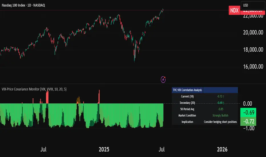
VIX-Price Covariance MonitorThe VIX-Price Covariance Monitor is a statistical tool that measures the evolving relationship between a security's price and volatility indices such as the VIX (or VVIX).
It can give indication of potential market reversal, as typically, volatility and the VIX increase before markets turn red,
This indicator calculates the Pearson correlation coefficient using the formula:
ρ(X,Y) = cov(X,Y) / (σₓ × σᵧ)
Where:
ρ is the correlation coefficient
cov(X,Y) is the covariance between price and the volatility index
σₓ and σᵧ are the standard deviations of price and the volatility index
Enjoy!
Features
Dual Correlation Periods: Analyze both short-term and long-term correlation trends simultaneously
Adaptive Color Coding: Correlation strength is visually represented through color intensity
Market Condition Assessment: Automatic interpretation of correlation values into actionable market insights
Leading/Lagging Analysis: Optional time-shift analysis to detect predictive relationships
Detailed Information Panel: Real-time statistics including current correlation values, historical averages, and trading implications
Interpretation
Positive Correlation (Red): Typically bearish for price, as rising VIX correlates with falling markets. This is what traders should be looking for.
Negative Correlation (Green): Typically bullish for price, as falling VIX correlates with rising markets
How to use it
Apply the indicator to any chart to see its correlation with the default VIX index
Adjust the correlation length to match your trading timeframe (shorter for day trading, longer for swing trading)
Enable the secondary correlation period to compare different timeframes simultaneously
For advanced analysis, enable the Leading/Lagging feature to detect if VIX changes precede or follow price movements
Use the information panel to quickly assess the current market condition and potential trading implications
Simple ## User Guide for the Simple
I. Indicator Philosophy
This indicator is not a simple system that provides only one type of signal. It is an advanced tool that analyzes the market using three independent "engines," each specializing in detecting a different type of trading opportunity. Its goal is to identify high-probability setups by filtering out market noise.
II. Legend – What You See on the Chart
Before we proceed to the signals, you need to understand what each visual element represents:
Orange Line (200 EMA): This is the main, long-term trend indicator. It acts like a river – if the price flows above it, we look for buying opportunities (LONG). If it's below, we look for selling opportunities (SHORT).
The Ribbon (green/red): Represents short-term momentum and acts as a dynamic support/resistance zone. A green ribbon suggests buying strength, while a red one suggests selling pressure.
Kijun-sen Line (blue/red): This is the medium-term "center of gravity" of the market. It shows the price equilibrium. Its position relative to the price and the ribbon is crucial for many signals.
Gray Background: This is a "NO-TRADE ZONE." It appears when the ADX indicator shows that the market is in consolidation and lacks a clear trend. Most signals are ignored in these areas.
## III. The Three Signal Engines – When to Consider a Position
The indicator generates three different types of signals, each with its own characteristics and risk profile.
1. LONG / SHORT Labels (The Pullback Engine - Conservative)
Character: Safe, conservative, trend-following. Appears the least frequently.
How it works: It looks for ideal, "textbook" conditions. For a LONG signal, all indicators must be in full alignment (price > ribbon > Kijun > orange line), the trend must be strong (high ADX), AND the price must make a pullback to the ribbon and then bounce off it.
When to consider a position: When you see this signal, you are entering a well-developed, healthy trend. It's a high-probability entry, but often not at the very beginning of the move. Ideal for traders who value safety.
2. 🔵 / 🟣 Circles (The Squeeze Engine - Moderate)
Character: Moderately aggressive, looks for the beginning of a new, dynamic move.
How it works: It searches for periods of consolidation and low volatility (when the market is "gathering energy"). The signal (a circle) appears at the moment the price breaks out of this consolidation, and the direction of the breakout is confirmed by the Kijun-sen line.
When to consider a position: When you see the price has been moving sideways for a while, and then a circle appears. This is a sign that the consolidation phase has likely ended and a new impulse is beginning. Ideal for catching "fresh" moves.
3. ⚡ Lightning Bolt (The Reversal Engine - Aggressive)
Character: Aggressive, contrarian, attempts to catch sharp reversals. This is the riskiest signal.
How it works: It ignores most of the trend filters. Its sole purpose is to find a moment where the price, after a sharp and overextended move in one direction, suddenly reverses on a strong candle with high volume.
When to consider a position: When you want to take a risk to catch the very bottom (V-bottom) or top (V-top). This signal requires the most experience. It is recommended to only take it when it appears near a significant, horizontal support or resistance level. Never take it "in a vacuum."
IV. Summary and Practical Strategy
Signal
Signal Type
Character
Ideal Market Conditions
LONG/SHORT
Pullback Entry
Conservative
A strong, developed, and healthy trend.
🔵/🟣
Squeeze Breakout
Moderate
The end of a sideways move, the beginning of a new impulse.
⚡
Sharp Reversal
Aggressive
Market panic, oversold/overbought conditions at a key S/R level.
Eksportuj do Arkuszy
