MTF_MA RibbonThis script plots a ribbon of Moving Averages for Daily, Weekly and Monthly timeframes and helps in Multi-timeframe analysis of securities for swing & positional trades. once applied to chart, the moving averages change automatically according to the selected timeframe.
Following are the default moving averages :
Daily TF EMAs: 5D, 10D, 20D
Daily TF SMAs: 50D, 100D, 150D, 200D
Weekly TF SMAs: 10W, 20W, 30W, 40W
Monthly TF SMAs: 3M, 5M, 8M, 11M
Indicators and strategies


Momentum SNR VIP [INDICATOR ONLY]//@version=6
indicator("Momentum SNR VIP ", overlay=true)
// === Inputs ===
lookback = input.int(20, "Lookback for S/R", minval=5)
rr_ratio = input.float(2.0, "Risk-Reward Ratio", minval=0.5, step=0.1)
// === SNR Detection ===
pivotHigh = ta.pivothigh(high, lookback, lookback)
pivotLow = ta.pivotlow(low, lookback, lookback)
supportZone = not na(pivotLow)
resistanceZone = not na(pivotHigh)
plotshape(supportZone, title="Support", location=location.belowbar, color=color.blue, style=shape.triangleup, size=size.tiny)
plotshape(resistanceZone, title="Resistance", location=location.abovebar, color=color.red, style=shape.triangledown, size=size.tiny)
// === Price Action ===
bullishEngulfing = close < open and close > open and close > open and open <= close
bearishEngulfing = close > open and close < open and close < open and open >= close
bullishPinBar = close < open and (low - math.min(open, close)) > 1.5 * math.abs(close - open)
bearishPinBar = close > open and (high - math.max(open, close)) > 1.5 * math.abs(close - open)
buySignal = supportZone and (bullishEngulfing or bullishPinBar)
sellSignal = resistanceZone and (bearishEngulfing or bearishPinBar)
// === SL & TP ===
buySL = low - 10
buyTP = close + (close - buySL) * rr_ratio
sellSL = high + 10
sellTP = close - (sellSL - close) * rr_ratio
// === Plot Signals
plotshape(buySignal, title="Buy Signal", location=location.belowbar, color=color.green, style=shape.labelup, text="BUY")
plotshape(sellSignal, title="Sell Signal", location=location.abovebar, color=color.red, style=shape.labeldown, text="SELL")
plot(buySignal ? buySL : na, title="Buy SL", color=color.red, style=plot.style_linebr, linewidth=1)
plot(buySignal ? buyTP : na, title="Buy TP", color=color.green, style=plot.style_linebr, linewidth=1)
plot(sellSignal ? sellSL : na, title="Sell SL", color=color.red, style=plot.style_linebr, linewidth=1)
plot(sellSignal ? sellTP : na, title="Sell TP", color=color.green, style=plot.style_linebr, linewidth=1)
// === Labels (Fixed)
if buySignal
label.new(x=bar_index, y=buySL, text="SL : " + str.tostring(buySL, "#.00"), style=label.style_label_down, color=color.red, textcolor=color.white)
label.new(x=bar_index, y=buyTP, text="TP 1 : " + str.tostring(buyTP, "#.00"), style=label.style_label_up, color=color.green, textcolor=color.white)
if sellSignal
label.new(x=bar_index, y=sellSL, text="SL : " + str.tostring(sellSL, "#.00"), style=label.style_label_up, color=color.red, textcolor=color.white)
label.new(x=bar_index, y=sellTP, text="TP 1 : " + str.tostring(sellTP, "#.00"), style=label.style_label_down, color=color.green, textcolor=color.white)
// === Alerts
alertcondition(buySignal, title="Buy Alert", message="🟢 BUY at Support Zone + Price Action")
alertcondition(sellSignal, title="Sell Alert", message="🟡 SELL at Resistance Zone + Price Action")

💼 Momentum SNR VIP//@version=5
indicator("Momentum", overlay=true)
// === SNR Detection ===
lookback = input.int(20, "Lookback for S/R", minval=5)
pivotHigh = ta.pivothigh(high, lookback, lookback)
pivotLow = ta.pivotlow(low, lookback, lookback)
// Plot SNR Zones
plotshape(pivotHigh, title="Resistance", location=location.abovebar, color=color.red, style=shape.triangledown, size=size.small)
plotshape(pivotLow, title="Support", location=location.belowbar, color=color.blue, style=shape.triangleup, size=size.small)
// === Price Action Detection ===
// Bullish Engulfing
bullishEngulfing = close < open and close > open and close > open and open <= close
// Bearish Engulfing
bearishEngulfing = close > open and close < open and close < open and open >= close
// Pin Bar Bullish
bullishPinBar = close > open and (low - math.min(open, close)) > 1.5 * (math.abs(close - open))
// Pin Bar Bearish
bearishPinBar = close < open and (math.max(open, close) - high) > 1.5 * (math.abs(close - open))
// === Combined Signal at SNR ===
supportZone = not na(pivotLow)
resistanceZone = not na(pivotHigh)
buySignal = (bullishEngulfing or bullishPinBar) and supportZone
sellSignal = (bearishEngulfing or bearishPinBar) and resistanceZone
// Plot Buy/Sell Arrows
plotshape(buySignal, title="Buy Signal", location=location.belowbar, color=color.green, style=shape.labelup, text="BUY")
plotshape(sellSignal, title="Sell Signal", location=location.abovebar, color=color.red, style=shape.labeldown, text="SELL")
// === SL & TP Calculation ===
rr_ratio = input.float(2.0, "Risk Reward Ratio", minval=0.5, step=0.5)
buySL = low
buyTP = close + (close - low) * rr_ratio
sellSL = high
sellTP = close - (high - close) * rr_ratio
plot(buySignal ? buySL : na, title="Buy SL", color=color.red, style=plot.style_linebr, linewidth=1)
plot(buySignal ? buyTP : na, title="Buy TP", color=color.green, style=plot.style_linebr, linewidth=1)
plot(sellSignal ? sellSL : na, title="Sell SL", color=color.red, style=plot.style_linebr, linewidth=1)
plot(sellSignal ? sellTP : na, title="Sell TP", color=color.green, style=plot.style_linebr, linewidth=1)
// === Alerts ===
alertcondition(buySignal, title="Buy Alert", message="GOLD: Potential BUY @ SNR Zone + Price Action")
alertcondition(sellSignal, title="Sell Alert", message="GOLD: Potential SELL @ SNR Zone + Price Action")

H IchimokuIchimoku Kinko Hyo (commonly called the Ichimoku Cloud) is a comprehensive technical analysis indicator developed by Japanese journalist Goichi Hosoda in the 1960s. Its name translates to “one glance equilibrium chart,” reflecting the tool’s purpose: to provide a quick, holistic view of market trend, momentum, and support/resistance levels.
The Ichimoku Cloud consists of five main components:
Tenkan-sen (Conversion Line): The average of the highest high and lowest low over the past 9 periods.
Kijun-sen (Base Line): The average of the highest high and lowest low over the past 26 periods.
Senkou Span A (Leading Span A): The average of the Tenkan-sen and Kijun-sen, plotted 26 periods ahead.
Senkou Span B (Leading Span B): The average of the highest high and lowest low over the past 52 periods, plotted 26 periods ahead.
Chikou Span (Lagging Span): The current closing price plotted 26 periods back.
The area between Senkou Span A and B forms the “cloud” (Kumo), which visually highlights key support and resistance zones. Prices above the cloud indicate an uptrend, below the cloud a downtrend, and within the cloud a consolidating or neutral market.
Ichimoku is valued for its ability to provide a broad, forward-looking perspective on price action, helping traders identify trends, momentum, and potential reversal points at a glance.

Dynamic VWAP: Fair Value & Divergence SuiteDynamic VWAP: Fair Value & Divergence Suite
Dynamic VWAP: Fair Value & Divergence Suite is a comprehensive tool for tracking contextual valuation, overextension, and potential reversal signals in trending markets. Unlike traditional VWAP that anchors to the start of a session or a fixed period, this indicator dynamically resets the VWAP anchor to the most recent swing low. This design allows you to monitor how far price has extended from the most recent significant low, helping identify zones of potential profit-taking or reversion.
Deviation bands (standard deviations above the anchored VWAP) provide a clear visual framework to assess whether price is in a fair value zone (±1σ), moderately extended (+2σ), or in zones of extreme extension (+3σ to +5σ). The indicator also highlights contextual divergence signals, including slope deceleration, weak-volume retests, and deviation failures—giving you actionable confluence around potential reversal points.
Because the anchor updates dynamically, this tool is particularly well suited for trend-following assets like BTC or stocks in sustained moves, where price rarely returns to deep negative deviation zones. For this reason, the indicator focuses on upside extension rather than symmetrical reversion to a long-term mean.
🎯 Key Features
✅ Dynamic Swing Low Anchoring
Continuously re-anchors VWAP to the most recent swing low based on your chosen lookback period.
Provides context for trend progression and overextension relative to structural lows.
✅ Standard Deviation Bands
Plots up to +5σ deviation bands to visualize levels of overextension.
Extended bands (+3σ to +5σ) can be toggled for simplicity.
✅ Conditional Zone Fills
Colored background fills show when price is inside each valuation zone.
Helps you immediately see if price is in fair value, moderately extended, or highly stretched territory.
✅ Divergence Detection
VWAP Slope Divergence: Flags when price makes a higher high but VWAP slope decelerates.
Low Volume Retest: Highlights weak re-tests of VWAP on low volume.
Deviation Failure: Identifies when price reverts back inside +1σ after closing beyond +3σ.
✅ Volume Fallback
If volume is unavailable, uses high-low range as a proxy.
✅ Highly Customizable
Adjust lookbacks, show/hide extended bands, toggle fills, and enable or disable divergences.
🛠️ How to Use
Identify Buy and Sell Zones
Price in the fair value band (±1σ) suggests equilibrium.
Reaching +2σ to +3σ signals increasing overextension and potential areas to take profits.
+4σ to +5σ zones can be used to watch for exhaustion or mean-reversion setups.
Monitor Divergence Signals
Use slope divergence and deviation failures to look for confluence with overextension.
Low volume retests can flag rallies lacking conviction.
Adapt Swing Lookback
30–50 bars: Faster re-anchoring for swing trading.
75–100 bars: More stable anchors for longer-term trends.
🧭 Best Practices
Combine the anchored VWAP with higher timeframe structure.
Confirm signals with other tools (momentum, volume profiles, or trend filters).
Use extended deviation zones as context, not as standalone signals.
⚠️ Disclaimer
This script is for educational and informational purposes only. It does not constitute financial advice or a recommendation to buy or sell any security or asset. Always do your own research and consult a qualified financial professional before making any trading decisions. Past performance does not guarantee future results.
VWAP SlopePositive (green) bars mean today’s (or this interval’s) VWAP is higher than the prior one → volume‐weighted average price is drifting up → bullish flow.
Negative (red) bars mean VWAP is lower than before → volume is skewed to sellers → bearish flow.
Bar height shows how much VWAP has shifted, so taller bars = stronger conviction.
Why it’s useful:
It gives you a real-time read on whether institutions are consistently buying at higher prices or selling at lower prices.
Use it as a bias filter: for shorts you want to see red bars (VWAP down-slope) at your entry, and for longs green bars (VWAP up-slope).
Because it updates tick-by-tick (or per bar), you get a live snapshot of volume-weighted momentum on top of your price‐action and oscillator signals.


Quarterly Revenue & Growthinspired by TrendSpider. Monitoring a company's earning revenue quarter by quarter.


OBV-ROC Tilson Trend (Delta Toggle)IT Tracks Change between one fast OBV and One Slow OBV. Best for trend cfolowing.

Gattsreal EMASummary
The Gattsreal EMA indicator is a complete technical analysis tool designed to provide a clear and immediate view of the market trend and momentum across multiple timeframes. It combines long-term Exponential Moving Averages (EMAs) with a short-term EMA "ribbon," allowing traders to quickly identify the direction of the main trend and the strength of short-term movements.
Indicator Components
The Gattsreal EMA is composed of two main elements, both fully customizable:
Long-Term EMAs (Thick Lines):
EMA 200 (White): Considered the definitive line between a bull market and a bear market. Prices above the 200 EMA are generally considered to be in a long-term uptrend.
EMA 50 (Blue): An important medium-term trend line, often used as a dynamic level of support or resistance.
Short-Term EMA Ribbon:
Consists of a set of 9 EMAs (periods 9, 10, 15, 20, 25, 30, 35, 40, and 45).
The "ribbon" expands when volatility increases and contracts when volatility decreases.
The color of the ribbon's fill changes to indicate short-term momentum:
Green: The ribbon is in an uptrend (fastest EMA above the slowest), suggesting buying pressure.
Red: The ribbon is in a downtrend (fastest EMA below the slowest), suggesting selling pressure.
How to Use the Indicator
The Gattsreal EMA can be used in various ways to enhance your analysis and decision-making:
Main Trend Identification: The price's position relative to the 200 and 50 EMAs helps define your operational bias. It is preferable to trade in the direction of the main trend.
Entry and Exit Signals: The crossing of the price through the EMA ribbon can be used as a signal. For example, when the price crosses and closes above the entire ribbon and it turns green, it can be a buy signal.
Momentum Confirmation: The color and expansion of the ribbon serve as excellent confirmation of the strength of a move. A green and expanding ribbon confirms strong bullish momentum.
Dynamic Support and Resistance: All 11 EMAs can act as dynamic levels of support (in an uptrend) or resistance (in a downtrend).
This indicator is a powerful tool for traders of all levels looking for a visual and effective way to analyze market trends.

BANKNIFTY Contribution Table [GSK-VIZAG-AP-INDIA]1. Overview
This indicator provides a real-time visual contribution table of the 12 constituent stocks in the BANKNIFTY index. It displays key metrics for each stock that help traders quickly understand how each component is impacting the index at any given moment.
2. Purpose / Trading Use Case
The tool is designed for intraday and short-term traders who rely on index movement and its internal strength or weakness. By seeing which stocks are contributing positively or negatively, traders can:
Confirm trend strength or divergence within the index.
Identify whether a BANKNIFTY move is broad-based or driven by a few heavyweights.
Detect reversals when individual components decouple from index direction.
3. Key Features and Logic
Live LTP: Current price of each BANKNIFTY stock.
Price Change: Difference between current LTP and previous day’s close.
% Change: Percentage move from previous close.
Weight %: Static weight of each stock within the BANKNIFTY index (user-defined).
This estimates how much each stock contributes to the BANKNIFTY’s point change.
Sorted View: The stocks are sorted by their weight (descending), so high-impact movers are always at the top.
4. User Inputs / Settings
Table Position (tableLocationOpt):
Choose where the table appears on the chart:
top_left, top_right, bottom_left, or bottom_right.
This helps position the table away from your price action or indicators.
5. Visual and Plotting Elements
Table Layout: 6 columns
Stock | Contribution | Weight % | LTP | Change | % Change
Color Coding:
Green/red for positive/negative price changes and contributions.
Alternating background rows for better visibility.
BANKNIFTY row is highlighted separately at the top.
Text & Background Colors are chosen for both readability and direction indication.
6. Tips for Effective Use
Use this table on 1-minute or 5-minute intraday charts to see near real-time market structure.
Watch for:
A few heavyweight stocks pulling the index alone (can signal weak internal breadth).
Broad green/red across all rows (signals strong directional momentum).
Combine this with price action or volume-based strategies for confirmation.
Best used during market hours for live updates.
7. What Makes It Unique
Unlike other contribution tables that show only static data or require paid feeds, this script:
Updates in real time.
Uses dynamic calculated contributions.
Places BANKNIFTY at the top and presents the entire internal structure clearly.
Doesn’t repaint or rely on lagging indicators.
8. Alerts / Additional Features
No alerts are added in this version.
(Optional: Alerts can be added to notify when a certain stock contributes above/below a threshold.)
9. Technical Concepts Used
request.security() to pull both 1-minute and daily close data.
Conditional color formatting based on price change direction.
Dynamic table rendering using table.new() and table.cell().
Static weights assigned manually for BANKNIFTY stocks (can be updated if index weights change).
10. Disclaimer
This script is intended for educational and informational purposes only. It does not constitute financial advice or a buy/sell recommendation.
Users should test and validate the tool on paper or demo accounts before applying it to live trading.
📌 Note: Due to internet connectivity, data delays, or broker feeds, real-time values (LTP, change, contribution, etc.) may slightly differ from other platforms or terminals. Use this indicator as a supportive visual tool, not a sole decision-maker.
Script Title: BANKNIFTY Contribution Table -
Author: GSK-VIZAG-AP-INDIA
Version: Final Public Release

Wave 2 Flat Detection - B Breaks A High, C Breaks A Low//@version=5
indicator("Wave 2 Flat Detection - B Breaks A High, C Breaks A Low", overlay=true)
// === Parameters ===
wave1_len = 10 // length of wave 1
a_len = 5 // candles to look for Wave A
b_len = 3 // candles to look for Wave B
c_len = 3 // candles to look for Wave C
// === Detect Wave 1 (upward impulse) ===
wave1_start = low
wave1_end = high
wave1_valid = wave1_end > wave1_start * 1.05 // 5% move up
// === Wave A ===
a_start = high // assumed wave 1 top
a_end = low // correction low (Wave A end)
wave_a_valid = a_end < a_start
// === Wave B ===
b_high = high
wave_b_valid = b_high > a_start // B breaks above A's high
// === Wave C ===
c_low = low
wave_c_break = c_low < a_end // C breaks below A's low
// === Final Condition ===
flat_pattern_confirmed = wave1_valid and wave_a_valid and wave_b_valid and wave_c_break
// === Plot + Alert ===
plotshape(flat_pattern_confirmed, title="Flat Wave 2 Detected", location=location.belowbar, color=color.red, style=shape.labelup, text="C↓")
alertcondition(flat_pattern_confirmed, title="Wave C Breaks Below A", message="Wave C broke below Wave A low — Flat correction confirmed, watch for Wave 3")


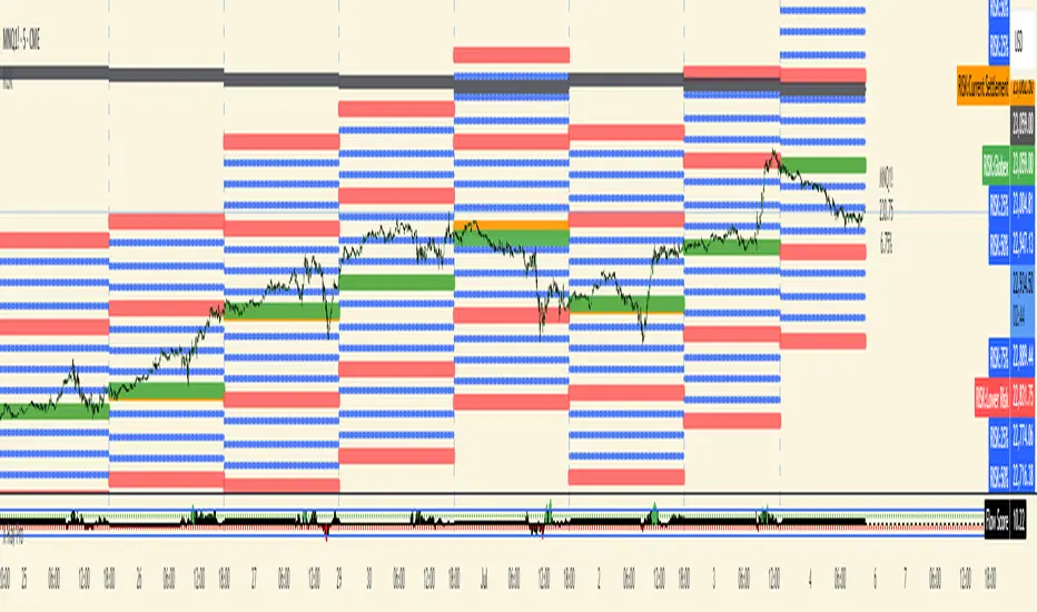
RISK## Main Purpose
The indicator calculates and displays risk levels based on margin requirements and daily settlement prices, helping traders visualize their potential risk exposure.
## Key Features
**Inputs:**
- **Margin for Calculation**: The CME long margin requirement for the asset
- **HTF Margin Line**: An anchor point for higher timeframe margin calculations
**Core Calculations:**
1. **Settlement Price Tracking**: Captures daily settlement prices during specific session times (6:58-6:59 PM ET for close, 6:00-6:01 PM ET for new day open)
2. **Risk Percentage**: Calculates `margin / (point value × settlement price)` - with special handling for Micro contracts (symbols starting with "M") that uses 10× point value
3. **Risk Intervals**: Determines price intervals representing one margin unit of risk
## Visual Display
The indicator plots multiple risk levels on the chart:
- **Settlement price** (orange circles)
- **Globex open** (green circles)
- **Upper/Lower Risk levels** (red circles) - one and two risk intervals away
- **Subdivision levels** (blue crosses) - 25%, 50%, and 75% of each risk interval
- **MHP+ level** (black crosses) - HTF anchor adjusted by risk percentage
- **HTF Anchor** (black crosses)
## Practical Use
This helps futures traders:
- Visualize how far price can move before hitting margin calls
- See risk levels relative to daily settlements
- Plan position sizing and risk management
- Understand exposure in terms of actual margin requirements
The indicator essentially transforms abstract margin numbers into concrete price levels on the chart, making risk management more visual and intuitive.
Spot Nachkauf-Zonen High TF (RSI + BB)**Spot Buy/Sell Zones High TF Indicator (RSI + Bollinger Bands + Trend & Volume Filters)**
This is an overlay indicator for TradingView that highlights optimal buy and sell areas on a higher timeframe (e.g. Daily, Weekly) while you view a lower timeframe chart. It combines volatility, momentum, trend and volume checks to reduce false signals.
---
### Key Features
* **Higher-Timeframe Calculations**
All indicators (Bollinger Bands, RSI, moving averages, volume) use data from a user-selected timeframe (for example “D” for daily or “W” for weekly).
* **Bollinger Bands**
* Middle line: Simple Moving Average (SMA) over N periods
* Upper/Lower bands: ±M × standard deviation
* Semi-transparent fill between the bands for quick visual reference
* **RSI Momentum**
* Classic 14-period RSI with adjustable overbought (e.g. 70) and oversold (e.g. 30) levels
* **Buy** when RSI crosses up out of oversold and price touches or goes below the lower Bollinger Band
* **Sell** when RSI crosses down out of overbought and price touches or goes above the upper Bollinger Band
* **Trend Filter (Optional)**
* Higher-TF SMA (default 200 periods) plotted in orange
* Signals only fire when price is above the SMA (for buys) or below (for sells) to align with the main trend
* **Volume Filter (Optional)**
* Compares current higher-TF volume against its SMA
* Signals require volume to exceed a user-set multiplier of average volume, ensuring real market participation
* **Visual Signals**
* Green triangles below bars mark buy zones; red triangles above bars mark sell zones
* Light green background highlights active buy areas
* **Built-In Alerts**
* Two alert conditions (“Buy Signal” and “Sell Signal”) ready to be used in TradingView’s Alert dialog
* Customizable alert messages include ticker and timeframe
---
### Inputs
| Setting | Default | Purpose |
| ------------------------- | ------- | ------------------------------------------------ |
| **Calculation Timeframe** | D | Higher timeframe for all calculations |
| **BB Periods** | 20 | Length of SMA for Bollinger middle line |
| **BB Std-Dev Multiplier** | 2.0 | Number of standard deviations for the bands |
| **RSI Periods** | 14 | Length of the RSI calculation |
| **Overbought / Oversold** | 70 / 30 | RSI thresholds for signal generation |
| **Enable Trend Filter** | true | Use higher-TF SMA to confirm trend direction |
| **Trend MA Periods** | 200 | SMA length for the trend filter |
| **Enable Volume Filter** | true | Require above-average volume to validate signals |
| **Volume MA Periods** | 20 | SMA length for volume filter |
| **Volume Multiplier** | 1.2 | How many times above average volume is needed |
---
### How to Use
1. **Add the Script**: Paste the Pine code into TradingView’s Pine Editor and save.
2. **Adjust Settings**: Choose your higher timeframe (“D”, “W”, etc.) and tweak BB, RSI, trend, and volume parameters.
3. **Activate Alerts**: In the Alerts panel, select the “Buy Signal” or “Sell Signal” alert condition.
4. **Interpret Signals**:
* A green triangle + green background = suggested buy zone
* A red triangle = suggested sell zone
This setup gives you clear, rule-based entry and exit areas by filtering noise and confirming market strength on a higher timeframe.

NEXGEN ADXNEXGEN ADX
NEXGEN ADX – Advanced Trend Strength & Directional Indicator
Purpose:
The NEXGEN ADX is a powerful trend analysis tool developed by NexGen Trading Academy to help traders identify the strength and direction of market trends with precision. Based on the Average Directional Index (ADX) along with +DI (Positive Directional Indicator) and –DI (Negative Directional Indicator), this custom indicator provides a reliable foundation for both trend-following strategies and trend reversal setups.

BOS INDICATOR )This indicator is used to mark out breaks of structures to the upside and the downside. It's used to easily determine which direction the market is breaking structure towards.

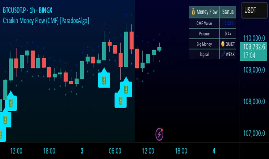
Chaikin Money Flow (CMF) [ParadoxAlgo]OVERVIEW
This indicator implements the Chaikin Money Flow oscillator as an overlay on the price chart, designed to help traders identify institutional money flow patterns. The Chaikin Money Flow combines price and volume data to measure the flow of money into and out of a security, making it particularly useful for detecting accumulation and distribution phases.
WHAT IS CHAIKIN MONEY FLOW?
Chaikin Money Flow was developed by Marc Chaikin and measures the amount of Money Flow Volume over a specific period. The indicator oscillates between +1 and -1, where:
Positive values indicate money flowing into the security (accumulation)
Negative values indicate money flowing out of the security (distribution)
Values near zero suggest equilibrium between buying and selling pressure
CALCULATION METHOD
Money Flow Multiplier = ((Close - Low) - (High - Close)) / (High - Low)
Money Flow Volume = Money Flow Multiplier × Volume
CMF = Sum of Money Flow Volume over N periods / Sum of Volume over N periods
KEY FEATURES
Big Money Detection:
Identifies significant institutional activity when CMF exceeds user-defined thresholds
Requires volume confirmation (volume above average) to validate signals
Uses battery icon (🔋) for institutional buying and lightning icon (⚡) for institutional selling
Visual Elements:
Background coloring based on money flow direction
Support and resistance levels calculated using Average True Range
Real-time dashboard showing current CMF value, volume strength, and signal status
Customizable Parameters:
CMF Period: Calculation period for the money flow (default: 20)
Signal Smoothing: EMA smoothing applied to reduce noise (default: 5)
Big Money Threshold: CMF level required to trigger institutional signals (default: 0.15)
Volume Threshold: Volume multiplier required for signal confirmation (default: 1.5x)
INTERPRETATION
Signal Types:
🔋 (Battery): Indicates strong institutional buying when CMF > threshold with high volume
⚡ (Lightning): Indicates strong institutional selling when CMF < -threshold with high volume
Background color: Green tint for positive money flow, red tint for negative money flow
Dashboard Information:
CMF Value: Current Chaikin Money Flow reading
Volume: Current volume as a multiple of 20-period average
Big Money: Status of institutional activity (BUYING/SELLING/QUIET)
Signal: Strength assessment (STRONG/MEDIUM/WEAK)
TRADING APPLICATIONS
Trend Confirmation: Use CMF direction to confirm price trends
Divergence Analysis: Look for divergences between price and money flow
Volume Validation: Confirm breakouts with corresponding money flow
Accumulation/Distribution: Identify phases of institutional activity
PARAMETER RECOMMENDATIONS
Day Trading: CMF Period 14-21, higher sensitivity settings
Swing Trading: CMF Period 20-30, moderate sensitivity
Position Trading: CMF Period 30-50, lower sensitivity for major trends
ALERTS
Optional alert system notifies users when:
Big money buying is detected (CMF above threshold with volume confirmation)
Big money selling is detected (CMF below negative threshold with volume confirmation)
LIMITATIONS
May generate false signals in low-volume conditions
Best used in conjunction with other technical analysis tools
Effectiveness varies across different market conditions and timeframes
EDUCATIONAL PURPOSE
This open-source indicator is provided for educational purposes to help traders understand money flow analysis. It demonstrates the practical application of the Chaikin Money Flow concept with visual enhancements for easier interpretation.
TECHNICAL SPECIFICATIONS
Overlay indicator (displays on price chart)
No repainting - all calculations are based on closed bar data
Suitable for all timeframes and asset classes
Minimal resource usage for optimal performance
DISCLAIMER
This indicator is for educational and informational purposes only. Past performance does not guarantee future results. Always conduct your own analysis and consider risk management before making trading decisions.
ROLLING-VWAP🔹 Session VWAP with Deviation Bands (±1σ, ±2σ, ±3σ)
This indicator plots a Volume-Weighted Average Price (VWAP) that resets daily, along with optional standard deviation bands (±1σ, ±2σ, ±3σ). It helps traders identify key dynamic support and resistance levels throughout the trading session.
Features:
Daily VWAP anchor resets at the start of each session.
Customizable standard deviation multiplier for precise volatility calibration.
Toggle visibility for ±1σ, ±2σ, and ±3σ bands independently.
Visual guidance for intraday trend strength, mean reversion, and volatility expansion.
Ideal For:
Intraday traders looking for mean-reversion or breakout opportunities.
Identifying overbought/oversold levels in real-time based on price's deviation from VWAP.

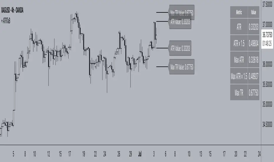
+ ATR Table and BracketsHi, all. I'm back with a new indicator—one I firmly believe could be one of the most valuable indicators you keep in your indicator toolshed—based around true range.
This is a simple, streamlined indicator utilizing true range and average true range that will help any trader with stoploss, trailing stoploss, and take-profit placement—things that I know many traders use average true range for. It could also be useful for trade entries as well, depending on the trader's style.
Typically, most traders (or at least what I've seen recommended across websites, video tutorials on YouTube, etc.) are taught to simply take the ATR number and use that, and possibly some sort of multiplier, as your stoploss and take-profit. This is fine, but I thought that it might be possible to dive a bit deeper into these values. Because an average is a combination of values, some higher, some lower, and we often see ATR spikes during periods of high volatility, I thought wouldn't it be useful to know what value those ATR spikes are, and how do they relate to the ATR? Then I thought to myself, well, what about the most volatile candle within that ATR (the candle with the greatest true range)? Couldn't knowing that value be useful to a trader? So then the idea of a table displaying these values, along with the ATR and the ATR times some multiplier number, would be a useful, simple way to display this information. That's what we have here.
The table is made up of two columns, one with the name of the metric being measured, and the other with its value. That's it. Simple.
As nice as this was, I thought an additional, great, and perhaps better, way to visualize this information would be in the form of brackets extending from the current bar. These are simply lines/labels plotted at the price values of the ATR, ATR times X, highest ATR, highest ATR times X, and highest TR value. These labels supply the actual values of the ATR, etc., but may also display the price if you should choose (both of these values are toggleable in the 'Inputs' section of the indicator.). Additionally, you can choose to display none of these labels, or all five if you wish (leaves the chart a bit cluttered, as shown in the image below), though I suspect you'll determine your preferences for which information you'd like to see and which not.
Chart with all five lines/labels displayed. I adjusted the ATRX value to 3 just to make the screenshot as legible as possible. Default is set to 1.5. As you can see, the label doesn't show the multiplier number, but the table does.
Here's a screenshot of the labels showing the price in addition to the value of the ATR, set to "Previous Closing Price," (see next paragraph for what that means) and highest TR. Personally, I don't see the value in the displaying the price, but I thought some people might want that. It's not available in the table as of now, but perhaps if I get enough requests for it I will add it.
That's basically it, but one last detail I need to go over is the dropdown box labeled "Bar Value ATR Levels are Oriented To." Firstly, this has no effect on Highest ATR, Highest ATRX, and Highest TR levels. Those are based on the ATR up to the last closed candle, meaning they aren't including the value of the currently open candle (this would be useless). However, knowing that different traders trade different ways it seemed to me prudent to allow for traders to select which opening or closing value the trader wishes to have the ATR brackets based on. For example, as someone who has consumed much No Nonsense Forex content I know that traders are urged to enter their trades in the last fifteen minutes of the trading day because the ATR is unlikely to change significantly in that period (ATR being the centerpiece of NNFX money management), so one of three selections here is to plot the brackets based on the ATR's inclusion of this value (this of course means the brackets will move while the candle is still open). The other options are to set the brackets to the current opening price, or the previous closing price. Depending on what you're trading many times these prices are virtually identical, but sometimes price gaps (stocks in particular), so, wanting your brackets placed relative to the previous close as opposed to the current open might be preferable for some traders.
And that's it. I really hope you guys like this indicator. I haven't seen anything closely similar to it on TradingView, and I think it will be something you all will find incredibly handy.
Please enjoy!