Indicators and strategies


Volume Data Table (Real-time & Historical Volume Analysis)Volume Data Table (Real-time & Historical Volume Analysis)
Overview:
The Volume Data Table indicator is a powerful tool designed to provide concise, real-time, and historical volume insights directly on your chart. It aggregates critical volume metrics into an organized, customizable table, making it incredibly easy to identify unusual volume activity, sudden surges, or sustained interest in a particular asset.
This indicator is perfect for traders who rely on volume analysis to confirm price movements, spot potential reversals, or gauge market conviction.
Key Features & How It Works:
Real-time Volume Metrics:
The table prominently displays the volume data for the current (last) candle, including:
Time: The precise time of the current candle's close, formatted in IST (Indian Standard Time - UTC+5:30) for your convenience.
Volume: The total volume for the current candle, smartly formatted in K (Thousands) or M (Millions) for readability.
Change % (Chg%): The percentage change in volume compared to the immediately preceding candle. This helps you quickly spot sudden increases or decreases in trading activity.
Vs 4-Avg % (vs4Avg%): The percentage change in volume compared to the average volume of the last 4 preceding candles. This is crucial for identifying volume surges or drops relative to recent historical activity, which can signal significant market events.
Configurable Historical Data:
Beyond the current candle, you can customize how many previous candles' volume data you wish to display. A simple input setting allows you to choose from 1 to 20 historical rows, giving you flexibility to review recent volume trends. Each historical row also provides its own "Change %" and "Vs 4-Avg %" for detailed analysis of past candle activity.
Intuitive Color-Coding:
Percentage change values are intuitively color-coded for instant visual cues:
Green: Indicates a positive (increase) in volume percentage.
Red: Indicates a negative (decrease) in volume percentage.
Clean & Organized Table Display:
The indicator presents all this data in a neat, easy-to-read table positioned at the top-right of your chart. The table automatically adjusts its height based on the number of historical rows you choose, ensuring a compact and efficient use of screen space.
Ideal Use Cases:
Volume Confirmation: Quickly confirm the conviction behind price movements. A strong price move on high "Vs 4-Avg %" volume often indicates higher reliability.
Spotting Abnormal Volume: Identify candles with unusually high or low volume compared to their recent average, which can precede or accompany significant price action.
Momentum Analysis: Understand if buying/selling pressure is increasing or decreasing over recent periods.
Scalping & Day Trading: The real-time updates and concise format make it highly effective for fast-paced short-term decision-making.
Complements Other Indicators: Use it alongside price action, candlestick patterns, or other technical indicators for a more robust analysis.
Customization Options:
Number of Historical Rows: Adjust Number of Historical Rows from 1 to 20 to tailor the depth of your historical volume review.
Important Disclaimer:
This indicator is a technical analysis tool and should be used as part of a comprehensive trading strategy. It is not financial advice. Trading in financial markets involves substantial risk, and you could lose money. Always perform your own research and risk management.
DrCID-CISD LevelThe CISD Levels indicator is a sophisticated market structure analysis tool that automatically identifies and plots critical support and resistance levels based on Change in State Direction (CISD) methodology. This indicator helps traders visualize key market turning points and potential breakout/breakdown levels with precision.

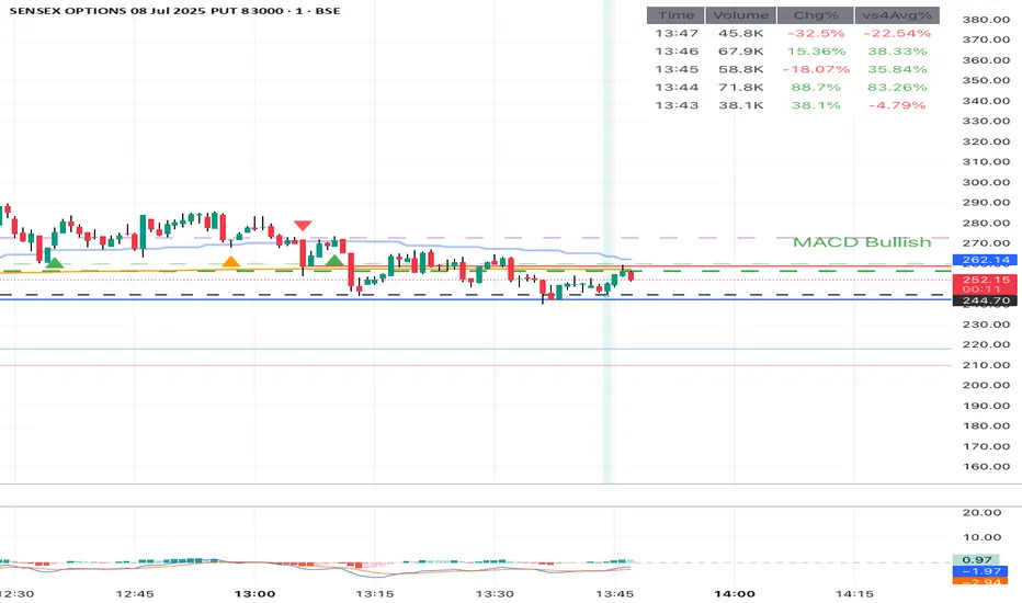
MACD Trend StatusOverview:
The Dynamic MACD Trend Status indicator is a sophisticated yet easy-to-interpret tool designed to provide instant, color-coded insights into the current MACD momentum and trend strength directly on your chart. Unlike traditional MACD indicators that clutter your main price panel, this indicator distills complex MACD calculations into a single, prominent text label, ideal for quick confirmations and fast-paced trading.
It features two distinct logic modes, allowing you to customize its sensitivity and confirmation level, making it adaptable to various market conditions and trading styles.
Key Features & How It Works:
Two Selectable Logic Modes:
This indicator offers a unique dropdown setting (Logic Selection) to switch between two powerful MACD interpretation algorithms:
a) Option 3 (Robust) - (Default)
This is the most stringent and reliable mode, designed to filter out market noise and highlight only strong, accelerating trends. It declares a "Bullish" or "Bearish" status when ALL of the following conditions are met:
Bullish: MACD Line is above Signal Line AND MACD Histogram is positive AND MACD Histogram is increasing (momentum is accelerating) AND both MACD Line and Signal Line are above the Zero Line (confirming an overall uptrend).
Bearish: MACD Line is below Signal Line AND MACD Histogram is negative AND MACD Histogram is decreasing (momentum is accelerating) AND both MACD Line and Signal Line are below the Zero Line (confirming an overall downtrend).
Neutral: If none of the above strong conditions are met, indicating sideways movement, weakening momentum, or a transition phase.
b) Option 4 (Simplified + Enhanced)
This mode offers a more responsive signal while still providing a clear distinction for exceptionally strong moves. It determines status based on:
"MACD Bullish +" (Super Bullish): If all the rigorous conditions of "Option 3 (Robust) - Bullish" are met. This provides an immediate visual cue of extreme bullish strength within the simpler logic.
"MACD Bearish +" (Super Bearish): If all the rigorous conditions of "Option 3 (Robust) - Bearish" are met. This highlights exceptional bearish strength.
"MACD Bullish": MACD Line is above Signal Line AND MACD Histogram is positive (basic bullish momentum).
"MACD Bearish": MACD Line is below Signal Line AND MACD Histogram is negative (basic bearish momentum).
"MACD Neutral": If none of the above conditions are met.
Instant Color-Coded Status:
The indicator provides clear visual feedback through dynamic text colors:
Green: "MACD Bullish" (Standard Bullish)
Red: "MACD Bearish" (Standard Bearish)
Gray: "MACD Neutral" (Choppy/Unclear)
Blue: "MACD Bullish +" (Enhanced Strong Bullish - when using Option 4)
Fuchsia/Purple: "MACD Bearish +" (Enhanced Strong Bearish - when using Option 4)
(Note: Colors for "+" signals are customizable in the code if you wish)
Unobtrusive Display:
The status is displayed in a transparent, discreet table positioned at the middle-right of your main chart panel. This avoids cluttering the top corners or the indicator sub-panel, keeping your price action clear.
Ideal Use Cases:
Quick Confirmation: Rapidly confirm your trade ideas with a glance at the MACD's underlying momentum.
Scalping & Day Trading: The instant visual feedback is invaluable for fast-paced short-term strategies.
Momentum Filtering: Use it to filter trades, ensuring you're entering when MACD momentum is in your favor.
Complementary Tool: Designed to work hand-in-hand with your primary analysis (price action, support/resistance, other indicators). It's not intended as a standalone signal but as a powerful re-confirmation tool.
Customization Options:
MACD Settings: Adjust Fast Length, Slow Length, and Signal Length.
Logic Selection: Toggle between "Option 3 (Robust)" and "Option 4 (Simplified)" for different sensitivities.
Show Status Text: Toggle the visibility of the status text On/Off.
Text Size: Choose from "tiny", "small", "normal", "large", "huge" for optimal visibility.
Important Disclaimer:
This indicator is a technical analysis tool and should be used as part of a comprehensive trading strategy. It is not financial advice. Trading in financial markets involves substantial risk, and you could lose money. Always perform your own research and risk management.
Post-Market Session AnalyzerThis script visually analyzes U.S. post-market trading hours (4:00 PM to 8:00 PM EST) by:
a) Highlighting post-market session background
b) Coloring candles based on price direction
c) Marking the final post-market candle with a trend label
Great for:
1) Traders who monitor after-hours price movement
2) Spotting late-day reversals or sentiment shifts
3) Understanding extended trading activity

Adiyogi Trend🟢🔴 “Adiyogi” Trend — Market Alignment Visualizer
“Adiyogi” Trend is a powerful, non-intrusive trend detection system built for traders who seek clarity, discipline, and alignment with true market flow. Inspired by the meditative stillness of Adiyogi and the need for mindful, high-probability decisions, this tool offers a clean and intuitive visual guide to trending environments — without cluttering the chart or pushing forced trades.
This is not a buy/sell signal generator. Instead, it is designed as a background confirmation engine that helps you stay on the right side of the market by identifying moments of true directional strength.
🧠 Core Logic
The “Adiyogi” Trend indicator highlights the background of your chart in green or red when multiple layers of strength and structure align — including momentum, market positioning, and relative force. Only when these internal components agree does the system activate a directional state.
It’s built on three foundational energies of trend confirmation:
Strength of movement
Structure in price action
Conviction in momentum
By combining these into one visual background, the indicator filters out indecision and helps you stay focused during real trend phases — whether you're day trading, swing trading, or holding longer-term positions.
📌 Core Concepts Behind the Tool
The indicator integrates three essential market filters—each confirming a different dimension of trend strength:
ADX (Average Directional Index) – Measures trend momentum.
You’ve chosen a very responsive setting (ADX Length = 2), which helps catch the earliest possible signs of momentum emergence.
The threshold is ADX ≥ 22, ensuring that weak or sideways markets are filtered out.
SuperTrend (10,1) – Captures short-term trend direction.
This setup follows price closely and reacts quickly to reversals, making it ideal for fast-moving assets or intraday strategies.
SuperTrend acts as the structural confirmation of directional bias.
RSI (Relative Strength Index) – Measures strength based on recent price closes.
You’ve configured RSI > 50 for bullish zones and < 50 for bearish—a neutral midpoint standard often used by professional traders.
This ensures that only trades in sync with momentum and recent strength are highlighted.
🌈 How It Visually Works
Background turns GREEN when:
ADX ≥ 22, indicating strong momentum
Price is above the 20 EMA and above SuperTrend (10,1)
RSI > 50, confirming recent strength
Background turns RED when:
ADX ≥ 22, indicating strong momentum
Price is below the 20 EMA and below SuperTrend (10,1)
RSI < 50, confirming recent weakness
The background remains neutral (transparent) when trend conditions are not clearly aligned—this is the tool's way of keeping you out of indecisive markets.
A label (BULL / BEAR) appears only when the bias flips from the previous one. This helps avoid repeated or redundant alerts, focusing your attention only when something changes.
📊 Practical Uses & Benefits
✅ Stay with the trend: Perfectly filters out choppy or sideways markets by only activating when conditions align across momentum, structure, and strength.
✅ Pre-trade confirmation: Use this tool to confirm trade setups from other indicators or price action patterns.
✅ Avoid noise: Prevent overtrading by focusing only on high-quality trend conditions.
✅ Visual clarity: Unlike arrows or plots that clutter the chart, this tool subtly highlights trend conditions in the background, preserving your price action view.
📍 Important Notes
This is not a buy/sell signal generator. It is a trend-confirmation system.
Use it in conjunction with your existing entry setups—such as breakouts, order blocks, retests, or candlestick patterns.
The tool helps you stay in sync with the dominant direction, especially when combining multiple timeframes.
Can be used on any market (stocks, forex, crypto, indices) and on any timeframe.

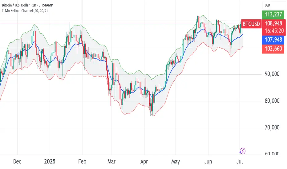
ZLMA Keltner ChannelThe ZLMA Keltner Channel uses a Zero-Lag Moving Average (ZLMA) as the centerline with ATR-based bands to track trends and volatility.
The ZLMA’s reduced lag enhances responsiveness for breakouts and reversals, i.e. it's more sensitive to pivots and trend reversals.
Unlike Bollinger Bands, which use standard deviation and are more sensitive to price spikes, this uses ATR for smoother volatility measurement.
Background:
Built on John Ehlers’ lag-reduction techniques, this indicator adapts the classic Keltner Channel for dynamic markets. It excels in trending (low-entropy) markets for breakouts and range-bound (high-entropy) markets for reversals.
How to Read:
ZLMA (Blue): Tracks price trends. Above = bullish, below = bearish.
Upper Band (Green): ZLMA + (Multiplier × ATR). Cross above signals breakout or overbought.
Lower Band (Red): ZLMA - (Multiplier × ATR). Cross below signals breakout or oversold.
Channel Fill (Gray): Shows volatility. Narrow = low volatility, wide = high volatility.
Signals (Optional): Enable to show “Buy” (green) on upper band crossovers, “Sell” (red) on lower band crossunders.
Strategies: Trade breakouts in trending markets, reversals in ranges, or use bands as trailing stops.
Settings:
ZLMA Period (20): Adjusts centerline responsiveness.
ATR Period (20): Sets volatility period.
Multiplier (2.0): Controls band width.
If you are still confused between the ZLMA Keltner Channels and Bollinger Bands:
Keltner Channel (ZLMA): Uses ATR for bands, which smooths volatility and is less reactive to sudden price spikes. The ZLMA centerline reduces lag for faster trend detection.
Bollinger Bands: Uses standard deviation for bands, making them more sensitive to price volatility and prone to wider swings in high-entropy markets. Typically uses an SMA centerline, which lags more than ZLMA.
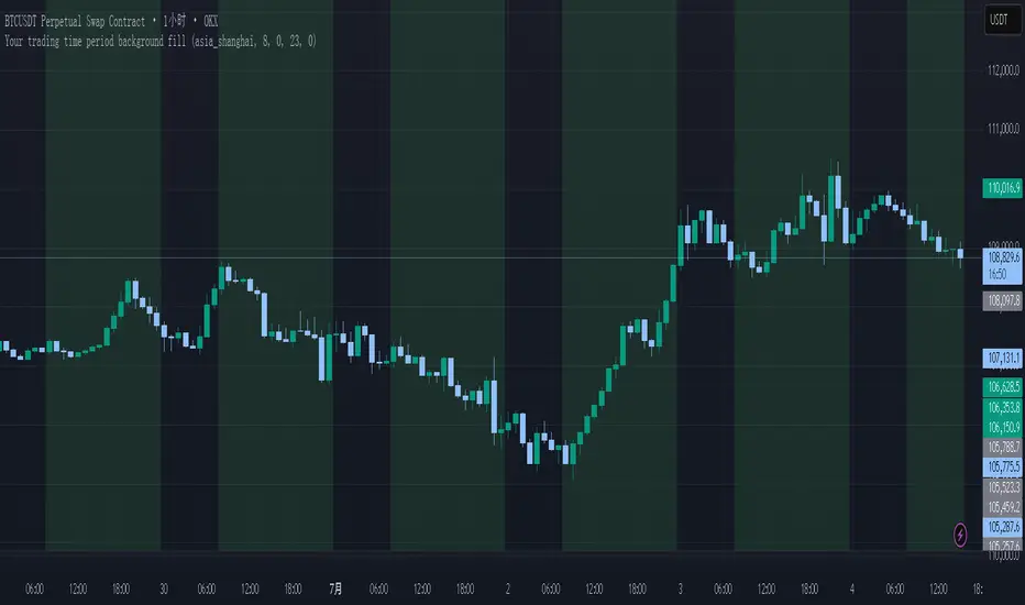
Your trading time period background fillThis script allows you to add background highlights to charts during any regional trading session, customize your own trading time, and is precise and customizable yet simple and easy to use, making it more convenient to review transactions.
Support global mainstream time zones: The drop-down list includes 30 commonly used IANA time zones (default is Asia/Shanghai) (such as Asia/Shanghai, America/New_York, Europe/London, etc.), one-click switching, no need to manually calculate the time difference.
Fully localized time input: "Start hour/minute" and "End hour/minute" are filled in with the local time of the selected time zone. The end hour defaults to 23:00 and can be adjusted to 0-23 at will.
Accurate time difference splitting: The script internally splits the time zone offset into whole hours and remainder minutes (supports half-hour zones, such as UTC+5:30), and ensures that all parameters are integers when calling timestamp to avoid errors.
Dynamic background rendering: Each K-line is judged according to the UTC timestamp whether it falls within the set range. If it meets the time period, it will be marked with a semi-transparent green background, and it will return to its original state after crossing the time period, helping you to identify the opening, closing or active period of any market at a glance.
Wide range of scenarios: It can be used for time-sharing highlighting of all-weather varieties of foreign exchange and cryptocurrency, and can also be used in conjunction with backtesting and timing strategies to only send signals during the active period of the target market, greatly improving trading efficiency and strategy accuracy.
Just select the region and set the time, and the script will automatically complete all complex time zone conversions and drawing, allowing you to focus on the transaction itself.
yuchenseo 15min intervalsHourly Candle Behaviour Indicator
- 0-15min look for continuation
- 15-30min look for reversal
- 30-45min look for reversal

AMOGH SMC 1Smart Money Concept (SMC) Indicator market structure ke powerful elements jaise Break of Structure (BOS), Change of Character (CHoCH), liquidity zones, aur Fair Value Gaps (FVG) ko identify karta hai. Is indicator ka purpose hai institutional price movements ko track karna—jahaan large players apna entry ya exit plan karte hain. Traditional indicators ke mukable SMC ek zyada refined aur logic-driven approach deta hai jisme market ka intent samajhna asaan hota hai. Ye tool traders ko trending aur consolidating market conditions me structure-based signals provide karta hai, jisse trade execution aur risk management aur effective ho jata hai. FVGs un zones ko highlight karte hain jahan price imbalance hota hai, aur CHoCH/BOS se market ka directional bias confirm hota hai. Jo traders price action aur institutional footprint pe kaam karte hain, unke liye ye indicator ek must-have resource hai. Iska design clean, customizable aur real-time plotting ke saath optimized hai.


BANKNIFTY Contribution Table [GSK-VIZAG-AP-INDIA]1. Overview
This indicator provides a real-time visual contribution table of the 12 constituent stocks in the BANKNIFTY index. It displays key metrics for each stock that help traders quickly understand how each component is impacting the index at any given moment.
2. Purpose / Trading Use Case
The tool is designed for intraday and short-term traders who rely on index movement and its internal strength or weakness. By seeing which stocks are contributing positively or negatively, traders can:
Confirm trend strength or divergence within the index.
Identify whether a BANKNIFTY move is broad-based or driven by a few heavyweights.
Detect reversals when individual components decouple from index direction.
3. Key Features and Logic
Live LTP: Current price of each BANKNIFTY stock.
Price Change: Difference between current LTP and previous day’s close.
% Change: Percentage move from previous close.
Weight %: Static weight of each stock within the BANKNIFTY index (user-defined).
This estimates how much each stock contributes to the BANKNIFTY’s point change.
Sorted View: The stocks are sorted by their weight (descending), so high-impact movers are always at the top.
4. User Inputs / Settings
Table Position (tableLocationOpt):
Choose where the table appears on the chart:
top_left, top_right, bottom_left, or bottom_right.
This helps position the table away from your price action or indicators.
5. Visual and Plotting Elements
Table Layout: 6 columns
Stock | Contribution | Weight % | LTP | Change | % Change
Color Coding:
Green/red for positive/negative price changes and contributions.
Alternating background rows for better visibility.
BANKNIFTY row is highlighted separately at the top.
Text & Background Colors are chosen for both readability and direction indication.
6. Tips for Effective Use
Use this table on 1-minute or 5-minute intraday charts to see near real-time market structure.
Watch for:
A few heavyweight stocks pulling the index alone (can signal weak internal breadth).
Broad green/red across all rows (signals strong directional momentum).
Combine this with price action or volume-based strategies for confirmation.
Best used during market hours for live updates.
7. What Makes It Unique
Unlike other contribution tables that show only static data or require paid feeds, this script:
Updates in real time.
Uses dynamic calculated contributions.
Places BANKNIFTY at the top and presents the entire internal structure clearly.
Doesn’t repaint or rely on lagging indicators.
8. Alerts / Additional Features
No alerts are added in this version.
(Optional: Alerts can be added to notify when a certain stock contributes above/below a threshold.)
9. Technical Concepts Used
request.security() to pull both 1-minute and daily close data.
Conditional color formatting based on price change direction.
Dynamic table rendering using table.new() and table.cell().
Static weights assigned manually for BANKNIFTY stocks (can be updated if index weights change).
10. Disclaimer
This script is intended for educational and informational purposes only. It does not constitute financial advice or a buy/sell recommendation.
Users should test and validate the tool on paper or demo accounts before applying it to live trading.
📌 Note: Due to internet connectivity, data delays, or broker feeds, real-time values (LTP, change, contribution, etc.) may slightly differ from other platforms or terminals. Use this indicator as a supportive visual tool, not a sole decision-maker.
Script Title: BANKNIFTY Contribution Table -
Author: GSK-VIZAG-AP-INDIA
Version: Final Public Release

Bearish Fibonacci Extension Distance Table
### 📉 **Bearish Fibonacci Extension Distance Table – Pine Script Indicator**
This TradingView indicator calculates and displays **bearish Fibonacci extension targets** based on recent price swings, specifically designed for traders looking to **analyze downside potential** in a trending market. Unlike traditional Fibonacci retracement tools that help identify pullbacks, this version projects likely **price targets below current levels** using Fibonacci ratios commonly followed by institutional and retail traders alike.
#### 🔧 **How It Works:**
* **Swing Calculation**:
The script looks back over a user-defined period (`swingLen`, default 20 bars) to find:
* `B`: The **highest high** in the lookback (start of bearish move)
* `A`: The **lowest low** in the same period (end of bearish swing)
* `C`: The **current high**, serving as the base for projecting future downside levels.
* **Bearish Extensions**:
It then calculates Fibonacci extension levels **below** the current high using standard ratios:
* **100%**, **127.2%**, **161.8%**, **200%**, and **261.8%**
* **Distance Calculation**:
For each level, the indicator computes:
* The **target price**
* The **distance (in %)** between the current close and each Fibonacci level
* **Visual Output**:
A live, auto-updating **data table** is shown in the **top-right corner** of the chart. This provides at-a-glance insight into how far current price is from each bearish target, with color-coded levels for clarity.
#### 📊 **Use Cases**:
* Identify **bearish continuation targets** in downtrending or correcting markets.
* Help manage **take-profit** zones for short trades.
* Assess **risk-reward** scenarios when entering bearish positions.
* Combine with indicators like RSI, OBV, or MACD for **confluence-based setups**.
#### ⚙️ **Inputs**:
* `Swing Lookback`: Number of bars to consider for calculating the swing high and swing low.
* `Show Table`: Toggle to display or hide the Fibonacci level table.
---
### 🧠 Example Interpretation:
Suppose the stock is trading at ₹180 and the 161.8% Fibonacci extension level is ₹165 with a -8.3% distance — this suggests the price may continue down to ₹165, offering a potential 8% short opportunity if confirmed by other indicators.


[TH] กลยุทธ์ SMC หลายกรอบเวลา (V5.2 - M15 Lead)English Explanation
This Pine Script code implements a multi-timeframe trading strategy based on Smart Money Concepts (SMC). It's designed to identify high-probability trading setups by aligning signals across three different timeframes.
The core logic is as follows:
High Timeframe (HTF) - M15: Determines the overall market direction or bias.
Medium Timeframe (MTF) - M5: Identifies potential Points of Interest (POI), such as Order Blocks or Fair Value Gaps, in alignment with the M15 bias.
Low Timeframe (LTF) - Current Chart: Looks for a specific entry trigger within the M5 POI to execute the trade.
Detailed Breakdown
## Part 1: Inputs & Settings
This section allows you to customize the indicator's parameters:
General Settings:
i_pivotLookback: Sets the lookback period for identifying pivot highs and lows on the LTF, which is crucial for finding the Change of Character (CHoCH).
M15 Bias Settings:
i_m15EmaFast / i_m15EmaSlow: These two EMA (Exponential Moving Average) values on the 15-minute chart determine the main trend. A bullish trend is confirmed when the fast EMA is above the slow EMA, and vice-versa for a bearish trend.
M5 Point of Interest (POI) Settings:
i_showM5Fvg / i_showM5Ob: Toggles the visibility of Fair Value Gaps (FVG) and Order Blocks (OB) on the 5-minute chart. These are the zones where the script will look for trading opportunities.
i_maxPois: Limits the number of POI zones drawn on the chart to keep it clean.
LTF Entry Settings:
i_entryMode:
Confirmation: The script waits for a Change of Character (CHoCH) on the LTF (your current chart) after the price enters an M5 POI. A CHoCH is a break of a recent pivot high (for buys) or pivot low (for sells), suggesting a potential reversal. This is the safer entry method.
Aggressive: The script triggers an entry as soon as the price touches the 50% level of the M5 POI, without waiting for a CHoCH. This is higher risk but can provide a better entry price.
i_showChoch: Toggles the visibility of the CHoCH confirmation lines.
Trade Management Settings:
i_tpRatio: Sets the Risk-to-Reward Ratio (RRR) for the Take Profit target. For example, a value of 2.0 means the Take Profit distance will be twice the Stop Loss distance.
i_slMode: (New in V5.2) Provides four different methods to calculate the Stop Loss:
POI Zone (Default): Places the SL at the outer edge of the M5 POI zone.
Last Swing: Places the SL at the most recent LTF swing high/low before the entry.
ATR: Uses the Average True Range (ATR) indicator to set a volatility-based SL.
Previous Candle: Places the SL at the high or low of the candle immediately preceding the entry. This is the tightest and riskiest option.
i_maxHistory: Sets the number of past trades to display on the chart.
## Part 2: Data Types & Variables
This section defines custom data structures (type) to organize information:
Poi: A structure to hold all information related to a single Point of Interest, including its price boundaries, direction (bullish/bearish), and whether it has been mitigated (touched by price).
Trade: A structure to store details for each trade, such as its entry price, SL, TP, result (Win/Loss/Active), and chart objects for drawing.
## Part 3: Core Logic & Calculations
This is the engine of the indicator:
Data Fetching: It uses request.security to pull EMA data from the M15 timeframe and candle data (high, low, open, close) from the M5 timeframe.
POI Identification: The script constantly scans the M5 data for FVG and OB patterns. When a valid pattern is found that aligns with the M15 bias (e.g., a bullish OB during an M15 uptrend), it's stored as a Poi and drawn on the chart.
Entry Trigger:
It checks if the price on the LTF enters a valid (unmitigated) POI zone.
Based on the selected i_entryMode, it either waits for a CHoCH or enters aggressively.
Once an entry condition is met, it calculates the SL based on the i_slMode, calculates the TP using the i_tpRatio, and creates a new Trade.
Trade Monitoring: For every active trade, the script checks on each new bar if the price has hit the SL or TP level. When it does, the trade's result is updated, and the visual boxes are finalized.
## Part 5: On-Screen Display
This part creates the Performance Dashboard table shown on the top-right of the chart. It provides a real-time summary of:
M15 Bias: Current market direction.
Total Trades: The total number of completed trades from the history.
Win Rate: The percentage of winning trades.
Total R-Multiple: The cumulative Risk-to-Reward multiple (sum of RRR from wins minus losses). A positive value indicates overall profitability.
🇹🇭 คำอธิบายและข้อแนะนำภาษาไทย
สคริปต์นี้เป็น Indicator สำหรับกลยุทธ์การเทรดแบบ Smart Money Concepts (SMC) ที่ใช้การวิเคราะห์จากหลายกรอบเวลา (Multi-Timeframe) เพื่อหาจุดเข้าเทรดที่มีความเป็นไปได้สูง
หลักการทำงานของ Indicator มีดังนี้:
Timeframe ใหญ่ (HTF) - M15: ใช้กำหนดทิศทางหลักของตลาด หรือ "Bias"
Timeframe กลาง (MTF) - M5: ใช้หาโซนสำคัญ หรือ "Point of Interest (POI)" เช่น Order Blocks หรือ Fair Value Gaps ที่สอดคล้องกับทิศทางจาก M15
Timeframe เล็ก (LTF) - กราฟปัจจุบัน: ใช้หาสัญญาณยืนยันเพื่อเข้าเทรดในโซน POI ที่กำหนดไว้
รายละเอียดของโค้ด
## ส่วนที่ 1: การตั้งค่า (Inputs & Settings)
ส่วนนี้ให้คุณปรับแต่งค่าต่างๆ ของ Indicator ได้:
การตั้งค่าทั่วไป:
i_pivotLookback: กำหนดระยะเวลาที่ใช้มองหาจุดกลับตัว (Pivot) ใน Timeframe เล็ก (LTF) เพื่อใช้ยืนยันสัญญาณ Change of Character (CHoCH)
การตั้งค่า M15 (ทิศทางหลัก):
i_m15EmaFast / i_m15EmaSlow: ใช้เส้น EMA 2 เส้นบน Timeframe 15 นาที เพื่อกำหนดเทรนด์หลัก หาก EMA เร็วอยู่เหนือ EMA ช้า จะเป็นเทรนด์ขาขึ้น และในทางกลับกัน
การตั้งค่า M5 (จุดสนใจ - POI):
i_showM5Fvg / i_showM5Ob: เปิด/ปิด การแสดงโซน Fair Value Gaps (FVG) และ Order Blocks (OB) บน Timeframe 5 นาที ซึ่งเป็นโซนที่สคริปต์จะใช้หาโอกาสเข้าเทรด
i_maxPois: จำกัดจำนวนโซน POI ที่จะแสดงผลบนหน้าจอ เพื่อไม่ให้กราฟดูรกเกินไป
การตั้งค่า LTF (การเข้าเทรด):
i_entryMode:
ยืนยัน (Confirmation): เป็นโหมดที่ปลอดภัยกว่า โดยสคริปต์จะรอให้เกิดสัญญาณ Change of Character (CHoCH) ใน Timeframe เล็กก่อน หลังจากที่ราคาเข้ามาในโซน POI แล้ว
เชิงรุก (Aggressive): เป็นโหมดที่เสี่ยงกว่า โดยสคริปต์จะเข้าเทรดทันทีที่ราคาแตะระดับ 50% ของโซน POI โดยไม่รอสัญญาณยืนยัน CHoCH
i_showChoch: เปิด/ปิด การแสดงเส้น CHoCH บนกราฟ
การตั้งค่าการจัดการเทรด:
i_tpRatio: กำหนด อัตราส่วนกำไรต่อความเสี่ยง (Risk-to-Reward Ratio) เพื่อตั้งเป้าหมายทำกำไร (Take Profit) เช่น 2.0 หมายถึงระยะทำกำไรจะเป็น 2 เท่าของระยะตัดขาดทุน
i_slMode: (ฟีเจอร์ใหม่ V5.2) มี 4 รูปแบบในการคำนวณ Stop Loss:
โซน POI (ค่าเริ่มต้น): วาง SL ไว้ที่ขอบนอกสุดของโซน POI
Swing ล่าสุด: วาง SL ไว้ที่จุด Swing High/Low ล่าสุดของ Timeframe เล็ก (LTF) ก่อนเข้าเทรด
ATR: ใช้ค่า ATR (Average True Range) เพื่อกำหนด SL ตามระดับความผันผวนของราคา
แท่งเทียนก่อนหน้า: วาง SL ไว้ที่ราคา High/Low ของแท่งเทียนก่อนหน้าที่จะเข้าเทรด เป็นวิธีที่ SL แคบและเสี่ยงที่สุด
i_maxHistory: กำหนดจำนวนประวัติการเทรดที่จะแสดงย้อนหลังบนกราฟ
## ส่วนที่ 2: ประเภทข้อมูลและตัวแปร
ส่วนนี้เป็นการสร้างโครงสร้างข้อมูล (type) เพื่อจัดเก็บข้อมูลให้เป็นระบบ:
Poi: เก็บข้อมูลของโซน POI แต่ละโซน เช่น กรอบราคาบน-ล่าง, ทิศทาง (ขึ้น/ลง) และสถานะว่าถูกใช้งานไปแล้วหรือยัง (Mitigated)
Trade: เก็บรายละเอียดของแต่ละการเทรด เช่น ราคาเข้า, SL, TP, ผลลัพธ์ (Win/Loss/Active) และอ็อบเจกต์สำหรับวาดกล่องบนกราฟ
## ส่วนที่ 3: ตรรกะหลักและการคำนวณ
เป็นหัวใจสำคัญของ Indicator:
ดึงข้อมูลข้าม Timeframe: ใช้ฟังก์ชัน request.security เพื่อดึงข้อมูล EMA จาก M15 และข้อมูลแท่งเทียนจาก M5 มาใช้งาน
ระบุ POI: สคริปต์จะค้นหา FVG และ OB บน M5 ตลอดเวลา หากเจ้ารูปแบบที่สอดคล้องกับทิศทางหลักจาก M15 (เช่น เจอ Bullish OB ในขณะที่ M15 เป็นขาขึ้น) ก็จะวาดโซนนั้นไว้บนกราฟ
เงื่อนไขการเข้าเทรด:
เมื่อราคาใน Timeframe เล็ก (LTF) วิ่งเข้ามาในโซน POI ที่ยังไม่เคยถูกใช้งาน
สคริปต์จะรอสัญญาณตาม i_entryMode ที่เลือกไว้ (รอ CHoCH หรือเข้าแบบ Aggressive)
เมื่อเงื่อนไขครบ จะคำนวณ SL และ TP จากนั้นจึงบันทึกการเทรดใหม่
ติดตามการเทรด: สำหรับเทรดที่ยัง "Active" อยู่ สคริปต์จะคอยตรวจสอบทุกแท่งเทียนว่าราคาไปถึง SL หรือ TP แล้วหรือยัง เมื่อถึงจุดใดจุดหนึ่ง จะบันทึกผลและสิ้นสุดการวาดกล่องบนกราฟ
## ส่วนที่ 5: การแสดงผลบนหน้าจอ
ส่วนนี้จะสร้างตาราง "Performance Dashboard" ที่มุมขวาบนของกราฟ เพื่อสรุปผลการทำงานแบบ Real-time:
M15 Bias: แสดงทิศทางของตลาดในปัจจุบัน
Total Trades: จำนวนเทรดทั้งหมดที่เกิดขึ้นในประวัติ
Win Rate: อัตราชนะ คิดเป็นเปอร์เซ็นต์
Total R-Multiple: ผลตอบแทนรวมจากความเสี่ยง (R) ทั้งหมด (ผลรวม RRR ของเทรดที่ชนะ ลบด้วยจำนวนเทรดที่แพ้) หากเป็นบวกแสดงว่ามีกำไรโดยรวม
📋 ข้อแนะนำในการใช้งาน
Timeframe ที่เหมาะสม: Indicator นี้ถูกออกแบบมาให้ใช้กับ Timeframe เล็ก (LTF) เช่น M1, M3 หรือ M5 เนื่องจากมันดึงข้อมูลจาก M15 และ M5 มาเป็นหลักการอยู่แล้ว
สไตล์การเทรด:
Confirmation: เหมาะสำหรับผู้ที่ต้องการความปลอดภัยสูง รอการยืนยันก่อนเข้าเทรด อาจจะตกรถบ้าง แต่ลดความเสี่ยงจากการเข้าเทรดเร็วเกินไป
Aggressive: เหมาะสำหรับผู้ที่ยอมรับความเสี่ยงได้สูงขึ้น เพื่อให้ได้ราคาเข้าที่ดีที่สุด
การเลือก Stop Loss:
"Swing ล่าสุด" และ "โซน POI" เป็นวิธีมาตรฐานตามหลัก SMC
"ATR" เหมาะกับตลาดที่มีความผันผวนสูง เพราะ SL จะปรับตามสภาพตลาด
"แท่งเทียนก่อนหน้า" เป็นวิธีที่เสี่ยงที่สุด เหมาะกับการเทรดเร็วและต้องการ RRR สูงๆ แต่ก็มีโอกาสโดน SL ง่ายขึ้น
การบริหารความเสี่ยง: Indicator นี้เป็นเพียง เครื่องมือช่วยวิเคราะห์ ไม่ใช่สัญญาณซื้อขายอัตโนมัติ 100% ผู้ใช้ควรมีความเข้าใจในหลักการของ SMC และทำการบริหารความเสี่ยง (Risk Management) อย่างเคร่งครัดเสมอ
การทดสอบย้อนหลัง (Backtesting): ควรทำการทดสอบ Indicator กับสินทรัพย์และตั้งค่าต่างๆ เพื่อให้เข้าใจลักษณะการทำงานและประสิทธิภาพของมันก่อนนำไปใช้เทรดจริง

Spot Nachkauf-Zonen High TF (RSI + BB)**Spot Buy/Sell Zones High TF Indicator (RSI + Bollinger Bands + Trend & Volume Filters)**
This is an overlay indicator for TradingView that highlights optimal buy and sell areas on a higher timeframe (e.g. Daily, Weekly) while you view a lower timeframe chart. It combines volatility, momentum, trend and volume checks to reduce false signals.
---
### Key Features
* **Higher-Timeframe Calculations**
All indicators (Bollinger Bands, RSI, moving averages, volume) use data from a user-selected timeframe (for example “D” for daily or “W” for weekly).
* **Bollinger Bands**
* Middle line: Simple Moving Average (SMA) over N periods
* Upper/Lower bands: ±M × standard deviation
* Semi-transparent fill between the bands for quick visual reference
* **RSI Momentum**
* Classic 14-period RSI with adjustable overbought (e.g. 70) and oversold (e.g. 30) levels
* **Buy** when RSI crosses up out of oversold and price touches or goes below the lower Bollinger Band
* **Sell** when RSI crosses down out of overbought and price touches or goes above the upper Bollinger Band
* **Trend Filter (Optional)**
* Higher-TF SMA (default 200 periods) plotted in orange
* Signals only fire when price is above the SMA (for buys) or below (for sells) to align with the main trend
* **Volume Filter (Optional)**
* Compares current higher-TF volume against its SMA
* Signals require volume to exceed a user-set multiplier of average volume, ensuring real market participation
* **Visual Signals**
* Green triangles below bars mark buy zones; red triangles above bars mark sell zones
* Light green background highlights active buy areas
* **Built-In Alerts**
* Two alert conditions (“Buy Signal” and “Sell Signal”) ready to be used in TradingView’s Alert dialog
* Customizable alert messages include ticker and timeframe
---
### Inputs
| Setting | Default | Purpose |
| ------------------------- | ------- | ------------------------------------------------ |
| **Calculation Timeframe** | D | Higher timeframe for all calculations |
| **BB Periods** | 20 | Length of SMA for Bollinger middle line |
| **BB Std-Dev Multiplier** | 2.0 | Number of standard deviations for the bands |
| **RSI Periods** | 14 | Length of the RSI calculation |
| **Overbought / Oversold** | 70 / 30 | RSI thresholds for signal generation |
| **Enable Trend Filter** | true | Use higher-TF SMA to confirm trend direction |
| **Trend MA Periods** | 200 | SMA length for the trend filter |
| **Enable Volume Filter** | true | Require above-average volume to validate signals |
| **Volume MA Periods** | 20 | SMA length for volume filter |
| **Volume Multiplier** | 1.2 | How many times above average volume is needed |
---
### How to Use
1. **Add the Script**: Paste the Pine code into TradingView’s Pine Editor and save.
2. **Adjust Settings**: Choose your higher timeframe (“D”, “W”, etc.) and tweak BB, RSI, trend, and volume parameters.
3. **Activate Alerts**: In the Alerts panel, select the “Buy Signal” or “Sell Signal” alert condition.
4. **Interpret Signals**:
* A green triangle + green background = suggested buy zone
* A red triangle = suggested sell zone
This setup gives you clear, rule-based entry and exit areas by filtering noise and confirming market strength on a higher timeframe.

Liquidity Sweeps [SB1]Liquidity Sweeps
This indicator detects liquidity sweep events where price briefly breaks above or below recent swing points before reversing. These sweeps often occur during stop hunts, fakeouts, or liquidity grabs, and are commonly used by smart money traders to trap breakout participants before reversing direction.
🔍 What It Does
Identifies key swing highs and lows based on user-defined pivot strength.
Detects:
Bearish Sweeps: Price breaks a recent high but fails to close above it.
Bullish Sweeps: Price breaks a recent low but fails to close below it.
Tracks whether these sweeps are simply wicks, full breakouts and retests, or a combination of both.
Highlights these zones with boxes and labels to signal high-probability reversal or reaction zones.
🧠 Why Use It
Liquidity sweeps are often used by institutions and large players to trigger stops and create movement. Detecting these events helps traders:
Avoid chasing false breakouts
Time entries around exhaustion or reversal points
Align trades with Smart Money Concepts (SMC), ICT principles, or Order Block Theory
Avoid chasing false breakouts
Time entries around exhaustion or reversal points
Align trades with Smart Money Concepts (SMC), ICT principles, or Order Block Theory
⚙️ Settings & Customization
Swings: Adjusts the sensitivity of swing high/low detection.
Detection Type:
Only Wicks: Detects when a wick pierces a level but closes back inside.
Only Outbreaks & Retests: Detects when a candle breaks out and later retests.
Wicks + Outbreaks & Retests: Shows both types for full coverage.
Extend Zones: Draws boxes across future bars until invalidation.
Colors: Fully customizable for bullish and bearish sweeps.
🧬 Original Enhancements
This script is based on open-source work by LuxAlgo and has been significantly enhanced with:
Multiple detection modes
Real-time alert support📣 📣
Efficient pivot memory cleanup📣 📣
Sweep zone auto-extension until broken
Improved visual clarity with dotted/dashed lines, and color-coded boxes
✅ Note: The original version had no alerts. This version adds real-time detection alerts for practical trading use. Credit: Original swing detection logic inspired by LuxAlgo’s open-source Liquidity Sweep framework. This version is extended and modified under the terms of the CC BY-NC-SA 4.0 license.
📣 📣 Alerts Included📣📣
🔼 Bullish Wick Sweep📣
🔽 Bearish Wick Sweep📣
These alerts allow traders to be notified the moment a liquidity sweep occurs, providing immediate edge for reactive or anticipatory trading.
📈 How to Use It
Add to your chart.
Choose the detection type based on your trading style:
Wicks for reversals and stop hunts
Outbreaks for failed breakouts or retests
Wait for sweep zones to form and monitor price behavior around them.
Use in conjunction with:
Fair Value Gaps (FVG)
Order Blocks
VWAP Anchors
Market Structure Breaks/ Breaks of structures

NEXGEN ADXNEXGEN ADX
NEXGEN ADX – Advanced Trend Strength & Directional Indicator
Purpose:
The NEXGEN ADX is a powerful trend analysis tool developed by NexGen Trading Academy to help traders identify the strength and direction of market trends with precision. Based on the Average Directional Index (ADX) along with +DI (Positive Directional Indicator) and –DI (Negative Directional Indicator), this custom indicator provides a reliable foundation for both trend-following strategies and trend reversal setups.

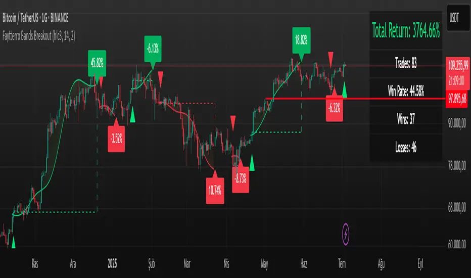
Faytterro Bands Breakout📌 Faytterro Bands Breakout 📌
This indicator was created as a strategy showcase for another script: Faytterro Bands
It’s meant to demonstrate a simple breakout strategy based on Faytterro Bands logic and includes performance tracking.
❓ What Is It?
This script is a visual breakout strategy based on a custom moving average and dynamic deviation bands, similar in concept to Bollinger Bands but with unique smoothing (centered regression) and performance features.
🔍 What Does It Do?
Detects breakouts above or below the Faytterro Band.
Plots visual trade entries and exits.
Labels each trade with percentage return.
Draws profit/loss lines for every trade.
Shows cumulative performance (compounded return).
Displays key metrics in the top-right corner:
Total Return
Win Rate
Total Trades
Number of Wins / Losses
🛠 How Does It Work?
Bullish Breakout: When price crosses above the upper band and stays above the midline.
Bearish Breakout: When price crosses below the lower band and stays below the midline.
Each trade is held until breakout invalidation, not a fixed TP/SL.
Trades are compounded, i.e., profits stack up realistically over time.
📈 Best Use Cases:
For traders who want to experiment with breakout strategies.
For visual learners who want to study past breakouts with performance metrics.
As a template to develop your own logic on top of Faytterro Bands.
⚠ Notes:
This is a strategy-like visual indicator, not an automated backtest.
It doesn't use strategy.* commands, so you can still use alerts and visuals.
You can tweak the logic to create your own backtest-ready strategy.
Unlike the original Faytterro Bands, this script does not repaint and is fully stable on closed candles.