Clean 20/40/60 High/Low LabelsIPDA Data Ranges
Works on all timeframes
20 period high and low, 40 period high and low, and 60 period high and low
This helps to identify large cycles on the daily and 4H chart
Can also be useful at liquidity injections and opening and closing prices of the market.
Indicators and strategies


MTF Trend + SMC Structure (EMA/SMA Mix - HH/HL)Objective
To provide a quick, visual, and reliable reading of market trends and structure.
Combines dynamic moving averages and SMC (market structure) logic.
Effectively integrates into the chart via a clear table displayed in the top right corner.
📊 What the indicator displays (by timeframe: M5, M15, M30, H1, H4, D1, W1)
🟢 1. MA Trend
Based on two moving averages (short and long).
Average Type:
EMA for M5 to M30 (reactive)
SMA for H1 to Weekly (smoother)
Display:
🟢 Up if short MA > long MA
🔴 Down if short MA < long MA
Customizable lengths per timeframe
🧱 2. Structure (SMC logic)
Detects Higher High / Higher Low and Lower High / Lower Low
Based on significant pivots (pivothigh, pivotlow)
Logic inspired by SMC swing trading
Display:
🟢 Up = bullish structure (HH + HL)
🔴 Down = bearish structure (LH + LL)
⚪ Neutral = no clear structure
✅ Advantages
🔍 Instant view of the overall multi-timeframe context
📉 Combines trend by MA and SMC structure
🎯 Helps filter out bad entries Countertrend
⚡️ Very useful for intraday, swing, or SMC traders

FutureObitz Official Bank Levels// © 2025 FutureObitz - Custom version for private use
This Bank Levels indicator automatically calculates daily high, low, mid, and premium/discount zones using dynamic ranges.
Ideal for intraday traders using supply/demand, liquidity concepts, and institutional levels. Labels are cleanly aligned and update once per day for minimal chart clutter.
This version was customized for my personal trading style and refined for visual clarity.

Smart Money Premium | Made by EF (Improved)📊 Smart Money Premium | Made by EF (Improved)
A powerful all-in-one toolkit built for Smart Money / ICT traders.
It helps you clearly identify market structure, liquidity, order blocks, fair value gaps, and high-probability entry signals — all visualized directly on your chart.
✨ Key features:
✅ Automatic detection of Swing High / Swing Low points
✅ Real-time BOS / CHOCH (Break of Structure / Change of Character) labeling
✅ Dynamic Order Blocks with adjustable duration and color
✅ Detection of Fair Value Gaps (FVG) and visualization with customizable zones
✅ Liquidity zones (EQH/EQL) with tolerance settings
✅ Smart Swing Failure Patterns (SFP) with instant labels
✅ Built-in Kill Zones for London & New York sessions
✅ Automatic adaptation of key parameters to your timeframe
✅ Volume filter for additional signal confirmation
✅ Clear SL/TP levels with customizable Risk:Reward
✅ Interactive status panel showing trend, structure, session, and live signal readiness
⚙️ How to use:
1️⃣ Add the indicator to your chart
2️⃣ Choose your preferred settings (or let it auto-tune by timeframe)
3️⃣ Follow the on-chart signals: BOS, CHOCH, SFP, OB & FVG zones
4️⃣ Use the SL/TP levels and Risk:Reward built into each signal to plan your trades
✅ Designed for:
• Traders who follow Smart Money Concepts / ICT methodology
• Those who want a clean, visual and data-driven approach
• Both beginners and advanced traders looking to save time and keep discipline
🛠 All logic is transparent and customizable — colors, lookback periods, OB/FVG duration, liquidity sensitivity and more.
🔔 Alerts included for Long and Short setups.

Highlight Candles with Open-Close Difference ≥ 24momentum candle. price starts big move or continue momentum on either side.

Adj Momentum (3M / 6M / 12M)Mirza Salman Volatility Adjusted Momentum.
The Volatility Adjusted Momentum Indicator distills a security’s recent performance into a single, decision-ready metric that captures both the velocity and the reliability of its trend. By simultaneously rewarding sustained price appreciation and discounting erratic fluctuations, the indicator highlights those stocks that are not only advancing but doing so with a consistent, low-volatility profile—attributes typically favoured by quantitative momentum and trend-following frameworks. A high positive reading points to instruments exhibiting strong, orderly upward trajectories, making them prime candidates for capital allocation in momentum-oriented portfolios. Conversely, muted or negative readings reveal markets whose returns have been lacklustre, unstable, or downward-sloping, signalling that they warrant caution or exclusion. In practice, this indicator enables portfolio managers and traders to rank broad watch-lists swiftly, focus due-diligence on the most robust price leaders, and enforce systematic discipline in scaling back exposure to choppier, less reliable names—all without resorting to subjective chart interpretation or ad-hoc volatility filters.

GalihRidha ZoneX — Adaptive MTF S&R + Smart Money AreasWelcome to ZoneX: The new frontier of Support & Resistance for modern traders!
ZoneX is more than just S&R — it’s a hybrid price map that fuses classic pivots with institutional logic, visualizing the zones that really matter.
What Makes ZoneX Different?
Multi-Timeframe S&R:
Instantly spot the true key levels from higher timeframes, not just what everyone else sees on the current chart.
Smart Money Order Blocks:
Automatically highlights supply and demand zones where institutions accumulate or distribute — find the real “trap” areas and avoid getting faked out.
VWAP Bands:
See where the liquidity is thickest — these bands act as magnets for price, great for both reversals and breakouts.
Midline Channel:
Identify the market’s equilibrium — know when you’re in value and when you’re at the edge.
Previous High/Low:
Mark institutional magnets and classic stop-hunt zones, updated in real-time.
Ultra Customizable:
One-click to enable/disable any feature. Clean for minimalists, packed for pros.
How to Use ZoneX
Breakout?
Wait for price to clear a ZoneX band or order block with momentum — enter on the retest.
Reversal?
Fade wicks and exhaustion right in the highlighted zone — confirm with price action or volume.
Range/Balance?
Trade the ping-pong between ZoneX midline and outer bands — great for scalping and mean reversion.
Who’s It For?
Active traders who want an edge beyond standard S&R.
Institutional-mindset scalpers and swing traders.
Anyone who loves a clean chart but craves real market context.
Level up your chart, see what the big players see —
and never trade blind again. This is ZoneX.

OTC supply & demand Candleshi traders and OTC colleagues,
this simple indicator used to spot easly the (indecisive , decisive , explosive) candles
i suggest to keep the candle boarders from the chart setting (blue or green for bullish ) and (red for bearish) . this indicator simplify spotting the supply and demand zones and the most powerful explosive candles in eye plink based on Bernd Skorupinski
theory.
from indicator setting
colour 0 (indecisive)
colour 1 (decisive) bullish
colour 2 (decisive) bearish
colour 3 (explosive) bullish
colour 4 (explosive) bearish
you can change the colour as u wish.
have a good trading day

OTC supply & demand Candleshi traders and OTC colleagues,
this simple indicator used to spot easly the (indecisive , decisive , explosive) candles
i suggest to keep the candle boarders from the chart setting (blue or green for bullish ) and (red for bearish) . this indicator simplify spotting the supply and demand zones and the most powerful explosive candles in eye plink based on Bernd Skorupinski
theory.
from indicator setting
colour 0 (indecisive)
colour 1 (decisive) bullish
colour 2 (decisive) bearish
colour 3 (explosive) bullish
colour 4 (explosive) bearish
you can change the colours as u wish.
have a good trading day

Average Volume (Millions) On ChartThe indicator shows the average number Volume in the period of time of your decision

ADX and DI – Clean Trend IndicatorADX and DI – Clean Trend Indicator helps traders identify trending conditions and the strength of a trend using the classic Average Directional Index (ADX) along with the +DI and -DI directional movement lines.
ADX (orange line) shows overall trend strength.
+DI (green line) and -DI (red line) reveal bullish or bearish pressure.
When ADX is above the threshold (default 25), the background turns green to highlight strong trending conditions — a great time to apply trend-following strategies.
This script offers:
A visually clean layout
Configurable ADX length and strength threshold
Automatic background highlighting when strong trends are detected
Use this tool to confirm market momentum, avoid sideways chop, and enhance your entry timing for breakout or pullback setups.

Volume Breakout SignalsScript by Hanssome
The Volume Breakout Signals indicator is a trading tool designed to identify potential entry points by pinpointing high-momentum price breakouts on your main chart. It operates on a simple but powerful principle: a true breakout should be supported by a significant increase in trading volume.
The indicator plots two primary visual elements on your price chart:
Pivot Highs and Lows: These are marked with green and red circles and represent the most recent significant swing points in the price. They act as dynamic support and resistance levels, and the script watches for the price to break past them.
BUY and SELL Labels: These signals appear directly on the chart to indicate a potential trading opportunity.
A signal is only generated when two specific conditions are met simultaneously:
Price Breakout: A BUY signal requires the price to cross decisively above the most recent pivot high. A SELL signal requires the price to cross below the most recent pivot low.
Volume Confirmation: This price breakout must be accompanied by a recent spike in trading volume. This confirmation suggests strong momentum and conviction behind the move, increasing the probability of a successful breakout.
All the parameters, such as the sensitivity of the pivot points and the definition of a volume spike, can be adjusted in the indicator's settings to fit your specific trading style and the asset you are viewing.

Volume VisualizerVolume by Hannsome
The Volume Visualizer is a simple yet effective tool designed to display trading volume in a dedicated panel below the main price chart. Its primary goal is to help you easily identify when trading activity is significantly higher than usual.
The indicator plots two key elements:
Volume Bars: These are standard volume bars showing the amount of trading activity for each period. To draw your attention to important moments, bars with unusually high volume are highlighted in a distinct color (yellow by default).
Average Volume Line: A moving average line (orange by default) is plotted over the volume bars. This line represents the recent average trading volume, giving you a clear baseline to compare the current volume against.
A "significant" volume spike is defined as any period where the volume exceeds the moving average by a certain multiplier. You can adjust both the moving average length and this multiplier in the indicator's settings to fine-tune its sensitivity to what you consider a significant spike in activity.

OBV MACD IndicatorI have added alert function providing the ability to add an alert when either a long or short signal is detected.
The original script is OBV MACD Indicator by RafaelZioni

Hurst Exponent DFAThis script computes the Hurst exponent using Detrended Fluctuation Analysis (DFA) in TradingView. It works as follows:
- It takes a user-defined lookback window of closing prices and centers them by subtracting their mean.
- It builds a cumulative profile of these centered values.
- For each sample size input by the user, it divides the profile into non-overlapping segments, fits a local linear trend in each segment, and measures the root-mean-square fluctuation around that trend.
- It then performs a log–log regression of the average fluctuation versus segment size to estimate the Hurst exponent H.
- An optional exponential moving average smooths the Hurst series to reduce noise.
- A horizontal line at H = 0.5 helps distinguish trending regimes (H > 0.5) from mean-reverting regimes (H < 0.5).

The Great Anchors: Dual AVWAP Powered by RSI
The Great Anchors
*Dual Anchored Volume Weighted Average Price Powered by RSI*
---
📌 Overview
The Great Anchors is a dual AVWAP-based indicator that resets dynamically using RSI extremes — either from the current asset or a master symbol (e.g., BTCUSDT). It identifies meaningful shifts in price structure and momentum using these "anchored" levels.
It’s designed to help traders spot trend continuations, momentum inflection points, and entry signals aligned with overbought/oversold conditions — but only when the market confirms through volume-weighted price direction.
---
🛠 Core Logic
• AVWAP 1 (favwap): Anchored when RSI reaches overbought levels (top anchor)
• AVWAP 2 (savwap): Anchored when RSI reaches oversold levels (bottom anchor)
• AVWAPs are recalculated each time a new OB/OS condition is triggered — acting like "fresh anchors" at key market turning points.
---
⚙️ Key Features
🔁 Auto or Manual RSI Thresholds
→ Automatically determines dynamic RSI OB/OS levels based on past peaks and troughs, or lets you set fixed levels.
🧠 Master Symbol Control
→ Use the RSI of a separate asset (like BTCUSDT, ETHUSDT, SOLUSDT, BNBUSDT, SUPRAUSDT) or indices (like TOTAL, TOTAL2, BFR) to control resets — ideal for tracking how BTC/major coins impacts altcoins/others.
🔍 Trend-Filtering Signal Logic
→ Signals are filtered for less noise and are triggered when:
- Both AVWAPs are rising (bullish) or falling (bearish)
- Price action confirms the structure
🎯 Visual Markers & Alerts
→ "💥" for bullish signals and "🔥" for bearish ones. Alerts included for automation or push notifications.
---
🎯 How to Use It
1. Add the indicator to your chart.
2. Choose whether to use RSI from the current symbol or a master symbol (e.g., BTC).
3. Select auto-adjusted or manual OB/OS levels.
4. Watch for:
- AVWAP(s) making a significant change (at this point it's one of the AVWAPs resetting)
- Check if price flip it upwards or downwards
- If price goes above both AVWAPs thats a likely bullish trend
- If price can't go above both AVWAPs up and fall bellow both that's a likely bearish trend
- Price retesting upper AVWAP and bounce
- likely bullish continuation
- Price retesting lower AVWAP and dip
- likely bearish continuation
- Signal icons on chart ("💥 - Bullish" or "🔥- Bearish")
Best suited for:
• Swing traders
• Momentum traders
• Traders timing altcoin entries using BTC/Major asset's RSI
---
🔔 Signal Explanation
💥 Bullish Signal =
• Both AVWAPs rising
• Higher lows in price structure
• Bullish candle close
• Triggered from overbought RSI reset
🔥 Bearish Signal =
• Both AVWAPs falling
• Lower highs in price structure
• Bearish candle close
• Triggered from oversold RSI reset
Signals reset by opposite signals to prevent noise or overfitting.
---
⚠️ Tips & Notes
• Use AVWAPs as dynamic support/resistance, even without signal triggers
• Pair with volume or divergence tools for stronger confirmation
---
🧩 Credits & Philosophy
This tool is built with a simple philosophy:
"Anchor your trades to meaningful moments in price — not arbitrary time."
The dual AVWAP concept helps you see how price reacts after momentum peaks, giving you a cleaner bias and more precise trade setups.
---

EdgeXplorer // Swing SequenceEdgeXplorer - Swing Sequence
Swing Sequence is an advanced structural mapping indicator designed to detect and visualize internal swing formations, sequence logic, and multi-leg transitions directly on the chart. This tool is particularly useful for traders applying Smart Money Concepts (SMC), Wyckoff theory, or Elliott-style structure recognition, where the accuracy of pivot timing, internal leg evaluation, and pattern tracking is mission-critical.
Instead of drawing arbitrary zig-zags, this indicator uses real market structure to extract and label potential bullish or bearish reversal sequences, including optional point 5 confirmations and internal double-top/double-bottom logic — all in real time.
⸻
🔍 What Does Swing Sequence Do?
Swing Sequence dynamically identifies structured pivot points and evaluates swing sequences composed of up to 6 labeled legs (A, B, 1, 2, 3, 4) and an optional 5th confirmation point. Once a valid bullish or bearish pattern is recognized based on defined structural rules, it plots:
• Pivot labels (A through 5)
• Swing zones or boxes outlining the full formation
• Optional pathlines to visualize swing flow
• Dotted projection lines for context
It also uses internal logic to detect double-point confirmations, creating a highly structured, rule-based method for visualizing potential reversals or continuations.
⸻
⚙️ How It Works – Technical Breakdown
1. Pivot Detection
The script calculates two sets of pivots:
• External Swings using Swing Pivot Length (len)
• Internal Swings using Internal Pivot Length (ilen)
Both use high/low extremities to determine directional bias (BULL or BEAR).
2. Sequence Evaluation
Once enough pivots are collected (at least six), the algorithm attempts to construct valid sequences:
• Bullish: A → B → 1 → 2 → 3 → 4 (+ optional 5)
• Bearish: A → B → 1 → 2 → 3 → 4 (+ optional 5)
Each candidate is evaluated using logical price containment, directional flow, and a unique “point 4 beyond point 2” condition (optional).
3. Double Point Logic
If enabled, the indicator looks for a second internal pivot that aligns in price proximity with point 4 (adjustable via Strict Double-Top/Bottom and ATR-based Threshold), allowing traders to require confirmation before considering a sequence valid.
4. Sequence Validation
Sequences are only plotted if:
• All structural rules are met
• There’s no overlap with a previously plotted sequence
• Optional filters (like show/hide point 5) are satisfied
⸻
📈 What You See on the Chart
Visual Purpose
Labels A–5 Marks each structural point in the sequence. Label 5 is optional.
Colored Box Encapsulates the swing structure:
• Green Box → Bullish sequence
• Red Box → Bearish sequence
Dotted Lines Horizontal projection from each swing point to end of sequence
Polyline (Path) (Optional) Connects all swing points to show flow
Auto-Coloring Box and line colors change based on bullish or bearish pattern, unless overridden
⸻
📊 Inputs & Settings Explained
Detection Settings
Input Description
Swing Pivot Length (len) Controls the lookback for external high/low pivots. Larger values = broader swings
Internal Pivot Length (ilen) Controls lookback for internal swing structure — used for validation and double-point logic
4 Beyond 2 Forces point 4 to go beyond point 2 for sequence to be valid
Show Point 5 Toggles whether point 5 is included in plotted sequences
Strict Double-Top/Bottom Enables stricter proximity matching between internal pivots (uses absolute levels vs. price containment)
Threshold Sets sensitivity of double-point matching, scaled by ATR(200) for dynamic precision
Display Settings
Input Description
Path Plots a polyline that connects all labeled points in a sequence
Boxes Toggles the shaded swing box zone
Line Color Default color for path and projection lines when auto-coloring is disabled
Auto-Color Automatically changes box and label colors based on trend direction
Show Lines Toggles horizontal dotted projection lines from each swing point
⸻
🧠 How to Read & Use Swing Sequence
Swing Sequence is a visual structural analyzer, not a signal tool. Here’s how to interpret what you see:
Bullish Sequence Example
A (high)
↓
B (low)
↓
1 → 2 → 3 → 4 (lower highs/lows)
↓
5 (double bottom)
Interpretation: Price is forming a potential reversal base. Confirmation at point 5 adds confluence for long setups.
Bearish Sequence Example
A (low)
↑
B (high)
↑
1 → 2 → 3 → 4 (higher highs/lows)
↑
5 (double top)
Interpretation: Market may be topping out. Point 5 adds structural symmetry and possible short confluence.
⸻
🧪 Use Cases & Strategy Integration
• 🔍 Smart Money Traders: Use the sequences to identify where price is structurally exhausting liquidity or forming distribution/accumulation
• 🔄 Reversal Traders: Use point 5 or sequence completion as part of your entry filter
• 🎯 Structure-Based Confirmation: Use Swing Sequence to validate bias after FVG, OB, or BOS breaks
• 📏 Target Zones: Swing boxes can define range-based targets, stop zones, or breaker levels

ONE: PEMA, EMA, SuperTrend, CPR, VIDYAThe ONE indicator is an all-in-one TradingView Pine Script that combines multiple popular trend, momentum, and volume tools into a single overlay. It is designed for senior traders and analysts who need a comprehensive yet lightweight solution to:
1. Identify dynamic price trends (PEMA & standard EMAs)
2. Capture volatility-driven reversals (SuperTrend)
3. Define key support/resistance (Central Pivot Range)
4. Measure adaptive momentum (VIDYA)
Key Advantages
Unified InterfaceNo more juggling separate scripts—activate/deactivate each component via simple inputs.
-PEMA (Price-Embedded MAs) with color-coded trend direction.
-Standard EMAs (5/13/26) for classic crossover strategies.
-SuperTrend for volatility-based stop-and-reverse signals.
-Central Pivot Range (daily & weekly) for intraday support/resistance.
-VIDYA (Variable Index Dynamic Average) for momentum that adapts to market conditions.
Adaptive Momentum Smoothing (VIDYA)Unlike fixed-length moving averages, VIDYA adjusts its sensitivity based on Chande Momentum Oscillator (CMO) or standard deviation.
- Fixed CMO option ensures consistent smoothing when you prefer a stable lookback.
- StDev option allows reactive smoothing in high-volatility environments.
- Customizable AlertsReal-time alertcondition on VIDYA color changes—ideal for automated trade entries/exits.
- Try pairing alerts with SuperTrend cross signals for high-probability setups.
Volume-Weighted Bar ColoringB ars are shaded based on volume spikes relative to an EMA of volume.
- Quickly spot institutional activity or accumulation/distribution phases.
Professional-Grade StylingClean, corporate color palette and line widths optimized for readability on both light and dark backgrounds.
Signal Interpretation
1. PEMA Green-to-Red Fill: Confirms multi-disciplinary trend reversals when the fast PEMA crosses the slow PEMA.
2. EMA Crossovers: Traditional 5/13/26 cross signals for momentum entry/exit.
3. SuperTrend Line: Trades above the line in uptrends; short when price closes below.
4. CPR Levels: Use daily CPR pivot (CP, BC, TC) for intraday range strategies; weekly pivot for broader support/resistance.
5. VIDYA Color Change: Blue to maroon or vice versa triggers alert for momentum shift.
6. Volume Coloring: Lime/red bars highlight high-volume moves; silver/gray for normal conditions.
Alert Setup
- Right-click on chart → Add Alert → Select ONE_VIDYA → Under Condition, choose VIDYA Color Alarm.
- Configure webhook/email/popup notifications for automated trading systems.

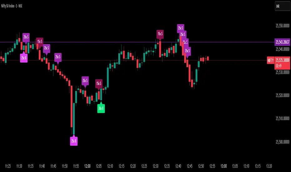
Delta Spike Detector [GSK-VIZAG-AP-INDIA]📌 Delta Spike Detector – Volume Imbalance Ratio
By GSK-VIZAG-AP-INDIA
📘 Overview
This indicator highlights aggressive buying or selling activity by analyzing the imbalance between estimated Buy and Sell volume per candle. It flags moments when one side dominates the other significantly — defined by user-selectable volume ratio thresholds (10x, 15x, 20x, 25x).
📊 How It Works
Buy/Sell Volume Estimation
Approximates buyer and seller participation using candle structure:
Buy Volume = Proximity of close to low
Sell Volume = Proximity of close to high
Delta & Delta Ratio
Delta = Buy Volume − Sell Volume
Delta Ratio = Ratio of dominant volume side to the weaker side
When this ratio exceeds a threshold, it’s classified as a spike.
Spike Labels
Labels are plotted on the chart:
10x B, 15x B, 20x B, 25x B → Buy Spike Labels (below candles)
10x S, 15x S, 20x S, 25x S → Sell Spike Labels (above candles)
The color of each label reflects the spike strength.
⚙️ User Inputs
Enable/Disable Buy or Sell Spikes
Set custom delta ratio thresholds (default: 10x, 15x, 20x, 25x)
🎯 Use Cases
Spotting sudden aggressive activity (e.g. smart money moves, traps, breakouts)
Identifying short-term market exhaustion or momentum bursts
Complementing other trend or volume-based tools
⚠️ Important Notes
The script uses approximated Buy/Sell Volume based on price position, not actual order flow.
This is not a buy/sell signal generator. It should be used in context with other confirmation indicators or market structure.
✍️ Credits
Developed by GSK-VIZAG-AP-INDIA
For educational and research use only.
EdgeXplorer – VWAP Cloud RunnerEdgeXplorer – VWAP Cloud Runner
VWAP Cloud Runner is a high-resolution, percentile-based volume-weighted average price (VWAP) cloud designed to help traders track dynamic price positioning across time-anchored VWAP layers. Unlike traditional single-line VWAPs, this tool offers a complete “cloud system” of rolling anchored VWAPs, statistically evaluated and plotted across multiple quantiles to visualize relative value zones and market bias gradients in real time.
Built for traders who depend on volume-informed structure, VWAP Cloud Runner can be used in both trending and ranging environments to identify premium vs. discount conditions, price acceptance, and overbought/oversold behavior — through the lens of aggregated VWAP layers.
⸻
🔍 What Does VWAP Cloud Runner Do?
This indicator computes a user-defined number of rolling anchored VWAPs — each seeded from a recurring anchor period (e.g. every hour, session, or day) — and stores them in memory. From this array of VWAPs, it then calculates statistical percentile levels (Max, High, Median, Low, Min) across the set.
Each percentile level reflects where price sits relative to the historical range of VWAPs, rather than raw price alone. The resulting cloud offers:
• A contextual map of volume-based fair value,
• A way to visually separate trending from reversionary price action,
• And a statistically sound framework for mean reversion, breakout filtering, or value zone trades.
⸻
⚙️ How It Works – Technical Breakdown
1. Anchor Period Selection
Every new bar of the selected anchor timeframe triggers the start of a new VWAP instance. Each VWAP is built over time using standard volume * price accumulation and volume division.
2. Rolling VWAP Array
The user sets the number of VWAPs (VWAP Count) to track (up to 500). Each VWAP updates in real-time and is stored in an internal array.
3. Percentile Calculation
At every new bar:
• The indicator performs percentile interpolation on the array of stored VWAPs using TradingView’s array.percentile_linear_interpolation() method.
• It extracts 5 key percentile levels (Min, Low, Median, High, Max) and plots them live on the chart.
4. Visual Styling & Optional Enhancements
• Lines can be solid or dashed depending on preference.
• Gradient fills between percentile bands form the “cloud.”
• The script includes smoothing logic to soften fills based on the difference between anchor periods, improving legibility.
⸻
📈 What Each Visual Component Represents
Visual Meaning
Max (Green Line) 100th percentile VWAP — the highest anchored VWAP in memory
High (Light Gray Line) ~70th percentile — often used to mark premium zones
Median (Gray Line) 50th percentile VWAP — midpoint of historical VWAPs
Low (Light Gray Line) ~30th percentile — used to gauge discount or acceptance zones
Min (Red Line) 0th percentile — lowest VWAP across all tracked anchors
Gradient Fills Shaded clouds between max/median and min/median, visually representing value extremes
Anchor Highlight A faint gray background briefly appears when a new VWAP is seeded (anchor event)
Dashed Styling Optional dashed lines toggle to differentiate levels without distraction
Everything on screen is statistically anchored and volume-aware — not arbitrary.
⸻
📊 Inputs & Settings Explained
VWAP Cloud Runner Settings
Input Description
Anchor Period Determines how often a new VWAP is seeded. Common examples: 15m, 1h, 1D
VWAP Source Price source used for VWAP calculation (default: hlc3)
VWAP Count Number of rolling VWAPs to store and evaluate. Affects how responsive or stable the cloud is
Toggle / Percentile / Width / Color
Each of the 5 layers — Max, Upper, Median, Lower, and Min — includes:
• Toggle (on/off)
• Percentile (editable for custom statistical boundaries)
• Line Width
• Color
This design gives traders full control to custom-tailor the cloud’s resolution and emphasis.
Style Options
Input Description
Use Dashed Lines Adds rhythm to cloud lines by visually breaking up uniform structure
Enable Gradient Fill Enables shaded cloud fills between Min–Median and Max–Median
Show Anchor Highlight When enabled, highlights the bar where each new VWAP instance is created
⸻
🧠 How to Interpret VWAP Cloud Runner
This tool is built for contextual reading, not explicit signals. Here’s how to interpret what you see:
• Price Near Max → Price is at a volume-weighted extreme → possible overextension or trend strength
• Price Near Min → Price is deeply discounted relative to recent VWAP history → potential reversion
• Price Near Median → Price is in balance → potential for breakout or continuation depending on trend
Use VWAP slope and percentile spacing to read the “shape” of price structure:
• Tight range between all percentiles → compression, awaiting expansion
• Widening gaps → trend formation or volatility burst
• Symmetric curve → balanced distribution
• Skewed cloud → directional bias forming
⸻
🧪 Use Cases and Strategy Tips
• 🎯 Mean Reversion Strategies: Fade extremes when price touches Max or Min and fails to close beyond
• 🛡️ Trend Confirmation: Ride price between High and Max or Low and Min — these zones act as trend channels
• 📉 Breakout Filtering: Use percentile gaps to measure conviction — small gaps = low conviction breakout
• 💡 Volume Fair Value: Trade only when price is near or reclaims the median VWAP → fair value validation
Works seamlessly across assets — whether you’re scalping BTC, swing trading FX pairs, or following trend continuation in equities.
⸻
🔒 Compliance Notice
VWAP Cloud Runner is a data visualization and contextual awareness tool. It does not provide trade signals or advice and should be used in conjunction with your existing strategy and risk parameters.
This script is protected under ETAPX Inc. and is proprietary to the EdgeXplorer platform. Redistribution, resale, or any use outside of TradingView without express written permission is strictly prohibited.

High Volume Buyers/SellersThis indicator will help you indicate wether breakout happened with high volume or not

EdgeXplorer - Liquidity ScopeLiquidity Scope by EdgeXplorer
Liquidity Scope is a real-time liquidity detection system developed for traders who want to track where the market is hunting stops, absorbing orders, and setting up traps — often before the average eye catches on. Built to identify the telltale behavior of liquidity sweeps and false breakouts, this tool highlights areas on the chart where price interacts with key swing points, including wicks, breaks, and retests.
⸻
🔍 What Does Liquidity Scope Do?
Liquidity Scope scans price action for swing highs and lows, tracks how price behaves around them, and visually plots zones where liquidity is likely being targeted. It tells you:
• When price wicks into a previous swing without breaking it (a liquidity probe),
• When price breaks past that level and returns (a potential retest),
• And when a sweep is complete or mitigated.
The result? A visual map of where liquidity was grabbed, where it hasn’t been yet, and where price might revisit — all drawn directly on your chart, in real time.
⸻
⚙️ How It Works – Technical Breakdown
Here’s the logic behind the engine:
1. Swing Detection
The script uses ta.pivothigh() and ta.pivotlow() to mark structural swing points, using your selected “Swings” length to define sensitivity.
2. Sweep Conditions
For each swing high or low:
• If price wicks into the level but fails to close beyond it → potential liquidity test.
• If price closes beyond the swing → it’s marked as broken.
• If price later retests the broken level from the other side → it’s tagged as a retest zone.
3. Visual Memory
Each swing level stores its own “memory state” (whether it was wicked, broken, retested, or mitigated), allowing the tool to update visuals live and avoid clutter.
4. Dynamic Zones
• When a sweep is detected, the tool draws a colored zone (box) at the sweep location, along with a supporting line.
• These zones extend forward until price clearly invalidates or mitigates them.
⸻
📈 Visual Components – What You See on the Chart
Element Meaning
Green Zones / Lines Bullish sweep: liquidity hunted below a swing low
Red Zones / Lines Bearish sweep: liquidity hunted above a swing high
Dotted Lines Wicks — price tested the level without breaking
Dashed Lines Retests — price returned to retest a broken level
Solid Lines Confirmed sweep levels with clean structure
Shaded Boxes Sweep zones extended into the future for monitoring
Faded Transparency Indicates mitigation or that the zone is cooling off
Every visual is tied to a logic branch in the code — nothing is decorative. Each shape or line has meaning tied to price behavior.
⸻
📊 Inputs & Settings Explained
Setting Description
Swings (len) Sets the pivot lookback range. Higher = fewer, stronger swing levels.
Options (opt) Controls what sweep types you want to see:
• Only Wicks → Focus on traps and fakeouts
• Only Outbreaks & Retest → Focus on confirmed moves
• Wicks + Outbreaks & Retest → See it all |
| Bull/Bear Colors | Customize how bullish vs. bearish sweeps are drawn |
| Extend Zones (extend) | When on, boxes stretch forward in time until price touches or invalidates them |
| Max Bars (maxB) | Sets how long (in bars) sweep zones will stay active before expiring |
⸻
🧠 How to Read It in Live Markets
Liquidity Scope doesn’t tell you what to do — it tells you what the market just did in relation to liquidity and structure.
Here’s how to use it:
• Green Zones (Bullish Sweeps):
Price just grabbed liquidity under a low. Watch for:
• A bounce → potential reversal
• A retest → possible long entry confirmation
• Red Zones (Bearish Sweeps):
Price swept above a high. Watch for:
• Immediate rejection → potential short zone
• Pullback and retest → trend continuation trap or fake breakout
• Wick Sweeps Only:
Often seen in range-bound markets or when market makers are testing stops.
• Retest Sweeps:
Often seen in trending markets, validating breakouts or signaling exhaustion.
⸻
🧪 Optional Use Cases & Strategy Tips
Here’s how traders on the EdgeXplorer platform use Liquidity Scope:
• 🔄 Smart Money Concepts: Use sweep zones alongside order blocks, FVGs, and breakers to confirm institutional movement.
• ⚠️ Trap Zones: Spot liquidity fakeouts where retail might be chasing early breakouts.
• 🎯 Entry/Exit Filtering: Use zones to validate entries only when price reacts cleanly around them — or exits when mitigation completes.
• 🧠 Confluence Layer: Combine with trend indicators or volume to add strength to directional bias.
⸻
🔒 Final Note on Use & Compliance
Liquidity Scope is a market behavior visualizer, not a signal generator. It helps you understand where the market might be trapping liquidity, but you are the strategy. Always pair with proper confirmation, risk management, and your own discretion.
All logic, structure, and assets in this script are © protected under ETAPX Inc. and the EdgeXplorer platform. Unauthorized sharing or monetization of this code is prohibited under company and platform policy.
