How to Trade Liquidity Sweep in Forex Market (SMC Trading)
I will show you a real example of trading liquidity sweep with Smart Money Concepts.
You will learn the essential SMC liquidity basics, a simple and profitable strategy to identify and trade liquidity sweep.
I will share with you an accurate entry confirmation signal that works perfectly on any Forex pair.
Liquidity Basics
In order to trade liquidity sweeps profitably, you should learn to identify significant liquidity zones.
To spot them, analyze a historic price action and find clusters of important historic key levels.
Examine a price action on EURUSD on an hourly time frame.
I underlined multiple horizontal key levels.
The price respected each level, found support on them, and rebounded.
What is so specific about these levels is that they are lying close to each other, composing a liquidity cluster.
That fact that EURUSD strongly bounced from these levels suggests that buying interest and high buying volumes were concentrated around them.
We can unite these levels and treat them as a single demand zone that has just been broken and turned into a supply zone.
After we found a valid liquidity zone, we can look for a liquidity sweep.
First, we should let the price approach that area and look for a specific price behavior then.
That is a perfect example of a liquidity sweep.
You can see that the price formed a wide range candle with a long tail.
Its high went way beyond the underlined area, but its body closed within.
In order to understand, why a liquidity sweep occurred, let's zoom in our chart and try to understand a behavior of the market participants.
Our supply zone concentrated selling orders , we assume that sellers were placing their orders across its entire length.
Their stop losses were presumably lying above that area.
Smart Money know that and with a liquidity sweep they manipulate the market, making sellers close their positions in a loss (buying back their positions from the market) and providing a liquidity for big players.
After a formation of a such a candlestick, a reliable confirmation of a saturation of the Smart Money is a formation of a strong bearish candle - a clear sign of strength of the sellers.
A bearish engulfing candle above confirmed a completion of a liquidity sweep and indicates a highly probable bearish continuation.
Your perfect sell entry is immediately after a close of such a candlestick.
Stop loss should strictly lie above the high of a liquidity sweep.
Take profit is based on a local low.
Look, how quickly the price reached the goal.
Your strategy of trading liquidity sweeps of demand zones is absolutely the same.
Let the price test a demand zone, wait for a formation of wide range bearish candle with a tail going below its lows.
Wait for a bullish imbalance candle and buy immediately then.
Stop loss will be below the low of a liquidity sweep, take profit - a local high.
This SMC strategy works on any time frame and can be applied for trading any Forex pair, Gold, Silver, Crypto and commodities.
Try it by your own and let me know your results.
❤️Please, support my work with like, thank you!❤️
I am part of Trade Nation's Influencer program and receive a monthly fee for using their TradingView charts in my analysis.
Supply and Demand

Internal and external liquidity Here's another mechanical lesson for you.
In my last post I covered a mechanical technique to identify swing ranges. Rule-based, simple and repeatable.
In this post, I want to share another little technique, again part of the mechanical series. But this time I want to talk about liquidity.
Most traders talk about liquidity, they might even have a grasp of what it is. But most do not know how liquidity forms the sentiment and how that creates a type of algo for the market.
You might have heard of Elliott wave theory. There is a saying along the lines of "you ask 10 Elliott traders for their count and you get 11 answers".
But the point is here, when you simplify the concept, it's clear to see that sentiment caused by liquidity swings is what causes a repeatable pattern in the market.
Let's take the idea of the ranges from my last post.
Now after a fair amount of accumulation, this level becomes "defended" - the price will gradually move up until old short stop losses are tagged and new long entries are entered into.
This allows the institutional players to open up their orders without setting off the alarm bells.
Price then comes back from external liquidity to find internal liquidity (more on this in a later post).
But then it looks for the next fresh highs.
As the highs are put in, we can use the range technique to move our range to the new area as seen in the image above.
Next we will be looking for an internal move, not just internal to the range, but a fractal move on the smaller timeframe that drives the pullback down. See this in blue.
The logic here is simple; on the smaller timeframes we have witnessed an accumulation at the 2 region and as we spike up for 3; we will witness a distribution on the smaller timeframes.
Wyckoff called this the accumulation, followed by a mark-up and then the distribution and a mark-down.
It is this pattern, over and over again that leads to this type of structure.
This will then be re-branded by various analysts who will call it things like a head and shoulders, smart money will see a change of character and a retest before breaking the structure.
This is all the same thing - just a different naming convention.
Again, I hope this helps some of you out there!
Disclaimer
This idea does not constitute as financial advice. It is for educational purposes only, our principal trader has over 25 years' experience in stocks, ETF's, and Forex. Hence each trade setup might have different hold times, entry or exit conditions, and will vary from the post/idea shared here. You can use the information from this post to make your own trading plan for the instrument discussed. Trading carries a risk; a high percentage of retail traders lose money. Please keep this in mind when entering any trade. Stay safe.

Impact on the Dollar and Forex — Artavion AnalyticsThe development of central bank digital currencies (CBDCs) — especially the digital yuan (e-CNY) — is becoming a key factor in transforming global currency flows. While the US dollar still dominates, the architecture of global liquidity is beginning to shift.
At Artavion, we see the e-CNY not just as a technological experiment but as a tool of China’s currency policy. Its goal is to strengthen the yuan’s role in international settlements and reduce dependence on the dollar, particularly in developing regions.
Why the Digital Yuan Matters
The e-CNY is already being used in China for retail payments and is being tested in cross-border transactions (e.g., in the mBridge project with the UAE and Thailand). This enables the creation of alternative payment systems not tied to SWIFT.
If the digital yuan gains broader acceptance, especially for commodity and energy settlements, its role in forex will grow, potentially weakening the dollar’s monopoly in certain regions.
CBDCs and Forex Structure
CBDCs won’t displace the dollar in the near term, but they are already influencing the structure of currency trading:
New currency pairs are emerging, especially in Asia;
Transactions are becoming faster and cheaper, particularly in the B2B segment;
Market participants are adjusting strategies to real-time settlements and the potential programmability of currencies.
Risks and Limitations
Privacy: CBDCs are under full state control;
Fragmentation: There is no unified technical standard across different countries’ CBDCs;
Geopolitics: The rise of the e-CNY could intensify currency competition with the dollar.
Artavion’s Conclusion
The digital yuan will not replace the dollar, but it is creating an alternative — especially in regions seeking autonomy from Western financial infrastructure. For traders and investors, this means reassessing currency risks and exploring new opportunities in decentralized settlement channels.

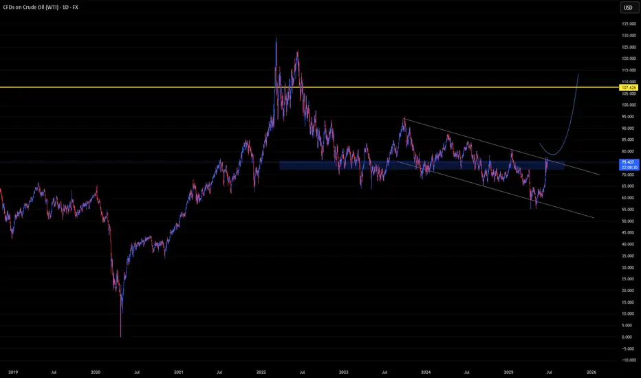
U-oyela Ongahluziwe Nenkunzi.Considering the current countries in conflict - FX:USOIL is in the middle of it. This will lead in a high demand but low supply of the commodity resulting in a soaring bullish move, fundamentally. Technically, the commodity has created a LL in the current year, tapping lows last touched since 2021 and has further recovered from last years close of 71.899.
FX:USOIL reaching highs of $110.00 is therefore likely.
***The best way to take advantage of this commodity or any other is to cherry pick stocks that are sensitive to it e.g. JSE:SOL is sensitive to FX:USOIL .***
Long position on the 1h/15m LTFThis is a position that just got filled a while ago.
It was executed using supply and demand zones on the LTF.

How to use VWAP the right-way on TradingView
1️⃣ What Is VWAP (Volume Weighted Average Price)?
VWAP stands for Volume Weighted Average Price. It's a tool that shows the average price an asset has traded at throughout the day, adjusted for volume. That means it gives more weight to prices with high trading volume.
✅ It helps traders and investors see if the current price is above or below the average price paid.
✅ It’s often used by institutional traders, such as mutual funds and pension funds, to enter and exit positions without causing major price moves.
VWAP = (Sum of Price * Volume) / Total Volume
2️⃣ Why VWAP Matters
I (Traders) often use VWAP as a dynamic support or resistance zone.
- Price below VWAP: considered undervalued by some 👉 may act as support
- Price above VWAP: considered overvalued 👉 may act as resistance
It acts like a magnet for price, especially in trending markets.
VWAP is also used as a benchmark for large players want to buy below VWAP or sell above it.
3️⃣ Anchored VWAP (AVWAP)
Anchored VWAP is a more advanced version of VWAP. Instead of starting at the market open, you anchor it to a specific candle (pivot high or low).
🔍 Why use it:
- Lets you analyze the average price from key market turning points
- Helps spot institutional interest near pivots
- More accurate for swing trading
When you anchor VWAP to a major high or low, it gives you clean zones where smart money might enter or exit.
4️⃣ How I Use Anchored VWAP
I personally anchor VWAP from:
- Major pivot highs/lows
- Breakout points
- Strong reversal candles
Then I watch how price interacts with it.
✅ Works well on 30m and 4H charts for intraday or swing setups
✅ Can be combined with fixed range volume profile for extra confluence
If you haven’t read my guide on fixed range volume profile, scroll below — it’s linked there.
5️⃣ Common Uses
✔️ Support and resistance zone in trending markets
✔️ Institutional entry/exit level benchmark
✔️ Reversion-to-mean setups
VWAP is used across timeframes. I use higher timeframes like 4H to spot trend zones, then zoom into 30m or 15m for entries.
Setting and more information
VWAP Explained by TradingView: www.tradingview.com
Anchored VWAP Explained by TradingView: www.tradingview.com
6️⃣ VWAP Limitations
⚠️ VWAP doesn’t work well in all cases:
- In sideways/choppy markets, it can lose value
- It is not an exact entry/exit signal, but rather a dynamic zone
- In FX markets, it’s unreliable due to lack of centralized volume data
Also, treat VWAP as a zone, not a line. Large players fill big orders in that area, expect false moves or liquidity grabs.
7️⃣ Mistakes to Avoid
❌ Entering blindly on VWAP touches
❌ Using VWAP without confirmation from price action or volume
❌ Assuming it always gives perfect levels
It works best when combined with other tools, such as market structure, support/resistance, and volume profile.
8️⃣ Final Thoughts
VWAP is a powerful tool to see where price is relative to volume-based value. Anchoring VWAP to key levels adds precision and insight.
Used properly, it helps:
- Spot where institutions might be active
- Confirm high-probability zones
- Improve entries/exits when paired with other tools
Examples are provided below to show how VWAP works in real-time setups. This guide is educational and for learning purposes only.
VWAP Zone and a Example trade CRYPTOCAP:BTC
Example Stock Market NASDAQ:AAPL
Example Resistance NASDAQ:MSTR
VWAP (Volume Weighted Average Price) helps traders see the average price weighted by volume. It's commonly used by institutions to identify good entry/exit zones. Anchored VWAP takes this further by starting from key points like pivot highs/lows for more accuracy. It's most useful in trending markets and works best when combined with tools like fixed range volume profile or support/resistance. While powerful, VWAP isn’t perfect it should be used as a dynamic zone, not a fixed level, and always with other confirmations.
Disclaimer: This is not financial advice. Always do your own research. This content may include enhancements made using AI.

When and How to Use Weekly Time Frame in Gold Forex Trading
Ignoring weekly time frame chart analysis could cost you big losses in Forex, Gold trading!
Discover 3 specific cases when weekly time frame beats daily time frame analysis.
Learn the situations when weekly timeframe exposes what daily charts can’t, how to analyze it properly and when to check it.
1. Long-term historic levels
When the market trades in a strong bullish or bearish trend and goes beyond recent historic levels, quite often the daily time frame will not be sufficient for the identification of significant supports and resistances.
The proven way to identify the next meaningful levels will be to analyze a weekly time frame.
Examine a price action on EURAUD forex pair on a daily time frame chart. The market is trading in a strong bullish trend and just updated the high.
Checking the historic price action, we don't see any historic resistance on the left.
Switching to a weekly time frame chart, we can easily recognize a historic resistance that the price respected 5 years ago.
That's a perfect example when weekly t.f revealed a historic price action that a daily didn't.
2. Trend-lines
Weekly time frame analysis is important not only for a search of historic levels. It can help you find significant vertical structures - the trend lines.
We can easily find several meaningful historic resistances on EURUSD pair on a daily time frame.
Though, there are a lot of historic structures there, let's check if there are some hidden structures on a weekly.
Weekly time frame reveals 2 important trend lines, one being a vertical support and another being a vertical resistance.
With a daily time frame analysis, these trend lines would be missed .
3. More accurate breakout confirmations
Some false support and resistance breakouts that you see on a daily could be easily avoided with a weekly time frame analysis.
Quite regularly, a daily time frame support or resistance is in fact a weekly structure. And for its breakout, a weekly candle close will provide more accurate confirmation.
From a daily time frame perspective, we see a confirmed breakout - a daily candle close above a solid resistance zone.
It provides a strong bullish signal on AUDUSD forex pair.
However, the violation turned out to be false and dropped.
Such a false breakout , could be easily avoided, checking a weekly time frame chart.
The underlined resistance is in fact a weekly structure.
The price did not manage to close above, and perfectly respected that, starting to fall after its test.
Such a deeper analysis would completely change our bias from strong bullish (based solely on a daily) to strongly bearish (based on a daily AND weekly)
Remember This
Do not ignore and always check a weekly time frame.
It shows a unique perspective on the market and reveals a lot of hidden elements that you would not notice.
No matter whether you are a scalper, day trader or swing trader,
remember that weekly time frame structures are very impactful and accumulate large trading volumes.
❤️Please, support my work with like, thank you!❤️
I am part of Trade Nation's Influencer program and receive a monthly fee for using their TradingView charts in my analysis.

Why You Should Trade Zones, Not Points – Especially on XAUUSDIf you've been trading Gold (XAUUSD) for a while, you’ve likely noticed something strange in many analyses online. Support at 3256.73? Resistance at 3352.14?
Really? That precise?
This kind of fixed-point trading might look good on a chart, but it doesn't work in a real, volatile market — especially not in 2025.
I've been trading Gold as my primary asset for over a decade, and if there's one thing experience — and logic — have consistently shown me, it's this: you should trade price zones, not fixed points. Let me explain you why.
________________________________________
🔍 1. Gold Is Not a Low-Volatility Asset
Gold isn't EURUSD. It doesn't move in clean 20-30-pip increments. It's volatile, reactive, and sensitive to everything from Fed rate rumors to random tweets and global conflicts.
Over the past months, volatility has spiked — and not just because of economic data. We’re seeing:
• Geopolitical uncertainty that escalates and de-escalates overnight
• Macro shifts in interest rate expectations almost weekly
• Market sentiment changing faster than ever
In this environment, the idea that price will reverse exactly at 3352.14 is pure fantasy.
________________________________________
📏 2. Percentages Matter More Than Pips Now
Back when Gold was around $2000, a 200-pip move meant a 1% change in price.
Now, with Gold trading above $3300, the same 1% move is 330 pips.
So, if you're still treating 30–50 pips like a serious target on Gold, you're not adjusting to reality. You're chasing crumbs in a storm.
I’ve written before about why you shouldn't trade Gold for small 30–50 pip moves. It’s no longer a high-probability game — the math doesn’t work. You’re either over-leveraging or underperforming.
________________________________________
📈 3. Price Zones Are Where the Smart Money Trades
Markets aren’t binary. They don’t care about your exact number.
They care about liquidity zones — where enough buyers and sellers are willing to transact in volume.
Here’s how professionals approach it:
• Support isn’t a number — it’s a range.
• Resistance isn’t a line — it’s a battle zone.
When you analyze Gold, think in ranges like 3280–3290 or 3320–3330. This is where price breathes, traps traders, and makes real moves.
Fixed points create unrealistic expectations and false confidence.
________________________________________
🧠 4. Emotion Kills Precision in Real Time
In live trading, you’re not a machine. You’re a human reacting to candles, tweets, and news.
Waiting for an entry at exactly 3352.14 often means:
• You miss the move entirely
• Or you force a bad entry when price front-runs your level
But when you use zones, you give yourself the flexibility to act within context, not dogma.
You can read the candle behavior inside that zone, you can spot exhaustion, you can scale in or out — you become tactical, not rigid.
________________________________________
✅ Final Thoughts: Adapt or Stay Frustrated
If you want to trade Gold successfully in this current market, you must adapt:
• Use zones instead of pin-point levels
• Adjust your expectations to the new pip-to-percentage dynamics
• Respect the volatility and macro backdrop
The traders who will survive are not the ones with the cleanest lines on their charts. They’re the ones who know how to handle chaos with structure, using zones as flexible tools, not false certainties.
🎯 Start thinking in ranges, not numbers. That’s where the edge is.
Disclosure: I am part of TradeNation's Influencer program and receive a monthly fee for using their TradingView charts in my analyses and educational articles.

How to draw support and resistance levels the right way?
1️⃣ Why Are Support and Resistance Levels So Important?
Support and resistance levels show where price has reacted strongly in the past. These are zones where many traders including large players have placed buy or sell orders.
Support = where buyers step in and push price up
Resistance = where sellers step in and push price down
These levels are important because they act like decision zones:
- Price might bounce from these levels
- Or break through and start a new move
- Or even fake out traders before reversing again
Knowing where these levels are gives you an edge:
- You can better time your entries and exits
- You avoid chasing price in the middle of nowhere
- You prepare for market reactions not random guesses
Think of them like traffic lights for the market when price hits them, something important usually happens.
2️⃣ Three Main Types of Support and Resistance
There are 3 key types of support and resistance levels traders commonly use:
- Level-Based: Horizontal zones drawn from key highs and lows
- Pattern-Based: Support/resistance found in chart patterns like triangles, flags, etc.
- Channel-Based: Diagonal trendlines showing support and resistance in a channel
Today, we focus on level-based support and resistance horizontal lines drawn on key price zones.
3️⃣ How to Draw Support and Resistance Levels
Use daily, weekly, or monthly timeframes to find major zones. These higher timeframes give you stronger, more respected levels.
Look for:
- Candle bodies that close and open around the same price
- Strong wicks rejecting a certain level
- Zones where price has bounced multiple times in the past
I often pick:
- The close of a red candle
- The open of the next green candle
These spots usually show where sellers lost control and buyers stepped in — or vice versa.
4️⃣ Timeframes and Their Strength
The higher the timeframe, the stronger the level:
- Monthly = very strong, long-term zones
- Weekly = strong and reliable
- Daily = useful for swing trading
- Lower timeframes (15m, 5m) = more noise, less reliable unless you're day trading or scalping
Pick levels based on your strategy:
- Swing traders = use daily/weekly/monthly
- Scalpers = lower timeframes with extra confluence (volume, structure)
5️⃣ Don’t Use Support/Resistance Alone
Support and resistance are helpful — but not enough by themselves. Always combine them with:
- Market structure (higher highs/lows)
- Volume confirmation
- Indicators or price action signals
You want to watch how price reacts at your levels. Wait for confirmation before making decisions.
6️⃣ Common Mistakes Traders Make
Mistake 1: Drawing too many levels clutters your chart and creates confusion.
Mistake 2: Keeping old levels that have already been broken or invalidated.
Mistake 3: Ignoring volume. Just because price hits a level doesn’t mean it will reverse. You need volume to back the move.
Also:
Don’t enter blindly on breakout, breakouts can fail. Wait for confirmation.
Don’t assume a level is strong just because it’s touched once — look for multiple rejections.
7️⃣ Example: How I Draw Support/Resistance
Let’s say I’m looking at a daily chart.
- I find a red candle that closes at 42,000
- Then a green candle opens at 42,000 and pushes higher
That tells me buyers stepped in at 42,000 — this is a potential support.
I draw my horizontal line across that level.
Then I zoom into 30m or 15m charts to watch price behavior when it comes back to that level.
If price respects it again, I may enter a trade based on the reaction.
This technique gives me more confidence and clarity.
I know where liquidity might be waiting.
I can combine it with indicators or volume tools.
I avoid random trades.
🔄 Summary
Identify a timeframe – Use the monthly, weekly, or daily chart.
Look for two candles – Draw your support or resistance line at the point where one candle closes and the next one opens.
Make sure the level hasn’t been hit yet – This helps you spot areas where liquidity grabs might happen.
Wait for price to reach the level – Once price touches the support or resistance zone, watch how it reacts.
After price touches the level, remove it – Once tested, that level is no longer fresh and should be cleared from your chart.
Support and resistance isn’t magic — but used with confluence, it becomes a powerful guide.
Please LIKE 👍, FOLLOW ✅, SHARE 🙌 and COMMENT ✍ if you enjoy this idea! Also share your ideas and charts in the comments section below! This is best way to keep it relevant, support us, keep the content here free and allow the idea to reach as many people as possible.
Disclaimer: This is not financial advice. Always do your own research. This content may include enhancements made using AI.

How to Use Fixed Range Volume Profile on TradingView
1️⃣ Why Fixed Range Volume Profile Matters
✅ It helps you spot real price structure where traders were active, not just where price passed through.
Useful for:
Identifying Supply & Demand zones
Understanding nstitutional activity (volume concentration = likely smart money involvement)
Analyzing range-bound markets
Confirming pullbacks or entries in trending setups
There are two different tools: one is called Volume Profile, and the other is Fixed Range Volume Profile. To learn more about them, check out the link below.
Volume Profile Indicators: basic concepts: www.tradingview.com
Fixed Range Volume Profile: www.tradingview.com
2️⃣ What is Volume in Trading?
Volume refers to the total number of units (e.g., shares, contracts, coins) traded during a specific time period. It measures the market's participation.
✔️ High Volume = strong interest and confirmation of price moves.
❌ Low Volume = weak conviction, indecision, or potential false moves.
Volume is calculated by counting all completed trades in a candle both buying and selling.
Learn more about volume here: www.tradingview.com
3️⃣ What is Fixed Range Volume Profile?
Fixed Range Volume Profile is a tool you can draw on your chart to check how much trading happened at different price levels, but only within the range you select. You pick the start and end point, and the tool shows volume activity just in that area.
It shows three main levels:
🔴 Point of Control (POC): the price where the most trading happened
🟢 Value Area High (VAH): the highest price in the area where most trades occurred (about 70% of total volume)
🔵 Value Area Low (VAL): the lowest price in that same area
These three levels show the price range where most trading took place also called the value area.
4️⃣ Why Fixed Range Volume Profile Matters
It helps you spot real price structure where traders were active, not just where price passed through.
Useful for:
Identifying Supply & Demand zones
Understanding institutional activity (volume concentration = likely smart money involvement)
Analyzing **range-bound markets
Confirming pullbacks or entries in trending setups
5️⃣ How to Use Fixed Range Volume Profile on TradingView
Steps:
1. First, look for a clear range on your chart. A range is a sideways movement where price is mostly moving back and forth instead of trending.
2. I like to use the 4-hour chart for this, but you can use any timeframe. Using candles with clearer shapes can help you see the range more easily.
3. Once you see a range, go to the left-hand toolbar and select the Fixed Range Volume Profile tool.
4. Click at the beginning of the range, then drag your mouse to the end of the range.
5. Let go of the mouse, and the volume profile will appear on that section of the chart.
Analyze:
POC: Price may often return to this level because it's where most trading happened
VAH: Price could have a harder time moving higher if it reaches this level may act like resistance
VAL: Price may find support around here — traders bought more in this area
1. Find the Range
2. Draw your Profile
3. You should treat your volume range like a basic support and resistance level. What you want to see is a flip between support and resistance.
4. If the price breaks above the volume profile and keeps going higher, you want it to come back and retest that same range this time acting as support.
5. Your entry should be near the support. Your stop-loss should be placed above the high of the breakout or a logical structure. Of course, setting a stop-loss always depends on more context, like the overall market structure and your risk management plan.
6️⃣ Practical Scenarios
✔️ Use it during sideways or quiet market phases (called consolidation) to see where most of the trading happened before the market moved
✔️ Try it on pullbacks in trending markets to check if price is returning to an area of high volume
✔️ Draw profiles on different price swings to spot areas where volume keeps showing up again and again
Example:
⚠️ Limitations
Fixed Range Volume Profile might not work well when:
The asset has very little trading volume (like new coins or very small stocks)
There’s a big news event causing unexpected volume spikes
The market is moving fast in one direction, and the volume zones don’t hold
⚠️ A couple of common mistakes traders make when using Fixed Range Volume Profile:
They apply it in trending markets. This tool works best in sideways or ranging markets, not when price is trending strongly up or down.
They include breakout volume. Breakouts often include forced liquidations or trapped traders this can create misleading spikes in volume.
7️⃣ Summary
Fixed Range Volume Profile helps you see where most trades happened in a specific part of the chart. It highlights price zones where traders were most active, which can help you understand possible support, resistance, or value areas.
✅ Good for:
Markets that are going sideways
Double-checking volume around key levels
Spotting price zones where support or resistance might appear
Disclaimer: This is not financial advice. Always do your own research. This content may include enhancements made using AI.

Follow the Flow: Trading with Liquidity ZonesLiquidity is where the market breathes. The Liquidity Zones indicator by BigBeluga helps traders visualize where large players may be hiding orders—revealing the zones where price is most likely to react, reverse, or accelerate.
Let’s break down how this tool works, how we use it at Xuantify, and how you can integrate it into your own strategy.
🔍 What Is the Liquidity Zones Indicator?
This open-source tool identifies pivot highs and lows filtered by volume strength and plots them as liquidity zones —highlighting areas where buy/sell orders are likely to accumulate.
Key Features:
Volume-filtered pivot detection (Low, Mid, High)
Dynamic or static liquidity zone boxes
Color intensity based on volume strength
Liquidity grab detection with visual cues
These zones act as magnets for price , helping traders anticipate where reactions, reversals, or stop hunts may occur.
🧠 How We Use It at Xuantify
We use Liquidity Zones as a contextual map for structure and execution.
1. Entry & Exit Planning
We align entries near untested liquidity zones and use them as targets for exits—especially when confirmed by structure or momentum.
2. Liquidity Grab Detection
When price pierces a zone and reverses, it often signals a liquidity sweep . We use this as a trigger for reversal setups.
3. Volume Context
Zones with higher volume intensity are prioritized. These are more likely to attract institutional activity and generate stronger reactions.
🧭 Dynamic vs. Static Zones
The indicator offers both dynamic and static zone modes:
Dynamic : Box height adjusts based on normalized volume, showing how much liquidity is likely present.
Static : Consistent box size for cleaner visuals and easier backtesting.
Why this matters:
Dynamic zones reflect real-time volume strength
Static zones offer simplicity and clarity
Both modes help visualize where price is likely to “grab” liquidity
⚙️ Settings That Matter
To get the most out of this tool, we recommend:
Volume Strength = Mid or High for cleaner zones
Enable Dynamic Mode when trading volatile assets
Use Color Intensity to quickly spot high-liquidity areas
🔗 Best Combinations with This Indicator
We pair Liquidity Zones with:
Market Structure Tools – BOS/CHOCH for context
Momentum Indicators – Like RSI or MACD for confirmation
Fair Value Gaps (FVGs) – For precision entries near liquidity
This layered approach helps us trade into liquidity , not against it.
⚠️ What to Watch Out For
Liquidity zones are not signals —they’re context . In fast-moving or low-volume markets, price may ignore zones or overshoot them. Always combine with structure and confirmation.
🔁 Repainting Behavior
The Liquidity Zones indicator is designed to be non-repainting . However, due to waiting for pivot confirmation, the zones are plotted in hindsight. This makes it suitable for real-time execution .
⏳ Lagging or Leading?
This tool is partially lagging —it waits for pivot confirmation and volume validation before plotting a zone. However, once plotted, these zones often act as leading levels , helping traders anticipate where price may react next.
🚀 Final Thoughts
The Liquidity Zones indicator by BigBeluga is a powerful visual tool for traders who want to understand where the market is likely to move—not just where it’s been. Whether you’re trading reversals, breakouts, or mean reversion, this tool helps you stay aligned with the market’s hidden intent.
Add it to your chart, test it, and see how it sharpens your edge.

Learn Best Candlestick Pattern For Trend Trading Gold XAUUSD
This secret pattern will change the way you trade Gold XAUUSD.
If you study technical analysis in Gold trading, there is one unique candlestick pattern that you absolutely need to know.
In this article, you will learn the structure and the meaning of one of the most accurate candlesticks in Gold trading.
I will teach you how to recognize this pattern and how to trade it for maximum profits.
Let's start with some theory and let me show you how this candlestick pattern looks.
This candlestick pattern is called inside bar.
It is based on a combination of at least 3 candles.
The first candlestick in a sequence should be a strong bullish or bearish candle. The consequent candles should strictly close within its range.
If at least 2 candles close within the range of the first candle with its bodies, that will be a valid inside bar.
The first candle will always be called the mother's bar , while the following candles will be called the inside bars.
That's a perfect example of the inside bar pattern on Gold XAUUSD chart on a daily.
This pattern is based on 2 important elements that you should always pay close attention to.
The upper boundary of the range of the mother's bar will compose a significant resistance that will provide a safe place to sell.
While the lower boundary of the range of the mother's bar will be a strong support to buy Gold from.
Look how nicely Gold price respected the resistance of the range, dropped to its support and started to grow then.
Once you identified the inside bar, you can easily trade it within the range.
However, I strictly recommend waiting for a confirmation signal before you place a trade.
One of the proven confirmations is a price action signal on lower time frames.
In the example above, Gold formed a bullish chart pattern - double bottom after a test of a support and a bearish pattern - head and shoulders after a test of a resistance.
Remember that the market can not stay within the range of the inside bar candlestick pattern forever.
Bullish violation and a candle close above the range will be a strong signal to buy Gold.
While, a bearish breakout of its range will provide a strong bearish confirmation.
That's how a breakout of the underlined resistance triggered a strong rally on Gold.
Inside bar is the essential pattern both for the gold swing traders and day traders.
This pattern provides a lot of profitable trading opportunities, being very simple to recognize.
❤️Please, support my work with like, thank you!❤️
I am part of Trade Nation's Influencer program and receive a monthly fee for using their TradingView charts in my analysis.

Exposing Price Inefficiencies: The Role of Fair Value Gaps (FVG)In the ever-evolving landscape of price action trading, one concept has gained significant traction among institutional and retail traders alike: Fair Value Gaps (FVGs) . At Xuantify, we believe that understanding market inefficiencies is key to anticipating high-probability setups—and FVGs offer just that.
🔍 What Is a Fair Value Gap?
A Fair Value Gap is a price imbalance that occurs when the market moves too quickly in one direction, leaving behind a "gap" in liquidity. This typically happens during high volatility or news-driven events, where price skips over levels without sufficient buying or selling.
In technical terms, an FVG is identified when a candle’s low (in a bullish move) or high (in a bearish move) does not overlap with the previous or next candle. This creates a three-candle structure :
- Bullish FVG : Candle 1 (bearish), Candle 2 (strong bullish), Candle 3 (bullish or neutral)
- Bearish FVG : Candle 1 (bullish), Candle 2 (strong bearish), Candle 3 (bearish or neutral)
These gaps often act as magnets for price , as the market seeks to rebalance and fill the inefficiency.
🧠 Why Do FVGs Matter?
FVGs are not just visual anomalies—they represent institutional footprints . When large orders are executed, they often cause price to move rapidly, leaving behind unfilled orders. Smart money tends to revisit these zones to complete their positions.
Key Benefits of Trading FVGs:
- ✅ High-probability entries: Price often returns to fill the gap before continuing its trend.
- ✅ Clear invalidation levels: The edges of the gap provide natural stop-loss zones.
- ✅ Works across timeframes: From scalping on the 1-minute to swing trading on the daily.
🧩 Using the “Fair Value Gap ” Indicator
To simplify the process of identifying and trading FVGs, we recommend the Fair Value Gap indicator on TradingView. This tool automatically highlights bullish and bearish FVGs, tracks their mitigation, and even provides alerts when gaps are filled.
Key Features:
- Auto-detection of bullish and bearish FVGs
- Mitigation tracking: See which gaps are filled and which remain open
- Threshold filtering: Focus on significant gaps by adjusting the minimum size
- Dynamic mode: Monitor evolving FVGs in real time
- Alerts: Get notified when price fills a gap
💡 No Repainting, No Delays
One of the most reassuring aspects of this indicator is that it does not repaint . Once a fair value gap is printed, it stays on the chart—no disappearing zones, no misleading signals.
Even better, the indicator plots FVGs in real time . It uses a three-candle structure and confirms the gap immediately after the third candle closes . This means you’re seeing valid, actionable gaps as they form—not in hindsight.
This makes the LuxAlgo FVG tool a reliable companion for both live trading and backtesting , giving traders the confidence that what they see is what the market actually delivered.
How to Use It:
1. Add the indicator : Search for “Fair Value Gap ” in the TradingView Indicators tab.
2. Adjust settings :
- Use the “Threshold %” to filter out smaller, less relevant gaps.
- Enable “Mitigation Levels” to track filled gaps.
- Use “Auto Threshold” for adaptive filtering based on volatility.
3. Trade setups :
- Contrarian : Wait for price to fill a gap and look for reversal signals.
- Trend-following : Enter trades in the direction of the gap when it forms.
⚠️ FVGs Are Not Always Honored
While FVGs offer powerful insight into market inefficiencies, it's important to remember: they are not guaranteed reversal or continuation zones . Sometimes price will blow right through a gap without reacting—especially in trending or news-driven markets.
Why this happens:
The gap may have already been mitigated on a lower timeframe
Strong momentum or macroeconomic catalysts override technical zones
The FVG is too small or lacks confluence with other key levels
How to manage this:
Always combine FVGs with structure, liquidity, and volume
Use alerts and confirmations (e.g., candle patterns or BOS/CHOCH)
Avoid trading FVGs in isolation—context is everything
🧠 Best Indicator Combinations with FVG
To increase the accuracy of FVG-based setups, we recommend combining the LuxAlgo FVG indicator with the following tools:
1. Market Structure (LuxAlgo Smart Money Concepts)
Identify breaks of structure (BOS) or change of character (CHOCH) near FVGs. Use structure shifts to confirm whether the FVG is likely to hold or fail.
2. Volume Profile or Session Volume
Confirm FVGs with low-volume nodes or volume gaps . FVGs aligning with volume imbalances are more likely to be respected.
3. Order Blocks
Look for FVGs that overlap with bullish or bearish order blocks . This confluence often signals institutional accumulation or distribution.
4. Relative Strength Index (RSI) or Stochastic
Use momentum indicators to confirm exhaustion or continuation near FVGs. For example, a bullish FVG + oversold RSI = potential long setup.
5. Liquidity Zones (Equal Highs/Lows, Swing Points)
FVGs near liquidity pools are often targeted before reversal. Combine with sweep setups for sniper entries.
Here’s a new section you can add to your blog post, focusing on the power of **Multi-Timeframe (MTF) FVG Alignments**:
🧭 Multi-Timeframe FVG Alignments
One of the most powerful ways to increase the reliability of Fair Value Gaps is by using multi-timeframe confluence . When FVGs align across different timeframes—say, a 1H FVG inside a 4H FVG zone—it often signals a high-probability reaction area .
Why it works:
Higher timeframe FVGs represent broader institutional imbalances
Lower timeframe FVGs offer precise entries within those zones
Alignment confirms that multiple layers of market participants are active in the same area
How to use it:
Start with a higher timeframe (e.g., 4H or Daily) and mark key FVGs
Drop to a lower timeframe (e.g., 15M or 1H) and look for fresh FVGs forming inside the higher zone
Wait for structure shifts or liquidity sweeps within the lower timeframe FVG before entering
This technique is especially effective when combined with tools like LuxAlgo Smart Money Concepts and Volume Profile , helping you time entries with sniper-like precision while staying aligned with the broader market narrative.
📊 Backtest It Yourself
FVGs are best understood through chart time . Load up your favorite pair on TradingView, activate the LuxAlgo FVG indicator, and observe how price reacts. You’ll be surprised how often these zones act as support, resistance, or launchpads for major moves.
🚀 Final Thoughts
Fair Value Gaps are more than just a buzzword—they’re a window into how smart money operates. By incorporating FVGs and tools like the LuxAlgo indicator , you gain a deeper understanding of market dynamics and a sharper edge in execution.
At Xuantify, we’re committed to decoding institutional logic and bringing it to the retail trader. Stay tuned for more insights, and as always— trade smart, not hard .

What is Opening Range Breakout (ORB)Hello mates today i want to share an Educational post about Opening range breakout a very common and old strategy used by many traders and it's still pretty effective. I hope you will read the complete post and like my publication too friends.
So let's understand about Opening Range Breakout below-::
⚡Introduction to Opening Range Breakout-::
In the world of trading timing can be everything. One of the strategies that traders use to capitalize on market movements at the start of the trading day is the Opening Range Breakout (ORB). This technique is particularly popular among day traders because it leverages the market's early volatility to make quick profits. In this article we'll dive deep into what ORB is, how it works, and how traders can effectively use it.
⚡What is the Opening Range-::
The "opening range" refers to the price range established during the first few minutes of a trading session. This range is defined by the high and low prices observed within this period. Depending on the trader's preference and the asset being traded, this range can be set over different time intervals, commonly 5, 15, or 30 minutes.
⚡Understanding the Breakout-::
A breakout occurs when the price moves outside the opening range, either above the high or below the low. This movement indicates a potential direction for the day's trend. The idea behind the ORB strategy is that the price, once it breaks out of this range, is likely to continue moving in that direction, giving traders a chance to enter a position early in the day and ride the trend.
⚡Why Use ORB-::
1.Early Market Volatility-: The market often shows significant volatility at the opening bell, driven by overnight news, earnings reports, and economic data. This creates opportunities for sharp price movements.
2.Defined Risk and Reward-: Since the opening range is defined, traders can set clear entry, stop-loss, and take-profit levels, making risk management straightforward.
3.Capturing Early Trends-: ORB allows traders to capture trends early, often before the broader market catches on. This can lead to significant profits in a short period.
⚡How to Implement the ORB Strategy-::
1-Identify the Opening Range-: At the start of the trading session, observe the price action and note the high and low points within your chosen time frame (e.g., the first 15 minutes).
2-Set Breakout Levels-: Once the opening range is established, these levels (the high and low) become your breakout levels.
3-Place Orders-::
Long Position-: If the price breaks above the high of the opening range, enter a long position (buy).
Short Position-: If the price breaks below the low of the opening range, enter a short position (sell).
4-Set Stop-Loss-: A common approach is to place a stop-loss just inside the opening range. For example, if you enter a long position, your stop-loss might be slightly below the high of the range.
5-Set Profit Targets-: Profit targets can be set based on a fixed ratio (e.g., 2:1 risk/reward ratio), or by trailing the stop-loss as the price moves in your favor.
⚡Factors to Consider for ORB Success-::
1-Market Conditions-: ORB tends to work best in markets with high liquidity and volatility. Stocks with news catalysts, or major indices, are often good candidates.
2-Time Frame Selection-: The choice of the opening range time frame is critical. Shorter time frames (e.g., 5 minutes) might offer more frequent signals, but they can also lead to more false breakouts. Longer time frames (e.g., 30 minutes) may provide more reliable signals but fewer opportunities.
3-Volume Confirmation-: It's often wise to confirm breakouts with an increase in volume, which can indicate the strength of the move.
4-Avoiding False Breakouts-: Not every breakout leads to a sustained move. To avoid false breakouts, some traders wait for a retest of the breakout level or use additional technical indicators, such as moving averages or momentum oscillators, to confirm the trend.
⚡Example of ORB in Action-::
Let’s consider a stock that has an opening range of 100 to 105 in the first 15 minutes of trading. Here’s how a trader might approach this:
Breakout Above 105-: The trader places a buy order at 105.10 (a little above the breakout level) and sets a stop-loss at 104.50 (just below the high of the opening range). The profit target might be set at 107.20, assuming a 2:1 reward-to-risk ratio.
Breakout Below 100-: Alternatively, if the stock breaks below 100, the trader could short the stock at 99.90 with a stop-loss at 100.50 and a profit target at 97.80.
⚡Advantages of ORB-::
Clarity-: The strategy provides clear entry and exit points, reducing guesswork.
Structure-: It imposes discipline by setting predefined rules for trading.
Simplicity-: ORB is relatively simple to understand and execute, making it accessible to traders of all experience levels.
⚡Challenges and Limitations-::
False Breakouts-: These can lead to losses if not managed carefully.
Whipsaws-: In highly volatile markets, prices might break the range multiple times, leading to potential whipsaws.
Over-Reliance on Opening Range-: Solely relying on the opening range might ignore broader market context or trends from previous days.
⚡Conclusion-::
The Opening Range Breakout strategy is a powerful tool in a trader's arsenal, particularly for those who thrive on early market action. While it offers a structured approach to capturing trends, success with ORB requires discipline, proper risk management, and an understanding of market conditions. By combining ORB with other strategies or indicators, traders can increase their chances of capturing profitable moves while minimizing risks.
Whether you’re a seasoned trader or just starting, mastering the ORB strategy can provide you with the edge needed to navigate the fast-paced world of day trading.
Thanks for reading the post, I hope you will like the information shared above and like my idea too.
Best Regards- Amit

KISS Trading SystemOverview :
Trading process should be as simple as possible. One of the simple method to trade is primarily identify direction, find a good location to entry, wait for confirmation in the location, and finally execute the trade when the risk reward ratio is good.
1. Direction
To identify direction, follow the market structure. Higher high and higher low indicates price is in a bullish trend (uptrend), while lower high and lower low indicates the price is in a bearish trend (downtrend). If there is no clear structure higher high and higher low or lower and high lower low, price is in sideways mode. Best is to avoid trade under this condition until clear trend is formed.
2. Location
Every time price create a new breakout structure, mark the the structure as our potential location for entry. There are some occasion where price does not pullback to the location and continuing the trend by creating a new breakout structure. Do not FOMO, just wait for the next location and confirmation within the location to entry and minimize your risk.
3. Confirmation
Patience is the key. Wait for price to pullback at higher time frame location, and focus for confirmation in lower time frame to entry and reduce risk. Time is fractal, the structure pattern is same on all timeframes. Choosing the right timeframe pair is crucial. Refer to table in the notes below for timeframe pairing.
4. Risk Reward
This is the main essence in trading, controlling risk and preserving capital. Entry without doubt when the risk reward are good. Execute, and trust your setup.

Have Right Tools and Right StructureHi there,
Some insights on the recent movement of XRPUSDT. It recently broke through two key support trendlines, creating lows that line up with the 0.38 Fibonacci retracement level. This area has significant importance, especially when considering the lower point at 2.2404. The bullish RSI suggests we might see a positive price movement soon.
However, it's essential to recognize that while we're anticipating a bullish trend, we need more confirmation. We’ve identified 2.2404 as a significant low, supported by multiple indicators, but we should also validate this level using higher timeframes to ensure we have a solid structure behind it.
Measuring probabilities against the inherent randomness of the market, along with keeping an eye on the market calendar, is crucial. It's important to have clear definitions for the concepts you trade. Jumping into live trades without clarity can lead to confusion, mixing varying strategies like change of character (choch), liquidity, and price action coming all together as a confusing mess.
Remember, trading isn’t about shifting from one strategy to another. It’s about understanding how the market behaves at price lows and highs and aligning that movement with the concepts that work best for you.
So, it’s all about interpretation. The tools must allow you to see clearly without straining to understand what the market might be doing. The structure must also be clear. This means breaking previous highs and breaking previous lows, each followed by measurable retests, respectively.
Stay sharp and trade smart
Khiwe.

Market Psychology and ImpressionsHi There,
Right now, BTCUSDT looks like it’s going up, but the price movement isn’t very stable. It could still go higher—but there’s also a chance it might drop. The market is kind of in a tricky area where it’s not clear what will happen next. This is where a Fibonacci tool can be useful to spot areas of interest drawn from a High to Low and take note of 0.618 and 0.5. Never chase the market; only react. Let price come to your area and give you a clear signal in terms of higher lows and lower highs for entry with some confirmation.
This is the kind of situation where people often get caught up in FOMO, jumping in too fast because they’re afraid of missing a big move. But that can lead to getting stuck if the price suddenly moves the other way.
When the market is behaving like this—unpredictable and uncertain—it’s often better to just watch and wait.
Remember: not every move needs to be traded. Sometimes, the best position is no position at all.
Stay sharp and trade smart.
Khiwe.

Best Liquidity Grab / Sweep Strategy For Trading Forex & Gold
Learn how to trade liquidity grab / sweep with multiple time frame analysis.
Discover how to combine top-down analysis and smart money concept SMC for trading forex and gold.
You will get a complete step by step trading strategy with entry, stop loss and target.
1. In order to trade liquidity grab / sweep properly, you need to find liquidity zones first.
For this trading strategy, the best liquidity zones will be on a daily time frame.
Check these 2 significant liquidity zones on EURAUD forex pair on a daily.
The zone where the selling activity concentrate will be called a supply zone. While the zone with a strong concentration of a buying activity will be a demand zone.
2. After that, you should look for a liquidity grab / sweep.
For a valid liquidity grab / sweep the daily candle should violate the liquidity zone only with the tail / wick of the candle , while the body should stay within the zone.
Above is the example of a liquidity grab of a demand zone.
While the daily candle closed within the underlined area, the wick went beyond that.
3. After you identified a liquidity grab/sweep, start analyzing lower time frames . For this strategy, the best time frames are 4H and 1H.
On these time frames, you should look for a consolidation and a formation of a horizontal range.
Here is such a range on EURAUD on a 4H.
These ranges will be used for confirmation .
Your bullish signal will be a breakout of the resistance of the range ,
it will confirm a strong buying interest after a liquidity grab.
That is the example of such a confirmation.
4. After that, set a buy limit order on a retest of a broken resistance of the range. Take profit will be the closest strong resistance, stop loss will be below the support of the range.
That is how we trade a liquidity grab/sweep of a demand zone.
With the supply zone liquidity grab trading strategy, you should wait for a bullish liquidity sweep followed by a bearish breakout of a range on a 4H / 1H time frames.
I always say to my students that a single time frame analysis is not sufficient for profitable trading SMC.
A proper combination of multiple time frames is the key to consistent profits.
Following this strategy, you should achieve up to 80% winning rate trading liquidity grabs / sweeps.
❤️Please, support my work with like, thank you!❤️
I am part of Trade Nation's Influencer program and receive a monthly fee for using their TradingView charts in my analysis.

USDJPY Case StudyHey guys!
Trendline traders would be profited from this UJ trade last week or today.
The market structure before the supply zone that I draw was a messy, don't you agree?
I would not consider this supply zone to enter the trade. But, if you draw a trendline and the supply zone automatically aligns with the break of the trendline, it became the place where trendline traders put their sell limit to join the bearish moves. It was a beauty. As of now, my target is only 2RR for my small funded account, so yeah it is easy to achieve.
The supply zone met my requirement as below:
1. Supply was left with imbalance followed by break of structure to the downside.
2. After supply zone, there was SBR level present. SBR traders would benefited from this zone.
3. Price approaching in clean structure or candles.
Btw, I am not taking this trade since I draw my supply zone without try to place a trendline on the market structure before it.
What is your goal this week?
Mine still the same. Trade the same setup, if setup no present, I will continue watching "traders motivation videos".

GBPJPY Bullish Continuation Case StudyTo share the GBPJPY case study, where I only took +1RR from +2RR possible return.
Reason:
1. Price moved from downtrend to uptrend
2. Demand with huge bullish candle after it (imbalance above demand) not yet re-test
3. Multiple supports above demand zone
4. Price tapped to demand zone, looks aggressive but demand was strong enough to hold and price bounces from it
This is textbook setup, targeting 2RR from this setup is achievable. Please do not trust me! I do not have big capital to support my statement.
One thing is certain is that, if you trade one setup or strategy, and collect data and watch how it work, you can achieve a profitable trading journey.

This is where money is made — in the retrace, not the rally. Strategy Recommendation
Wait for:
Rejection or bullish reversal pattern in Buy Zone.
CHoCH or BOS in LTF (1H/4H).
Target: 1.1600–1.2000 supply zone (wave v completion).
Risk Management: Below the But Zone or trendline break.

EUR/USD- Elliott Wave + Smart Money Concepts (SMC)SMC Insight
Supply Zone Marked: Between 1.1500 – 1.2000.
Price is heading toward the supply zone.
On the right visual, schematic shows:
Liquidity build-up below equal highs.
Possible liquidity grab just above the supply zone.
Expect reaction or reversal around that supply.
---
Trade Bias
Short-term: Bullish (momentum and structure are up).
Long-term: Watch for reaction at the 1.1500–1.2000 zone. This could be a major sell zone if price shows rejection/mitigation signs

Why Support and Resistance are Made to Be Broken ?Hello fellow traders! Hope you're navigating the markets smoothly. As we go through the daily dance of price action, one thing becomes clear support and resistance are just moments, not walls. They're temporary. Momentum and trend strength? Now that’s where the real story lies.
This publication dives into how these so-called key levels break and more importantly, how to position yourself smartly when they do. Stay flexible, trade with confidence, and let the market lead. Let’s get into it.
Why Support and Resistance Levels Break
Support and resistance are some of the most talked-about tools in technical analysis. But here's the truth they’re not meant to last forever.
No matter how strong a level may appear on your chart, it eventually gets tested, challenged, and often broken. Why? Because the market is dynamic. The real edge for a trader lies not in hoping a level holds, but in reading when it’s about to fail and being ready for it.
No Resistance in a Bull, No Support in a Bear
Ever seen a strong bull market pause just because of a resistance line? It doesn’t. Price keeps pushing higher as buyers keep stepping in. Same goes for a strong bear market support levels collapse as fear takes over and selling snowballs.
Instead of clinging to lines on a chart, think bigger: Where is the momentum? What’s the trend saying? That’s where your trading decisions should come from.
Support and Resistance: Not Fixed, Always Shifting
Yes, these levels matter but only as zones, not exact prices. They’re areas where price has reacted in the past, where traders might expect something to happen again. But they’re not magic numbers.
When traders treat these levels as absolute, they fall into traps false confidence, poor entries, tighter than-needed stop losses. Always remember: market sentiment, liquidity, and institutional activity are constantly changing. So should your interpretation of the chart.
The Temporary Nature of These Levels
Markets move on supply and demand. A level that acted as resistance last week could easily become support next week. Or break completely.
Take the classic example support turning into resistance. When support breaks, former buyers might now be sellers, trying to get out on a bounce. That flip happens because behavior and sentiment have shifted. And as traders, that’s the real pattern we need to track not just price levels, but the psychology behind them.
“Strong” Support? It’s Mostly an Illusion
We all love the idea of a strong level something we can lean on. But large players? They don’t think like that.
Institutions don’t place massive orders at a single price point. They spread across a zone building positions slowly without moving the market too much. What looks like a strong level to us might just be an accumulation or distribution range for them. Always think beyond what’s visible on the surface.
How to Spot Breakouts Before They Hit
Here’s what separates seasoned traders from the rest the ability to spot potential breakouts before they explode.
🔹 Volume Confirmation: If a resistance level is tested repeatedly on rising volume, that’s a big clue buyers are serious.
🔹 Structure Shifts: Higher highs in an uptrend or lower lows in a downtrend signal that the old levels are being challenged.
🔹 Liquidity Traps: Watch out for fakeouts. These are designed to trap impatient traders just before the real move.
🔹 News & Events: Never ignore macro triggers. Earnings, economic data, or geopolitical surprises can fuel breakouts that crush technical levels.
🔹 Break & Retest: A solid strategy — wait for the level to break, then get in on the retest.
🔹 Momentum Tools: Indicators like RSI, MACD, or even EMAs can offer extra confidence that a move has legs.
3 Practical Trading Setups
1. Breakout Trading
Mark key levels on daily or weekly charts.
Watch for volume and momentum confirmation.
Enter after a clear breakout or retest.
Stop-loss: Just below resistance (for longs) or above support (for shorts).
2. Range Trading
If price is stuck between support and resistance, trade the range.
Look for price rejection (wicks, pin bars, etc.).
Use RSI or Stochastics to time entries.
3. Trend Following
Identify the dominant trend using moving averages or price structure.
Avoid going against the trend unless reversal signs are very clear.
Let profits run use trailing stops instead of fixed targets.
Mind Over Market: Psychology of S&R
One of the biggest traps in trading? Overtrusting support and resistance.
We get emotionally attached. We want the support to hold or the resistance to reject. And that bias clouds our judgment. How many times have you seen price break a level — and you freeze because it “wasn’t supposed to”?
To break free of that:
✅ Trade with a plan.
✅ Set your risk before the trade, not after.
✅ Don’t treat any level as sacred.
✅ Stay open to what the market is telling you not what you want it to say.
Final Thoughts
Support and resistance are great tools but they’re just one part of the puzzle. The real power lies in reading price action, watching volume, and understanding market sentiment. Don’t ask, “Will this level hold?” Ask instead, “What happens if it breaks?”
That shift in thinking? It can make all the difference.
Stay sharp, stay adaptive, and keep evolving with the market.
Wishing you green trades and growing accounts!
Best Regards- Amit Rajan.
