Supply and Demand Cheat SheetSupply and demand trading methods has been explained in detail by forexbee.
Supply and Demand

AUD/USD: Power of round numbers in forex tradingA look at the following downtrend in the AUD/USD currency pair shows 3x 300-pip swings that start and end close to round numbers.
The swings in the price sometimes stop almost perfectly at the round numbers, but sometimes they fall just short or runover them before reversing. Which one happens doesn’t matter for the purposes of a swing trader. If you are targeting a 300-pip profit on a forex trade, you don’t care about missing 20-pips or even 50 pips at the start or end of the move. Your sole objective is capturing those core 300 pips. The scalpers and day traders can fight over the rest.
Hope this was instructive

Btc Analysis Serie 3- Line PivotPoint Analysis For New İnvestorsEasiest and mostly trustable lines for new investors.
spikes which are over candles are indıcators of candle extremity. The indicator makes support and resistances zones with accumalating at the time frame
these spikes are data points.
When merge the points, it gives to us knowladge about to investors buy and sell.
Already thecnic analysis is art of investors psycholigal which are reflect on the candle sticks.
So, technical analysis is psychoanalysis. it is reflect on graphics of investors psychology.
When look to the my analysis, we see a strong support where spikes to concentrate on , this zone taken by me orange square with pencil.
Mean of breakout the zone, drop prices to resistance zone, ı took square also the zone with green pencil at the bottom.
Hard to breakout a strong support. but mostly impossible to breakout two strong support. Because supply show us event of accumulating investors. The areas always protected by big investors cause of using start position or sell position at old days.
Also bots are more active on the areas because of indicator data produce buy and sell signals more than the other areas.
So, if the supply areas breakout, it means loss the area completely. but next supply area will give to us a new buy zone.
Lines are important because if you want to see how it work now, you should draw a line to current price from the old supply area. You can see price movements where is support, where is resistance.
When look on the btc, red zone is 1. support area and 2. green area is a support which good for buy. We can use end of 1. and 2. spike areas for stop loss.
dont losing money is greatest profit. If you dont protect your capital, you cant protect your earn. dont forget, greatest profit earn when buying, not selling.
Datas becaming to more trustable when time frame expansion. So trendlines and channel lines should draw on 4 hour. I think it gives better results.
When timeframe getting smaller, we see more manipulative actions so we losing confidence on lines more.
Indıcators on measure lines
indicators are software which measure movement of prices with some algorithm. also they follow some datas of buy and sell, gives knowledge to us about price movements of trend direction.
When merge indicators line's dip to top, we are trying measure candle graphics fit. If candle graphics going to higher when ındicator lines going to lower, it means negative divergence. So we think movements dont reflect reality of what we see.
In this case, ı cant see a divergence which isnt fit to candle on ındicator datas.
Indicator datas signal show us the area work as a support and price movement direction is up on 1 hour chart. But trust to 1 hour chart less to ındicator datas.
So measure ındicator datas on long timeframe better for getting good results.
I cant see a positive or negative divergence when see 4 h chart indicator datas. But even 4 h datas show support is so strong, price direction isnt up yet. So ı think we should make strategy after candle closes. ıt is safer.
If ma25/50/90 datas usıng with ındicators, their intersection points give better results on long time frame I cant see a intersection between ma 25 50 and 90.
You can use supply areas on graphic for your tp and sl strategy. If it will lost support from the area, you can buy pieced from 43K to 39K. This is not investment advice, Ishare a strategy.
p.s Note :The note is not investment advice.

Eg.2: Viewing Break of Market Structures as Broken Expectations Another example of how market structure breaks can be viewed from a perspective of broken expectations of either parties (buyers or sellers). If you were a buyer or seller, where would you be getting involved? Had you gotten involved, would your expectations have been met? If not, how violently were they broken?

Viewing Break of Market Structures as Broken ExpectationsBreak of expectations is a perspective from which I look at market moves a lot of the time. Broken expectations manifest in the form of broken structures. It's the same thing, but just another way of looking at such moves which makes the liquidity story a bit clearer thereby inducing more confidence in taking trades off these zones. Obvious trend continuation zones, when broken, catch many a trader offside. These make for high probability trade locations (for trades in the opposite direction).

Support & Resistance (Look For Swing Points)Support and Resistance
The price action trader pays particular attention to pivotal price levels, often “drawing” these lines horizontally as Support and Resistance levels. The theory behind employing these lines is that the market has a sort of memory: price behaves with respect to certain levels that have previously been significant
turning points in the historical narrative of the price’s action, and other market participants are likely to also be trading with consideration for these levels.
When the levels are below the current price, they constitute “Support,” a potential buffer against bearish movement; when the levels are above the
current price, they appear as “Resistance,” a potential barrier to bullish movement. As price comes close to these levels, traders often wait until the levels have been tested and either broken or defended before they are confident enough in the direction of price’s movement to enter into a trade.
As price moves through one of these levels, they convert into the opposite role –when pierced by an uptrend, a Resistance level becomes a Support level, indicating a significant level at which buyers successfully drove price up beyond a level previously guarded by sellers.
In general, price action traders buy at Support and sell at Resistance, relying on these previously-tested levels to make safer bets on the future behavior of price. Most significant Support and Resistance levels are those closest to current price level, as they are the most likely to be taken into consideration in the immediate developments of price movement – some traders will only draw in the nearest reliable level of Support and Resistance to simplify their charts.

Trading ranges in an trendFair value in other words is a horizontal or ascending trading range within the boundaries.
Above the fair value is the excess price (marked in red).
The stronger the rejection from the excess price (either top or bottom) the bigger supply or demand is at that rejection area - probability of the reversal is proportional to the strength of rejection.
If the price starts ignoring the old fair value, you should start discovering new one.

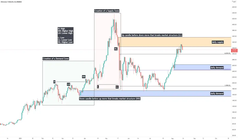
Price Action Study: Single Candle Supply & Demand ZonesHappy Sunday everybody, today I'll be providing a quick writeup on identification of single-candle Supply & Demand zones, otherwise known as "Orderblocks" (Credits to ICT for coining this phrase)
Supply & Demand are one of the most fundamental aspects of trading securities.
In price action - liquidity is believed to be the driving force behind market movements. The primary reason assets move is because of an imbalance between buyers and sellers - supply & demand.
If supply outweighs demand, price moves down.
If demand outweighs supply, price moves up.
If supply and demand are relatively the same - the market consolidates.
Supply and demand zones are created during consolidations - and today we are going to look at how to identify them. When prices is to return to these zones, we look for signs of accumulation to go long, or distribution to short.
Single candle supply and demand zones are also commonly referred to as "orderblocks" - here's how to identify them.
Demand/Bullish OB: A down candle before an up move that breaks market structure - a higher high.
Supply/Bearish OB: An up candle before a down move that breaks market structure - a lower low.
It is an important distinction - we need a structural break for the zone to be a meaningful region to watch if/when price is to return.
-Will, OptionsSwing Analyst
Position Size Calculator (Use It On All Trades)Example CADJPY daily setup is a swing trade using the position size calculator, on chart.
This should be down on all trades down, for risk management and to trade Forex for a lifetime and be part of the winners in trading.
Yes, this example is on daily, but practice on 4 hour, 1 hour or lower charts using position size calculator.
There are several free ones online, fine one you like and book mark it for easy access when needed. Good Luck.

Supply Zones & Demand Zones (Where Swings Happen)Supply zone are areas of resistance on charts which price action reverses at a swing point and goes bearish and Demand zones are areas of support on charts which price action reverses at a swing point and goes bullish.
Once Big Banks have consumed all of the SELL ORDERS- from a demand area price action will go up. No sell orders left, sharp move up. This is so that Big banks can move market quickly consuming buy orders along the way to their targets.
Once Big Banks have consumed all of the BUY ORDERS- from a supply area price action will go down. No buy orders left, sharp move down. This is so that Big banks can move market quickly consuming sell orders along the way to their targets.
Price action is #1 (ALWAYS)- Big banks will range for as long as they need to do accumulate positions for what direction they take Forex pair in future, that is why use the COT REPORT (to get a heads up on this information and to keep you trading with them not against them (which is a failing/gambling trading)
There are major supply and demand zones on higher time frames on 4 hour or higher charts (used for swinging or daily time frame trading) and minor supply and demand zones on 1 hour or less time frames (used for scalping or day trading)
Using supply and demand zones should be part of your normal practice and trading, they will give you possible entries and targets. You can tell weak and strong supply and demand zones, by how easily price action goes thru it and/or stops (makes a base at) or reverses at... They tell you a lot in Forex trading.

Breakout & Return Strategy (#1 Setup)Example is on CADJPY 15 minute example chart. This is #1 best risk to reward setup for retail traders- scalpers and/or day trading. The noted risk to reward on chart example was 1:2 or 20 pips stop to 40 profit or target. Use this with engulfing, harami or pinbar candlestick(s) setups. good luck.

Crypto/Investing Cycle - How INVESTING really works, EducationWhen we hear the first time about investing the majority thinks that this is rocket science. But it is not. I do not mean that it super easy but with the right knowledge it will super clear on how to participate and how take advantage of it.
In this video I will explain everything which is important to know
- Investing Cycle
- Crypto Cycle
- how money is moving
- big institutions
What do you think?

What Makes Stock Prices Go Up & Down? What Makes Stock Prices Go Up & Down?
━━━━━━━━━━━━━
There are many factors that determine whether stock prices rise or fall. These include the media, the opinions of well-known investors, natural disasters, political and social unrest, risk, supply and demand, and the lack of or abundance of suitable alternatives. The compilation of these factors, plus all relevant information that has been disseminated, creates a certain type of sentiment (i.e. bullish and bearish) and a corresponding number of buyers and sellers. If there are more sellers than buyers, stock prices will tend to fall. Conversely, when there are more buyers than sellers, stock prices tend to rise.
━━━━━━━━━━━━━

What is equity ?What Is Equity ?
━━━━━━━━━━━━━
In stock market parlance, equity and stocks are often used interchangeably. Stocks and equity are same, as both represent the ownership in an entity (company) and are traded on the stock exchanges. Equity by definition means ownership of assets after the debt is paid off. Stock generally refers to traded equity.
━━━━━━━━━━━━━

What Is Swing Trading and what are its advantages ?📊 What Is Swing Trading? 📊
━━━━━━━━━━━━━
Swing trading is a style of trading that attempts to capture short- to medium-term gains in a stock (or any financial instrument) over a period of a few days to several weeks. Swing traders primarily use technical analysis to look for trading opportunities. These traders may utilize fundamental analysis in addition to analyzing price trends and patterns.
━━━━━━━━━━━━━
📊 Advantages of Swing Trading 📊
━━━━━━━━━━━━━
🔴 It allows you to take advantage of the natural ebb and flow of markets. Financial markets never go in one direction forever, and by being able to take advantage of that, you can increase your returns as you in theory are going to be making money when the market rises over the next few days, and then make some when the market pulls back, as it will certainly do sooner or later.
🔴 By being in and out of the markets, you can identify more opportunities. If you look at any financial chart, you can see that there is almost always a definite long-term trend, but the market might not always be at a support or resistance area. By being in and out of the market in a matter of a few days, (typically) you can collect profits, and identify other markets that are setting up for other trades. This allows you to spread the risk around, and ties up a lot less capital instead of constantly having to come up with margin for new positions as you find new trades. By closing your first position, you will not have to deposit more money in your account to cover the second one.
🔴 Stop losses are typically smaller than longer term trades. The stop losses on a swing trade might be 100 pips based upon a 4 hour chart, while a stop loss on a weekly chart that is based upon the overall trend might have to be 400 pips. This allows for you to place larger sized positions instead of extremely low leveraged ones via the longer-term trends.

When is the Best Time to Buy & Sell ?
📊 When Is The Best Time To Buy & Sell? 📊
━━━━━━━━━━━━━
The two most important decisions an investor will make are when to buy and when to sell. The best time to buy is when others are pessimistic. The best time to sell is when others are actively optimistic. When buying, remember that the prospect of a high return is greater if you buy after its price has fallen rather than after it has risen. But caution should be exercised. For example, after the stock of fictitious Company X declined by 30%, 40% or more, the first question to ask is why. Why did the stock fall as it did? Did other stocks in the same industry experience a decline? If so, was it as severe? Did the entire stock market fall? If the broader market or other stocks in the same industry/sector performed relatively well, there may be a problem specific to Company X. It’s best to adopt a buy/sell discipline and adhere to it. Benjamin Graham, the father of value investing, once said, “The buyer of common stocks must assure himself that he is not making his purchase at a time when the general market level is a definitely high one, as judged by established standards of common-stock values.” His reference was to what we discussed as fair value under the section Stock Valuation above.

A breakdown of my EU entry showcasing how I analyse the market.I've annotated my charts for your convenience. Enjoy!

Accumulation-Manipulation-Distribution PhasesOut of these three phases:
Manipulation phase is where trend is and where the general public and/or retail traders mostly trade in. This is where the easy money is made.
The Accumulation and Distribution phases are where trading is difficult and where the general public and/or retail traders lose most of their money and blow their accounts.
You need to under where price action is in the big picture and trade accordingly.

Smart Money- Pair,Price,Session & TimeIf you are a scalper trader or day trader you need to know always:
What pair are you trading (ADR, day of week, etc...)
What price is right now
What session(s) is open/closed now- start of session, middle or end
What is time- lunch in Tokyo, London or NY.
Smart Money- Where is the money- right now?
From example one hour chart of Friday (what do you see?)
You need to know support or resistance areas (bearish or bullish order blocks)
When price action could breakout or reverse from a manipulation phase- anticipation and catching these moves are early will give your set ups less risk and lower stop loss, especially if you scalp or day trade.

What is Rounding Bottom Pattern?What is Rounding Bottom Pattern?
Round bottom can be identified when the price changes graphically form the shape of a "U" on charts. It is also called a saucer bottom pattern. It shows potential reversal in price movements. It shows a very slow and gradual turn from down to sideways to up. The longer it stays the longer the more possibility it gives for reversal.
How does Rounding Bottom Pattern Work?
Rounding Bottom Pattern can be divided into three phases:
1. Declining Phase
The decline phase indicates the excessive supply which leads to the price decline.
2. Sideways Phase
After the excessive supply and price decline their is nor demand or supply. Which leads to sideways phase. Usually the prices in this phase will trade flat which means price movement will be very less here with the volume.
3. Recovering Phase
Here in Recovering phase demand start to rise again. Due to excessive demand the price starts to recover.
Above Chart Example:
Here you can see the Bitcoin chart at 1 Day Time frame. It is forming the same Rounding Bottom Pattern. You can see the price price declining in the first phase of the pattern with good volumes.
After that we can also see the sideways phase where the price did not move much.
And finally last phase the prices start to recover again. Here traders can enter in long position after the prices breakout the resistance.
Conclusion:
Hence, Rounding Bottom Pattern is a rare long term reversal pattern to identify the end of a downtrend and the beginning of a potential uptrend.
Disclaimer:
This is just an educational post never trade just any pattern. And please do your research before taking any trades.

TradingWise Supply and Demand IndicatorTradingWise Supply and Demand Indicator is based on the Price Action candlestick patterns to identify the Supply and Demand zones in the charts (Areas of liquidity). It works on all Timeframes and Asset Classes. This Script helps the traders to identify the demand and supply zones with identifications on the candle stick patterns indicating the origin of the Strong move. Also it generates Alerts automatically once the supply or demand area is formed thus by reducing the hours spent on the charts and reducing the missed trade Opportunities as well. This Indicator is extremely helpful for those on Full time Jobs/ Busy Schedule.
Buy/Sell Alerts by Indicator:
Green Diamond + DZ Sign ---> Indicates the Demand Zone Formation. Place Buy Trade upon Entry Criteria Met
Orange Diamond + SZ Sign ---> Indicates the Supply Zone Formation. Place Sell Trade upon Entry Criteria Met

A breakdown of my EU entry showcasing how I analyse the market.I've annotated my charts for your convenience. Enjoy!

LEARNING How to Identify Price Action with Basic Count X + Y = 0this learning with BTCUSD htf 1D
so, basically, this is the action of buyers and sellers
Formula : X + Y = 0 with HLC (high low close)
1D : close candle
X : (-) minus
Y : (+) plus
Body : candle mother
Wick : line high or low
Next support BTCUSD on 30500 if crash we see 29k 28k stop on 26700.
